Nighttime views of the Riviera Hotel and Casino signs on the Strip. Information about the sign is available in the Southern Nevada Neon Survey Data Sheet. Site name: Riviera Hotel and Casino (Las Vegas, Nev.) Site address: 2901 S Las Vegas Blvd Sign owner: Riveria Holdings Corporation Sign details: The Riviera is another of the properties on the Strip which brought its borders to the street. It is one of the properties with an extensive collection of signs on its properties. The glass wall and block long facade, which incorporates infinity lighting and neon displays. A highly animated an reflective ceiling of the westernmost pedestrian element right along Las Vegas Boulevard also plays host to a continuously pulsing entablature of text and neon. The outer portion of the wall facing west is also adorned with raceways, backlit signs, neon stars, and a host of other signs as well. The northwest corner is a unique collection of fascia wall design and sculptural elements on the corner as well for the "Nickeltown" portion of the casino. Along the east end of the property, more Riviera logo/wall signs denote entrances, while the eastern most edge plays host to the massive Riviera Pylon. Various signs also reside on the eastern side of the property. Text signs are located in several positions among various structures. There is also a rather busily illuminated awning, which is lined with incandescent bulbs and text. Sign condition: Structure 5 Surface 4 Lighting 5 Sign form: Pylon; Fascia; Porte-cochère Sign-specific description: The main attraction to the Riviera is its mirrored round wall which serves as a multiuse billboard built around the neon advertisements for the Riviera's big show: Splash Front façade: The front façade of the Riviera is best described by starting with the giant glass well and heading north. The radius of the giant reflective extravaganza is in the general direction of the southwest so reflectivity is extremely good during the afternoon hours. The surface of the structurally integrated visions is surfaced with giant reflective mirrored panel which give way to the multicolored neon puzzle work of the Splash logo. The logo advertises for the show using iconography from the show itself represented with pan channel figures lined on the interiors with neon of corresponding colors for which they are painted. The text that spells "Splash" is painted red, with the circular raceway that sits in its background is painted yellow. The "Splash" text sits above the organic shapes of water shooting out from underneath the array of signage, painted blue and purple. The image of the female inside the logo text is graphically treated with the proper registration of illustrative quality. She is also lined with neon in the proper colors over the major outlines of her form. The entire array sits on a black background laden with incandescent bulbs. The neon is arranged so that as it progresses toward the ground the organic shapes radiate in a repeating pattern outward. The blue and purple neon radiate toward the ground while the red neon in the "Splash" radiates left toward the other side of the wall. Green channels spurt out of the top lined with green neon as well. On opposite sides of the radius wall, there are a series of signage that mirror each other. "Riviera" is written in channel letters filled with neon, and a series of internally lit, color cabinets, lined on the edges with incandescent bulbs. The middle portion of the wall is occupied with various sized stars, raceways, and incandescent bulbs found on extensions and diamond shaped faces. The stars are lined on the interior profile of the shape with blue and pink neon, as well as incandescent bulbs on the interior as well. The bottom of the radius wall is adorned with adorned with internally lit cabinets as well as various small neon creations. Moving north along the face of the building the façade the external elements are greatly supportive of the mirrored walls, and just as brilliant in their own right. The façade begins just to the south of the giant mirrored wall, with a section lined with vertical bars of neon animating in red, pink, purple, and blue neon. Riviera is written in cahnnel letters and filled with incandescent bulbs. The letters are outlined in red neon. On either side of the rectangular section, two small versions of the giant mirrored wall support green and blue wavy channels, lined on the interior edges with corresponding neon colors. Incandescent bulbs are present as well. The façade on the north side smoothly transitions into a wall of transparent plastic cubes, lit from the inside, with raceways running down the edges. This façade runs the entire length of the building, until the end is reached at the northwest corner and Nickeltown. Along the facade, internally lit cabinets surrounded by raceways occupy the vicinity of the lower portion of the sign. The faces are colored plastic and treated with graphics and text. Toward the end of the facade, a collection of small signs is fused together to create a single collection of busy signs. The entire structure is a chaotic vision of relief sculpture smashing into text and iconography, while bright, vibrant colors and neon, fight for attention. The majority of the sign is located on the body of the building, reaches down to touch the ground. Four fluted columns rise up from the ground to meet the bottom base of the massive wall sign. The columns rise up into a sculpted cabinet that is heavily crafted and adorned with ornate edges of hard-coated foam or fiberglass scrollwork. The swelling and swirling scrolls swell out in three dimensions. The entire border of the bottom section is turned into a detailed, organically shaped, cloud like shape. The scrollwork as well as the columns is finished white, with the recesses being toned a golden color. The effect accentuates the three dimensional nature of the design. The surface of this bottom portion is a diagonally crisscrossing pattern of white lattice- work on top of a golden surface. The center of the open surface is occupied by a giant pan channel, of the top three points at a purple, five-pointed star. Flanking either side of the star are small, steel, closed face cabinets, in the shape of squatty looking five pointed stars. They are varying sizes and are painted the three separate colors of purple, yellow, and green. The top point of the largest purple star rises through the top part of the bottom cloud section touching up into the massive collection of signs. This particular sign centers on a top logo reading "Riviera Slot Adventure" in channel letters in the style of action adventure movies such as "Indiana Jones." The first word is written in the logo style of the Riviera, and painted yellow on the interiors. The letters for the two words, "Slot Adventure" are bent with the force of motion and painted red, grading into an orange. Behind that, a circular cabinet, representing a globe, is painted blue in the center and fading to white. Flanking either side of the globe, associated more with the top portion of the globe, pairs of arching bronze colored cabinets slightly arch outward suggesting shining or an explosion. They are laden with incandescent bulbs. The remainder of the sign between the bottom star structure and the top slot adventure text, is occupied by a varied array of signage that can be designated between two halves of the collection. The left-hand side of the sign consists of three-dimensional sculptural elements, channel letters, relief elements. The far left side of the collection is rounded out by the three dimensional relief of crashing waves, creating a background for the three-dimensional structure of the mermaid. Red channel letters spell "Splash" above the mermaid, in white channel letters painted red on the inside. Neon lines the interior of the letters as well. Below the mermaid, more channel letters spell "Gardens" in red channel letters painted yellow on the interiors and lined on the interiors with neon. Above the crest of the wave a relief of a train shoots toward the north with a yellow and red circular cabinet above that with the text for jackpot junction. The train relief is also the designed with perspective to appear as if it is moving forward. Directly to the left of the train is set of yellow channel letters painted blue on the interior reading "Jackpot Factory," lined on the interior with neon. A purple backing cabinet is graphically painted on the face with images of gears. Just to the left of the text is the three dimensional sculpture representing a stack of coins. The space below the "Jackpot Factory" a purple cabinet with a colored face reads with graphics and text for "Valley of Games." Directly to the left of the "Valley of the Games" cabinet a three dimensional cherub is holding a large nickel, with a banner above that. The cherub is painted with the proper flesh tones, and the nickel is adorned with the proper details. The wings animate, utilizing two tubes of neon shaped as wings and in different positions to appear as flapping. A white arched steel banner, with blue text, reading "Nickel Heaven." Neon floats over the top of the letters. The right hand side of the entire collection is just as detailed and elaborate, if not ore than the left hand side. A white steel cabinet cut into the profile of the text, which is painted yellow with red outlines. The text reads 'Slot Frenzy' in two lanes. The red borders are lined with incandescent bulbs. The remaining negative space in the center of the sign is a painted slot handle with a circle of neon around the top of the handle. To the right of that, the surface of the board is created out of relief of faux rocks above what is a set of railroad tracks. A mine cart is on the tracks with giant diamond shaped gems residing in the interior space. A cabinet made of an arched banner and a square cabinet resides above the mine cart. The banner reads Double diamond in blue text, and "mines is spelled" in blue text on the rectangle. Further right the rocks give way to a portion of the cabinet, that reads "Jackpot City" in yellow channel letters, with yellow neon. Vertical raceways lined with incandescent bulbs shoot upward in the area of the text. All are supported on a multicolored flat cabinet, predominantly painted red. Nickel town: On the Northwest corner of the property three distinct images comprise the signage. The main marquee for Nickeltown over the entrance, a Riviera logo just to the right of that, and a large sculptural fountain, that dominates the corner with it's presence. Over the brass and glass doors for the entrance, a polished metal overhang radiuses above the door, and contains the words Nickel Town in channel letters. The two words are written horizontally in a line, and separated in the middle with a pan cjhannel star also lined with neon on it's interior. The star is centered with a channel number "5" which is filled with white neon. The star's neon colors are pink and blue, and are arranged as interior lining of the star. The underside of the awning, as the rest of the front facade, is adorned with the incandescent bulbs, placed neatly in the designated prismatic shapes. The neon rings also are present, running the pediment across the facade. Elements of the electric wall can be seen as well, with the metal diamonds supporting incandescent bulbs trailing upward from the awning up to the facade of the building behind it. Several different sizes of star rise up as well, they are identical in color and design shape. Since the interiors do not contain a channel letter, they contain a channel shaped star, lined with incandescent bulbs in the center. A different sort of star shape is present as well. This shape is an eight-sided shape, reminiscent of a snowflake. When I say snowflake, it is essentially a cross shaped piece crossed, with an "X" shape. The shape is designed out of a pan channel, filled with incandescent bulbs. White neon backs the channel. Directly to the right of the entrance, the mirrored facade reflects the entrance, as the reflective surface house vertical, neon bars as well. The three different colors are Blue, gold and green. Consuming the majority of the concrete expanse created by the small plaza, is the neon-laden fountain of light and steel, with a base of ceramic pool. The design is a circular pool, covered in 1"x1" ceramic tiles, and filled with water. Thee square poles are bent over, looking as if they are spraying up out of the fountain. They appear almost as if a bouquet. One is painted Blue, one gold, and the other red. These poles are striped with neon tubing of the corresponding colors. Internally lit cubes, of the same color scheme as the primary palette. Wrapping around the circumference of the top half of the plumage, is a silver pediment that radiuses around the fountain. The finish is polished metal, and matches the overhang presented in the Nickel Town signage. Raceways run along the top and bottom edges of the face, wile the internally lit advertisements occupying the open space of the pediment every so often. Riviera Convention Center: Directly to the east of Nickeltown, is the Riviera Convention center. Signage for the building is first evident when traveling west, looking at the east face of the building. Not far on the north side of the east face of the building, large channel letters hang denoting the building. The Riviera logo text is spelled in the signature text, outlined with red neon and filled with incandescent bulbs. Below that, a two lined text reads convention center in red channel letters, lined on the interior with red neon. On the south side of the building, two lines of text reads, "Royale Pavilion" and "Entrance" below that. These channel letters are red, and lined with red neon on the interiors. Tower: Along the north side of the main tower, "Riviera" is spelled with giant red channel letters, filled with incandescent bulbs, and lined with red neon. The rear entrance is shared for the hotel, and the convention center, and is denoted with signage, and an overhang. A large blockish overhang is cantilevered off of the side of the building and projects outward, toward the east. On the front edge, an arcade of arches is evident, which reveal five tube-like vaults that project the half radius all the way back to the building. All of the edges of the raceway, including the spaces on the underside, which separates the vaults, are lined with incandescent bulb lined raceways. The Riviera text spells "Riviera" across the front of the cantilevered structure. The channel letters are painted red, lined with red neon and filled with incandescent bulbs. Left of the cantilevered structure are letters, which spell convention center. They are channel letters with red plastic faces. Sign - type of display: Neon; Incandescent; Backlit Sign - media: Steel; Plastic; Glass; Fiberglass Sign - non-neon treatments: Graphics; Paint Sign animation: Chasing, flashing, oscillating Notes: The incandescent bulbs inside the text reading "Paris" on the balloon oscillate rapidly. Sign manufacturer: Federal Signal (fascia front glass) Sign designer: Marge Williams/ Arch: Nikita Zukov (fascia design) Sign - date of installation: 1988-1989 Sign - date of redesign/move: Pylon was moved to Convention Center Dr. and Paradise Rd. c. 1988 Surveyor: Joshua Cannaday Survey - date completed: 2002 Sign keywords: Chasing; Flashing; Oscillating; Pylon; Fascia; Porte-cochère; Neon; Incandescent; Backlit; Steel; Plastic; Glass; Fiberglass; Paint; Graphics
Oral history interview with Christian Giovanni conducted by Cecilia Winchell, Jerwin Tiu, and Stefani Evans on May 17, 2022 for the Reflections: the Las Vegas Asian American and Pacific Islander Oral History Project. In this interview, Giovanni describes her early life being born and raised in Las Vegas, Nevada. She discusses her mother, Oywan, who first worked for the casinos before turning her focus to community building. Throughout Oywan's life, she did everything from start the first temple in the city to the first Thai newspaper, Las Vegas News. Giovanni mentions having what she considers a normal childhood, especially because of her more Western appearance, and did not embrace her AAPI identity until much later in life after she started helping her mother with different organizations. Currently, Giovanni is involved in many organizations, from the AAPI County Commission to the Thai Culture Foundation.
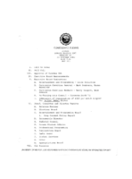
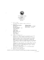
The meeting minutes of the board of directors of Temple Beth Sholom, then known as the Jewish Community Center of Las Vegas, Inc., include the proceedings of meetings held from 1952 to 1956. Also included are periodic reports from committees of the board such as Jewish education, cemetery, and building committees, and budget reports.
Oral history interview with José Luis Meléndrez conducted by Laurents Bañuelos-Benitez on November 20, 2018 for the Latinx Voices of Southern Nevada Oral History Project. In this interview, Meléndrez discusses his family background and early life in Baja California. He talks about his father's decision to migrate to the United States, and attending Catholic schools in California, Nevada, and Texas as the family moved around the country. Meléndrez recalls moving to Las Vegas, Nevada in 1990, enrolling at the University of Nevada, Las Vegas (UNLV), and his involvement with the Boy Scouts of America affiliated program, Learning for Life. Later, Meléndrez describes attending the University of Michigan, earning a master's degree in social work, and becoming executive director for the office of Community Partnerships in the UNLV School of Public Health. Lastly, Meléndrez discusses the future of the Las Vegas Latinx community, and becoming a founding member and chair for the Nevada Minority Health and Equity Coalition.