Search Results
Photographs of Casino Royale and Denny's signs, Las Vegas (Nev.), 2002
Date
Archival Collection
Description
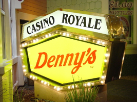
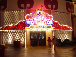
Site address: 3419 S Las Vegas Blvd
Sign owner: Tom Elardi
Sign details: The Casino Royale is located on the east side of the strip facing west, just south of the Venetian. The smaller establishment shares its space with a Denny's restaurant, which was present before the Royale was opened. The exterior is adorned with a stylized, European-esque, architecture, including apparent windows, domes, towers, and a cohesive landscape of connected buildings. The exterior of the Royale is a brightly lit facade of white raceways, lined with incandescent bulbs, boxing in vibrantly toned walls, and subdued neon. The colors correspond with those seen in the sign itself, as well the neon placed inside the edges of the windows. One section displays purple, the next a teal color, next a blue, then a red. Total signage of the property includes a two LED screens, one on the west side of the building, and the other housed in the logo cabinet on the south west corner of the property. Two logo cabinets, one in the aforementioned spot, and the second facing west over the main entrance on the west side of the building. Two double-faced cabinets lie on the northern end of the west side of the building, advertising for Denny's restaurant. Two small logos signs are also placed on the west face of the structure, for Caffe Trilussa.
Sign condition: Structure 5 Surface 5 Lighting 5
Sign form: Fascia
Sign-specific description: Upon the southwest corner of the building, a blue cabinet houses an LED screen in the rectangular body of the cabinet. The cabinet continues upward where the blue steel face supports white channel letters bordered in red neon and filled with incandescent bulbs. The text is written in two lines. The cabinet continues upward and is transformed into the sculpted design of a pink, purple, red, and blue crown on channel faced scrolls and sweeping shapes. The interiors of each section are lined with neon of a corresponding color to the paint treatments. Around to the west side of the building, the same style of text and scrolling adornments are used in a different marquee sign denoting the main entrance to the establishment. The same style of text seen on the southwestern sign is present with the same pattern of scroll work, crafted in a cabinet style, with channel faces. The major difference between the two signs is the size. The main entrance sign is much larger than the corner sign, as well as not having a LED screen incorporated below the text. The western sign possesses more scroll work below the text instead. The neon treatments are the same, as well as the incandescent bulbs, inside of the text. The lower roofline of the property plays host to the small but noticeable signage for Caffe Trilussa. Upon a extended surface of the roof line, two separate signs for the establishment are present. The roof shape is three sided with the signage on the northwest and southwest sides of the extension. Inside a section of the entablature created with white raceways, brown channel letters, spell the text "Trilussa," stretching across the length of the surface. The brown letters sit upon a yellow surface and are filled with incandescent bulbs, which are as wide as the channel letters themselves. Spelled in bent neon tubing, the word "Caffe" is spelled in all capital letters, sitting just above the left hand side of the title text. The right of the collection is occupied by a graphically treated, two-dimensional cut-out of a palm tree. The palm tree is treated on the surface with neon tubing as well. The tubing glows green and a gold corresponding to the graphical treatments. At the northern end of the property, two signs sit outside facing north, south. The double backed, internally lit cabinets represent the advertisements for the Denny's restaurant attached to the Royale. The first is at ground level outside the main entrance of the restaurant, the six sided, green cabinet, sports a yellow plastic face with red graphic text, reading "Denny's" in script text. Around the border of the face, incandescent bulbs run in a raceway pattern, and are covered in a plastic sheath. An angular cabinet rests on top of the other cabinet, creating a shallow peak. The internally lit, white face reads "Casino Royale" in black text. The same cabinet can be seen cantilevering off of the west side of the building above its partner sign. The cabinets are of identical design except for there is no plastic sheath covering the raceway of incandescent bulbs, and the plastic face of the main section of the cabinet is treated in different graphics. The script reads "Denny's" similar red script, but with a different background.
Sign - type of display: Neon; Incandescent; Backlit
Sign - media: Steel; Plastic
Sign - non-neon treatments: Graphics; Paint
Sign animation: Chasing, oscillating
Notes: The incandescent bulbs inside the channel letters of the main text oscillate, while all incandescent bulbs on the raceways along the building chase each other also. The incandescent bulbs, which surround the Denny's cabinet, also chase each other.
Sign environment: The Casino Royale stands independently on it's own even though it is surrounded on all sides by casino giants. To the north stands the Venetian, to the South stands Harrah's, and the Mirage lies west across the street. Yes, the property itself seems to be dwarfed by the immense neighbors, but the ultra bright, clear external signage and facade create a charming and bright environment that announces its presence.
Sign manufacturer: YESCO
Sign - date of installation: 1992
Sign - date of redesign/move: The Royale was once the Nob hill, which was closed in 1980. It was reopened in 1992 as the Casino Royale.
Sign - thematic influences: The theme seems to be tied to a European theme with the French term "Royale" in the title. The scrollwork is reminiscent of confetti or Mardi Gras theme. Such a combination of elements to suggest a theme is seen in the Harrah's property also. The party themed reminiscent sculpted cabinets are also reminiscent of the Fleur de Li. Believe it or not, the property is tied to many other larger, corporate, properties in one respect regarding its facades. The facade of a town or city, shrunken down and stylized into the facade of the property is present all over the Strip. Such properties which utilize this technique, to one degree or the next, include: New York New York, Oshea's, Treasure Island, Bellagio, The Venetian, The Luxor, The Tropicana, and the Excalibur.
Surveyor: Joshua Cannaday
Survey - date completed: 2002
Sign keywords: Chasing; Oscillating; Fascia; Neon; Incandescent; Backlit; Steel; Plastic
Mixed Content

Alpha Kappa Alpha Sorority, Theta Theta Omega Chapter "Hodegos" reports
Date
Archival Collection
Description
From the Alpha Kappa Alpha Sorority, Incorporated, Theta Theta Omega Chapter Records (MS-01014) -- Chapter records file.
Text
Meeting minutes for Consolidated Student Senate University of Nevada, Las Vegas, March 14, 1991
Date
Archival Collection
Description
Text

Photographs of Slots a Fun signs, Las Vegas (Nev.), 2002
Date
Archival Collection
Description
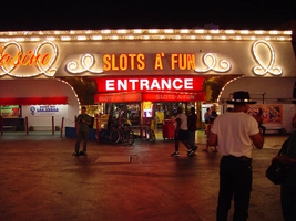
Site address: 2880 S Las Vegas Blvd
Sign owner: Mandalay Resort Group
Sign details: Slots a' Fun is located on the south side of the Circus Circus parking lot, but it is on residence now. The small building stretches west with the mouth of the building being an open mouth facing the east. The external signage is located on the elongated north face of the building, and the gaping east entrance. The north side is comprised of gold painted, crafted raceways with various text signage. The entrance is adorned with various internally lit cabinets as well as a marquee adorned pediment, located within the front face of the entrances overhang. The entrance is considerably small, sandwiched between flamboyant properties such as the Westward Ho and the Circus Circus.
Sign condition: Structure 4 Surface 4 Lighting 4 The structural integrity is good as well the lighting. The surface is starting to show some signs of wear, but not very much at all.
Sign form: Fascia
Sign-specific description: The main entrance faces east and contains an interesting array of signage. The front is highlighted by two giant pillars. The are uniquely designed as inverted, tapered cones supporting the barrel vaulted cantilevered overhang. Near the top portion of the column a backlit message box cuts through the pole dividing it into two apparent sections. Bordered on all edges with gold polished raceways with incandescent bulbs, the box is animated in a chasing pattern. A top the poles on the north and south sides a polished aluminum, circular cabinet, has red, backlit plastic containing the words "Slots A' Fun" in white text. These cabinets are outlined in red neon. The edges of the apparent recess are lined with incandescent bulbs Each vault contains a long bank of large incandescent sphere's, arranged in single file. Along the front of the cantilevered overhang we have an entablature running the length of building. Gold raceways run horizontally along the top and the bottom with rows of triple incandescent bulbs. In the center of the pediment, white channel letters painted red on the inside, with incandescent bulbs filling the interior space of all of the characters. Each letter is also outlined in neon. The rest of the interior space of the facade is sculpted raised circular pattern with incandescent bulbs placed in the centers where the repeated panels connect. Under that, a polished gold aluminum banner with various assorted neon letters and advertisements is displayed. Since the "Slots A' Fun" used to be part of the Circus Circus it is closely integrated into the environment and even with the signage. Upon the northeast corner of the building a sign for the Circus Circus is perched on the top of the roofline facing north/south. Facade is sculpted raised circular pattern with incandescent bulbs placed in the centers where the repeated panels connect. Moving around to the north face of the building, an array of signage is present headed west along the wall. Along the stucco facade we have overhangs of different dimensions. On these three overhangs we have gold channels in the shape of a continuous curly cue or rope shape. These raceway channels are lined on the inside with incandescent bulbs. The first one, furthest east, is a good length, and smaller in height than the others. The pattern loops eight times along the front. One single loop of the rope shape is located on the return width of the overhang as well. No text is incorporated with this overhang. The second curling raceway is over a wider, shallower depth. The overhang, is much larger in size and supports cursive pan channel letters painted red and outlined with red neon. The letters spell "Casino" in a continuous script text. The third overhang is the largest of the trio, and serves as the main entrance for this face of the building. It is in direct proximity to the actual Circus Circus building and the blazing signage, and porte cochere. This overhang is lower to the ground than the other two but projects further out. Channel letters spell "Slots A' Fun" in the front face of the overhang located in the center. The channel letters are painted red and lined on the interiors with red neon as well. This text is block instead of script. Flanking either side of the text there is the curling channels. The face of the building rises upward from the ground and meets the bottom edge of the overhang, with a continuous radius vault. The surface of the wall is surfaced with a gold reflective material. Just below the text of the overhang is a red steel cabinet, that is internally lit. The red painted steel box has a red plastic with a red plastic face with white lettering. The block text reads "Entrance." The sides are sculpted with a radius space reduced out of the sides of the cabinet. The edges of the face are lined with incandescent bulbs. Below the cabinet a red, vinyl, awning extends out over the doors, and a pedestrian path. A small portion of the main structure still extends west with one more loop on the face of the building.
Sign - type of display: Neon; Incandescent; Backlit
Sign - media: Steel; Masonry
Sign - non-neon treatments: Graphics; Paint
Sign animation: Chasing, oscillating
Notes: All of the raceways chase each other. This includes all of the different aspects which are lined with incandescent bulbs.
Sign environment: The Slots A Fun has the unique position of being in between the Westward Ho and the Circus Circus. It was at one time part of the Circus Circus, so it essentially blends in with its environment. The south side of the building literally resides touching the Westward Ho.
Sign manufacturer: YESCO
Sign - thematic influences: The theme of Slots a Fun can be regarded as the heavy influence from its initial design based on the Circus Circus. In that respect it would be linked to a circus theme. The almost surrealistic swelling of the tile laden columns on the east face of the building as well as the curly cue raceways suggest a busy excitement usually associated with the extravaganza of the circus. To that end, the interaction with the Las Vegas environment would suggest the theme of a party. Such influence of the same element of theming can be seen in the umbrella shapes and chasing action of the neighboring Westward Ho. Several elements of the facade suggest different trends as well. The eastern overhang's vaulted dome is surfaced with the highly reflective polished gold aluminum. The entrance on the northern face incorporated with the surfacing with a golden reflective surface. The trend of using the reflective surface to further perpetuate the luminescence is used highly in the flanking properties. The use of the raceways is a unique function, not repeated on any other property.
Sign - artistic significance: Some unusual elements that have not been repeated can be found in this lesser-known example of sign art.
Surveyor: Joshua Cannaday
Survey - date completed: 2002
Sign keywords: Chasing; Oscillating; Fascia; Neon; Incandescent; Backlit; Steel; Masonry; Graphics; Paint
Mixed Content
Photographs of Westward Ho signs, Las Vegas (Nev.), 2002
Date
Archival Collection
Description
Site name: Westward Ho Motel (Las Vegas, Nev.)
Site address: 2900 S Las Vegas Blvd
Sign details: The space of the westward Ho is limited yet busy on the landscape of the strip. Approaching from the south, the property lies on the West- side of the Strip. Signage is available on the south elevation, wrapping around into the east elevation, which happens to be the front. Starting with the pylon sign a similar courtyard stretches north with its translucent vinyl awnings, until it reaches its abrupt end with the Circus Circus and Slots A Fun properties.
Sign condition: Structure 5 Surface 5 Lighting 5
Sign form: Pylon; Porte-cochère
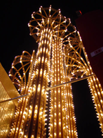
Sign-specific description: Approaching the Westward Ho headed north you are immediately confronted by a couple of signs. The first being giant yellow channel letters in Western style font and outlined in blue neon. The font is similar to that of the Frontier Hotel and Casino. The ends of extended appendages of the letters swell in block shapes with points jutting from the flat surface. The letters are filled with incandescent bulbs which all flash on together almost illuminating the entire parking lot in for a brief few seconds and then off again. Below that the building is horizontally striped with polished gold panels sporting three back lit signs for various resort attractions of buffets and drink specials. The building long panel is bordered on the top and the bottom by chasing incandescent bulbs on a polished raceway from left to right when facing this south elevation. The brick facade is adorned with a long backlit message cabinet with yellow painted raceways with incandescent bulbs. On either end of the backlit cabinet are two large square backlit cabinets. These two are bordered with a large steel raceway painted black. Dividing the two large raceways is a channel painted yellow. Inside the recessed channel are incandescent bulbs. The black raceways are faced each with three stripes of neon in blue, whir. The facade of signage and mirrored panels leads the eye to the obvious main pylon sign for the motel. The giant exploding pylon of gold raceways shooting upward into the sky and finally mushrooming out into umbrella formations at different elevations. The sign is comprised of five separate towers: One giant one in the center, which is the tallest, two lower ones flanking the center poles, then one smaller one on the south side of the sign and one equal size on the East side of the structure. The polished gold aluminum raceways comprise the body of the structure and are illuminated with incandescent lamps. The very base of the structure is supported with a structure of red brick masonry. The only elements of actual signage are the back-to-back color animated LED message centers, which are crowned by the 'old west' style text of various sized red neon bordered channel letters. Viewed from the side the Westward ho sign takes on a more sculptural aspect than that of signage. The reason for this is the brilliant finishing of the backs of the message centers. The rears of each panel are finely finished with brushed aluminum gold panels, which combined with the electrifying animation of the incandescent bulbs, creates a high degree of reflectivity. (Barnard) As if echoing the main pylon sign, stretching to the north is a small plaza utilizing the same three-dimensional sculpted umbrella designed awnings to create a pedestrian ready experience to the design. The umbrellas are made into coverings by the addition of illuminated vinyl. The pole structures are steel, covered with brick masonry. Each one of the umbrellas has a planter base and benches where visitors my rest or enjoy the surrounding environment. As the pylon, bulb laden, polished aluminum raceways form the skeleton of the Umbrella. Non-illuminated brass raceways stretch down from the inside and down the center pole. As well as the pylon, polished metal lacework finds its way around the circumference of the Umbrellas bottom edge. The East face of the building is mirrored to ad to the reflectivity of the entire plaza, and adding the illusion of depth to the rather limited space. The half columns and half umbrella's are set into the wall looking as if it is whole against the mirrored surface. A backlit triangular polished cabinet is of particular interest, because it is a sculpted cabinet frame. The top of the two faces is made to mimic the shapes of the pylons swelled crowns. Westward Ho is spelled in red paint.
Sign - type of display: Neon; Incandescent; Backlit; Matrix; Ambient
Sign - media: Steel; Plastic; Glass; Masonry
Sign - non-neon treatments: Graphics; Paint
Sign animation: Chasing, flashing, oscillating
Notes: The incandescent bulbs inside the text reading "Paris" on the balloon oscillate rapidly.
Sign environment: The Westward Ho's unique design of an incorporated courtyard frontage, creates a small strip of closed environment between the Stardust and the Circus Circus/Slots A Fun. The space between the Stardust's property and the Westward Ho's is separated by a small parking lot, which holds claim to the giant letters which boom out casino to the passerby. With its party atmospheric, umbrella design, and mirrored backdrop the pedestrian element makes its own environment distinct to the passerby. Walking through this section gives a sense of a specific taste held in Las Vegas two decades ago, yet still evident today in almost every casino design.
Sign manufacturer: Sign Systems, Inc (pylon and courtyard) YESCO (south side signage)
Sign designer: Brian K. Leming (Pylon and Umbrella frontage)
Sign - date of installation: 1983 (Pylon and Umbrella frontage)
Sign - date of redesign/move: Original backlit plastic message center was replaced with the now existing LED matrix screen
Sign - thematic influences: The Westward Ho facility itself is a Western themed establishment but the design by Lemming reflects a more party atmosphere with its umbrella shaped overhangs and highly animated incandescent raceways. The courtyard was originally designed with a different idea fore a pylon, but the idea of the canopies was carried over into that of the design of the pylon. The over use of the theme of the polished aluminum is reminiscent of that period in Vegas history when the materials could be found virtually everywhere. Such examples included the porte cocheres at the Silverbird Hotel and Casino and the Stardust as well. This theme is still seen on virtually almost every sign. The only elements of Western imagery or style are found in the pylon sign are the font style of the lettering. As for the he building's flavor of the old west, the south wall's yellow channel letters reading "CASINO" is reminiscent of the style of font found on the pylon.
Sign - artistic significance: Besides the fact that the pylon structure stood independently in sculptural aspects as well as functional aspects, the use of materials proved to be a trend setting achievement in that period of Las Vegas. Not only did the property take extensive use materials that could maximize the ability of the lighting such as polished aluminum and mirrored paneling, it was the first to significantly employ the use of colored, translucent vinyl.(Barnard) Soon after the use of this translucent materials in signs could be seen all over the Strip on the interior and exterior of signs and buildings.
Surveyor: Joshua Cannaday
Survey - date completed: 2002
Sign keywords: Chasing; Flashing; Oscillating; Pylon; Porte-cochère; Neon; Incandescent; Backlit; Matrix; Steel; Plastic; Masonry; Glass; Paint; Graphics
Mixed Content
Photographs of Circus Circus signs, Las Vegas (Nev.), 2002
Date
Archival Collection
Description
Site name: Circus Circus (Las Vegas, Nev.)
Site address: 2880 S Las Vegas Blvd
Sign owner: Mandalay Resort Group
Sign details: Circus Circus is a cluster of signage and buildings located toward the Sahara Boulevard. When approaching Circus Circus on Las Vegas Boulevard from the North or the South the first thing which is seen is Lucky the Clown, the giant, sculpted, roadside pylon, on the west side of the strip where the property is located. From the South as you approach the property A small double backed marquis sign for the Circus Circus is perched atop the corner or the shared and neighboring establishment of the Slots-a-fun's small street side covering. As you make you way past to entrance to Slots of Fun toward the Giant Lucky sign, the impressive porte cochere comes into view. The porte cochere is the centerpieces for the flankings of the electrified north elevation of the low rise Slots a fun building and the Lucky the Clown Pylon. Following the building North and around it's North elevation, and elevated tram track is exaggerated by the striping of red neon and incandescent bulbs. From there you see the letters horizontally along the high rise towers spelling Circus Circus. The rear of the property serves as home to the Circus Circus Manor, an RV park for the recreational motorist to stay in their travels.
Sign condition: Structure 4 Surface 4 Lighting 5
Sign form: Pylon; Fascia; Porte-cochère
Sign-specific description: The first description belongs to the double backed color LED message center. The board is outlined in rose neon leading up into neon scrollwork center-pieced at the very top of the sign by a smiling clown face. Between the message center and reader board are the animated neon words circus circus in channel lettering with red neon. When facing the front of the Circus Circus, the first fixture, which catches the eye, is the dazzling Rudy Coristomo designed porte cochere. The gradually arched cover is of fully cantilevered design, and the entire piece is encrusted with a dizzying array of animated red and white incandescent bulbs. The words Circus Circus are spelled in channel lettering cross the front peak of the low rise arch design. The letters are filled with white animated incandescent bulbs. A backdrop for the porte-cochere is the pattern of incandescent bulbs along the wall of the structure, which supports the porte cochere. Painted in animated bulbs, narrow, intersecting archway designs reach from the ground nearly to the top of the building itself. The effect is nice backdrop, which leads the eye from the wings of the property to the center. Placed just to the left of the Porte cochere is an entrance into the casino. Above the door a neon and bulb encrusted fascia designed clown holds guard to the word entrance spelled in backlit plastic. Flanking the figure itself are animated red and white bulb laden scrollwork. To the right of the porte cochere is a smeller yet equally charming sign representing another entrance into the building. The smiling backlit plastic wall sign, like the previous, holds an arched text of casino which itself sits above the word entrance. It is outlined in blue neon, with animated incandescent bulbs. Two backlit plastic message boards with changeable vinyl lettering join the wall sign. Animated incandescent bulbs form a border around each. Following around to the North side of the building. A continuous stripe of red neon and a stream of incandescent bulbs border an elevated tram path. As it disappears into a higher elevation building, the giant, vertical, red neon letters Spelling Circus Circus can be seen high above along the east elevation of the tower in the near distance. Continuing west you arrive in the rear parking lot where several items of signage reside. At the very west edge of the property a single sided arched backlit panel faces east and is supported by two candy striped red and white poles. Following the striping and forming a border around the arched panel, white incandescent bulbs chase around the entire sign. In a two-leveled section of text, in the very center of the top of the sign, the words Circus Circus and then Entrance below that are spelled in metal channel lettering with exposed red neon on the interior. On either side of the red neon text are the words free parking painted in white. Directly through the gate further in the distance in the Parking lot, the parking garage can be seen highlighted by the vertical channel lettering, in block text the words Free parking on the west elevation and on the north elevation the key circus circus turn of the century lettering spell circus circus lighted with red neon. The words light up in sequence back and forth in animated turn, saying Circus, Circus. Below that Free Parking is also spelled in block text channel lettering, with exposed red neon. Along the north side of the parking lot is Circus Circus Manor, the recreational vehicle park is highlighted with it's own unique signage.
Sign - type of display: Neon; Incandescent; Backlit; Matrix
Sign - media: Steel; Plastic; Fiberglass
Sign - non-neon treatments: Graphics; Paint
Sign animation: Oscillating, flashing
Sign environment: The site is bordered on the South by Slots of Fun, on the north by the Hilton timeshare under construction, and across the Strip by the Riviera.
Sign manufacturer: YESCO (porte and pylon)
Sign designer: Rudy Crisostomo/LeeLinton (Porte cochere) Dan Edwards (Lucky the Clown Pylon)
Sign - date of installation: Pylon: 1976, Porte Cochere: 1983
Sign - date of redesign/move: The back-lit plastic message board of Lucky the Clown was replaced with an LED matrix screen. In 1983, the porte cochere was redesigned by Rudy Crisostomo and architect Lee Linton.
Sign - thematic influences: The Circus Circus is entirely encompassed by the theme of the big top extravaganza of the three ring circus. The furiously animated light arrays, sheer magnitude of the number of bulbs, intensity of light, all add to the exciting concept of the circus. The turn of the century fonts, reminiscent of the Barbary Coast block Style, are mostly consistent through out the property.
Sign - artistic significance: This theme was en effort to give a bit more respectable image to gambling originally in the late sixties and early seventies. They would incorporate live aerial acts over the casino floor The unique concept was accented by a higher capacity for staying travelers and more family oriented attractions. The giant backlit sculpted pylon Lucky the Clown sign stood as a standard for size and dominance. The 84 ton steel structure was all internally contained and lit from head to toe and welcomed guests and was on of the most memorable Las Vegas sign experiences. Artistically it was influential on the standard on how a resort could be totally encompassed by a theme to create a unique spectacular for most people as well as retain the brilliance of Las Vega's garish style.
Surveyor: Joshua Cannaday
Survey - date completed: 2002
Sign keywords: Oscillating; Flashing; Pylon; Fascia; Porte-cochère; Neon; Incandescent; Backlit; Matrix; Steel; Plastic; Fiberglass; Graphics; Paint
Mixed Content
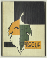
Epilogue: Nevada Southern University Yearbook, 1963
Date
Description
Yearbook main highlights: schools and departments; detailed lists with names and headshots of faculty, administration and students; variety of photos from activities, festivals, campus life, and buildings; campus organizations such as sororities, fraternities and councils; beauty contest winners; college sports and featured athletes; and printed advertisements of local businesses; Institution name: Nevada Southern University, Las Vegas, NV
Mixed Content

Meeting minutes for Consolidated Student Senate University of Nevada, Las Vegas, January 23, 1986
Date
Archival Collection
Description
Text