Search Results
Nat Hart Professional Papers
Identifier
Abstract
The Nat Hart Professional Papers contain the business records, personal papers, and photographs of Las Vegas, Nevada chef and restaurateur Nat Hart, who served as the Corporate Vice-President of Food and Beverage for Caesars World in the 1970s and 1980s. Papers date from 1930 to 2000 and include restaurant training and service manuals, business proposals, architectural drawings, recipe cards, cookbooks, menu specifications, photographs, scrapbooks, awards, news releases, and correspondence.
Archival Collection

Nevada Southern University 5th commencement program
Date
Archival Collection
Description
Commencement program from University of Nevada, Las Vegas Commencement Programs and Graduation Lists (UA-00115).
Text
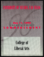
University of Nevada, Las Vegas (UNLV) College of Liberal Arts 33rd commencement program
Date
Archival Collection
Description
Commencement program from University of Nevada, Las Vegas Commencement Programs and Graduation Lists (UA-00115).
Text
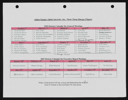
Alpha Kappa Alpha Sorority, Theta Theta Omega Chapter calendars
Date
Archival Collection
Description
From the Alpha Kappa Alpha Sorority, Incorporated, Theta Theta Omega Chapter Records (MS-01014) -- Chapter records file.
Text
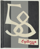
Epilogue: Nevada Southern University Yearbook, 1958
Date
Description
Yearbook main highlights: schools and departments; detailed lists with names and headshots of faculty, administration and students; variety of photos from activities, festivals, campus life, and buildings; campus organizations such as sororities, fraternities and councils; beauty contest winners; college sports and featured athletes; and printed advertisements of local businesses; Institution name: Nevada Southern University, Las Vegas, NV
Mixed Content
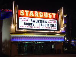
Photographs of Stardust signs, Las Vegas (Nev.), 2002
Date
Archival Collection
Description
Site name: Stardust Resort and Casino
Site address: 3000 S Las Vegas Blvd
Sign owner: Boyd Gaming
Sign details: This is a large casino property that is clearly a center of attention.
Sign condition: Structure 4 Surface 4 Lighting 4
Sign form: Pylon; Fascia; Porte-cochère
Sign-specific description: Even though the facade of the Stardust has gone through many changes, streamlining itself over the years, yet retains aspects of it's original flavor. The tower faces northwest and southeast and is adorned with horizontal bars of red neon underlining each floor. The top tube only stretches approximately one-quarter of the way across the face, and with each floor, the neon gets increasingly longer. The result is the building being cut across the face at an angle, with one half being illuminated by the red neon and the other by ambiently blue lighting. Large Channel letters spelling "Stardust," are bordered by red neon and filled with incandescent bulbs. The Majority of the external signage is on the low rise structure close to the street, with the tower located to the northwest behind it. The array is comprised of two small pylon message centers, a porte cochere, the main pylon, and assorted entrance signs. On the south side of the building alongside a large parking lot, an entrance sign hangs above a two-sided corner entrance, Wrapping this small corner, polished gold raceways and trim create borders for the accordion surfaced pediment, and shoot up vertically into the sky on the far ends. Blue neon shines from behind the shining trim above the door to illuminate the whit accordion facade. The trim above that is adorned with two tubes of gold neon on the top and the bottom, hidden in recessed channels to cast a gold halo from behind. The two vertical edges are lined with incandescent bulbs. On the south wall of the small corner, channel letters stand on the top edge of the golden molding, reading "Casino." They are black on the exterior, painted white on the interior, and filled with incandescent bulbs, and bordered with red neon. On the Southeast edge of the building another entrance of a bit more design Above a set of doors, and the blue lit accordion facade and golden halo cast metallic trim, a Squared "U" shape made of polished metal raceways, holds a back lit message center housed on a black cabinet. On either side of the vertical legs of the "U" shape, another single raceway rises slightly higher in the air. All the raceways are lined with incandescent bulbs. Above the cabinet, black channel letters, spell "Stardust." They are finished white on the exterior, filled with incandescent bulbs, and outlined in red neon. Moving around to the eastern facade of the building, the facade is a three leveled pediment in the accordion pattern, and separated with the polished trim. The Yellow and blue lighting illuminate this facade also. The pattern is only interrupted by oval shaped back lit cabinets, placed every so often. Eventually you come to the porte. It is no longer finished with mirrors, but still retains the raceways lined with incandescent bulbs. The surface in between is filled with white stucco finish. What is left is a series of 5 hexagonal shapes crafted out of raceways and hung a section ceiling lower than the rest. Geometric patterns radiate from this center piece. North, past the porte cochere a section of building juts out to the east. It contains an entrance on the north and south faces, and two on the east face which are parts wrapping around from the previously mentioned entrances. Over the north and south entrances the "U" shaped polished metallic raceways and external flanking raceways, as seen before on the southeast entrance, play host to a narrow LED message center and channel text spelling stardust. The letters have the same treatment as the previous sign as well, and spell "Stardust" in channel letters. They too are filled with incandescent bulbs and bordered with red neon. Above the text, channel pans are in the shape of four pointed stars as seen on the main pylon, are slightly scattered as if to be showering over the text. They are multi colored, centered with arrays of incandescent bulbs and interior neon contours. The accordion facade and lighting are below the composition. Below the accordion pediment, a polished gold bullnose creates a pediment above the door and wraps around to the east face of the structure. A pointed end polished metallic cabinet is placed in the section of the bullnose over the door, spelling "Casino Entrance" in channel letters and filled with red neon. The surface of the bullnose is laden with incandescent bulbs. The facade wraps around the front with another pointed end cabinet reading entrance in the same fashion as the previously mentioned text. A small section of foliage and shrubbery line the west face of this extension of the casino before the same arrangements of sign are seen repeated on the north face. Passing the entrance the property opens up into a courtyard with an arrangement of low rising concrete cylindrical fountains created a multi-leveled garden of spurting water and plants. Just past the courtyard another entrance is found created out of the northeast corner of the building. Like the other entrances, elements such as the blue lit accordion face, double rows of vertical metallic raceways, properly treated channel letters, are present. The gold raceways wrap the corner with backlit cabinets on the east and north faces. The channel letters read "Stardust" on the east face and "Casino" on the northern face. The ceiling that the overhang creates is finished in polished metallic material and laden with incandescent bulbs. Just outside the last entrance the first of two low rise message pylons. The one located on the north end of the property is larger and more spectacular. The large triangular cabinet's faces are backlit, slightly concave message boards. The tops of each o these cabinets in adorned with a smaller, purple steel cabinet, approximately eighteen inches tall, and running the length of the cabinet. "Stardust is spelled across the length of the cabinet in channel letters, and filed with rose neon. The cabinet is laden with incandescent bulbs, creating a canvass for the letters to reside. The three edges, which is the gap where the three signs meet and the bottom of the cabinet are covered in incandescent bulbs. The surfaces are treated with polished metal. The pole which the cabinet sits is a white, two sided, support with two peaks growing out horizontally about two-thirds up the height. The shape, along with a Stardust style star channel pan in its center, is a representation of the repeated image associated with the logo of the property. The edge of the post is treated with a border of purple paint and lined with purple incandescent bulbs. Just inside the border stripe a channel recesses forming another border for a tube of purple neon. The star pan channel in the center is bordered in teal neon and filled with incandescent bulbs. A top the entire cabinet is an array of stardust stars of various colors, bordered in neon, and or filled incandescent bulbs. The array is assorted again to appear as if they are being showered, tapering to one single star at the top. The entire cabinet rotates slowly from right to left. The cousin to this sign is at the extreme south end of the property, set before an entrance give a larger double backed cabinet sits off center on a square post. The white plastic face is housed in a white steel cabinet with rounded edges. The top or the sign is comprised of the same purple cabinet and channel letters seen in tops of the concave message boards of the rotating relative at the north end. The width of the cabinet is strewn with incandescent bulbs, continuing underneath as well. The post is painted two tones.
Sign - type of display: Neon; Incandescent; Backlit
Sign - media: Steel
Sign - non-neon treatments: Graphics; Paint
Sign animation: Chasing, flashing, oscillating
Notes: The incandescent bulbs inside the text reading "Paris" on the balloon oscillate rapidly.
Sign environment: To the south of the Stardust is the Westward Ho, and to the North is Circus Circus. It stands with these two as well as the Frontier as vestiges of an older era of Las Vegas resorts. The Riviera also resides across the street. Vast shoots of concrete, spread out in front of the hotel, creating a continual plaza which runs from north to south. It contains lush flowers and fountains that toss water to each other is shooting arcs. In the daytime, the white of the remodeled facade is almost blinding against the concrete.
Sign manufacturer: Ad-Art (pylon); Sign Systems, Inc (porte cochere)
Sign designer: Paul Miller (pylon) Brian K. Leming ( porte cochere and facade)
Sign - date of installation: 1968
Sign - date of redesign/move: The original Electra-Jag style letters were replaced in 1991 by a sleeker Helvetica type face, as well as the letters for Enter the Night being changed to read "The Wayne Newton Theatre" in 1999. Also in this year, the facade was changed to a reserved white finish. The accordion shape is still present but no longer tri colored. The move was presumably made in an attempt to compete and fit in with its bigger corporate competitors.
Sign - thematic influences: The Stardust's theme revolves around an outer space/science-fiction theme, which was exceptionally popular during the era which it was created. When the original design, no longer present, was created in 1958, the Russian space project of Sputnik was just realized.
Sign - artistic significance: This is one of the most widely-admired and imitated signs on all the Strip.
Surveyor: Joshua Cannaday
Survey - date completed: 2002
Sign keywords: Chasing; Flashing; Oscillating; Pylon; Fascia; Porte-cochère; Neon; Incandescent; Backlit; Steel; Paint; Graphics
Mixed Content
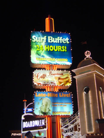
Photographs of Boardwalk Holiday Inn signs, Las Vegas (Nev.), 2002
Date
Archival Collection
Description
Site address: 3750 S Las Vegas Blvd
Sign owner: MGM Mirage
Sign details: The Boardwalk Holiday Inn is one of the most distinctive front faces which incorporate an extreme amount of signage condensed into a replica version of an eastern sea board. Since it is designed to be reminiscent of a boardwalk, the pedestrian element is a wooden planked walkway lined with shops and establishments. The area is separated from the traffic by landscaping and concrete elements. All the shop fronts designs, some false and others functioning, are all linked into the casino. The structure is encrusted with raceways and incandescent bulbs, as well as a ridiculous amount of internally lit signage that advertising everything from hotel promotions, to prices of drinks. Headed from the south, headed north, the parking garage can be seen, set back from the street slightly west, adorned with signage on it's face. The casino begins at full throttle aesthetically, with raceways lining almost every edge, contrasting tones of paint, murals, advertisements, neon and incandescence all come together. Above the first main entrance of the property, is a vibrantly lit, gold clad entrance canopy. Above that a non-functioning skeletal mass of a roller coaster comprises the majority of the southern end of the property. Neon letters are located on the vertical plane created by the rise of the tracks. The carnival style treatments of raceways and propaganda run north until the path is interrupted by the vertical pylon sign which is integrated into the architecture of the Boardwalks facade. The tracks continue above the property, all along the length interrupted by the main pylon and addressed with replica's of Ferris wheels with actual mannequins, dressed and riding inside of them. Just pas the main pylon the facade is transformed into a giant three dimensional clowns head smiling joyfully. The facade continues a short distance past the clown's head, and rounds off just as it began.
Sign condition: Structure 4 Surface 4 Lighting 4
Sign form: Pylon; Fascia
Sign-specific description: Upon the eastern face of the parking garage signage is created upon the top edge of the outside wall. The top edge of the wall is fashioned into a sculpted entablature of signage, complete with rising crests and swooping scrolls, which match the fashion of decoration for the facade as well. On each side of the surface possess a pair of internally lit signage. One is square, and the next is rectangular, brandished with black text. The center portion of the sign is closed in with a pair of half columns which rise out of the surface of the entablature to flank the main text. These half columns are laced with an outline of an orange and yellow neon tubing. The Text is spelled in two different lines of channel letters lined with red neon on the interiors. The First line reads "Boardwalk Casino" the second line reads "Free Parking." The two lines span the length of the space provided and are separated by a sculpted dividing line. The tower just to the north of the parking garage is suited with channel letters that spell "Boardwalk' and are filled with red neon. Roller coaster: The sign which resides over the first entrance is similar that of the paring garage, for it is placed in a raceway bordered fascia. The large channel letters are placed in the center and spell " Casino." The first and last letter are the smallest in size, and gradually climb up toward the middle. They are filled with incandescent bulbs and outlined with a border of red neon. Pylon: The rest of the facade is necessary for the theme to really work, but the tallest and brightest piece is the main pylon sign. The pylon sign is essentially a triangular shape which rises straight up into the air. If a unilateral triangle, then one point is facing east with the two sides meeting at this eastern most point, being designated for the main signage. Three visible posts support the sign, glowing with the reflectivity of the gold polished underside which is striped with rows of incandescent bulbs, running perpendicular to the entrance. Three bands of pink neon wrap the two visible sides, just above the pedestrians head. Just above that there is a narrow LED message center which scrolls text, which also wraps the two sides. The majority of the sign occupies the space between this small border and the main marquee. This rectangular portion each one of the pylons sides can be broken down into four horizontal sections. The bottom two comprise the bottom 1/3 of the sign, and are internally lit advertisements ninety-nine cent offers and the Surf buffet. The middle section, being the tallest, contains a large LED message center, flanked on both sides by multi colored neon tubes crafted into the shapes of stars. The stars vary in size and spread up the small wings of the reader board with surprising fluidity. Compared to the rest of this section, the top remainder is rather plain. A plain surface is accented with a pair of words spelled in channel letters. The word hotel is spelled on the left and filled red neon. They are separated by a small, circular, channel filled with green neon. The word on the right is spelled in the same lettering except it is filled with green neon. The space above that is occupied by the main logo for the establishment. A black field supports large white channel letters that are filled with white neon. Then black field is closed in on all sides by scrollwork shapes created out of incandescence and neon. The white and yellow luminescence, takes the form of a double arched section resembling an "E" or a sideways "M" or "W." The top sweeps upward creating an arched top. A top the main array of signage there are three smoke stacks arranged in a triangular formation, with one at the very front of the edge of the sign and two flanking them in the distance. When looking at the sign directly at the face, it appears as if there are a pair for either side. Spanning the distance between the two smoke stacks is an LED reader board lined on both the top and bottom edge with blue neon. An arch of raceways lined with incandescent bulbs loops over the reader board. A large pylon is designated for the Surf Buffet as well. On the northern end of the property a tall pylon sign faces north/south, and stands lined with red neon. The vertical post supports three internally lit cabinets. The post itself, if viewed directly from the top, would be in an "X" or cross formation. Vertical bars of red neon run up the length of the pole, creating a striping effect. The three cabinets are arranged sitting one on top the other, with a small space in between each. The group all differ in size to an extent, with the two lower cabinets being similar sized, horizontal rectangles, and the top cabinet being the largest. They all have raceways lining the exterior faces with chasing incandescent bulbs. The faces are brightly illuminated colored plastic, with the main cabinet being an advertisement for the Surf Buffet. The others advertise for similar amenities.
Sign - type of display: Neon; Incandescent; Backlit
Sign - media: Steel; Plastic; Fiberglass
Sign - non-neon treatments: Graphics; Paint
Sign animation: Chasing, flashing, oscillating
Sign environment: The environment created by the Boardwalk is an effective use of the theme on the pedestrian to create the environment. The Boardwalk is located next to a CVS Pharmacy to the south, which was erected during the course of the survey. When the pedestrian walks upon the Boardwalk, it is busy and noisy, and very attraction getting. When passing into the front side of the property, a pedestrian is assaulted with sounds and noises that are difficult not to pay attention to. This feeling created by the conglomerate of signage and utter blazing advertisement, is almost like a roller coaster. Person comes out the other side noticeably aware of the silence and darkness contrasted to the presence of the property.
Sign - thematic influences: The theme surrounding the Holiday Inn Boardwalk is that of a seaside boardwalk. Most preferably it is modeled to be representative of the eastern seaboard Coney Island. The facade therefore is most logically themed after the environment experienced on such property, amusement rides, and boisterous circus type lighting loom overhead, while wooden planks exist under the foot of the pedestrian. The walk is lined with coin-operated gadgets and games, while store fronts are found spaced between glowing advertisements. A faux Ferris wheel and roller coaster create an overhead arena of stylized representation that can best be suited as one of the more unique on the strip. It is not often that you see mock people lined up inside of a non- functioning Ferris wheel. Oddly enough, this phenomenon can be linked to couple of still existing Las Vegas Strip properties. When Caesars Palace completed its initial main pylon sign, actual life sized replicas of Centurions and Romans were placed at the base of the statue. They were painted to appear as life like as well. This is one example. The next is the living embodiment of this representation of figures, and their role as evolved on the strip as well. Madame Tussaud's wax museum can be said to be the incarnation of the use and fascination with such a medium. While the exteriors of such properties have shifted toward classic statuary, the life like figure has assumed the role of art form, as an elevated attraction in today's strip community. The noisy facade finds a place for three dimensional sculptural elements, such as the clowns face, which further adds to the "Coney Island" "Atlantic City" theming. Event though, the theme, and very nature of the construction of the Boardwalks facade are dictated by its name, it set early precedence for this interactive miniature city facade as present in many of the major player among the strip. e.g. The Paris, NY NY, Bellagio, Aladdin, etc.
Surveyor: Joshua Cannaday
Survey - date completed: 2002
Sign keywords: Chasing; Flashing; Oscillating; Pylon; Fascia; Neon; Incandescent; Backlit; Steel; Plastic; Fiberglass; Graphics; Paint
Mixed Content