Search Results
Correspondence, Levi Syphus to Sadie George
Date
Archival Collection
Description
Text


Photographs of Blue Note signs, Las Vegas (Nev.), 2002
Date
Archival Collection
Description
Site address: 3663 S Las Vegas Blvd
Sign owner: Blue Note International: Father & Son team of Danny and Steven Bensusan
Sign details: The Blue Note is located a short distance east, down Harmon Ave., on the north side of the street, facing south. It is part of the Aladdin Hotel Casino. A vacant lot resides on the corner, and is the only thing that separates the Blue Note from the Strip. Signage for the property includes two logo wall signs on the west wall of the building, a vertical blade sign and an entrance sign over the main port to the establishment.
Sign condition: Structure 5 Surface 5 Lighting 5
Sign form: Fascia
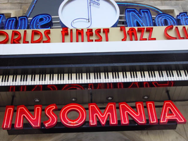
Sign-specific description: Just east off of Las Vegas Blvd, down Harmon Ave, lies the entrance to the "Blue Note: Jazz Capital of the World." The Blue Note is actually part of the Aladdin property, residing in the eastern most wing of the building, on the south side of Harmon. The majority of the signage hangs on the front of the building, which faces south toward Harmon Ave., with additional signage on the west face of the structure that extends from the Aladdin property. A vacant lot on the north east corner separates the Blue Note from the rest of the strip. The structure of the building and the design of the signage are juxtaposed with the building still being finished in a Persian Palace theme. While the signs are reminiscent of roaring twenties style font and theatre front design. Several different types of signs adorn the Blue Note. Two wall /logo signs hang on the west side of the building, while a sculpted entrance marquee, a hanging logo sign, and a vertical blade sign hung on the south side of the building. The west wall logo sign is composed of blue channel letters spelling the text " Blue Note," separated by a circular cabinet with a tube of neon bent to emulate the shape of a musical note placed in the middle. Five steel bars just out from either side of the cabinet. Below the text, a white steel cabinet with rounded ends, support a thin set of blue channel letters reading, "Jazz capital of the world." Further to the right a set of pink channel letters rest upon the upper portion of the corner of the structure. The letters are filled with pink neon. Along the South face of the building the first sign, hung in close proximity to the southwest corner, a vertical blade sign sits on a radius base of shaped molding jutting out of the wall. The actual body of the sign is a double backed cabinet finished in polished aluminum, with blue pin striping along the edges as well as along the rounded edge of the top. Near the top of the sign, the same rounded cabinet seen on the west wall of the structure, is integrated into the blade facing east/west. The cabinet is thicker in width to compensate for the width of the actual sign. The edges of the steel structure are painted in the same blue tone. The afore mentioned blue neon tubing fashioned into the shape of the note resides in this cabinet also. Along the east/west sides of the sign the text "The Blue Note," runs vertically from top to bottom, in blue channel letters only interrupted by the circular cabinet. The panel, which the text resides is painted white. Along the edge of the blade, which faces south, the text "Blue Note" is spelled vertically in blue channel letters. Sitting along the edge of the base, which the sign sits on, thin red channel letters stand almost independently, wrapping around the radius of the base. Starting on the west side of the sign and finishing on the east side, the text reads "Club & Cafe." These letters are filled with tubes of red neon. The letters are attached to a backing radius band of metal appearing to be gold. Further down the face of the building the main entrance to the building plays host to an overhead marquee/logo sign incorporating sculptural elements as well. Directly in the center of the composition, a long horizontal cabinet plays host to the red channel letters filed with red neon, reading, "World's Finest Jazz Club." Sitting on the top edge of the cabinet the same configuration of the Blue Note logo sign along with the circular cabinet, rests in front a sculpted piece of black steel. This piece of black painted steel is cut to appear as if it is the open top to a piano. Along the interior edge of the lid tubes of blue neon form a blue border. Between the piano top and the Blue Note logo, a horizontal steel grate serves as a divider as well as support for the blue channel letters. This entire section sits on a long horizontal ledge composed of a long polished steel section with a long LED message center just below that. Slightly recessed below the message center another width of overhang constructed of steel is painted to appear as if it is made of piano keys. Along the wall, just above the door, the pink channel letters read "Insomnia" with pink neon on the interior.
Sign - type of display: Neon
Sign - media: Steel; Fiberglass
Sign - non-neon treatments: Paint
Sign environment: Situated just east off the strip, down Harmon Avenue, the Blue Note is the only attraction in its immediate area. Even though it is part of the Aladdin complex, the closest property is the Harley Davidson Cafe on the south east corner of Harmon and Las Vegas Blvd At night, the property loses its Arabian Nights architecture emitting a sultry glow of neon. It is hard to miss, if a pedestrian peers down the street while traveling north or south, on the east side of the strip. During the day, the architecture helps to blend in the property to appear as it is, part of the Aladdin.
Sign manufacturer: YESCO
Sign - date of installation: 2000
Sign - thematic influences: The building itself is part of the actual Aladdin property, so the faced of the structure is themed in the manner of an ancient Persian city. It is an interesting juxtaposition for the sleek, modern finish and colors of the signage, with the organic facade of domed towers and stone facade. The Blue note signage is themed around the subject of music, specifically Jazz and Blues music. The blue hue of the neon, and the cabinet containing the crafted musical note are all evidence of this. The blade sign is thematically influenced by marquee building signs for theaters and music clubs from the first part of the century, specifically the forties and fifties. Such examples that utilized a similar designed blade sign were properties from the 1930's 40's and 50's such as The Boulder Club, The Pioneer Club, and the Las Vegas Club.
Surveyor: Joshua Cannaday
Survey - date completed: 2002
Sign keywords: Fascia; Neon; Steel; Fiberglass; Paint
Mixed Content
Photographs of Casino Royale and Denny's signs, Las Vegas (Nev.), 2002
Date
Archival Collection
Description
Site address: 3419 S Las Vegas Blvd
Sign owner: Tom Elardi
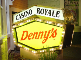
Sign details: The Casino Royale is located on the east side of the strip facing west, just south of the Venetian. The smaller establishment shares its space with a Denny's restaurant, which was present before the Royale was opened. The exterior is adorned with a stylized, European-esque, architecture, including apparent windows, domes, towers, and a cohesive landscape of connected buildings. The exterior of the Royale is a brightly lit facade of white raceways, lined with incandescent bulbs, boxing in vibrantly toned walls, and subdued neon. The colors correspond with those seen in the sign itself, as well the neon placed inside the edges of the windows. One section displays purple, the next a teal color, next a blue, then a red. Total signage of the property includes a two LED screens, one on the west side of the building, and the other housed in the logo cabinet on the south west corner of the property. Two logo cabinets, one in the aforementioned spot, and the second facing west over the main entrance on the west side of the building. Two double-faced cabinets lie on the northern end of the west side of the building, advertising for Denny's restaurant. Two small logos signs are also placed on the west face of the structure, for Caffe Trilussa.
Sign condition: Structure 5 Surface 5 Lighting 5
Sign form: Fascia
Sign-specific description: Upon the southwest corner of the building, a blue cabinet houses an LED screen in the rectangular body of the cabinet. The cabinet continues upward where the blue steel face supports white channel letters bordered in red neon and filled with incandescent bulbs. The text is written in two lines. The cabinet continues upward and is transformed into the sculpted design of a pink, purple, red, and blue crown on channel faced scrolls and sweeping shapes. The interiors of each section are lined with neon of a corresponding color to the paint treatments. Around to the west side of the building, the same style of text and scrolling adornments are used in a different marquee sign denoting the main entrance to the establishment. The same style of text seen on the southwestern sign is present with the same pattern of scroll work, crafted in a cabinet style, with channel faces. The major difference between the two signs is the size. The main entrance sign is much larger than the corner sign, as well as not having a LED screen incorporated below the text. The western sign possesses more scroll work below the text instead. The neon treatments are the same, as well as the incandescent bulbs, inside of the text. The lower roofline of the property plays host to the small but noticeable signage for Caffe Trilussa. Upon a extended surface of the roof line, two separate signs for the establishment are present. The roof shape is three sided with the signage on the northwest and southwest sides of the extension. Inside a section of the entablature created with white raceways, brown channel letters, spell the text "Trilussa," stretching across the length of the surface. The brown letters sit upon a yellow surface and are filled with incandescent bulbs, which are as wide as the channel letters themselves. Spelled in bent neon tubing, the word "Caffe" is spelled in all capital letters, sitting just above the left hand side of the title text. The right of the collection is occupied by a graphically treated, two-dimensional cut-out of a palm tree. The palm tree is treated on the surface with neon tubing as well. The tubing glows green and a gold corresponding to the graphical treatments. At the northern end of the property, two signs sit outside facing north, south. The double backed, internally lit cabinets represent the advertisements for the Denny's restaurant attached to the Royale. The first is at ground level outside the main entrance of the restaurant, the six sided, green cabinet, sports a yellow plastic face with red graphic text, reading "Denny's" in script text. Around the border of the face, incandescent bulbs run in a raceway pattern, and are covered in a plastic sheath. An angular cabinet rests on top of the other cabinet, creating a shallow peak. The internally lit, white face reads "Casino Royale" in black text. The same cabinet can be seen cantilevering off of the west side of the building above its partner sign. The cabinets are of identical design except for there is no plastic sheath covering the raceway of incandescent bulbs, and the plastic face of the main section of the cabinet is treated in different graphics. The script reads "Denny's" similar red script, but with a different background.
Sign - type of display: Neon; Incandescent; Backlit
Sign - media: Steel; Plastic
Sign - non-neon treatments: Graphics; Paint
Sign animation: Chasing, oscillating
Notes: The incandescent bulbs inside the channel letters of the main text oscillate, while all incandescent bulbs on the raceways along the building chase each other also. The incandescent bulbs, which surround the Denny's cabinet, also chase each other.
Sign environment: The Casino Royale stands independently on it's own even though it is surrounded on all sides by casino giants. To the north stands the Venetian, to the South stands Harrah's, and the Mirage lies west across the street. Yes, the property itself seems to be dwarfed by the immense neighbors, but the ultra bright, clear external signage and facade create a charming and bright environment that announces its presence.
Sign manufacturer: YESCO
Sign - date of installation: 1992
Sign - date of redesign/move: The Royale was once the Nob hill, which was closed in 1980. It was reopened in 1992 as the Casino Royale.
Sign - thematic influences: The theme seems to be tied to a European theme with the French term "Royale" in the title. The scrollwork is reminiscent of confetti or Mardi Gras theme. Such a combination of elements to suggest a theme is seen in the Harrah's property also. The party themed reminiscent sculpted cabinets are also reminiscent of the Fleur de Li. Believe it or not, the property is tied to many other larger, corporate, properties in one respect regarding its facades. The facade of a town or city, shrunken down and stylized into the facade of the property is present all over the Strip. Such properties which utilize this technique, to one degree or the next, include: New York New York, Oshea's, Treasure Island, Bellagio, The Venetian, The Luxor, The Tropicana, and the Excalibur.
Surveyor: Joshua Cannaday
Survey - date completed: 2002
Sign keywords: Chasing; Oscillating; Fascia; Neon; Incandescent; Backlit; Steel; Plastic
Mixed Content

Nadine Cracraft oral history interview: transcript
Date
Archival Collection
Description
Oral history interview with Nadine Cracraft conducted by Barbara Tabach on November 27, 2017 for the Remembering 1 October Oral History Project. In this interview, Nadine Cracraft discusses the development of her career in child and family therapy after moving to Las Vegas, Nevada in 1991. While describing the work she has done, Cracraft talks about the volunteer counseling services she provided for the survivors of the October 2017 Las Vegas mass shooting. She specifically mentions working with Aria staff members who were struggling with the aftermath of the shooting as well as her time spent working with First Friday to help those impacted by the traumatic event. Throughout the interview, Cracraft explains the different ways people manage their post-traumatic stress disorder and how this knowledge influenced her care of the survivors.
Text