Search the Special Collections and Archives Portal
Search Results
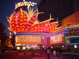
Photographs of Flamingo signs, Las Vegas (Nev.), 2002
Date
Archival Collection
Description
Site name: Flamingo Hotel and Casino (Las Vegas, Nev.)
Site address: 3555 S Las Vegas Blvd
Sign owner: Park Place Entertainment
Sign details: The majority of the Flamingo hotel and casino's neon signage encompasses the stretch of property that faces the strip. Even though the original porte-cochere and pylon sign are no longer in use, or in the original position, they are still evident and very much present. The original pylon has been moved around the corner onto Flamingo, actually closer to the Barbary coast than the Flamingo. The famous sculpted bull-nose design is repeated several times throughout the property and the design is repeated in visual reference on the towers of the hotel.. The Flamingo was one of the first hotels to push its entrance out to the street.
Sign condition: Structure 5 Surface 5 Lighting 5
Sign form: Pylon; Fascia; Porte-cochère
Sign-specific description: The Flamingo's vast array of signage of various types and styles make the hotel one of the more unique facades. Headed north just past the corner entrance to the Barbary Coast, only a two-lane drive separates the two properties. Across the drive, the original top of the old porte-cochere creates the first of the several three-dimensional, sculpted, corner sign you see. The well known swollen base and flexing body of this trademark crowning figure spread out in a bouquet of pink and orange steel feathers. Neon runs horizontally in a repeated pattern up the lengths of the feathers, with the outlying edge portions painted white and filled with incandescent bulbs, turning into single row raceways at the waving ends of the very tips. This corner serves as a pedestrian entrance now, and one of the main causeways between the Barbary Coast and Flamingo. The fattened plumage is set up high a top the corner of the building pointing to the southwest. The broad corner is dominated by the expansive sculpture. Standing atop of the plumage a channel letter logo sign faces outward spelling "Flamingo" in the Flamingo cursive text. The text is appropriated in a radius pattern, supported by a steel support structure making the logo seem as if it is floating above the sculpture. The sign is filled with incandescent bulbs. Two tubes of blue neon wrap the bull nose molding just below the three-dimensional structure, creating a space for the facade of the faceted pediment. Wrapping the face of the corner is a large entablature of patterned squares forming a grid like terrain with incandescent bulbs in the center of each square. Each square is faceted into pyramid shapes with bulbs at the center of each. Just above the pedestrian's head and below the faceted entablature, a raceway sandwiched by two tubes of pink neon creates a bottom line of the composition. The configuration continues to the right of the entrance into a smaller representation of the same effect. To the right of the old porte-cochere entrance, a small wall sign for "mega-jackpot world" is displayed with pink and Purple channel letters filled with neon on the section of wall which faces to the west. The sign is also incorporated into the famed pink and orange flame style, with the plumage emulated in channel pans on either side of the text. They are complete with horizontal neon bars and sections lined with incandescent bulbs as well. The section of wall that the sign sits upon is in the style of the faceted entablature spoken of previously. The two tubes of blue neon are above the pediment and sign and the bottom is also rounded out with the pink neon. Continuing east down the south face of the building, a continuous glass entablature is first seen, at the same height as the blue neon capped molding. The entablature is a glass wall lined with glass faced, two, dimensional figures of flamingos and shrubbery. Details such as wings, and other features are denoted by pink colored glass. Standing several inches off of the wall, the flamingos are lit from behind with red and pink neon creating halos, which reflect off of the glass behind them. The top edge of the pediment is lined with teal neon, while the bottom is blue. The top edge of the building, above the pediment and along other edges of the face, is a rolling design of hills lined pink neon. This element continues down the south wall of the building until it reaches the current porte- cochere. This structure is a circular drive covered with a circular roof. The east and west edges of the structure play host to large channel letter logo for the Flamingo. The pink steel structure spells "Flamingo" in their continuous cursive fashion, and filled with incandescent bulbs. The ceiling of the porte-cochere is an ornate pattern of raceways lined with incandescent bulbs. The pattern is reminiscent of a flower and it's radiating petals. The mirrored pediment continues past the porte-cochere on the wall of the building. Down the west face of the building, being the front of the facility along the strip, past the original porte-cochere, the glass pediment continues until it stops at a small wing of the building denoting another entrance. The entrance slightly radiuses out from the flat plane of the building, and is crowned by another three dimensional swollen bouquet of steel plumage spreading generously over the entrance, stretching it's waving fingers a good degree out on either side. It is constructed with the same color scheme and array of placement for incandescent lighting and neon. While not quite as bulbous as the southwest corner entrance, it breadth is the quality that beckons to the entrance. On the entablature below, the Flamingo logo is spelled in channel letters, and filled with pink neon. Teal neon lines the top of this pediment as well as blue along the bottom. The glass pediment continues on the wall north of the entrance until the face of the building goes from a stucco finish into a section of the elevation created by a wall of glass window panels. This section of the front is anchored in the center by as giant Doric column crowned by a third set of three dimensional sculpted array of pink and orange plumage. Like the two previously mentioned elements of this nature, the swollen base and stretching feathers take on a waving effect. This element is smaller in width than the previous two, but it's feathers or fingers curl forward in the center providing a support for a triangular cabinet section, with the two visible faces pointed northwest and southwest. The feathers continue in a smaller portion on top of the cabinet, appearing as if they rise thorough the cabinet.. The appearance of this set of plumage takes on different appearances for two reasons. The first being it's position upon the top of a column making appear as a torch. The plumage takes on the effect of being flames instead of feathers. The second being the severity of the curve of the center leaf or flame. From the side, coupled with the outer wings, it takes on the persona of a perched bird. The glass pediment continues past this section, stopping with another rooftop set of plumage on the entrance to the building, facing northwest. Above a backlit plastic advertisement cabinet, the fiery fingers of the sculpted, swollen signage, stand as a solid marker to the end of the property, or entrance to the pedestrian headed south. The glass pediment picks up again along the north face of the building headed east. On the East side of the Flamingo property, two fully three-dimensional sculpted steel structures serve as a gateway to the east side of the porte-cochere. Flanking either side of the drive, two identical bud-like structures stand with the same influence as the swollen elements of the front property. A short, faceted column, supports a three tiered, three layered rosebud shape crafted out of leaves more akin to palm fronds. Sagging leaves, pointed toward the ground, create the section between bud shape and the supporting column. They are folded down, representing the action of the leaves being opened. Neon runs in short horizontal bars along the outer surface leaves and all flat planes excluding the topsides of the relaxed leaves. These two markers also take on the persona an organic structure as a sapling palm tree, or rosebud, as well as the image of a burning torch. Building signage: Upon the western tower Flamingo is spelled in channel letters designed with the Flamingo text, and filled with pink neon. Upon the eastern face of the south tower, the half plumage of neon, flaming upward, reside underneath the Flamingo text logo. The same sign is repeated on the north edge of the west tower. Pylon: The original pylon sign now located on the north side of Las Vegas Blvd, in close proximity to the hotel, but actually between the Bourbon Street and the Barbary Coast. The vertical pylon is a double-sided pylon that faces east west. It has slightly modified over the years. The internally lit message center has been scaled down to fit its new environment. The pylon rises up in a square pole design, with neon running vertically up the center, approximately fifteen feet above the pedestrian's head, before being interrupted by the message cabinet. The cabinet has a white plastic face with removable letters. Gold polished raceways line the face of each of the sign, and incandescent bulbs line the raceways. The sides of the cabinet slope inward, round at the corners at the top, reaching toward the center that rises at a peak. The neon continues upward past the highest peak of the cabinet, and continues up to fan outward, created a giant frond of vermilion and red. The giant fan shape at the top supports channel letters, that spell "Flamingo' in white channel letters that are outlined in blue neon and filled with incandescent bulbs. The top fan shape is actually comprised of seven different levels, appearing to be stacked on top of one another. The center, oblong shaped panel, is the highest, with three sections on each side, fanned out, stepping back into space. The furthest wings on the edge are scrambled with bent and undulating tubes of pink neon. The center two are red, and the center holds the pink members. The waving tubes, which lose form and pattern as they spread toward the edges, resemble veins of a leaf, or the elements, which make up the feather. The sides of the pylon, including the internally lit cabinet, are treated with a pink paint.
Sign - type of display: Neon; Incandescent
Sign - media: Steel; Glass
Sign - non-neon treatments: Paint
Sign animation: Chasing, flashing, oscillating
Notes: The incandescent bulbs inside the text reading "Paris" on the balloon oscillate rapidly.
Sign environment: The Flamingo is in between the Barbary Coast and O'Shea's on the east side of the street. The establishment itself dominates the stretch of property, separating the pedestrian from the sidewalk with various shrubbery and palm, a phenomenon seen often on the strip. Exiting the Barbay Coast, headed north, the passerby is seamlessly brought into the Flamingo, bombarded by the vibrant pink and orange plumage, and continuous atmosphere. O'Shea's lies on the north end of the Flamingo, adding a bookend type effect along with the Barbary Coast. Even though the Barbary Coast is a vibrant and active property, most of it's action lies on the south side of the building, thus the Flamingo signage is the most dominating within its length along the Strip.
Sign manufacturer: Original Pylon: Ad-Art, Facade: Heath & Co
Sign designer: Original : Raul Rodriguez. Original Pylon: Bill Clarke
Sign - date of installation: Original Pylon: 1968 Original Porte Cochere 1976
Sign - date of redesign/move: When Park Place Entertainment separated the Flamingo name from Hilton, all of the text signs which read Hilton were removed. The original pylon sign was moved from the west side, or street side of the property, and moved East down Flamingo Rd., Between the Barbary Coast and the Bourbon Street during remodeling done in the Eighties. The pylon has been modified several times over the years, but has evolved into a slimmer, less flamboyant version, including a simplified internally lit message center.
Sign - thematic influences: The theme surrounding the resort is the theme of the pink flamingo bird, and its tropical environment. The blazing pink tone ( Vermillion ) of the neon is seen extensively throughout the property, as well as the repeated image of the pink bird. The white plaster facade and sculpted edges of the exterior's roof line are reminiscent of sun drenched villas, while staying well within the realm the surrounding environment. Elements such as the mirrored entablatures lined with illuminated pink Flamingos
Surveyor: Joshua Cannaday
Survey - date completed: 2002
Sign keywords: Chasing; Flashing; Oscillating; Pylon; Fascia; Porte-cochère; Neon; Incandescent; Steel; Glass; Paint
Mixed Content

Stewart family histories
Date
Archival Collection
Description
Stewart family histories
Text
Correspondence, Levi Syphus to Sadie George
Date
Archival Collection
Description
Text
Audio clip from interview with Bess Rosenberg by Jerry Masini, November 12, 1975
Date
Archival Collection
Description
Part of an interview with Bess Rosenberg on November 12, 1975. In this clip, Rosenberg discusses her decision to move to Las Vegas and what her life was like.
Sound
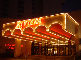
Photographs of Riviera signs, Las Vegas (Nev.), 2002
Date
Archival Collection
Description
Site name: Riviera Hotel and Casino (Las Vegas, Nev.)
Site address: 2901 S Las Vegas Blvd
Sign owner: Riveria Holdings Corporation
Sign details: The Riviera is another of the properties on the Strip which brought its borders to the street. It is one of the properties with an extensive collection of signs on its properties. The glass wall and block long facade, which incorporates infinity lighting and neon displays. A highly animated an reflective ceiling of the westernmost pedestrian element right along Las Vegas Boulevard also plays host to a continuously pulsing entablature of text and neon. The outer portion of the wall facing west is also adorned with raceways, backlit signs, neon stars, and a host of other signs as well. The northwest corner is a unique collection of fascia wall design and sculptural elements on the corner as well for the "Nickeltown" portion of the casino. Along the east end of the property, more Riviera logo/wall signs denote entrances, while the eastern most edge plays host to the massive Riviera Pylon. Various signs also reside on the eastern side of the property. Text signs are located in several positions among various structures. There is also a rather busily illuminated awning, which is lined with incandescent bulbs and text.
Sign condition: Structure 5 Surface 4 Lighting 5
Sign form: Pylon; Fascia; Porte-cochère
Sign-specific description: The main attraction to the Riviera is its mirrored round wall which serves as a multiuse billboard built around the neon advertisements for the Riviera's big show: Splash Front façade: The front façade of the Riviera is best described by starting with the giant glass well and heading north. The radius of the giant reflective extravaganza is in the general direction of the southwest so reflectivity is extremely good during the afternoon hours. The surface of the structurally integrated visions is surfaced with giant reflective mirrored panel which give way to the multicolored neon puzzle work of the Splash logo. The logo advertises for the show using iconography from the show itself represented with pan channel figures lined on the interiors with neon of corresponding colors for which they are painted. The text that spells "Splash" is painted red, with the circular raceway that sits in its background is painted yellow. The "Splash" text sits above the organic shapes of water shooting out from underneath the array of signage, painted blue and purple. The image of the female inside the logo text is graphically treated with the proper registration of illustrative quality. She is also lined with neon in the proper colors over the major outlines of her form. The entire array sits on a black background laden with incandescent bulbs. The neon is arranged so that as it progresses toward the ground the organic shapes radiate in a repeating pattern outward. The blue and purple neon radiate toward the ground while the red neon in the "Splash" radiates left toward the other side of the wall. Green channels spurt out of the top lined with green neon as well. On opposite sides of the radius wall, there are a series of signage that mirror each other. "Riviera" is written in channel letters filled with neon, and a series of internally lit, color cabinets, lined on the edges with incandescent bulbs. The middle portion of the wall is occupied with various sized stars, raceways, and incandescent bulbs found on extensions and diamond shaped faces. The stars are lined on the interior profile of the shape with blue and pink neon, as well as incandescent bulbs on the interior as well. The bottom of the radius wall is adorned with adorned with internally lit cabinets as well as various small neon creations. Moving north along the face of the building the façade the external elements are greatly supportive of the mirrored walls, and just as brilliant in their own right. The façade begins just to the south of the giant mirrored wall, with a section lined with vertical bars of neon animating in red, pink, purple, and blue neon. Riviera is written in cahnnel letters and filled with incandescent bulbs. The letters are outlined in red neon. On either side of the rectangular section, two small versions of the giant mirrored wall support green and blue wavy channels, lined on the interior edges with corresponding neon colors. Incandescent bulbs are present as well. The façade on the north side smoothly transitions into a wall of transparent plastic cubes, lit from the inside, with raceways running down the edges. This façade runs the entire length of the building, until the end is reached at the northwest corner and Nickeltown. Along the facade, internally lit cabinets surrounded by raceways occupy the vicinity of the lower portion of the sign. The faces are colored plastic and treated with graphics and text. Toward the end of the facade, a collection of small signs is fused together to create a single collection of busy signs. The entire structure is a chaotic vision of relief sculpture smashing into text and iconography, while bright, vibrant colors and neon, fight for attention. The majority of the sign is located on the body of the building, reaches down to touch the ground. Four fluted columns rise up from the ground to meet the bottom base of the massive wall sign. The columns rise up into a sculpted cabinet that is heavily crafted and adorned with ornate edges of hard-coated foam or fiberglass scrollwork. The swelling and swirling scrolls swell out in three dimensions. The entire border of the bottom section is turned into a detailed, organically shaped, cloud like shape. The scrollwork as well as the columns is finished white, with the recesses being toned a golden color. The effect accentuates the three dimensional nature of the design. The surface of this bottom portion is a diagonally crisscrossing pattern of white lattice- work on top of a golden surface. The center of the open surface is occupied by a giant pan channel, of the top three points at a purple, five-pointed star. Flanking either side of the star are small, steel, closed face cabinets, in the shape of squatty looking five pointed stars. They are varying sizes and are painted the three separate colors of purple, yellow, and green. The top point of the largest purple star rises through the top part of the bottom cloud section touching up into the massive collection of signs. This particular sign centers on a top logo reading "Riviera Slot Adventure" in channel letters in the style of action adventure movies such as "Indiana Jones." The first word is written in the logo style of the Riviera, and painted yellow on the interiors. The letters for the two words, "Slot Adventure" are bent with the force of motion and painted red, grading into an orange. Behind that, a circular cabinet, representing a globe, is painted blue in the center and fading to white. Flanking either side of the globe, associated more with the top portion of the globe, pairs of arching bronze colored cabinets slightly arch outward suggesting shining or an explosion. They are laden with incandescent bulbs. The remainder of the sign between the bottom star structure and the top slot adventure text, is occupied by a varied array of signage that can be designated between two halves of the collection. The left-hand side of the sign consists of three-dimensional sculptural elements, channel letters, relief elements. The far left side of the collection is rounded out by the three dimensional relief of crashing waves, creating a background for the three-dimensional structure of the mermaid. Red channel letters spell "Splash" above the mermaid, in white channel letters painted red on the inside. Neon lines the interior of the letters as well. Below the mermaid, more channel letters spell "Gardens" in red channel letters painted yellow on the interiors and lined on the interiors with neon. Above the crest of the wave a relief of a train shoots toward the north with a yellow and red circular cabinet above that with the text for jackpot junction. The train relief is also the designed with perspective to appear as if it is moving forward. Directly to the left of the train is set of yellow channel letters painted blue on the interior reading "Jackpot Factory," lined on the interior with neon. A purple backing cabinet is graphically painted on the face with images of gears. Just to the left of the text is the three dimensional sculpture representing a stack of coins. The space below the "Jackpot Factory" a purple cabinet with a colored face reads with graphics and text for "Valley of Games." Directly to the left of the "Valley of the Games" cabinet a three dimensional cherub is holding a large nickel, with a banner above that. The cherub is painted with the proper flesh tones, and the nickel is adorned with the proper details. The wings animate, utilizing two tubes of neon shaped as wings and in different positions to appear as flapping. A white arched steel banner, with blue text, reading "Nickel Heaven." Neon floats over the top of the letters. The right hand side of the entire collection is just as detailed and elaborate, if not ore than the left hand side. A white steel cabinet cut into the profile of the text, which is painted yellow with red outlines. The text reads 'Slot Frenzy' in two lanes. The red borders are lined with incandescent bulbs. The remaining negative space in the center of the sign is a painted slot handle with a circle of neon around the top of the handle. To the right of that, the surface of the board is created out of relief of faux rocks above what is a set of railroad tracks. A mine cart is on the tracks with giant diamond shaped gems residing in the interior space. A cabinet made of an arched banner and a square cabinet resides above the mine cart. The banner reads Double diamond in blue text, and "mines is spelled" in blue text on the rectangle. Further right the rocks give way to a portion of the cabinet, that reads "Jackpot City" in yellow channel letters, with yellow neon. Vertical raceways lined with incandescent bulbs shoot upward in the area of the text. All are supported on a multicolored flat cabinet, predominantly painted red. Nickel town: On the Northwest corner of the property three distinct images comprise the signage. The main marquee for Nickeltown over the entrance, a Riviera logo just to the right of that, and a large sculptural fountain, that dominates the corner with it's presence. Over the brass and glass doors for the entrance, a polished metal overhang radiuses above the door, and contains the words Nickel Town in channel letters. The two words are written horizontally in a line, and separated in the middle with a pan cjhannel star also lined with neon on it's interior. The star is centered with a channel number "5" which is filled with white neon. The star's neon colors are pink and blue, and are arranged as interior lining of the star. The underside of the awning, as the rest of the front facade, is adorned with the incandescent bulbs, placed neatly in the designated prismatic shapes. The neon rings also are present, running the pediment across the facade. Elements of the electric wall can be seen as well, with the metal diamonds supporting incandescent bulbs trailing upward from the awning up to the facade of the building behind it. Several different sizes of star rise up as well, they are identical in color and design shape. Since the interiors do not contain a channel letter, they contain a channel shaped star, lined with incandescent bulbs in the center. A different sort of star shape is present as well. This shape is an eight-sided shape, reminiscent of a snowflake. When I say snowflake, it is essentially a cross shaped piece crossed, with an "X" shape. The shape is designed out of a pan channel, filled with incandescent bulbs. White neon backs the channel. Directly to the right of the entrance, the mirrored facade reflects the entrance, as the reflective surface house vertical, neon bars as well. The three different colors are Blue, gold and green. Consuming the majority of the concrete expanse created by the small plaza, is the neon-laden fountain of light and steel, with a base of ceramic pool. The design is a circular pool, covered in 1"x1" ceramic tiles, and filled with water. Thee square poles are bent over, looking as if they are spraying up out of the fountain. They appear almost as if a bouquet. One is painted Blue, one gold, and the other red. These poles are striped with neon tubing of the corresponding colors. Internally lit cubes, of the same color scheme as the primary palette. Wrapping around the circumference of the top half of the plumage, is a silver pediment that radiuses around the fountain. The finish is polished metal, and matches the overhang presented in the Nickel Town signage. Raceways run along the top and bottom edges of the face, wile the internally lit advertisements occupying the open space of the pediment every so often. Riviera Convention Center: Directly to the east of Nickeltown, is the Riviera Convention center. Signage for the building is first evident when traveling west, looking at the east face of the building. Not far on the north side of the east face of the building, large channel letters hang denoting the building. The Riviera logo text is spelled in the signature text, outlined with red neon and filled with incandescent bulbs. Below that, a two lined text reads convention center in red channel letters, lined on the interior with red neon. On the south side of the building, two lines of text reads, "Royale Pavilion" and "Entrance" below that. These channel letters are red, and lined with red neon on the interiors. Tower: Along the north side of the main tower, "Riviera" is spelled with giant red channel letters, filled with incandescent bulbs, and lined with red neon. The rear entrance is shared for the hotel, and the convention center, and is denoted with signage, and an overhang. A large blockish overhang is cantilevered off of the side of the building and projects outward, toward the east. On the front edge, an arcade of arches is evident, which reveal five tube-like vaults that project the half radius all the way back to the building. All of the edges of the raceway, including the spaces on the underside, which separates the vaults, are lined with incandescent bulb lined raceways. The Riviera text spells "Riviera" across the front of the cantilevered structure. The channel letters are painted red, lined with red neon and filled with incandescent bulbs. Left of the cantilevered structure are letters, which spell convention center. They are channel letters with red plastic faces.
Sign - type of display: Neon; Incandescent; Backlit
Sign - media: Steel; Plastic; Glass; Fiberglass
Sign - non-neon treatments: Graphics; Paint
Sign animation: Chasing, flashing, oscillating
Notes: The incandescent bulbs inside the text reading "Paris" on the balloon oscillate rapidly.
Sign manufacturer: Federal Signal (fascia front glass)
Sign designer: Marge Williams/ Arch: Nikita Zukov (fascia design)
Sign - date of installation: 1988-1989
Sign - date of redesign/move: Pylon was moved to Convention Center Dr. and Paradise Rd. c. 1988
Surveyor: Joshua Cannaday
Survey - date completed: 2002
Sign keywords: Chasing; Flashing; Oscillating; Pylon; Fascia; Porte-cochère; Neon; Incandescent; Backlit; Steel; Plastic; Glass; Fiberglass; Paint; Graphics
Mixed Content
Meeting minutes for Consolidated Student Senate, University of Nevada, Las Vegas, October 18, 1983
Date
Archival Collection
Description
Text
Transcript of interview with Lyle and Mary Ann "Timbuck" Rivera by Claytee White, May 1, 2009
Date
Archival Collection
Description
The oral history interview of Lyle and Mary Ann "Timbuck" Rivera begins with the 1915 birth of Frances McNamee, Timbuck's mother, who had the distinction of being the eleventh baby born in early Las Vegas. Frances' father and grandfather who were attorneys for the railroad arrived in 1905 and became part of the historical roots of the community. Timbuck's memories also include landmarks and activities that were integral to the growing town, such as her mother's involvement in organizing the Junior League. Lyle Rivera, a relative newcomer, arrived in the 1940s and experienced what he describes as a life of "bouncing around" and being the only child of a single mother, a cocktail waitress at the Golden Nugget. Lyle would grow to distinguish himself within the community as a lawyer and community activist. He modestly mentions his achievements which included involvement with the UNLV Foundation, professional careers in both the Attorney General's and District Attorney's offices,
Text

Jahaira Farias interview, April 12, 2019: transcript
Date
Archival Collection
Description
Interviewed by Monserrath Hernández and Barbara Tabach. Jahaira Farias is a graduate of Western High School, a Marine Corps veteran, and a founder of a local chapter of the Women Marines Association. At the time of this oral history, Jahaira worked for US Congresswoman Susie Lee. Jahaira Farias was born in Las Vegas, Nevada, and grew up on the west side of town. She has summertime memories of her travels to Mexico, where she was able to connect with her family's heritage and language. During her years at Western High School, she participated in varsity sports and was the armed drill team commander. After graduation, Jahaira enlisted into the Marine Corps, where she specialized as a transport operator and hazardous material transporter and served two deployments in Iraq and Afghanistan. Her transition to civilian life included work in security at Caesars Palace. When she took a position with as district representative for Congresswoman Susie Lee, her focus was to assist veterans and immigrants. She helped Rep. Lee develop community outreach towards the Latinx community and Veterans. Jahaira is the president of the Las Vegas NV-3 Sagebrush Marines chapter of the Women Marines Association, an organization she helped establish and rebuild. The WMA helps veterans find their footing again through mentoring and support, and conducts community engagement by fostering the same camaraderie found in the Corps. After surviving a motorcycle accident, Jahaira's recovery is nothing short of miraculous, going from being in a wheelchair to competing in Tough Mudder. Now extremely active, Jahaira is an avid hiker and certified yoga instructor, specializing in trauma recovery. A polyglot, Jahaira formally studied Arabic and Russian, and speaks English, Spanish, and Pashto, and received an associate degree in Russian from the College of Southern Nevada.
Text

Transcript of interview with Eleazar "Al" Martinez by Marcela Rodriguez-Campo, October 2, 2018
Date
Archival Collection
Description
In his lifetime, Eleazar Martinez has climbed both literal and figurative mountains as an avid outdoorsman and social justice advocate for Latinx issues. Born in Sweetwater, Texas, Eleazar (Al for short) grew up connected to the land and his family. Al comes from a large family with strong ties in Texas and Mexico. His mother worked the fields and his father was a construction worker who instilled in their children the importance of a strong work ethic and the pursuit of an education. Al shares about growing up during a time when Spanish was banned from schools and children would get punished if they were caught using their home languages. His experiences developed his aspiration to serve his community and fight for people’s rights. After a short stint in the Navy, Al followed his instincts and sought out a college education and majored in sociology. His interest in social issues lead him to serve in a range of roles from psychiatric support, community education outreach, and counseling. At one point, Al even helped mediate tensions between gangs and law enforcement in order to prevent violence from erupting. Since arriving in Las Vegas in 1998, Al has been working alongside diverse communities to build solidarity. Today, he works as a supervisor for the Whitney Recreation Center and leader in Hispanics Enjoying Camping, Hunting, and the Outdoors (HECHO). As Al would describe himself, he is “a proud Mexican Latino American, a Tejano with a Chicano attitude”.
Text

