Search the Special Collections and Archives Portal
Search Results

Transcript of interview with Robert & Patricia Campbell by Stefani Evans, November 28, 2017 & March 1, 2018
Date
Archival Collection
Description
In 1976, when Bob Campbell accepted the city manager position in Henderson, Nevada, he and his family had just endured nearly a month of sub-zero temperatures in their native Missouri. Southern Nevada's mild winter coupled with the promise of developing the 8,600 acres that would become Green Valley convinced Bob and his wife, Pat, to make the move. Bob came to Henderson with a degree in public administration and city manager experience in two Missouri towns, but Green Valley offered something akin to "an artist having a blank canvas on which to plan and create." In this interview, Bob talks about the ways his career in public administration blossomed in Southern Nevada. After about five years with the City of Henderson, Campbell joined Mark Fine and American Nevada Corporation to develop Green Valley; five years after that, he moved to Southwest Gas Corporation to work with Bill Laub and later, Kenny Guinn. From about 1989 to 1997, he helped develop Lake Las Vegas. In 1994, Bob and Pat together formed The Campbell Company, a private consulting firm whose clients included Transcontinental Properties' Lake Las Vegas project as well as Henry Chen's Ascaya. v Much of the interview focuses on the Lake Las Vegas project: its original visionary, false starts, and its tumultuous development as an arm of the Bass brothers of Fort Worth, Texas; their developer, Ronald Boeddeker of Transcontinental Properties in Santa Barbara, California, and Boeddeker's appointee, Alton Jones. Along the way Campbell shares the strategies employed by the Wednesday morning group of Henderson boosters who met at Saint Peter's Catholic Church and who succeeded in gaining the necessary local, state, and federal approvals to move the project forward. He reveals the intimidation, physical threats, and sexual harassment suffered by those who questioned the way Jones did business. Overall, though, he explains why he continues to respect the Bass brothers and is still proud of Lake Las Vegas, "proud that we got it on, and proud that it's turned out to be what it is."
Text
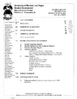
Meeting minutes for Consolidated Student Senate, University of Nevada, Las Vegas, June 16, 2003
Date
Archival Collection
Description
Text
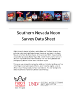
Road Runner RV Park Neon Survey document, September 14, 2017
Date
Archival Collection
Description
Site address: 4711 Boulder Hwy
Sign owner: Daryl Thompson
Sign details: This local owned R.V. park has been open since 1986 just miles from the Strip. They have 200 sites to hold guests, as well as a swimming pool.
Sign condition: 5- paint and lights are still bright on the signs
Sign form: Pylon
Sign-specific description: This pylon sign has Roadrunner on the top of it which is outlined in skeletal neon, underneath is a rectangular red sign. This sign has yellow bubble font channeled letters stating "ROAD RUNNER". Underneath this states "R-V Park" in a channeled white frontier style font that contains incandescents. Underneath the red rectangular sign is there prices listed which is on a plastic sign for their daily, weekly and monthly prices. Under the prices is a traditional "NO VACANCY" in red skeletal neon.
Sign - type of display: Neon and incandescents
Sign - media: Steel and plastic
Sign - non-neon treatments: Plastic portion of the sign and incandescent light bulbs
Sign animation: Flasher for incandescent light bulbs
Sign environment: This property is on Boulder Highway and has grocery stores and banks close to it.
Sign - thematic influences: Road Runners are prominent animals in the Nevada and southwest region of the United States.
Sign - artistic significance: Artistically this sign looks as though it can be for a motel particularly since it is also on a highway , but it's for an R.V. park.
Survey - research locations: Asessor's page, Road Runner RV website https://www.roadrunnerrvpark.com/ , Travel Nevada Website https://travelnevada.com/places/26805/roadrunner-rv-park
Surveyor: Emily Fellmer
Survey - date completed: 2017-09-14
Sign keywords: Pylon; Neon; Incandescent; Steel; Plastic; Flashing; Reader board
Text
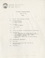
Jewish Federation correspondence, meeting minutes, and other records, item 18
Description
Jewish Federation of Las Vegas (JFLV) Board of Directors Meeting minutes, April 20, 1988.
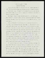
"Apologies Across The Board": article draft by Roosevelt Fitzgerald
Date
Archival Collection
Description
From the Roosevelt Fitzgerald Professional Papers (MS-01082) -- Drafts for the Las Vegas Sentinel Voice file. On Las Vegas fire chief publicizing excellent work ethic of LDS firefighters.
Text
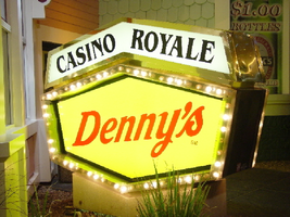
Photographs of Casino Royale and Denny's signs, Las Vegas (Nev.), 2002
Date
Archival Collection
Description
Site address: 3419 S Las Vegas Blvd
Sign owner: Tom Elardi
Sign details: The Casino Royale is located on the east side of the strip facing west, just south of the Venetian. The smaller establishment shares its space with a Denny's restaurant, which was present before the Royale was opened. The exterior is adorned with a stylized, European-esque, architecture, including apparent windows, domes, towers, and a cohesive landscape of connected buildings. The exterior of the Royale is a brightly lit facade of white raceways, lined with incandescent bulbs, boxing in vibrantly toned walls, and subdued neon. The colors correspond with those seen in the sign itself, as well the neon placed inside the edges of the windows. One section displays purple, the next a teal color, next a blue, then a red. Total signage of the property includes a two LED screens, one on the west side of the building, and the other housed in the logo cabinet on the south west corner of the property. Two logo cabinets, one in the aforementioned spot, and the second facing west over the main entrance on the west side of the building. Two double-faced cabinets lie on the northern end of the west side of the building, advertising for Denny's restaurant. Two small logos signs are also placed on the west face of the structure, for Caffe Trilussa.
Sign condition: Structure 5 Surface 5 Lighting 5
Sign form: Fascia
Sign-specific description: Upon the southwest corner of the building, a blue cabinet houses an LED screen in the rectangular body of the cabinet. The cabinet continues upward where the blue steel face supports white channel letters bordered in red neon and filled with incandescent bulbs. The text is written in two lines. The cabinet continues upward and is transformed into the sculpted design of a pink, purple, red, and blue crown on channel faced scrolls and sweeping shapes. The interiors of each section are lined with neon of a corresponding color to the paint treatments. Around to the west side of the building, the same style of text and scrolling adornments are used in a different marquee sign denoting the main entrance to the establishment. The same style of text seen on the southwestern sign is present with the same pattern of scroll work, crafted in a cabinet style, with channel faces. The major difference between the two signs is the size. The main entrance sign is much larger than the corner sign, as well as not having a LED screen incorporated below the text. The western sign possesses more scroll work below the text instead. The neon treatments are the same, as well as the incandescent bulbs, inside of the text. The lower roofline of the property plays host to the small but noticeable signage for Caffe Trilussa. Upon a extended surface of the roof line, two separate signs for the establishment are present. The roof shape is three sided with the signage on the northwest and southwest sides of the extension. Inside a section of the entablature created with white raceways, brown channel letters, spell the text "Trilussa," stretching across the length of the surface. The brown letters sit upon a yellow surface and are filled with incandescent bulbs, which are as wide as the channel letters themselves. Spelled in bent neon tubing, the word "Caffe" is spelled in all capital letters, sitting just above the left hand side of the title text. The right of the collection is occupied by a graphically treated, two-dimensional cut-out of a palm tree. The palm tree is treated on the surface with neon tubing as well. The tubing glows green and a gold corresponding to the graphical treatments. At the northern end of the property, two signs sit outside facing north, south. The double backed, internally lit cabinets represent the advertisements for the Denny's restaurant attached to the Royale. The first is at ground level outside the main entrance of the restaurant, the six sided, green cabinet, sports a yellow plastic face with red graphic text, reading "Denny's" in script text. Around the border of the face, incandescent bulbs run in a raceway pattern, and are covered in a plastic sheath. An angular cabinet rests on top of the other cabinet, creating a shallow peak. The internally lit, white face reads "Casino Royale" in black text. The same cabinet can be seen cantilevering off of the west side of the building above its partner sign. The cabinets are of identical design except for there is no plastic sheath covering the raceway of incandescent bulbs, and the plastic face of the main section of the cabinet is treated in different graphics. The script reads "Denny's" similar red script, but with a different background.
Sign - type of display: Neon; Incandescent; Backlit
Sign - media: Steel; Plastic
Sign - non-neon treatments: Graphics; Paint
Sign animation: Chasing, oscillating
Notes: The incandescent bulbs inside the channel letters of the main text oscillate, while all incandescent bulbs on the raceways along the building chase each other also. The incandescent bulbs, which surround the Denny's cabinet, also chase each other.
Sign environment: The Casino Royale stands independently on it's own even though it is surrounded on all sides by casino giants. To the north stands the Venetian, to the South stands Harrah's, and the Mirage lies west across the street. Yes, the property itself seems to be dwarfed by the immense neighbors, but the ultra bright, clear external signage and facade create a charming and bright environment that announces its presence.
Sign manufacturer: YESCO
Sign - date of installation: 1992
Sign - date of redesign/move: The Royale was once the Nob hill, which was closed in 1980. It was reopened in 1992 as the Casino Royale.
Sign - thematic influences: The theme seems to be tied to a European theme with the French term "Royale" in the title. The scrollwork is reminiscent of confetti or Mardi Gras theme. Such a combination of elements to suggest a theme is seen in the Harrah's property also. The party themed reminiscent sculpted cabinets are also reminiscent of the Fleur de Li. Believe it or not, the property is tied to many other larger, corporate, properties in one respect regarding its facades. The facade of a town or city, shrunken down and stylized into the facade of the property is present all over the Strip. Such properties which utilize this technique, to one degree or the next, include: New York New York, Oshea's, Treasure Island, Bellagio, The Venetian, The Luxor, The Tropicana, and the Excalibur.
Surveyor: Joshua Cannaday
Survey - date completed: 2002
Sign keywords: Chasing; Oscillating; Fascia; Neon; Incandescent; Backlit; Steel; Plastic
Mixed Content
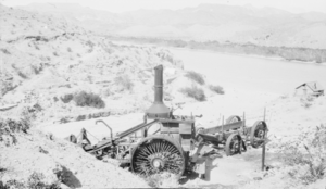
Photograph of a steam-powered tractor in Eldorado Canyon, Nevada, circa early 1900s
Date
Archival Collection
Description
Image


