Search the Special Collections and Archives Portal
Search Results

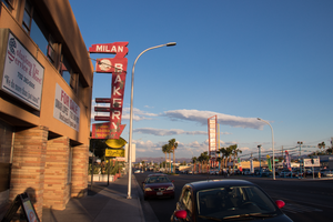
Photographs of Milan Bakery, Las Vegas (Nev.), April 18, 2017
Date
Archival Collection
Description
Site address: 1625 Fremont St
Sign owner: Selak, LLC
Sign details: The building was constructed in 1952 (Assessor). Milan Selakovik acquired the property from the Salvation Army in 1966 (Assessor).
Sign condition: The sign is condition 2, fair to poor. The paint is flaking. Approximately a third of cabinet bottom has rusted out. No neon remains on the sign.
Sign form: Blade sign
Sign-specific description: The background of the entire sign is painted red. The top and bottom of the sign are attached to the building by two metal cabinets. The lower cabinet is irregularly shaped. On the west side of the lower cabinet, the telephone and fax numbers are painted in peeling yellow. The paint has almost completely flaked off around the area where a cursive "Fax" formerly appeared. Attached to the street side of the sign is a vertical metal cabinet which runs almost the entire height of the sign. The word "BAKERY" is painted in white sans serif letters which run vertically over most of the cabinet. Extending horizontally from the cabinet toward the building are three small metal cabinets. A horizontal white line is painted on each of the three cabinets. A larger cabinet attached next to the "B" in "BAKERY" extends horizontally toward the building. The cabinet has a medallion shaped black and white cartoon of a baker holding a tray of baked goods. An irregularly shaped cabinet topping the sign contains the name, "MILAN" painted in white sans serif letters. The east side of the sign is painted similarly to the west, except that: 1) a cursive white or silver "Fax" is located at the bottom of the sign to the left of the fax number and, 2) extreme flaking has completely removed what was painted on the medallion at the top of the sign.
Sign - type of display: Formerly neon
Sign - media: Steel
Sign environment: Down on the East side of Fremont Street
Sign - date of installation: Based on the acquisition date of the property by Milan Selakovik in 1966, the current design of the sign possibly dates from the 1960's.
Sign - date of redesign/move: The unusual shape of the sign indicates that it has been modified over time. The form suggests that the sign was originally a directional arrow which pointed down from the roof toward the entrance to the business, with additional cabinets added later. A 2004 photograph shows the current sign design and color scheme (RoadsidePeek.com). A drawing of a baker's head was located in the medallion where the cartoon baker now resides. The three small cabinets which jut out horizontally from the sign formerly stated, "BREAD", "CAKES" and "PASTRY". The lower portion of the sign advertised "FRESH SANDWICHES".
Sign - thematic influences: Their sign showcases similar themes to cartoons, bakers and bakeries.
Sign - artistic significance: The sign portrays similar designs to other signs manufactured in the 1960's.
Survey - research locations: Clark County Assessor Parcel No. 139-35-315-002. Retrieved from http://www.clarkcountynv.gov/assessor/Pages/PropertyRecords.aspx?H=redrock&P=assrrealprop/pcl.aspx RoadsidePeek.com. Milan Bakery. Retrieved from http://roadsidepeek.com/roadusa/southwest/nevada/vegas/lvsign/lvothersign/index2.htm
Surveyor: Mitchell Cohen
Survey - date completed: 2017-08-17
Sign keywords: Blade; Neon; Steel
Mixed Content

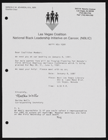
Alpha Kappa Alpha Sorority, Theta Theta Omega Chapter Health committee reports and National Black Leadership Initiative on Cancer, Las Vegas coalition (NBLIC) fliers
Date
Archival Collection
Description
From the Alpha Kappa Alpha Sorority, Incorporated, Theta Theta Omega Chapter Records (MS-01014) -- Chapter records file.
Text

Stewart family real estate documents
Date
Archival Collection
Description
Stewart family real estate documents
Text
Betty Henderson Professional Papers
Identifier
Abstract
The Betty Henderson Professional Papers (1963-1985) are comprised of materials produced by Betty Henderson in her capacity as a private music teacher in Las Vegas, Nevada and as a member of the Nevada Music Teachers Association (NMTA). The collection includes scrapbooks of concert programs and NMTA events, materials from Henderson's experiences in Europe as a People-to-People ambassador with the Music Teachers National Association, and recordings on reel-to-reel tapes of concerts Henderson performed in or judged.
Archival Collection
State of Arizona vs. State of California Proceedings Concerning the Colorado River Usage Dispute
Identifier
Abstract
The State of Arizona vs. State of California Proceedings Concerning the Colorado River Usage Dispute collection (1957-1961) contains supplemental documents from the
Archival Collection
Stanley Mallin Papers
Identifier
Abstract
Collection consists of the 1974 lease agreement between Circus Circus and William Bennet and William Pennington, and a 1981 Desert Inn Country Club 25th Anniversary scrapbook.
Archival Collection
David Coons Photograph Collection
Identifier
Abstract
The David Coons Photograph Collection contains photographs and postcards depicting railroads in Nevada, California, and Utah from 1907 to 1956. The photographs depict trains and locomotives from the Tonopah & Tidewater Railroad, Union Pacific Railroad, San Pedro, Los Angeles & Salt Lake City Railroad, Bullfrog-Goldfield Railroad, Las Vegas & Tonopah Railroad, and Tonopah & Goldfield Railroad. The photographs also portray Arden, Nevada and the Arden Plaster Company Plant, Las Vegas High School after a fire, and early Fremont Street in Las Vegas, Nevada.
Archival Collection

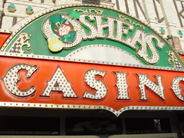
Photographs of O'Shea's signs, Las Vegas (Nev.), 2002
Date
Archival Collection
Description
Site address: 3555 S Las Vegas Blvd
Sign owner: Park Place Entertainment
Sign details: O'Shea's Casino is located just north across a small driveway from the Flamingo. The small but busy facade is a small, yet busy stop along the Las Vegas Strip. The exterior signage consists of two corner signs, a blade sign, hanging off of the west face of the building, a main entrance sign, backlit screens as well as various images laden with neon. All of these create a flashing display of luminescence all just above the pedestrian's head.
Sign condition: Structure 5 Surface 5 Lighting 5
Sign form: Fascia
Sign-specific description: O'Shea's Casino is located just north across a small driveway from the Flamingo. O'Shea's theme and signage is influenced by Irish culture and imagery, integrated into the forms of signage along the Las Vegas Strip. The building design itself is influenced by traditional European housing imagery, generalized with other elements of architecture also. One example of this is the coloring, exposed wooden beams and narrow rooflines over treated windows, which suggest styles seen in classic European architectural imagery. Examples of other elements such as sculpted windowsills and exterior molding are more akin to neoclassical than the Irish pub or cottage. A small blade sign hangs in the center of the structure facing north /south. Attached off of the building by two poles, the double sided cabinet is designed with a circular portion at the top that transforms along it's bottom edge into length portion of the "blade" that continues down to a rounded bottom. The Circular portion serves as the "O" in O'Shea's. The exterior of the signs width is finished in a polished gold aluminum surface. The top portion continues into a full circular space in the front where the backlit image of the O'Shea's leprechaun mascot resides in it's center. The image has a circular green neon border at the edge of the cabinet and is set into a field of incandescent bulbs, which occupy the remaining space in the face of the "O". Incandescent bulbs also run around the edge of a face on a gold raceway. Channel letters run vertically down the face of the blade spelling the remaining "Sea's" of the title. Each letter is filled with incandescent bulbs, and bordered on it's exterior in green neon. The remainder of the space, which comprises the surface of the sign, is a green material. The entire edge of the rest of the sign is also bordered with incandescent bulbs. Below the blade sign, the main entrance for the establishment is denoted by the large, arched, marquee logo, and wall sign for the casino. The arch shape is bordered by gold polished raceways, with the interior space where the O'Shea's logo is written in a bowed, horizontal arrangement with the "O" and "S" being the biggest letters in this group. The same back-lit leprechaun figure which is present in the blade sign, in seen in the "O" of the logo. The letters are of channel design and filled with incandescent bulbs. Gold scrollwork adorns the green background above and on the sides of the logo. An entablature, running the length below the arch, reads "casino" in channel letters filled with incandescent bulbs and bordered with green neon. The orange background in contained on the bottom edge with a gold polished raceway, which sharply curves into a downward point at the very center. All the raceway edges of the sign are lined with incandescent bulbs. Flanking the wall on either side of the main entrance are two backlit message centers with vinyl lettering. They also are bordered with incandescent bulbs, strewn upon polished raceways. To the south toward the Flamingo Casino, a corner marquee sign faces toward the southwest. The message center on the right of the main entrance essentially continues its shape wrapping in radius fashion all the way around the corner. As the entablature wraps the corner, the color changes to a section of black, containing the channel letters hung at a slight angle, spelling the words " Hall of Fame," in cursive text. Small stars in channel design adorn the black background. On the left of the text, O'Shea's is painted in red paint, in a cursive script at a similar angle as the premier text. Neon is shaped over the surface of the letters to allow it to be spelled in light. The word "Casino" is spelled on the right hand side, and treated in the same fashion. A top the black portion of pediment, the sign continues with it's corner finishing, rounded marquee, containing the text, "Magic & Movie," in a three lined arrangement. Putting the two signs together the appropriate title for the advertisement of the attraction is read "Magic and Movie Hall of Fame." The channel letters on the top portion are filled with neon and treated white on the interiors. The edge of the cabinet is treated with white bull nose borders, sandwiching a field of pink holding two tubes of contoured neon. At the peak of the sign a small element reminiscent of a fan, created using a multi layered box, uses different levels receding into space, with the center blade at the front of the sign. The sections are lined with gold raceways and incandescent bulbs, with the center blade being horizontally striped with tubes of neon. Two small gold finished gargoyle statues flank either side of the theatre-esque entrance. Underneath the overhang created by the corner sign, polished aluminum element creates a sloping drum shape above the door. This drum is divided into sections by gold polished raceways. The flat portion, which returns to the ceiling of the overhang is adorned with painted images of clovers, encircled in rings of green neon. This section is reminiscent of the top section of the corner drum of the Barbary Coast. The black pediment along the south portion of the building., abruptly changes to the orange color seen on the main entrance. Along the south wall section of the pediment green pan channels in the shape of clovers hang, lined on the interior with neon. A small sign denoting parking is also present. Another corner entrance is located on the north end of the property, facing northwest. It too has the rounded corner entrance and logo sign. Slightly different than the main entrance, the same "Casino text and structure is seen on the orange pediment above the door, as well as the channel logo with the mascot located in the letter "O." A three-sectioned panel with swooping wings and an arched center creates the field for the main logo. A more busy section of two dimensional scrollwork sits below the neon filled text. The wings of the top section a recessed panels with checkerboard design behind that. Each side of the entire top section is book ended with two small square posts. Three small miniature spires line the very top, and the same inverted drum shape sits underneath the door. Street posts reside on the sidewalk outside.
Sign - type of display: Neon; Incandescent; Backlit
Sign - media: Steel; Plastic
Sign animation: Chasing, flashing, oscillating
Notes: All of the bulbs, which reside in the fascia signs which designate entrances, oscillate rapidly. The entrance sign a bit closer to the north end of the property also contain the pan channel star shapes, with incandescent bulbs in the center. The bulbs which, reside on the widths edge of the small pole sign at the south end of the property, oscillate giving a twinkling effect. The main pylon's animation is rather simple considering the amount of lighting. Bulbs which create the dazzling background chase each other upward to the very point, then once they reach the top, each letter light up from left to right, one at a time, then off one letter at a time. The letters all turn on simultaneously while, while the background chases up, leaving the lights off in its trail. The text then shuts off as well. The small incandescent bulbs lacing the background of the main body of the sign oscillate subtly, twinkling themselves. Each letter of the text contains a single row of incandescent bulbs, just inside the border of the red neon. This row is always on in a chasing animation from left to right even when the letters are dark. The animation for the three sided, pole sign, at the north end of the property is adorned with sparkling animation as well. The purple bulbs, which create the border of the main base, chase each other from bottom to top, and the star shape in the center is filled with oscillating incandescent bulbs. The bulbs, which also encrust the bottom surface of the cabinet, oscillate as well. The incandescent bulbs, which adorn the background of the text portion of the sign, also sparkle with a soft random oscillating pattern. The stars which sit on top of the cabinet, animate in a random, non descriptive fashion. The inner star shaped pans oscillate with incandescent bulbs, and the neon borders flash on then off, in a clumsy random order. The three-sided sign also rotates, one of the few animatronic signs on the Strip.
Sign environment: Being essentially part of the Flamingo, O'Shea's is only separated by a small drive, producing the easy traffic flow from the north entrance of the former. The north of O'Shea's on the immediate vertical explosion of the front tower/porte cochere of the Imperial Palace. It is easy to say that O'Shea's is sandwiched in between two giants, assuming its place as the charming gap between the Flamingo and the Imperial Palace which is quite a bit more pedestrian friendly. Traveling north on the east side of the strip, O'Shea's is not hard to miss at all
Sign - date of installation: Original date of installation 1989. The southwest, and northwest corner signage were added at a later date
Sign - thematic influences: O'Shea's centers around the theme of the Irish pub, utilizing various imagery to get support the design. The color green is used extensively in the main signs color scheme while the ever-popular image of the folkloric leprechaun illuminated it a cartoon form upon the pylon. The green pan channels, which are shaped like shamrocks, are place along the exterior wall, an obvious reference to the St. Patrick's Day Holiday as well a reference to good luck. ( example: the four-leaf clover, luck of the Irish.) Luck is something synonymously associated with an industry such as gaming. Gold is also used extensively with the exterior referencing the infamous pot of gold associated with the lore of leprechauns. The actual structure itself is constructed with elements which suggest a European rustic cottage.
Surveyor: Joshua Cannaday
Survey - date completed: 2002
Sign keywords: Chasing; Oscillating; Fascia; Neon; Incandescent; Backlit; Steel; Plastic
Mixed Content


