Search Results
Transcript of interview with JoNell Thomas by Claytee White, January 12, 2010
Date
Archival Collection
Description
JoNell Thomas grew up in a large Utah family, went to Utah State and law school at University of Utah. She moved to Nevada in 1992; first as with the Nevada Supreme Court and then as a staff attorney with a Las Vegas firm, and currently is an attorney with the Clark County Special Public Defender's office. She and her husband, Billy Logan and their twin daughters have lived in the John S. Park Neighborhood since 2001. Their residence was constructed in 1956 on a large corner lot with lots of trees and a fifty-year-old swimming pool. JoNell offers her observations on a variety of JSP events: Stratosphere's failed rollercoaster across the Strip idea; the proposed high-rise complexes; the Monorail lack of convenience to locals; effects of dropping home prices and downturn of economy; the homeless population and closing of Circle Park. She helped create the early online community called the Downtown Neighbors website which provided information regarding , part activist, part pra
Text
Transcript of interview with Todd Jones by Claytee White, January 7, 2010
Date
Archival Collection
Description
In 1991, Todd Jones arrived in Las Vegas to become a professor of philosophy at University of Nevada Las Vegas. He immediately liked the John S. Park neighborhood, where he had friends—members of a poetry group and other professors. He was attracted to the vintage esthetics and the feel of streets lined with large trees. It was a contrast with the explosion of homes being built in the city during the 1990s. Todd knew if ever bought a house, it would be there. In 2000 he did. He describes his impressions of the neighborhood's history as an old Mormon area. He also classifies the residents as being members of what her describes as three or four very distinct populations: "urban professionals, old Mormons, professors and lots of immigrants from Mexico. Todd talks about the neighborhood website that once existed and his impression of the political leanings of residents. At one point he worked as a Democrat precinct captain.
Text
Transcript of interview with Yorgo Kagafas by Claytee White, January 14, 2010
Date
Archival Collection
Description
Yorgo Kagafas is a self-described "urban guy." He became an Urban Planner for the City of Las Vegas in 1999. A farm boy from Ohio, he was educated at The Ohio State University, served in the US Navy and earned a M.A. in Environmental Planning from Arizona State University. He came to Las Vegas with a successful grassroots experience from living in a historic Phoenix neighborhood. His unique background complemented his new job which was to implement the Neighborhood Planning Process, a proactive system for Las Vegas communities to express their neighborhood desires prior to a developer coming in with their own agenda. In this interview he explains the criteria that must be met in this process. By coincidence, Yorgo moved into the John S. Park Neighborhood. He was attracted to its central location, intact residential neighborhood, and homes with character at affordable prices. While walking his dog one day, he met neighborhood leader, Bob Bellis, and became aware of neighborhood activism that could use his expertise. Yorgo points out that the good-old-boy mentality that still existed in Las Vegas was a potential obstacle. However he, Bob, and others were able to rally the homeowners and became a textbook example of how the Neighborhood Planning Process should work. He helped them identify their main issues: 1) Mary Dutton Park rehabilitation; 2) code enforcement of property maintenance; 3) attaining historic designation; 4) halting commercial encroachment. That was the first battle, according to Yorgo. With that done, they could next devise and implement a plan, which he describes. The process officially began March 14 2000. In June 2001, the Las Vegas City Council approved the final document.
Text
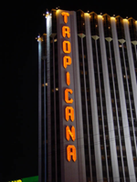
Photographs of Tropicana signs, Las Vegas (Nev.), 2002
Date
Archival Collection
Description
Site name: Tropicana Hotel and Casino (Las Vegas, Nev.)
Site address: 3801 S Las Vegas Blvd
Sign owner: Aztar
Sign details: The southeast corner of Las Vegas Blvd and Tropicana Boulevard belongs to the Tropicana Hotel Casino. The Tropicana is composed of two high-rise towers, the low-rise wings of rooms, and the casino itself. One tower faces southwest/northeast, while the other tower, further east on the property faces southeast/northwest. The expanse of the corner, near the street is an open concrete pedestrian plaza, with rising planters, a large functioning waterfall, also surrounded by foliage, and various vendors. The porte-cochere connects the plaza to the hotel, with the connecting bridge to the Excalibur, residing on top.
Sign condition: Structure 5 Surface 5 Lighting 5
Sign form: Pylon; Fascia
Sign-specific description: On the north and south faces of the porte-cochere roof line, on a pediment between the sloping blue roof and a row of brass fixtures, large channel letters in the faceted Tropicana font, horizontally spell "Tropicana." The exteriors are painted black wit a blue reflective finishing the interiors. They are filled with blue neon. The ceiling of the porte-cochere holds two distinct features to its credit. The north half is adorned with a glass domed hole through the roof. The interior thickness and recessed lip are covered in a polished metallic surface. Seashells adorn the edge where the lip meets the ceiling as well as on the face of the ledge as well. Teal, red and gold organic lines are floating across the surface in paint. The south half of the porte-cochere is covered with six recessed rectangular areas. Within the giant coffering a field of polished metal squares form a tiled field bordered with incandescent bulbs. In each of the corner intersections a sculpted glass cover, hold a single incandescent bulbs. Each field holds forty or so of these bulbs and their coverings. Two identical pylons flank the courtyard. One of them is on the south side of Tropicana avenue facing east /west, while the other faces north/south on the east side of the street. The pylon is essentially a giant double-sided rectangle with a top section that angles back into space on either side to meet at a peak. The result is a small roof like peak at the top of the sign supporting text on its face. The text however is standing up horizontally at a 90-degree angle. Besides the text logo at the top, the sign possesses an internally lit message cabinet on the bottom of the face, a small LED message center, and another backlit cabinet with a color advertisement for Follies Berger. The message center at the bottom is white plastic with vinyl lettering. The small message center is flanked by three steel poles, the height of the sign and finished to look like bamboo. The horizontal line created by the top edge of the sign is also lined with this false bamboo. The channel lettering at the top are polished metallic, shallow channel letters, which extend in depth all the way back to the face of the roof like form. The faces are filled with incandescent bulbs and bordered in neon. The sides of the sign are treated with a vertical bull nose like shape which runs vertically up the width of the sign. It is pointed wit ha triangular shape on both ends. The shape begins flush with the triangular peak of the signs profile and ends with its point approximately halfway down the height of the bottom message center. The bull nose is faceted with three faces. At the triangular tips, the three faces appear to make the space retain a jewel like shape. The middle face is laden with incandescent bulbs. The rest of the width of the sign is also finished in polished gold metal. The remaining open space on the faces of the cabinet, as well as exposed pieces of the cabinet, are painted a teal color. A border on incandescent bulbs runs around the entire face of the signage. The only signage present on the towers , is the on the first tower, closest to the corner. Running vertically down the west side of the southwest face of the tower, giant metallic channel letters spell "Tropicana" and are lined on the interiors with a double row of neon. Along the western end of the tower, three, double rows of incandescent bulbs run the entire height of the building. These animate, chasing each other down, simulating a waterfall.
Sign - type of display: Neon; Incandescent; Backlit; LED
Sign - media: Steel; Plastic
Sign - non-neon treatments: Graphics; Paint
Sign animation: Chasing, oscillating
Notes: Pylons: The incandescent bulbs inside the channel letters for the logo oscillate, as well as on the vertical width of the pylon. The raceways around the backlit screen chase each other, but it is a double row of incandescent bulbs that chase in opposite directions to each other. Building: The giant raceways of incandescent bulbs on the northwest corner of the Tropicana's front tower, chase each other from top to bottom, representing a waterfall.
Sign environment: The Tropicana belongs to one of the four major properties which comprise the intersection of Tropicana Ave. and Las Vegas Blvd The corner is occupied by a plaza and pedestrian element that is also seen in the other neighbors in the intersection as well. The towers loom over the plaza, as is accented by kiosks for patron promotions, and other services such as refreshments. The property is a good example of a property which has adapted over the years to fit and compete with the rapid evolution of Las Vegas.
Sign manufacturer: Original fascia design ( letters on building are what remain after remodel) by Heath and Company. Pylons: by YESCO
Sign designer: Original prismatic design was submitted by AD-Art's Jack DuBois ,but produced by Raul Rodriguez for heath and Company.
Sign - date of installation: 1978
Sign - date of redesign/move: The original facade was remodeled, which altered the exterior of the porte- cochere, but the letters remain.
Sign - thematic influences: The theme surrounding the Tropicana is that of the island paradise. References to the theming, that are evident on the exterior, are the shape and style of the text utilized in the various signage as well as those shapes being carried over into the designs other architectural elements. The blue incandescent bulbs that chase each other down the face of the building obviously reference a waterfall. Juxtaposed to the aesthetic, actual water elements have been incorporated into the front facade also. The angular design of the text is reminiscent of prism like faceted fonts is reminiscent many aspects dealing with Las Vegas, but fit more into the theme of the property than Vegas. The prismatic design is also incorporated into the design of the actual pylon also. The edges of the vertical length of the pylon are faceted and the triangular end seen on the fonts can be found elsewhere on the pylon. Not only is this shape evident with the pylon but on the fascia of the neighboring facade. The peaked rooflines of the village like facade also mirror this shape, being accented by the incandescent bulbs that line the edges. The text are reminiscent of something tropical, the shape somehow represents something rustic and wooden, even a tiki-like flavor.
Surveyor: Joshua Cannaday
Survey - date completed: 2002
Sign keywords: Chasing; Oscillating; Pylon; Fascia; Neon; Incandescent; Backlit; Steel; Plastic; Graphics; Paint; LED
Mixed Content
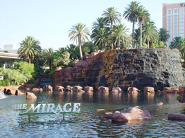
Photographs of Mirage signs, Las Vegas (Nev.), 2002
Date
Archival Collection
Description
Site name: Mirage (Las Vegas, Nev.)
Site address: 3400 S Las Vegas Blvd
Sign owner: MGM Mirage
Sign details: The main attraction of the property is its spectacular exploding volcano placed among an astounding array of lagoons, waterfalls and palm trees. One of the themed hotel casinos, the architectural form takes precedence over an abundance of flashing lights and neon. Two pylon signs reside on the front of the property along Las Vegas Blvd, another on the west side of the property, two arched banner entrances are placed among them, lettering atop the towers, and various text placed among the vast stretch of landscaping are the only visible large elements of signage.
Sign condition: Structure 5 Surface 5 Lighting 5 The structure and lighting on the signs are in excellent repair, with no apparent major physical damage. The surfaces of the pylons and assorted log text, are a bit dirty, but no more than any other establishment, considering the punishment each must undergo due to the elements as well as the live volcano.
Sign form: Pylon; Fascia; Porte-cochère
Sign-specific description: Just north of Caesars Palace a giant pylon sign faces north/south, on the east side of the strip. Two giant square posts support a giant backlit advertisement panel, and an adorning entablature containing the channel letters spelling "Mirage." Between the two giant legs two cabinets are present to fill the space. Just below the main backlit panel an LED screen resides just above another back lit panel. The two giant legs have a series of polished metallic panels running vertically up the sides, creating a recessed channel. The sections are separated with slight overhangs. The bottom smaller panel cabinet is an advertisement for "Danny Gans" and the main panel advertises for the "Seigfried and Roy" magic show. A small banner rests between the main entablature, and the panel, reading "Magicians of the Century." The black channel letters in the main pediment spells "The Mirage," and are filled with incandescent bulbs. The lush foliage and walkways continue north where a covered awning faced with a carved wood and brass bullnose, allows pedestrians to take a moving walkway up to the resort. The landscaping continues north where it meets a driveway denoted by a low arched banner supported by a pair of square columns on either end. "The Mirage" is spelled in polished gold channel letters, with white interiors and filled with incandescent bulbs. The banner itself is sculpted into two sweeping solid shapes on the tops and bottoms, with a series of folded ribbon like scroll shapes. The center section is crafted as to allow light to pass through the negative spaces created by the rows of positive scroll shapes. The banners face east. On the faces of each of the flanking posts, two images of jumping dolphins are sculpted and finished in the same fashion. Past the gateway the thick beds of foliage and palm trees can be seen headed back along the drives. Continuing north a multi tiered lagoon rushes circulating water on and over waterfalls, while yet more green shrubbery and palm trees encrust islands and images of eroded rocks and geological formations. The beautiful imagery continues north, twisting and turning in and behind itself to create a fantastic spectacle for a passerby to be lured in and be fascinated. Approximately in the middle of the length of the expanse, the famous functioning volcano rests quietly amongst smaller rocks and waterfalls. Just past the volcano the lagoon opens up into a wide flat area of water where bronze dolphins are positioned to look as if they are jumping out of the water. Still the rich foliage dominates the landscape, until another arched gateway interrupts the expanse to allow traffic. The foliage, and lagoon landscaping, picks up again, cozily grasping the base of a smaller pylon of similar design as the first. The two reflective paneled legs rise up to connect with a horizontal piece of the same design. A large backlit cabinet advertising for Danny Gans occupies approximately three-quarters of the space between the legs. An entablature of the same design as the main pylon, yet smaller, crowns the top of the sign. The trademark font spells "The Mirage" in black channel letters and filled with incandescent bulbs. Just past the small double sided pylon, a small of recess of rocks plays home to the end marker of the Mirage. A bust of Siegfried and Roy with a tiger is ambiently lit, provided photo opportunities for tourists. An interesting function has been added to the bust. In the flower bed behind and on the sides of the object, faux boulders are places with glowing crystals protruding from the surface. The tower of rooms for the Mirage is the popular three winged "Y" configuration converging onto a center structure. On each face of each wing, giant black channel letters spell "The Mirage" in their trademark text. Each is filled with incandescent bulbs.
Sign - type of display: Neon; Incandescent; Backlit
Sign - media: Steel; Plastic
Sign animation: Oscillating
Notes: The incandescent bulbs located within text logos on the pylon sign, and upon the tower oscillate to appear as shimmering. The effect is one of the more common animations particularly among the larger, corporate casinos.
Sign environment: The placement of the Mirage right on the curve of the Strip makes the pylons visible from a good distance from either direction. The environment displayed by the mirage is that of paradise. When walking past, and up to the property, it hard not to stop and stare at the amazing foliage and spread of waterfalls, and rocks.
Sign manufacturer: Ad-Art
Sign designer: Pylons: Charles Barnard with touches from Wynn's design group Atlandia Design Group. Dolphin Archways: Barnard and Jack Dubois as well as hotel architect, Joel Bergman
Sign - date of installation: 1989
Sign - date of redesign/move: The main pylon has since been updated with a new Siegfried and Roy Back lit Mural, a new LED screen, and another back lit plastic screen featuring Danny Gans. An internally lit banner reads horizontally across the top of the giant Siegfried and Roy Mural which reads Magicians of the Century.
Sign - thematic influences: The theme is tropical island paradise. Complete with active volcano, the front spectacle of rushing waterfalls, chirping bird noises, and leaping bronze dolphins, serves as the backdrop for the simple, slim design of the property's pylon structure. The pylons were designed to reach harmony with the structure of the tower itself, rather than the island theme. The dolphins over the entrance arches however represent the tropical island theme, as well as speaking about the dolphin habitat inside.
Sign - artistic significance: The main pylon was the first of its kind to feature a full color illuminated photographic pictoral. Designed by Rosco, it was billed as the largest of its type in the world. The resort's themed spectacular was also the first of it's kind in regards to its extravagance and unique functionality. Approximate 125,000 people visited the property on its opening day. The resort fits well into the theme of design of the large, corporate property, after all it was one of the pioneers of such a movement in Las Vegas. The Mirage also set the standards for the now frequently seen element of the attraction spectacle, and the standard of quality on the Las Vegas Strip
Surveyor: Joshua Cannaday
Survey - date completed: 2002
Sign keywords: Oscillating; Pylon; Fascia; Porte-cochère; Neon; Incandescent; Backlit; Steel; Plastic
Mixed Content

Meeting minutes for Consolidated Student Senate University of Nevada, Las Vegas, April 07, 1993
Date
Archival Collection
Description
Text