Search Results
Photographs of Gateway Motel sign, Las Vegas (Nev.), March 12, 2017
Date
Archival Collection
Description
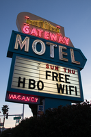
Site address: 928 S Las Vegas Blvd
Sign owner: Vinod Soni and Gateway Motel Inc
Sign details: The Gateway Motel dates back to early 1930's and could be considered one of the earliest motels to pop up in Las Vegas. Before the name changed to Gateway Motel it was named as the Gateway Auto Court circa 1930-1946 it was known as the Gateway Auto Court. The first sign was built circa 1930's and their new remodeled sign which is still in use today was built circa 1950's. The 1950's sign was originally painted darker colors and had a larger graphic of a gate. The original 1930's sign has the streamline modern influence that was prominent in 1930's and 40's. The sign itself is a pole sign with a square structure at the top. The font Auto-Court is in pure neon with that fire-red hue; the font is placed in the middle to stand out the most. The word Gateway is on top of Auto-Court in black with black streamline lines surrounding the word. Underneath is a small wooden board hanging probably stating no vacancy. The background color of the square structure is in pure white and the pole is chrome.
Sign condition: The condition of the sign is a 3.5. Some of the neon is not working when it's turned on at night. The paint has some sun/UV damage since it looks faded. The reader board has a stained effect from sun damage.
Sign form: Pylon with three separate signs converged into one.
Sign-specific description: The sign is made out of glass, steel, plastic, and concrete. The color palette is light blue, white and a cream white. The sign is designed in separate sections. The white cream based portion is situated at the top with a gate and bridge illustrative design in glass tubes and neon. The gate itself lights up yellow with red on the side. The font Gateway is larger than the gate and is in the color white when lit up. Underneath the Gateway word is a subliminal directional arrow pointing towards the motel buildings This section is in the color sky blue with the word motel in massive white letters. Underneath the directional arrow is the reader board surrounded by the steel light blue border. The reader board states Free Wi-Fi and HBO. Underneath in the left corner is a small light blue board that states "no vacancy" in neon. These three separate signs are all connected like blocks with a concrete pillar structure holding up the sign. During the evening, the light blue paint is not shown and is just pure black with the neon illuminating the sign.
Sign - type of display: Neon and plastic back lit sign
Sign - media: Steel, plastic and concrete
Sign - non-neon treatments: Plastic back lit portion
Sign environment: This location is on the corner of Las Vegas Blvd and Charleston. This is right next to the original Dona Maria Tamales restaurant.
Sign - date of installation: Circa 1950's
Sign - date of redesign/move: From a 1930's streamline modern sign to a 1950's Mid-Century modern architectural roadside motel sign.
Sign - thematic influences: The sign is influenced by Mid-Century Modern roadside architecture, with the directional arrow as a staple in many motel roadside designs of the 1950's and 60's to accommodate the car consumer era.
Sign - artistic significance: One main trends of the 1950's designs with neon signs is using illustrative motifs with the inclusion of directional arrows to lend to the highway travelers an idea of where the property is located. To make sure these travelers don't miss the establishment in an empty road.
Survey - research locations: Assessor's Page, Roadside Architecture Website http://www.roadarch.com/signs/nvvegas.html , Neon Museum book Spectacular, Vintage Las Vegas http://vintagelasvegas.com/search/Gateway+Motel
Surveyor: Gisselle Tipp
Survey - date completed: 2017-08-30
Sign keywords: Neon; Plastic; Backlit; Steel; Concrete; Roadside; Reader board; Back to back
Mixed Content

Photographs of Candlelight Wedding Chapel sign, Las Vegas (Nev.), 2002
Date
Archival Collection
Description
Site address: 800 S 4th Street
Sign details: The Candlelight Wedding chapel is located on the corner, just north from the Riviera and in the same parking lot as The Algiers. The small white, wooden roofed structure sits just to the east of the street and the northern side butts against Stardust Rd . Outside, the corner is treated with grass, and landscaping, creating a pleasant environment to go along with the charm of the building as well. The low level pole sign faces north/west. The building has a small wooden cross, surrounded on the edges with white neon, on the top of the building, in the same fashion as the Little Church of the West. The style of the building is classic New England architecture
Sign condition: Structure 4 Surface 3 Lighting 3
Sign form: Pylon
Sign-specific description: The main sign for the candlelight wedding chapel is essentially a small pole sign with three separate sections of cabinets along with lighting elements. The white steel pole rises out of the ground ,before transforming into a large two sided marquee cabinet. The cabinet is crafted with sculptural elements into its outer edge. The four corners swell up and bulge, before slightly swooping inward. The top and bottom edges are climaxed into a shallow point. The sides sweep into the notch of a negative circular shape. The sides are given a scroll type feel. In two lines across the red face of the sign, Wedding Chapel is spelled is white text, occupying most of the space of the cabinet. Across the very bottom of the cabinet Wedding Information is spelled in an all white single row of text. The larger text is lined with incandescent bulbs and outlined in neon. The bottom line of text is just lined in neon. The pole protrudes through the top of the sign where a small horizontal, internally lit cabinet, sports sculpted edges as well. The top and bottom edges sweep from either side, then descend meeting at a point in the center. The sides are simply concave, radiuses inward. The white cabinet is lit internally, illuminating the white plastic face. Black text stretches across the plastic face, reading candlelight. Below the main cabinet two internally lit cabinet sandwich the pole, creating two faces. The cabinets are all white, with white faces, utilizing red letters. At the very top of the pole is a tree tiered formation created with raceways and lined with incandescent bulbs. One raceway rises vertically into the air perpendicular to the ground, while the two flanking pieces arch out created a three-pieced fountain shape. It is also reminiscent of a Fleur de Lis.
Sign - type of display: Neon; Incandescent; Backlit
Sign - media: Steel; Plastic
Sign animation: none
Sign environment: The positioning of the Candlelight Wedding chapel gives it a unique role as an accent of softness, among a bombardment of neon and pulsating lights. Just to the North, is the Algiers parking lot, and to the south, the Riviera. Directly west across the strip there is the ever electric Circus Circus. Amid all this chaos of incandescence, screeching cabs, and buzzing current, the green shrubbery and plot of turf finely houses the pylon, and leads up to the structure itself. It is very charming and fresh compared to. It definitely is reminiscent of the era of establishment such as its neighbor the Algiers.
Sign manufacturer: YESCO
Sign - thematic influences: The theme of the sign has little to do with the theme of the wedding chapel, and more so to do with the architectural theme, than the function of the establishment. The pole sign contains standard elements of local signage. The logo cabinet, and internally lit message center. It even contains the most common element of a raceway lined with incandescent bulbs. The sculpted edges of the pylon's logo cabinet are reminiscent of other cabinets with sculpted edges. The most famous reference to this shape seen in classic Vegas history, is the original corner fascia seen on the Golden Nugget. As far as being compared to the only other existing independent wedding chapel, its structure is similar, that being a small structure boasting a highly visible steeple.
Surveyor: Joshua Cannaday
Survey - date completed: 2002
Sign keywords: Pylon; Neon; Incandescent; Backlit; Steel; Plastic
Mixed Content
Photographs of Travelers Motel sign, Las Vegas (Nev.), 2017
Date
Archival Collection
Description
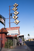
Site address: 1100 Fremont St
Sign details: This location was constructed in 1926. Though the year of when the Traveler's Motel opened in unknown though its sign states, "Your Best Bet In Las Vegas Since 1936'. Though Vintage Las Vegas' blog states that the Traveler's Motel acquired some of their land from the Lucky Motel. Currently the Traveler's Motel is closed and gated up.
Sign condition: 3, the sign is fairly in condition. However, the sign does not light up at night. The sign that used to read "Traveler's Motel" that was affixed to the iron gate-like structure appears to have the majority of its sign taken down or destroyed in recent times.
Sign form: Blade Pole sign and Porte Cochere
Sign-specific description: This sign is attached to the building that belongs to and extends outward to Fremont Street. The lower portion of this sign has the same details on each side of the sign. The top portion of this sign is a trapezoid with "Traveler's" painted on it in a cursive text except for the "t." This is done in white on a rust colored background. Neon is also affixed to "Traveler's." Underneath this is a plastic back lit sign detail the various accommodations of the property, such as: phone, cable T.V., microwave, refrigerators, "totally remodeled rooms," "daily * weekly rental," and "Your Best Bet In Las Vegas Since 1936." Under this is another, smaller trapezoid that has the street address painted on it in bold white numbers with a rust background. Extending from the top portion of this sign is a rust colored pole that has five other poles with various lengths extending out from that towards Fremont Street. Attached to these poles are letters that spell out "MOTEL," the top supports the "M" and each pole following hold each of the others letters to spell out the word. Each of these are diamond shaped plastic, possibly back lit signs. The plastic is off-white and each of the letters is black. The marquee sign attached to the iron gate-like structure that connects one side of the building to the next. This sign is a long, rectangular back lit sign that has a white background and bold red text reading "Traveler's Motel. " This sign also was attached to an longer, yellow rectangle with rounded sided on the left and right side of the sign.
Sign - type of display: Neon, possibly back lit (sign doesn't light up any more)
Sign - media: Steel and Plastic
Sign - non-neon treatments: Plastic back lit portion
Sign animation: The sign is no longer in use; therefore, it is difficult to determine this. There is also no record of the sign having any animation.
Sign environment: This property resides in the area east of the Fremont East District with many new businesses surrounding it, such as: PublicUs, the Bunkhouse Saloon, Chow, The Writer's Block, and 11th Street Records. However, there are quite a few other closed Motel properties that reside near the Traveler's Motel as well.
Sign - thematic influences: The sign is extremely reminiscent of many of the signs from the 50's and 60's that belong to the other motels in the downtown area. The sign has many geometric elements to it that make it appear that it could be from this time period.
Sign - artistic significance: This sign does not have a specific theme to it. However, the plastic figure climbing on the sign stresses that this motel would be for those who do enjoy traveling and adventures. This sign does follow a very basic trend regarding motel signs on Fremont Street. It is attractive and very noticeable to those moving along Fremont Street. The overall design of the sign is very geometric, which is a common aesthetic among signs made in the 50's and 60's.
Survey - research locations: Assessor's Page and Vintage Las Vegas website http://vintagelasvegas.com/search/Traveler+Motel
Survey - research notes: It was difficult to find any history or old photographs of this property.
Surveyor: Lauren Vaccaro
Survey - date completed: 2017-08-18
Sign keywords: Neon; Steel; Plastic; Backlit; Pole sign
Mixed Content
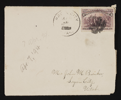
Letter and envelope from Mary Etta Syphus, Provo, Utah to John M. Bunker, Logan, Utah
Date
Archival Collection
Description
From the Syphus-Bunker Papers (MS-00169). The folder contains an original handwritten letter, an envelope, a typed transcription of the same letter, and a copy of original letter attached.
Text
Letter and envelope from Mary Etta Syphus, Provo, Utah to John M. Bunker, Logan, Utah
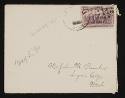
Date
Archival Collection
Description
From the Syphus-Bunker Papers (MS-00169). The folder contains an original handwritten letter, an envelope, a typed transcription of the same letter, and a copy of original letter attached.
Text

Nora Mirabal interview, August 30, 2019: transcript
Date
Archival Collection
Description
Interviewed by Elsa Lopez and Barbara Tabach. Cuban refugee family by way of Spain and then to the US; arrived in Las Vegas in 1973 when Nora was 9 years old. Struggled in youth but rises up as embraces educaton. Currently is Assistant Director of Academic Partnership at CSN.
Text

Transcript of roundtable interview with the Holocaust Resource Center: Myra Berkovits, Susan Dubin and Doug Unger, by Barbara Tabach, September 4, 2014
Date
Archival Collection
Description
Interview with Myra Berkovits, Susan Dubin and Doug Unger of the Holocaust Resource Center. In this interview, the group discusses the beginnings of what is now the Sperling Kronberg Mack Holocaust Resource Center. Edythe Katz-Yarchever is discussed as the catalyst for establishing the center and getting others involved with the Governor's Advisory Council on Education Relating to the Holocaust. Berkovits talks about her role as a liason for Holocaust education in the Clark County School District and the student-teacher conferences held each year with funding from Sheldon Adelson. Unger discusses expanding the outreach to the Washoe County School District with assistance from Atlantis Hotel (Reno, Nev.) owner, John Farahi and Judy Mack. They talk about the previous locations of the Holocaust Resource Center on Maryland Parkway, then Renaissance Drive, and the affiliation with the Jewish Federation and the Jewish Family Service Agency. After funding and personnel issues around 2011, the advisory council and the library went through a re-structuring and hired Susan Dubin who organized and catalogued the library collection. The library is now accredited by the Association of Jewish Libraries.
Text
Meeting minutes for Consolidated Student Senate, University of Nevada, Las Vegas, February 26, 1974
Date
Archival Collection
Description
Text
Meeting minutes for Consolidated Student Senate, University of Nevada, Las Vegas, November 12, 1974
Date
Archival Collection
Description
Text
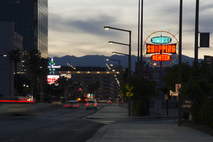
Photographs of Somerset Shopping Center sign, Las Vegas (Nev.), April 4, 2017
Date
Archival Collection
Description
Site address: 252 Convention Center Dr
Sign owner: Somerset Shopping Center CO LP
Sign details: This shopping center was built in 1966 next to the Somerset House Motel. The motel was demolished in 2011; however, the shopping center is still around. Some businesses that reside in the shopping center include: a hair and nail salon, a dry cleaners, an Ethiopian restaurant, and a place for banquets to name a few.
Sign condition: 5, the sign is in beautiful condition.
Sign form: Pole
Sign-specific description: This pole sign sits close to the street so motorists and pedestrians can view it easily. A light blue pole holds up the main portion of this sign, as well as back lit plastic signs on each side of the pole that display what businesses are in the shopping center. The sign itself consists of a yellow ring that encircles three other signs. This yellow circle is covered in incandescent light bulbs that chase when the sign is lit up at night. Also, extending from this yellow circle are light blue poles in various lengths that are surrounded in neon tubes and oscillate around the yellow circle when the sign is lit up at night. In the center of the circle are three signs. The first sign is an elongated oval that has the word "SOMERSET" painted on it in bold white letters with a black outline on a light blue background. Neon tubes outline these letters. The sign under that is a large rectangle shape with each of the sides curving inward. There are also incandescent light bulbs lining the outer edge of this sign that chase when the sign is lit up. This sign has the word "SHOPPING" painted on it in bold white text against a red background. Neon tubes outline each letter of this word. The sign under this is another elongated oval that is a similar size to the "SOMERSET" sign. This sign reads "CENTER" in bold white text against a red background and neon tubes outline this word as well.
Sign - type of display: Neon, Incandescent light bulbs and back lit
Sign - media: Steel and plastic
Sign - non-neon treatments: Plastic portion of sign
Sign animation: Oscillating, chasing
Sign environment: The shopping center that this sign is located in is about a block away from the Strip and is near a few monumental properties. It resides close to the Las Vegas Country Club, the Las Vegas Convention Center, and the Guardian Angel Cathedral that Paul Revere Williams designed. It is down the road from casinos like the Wynn, Encore, Circus Circus, and the Westgate. The Peppermill, an iconic Las Vegas restaurant, is down the street as well. It was down the street from the Stardust when that property was up and running.
Sign manufacturer: YESCO
Sign - date of installation: Most likely 1966, 1960's era
Sign - thematic influences: The design of this sign is very eye-catching from the road, as are many roadside signs throughout this era of the city. Bold text and light animation make this a standout sign to attract motorists and pedestrians to the shopping center.
Sign - artistic significance: This sign appears to have some Googie design influence throughout it. It has a space age feel to it because of the yellow circle that surrounds the "SOMERSET SHOPPING CENTER" signs and the blue poles that extend from it also add to this style.
Survey - research locations: Assessor's Page http://www.clarkcountynv.gov/assessor/Pages/searchbybusinessname.aspx , Vintage Las Vegas website http://vintagelasvegas.com/search/somerset , Roadside architecture website http://www.roadarch.com/signs/nvvegas.html
Surveyor: Lauren Vaccaro
Survey - date completed: 2017-09-01
Sign keywords: Neon; Incandescent; Backlit; Steel; Plastic; Oscillating; Chasing; Pole sign
Mixed Content