Search Results
Meeting minutes for Consolidated Student Senate University of Nevada, Las Vegas, March 13, 1984
Date
Archival Collection
Description
Text
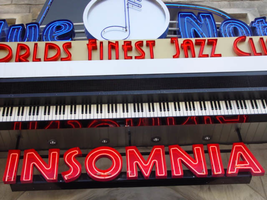
Photographs of Blue Note signs, Las Vegas (Nev.), 2002
Date
Archival Collection
Description
Site address: 3663 S Las Vegas Blvd
Sign owner: Blue Note International: Father & Son team of Danny and Steven Bensusan
Sign details: The Blue Note is located a short distance east, down Harmon Ave., on the north side of the street, facing south. It is part of the Aladdin Hotel Casino. A vacant lot resides on the corner, and is the only thing that separates the Blue Note from the Strip. Signage for the property includes two logo wall signs on the west wall of the building, a vertical blade sign and an entrance sign over the main port to the establishment.
Sign condition: Structure 5 Surface 5 Lighting 5
Sign form: Fascia
Sign-specific description: Just east off of Las Vegas Blvd, down Harmon Ave, lies the entrance to the "Blue Note: Jazz Capital of the World." The Blue Note is actually part of the Aladdin property, residing in the eastern most wing of the building, on the south side of Harmon. The majority of the signage hangs on the front of the building, which faces south toward Harmon Ave., with additional signage on the west face of the structure that extends from the Aladdin property. A vacant lot on the north east corner separates the Blue Note from the rest of the strip. The structure of the building and the design of the signage are juxtaposed with the building still being finished in a Persian Palace theme. While the signs are reminiscent of roaring twenties style font and theatre front design. Several different types of signs adorn the Blue Note. Two wall /logo signs hang on the west side of the building, while a sculpted entrance marquee, a hanging logo sign, and a vertical blade sign hung on the south side of the building. The west wall logo sign is composed of blue channel letters spelling the text " Blue Note," separated by a circular cabinet with a tube of neon bent to emulate the shape of a musical note placed in the middle. Five steel bars just out from either side of the cabinet. Below the text, a white steel cabinet with rounded ends, support a thin set of blue channel letters reading, "Jazz capital of the world." Further to the right a set of pink channel letters rest upon the upper portion of the corner of the structure. The letters are filled with pink neon. Along the South face of the building the first sign, hung in close proximity to the southwest corner, a vertical blade sign sits on a radius base of shaped molding jutting out of the wall. The actual body of the sign is a double backed cabinet finished in polished aluminum, with blue pin striping along the edges as well as along the rounded edge of the top. Near the top of the sign, the same rounded cabinet seen on the west wall of the structure, is integrated into the blade facing east/west. The cabinet is thicker in width to compensate for the width of the actual sign. The edges of the steel structure are painted in the same blue tone. The afore mentioned blue neon tubing fashioned into the shape of the note resides in this cabinet also. Along the east/west sides of the sign the text "The Blue Note," runs vertically from top to bottom, in blue channel letters only interrupted by the circular cabinet. The panel, which the text resides is painted white. Along the edge of the blade, which faces south, the text "Blue Note" is spelled vertically in blue channel letters. Sitting along the edge of the base, which the sign sits on, thin red channel letters stand almost independently, wrapping around the radius of the base. Starting on the west side of the sign and finishing on the east side, the text reads "Club & Cafe." These letters are filled with tubes of red neon. The letters are attached to a backing radius band of metal appearing to be gold. Further down the face of the building the main entrance to the building plays host to an overhead marquee/logo sign incorporating sculptural elements as well. Directly in the center of the composition, a long horizontal cabinet plays host to the red channel letters filed with red neon, reading, "World's Finest Jazz Club." Sitting on the top edge of the cabinet the same configuration of the Blue Note logo sign along with the circular cabinet, rests in front a sculpted piece of black steel. This piece of black painted steel is cut to appear as if it is the open top to a piano. Along the interior edge of the lid tubes of blue neon form a blue border. Between the piano top and the Blue Note logo, a horizontal steel grate serves as a divider as well as support for the blue channel letters. This entire section sits on a long horizontal ledge composed of a long polished steel section with a long LED message center just below that. Slightly recessed below the message center another width of overhang constructed of steel is painted to appear as if it is made of piano keys. Along the wall, just above the door, the pink channel letters read "Insomnia" with pink neon on the interior.
Sign - type of display: Neon
Sign - media: Steel; Fiberglass
Sign - non-neon treatments: Paint
Sign environment: Situated just east off the strip, down Harmon Avenue, the Blue Note is the only attraction in its immediate area. Even though it is part of the Aladdin complex, the closest property is the Harley Davidson Cafe on the south east corner of Harmon and Las Vegas Blvd At night, the property loses its Arabian Nights architecture emitting a sultry glow of neon. It is hard to miss, if a pedestrian peers down the street while traveling north or south, on the east side of the strip. During the day, the architecture helps to blend in the property to appear as it is, part of the Aladdin.
Sign manufacturer: YESCO
Sign - date of installation: 2000
Sign - thematic influences: The building itself is part of the actual Aladdin property, so the faced of the structure is themed in the manner of an ancient Persian city. It is an interesting juxtaposition for the sleek, modern finish and colors of the signage, with the organic facade of domed towers and stone facade. The Blue note signage is themed around the subject of music, specifically Jazz and Blues music. The blue hue of the neon, and the cabinet containing the crafted musical note are all evidence of this. The blade sign is thematically influenced by marquee building signs for theaters and music clubs from the first part of the century, specifically the forties and fifties. Such examples that utilized a similar designed blade sign were properties from the 1930's 40's and 50's such as The Boulder Club, The Pioneer Club, and the Las Vegas Club.
Surveyor: Joshua Cannaday
Survey - date completed: 2002
Sign keywords: Fascia; Neon; Steel; Fiberglass; Paint
Mixed Content
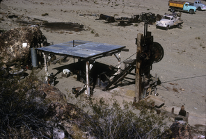
Slide of the old stamp mill, circa 1950s
Date
Archival Collection
Description
Image
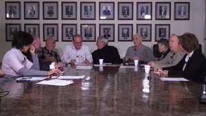
Video, Roundtable discussion with members of Temple Beth Sholom, January 14, 2015
Date
Archival Collection
Description
In this roundtable discussion video, members of Temple Beth Sholom discuss the history of the long-established congregation. Interviewees are Sandy Mallin, Oscar Goodman, Jared Shafer, Joel Goot, Arne Rosencrantz, Jerry Blut, Jackie Boiman, Gene Greenberg, and Flora Mason, with Shelley Berkley joining in later in the interview. Most of the interviewees have been involved in the leadership of the congregation. They discuss relationships with various rabbis over the years, and successful fundraising efforts to build the original synagogue. Other early leaders in the congregation were Edythe Katz-Yarchever, the Goot family, Stuart Mason, Herb Kaufman and Leo Wilner. Until the 1980s, Temple Beth Sholom was the only synagogue in Las Vegas, but after a dispute over the burial of a non-Jew, a new synagogue formed (Shareii Tefilla), and at nearly the same time, Temple Beth Sholom began investigating a move from their site on Oakey Boulevard. Most have nostalgia for the former location, but discuss the changes in the neighborhood that necessitated the move to Summerlin. Then they discuss the other initiatives that were borne out of Temple Beth Sholom, such as bond drives for Israel, B'nai B'rith, and the Kolod Center. They share other memories, and discuss the leadership and Sandy Mallin becoming the first female president of the temple. They credit Mallin with keeping the temple going through lean years, and helping to recruit Rabbi Felipe Goodman. The group goes on to mention other influential members of the Jewish community including Jack Entratter and Lloyd Katz, who helped integrate Las Vegas.
Moving Image

Meeting minutes for Consolidated Student Senate University of Nevada, Las Vegas, October 17, 1985
Date
Archival Collection
Description
Text
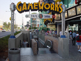
Photographs of Gameworks signs, Las Vegas (Nev.), 2002
Date
Archival Collection
Description
Site address: 3785 S Las Vegas Blvd
Sign details: Game Works is located on the underground level of The Showcase Plaza, which is also home to such establishments as M&M World and the Show case theatres. Two small gateway pylons for the Game Works center, stand on other side of staircases that lead to the underground facility. Just east of there a large wall front design hands approximately nine feet above the ground on the structure of the mall.
Sign condition: Structure 5 Surface 4 Lighting 5
Sign form: Pylon; Fascia
Sign-specific description: The large wall marquee that reads GAMEWORKS in all capitals, utilizes deep, yellow, steel, channel letters painted black on the exteriors. The slightly arched sign is on the West wall of the building, facing West from the East side of the strip. The interior of the text contains double rows of yellow neon. The cabinet, which the words sit upon, is a black steel cabinet shadowing the individual letters in one cabinet. The backing cabinet itself is illuminated from its interior, with middle section of the width of the cabinet is made of a steel grating. This function allows the blue neon on the inside to cast a blue glowing halo seen from the exterior. Sitting on top of the right hand side of the marquee are two steel boxes manufactured into the shape of a male and female figure dashing to the end of the sign. These figures are made of black steel box like formations while retaining a cartoon-ish silhouette. Their posture suggests motion or running. These figures are constructed in the same fashion as the black cabinet, which the text is supported upon. They too are glowing with the blue interior neon halo. In front of the large wall sign are the two, single sided, gateway pylons. They serve as markers for the stairs that lead the underground facility. They sit on either end of the large channel cut into the sidewalk. One faces South on the South entrance, and one faces North at the North end. The signage is actually a smaller replica of the large building front logo. The same interior lit cabinet supports the same design of yellow channel letters, with the backing "shadow" cabinet. A difference between the larger and smaller cabinets is that the cabinets are surfaced with the grated material. The only difference in the channel letters besides their obvious discrepancy in size, is that single rows of neon comprise the interior of the channel letters. On either side of the sign, two, "space age" themed posts provide support. They are topped with a sculpted cylindrical fashion capital. The bases for which they are attached to the concrete with, are blue in color. The actual shaft of the pole is made of several smaller pipes, with a plastic cylindrical tube in the center. Inside this tube is a string of attached incandescent bulbs running vertically. Below the text, suspended with two rods, is an oval shaped, aluminum cabinet. In the face of the cabinet there are the words "cafe" and "lounge" painted in blue. Over the painted text is blue neon. From both sides of the sign, the blue neon scrawl is visible Separating the two words is a black circle with a red neon rectangular shape in the center. The ends of the cabinet are made small circular cabinets approximately seven inches in diameter.
Sign - type of display: Neon; Incandescent; Backlit
Sign - media: Steel; Plastic; Fiberglass
Sign - non-neon treatments: Paint
Sign animation: none
Sign environment: The Game Works facility is located directly across the street from the pedestrian "Brooklyn Bridge" element of the New York New York and sit is the shadow of the MGM super pylon. The vibrant yellow of the sign do stand out as distinct among the tremendous and attractive signage of the Showcase plaza. The large channel cut into the sidewalk, along with its large surrounding counterparts, makes the entrance reminiscent of that of a subway. The plaza itself is self-contained and while standing along the front a person is enveloped in the plaza without being distracted by the rest of the strip itself. The large signage looms over a pedestrian while walking by, or shouts at you while sitting along the shrub filled flowerbeds.
Sign - thematic influences: The actual theme of the sign is correspondent to that of the business, which the sign advertises. The property is an interactive gaming facility and lounge. The use of the glow of a monitor or computer screen. The polished aluminum poles supporting the gateways are reminiscent of the futuristic, or "space-age" theming associated with the classic representations of science fiction in movies and television throughout the twentieth century. Such examples of this classic representations may be seen in television programs from the past like "Lost in Space," or even literary descriptions in Orson Well's "War of The Worlds" of Ray Bradbury's "Martian Chronicles" The combination of materials along with the innovative use of lighting also suggests electricity and digital elements which associate with the function of the facility.
Sign - artistic significance: If not significant for simply combining different elements to create a completely self-contained sign, it fits into the movement in Las Vegas's history , which is geared more toward the family. Not only the space that it occupies, but also the function itself in intended to attract young people if not children into it domain. It is an obvious standout for the vote to make Las Vegas move toward a more family oriented town. Aesthetically the signage is modern innovation on a classic design.
Surveyor: Joshua Cannaday
Survey - date completed: 2002
Sign keywords: Pylon; Fascia; Neon; Incandescent; Backlit; Steel; Plastic; Fiberglass; Paint
Mixed Content
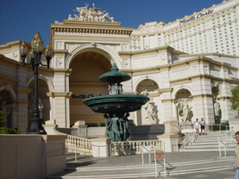
Photographs of Monte Carlo signs, Las Vegas (Nev.), 2002
Date
Archival Collection
Description
Site name: Monte Carlo Resort and Casino (Las Vegas, Nev.)
Site address: 3770 S Las Vegas Blvd
Sign owner: Mandalay Resort Group (50%), MGM Mirage (50%)-Mandalay manages the property
Sign details: The Monte Carlo is located on the west side of the strip just past the New York New York. The signage on the front of the Monte Carlo is limited, with the dominant honors going to the architectural aspects instead. The front facade is made to represent the classical architecture actually found in Monte Carlo. Giant patina fountains are flanked by sweeping staircases, where giant recessed arches and niches hold an abundant array of diversely positioned statuary.
Sign condition: Structure 5 Surface 5 Lighting 5
Sign form: Pylon; Fascia
Sign-specific description: Through the main arch behind the fountain, located on the south east corner, an entrance is guarded from above by black channel letters spelling "Monte Carlo" and filled with incandescent bulbs. This entrance faces southeast. The architecture continues with relief entablature upon fluted columns supporting Corinthian caps, and more statuary. Light posts adorn the sweeping walk in front of the property. Throughout the architecture you can see pools and fountains contained between arches and recessed into other area. Another entrance in the same fashion as the southeast entrance sits facing northeast. Another set of channel letters is set above these doors as well. Just north of the last entrance is the pylon for the Monte Carlo. The pylon fits into the category commonly seen at resorts such as The Mirage, or Luxor. Essentially a giant rectangle in its general silhouette, a multi leveled collection of signs are designated into geometrical planes by the use of classical architectural elements. The sign is at the north end of the Monte Carlo property and faces north/south, and is double sided. The bottom half of the structure is occupied by a tall arch, creating a pedestrian element, allowing passage through the sign. The two legs that flank the arch are created utilizing a pair of double columns supporting a series of crowned ledges supporting yet another architectural element of a pilaster. The resultant effect is two rather massive collections of elements creating the outer legs of columns, combined with pilasters, for the recessed borders of the impressive arch. Above the arch the cabinet rises up divided into two planes, one on top of the other, each holding a message cabinet with a pair of the square post as seen on the structure just below. It creates another pilaster from the front with rows of stacked columns on the structures width. The two arrangements are identical in structure and facade. The difference lies in the different types of display each on holds. The top is a back lit color advertisement currently for magician Lance Burton, while the bottom is an LED matrix screen . The top is an entablature crowned with sweeping overhangs, and containing the text Monte Carlo in black channel letters and filled with incandescent bulbs. The signage on the towers of the hotel are the repeated Monte Carlo logos in giant black channel letters, and filled with incandescent bulbs. On each face of each one of the wings Monte Carlo is spelled in it's trademark text, in black channel letters and filled with incandescent bulbs.
Sign - type of display: Incandescent; Backlit
Sign - media: Steel; Plastic
Sign animation: Oscilllating
Notes: The incandescent bulbs inside the channel letters oscillate, at the entrances on the building as well.
Sign environment: The environment the Monte Carlo creates with its various forms of advertisement abruptly changes in aesthetic contrast to its southern companion and precursor to the northbound traveler. One minute the pedestrian is listening to the nasal audio streaming from the ESPN Zone loudspeakers, to the delicately ornate facade of the Monte Carlo's fountains and highly detailed statuary. Once you cross the drive it is not hard to be attracted the by classical architecture which serves its purpose of bringing in the patron with the limited space utilized for pedestrian passage across the front. I say limited, even though it is one of the more ornate and expansive ones, that is in comparison to its related properties of the Mirage and the Bellagio. The use of architecture makes the utmost use of this great strength of aesthetic by making it interactive for the pedestrian by allowing them to pass up close to the elements while entering the building or traversing the facade. The two giant wings on either end of the property act as arms to pull in people using swooping steps and large fountains. The signage is integrated into this environment, blending in nicely, in similar fashion as the previously mentioned examples. The oscillating incandescent bulbs can be found inside the channel letters, which is the most common animation seen in this type of signage in the other properties as well.
Sign - date of installation: 1995
Sign - thematic influences: The Monte Carlo theme is that of an understated European elegance.
Surveyor: Joshua Cannaday
Survey - date completed: 2002
Sign keywords: Oscillating; Pylon; Fascia; Incandescent; Backlit; Steel; Plastic
Mixed Content
Meeting minutes for Consolidated Student Senate University of Nevada, Las Vegas, December 2, 1992
Date
Archival Collection
Description
Text

Interview with Philip Wymer Allen, August 26, 2004
Date
Archival Collection
Description
Text