Search the Special Collections and Archives Portal
Search Results
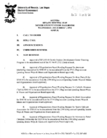
Meeting minutes for Consolidated Student Senate University of Nevada, Las Vegas, December 07, 1994
Date
Archival Collection
Description
Text
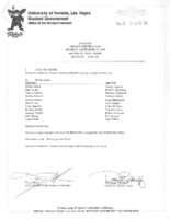
Meeting minutes for Consolidated Student Senate University of Nevada, Las Vegas, November 20, 1995
Date
Archival Collection
Description
Text
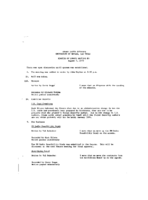
Meeting minutes for Consolidated Student Senate, University of Nevada, Las Vegas, August 1, 1973
Date
Archival Collection
Description
Text
Meeting minutes for Consolidated Student Senate, University of Nevada, Las Vegas, October 5, 1982
Date
Archival Collection
Description
Text
High Hat Regency Neon Survey document, September 6, 2017
Date
Archival Collection
Description
Site address: 1300 S Las Vegas Blvd
Sign owner: Tarighi Bahman and Farideh
Sign details: The building was constructed in 1958 (Assessor). A vintage postcard from the 1950's-- or more likely the 1960's (based upon the automobiles pictured)-- shows that the business was previously named the Chevron Motel (Las Vegas motels then and now).
Sign condition: Condition is 3-4, fair to good. The pole, cabinets and reader board are in good condition. Moderate rust is evident around the edges of the top cabinet. The paint is generally in good condition, although there white patches (from repairs?) on the chevron. The neon tubing is entirely intact. Most of the incandescent light bulbs are present, except for the underside of the lower cabinet, where they are completely absent.
Sign form: Pole Sign
Sign-specific description: A single round white metal pole supports the sign, which is cantilevered toward the street. The cabinets form a rectangular "C" which is open on the motel side. The interior of the "C" surrounds a chevron which points toward the motel. On top of the motel side of the upper cabinet is a metal top hat and cane. The sign is attached to the pole at the side of the lower cabinet, the point of the chevron and the bottom of the upper cabinet. The background color of the sign is sky blue. The bottom of the face of the lower cabinet has the word "VACANCY" painted in white sans serif letters. The letters are traced in white skeleton neon. To the left, the word "NO" is spelled out in clear skeleton neon sans serif letters. Above the neon letters is a white metal reader board which has a row of clear incandescent light bulbs running along the top, bottom and motel side edges. A single row of clear incandescent light bulbs runs the entire length of the street side of the sign. On the street side of the chevron is a blue metal cabinet with the word "MOTEL" spelled in white channel letters. The channels are outlined by white neon tubes, while the interior of the channels are filled with clear or white incandescent light bulbs. On the motel side of the "MOTEL" cabinet is a blue chevron which is covered with clear or white incandescent light bulbs. The top cabinet features the words "High Hat" spelled out in white cursive letters. Below is the word "REGENCY" painted in white sans serif letters. All wording is traced by white skeleton neon. On top of the motel side of the upper cabinet is a white top hat with a blue hat band. Running through the hat is a white cane. The hat and cane are traced by white skeleton neon. The hat is covered with white or clear incandescent light bulbs.
Sign - type of display: Neon, incandescent, reader board
Sign - media: Steel, plastic
Sign - non-neon treatments: reader board
Sign animation: Light bulbs flicker
Sign environment: Las Vegas Boulevard South, north of the Las Vegas Strip near other motels and wedding chapels.
Sign - date of installation: c.1950s
Sign - thematic influences: Elegance, sophistication, high society, boomerang/chevron, 1950's, 1960's, mid-century
Survey - research locations: Assessor's website
Survey - research notes: Connolly, D. (2012 July 21). Chevron Motel. Retrieved from https://www.flickr.com/photos/dennisconnolly5059yahoocom/7635650456 Hagopian, M. (2011 January 28). No vacancy in vintage Vegas. Retrieved https://hyperallergic.com/15738/no-vacancy- vintage-vegas/ Las Vegas motels then and now. (n.d.). Chevron Motel. Retrieved from http://stefanidrivesvegas.com/8.html RoadsideArchitecture. (n.d.). High Hat Regency Motel. Retrieved from http://www.roadarch.com/signs/nvvegas.html Seltzer, D. J. (2014 June 1). High Hat Regency Motel sign in Las Vegas [Video recording]. Retrieved from https://www.youtube.com/watch?v=-bQdw48LVrA
Survey - other remarks: A vintage postcard circa 1950's-1960's shows the Chevron Motel sign as a simple pole mounted with a reader board and two light boxes which form a "C" shape open toward the motel (Las Vegas motels then and now, n.d.). A later postcard features the same sign with a chevron in the center and a semi-circular arch which encloses a light ball above the upper cabinet (Connolly, 2012). The current sign retains the chevron, the metal frames of the light boxes and reader board (Las Vegas motels then and now, n.d.). A hat and cane have replaced the arch and light ball at the top of the sign (Las Vegas motels then and now, n.d.). The light boxes have been replaced with metal cabinets with incandescent and neon displays (Las Vegas motels then and now, n.d.). The sign is pictured in a vintage postcard circa 1950's-1960's (Las Vegas motels then and now, n.d.). At that time it advertised the Chevron Motel.
Surveyor: Mitchell Cohen
Survey - date completed: 2017-09-06
Sign keywords: Neon; Incandescent; Steel; Plastic; Reader board; Pole sign; Flickering
Text
Mabel Hoggard: folder of materials related to her artistic interests
Date
Archival Collection
Description
Folder of materials from the Mabel Hoggard Papers (MS-00565) -- Personal papers file. This folder contains poems, quotations, essays, and short stories. It also contains Living Blues magazine (autumn 1971), a concert poster for vibraphonist Jay Hoggard, magazine clippings, visual art, letters, programs, and The Nixon Theater booklet (season 1903 and 1904, not digitized in its entirety).
Mixed Content
Rinker, C. A. Earle (Cleveland A. Earle), 1883-1965
Cleveland A. Earle Rinker was born in Indiana in 1883 to S. Cleveland Rinker and Isadora (Fenwick) Rinker. Shortly after his twentieth birthday Rinker went to Parker, Indiana, seeking work as a stenographer. He soon began working as a clerk for Thomas Condon, a coal and oil dealer who was also an enthusiastic investor in Nevada gold mines. Condon encouraged Rinker to seek his fortune in the gold fields and, in late October of 1906, Rinker boarded a train to make the journey to Goldfield, Nevada.
Person

Film strip of individuals or Hoover Dam construction, image 006: photographic print
Date
Archival Collection
Description
Image
neo000139-004
Description
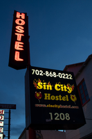
Notes: The logo cabinets which adorn the entrances on the elevated walkways: The letters start with both rows of text in the off position. The top row flashes on, while the bottom row is dark then the bottom row illuminates, as the top row goes dark. Once the top row flashes off it flashes back on so that both rows of text are briefly illuminated simultaneously before they both go dark and the sequence stars over again. While this is going on the incandescent bulbs which line all of the raceways are chasing each other from left to right on the horizontal planes, while the arched sections chase each other downward. The triangular peaks which radiate around the top of the logo sign, flash on and off in a sequence which chase each other downward. First the top center peak flashes on, then the next sequential triangular channel on both sides illuminate simultaneously, flash off, then the next two in the series illuminate. The resultant effect is a chasing pattern starting from the top. The sister animation is located on almost the exact same design on the porte cochere. I would think the previous smaller sign would be based on the larger porte cochere. The other variance besides obvious size difference is the that the channel letters are filled with incandescent bulbs instead of neon. The animation is a bit simpler as well. The incandescent bulbs oscillate continuously while the triangular pan channels which create the radiating crown, animate. The neon in the channels chase each other as described in the smaller walk way version, while the text continues until the entire text flashes off, then on, off, then begin to animate once again. All of the bulbs, which line the raceways of the exterior edge of the porte cochere, as well as the encrustation of bulbs on the brass bull nose portion, animate in rapid succession. All the raceway bulbs chase each other while the bulbs on the brass portion continually oscillate. Animation continues on the east face of the building with the entrances first. The principle for these two signs is oscillation and chasing. All bulbs on the underside of the entrance, as well as in the logo, oscillate rapidly. All bulbs on the raceways chase each other. Further on the surface of the building as well, the Pepsi cola wall sign is found displaying a very unique form of animation, seen here on the strip. The signage for the Pepsi ad is located on the eastern wall. (Detailed in specific description) The Incandescent bulbs which fill the inside of the text that spells Pepsi, chase each other from left to right, leaving all the bulbs in its path illuminated, as if writing out the word Pepsi. The neon bars located within the tilted bottle of Pepsi are illuminated, and chase each other downward, leaving the bars it its path dark. As this sequence in taking place, the waving tubes of neon illuminate, flashed subtly making the neon appear as soda pouring out of the bottle. As the tubing flows then the vertical neon bars in the cup illuminate one at a time making the cup appear as if it is filling up. The text above each of the painted fires head, flashes back and forth as if talking to each other as well. ESPN ZONE animation: The letters in the vertical blade portion of the ESPN Zone illuminate one at a time, starting from the top. Once the entire phrase is lit, in flashes off then on then off, before restating. The orange and red neon tubing which resides inside the pan channels that represent flames flash on and off in a relaxed manner as if to animate the flickering of the flames. The small incandescent bulbs on the black portions above the main matrix reader board flash on and off subtly.
Sign keywords: Neon; Backlit

