Search Results
Transcript of interview with Dr. Lonnie D. Spight by Dr. David Emerson, May 8, 2007
Date
Archival Collection
Description
Text
Mabel Hoggard: community interest materials (folder 1 of 3)
Date
Archival Collection
Description
Folder of materials from the Mabel Hoggard Papers (MS-00565) -- Personal papers file. This folder contains newspaper clippings, jewelry designs, a "Basic Principles of Parliamentary Law and Protocol" booklet by Marguerite Grumme (not digitized in its entirety), event programs (including Las Vegas school graduations and reunions), "Nevada Nuclear Waste Storage Investigations" booklet (November 1980), "Black Women: The Unsung Heroines, Black History Week 1979" booklet, and other miscellaneous booklets (not all are digitized in their entirety).
Mixed Content
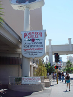
Photographs of Rosewood Grille signs, Las Vegas (Nev.), 2002
Date
Archival Collection
Description
Site address: 3335 S Las Vegas Blvd
Sign owner: Alan and Kevin LeWinter
Sign details: The Rosewood Grill is between the Venetian Hotel-Casino and the Tam O'Shanter Motel on the east side of Las Vegas Blvd The facade of the building is a plain, if not unassuming white stucco structure, with a driveway running along the north side of the building. Directly in front of the buildings western wall, along the strip, a tall pylon faces north /south
Sign condition: Structure 3 Surface 3 Lighting 3
Sign form: Pylon
Sign-specific description: The pylon sign, which faces north/south, is the only signage notifying the pedestrian traffic of the establishment within. It is a tall vertical advertisement, mostly comprised of a vertical, rectangular shaped, internally lit cabinet, with rounded edges. The face of the sign is a plastic, graphically treated photo image of a man in a tuxedo holding up a giant lobster.
Sign - type of display: Incandescent; Backlit
Sign - media: Steel; Plastic
Sign - non-neon treatments: Graphics
Sign animation: Chasing, flashing
Notes: The raceway, which runs the circumference of the faces of the sign, contains small strobes placed at random places, and flashing at random patterns.
Sign environment: The sign for the establishment is the only marker that anything is operational in the dimly lit building. Not that the building looks non operational, but the majority of the building is very unassuming, mostly being denoted by the large drive and entrance. It is located just south of the Tam O'Shanter motel, among the awkward transition of the strip, that is Spring Mountain Rd. The Vagabond Inn and the Treasure Island square off the end of the block before the desolate expanse of what used to be the Desert Inn, and the transforming Fashion Show Mall, sprawl out across the north side of the road. The Rosewood Grill is part of the side of the street that trails off in size, but not character as the giant Venetian slows its progress.
Sign - date of redesign/move: Was the Anoje Continental Restaurant, next to the Kit Carson Motel, but was changed to the Rosewood Grill.
Sign - thematic influences: Not much of a theme, outside of advertising for a big lobster dinner.
Surveyor: Joshua Cannaday
Survey - date completed: 2002
Sign keywords: Chasing; Flashing; Pylon; Incandescent; Backlit; Steel; Plastic; Graphics
Mixed Content
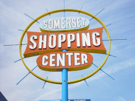
Photographs of Somerset Shopping Center sign, Las Vegas (Nev.), 2002
Date
Archival Collection
Description
Site address: 252 Convention Center Dr
Sign form: Pylon
Sign-specific description: The sign is designed out of a blue pole, telescoping upward, spearing three double backed cabinets stacked on top of each other in close proximity. Two small wings flagpole of the north and south edges of the pole, which houses graphics advertisement for the businesses in the shopping center. The top sign is an oval cabinet, painted a light blue color on the surface and yellow on the width. The text, "Somerset" is painted white all capital letters, and outlined in black. The text that occupies the cabinet takes up most of the available space and is overlaid with neon tubing. The middle cabinet is the largest of the three. It is a rectangular shape with concave sides. The sides look as if a low sweeping cut has been taken out of the body, starting from edge to edge. The result is a symmetrically morphed geometric shape. "Shopping" is spelled in all capital channel letters, painted white on the interiors, and lined on the interiors with neon tubing. The surface is painted a rusted orange with the width painted yellow. The width of the cabinet is lined with a single row of incandescent bulbs on opposite edges. The bottom and third cabinet is identical to the oval shape of the top cabinet. The difference is that the surface of the cabinet is painted the same rusted orange color as the middle cabinet, and yellow on the width. The three cabinets are encircled with a giant circular, yellow, raceway, reaching up in the sky arching up over the top and completely encompassing the cabinets facing east/west. Blue rods radiate outward, repeating around the edge of the raceway at various lengths. They penetrate the surface of the raceway, protruding on both sides. They start at the top one vertical rod pointing directly vertical into the sky from the center pole. They then alternate, short then long, attached to various strategic points on the three central cabinet, creating a symmetrical pattern. The rods are lined on two edges with neon tubing, which animate in a chasing pattern.
Sign - type of display: Neon; Incandescent; Backlit
Sign - media: Steel; Plastic
Sign - non-neon treatments: Graphics; Paint
Sign animation: Chasing, flashing, oscillating
Surveyor: Joshua Cannaday
Survey - date completed: 2002
Sign keywords: Chasing; Flashing; Oscillating; Pylon; Neon; Incandescent; Backlit; Steel; Plastic; Graphics; Paint
Mixed Content
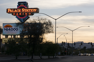
Photographs of Palace Station sign, Las Vegas (Nev.), April 5, 2017
Date
Archival Collection
Description
Site address: 2411 W Sahara Ave
Sign owner: Palace Station
Sign details: Founded by Frank Fertitta III, was originally Bingo Palace in 1976 but was changed to Palace Station
Sign condition: 4 - some broken lights on the sign but for the most part seems in great condition. Owners unsure if keeping the sign or replacing it with a new one during 2017 remodel of property
Sign form: back to back pylon
Sign-specific description: Double sided pylon road side sign, word "PALACE STATION HOTEL CASINO" In red encasement stuck to the front of a minimalistic image of a train, the word "BINGO" underneath the train front. Skeleton Neon is used to accentuate the features of the train and the lettering on the sign.
Sign - type of display: Neon and incandescent
Sign - media: Steel, Plastic
Sign animation: Chasers around "PALACE STATION HOTEL CASINO" and "BINGO" boxes and the neon in the boxes turn off then fill in from both sides until full again
Sign environment: Property is near the I-15, by local businesses and some residential
Sign - date of installation: c. 1983
Sign - thematic influences: Seeking to avoid the western theme popular among casinos at the time, Fertitta chose trains. Worried that the name Bingo Palace didn't highlight the full-range of gaming and amenities on offer at the expanded casino, Fertitta held an open contest to rename the casino later that year. More than 26,000 entries were received over three weeks. Las Vegas resident Claire Jarvis won as Palace Station touched on the new train theme while keeping part of the original name. - Las Vegas Review Journal
Sign - artistic significance: Owner Frank Ferttitta Jr held a contest for the casinos new theme and the "train station" theme was the favorite out of the entries.
Survey - research locations: UNLV Special Collections, Las Vegas Sun, YESCO, Review Journal
Surveyor: Danny Jacobs
Survey - date completed: 2017-09-10
Sign keywords: Pylon; Neon; Incandescent; Steel; Chasing; Back to back; Roadside; Video screen; Reader board
Mixed Content
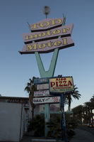
Photographs of Tod Motor Motel sign, Las Vegas (Nev.), February 28, 2017
Date
Archival Collection
Description
Site address: 1508 S Las Vegas Blvd
Sign owner: Ron and Carol Tadmor; Herb Sider
Sign details: Opened in 1962, the Tod Motor Motel was an exciting contribution to Las Vegas Boulevard. However, hard financial times and changing environments altered the motel scene after several years of being open. After a period of crime, new owners renovated the hotel from top to bottom: new facade, carpet, and furnishings. In 2005 ownership changed again and the new owners sought to expand the property. The neighboring properties, however, refused to sell and the owner of Tod tried to get approval to sell units as condos. The Tod Motor Motel has since closed and entrance is boarded up.
Sign condition: About 4-5, appears to have relatively low damage, if any
Sign form: Street pylon and porte cochere near front office
Sign-specific description: Green V-shape with "Tod motor Motel" in orange block letters overlaid, metal pole protruding atop "o" in "Tod" with red, outline sphere attached.
Sign - type of display: Neon
Sign - media: Steel
Sign - non-neon treatments: Blue, metal lettering placed on side and front of hotel, spells out "Tod Motor Motel," large painted flowers on side and front near blue lettering; pink, diamond-shaped railing along exterior
Sign environment: On the north end of the strip near the base of the Stratosphere, neighboring Dino's Lounge.
Sign - date of installation: 1962
Sign - date of redesign/move: Remodeled after new ownership, sometime in the mid-2000's.
Sign - thematic influences: Design and patterns similar to South Beach (Miami) hotels, tropical element. Also this sign has remnants of the 50's/60's motorist theme.
Survey - research locations: Assessor's page, Las Vegas Sun article https://lasvegassun.com/news/2007/mar/30/new-life-for-tod/ , Las Vegas Weekly video https://lasvegasweekly.com/photos/galleries/2008/may/22/tod-motor-motel/#/0
Surveyor: Carlyle Constantino
Survey - date completed: 2017-07-13
Sign keywords: Neon; Steel; Pole sign; Incandescent; Back to back; Backlit; Cantilever construction; Directional
Mixed Content
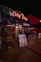
Photograph of Evel Pie sign, Las Vegas (Nev.), June 28, 2017
Date
Archival Collection
Description
Site address: 508 Fremont St
Sign owner: High Horse Group
Sign details: Original construction year of the building was 1949. Previous to this property being Evel pie it house the short lived F. Pigalle fondue restaurant, and the Radio City Pizza. This 1979 Evel Knievel themed pizza restaurant and bar opened in late 2016. Their motto is Live Hard, Ride Fast, Eat Pizza. In the restaurant there is an Evel Knievel Pinball machine and a Stunt Cycle Game.
Sign condition: 5 - new sign, just over a year old
Sign form: Sign above the entrance
Sign-specific description: Above the entrance there are red channeled cursive letters Evel Pie filled with neon tubes that illuminate red at night. To the left and right of the letters there are little white wings that are plastic but are illuminated with neon tubes I behind it.
Sign - type of display: Neon
Sign - media: Steel and Plastic
Sign - non-neon treatments: Plastic for "wings" of sign
Sign environment: Located in the East Fremont District
Sign manufacturer: Diamond Head Signs
Sign - date of installation: Late 2016
Sign - artistic significance: The logo is the same font as Evel Knievels old advertisements. This font this was a close representation of his signature but more of a bubble font cursive letters rather than the flat signature that would have been done with a pen/pencil. Also the wings on the sign represent the theme since he was known for jumping such long distances that they said he would fly.
Survey - research locations: Assessor's website
Survey - research notes: Eater Vegas https://vegas.eater.com/2016/12/16/13979544/evel-knievel- evel-pie- pizza-las- vegas, Las Vegas weekly https://lasvegasweekly.com/dining/dining-news/2016/sep/28/evel- pie-fremont- east-downtown-las- vegas/
Survey - other remarks: The High Horse ownership group that owns this property is comprised of Barden Powers, Jeff Fine, Seth Schorr and Kelly Knievel.
Surveyor: Emily Fellmer
Survey - date completed: 2017-08-22
Sign keywords: Plastic; Steel; Neon; Fascia; Building-front design
Mixed Content
Photographs of Cash for Cars sign, Las Vegas (Nev.), March 3, 2017
Date
Archival Collection
Description
Site address: 1716 Fremont St
Sign owner: California Auto Sales
Sign details: This location was built in 1971
Sign condition: 3- The sign has a lot of damage on the road side of the sign.
Sign form: Pylon that has characteristics of a blade
Sign-specific description: This roadside pylon has a long yellow thin round base that the sign hangs off of like a blade. It has 4 pieces of steel that connect it to the red portion of the sign. The main portion of the sign is all outlined in a red steel rectangle that contain incandescent light bulbs. Then from the top down there are 8 plastic rectangles that are back lit by reader boards that each say something different but all in the same font. The first one is a silhouette of a car followed by "Cars", " Direct", another silhouette of a car, "Great", "Deals", their phone number , then their address. Below the plastic back lit signs is a round steel sign with white painted letters stating, "Cash for Cars" in neon. This circle has a white border in incandescent light bulbs as well.
Sign - type of display: Neon, Plastic, incandescent and a plastic reader board
Sign - media: Steel and plastic
Sign - non-neon treatments: Backlit plastic portion of sign and reader board
Sign animation: Chaser for incandescent light bulbs
Sign environment: This location is on the east side of Fremont near Bruce St. and has many different motels near it, but is close to a residential area.
Sign manufacturer: YESCO
Sign - date of installation: Has been up since at least 2007
Sign - thematic influences: This sign has similar traits to the Genuine Auto Parts sign.
Survey - research locations: Assessor's page, google maps satellite and street view
Survey - research notes: On google maps road view you can see the sign in the 2007 view but it must be a lot older than that since even in that year it had quite a bit of damage but no other photos or records were found finding its exact year of installation.
Surveyor: Emily Fellmer
Survey - date completed: 2017-09-27
Sign keywords: Blade; Neon; Plastic; Incandescent; Chasing; Reader board; Pole sign
Mixed Content
Echo Mobile Park Neon Survey document, September 28, 2017
Date
Archival Collection
Description
Site address: 1322 S Mojave Rd
Sign owner: Garcia Maria Hilda and Whispering Sands LLC
Sign details: This location was constructed in 1961 as a manufactured home park that includes a pool and a laundromat.
Sign condition: 3- paint is heavily faded
Sign form: Porte Cochere
Sign-specific description: This sign is placed above a parking garage. The sign is a turquoise color in a linear geometric shape, almost like a long rectangle was attached to a trapezoid on its top left side. On this sign there are white block font letters spelling out ECHO PARK with a black painted trim. These letters contain skeletal neon.
Sign - type of display: Neon
Sign - media: Steel
Sign - non-neon treatments: Paint
Sign environment: This location is off of East Charleston on the side street Mojave,and is surrounded by other mobile parks as well.
Sign - date of installation: Record shows this has been up since at least 2011 though that record even shows aging on the sign.
Sign - thematic influences: This sign shows a good example of skeletal neon.
Sign - artistic significance: These linear geometric shapes showcased on the sign present mid-century modern design aspects.
Survey - research locations: Asessor's page, google maps satelite and road view
Survey - research notes: There is not much information on this location, and there is no designated website to contact anyone for information on the sign.
Survey - other remarks: The condition of the sign looks as though it could have been from around 1961 when the building was constructed especially with the mid- century modern design, but there is no confirmation or evidence to show when it was made.
Surveyor: Emily Fellmer
Survey - date completed: 2017-09-28
Sign keywords: Neon; Steel; Paint; Pole sign
Text

J. K. Russ oral history interview: transcript
Date
Archival Collection
Description
Oral history interview with J. K. Russ conducted by Claytee D. White on December 22, 2017 for the Remembering 1 October Oral History Project. In this interview, Russ discusses her early life in New Zealand and growing up on a tobacco farm. She remembers arriving to the United States and establishing a career as an artist. Russ talks about the 1 October shooting, creating an art exhibit using cards and letters received from people all over the world, and Las Vegas’ response to the tragedy. Lastly, Russ describes the art community in Las Vegas and the Arts District.
Text