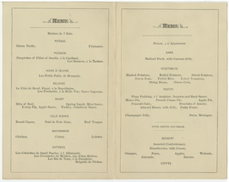
Search Results

Café Royal, menu, Friday, October 2, 1896
Date
1896-10-02
Archival Collection
Description
Restaurant: Café Royal Location: 68 Regent Street, W., London, England
Text
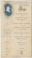
Inaugural banquet of the re-opening of the Kuhn's Restaurant, menu
Date
Unknown year in the decade of the 1890s (year uncertain)
Archival Collection
Description
Note: Includes wine list Restaurant: Kuhn's Restaurant Location: 21 Hanover Street, London, England
Text

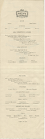
Opera supper, menu, May 19, 1900, at Savoy Hotel
Date
1900-05-19
Archival Collection
Description
Note: Handwritten menu. Crossed flags at top of menu: the Royal Standard of the United Kingdom on the left and the Flag of the United Kingdom on the right (most of the red stripes are worn off). A portrait of a man wearing a military slouch hat appears above the flags Restaurant: Savoy Hotel & Restaurant Location: London, England
Text
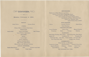
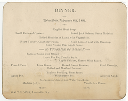
Galt House dinner menu, Wednesday, February 6, 1884
Date
1884-02-06
Archival Collection
Description
Restaurant: Galt House (Louisville, Ky.) Location: Louisville, Kentucky, United States
Text
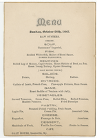
Galt House menu, Sunday, October 28, 1883
Date
1883-10-28
Archival Collection
Description
Restaurant: Galt House (Louisville, Ky.) Location: Louisville, Kentucky, United States
Text