Search Results

Transcript of interview with Elmore Curtis by Judy Curtis, March 1, 1975
Date
Archival Collection
Description
On March 1, 1975, collector Judy L. Curtis interviewed fire department captain, Elmore B. Curtis (born December 17th, 1896 in Minnesota) in his home in Las Vegas, Nevada. This interview covers life in Southern Nevada since 1942, including Mr. Curtis’s personal history and the early development of the Nevada Test Site. During the interview Mr. Curtis also discusses early tourism and socio-economic progress in Southern Nevada.
Text

Transcript of interview with Helen Early by Dale Forshee, February 26 & 27, 1979
Date
Archival Collection
Description
On February 26 and 27, 1979, Dale Forshee interviewed Helen Early (born 1919 in Des Moines, Iowa) about her life in Southern Nevada. Early first talks about her arrival to Las Vegas and the early development of the city. She also talks about some of the first businesses in Las Vegas, the initial development of the University of Nevada, Las Vegas, and the early nightclubs and casinos in the city. Early also discusses her work in establishing a school for disabled children before discussing other topics related to McCarran Airport, Bugsy Siegel, Senator Walter Baring, the first churches in Las Vegas, and the Helldorado Parade.
Text

Transcript of interview with Roger Thomas by Stefani Evans and Claytee D. White, August 31, 2016
Date
Archival Collection
Description
As he reveals in this oral history, Roger Thomas is, among many other things, a son, a father, a brother, a husband, a student, an artist, a visionary, and a philanthropist. As the second son of Peggy and E. Parry Thomas’s five children, Roger was raised a Mormon child of privilege and civic responsibility. The banking family summered in Newport Beach, wintered in Sun Valley, and taught their children by words and deeds that it is not up for debate if you will be involved in your community; the only question is how you will apply your talents and resources to benefit your community. Roger absorbed the lessons well. As a child who struggled in school but excelled in art, he attended his last two years of high school at Interlochen Arts Academy, graduating in 1969, finally finding himself “in an environment where what I did had currency.” From there he earned his BFA from the School of the Museum of Fine Arts Boston and Studio Degree from Tufts University before returning to Las Vegas and eventually joining Steve Wynn’s team in 1981. As Executive Vice President of Design for Wynn Design & Development, he is the man in whom Steve Wynn places his trust to make real at each Wynn property the Wynn design philosophy: aim for a constituency of highly sophisticated, well-traveled, very educated people and give them a reality, a now, that is so fetching, so alluring they wish to be no place else. As he was mentored by his father and Steve Wynn, he too is mentoring those who will follow him. At Wynn, the next generation will carry forward the Wynn idea of evoca-texture, of creating “moments of experiential emotion that result in a memory so captivating and so unique that if you want to repeat that you have to come back.” At home, he collaborates with his daughter on a children’s book that has the potential to become a series; she is the illustrator, while he provides the words. Roger Thomas sat for this interview five days after his father, E. Parry Thomas, passed away in Idaho. Instead of postponing the interview to a more convenient time, Roger kept the appointment and explained, “This is for UNLV. If I’d cancelled my father would have killed me.”
Text

Mabel Hoggard: lesson plans and textbooks
Date
Archival Collection
Description
Folder of materials from the Mabel Hoggard Papers (MS-00565) -- Educational work and legacy file. The folder contains a "Teachers' manual for human geography," teaching notes, notes on United States history, assignments, and an exam book with handwritten notes. Many of the documents are handwritten.
Mixed Content

Chris Davis, Debbie Davis, and Mynda Smith oral history interview: transcript
Date
Archival Collection
Description
Oral history with Chris Davis, Debbie Davis, and Mynda Smith conducted by Claytee D. White and Barbara Tabach on May 24, 2018 for the Remembering 1 October Oral History Project. In this interview, Debbie and Chris Davis and Mynda Smith discuss the murder of their daughter and sister (respectively), Neysa Davis Tonks, at the Route 91 Harvest Country Music Festival on October 1, 2017. They discuss plans to form Fifty-Eight Loved and Never Forgotten, a foundation to help educate the children of the 58 families affected that night. Neysa, a single mother, left behind three sons, 24, 18, and 15 years of age. The family members recall how they were first alerted to Neysa's death, and having to locate and identify her body at the coroner's office twenty-four hours later. Chris, David, and Mynda reflect on Neysa's life, her work, and legacy. Debbie, Chris, and Mynda believe that "darkness cannot exist in the presence of light. Neysa's light will shine forever."
Text

Amy Bush Herzer oral history interview: transcript
Date
Archival Collection
Description
Oral history interview with Amy Bush Herzer conducted by Barbara Tabach on November 14, 2019 for the Remembering 1 October Oral History Project. Herzer begins the interview discussing her early life, education, and her current job as the University of Nevada, Las Vegas (UNLV) women's golf coach. She speaks about her family's history with golf, her personal history, and life with her husband, Kendall Herzer. After, she recalls where she was on the day of the October 1 shooting, and how she found out about the event, and recalls her husband reported to the main fire station as an Emergency Manager for the State of Nevada. She recalls keeping track of her athletes' whereabouts and letting their families know. Herzer describes how people reacted when she had brought a therapy dog, Apollo, in for the people donating blood and how the community came together to support each other and share resources as a community.
Text

Casiano Corpus Jr. oral history interview: transcript
Date
Archival Collection
Description
Oral history interview with Casiano Corpus Jr. conducted by Cecilia Winchell and Stefani Evans on February 14, 2023 for the Reflections: the Las Vegas Asian American and Pacific Islander Oral History Project. In this interview, Corpus Jr. details a difficult childhood in the Philippines, where society is highly socioeconomically stratified. He recalls his parents working a number of jobs to support their large family, and as soon as he finished his primary schooling, he also started working in construction. When his father was finally petitioned by his uncle to move to the United States, Corpus was at first reluctant to go, since he had a familiar life in the Philippines, but has come to love the United States and the life he created for himself. Immediately after moving to the United States, their family landed in Las Vegas, Nevada, and Corpus began working a number of jobs. He started out as a busboy at a Chinese restaurant before deciding that he wanted to work in a casino and moved to Union Plaza. His current job is as a porter at Palace Station, where he has been for the past 31 years. He has also been working to unionize Palace Station and Station casinos with the Culinary Union for the past twelve years. He talks about the hunger strike he organized, why he organizes with no fear, and what he hopes to see out of his efforts throughout the interview.
Text
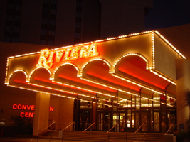
Photographs of Riviera signs, Las Vegas (Nev.), 2002
Date
Archival Collection
Description
Site name: Riviera Hotel and Casino (Las Vegas, Nev.)
Site address: 2901 S Las Vegas Blvd
Sign owner: Riveria Holdings Corporation
Sign details: The Riviera is another of the properties on the Strip which brought its borders to the street. It is one of the properties with an extensive collection of signs on its properties. The glass wall and block long facade, which incorporates infinity lighting and neon displays. A highly animated an reflective ceiling of the westernmost pedestrian element right along Las Vegas Boulevard also plays host to a continuously pulsing entablature of text and neon. The outer portion of the wall facing west is also adorned with raceways, backlit signs, neon stars, and a host of other signs as well. The northwest corner is a unique collection of fascia wall design and sculptural elements on the corner as well for the "Nickeltown" portion of the casino. Along the east end of the property, more Riviera logo/wall signs denote entrances, while the eastern most edge plays host to the massive Riviera Pylon. Various signs also reside on the eastern side of the property. Text signs are located in several positions among various structures. There is also a rather busily illuminated awning, which is lined with incandescent bulbs and text.
Sign condition: Structure 5 Surface 4 Lighting 5
Sign form: Pylon; Fascia; Porte-cochère
Sign-specific description: The main attraction to the Riviera is its mirrored round wall which serves as a multiuse billboard built around the neon advertisements for the Riviera's big show: Splash Front façade: The front façade of the Riviera is best described by starting with the giant glass well and heading north. The radius of the giant reflective extravaganza is in the general direction of the southwest so reflectivity is extremely good during the afternoon hours. The surface of the structurally integrated visions is surfaced with giant reflective mirrored panel which give way to the multicolored neon puzzle work of the Splash logo. The logo advertises for the show using iconography from the show itself represented with pan channel figures lined on the interiors with neon of corresponding colors for which they are painted. The text that spells "Splash" is painted red, with the circular raceway that sits in its background is painted yellow. The "Splash" text sits above the organic shapes of water shooting out from underneath the array of signage, painted blue and purple. The image of the female inside the logo text is graphically treated with the proper registration of illustrative quality. She is also lined with neon in the proper colors over the major outlines of her form. The entire array sits on a black background laden with incandescent bulbs. The neon is arranged so that as it progresses toward the ground the organic shapes radiate in a repeating pattern outward. The blue and purple neon radiate toward the ground while the red neon in the "Splash" radiates left toward the other side of the wall. Green channels spurt out of the top lined with green neon as well. On opposite sides of the radius wall, there are a series of signage that mirror each other. "Riviera" is written in channel letters filled with neon, and a series of internally lit, color cabinets, lined on the edges with incandescent bulbs. The middle portion of the wall is occupied with various sized stars, raceways, and incandescent bulbs found on extensions and diamond shaped faces. The stars are lined on the interior profile of the shape with blue and pink neon, as well as incandescent bulbs on the interior as well. The bottom of the radius wall is adorned with adorned with internally lit cabinets as well as various small neon creations. Moving north along the face of the building the façade the external elements are greatly supportive of the mirrored walls, and just as brilliant in their own right. The façade begins just to the south of the giant mirrored wall, with a section lined with vertical bars of neon animating in red, pink, purple, and blue neon. Riviera is written in cahnnel letters and filled with incandescent bulbs. The letters are outlined in red neon. On either side of the rectangular section, two small versions of the giant mirrored wall support green and blue wavy channels, lined on the interior edges with corresponding neon colors. Incandescent bulbs are present as well. The façade on the north side smoothly transitions into a wall of transparent plastic cubes, lit from the inside, with raceways running down the edges. This façade runs the entire length of the building, until the end is reached at the northwest corner and Nickeltown. Along the facade, internally lit cabinets surrounded by raceways occupy the vicinity of the lower portion of the sign. The faces are colored plastic and treated with graphics and text. Toward the end of the facade, a collection of small signs is fused together to create a single collection of busy signs. The entire structure is a chaotic vision of relief sculpture smashing into text and iconography, while bright, vibrant colors and neon, fight for attention. The majority of the sign is located on the body of the building, reaches down to touch the ground. Four fluted columns rise up from the ground to meet the bottom base of the massive wall sign. The columns rise up into a sculpted cabinet that is heavily crafted and adorned with ornate edges of hard-coated foam or fiberglass scrollwork. The swelling and swirling scrolls swell out in three dimensions. The entire border of the bottom section is turned into a detailed, organically shaped, cloud like shape. The scrollwork as well as the columns is finished white, with the recesses being toned a golden color. The effect accentuates the three dimensional nature of the design. The surface of this bottom portion is a diagonally crisscrossing pattern of white lattice- work on top of a golden surface. The center of the open surface is occupied by a giant pan channel, of the top three points at a purple, five-pointed star. Flanking either side of the star are small, steel, closed face cabinets, in the shape of squatty looking five pointed stars. They are varying sizes and are painted the three separate colors of purple, yellow, and green. The top point of the largest purple star rises through the top part of the bottom cloud section touching up into the massive collection of signs. This particular sign centers on a top logo reading "Riviera Slot Adventure" in channel letters in the style of action adventure movies such as "Indiana Jones." The first word is written in the logo style of the Riviera, and painted yellow on the interiors. The letters for the two words, "Slot Adventure" are bent with the force of motion and painted red, grading into an orange. Behind that, a circular cabinet, representing a globe, is painted blue in the center and fading to white. Flanking either side of the globe, associated more with the top portion of the globe, pairs of arching bronze colored cabinets slightly arch outward suggesting shining or an explosion. They are laden with incandescent bulbs. The remainder of the sign between the bottom star structure and the top slot adventure text, is occupied by a varied array of signage that can be designated between two halves of the collection. The left-hand side of the sign consists of three-dimensional sculptural elements, channel letters, relief elements. The far left side of the collection is rounded out by the three dimensional relief of crashing waves, creating a background for the three-dimensional structure of the mermaid. Red channel letters spell "Splash" above the mermaid, in white channel letters painted red on the inside. Neon lines the interior of the letters as well. Below the mermaid, more channel letters spell "Gardens" in red channel letters painted yellow on the interiors and lined on the interiors with neon. Above the crest of the wave a relief of a train shoots toward the north with a yellow and red circular cabinet above that with the text for jackpot junction. The train relief is also the designed with perspective to appear as if it is moving forward. Directly to the left of the train is set of yellow channel letters painted blue on the interior reading "Jackpot Factory," lined on the interior with neon. A purple backing cabinet is graphically painted on the face with images of gears. Just to the left of the text is the three dimensional sculpture representing a stack of coins. The space below the "Jackpot Factory" a purple cabinet with a colored face reads with graphics and text for "Valley of Games." Directly to the left of the "Valley of the Games" cabinet a three dimensional cherub is holding a large nickel, with a banner above that. The cherub is painted with the proper flesh tones, and the nickel is adorned with the proper details. The wings animate, utilizing two tubes of neon shaped as wings and in different positions to appear as flapping. A white arched steel banner, with blue text, reading "Nickel Heaven." Neon floats over the top of the letters. The right hand side of the entire collection is just as detailed and elaborate, if not ore than the left hand side. A white steel cabinet cut into the profile of the text, which is painted yellow with red outlines. The text reads 'Slot Frenzy' in two lanes. The red borders are lined with incandescent bulbs. The remaining negative space in the center of the sign is a painted slot handle with a circle of neon around the top of the handle. To the right of that, the surface of the board is created out of relief of faux rocks above what is a set of railroad tracks. A mine cart is on the tracks with giant diamond shaped gems residing in the interior space. A cabinet made of an arched banner and a square cabinet resides above the mine cart. The banner reads Double diamond in blue text, and "mines is spelled" in blue text on the rectangle. Further right the rocks give way to a portion of the cabinet, that reads "Jackpot City" in yellow channel letters, with yellow neon. Vertical raceways lined with incandescent bulbs shoot upward in the area of the text. All are supported on a multicolored flat cabinet, predominantly painted red. Nickel town: On the Northwest corner of the property three distinct images comprise the signage. The main marquee for Nickeltown over the entrance, a Riviera logo just to the right of that, and a large sculptural fountain, that dominates the corner with it's presence. Over the brass and glass doors for the entrance, a polished metal overhang radiuses above the door, and contains the words Nickel Town in channel letters. The two words are written horizontally in a line, and separated in the middle with a pan cjhannel star also lined with neon on it's interior. The star is centered with a channel number "5" which is filled with white neon. The star's neon colors are pink and blue, and are arranged as interior lining of the star. The underside of the awning, as the rest of the front facade, is adorned with the incandescent bulbs, placed neatly in the designated prismatic shapes. The neon rings also are present, running the pediment across the facade. Elements of the electric wall can be seen as well, with the metal diamonds supporting incandescent bulbs trailing upward from the awning up to the facade of the building behind it. Several different sizes of star rise up as well, they are identical in color and design shape. Since the interiors do not contain a channel letter, they contain a channel shaped star, lined with incandescent bulbs in the center. A different sort of star shape is present as well. This shape is an eight-sided shape, reminiscent of a snowflake. When I say snowflake, it is essentially a cross shaped piece crossed, with an "X" shape. The shape is designed out of a pan channel, filled with incandescent bulbs. White neon backs the channel. Directly to the right of the entrance, the mirrored facade reflects the entrance, as the reflective surface house vertical, neon bars as well. The three different colors are Blue, gold and green. Consuming the majority of the concrete expanse created by the small plaza, is the neon-laden fountain of light and steel, with a base of ceramic pool. The design is a circular pool, covered in 1"x1" ceramic tiles, and filled with water. Thee square poles are bent over, looking as if they are spraying up out of the fountain. They appear almost as if a bouquet. One is painted Blue, one gold, and the other red. These poles are striped with neon tubing of the corresponding colors. Internally lit cubes, of the same color scheme as the primary palette. Wrapping around the circumference of the top half of the plumage, is a silver pediment that radiuses around the fountain. The finish is polished metal, and matches the overhang presented in the Nickel Town signage. Raceways run along the top and bottom edges of the face, wile the internally lit advertisements occupying the open space of the pediment every so often. Riviera Convention Center: Directly to the east of Nickeltown, is the Riviera Convention center. Signage for the building is first evident when traveling west, looking at the east face of the building. Not far on the north side of the east face of the building, large channel letters hang denoting the building. The Riviera logo text is spelled in the signature text, outlined with red neon and filled with incandescent bulbs. Below that, a two lined text reads convention center in red channel letters, lined on the interior with red neon. On the south side of the building, two lines of text reads, "Royale Pavilion" and "Entrance" below that. These channel letters are red, and lined with red neon on the interiors. Tower: Along the north side of the main tower, "Riviera" is spelled with giant red channel letters, filled with incandescent bulbs, and lined with red neon. The rear entrance is shared for the hotel, and the convention center, and is denoted with signage, and an overhang. A large blockish overhang is cantilevered off of the side of the building and projects outward, toward the east. On the front edge, an arcade of arches is evident, which reveal five tube-like vaults that project the half radius all the way back to the building. All of the edges of the raceway, including the spaces on the underside, which separates the vaults, are lined with incandescent bulb lined raceways. The Riviera text spells "Riviera" across the front of the cantilevered structure. The channel letters are painted red, lined with red neon and filled with incandescent bulbs. Left of the cantilevered structure are letters, which spell convention center. They are channel letters with red plastic faces.
Sign - type of display: Neon; Incandescent; Backlit
Sign - media: Steel; Plastic; Glass; Fiberglass
Sign - non-neon treatments: Graphics; Paint
Sign animation: Chasing, flashing, oscillating
Notes: The incandescent bulbs inside the text reading "Paris" on the balloon oscillate rapidly.
Sign manufacturer: Federal Signal (fascia front glass)
Sign designer: Marge Williams/ Arch: Nikita Zukov (fascia design)
Sign - date of installation: 1988-1989
Sign - date of redesign/move: Pylon was moved to Convention Center Dr. and Paradise Rd. c. 1988
Surveyor: Joshua Cannaday
Survey - date completed: 2002
Sign keywords: Chasing; Flashing; Oscillating; Pylon; Fascia; Porte-cochère; Neon; Incandescent; Backlit; Steel; Plastic; Glass; Fiberglass; Paint; Graphics
Mixed Content