Search Results
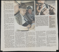
Wolff, Elise, 1935-
"Elise Lenora Wolff was born in New York City on July 16, 1935. She attended elementary schools P.S. 28 and P.S. 117, and William H. Taft High School in the Bronx, New York. In August of 1953, Elise enrolled at the University of Bridgeport, Connecticut, and graduated in the Spring of 1957 with a Bachelor of Science degree. Elise embarked upon her teaching career as a third grade teacher in Fairfield, Connecticut, at the Nathan Hale Elementary School in the Fall of 1957. The following year, she moved to Westchester, New York, where she enjoyed a variety of teaching experiences.
Person
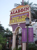
Photographs of Aladdin Casino Hotel and Resort signs, Las Vegas (Nev.), 2002
Date
Archival Collection
Description
Site name: Aladdin Hotel (Las Vegas, Nev.)
Site address: 3667 Las Vegas Blvd
Sign owner: Aladdin Gaming LLC
Sign details: Just north of Harmon across the street from the Harley Davidson café, the stretch of the Aladdin property begins. The facade of the building is a pedestrian designed attraction, for it replaces the sidewalk. One must pass along the elaborate array of landscaping, to be confronted by the massive replication of the ancient Persian city, fully realizing it's Arabian Nights theme. Various signage does adorn the Aladdin property, Including a small one sided message board, resembling a miniature pylon, two jumbo LCD screens adorned with text, and entrance signs cover a couple of entrances.
Sign condition: Structure 5 Surface 5 Lighting 5--All signage is in good repair.
Sign form: Pylon; Fascia
Sign-specific description: The first sign you come upon is a small single sided pylon , which houses a message cabinet, and a channel letter logo for the Aladdin. Two poles rise out of a flowerbed, supporting a purple-faced message cabinet reading about valet and parking service. Incandescent bulbs surround the box along the border. Above that section, Aladdin is spelled in red channel letters, filled with red neon. They are hung upon the remainder of space on the upper portion of the cabinet, which only rises an additional 10 inches or so above the internally lit cabinet. The top of the cabinet is adorned with a three-tiered sculpted steel section mimicking the classic shape of the Persian spire seen so often in the property. Each section is finished in a different color: gold, pink and purple. Two neon tubes run the circumference of the tops of the poles, just underneath the negative Persian spire shape, which supports the internally lit cabinet. Neon tubes also border the tops and bottoms of each section of the sign as well as following the contour of the sculpted edges. This sign faces southwest and is found on the south end of the property and is the first sign you see walking on the property headed north. The first casino entrance is seen north of the previous sign and is above an entrance. The negative space of a Persian arch, preceding the entrance is occupied by a sign which designating an entrance. It is essentially one giant pan channel, with a smaller positive shaped cabinet in the center. Aladdin is spelled in gold polished channel letters with blue plastic faces. Another sign, of this sort, is also further down the face of the building. Translucent red ruby shapes run horizontally across the bottom. As the building steps up in various places, a larger, higher elevation, approximately in the center of the complex, plays host to two LCD screens facing northwest and southwest on the surface of the wall. Above each screen, Aladdin is spelled with larger red translucent letters, backed with white neon. When the light is visible, it creates a halo of white light around the text.
Sign - type of display: Neon; Incandescent; Matrix
Sign - media: Steel; Plastic
Sign animation: Chasing
Notes: The only Animation which I see present are in the pan channels occupying the negative Persian arch shape over two of the entrances on the west face of the building. The red plastic jewel shapes chase from either side to meet in the middle.
Sign environment: The Aladdin property lies between Harmon avenue and the Paris Hotel, on the east side of the strip. Headed North from Harmon, on the east side of the street, the pedestrian is enveloped by the properties façade, for it replaces a standard sidewalk. Once inside the path along the façade, it curves to and fro, mostly toward the casino entrances. Tall shrubbery and bushes separate the pedestrian from Las Vegas Blvd, creating a world all to it's own.
Sign architect of record: Nadel Architects, Contractor: Adp/Fd, Fluor Daniel
Sign - date of installation: 2000
Sign - thematic influences: The theme surrounding the Aladdin is centered around the Arabian Nights theme of an ancient Persian city or palace. Restaurants and storefronts are cased in with faux stone facades topped with bulbous towers and Persian spires. The significance lies in the lineage of the Aladdin transformed through the years since its change of management in 1966. It stands today holding the same theme but designed to fit in with the themed mega resorts currently present on the strip. The exterior is completely engulfed in themed architecture but draws references not only to its past self but other desert fantasy themed resorts such as the Desert Inn and the Sahara.
Surveyor: Joshua Cannaday
Survey - date completed: 2002
Sign keywords: Chasing; Steel; Plastic; Neon; Incandescent; Matrix; Pylon; Fascia; LCD; Internally illuminated
Mixed Content

Proposal for the Xanadu Hotel and Casino (Las Vegas), October 30, 1975
Date
Description
Binder containing the proposal for the Xanadu resort, including conceptual sketches, pictures of mockups, and detailed proposal documents. Unbuilt project. Page 75 of proposal is missing. Stamped or labeled on back of photos: "Photography by Julius Shulman. P.O. Box 46206 Los Angeles, California 90046." Julius Shulman, photographer.
Image
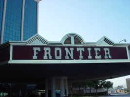
Photographs of Frontier signs, Las Vegas (Nev.), 2002
Date
Archival Collection
Description
Site name: Frontier Hotel and Casino
Site address: 3120 S Las Vegas Blvd
Sign owner: Phil Ruffin
Sign details: The New Frontier Hotel and Casino sits south of the Stardust, on the east side of Las Vegas Blvd The Frontier main pylon still remains at the south end of the property, a short distance from the southeast, near the porte-cochere. A rear port e cochere also resides on the east side of the building . Like so many other properties the Frontier is composed of a low-rise building accompanied by, another higher rise structure, and a tower of rooms. A parking lot sits on the north end of the property, denoted by a small, double-sided pole sign. Two porte-cocheres adorn on the southeast and west sides of the property, as well as the famous pylon outside the eastern porte- cochere.
Sign condition: Structure 4 Surface 4 Lighting 4
Sign form: Pylon; Porte-cochère; Fascia
Sign-specific description: A parking lot sits on the north end of the property, denoted by a small, double-sided pole sign. It is a simple rectangular cabinet, with a small steel circular cabinet on the top east edge of the sign, and a triangle on the west edge of the height, pointing west. The two are connected by a long horizontal section, which runs along the top of the cabinet. The circle, arrow, and connecting pieces are lined with incandescent bulbs. The surface if the Frontier is reserved, not holding too many exterior references to a western theme, besides the actual script of the logo, and wood paneling of the overhangs, little else is there to support the theme. Just south of the parking lot and on the west side of the strip, the Frontier is separated from the sidewalk with a large section of green lawn, and a guard of tall palm trees against the east face of the building. Tall windows occupy most of the wall separated by columns of brick. The structure continues south and juts east to create an entrance, with a text logo above the door with brass edges and a wood panel facade. The three sided entrance is two tiered flat font design, with the lower half being taller, fit with a backlit message board. The top half is shorter in height, and plays home to the polished channel letters spelling "Frontier," and filled with incandescent bulbs. The surface of the top half of the facade is a rusted brown color, referencing panels of exposed wooden construction. The bottom edge of the entire face of the sign is a protruding brass geometric edge, as well as being the device that separates the two parts of the sign. The top edge of the top section is brass treatment also, but is crafted into different forms along its path. Directly in the center of the front face, there is an arch curving over a set of vents. The two sides are treated with an pointed triangular shape. The porte-cochere is located just south, if you follow the property, pointed toward the southeast extending off of the building. The northeast and southwest sides of the porte- cochere are lined on the top and the bottom with the same protruding, square molding, rising into a long, low rising arch, peaking in the center of the sign. The center portions of the sides are the same rusted brown tone seen on the entrance mentioned earlier. Suggestions of the paneling are evident at the edges. The "Old west" font, polished channel letters spell out "Frontier" on the rust facade. Each is filled with incandescent bulbs, and outlined in neon. Most impressive about the covered area is the space occupied by the ceiling. The underside of the port-cochere is separated by four large, deep, recessed rectangles with mirrored walls. The walls slope into another smaller recessed rectangle rising straight up only a sort distance before stopping. Standing directly underneath the section, it is seen as a smaller rectangle located within a larger one. Both rectangles are lined on all edges by polished gold raceways, and incandescent bulbs. The open space is occupied by multi armed, ornate brass chandelier. Each arm is adorned with faux gas lanterns. The arms are curved in a quite extreme fashion, making the piece appear more as an organic shape, or a creature such as an octopus. The centers are adorned with decorative silver spheres. Over the doors to the casino a large backlit message center panel, curves with the radius of the face of the building. The brown and polished metal edges of the sign combined with the incorporation of the architecture of the building, gives it a reserved, streamlined look. South of here the building grows in height and becomes a series of tall windows that create the wall. Following the property around to the building's west side, another porte-cochere can be seen. An eight-sided post serves as a valet station. The facade of the roof is treated as the entrance on the east side of the building. Protruding square brass edges form borders for polished channel letters filled with incandescent bulbs. Text is contained within the southwest, southeast, and western panels. Frontier is spelled in the properties font on both the southeast, and western sides. The southwest side reads "Parking" in the company's font, but is flanked by "self" and "valet," in smaller plain white channel letters filled with neon. The western and southeastern sides are crafted with the top edge of the pediments being an arch flanked by two triangle shaped rooflines. Elements also seen elsewhere over the other entrances. Looking up, facing this porte-cochere, the tower of rooms looms high overhead. Signage is located on all four sides of the tower. The northeast and southwest sides of the tower hold giant channel letters that spell "Frontier" with the interior being a reflective orange material. The facade is a giant replication of the two sides of the southeast and western sides of the multisided porte-cochere below. A giant polished metal framework, with a rounded arch flanked by two A frame roof lines, as well as the rust colored background hold the letters. The text is filled with incandescent bulbs. Along the northwest and southeast sides of the tower "Frontier" is spelled vertically down the face of the building in the distinctive channel letters. They too are filled with incandescent bulbs and finished orange on the inside. The famed main pylon sign for the frontier still stands in good repair, as reminder of Las Vegas past. It is located in the south side of the Frontier property facing north south. The two-sided sign is essentially pair of close set steel legs joined by an arch at the top to create one continuous shape. The steel is treated in a pastel pink coloring lined on both edges with a double row of incandescent bulbs. The inner portion of the arch contains three elements. The small cabinet at the top holds the image of the Frontier "F" logo. The edge of this cabinet is painted yellow, with a white internally lit face below that a long cabinet runs the length of the remaining space to the ground. The interior of the cabinet has been cut away to form a pattern of repeated circular holes down the length of the cabinet. This portion has been painted a teal color, with the edges lined with incandescent bulbs. In the space inside of the circles a continuous string of star shapes, reminiscent of the Stardust star emblems, are crafted in yellow painted steel and laden with small incandescent bulbs. The shape is interrupted twice with the main marquee logo for the establishment as well as well as a large internally lit message center. Both portions are not solid, double faced cabinets, but four single faced cabinets. The design is also seen in the Westward HO pylon. The bottom section message center can divided into essentially six parts: four individually denoted sections for vinyl lettering, and two steel panels with an animated neon silhouette of a cowboy riding a mechanical bull. The bottom half of the cabinet is one portion of the collection of section, with a thin, one letter width portion running the length of the cabinet, separating the sign into two halves. The top half is another section flanked by the two steel panels containing the bull rider. The middle portion contains crafted red vinyl logo the "Gilley's" establishment. A thin, one letter space cabinet, emerges out of the top of the sign, running a bit shorter than the length of the cabinet. The panel with the rider is actually three separate images, crafted with gold neon stacked on top of another in different positions to allow the three-stage animation process of the rider to be realized. Fashioned out of red neon text is written in the same text as the Frontier wall logo's above and below the rider. The word "Ride" sits above and the phrase "The Bull" is below the rider. He entire width edge of both the North and South sides are encrusted with yellow incandescent bulbs. While the bottom half of the pylon is dominated by the message center, a bit further up on the structure is the main marquee logo. The green steel cabinet is a rectangular with added elements of shape and design. The ends of the plane are slightly curved back into space, with the actual surface of the shape rising into a small pointed crest in the center. Across the surface of the cabinet the word "Frontier" is spelled in the "Western Font" in channel letters. The letters are outlined in neon and filled with incandescent bulbs. The surface of the cabinet is striped horizontally with tubes of red neon.
Sign - type of display: Neon; Incandescent; Backlit
Sign - media: Steel; Plastic
Sign - non-neon treatments: Graphics; Paint
Sign animation: Chasing, flashing, oscillating
Notes: The incandescent bulbs inside the text reading "Paris" on the balloon oscillate rapidly.
Sign environment: Sitting north of the Fashion Show Mall and, south of the Stardust, the Frontier seems to create its own environment upon an expansive property. The expansive sidewalks, healthy landscaping, and clean, reserved faced, make the Frontier more akin to the larger corporate establishments such as the Mirage, or Monte Carlo. It is quite the dominant presence on the west side of the street, for the east side is the vacant lot where the Desert Inn used to reside. The Frontier stands clean and strong amongst the chaos of the Fashion Show construction, and the empty lot across the street.
Sign manufacturer: Ad-art (Pylon), Sign Systems, Inc (facade and porte-cochere)
Sign designer: Bill Clarke (Pylon) Brian K. Leming (facade and porte-cochere)
Sign - date of installation: pylon: 1967 porte-cochere and facade 1981
Sign - date of redesign/move: The face of the Frontier was remodeled in an effort to keep up with the larger corporate casinos in 1998, but retained the main pylon, tower signage, porte-cochere signage and various entrance signs.
Sign - thematic influences: The obvious theme of the hotel is a Western, cowboy/pioneer themed establishment. The facade of the structure was at one time engulfed in the theme, but has slowly over time changed to compete and fit in with the ever-changing Las Vegas strip. Vestiges of the Western theme are present in the remaining elements of the porte-cochere, side entrances, the tower fascia and roofline, as well as all the text, including the main pylon. Other establishments that carry the much popular theme throughout Las Vegas history, include the Westward Ho, The Golden Nugget, The Bonanza, Hotel Apache, the Boulder Club, and the Pioneer Club.
Sign - artistic significance: In 1967, the Frontier sign was considered the tallest sign on the Strip. The 24 x 84 foot signature panel proved to be one of the largest at the time as well. Charles Barnard's scale model displayed at the Montreal Expo and his design of the seventeen-foot tall logo cabinet, were instrumental in Ad-Art landing the contract for the establishment. (Barnard) The cabinet and center scalloping used to incorporate animatronics, turning in concert.
Surveyor: Joshua Cannaday
Survey - date completed: 2002
Sign keywords: Chasing; Flashing; Oscillating; Pylon; Porte-cochère; Fascia; Neon; Incandescent; Backlit; Steel; Plastic; Graphics; Paint
Mixed Content
Land transaction
Date
Archival Collection
Description
Text