Search Results
Daly v. Daly Collection
Identifier
Abstract
The Daly v Daly Collection documents materials produced for and as a result of the lawsuits between Suzanne Daly (formerly Tim Daly), a male-to-female transgender woman, and Nancy Toews Daly from 1980 to 2003. The collection primarily focuses on the motions filed with the Nevada District Courts and Nevada Supreme Court and transcripts of the divorce, the battle for parental rights, and an allegation of civil rights violations.
Archival Collection
George Knox Roth Collection
Identifier
Abstract
The George Knox Roth Collection (1959-1980) consists of newspaper clippings (including photocopies), magazine articles, newsletters, technical reports and publications, correspondence, notes, and photographs relating to the Atomic Energy Commission, the environmental impact of nuclear testing in Nevada, Nevada mining, Airwest and the Hughes Airport, and other aspects of Howard Hughes’ Nevada operations. The George Knox Roth Collection also includes correspondence and expense reports related to his own company, General Research Consultants.
Archival Collection
High Hat Regency Neon Survey document, September 6, 2017
Date
Archival Collection
Description
Site address: 1300 S Las Vegas Blvd
Sign owner: Tarighi Bahman and Farideh
Sign details: The building was constructed in 1958 (Assessor). A vintage postcard from the 1950's-- or more likely the 1960's (based upon the automobiles pictured)-- shows that the business was previously named the Chevron Motel (Las Vegas motels then and now).
Sign condition: Condition is 3-4, fair to good. The pole, cabinets and reader board are in good condition. Moderate rust is evident around the edges of the top cabinet. The paint is generally in good condition, although there white patches (from repairs?) on the chevron. The neon tubing is entirely intact. Most of the incandescent light bulbs are present, except for the underside of the lower cabinet, where they are completely absent.
Sign form: Pole Sign
Sign-specific description: A single round white metal pole supports the sign, which is cantilevered toward the street. The cabinets form a rectangular "C" which is open on the motel side. The interior of the "C" surrounds a chevron which points toward the motel. On top of the motel side of the upper cabinet is a metal top hat and cane. The sign is attached to the pole at the side of the lower cabinet, the point of the chevron and the bottom of the upper cabinet. The background color of the sign is sky blue. The bottom of the face of the lower cabinet has the word "VACANCY" painted in white sans serif letters. The letters are traced in white skeleton neon. To the left, the word "NO" is spelled out in clear skeleton neon sans serif letters. Above the neon letters is a white metal reader board which has a row of clear incandescent light bulbs running along the top, bottom and motel side edges. A single row of clear incandescent light bulbs runs the entire length of the street side of the sign. On the street side of the chevron is a blue metal cabinet with the word "MOTEL" spelled in white channel letters. The channels are outlined by white neon tubes, while the interior of the channels are filled with clear or white incandescent light bulbs. On the motel side of the "MOTEL" cabinet is a blue chevron which is covered with clear or white incandescent light bulbs. The top cabinet features the words "High Hat" spelled out in white cursive letters. Below is the word "REGENCY" painted in white sans serif letters. All wording is traced by white skeleton neon. On top of the motel side of the upper cabinet is a white top hat with a blue hat band. Running through the hat is a white cane. The hat and cane are traced by white skeleton neon. The hat is covered with white or clear incandescent light bulbs.
Sign - type of display: Neon, incandescent, reader board
Sign - media: Steel, plastic
Sign - non-neon treatments: reader board
Sign animation: Light bulbs flicker
Sign environment: Las Vegas Boulevard South, north of the Las Vegas Strip near other motels and wedding chapels.
Sign - date of installation: c.1950s
Sign - thematic influences: Elegance, sophistication, high society, boomerang/chevron, 1950's, 1960's, mid-century
Survey - research locations: Assessor's website
Survey - research notes: Connolly, D. (2012 July 21). Chevron Motel. Retrieved from https://www.flickr.com/photos/dennisconnolly5059yahoocom/7635650456 Hagopian, M. (2011 January 28). No vacancy in vintage Vegas. Retrieved https://hyperallergic.com/15738/no-vacancy- vintage-vegas/ Las Vegas motels then and now. (n.d.). Chevron Motel. Retrieved from http://stefanidrivesvegas.com/8.html RoadsideArchitecture. (n.d.). High Hat Regency Motel. Retrieved from http://www.roadarch.com/signs/nvvegas.html Seltzer, D. J. (2014 June 1). High Hat Regency Motel sign in Las Vegas [Video recording]. Retrieved from https://www.youtube.com/watch?v=-bQdw48LVrA
Survey - other remarks: A vintage postcard circa 1950's-1960's shows the Chevron Motel sign as a simple pole mounted with a reader board and two light boxes which form a "C" shape open toward the motel (Las Vegas motels then and now, n.d.). A later postcard features the same sign with a chevron in the center and a semi-circular arch which encloses a light ball above the upper cabinet (Connolly, 2012). The current sign retains the chevron, the metal frames of the light boxes and reader board (Las Vegas motels then and now, n.d.). A hat and cane have replaced the arch and light ball at the top of the sign (Las Vegas motels then and now, n.d.). The light boxes have been replaced with metal cabinets with incandescent and neon displays (Las Vegas motels then and now, n.d.). The sign is pictured in a vintage postcard circa 1950's-1960's (Las Vegas motels then and now, n.d.). At that time it advertised the Chevron Motel.
Surveyor: Mitchell Cohen
Survey - date completed: 2017-09-06
Sign keywords: Neon; Incandescent; Steel; Plastic; Reader board; Pole sign; Flickering
Text
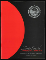
University of Nevada, Las Vegas (UNLV) 44th commencement program
Date
Archival Collection
Description
Commencement program from University of Nevada, Las Vegas Commencement Programs and Graduation Lists (UA-00115).
Text

Transcript of interview with Helen Naugle by Irene Rostine, October 31, 1996
Date
Archival Collection
Description
Prior to 1962, Helen Naugle had only visited Las Vegas once in her life while traveling from Idaho to California for a vacation with her husband and her boss. The group made a quick stop so her boss could interview for a position with EG&G and, as fate would have it, EG&G did not hire Helen’s boss. However, they did extend a job offer to Helen’s husband. A month later, Helen, her two daughters, and her husband became residents of Las Vegas, Nevada. Before moving to Nevada, Helen enjoyed singing in super clubs and performing on her radio show, “Melodies from Meadowland” and working for American Machine and Foundry. Upon her arrival in Las Vegas, Helen went to work for Bonanza Airlines before attending real estate school. In 1963, Helen opened her first office, Bruce Realty, and in 1965, she obtained her Broker’s license. She spent the next ten years selling general real estate. During this period, Helen was an active member of the Board of Realtors, as well as an early participant in the Board’s newly formed Women’s Council. Fate would strike again in Helen’s life while she was visiting her daughter at college in Arizona where she read an article in the Phoenix newspaper about a group of brokers who had formed a networking association to sell hotels and motels across the country. As a result of her initial contact with this association, Helen spent the next four decades selling hotels and motels throughout the State of Nevada, including Las Vegas, Elko, Tonopah, and Wells. She eventually became the first woman President of the American National Hotel-Motel Association. The cultural diversity of hotel and motel buyers would provide Helen with opportunities to travel the world and work with buyers from many different countries and cultural backgrounds. It also led to Helen’s membership in the FIABCI (International Real Estate Federation) and her Certified International Property Specialist and Federation of International Property Consultants certifications. Helen was also selected by the Association to represent the Air Force as “Innkeeper Evaluator” for one year. This honor took her to five Air Force bases in the United States and to Clark Air Force Base in the Philippines. During Helen’s career in hotel and motel real estate sales, she witnessed the transition from “mom-and-pop” American buyers to the influx of international buyers predominately from East India and Asia. The opportunities for helping repeat buyers and sellers gradually went away, as foreign buyers entered the market and tended to resell their properties to friends and family members from their own countries. During the latter part of her career, Helen found time to give back to the Las Vegas community through her volunteer work helping to establish the Scleroderma Foundation of Nevada. She also served on the Board of Directors of the Downtown Las Vegas Partnership where she focused on public safety in the area encompassing the Fremont Street Experience. Her work with both of these organizations allowed her to draw on her career experience for the benefit of others. Whether it was fate, or as Helen put it, she “just lucked into a lot of things,” one thing is certain - Helen Naugle was certainly a trail blazer for women in the hotel-motel niche of the real estate business, not only in Nevada, but across the nation.
Text

Amber Diskin oral history interview: transcript
Date
Archival Collection
Description
Oral history interview with Amber Diskin conducted by Barbara Tabach on January 5, 2018 for the Remembering 1 October Oral History Project. In this interview, Amber Diskin discusses her experience at the Route 91 Harvest music festival during the October 1, 2017 mass shooting in Las Vegas, Nevada. Diskin talks about finding her way home after escaping the crowds and letting her family and friends know she was not hurt. She speaks of the aftermath of the shooting, including how her children were affected, the post-traumatic stress disorder she developed, and how the shooting has affected her love of concerts. As a native Nevadan, she shares her views of Las Vegas and how her sense of community deepened after this event. Diskin ends the interview by discussing her appreciation for the first responders and the gift baskets she helped distribute to hospitals, police stations, and the fire department.
Text
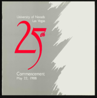
University of Nevada, Las Vegas (UNLV) 25th commencement program
Date
Archival Collection
Description
Commencement program from University of Nevada, Las Vegas Commencement Programs and Graduation Lists (UA-00115).
Text
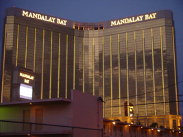
Photographs of Mandalay Bay signs, Las Vegas (Nev.), 2002
Date
Archival Collection
Description
Site name: Mandalay Bay (Las Vegas, Nev.)
Site address: 3950 S Las Vegas Blvd
Sign owner: Mandalay Resort Group
Sign details: Mandalay Bay resides on the west side of the Strip, south of the Luxor. The expanse of property is surrounded with ornate foliage, jutting faux rocks, and assorted statuary accented with the flavor of an ancient island. The three-winged tower looms over the low-rise casino structure. The surface of the tower is covered with an impressive expanse of gold mirrored windows, and vertically striped with gold tubes of neon. The towers also home to the giant channel letters, which serve as the logo building text for the establishment. The ground level the property is home to two giant pylon signs at either end of the property as well. One resides on the east side of the property, while the other on the west.
Sign condition: Structure 5 Surface 5 Lighting 5
Sign form: Pylon; Fascia
Sign-specific description: The Mandalay Bay has little signage, but is cohesively joined together into a simple yet effective use of lighting, which fits in well with it's environment. The building itself is actually the biggest piece of signage, being vertically striped with tubing of gold neon. There is actually over three miles of neon tubing which runs up and down the surface of the tower, reflecting off of the gold, mirrored, surface of the tower. The tower itself during the day is unassuming, for the off white stucco, and mirrored surface, blend to create a harmonious surface. When dark, the building transforms into a mysterious figure clad in golden stripes. On each wing of the Y shaped tower, " Mandalay Bay" is spelled in channel letters across the top edge of the surface. These giant black pans hold incandescent bulbs, which oscillate rapidly. The two pylon signs sit flanking the building on extreme edges of the property. The two pylons are rather plain in design, but are efficient and large. They are highly integrated architecturally, being essentially two giant vertical rectangles. Two massive square legs support an upshot of space defined by two internally it color screens advertising for the "Shark Reef" and for the "House of Blues" These two are squares which sit side by sides, comprising the bottom section of the face. Above that, a large LED screen stretches up to the end of this section. The three signs are closed in on either side by a set square legs capped on the top and bottom with molding. Making up the top section of the pylon another horizontal plane rises up a bit before being topped with a series of crown moldings. Two lines of channel letters spell " Mandalay Bay" and are filled with incandescent bulbs.
Sign - type of display: Neon; Incandescent; Backlit
Sign - media: Steel; Plastic; Masonry
Sign - non-neon treatments: Graphics; Paint
Sign animation: Oscillating
Notes: The incandescent bulbs inside the channel letters which spell the text for the establishment oscillate in a pattern which makes them appear as if shimmering. This style is the most common animation next to the incandescent bulbs on the raceway.
Sign environment: The Mandalay Bay resides in exclusive company on the south end of the Strip. It stands as one of the four major establishments before Tropicana Ave. The other three include the Luxor, the Excalibur, and the Tropicana
Sign manufacturer: LED and plastic sign inside pylon were manufactured by Ad-Art
Sign - date of installation: 1999
Sign - thematic influences: The theme of the Mandalay Bay is one revolving around an island paradise, transformed into a sleek ultra modern super resort, creating a sort of independent city of steel glass, neon, lush foliage, and assorted statuary. It could best be said that it is a combination of the influences of the Tropicana, the Mirage, and Treasure Island, all mixed together as one. The pylons themselves find themselves more a kin to those displayed by the large corporate properties like the Bellagio, and the Mirage. The simple vertically oriented rectangle, plays host to LED screens and backlit color advertisements, and channel letters filled with incandescent bulbs. These elements can be seen in other large properties such as the Mirage.
Surveyor: Joshua Cannaday
Survey - date completed: 2002
Sign keywords: Oscillating; Pylon; Fascia; Neon; Incandescent; Backlit; Steel; Plastic; Masonry; Paint; Graphics
Mixed Content
neo000139-004
Description
Notes: The logo cabinets which adorn the entrances on the elevated walkways: The letters start with both rows of text in the off position. The top row flashes on, while the bottom row is dark then the bottom row illuminates, as the top row goes dark. Once the top row flashes off it flashes back on so that both rows of text are briefly illuminated simultaneously before they both go dark and the sequence stars over again. While this is going on the incandescent bulbs which line all of the raceways are chasing each other from left to right on the horizontal planes, while the arched sections chase each other downward. The triangular peaks which radiate around the top of the logo sign, flash on and off in a sequence which chase each other downward. First the top center peak flashes on, then the next sequential triangular channel on both sides illuminate simultaneously, flash off, then the next two in the series illuminate. The resultant effect is a chasing pattern starting from the top. The sister animation is located on almost the exact same design on the porte cochere. I would think the previous smaller sign would be based on the larger porte cochere. The other variance besides obvious size difference is the that the channel letters are filled with incandescent bulbs instead of neon. The animation is a bit simpler as well. The incandescent bulbs oscillate continuously while the triangular pan channels which create the radiating crown, animate. The neon in the channels chase each other as described in the smaller walk way version, while the text continues until the entire text flashes off, then on, off, then begin to animate once again. All of the bulbs, which line the raceways of the exterior edge of the porte cochere, as well as the encrustation of bulbs on the brass bull nose portion, animate in rapid succession. All the raceway bulbs chase each other while the bulbs on the brass portion continually oscillate. Animation continues on the east face of the building with the entrances first. The principle for these two signs is oscillation and chasing. All bulbs on the underside of the entrance, as well as in the logo, oscillate rapidly. All bulbs on the raceways chase each other. Further on the surface of the building as well, the Pepsi cola wall sign is found displaying a very unique form of animation, seen here on the strip. The signage for the Pepsi ad is located on the eastern wall. (Detailed in specific description) The Incandescent bulbs which fill the inside of the text that spells Pepsi, chase each other from left to right, leaving all the bulbs in its path illuminated, as if writing out the word Pepsi. The neon bars located within the tilted bottle of Pepsi are illuminated, and chase each other downward, leaving the bars it its path dark. As this sequence in taking place, the waving tubes of neon illuminate, flashed subtly making the neon appear as soda pouring out of the bottle. As the tubing flows then the vertical neon bars in the cup illuminate one at a time making the cup appear as if it is filling up. The text above each of the painted fires head, flashes back and forth as if talking to each other as well. ESPN ZONE animation: The letters in the vertical blade portion of the ESPN Zone illuminate one at a time, starting from the top. Once the entire phrase is lit, in flashes off then on then off, before restating. The orange and red neon tubing which resides inside the pan channels that represent flames flash on and off in a relaxed manner as if to animate the flickering of the flames. The small incandescent bulbs on the black portions above the main matrix reader board flash on and off subtly.
Sign keywords: Neon; Backlit