Search the Special Collections and Archives Portal
Search Results
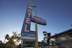
Photographs of Fergusons Motel sign at sundown, Las Vegas (Nev.), June 28, 2017
Date
Archival Collection
Description
Site address: 1028 Fremont St
Sign owner: 1028 Fremont LLC (Assessor) /Downtown Las Vegas Project (Bruzda, 2016; Millward, 2017; Schoenmann, 2013; Snel 2014)
Sign details: The building was constructed in 1946 (Assessor). The business opened originally as the Franklin Motel (RoadsideArchitecure.com). The motel may have been renamed Ferguson's in 1962 (Las Vegas motels-Then and Now). The current sign probably dates from the late 1950's or 1960's and is not from the Franklin (RoadsideArchitecture.com). Downtown Project partners purchased Fergusons Motel in December 2012 and the property was closed as of 2013 (Schoennmann, 2013). The Downtown Project planned to convert the motel's 69 rooms into retail shops, offices, taverns and a restaurant (Schoenmann). As of May 2017, no construction had been completed and The Downtown Project had altered its plans to instead use the site for residences, restaurants and art space (Millward, 2017).
Sign condition: Condition is 5. The sign has been reconditioned to look like new.
Sign form: Pole
Sign-specific description: The sign is mounted on a rectangular metal pole which is painted yellow. Attached to the street side of the pole are several metal cabinets joined to form an "L" shape which points toward the motel. The bottom cabinet contains the word "KITCHENS", which runs horizontally in white painted sans serif letters and white sans serif skeleton neon letters. Below "KITCHENS" is a white plastic light box. Below the lightbox are two rows of intertwining clear light bulbs. The bottom of the metal cabinet is shaped like two undulating waves. Over the top of "KITCHENS" is a small cabinet which spells out "VACANCY" in white san serif letters which are covered by clear skeleton neon sans serif letters spelling out, "Sorry NO VACANCY". The word "MOTEL" runs vertically down the sign in white painted and white neon letters, all san serif. Neon tubes outline the letters while another tube runs down the center. Running down the street side of the sign are three intertwining rows of clear light bulbs. The top of the cabinet is painted green in the shape of a chevron or boomerang. The bottom sides of the boomerang intersect at a perpendicular angle and the top is curved. The tip of the boomerang juts out from the sign toward the hotel. The interior of the boomerang is traced by three rows of skeleton neon. On top of the boomerang is a yellow circle outlined in light blue. The blue outline contains 16 clear light bulbs. The yellow interior of the circle has 16 spiral rows of clear light bulbs running from the exterior to the interior of the circle. The yellow pole which supports the sign runs through a lozenge shaped blue metal cabinet. The cabinet states, "FERGUSONS" in Googie style white letters and skeleton neon and "DOWNTOWN" is sans serif white letters and skeleton neon. Above the cabinet, attached to a pole, is a white statue of a climbing figure which is similar to other figures on Fremont Street and was likely added to the sign by the Downtown Project.
Sign - type of display: Neon and incandescent
Sign - media: Steel and plastic. Possibly fiberglass for the climbing figure.
Sign - non-neon treatments: Incandescent light bulbs, light box
Sign environment: In the East Fremont district this motel is surrounded by other motels many of which are also currently closed.
Sign - date of installation: Circa late 1950's/ 1960's
Sign - date of redesign/move: The sign is probably from the late 1950's or 1960's (RoadsideArchitecture.com). A postcard from the 1960's shows the background of the "MOTEL" portion of the sign painted black (Garofalo, 2011). Below "FERGUSONS" hung two smaller signs: the top sign displayed the AAA symbol and the words, "Phone", "Pool" and "T-V" (Garofalo, 2011). The lower sign displayed three badges (auto clubs?).
Sign - artistic significance: The sign design style is Googie.
Survey - research locations: Bruzda, N. (2016 May 2). Construction planned for Fergusons Motel in downtown Las Vegas still yet to be seen. Las Vegas Review Journal. Retrieved from https://www.reviewjournal.com/business/construction-planned-for-fergusons-motel-in-downtown-las-vegas-still-yet-to-be-seen/ Clark County Assessor. Parcel No. 139-35-201-006. Retrieved from http://www.clarkcountynv.gov/assessor/Pages/PropertyRecords.aspx?H=redrock&P=assrrealprop/pcl.aspx Garofalo, M. (2011 November 1). Still standing-Fergusons[sic] Motel [Photograph]. Retrieved from https://www.flickr.com/photos/vintageroadtrip/6305057708/in/photolist-aBa4Zw-qeNAZa-fxWx3V-54q1dr-7qs1A1-81uYMJ-9i1MAF-pUfCjM-m57jkW-8BzGrN-nM1Nyq-zCCx9s-EJBciL-BkTrgS-zpiF94-aW6aKv-2ZFRQ4-opLfq5-riESKk-n8Wdz-qmMWgN-riESNg-FW15N3-dvx2N-7As5GF-aC7z44-omUMSx-qmMWKy-5XLHvx-evbtLo-onbi7i-635ftN-UhMyz7-8sfVoW-BVWgRY-m8qWB8-ev8mFD-6sadvS-8FdMPf-pBdbtQ-etP68R-pfCeRE-54HNiA-9uFAxg-3b4UbW-FWTWBt-pjCShX-8Bv6mp-aUDgVc-qUKBLu Las Vegas motels-Then and now. (n.d.) Retrieved from http://stefanidrivesvegas.com/2.html Millward, W. T. (2017 May 8). Plans to turn Fergusons Motel into mixed-use campus advance. Las Vegas Review Journal. Retrieved from https://www.reviewjournal.com/local/local-las-vegas/downtown/plans-to-turn-fergusons-motel-into-mixed-use-campus-advance/ RoadsideArchitecture.com. Fergusons Motel. Retrieved from http://www.roadarch.com/signs/nvvegas2.html Schoenmann, J. (2013 July 3). Joe Downtown: Ferguson Motel being converted into taverns, retail spaces. Las Vegas Sun. Retrieved from https://lasvegassun.com/news/2013/jul/03/joe-downtown-ferguson-motel-being-converted-tavern/ Snel, A. (2014 August 5). New plans proposed for rundown Fremont Street motel. Las Vegas Review Journal. Retrieved from https://www.reviewjournal.com/business/new-plans-proposed-for-rundown-fremont-street-motel/
Surveyor: Mitchell Cohen
Survey - date completed: 2017-08-16
Sign keywords: Steel; Plastic; Fiberglass; Incandescent; Pole sign; Neon
Mixed Content

Transcript of interview with George Pollak by Claytee White, May 25, 2010
Date
Archival Collection
Description
George was raised in Mattapan, a suburb of Boston, by his mother and father. George had four siblings and was the second youngest. George shares fond memories of growing up and playing softball and tennis in the neighborhood park with his numerous friends. George could listen to a song on the radio and play it on the piano by ear when he was as young as four years old. George had several jobs to earn money growing up, including working in a record store and as a busboy. Eventually George and his brother joined a trio with Steve Harrington and performed in clubs. In 1958, George joined his brother and Paulette Richards in Las Vegas where they had a contract to play at El Rancho Hotel & Casino where they played until it was destroyed by fire. Following the fire, George and his brother parted ways and each did their own thing. In the 1960s, George began playing with the band at Caesars Palace. George used his background in accounting to do some bookkeeping and payroll for some of the ban
Text
Meeting minutes for Consolidated Student Senate University of Nevada, Las Vegas, November 7, 1991
Date
Archival Collection
Description
Text
Meeting minutes for Consolidated Student Senate University of Nevada, Las Vegas, November 14, 1991
Date
Archival Collection
Description
Text
Pair A Dice Mobile Home Park Neon Survey document, September 12, 2017
Date
Archival Collection
Description
Site address: 2067 N Las Vegas Blvd
Sign owner: Peyman Masachi and Pair A Dice Estates LLC
Sign details: Originally construction was in 1956 for a Manufactured Homes park. This location offers 137 spaces for mobile homes and have 42 permanent parked homes.
Sign condition: 3.5- paint has faded drastically
Sign form: Pylon
Sign-specific description: This pylon has 2 plastic back lit red dice on the top of it with the one on top with the number 5 and the lower one reads 2 to make the lucky number 7. To the non-road side of this double sided sign is a yellow circle plastic back lit sign that has painted black letters stating "Pair A Dice". Below this is an orange triangle shape that has channeled neon white steel letters near the top of it stating "Trailer Park" in a block type font that illuminate white at night. Below these letters are a white plastic back lit sign stating "R.V.'s Welcome" with their phone number posted underneath. Below is another plastic back lit sign that is yellow with a black font stating "Senior Park". Below this is a skeletal neon arrow that points to their driveway that illuminates yellow at night.
Sign - type of display: Neon and plastic back lit signs
Sign - media: Steel and plastic
Sign - non-neon treatments: Plastic Back lit portions
Sign animation: Chasing, flashing, oscillating
Notes: The logo cabinets which adorn the entrances on the elevated walkways: The letters start with both rows of text in the off position. The top row flashes on, while the bottom row is dark then the bottom row illuminates, as the top row goes dark. Once the top row flashes off it flashes back on so that both rows of text are briefly illuminated simultaneously before they both go dark and the sequence stars over again. While this is going on the incandescent bulbs which line all of the raceways are chasing each other from left to right on the horizontal planes, while the arched sections chase each other downward. The triangular peaks which radiate around the top of the logo sign, flash on and off in a sequence which chase each other downward. First the top center peak flashes on, then the next sequential triangular channel on both sides illuminate simultaneously, flash off, then the next two in the series illuminate. The resultant effect is a chasing pattern starting from the top. The sister animation is located on almost the exact same design on the porte cochere. I would think the previous smaller sign would be based on the larger porte cochere. The other variance besides obvious size difference is the that the channel letters are filled with incandescent bulbs instead of neon. The animation is a bit simpler as well. The incandescent bulbs oscillate continuously while the triangular pan channels which create the radiating crown, animate. The neon in the channels chase each other as described in the smaller walk way version, while the text continues until the entire text flashes off, then on, off, then begin to animate once again. All of the bulbs, which line the raceways of the exterior edge of the porte cochere, as well as the encrustation of bulbs on the brass bull nose portion, animate in rapid succession. All the raceway bulbs chase each other while the bulbs on the brass portion continually oscillate. Animation continues on the east face of the building with the entrances first. The principle for these two signs is oscillation and chasing. All bulbs on the underside of the entrance, as well as in the logo, oscillate rapidly. All bulbs on the raceways chase each other. Further on the surface of the building as well, the Pepsi cola wall sign is found displaying a very unique form of animation, seen here on the strip. The signage for the Pepsi ad is located on the eastern wall. (Detailed in specific description) The Incandescent bulbs which fill the inside of the text that spells Pepsi, chase each other from left to right, leaving all the bulbs in its path illuminated, as if writing out the word Pepsi. The neon bars located within the tilted bottle of Pepsi are illuminated, and chase each other downward, leaving the bars it its path dark. As this sequence in taking place, the waving tubes of neon illuminate, flashed subtly making the neon appear as soda pouring out of the bottle. As the tubing flows then the vertical neon bars in the cup illuminate one at a time making the cup appear as if it is filling up. The text above each of the painted fires head, flashes back and forth as if talking to each other as well. ESPN ZONE animation: The letters in the vertical blade portion of the ESPN Zone illuminate one at a time, starting from the top. Once the entire phrase is lit, in flashes off then on then off, before restating. The orange and red neon tubing which resides inside the pan channels that represent flames flash on and off in a relaxed manner as if to animate the flickering of the flames. The small incandescent bulbs on the black portions above the main matrix reader board flash on and off subtly.
Sign environment: This location is in North Las Vegas along Las Vegas Blvd. It is north of Jerry's Nugget by about a mile.
Sign manufacturer: There is a marking for "BMS" on this sign which is a sign manufacturer in Minneapolis, Minnesota but could not get in contact with anyone to see if this is the correct manufacturer/maintainer or if it had a different meaning.
Sign - date of installation: Has been up since at least 2007 but does look a lot older than that
Sign - thematic influences: The triangle in this sign does have a mid-century modern theme (50's/60's) to it with curved geometric shapes.
Sign - artistic significance: The theme of Pair A- Dice plays perfectly with the theme of Vegas since for many table dice games you need a pair of dice. Though you are also in paradise here in Vegas particularly since the incorporated area of Vegas which we all know as the strip is technically the city of "Paradise". Also the Pair O' Dice was the name of one of the first casino's down on the strip when gambling was re-legalized in the state of Nevada in 1931.
Survey - research locations: Assessor's Page, Loop Net- Information on what the property offers http://www.loopnet.com/Listing/18840376/2067-N-Las-Vegas-Boulevard-Las-Vegas-NV/ , _Las Vegas Sun article https://lasvegassun.com/news/2011/mar/01/2-southern-nevada-contractors-file-bankruptcy/_, google maps satellite and roadside view
Survey - research notes: With the BMS sticker on this sign, it could be a sign company but the only one found online was in Minnesota. Unless if there was a BMS in Las Vegas but was bought out by a bigger sign company.
Survey - other remarks: The Pair A Dice LLC company went bankrupt in 2011 which this Las Vegas Sun article discusses https://lasvegassun.com/news/2011/mar/01/2-southern-nevada-contractors-file-bankruptcy/
Surveyor: Emily Fellmer
Survey - date completed: 2017-09-12
Sign keywords: Neon; Plastic; Backlit; Steel; Roadside
Text

