Search Results
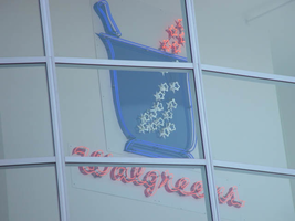
Photographs of Walgreens signs, Las Vegas (Nev.), 2002
Date
Archival Collection
Description
Site address: 3765 S Las Vegas Blvd
Sign condition: Structure 5 Surface 3 Lighting 5
Sign form: Fascia
Sign-specific description: The Walgreens lot is shared with the Fat Burger establishment, and a strip mall of assorted shops. The lot is located on the east side of the strip, just north of the Showcase Mall. On the west elevation of the building the Walgreen's cursive, logo script spells out the word "Walgreen's". The same sign design is repeated on the north face of the building also. The two signs are crafted out of channel letter, with blue and red neon in the interior of the channel. In small black channel letters, a bit further below the logos, there are three separate sets of much smaller channel letters. These spell the phrases "Pharmacy," "24HRS," and "1 Hour Photo." These are also lined on the interior with red and blue neon. Above the entrance to the building, a wall sign crafted of neon in the shape of the "mortar and pestle" is perched above the customers head as they enter the building from the NW. The entire structure of the image of the Walgreen's mortar and pestle, as well as the outline of the exterior stars, is constructed of one giant pan channel. The body of the pestle is made of a series of blue neon tubing which starts in the center of the pan in a square shape and creates a concentric pattern, filling the pan. Small white neon stars float to the top of the sign and into the body of the sign. Below that image, on the same elevated plane, the Walgreen's script logo is written in channel letters with white neon. Below that script is written independently in neon reading "The Pharmacy that America Trusts." Facing north /south, the street-side, pylon sign for the Walgreen's establishment is a multi-use pylon. The sign boasts advertisements for several other businesses, however the Walgreen's advertisement is the most visible and dominant on the face. The architecture of the sign is mostly a giant, stucco covered vertical rectangle with a simple crown cornice molding on the top edge of the structure. The other establishments mentioned on the sign are as read from the top of the sign to the bottom: Alan Albert's Lobster House, Club Utopia, Fatburger, and a small back-lit plastic sign for ice cream and t-shirts. At the bottom of the sign, channel letters spell the phrase parking in rear, with an arrow of the same concept pointing east toward the rear of the property. The pylon is two sided, with almost the entire top of the sign belonging to Walgreen's, and sculpted almost completely out of neon. Red, horizontal neon tubes form a field of light for the neon mortar and pestle, as seen above the entrance. The red field is also home to the cursive, Walgreen's logo script, and the phrase "Open 24 hours." The mortar and pestle are a pan channel including the stars floating out of the top incorporated into its design. Crafted in blue, with white neon for the stars, the mortar handle portion sticking out of the top of the pestle animates to appear as if it is stirring, while the stars turn on and off, representing the concoction being stirred in the body of the image. The Walgreen's script is made of channel letters filled with white neon. The bottom line of the sign that reads "Open 24 Hours," is in all caps, and channel letters with white neon on the interior. They animate in sequence one word at a time from left to right. Along the vertical edge width of the sign, the words "The Plaza" are spelled in red neon.
Sign - type of display: Neon
Sign - media: Steel
Sign - non-neon treatments: Paint
Sign animation: Chasing, flashing, oscillating
Notes: The text, which resides on the southern wall and reads "Casino," is filled with incandescent bulbs that all illuminate at the same time, and oscillate. They then shut off at the same time, and then repeat. The raceways of incandescent bulbs chase each other while the neon, which surrounds the back lit, plastic, screens on this wall flash on then off. The bottom two raceways sandwiching the reflective panel chase from left to right, while the remainder of the raceways surrounding the signs, run right to left. The incandescent bulbs on the pylon chase each other gracefully up the length of the pylon. The animation is patterned so as to appear as if a section of several bulbs are pulsing its way up the towers, hugging the edge of the bulbous tops. The raceways continue around the east face of the building. The umbrellas in the plaza behind the pylon, also are animated with incandescent bulbs chasing each other downward along the raceways.
Sign manufacturer: Mikhon lighting and sign
Sign - date of installation: 1997
Sign - thematic influences: The thematic influence of the Walgreens pylon is based on the logo for the establishment, incorporated into the architectural design of a modern commercial signage. The objects represented in the logo's are based on historical peripheral tools used in the pharmaceutical trade. The mortar and pestle were instruments used by chemists and doctors to grind and pulverize chemical to me mixed together. Since Walgreen's is a pharmacy and purveyor of commonly used goods, the mortar and pestle are appropriate symbols of the property's function.
Sign - artistic significance: Walgreen's fits into a niche of locations on the Las Vegas Strip that are establishments that can be found anywhere in the United States.
Surveyor: Joshua Cannaday
Survey - date completed: 2002
Sign keywords: Flashing; Fascia; Neon; Steel; Paint
Mixed Content
Epilogue: Nevada Southern University Yearbook, 1965
Date
Description
Yearbook main highlights: schools and departments; detailed lists with names and headshots of faculty, administration and students; variety of photos from activities, festivals, campus life, and buildings; campus organizations such as sororities, fraternities and councils; beauty contest winners; college sports and featured athletes; and printed advertisements of local businesses; Institution name: Nevada Southern University, Las Vegas, NV
Mixed Content
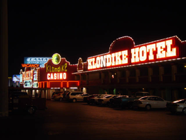
Photographs of Klondike signs, Las Vegas (Nev.), 2002
Date
Archival Collection
Description
Site address: 5191 S Las Vegas Blvd
Sign details: The Klondike Motel Casino is located on the east side of the strip, just north of the Las Vegas Tourist Bureau, actually sharing the same lot. The two are only separated by a small driveway. The mining town theme is exemplified throughout the exterior of the property with a western style text, seen on other similar themed properties such as the Frontier. Murals depicting scenes of prospecting miners and saloons adorn the surface as well as red steel sides which appears as wood, because of its horizontal panels. The property stretches north/south with a small parking lot separating the street from the establishment. Behind the front building a series of structures house the rooms. The buildings signage is situated along the face of the building, on the elevated surface of the walls themselves.
Sign condition: Structure 4 Surface 4 Lighting 3
Sign form: Fascia
Sign-specific description: The top edge of the wall entire face of the building arches, and steps up in various places, and is lined with gold raceways lined with incandescent bulbs. On the north side of the main building upon a vast paneled steel surface the word "Casino" is spelled in giant gold channel letters painted white on the interior. They are bordered in red neon and filled with incandescent bulbs. The text for the establishment is the western type face seen in properties such as the Frontier, or the Westward Ho. To the right of the text, an internally lit, white faced, plastic message board message board, is housed in a gold painted steel cabinet. Moving around the corner to the west face of the property, we see "Casino" spelled in the same manner of Cannel letters, flanked on either side by gold painted housings for cabinets, both crowning with an arched top. Incandescent bulbs forma border around the housing. Set inside each one of the square recessed areas is an internally lit, white, plastic faced message center, with vinyl lettering. Both cabinets are painted red. Below the main text an internally lit, white plastic faced, message center, with rounded ended runs the length of the space underneath the letters. The main entrance is underneath an awning, facing southwest. In the center of the top edge of the vertical wall above the awning, a circular internally lit cabinet is bordered with a gold raceway lined with incandescent bulbs. The surface of the sign is yellow plastic with the cartoon image of a dancing miner, complete with pick-axe. Below that Klondike is spelled with metallic channel letters with yellow plastic faces. The text descends in size toward the center of the text, then swells back to the original size on the sides. Below this, "Casino" is spelled in all capital, channel letters, filled with incandescent bulbs and bordered in neon. They are treated gold on the exterior and white in the interior. The awning cover the entrance, and is treated with neon as well. The face of the square awning is designed with three square recessed panels, with open bottoms. Three tubes of neon line each one of the three closed edges. Each tube takes a turn illuminating, red yellow, and blue. Cantilevered off of the left-hand side of the entrance roof line, a horizontal black cabinet reads "Vacancy" painted in white, and overlaid with red neon. The all caps text faces north/south. Continuing south along the face of the building, a two leveled stretch of structure, continues the last portion of the main building. On the red steel fascia continuing, above the overhang of the second level, "Klondike Hotel" is spelled in large channel letters, treated the same as those seen on the north face of the structure. They are painted gold on the exterior and white on the interiors, filled with incandescent bulbs and bordered with neon. To the left of the text, one on the golden housings for the cabinet, seen on the northern end of the west face, is present but empty. The edge of the overhang, beneath the text is also lined with a raceway and incandescent bulbs
Sign - type of display: Neon; Incandescent; Backlit
Sign - media: Steel; Plastic
Sign - non-neon treatments: Paint
Sign animation: Chasing, oscillating
Notes: The text which spells casino flashes on and steady burns, then oscillates, steady burns again, then shuts off. Moving around the corner to the western face, all the raceways bordering all the elements chase each other, while the incandescent bulbs located within the text which spells, "Casino" oscillate rapidly. The awning adorned with neon also animates, changing color flashing from red, then blue, then gold. The text which reads "Casino" above the awning is filled with incandescent bulbs which oscillate as well. The incandescent bulbs in the main text on the southern half of the western face of the building light up one letter at a time then once they are all illuminated, then they all begin to oscillate. Once they oscillate for a few seconds, then they all light up once again. The sequence is ended once all the letters go dark.
Sign environment: Located just north of the tourist bureau, the Klondike has the honor of being the first casino a traveler encounters as they enter the Strip. Besides the company of the tourist bureau and the Welcome to Las Vegas sign, it stands rather solitary. It's collection of pulsating bulbs and neon make the Klondike the most dominant force in its presence.
Sign - date of installation: 1978
Sign - date of redesign/move: Before the Klondike was opened twenty five years ago, it was known as the Konakai Motel.
Sign - thematic influences: mining, goldrush--small roadside motels
Surveyor: Joshua Cannaday
Survey - date completed: 2002
Sign keywords: Chasing; Oscillating; Fascia; Neon; Incandescent; Backlit; Steel; Plastic; Paint
Mixed Content

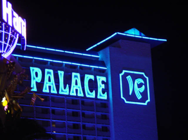
Photographs of Imperial Palace signs, Las Vegas (Nev.), 2002
Date
Archival Collection
Description
Nighttime views of the Imperial Palace Hotel and Casino signs on the Strip. Information about the sign is available in the Southern Nevada Neon Survey Data Sheet.
Site address: 3535 S Las Vegas Blvd
Sign owner: Ralph Engelstad
Sign details: Shadowing Oshea's, the Imperial palace looms high above the street. The tower for the hotel is located just east of the strip, but one of the main entrances is the unique porte-cochere and facade on the east side of the strip. The main tower resides east, seen behind the Harrah's Carnival Court. Signage includes Giant channel letters on the tower, five cabinets of the Imperial Palace logo initials placed along the towers, internally lit sculpted cabinets on the front tower, as well as the an LED screen, and a vastly lit porte- cochere, along with cabinets.
Sign condition: Structure 4 Surface 3 Lighting 4 The structure of the Imperial Palace's main tower signs seem to be intact, while the front towers signage and porte cochere are in great repair. The surfaces of the main tower are rather dull and pale during the day, but the light color aids in the luminescence at night. The lighting is in excellent repair.
Sign form: Fascia; Porte-cochère
Sign-specific description: The structure is themed after an Asian palace, complete with multi tiered swooping tiled Asian style roof lines, and wooden square beams placed to be representative of rice paper doors and windows, and symbols of dragons. Between two gaping square entrances of the front tower, sliding doors almost cower below a giant color LED message center, flanked by two back-lit , color, flex-front, two-dimensional dragons. The dragons stand upright pawing at each side of the central cabinet. The entire array sits on the lowest swooping Asian design roof level in blue tiles. As the building rises upwards, the center section repeats in multi tiered, blue roof lines, finally crowning with a fourth one, peaked at the top. The bottoms of each ones of these rooflines is bordered on the bottom with blue tubes of neon. The two main drives into to covered porte cochere, head east then turn inward, forming a squared U shape. Obviously one door is for entrance and one an exit. The ceiling is comprised of polished aluminum square panels, each one with four large, spherical, incandescent bulbs. The effect is an engaging field of animated bulbs, interrupted only by the presence of five large circular cabinets, which hang facing the floor. One hangs just into the entrance and exit, and one in the center of the north/south connecting sections of the two flanking tunnels, and two more set in the corners. The two just into the mouth, and in the corner of the tunnels, are polished aluminum themselves, with internally lit plastic fronts. These fronts are blue and white, pained graphically with an Asian geometric design, which fills the entire surface. The one cabinet is treated in the same exterior finish, but the design is created out of blue neon. Above the doors to the casino, in this cove, polished channel letters with blue plastic fronts, and borders created with narrow channels, are lined with incandescent bulbs. The tower set back into the property is adorned by a set of two story tall, white channel letters, facing west just below a long blue tiled roof, spell "Imperial Palace" and are filled with blue neon. Letters can be seen on the East face of the tower as well. On the same level of the southern end of the tower, a square, blue, channel edged cabinet, holds the channel letter initials "I" and "P." Another cabinet faces north on the north side of the tower. The channels and initials are lined with blue neon. The same arrangement can be found on the east side of the tower as well. The I and P can also be seen on the north and south end of the tower, but without the border. All of the rooflines on the tower are lined with blue neon as well. Both towers are ambiently lit with blue spotlights, casting a blue hue all over the property. At the very top of the front tower, a spike rises into the air, and is adorned with rings of blue neon.
Sign - type of display: Neon; Incandescent; Backlit
Sign - media: Steel; Plastic
Sign - non-neon treatments: Graphics
Sign animation: Oscillating
Notes: The incandescent bulbs covering the ceiling of the porte cochere, oscillate vibrantly, creating a shimmering cave of light.
Sign environment: The Imperial Palace is placed in an unusual position, with the front tower pushed right up to the street, with cars and taxis zipping in and out of the large square entrances. Just to the north is the Harrah's Carnival Court, which pushes right up to the edge of the north face of the front tower. Just to the south O Shea's sits in the great blue shadow of the Imperial palace.
Sign - date of installation: The hotel opened as the Imperial Palace in 1979. The front tower was built in 1981. The hotel was finished in three phases 1981, 1982, and 1987-1989.
Sign - thematic influences: The Imperial Palace is themed after an Asian palace, signifying the theme through several structural elements seen on the exterior. The stylized roofline, and actual shape of the roof are the representative of the classic eastern palace design seen throughout most Asian cultures in their history. The text on the main towers is stylized and representative of western text written to resemble the graceful brush stroke of Asian characters. Another obvious aspect is the backlit Asian dragons on either side of the giant LED screen on the front of the tower containing the porte-cochere. The Imperial Palace is a themed hotel, revolving around a culture, like that seen in Paris or the Bellagio. The significance of the signage relies in its Porte cochere. Related to the Riviera's parking garage due to the fact that it is located inside of one of the buildings, hidden away from plain sight. The stunning array of incandescent bulbs, lining the ceiling, and reflecting off of the high use of reflective panels. The use of the reflective metals is evidence of the leftover trend massive trend used in the 1970's due to an energy shortage. It itself, is a one of a kind porte-cochere and, is one of the most vibrant still in existence.
Surveyor: Joshua Cannaday
Survey - date completed: 2002
Sign keywords: Oscillating; Fascia; Porte-cochère; Neon; Incandescent; Backlit; Steel; Plastic; Graphics
Mixed Content
Meeting minutes for Consolidated Student Senate, University of Nevada, Las Vegas, April 11, 2005
Date
Archival Collection
Description
Text
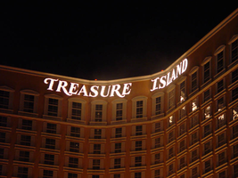
Photographs of Treasure Island signs, Las Vegas (Nev.), 2002
Date
Archival Collection
Description
Site name: Treasure Island Hotel and Casino (Las Vegas, Nev.)
Site address: 3300 S Las Vegas Blvd
Sign owner: MGM Mirage
Sign details: Next to the Mirage, this property complements its sister property
Sign condition: Structure 5 Surface 5 Lighting 5 Signage is in good condition
Sign form: Pylon; Fascia; Porte-cochère
Sign-specific description: The Treasure Island Hotel and Casino sits between the Mirage and Spring Mountain road. Fitting right into the themed hotel resort genre that dominates this side of the strip, the Treasure Island provides one of the more unique facades. Just past the bust of Siegfried and Roy, the dense foliage and trees continue on almost fluently between properties. The first elements you see headed north is the giant sculpted pylon for the resort, set beside a sweeping incline drive, leading to the porte-cohere. The pylon is a collection a heavily crafted and sculpted elements, creating a framework for two message cabinets and a marquee banner on either side. At the base, steel poles exit the ground in a "V" shape, into the interior of the area designated for the LCD and backlit cabinets. Steel poles forma grid work between the "V" shape. The message boards are bordered by steel piles made to appear as if they are pieces of bamboo lashed together at the corners, extending past the joints in an irregular fashion. Two base poles and inner grid are finished in the same fashion. Above the message cabinet a three-dimensional sculpted crows nest sits just below a giant skull adorned with a scarf. The tip of the bottom of green finished crows nest just reaches the top of the two cabinets. The fully three dimensional skull is finished in a realistic fashion. Two giant swords cross each other in an X pattern behind the crow's nest and underneath the skull. The resultant effect is the pirate emblem of the "skull and cross bones" or "jolly roger." The hilts of the two swords come to rest on top of the message centers also. A grid work of false bamboo poles can be seen , providing a buffer between the two halves of the sign. Above the head of the pirate an arched steel cabinet ,creates a banner, which reads "Treasure Island" in white channel letters and filled with incandescent bulbs. Decorative scrollwork adorns the top of the banner as well as the two sides of the skull. The Treasure Island tower is also in the popular Y shaped configuration. The 38 story building stands 456 feet tall, with the text hung on the top of the tower in a couple of different fashions. On the face created by the north and southeast wings of the tower, Treasure Island is spelled in giant channel letters, but the two words are in close proximity to each other, resting in the angle created by the joining of the two wings into the center structure. The southwest face created by the west and southeast wings have the text separated. Treasure on the west towers and island on the southeast tower. The northwest side is appropriately displayed only on the north face of the wing, so the southbound traffic on I-15 can read the letters clearly. The Treasure Island also has two additional signs located toward the back of the property. Those would include a small pylon facing east west actually situated in the rear of the property. The pylon is a simple square supported with two square posts. The other resides on Spring Mtn Rd. headed east on the south side of the street. It resides on the corner of the main traffic flow from the parking garage and inner sanctum of roads leading to the porte- cochere.
Sign - type of display: Neon; Incandescent; Backlit
Sign - media: Steel; Plastic
Sign - non-neon treatments: Graphics; Paint
Sign animation: Oscillating
Notes: The only animation present is in the channel letters themselves. The incandescent bulbs on the interiors oscillate wildly
Sign environment: The front spectacular of the pirate show truly creates the theme of the pirate island, and is where most of the pedestrian traffic for the hotel is present. The pylon is just south of the spectacular, towering high overhead. The Treasure Island's environment is abruptly halted by Spring Mtn road but at the same time, it also wraps the corner of the hotel, and continues west. It is the bookend piece to the other major MGM resorts, which reside south of the Treasure Island. Even though it is a smaller child of the bigger properties, it still looms as a giant to its neighbors the Vagabond and Tam O'Shanter
Sign manufacturer: Atlandia Design
Sign - date of installation: 1993
Sign - thematic influences: The theme of the Treasure Island is painfully apparent, from its name to its live pirate show. The signage truly reflects it as well. Treasure Island is definitely in the class of properties, which can be called a themed resort. The main pylon looks to be constructed out pieces of a wrecked ship, with the most commonly seen symbol for a pirate, in the Jolly Roger skull, being the most impactful piece up there. Steel beams are finished to look like wooden masts, and giant ropes, slinging the entire sign together. It utilizes the three dimensional aspects, yet retains the design of a pylon. Unlike its neighbor to the south the mirage, the Treasure islands theme encompasses the main pylon, with the exception of the pylon in the rear of the property. The surroundings, which provide the background for the pylon, as well as the environment for the property, reflect them as well. The landscaping boasts tropical plants emitting false bird noises, which stretch around to the face of the property, where the pirate village and ships reside in cold waters, and faux cliffs. The wooden planks resembling pier docks, provide a tidy border for the arena and spectators. The theme has been seen before in one sense or related from a slight distance. None has actually utilized the name of the novel, and been so garish with the pirate theme, but it can be tied to propertied that are more island, and paradise themed. Such properties include the Mirage, the Tropicana, and the Castaways.
Surveyor: Joshua Cannaday
Survey - date completed: 2002
Sign keywords: Oscillating; Pylon; Fascia; Porte-cochère; Neon; Incandescent; Backlit; Steel; Plastic; Paint; Graphics
Mixed Content