Search the Special Collections and Archives Portal
Search Results
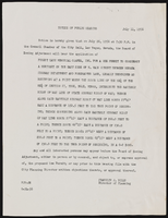
City of Las Vegas building codes, notices, correspondence
Date
Archival Collection
Description
City of Las Vegas building codes, notices, correspondence
Text
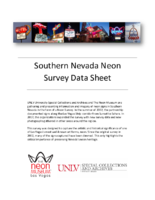
High Hat Regency Neon Survey document, September 6, 2017
Date
Archival Collection
Description
Site address: 1300 S Las Vegas Blvd
Sign owner: Tarighi Bahman and Farideh
Sign details: The building was constructed in 1958 (Assessor). A vintage postcard from the 1950's-- or more likely the 1960's (based upon the automobiles pictured)-- shows that the business was previously named the Chevron Motel (Las Vegas motels then and now).
Sign condition: Condition is 3-4, fair to good. The pole, cabinets and reader board are in good condition. Moderate rust is evident around the edges of the top cabinet. The paint is generally in good condition, although there white patches (from repairs?) on the chevron. The neon tubing is entirely intact. Most of the incandescent light bulbs are present, except for the underside of the lower cabinet, where they are completely absent.
Sign form: Pole Sign
Sign-specific description: A single round white metal pole supports the sign, which is cantilevered toward the street. The cabinets form a rectangular "C" which is open on the motel side. The interior of the "C" surrounds a chevron which points toward the motel. On top of the motel side of the upper cabinet is a metal top hat and cane. The sign is attached to the pole at the side of the lower cabinet, the point of the chevron and the bottom of the upper cabinet. The background color of the sign is sky blue. The bottom of the face of the lower cabinet has the word "VACANCY" painted in white sans serif letters. The letters are traced in white skeleton neon. To the left, the word "NO" is spelled out in clear skeleton neon sans serif letters. Above the neon letters is a white metal reader board which has a row of clear incandescent light bulbs running along the top, bottom and motel side edges. A single row of clear incandescent light bulbs runs the entire length of the street side of the sign. On the street side of the chevron is a blue metal cabinet with the word "MOTEL" spelled in white channel letters. The channels are outlined by white neon tubes, while the interior of the channels are filled with clear or white incandescent light bulbs. On the motel side of the "MOTEL" cabinet is a blue chevron which is covered with clear or white incandescent light bulbs. The top cabinet features the words "High Hat" spelled out in white cursive letters. Below is the word "REGENCY" painted in white sans serif letters. All wording is traced by white skeleton neon. On top of the motel side of the upper cabinet is a white top hat with a blue hat band. Running through the hat is a white cane. The hat and cane are traced by white skeleton neon. The hat is covered with white or clear incandescent light bulbs.
Sign - type of display: Neon, incandescent, reader board
Sign - media: Steel, plastic
Sign - non-neon treatments: reader board
Sign animation: Light bulbs flicker
Sign environment: Las Vegas Boulevard South, north of the Las Vegas Strip near other motels and wedding chapels.
Sign - date of installation: c.1950s
Sign - thematic influences: Elegance, sophistication, high society, boomerang/chevron, 1950's, 1960's, mid-century
Survey - research locations: Assessor's website
Survey - research notes: Connolly, D. (2012 July 21). Chevron Motel. Retrieved from https://www.flickr.com/photos/dennisconnolly5059yahoocom/7635650456 Hagopian, M. (2011 January 28). No vacancy in vintage Vegas. Retrieved https://hyperallergic.com/15738/no-vacancy- vintage-vegas/ Las Vegas motels then and now. (n.d.). Chevron Motel. Retrieved from http://stefanidrivesvegas.com/8.html RoadsideArchitecture. (n.d.). High Hat Regency Motel. Retrieved from http://www.roadarch.com/signs/nvvegas.html Seltzer, D. J. (2014 June 1). High Hat Regency Motel sign in Las Vegas [Video recording]. Retrieved from https://www.youtube.com/watch?v=-bQdw48LVrA
Survey - other remarks: A vintage postcard circa 1950's-1960's shows the Chevron Motel sign as a simple pole mounted with a reader board and two light boxes which form a "C" shape open toward the motel (Las Vegas motels then and now, n.d.). A later postcard features the same sign with a chevron in the center and a semi-circular arch which encloses a light ball above the upper cabinet (Connolly, 2012). The current sign retains the chevron, the metal frames of the light boxes and reader board (Las Vegas motels then and now, n.d.). A hat and cane have replaced the arch and light ball at the top of the sign (Las Vegas motels then and now, n.d.). The light boxes have been replaced with metal cabinets with incandescent and neon displays (Las Vegas motels then and now, n.d.). The sign is pictured in a vintage postcard circa 1950's-1960's (Las Vegas motels then and now, n.d.). At that time it advertised the Chevron Motel.
Surveyor: Mitchell Cohen
Survey - date completed: 2017-09-06
Sign keywords: Neon; Incandescent; Steel; Plastic; Reader board; Pole sign; Flickering
Text

Helen Yu oral history interview: transcript
Date
Archival Collection
Description
Oral history interview with Helen Yu conducted by Andrew Yu on December 1, 2021 for Reflections: The Las Vegas Asian American and Pacific Islander Oral History Project. Helen Yu discusses her upbringing in Seoul, South Korea, her grandfather's immigration to the United States in the late 1970s, and her family's decision to follow him to Portland, Oregon in 1984. She shares her family's history and their experiences during the Korean War, including what life was like both in North and South Korea at that time. Helen Yu discusses her undergraduate education at the University of Oregon studying graphic design and her graduate education at Ewha Womans University College of Art and Design in South Korea. She shares her thoughts having both a Korean American and Asian American identity, her marriage and two wedding ceremonies to her Korean husband, and her family's move to Las Vegas, Nevada in 2001. Helen Yu concludes with a discussion of her event planning work which led to her current role as the Operations Manager at the Emerald at Queensridge in Las Vegas.
Text

Tanya Olson oral history interview: transcript
Date
Archival Collection
Description
Oral history interview with Tanya Olson conducted by Claytee D. White on July 6, 2018 for the Remembering 1 October Oral History Project. In this interview, Olson recalls beginning October 2, 2017 to photograph scenes surrounding the aftermath of the shooting at the Route 91 Country Music Festival. Her efforts culminated in a film that highlights the Healing Garden, a memorial established after the shooting. It was dedicated on the first Friday of October 2017. Her 6-minute film, Forever In Our Hearts, is described as "Citizens unite to provide kindness and salve the wounds caused by the October 1, 2017 massacre during a Las Vegas country concert." The film was shown at the Nevada Women's Film Festival in 2018. Olson discusses beginning her latest endeavor, matriculating at the American Film Institute, a lifelong dream that she is pursuing after 23 years in the military, a film degree from University of Nevada, Las Vegas (UNLV), and completing her film project on one of the worst massacres in American history.
Text
Virginia Valentine (Nevada Resorts Association) oral history interview conducted by Kelliann Beavers and John Hudak: transcript
Date
Archival Collection
Description
From the Lincy Institute "Perspectives from the COVID-19 Pandemic" Oral History Project (MS-01178) -- Business interviews file.
Text
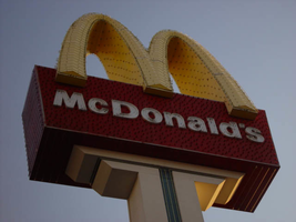
Photographs of McDonald's sign, 2800 S Las Vegas Blvd, Las Vegas (Nev.), 2002
Date
Archival Collection
Description
Site address: 2800 S Las Vegas Blvd
Sign details: Located just south of the Westward Ho's south parking lot is the third and northern most version of the sign. Unlike its other two relatives, this sign is solely designated to the McDonald's establishment. It is located in a small landscaped area directly east of the front of the restaurant. This section essentially comprises the front of the establishment itself. It stands tall on the west side of the strip facing north south.
Sign condition: Structure 5 Surface 4 Lighting 4 It is noted that the structural integrity is intact. Certain elements of lighting are out or not working but still present. The surface appears to be slightly deteriorating at this point.
Sign form: Pylon
Sign-specific description: The odd member of the three McDonald's pylons is different in almost every aspect, considering the similarity of the first two to each other. The sign construction itself is a more sleek, opting to integrate the entire structure into a much smoother design than the previous design as well. The other two cabinets are impressive indeed, but the placement of the cabinets is less clumsy than the others. The pole itself is thinner, painted brown steel flat post, which rises into the air, recording a small rectangular anomaly in the vertical line, which is used to support a yellow plastic internally lit cabinet. The four-sided shape swells out on each side, but transitions smoothly as the vertical shot continues upward. The brown post T's off to either side actually stretching to the widest point of the sign. It then grows vertically once again to create the sides of the cabinet. The shape that the brown portion creates is now more akin to a "U" shape rather than a "T." The entire surface of the pylon which is designated brown in laced with incandescent bulbs. Inside this U shape the face of the cabinet is designated red, and set higher above the surface plain of the face. The red fluted steel face is adorned with vertical neon bars and white channel letters floating above the surface. The channel letters are filled with bars of white neon. The giant golden arches break up the top edge of the red cabinet. The arches themselves are yellow painted steel, whose face are encrusted with yellow incandescent bulbs as well as border of yellow neon which floats around the edge of the arch. The tops and bottom surfaces are finished in a reflective, gold, polished metal. A channel runs up the center of the post and a yellow tube of neon glows as a centering stripe. This stripe actually ties in the internally lit yellow sign, with the crowning arches, quite well.
Sign - type of display: Neon; Incandescent; Backlit
Sign - media: Steel; Plastic
Sign - non-neon treatments: Paint
Sign animation: Oscillating, flashing
Notes: The white incandescent bulbs on the face of the sign illuminate in a chasing pattern from bottom to top, leaving all the bulbs illuminated in it's path, oscillating as they are illuminated. The post vertically illuminates, and when the bulbs reach the top of the brown arms of the U shape, the vertical, red, neon bars on the red portion of the cabinet, chase in simultaneously from either side. They meet in the middle leaving all the bars and thus the cabinet fully illuminated. The cabinet stays lit for a few moments, then the bars curtain out from the middle, back to either side, leaving the bars dark in the animations path. Once they reach the edge, the incandescent bulbs follow suit, and chase back down to the bottom, leaving all the bulbs dark it the chasing path. The yellow incandescent bulbs, which are on the face of the golden arches, constantly oscillate during the animations sequence.
Sign environment: As compared to the other two properties, the environment of this McDonald's is quite different. The other two were integrated into the strip mall design, utilizing the pylon itself for other advertisements as well. Even though the McDonald's pylon stood out as the dominant figure among their surroundings, They still felt as if they were part of a whole as well. The environment, which the northern pylon portrays, also reflects its surroundings as well. This environment of the Westward Ho, the Stardust, the Riviera, and the Circus Circus, bring about a certain garish nature in its design that fits in present in the McDonald's pylon.( see artistic significance and theme for further).
Sign manufacturer: YESCO
Sign - thematic influences: The theme of the McDonald's establishment is in the realm of the well-established McDonalds corporation. The golden arches, and solid red hue, have become synonymous with the name "McDonald's," and is an image, which has been communicated to the masses of people for half a century. It is an icon that is associated with America all over the world. McDonalds has created it's own realm and thematic influence over the years from all of it's extensive advertisements and marketing. Therefore, the theme of the establishment's signs draws from itself and the world, which the name has created. Being one of the most commonly seen images in America, this sign is tailored to fit into the illustrious, illuminative properties held on the Las Vegas Strip. It fits into the category of everyday images and businesses dressed up for Las Vegas, which include, Arabia's, Arco AM/PM, Walgreen's, and Fatburger.
Sign - artistic significance: Besides what is mentioned in the above paragraph about the above nature of the iconography of the said logo, this particular sign draws off of its surroundings to display certain aesthetic elements.
Surveyor: Joshua Cannaday
Survey - date completed: 2002
Sign keywords: Oscillating; Flashing; Pylon; Neon; Incandescent; Backlit; Steel; Plastic; Paint
Mixed Content
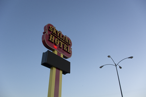
Photographs of Skyline Hotel and Casino sign, Las Vegas (Nev.), March 14, 2017
Date
Archival Collection
Description
Site address: 1741 N Boulder Hwy
Sign owner: Jim Marsh American Corp.
Sign details: The business began as the Dixie bar, which was operating by 1948 in what was then known as Pittman, Nevada (Moore, 2016; Skyline Casino, n.d.). The property's colorful history includes the suicide of one of the original owners on the motel premises and the first library in Pittman, which was located inside the tavern (Skyline Casino, n.d.). The Skyline Casino and restaurant was built on the property in 1964 (Benston, 2003; Meehan, 2016; Skyline Casino, n.d.). The name was briefly changed to Wheel and then returned to Skyline (Old-And the new, 1988). Jim Marsh purchased the Skyline from the son of the original owner in 2003 (Benston, 2003; Meehan, 2016; Skyline Casino, n.d.). In June of 2017, Marsh added a hotel to the casino and restaurant (Meehan, 2016; Moore, 2016; Skyline Casino, n.d.).
Sign condition: Condition is 5, fully restored to a "like new" state. The cabinet, paint and lights are in excellent shape.
Sign form: Pole Sign
Sign-specific description: The sign consists of a rectangular metal pole which supports an electronic reader board topped by a badge-shaped metal cabinet. The pole is painted yellow with a red stripe running down the center. The frame of the reader board is black metal. The badge-shaped metal cabinet is painted red outlined in gold. Yellow incandescent light bulbs outline the cabinet. Light boxes framed in black metal faced with yellow plastic spell out "SKYLINE HOTEL" in western-style serif letters. "SKYLINE" is stacked over "HOTEL", the words separated by a horizontal ornamental design. Below the light boxes, "NO VACANCY" is spelled out in clear skeleton neon letters.
Sign - type of display: Neon
Sign - media: Steel, Plastic
Sign - non-neon treatments: Incandescent lightbulbs, lightboxes and electronic readerboard
Sign environment: Property is located on Boulder Highway near the Skyline Casino
Sign - date of installation: c. 1988
Sign - thematic influences: Western style, common to a lot of Las Vegas valley casino and motel properties
Sign - artistic significance: The property opened in the 1960s, still during the heyday of Western themed properties
Survey - research locations: Assessor's website
Survey - research notes: Benston, L. (2003 June 5). Owner to sell Henderson's Skyline casino. Las Vegas Sun. Retrieved from https://lasvegassun.com/news/2003/jun/05/owner-to- sell-hendersons- skyline-casino/ Meehan, J. (2016 June 26). Marsh adding hotel to Skyline Casino. Las Vegas Business Press. Retrieved from https://businesspress.vegas/gaming-hospitality/marsh- adding-hotel- to-skyline- casino/ Moore, T. (2016 October 11). Changing Skyline: Hotel wing coming to old-time casino. Las Vegas Sun. Retrieved from https://lasvegassun.com/news/2016/oct/11/changing-skyline- hotel-wing- coming-to- old- time-cas/ Old-And the new. (1988 October 20). Henderson Home News [Newspaper clipping]. Retrieved from http://www.recapturist.com/wp-content/uploads/Sky- Motel_Henderson-Home- News-19881020.jpg Sky Motel. (n.d.). Retrieved from http://www.recapturist.com/portfolio/sky-motel/ Skyline Casino. (n.d.). Wikipedia. Retrieved from https://en.wikipedia.org/wiki/Skyline_Casino Skyline Casino & Restaurant. (n.d.). Retrieved from https://www.cardcow.com/368494/skyline-casino- restaurant-henderson/
Survey - other remarks: Date(s) of any major redesign/move: An undated postcard shows the sign sometime between 1964 and 1988 (Skyline Casino & Restaurant, n.d.). A round pole supports a light box type reader board topped by a badge-shaped metal cabinet. Yellow incandescent light bulbs outline the cabinet. "SKYLINE" is spelled out in clear red skeleton neon sans serif letters. "CASINO" is spelled out in blue skeleton neon western-style serif letters. "RESTAURANT" is spelled out in clear red neon skeleton neon sans serif letters. A photograph taken for a news article in 1988 shows the sign with the same design when it was taken down and moved next door to the Sky Motel (Old-And the new, 1988). The Sky Motel retained the round pole, the reader board, the badge-shaped cabinet and the incandescent light bulbs outlining the cabinet. The Skyline lettering was removed and replaced. "SKY MOTEL" was spelled out in white channel western-style serif letters which were outlined in the interior by white neon tubing. Below "SKY MOTEL" were clear skeleton neon san serif letters which spelled out "NO VACANCY". The Skyline Hotel reclaimed the sign when it opened in 2017. The current sign has a rectangular support, although the original round pole might still be inside. The light box has been replaced by an electronic reader board. The "SKY MOTEL" channel letters have been replaced with light box "SKYLINE HOTEL" letters. The "NO VACANCY" letters from the Sky Motel have been retained.
Surveyor: Mitchell Cohen
Survey - date completed: 2017-09-18
Sign keywords: Neon; Steel; Plastic; Incandescent; Reader board; Pole sign; Light box
Mixed Content
Sands Hotel Photograph Collection
Identifier
Abstract
The Sands Hotel Photograph Collection depicts entertainers, celebrities, events, amenities, and staff at the Sands Hotel in Las Vegas, Nevada from approximately 1952 to 1980. The photographs primarily depict entertainers like Frank Sinatra, Dean Martin, and the Copa Girls performing in the Copa Room, the showroom of the Sands Hotel. The photographs also depict patrons gambling, events held in the Sands Hotel's ballrooms, banquets, the pool, rooms in the hotel, as well as Jack Entratter, the hotel'’s director of entertainment.
Archival Collection

