Search Results
Photographs of Blue Note signs, Las Vegas (Nev.), 2002
Date
2002
Archival Collection
Description
Views of the Blue Note club signs on the Las Vegas Strip. Information about the sign is available in the Southern Nevada Neon Survey Data Sheet.
Site address: 3663 S Las Vegas Blvd
Sign owner: Blue Note International: Father & Son team of Danny and Steven Bensusan
Sign details: The Blue Note is located a short distance east, down Harmon Ave., on the north side of the street, facing south. It is part of the Aladdin Hotel Casino. A vacant lot resides on the corner, and is the only thing that separates the Blue Note from the Strip. Signage for the property includes two logo wall signs on the west wall of the building, a vertical blade sign and an entrance sign over the main port to the establishment.
Sign condition: Structure 5 Surface 5 Lighting 5
Sign form: Fascia
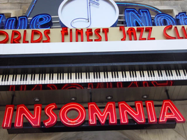
Sign-specific description: Just east off of Las Vegas Blvd, down Harmon Ave, lies the entrance to the "Blue Note: Jazz Capital of the World." The Blue Note is actually part of the Aladdin property, residing in the eastern most wing of the building, on the south side of Harmon. The majority of the signage hangs on the front of the building, which faces south toward Harmon Ave., with additional signage on the west face of the structure that extends from the Aladdin property. A vacant lot on the north east corner separates the Blue Note from the rest of the strip. The structure of the building and the design of the signage are juxtaposed with the building still being finished in a Persian Palace theme. While the signs are reminiscent of roaring twenties style font and theatre front design. Several different types of signs adorn the Blue Note. Two wall /logo signs hang on the west side of the building, while a sculpted entrance marquee, a hanging logo sign, and a vertical blade sign hung on the south side of the building. The west wall logo sign is composed of blue channel letters spelling the text " Blue Note," separated by a circular cabinet with a tube of neon bent to emulate the shape of a musical note placed in the middle. Five steel bars just out from either side of the cabinet. Below the text, a white steel cabinet with rounded ends, support a thin set of blue channel letters reading, "Jazz capital of the world." Further to the right a set of pink channel letters rest upon the upper portion of the corner of the structure. The letters are filled with pink neon. Along the South face of the building the first sign, hung in close proximity to the southwest corner, a vertical blade sign sits on a radius base of shaped molding jutting out of the wall. The actual body of the sign is a double backed cabinet finished in polished aluminum, with blue pin striping along the edges as well as along the rounded edge of the top. Near the top of the sign, the same rounded cabinet seen on the west wall of the structure, is integrated into the blade facing east/west. The cabinet is thicker in width to compensate for the width of the actual sign. The edges of the steel structure are painted in the same blue tone. The afore mentioned blue neon tubing fashioned into the shape of the note resides in this cabinet also. Along the east/west sides of the sign the text "The Blue Note," runs vertically from top to bottom, in blue channel letters only interrupted by the circular cabinet. The panel, which the text resides is painted white. Along the edge of the blade, which faces south, the text "Blue Note" is spelled vertically in blue channel letters. Sitting along the edge of the base, which the sign sits on, thin red channel letters stand almost independently, wrapping around the radius of the base. Starting on the west side of the sign and finishing on the east side, the text reads "Club & Cafe." These letters are filled with tubes of red neon. The letters are attached to a backing radius band of metal appearing to be gold. Further down the face of the building the main entrance to the building plays host to an overhead marquee/logo sign incorporating sculptural elements as well. Directly in the center of the composition, a long horizontal cabinet plays host to the red channel letters filed with red neon, reading, "World's Finest Jazz Club." Sitting on the top edge of the cabinet the same configuration of the Blue Note logo sign along with the circular cabinet, rests in front a sculpted piece of black steel. This piece of black painted steel is cut to appear as if it is the open top to a piano. Along the interior edge of the lid tubes of blue neon form a blue border. Between the piano top and the Blue Note logo, a horizontal steel grate serves as a divider as well as support for the blue channel letters. This entire section sits on a long horizontal ledge composed of a long polished steel section with a long LED message center just below that. Slightly recessed below the message center another width of overhang constructed of steel is painted to appear as if it is made of piano keys. Along the wall, just above the door, the pink channel letters read "Insomnia" with pink neon on the interior.
Sign - type of display: Neon
Sign - media: Steel; Fiberglass
Sign - non-neon treatments: Paint
Sign environment: Situated just east off the strip, down Harmon Avenue, the Blue Note is the only attraction in its immediate area. Even though it is part of the Aladdin complex, the closest property is the Harley Davidson Cafe on the south east corner of Harmon and Las Vegas Blvd At night, the property loses its Arabian Nights architecture emitting a sultry glow of neon. It is hard to miss, if a pedestrian peers down the street while traveling north or south, on the east side of the strip. During the day, the architecture helps to blend in the property to appear as it is, part of the Aladdin.
Sign manufacturer: YESCO
Sign - date of installation: 2000
Sign - thematic influences: The building itself is part of the actual Aladdin property, so the faced of the structure is themed in the manner of an ancient Persian city. It is an interesting juxtaposition for the sleek, modern finish and colors of the signage, with the organic facade of domed towers and stone facade. The Blue note signage is themed around the subject of music, specifically Jazz and Blues music. The blue hue of the neon, and the cabinet containing the crafted musical note are all evidence of this. The blade sign is thematically influenced by marquee building signs for theaters and music clubs from the first part of the century, specifically the forties and fifties. Such examples that utilized a similar designed blade sign were properties from the 1930's 40's and 50's such as The Boulder Club, The Pioneer Club, and the Las Vegas Club.
Surveyor: Joshua Cannaday
Survey - date completed: 2002
Sign keywords: Fascia; Neon; Steel; Fiberglass; Paint
Site address: 3663 S Las Vegas Blvd
Sign owner: Blue Note International: Father & Son team of Danny and Steven Bensusan
Sign details: The Blue Note is located a short distance east, down Harmon Ave., on the north side of the street, facing south. It is part of the Aladdin Hotel Casino. A vacant lot resides on the corner, and is the only thing that separates the Blue Note from the Strip. Signage for the property includes two logo wall signs on the west wall of the building, a vertical blade sign and an entrance sign over the main port to the establishment.
Sign condition: Structure 5 Surface 5 Lighting 5
Sign form: Fascia
Sign-specific description: Just east off of Las Vegas Blvd, down Harmon Ave, lies the entrance to the "Blue Note: Jazz Capital of the World." The Blue Note is actually part of the Aladdin property, residing in the eastern most wing of the building, on the south side of Harmon. The majority of the signage hangs on the front of the building, which faces south toward Harmon Ave., with additional signage on the west face of the structure that extends from the Aladdin property. A vacant lot on the north east corner separates the Blue Note from the rest of the strip. The structure of the building and the design of the signage are juxtaposed with the building still being finished in a Persian Palace theme. While the signs are reminiscent of roaring twenties style font and theatre front design. Several different types of signs adorn the Blue Note. Two wall /logo signs hang on the west side of the building, while a sculpted entrance marquee, a hanging logo sign, and a vertical blade sign hung on the south side of the building. The west wall logo sign is composed of blue channel letters spelling the text " Blue Note," separated by a circular cabinet with a tube of neon bent to emulate the shape of a musical note placed in the middle. Five steel bars just out from either side of the cabinet. Below the text, a white steel cabinet with rounded ends, support a thin set of blue channel letters reading, "Jazz capital of the world." Further to the right a set of pink channel letters rest upon the upper portion of the corner of the structure. The letters are filled with pink neon. Along the South face of the building the first sign, hung in close proximity to the southwest corner, a vertical blade sign sits on a radius base of shaped molding jutting out of the wall. The actual body of the sign is a double backed cabinet finished in polished aluminum, with blue pin striping along the edges as well as along the rounded edge of the top. Near the top of the sign, the same rounded cabinet seen on the west wall of the structure, is integrated into the blade facing east/west. The cabinet is thicker in width to compensate for the width of the actual sign. The edges of the steel structure are painted in the same blue tone. The afore mentioned blue neon tubing fashioned into the shape of the note resides in this cabinet also. Along the east/west sides of the sign the text "The Blue Note," runs vertically from top to bottom, in blue channel letters only interrupted by the circular cabinet. The panel, which the text resides is painted white. Along the edge of the blade, which faces south, the text "Blue Note" is spelled vertically in blue channel letters. Sitting along the edge of the base, which the sign sits on, thin red channel letters stand almost independently, wrapping around the radius of the base. Starting on the west side of the sign and finishing on the east side, the text reads "Club & Cafe." These letters are filled with tubes of red neon. The letters are attached to a backing radius band of metal appearing to be gold. Further down the face of the building the main entrance to the building plays host to an overhead marquee/logo sign incorporating sculptural elements as well. Directly in the center of the composition, a long horizontal cabinet plays host to the red channel letters filed with red neon, reading, "World's Finest Jazz Club." Sitting on the top edge of the cabinet the same configuration of the Blue Note logo sign along with the circular cabinet, rests in front a sculpted piece of black steel. This piece of black painted steel is cut to appear as if it is the open top to a piano. Along the interior edge of the lid tubes of blue neon form a blue border. Between the piano top and the Blue Note logo, a horizontal steel grate serves as a divider as well as support for the blue channel letters. This entire section sits on a long horizontal ledge composed of a long polished steel section with a long LED message center just below that. Slightly recessed below the message center another width of overhang constructed of steel is painted to appear as if it is made of piano keys. Along the wall, just above the door, the pink channel letters read "Insomnia" with pink neon on the interior.
Sign - type of display: Neon
Sign - media: Steel; Fiberglass
Sign - non-neon treatments: Paint
Sign environment: Situated just east off the strip, down Harmon Avenue, the Blue Note is the only attraction in its immediate area. Even though it is part of the Aladdin complex, the closest property is the Harley Davidson Cafe on the south east corner of Harmon and Las Vegas Blvd At night, the property loses its Arabian Nights architecture emitting a sultry glow of neon. It is hard to miss, if a pedestrian peers down the street while traveling north or south, on the east side of the strip. During the day, the architecture helps to blend in the property to appear as it is, part of the Aladdin.
Sign manufacturer: YESCO
Sign - date of installation: 2000
Sign - thematic influences: The building itself is part of the actual Aladdin property, so the faced of the structure is themed in the manner of an ancient Persian city. It is an interesting juxtaposition for the sleek, modern finish and colors of the signage, with the organic facade of domed towers and stone facade. The Blue note signage is themed around the subject of music, specifically Jazz and Blues music. The blue hue of the neon, and the cabinet containing the crafted musical note are all evidence of this. The blade sign is thematically influenced by marquee building signs for theaters and music clubs from the first part of the century, specifically the forties and fifties. Such examples that utilized a similar designed blade sign were properties from the 1930's 40's and 50's such as The Boulder Club, The Pioneer Club, and the Las Vegas Club.
Surveyor: Joshua Cannaday
Survey - date completed: 2002
Sign keywords: Fascia; Neon; Steel; Fiberglass; Paint
Mixed Content
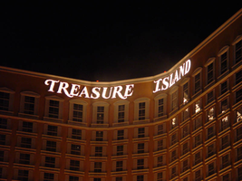
Photographs of Treasure Island signs, Las Vegas (Nev.), 2002
Date
2002
2017-08-30
Archival Collection
Description
Photos show Treasure Island signs during the day and at night. Two surveys were conducted to gather information about this sign. One was conducted in 2002 and one was conducted in 2017. PDFs are available for both surveys. See the 2017 survey PDF for additional information that is not included in the object description.
Site name: Treasure Island Hotel and Casino (Las Vegas, Nev.)
Site address: 3300 S Las Vegas Blvd
Sign owner: MGM Mirage
Sign details: Next to the Mirage, this property complements its sister property
Sign condition: Structure 5 Surface 5 Lighting 5 Signage is in good condition
Sign form: Pylon; Fascia; Porte-cochère
Sign-specific description: The Treasure Island Hotel and Casino sits between the Mirage and Spring Mountain road. Fitting right into the themed hotel resort genre that dominates this side of the strip, the Treasure Island provides one of the more unique facades. Just past the bust of Siegfried and Roy, the dense foliage and trees continue on almost fluently between properties. The first elements you see headed north is the giant sculpted pylon for the resort, set beside a sweeping incline drive, leading to the porte-cohere. The pylon is a collection a heavily crafted and sculpted elements, creating a framework for two message cabinets and a marquee banner on either side. At the base, steel poles exit the ground in a "V" shape, into the interior of the area designated for the LCD and backlit cabinets. Steel poles forma grid work between the "V" shape. The message boards are bordered by steel piles made to appear as if they are pieces of bamboo lashed together at the corners, extending past the joints in an irregular fashion. Two base poles and inner grid are finished in the same fashion. Above the message cabinet a three-dimensional sculpted crows nest sits just below a giant skull adorned with a scarf. The tip of the bottom of green finished crows nest just reaches the top of the two cabinets. The fully three dimensional skull is finished in a realistic fashion. Two giant swords cross each other in an X pattern behind the crow's nest and underneath the skull. The resultant effect is the pirate emblem of the "skull and cross bones" or "jolly roger." The hilts of the two swords come to rest on top of the message centers also. A grid work of false bamboo poles can be seen , providing a buffer between the two halves of the sign. Above the head of the pirate an arched steel cabinet ,creates a banner, which reads "Treasure Island" in white channel letters and filled with incandescent bulbs. Decorative scrollwork adorns the top of the banner as well as the two sides of the skull. The Treasure Island tower is also in the popular Y shaped configuration. The 38 story building stands 456 feet tall, with the text hung on the top of the tower in a couple of different fashions. On the face created by the north and southeast wings of the tower, Treasure Island is spelled in giant channel letters, but the two words are in close proximity to each other, resting in the angle created by the joining of the two wings into the center structure. The southwest face created by the west and southeast wings have the text separated. Treasure on the west towers and island on the southeast tower. The northwest side is appropriately displayed only on the north face of the wing, so the southbound traffic on I-15 can read the letters clearly. The Treasure Island also has two additional signs located toward the back of the property. Those would include a small pylon facing east west actually situated in the rear of the property. The pylon is a simple square supported with two square posts. The other resides on Spring Mtn Rd. headed east on the south side of the street. It resides on the corner of the main traffic flow from the parking garage and inner sanctum of roads leading to the porte- cochere.
Sign - type of display: Neon; Incandescent; Backlit
Sign - media: Steel; Plastic
Sign - non-neon treatments: Graphics; Paint
Sign animation: Oscillating
Notes: The only animation present is in the channel letters themselves. The incandescent bulbs on the interiors oscillate wildly
Sign environment: The front spectacular of the pirate show truly creates the theme of the pirate island, and is where most of the pedestrian traffic for the hotel is present. The pylon is just south of the spectacular, towering high overhead. The Treasure Island's environment is abruptly halted by Spring Mtn road but at the same time, it also wraps the corner of the hotel, and continues west. It is the bookend piece to the other major MGM resorts, which reside south of the Treasure Island. Even though it is a smaller child of the bigger properties, it still looms as a giant to its neighbors the Vagabond and Tam O'Shanter
Sign manufacturer: Atlandia Design
Sign - date of installation: 1993
Sign - thematic influences: The theme of the Treasure Island is painfully apparent, from its name to its live pirate show. The signage truly reflects it as well. Treasure Island is definitely in the class of properties, which can be called a themed resort. The main pylon looks to be constructed out pieces of a wrecked ship, with the most commonly seen symbol for a pirate, in the Jolly Roger skull, being the most impactful piece up there. Steel beams are finished to look like wooden masts, and giant ropes, slinging the entire sign together. It utilizes the three dimensional aspects, yet retains the design of a pylon. Unlike its neighbor to the south the mirage, the Treasure islands theme encompasses the main pylon, with the exception of the pylon in the rear of the property. The surroundings, which provide the background for the pylon, as well as the environment for the property, reflect them as well. The landscaping boasts tropical plants emitting false bird noises, which stretch around to the face of the property, where the pirate village and ships reside in cold waters, and faux cliffs. The wooden planks resembling pier docks, provide a tidy border for the arena and spectators. The theme has been seen before in one sense or related from a slight distance. None has actually utilized the name of the novel, and been so garish with the pirate theme, but it can be tied to propertied that are more island, and paradise themed. Such properties include the Mirage, the Tropicana, and the Castaways.
Surveyor: Joshua Cannaday
Survey - date completed: 2002
Sign keywords: Oscillating; Pylon; Fascia; Porte-cochère; Neon; Incandescent; Backlit; Steel; Plastic; Paint; Graphics
Mixed Content