Search Results
Photographs of Casino Royale and Denny's signs, Las Vegas (Nev.), 2002
Date
Archival Collection
Description
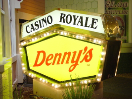
Site address: 3419 S Las Vegas Blvd
Sign owner: Tom Elardi
Sign details: The Casino Royale is located on the east side of the strip facing west, just south of the Venetian. The smaller establishment shares its space with a Denny's restaurant, which was present before the Royale was opened. The exterior is adorned with a stylized, European-esque, architecture, including apparent windows, domes, towers, and a cohesive landscape of connected buildings. The exterior of the Royale is a brightly lit facade of white raceways, lined with incandescent bulbs, boxing in vibrantly toned walls, and subdued neon. The colors correspond with those seen in the sign itself, as well the neon placed inside the edges of the windows. One section displays purple, the next a teal color, next a blue, then a red. Total signage of the property includes a two LED screens, one on the west side of the building, and the other housed in the logo cabinet on the south west corner of the property. Two logo cabinets, one in the aforementioned spot, and the second facing west over the main entrance on the west side of the building. Two double-faced cabinets lie on the northern end of the west side of the building, advertising for Denny's restaurant. Two small logos signs are also placed on the west face of the structure, for Caffe Trilussa.
Sign condition: Structure 5 Surface 5 Lighting 5
Sign form: Fascia
Sign-specific description: Upon the southwest corner of the building, a blue cabinet houses an LED screen in the rectangular body of the cabinet. The cabinet continues upward where the blue steel face supports white channel letters bordered in red neon and filled with incandescent bulbs. The text is written in two lines. The cabinet continues upward and is transformed into the sculpted design of a pink, purple, red, and blue crown on channel faced scrolls and sweeping shapes. The interiors of each section are lined with neon of a corresponding color to the paint treatments. Around to the west side of the building, the same style of text and scrolling adornments are used in a different marquee sign denoting the main entrance to the establishment. The same style of text seen on the southwestern sign is present with the same pattern of scroll work, crafted in a cabinet style, with channel faces. The major difference between the two signs is the size. The main entrance sign is much larger than the corner sign, as well as not having a LED screen incorporated below the text. The western sign possesses more scroll work below the text instead. The neon treatments are the same, as well as the incandescent bulbs, inside of the text. The lower roofline of the property plays host to the small but noticeable signage for Caffe Trilussa. Upon a extended surface of the roof line, two separate signs for the establishment are present. The roof shape is three sided with the signage on the northwest and southwest sides of the extension. Inside a section of the entablature created with white raceways, brown channel letters, spell the text "Trilussa," stretching across the length of the surface. The brown letters sit upon a yellow surface and are filled with incandescent bulbs, which are as wide as the channel letters themselves. Spelled in bent neon tubing, the word "Caffe" is spelled in all capital letters, sitting just above the left hand side of the title text. The right of the collection is occupied by a graphically treated, two-dimensional cut-out of a palm tree. The palm tree is treated on the surface with neon tubing as well. The tubing glows green and a gold corresponding to the graphical treatments. At the northern end of the property, two signs sit outside facing north, south. The double backed, internally lit cabinets represent the advertisements for the Denny's restaurant attached to the Royale. The first is at ground level outside the main entrance of the restaurant, the six sided, green cabinet, sports a yellow plastic face with red graphic text, reading "Denny's" in script text. Around the border of the face, incandescent bulbs run in a raceway pattern, and are covered in a plastic sheath. An angular cabinet rests on top of the other cabinet, creating a shallow peak. The internally lit, white face reads "Casino Royale" in black text. The same cabinet can be seen cantilevering off of the west side of the building above its partner sign. The cabinets are of identical design except for there is no plastic sheath covering the raceway of incandescent bulbs, and the plastic face of the main section of the cabinet is treated in different graphics. The script reads "Denny's" similar red script, but with a different background.
Sign - type of display: Neon; Incandescent; Backlit
Sign - media: Steel; Plastic
Sign - non-neon treatments: Graphics; Paint
Sign animation: Chasing, oscillating
Notes: The incandescent bulbs inside the channel letters of the main text oscillate, while all incandescent bulbs on the raceways along the building chase each other also. The incandescent bulbs, which surround the Denny's cabinet, also chase each other.
Sign environment: The Casino Royale stands independently on it's own even though it is surrounded on all sides by casino giants. To the north stands the Venetian, to the South stands Harrah's, and the Mirage lies west across the street. Yes, the property itself seems to be dwarfed by the immense neighbors, but the ultra bright, clear external signage and facade create a charming and bright environment that announces its presence.
Sign manufacturer: YESCO
Sign - date of installation: 1992
Sign - date of redesign/move: The Royale was once the Nob hill, which was closed in 1980. It was reopened in 1992 as the Casino Royale.
Sign - thematic influences: The theme seems to be tied to a European theme with the French term "Royale" in the title. The scrollwork is reminiscent of confetti or Mardi Gras theme. Such a combination of elements to suggest a theme is seen in the Harrah's property also. The party themed reminiscent sculpted cabinets are also reminiscent of the Fleur de Li. Believe it or not, the property is tied to many other larger, corporate, properties in one respect regarding its facades. The facade of a town or city, shrunken down and stylized into the facade of the property is present all over the Strip. Such properties which utilize this technique, to one degree or the next, include: New York New York, Oshea's, Treasure Island, Bellagio, The Venetian, The Luxor, The Tropicana, and the Excalibur.
Surveyor: Joshua Cannaday
Survey - date completed: 2002
Sign keywords: Chasing; Oscillating; Fascia; Neon; Incandescent; Backlit; Steel; Plastic
Mixed Content
Photographs of Rummel Motel sign, Las Vegas (Nev.), February 23, 2017
Date
Archival Collection
Description
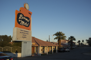
Site address: 1809 S Las Vegas Blvd
Sign owner: Yeh Chia-Hong
Sign details: The motel was founded by Marvin Rummel in 1945 (VintageLasVegas, n.d.), although the Clark County Assessor lists the original construction year as 1951 (Assessor, n.d.). Undated vintage postcards, one describing the motel as "new" (Rummel Motel, 1809 So. 5th St. U.S. 91 - L.A. Highway Las Vegas, Nevada original vintage postcard, n.d.) show that a two-story building was later added to the back of the motor court (VintageLasVegas). The addition may explain the discrepancy in construction dates. The Roles family purchased the property in 1958 (VintageLasVegas; Noted bowler, hotel owner dies, 2002). Ralph Roles also operated the Del Mar Motel (the Del Mar's sign, designed by Betty Willis, is now at the Neon Museum). A vintage postcard from 1958 shows that motel was endorsed by the Automobile Association of America and another automobile club (Garofalo, 2011). The motel was severely damaged by fire on April 30 2017 (VintageLasVegas; Hershkovitz, 2017) and is currently closed.
Sign condition: The condition is 2, fair. The lower portion of the cabinet is dented and access panels are damaged or missing. The upper portions of the cabinet display numerous metal patches. The plastic on the reader board has holes. The remaining neon tubing appears to be intact. All incandescent light bulbs are missing.
Sign form: Pylon sign
Sign-specific description: The sign is supported by a rectangular blue metal pylon. A blue metal-framed reader board and orange metal upper cabinet are cantilevered out from the pylon toward the street. In the center of the upper cabinet is an amoeba-shaped area which is painted black and outlined by white skeleton neon. Inside the black amoeba are individual cursive letters which spell out "Rummel Motel" in white paint traced by white skeleton neon. Atop the upper cabinet is a smaller orange metal cabinet which is wing-shaped. Above the wing is a blue metal circle. Inside the channel of the circle are six concentric circles of empty light sockets. On the outside of the circle is a semi-circular metal frame which holds five white skeleton neon five-pointed stars.
Sign - type of display: Neon, incandescent and reader board
Sign - media: Steel and plastic
Sign - non-neon treatments: Incandescent light bulbs and a reader board
Sign environment: This is located on Las Vegas Boulevard South just north of the Las Vegas Strip
Sign - date of installation: The current sign dates back to at least 1958, but probably is not the original motel sign. A vintage postcard shows that before the two-story addition, the motel had a simple double pole sign with the name "Rummel Motel" enclosed by an open oval (Rummel Motel, 1809 So. 5th St. U.S. 91 - L.A. Highway Las Vegas, Nevada original vintage postcard, n.d.). The colors, lettering style and oval shape of the former sign appear to have inspired the design of the sign seen in a postcard from 1958 (Garofalo, 2011). The latter sign, with heavy modification, is the sign seen on the property today. The sign as currently configured is recognizable in a postcard from the late 1950's or early 1960's (Las Vegas motels then and now, n.d.).
Sign - date of redesign/move: The circa 1958 sign (Garofalo, 2011) was supported by double poles. The pole on the street side of the sign can still be seen on the upper cabinet, but it no longer reaches to the ground. The pole on the motel side of the sign ran from the ground toward the center of the sign, and then doglegged inward toward the motel to support the sign from the side. That pole appears to be the same one now enclosed by the pylon. The shadow of the pole can be seen inside the current reader board, which was a later addition attached below the circa 1958 sign. Automobile club shields at the bottom of the circa 1958 sign have been removed. A black metal directional arrow pointing toward the motel from the street side of the sign has also been removed. A circular white or light yellow metal cabinet with concentric rows of incandescent lightbulbs in the interior and a semi-circle of neon stars on the exterior has been moved from the top of the former directional arrow to the top of the wing-shaped cabinet. The circa 1958 wing-shaped cabinet was flush with the street side of the sign and contained skeleton neon which advertised, "HEATED POOL". The current wing-shaped cabinet contains no neon and has been pushed to the center of the sign. The lower cabinet of the circa 1958 sign was painted orange and black, which is now all orange. The amoeba shape was painted blue and is now black. Below the amoeba were skeleton neon letters which spelled out, "NO VACANCY" and "24 HOUR ROOM SERVICE". The neon is now gone. A small black metal cabinet attached at the bottom of the sign contained what appear to be either painted or skeleton neon letters which state, "COOLED BY REFRIGERATION". That portion of the sign is now gone.
Sign - thematic influences: This sign showcases 1950's and 1960's Googie trends. This also conveys earlier motor court designs in the building and the sign.
Survey - research locations: Clark County Assessor, Parcel No. 162-03-310-007, Retrieved from http://www.clarkcountynv.gov/assessor/Pages/PropertyRecords.aspx?H=redrock&P=assrrealprop/pcl.aspx Garofalo, M. (2011 November 2). Still standing-Rummel Motel. Retrieved from https://www.flickr.com/photos/vintageroadtrip/6304823598/ Hershkovitz, R. (2017 April 30). Fire damages vacant downtown Las Vegas motel. Las Vegas Review Journal. Retrieved from https://www.reviewjournal.com/local/local-las-vegas/downtown/fire-damages-vacant-downtown-las-vegas-motel/ Las Vegas motels-Then and now. (n.d.). Rummel Motel. Retrieved from http://stefanidrivesvegas.com/8.html Noted bowler, motel owner Roles dies. (2002 July 30). Las Vegas Sun. Retrieved from https://lasvegassun.com/news/2002/jul/30/noted-bowler-motel-owner-roles-dies/ RoadsideArchitecture. (n.d.) The Rummel Motel. Retrieved from http://www.roadarch.com/signs/nvvegas3.html Rummel Motel, 1809 So. 5th St. U.S. 91 - L.A. Highway Las Vegas, Nevada original vintage postcard. (n.d.). Retrieved from https://www.amazon.com/Rummel-Motel-1809-So-U-S/dp/B00P9LEQCS VintageLasVegas. (n.d.). Rummel Motel. Retrieved from http://vintagelasvegas.com/post/160953547509/rummel-motel-1809-s-las-vegas-blvd-built-by
Surveyor: Mitchell Cohen
Survey - date completed: 2017-09-18
Sign keywords: Pylon; Neon; Incandescent; Reader board; Plastic; Steel
Mixed Content
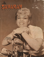
Saharan Magazine from the Sahara Hotel and Casino, July 1966
Date
Archival Collection
Description
An issue of the Saharan Magazine from the Sahara Hotel and Casino in Las Vegas, Nevada. Some of the headlines in the magazine include: "Liberace Heads Show with Special Appearance of "Day of Decision" Artist", "Sahara Maestro Louis Basil Tells All (about work with Super Stars)", "Sahara news in pictures", "Crowds Hail Opening of $3 Million Sahara-Tahoe Theatre, largest in U.S.", and "We Get Visitors!"
Mixed Content
Report on the Basic Magnesium, Incorporated water supply system, Clark County, Nevada, October, 1949
Date
Archival Collection
Description
Report on the water supply system at Basic Magnesium, Inc.
Text
Drug laws: reports, analysis, House Resolution 5484, status, correspondence, clippings, press release, statement from Senator Hecht, and notes
Date
Archival Collection
Description
Folder of documents from the Senator Chic Hecht Political Papers (MS-00003) -- Subject Files -- Judiciary file.
Text
Photographs of Westward Ho signs, Las Vegas (Nev.), 2002
Date
Archival Collection
Description
Site name: Westward Ho Motel (Las Vegas, Nev.)
Site address: 2900 S Las Vegas Blvd
Sign details: The space of the westward Ho is limited yet busy on the landscape of the strip. Approaching from the south, the property lies on the West- side of the Strip. Signage is available on the south elevation, wrapping around into the east elevation, which happens to be the front. Starting with the pylon sign a similar courtyard stretches north with its translucent vinyl awnings, until it reaches its abrupt end with the Circus Circus and Slots A Fun properties.
Sign condition: Structure 5 Surface 5 Lighting 5
Sign form: Pylon; Porte-cochère
Sign-specific description: Approaching the Westward Ho headed north you are immediately confronted by a couple of signs. The first being giant yellow channel letters in Western style font and outlined in blue neon. The font is similar to that of the Frontier Hotel and Casino. The ends of extended appendages of the letters swell in block shapes with points jutting from the flat surface. The letters are filled with incandescent bulbs which all flash on together almost illuminating the entire parking lot in for a brief few seconds and then off again. Below that the building is horizontally striped with polished gold panels sporting three back lit signs for various resort attractions of buffets and drink specials. The building long panel is bordered on the top and the bottom by chasing incandescent bulbs on a polished raceway from left to right when facing this south elevation. The brick facade is adorned with a long backlit message cabinet with yellow painted raceways with incandescent bulbs. On either end of the backlit cabinet are two large square backlit cabinets. These two are bordered with a large steel raceway painted black. Dividing the two large raceways is a channel painted yellow. Inside the recessed channel are incandescent bulbs. The black raceways are faced each with three stripes of neon in blue, whir. The facade of signage and mirrored panels leads the eye to the obvious main pylon sign for the motel. The giant exploding pylon of gold raceways shooting upward into the sky and finally mushrooming out into umbrella formations at different elevations. The sign is comprised of five separate towers: One giant one in the center, which is the tallest, two lower ones flanking the center poles, then one smaller one on the south side of the sign and one equal size on the East side of the structure. The polished gold aluminum raceways comprise the body of the structure and are illuminated with incandescent lamps. The very base of the structure is supported with a structure of red brick masonry. The only elements of actual signage are the back-to-back color animated LED message centers, which are crowned by the 'old west' style text of various sized red neon bordered channel letters. Viewed from the side the Westward ho sign takes on a more sculptural aspect than that of signage. The reason for this is the brilliant finishing of the backs of the message centers. The rears of each panel are finely finished with brushed aluminum gold panels, which combined with the electrifying animation of the incandescent bulbs, creates a high degree of reflectivity. (Barnard) As if echoing the main pylon sign, stretching to the north is a small plaza utilizing the same three-dimensional sculpted umbrella designed awnings to create a pedestrian ready experience to the design. The umbrellas are made into coverings by the addition of illuminated vinyl. The pole structures are steel, covered with brick masonry. Each one of the umbrellas has a planter base and benches where visitors my rest or enjoy the surrounding environment. As the pylon, bulb laden, polished aluminum raceways form the skeleton of the Umbrella. Non-illuminated brass raceways stretch down from the inside and down the center pole. As well as the pylon, polished metal lacework finds its way around the circumference of the Umbrellas bottom edge. The East face of the building is mirrored to ad to the reflectivity of the entire plaza, and adding the illusion of depth to the rather limited space. The half columns and half umbrella's are set into the wall looking as if it is whole against the mirrored surface. A backlit triangular polished cabinet is of particular interest, because it is a sculpted cabinet frame. The top of the two faces is made to mimic the shapes of the pylons swelled crowns. Westward Ho is spelled in red paint.
Sign - type of display: Neon; Incandescent; Backlit; Matrix; Ambient
Sign - media: Steel; Plastic; Glass; Masonry
Sign - non-neon treatments: Graphics; Paint
Sign animation: Chasing, flashing, oscillating
Notes: The incandescent bulbs inside the text reading "Paris" on the balloon oscillate rapidly.
Sign environment: The Westward Ho's unique design of an incorporated courtyard frontage, creates a small strip of closed environment between the Stardust and the Circus Circus/Slots A Fun. The space between the Stardust's property and the Westward Ho's is separated by a small parking lot, which holds claim to the giant letters which boom out casino to the passerby. With its party atmospheric, umbrella design, and mirrored backdrop the pedestrian element makes its own environment distinct to the passerby. Walking through this section gives a sense of a specific taste held in Las Vegas two decades ago, yet still evident today in almost every casino design.
Sign manufacturer: Sign Systems, Inc (pylon and courtyard) YESCO (south side signage)
Sign designer: Brian K. Leming (Pylon and Umbrella frontage)
Sign - date of installation: 1983 (Pylon and Umbrella frontage)
Sign - date of redesign/move: Original backlit plastic message center was replaced with the now existing LED matrix screen
Sign - thematic influences: The Westward Ho facility itself is a Western themed establishment but the design by Lemming reflects a more party atmosphere with its umbrella shaped overhangs and highly animated incandescent raceways. The courtyard was originally designed with a different idea fore a pylon, but the idea of the canopies was carried over into that of the design of the pylon. The over use of the theme of the polished aluminum is reminiscent of that period in Vegas history when the materials could be found virtually everywhere. Such examples included the porte cocheres at the Silverbird Hotel and Casino and the Stardust as well. This theme is still seen on virtually almost every sign. The only elements of Western imagery or style are found in the pylon sign are the font style of the lettering. As for the he building's flavor of the old west, the south wall's yellow channel letters reading "CASINO" is reminiscent of the style of font found on the pylon.
Sign - artistic significance: Besides the fact that the pylon structure stood independently in sculptural aspects as well as functional aspects, the use of materials proved to be a trend setting achievement in that period of Las Vegas. Not only did the property take extensive use materials that could maximize the ability of the lighting such as polished aluminum and mirrored paneling, it was the first to significantly employ the use of colored, translucent vinyl.(Barnard) Soon after the use of this translucent materials in signs could be seen all over the Strip on the interior and exterior of signs and buildings.
Surveyor: Joshua Cannaday
Survey - date completed: 2002
Sign keywords: Chasing; Flashing; Oscillating; Pylon; Porte-cochère; Neon; Incandescent; Backlit; Matrix; Steel; Plastic; Masonry; Glass; Paint; Graphics
Mixed Content
University of Nevada, Las Vegas (UNLV) 35th commencement program
Date
Archival Collection
Description
Commencement program from University of Nevada, Las Vegas Commencement Programs and Graduation Lists (UA-00115).
Text
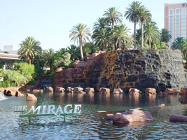
Photographs of Mirage signs, Las Vegas (Nev.), 2002
Date
Archival Collection
Description
Site name: Mirage (Las Vegas, Nev.)
Site address: 3400 S Las Vegas Blvd
Sign owner: MGM Mirage
Sign details: The main attraction of the property is its spectacular exploding volcano placed among an astounding array of lagoons, waterfalls and palm trees. One of the themed hotel casinos, the architectural form takes precedence over an abundance of flashing lights and neon. Two pylon signs reside on the front of the property along Las Vegas Blvd, another on the west side of the property, two arched banner entrances are placed among them, lettering atop the towers, and various text placed among the vast stretch of landscaping are the only visible large elements of signage.
Sign condition: Structure 5 Surface 5 Lighting 5 The structure and lighting on the signs are in excellent repair, with no apparent major physical damage. The surfaces of the pylons and assorted log text, are a bit dirty, but no more than any other establishment, considering the punishment each must undergo due to the elements as well as the live volcano.
Sign form: Pylon; Fascia; Porte-cochère
Sign-specific description: Just north of Caesars Palace a giant pylon sign faces north/south, on the east side of the strip. Two giant square posts support a giant backlit advertisement panel, and an adorning entablature containing the channel letters spelling "Mirage." Between the two giant legs two cabinets are present to fill the space. Just below the main backlit panel an LED screen resides just above another back lit panel. The two giant legs have a series of polished metallic panels running vertically up the sides, creating a recessed channel. The sections are separated with slight overhangs. The bottom smaller panel cabinet is an advertisement for "Danny Gans" and the main panel advertises for the "Seigfried and Roy" magic show. A small banner rests between the main entablature, and the panel, reading "Magicians of the Century." The black channel letters in the main pediment spells "The Mirage," and are filled with incandescent bulbs. The lush foliage and walkways continue north where a covered awning faced with a carved wood and brass bullnose, allows pedestrians to take a moving walkway up to the resort. The landscaping continues north where it meets a driveway denoted by a low arched banner supported by a pair of square columns on either end. "The Mirage" is spelled in polished gold channel letters, with white interiors and filled with incandescent bulbs. The banner itself is sculpted into two sweeping solid shapes on the tops and bottoms, with a series of folded ribbon like scroll shapes. The center section is crafted as to allow light to pass through the negative spaces created by the rows of positive scroll shapes. The banners face east. On the faces of each of the flanking posts, two images of jumping dolphins are sculpted and finished in the same fashion. Past the gateway the thick beds of foliage and palm trees can be seen headed back along the drives. Continuing north a multi tiered lagoon rushes circulating water on and over waterfalls, while yet more green shrubbery and palm trees encrust islands and images of eroded rocks and geological formations. The beautiful imagery continues north, twisting and turning in and behind itself to create a fantastic spectacle for a passerby to be lured in and be fascinated. Approximately in the middle of the length of the expanse, the famous functioning volcano rests quietly amongst smaller rocks and waterfalls. Just past the volcano the lagoon opens up into a wide flat area of water where bronze dolphins are positioned to look as if they are jumping out of the water. Still the rich foliage dominates the landscape, until another arched gateway interrupts the expanse to allow traffic. The foliage, and lagoon landscaping, picks up again, cozily grasping the base of a smaller pylon of similar design as the first. The two reflective paneled legs rise up to connect with a horizontal piece of the same design. A large backlit cabinet advertising for Danny Gans occupies approximately three-quarters of the space between the legs. An entablature of the same design as the main pylon, yet smaller, crowns the top of the sign. The trademark font spells "The Mirage" in black channel letters and filled with incandescent bulbs. Just past the small double sided pylon, a small of recess of rocks plays home to the end marker of the Mirage. A bust of Siegfried and Roy with a tiger is ambiently lit, provided photo opportunities for tourists. An interesting function has been added to the bust. In the flower bed behind and on the sides of the object, faux boulders are places with glowing crystals protruding from the surface. The tower of rooms for the Mirage is the popular three winged "Y" configuration converging onto a center structure. On each face of each wing, giant black channel letters spell "The Mirage" in their trademark text. Each is filled with incandescent bulbs.
Sign - type of display: Neon; Incandescent; Backlit
Sign - media: Steel; Plastic
Sign animation: Oscillating
Notes: The incandescent bulbs located within text logos on the pylon sign, and upon the tower oscillate to appear as shimmering. The effect is one of the more common animations particularly among the larger, corporate casinos.
Sign environment: The placement of the Mirage right on the curve of the Strip makes the pylons visible from a good distance from either direction. The environment displayed by the mirage is that of paradise. When walking past, and up to the property, it hard not to stop and stare at the amazing foliage and spread of waterfalls, and rocks.
Sign manufacturer: Ad-Art
Sign designer: Pylons: Charles Barnard with touches from Wynn's design group Atlandia Design Group. Dolphin Archways: Barnard and Jack Dubois as well as hotel architect, Joel Bergman
Sign - date of installation: 1989
Sign - date of redesign/move: The main pylon has since been updated with a new Siegfried and Roy Back lit Mural, a new LED screen, and another back lit plastic screen featuring Danny Gans. An internally lit banner reads horizontally across the top of the giant Siegfried and Roy Mural which reads Magicians of the Century.
Sign - thematic influences: The theme is tropical island paradise. Complete with active volcano, the front spectacle of rushing waterfalls, chirping bird noises, and leaping bronze dolphins, serves as the backdrop for the simple, slim design of the property's pylon structure. The pylons were designed to reach harmony with the structure of the tower itself, rather than the island theme. The dolphins over the entrance arches however represent the tropical island theme, as well as speaking about the dolphin habitat inside.
Sign - artistic significance: The main pylon was the first of its kind to feature a full color illuminated photographic pictoral. Designed by Rosco, it was billed as the largest of its type in the world. The resort's themed spectacular was also the first of it's kind in regards to its extravagance and unique functionality. Approximate 125,000 people visited the property on its opening day. The resort fits well into the theme of design of the large, corporate property, after all it was one of the pioneers of such a movement in Las Vegas. The Mirage also set the standards for the now frequently seen element of the attraction spectacle, and the standard of quality on the Las Vegas Strip
Surveyor: Joshua Cannaday
Survey - date completed: 2002
Sign keywords: Oscillating; Pylon; Fascia; Porte-cochère; Neon; Incandescent; Backlit; Steel; Plastic
Mixed Content
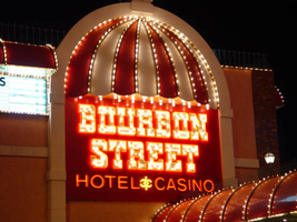
Photographs of Bourbon Street signs, Las Vegas (Nev.), 2002
Date
Archival Collection
Description
Site address: 120 E Flamingo Rd
Sign owner: Carma LTD
Sign details: Bourbon Street is located between the Maxim and the Barbary Coast on the north side of Flamingo, stretching to the corner of Audrie and Flamingo. The building contains elements such as brick masonry, stucco and wrought iron grating. It is a smaller property compared to nearby plots such as Bally's or the Flamingo. Extending north a short distance for a structure of rooms and parking, the signage consists of wall signs on the east and west sides of the building, a main sign on the south side of the building, a sidewalk and window canopies, as well as a main pylon.
Sign condition: Structure 3 Surface 3 Lighting 3--notes: The entire facade of the building, as well as canopies are badly faded and in need of attention.
Sign form: Pylon; Fascia; Porte-cochère
Sign-specific description: Headed west on Flamingo the first signage visible of the Bourbon Street is on the east face of the main building. A giant stucco arch, which runs the height of the building, is adorned at the very top with a round canopy. The canopy is divided into striped sections of red and white alternating panels, separated by gold aluminum polished raceways lined with incandescent bulbs. The canopy's underside is laden with incandescent bulbs. White channel letters reside on the surface of the building spelling out " Bourbon Street," with one word above the other. The letters are filled with white neon. Below the word "Street," the words "Hotel Casino," are spelled in channel letters and filled with red neon. Below the collection of channel letters and canopy, the majority of the space is occupied with an internally lit plastic screen with vinyl letters. Two small canopies flank the arch over two windows and also contain incandescent bulb raceways. The top edge of the building is gold polished raceways with incandescent bulbs. Along the south side of the building, long canopies are hung upon the top edge of the wall hanging over backlit plastic screens with vinyl letters. The middle of the building is an archway projected out into space creating an extension of the side of the building. The same canopy design seen on the east side of the building is seen at the top of the structure only larger in size. It is also treated with the same raceway and incandescent bulb design. "Bourbon Street" is spelled in al capital channel letters outlined in red neon and filled with incandescent bulbs. Above and below the text on the wall, white neon is bent into decorative, scrollwork patterns. The very top of the arch is crowned with a single internally lit spherical bulb. Below the text a cabinet with rounded top corners, houses channel letters filled with red neon. It is bordered with a raceway lined with incandescent bulbs. Projecting out on either side of this cabinet, along the face of the building, hanging over the sidewalk, is a canopy with an exoskeleton of raceways lined with incandescent bulbs. On the wall of the building, between the two top and bottom canopies, and on either side of the main entrance two small canopies hang over windows. They are treated the same as the window canopies on the east side of the building. On the west end of the property there is a small porte-cochere, and covered walkway that extends west to the end of the property. At a slightly higher elevation than the facade's canopy, the porte-cochere is a square design with the same external raceways and bulbs, the same can be said for the walkway extending to the edge of the property. The canopies look to be made of steel and painted to match the color scheme of the establishment. The underside of the porte-cochere is comprised of squared mirrored paneling illuminated with incandescent bulbs. On the west side of the building above the porte-cochere the same canopy and arch design can be seen but the text is more akin to the text on the south side of the building. The channel letters spell the text Bourbon Street in two lines. They are outlined in red neon and filled with incandescent bulbs. The text "Hotel Casino" is represented in channel letters filled with red neon. The only difference is the yellow neon design placed in between the two words. To the left of this sign, along the top edge of the building the canopy design picks up again hovering above a backlit sign message board. On the extreme west end of the property the main pylon sign faces east/west on the northeast corner. The sign basically consists of a large pole with a double-backed cabinet, crowned with the umbrella canopy shape seen throughout the property. The cabinet is of rectangular design with the corners cut out in a circular shape. The majority of the sign is occupied by the red neon bordered channel letters, which read "Bourbon Street". These are also filled with incandescent bulbs. The text "Hotel Casino" is spelled in channel letters and outlined on the interior with red neon. The left and right sides of the word "Street" are occupied with a channel scrollwork design lined with yellow neon. A channel pattern also separates the words "Hotel" and "Casino" This patterns appears to be like a flier de lie with its mirror image attached to it from the bottom. It too is filled with yellow neon. The face of the cabinet is lined with a raceway containing incandescent bulbs. The umbrella canopy occupies the top of the sign. It is fully realized in the round, with the exterior skeleton of the raceways with incandescent bulbs. The underside is also mirrored with incandescent bulbs spread across the surface. At the very top of the umbrella shape a streetlight puts the finishing touches on the sign. A small sign worth mentioning sits north of the main pylon at the edge of a small parking lot for the facility. It is a small back-lit cabinet denoting hotel registration and parking. The rectangular cabinet sits upon a small pole with a rounded section incorporated into its design. On the plastic portion of this rounded extension the words "Bourbon Street" are graphically painted along with the image of the red and white canopy.
Sign - type of display: Neon; Incandescent; Backlit
Sign - media: Steel; Fiberglass; Glass
Sign - non-neon treatments: Paint
Sign animation: Oscillating, chasing
Notes: All the incandescent bulbs on the raceways that are visible, chase each from other top to bottom. The incandescent bulbs, which line the raceways on the umbrella shape on the main pylon, chase each other downward as well as around the border of the face of the sign. The underside of the umbrella is also encrusted with incandescent bulbs, which oscillate. The text on the pylon sign all light up simultaneously in an oscillating pattern, they then steady burn, then shut off. The main logo marquee seen on the south face of the building contains the same animation seen on the pylon sign as well. The small vertical raceways underneath the porte cochere also animate by chasing downward.
Sign environment: Headed west toward the strip on Flamingo, the defunct Maxim is almost invisible at night, while the first active property is the Bourbon Street. The main pylon resides directly across Audrie from the Battista's pylon, making a flanking neon gateway to northern bound travelers on Audrie.
Sign manufacturer: YESCO
Sign - date of installation: 1984-05
Sign - thematic influences: The theme of the Bourbon Street is evident in its name being influenced by the Mardi Gras party atmosphere of New Orleans. The new Orleans theme itself is reminiscent of turn of the century America. The canopies and brass railing are reminiscent of properties such as the Westward Ho, with its umbrellas, brass treatments and raceways as well. The pylon is reminiscent of a close neighbor in the Barbary Coast, with similar style 19th century block text, and color palette.
Surveyor: Joshua Cannaday
Survey - date completed: 2002
Sign keywords: Oscillating; Chasing; Pylon; Fascia; Porte-cochère; Neon; Incandescent; Backlit; Steel; Fiberglass; Glass; Paint
Mixed Content