Search Results
Photographs of Barbary Coast signs, Las Vegas (Nev.), 2002
Date
Archival Collection
Description
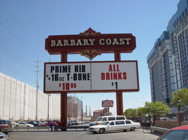
Daytime and nighttime views of the Barbary Coast signs on The Strip. Information about the sign is available in the Southern Nevada Neon Survey Data Sheet.
Site address: 3595 Las Vegas Blvd
Sign owner: Coast Casinos
Sign details: Just West of the Maxim, on a strip of property adjacent to the Flamingo, the Barbary Coast appeared in 1977 dressed in Burgundy and gold with full wrap mansard canopies and simulated Tiffany glass fascias. YESCO's Brian Lemming drew from 19th century woodblock alphabet styles to create the new distinctive logo style. It has since earned the nickname Barbary Coast Block. Lemming's bull nose design paired two opposing drum elements, which tapered near midpoint and were ringed with traceries of traveling lamps alternating with decorative panels outlined in red neon. Other signage includes a pylon sign on Flamingo Rd., textual wall an logo signs, as well as LED display screens. The screens are located near walkways, which extend north/south across Flamingo road, and east/west across Las Vegas Blvd
Sign condition: Structure 5 Surface 5 Lighting 5
Sign form: Pylon; Fascia
Sign-specific description: Upon the south elevation of the building, eight foot tall channel letters spell the "Barbary Coast" logo. South of the main logo, two square poles support the Barbary Coast pylon, which is on the north side of Flamingo, facing east/west. The two legs play Atlas to a double backed, internally lit, message cabinet, with vinyl lettering. The two legs protrude through the top of the sign for a short distance before the main logo cabinet begins. It is about half the size in height of the internally lit message center and containing more elements of design. "Barbary Coast" is spelled in white channel letters and filled with incandescent bulbs, in the Barbary Coast text. The edges of the letters are actually narrow channels that house tubes of gold neon. The neon and the channels actually create the designed curves of the fonts. The centers of the top and bottom edges of the cabinet, are crafted into protrusions in the rectangular shape. They are placed cleverly shallow into the surface to almost seem as if they are resting on the width of the cabinet instead of being part of it. Being completely treated in a gold paint on its width edge, which are parallel to the straight portion of the cabinet edge width, helps with the illusion of the sections being separate entities. Orange and burgundy scroll works are graphically placed into the faces of these protrusions in the panel to finish them off. Headed west at the beginning of the actual property, the first vestiges of signage hangs above the parking garage. A triangular back lit cabinet is finished in polished gold aluminum with a raceway acting as an element, on the edge pointing north, then transforms into a raceway arrow pointed toward the entrance of the garage. The famed overhang creates an arch over the garage entrance, which is recessed all the way back to the main wall of the structure. Mirrors create the surface of the wall at the back of the tunnel vault, of the recessed arch. Upon the mirrored surface a channel logo for the "Drai's" nightclub, hangs quite high above the pedestrian's head. The logo is bordered with green neon and filled with incandescent bulbs. The entire sign is a shallow channel letter design allowing enough room for the depth of the bulb. Another arch and tunnel, with a mirrored wall, is located just west of the first arch. It plays host to a brass colored chandelier with spherical lamps. At ground level underneath the middle section of the famed structure where the main logo text resides, we have an entrance to the casino with a cabinet denoting that over the door. The cabinet is a mirrored face with a gold aluminum polished raceways with incandescent bulbs. The text spelling "Hotel Casino Entrance" is in gold polished channel letters and filled incandescent bulbs. Underneath the canopy, the faux Tiffany glass is separated on its edges by gold polished raceways with incandescent bulbs. Past the main entrance another tunnel arch is formed just past the "B" in Barbary main logo and plays host to a different entrance. It too has a brass chandelier and a mirrored cabinet of the same design as the afore mentioned entrance. The only difference is the text. It spells " Casino Entrance." The rest of the treatments for this sign are identical to the first entrance. On the northeast corner underneath the bull nose, a giant brass chandelier hangs in the center, supported with a multisided, mirrored column. The corner of the building is also an entrance. The west side of the building boasts two wall signs. The south side of the building plays host to the main logo text for the Barbary Coast facility, upon the fascias architecture. The middle of the sign is a long low rise arch. Giant channel letters spell Barbary Coast, above the row of faux stained glass squares, and stand independently away from the wall. They are filled with incandescent bulbs and bordered with neon. The interiors are painted red and the exteriors are treated in gold. Rows of red, vertical, neon tubes line the face of the facade behind the standing channel letters. Continuing around the corner upon the west face of the building the facade continues for a short stretch north after the corner rotunda. The wall of the building itself is where another Barbary Coast text logo resides It's large, and occupies a good portion of the area of the wall. The letters are designed in the same fashion as the letters on the pylon, painted white on the interior and treated gold on the exterior. Above and below the text, two cabinets crafted into scrollwork, similar to those seen on the pylon yet are not attached to the text. The cabinets are slightly recessed providing room for a border of gold neon. Below that and above an LED screen another logo for Drai's, as seen on the south elevation, hangs on the wall. A pair of LED screens flank the NW corner, on the west and south faces of the building. The LED screen on the south wall is at the end of an elevated walkway, that crosses Flamingo. The West wall LED is appropriation to the elevated walkway crossing Las Vegas Blvd, on the west side of the building as well. Another Drai's logo sign shares the west wall also. Along the fascia awning that wraps around the building graphics adorn the rounded panels, which simulate the Tiffany glass. Vertical raceways separate these panels. Neon borders each one of these panels as well as polished raceways along the top and bottom. Incandescent bulbs line all the raceways, as well as the outer edges of the underside. On the North wall of the building, just around the corner from the signage on the west face of the building, another Barbary coast logo wall sign is located on the top portion of the building. It is accompanied by an internally lit, plastic, message board, with vinyl lettering. The two pieces together sit in a slightly recessed niche, so that the board and the text are flush with the rest of the building. The letters are painted yellow on the inside, possess incandescent yellow incandescent bulbs on the interior. The letters are also treated with the same gold finish seen throughout the establishment.
Sign - type of display: Neon; Incandescent; LCD; LED
Sign - media: Plastic
Sign - non-neon treatments: Graphics; Paint
Sign animation: Flashing, chasing, oscillating
Notes: All incandescent bulbs on the polished, gold raceways, chase each other down their entire lengths. The bulbs inside the polished channel letters oscillate as well. The incandescent bulbs in the Drai's sign also oscillate. The pylon sign: The background of vertical red neon bars chase each other from the outer ends, until the entire background is illuminated, then the incandescent bulbs inside the letters chase down and fill the letters, which then oscillate. The text then steady burns, chases downward, then leaves the letters dark in it's path. Once the letters are dark then the neon background curtains open chasing from the center to either end. Once the neon goes dark, then the empty text chases downward again, oscillating, then chasing from top to bottom leaving the letters dark in it's path. The text on the west side of the building lights up one letter at a time, then oscillates, and then steady burns. The letters then oscillate again, shut of for a split second. Then each individual word lights up one at a time. "Barbary" then "Coast," "Barbary" then "Coast" again. On the last sequence of the individual words lighting up they stay lit, and turn off one letter at a time. The main marquee: Each letter of the main marquee illuminate one letter at a time, then oscillate. While they are oscillating then, the vertical red neon bars chase from either end of the sign illuminating each bar in it's path. Right before it reaches the center, the letters shut off briefly then lights up "Barbary" then "Coast," then they both oscillate. They shut off briefly lighting up one word at a time again, oscillating once more. This pattern runs one more time while the red background chases from the center to the ends leaving the rest dark in it's path. The letters remain dark until the red bars regenerate, by chasing outward from two different spots, meeting in the center and extending to the ends. By the time the background is regenerated then the text begins to light up again, rapidly from left to right as if saying "Barbary Coast." It does this a total of three times. All the while the background is opening and closing from the two spots a total of three times. Once the background regenerates one more time, then the letters flash off then on, then alternates with the background. Letters, then background, letters, then background, then off. The two are not lit at the same time during this exchange, but take turns lighting up.
Sign environment: The Barbary Coast sits in the unique intersection of Flamingo Rd. and Las Vegas Blvd, once the main four corners of the Strip. The majority of the surface of the building is located on Flamingo road, just off the strip, headed east. Walking underneath the covered awing on the south side of the building, the constantly pulsating incandescent bulbs and various sounds of the casino bombard a pedestrian, enveloping one until you meet the end of the establishment at either end. The large drummed corner, makes the rest of the adjacent facade hard to miss. Directly south, across Flamingo the Bally's multimedia pylon behemoth resides, and the vibrant Flamingo, sits snugly next to the Barbary Coast's north side. The two establishments of Flamingo and Bally's are considered akin, due to such close proximity. Once you exit the Barbary Coast, utilizing the portals on the west side, headed north, you are almost automatically standing in a small courtyard, in the grasp of the attractive, bright, pink and orange plumage of the Flamingo Hilton. The pedestrian traffic flows from one establishment to the next with ease.
Sign manufacturer: YESCO
Sign designer: Brian K. Leming (bull nose and wrap around fascia)
Sign - date of installation: 1977
Sign - date of redesign/move: LED screens were added to the west and south faces of the building
Sign - thematic influences: A good phrase to describe the thematic influence would be that of a turn of the century ambiance. With it's logo style derived from 19th century woodblock prints, canopies covered in faux Tiffany glass, ornate brass tracings, and distinctive mansards, the decor is reminiscent of a bustling turn of the century gala or festival.
Sign - artistic significance: The full wrap fascia design by Leming, is reminiscent of older Fremont street properties such as the Golden Nugget, and Binion's Horse Shoe. The pedestrian passes underneath the pulsating signage, next to the entrances to the facility. It is a significant design maximizing the space with its design.
Surveyor: Joshua Cannaday
Survey - date completed: 2002
Sign keywords: Chasing; Oscillating; Flashing; Pylon; Fascia; Neon; Incandescent; LED; LCD; Plastic; Paint; Graphics
Mixed Content
"Let's Go A-Go-Go" act performing on the Strip and touring Caesars Palace under construction: video, 1966
Level of Description
Scope and Contents
Static view of the Hacienda Horse and Rider sign; cuts to the "Let's Go A-Go-Go" performers talking and then viewing the Las Vegas Strip from a balcony at The Dunes. Behind the performers, parts of the Strip can be seen including The Sands, The Sahara, Guardian Angel Cathedral, The Desert Inn, and downtown in the distance. Other sequences show the Flamingo and the Dunes sign from the elevated viewpoint. Cuts to Caesars Palace construction site where owner Jay Sarno leads a tour through the property; Sarno walks the group through the pool area where construction laborers work on the just poured swimming pool. Footage then cuts to a dressing room scenes as women apply makeup followed by clips from a performance in various outfits. Footage then cuts to the Hacienda pool where the act meets with Hacienda Casino owner Judy Bailey; group is filmed near the Thunderbird Casino driving away in a Corvette. Footage also shows The Riviera marquee featuring an ad for Betty Grable starring in Hello Dolly with smaller acts touted including Shecky Greene, Tony Sandler, and Ralph Young. Original media 16mm film, black-and-white, frame size 720 x 486, aspect ratio 4 x 3.
Archival Collection
Collection Name: The Production Company Audiovisual Collection
Box/Folder: Digital File 00
Archival Component

Film transparency of the Flamingo Hotel and Casino, Las Vegas, Nevada, January 7, 1955
Date
Archival Collection
Description
Image
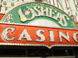
Photographs of O'Shea's signs, Las Vegas (Nev.), 2002
Date
Archival Collection
Description
Site address: 3555 S Las Vegas Blvd
Sign owner: Park Place Entertainment
Sign details: O'Shea's Casino is located just north across a small driveway from the Flamingo. The small but busy facade is a small, yet busy stop along the Las Vegas Strip. The exterior signage consists of two corner signs, a blade sign, hanging off of the west face of the building, a main entrance sign, backlit screens as well as various images laden with neon. All of these create a flashing display of luminescence all just above the pedestrian's head.
Sign condition: Structure 5 Surface 5 Lighting 5
Sign form: Fascia
Sign-specific description: O'Shea's Casino is located just north across a small driveway from the Flamingo. O'Shea's theme and signage is influenced by Irish culture and imagery, integrated into the forms of signage along the Las Vegas Strip. The building design itself is influenced by traditional European housing imagery, generalized with other elements of architecture also. One example of this is the coloring, exposed wooden beams and narrow rooflines over treated windows, which suggest styles seen in classic European architectural imagery. Examples of other elements such as sculpted windowsills and exterior molding are more akin to neoclassical than the Irish pub or cottage. A small blade sign hangs in the center of the structure facing north /south. Attached off of the building by two poles, the double sided cabinet is designed with a circular portion at the top that transforms along it's bottom edge into length portion of the "blade" that continues down to a rounded bottom. The Circular portion serves as the "O" in O'Shea's. The exterior of the signs width is finished in a polished gold aluminum surface. The top portion continues into a full circular space in the front where the backlit image of the O'Shea's leprechaun mascot resides in it's center. The image has a circular green neon border at the edge of the cabinet and is set into a field of incandescent bulbs, which occupy the remaining space in the face of the "O". Incandescent bulbs also run around the edge of a face on a gold raceway. Channel letters run vertically down the face of the blade spelling the remaining "Sea's" of the title. Each letter is filled with incandescent bulbs, and bordered on it's exterior in green neon. The remainder of the space, which comprises the surface of the sign, is a green material. The entire edge of the rest of the sign is also bordered with incandescent bulbs. Below the blade sign, the main entrance for the establishment is denoted by the large, arched, marquee logo, and wall sign for the casino. The arch shape is bordered by gold polished raceways, with the interior space where the O'Shea's logo is written in a bowed, horizontal arrangement with the "O" and "S" being the biggest letters in this group. The same back-lit leprechaun figure which is present in the blade sign, in seen in the "O" of the logo. The letters are of channel design and filled with incandescent bulbs. Gold scrollwork adorns the green background above and on the sides of the logo. An entablature, running the length below the arch, reads "casino" in channel letters filled with incandescent bulbs and bordered with green neon. The orange background in contained on the bottom edge with a gold polished raceway, which sharply curves into a downward point at the very center. All the raceway edges of the sign are lined with incandescent bulbs. Flanking the wall on either side of the main entrance are two backlit message centers with vinyl lettering. They also are bordered with incandescent bulbs, strewn upon polished raceways. To the south toward the Flamingo Casino, a corner marquee sign faces toward the southwest. The message center on the right of the main entrance essentially continues its shape wrapping in radius fashion all the way around the corner. As the entablature wraps the corner, the color changes to a section of black, containing the channel letters hung at a slight angle, spelling the words " Hall of Fame," in cursive text. Small stars in channel design adorn the black background. On the left of the text, O'Shea's is painted in red paint, in a cursive script at a similar angle as the premier text. Neon is shaped over the surface of the letters to allow it to be spelled in light. The word "Casino" is spelled on the right hand side, and treated in the same fashion. A top the black portion of pediment, the sign continues with it's corner finishing, rounded marquee, containing the text, "Magic & Movie," in a three lined arrangement. Putting the two signs together the appropriate title for the advertisement of the attraction is read "Magic and Movie Hall of Fame." The channel letters on the top portion are filled with neon and treated white on the interiors. The edge of the cabinet is treated with white bull nose borders, sandwiching a field of pink holding two tubes of contoured neon. At the peak of the sign a small element reminiscent of a fan, created using a multi layered box, uses different levels receding into space, with the center blade at the front of the sign. The sections are lined with gold raceways and incandescent bulbs, with the center blade being horizontally striped with tubes of neon. Two small gold finished gargoyle statues flank either side of the theatre-esque entrance. Underneath the overhang created by the corner sign, polished aluminum element creates a sloping drum shape above the door. This drum is divided into sections by gold polished raceways. The flat portion, which returns to the ceiling of the overhang is adorned with painted images of clovers, encircled in rings of green neon. This section is reminiscent of the top section of the corner drum of the Barbary Coast. The black pediment along the south portion of the building., abruptly changes to the orange color seen on the main entrance. Along the south wall section of the pediment green pan channels in the shape of clovers hang, lined on the interior with neon. A small sign denoting parking is also present. Another corner entrance is located on the north end of the property, facing northwest. It too has the rounded corner entrance and logo sign. Slightly different than the main entrance, the same "Casino text and structure is seen on the orange pediment above the door, as well as the channel logo with the mascot located in the letter "O." A three-sectioned panel with swooping wings and an arched center creates the field for the main logo. A more busy section of two dimensional scrollwork sits below the neon filled text. The wings of the top section a recessed panels with checkerboard design behind that. Each side of the entire top section is book ended with two small square posts. Three small miniature spires line the very top, and the same inverted drum shape sits underneath the door. Street posts reside on the sidewalk outside.
Sign - type of display: Neon; Incandescent; Backlit
Sign - media: Steel; Plastic
Sign animation: Chasing, flashing, oscillating
Notes: All of the bulbs, which reside in the fascia signs which designate entrances, oscillate rapidly. The entrance sign a bit closer to the north end of the property also contain the pan channel star shapes, with incandescent bulbs in the center. The bulbs which, reside on the widths edge of the small pole sign at the south end of the property, oscillate giving a twinkling effect. The main pylon's animation is rather simple considering the amount of lighting. Bulbs which create the dazzling background chase each other upward to the very point, then once they reach the top, each letter light up from left to right, one at a time, then off one letter at a time. The letters all turn on simultaneously while, while the background chases up, leaving the lights off in its trail. The text then shuts off as well. The small incandescent bulbs lacing the background of the main body of the sign oscillate subtly, twinkling themselves. Each letter of the text contains a single row of incandescent bulbs, just inside the border of the red neon. This row is always on in a chasing animation from left to right even when the letters are dark. The animation for the three sided, pole sign, at the north end of the property is adorned with sparkling animation as well. The purple bulbs, which create the border of the main base, chase each other from bottom to top, and the star shape in the center is filled with oscillating incandescent bulbs. The bulbs, which also encrust the bottom surface of the cabinet, oscillate as well. The incandescent bulbs, which adorn the background of the text portion of the sign, also sparkle with a soft random oscillating pattern. The stars which sit on top of the cabinet, animate in a random, non descriptive fashion. The inner star shaped pans oscillate with incandescent bulbs, and the neon borders flash on then off, in a clumsy random order. The three-sided sign also rotates, one of the few animatronic signs on the Strip.
Sign environment: Being essentially part of the Flamingo, O'Shea's is only separated by a small drive, producing the easy traffic flow from the north entrance of the former. The north of O'Shea's on the immediate vertical explosion of the front tower/porte cochere of the Imperial Palace. It is easy to say that O'Shea's is sandwiched in between two giants, assuming its place as the charming gap between the Flamingo and the Imperial Palace which is quite a bit more pedestrian friendly. Traveling north on the east side of the strip, O'Shea's is not hard to miss at all
Sign - date of installation: Original date of installation 1989. The southwest, and northwest corner signage were added at a later date
Sign - thematic influences: O'Shea's centers around the theme of the Irish pub, utilizing various imagery to get support the design. The color green is used extensively in the main signs color scheme while the ever-popular image of the folkloric leprechaun illuminated it a cartoon form upon the pylon. The green pan channels, which are shaped like shamrocks, are place along the exterior wall, an obvious reference to the St. Patrick's Day Holiday as well a reference to good luck. ( example: the four-leaf clover, luck of the Irish.) Luck is something synonymously associated with an industry such as gaming. Gold is also used extensively with the exterior referencing the infamous pot of gold associated with the lore of leprechauns. The actual structure itself is constructed with elements which suggest a European rustic cottage.
Surveyor: Joshua Cannaday
Survey - date completed: 2002
Sign keywords: Chasing; Oscillating; Fascia; Neon; Incandescent; Backlit; Steel; Plastic
Mixed Content
Audio clip from interview with Hank Greenspun, 1975
Date
Archival Collection
Description
In this clip, Hank Greenspun speaks with Perry Kaufman about arriving in Las Vegas in 1946, and his first encounter with Bugsy Siegel.
No release form is on file for this interview. The interview is accessible onsite only, and researchers must seek permission from the interviewee or heirs for quotation, reproduction, or publication. Please contact special.collections@unlv.edu for further information.
Sound
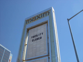
Photographs of Maxim signs, Las Vegas (Nev.), 2002
Date
Archival Collection
Description
Site address: 160 E Flamingo Rd
Sign owner: Premier Interval Resorts
Sign details: The Maxim is located just east of the Bourbon Street, in close proximity to Bally's Hotel Casino. The Maxim is no longer operating, and is fenced off from further inspection. The signage that is seen entails building signs, the original pylon, and the porte cochere
Sign condition: Structure 2 Surface 2
Sign form: Pylon; Fascia; Porte-cochère
Sign-specific description: Building: The tower itself contains the logo and giant text spelling the name of the establishment, on one side of the building. The tower is mirrored and reflective, thus matching the porte cochere and pylon, and reserves to collect its building signage to one end of the tower. The tower, which runs east/west, and faces north/south contains the signs on the east end structure. On the north and south faces of the building, giant red channel letters run vertically along the block surface. The letters look to be lined on the interior of the letters with neon. The logo can be seen on the east face. Pylon: The pylon sign is essentially a giant vertical monolith of a rectangle, divided into several different sub-shapes. The center of the monolith is occupied by cabinets which fill in most of the shape, with a small gap bordering the cabinet. The cabinets are treated the same as the square arch, and flush with the surface. The cabinets are very subtle and create an illusion of one solid object. The entire outer arch shape and interior cabinets are bordered with polished aluminum. The interiors surface of the arch are covered in polished gold aluminum panels. The lining of the incandescent bulbs on the sign is interesting. On the arch the incandescent bulbs are on the interior return width of the aluminum borders. With this configuration, the bulbs sit parallel to the surface instead of perpendicular. The main marquee text is aligned horizontally across the top in gold channel letters with red plastic faces. The letters blend with the gold surface nicely. The interior cabinets are internally lit with plastic faces. There are two cabinets, the larger of the two, occupying the upper part the interior space of the monolith. Incandescent bulbs line the exteriors of the cabinets, sitting back on a recessed edge. Porte Cochere: The porte cochere is unique, opting to rise high above the surface of the pavement. The prismatic design crafted in polished aluminum, interlocks into a pattern suitable to the space which it resides. The recesses in which the decoration resides are separated by a small width of structure. This pattern of giant recesses, matched with the prismatic design in each negative space create a hulking environment high above the head in proud stature. Along the peak edge of the pieces of the prism, rods protrude every foot or so, creating a row of arms holding incandescent spheres.
Sign - type of display: Neon; Incandescent
Sign - media: Steel; Plastic
Sign - non-neon treatments: Graphics; Paint
Sign animation: chasing, flashing
Sign environment: The Maxim is now closed, and stands in marked contrast to its neighbors a bit to the east--the famous "Four Corners" of Flamingo and the Strip, and next to the trendy Meridian at Hughes Center apartment complex.
Sign designer: Maxim letter design: Kenneth Young, Porte Cochere; Lighting: Jack Dubois Pylon sign: Marnell Corrao
Sign - date of installation: 1977
Sign - thematic influences: The influence of the Maxim hotel was 70's Vegas design refined to simple geometric forms and curved linear logo's. The pylon was completely sheathed in polished aluminum, as well as the underside of the porte cochere being polished gold aluminum. The use of the popular 70's material is used extensively throughout the design. Letters hung over the main entrance, as well as signage on three sides of the building. Other examples of the material can be seen elsewhere but not as extensively. The only property that comes close is the pylon for usage of the material is the Westward Ho.
Surveyor: Joshua Cannaday
Survey - date completed: 2002
Sign keywords: Chasing; Flashing; Pylon; Fascia; Porte-cochère; Neon; Incandescent; Steel; Plastic; Graphics; Paint
Mixed Content