Search the Special Collections and Archives Portal
Search Results

Pom Fritz oral history interview: transcript
Date
Archival Collection
Description
Oral history interview with Pom Fritz conducted by Kristel Peralta and Stefani Evans on June 8, 2021 for Reflections: The Las Vegas Asian American and Pacific Islander Oral History Project. Pom talks about her family and upbringing in Udon Thani, Thailand and her immigration to the United States with her second husband, an American citizen, in 1972. She discusses living on Air Force bases in North Carolina and California before moving to Las Vegas and finding work at different hotels. Pom shares her experiences as a member, steward, and executive board representative of the Culinary Workers Union and what she recalls from the Frontier Strike. She also talks about her children and grandchildren, some of whom still live in Thailand.
Text
Audio clip from interview with Henry and Anita Schuster by Claytee White, March 1, 2011
Date
Archival Collection
Description
Part of an interview with Henry and Anita Schuster on March-April 2011. In this clip, the Schuster's discuss childhood, family, and life during the rise of Nazi power.
Sound
Tiza Stewart real estate documents
Date
Archival Collection
Description
Tiza Stewart real estate documents
Text
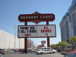
Photographs of Barbary Coast signs, Las Vegas (Nev.), 2002
Date
Archival Collection
Description
Daytime and nighttime views of the Barbary Coast signs on The Strip. Information about the sign is available in the Southern Nevada Neon Survey Data Sheet.
Site address: 3595 Las Vegas Blvd
Sign owner: Coast Casinos
Sign details: Just West of the Maxim, on a strip of property adjacent to the Flamingo, the Barbary Coast appeared in 1977 dressed in Burgundy and gold with full wrap mansard canopies and simulated Tiffany glass fascias. YESCO's Brian Lemming drew from 19th century woodblock alphabet styles to create the new distinctive logo style. It has since earned the nickname Barbary Coast Block. Lemming's bull nose design paired two opposing drum elements, which tapered near midpoint and were ringed with traceries of traveling lamps alternating with decorative panels outlined in red neon. Other signage includes a pylon sign on Flamingo Rd., textual wall an logo signs, as well as LED display screens. The screens are located near walkways, which extend north/south across Flamingo road, and east/west across Las Vegas Blvd
Sign condition: Structure 5 Surface 5 Lighting 5
Sign form: Pylon; Fascia
Sign-specific description: Upon the south elevation of the building, eight foot tall channel letters spell the "Barbary Coast" logo. South of the main logo, two square poles support the Barbary Coast pylon, which is on the north side of Flamingo, facing east/west. The two legs play Atlas to a double backed, internally lit, message cabinet, with vinyl lettering. The two legs protrude through the top of the sign for a short distance before the main logo cabinet begins. It is about half the size in height of the internally lit message center and containing more elements of design. "Barbary Coast" is spelled in white channel letters and filled with incandescent bulbs, in the Barbary Coast text. The edges of the letters are actually narrow channels that house tubes of gold neon. The neon and the channels actually create the designed curves of the fonts. The centers of the top and bottom edges of the cabinet, are crafted into protrusions in the rectangular shape. They are placed cleverly shallow into the surface to almost seem as if they are resting on the width of the cabinet instead of being part of it. Being completely treated in a gold paint on its width edge, which are parallel to the straight portion of the cabinet edge width, helps with the illusion of the sections being separate entities. Orange and burgundy scroll works are graphically placed into the faces of these protrusions in the panel to finish them off. Headed west at the beginning of the actual property, the first vestiges of signage hangs above the parking garage. A triangular back lit cabinet is finished in polished gold aluminum with a raceway acting as an element, on the edge pointing north, then transforms into a raceway arrow pointed toward the entrance of the garage. The famed overhang creates an arch over the garage entrance, which is recessed all the way back to the main wall of the structure. Mirrors create the surface of the wall at the back of the tunnel vault, of the recessed arch. Upon the mirrored surface a channel logo for the "Drai's" nightclub, hangs quite high above the pedestrian's head. The logo is bordered with green neon and filled with incandescent bulbs. The entire sign is a shallow channel letter design allowing enough room for the depth of the bulb. Another arch and tunnel, with a mirrored wall, is located just west of the first arch. It plays host to a brass colored chandelier with spherical lamps. At ground level underneath the middle section of the famed structure where the main logo text resides, we have an entrance to the casino with a cabinet denoting that over the door. The cabinet is a mirrored face with a gold aluminum polished raceways with incandescent bulbs. The text spelling "Hotel Casino Entrance" is in gold polished channel letters and filled incandescent bulbs. Underneath the canopy, the faux Tiffany glass is separated on its edges by gold polished raceways with incandescent bulbs. Past the main entrance another tunnel arch is formed just past the "B" in Barbary main logo and plays host to a different entrance. It too has a brass chandelier and a mirrored cabinet of the same design as the afore mentioned entrance. The only difference is the text. It spells " Casino Entrance." The rest of the treatments for this sign are identical to the first entrance. On the northeast corner underneath the bull nose, a giant brass chandelier hangs in the center, supported with a multisided, mirrored column. The corner of the building is also an entrance. The west side of the building boasts two wall signs. The south side of the building plays host to the main logo text for the Barbary Coast facility, upon the fascias architecture. The middle of the sign is a long low rise arch. Giant channel letters spell Barbary Coast, above the row of faux stained glass squares, and stand independently away from the wall. They are filled with incandescent bulbs and bordered with neon. The interiors are painted red and the exteriors are treated in gold. Rows of red, vertical, neon tubes line the face of the facade behind the standing channel letters. Continuing around the corner upon the west face of the building the facade continues for a short stretch north after the corner rotunda. The wall of the building itself is where another Barbary Coast text logo resides It's large, and occupies a good portion of the area of the wall. The letters are designed in the same fashion as the letters on the pylon, painted white on the interior and treated gold on the exterior. Above and below the text, two cabinets crafted into scrollwork, similar to those seen on the pylon yet are not attached to the text. The cabinets are slightly recessed providing room for a border of gold neon. Below that and above an LED screen another logo for Drai's, as seen on the south elevation, hangs on the wall. A pair of LED screens flank the NW corner, on the west and south faces of the building. The LED screen on the south wall is at the end of an elevated walkway, that crosses Flamingo. The West wall LED is appropriation to the elevated walkway crossing Las Vegas Blvd, on the west side of the building as well. Another Drai's logo sign shares the west wall also. Along the fascia awning that wraps around the building graphics adorn the rounded panels, which simulate the Tiffany glass. Vertical raceways separate these panels. Neon borders each one of these panels as well as polished raceways along the top and bottom. Incandescent bulbs line all the raceways, as well as the outer edges of the underside. On the North wall of the building, just around the corner from the signage on the west face of the building, another Barbary coast logo wall sign is located on the top portion of the building. It is accompanied by an internally lit, plastic, message board, with vinyl lettering. The two pieces together sit in a slightly recessed niche, so that the board and the text are flush with the rest of the building. The letters are painted yellow on the inside, possess incandescent yellow incandescent bulbs on the interior. The letters are also treated with the same gold finish seen throughout the establishment.
Sign - type of display: Neon; Incandescent; LCD; LED
Sign - media: Plastic
Sign - non-neon treatments: Graphics; Paint
Sign animation: Flashing, chasing, oscillating
Notes: All incandescent bulbs on the polished, gold raceways, chase each other down their entire lengths. The bulbs inside the polished channel letters oscillate as well. The incandescent bulbs in the Drai's sign also oscillate. The pylon sign: The background of vertical red neon bars chase each other from the outer ends, until the entire background is illuminated, then the incandescent bulbs inside the letters chase down and fill the letters, which then oscillate. The text then steady burns, chases downward, then leaves the letters dark in it's path. Once the letters are dark then the neon background curtains open chasing from the center to either end. Once the neon goes dark, then the empty text chases downward again, oscillating, then chasing from top to bottom leaving the letters dark in it's path. The text on the west side of the building lights up one letter at a time, then oscillates, and then steady burns. The letters then oscillate again, shut of for a split second. Then each individual word lights up one at a time. "Barbary" then "Coast," "Barbary" then "Coast" again. On the last sequence of the individual words lighting up they stay lit, and turn off one letter at a time. The main marquee: Each letter of the main marquee illuminate one letter at a time, then oscillate. While they are oscillating then, the vertical red neon bars chase from either end of the sign illuminating each bar in it's path. Right before it reaches the center, the letters shut off briefly then lights up "Barbary" then "Coast," then they both oscillate. They shut off briefly lighting up one word at a time again, oscillating once more. This pattern runs one more time while the red background chases from the center to the ends leaving the rest dark in it's path. The letters remain dark until the red bars regenerate, by chasing outward from two different spots, meeting in the center and extending to the ends. By the time the background is regenerated then the text begins to light up again, rapidly from left to right as if saying "Barbary Coast." It does this a total of three times. All the while the background is opening and closing from the two spots a total of three times. Once the background regenerates one more time, then the letters flash off then on, then alternates with the background. Letters, then background, letters, then background, then off. The two are not lit at the same time during this exchange, but take turns lighting up.
Sign environment: The Barbary Coast sits in the unique intersection of Flamingo Rd. and Las Vegas Blvd, once the main four corners of the Strip. The majority of the surface of the building is located on Flamingo road, just off the strip, headed east. Walking underneath the covered awing on the south side of the building, the constantly pulsating incandescent bulbs and various sounds of the casino bombard a pedestrian, enveloping one until you meet the end of the establishment at either end. The large drummed corner, makes the rest of the adjacent facade hard to miss. Directly south, across Flamingo the Bally's multimedia pylon behemoth resides, and the vibrant Flamingo, sits snugly next to the Barbary Coast's north side. The two establishments of Flamingo and Bally's are considered akin, due to such close proximity. Once you exit the Barbary Coast, utilizing the portals on the west side, headed north, you are almost automatically standing in a small courtyard, in the grasp of the attractive, bright, pink and orange plumage of the Flamingo Hilton. The pedestrian traffic flows from one establishment to the next with ease.
Sign manufacturer: YESCO
Sign designer: Brian K. Leming (bull nose and wrap around fascia)
Sign - date of installation: 1977
Sign - date of redesign/move: LED screens were added to the west and south faces of the building
Sign - thematic influences: A good phrase to describe the thematic influence would be that of a turn of the century ambiance. With it's logo style derived from 19th century woodblock prints, canopies covered in faux Tiffany glass, ornate brass tracings, and distinctive mansards, the decor is reminiscent of a bustling turn of the century gala or festival.
Sign - artistic significance: The full wrap fascia design by Leming, is reminiscent of older Fremont street properties such as the Golden Nugget, and Binion's Horse Shoe. The pedestrian passes underneath the pulsating signage, next to the entrances to the facility. It is a significant design maximizing the space with its design.
Surveyor: Joshua Cannaday
Survey - date completed: 2002
Sign keywords: Chasing; Oscillating; Flashing; Pylon; Fascia; Neon; Incandescent; LED; LCD; Plastic; Paint; Graphics
Mixed Content

Transcript of Interview with Michael Drakulich by Jane Finfrock, May 8, 1979
Date
Archival Collection
Description
Text
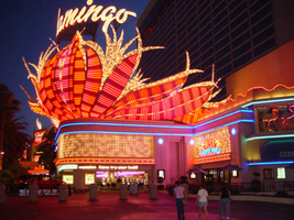
Photographs of Flamingo signs, Las Vegas (Nev.), 2002
Date
Archival Collection
Description
Site name: Flamingo Hotel and Casino (Las Vegas, Nev.)
Site address: 3555 S Las Vegas Blvd
Sign owner: Park Place Entertainment
Sign details: The majority of the Flamingo hotel and casino's neon signage encompasses the stretch of property that faces the strip. Even though the original porte-cochere and pylon sign are no longer in use, or in the original position, they are still evident and very much present. The original pylon has been moved around the corner onto Flamingo, actually closer to the Barbary coast than the Flamingo. The famous sculpted bull-nose design is repeated several times throughout the property and the design is repeated in visual reference on the towers of the hotel.. The Flamingo was one of the first hotels to push its entrance out to the street.
Sign condition: Structure 5 Surface 5 Lighting 5
Sign form: Pylon; Fascia; Porte-cochère
Sign-specific description: The Flamingo's vast array of signage of various types and styles make the hotel one of the more unique facades. Headed north just past the corner entrance to the Barbary Coast, only a two-lane drive separates the two properties. Across the drive, the original top of the old porte-cochere creates the first of the several three-dimensional, sculpted, corner sign you see. The well known swollen base and flexing body of this trademark crowning figure spread out in a bouquet of pink and orange steel feathers. Neon runs horizontally in a repeated pattern up the lengths of the feathers, with the outlying edge portions painted white and filled with incandescent bulbs, turning into single row raceways at the waving ends of the very tips. This corner serves as a pedestrian entrance now, and one of the main causeways between the Barbary Coast and Flamingo. The fattened plumage is set up high a top the corner of the building pointing to the southwest. The broad corner is dominated by the expansive sculpture. Standing atop of the plumage a channel letter logo sign faces outward spelling "Flamingo" in the Flamingo cursive text. The text is appropriated in a radius pattern, supported by a steel support structure making the logo seem as if it is floating above the sculpture. The sign is filled with incandescent bulbs. Two tubes of blue neon wrap the bull nose molding just below the three-dimensional structure, creating a space for the facade of the faceted pediment. Wrapping the face of the corner is a large entablature of patterned squares forming a grid like terrain with incandescent bulbs in the center of each square. Each square is faceted into pyramid shapes with bulbs at the center of each. Just above the pedestrian's head and below the faceted entablature, a raceway sandwiched by two tubes of pink neon creates a bottom line of the composition. The configuration continues to the right of the entrance into a smaller representation of the same effect. To the right of the old porte-cochere entrance, a small wall sign for "mega-jackpot world" is displayed with pink and Purple channel letters filled with neon on the section of wall which faces to the west. The sign is also incorporated into the famed pink and orange flame style, with the plumage emulated in channel pans on either side of the text. They are complete with horizontal neon bars and sections lined with incandescent bulbs as well. The section of wall that the sign sits upon is in the style of the faceted entablature spoken of previously. The two tubes of blue neon are above the pediment and sign and the bottom is also rounded out with the pink neon. Continuing east down the south face of the building, a continuous glass entablature is first seen, at the same height as the blue neon capped molding. The entablature is a glass wall lined with glass faced, two, dimensional figures of flamingos and shrubbery. Details such as wings, and other features are denoted by pink colored glass. Standing several inches off of the wall, the flamingos are lit from behind with red and pink neon creating halos, which reflect off of the glass behind them. The top edge of the pediment is lined with teal neon, while the bottom is blue. The top edge of the building, above the pediment and along other edges of the face, is a rolling design of hills lined pink neon. This element continues down the south wall of the building until it reaches the current porte- cochere. This structure is a circular drive covered with a circular roof. The east and west edges of the structure play host to large channel letter logo for the Flamingo. The pink steel structure spells "Flamingo" in their continuous cursive fashion, and filled with incandescent bulbs. The ceiling of the porte-cochere is an ornate pattern of raceways lined with incandescent bulbs. The pattern is reminiscent of a flower and it's radiating petals. The mirrored pediment continues past the porte-cochere on the wall of the building. Down the west face of the building, being the front of the facility along the strip, past the original porte-cochere, the glass pediment continues until it stops at a small wing of the building denoting another entrance. The entrance slightly radiuses out from the flat plane of the building, and is crowned by another three dimensional swollen bouquet of steel plumage spreading generously over the entrance, stretching it's waving fingers a good degree out on either side. It is constructed with the same color scheme and array of placement for incandescent lighting and neon. While not quite as bulbous as the southwest corner entrance, it breadth is the quality that beckons to the entrance. On the entablature below, the Flamingo logo is spelled in channel letters, and filled with pink neon. Teal neon lines the top of this pediment as well as blue along the bottom. The glass pediment continues on the wall north of the entrance until the face of the building goes from a stucco finish into a section of the elevation created by a wall of glass window panels. This section of the front is anchored in the center by as giant Doric column crowned by a third set of three dimensional sculpted array of pink and orange plumage. Like the two previously mentioned elements of this nature, the swollen base and stretching feathers take on a waving effect. This element is smaller in width than the previous two, but it's feathers or fingers curl forward in the center providing a support for a triangular cabinet section, with the two visible faces pointed northwest and southwest. The feathers continue in a smaller portion on top of the cabinet, appearing as if they rise thorough the cabinet.. The appearance of this set of plumage takes on different appearances for two reasons. The first being it's position upon the top of a column making appear as a torch. The plumage takes on the effect of being flames instead of feathers. The second being the severity of the curve of the center leaf or flame. From the side, coupled with the outer wings, it takes on the persona of a perched bird. The glass pediment continues past this section, stopping with another rooftop set of plumage on the entrance to the building, facing northwest. Above a backlit plastic advertisement cabinet, the fiery fingers of the sculpted, swollen signage, stand as a solid marker to the end of the property, or entrance to the pedestrian headed south. The glass pediment picks up again along the north face of the building headed east. On the East side of the Flamingo property, two fully three-dimensional sculpted steel structures serve as a gateway to the east side of the porte-cochere. Flanking either side of the drive, two identical bud-like structures stand with the same influence as the swollen elements of the front property. A short, faceted column, supports a three tiered, three layered rosebud shape crafted out of leaves more akin to palm fronds. Sagging leaves, pointed toward the ground, create the section between bud shape and the supporting column. They are folded down, representing the action of the leaves being opened. Neon runs in short horizontal bars along the outer surface leaves and all flat planes excluding the topsides of the relaxed leaves. These two markers also take on the persona an organic structure as a sapling palm tree, or rosebud, as well as the image of a burning torch. Building signage: Upon the western tower Flamingo is spelled in channel letters designed with the Flamingo text, and filled with pink neon. Upon the eastern face of the south tower, the half plumage of neon, flaming upward, reside underneath the Flamingo text logo. The same sign is repeated on the north edge of the west tower. Pylon: The original pylon sign now located on the north side of Las Vegas Blvd, in close proximity to the hotel, but actually between the Bourbon Street and the Barbary Coast. The vertical pylon is a double-sided pylon that faces east west. It has slightly modified over the years. The internally lit message center has been scaled down to fit its new environment. The pylon rises up in a square pole design, with neon running vertically up the center, approximately fifteen feet above the pedestrian's head, before being interrupted by the message cabinet. The cabinet has a white plastic face with removable letters. Gold polished raceways line the face of each of the sign, and incandescent bulbs line the raceways. The sides of the cabinet slope inward, round at the corners at the top, reaching toward the center that rises at a peak. The neon continues upward past the highest peak of the cabinet, and continues up to fan outward, created a giant frond of vermilion and red. The giant fan shape at the top supports channel letters, that spell "Flamingo' in white channel letters that are outlined in blue neon and filled with incandescent bulbs. The top fan shape is actually comprised of seven different levels, appearing to be stacked on top of one another. The center, oblong shaped panel, is the highest, with three sections on each side, fanned out, stepping back into space. The furthest wings on the edge are scrambled with bent and undulating tubes of pink neon. The center two are red, and the center holds the pink members. The waving tubes, which lose form and pattern as they spread toward the edges, resemble veins of a leaf, or the elements, which make up the feather. The sides of the pylon, including the internally lit cabinet, are treated with a pink paint.
Sign - type of display: Neon; Incandescent
Sign - media: Steel; Glass
Sign - non-neon treatments: Paint
Sign animation: Chasing, flashing, oscillating
Notes: The incandescent bulbs inside the text reading "Paris" on the balloon oscillate rapidly.
Sign environment: The Flamingo is in between the Barbary Coast and O'Shea's on the east side of the street. The establishment itself dominates the stretch of property, separating the pedestrian from the sidewalk with various shrubbery and palm, a phenomenon seen often on the strip. Exiting the Barbay Coast, headed north, the passerby is seamlessly brought into the Flamingo, bombarded by the vibrant pink and orange plumage, and continuous atmosphere. O'Shea's lies on the north end of the Flamingo, adding a bookend type effect along with the Barbary Coast. Even though the Barbary Coast is a vibrant and active property, most of it's action lies on the south side of the building, thus the Flamingo signage is the most dominating within its length along the Strip.
Sign manufacturer: Original Pylon: Ad-Art, Facade: Heath & Co
Sign designer: Original : Raul Rodriguez. Original Pylon: Bill Clarke
Sign - date of installation: Original Pylon: 1968 Original Porte Cochere 1976
Sign - date of redesign/move: When Park Place Entertainment separated the Flamingo name from Hilton, all of the text signs which read Hilton were removed. The original pylon sign was moved from the west side, or street side of the property, and moved East down Flamingo Rd., Between the Barbary Coast and the Bourbon Street during remodeling done in the Eighties. The pylon has been modified several times over the years, but has evolved into a slimmer, less flamboyant version, including a simplified internally lit message center.
Sign - thematic influences: The theme surrounding the resort is the theme of the pink flamingo bird, and its tropical environment. The blazing pink tone ( Vermillion ) of the neon is seen extensively throughout the property, as well as the repeated image of the pink bird. The white plaster facade and sculpted edges of the exterior's roof line are reminiscent of sun drenched villas, while staying well within the realm the surrounding environment. Elements such as the mirrored entablatures lined with illuminated pink Flamingos
Surveyor: Joshua Cannaday
Survey - date completed: 2002
Sign keywords: Chasing; Flashing; Oscillating; Pylon; Fascia; Porte-cochère; Neon; Incandescent; Steel; Glass; Paint
Mixed Content
Transcript of interview with Gail S. McQuary by Joanne L. Goodwin, April 14, 1997, May 25, 1997, & May 28, 1997
Date
Archival Collection
Description
Interviewed by Joanne L. Goodwin. Gail Spaulding (Jaros) was born on October 16, 1937, in Cicero, Illinois. a suburb of Chicago. Both of her parents were in show business. Gail began tap and ballet lessons when she was five years old. She signed as a dancer with Moro-Landis Productions in 1956, and she worked for that company at the Sahara Hotel and Casino in Las Vegas, the Riverside Hotel and Casino in Reno, and the Beverly Hills Country Club in Covington, Kentucky. Gail was promoted to line captain and did choreography at the Beverly Hills Country Club. She stopped dancing shortly before her daughter was born and worked as a cocktail waitress at the Riverside Hotel and Casino and at the Mapes Hotel in Reno. In 1964 she moved back to Las Vegas, trained in real estate, became general sales manager and corporate broker for Realty Executives in Las Vegas and later worked as an associate with Dyson and Dyson Real Estate in Indian Wells, California.
Text

Transcript of interview with Cecile Dotson Crowe by Darin Toldisky, April 27, 1981
Date
Archival Collection
Description
On April 27, 1981, Darin Toldisky interviewed Cecile Dotson Crowe (born October 17th, 1911, in Millville, Utah) at Clark County Library in Las Vegas, Nevada. This interview covers Mrs. Crowe’s account of the building of Hoover (Boulder Dam). Mrs. Crowe discusses the Six Companies, Boulder City, and recalls President Franklin Delano Roosevelt’s visit to Nevada by train to dedicate the dam on the 30th of September, 1937.
Text
Transcript of interview with Jan Stewart by Claytee White, June 28, 2010
Date
Archival Collection
Description
In 1901, Jan Stewart's grandfather William T. Stewart brought his family to Alamo, Nevada in Lincoln County and about 90 miles north of Las Vegas to ranch. Soon he and his wife were operating a livery stable. One of his customers was an executive with the Union Pacific Railroad for whom he provided transportation to Las Vegas, where the railroad owned a ranch referred to as the Old Ranch. In this narrative Jan recounts how his grandfather and later his father became managers of the Old Ranch and lived a just a few dozen yards from the Old Mormon Fort, a historic Las Vegas landmark. In addition to sharing stories of his family's history, he describes how the ranch was a unique place to group up, brought the family in contact with many community people and an occasional celebrity.
Text

