
Search the Special Collections and Archives Portal

Search Results

Display    Results Per Page
Displaying results 133111 - 133120 of 133121

Economic Opportunity Board of Clark County (Nev.): memos, agendas, and meeting minutes

Date

1964

Description

From the Clark County Economic Opportunity Board Records -- Series I. Administrative. This folder contains memos, agendas and minutes from meetings of the Clark County Economic Opportunity Board in 1964. 

Text

Las Vegas Sentinel-Voice

Alternate Title

Las Vegas Voice (1963-1974); Las Vegas Sentinel (1980-1982); Sentinel Voice (1982-2014)

Description

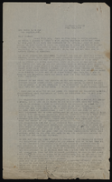
THE VOICE BELONGS TO YOU, THE READERS. The Voice belongs to each reader, individually, and to all readers collectively. It does not belong to the publisher, not to its staff. We are merely your servants, whose job it is to echo your voice along the path to full citizenship. The Voice does not belong to any politician, nor to any group of politicians, nor to any political party. It belongs solely to you, the people for whom it was created. The Voice is not, nor shall it ever be, controlled in any way by an individual, nor by any group of individuals. It shall always be controlled, in its editorial policies, by the will of the people, and solely for the purpose of upgrading the people. This publication is your publication. We want you to develop a deep and sincere feeling of the part you play in the Voice. I shall never be influenced, coerced, or intimidated by any pressures to change the policy of doing what is best for the cause. Your-paper will never fear to publish whatever truth that will further our program for equality, regardless of how high up the toes are that we must at times step upon. Regardless of threats of reprisals from any source, we will print what is best for our collective interests. We ask your prayers that we may never falter, nor be found lacking in the courage necessary to pursue the struggle toward first class citizenship, and realistic equities in the field of job opportunity. The Voice will lead the way in waging whatever battles are necessary for total victory, but we must know that you are right there to back us up. Your confidence in us will be the spark that will light the torch that will blaze the way to victory. You, each of you, can play a most important part in supporting the Voice, by supporting the advertisers who keep this instrument active in our operation to attain our full democratic rights. We need your prayers. We need your confidence in us, if the job is to get finished. Togetherness is our way to success. Support only those who support our cause. When you go shopping, take the Voice with you, and ask all with whom you spend your hard-earned money, if they advertise in the Voice. Selective purchasing is the quickest way to better job opportunities. Start today, and never stop until total victory has been won. We will not, and we cannot fail if we stick together, and spend wisely. Support those who advertise in the Voice. They will keep the Voice in position to support the cause. Charles I. West, Publisher

Dr. Charles I. West, the first African American physician in Las Vega and prominent pioneer of the early civil rights movement in Las Vegas began publishing the Las Vegas Voice in October of 1963. He issued this statement in January of 1964 (a photo of Dr. West appeared on the front page) both as a call for community support but also to define his newspaper as the Voice of the People, the African American people of Las Vegas, and the Westside community. The title, the Voice, defined the paper and its mission throughout its history and through changes in owners, publishers and editors. Later publishers Ed and Betty Brown would merge the Voice with the Sentinel, another symbol defining the role of the paper as the guardian of the rights and interests on the Black community.

Dr. West’s call for community support also reflected some of the issues which the Voice and then the Sentinel Voicewould always face as a community newspaper: independence from influence and intimidation, whether from outside the Black community, from local and state officials, or agencies, or from individual politicians, and civic leaders white and Black who would endeavor to use The Voice as a platform, as Ramon Savoy, the paper’s last publisher and editor noted, “to promote their own agendas”. An ever present question for the paper was whose voice, who spoke for the Black community? A paper dedicated to the truth could not ignore or avoid reporting the inevitable tensions and conflicts within the Black community and between its leaders.

The financial frailty of the newspaper as a simple business enterprise was a constant worry to it publishers. Hence the call to, and for its advertisers, and to the community to support its advertisers. Another theme is what Dr. West called “togetherness” – “our way to success”, the idea that the Westside community had to unify and create its own opportunities for its economic survival as a viable community, as well as to further the cause of civil rights in Las Vegas. Editor after editor would use the paper as a platform to create a stronger sense of community in the face, at times, of neglect, division, and indifference.  

 The Voice was strident in promoting “the cause” and bringing to light the racial injustices that plagued both the Westside, Las Vegas, and the nation. In the same issue in which Dr. West called on the support of the community, on the front page was a photo of a street with the caption, “BLOODSTAINS: In this photo you will note the bloodstains on the sidewalk where Homer Williams was dragged after being beaten to the ground by a club swinging Las Vegas Policeman.” The story, a demonstration on Jackson Street, on Christmas Eve began: “All hell broke loose on Jackson Street. . .  “

We sincerely at this time hope that you will place trust and faith to this newspaper and to the leadership of this community that a job will be done. We know that we face a vital and grave task if we are to have your continued blessings and support.  If there would have been a riot you would have lost, but simply because a riot was averted you shall win. You shall win because you are not the unruly children or a pack of animals that some feel that you are. Furthermore, because you are men and women with children, homes, jobs, churches, places of business and respect for yourselves and the law, your demands for action will be heaped together in a giant size jackpot that will explode sound into a previously deaf ear.”

The editorial, by James Waddell, castigated the white newspapers for their coverage of the incident

“TO THE REVIEW JOURNAL AND THE LAS VEGAS SUN "Even if both of you decided to merge, you would still be a long way from printing a good newspaper and as it is right now, both of you would be in a world of trouble if Associated Press and the other wire services ever closed shop. If they gave out awards for dismal newspaper creations both of you would run a dead heat for first place.  Both of you, who are editors of these papers (?) had better believe this: If 1,000 Negroes had been milling about Jackson Street the other day, you would have sent everything you’ve got down there that could write his name including yourselves. One of you were so on top of the situation that you sent a lone photographer with a flashbulb, a pencil and a scrap of paper and he arrived at the scene some two hours after the incident. You have been twisting the course of the Negro events in this city for a long time but this is your last time. As long as I sit behind this desk, you won’t be able to twist the cap off a bottle of coke on the West- side without my knowing about it. Running a few Negro’s pictures in your papers (?) could never erase your twisted blunders. You have made us look bad for the last time and that you had better believe. Your days of sugar coating a select few and smearing the majority have suddenly come to one very sudden halt. You might as well dig in because Progress is about to kick your damn door down and you ought to jump for joy that I’m giving you enough time to keep from being caught with your pants down. Phillip Waddell, editor

This was the tone of The Voice. But alongside the harsh headlines and editorials was the news and images of a vibrant community, its people and events, captured by local photographer Clinton Wright. Dr. West wrote a series of thoughtful articles “Africa in Todays’ World,” examining the socialism in emerging African Nations and their relationship to Cold War global politics.  It also highlighted prominent African Americans such as architect Paul Revere Williams in the 1965 story Famed Negro Architect Designs Air-Cab System -- An “air-cab” transportation system which could revolutionize the nation’s transit systems has been designed by a noted Negro architect. Paul R. Williams of Los Angeles, has designed a system calling for building a 17-1/2 mile elevated network. Tiny four-passenger gondolas, capable of speeds up to 30 miles an hour, would be suspended from the network. THE SYSTEM could carry 16,000 passengers an hour to 15 separate stops. It would link the city’s downtown center with McCarran Airport. The air-cab idea is expected to be copied by other cities having traffic congestion problems, promoters of the system say. “From its first day of operations, the cab will instantly remove untold amounts of congestion from the sidewalks and roadways of Las Vegas,” the backers said. Williams has designed such West Coast landmarks as the Los Angeles International airport, Saks Fifth Avenue of Beverly Hills, the County of Los Angeles House, and the Botany building at the University of California, Los Angeles

Dr. West published the Voice until 1974 when he sold it to Lawrence Albert. Albert continued the Voice as West had envisioned it as a champion of African Americans and their civil rights and to empower the Westside Community. He summarized these struggles and the struggles of the paper in his editorial in 1979 a few months before he, in turn, sold the newspaper.

The Las Vegas VOICE is in the same shape as the residents it serves. While it is struggling for survival, it is being stabbed in the back. Instead of always knocking this paper, the community should get behind it. I feel it has been more than fair with this community, since I took control of it. One of the reasons that we are always last in the bread line, is that we don’t trust anything that belongs to a Black person. It seems that we don’t consider anything legitimate unless it is accepted and endorsed by whites. . . . We must understand that we will never have the respect of the white community until we respect our own community. To do this we must continually strive to build up our own part of town. And whether you realize it or not, we will never be liked in the white community. We will always be considered outsiders, but if we respected ourselves, we would be respected by the white community. If we got together over here and tried to upgrade our businesses and community as a whole, the white community would flood us with money. For someone this country loves to try to help is the underdog, that is trying to help himself. We are viewed now as a bunch of panhandlers, who are always standing on the street corners of white communities with our hands out. Because we are isolated, we could have one of the most affluent communities in this country. All we have to do is stop working for the acceptance of white people and start working for the respect of ourselves. Right now we don’t have any good restaurants in our community; we don’t have any movie theatres; we don’t have any banks or telephone and power company sub-stations. The reason is clear: white people know we would rather go to their part of town and suffer abuse and poor service than to support such places in our own community. As long as we make it blatantly clear that we need white people, they will continue to deny us our rightful place in this county and country. But once we start showing them that we don’t need them, they will give us anything we want — white people have an unquenchable desire to be needed and looked up to

The July 26, 1979 issue announced the new publishers of the Voice, the Westside Community Development Corporation, sponsored by the Christian Fellowship Industries, and paid homage to the previous publishers.

With the advent of the new publisher for the LAS VEGAS VOICE Newspaper, the WESTSIDE COMMUNITY DEVELOPMENT CORPORATION sponsored by the Christian Fellowship Industries, it's time for reflection. Let’s go back in time and give due nods to some of the forbearers of this publication. It has met the test in time with founder, Dr. Charles West, who through many trials and tribulations, carried the colors and banners for the cause. He sought a course and guided the paper through turmoil and successes. The paper was the VOICE of the people for the people, by the people. Dr. West shed much sweat and many a tear in his effort to inform, counsel and entertain. Then there was Lawrence Albert who expanded upon these principles. Mr. Albert’s approach was a gallant one. He huffed and he puffed until he blew the house down - he was daring, brave, unafraid - a champion of the cause. He barked loud and clear and he was heard. But the effort was not all uphill. Lawrence Albert found many obstacles in his way but he put his shoulder against the tide and moved the mountain of adversity with dogged determination. He loved the challenge and it showed. Now there is a new face in the place the WESTSIDE COMMUNITY DEVELOPMENT CORPORATION - sponsored by the Christian Fellowship Industries - a new group who has gained strength, and vitality from the forbearers. The goal ahead is to strengthen itself and utilize its journalistic experience rendering dynamic community involvement, leadership - inform and help to reform - attempt to help shape and reshape our way of life. We want to see our leaders in public office, we want to see them share in the decisions and plans which will ultimately involve or affect all of us. The LAS VEGAS VOICE wants to be a part of all this. We solicit your help and understanding. Let’s share and work together for the common good of all.

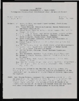
The Westside Community Development Corporation added a number of prominent Westside leaders to its staff, Sarann Knight and Alice Key as Associate Editors and State Senator Joe Neal as a regular contributing editor.  “Now,” the publishers announced “the Voice newspaper is truly the exclusive BLACK VOICE in the state of Nevada.”

The claim to be the exclusive BLACK VOICE was not without challenge. In September 1979, Frank Ferris, a spokesman for the publishers felt compelled to editorialize on the front page, “BLACKS MUST CONTROL THEIR OWN COMMUNITY.” “Blacks in Las Vegas have been sold out!”, Ferris warned, “But, don't put all of the blame on white folks, the fact is, that as long as certain weak minded blacks continue to sell out themselves and each other to certain white elements in our community who would like to have the multitude of blacks in this community under their direct control, we will continue to have more of the same economic and political problems our community has had for the last 20 years. Until we learn how to survive on our own thru successful Black Owned and Controlled Black Business ventures, we will continue to have Blacks within our community selling themselves out to others. Blacks who have become successful must reach out and help other Blacks to also, become successful. The corporation that owns and publishes the Las Vegas VOICE Newspaper, is 100% Black owned and controlled, has invested thousands of dollars into the Black Community and will continue to do so. We will not be intimidated by anyone at any time. We will continue to fight for the rights of Blacks in Las Vegas. Bring us your community problems. Watch us tackle these problems in a manner that our community can be proud of. Since 1963, the Las Vegas VOICE has served the Black community to the best of its ability.”

In the same issue Dr. McMillan, President of the local chapter of the NAACP castigated Cy and Evelyn Newman, the Jewish owners of a new “Black-oriented newspaper” the Las Vegas West (and also of the Black-oriented radio station KVOV) for presuming to “unite the Black Community” and suggesting that their publication "might just show that the rank-and-file of the Black community has been led down a garden path by their leaders." “Can we buy the premise that one who does not live in our community; who has never lived in it is qualified to represent our point of view and persuade the residents therein to accept their standards of who and what is right or wrong for Blacks.” McMillan defended Black ministers and elected officials – apparently the “leaders” targeted in the Newman’s “diatribes” -- as truly representing their constituents. 

But the Voice’s monopoly was also challenged by Black publishers, Ed and Betty Brown. Ed Brown was a retired and decorated Army Lieutenant Colonel who served in World War II and Korea. He was also an experienced radio man - disc jockey, announcer, and station manager for a major radio station in Newark, New Jersey. In 1974 he and his wife Betty moved to Las Vegas where Ed became station manager at KVOV Radio. His wife Betty was a practicing therapist (They met at the Tuskegee Veterans Hospital where they were both stationed). In 1980 the Browns started the Las Vegas Sentinel to compete with the Las Vegas Voice. In their first issue they stated their mission.

TO OUR READERS This is the first issue of the LAS VEGAS SENTINEL and the publishers and staff invite you to participate in a new and enhanced dimension of cooperation with your community newspaper. Our goal is to bring you a paper of quality, integrity and accuracy — a paper of which you will be proud, on which you can depend and with which you will want to become involved. Our name, the SENTINEL, and our logo denote our purpose. We are striving to perceive and report to you what is real and to serve as an ever vigilant guard that will be alertly watchful, especially to help avoid danger to our community. In the center of our logo crouches our young black “sentinel”, alert and strong, holding his horn and his drum. His is an all-embracing and responsible task to know what is happening in our community and that which concerns all of us, and then to send the message loudly, clearly and without bias, for “the truth shall set us free”. When need arises, it is his task to signal the alert of impending danger, for “if we are forewarned, we are forearmed”. Also, the calling together of ALL the people for the purpose of presenting a UNIFIED front in times of trouble is his task, for “in our unity lies our strength” However, the young sentinel’s success does not and cannot rest with him alone.' He may send the strongest, clearest message and the most urgent alert, but if they fall on deaf ears, his efforts are to no avail. He may call all of the various groups together, but if the groups do not understand the wisdom of unity or cannot set aside individual selfish desires to work for the common good of all; then his vigilance, his guarding and his warnings are for naught. The LAS VEGAS SENTINEL dedicates its existence to the building of an ever improving and thriving community. May our community and the LAS VEGAS SENTINEL have a never ending dependence upon each other! Betty Brown, Editor

The Browns emphasized in their announcement of a new (and competing) Black newspaper in Las Vegas the need for a “unified front” of “all the people”, perhaps simply echoing the mission of the Voice as an advocate for the community, but perhaps subtly suggesting that the Voice did not necessarily represent “ALL the People”.  In any event the competition between the two papers did not last long; in September 1982 the Browns acquired the Voice and in November merged the two papers. The last issue of the Voice was November 20, 1982, the Sentinel-Voice appeared on November 25 (as vol. 3 no. 29 of the Sentinel) with this announcement:

BROWN PUBLISHING ANNOUNCES SENTINEL-VOICE NEWSPAPER MERGER. Brown Publishing Company president Ed Brown announced the merger of the Las Vegas Sentinel, Nevada’s largest black community newspaper and the Vegas Voice, Las Vegas’ oldest weekly newspaper, effective with his issue. “Due to the increased newsprint and production costs, we find it more practical, at this time, to merge both publications,” said Brown. “The concept of maintaining both papers is not totally disbanded. Their individual identity will be maintained and will contribute to a broader perspective of objective journalism.” Publisher Betty Brown stated that “the size of the joint publication will enlarge with national full color black syndicated magazine sections and we will have an expanded opportunity of adding the reports of the national black correspondents and feature services. We foresee a new dimension being added to the community publication. We are excited about the prospects.”

The Browns owned and edited the Sentinel Voice until 1996. Ed Brown died in 1988, his obituary ran in the Sentinel Voice September 29, 1988 https://special.library.unlv.edu/node/691901. His wife Betty ran the paper alone until her son, Lee Brown returned to Las Vegas to help with the paper. In 1991 Harlem-born Ramon Savoy joined the paper. Savoy had been stationed at Nellis Air Force Base from 1978 to 1984 and had worked as a disc jockey for UNLV’s public radio station. He met Ed Brown at KCEP radio station where Savoy was working in sales. Savoy, who took over the paper’s advertising and marketing, joined the Sentinel Voice initially in sales but soon took on reporting, editing and distribution. When Betty Brown died in January 1995 https://special.library.unlv.edu/node/698386 her son, Lee took over as publisher and editor, until October when Ramon Savoy bought the paper from him and became the publisher. Lee Brown continued as managing editor until October 1996 when Lynette Sawyer, Savoy’s wife took over that role.

Under Savoy, the Sentinel Voice reached a new level of maturity, carrying the syndicated columns of celebrated African American journalist Carl Rowan and others, along with national and international syndicated news. But when it came to a target audience, according to Savoy, the Historic West Side neighborhood was the newspaper’s “bread and butter.”

In an interview in The Nevada Independent in March 2020, Ramon Savoy talked about the history of the paper and its significance to the Black community in Las Vegas and the Historic Westside. Getting the information out on the streets had been a driving force behind Savoy’s activism. When Savoy took on sales in 1991, he recalled, the Sentinel Voice regularly published editorials from community figures such as Ray Willis, who was a spokesman for Clark County School District, or then-Nevada Assemblyman Wendell Williams. He put a stop to such editorials and initiated a shift from “soft” coverage of things like local beauty pageants, fundraisers and church events to tougher stories. Savoy said Betty Brown “didn’t put any restraints” on what directions she wanted to take the paper before her death in 1995. Some public figures who had gotten used to advancing their own “agendas” in the paper’s editorials were taken aback when Savoy cut them off and then wrote less-than-flattering stories about them. “The editorials were harder-hitting, so if you’re talking about the police, that gets them riled up,” he said. “The corrections officers and administrators were the ones keeping the paper up in the office and looking at it. . . We were not trying to sugar coat nothing, we were just trying to be straight up with it,” he said.

“Savoy saw media — both print and radio — as a way to awaken the West Side’s community members and in turn, revitalize the neighborhood. . . Savoy warns that not transmitting that knowledge “creates a vacuum” and affects the larger community who depend on being informed in order to advocate for their rights and interests. As a member of an older generation, Savoy thinks it is his responsibility to take the lead in spreading the community’s stories — the good and the bad — to younger generations.” 

In January 2014 the last issue of the Las Vegas Sentinel-Voice went out. Publisher Ramon Savoy decided to close the paper, “Nevada’s only African-American community newspaper” rather than sell it someone who might not share his mission. On Wednesday, Feb. 5, 2019 Ramon Savoy was recognized at a Las Vegas City Council Meeting for his contributions over a quarter century, expressed in a formal proclamation by the City of Las Vegas.


Note: Not all issues are available online. See missing issues list.


1985
January
February
March
April
May
June
July
August
September
October
November
December
1986
January
February
March
April
May
June
July
August
September
October
November
December
1987
January
February
March
April
May
June
July
August
September
October
November
December
1988
January
February
March
April
May
June
July
September
October
November
December

Language

English

English

Frequency

Weekly

Place of Publication

Geographic Coverage

Library of Congress Control Number (lccn)

sn86076451

Photographs of Barbary Coast signs, Las Vegas (Nev.), 2002

Date

2002

Description

Daytime and nighttime views of the Barbary Coast signs on The Strip. Information about the sign is available in the Southern Nevada Neon Survey Data Sheet.
Site address: 3595 Las Vegas Blvd
Sign owner: Coast Casinos
Sign details: Just West of the Maxim, on a strip of property adjacent to the Flamingo, the Barbary Coast appeared in 1977 dressed in Burgundy and gold with full wrap mansard canopies and simulated Tiffany glass fascias. YESCO's Brian Lemming drew from 19th century woodblock alphabet styles to create the new distinctive logo style. It has since earned the nickname Barbary Coast Block. Lemming's bull nose design paired two opposing drum elements, which tapered near midpoint and were ringed with traceries of traveling lamps alternating with decorative panels outlined in red neon. Other signage includes a pylon sign on Flamingo Rd., textual wall an logo signs, as well as LED display screens. The screens are located near walkways, which extend north/south across Flamingo road, and east/west across Las Vegas Blvd
Sign condition: Structure 5 Surface 5 Lighting 5
Sign form: Pylon; Fascia
Sign-specific description: Upon the south elevation of the building, eight foot tall channel letters spell the "Barbary Coast" logo. South of the main logo, two square poles support the Barbary Coast pylon, which is on the north side of Flamingo, facing east/west. The two legs play Atlas to a double backed, internally lit, message cabinet, with vinyl lettering. The two legs protrude through the top of the sign for a short distance before the main logo cabinet begins. It is about half the size in height of the internally lit message center and containing more elements of design. "Barbary Coast" is spelled in white channel letters and filled with incandescent bulbs, in the Barbary Coast text. The edges of the letters are actually narrow channels that house tubes of gold neon. The neon and the channels actually create the designed curves of the fonts. The centers of the top and bottom edges of the cabinet, are crafted into protrusions in the rectangular shape. They are placed cleverly shallow into the surface to almost seem as if they are resting on the width of the cabinet instead of being part of it. Being completely treated in a gold paint on its width edge, which are parallel to the straight portion of the cabinet edge width, helps with the illusion of the sections being separate entities. Orange and burgundy scroll works are graphically placed into the faces of these protrusions in the panel to finish them off. Headed west at the beginning of the actual property, the first vestiges of signage hangs above the parking garage. A triangular back lit cabinet is finished in polished gold aluminum with a raceway acting as an element, on the edge pointing north, then transforms into a raceway arrow pointed toward the entrance of the garage. The famed overhang creates an arch over the garage entrance, which is recessed all the way back to the main wall of the structure. Mirrors create the surface of the wall at the back of the tunnel vault, of the recessed arch. Upon the mirrored surface a channel logo for the "Drai's" nightclub, hangs quite high above the pedestrian's head. The logo is bordered with green neon and filled with incandescent bulbs. The entire sign is a shallow channel letter design allowing enough room for the depth of the bulb. Another arch and tunnel, with a mirrored wall, is located just west of the first arch. It plays host to a brass colored chandelier with spherical lamps. At ground level underneath the middle section of the famed structure where the main logo text resides, we have an entrance to the casino with a cabinet denoting that over the door. The cabinet is a mirrored face with a gold aluminum polished raceways with incandescent bulbs. The text spelling "Hotel Casino Entrance" is in gold polished channel letters and filled incandescent bulbs. Underneath the canopy, the faux Tiffany glass is separated on its edges by gold polished raceways with incandescent bulbs. Past the main entrance another tunnel arch is formed just past the "B" in Barbary main logo and plays host to a different entrance. It too has a brass chandelier and a mirrored cabinet of the same design as the afore mentioned entrance. The only difference is the text. It spells " Casino Entrance." The rest of the treatments for this sign are identical to the first entrance. On the northeast corner underneath the bull nose, a giant brass chandelier hangs in the center, supported with a multisided, mirrored column. The corner of the building is also an entrance. The west side of the building boasts two wall signs. The south side of the building plays host to the main logo text for the Barbary Coast facility, upon the fascias architecture. The middle of the sign is a long low rise arch. Giant channel letters spell Barbary Coast, above the row of faux stained glass squares, and stand independently away from the wall. They are filled with incandescent bulbs and bordered with neon. The interiors are painted red and the exteriors are treated in gold. Rows of red, vertical, neon tubes line the face of the facade behind the standing channel letters. Continuing around the corner upon the west face of the building the facade continues for a short stretch north after the corner rotunda. The wall of the building itself is where another Barbary Coast text logo resides It's large, and occupies a good portion of the area of the wall. The letters are designed in the same fashion as the letters on the pylon, painted white on the interior and treated gold on the exterior. Above and below the text, two cabinets crafted into scrollwork, similar to those seen on the pylon yet are not attached to the text. The cabinets are slightly recessed providing room for a border of gold neon. Below that and above an LED screen another logo for Drai's, as seen on the south elevation, hangs on the wall. A pair of LED screens flank the NW corner, on the west and south faces of the building. The LED screen on the south wall is at the end of an elevated walkway, that crosses Flamingo. The West wall LED is appropriation to the elevated walkway crossing Las Vegas Blvd, on the west side of the building as well. Another Drai's logo sign shares the west wall also. Along the fascia awning that wraps around the building graphics adorn the rounded panels, which simulate the Tiffany glass. Vertical raceways separate these panels. Neon borders each one of these panels as well as polished raceways along the top and bottom. Incandescent bulbs line all the raceways, as well as the outer edges of the underside. On the North wall of the building, just around the corner from the signage on the west face of the building, another Barbary coast logo wall sign is located on the top portion of the building. It is accompanied by an internally lit, plastic, message board, with vinyl lettering. The two pieces together sit in a slightly recessed niche, so that the board and the text are flush with the rest of the building. The letters are painted yellow on the inside, possess incandescent yellow incandescent bulbs on the interior. The letters are also treated with the same gold finish seen throughout the establishment.
Sign - type of display: Neon; Incandescent; LCD; LED
Sign - media: Plastic
Sign - non-neon treatments: Graphics; Paint
Sign animation: Flashing, chasing, oscillating
Notes: All incandescent bulbs on the polished, gold raceways, chase each other down their entire lengths. The bulbs inside the polished channel letters oscillate as well. The incandescent bulbs in the Drai's sign also oscillate. The pylon sign: The background of vertical red neon bars chase each other from the outer ends, until the entire background is illuminated, then the incandescent bulbs inside the letters chase down and fill the letters, which then oscillate. The text then steady burns, chases downward, then leaves the letters dark in it's path. Once the letters are dark then the neon background curtains open chasing from the center to either end. Once the neon goes dark, then the empty text chases downward again, oscillating, then chasing from top to bottom leaving the letters dark in it's path. The text on the west side of the building lights up one letter at a time, then oscillates, and then steady burns. The letters then oscillate again, shut of for a split second. Then each individual word lights up one at a time. "Barbary" then "Coast," "Barbary" then "Coast" again. On the last sequence of the individual words lighting up they stay lit, and turn off one letter at a time. The main marquee: Each letter of the main marquee illuminate one letter at a time, then oscillate. While they are oscillating then, the vertical red neon bars chase from either end of the sign illuminating each bar in it's path. Right before it reaches the center, the letters shut off briefly then lights up "Barbary" then "Coast," then they both oscillate. They shut off briefly lighting up one word at a time again, oscillating once more. This pattern runs one more time while the red background chases from the center to the ends leaving the rest dark in it's path. The letters remain dark until the red bars regenerate, by chasing outward from two different spots, meeting in the center and extending to the ends. By the time the background is regenerated then the text begins to light up again, rapidly from left to right as if saying "Barbary Coast." It does this a total of three times. All the while the background is opening and closing from the two spots a total of three times. Once the background regenerates one more time, then the letters flash off then on, then alternates with the background. Letters, then background, letters, then background, then off. The two are not lit at the same time during this exchange, but take turns lighting up.
Sign environment: The Barbary Coast sits in the unique intersection of Flamingo Rd. and Las Vegas Blvd, once the main four corners of the Strip. The majority of the surface of the building is located on Flamingo road, just off the strip, headed east. Walking underneath the covered awing on the south side of the building, the constantly pulsating incandescent bulbs and various sounds of the casino bombard a pedestrian, enveloping one until you meet the end of the establishment at either end. The large drummed corner, makes the rest of the adjacent facade hard to miss. Directly south, across Flamingo the Bally's multimedia pylon behemoth resides, and the vibrant Flamingo, sits snugly next to the Barbary Coast's north side. The two establishments of Flamingo and Bally's are considered akin, due to such close proximity. Once you exit the Barbary Coast, utilizing the portals on the west side, headed north, you are almost automatically standing in a small courtyard, in the grasp of the attractive, bright, pink and orange plumage of the Flamingo Hilton. The pedestrian traffic flows from one establishment to the next with ease.
Sign manufacturer: YESCO
Sign designer: Brian K. Leming (bull nose and wrap around fascia)
Sign - date of installation: 1977
Sign - date of redesign/move: LED screens were added to the west and south faces of the building
Sign - thematic influences: A good phrase to describe the thematic influence would be that of a turn of the century ambiance. With it's logo style derived from 19th century woodblock prints, canopies covered in faux Tiffany glass, ornate brass tracings, and distinctive mansards, the decor is reminiscent of a bustling turn of the century gala or festival.
Sign - artistic significance: The full wrap fascia design by Leming, is reminiscent of older Fremont street properties such as the Golden Nugget, and Binion's Horse Shoe. The pedestrian passes underneath the pulsating signage, next to the entrances to the facility. It is a significant design maximizing the space with its design.
Surveyor: Joshua Cannaday
Survey - date completed: 2002
Sign keywords: Chasing; Oscillating; Flashing; Pylon; Fascia; Neon; Incandescent; LED; LCD; Plastic; Paint; Graphics

Mixed Content

Photographs of Flamingo signs, Las Vegas (Nev.), 2002

Date

2002
2017-08-11

Description

Photos show Flamingo signs at night. Two surveys were conducted to gather information about this sign. One was conducted in 2002 and one was conducted in 2017. PDFs are available for both surveys. See the 2017 survey PDF for additional information that is not included in the object description.
Site name: Flamingo Hotel and Casino (Las Vegas, Nev.)
Site address: 3555 S Las Vegas Blvd
Sign owner: Park Place Entertainment
Sign details: The majority of the Flamingo hotel and casino's neon signage encompasses the stretch of property that faces the strip. Even though the original porte-cochere and pylon sign are no longer in use, or in the original position, they are still evident and very much present. The original pylon has been moved around the corner onto Flamingo, actually closer to the Barbary coast than the Flamingo. The famous sculpted bull-nose design is repeated several times throughout the property and the design is repeated in visual reference on the towers of the hotel.. The Flamingo was one of the first hotels to push its entrance out to the street.
Sign condition: Structure 5 Surface 5 Lighting 5
Sign form: Pylon; Fascia; Porte-cochère
Sign-specific description: The Flamingo's vast array of signage of various types and styles make the hotel one of the more unique facades. Headed north just past the corner entrance to the Barbary Coast, only a two-lane drive separates the two properties. Across the drive, the original top of the old porte-cochere creates the first of the several three-dimensional, sculpted, corner sign you see. The well known swollen base and flexing body of this trademark crowning figure spread out in a bouquet of pink and orange steel feathers. Neon runs horizontally in a repeated pattern up the lengths of the feathers, with the outlying edge portions painted white and filled with incandescent bulbs, turning into single row raceways at the waving ends of the very tips. This corner serves as a pedestrian entrance now, and one of the main causeways between the Barbary Coast and Flamingo. The fattened plumage is set up high a top the corner of the building pointing to the southwest. The broad corner is dominated by the expansive sculpture. Standing atop of the plumage a channel letter logo sign faces outward spelling "Flamingo" in the Flamingo cursive text. The text is appropriated in a radius pattern, supported by a steel support structure making the logo seem as if it is floating above the sculpture. The sign is filled with incandescent bulbs. Two tubes of blue neon wrap the bull nose molding just below the three-dimensional structure, creating a space for the facade of the faceted pediment. Wrapping the face of the corner is a large entablature of patterned squares forming a grid like terrain with incandescent bulbs in the center of each square. Each square is faceted into pyramid shapes with bulbs at the center of each. Just above the pedestrian's head and below the faceted entablature, a raceway sandwiched by two tubes of pink neon creates a bottom line of the composition. The configuration continues to the right of the entrance into a smaller representation of the same effect. To the right of the old porte-cochere entrance, a small wall sign for "mega-jackpot world" is displayed with pink and Purple channel letters filled with neon on the section of wall which faces to the west. The sign is also incorporated into the famed pink and orange flame style, with the plumage emulated in channel pans on either side of the text. They are complete with horizontal neon bars and sections lined with incandescent bulbs as well. The section of wall that the sign sits upon is in the style of the faceted entablature spoken of previously. The two tubes of blue neon are above the pediment and sign and the bottom is also rounded out with the pink neon. Continuing east down the south face of the building, a continuous glass entablature is first seen, at the same height as the blue neon capped molding. The entablature is a glass wall lined with glass faced, two, dimensional figures of flamingos and shrubbery. Details such as wings, and other features are denoted by pink colored glass. Standing several inches off of the wall, the flamingos are lit from behind with red and pink neon creating halos, which reflect off of the glass behind them. The top edge of the pediment is lined with teal neon, while the bottom is blue. The top edge of the building, above the pediment and along other edges of the face, is a rolling design of hills lined pink neon. This element continues down the south wall of the building until it reaches the current porte- cochere. This structure is a circular drive covered with a circular roof. The east and west edges of the structure play host to large channel letter logo for the Flamingo. The pink steel structure spells "Flamingo" in their continuous cursive fashion, and filled with incandescent bulbs. The ceiling of the porte-cochere is an ornate pattern of raceways lined with incandescent bulbs. The pattern is reminiscent of a flower and it's radiating petals. The mirrored pediment continues past the porte-cochere on the wall of the building. Down the west face of the building, being the front of the facility along the strip, past the original porte-cochere, the glass pediment continues until it stops at a small wing of the building denoting another entrance. The entrance slightly radiuses out from the flat plane of the building, and is crowned by another three dimensional swollen bouquet of steel plumage spreading generously over the entrance, stretching it's waving fingers a good degree out on either side. It is constructed with the same color scheme and array of placement for incandescent lighting and neon. While not quite as bulbous as the southwest corner entrance, it breadth is the quality that beckons to the entrance. On the entablature below, the Flamingo logo is spelled in channel letters, and filled with pink neon. Teal neon lines the top of this pediment as well as blue along the bottom. The glass pediment continues on the wall north of the entrance until the face of the building goes from a stucco finish into a section of the elevation created by a wall of glass window panels. This section of the front is anchored in the center by as giant Doric column crowned by a third set of three dimensional sculpted array of pink and orange plumage. Like the two previously mentioned elements of this nature, the swollen base and stretching feathers take on a waving effect. This element is smaller in width than the previous two, but it's feathers or fingers curl forward in the center providing a support for a triangular cabinet section, with the two visible faces pointed northwest and southwest. The feathers continue in a smaller portion on top of the cabinet, appearing as if they rise thorough the cabinet.. The appearance of this set of plumage takes on different appearances for two reasons. The first being it's position upon the top of a column making appear as a torch. The plumage takes on the effect of being flames instead of feathers. The second being the severity of the curve of the center leaf or flame. From the side, coupled with the outer wings, it takes on the persona of a perched bird. The glass pediment continues past this section, stopping with another rooftop set of plumage on the entrance to the building, facing northwest. Above a backlit plastic advertisement cabinet, the fiery fingers of the sculpted, swollen signage, stand as a solid marker to the end of the property, or entrance to the pedestrian headed south. The glass pediment picks up again along the north face of the building headed east. On the East side of the Flamingo property, two fully three-dimensional sculpted steel structures serve as a gateway to the east side of the porte-cochere. Flanking either side of the drive, two identical bud-like structures stand with the same influence as the swollen elements of the front property. A short, faceted column, supports a three tiered, three layered rosebud shape crafted out of leaves more akin to palm fronds. Sagging leaves, pointed toward the ground, create the section between bud shape and the supporting column. They are folded down, representing the action of the leaves being opened. Neon runs in short horizontal bars along the outer surface leaves and all flat planes excluding the topsides of the relaxed leaves. These two markers also take on the persona an organic structure as a sapling palm tree, or rosebud, as well as the image of a burning torch. Building signage: Upon the western tower Flamingo is spelled in channel letters designed with the Flamingo text, and filled with pink neon. Upon the eastern face of the south tower, the half plumage of neon, flaming upward, reside underneath the Flamingo text logo. The same sign is repeated on the north edge of the west tower. Pylon: The original pylon sign now located on the north side of Las Vegas Blvd, in close proximity to the hotel, but actually between the Bourbon Street and the Barbary Coast. The vertical pylon is a double-sided pylon that faces east west. It has slightly modified over the years. The internally lit message center has been scaled down to fit its new environment. The pylon rises up in a square pole design, with neon running vertically up the center, approximately fifteen feet above the pedestrian's head, before being interrupted by the message cabinet. The cabinet has a white plastic face with removable letters. Gold polished raceways line the face of each of the sign, and incandescent bulbs line the raceways. The sides of the cabinet slope inward, round at the corners at the top, reaching toward the center that rises at a peak. The neon continues upward past the highest peak of the cabinet, and continues up to fan outward, created a giant frond of vermilion and red. The giant fan shape at the top supports channel letters, that spell "Flamingo' in white channel letters that are outlined in blue neon and filled with incandescent bulbs. The top fan shape is actually comprised of seven different levels, appearing to be stacked on top of one another. The center, oblong shaped panel, is the highest, with three sections on each side, fanned out, stepping back into space. The furthest wings on the edge are scrambled with bent and undulating tubes of pink neon. The center two are red, and the center holds the pink members. The waving tubes, which lose form and pattern as they spread toward the edges, resemble veins of a leaf, or the elements, which make up the feather. The sides of the pylon, including the internally lit cabinet, are treated with a pink paint.
Sign - type of display: Neon; Incandescent
Sign - media: Steel; Glass
Sign - non-neon treatments: Paint
Sign animation: Chasing, flashing, oscillating
Notes: The incandescent bulbs inside the text reading "Paris" on the balloon oscillate rapidly.
Sign environment: The Flamingo is in between the Barbary Coast and O'Shea's on the east side of the street. The establishment itself dominates the stretch of property, separating the pedestrian from the sidewalk with various shrubbery and palm, a phenomenon seen often on the strip. Exiting the Barbay Coast, headed north, the passerby is seamlessly brought into the Flamingo, bombarded by the vibrant pink and orange plumage, and continuous atmosphere. O'Shea's lies on the north end of the Flamingo, adding a bookend type effect along with the Barbary Coast. Even though the Barbary Coast is a vibrant and active property, most of it's action lies on the south side of the building, thus the Flamingo signage is the most dominating within its length along the Strip.
Sign manufacturer: Original Pylon: Ad-Art, Facade: Heath & Co
Sign designer: Original : Raul Rodriguez. Original Pylon: Bill Clarke
Sign - date of installation: Original Pylon: 1968 Original Porte Cochere 1976
Sign - date of redesign/move: When Park Place Entertainment separated the Flamingo name from Hilton, all of the text signs which read Hilton were removed. The original pylon sign was moved from the west side, or street side of the property, and moved East down Flamingo Rd., Between the Barbary Coast and the Bourbon Street during remodeling done in the Eighties. The pylon has been modified several times over the years, but has evolved into a slimmer, less flamboyant version, including a simplified internally lit message center.
Sign - thematic influences: The theme surrounding the resort is the theme of the pink flamingo bird, and its tropical environment. The blazing pink tone ( Vermillion ) of the neon is seen extensively throughout the property, as well as the repeated image of the pink bird. The white plaster facade and sculpted edges of the exterior's roof line are reminiscent of sun drenched villas, while staying well within the realm the surrounding environment. Elements such as the mirrored entablatures lined with illuminated pink Flamingos
Surveyor: Joshua Cannaday
Survey - date completed: 2002
Sign keywords: Chasing; Flashing; Oscillating; Pylon; Fascia; Porte-cochère; Neon; Incandescent; Steel; Glass; Paint

Mixed Content

Brandon Snook oral history interview: transcript

Date

2018-03-14

Description

Oral history interview with Brandon Snook conducted by Barbara Tabach on March 14, 2018 for the Remembering 1 October Oral History Project. In this interview, Colonel Brandon Snook describes his military career as a trauma surgeon and his job at Nellis Air Force Base in Las Vegas, Nevada, where he has been stationed since 2004. He shares details about Sustained Medical and Readiness Trained (SMART), a program that brings physicians, nurses, and technicians from the around the world to the University Medical Center of Southern Nevada (UMC) for intensive medical training. Snook also discusses the night of the October 1, 2017 mass shooting when he and others from Nellis were called in to UMC to treat the injured.

Text

Photographs of Riviera signs, Las Vegas (Nev.), 2002

Date

2002

Description

Nighttime views of the Riviera Hotel and Casino signs on the Strip. Information about the sign is available in the Southern Nevada Neon Survey Data Sheet.
Site name: Riviera Hotel and Casino (Las Vegas, Nev.)
Site address: 2901 S Las Vegas Blvd
Sign owner: Riveria Holdings Corporation
Sign details: The Riviera is another of the properties on the Strip which brought its borders to the street. It is one of the properties with an extensive collection of signs on its properties. The glass wall and block long facade, which incorporates infinity lighting and neon displays. A highly animated an reflective ceiling of the westernmost pedestrian element right along Las Vegas Boulevard also plays host to a continuously pulsing entablature of text and neon. The outer portion of the wall facing west is also adorned with raceways, backlit signs, neon stars, and a host of other signs as well. The northwest corner is a unique collection of fascia wall design and sculptural elements on the corner as well for the "Nickeltown" portion of the casino. Along the east end of the property, more Riviera logo/wall signs denote entrances, while the eastern most edge plays host to the massive Riviera Pylon. Various signs also reside on the eastern side of the property. Text signs are located in several positions among various structures. There is also a rather busily illuminated awning, which is lined with incandescent bulbs and text.
Sign condition: Structure 5 Surface 4 Lighting 5
Sign form: Pylon; Fascia; Porte-cochère
Sign-specific description: The main attraction to the Riviera is its mirrored round wall which serves as a multiuse billboard built around the neon advertisements for the Riviera's big show: Splash Front façade: The front façade of the Riviera is best described by starting with the giant glass well and heading north. The radius of the giant reflective extravaganza is in the general direction of the southwest so reflectivity is extremely good during the afternoon hours. The surface of the structurally integrated visions is surfaced with giant reflective mirrored panel which give way to the multicolored neon puzzle work of the Splash logo. The logo advertises for the show using iconography from the show itself represented with pan channel figures lined on the interiors with neon of corresponding colors for which they are painted. The text that spells "Splash" is painted red, with the circular raceway that sits in its background is painted yellow. The "Splash" text sits above the organic shapes of water shooting out from underneath the array of signage, painted blue and purple. The image of the female inside the logo text is graphically treated with the proper registration of illustrative quality. She is also lined with neon in the proper colors over the major outlines of her form. The entire array sits on a black background laden with incandescent bulbs. The neon is arranged so that as it progresses toward the ground the organic shapes radiate in a repeating pattern outward. The blue and purple neon radiate toward the ground while the red neon in the "Splash" radiates left toward the other side of the wall. Green channels spurt out of the top lined with green neon as well. On opposite sides of the radius wall, there are a series of signage that mirror each other. "Riviera" is written in channel letters filled with neon, and a series of internally lit, color cabinets, lined on the edges with incandescent bulbs. The middle portion of the wall is occupied with various sized stars, raceways, and incandescent bulbs found on extensions and diamond shaped faces. The stars are lined on the interior profile of the shape with blue and pink neon, as well as incandescent bulbs on the interior as well. The bottom of the radius wall is adorned with adorned with internally lit cabinets as well as various small neon creations. Moving north along the face of the building the façade the external elements are greatly supportive of the mirrored walls, and just as brilliant in their own right. The façade begins just to the south of the giant mirrored wall, with a section lined with vertical bars of neon animating in red, pink, purple, and blue neon. Riviera is written in cahnnel letters and filled with incandescent bulbs. The letters are outlined in red neon. On either side of the rectangular section, two small versions of the giant mirrored wall support green and blue wavy channels, lined on the interior edges with corresponding neon colors. Incandescent bulbs are present as well. The façade on the north side smoothly transitions into a wall of transparent plastic cubes, lit from the inside, with raceways running down the edges. This façade runs the entire length of the building, until the end is reached at the northwest corner and Nickeltown. Along the facade, internally lit cabinets surrounded by raceways occupy the vicinity of the lower portion of the sign. The faces are colored plastic and treated with graphics and text. Toward the end of the facade, a collection of small signs is fused together to create a single collection of busy signs. The entire structure is a chaotic vision of relief sculpture smashing into text and iconography, while bright, vibrant colors and neon, fight for attention. The majority of the sign is located on the body of the building, reaches down to touch the ground. Four fluted columns rise up from the ground to meet the bottom base of the massive wall sign. The columns rise up into a sculpted cabinet that is heavily crafted and adorned with ornate edges of hard-coated foam or fiberglass scrollwork. The swelling and swirling scrolls swell out in three dimensions. The entire border of the bottom section is turned into a detailed, organically shaped, cloud like shape. The scrollwork as well as the columns is finished white, with the recesses being toned a golden color. The effect accentuates the three dimensional nature of the design. The surface of this bottom portion is a diagonally crisscrossing pattern of white lattice- work on top of a golden surface. The center of the open surface is occupied by a giant pan channel, of the top three points at a purple, five-pointed star. Flanking either side of the star are small, steel, closed face cabinets, in the shape of squatty looking five pointed stars. They are varying sizes and are painted the three separate colors of purple, yellow, and green. The top point of the largest purple star rises through the top part of the bottom cloud section touching up into the massive collection of signs. This particular sign centers on a top logo reading "Riviera Slot Adventure" in channel letters in the style of action adventure movies such as "Indiana Jones." The first word is written in the logo style of the Riviera, and painted yellow on the interiors. The letters for the two words, "Slot Adventure" are bent with the force of motion and painted red, grading into an orange. Behind that, a circular cabinet, representing a globe, is painted blue in the center and fading to white. Flanking either side of the globe, associated more with the top portion of the globe, pairs of arching bronze colored cabinets slightly arch outward suggesting shining or an explosion. They are laden with incandescent bulbs. The remainder of the sign between the bottom star structure and the top slot adventure text, is occupied by a varied array of signage that can be designated between two halves of the collection. The left-hand side of the sign consists of three-dimensional sculptural elements, channel letters, relief elements. The far left side of the collection is rounded out by the three dimensional relief of crashing waves, creating a background for the three-dimensional structure of the mermaid. Red channel letters spell "Splash" above the mermaid, in white channel letters painted red on the inside. Neon lines the interior of the letters as well. Below the mermaid, more channel letters spell "Gardens" in red channel letters painted yellow on the interiors and lined on the interiors with neon. Above the crest of the wave a relief of a train shoots toward the north with a yellow and red circular cabinet above that with the text for jackpot junction. The train relief is also the designed with perspective to appear as if it is moving forward. Directly to the left of the train is set of yellow channel letters painted blue on the interior reading "Jackpot Factory," lined on the interior with neon. A purple backing cabinet is graphically painted on the face with images of gears. Just to the left of the text is the three dimensional sculpture representing a stack of coins. The space below the "Jackpot Factory" a purple cabinet with a colored face reads with graphics and text for "Valley of Games." Directly to the left of the "Valley of the Games" cabinet a three dimensional cherub is holding a large nickel, with a banner above that. The cherub is painted with the proper flesh tones, and the nickel is adorned with the proper details. The wings animate, utilizing two tubes of neon shaped as wings and in different positions to appear as flapping. A white arched steel banner, with blue text, reading "Nickel Heaven." Neon floats over the top of the letters. The right hand side of the entire collection is just as detailed and elaborate, if not ore than the left hand side. A white steel cabinet cut into the profile of the text, which is painted yellow with red outlines. The text reads 'Slot Frenzy' in two lanes. The red borders are lined with incandescent bulbs. The remaining negative space in the center of the sign is a painted slot handle with a circle of neon around the top of the handle. To the right of that, the surface of the board is created out of relief of faux rocks above what is a set of railroad tracks. A mine cart is on the tracks with giant diamond shaped gems residing in the interior space. A cabinet made of an arched banner and a square cabinet resides above the mine cart. The banner reads Double diamond in blue text, and "mines is spelled" in blue text on the rectangle. Further right the rocks give way to a portion of the cabinet, that reads "Jackpot City" in yellow channel letters, with yellow neon. Vertical raceways lined with incandescent bulbs shoot upward in the area of the text. All are supported on a multicolored flat cabinet, predominantly painted red. Nickel town: On the Northwest corner of the property three distinct images comprise the signage. The main marquee for Nickeltown over the entrance, a Riviera logo just to the right of that, and a large sculptural fountain, that dominates the corner with it's presence. Over the brass and glass doors for the entrance, a polished metal overhang radiuses above the door, and contains the words Nickel Town in channel letters. The two words are written horizontally in a line, and separated in the middle with a pan cjhannel star also lined with neon on it's interior. The star is centered with a channel number "5" which is filled with white neon. The star's neon colors are pink and blue, and are arranged as interior lining of the star. The underside of the awning, as the rest of the front facade, is adorned with the incandescent bulbs, placed neatly in the designated prismatic shapes. The neon rings also are present, running the pediment across the facade. Elements of the electric wall can be seen as well, with the metal diamonds supporting incandescent bulbs trailing upward from the awning up to the facade of the building behind it. Several different sizes of star rise up as well, they are identical in color and design shape. Since the interiors do not contain a channel letter, they contain a channel shaped star, lined with incandescent bulbs in the center. A different sort of star shape is present as well. This shape is an eight-sided shape, reminiscent of a snowflake. When I say snowflake, it is essentially a cross shaped piece crossed, with an "X" shape. The shape is designed out of a pan channel, filled with incandescent bulbs. White neon backs the channel. Directly to the right of the entrance, the mirrored facade reflects the entrance, as the reflective surface house vertical, neon bars as well. The three different colors are Blue, gold and green. Consuming the majority of the concrete expanse created by the small plaza, is the neon-laden fountain of light and steel, with a base of ceramic pool. The design is a circular pool, covered in 1"x1" ceramic tiles, and filled with water. Thee square poles are bent over, looking as if they are spraying up out of the fountain. They appear almost as if a bouquet. One is painted Blue, one gold, and the other red. These poles are striped with neon tubing of the corresponding colors. Internally lit cubes, of the same color scheme as the primary palette. Wrapping around the circumference of the top half of the plumage, is a silver pediment that radiuses around the fountain. The finish is polished metal, and matches the overhang presented in the Nickel Town signage. Raceways run along the top and bottom edges of the face, wile the internally lit advertisements occupying the open space of the pediment every so often. Riviera Convention Center: Directly to the east of Nickeltown, is the Riviera Convention center. Signage for the building is first evident when traveling west, looking at the east face of the building. Not far on the north side of the east face of the building, large channel letters hang denoting the building. The Riviera logo text is spelled in the signature text, outlined with red neon and filled with incandescent bulbs. Below that, a two lined text reads convention center in red channel letters, lined on the interior with red neon. On the south side of the building, two lines of text reads, "Royale Pavilion" and "Entrance" below that. These channel letters are red, and lined with red neon on the interiors. Tower: Along the north side of the main tower, "Riviera" is spelled with giant red channel letters, filled with incandescent bulbs, and lined with red neon. The rear entrance is shared for the hotel, and the convention center, and is denoted with signage, and an overhang. A large blockish overhang is cantilevered off of the side of the building and projects outward, toward the east. On the front edge, an arcade of arches is evident, which reveal five tube-like vaults that project the half radius all the way back to the building. All of the edges of the raceway, including the spaces on the underside, which separates the vaults, are lined with incandescent bulb lined raceways. The Riviera text spells "Riviera" across the front of the cantilevered structure. The channel letters are painted red, lined with red neon and filled with incandescent bulbs. Left of the cantilevered structure are letters, which spell convention center. They are channel letters with red plastic faces.
Sign - type of display: Neon; Incandescent; Backlit
Sign - media: Steel; Plastic; Glass; Fiberglass
Sign - non-neon treatments: Graphics; Paint
Sign animation: Chasing, flashing, oscillating
Notes: The incandescent bulbs inside the text reading "Paris" on the balloon oscillate rapidly.
Sign manufacturer: Federal Signal (fascia front glass)
Sign designer: Marge Williams/ Arch: Nikita Zukov (fascia design)
Sign - date of installation: 1988-1989
Sign - date of redesign/move: Pylon was moved to Convention Center Dr. and Paradise Rd. c. 1988
Surveyor: Joshua Cannaday
Survey - date completed: 2002
Sign keywords: Chasing; Flashing; Oscillating; Pylon; Fascia; Porte-cochère; Neon; Incandescent; Backlit; Steel; Plastic; Glass; Fiberglass; Paint; Graphics

Mixed Content

Correspondence, Levi Syphus to Sadie George

Date

1925-07

Archival Collection

Description

This folder is from the "Correspondence" file of the Sadie and Hampton George Papers (MS-00434)

Text

Audio clip from interview with Bess Rosenberg by Jerry Masini, November 12, 1975

Date

1975-11-12

Description

Part of an interview with Bess Rosenberg on November 12, 1975. In this clip, Rosenberg discusses her decision to move to Las Vegas and what her life was like.

Sound