Search the Special Collections and Archives Portal
Search Results
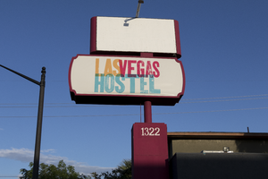
Photographs of Las Vegas Hostel sign, Las Vegas (Nev.), March 3, 2017
Date
Archival Collection
Description
Site address: 1322 E Fremont St
Sign owner: Downtown Lodging LLC
Sign details: This building was originally constructed in 1973 for commercial living accommodations and motel purposes. Previous to the Las Vegas Hostel opening in late 2014/early 2015 it was USA hostel whom used the sign box that the Las Vegas Hostel currently uses today. They have 38 rooms of different variety and 158 beds as a cheaper option that the hotels. They also offer packages to do tours of surrounding places such and the Grand Canyon and the Hoover Dam. They also claim to be the only Hostel in Las Vegas with a pool.
Sign condition: 4.5- The sign box was recently repainted and the plastic portion of this sign is relatively new and both still are in good condition
Sign form: Pylon
Sign-specific description: This sign has a reddish/pink steel beam base. There are two sign boxes the top one is a rectangle shape and the bottom one is a oval-rectangular shape. Currently the top rectangle box does not have any signage in it but if it did it would be a plastic or steel sign that would be down lit by an LED spotlight. The bottom one has a plastic back lit sign with the hostel's logo. Their logo entails "Las Vegas Hostels" in modern bright colored block fonts. The "Las" letters are a bright orange, the "Vegas" letters are a magenta pink, and "Hostels" in a bright light blue.
Sign - type of display: Plastic Back lit sign
Sign - media: Steel and Plastic
Sign - non-neon treatments: LED and Plastic back lit signage
Sign environment: On the Intersection of East Fremont St and 14th street. A few blocks from the Fremont East District but is in a neighborhood with many different motels though many of them are currently closed
Sign - date of installation: The sign boxes have been up like this since at least 2007 but with different logos within the sign boxes
Sign - date of redesign/move: Late 2014/ early 2015 they repainted the beam and boxes of the sign and inserted the Las Vegas Hostel logo.
Sign - thematic influences: Since this sign was re-purposed and redesigned it shows how Vegas is constantly changing but can reuse old signs from previous properties.
Sign - artistic significance: The bright colors in the sign show that they are going for a modern vibe which works since they opened in the past few years and have events such as pool parties that appeal to the youth that comes through Vegas.
Survey - research locations: Las Vegas Hostel Website http://lasvegashostel.net/en_US/rooms/, Assessor's page, google maps satellite and roadside view
Surveyor: Emily Fellmer
Survey - date completed: 2017-09-09
Sign keywords: Plastic; Backlit; Steel; Pole sign
Mixed Content
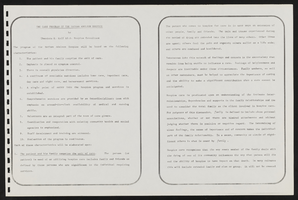
Program for the Design and Operation of The Nathan Adelson Hospice, circa 1980
Date
Archival Collection
Description
A program for the design and operation of The Nathan Adelson Hospice in Las Vegas, Nevada. Included in the program are several appendices on functions, regulations, services, and standards, along with several pages on establishing goals for the hospice. Pages near the end include hand-drawn diagrams and several monetary finance charts.
Text
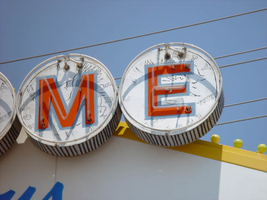
Photographs of Welcome to Fabulous Las Vegas sign, Las Vegas (Nev.), 2002
Date
Archival Collection
Description
Site name: Welcome to Las Vegas neon sign
Site address: 5200 S Las Vegas Blvd
Sign owner: YESCO
Sign details: The sign sits as a welcome to travelers entering the Las Vegas experience via Las Vegas Blvd The sign itself resides in the middle of traffic median directly in the middle of the road.
Sign condition: Structure 5 Surface 5 Lighting 5
Sign form: Pylon
Sign-specific description: The sign itself is a classic roadside pole design which faces North/South. It is double backed, internally lit with a border of yellow incandescent bulbs along the flat edge of its width. Across the top of the sign seven white neon circles house separate red neon letters which form the word welcome. Crowning the sign at the very peak, above the word welcome, is a seven pointed neon star comprised of orange and yellow neon. The cabinet itself is faced with translucent white plastic and treated with blue and red painted text. The South side of the sign reads with the Neon welcome word then in blue painted text "To Fabulous" in a 50's style text reminiscent of that used in the Last Frontier property, and cursive. The Words "Las Vegas" are spelled in all caps, in red block text. And below that in smaller blue text the word "Nevada" are spelled in all caps block text.
Sign - type of display: Neon; Incandescent; Backlit
Sign - media: Steel; Plastic
Sign - non-neon treatments: Graphics; Paint
Sign animation: chasing, flashing
Sign environment: The famous Welcome to Las Vegas sign sits alone at the South end of the strip and is often the very first sign a traveler encounters when entering the strip. It casts a surprisingly powerful glow over the barren median which it stands. It stands as a gateway to the extravaganza that is Las Vegas. When leaving the main drag headed south the sign has an equal effect of being a lone gateway in and out of the Strip.
Sign manufacturer: YESCO
Sign designer: Betty Willis
Sign - date of installation: 1959
Sign - thematic influences: Although it has no specific theme, it is from a specific period in Las Vegas History. It is the quintessential roadside pylon design. With an exposed steel center pole double backed marquee it is reminiscent of the common design of the roadside motor inn.
Sign - artistic significance: This sign has become perhaps the most copied icon of Las Vegas, as it was never copyrighted. It is a ubiquitous symbol of the city.
Surveyor: Joshua Cannaday
Survey - date completed: 2002
Sign keywords: Chasing; Flashing; Pylon; Neon; Incandescent; Backlit; Steel; Plastic; Paint; Graphics
Mixed Content
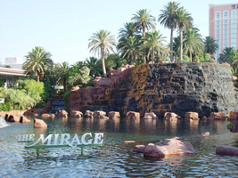
Photographs of Mirage signs, Las Vegas (Nev.), 2002
Date
Archival Collection
Description
Site name: Mirage (Las Vegas, Nev.)
Site address: 3400 S Las Vegas Blvd
Sign owner: MGM Mirage
Sign details: The main attraction of the property is its spectacular exploding volcano placed among an astounding array of lagoons, waterfalls and palm trees. One of the themed hotel casinos, the architectural form takes precedence over an abundance of flashing lights and neon. Two pylon signs reside on the front of the property along Las Vegas Blvd, another on the west side of the property, two arched banner entrances are placed among them, lettering atop the towers, and various text placed among the vast stretch of landscaping are the only visible large elements of signage.
Sign condition: Structure 5 Surface 5 Lighting 5 The structure and lighting on the signs are in excellent repair, with no apparent major physical damage. The surfaces of the pylons and assorted log text, are a bit dirty, but no more than any other establishment, considering the punishment each must undergo due to the elements as well as the live volcano.
Sign form: Pylon; Fascia; Porte-cochère
Sign-specific description: Just north of Caesars Palace a giant pylon sign faces north/south, on the east side of the strip. Two giant square posts support a giant backlit advertisement panel, and an adorning entablature containing the channel letters spelling "Mirage." Between the two giant legs two cabinets are present to fill the space. Just below the main backlit panel an LED screen resides just above another back lit panel. The two giant legs have a series of polished metallic panels running vertically up the sides, creating a recessed channel. The sections are separated with slight overhangs. The bottom smaller panel cabinet is an advertisement for "Danny Gans" and the main panel advertises for the "Seigfried and Roy" magic show. A small banner rests between the main entablature, and the panel, reading "Magicians of the Century." The black channel letters in the main pediment spells "The Mirage," and are filled with incandescent bulbs. The lush foliage and walkways continue north where a covered awning faced with a carved wood and brass bullnose, allows pedestrians to take a moving walkway up to the resort. The landscaping continues north where it meets a driveway denoted by a low arched banner supported by a pair of square columns on either end. "The Mirage" is spelled in polished gold channel letters, with white interiors and filled with incandescent bulbs. The banner itself is sculpted into two sweeping solid shapes on the tops and bottoms, with a series of folded ribbon like scroll shapes. The center section is crafted as to allow light to pass through the negative spaces created by the rows of positive scroll shapes. The banners face east. On the faces of each of the flanking posts, two images of jumping dolphins are sculpted and finished in the same fashion. Past the gateway the thick beds of foliage and palm trees can be seen headed back along the drives. Continuing north a multi tiered lagoon rushes circulating water on and over waterfalls, while yet more green shrubbery and palm trees encrust islands and images of eroded rocks and geological formations. The beautiful imagery continues north, twisting and turning in and behind itself to create a fantastic spectacle for a passerby to be lured in and be fascinated. Approximately in the middle of the length of the expanse, the famous functioning volcano rests quietly amongst smaller rocks and waterfalls. Just past the volcano the lagoon opens up into a wide flat area of water where bronze dolphins are positioned to look as if they are jumping out of the water. Still the rich foliage dominates the landscape, until another arched gateway interrupts the expanse to allow traffic. The foliage, and lagoon landscaping, picks up again, cozily grasping the base of a smaller pylon of similar design as the first. The two reflective paneled legs rise up to connect with a horizontal piece of the same design. A large backlit cabinet advertising for Danny Gans occupies approximately three-quarters of the space between the legs. An entablature of the same design as the main pylon, yet smaller, crowns the top of the sign. The trademark font spells "The Mirage" in black channel letters and filled with incandescent bulbs. Just past the small double sided pylon, a small of recess of rocks plays home to the end marker of the Mirage. A bust of Siegfried and Roy with a tiger is ambiently lit, provided photo opportunities for tourists. An interesting function has been added to the bust. In the flower bed behind and on the sides of the object, faux boulders are places with glowing crystals protruding from the surface. The tower of rooms for the Mirage is the popular three winged "Y" configuration converging onto a center structure. On each face of each wing, giant black channel letters spell "The Mirage" in their trademark text. Each is filled with incandescent bulbs.
Sign - type of display: Neon; Incandescent; Backlit
Sign - media: Steel; Plastic
Sign animation: Oscillating
Notes: The incandescent bulbs located within text logos on the pylon sign, and upon the tower oscillate to appear as shimmering. The effect is one of the more common animations particularly among the larger, corporate casinos.
Sign environment: The placement of the Mirage right on the curve of the Strip makes the pylons visible from a good distance from either direction. The environment displayed by the mirage is that of paradise. When walking past, and up to the property, it hard not to stop and stare at the amazing foliage and spread of waterfalls, and rocks.
Sign manufacturer: Ad-Art
Sign designer: Pylons: Charles Barnard with touches from Wynn's design group Atlandia Design Group. Dolphin Archways: Barnard and Jack Dubois as well as hotel architect, Joel Bergman
Sign - date of installation: 1989
Sign - date of redesign/move: The main pylon has since been updated with a new Siegfried and Roy Back lit Mural, a new LED screen, and another back lit plastic screen featuring Danny Gans. An internally lit banner reads horizontally across the top of the giant Siegfried and Roy Mural which reads Magicians of the Century.
Sign - thematic influences: The theme is tropical island paradise. Complete with active volcano, the front spectacle of rushing waterfalls, chirping bird noises, and leaping bronze dolphins, serves as the backdrop for the simple, slim design of the property's pylon structure. The pylons were designed to reach harmony with the structure of the tower itself, rather than the island theme. The dolphins over the entrance arches however represent the tropical island theme, as well as speaking about the dolphin habitat inside.
Sign - artistic significance: The main pylon was the first of its kind to feature a full color illuminated photographic pictoral. Designed by Rosco, it was billed as the largest of its type in the world. The resort's themed spectacular was also the first of it's kind in regards to its extravagance and unique functionality. Approximate 125,000 people visited the property on its opening day. The resort fits well into the theme of design of the large, corporate property, after all it was one of the pioneers of such a movement in Las Vegas. The Mirage also set the standards for the now frequently seen element of the attraction spectacle, and the standard of quality on the Las Vegas Strip
Surveyor: Joshua Cannaday
Survey - date completed: 2002
Sign keywords: Oscillating; Pylon; Fascia; Porte-cochère; Neon; Incandescent; Backlit; Steel; Plastic
Mixed Content
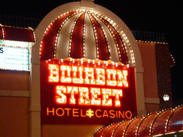
Photographs of Bourbon Street signs, Las Vegas (Nev.), 2002
Date
Archival Collection
Description
Site address: 120 E Flamingo Rd
Sign owner: Carma LTD
Sign details: Bourbon Street is located between the Maxim and the Barbary Coast on the north side of Flamingo, stretching to the corner of Audrie and Flamingo. The building contains elements such as brick masonry, stucco and wrought iron grating. It is a smaller property compared to nearby plots such as Bally's or the Flamingo. Extending north a short distance for a structure of rooms and parking, the signage consists of wall signs on the east and west sides of the building, a main sign on the south side of the building, a sidewalk and window canopies, as well as a main pylon.
Sign condition: Structure 3 Surface 3 Lighting 3--notes: The entire facade of the building, as well as canopies are badly faded and in need of attention.
Sign form: Pylon; Fascia; Porte-cochère
Sign-specific description: Headed west on Flamingo the first signage visible of the Bourbon Street is on the east face of the main building. A giant stucco arch, which runs the height of the building, is adorned at the very top with a round canopy. The canopy is divided into striped sections of red and white alternating panels, separated by gold aluminum polished raceways lined with incandescent bulbs. The canopy's underside is laden with incandescent bulbs. White channel letters reside on the surface of the building spelling out " Bourbon Street," with one word above the other. The letters are filled with white neon. Below the word "Street," the words "Hotel Casino," are spelled in channel letters and filled with red neon. Below the collection of channel letters and canopy, the majority of the space is occupied with an internally lit plastic screen with vinyl letters. Two small canopies flank the arch over two windows and also contain incandescent bulb raceways. The top edge of the building is gold polished raceways with incandescent bulbs. Along the south side of the building, long canopies are hung upon the top edge of the wall hanging over backlit plastic screens with vinyl letters. The middle of the building is an archway projected out into space creating an extension of the side of the building. The same canopy design seen on the east side of the building is seen at the top of the structure only larger in size. It is also treated with the same raceway and incandescent bulb design. "Bourbon Street" is spelled in al capital channel letters outlined in red neon and filled with incandescent bulbs. Above and below the text on the wall, white neon is bent into decorative, scrollwork patterns. The very top of the arch is crowned with a single internally lit spherical bulb. Below the text a cabinet with rounded top corners, houses channel letters filled with red neon. It is bordered with a raceway lined with incandescent bulbs. Projecting out on either side of this cabinet, along the face of the building, hanging over the sidewalk, is a canopy with an exoskeleton of raceways lined with incandescent bulbs. On the wall of the building, between the two top and bottom canopies, and on either side of the main entrance two small canopies hang over windows. They are treated the same as the window canopies on the east side of the building. On the west end of the property there is a small porte-cochere, and covered walkway that extends west to the end of the property. At a slightly higher elevation than the facade's canopy, the porte-cochere is a square design with the same external raceways and bulbs, the same can be said for the walkway extending to the edge of the property. The canopies look to be made of steel and painted to match the color scheme of the establishment. The underside of the porte-cochere is comprised of squared mirrored paneling illuminated with incandescent bulbs. On the west side of the building above the porte-cochere the same canopy and arch design can be seen but the text is more akin to the text on the south side of the building. The channel letters spell the text Bourbon Street in two lines. They are outlined in red neon and filled with incandescent bulbs. The text "Hotel Casino" is represented in channel letters filled with red neon. The only difference is the yellow neon design placed in between the two words. To the left of this sign, along the top edge of the building the canopy design picks up again hovering above a backlit sign message board. On the extreme west end of the property the main pylon sign faces east/west on the northeast corner. The sign basically consists of a large pole with a double-backed cabinet, crowned with the umbrella canopy shape seen throughout the property. The cabinet is of rectangular design with the corners cut out in a circular shape. The majority of the sign is occupied by the red neon bordered channel letters, which read "Bourbon Street". These are also filled with incandescent bulbs. The text "Hotel Casino" is spelled in channel letters and outlined on the interior with red neon. The left and right sides of the word "Street" are occupied with a channel scrollwork design lined with yellow neon. A channel pattern also separates the words "Hotel" and "Casino" This patterns appears to be like a flier de lie with its mirror image attached to it from the bottom. It too is filled with yellow neon. The face of the cabinet is lined with a raceway containing incandescent bulbs. The umbrella canopy occupies the top of the sign. It is fully realized in the round, with the exterior skeleton of the raceways with incandescent bulbs. The underside is also mirrored with incandescent bulbs spread across the surface. At the very top of the umbrella shape a streetlight puts the finishing touches on the sign. A small sign worth mentioning sits north of the main pylon at the edge of a small parking lot for the facility. It is a small back-lit cabinet denoting hotel registration and parking. The rectangular cabinet sits upon a small pole with a rounded section incorporated into its design. On the plastic portion of this rounded extension the words "Bourbon Street" are graphically painted along with the image of the red and white canopy.
Sign - type of display: Neon; Incandescent; Backlit
Sign - media: Steel; Fiberglass; Glass
Sign - non-neon treatments: Paint
Sign animation: Oscillating, chasing
Notes: All the incandescent bulbs on the raceways that are visible, chase each from other top to bottom. The incandescent bulbs, which line the raceways on the umbrella shape on the main pylon, chase each other downward as well as around the border of the face of the sign. The underside of the umbrella is also encrusted with incandescent bulbs, which oscillate. The text on the pylon sign all light up simultaneously in an oscillating pattern, they then steady burn, then shut off. The main logo marquee seen on the south face of the building contains the same animation seen on the pylon sign as well. The small vertical raceways underneath the porte cochere also animate by chasing downward.
Sign environment: Headed west toward the strip on Flamingo, the defunct Maxim is almost invisible at night, while the first active property is the Bourbon Street. The main pylon resides directly across Audrie from the Battista's pylon, making a flanking neon gateway to northern bound travelers on Audrie.
Sign manufacturer: YESCO
Sign - date of installation: 1984-05
Sign - thematic influences: The theme of the Bourbon Street is evident in its name being influenced by the Mardi Gras party atmosphere of New Orleans. The new Orleans theme itself is reminiscent of turn of the century America. The canopies and brass railing are reminiscent of properties such as the Westward Ho, with its umbrellas, brass treatments and raceways as well. The pylon is reminiscent of a close neighbor in the Barbary Coast, with similar style 19th century block text, and color palette.
Surveyor: Joshua Cannaday
Survey - date completed: 2002
Sign keywords: Oscillating; Chasing; Pylon; Fascia; Porte-cochère; Neon; Incandescent; Backlit; Steel; Fiberglass; Glass; Paint
Mixed Content
University of Nevada, Las Vegas (UNLV) 18th commencement program
Date
Archival Collection
Description
Commencement program from University of Nevada, Las Vegas Commencement Programs and Graduation Lists (UA-00115).
Text
University of Nevada, Las Vegas School of Architecture Records
Identifier
Abstract
The University of Nevada, Las Vegas School of Architecture Records (1980-2011) include marketing material, curriculum development material, student letters to the Nevada legislative counsel, journals, newspaper clippings, and architectural drawing sets for the school building's construction.
Archival Collection

Meeting minutes for Consolidated Student Senate, University of Nevada, Las Vegas, January 10, 2000
Date
Archival Collection
Description
Text

