Search Results

Gene Noboru Nakanishi oral history interview: transcript
Date
Archival Collection
Description
Oral history interview with Gene Noboru Nakanishi conducted by Ayrton Yamaguchi, Cecilia Winchell, and Stefani Evans on April 2, 2021 for Reflections: The Las Vegas Asian American and Pacific Islander Oral History Project. Gene Nakanishi shares his detailed family history from both his father's and his mother's families. He discusses his paternal grandfather's work on the Union Pacific Railroad, the family's internment in Wyoming during World War II, and his father's release from the camp by joining the United States Army Signal Corps. Nakanishi also talks of his maternal grandfather who was of the Bushido ("warrior") class in Osaka, Japan, and his grandfather's work with Christian missionaries. He shares details of his mother's restaurant employment in Los Angeles and her opening of Osaka Japanese Bistro in Las Vegas in 1969. Nakanishi also talks about being born and raised in Las Vegas, his musical schooling at Berklee College of Music in Boston, and his graduate education at Harvard University. He discusses his work as a band teacher for the Clark County School District, his involvement in the Idyllwild Arts Summer Program band camp, and his interests in jazz music.
Text
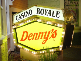
Photographs of Casino Royale and Denny's signs, Las Vegas (Nev.), 2002
Date
Archival Collection
Description
Site address: 3419 S Las Vegas Blvd
Sign owner: Tom Elardi
Sign details: The Casino Royale is located on the east side of the strip facing west, just south of the Venetian. The smaller establishment shares its space with a Denny's restaurant, which was present before the Royale was opened. The exterior is adorned with a stylized, European-esque, architecture, including apparent windows, domes, towers, and a cohesive landscape of connected buildings. The exterior of the Royale is a brightly lit facade of white raceways, lined with incandescent bulbs, boxing in vibrantly toned walls, and subdued neon. The colors correspond with those seen in the sign itself, as well the neon placed inside the edges of the windows. One section displays purple, the next a teal color, next a blue, then a red. Total signage of the property includes a two LED screens, one on the west side of the building, and the other housed in the logo cabinet on the south west corner of the property. Two logo cabinets, one in the aforementioned spot, and the second facing west over the main entrance on the west side of the building. Two double-faced cabinets lie on the northern end of the west side of the building, advertising for Denny's restaurant. Two small logos signs are also placed on the west face of the structure, for Caffe Trilussa.
Sign condition: Structure 5 Surface 5 Lighting 5
Sign form: Fascia
Sign-specific description: Upon the southwest corner of the building, a blue cabinet houses an LED screen in the rectangular body of the cabinet. The cabinet continues upward where the blue steel face supports white channel letters bordered in red neon and filled with incandescent bulbs. The text is written in two lines. The cabinet continues upward and is transformed into the sculpted design of a pink, purple, red, and blue crown on channel faced scrolls and sweeping shapes. The interiors of each section are lined with neon of a corresponding color to the paint treatments. Around to the west side of the building, the same style of text and scrolling adornments are used in a different marquee sign denoting the main entrance to the establishment. The same style of text seen on the southwestern sign is present with the same pattern of scroll work, crafted in a cabinet style, with channel faces. The major difference between the two signs is the size. The main entrance sign is much larger than the corner sign, as well as not having a LED screen incorporated below the text. The western sign possesses more scroll work below the text instead. The neon treatments are the same, as well as the incandescent bulbs, inside of the text. The lower roofline of the property plays host to the small but noticeable signage for Caffe Trilussa. Upon a extended surface of the roof line, two separate signs for the establishment are present. The roof shape is three sided with the signage on the northwest and southwest sides of the extension. Inside a section of the entablature created with white raceways, brown channel letters, spell the text "Trilussa," stretching across the length of the surface. The brown letters sit upon a yellow surface and are filled with incandescent bulbs, which are as wide as the channel letters themselves. Spelled in bent neon tubing, the word "Caffe" is spelled in all capital letters, sitting just above the left hand side of the title text. The right of the collection is occupied by a graphically treated, two-dimensional cut-out of a palm tree. The palm tree is treated on the surface with neon tubing as well. The tubing glows green and a gold corresponding to the graphical treatments. At the northern end of the property, two signs sit outside facing north, south. The double backed, internally lit cabinets represent the advertisements for the Denny's restaurant attached to the Royale. The first is at ground level outside the main entrance of the restaurant, the six sided, green cabinet, sports a yellow plastic face with red graphic text, reading "Denny's" in script text. Around the border of the face, incandescent bulbs run in a raceway pattern, and are covered in a plastic sheath. An angular cabinet rests on top of the other cabinet, creating a shallow peak. The internally lit, white face reads "Casino Royale" in black text. The same cabinet can be seen cantilevering off of the west side of the building above its partner sign. The cabinets are of identical design except for there is no plastic sheath covering the raceway of incandescent bulbs, and the plastic face of the main section of the cabinet is treated in different graphics. The script reads "Denny's" similar red script, but with a different background.
Sign - type of display: Neon; Incandescent; Backlit
Sign - media: Steel; Plastic
Sign - non-neon treatments: Graphics; Paint
Sign animation: Chasing, oscillating
Notes: The incandescent bulbs inside the channel letters of the main text oscillate, while all incandescent bulbs on the raceways along the building chase each other also. The incandescent bulbs, which surround the Denny's cabinet, also chase each other.
Sign environment: The Casino Royale stands independently on it's own even though it is surrounded on all sides by casino giants. To the north stands the Venetian, to the South stands Harrah's, and the Mirage lies west across the street. Yes, the property itself seems to be dwarfed by the immense neighbors, but the ultra bright, clear external signage and facade create a charming and bright environment that announces its presence.
Sign manufacturer: YESCO
Sign - date of installation: 1992
Sign - date of redesign/move: The Royale was once the Nob hill, which was closed in 1980. It was reopened in 1992 as the Casino Royale.
Sign - thematic influences: The theme seems to be tied to a European theme with the French term "Royale" in the title. The scrollwork is reminiscent of confetti or Mardi Gras theme. Such a combination of elements to suggest a theme is seen in the Harrah's property also. The party themed reminiscent sculpted cabinets are also reminiscent of the Fleur de Li. Believe it or not, the property is tied to many other larger, corporate, properties in one respect regarding its facades. The facade of a town or city, shrunken down and stylized into the facade of the property is present all over the Strip. Such properties which utilize this technique, to one degree or the next, include: New York New York, Oshea's, Treasure Island, Bellagio, The Venetian, The Luxor, The Tropicana, and the Excalibur.
Surveyor: Joshua Cannaday
Survey - date completed: 2002
Sign keywords: Chasing; Oscillating; Fascia; Neon; Incandescent; Backlit; Steel; Plastic
Mixed Content

Su Kim oral history interview: transcript
Date
Archival Collection
Description
Oral history interview with Su Kim conducted by Ashley Brooke Fuentes on November 21, 2021 for Reflections: The Las Vegas Asian American and Pacific Islander Oral History Project. In this interview, Su Kim discusses her family and life in Seoul, Korea. She talks about immigrating alone to the United States to study in Provo, Utah and later transferring to the College of Southern Nevada. Su Kim talks about her immigration experience, the culture shock of coming to America, and the discrimination and racism she has seen since the start of the COVID-19 pandemic. Su shares how she met her husband, details of her employment as an office manager, and her plans to pursue a degree in hospitality from the University of Nevada, Las Vegas.
Text
The Wheel of Rotary Las Vegas Rotary Club newsletter, October 6, 1949
Date
Archival Collection
Description
Text

Ashley E. Nitz oral history interview: transcript
Date
Archival Collection
Description
Oral history interview with Ashley Nitz conducted by Claytee D. White on February 6, 2018 for the Remembering 1 October Oral History Project. In this interview, Ashley Nitz discusses her experiences attending the 2017 Route 91 Harvest music festival in Las Vegas, Nevada with a friend. She talks about making the weekend of the event a "staycation", where she stayed with her friend at the Trump Hotel. Nitz goes into detail on the Route 91 Harvest festival venue and the events of that Sunday night when the shooting began. She speaks of the lockdown in the Tropicana Hotel and the support given there to all of the survivors, such as water and medical aid, as well as her journey home once the lockdown was lifted. The interview ends with a discussion on life after the shooting.
Text
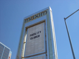
Photographs of Maxim signs, Las Vegas (Nev.), 2002
Date
Archival Collection
Description
Site address: 160 E Flamingo Rd
Sign owner: Premier Interval Resorts
Sign details: The Maxim is located just east of the Bourbon Street, in close proximity to Bally's Hotel Casino. The Maxim is no longer operating, and is fenced off from further inspection. The signage that is seen entails building signs, the original pylon, and the porte cochere
Sign condition: Structure 2 Surface 2
Sign form: Pylon; Fascia; Porte-cochère
Sign-specific description: Building: The tower itself contains the logo and giant text spelling the name of the establishment, on one side of the building. The tower is mirrored and reflective, thus matching the porte cochere and pylon, and reserves to collect its building signage to one end of the tower. The tower, which runs east/west, and faces north/south contains the signs on the east end structure. On the north and south faces of the building, giant red channel letters run vertically along the block surface. The letters look to be lined on the interior of the letters with neon. The logo can be seen on the east face. Pylon: The pylon sign is essentially a giant vertical monolith of a rectangle, divided into several different sub-shapes. The center of the monolith is occupied by cabinets which fill in most of the shape, with a small gap bordering the cabinet. The cabinets are treated the same as the square arch, and flush with the surface. The cabinets are very subtle and create an illusion of one solid object. The entire outer arch shape and interior cabinets are bordered with polished aluminum. The interiors surface of the arch are covered in polished gold aluminum panels. The lining of the incandescent bulbs on the sign is interesting. On the arch the incandescent bulbs are on the interior return width of the aluminum borders. With this configuration, the bulbs sit parallel to the surface instead of perpendicular. The main marquee text is aligned horizontally across the top in gold channel letters with red plastic faces. The letters blend with the gold surface nicely. The interior cabinets are internally lit with plastic faces. There are two cabinets, the larger of the two, occupying the upper part the interior space of the monolith. Incandescent bulbs line the exteriors of the cabinets, sitting back on a recessed edge. Porte Cochere: The porte cochere is unique, opting to rise high above the surface of the pavement. The prismatic design crafted in polished aluminum, interlocks into a pattern suitable to the space which it resides. The recesses in which the decoration resides are separated by a small width of structure. This pattern of giant recesses, matched with the prismatic design in each negative space create a hulking environment high above the head in proud stature. Along the peak edge of the pieces of the prism, rods protrude every foot or so, creating a row of arms holding incandescent spheres.
Sign - type of display: Neon; Incandescent
Sign - media: Steel; Plastic
Sign - non-neon treatments: Graphics; Paint
Sign animation: chasing, flashing
Sign environment: The Maxim is now closed, and stands in marked contrast to its neighbors a bit to the east--the famous "Four Corners" of Flamingo and the Strip, and next to the trendy Meridian at Hughes Center apartment complex.
Sign designer: Maxim letter design: Kenneth Young, Porte Cochere; Lighting: Jack Dubois Pylon sign: Marnell Corrao
Sign - date of installation: 1977
Sign - thematic influences: The influence of the Maxim hotel was 70's Vegas design refined to simple geometric forms and curved linear logo's. The pylon was completely sheathed in polished aluminum, as well as the underside of the porte cochere being polished gold aluminum. The use of the popular 70's material is used extensively throughout the design. Letters hung over the main entrance, as well as signage on three sides of the building. Other examples of the material can be seen elsewhere but not as extensively. The only property that comes close is the pylon for usage of the material is the Westward Ho.
Surveyor: Joshua Cannaday
Survey - date completed: 2002
Sign keywords: Chasing; Flashing; Pylon; Fascia; Porte-cochère; Neon; Incandescent; Steel; Plastic; Graphics; Paint
Mixed Content
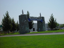
Photographs of McCarran Field signs, Las Vegas (Nev.), 2002
Date
Archival Collection
Description
Site address: 6005 S Las Vegas Blvd
Sign owner: McCarran International Airport
Sign details: On the south end of the Strip, the very last sign on the east side before you arrive at Sunset Blvd Facing West the two stone pylons are set approximately fifty feet off of the street at the end of a dual-lane stretch of pavement separated by an island of grass. The banner marquis between the two pylons stretches over this area of grass.
Sign condition: Structure 3 Surface 3 Lighting 4 Notes: The surface of the pylon is in good shape considering its age and its environmental condition. It is essentially left to fend for itself against the elements, being in the flat expanse of an airfield. The stone, plaques, and paint treatment are all badly worn, with the stone pylons, appearing the least worn.
Sign form: Pylon
Sign-specific description: The original McCarran Air Field entrance is constructed of two masonry pylons sit on an island of grass, and serve as an entrance to the private Hughes executive airport terminal. Each individual tower is adorned with a propeller attached to the front and the representation of a bird's wing crowning the tops Both facets are constructed of steel. When facing the structures the left has a plaque on the bottom section with the inscription "1948" while the one on the right reads "Las Vegas". Between the two pylons a stretch of text in white channel letters and white neon, large text in the old "Frontier style text reads McCarran Airport. The signage sits independently on top of a sturdy connecting steel cabinet, which supports the words "executive terminal" in smaller channel letters, with white neon. The cabinet is a painted blue horizontal plane tapering wider on either end in rounded profile patterns. The wings are outlined in pink neon, while the propellers are outlined in rose neon with a circle of white in the middle.
Sign - type of display: Neon
Sign - media: Masonry
Sign - non-neon treatments: Paint
Sign animation: none
Sign environment: The surrounding area is rather dark due to the wide expanse of the airfield which stretches out behind the sign. It truly is a last marker for the end of the Strip, and stands alone. Even though it is in close proximity to the major strip resorts of the Four Seasons as well as the Mandalay Bay and various small roadside hotels, it seems to stand in solitude.
Sign - date of installation: 1948
Sign - date of redesign/move: The blue banner of steel and white letters was added after its initial construction.
Sign - thematic influences: The masonry pylons are constructed in an adobe style masonry reminiscent of the desert landscape surroundings. Designed for the airport, the appendages stem obviously around the theme of flight. This may be denoted from the propeller and the wing. The juxtaposition of the two elements, one being the method of flight in nature and the other man made, serves as a reminder of mans fascination with flight. The added banner's text is in the pioneer fashion of the original Last Frontier.
Sign - artistic significance: Opened in 1948, the sign was intended for use as a marker for the endpoint of the Strip. " It was part of the city's expanding policy creating a jet-scale entrance for the city," Jorg Rudemer from Lost Las Vegas. Artistic significance also lies in the combination of materials using masonry, steel and, neon. The piece successfully combined these elements to provide an architecturally solid design by day, which was cohesive with its surrounding landscape. A metamorphosis takes place at night as the sign is transformed into a glowing specter of its daytime counterpart. The surrounding area is rather dark as the pylon rises up out of the darkness as a neon marker for the property. The illuminated wing and propeller stand out as the significant and successful partners in the world of flight.
Surveyor: Joshua Cannaday
Survey - date completed: 2002
Sign keywords: Pylon; Neon; Masonry; Paint
Mixed Content

Interview with Bennie Reilley, Sr., May 10, 2004
Date
Archival Collection
Description
Access note: May not quote in any form without written permission from interviewee
Text