Search Results

Photographs of O'Shea's signs, Las Vegas (Nev.), 2002
Date
Archival Collection
Description
Site address: 3555 S Las Vegas Blvd
Sign owner: Park Place Entertainment
Sign details: O'Shea's Casino is located just north across a small driveway from the Flamingo. The small but busy facade is a small, yet busy stop along the Las Vegas Strip. The exterior signage consists of two corner signs, a blade sign, hanging off of the west face of the building, a main entrance sign, backlit screens as well as various images laden with neon. All of these create a flashing display of luminescence all just above the pedestrian's head.
Sign condition: Structure 5 Surface 5 Lighting 5
Sign form: Fascia
Sign-specific description: O'Shea's Casino is located just north across a small driveway from the Flamingo. O'Shea's theme and signage is influenced by Irish culture and imagery, integrated into the forms of signage along the Las Vegas Strip. The building design itself is influenced by traditional European housing imagery, generalized with other elements of architecture also. One example of this is the coloring, exposed wooden beams and narrow rooflines over treated windows, which suggest styles seen in classic European architectural imagery. Examples of other elements such as sculpted windowsills and exterior molding are more akin to neoclassical than the Irish pub or cottage. A small blade sign hangs in the center of the structure facing north /south. Attached off of the building by two poles, the double sided cabinet is designed with a circular portion at the top that transforms along it's bottom edge into length portion of the "blade" that continues down to a rounded bottom. The Circular portion serves as the "O" in O'Shea's. The exterior of the signs width is finished in a polished gold aluminum surface. The top portion continues into a full circular space in the front where the backlit image of the O'Shea's leprechaun mascot resides in it's center. The image has a circular green neon border at the edge of the cabinet and is set into a field of incandescent bulbs, which occupy the remaining space in the face of the "O". Incandescent bulbs also run around the edge of a face on a gold raceway. Channel letters run vertically down the face of the blade spelling the remaining "Sea's" of the title. Each letter is filled with incandescent bulbs, and bordered on it's exterior in green neon. The remainder of the space, which comprises the surface of the sign, is a green material. The entire edge of the rest of the sign is also bordered with incandescent bulbs. Below the blade sign, the main entrance for the establishment is denoted by the large, arched, marquee logo, and wall sign for the casino. The arch shape is bordered by gold polished raceways, with the interior space where the O'Shea's logo is written in a bowed, horizontal arrangement with the "O" and "S" being the biggest letters in this group. The same back-lit leprechaun figure which is present in the blade sign, in seen in the "O" of the logo. The letters are of channel design and filled with incandescent bulbs. Gold scrollwork adorns the green background above and on the sides of the logo. An entablature, running the length below the arch, reads "casino" in channel letters filled with incandescent bulbs and bordered with green neon. The orange background in contained on the bottom edge with a gold polished raceway, which sharply curves into a downward point at the very center. All the raceway edges of the sign are lined with incandescent bulbs. Flanking the wall on either side of the main entrance are two backlit message centers with vinyl lettering. They also are bordered with incandescent bulbs, strewn upon polished raceways. To the south toward the Flamingo Casino, a corner marquee sign faces toward the southwest. The message center on the right of the main entrance essentially continues its shape wrapping in radius fashion all the way around the corner. As the entablature wraps the corner, the color changes to a section of black, containing the channel letters hung at a slight angle, spelling the words " Hall of Fame," in cursive text. Small stars in channel design adorn the black background. On the left of the text, O'Shea's is painted in red paint, in a cursive script at a similar angle as the premier text. Neon is shaped over the surface of the letters to allow it to be spelled in light. The word "Casino" is spelled on the right hand side, and treated in the same fashion. A top the black portion of pediment, the sign continues with it's corner finishing, rounded marquee, containing the text, "Magic & Movie," in a three lined arrangement. Putting the two signs together the appropriate title for the advertisement of the attraction is read "Magic and Movie Hall of Fame." The channel letters on the top portion are filled with neon and treated white on the interiors. The edge of the cabinet is treated with white bull nose borders, sandwiching a field of pink holding two tubes of contoured neon. At the peak of the sign a small element reminiscent of a fan, created using a multi layered box, uses different levels receding into space, with the center blade at the front of the sign. The sections are lined with gold raceways and incandescent bulbs, with the center blade being horizontally striped with tubes of neon. Two small gold finished gargoyle statues flank either side of the theatre-esque entrance. Underneath the overhang created by the corner sign, polished aluminum element creates a sloping drum shape above the door. This drum is divided into sections by gold polished raceways. The flat portion, which returns to the ceiling of the overhang is adorned with painted images of clovers, encircled in rings of green neon. This section is reminiscent of the top section of the corner drum of the Barbary Coast. The black pediment along the south portion of the building., abruptly changes to the orange color seen on the main entrance. Along the south wall section of the pediment green pan channels in the shape of clovers hang, lined on the interior with neon. A small sign denoting parking is also present. Another corner entrance is located on the north end of the property, facing northwest. It too has the rounded corner entrance and logo sign. Slightly different than the main entrance, the same "Casino text and structure is seen on the orange pediment above the door, as well as the channel logo with the mascot located in the letter "O." A three-sectioned panel with swooping wings and an arched center creates the field for the main logo. A more busy section of two dimensional scrollwork sits below the neon filled text. The wings of the top section a recessed panels with checkerboard design behind that. Each side of the entire top section is book ended with two small square posts. Three small miniature spires line the very top, and the same inverted drum shape sits underneath the door. Street posts reside on the sidewalk outside.
Sign - type of display: Neon; Incandescent; Backlit
Sign - media: Steel; Plastic
Sign animation: Chasing, flashing, oscillating
Notes: All of the bulbs, which reside in the fascia signs which designate entrances, oscillate rapidly. The entrance sign a bit closer to the north end of the property also contain the pan channel star shapes, with incandescent bulbs in the center. The bulbs which, reside on the widths edge of the small pole sign at the south end of the property, oscillate giving a twinkling effect. The main pylon's animation is rather simple considering the amount of lighting. Bulbs which create the dazzling background chase each other upward to the very point, then once they reach the top, each letter light up from left to right, one at a time, then off one letter at a time. The letters all turn on simultaneously while, while the background chases up, leaving the lights off in its trail. The text then shuts off as well. The small incandescent bulbs lacing the background of the main body of the sign oscillate subtly, twinkling themselves. Each letter of the text contains a single row of incandescent bulbs, just inside the border of the red neon. This row is always on in a chasing animation from left to right even when the letters are dark. The animation for the three sided, pole sign, at the north end of the property is adorned with sparkling animation as well. The purple bulbs, which create the border of the main base, chase each other from bottom to top, and the star shape in the center is filled with oscillating incandescent bulbs. The bulbs, which also encrust the bottom surface of the cabinet, oscillate as well. The incandescent bulbs, which adorn the background of the text portion of the sign, also sparkle with a soft random oscillating pattern. The stars which sit on top of the cabinet, animate in a random, non descriptive fashion. The inner star shaped pans oscillate with incandescent bulbs, and the neon borders flash on then off, in a clumsy random order. The three-sided sign also rotates, one of the few animatronic signs on the Strip.
Sign environment: Being essentially part of the Flamingo, O'Shea's is only separated by a small drive, producing the easy traffic flow from the north entrance of the former. The north of O'Shea's on the immediate vertical explosion of the front tower/porte cochere of the Imperial Palace. It is easy to say that O'Shea's is sandwiched in between two giants, assuming its place as the charming gap between the Flamingo and the Imperial Palace which is quite a bit more pedestrian friendly. Traveling north on the east side of the strip, O'Shea's is not hard to miss at all
Sign - date of installation: Original date of installation 1989. The southwest, and northwest corner signage were added at a later date
Sign - thematic influences: O'Shea's centers around the theme of the Irish pub, utilizing various imagery to get support the design. The color green is used extensively in the main signs color scheme while the ever-popular image of the folkloric leprechaun illuminated it a cartoon form upon the pylon. The green pan channels, which are shaped like shamrocks, are place along the exterior wall, an obvious reference to the St. Patrick's Day Holiday as well a reference to good luck. ( example: the four-leaf clover, luck of the Irish.) Luck is something synonymously associated with an industry such as gaming. Gold is also used extensively with the exterior referencing the infamous pot of gold associated with the lore of leprechauns. The actual structure itself is constructed with elements which suggest a European rustic cottage.
Surveyor: Joshua Cannaday
Survey - date completed: 2002
Sign keywords: Chasing; Oscillating; Fascia; Neon; Incandescent; Backlit; Steel; Plastic
Mixed Content

Sergio "Checko" Salgado oral history interview: transcript
Date
Archival Collection
Description
Oral history interview with Sergio "Checko" Salgado conducted by Laurents Bañuelos-Benitez, Barbara Tabach, Elsa Lopez, and Monserrath Hernández on June 4, 2019 for the Latinx Voices of Southern Nevada Oral History Project. Checko talks about his personal history that led him to pursue journalism and photography. He discusses his education and employment working in art galleries in Denver, Colorado and Las Vegas, Nevada and the various art exhibitions he has designed including in the Marjorie Barrick Museum at the University of Nevada, Las Vegas and in the Reynolds Senate Building in Washington, D.C.
Text

Jack Weinstein and Polly Weinstein interview, April 12, 2018: transcript
Date
Archival Collection
Description
Tower of Jewels is one of those iconic Las Vegas businesses that continues to thrive. At the time of this interview, Jack Weinstein is in his nineties and “retired.” With him is his daughter Polly Weinstein, who in addition to being involved in the business management has her own custom designed jewelry line, aptly named The Jeweler’s Daughter. As the youngest of six children born to Jewish Russian immigrants Joseph and Pauline (Polly is named for her grandmother), Jack was raised in a dangerous neighborhood of Detroit, Michigan. His youthful enterprise included collaborating and then splitting up with his brothers in a jewelry business, before eventually moving west to Los Angles in the early 1960s. On his own, Jack became a wholesale salesperson representing lines of watches to other businesses. Included in his list of clients was Al Sanford’s Tower of Jewels in Las Vegas. The two became friends and Al suggested setting up a partnership between Al’s son and Jack in 1964. Eventually
Text

Transcript of interview with Mindy Unger-Wadkins by Barbara Tabach, October 28, 2015
Date
Archival Collection
Description
In this interview, Unger-Wadkins discusses growing up in Las Vegas? close-knit Jewish community in the 1960s and 1970s, and involvement with various Jewish youth organizations and activities. She also describes her career in public relations, reflecting upon the unique challenges faced when interacting with the public, and with politics, in her positions. Unger-Wadkins ends by describing her current work in land development, particularly the history of the Three Kids Mine and the technical and political process of ensuring the land is suitable as a residential area.
Text

Patricia Vazquez interview, November 14, 2018, June 14, 2019: transcript
Date
Archival Collection
Description
Session 1: Interviewed by Marcela Rodriguez-Campo. Barbara Tabach also participates in the questioning. Session 2: Interviewed by Rodrigo Vazquez. Monserrath Hernandez also participates in the questioning. Patricia Vazquez was born and raised in Las Vegas, NV and shares her experiences growing up in the Valley as a Queer Latina. At a young age, she remembers traveling back and forth between Mexico and the U.S. to visit family. When she started school she shares how her home language, Spanish, became her family's "secret language" as she began to learn English. During elementary school Patricia was tracked into the special education program, and remove from the mainstream classroom. She would find her love for learning in books and libraries as she taught herself how to read in English. Despite being tracked into less advanced courses, Patricia would end up taking AP/ Honors courses in high school after forging her favorite teachers signature, which changed her educational trajectory. After coming out to her family, Patricia went nearly a decade distanced from her mother and continued her college education at Arizona State University. There, she would complete a bachelors in painting and a masters in comparative literature. Her work with the Chicano Studies program at ASU helped her develop her Chicana identity and begin her involvement in social activism. In Las Vegas, she worked to fight for marriage equality and LGBTQ rights with the American Civil Liberties Union , and later with the Progressive Leadership Alliance of Nevada. She also conducted several lectures for the Latino Youth Leadership Conference on sexuality, gender, and homophobia for over a decade. She has served as an English Professor at the College of Southern Nevada for the last 20 years and is an avid hiker, traveler, and painter.
Text
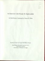
Transcript of interview with Wendy Starkweather by Claytee White, June 16, 2010
Date
Archival Collection
Description
Wendy Starkweather recalls her move to Las Vegas on a hot summer day in 1978. Her husband, Peter L. Starkweather had accepted a position to teach biology, but nothing had prepaied her for desert weather in July. She was a small town girl, born and raised in rural Ogdensburg, New York. She attended Skidmore College in Saratoga Springs, NY and became a teacher and librarian in New Hampshire Getting a job at UNLV's library took some time, but finally in 1985, she was offered the position of head of references. From that point on, there was only looking forward for Wendy. She was to be an active member of the library staff until her retirement in 2010. During her over two decades at UNLV she worked under the leadership of six deans. She was an vigorous voice in the development of services, impacting circulation, interlibrary loans and non-book services that included media and instruction. In addition, she was here during a momentous period as the future Lied Library was being fu
Text

Interview with Edward Bonfoy Giller, April 19, 2006
Date
Archival Collection
Description
Text

Interview with Elsie Lavonne Lewis, November 16, 2004
Date
Archival Collection
Description
Text
Script for television pilot, This Must Be the Place by Hank Henry and Bill Willard, 1950s
Date
Archival Collection
Description
The preface and script for a sitcom television show conceived of by Hank Henry and Bill Willard "to evoke the spirit of fun and laughs springing out of conflict and understanding between the old comedy school and the new school."
Text
