Search the Special Collections and Archives Portal
Search Results

Jahaira Farias interview, April 12, 2019: transcript
Date
Archival Collection
Description
Interviewed by Monserrath Hernández and Barbara Tabach. Jahaira Farias is a graduate of Western High School, a Marine Corps veteran, and a founder of a local chapter of the Women Marines Association. At the time of this oral history, Jahaira worked for US Congresswoman Susie Lee. Jahaira Farias was born in Las Vegas, Nevada, and grew up on the west side of town. She has summertime memories of her travels to Mexico, where she was able to connect with her family's heritage and language. During her years at Western High School, she participated in varsity sports and was the armed drill team commander. After graduation, Jahaira enlisted into the Marine Corps, where she specialized as a transport operator and hazardous material transporter and served two deployments in Iraq and Afghanistan. Her transition to civilian life included work in security at Caesars Palace. When she took a position with as district representative for Congresswoman Susie Lee, her focus was to assist veterans and immigrants. She helped Rep. Lee develop community outreach towards the Latinx community and Veterans. Jahaira is the president of the Las Vegas NV-3 Sagebrush Marines chapter of the Women Marines Association, an organization she helped establish and rebuild. The WMA helps veterans find their footing again through mentoring and support, and conducts community engagement by fostering the same camaraderie found in the Corps. After surviving a motorcycle accident, Jahaira's recovery is nothing short of miraculous, going from being in a wheelchair to competing in Tough Mudder. Now extremely active, Jahaira is an avid hiker and certified yoga instructor, specializing in trauma recovery. A polyglot, Jahaira formally studied Arabic and Russian, and speaks English, Spanish, and Pashto, and received an associate degree in Russian from the College of Southern Nevada.
Text
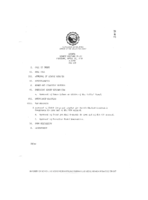
Meeting minutes for Consolidated Student Senate University of Nevada, Las Vegas, April 27, 1989
Date
Archival Collection
Description
Text
Kirk Kerkorian School of Medicine at UNLV 1st Commencement and Academic Hooding Ceremony
Date
Archival Collection
Description
Commencement program from University of Nevada, Las Vegas Commencement Programs and Graduation Lists (UA-00115).
Text
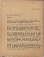
Letter from Walter R. Bracken (Las Vegas) to W. H. Comstock (Los Angeles), June 17, 1922
Date
Archival Collection
Description
LVL&WC executives had been called to a meeting with the Utilities Commission about water shortages, and W. H. Comstock was seeing if they could quickly increase capacity before the meeting.
Text
Capri Motel Neon Survey document, September 14, 2017
Date
Archival Collection
Description
Site address: 325 Fremont St
Sign owner: Nemo Motel LLC
Sign details: This motel was originally constructed in 1958. Their sign states "New Rooms, Daily and Weekly", so it is unclear if they renovated or if they have new rooms daily since this has been on their sign since 2007.
Sign condition: 2- Has a lot of weathering and the paint is very faded and some neon tubing is broken
Sign form: Pylon
Sign-specific description: This pylon has a red steel base. On the top there is a rusty-red rectangle with "MOTEL" spelt out horizontally in a painted white block letter font (looks as though it had skeletal neon with most of it broken on each side). Below this is a rusty-red rectangular blade sign box that has a white plastic sign in it that states "CAPRI" vertically in Red block font letters. The base behind this sign box does look like it has holes in it every few inches as a part of its design. Below this is another rusty-red sign box that has a white plastic sign that says, "New Rooms, Daily and Weekly, Free Phone- Wifi Internet-Cable T.V.- Movies" In a mid-century modern paint effect font. This sign box looks as though there once was incandescents surrounding it but are now mostly missing.
Sign - type of display: Neon and incandescent remains
Sign - media: Steel and plastic
Sign - non-neon treatments: Plastic backlit portion of sign
Sign environment: Down on the East side of Fremont, this location has two car sales lots on either side of it and has other Motels nearby.
Sign - date of installation: Has been up since at least 2007
Sign - thematic influences: The font they use on the bottom portion listing what this location offers has that thick paintbrush effect that you would see on older signs. With this it shows that many signs were hand painted (though we do not know if this one was or not).
Survey - research locations: Asessor's Page and Google map roadside view
Survey - other remarks: Next to the Flamingo there was a motel called the Flamingo Capri Motel which is a very similar name http://vintagelasvegas.com/post/116515472029/flamingo-capri- motel-las- vegas-c1960- this.
Surveyor: Emily Fellmer
Survey - date completed: 2017-09-14
Sign keywords: Neon; Steel; Plastic; Backlit; Pole sign
Text

Crystal Palace Neon Survey document, September 6, 2017
Date
Archival Collection
Description
Site address: 4680 Boulder Hwy
Sign owner: Tim Poole
Sign details: The building was constructed in 1977 for this Skating Center. This skating center opened during the prime skating rink roller age of the 70's/80's. The Crystal Palace does have a second location in North Las Vegas on Rancho built in 1981 which is ran by Larry & Judy Sandord though still under Tim Poole's company. Crystal Palace holds birthday parties, themed nights and open skate for all ages.
Sign condition: 4- has had some weathering over the ages.
Sign form: Pylon and building signs
Sign-specific description: On Boulder Hwy they have a roadside sign that has a yellow steel base with a yellow curved sign box that is lined with yellow incandescent light bulbs. Inside this box is a back lit plastic sign that states "Crystal Palace" in a retro 1970's/80's double lined font. Within the two words there is a red circle that showcases a navy blue pair of roller skates and then states "USA" in white letters within the red circle with two white stars on either side of it. On both sides of the building there are thin red steel words "Crystal Palace Skating Center" that is down lit by LED lights.
Sign - type of display: Incandescent, LED and backlit plastic sign
Sign - media: Steel and plastic
Sign - non-neon treatments: Signs on building up lit by LED lights and the roadside sign is backlit plastic
Sign animation: Flasher for incandescent light bulbs
Sign environment: On Boulder Hwy towards the East side of Las Vegas. There is an RV lot across the street as well as other shopping centers.
Sign - date of installation: Has been up sine at least 2007
Sign - thematic influences: The roller skate image on the sign shows symbolism for what kind of company it is, as well as the font makes you think of the classic 70's/80's roller rink style.
Sign - artistic significance: The double lined font is very 1970/80s roller rink/ video game style (similar to SEGAs logo).
Survey - research locations: Assessor's page, Crystal Palace website http://www.skatevegas.com/ , google maps satellite and road view
Surveyor: Emily Fellmer
Survey - date completed: 2017-09-06
Sign keywords: Incandescent; Backlit; Plastic; Steel; Flashing; Building-front design; Pole sign
Text

