Search Results
Photographs of Sunset Station signs, Henderson, (Nev.), February 2017
Date
2017-02-18
2017-02-19
2017-09-16
Archival Collection
Description
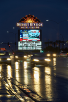
The Sunset Station Hotel and Casino sits at 1301 West Sunset Road as evening traffic passes by. Information about the sign is available in the Southern Nevada Neon Survey Data Sheet.
Site address: 1301 W Sunset Rd
Sign owner: Sunset Station Inc
Sign details: Original construction 1996. opened June 10th 1997, 74.75 acre lot
Sign condition: 5 - great condition, kept up with no broken lights
Sign form: Animated Back to Back Monument Sign
Sign-specific description: Has the words "Sunset Station Hotel Casino" in animated boxed under a setting sun which is framed, the wording lit with incandescent bulbs. The frame has chasers to draw attention and bright neon filling in the sun with neon flashing on and off starting from the middle then spreading out into the rays of the sun with mixed colors of red, white, yellow and orange. The blocks that the casino name sets in, blue neon flash on and off as well like the chasers but glow a bright blue, also framed with chaser bulbs as well. There is also a tv screen under the decorative topper of the sign, then a reader board underneath the tv screen which is internally lit.
Sign - type of display: Neon and incandescent, TV screens
Sign - media: Steel, Plastic
Sign animation: Neon flashing on and off, Chasers, TV screen
Sign environment: Sunset Station is surrounded by shopping centers
Sign - date of installation: c. 1997
Sign - artistic significance: Design inspired by Spanish avant-garde architect Antoni Gaudi.
Survey - research locations: Las Vegas Sun, Neon Museum archives
Survey - research notes: https://lasvegassun.com/news/2017/jun/26/how-sunset-station-changed-the-scene/ - Las Vegas Sun Article of 20th Anniversary of Sunset Station
Survey - other remarks: In 1998, the casino announced a $45 million expansion to add 20,000 square feet, 11 movie screens, a steakhouse, a food court, meeting rooms and a parking garage. In 2005, it opened a bowling alley called Strike Zone that featured 72 lanes and cost $25 million to build. In 2016, it renovated its tower and upgraded many of its suites and rooms.
Surveyor: Danny Jacobs
Survey - date completed: 2017-09-16
Sign keywords: Neon; Incandescent; Steel; Plastic; Flashing; Chasing; Back to back; Video screen; Pylon; Reader board
Mixed Content

Photographs of Casa Malaga signs, Las Vegas (Nev.), 2002
Date
2002
Archival Collection
Description
Daytime and nighttime views of the Casa Malaga signs on the Strip. Information about the sign is available in the Southern Nevada Neon Survey Data Sheet.
Site address: 4615 S Las Vegas Blvd
Sign details: The Casa Malaga resides on the east side of the strip, among the decaying roadside motels. The property is in the style of most of the motels in the area. A small office sits up front, with a drive next to it, and leading to a parking lot in the back of the property. The parking lot is surrounded on the east, north, and south sides by one story groups of rooms. The pole sign resides in the front parking lot, next to the street
Sign condition: Structure 2 Surface 2 Lighting 2
Sign form: Pylon
Sign-specific description: The main advertisement for the establishment is the roadside pole sign which faces north /south. It consists mostly of a single white, steel pole with a double-backed steel cabinet. The cabinet is an eight-sided geometric figure, appearing as a swollen cross shape. The middle, horizontal section being larger and wider, than the cross member. The white cabinet is treated with red painted text. The top section reads "Casa," the second "Malaga," and the third reads "Vacancy." All of the texts are in capital letters lined over the contours with bent tubes of neon. Just below the top cabinet, two single-faced cabinets sandwich the pole, facing north/south. The white cabinet with white faces contains vinyl lettering. On the east and west faces of the small office up front, channel letters with clear plastic faces, a gold polished band around the edges, and maroon, and red neon on the interior.
Sign - type of display: Neon; Incandescent
Sign - media: Plastic
Sign animation: Flashing, chasing
Notes: The channel letters which spell motel on the south and west wall of the main office chase. The two signs take turns flashing on, one then the other, as the first shuts off. The incandescent bulbs, which line the bottom of the roofline of the office, chase each other as well.
Sign environment: The Casa Malaga resides between the Little Church of the west and the Glass Pool Inn.
Sign - thematic influences: The only theme present is its significance in design to the classic roadside motel. It falls into this theme seen throughout the southern end of the strip. The tall double-backed pole sign, small front office, and surrounding lengths of rooms, all fit into this motif.
Surveyor: Joshua Cannaday
Survey - date completed: 2002
Sign keywords: Flashing; Chasing; Pylon; Neon; Incandescent; Plastic
Mixed Content

Photographs of Desert Oasis sign, Las Vegas (Nev.), 2002
Date
2002
Archival Collection
Description
Daytime views of the Desert Oasis motel sign. Information about the sign is available in the Southern Nevada Neon Survey Data Sheet.
Site address: 4445 Diamond Head Dr
Sign owner: Volunteers of America/HUD
Sign details: The Desert Oasis Apartments is on the south end of the strip, south of the Pit Stop. The low rise tan stone structure of the apartments sits just east of the strip separated by a small parking lot.
Sign condition: Structure 4 Surface 3 Lighting 3
Sign form: Pylon
Sign-specific description: The Desert Oasis Apartments is on the south end of the strip, south of the Pit Stop. The low rise tan stone structure of the apartments sits just east of the strip separated by a small parking lot. Just outside the main entrance, extremely close to the building, facing north south, two brown, sculpted, steel legs, support an internally lit message center. The two legs look to be representative giant Tiki heads. In the space between the legs, and on the bottom edge of the message cabinet, a clear plastic box hold neon sculpted into the words "Vacancy" underneath the word "No." The cabinet is painted a rusted color and the face is fluted plastic with vinyl lettering. Two square posts rise out of the top of the cabinet, a short distance, before they support a larger double backed internally lit cabinet. A center pole resides between the two legs, rising into the center of the cabinet as well. The cabinet is crafted out of a polished gold metal. The face of the sign is a graphically treated surface. Desert Oasis is written in red cursive script across the top of the sign. A small graphically painted green palm tree, sits just to the right of the text. The middle of the board is occupied by large all capital text reading "Motel," in black text. Two black horizontal scrolls flank the text. A band of red runs horizontally across the bottom of the sign, with white painted text reading "Apartments."
Sign - type of display: Backlit
Sign - media: Steel; Plastic
Sign - non-neon treatments: Graphics
Sign animation: none
Sign environment: The Desert Oasis is located between the Laughing Jackalope to the south and the Motel 8 establishment to the north. It stands very inconspicuous among the environment of the southern end of the strip, easily passed by the motorist or wandering pedestrian.
Sign - thematic influences: Even though the establishment fits into the genre of a roadside motel, the sign itself doesn't quite fit in to the motif. The building itself is reminiscent of standard architecture of the era and location, the sign itself has elements of a Polynesian flavor. The legs of the sign appear to be Tiki like figures, but the details are quite vague.
Surveyor: Joshua Cannaday
Survey - date completed: 2002
Sign keywords: Pylon; Backlit; Steel; Plastic; Graphics
Mixed Content
Barker Motel Neon Survey document, September 8, 2017
Date
2017-09-08
Archival Collection
Description
Information about the Barker Motel sign that sits at 2600 N Las Vegas Blvd.
Site address: 2600 N Las Vegas Blvd
Sign owner: Barker LLC
Sign details: 0.21 acre lot constructed in 1954. Property is closed.
Sign condition: 2- the sign is faded and neon has fallen off, as well as the majority of their original sign was taken down or weathered away
Sign form: Directional sign on top of building
Sign-specific description: The property has a tower which has a sign on top of it that is a peach colored arrow that has dark brown block lettering stating "MOTEL" that points towards the entrance of the parking lot of the motel. This end of the arrow has a steel support that goes to the first story of the building. This portion looks like it used to have skeletal neon but has fallen off. Near the road where this motel is located it looks as though there was once a sign because there is remnants of what the base of the sign was but no graphics on it.
Sign - type of display: Neon
Sign - media: Steel
Sign environment: Located in North Las Vegas, close to Jerry's Nugget Casino
Sign - date of redesign/move: Appears there are remnants of their original sign on the roadside, but the letters has been removed. It has been this way since at least 2010.
Sign - thematic influences: The arrow stating Motel is a 1950's/60's motel trend within the car consumer era and era of traveling to draw attention for people that are driving by.
Survey - research locations: Assessor's website
Survey - research notes: http://stefanidrivesvegas.com/12.html Stefani drives Vegas has images of before/after of this motel with an image that they date circa 1960
Surveyor: Emily Fellmer
Survey - date completed: 2017-09-08
Sign keywords: Neon; Steel; Directional; Paint
Text

Bunkhouse Saloon Neon Survey document, August 23, 2017
Date
2017-08-23
Archival Collection
Description
Information about the Bunkhouse Saloon sign that sits at 124 S 11th St.
Site address: 124 S 11th St
Sign owner: 11th Street Tavern LLC and Jillian is the manager (no last name found)
Sign details: This location opened in 1953, but has recently reopened under new ownership. This location is known for their concert venue as well as their southern style bar food.
Sign condition: 3-4- some fading in the plastic so it does not show as clear as an image as it could.
Sign form: Pylon
Sign-specific description: This sign has a black steel base with a sign box on top. This sign box is steel but has wood renderings on the sides of it. The sign box contains a back lit plastic sign that is red with yellow lettering that states "The Bunkhouse Saloon" in a swirly western font. Below this is a reader board.
Sign - type of display: Backlit plastic sign and reader board
Sign - media: Steel, wood and plastic
Sign - non-neon treatments: Plastic backlit sign and readerboard
Sign environment: This location is downtown on East Fremont across the street from PublicUs and a food market.
Sign - thematic influences: Their saloon theme is portrayed in the font on their sign. This theme could also pay homage to the early Las Vegas and Old West theme with the saloon idea.
Survey - research locations: Asessor's Page, Bunkhouse website http://www.bunkhousedowntown.com/about/ and google images.
Survey - research notes: Tried to contact manager for information on sign but no response.
Surveyor: Wyatt Currie-Diamond
Survey - date completed: 2017-08-23
Sign keywords: Pylon; Plastic; Backlit; Steel; Reader board
Text

Echo Mobile Park Neon Survey document, September 28, 2017
Date
2017-09-28
Archival Collection
Description
Information about the Echo Park Mobil Home Park sign that sits at 1322 S Mojave Rd.
Site address: 1322 S Mojave Rd
Sign owner: Garcia Maria Hilda and Whispering Sands LLC
Sign details: This location was constructed in 1961 as a manufactured home park that includes a pool and a laundromat.
Sign condition: 3- paint is heavily faded
Sign form: Porte Cochere
Sign-specific description: This sign is placed above a parking garage. The sign is a turquoise color in a linear geometric shape, almost like a long rectangle was attached to a trapezoid on its top left side. On this sign there are white block font letters spelling out ECHO PARK with a black painted trim. These letters contain skeletal neon.
Sign - type of display: Neon
Sign - media: Steel
Sign - non-neon treatments: Paint
Sign environment: This location is off of East Charleston on the side street Mojave,and is surrounded by other mobile parks as well.
Sign - date of installation: Record shows this has been up since at least 2011 though that record even shows aging on the sign.
Sign - thematic influences: This sign shows a good example of skeletal neon.
Sign - artistic significance: These linear geometric shapes showcased on the sign present mid-century modern design aspects.
Survey - research locations: Asessor's page, google maps satelite and road view
Survey - research notes: There is not much information on this location, and there is no designated website to contact anyone for information on the sign.
Survey - other remarks: The condition of the sign looks as though it could have been from around 1961 when the building was constructed especially with the mid- century modern design, but there is no confirmation or evidence to show when it was made.
Surveyor: Emily Fellmer
Survey - date completed: 2017-09-28
Sign keywords: Neon; Steel; Paint; Pole sign
Text

Road Runner RV Park Neon Survey document, September 14, 2017
Date
2017-09-14
Archival Collection
Description
Information about the Road Runner RV Park sign that sits at 4711 Boulder Hwy.
Site address: 4711 Boulder Hwy
Sign owner: Daryl Thompson
Sign details: This local owned R.V. park has been open since 1986 just miles from the Strip. They have 200 sites to hold guests, as well as a swimming pool.
Sign condition: 5- paint and lights are still bright on the signs
Sign form: Pylon
Sign-specific description: This pylon sign has Roadrunner on the top of it which is outlined in skeletal neon, underneath is a rectangular red sign. This sign has yellow bubble font channeled letters stating "ROAD RUNNER". Underneath this states "R-V Park" in a channeled white frontier style font that contains incandescents. Underneath the red rectangular sign is there prices listed which is on a plastic sign for their daily, weekly and monthly prices. Under the prices is a traditional "NO VACANCY" in red skeletal neon.
Sign - type of display: Neon and incandescents
Sign - media: Steel and plastic
Sign - non-neon treatments: Plastic portion of the sign and incandescent light bulbs
Sign animation: Flasher for incandescent light bulbs
Sign environment: This property is on Boulder Highway and has grocery stores and banks close to it.
Sign - thematic influences: Road Runners are prominent animals in the Nevada and southwest region of the United States.
Sign - artistic significance: Artistically this sign looks as though it can be for a motel particularly since it is also on a highway , but it's for an R.V. park.
Survey - research locations: Asessor's page, Road Runner RV website https://www.roadrunnerrvpark.com/ , Travel Nevada Website https://travelnevada.com/places/26805/roadrunner-rv-park
Surveyor: Emily Fellmer
Survey - date completed: 2017-09-14
Sign keywords: Pylon; Neon; Incandescent; Steel; Plastic; Flashing; Reader board
Text

West Wind Drive-In Neon Survey document, August 27, 2017
Date
2017-08-27
Archival Collection
Description
Information about the West Wind Drive-In sign that sits at 4150 W Carey Ave.
Site address: 4150 W Carey Ave
Sign owner: West Wind Drive-In and Public Markets
Sign details: The first West Wind theater opened 1952 in California. This location was constructed in 1967. West Wind Drive-Ins have always been family owned and remain as the largest Drive-In chain in the world. They have locations in California, Nevada and Arizona.
Sign condition: 5- the sign is kept up well
Sign form: Arch ways and a pylon
Sign-specific description: The pylon sign is mainly a reader board with a googie style star at the top of the pylon. Near the bottom of the sign is an arrow that has the word "Theater" in channeled neon letters. Driving into the theater there are lighted archways with reader boards joining the arches.
Sign - type of display: Neon and back lit sign
Sign - media: Steel and Plastic
Sign - non-neon treatments: Reader board
Sign environment: This location is in North Las Vegas next to the North Las Vegas Airport. Though this location is also near Texas Station and Fiesta Rancho.
Sign - thematic influences: The sign showcases Googie themes with the star, the arrow and archways. With this style it stays true to the classic Drive-In 50's/60's theme and feel.
Survey - research locations: West Wind Website https://www.westwinddi.com/locations/las-vegas , Assessor's Office
Survey - research notes: The Westwind website gives a good history of the Drive-In and history of their company. https://www.westwinddi.com/about-us
Surveyor: Wyatt Currie-Diamond
Survey - date completed: 2017-08-27
Sign keywords: Pylon; Neon; Backlit; Steel; Plastic; Reader board
Text
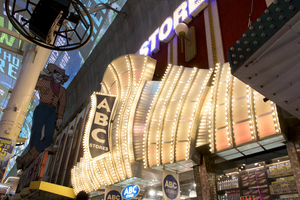
Photographs of ABC Stores sign, Las Vegas (Nev.), March 3, 2017
Date
2017-03-03
2017-09-01
Archival Collection
Description
The ABC Stores sign sits at 23 East Fremont Street inside the Fremont Street Experience. Information about the sign is available in the Southern Nevada Neon Survey Sheet.
Site address: 23 Fremont St
Sign owner: Sidney and Minnie Kosasa
Sign details: The idea of the ABC stores originated in Hawaii with their first store opening in Waikiki in 1964 as a traveler convenience store selling groceries, cosmetics and souvenirs. The company now has location here in Las Vegas as well as Guam and Saipan. The owners wanted a name that everyone could remember so they named it ABC. The building that houses this ABC Store on Fremont was originally constructed in 1940. The property opened as the ABC Stores in November of 2001.
Sign condition: 5- relatively new and in good condition.
Sign form: Flat bullnose sign, though nearly a canopy sign
Sign-specific description: Above their entrance are big silver plumes that are all lined with chasing incandescent. At night these plumes look like a iridescent pearl color. There is one big plume in the middle and two on either side of the big one. On the middle plume there is a blade sign stating "ABC (vertically) Stores (horizontally)" which is also lined in incandescent on the roadside portion of the sign. The blade portion is a backlit plastic sign. Above the silver plumes is "ABC STORES" in channeled block font letters. These letters are outlined in blue neon (argon) and have gold colored incandescent that are flashing.
Sign - type of display: Neon, incandescents and backlit plastic signs
Sign - media: Plastic and steel
Sign - non-neon treatments: Neon, incandescents and backlit plastic signs
Sign animation: Chaser for the incandescents on the plumes and flasher on the incandescents in the ABC letters above the plumes.
Sign environment: This property is on Fremont in between Main and First Street. To the east would be the site of the old Famous Pioneer Club and La Bayou was to the west, but has been torn down in the past year. Across the street was the Glitter Gulch.
Sign manufacturer: YESCO
Sign - date of installation: 2001
Sign - thematic influences: The plumes that this location has look very similar to the 1970's Raul Rodriguez Flamingo feathers.
Sign - artistic significance: Could be reminiscent of the 1970's Flamingo Feathers designed by Raul Rodriguez. Though it is also remnant of the old showgirl outfits with their plumes and big feathery outfits.
Survey - research locations: ABC website http://www.abcstores.com/about/ , Acessor's Page, contact with Lovella Joy C. Romulando the Assistant Property manager.
Surveyor: Emily Fellmer
Survey - date completed: 2017-09-01
Sign keywords: Neon; Incandescent; Backlit; Plastic; Steel; Chasing; Flashing; Bullnose
Mixed Content

Photograph of Beauty Bar sign, Las Vegas (Nev.), June 28, 2017
Date
2017-06-28
2017-08-14
Archival Collection
Description
The Beauty Bar sits at 517 Fremont Street in Downtown Las Vegas. Information about the sign is available in the Southern Nevada Neon Survey Data Sheet.
Site address: 517 Fremont St
Sign owner: Darin Feinstein and Corey Harrison (From Pawn Stars)
Sign details: Building originally constructed in 1988 for a retail store. The Beauty Bar franchise was founded in 2004 in New York City. The bar in Las Vegas used to be owned by Paul Devitt, but in 2014 is when Darin and Corey bought it and did some renovations. During the day they offer manicures/pedicures while serving cocktails, but at night function as a bar and concert venue with cool retro 1950s/60s salon style chairs and colors.
Sign condition: 3-4 During the day the sign looks faded and rusted over. At night the light does not beam as if it is a new sign either.
Sign form: Cabinet mounted to building
Sign-specific description: On the building there is a white oval shaped plastic sign saying Beauty Bar. Right above the doors there is a Salon of Beauty in channeled white block type letters. Both signs illuminate pink.
Sign - type of display: Neon and backlit sign
Sign - media: Steel and plastic
Sign - non-neon treatments: Backlit sign in plastic
Sign environment: Located in the Fremont Street East District surrounded by other bars and restaurants.
Sign - date of redesign/move: c. 2014
Sign - thematic influences: The bubbly pink backlit sign almost is the same shape as a painters pallet, so it shows an artsy theme since some consider doing hair and manicures as artwork as well
Sign - artistic significance: The "Salon of beauty" letters each have their illumination contained due to the metal channeling for each letter. The sign does have a retro aspect with their sign not looking totally brand new which extenuates the theme of an old beauty salon that you would see in the 50s or 60s.
Survey - research locations: Beauty Bar Website, accessor's office
Survey - research notes: Paul Devitt, the previous owner, actually started the chain of Beauty Bars in New York in 1995. He still has a part in the ownership in the other location he opened in N.Y., L.A., San Francisco and Chicago.
Surveyor: Emily Fellmer
Survey - date completed: 2017-08-14
Sign keywords: Backlit; Plastic; Steel; Neon; Fascia; Cabinet; Building-front design
Mixed Content