Search Results

Photographs of Milan Bakery, Las Vegas (Nev.), April 18, 2017
Date
Archival Collection
Description
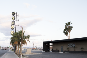
Site address: 1625 Fremont St
Sign owner: Selak, LLC
Sign details: The building was constructed in 1952 (Assessor). Milan Selakovik acquired the property from the Salvation Army in 1966 (Assessor).
Sign condition: The sign is condition 2, fair to poor. The paint is flaking. Approximately a third of cabinet bottom has rusted out. No neon remains on the sign.
Sign form: Blade sign
Sign-specific description: The background of the entire sign is painted red. The top and bottom of the sign are attached to the building by two metal cabinets. The lower cabinet is irregularly shaped. On the west side of the lower cabinet, the telephone and fax numbers are painted in peeling yellow. The paint has almost completely flaked off around the area where a cursive "Fax" formerly appeared. Attached to the street side of the sign is a vertical metal cabinet which runs almost the entire height of the sign. The word "BAKERY" is painted in white sans serif letters which run vertically over most of the cabinet. Extending horizontally from the cabinet toward the building are three small metal cabinets. A horizontal white line is painted on each of the three cabinets. A larger cabinet attached next to the "B" in "BAKERY" extends horizontally toward the building. The cabinet has a medallion shaped black and white cartoon of a baker holding a tray of baked goods. An irregularly shaped cabinet topping the sign contains the name, "MILAN" painted in white sans serif letters. The east side of the sign is painted similarly to the west, except that: 1) a cursive white or silver "Fax" is located at the bottom of the sign to the left of the fax number and, 2) extreme flaking has completely removed what was painted on the medallion at the top of the sign.
Sign - type of display: Formerly neon
Sign - media: Steel
Sign environment: Down on the East side of Fremont Street
Sign - date of installation: Based on the acquisition date of the property by Milan Selakovik in 1966, the current design of the sign possibly dates from the 1960's.
Sign - date of redesign/move: The unusual shape of the sign indicates that it has been modified over time. The form suggests that the sign was originally a directional arrow which pointed down from the roof toward the entrance to the business, with additional cabinets added later. A 2004 photograph shows the current sign design and color scheme (RoadsidePeek.com). A drawing of a baker's head was located in the medallion where the cartoon baker now resides. The three small cabinets which jut out horizontally from the sign formerly stated, "BREAD", "CAKES" and "PASTRY". The lower portion of the sign advertised "FRESH SANDWICHES".
Sign - thematic influences: Their sign showcases similar themes to cartoons, bakers and bakeries.
Sign - artistic significance: The sign portrays similar designs to other signs manufactured in the 1960's.
Survey - research locations: Clark County Assessor Parcel No. 139-35-315-002. Retrieved from http://www.clarkcountynv.gov/assessor/Pages/PropertyRecords.aspx?H=redrock&P=assrrealprop/pcl.aspx RoadsidePeek.com. Milan Bakery. Retrieved from http://roadsidepeek.com/roadusa/southwest/nevada/vegas/lvsign/lvothersign/index2.htm
Surveyor: Mitchell Cohen
Survey - date completed: 2017-08-17
Sign keywords: Blade; Neon; Steel
Mixed Content

Photographs of PublicUs sign, Las Vegas (Nev.), April 18, 2017
Date
Archival Collection
Description
Site address: 1126 Fremont St
Sign owner: Kimo Akiona, Cole McBride and Travis Landice
Sign details: PublicUs opened in 2015. This property has previously held other restaurants the most recent being a Philly Cheese Steak restaurant. PublicUs represents "for the people" in Latin. Hemant Kishore is the baker and chef. This location is a canteen-style restaurant and coffee house where they make all organic foods in house.
Sign condition: 4- the steel part of the sign looks relatively new and has bright paint, but the plastic portion for the sign does some aging to it.
Sign form: Pylon
Sign-specific description: On the corner of Fremont E and Maryland pkwy at the corner of their building there is a blue been sticking out of the ground that is curved at the top. Near this curved section is a rectangle steel sign box that has a back lit plastic sign in it, and underneath is a similar rectangular box. The bigger rectangular box has a white background, but has the a light tan box with PublicUs logo in white letters in the light tan brown box. The smaller box on the bottom has the white backdrop and the tan colored rectangle has Fremont Village written in a white font. Both rectangle signs have an arrow pointing through them with the tip of the arrow above their main logo sign and the "feathers" of the arrow underneath Fremont Village sign.
Sign - type of display: Backlit plastic sign and incandescent light bulbs
Sign - media: Steel and plastic
Sign - non-neon treatments: Plastic back lit portion of sign
Sign animation: Flasher for incandescent light bulbs
Sign environment: This is located on the corner of Maryland Pkwy and Fremont Street East. Surrounding this property is a lot of old motels that have been shut down, and painted over though many of their neon signs are still up and some working. On the same block as them is a vintage barber shop and a vintage tattoo parlor.
Sign manufacturer: Main portion of the sign was around before they opened so information on the base of the sign was not found
Sign - date of installation: The sign box has records of being around longer than the PublicUs has, records (Google Maps satellite view) show the sign similar to this has been up since at least 2013
Sign - date of redesign/move: Late 2015 is when their main logo was installed
Sign - thematic influences: This sign shows how signs can be re-purposed or can evolve with different colors and slightly different designs over the years even though the theme of the property has changed.
Sign - artistic significance: The arrow in the sign could signify a bulls eye in the sense that you are looking in the right spot or have found the perfect spot.
Survey - research locations: Google Maps satellite view, Sprudge coffee blog http://sprudge.com/publicus-97938.html , Eating Las Vegas http://www.eatinglv.com/2015/03/publicus-is-open-and-baking-for-the-people/
Survey - research notes: This restaurant has faux trees and nice wooden tables inside to make it feel as though you are outdoors but still in a homey place.
Surveyor: Emily Fellmer
Survey - date completed: 2017-08-18
Sign keywords: Plastic; Backlit; Incandescent; Steel; Flashing; Pole sign
Mixed Content
Photographs of Club 2100, Las Vegas (Nev.), March 3, 2017
Date
Archival Collection
Description
Site address: 2100 Fremont St
Sign details: The Club 2100 is a popular Latin nightclub on Fremont Street. An excerpt form the Las Vegas Weekly reads, "More than half a million Latinos call Las Vegas home, and 40 percent were born outside the United States, according to the Pew Research Center. These clubs give Las Vegans an opportunity to see live bands playing music with which they grew up." Certain nights of the week they specialize in different types of music in order to keep the club exciting for people to keep coming back. They have been a part of the Las Vegas community for about four years now.
Sign condition: 4, the sign is in good condition. However, it is unclear if it still lights up at night.
Sign form: Roadside pole and porte cochere
Sign-specific description: There are two major portions for this sign. One is the porte cochere signage that consists of two large, black arches. On the left arch are light blue backlit letters spelling the word "NIGHT" and on the right arch there are letters just like these spelling the word "CLUB." In the center of the arches a pole sign extends upward and along one side of the pole extending in the direction of the parking lot are five white, backlit four-point Googie Style stars. On the other side of the pole extending out toward Fremont Street are five signs with pointed edges at each top corner and a point in the bottom center, resembling arrows possibly. Each of these signs has yellow text and a black background. The top sign reads "CLUB" and the other signs that follow spell out "2100."
Sign - type of display: Backlit plastic sign
Sign - media: Steel and plastic
Sign - non-neon treatments: Plastic backlit portion
Sign environment: The neighborhood for this property is filled with small restaurants and apartment complexes. This property sits further east from the excitement of the other properties on Fremont Street.
Sign - date of installation: Around 1958. Around 2014 for the update for the night club.
Sign - date of redesign/move: It appears that this signage was part of the original signage for the Blue Angel Motel. From photos that were taken in 2014, it shows that this is when the Blue Angel signage became the signage for Club 2100.
Sign - thematic influences: It appears that this signage was part of the original signage for the Blue Angel Motel. From photos that were taken in 2014, it shows that this is when the Blue Angel signage became the signage for Club 2100.
Sign - artistic significance: The overall design of this sign still reflects the Googie style that was popular in the 1950's, which seems to be when this sign was first placed on Fremont Street.
Survey - research locations: Las Vegas Weekly articles locations (archives, library, recorder's office, etc) https://lasvegasweekly.com/nightlife/2016/sep/07/vegas-latin- nightclubs-banda- norteno-live- music/#/0 https://lasvegasweekly.com/as-we- see-it/2014/sep/03/blue- angel-uproar- signals-clash- between- preservati/#/0 , and Roadside architecture website http://www.roadarch.com/signs/nvvegas3.html
Survey - research notes: Assessor's page did not show current owner of the property, as well as other information on this current location was difficult to find.
Surveyor: Lauren Vaccaro
Survey - date completed: 2017-09-12
Sign keywords: Porte-cochère; Backlit; Plastic; Steel; Pole sign; Roadside; Fluorescent
Mixed Content

Photographs of The Gables Motel, Las Vegas (Nev.), April 18, 2017
Date
Archival Collection
Description
Site address: 1301 Fremont St
Sign owner: 1301 Fremont LLC
Sign details: The building was constructed in 1946 (Assessor). A postcard circa 1940's shows the property was named "Las Gables Court" and endorsed by AAA (Wikimedia Commons, 2015).
Sign condition: The sign is condition 1, very poor. The street side light box is missing over half of its plastic. About three quarters of the bottom of the light box is rusted through. Light bulbs are missing from the lower portion of the light box. The hotel side light box is badly dented on the east side. The paint on the cabinets is faded and flaking. Rust marks are beginning to appear along the seams on the pylon. The neon letters for "VACANCY" are missing from the lower portion of the hotel side light box.
Sign form: Pylon Sign
Sign-specific description: A metal rectangular pylon painted yellowish tan is located on the hotel side of the sign. The body of the sign is cantilevered out toward the street. Attached to the pole is a metal light box painted red and split into two sections. A second light box is attached to the street side of the first. On the west side, the top plastic section of the hotel side light box advertises "THE GABLES" in cartoon style lettering. The lower portion of the sign is a reader board. The lower portion of the plastic section of the reader board has been hand painted, "POSTAL AND SMOKE SHOP". Over half of the paint on the lower portion of the metal cabinet of the reader board has flaked off. The remaining sans serif skeleton neon on that part of the sign states, "NO". Also on the west side is a street side light box painted yellow. The remaining plastic panels spell out "M - - E " in san serif letters. The bottom of the metal cabinet is rusted out. The light bulbs are missing from the lower portion of the cabinet. On the east side, the plastic on hotel side light box is badly dented. The lower portion of the metal cabinet displays faded sans serif letters which spell out "ANCY". The remainder of the east side is similar to the west.
Sign - type of display: Neon, incandescent, lightbox
Sign - media: steel and plastic
Sign - non-neon treatments: lightbox
Sign environment: East Fremont St. surrounded by motels.
Sign - date of redesign/move: Yes, but date unknown
Sign - thematic influences: The Gables Motel was a country cottage style motor court. The cartoon lettering style of "THE GABLES" may allude to this theme.
Sign - artistic significance: Motor courts and cottages
Survey - research locations: Assessor's website
Survey - research notes: Wikimedia Commons. (2015 June 8). Las Gables Court. Retrieved from https://commons.wikimedia.org/wiki/File:Las_Gables_Court,_13th_and_Fremont_Streets_(U.S._93_- _95_-_466),_Las_Vegas,_Nevada_(80597).jpg
Survey - other remarks: The sign shown in a postcard circa 1940's (Wikimedia Commons, 2015) may have been modified to make the current sign.
Surveyor: Mitchell Cohen
Survey - date completed: 2017-08-19
Sign keywords: Neon; Incandescent; Steel; Plastic; Light box; Pole sign; Reader board; Internally illuminated
Mixed Content

Transcript of interview with William F. Kelsey by James M. Green, January 20, 1975
Date
Archival Collection
Description
On January 20, 1975, collector businessman, James M. Greene interviewed businessman, William F. Kelsey (born November 6th, 1908 in Pasadena, California) in his home in Nelson, Nevada. Mrs. Kelsey is also present during the interview. This interview covers the life and times of Mr. Kelsey.
Text

Transcript of interview with Marguerite Goldstein by Carol A. Semendoff, February 25, 1979
Date
Archival Collection
Description
On February 25 1979, collector, Carol A. Semendoff interviewed cashier, Marguerite Goldstein, (born on May 1925 in Oberlin, Kansas) in the library at the University of Nevada, Las Vegas. This interview covers early Las Vegas, from 1950 to 1979. Also included during this interview is discussion on local dignitaries, the growth of Las Vegas, gambling as the major industry in Las Vegas, Strip hotels, and housing developments.
Text
Meeting minutes for Consolidated Student Senate, University of Nevada, Las Vegas, January 29, 2001
Date
Archival Collection
Description
Text
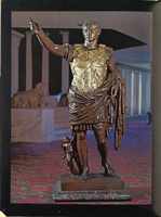
Hotel room brochure from Caesars Palace, circa 1969
Date
Archival Collection
Description
Bound booklet with concierge information for Caesars Palace. The guide provides entertainment and dining information about the resort and casino, including room service menus and a telephone directory.
Text
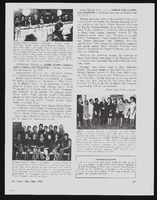
Alpha Kappa Alpha Sorority, Theta Theta Omega Chapter: Ivy Leaf newsletter articles
Date
Archival Collection
Description
From the Alpha Kappa Alpha Sorority, Incorporated, Theta Theta Omega Chapter Records (MS-01014) -- Chapter records file.
Text
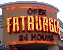
Photographs of Fatburger signs, Las Vegas (Nev.), 2002
Date
Archival Collection
Description
Site address: 3763 S Las Vegas Blvd
Sign details: The Fatburger establishment is directly north across a small drive from Walgreen's. The pylon contains a logo sign, but the most dominant is the text logo above the main entrance. The small parking in front of the building is illuminated with its incandescence. Smaller signs spread out evenly on both the west and south walls.
Sign condition: Structure 5 Surface 5 Lighting 5
Sign form: Pylon; Fascia
Sign-specific description: The Fatburger eatery is directly north from Walgreen's in the same parking lot. It resides on the east side of the strip. The entrance faces SW, mirroring the Walgreen's entrance. It is a rounded storefront design with "Fatburger" spelled in all capital, large, red, channel letters bordered in red neon. The letters face outward and follow the same radius of the entrance, creating a fascia effect with the size of the text. They are filled with incandescent bulbs, which oscillate in a random pattern. Open, red, channel letters, filled with red neon sit above and below the large "Fatburger" text. Above the main sign the letters read "open" and below they read "24 Hours". At the north end of the west face of the building is a diamond shaped, red, steel box with the "Fatburger" in silver channel letters with yellow neon in the interior of the letters. The diamond shape has a border of red neon on its face. Flanking the main entrance, on the south and west face of the building in red steel channel letters, with red translucent plastic faces, the phrase "The last great hamburger stand" is spelled in all caps. They reside approximately the same height on the building as the "24 Hours" script on the main sign. Additional signage is located on the bottom portion of the pylon sign designated for the "The Plaza." Above the back-lit cabinet is an arrangement of text and logo for Fatburger. From left to right, "Fatburger" is spelled in channel letters, the diamond logo is in the center of the sign, then "Fatburger" is spelled again in yellow channel letters. The channel letters are closed front with red translucent plastic. The diamond is outlined in red neon.
Sign - type of display: Neon; Backlit
Sign - media: Steel; Plastic
Sign - non-neon treatments: Graphics; Paint
Sign animation: Flashing, oscillating
Notes: The incandescent bulbs which are present inside the main channel letters, over the main entrance all turn on and hold, oscillate rapidly, then shut off.
Sign environment: The Fatburger eatery is in a unique position, being a widely known property located in a conglomerate of shops including such other well traveled properties such as Walgreen's and McDonald's. In fact, the building is located exactly between these locations. Walgreen's lies directly to the south, with McDonald's to the north. The small stretch of properties is dwarfed by the megalithic MGM further to the north, while the elaborate detail of the New York New York resides west across Las Vegas Blvd Once a pedestrian passes the MGM, headed north, on the east-side of the strip, the Fatburger does makes an lasting impression upon the passerby, being the brightest of the three immediate company.
Sign - thematic influences: Fatburger is another example of a typical everyday establishment turned into an electrifying display to fit in with its environment. No particular theme can be seen specifically other than the logo and color scheme influenced by the establishment itself. The entrance to the establishment contains the text wrapping the radius of the corner, creating a beacon for pedestrians. Such influence can be seen in other larger properties with corner entrances such as the Flamingo, the Barbary Coast, Harrah's, and O'Shea's.
Surveyor: Joshua Cannaday
Survey - date completed: 2002
Sign keywords: Flashing; Oscillating; Pylon; Fascia; Neon; Backlit; Steel; Plastic; Graphics; Paint
Mixed Content