Search the Special Collections and Archives Portal
Search Results
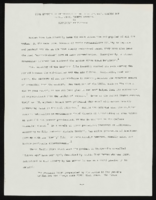
"Some Effects of Repression Films of Hollywood's Golden Age on the Civil Rights Movement": manuscript draft by Roosevelt Fitzgerald
Date
Archival Collection
Description
From the Roosevelt Fitzgerald Professional Papers (MS-01082) -- Unpublished manuscripts file.
Text
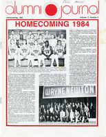
UNLV Alumni Journal, Volume 11, Number 5
Date
Archival Collection
Description
Volume 11, number 5 edition of the University of Nevada, Las Vegas "The Alumni Journal."
Mixed Content
Brian Sandoval (University of Nevada, Reno) oral history interview conducted by Magdalena Martinez and Elia Del Carmen Solano-Patricio: transcript
Date
Archival Collection
Description
From the Lincy Institute "Perspectives from the COVID-19 Pandemic" Oral History Project (MS-01178) -- Education sector interviews file.
Text
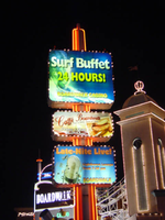
Photographs of Boardwalk Holiday Inn signs, Las Vegas (Nev.), 2002
Date
Archival Collection
Description
Site address: 3750 S Las Vegas Blvd
Sign owner: MGM Mirage
Sign details: The Boardwalk Holiday Inn is one of the most distinctive front faces which incorporate an extreme amount of signage condensed into a replica version of an eastern sea board. Since it is designed to be reminiscent of a boardwalk, the pedestrian element is a wooden planked walkway lined with shops and establishments. The area is separated from the traffic by landscaping and concrete elements. All the shop fronts designs, some false and others functioning, are all linked into the casino. The structure is encrusted with raceways and incandescent bulbs, as well as a ridiculous amount of internally lit signage that advertising everything from hotel promotions, to prices of drinks. Headed from the south, headed north, the parking garage can be seen, set back from the street slightly west, adorned with signage on it's face. The casino begins at full throttle aesthetically, with raceways lining almost every edge, contrasting tones of paint, murals, advertisements, neon and incandescence all come together. Above the first main entrance of the property, is a vibrantly lit, gold clad entrance canopy. Above that a non-functioning skeletal mass of a roller coaster comprises the majority of the southern end of the property. Neon letters are located on the vertical plane created by the rise of the tracks. The carnival style treatments of raceways and propaganda run north until the path is interrupted by the vertical pylon sign which is integrated into the architecture of the Boardwalks facade. The tracks continue above the property, all along the length interrupted by the main pylon and addressed with replica's of Ferris wheels with actual mannequins, dressed and riding inside of them. Just pas the main pylon the facade is transformed into a giant three dimensional clowns head smiling joyfully. The facade continues a short distance past the clown's head, and rounds off just as it began.
Sign condition: Structure 4 Surface 4 Lighting 4
Sign form: Pylon; Fascia
Sign-specific description: Upon the eastern face of the parking garage signage is created upon the top edge of the outside wall. The top edge of the wall is fashioned into a sculpted entablature of signage, complete with rising crests and swooping scrolls, which match the fashion of decoration for the facade as well. On each side of the surface possess a pair of internally lit signage. One is square, and the next is rectangular, brandished with black text. The center portion of the sign is closed in with a pair of half columns which rise out of the surface of the entablature to flank the main text. These half columns are laced with an outline of an orange and yellow neon tubing. The Text is spelled in two different lines of channel letters lined with red neon on the interiors. The First line reads "Boardwalk Casino" the second line reads "Free Parking." The two lines span the length of the space provided and are separated by a sculpted dividing line. The tower just to the north of the parking garage is suited with channel letters that spell "Boardwalk' and are filled with red neon. Roller coaster: The sign which resides over the first entrance is similar that of the paring garage, for it is placed in a raceway bordered fascia. The large channel letters are placed in the center and spell " Casino." The first and last letter are the smallest in size, and gradually climb up toward the middle. They are filled with incandescent bulbs and outlined with a border of red neon. Pylon: The rest of the facade is necessary for the theme to really work, but the tallest and brightest piece is the main pylon sign. The pylon sign is essentially a triangular shape which rises straight up into the air. If a unilateral triangle, then one point is facing east with the two sides meeting at this eastern most point, being designated for the main signage. Three visible posts support the sign, glowing with the reflectivity of the gold polished underside which is striped with rows of incandescent bulbs, running perpendicular to the entrance. Three bands of pink neon wrap the two visible sides, just above the pedestrians head. Just above that there is a narrow LED message center which scrolls text, which also wraps the two sides. The majority of the sign occupies the space between this small border and the main marquee. This rectangular portion each one of the pylons sides can be broken down into four horizontal sections. The bottom two comprise the bottom 1/3 of the sign, and are internally lit advertisements ninety-nine cent offers and the Surf buffet. The middle section, being the tallest, contains a large LED message center, flanked on both sides by multi colored neon tubes crafted into the shapes of stars. The stars vary in size and spread up the small wings of the reader board with surprising fluidity. Compared to the rest of this section, the top remainder is rather plain. A plain surface is accented with a pair of words spelled in channel letters. The word hotel is spelled on the left and filled red neon. They are separated by a small, circular, channel filled with green neon. The word on the right is spelled in the same lettering except it is filled with green neon. The space above that is occupied by the main logo for the establishment. A black field supports large white channel letters that are filled with white neon. Then black field is closed in on all sides by scrollwork shapes created out of incandescence and neon. The white and yellow luminescence, takes the form of a double arched section resembling an "E" or a sideways "M" or "W." The top sweeps upward creating an arched top. A top the main array of signage there are three smoke stacks arranged in a triangular formation, with one at the very front of the edge of the sign and two flanking them in the distance. When looking at the sign directly at the face, it appears as if there are a pair for either side. Spanning the distance between the two smoke stacks is an LED reader board lined on both the top and bottom edge with blue neon. An arch of raceways lined with incandescent bulbs loops over the reader board. A large pylon is designated for the Surf Buffet as well. On the northern end of the property a tall pylon sign faces north/south, and stands lined with red neon. The vertical post supports three internally lit cabinets. The post itself, if viewed directly from the top, would be in an "X" or cross formation. Vertical bars of red neon run up the length of the pole, creating a striping effect. The three cabinets are arranged sitting one on top the other, with a small space in between each. The group all differ in size to an extent, with the two lower cabinets being similar sized, horizontal rectangles, and the top cabinet being the largest. They all have raceways lining the exterior faces with chasing incandescent bulbs. The faces are brightly illuminated colored plastic, with the main cabinet being an advertisement for the Surf Buffet. The others advertise for similar amenities.
Sign - type of display: Neon; Incandescent; Backlit
Sign - media: Steel; Plastic; Fiberglass
Sign - non-neon treatments: Graphics; Paint
Sign animation: Chasing, flashing, oscillating
Sign environment: The environment created by the Boardwalk is an effective use of the theme on the pedestrian to create the environment. The Boardwalk is located next to a CVS Pharmacy to the south, which was erected during the course of the survey. When the pedestrian walks upon the Boardwalk, it is busy and noisy, and very attraction getting. When passing into the front side of the property, a pedestrian is assaulted with sounds and noises that are difficult not to pay attention to. This feeling created by the conglomerate of signage and utter blazing advertisement, is almost like a roller coaster. Person comes out the other side noticeably aware of the silence and darkness contrasted to the presence of the property.
Sign - thematic influences: The theme surrounding the Holiday Inn Boardwalk is that of a seaside boardwalk. Most preferably it is modeled to be representative of the eastern seaboard Coney Island. The facade therefore is most logically themed after the environment experienced on such property, amusement rides, and boisterous circus type lighting loom overhead, while wooden planks exist under the foot of the pedestrian. The walk is lined with coin-operated gadgets and games, while store fronts are found spaced between glowing advertisements. A faux Ferris wheel and roller coaster create an overhead arena of stylized representation that can best be suited as one of the more unique on the strip. It is not often that you see mock people lined up inside of a non- functioning Ferris wheel. Oddly enough, this phenomenon can be linked to couple of still existing Las Vegas Strip properties. When Caesars Palace completed its initial main pylon sign, actual life sized replicas of Centurions and Romans were placed at the base of the statue. They were painted to appear as life like as well. This is one example. The next is the living embodiment of this representation of figures, and their role as evolved on the strip as well. Madame Tussaud's wax museum can be said to be the incarnation of the use and fascination with such a medium. While the exteriors of such properties have shifted toward classic statuary, the life like figure has assumed the role of art form, as an elevated attraction in today's strip community. The noisy facade finds a place for three dimensional sculptural elements, such as the clowns face, which further adds to the "Coney Island" "Atlantic City" theming. Event though, the theme, and very nature of the construction of the Boardwalks facade are dictated by its name, it set early precedence for this interactive miniature city facade as present in many of the major player among the strip. e.g. The Paris, NY NY, Bellagio, Aladdin, etc.
Surveyor: Joshua Cannaday
Survey - date completed: 2002
Sign keywords: Chasing; Flashing; Oscillating; Pylon; Fascia; Neon; Incandescent; Backlit; Steel; Plastic; Fiberglass; Graphics; Paint
Mixed Content
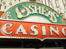
Photographs of O'Shea's signs, Las Vegas (Nev.), 2002
Date
Archival Collection
Description
Site address: 3555 S Las Vegas Blvd
Sign owner: Park Place Entertainment
Sign details: O'Shea's Casino is located just north across a small driveway from the Flamingo. The small but busy facade is a small, yet busy stop along the Las Vegas Strip. The exterior signage consists of two corner signs, a blade sign, hanging off of the west face of the building, a main entrance sign, backlit screens as well as various images laden with neon. All of these create a flashing display of luminescence all just above the pedestrian's head.
Sign condition: Structure 5 Surface 5 Lighting 5
Sign form: Fascia
Sign-specific description: O'Shea's Casino is located just north across a small driveway from the Flamingo. O'Shea's theme and signage is influenced by Irish culture and imagery, integrated into the forms of signage along the Las Vegas Strip. The building design itself is influenced by traditional European housing imagery, generalized with other elements of architecture also. One example of this is the coloring, exposed wooden beams and narrow rooflines over treated windows, which suggest styles seen in classic European architectural imagery. Examples of other elements such as sculpted windowsills and exterior molding are more akin to neoclassical than the Irish pub or cottage. A small blade sign hangs in the center of the structure facing north /south. Attached off of the building by two poles, the double sided cabinet is designed with a circular portion at the top that transforms along it's bottom edge into length portion of the "blade" that continues down to a rounded bottom. The Circular portion serves as the "O" in O'Shea's. The exterior of the signs width is finished in a polished gold aluminum surface. The top portion continues into a full circular space in the front where the backlit image of the O'Shea's leprechaun mascot resides in it's center. The image has a circular green neon border at the edge of the cabinet and is set into a field of incandescent bulbs, which occupy the remaining space in the face of the "O". Incandescent bulbs also run around the edge of a face on a gold raceway. Channel letters run vertically down the face of the blade spelling the remaining "Sea's" of the title. Each letter is filled with incandescent bulbs, and bordered on it's exterior in green neon. The remainder of the space, which comprises the surface of the sign, is a green material. The entire edge of the rest of the sign is also bordered with incandescent bulbs. Below the blade sign, the main entrance for the establishment is denoted by the large, arched, marquee logo, and wall sign for the casino. The arch shape is bordered by gold polished raceways, with the interior space where the O'Shea's logo is written in a bowed, horizontal arrangement with the "O" and "S" being the biggest letters in this group. The same back-lit leprechaun figure which is present in the blade sign, in seen in the "O" of the logo. The letters are of channel design and filled with incandescent bulbs. Gold scrollwork adorns the green background above and on the sides of the logo. An entablature, running the length below the arch, reads "casino" in channel letters filled with incandescent bulbs and bordered with green neon. The orange background in contained on the bottom edge with a gold polished raceway, which sharply curves into a downward point at the very center. All the raceway edges of the sign are lined with incandescent bulbs. Flanking the wall on either side of the main entrance are two backlit message centers with vinyl lettering. They also are bordered with incandescent bulbs, strewn upon polished raceways. To the south toward the Flamingo Casino, a corner marquee sign faces toward the southwest. The message center on the right of the main entrance essentially continues its shape wrapping in radius fashion all the way around the corner. As the entablature wraps the corner, the color changes to a section of black, containing the channel letters hung at a slight angle, spelling the words " Hall of Fame," in cursive text. Small stars in channel design adorn the black background. On the left of the text, O'Shea's is painted in red paint, in a cursive script at a similar angle as the premier text. Neon is shaped over the surface of the letters to allow it to be spelled in light. The word "Casino" is spelled on the right hand side, and treated in the same fashion. A top the black portion of pediment, the sign continues with it's corner finishing, rounded marquee, containing the text, "Magic & Movie," in a three lined arrangement. Putting the two signs together the appropriate title for the advertisement of the attraction is read "Magic and Movie Hall of Fame." The channel letters on the top portion are filled with neon and treated white on the interiors. The edge of the cabinet is treated with white bull nose borders, sandwiching a field of pink holding two tubes of contoured neon. At the peak of the sign a small element reminiscent of a fan, created using a multi layered box, uses different levels receding into space, with the center blade at the front of the sign. The sections are lined with gold raceways and incandescent bulbs, with the center blade being horizontally striped with tubes of neon. Two small gold finished gargoyle statues flank either side of the theatre-esque entrance. Underneath the overhang created by the corner sign, polished aluminum element creates a sloping drum shape above the door. This drum is divided into sections by gold polished raceways. The flat portion, which returns to the ceiling of the overhang is adorned with painted images of clovers, encircled in rings of green neon. This section is reminiscent of the top section of the corner drum of the Barbary Coast. The black pediment along the south portion of the building., abruptly changes to the orange color seen on the main entrance. Along the south wall section of the pediment green pan channels in the shape of clovers hang, lined on the interior with neon. A small sign denoting parking is also present. Another corner entrance is located on the north end of the property, facing northwest. It too has the rounded corner entrance and logo sign. Slightly different than the main entrance, the same "Casino text and structure is seen on the orange pediment above the door, as well as the channel logo with the mascot located in the letter "O." A three-sectioned panel with swooping wings and an arched center creates the field for the main logo. A more busy section of two dimensional scrollwork sits below the neon filled text. The wings of the top section a recessed panels with checkerboard design behind that. Each side of the entire top section is book ended with two small square posts. Three small miniature spires line the very top, and the same inverted drum shape sits underneath the door. Street posts reside on the sidewalk outside.
Sign - type of display: Neon; Incandescent; Backlit
Sign - media: Steel; Plastic
Sign animation: Chasing, flashing, oscillating
Notes: All of the bulbs, which reside in the fascia signs which designate entrances, oscillate rapidly. The entrance sign a bit closer to the north end of the property also contain the pan channel star shapes, with incandescent bulbs in the center. The bulbs which, reside on the widths edge of the small pole sign at the south end of the property, oscillate giving a twinkling effect. The main pylon's animation is rather simple considering the amount of lighting. Bulbs which create the dazzling background chase each other upward to the very point, then once they reach the top, each letter light up from left to right, one at a time, then off one letter at a time. The letters all turn on simultaneously while, while the background chases up, leaving the lights off in its trail. The text then shuts off as well. The small incandescent bulbs lacing the background of the main body of the sign oscillate subtly, twinkling themselves. Each letter of the text contains a single row of incandescent bulbs, just inside the border of the red neon. This row is always on in a chasing animation from left to right even when the letters are dark. The animation for the three sided, pole sign, at the north end of the property is adorned with sparkling animation as well. The purple bulbs, which create the border of the main base, chase each other from bottom to top, and the star shape in the center is filled with oscillating incandescent bulbs. The bulbs, which also encrust the bottom surface of the cabinet, oscillate as well. The incandescent bulbs, which adorn the background of the text portion of the sign, also sparkle with a soft random oscillating pattern. The stars which sit on top of the cabinet, animate in a random, non descriptive fashion. The inner star shaped pans oscillate with incandescent bulbs, and the neon borders flash on then off, in a clumsy random order. The three-sided sign also rotates, one of the few animatronic signs on the Strip.
Sign environment: Being essentially part of the Flamingo, O'Shea's is only separated by a small drive, producing the easy traffic flow from the north entrance of the former. The north of O'Shea's on the immediate vertical explosion of the front tower/porte cochere of the Imperial Palace. It is easy to say that O'Shea's is sandwiched in between two giants, assuming its place as the charming gap between the Flamingo and the Imperial Palace which is quite a bit more pedestrian friendly. Traveling north on the east side of the strip, O'Shea's is not hard to miss at all
Sign - date of installation: Original date of installation 1989. The southwest, and northwest corner signage were added at a later date
Sign - thematic influences: O'Shea's centers around the theme of the Irish pub, utilizing various imagery to get support the design. The color green is used extensively in the main signs color scheme while the ever-popular image of the folkloric leprechaun illuminated it a cartoon form upon the pylon. The green pan channels, which are shaped like shamrocks, are place along the exterior wall, an obvious reference to the St. Patrick's Day Holiday as well a reference to good luck. ( example: the four-leaf clover, luck of the Irish.) Luck is something synonymously associated with an industry such as gaming. Gold is also used extensively with the exterior referencing the infamous pot of gold associated with the lore of leprechauns. The actual structure itself is constructed with elements which suggest a European rustic cottage.
Surveyor: Joshua Cannaday
Survey - date completed: 2002
Sign keywords: Chasing; Oscillating; Fascia; Neon; Incandescent; Backlit; Steel; Plastic
Mixed Content

Transcript of interview with Frank H. Johnson by George Baker, February 21, 1980
Date
Archival Collection
Description
On February 21, 1980, George Baker interviewed Frank H. Johnson (born July 27th , 1929 in El Paso, Texas) about his occupational history in Southern Nevada. The two discuss Johnson’s career as a journalist for the Nevada State Journal and how he transitioned into his position as a government official. Johnson then recalls problems that arose while he was chairman of the Nevada Gaming Commission. The interview concludes with Johnson speculating about the impact of industrial growth on the environment.
Text

Transcript of interview with Laura Kelly by Cindy Gaylor, February 27, 1979
Date
Archival Collection
Description
On February 27, 1979, Cindy Gaylor interviewed engineering aid accountant, Laura Kelly (born December 31st, 1928 in Silverton, Colorado) in her home in Boulder City, Nevada. The two discuss Kelly’s reasons for moving, as well as her early life in Boulder City. They also discuss Nellis Air Force Base, as well as local politics. The interview concludes with a discussion of the Civilian Conservation Corps (CCC) in Southern Nevada, during the Great Depression.
Text

