Search the Special Collections and Archives Portal
Search Results
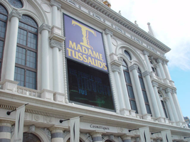
Photographs of Madame Tussaud's signs, Las Vegas (Nev.), 2002
Date
2002
Archival Collection
Description
Daytime and nighttime views of Madame Tussaud's museum signs on the Strip. Information about the sign is available in the Southern Nevada Neon Survey Data Sheet.
Site name: Venetian (Las Vegas, Nev.)
Site address: 3377 S Las Vegas Blvd
Sign details: Madame Tussaud's Wax Museum is located inside the Venetian Hotel and Casino. Located at the southern end of the property, it is tucked away at the end of a long stretch of escalators. Even though it is not in complete plain view, the facility is directly in the line of pedestrian traffic. The escalators serve as one of the main causeways into the Venetian for the traveler headed north on the east side of the strip. The facility is also advertised by an architecturally integrated building sign, and an LED screen that are in plain view from the street. A the end of the bay of escalators, a platform folds out, containing the vibrant entrance to the Wax Museum. Flanking the large opening designated as the entrance, are six free standing sculpted cabinet, advertising for Madame Tussaud's, lining up three on either side of the door. Standing underneath the entry, are a cast of ever rotating wax figures of celebrities. Just beyond the wax sentry, six more sculpted cabinets are present on other side of the pedestrian leading up to a ticket counter. On the ceiling above the pedestrian is an array of sculpted elements that are adorned with incandescent bulbs and neon, all leading up to the afore mentioned counter.
Sign condition: Structure 5 Surface 5 Lighting 5
Sign form: Fascia
Sign - type of display: Neon; Incandescent
Sign - media: Steel; Plastic
Sign - non-neon treatments: Graphics; Paint
Sign animation: Chasing
Sign environment: Madame Tussaud's holds the unique position of being elevated above the street, within the Venetian. Located at the top of a bank of escalators, the museum is positioned so that it is the dominating force upon the pedestrian with its immediate area. With careful examination it is evident that the it resides in the Venetian, but has tight hold on it's claim of space. Even though the location is somewhat hidden, it is a present force, and alongside a series of moving walk paths, generating a high frequency of vibration.
Sign manufacturer: YESCO
Sign - date of installation: 2000
Sign - thematic influences: The theme of Madame Tussaud's revolves around the theme of what the establishment provides. The main attraction is of course the lifelike imagery of celebrities sculpted in wax. The establishment draws from the theme of celebrities and stardom in design. The advertisement cabinets, which line the entry to Madame Tussaud's, are shaped to reference this. One set is crafted in the shape of a stylized star, while the others appear as street side movie posters seen in theatres or propaganda. The feel of them, to sum up initially, is classic "Hollywood" movie opening extravaganza. The star shapes and jutting channels on the ceiling of the entrance are other references to stars as well as the feel of electricity. These too can be associated with "movie star" like elements such as the Hollywood walk of fame, with it's star shaped crests, references to celebrities as "stars," as well as the a fore mentioned flavor of a movie opening or extravaganza.
Surveyor: Joshua Cannaday
Survey - date completed: 2002
Sign keywords: Chasing; Fascia; Neon; Incandescent; Steel; Plastic; Graphics; Paint
Mixed Content
Photographs of Pit Stop signs, Las Vegas (Nev.), 2002
Date
2002
Archival Collection
Description
Daytime views of the Pit Stop signs on the Strip. Information about the sign is available in the Southern Nevada Neon Survey Data Sheet.
Site address: 3951 S Las Vegas Blvd
Sign details: In the southern end of the Strip, an interesting lone pole sign stands as a reminder that actual functioning business remaining inside the old, minimal, stucco structures. On the east side of the Strip, somewhat south of the area dominated by the Luxor, a pole sign facing north south stands in close proximity to the strip.
Sign condition: Structure 3 Surface 2 Lighting 2 The sign is still standing, and appears to have a sufficient structural integrity, but the paint on the surface is extremely worn, but the text is still readable and present. The lighting on the sign that was once evident no longer exists.
Sign form: Pylon
Sign-specific description: On the south end of the Strip the small shop resides in an older complex, of dusty buildings. On the east side of the strip, a minimal pylon sign denotes the businesses presence. At the top of a narrow, white, steel pole, a six sided, internally lit, double backed, cabinet advertises the establishment. On the yellow plastic face, "Pit Stop" is spelled in black text, along with white text spelling "Diecast Collectibles" on a black horizontal rectangle. Just below the crowning cabinet, an arrow shaped cabinet is pointed to the bottom right hand side toward the building. The cabinet is double sided with two legs creating the head of the arrow, and the upper end formed by a tail of these two legs. A double pinstripe of blue and red border the edges of the cabinet's face. The word "NASCAR," is spelled in all capital, red, text across the horizontal plane of the cabinet. Placed cantilevering off of the west side of the pole, a square message cabinet faces north /south. It is painted white on the exterior, with a wooden face graphically treated with red white and blue text, and a blue line border. The north side of the cabinet has no face. A small steel cabinet sits on top of the cantilevered one, yet has signage upon it.
Sign - type of display: Backlit
Sign - media: Steel; Plastic
Sign - non-neon treatments: Graphics; Paint
Sign animation: None
Sign environment: To the south is the Motel 8 while a vacant lot occupies the north. The pole sin sits in an island of grass, designated for the beat-up pylon. The small, dual level building, which houses the establishment, is non-descriptive, containing no signage. Of the southern strip it is one of the more minimal structures.
Sign - thematic influences: There appears no theme associated with the actual structure, even with the name itself. The actual structure of the sign is however reminiscent of the roadside pole signs so commonly associated with the roadside motel. To reference an actual sign still standing, it is reminiscent of the signage available for the Happi Inn.
Surveyor: Joshua Cannaday
Survey - date completed: 2002
Sign keywords: Pylon; Backlit; Steel; Plastic; Graphics; Paint
Mixed Content
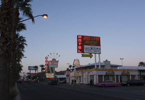
Photographs of Holiday House Motel sign, Las Vegas (Nev.), March 1, 2017
Date
2017-03-01
2017-08-30
Archival Collection
Description
The Holiday House motel sign with a "For Sale" sign sits at 2211 South Las Vegas Boulevard. Formerly the Bagdad Inn, the property has been in operation since the early 50s. Information about the sign is available in the Southern Nevada Neon Survey Data Sheet.
Site address: 2211 S Las Vegas Blvd
Sign details: The Holiday House Motel was originally the Bagdad Inn that opened up in the 1950's. The actual motel was possibly named after Bagdad California, a small ghost town in the San Bernardino county. This town was a former route 66 pit stop and later passed by with the new I-15 and I- 40 in the late 1970's. The motel changed its name in 1983 to Holiday House Motel. The motel currently has a for sale sign.
Sign condition: The sign is in a 4.5. There seems to not have much sun or wind damage to the sign. The color is still fresh.
Sign form: This is a two- pole squared structured sign.
Sign-specific description: The sign is a bright red squared basis. All aspects of the sign's advertisement are connected together in one large square. There is no separation within the structure; it just looks like one giant red canvas with words and would even suggest the sign is very minimal. At the bottom, right portion of the sign you will see a small reader board (currently the reader board has been covered with a for sale sign). Vertically on the left side is the word motel in white lettering. The holiday house font is in yellow incandescent lighting, and the font looks italicized. The no vacancy is in neon underneath the holiday house typography. Two white poles are what holds up the sign.
Sign - type of display: Neon, Incandescent and fluorescent lighting.
Sign - media: Steel and Plastic
Sign - non-neon treatments: Reader board
Sign animation: Flasher for the incandescent light bulbs in the letters
Sign environment: This location is on the north end of the Strip across the street from the Stratosphere and near the Holiday Motel and Fun City Motel.
Sign - date of installation: 1983
Sign - date of redesign/move: In 1950's the sign was Bagdad Inn and in 1983 the establishment later changed into the Holiday House Motel.
Sign - thematic influences: This sign could have inspiration from the post modernism idea of open space and minimal design to "advertise" to consumers. This sign is very representative of 1970's designs.
Sign - artistic significance: Every portion of the sign was thoughtfully placed to hit the consumer in a fast and efficient way.
Survey - research locations: Vintage Vegas http://vintagelasvegas.com/search/Holiday+House+Motel and Roadside Architecture http://www.roadarch.com/signs/nvvegas.html .
Surveyor: Gisselle Tipp
Survey - date completed: 2017-08-30
Sign keywords: Neon; Incandescent; Steel; Plastic; Flashing; Reader board; Pole sign; Fluorescent; Roof Sign
Mixed Content
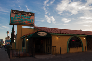
Photographs of Dona Maria's Tamales Restaurant signs, Las Vegas (Nev.), March 13, 2017
Date
2017-03-13
2017-08-28
Archival Collection
Description
Dona Maria's Tamales Restaurant sits at 910 South Las Vegas Boulevard. The family owned and operated eatery has been serving the valley for over thirty years. Information about the sign is available in the Southern Nevada Neon Survey Data Sheet.
Site address: 910 S Las Vegas Blvd
Sign owner: Dona Maria Alfredo Martinez
Sign details: Alfredo Martinez and Elvia met each other in California as high school sweethearts. Alfredo was a soccer player and Elvia a cheerleader who always watched his matches. After high school the two of them married and started a new chapter in their life in Las Vegas. Alfredo has a love of cooking traditional Mexican cuisine and soon taught Elvia his family recipes. In 1980 they opened their first restaurant a four table fast food operation on Charleston and 10th. Three years later after great success the four table operation grew into a full time restaurant where their location moved to 910 S. Las Vegas BLVD. For years their restaurant won many awards that led the couple to open another establishment in 1993.
Sign condition: The sign is a 4 out of 5, for the family maintains the sign. The paint on the sign is fading so it could use a new layer of paint to update the color hue.
Sign form: Pylon and entrance sign
Sign-specific description: The sign uses pale turquoise and soft pink hues to stand out. It resembles 1980s southwestern color palette. The sign is rectangular shaped with the background as the soft pink and font as turquoise. Dona Maria's font is in white and the background is maroon surrounding the letters. The border outline for the rectangular shaped sign is also in the color Turquoise to make the soft pink pop out. The base of the sign is bright custard concrete yellow attached to the building.
Sign - type of display: Neon
Sign - media: Concrete and steel
Sign - non-neon treatments: Small portion of the sign is back lit plastic
Sign environment: This location is on Las Vegas Blvd close to Charleston. It is next door to the Gateway Motel, as well as close to the Goodwhich, the Millennium Fandom Bar and a 7/11.
Sign - date of installation: Circa 1983
Sign - thematic influences: The theme resembles the prominent late 1970's/early 1980s Southwestern color palette. The sign is very colorful that resembles many Mexican restaurants that are quite colorful naturally.
Sign - artistic significance: Artistic themes is very 80s in terms of color palette, but also utilizes colors that is representative of Mexican culture.
Survey - research locations: Assessor's Page, Dona Maria's Website for the history- https://www.donamariatamales.com/our-history/
Survey - research notes: In 1980 the restaurant expanded and grew from their location at 10th and Charleston to 910 S. LV, BLVD S.
Surveyor: Gisselle Tipp
Survey - date completed: 2017-08-28
Sign keywords: Neon; Steel; Backlit; Plastic; Building-front design; Back to back; Pole sign
Mixed Content
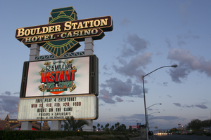
Photographs of Boulder Station sign, Las Vegas (Nev.), March 27, 2017
Date
2017-03-27
2017-09-27
Archival Collection
Description
The Boulder Station Hotel and Casino sign sits at 4111 Boulder Highway. Information about the sign is available in the Southern Nevada Neon Survey Data Sheet.
Site address: 4111 Boulder Hwy
Sign owner: Stations Casino Company
Sign details: This location opened in 1991 and is considered a locals casino. They have a similar train station theme to a few of the other Stations Casino properties used to have. This location also holds a movie theater.
Sign condition: 5- still in very good condition and lights up very brightly at night still
Sign form: Pylon, Porte cochere and semi-decorated shed
Sign-specific description: The main pylon sign has a two white steel bases with a reader board on the bottom, a plasma t.v. screen on top of the reader board and the main portion of the sign with their logo above. Their main logo is a green train front with a yellow neon trim with curved maroon ovals on it stating "Boulder Station" and "Hotel-Casino" underneath it in channeled white letters that contain flashing incandescent. The porte cochere sign above their valet is in a rainbow shape stating "Boulder Station" in sparkling incandescent. With red letters underneath stating "Hotel" in red neon. Also on the main hotel tower there are the same "Boulder Station" letters in incandescent lights outlined in red neon as well. Also the word "Casino" is also in incandescent lights on the side of the building. There are also LED lights that are chasing outlining the whole building making a semi-decorated shed look.
Sign - type of display: Neon, Incandescent, LED, LED plasma screen
Sign - media: Steel and plastic for reader board
Sign - non-neon treatments: Reader board and Plasma screen
Sign animation: Flashing incandescents and Chasing LED lights
Sign environment: This location is on Boulder Hwy on the way to Henderson/Boulder City. This location is near a residential areas and is a neighbor to a Motel 6.
Sign - date of installation: Has been up since at least 2007
Sign - thematic influences: Their train theme is portrayed well in their pylon sign. Also the train theme could be considered an homage to early Vegas history as a railroad stop.
Sign - artistic significance: The pylon sign is very similar to the Fiesta Rancho sign which is also a station casino with the reader board and plasma screen. This sign is almost identical in design to the old Palace Station sign.
Survey - research locations: Palace Station sign. Surveyor Notes 1. Research locations (archAsessor's page, Boulder Station website https://boulderstation.sclv.com/ , Station's Casino website https://www.sclv.com/, google maps satellite/ road view
Survey - research notes: Station's Casinos have 10 casinos in Las Vegas and have been present in the community for the past 40 years.
Surveyor: Emily Fellmer
Survey - date completed: 2017-09-27
Sign keywords: Pylon; Porte-cochère; Neon; Incandescent; Steel; Plastic; Flashing; Reader board; Chasing; Plasma display
Mixed Content
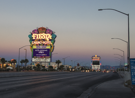
Photographs of Fiesta sign at dusk, Las Vegas (Nev.), April 2, 2017
Date
2017-04-02
2017-09-06
Archival Collection
Description
The Fiesta Rancho Hotel and Casino sits at 2400 North Rancho Drive. Information about the sign is available in the Southern Nevada Neon Survey Data Sheet.
Site address: 2400 N Rancho Dr
Sign owner: Stations Casinos Inc.
Sign details: This location was constructed in 1995 as the Fiesta, but in 2001 Stations Casino bought out the casino and renamed it Fiesta Rancho. Stations Casinos Inc. that own this casino have a chain of 9 resort casinos and a number of smaller casinos in the Las Vegas Valley that are popular along the local community here in Las Vegas. The Fiesta Rancho has a sister property named Fiesta Henderson which also has an ice rink as well as identical sign designs.
Sign condition: 4 - the lights still shine very brightly on this one but the colors on the sign have faded over the years and look more like pastel colors when they used to be very vibrant
Sign form: Marquee and Entrance Sign
Sign-specific description: The marquee on Rancho Dr. has concrete bases with a big plasma screen tv with a reader board underneath it. Above the T.V. screen they have a huge design with a purple background, but around this is yellow, orange, blue, green and pink streamers. These all illuminate the same color as the paint at night time. In the middle of the streamer design is channeled letters "Fiesta" in a curvy print font, and then the words "Casino Hotel" underneath it in a normal block type font. The letters illuminate white at night time. Above their main entrance to the casino they have big channeled letters stating " Fiesta" in the same font to their other signs that contain incandescent bulbs that flash at night. Underneath the incandescent "Fiesta" there are red channeled Neon signs stating "Race Sports Keno Bingo" that illuminate red.
Sign - type of display: Neon and Incandescents
Sign - media: Steel
Sign - non-neon treatments: Reader Board and Plasma Screen
Sign animation: Flasher for incandescent bulbs
Sign environment: This property is on North Rancho about a mile north of the 95 highway. It is located right next door to Texas Station, and is near a residential area.
Sign manufacturer: Possibly YESCO
Sign - date of installation: c. 2001
Sign - thematic influences: The theme of the casino matches the sign with the fun party colors and ribbon streamers that they depict on their sign looks like a fiesta.
Sign - artistic significance: This sign is practically identical to the signage for Fiesta Henderson, for they based their sign off of this Fiesta Rancho sign design.
Survey - research locations: Assessor's website, company website
Survey - research notes: Fiesta Rancho website https://fiestarancho.sclv.com/, Stations Casino page https://www.sclv.com/
Survey - other remarks: https://www.sclv.com/Casinos/PropertyMap Stations Casino website has an interactive map of their locations
Surveyor: Emily Fellmer
Survey - date completed: 2017-09-06
Sign keywords: Neon; Incandescent; Steel; Flashing; Reader board; Marquee; Video screen; Pylon
Mixed Content
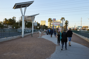
Photographs of Welcome to Fabulous Las Vegas sign, Las Vegas (Nev.), March 1, 2017
Date
2017-03-01
2017-09-09
Archival Collection
Description
The world famous "Welcome to Fabulous Las Vegas, Nevada" sign sits at 5200 South Las Vegas Boulevard. Information about the sign is available in the Southern Nevada Neon Survey Data Sheet.
Site name: Welcome to Las Vegas neon sign
Site address: 5200 S Las Vegas Blvd
Sign owner: YESCO
Sign details: The sign was originally installed 1959, quickly became an iconic sign for Las Vegas. Betty Willis never trademarked the sign. Betty Willis died at 91 in 2015. Betty Willis also designed the Moulin Rouge and Blue Angel Motel signs. The Welcome to Fabulous Las Vegas sign is on the National Register of Historic Places. This is a 25 foot sign which is considered smaller than a lot of the other signs in Las Vegas.
Sign condition: 5, Taken care of by YESCO and Clark County
Sign form: Pylon
Sign-specific description: The base of this sign is a blue rectangle outline. The main portion of the sign is a white rhombus shape. Welcome to Fabulous Las Vegas written in red and blue on a translucent white background. The word "Welcome" is spelled in red skeletal neon on Silver Coins with each letter on its own coin. On the back of the sign it states Drive Safely Come back Soon. This plastic portion of the sign is surrounded by incandescent light bulbs. On the top left portion of the sign where the blue base of the sign comes out of the top of the sign is the famous red star that is outlined in neon.
Sign - type of display: Incandescent, Neon and back lit plastic.
Sign - media: Steel and plastic
Sign - non-neon treatments: Plastic back lit portion
Sign animation: Chaser for Incandescent light bulbs on the border of the sign.
Sign environment: This sign is in the median of Las Vegas Blvd. near the South most end of the Strip. This location has Mandalay Bay to the west of it and the airport to the east.
Sign manufacturer: Western Neon
Sign designer: Betty Willis
Sign - date of installation: 1959
Sign - date of redesign/move: Mid 2000s redesign of the median to accommodate parking for visitors.
Sign - thematic influences: This sign is designed in the Googie style. This sign also has symbolism with the words Welcome, as each letter is on a silver coin to represent Nevada as the Silver State.
Sign - artistic significance: One of the most Significant signs for Las Vegas. It is easily recognizable and ingrained as part of Las Vegas culture.
Survey - research locations: Las Vegas Sun article https://lasvegassun.com/news/2009/may/21/fabulous-las-vegas-sign-garners-historic-designati/ , Vegas website https://www.vegas.com/attractions/on-the-strip/welcome-las-vegas-sign/ http://www.lasvegaswhereto.com/welcome-las-vegas-sign/ Neon Museum Tour outline , Vintage Vegas http://vintagelasvegas.com/search/welcome+to+fabulous+las+vegas
Surveyor: Wyatt Currie-Diamond
Survey - date completed: 2017-09-09
Sign keywords: Chasing; Plastic; Backlit; Steel; Incandescent; Neon; Pylon
Mixed Content
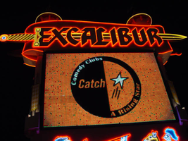
Photographs of Excalibur signs, Las Vegas (Nev.), 2002
Date
2002
2017-08-18
Archival Collection
Description
Photos show Excalibur signs at night. Two surveys were conducted to gather information about this sign. One was conducted in 2002 and one was conducted in 2017. PDFs are available for both surveys. See the 2017 survey PDF for additional information that is not included in the object description
Site name: Excalibur Hotel and Casino (Las Vegas, Nev.)
Site address: 3850 S Las Vegas Blvd
Sign owner: Mandalay Resort Group
Sign details: The Excalibur Hotel and Casino sits on the NE corner of Las Vegas Blvd and Tropicana Ave. While the main attraction is the brightly illuminated fantasy castle facade, the two giant multimedia pylon signs flank the property along the streets. One, on the South side of Tropicana, faces East /West, while the second sits on the West Side of LV Blvd, and faces North/South.
Sign condition: Structure 5 Surface 4 Lighting 5
Sign form: Pylon
Sign-specific description: The two pylons are identical in design. They are both double backed, pylons containing animated incandescent Excalibur logos, neon borders, an animated, color, matrix message center, and a two dizzying renderings of jousting knights, constructed completely of neon, on either side. Constructed to appear as a medieval castle facade themselves, the signs are finished in stucco to appear as if built with stone blocks. The scroll shaped main logo sign box, the outline of the logo, the spires, and sword, are all outlined in neon. The 10'-6" channel letters contain white incandescent bulbs that animate.
Sign - type of display: Neon; Incandescent; Matrix
Sign - media: Steel
Sign - non-neon treatments: Graphics; Paint
Sign animation: Chasing, flashing
Notes: The Excalibur logo, which is comprised of incandescent bulbs, displays a two part chase animation from left to right over the entire text, then in sequence, displays a flashing animation over the entire word before starting the pattern over again.
Sign environment: The two pylons are both in parking lots of their respected positions. Pedestrians may walk up to the one located in a public lot on Tropicana Ave.
Sign manufacturer: Sign Systems, Inc
Sign designer: Brian K. Leming
Sign - date of installation: 1989-1990
Sign - date of redesign/move: The backlit plastic message board and old electronic message center, have been replaced by a single, giant animated, color electronic message board.
Sign - thematic influences: Excalibur capitalizes on the King Arthur/Renaissance fair theme.
Sign - artistic significance: Artistically the sheer magnitude, construction techniques and the magnitude of the themed facade are sincerely significant in the artistic developments of sign making. The pylons directly reflect those elements.
Surveyor: Joshua Cannaday
Survey - date completed: 2002
Sign keywords: Chasing; Flashing; Pylon; Neon; Matrix; Incandescent; Steel; Paint; Graphics
Mixed Content
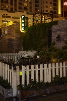
Photographs of Park on Fremont sign, Las Vegas (Nev.), June 28, 2017
Date
2017-06-28
2017-08-11
Archival Collection
Description
The Park on Fremont sign sits at 506 Fremont Street in Downtown Las Vegas. Information about the sign is available in the Southern Nevada Neon Survey Sheet.
Site address: 506 Fremont St
Sign owner: Justin Weniger and Ryan Doherty both with Corner Bar Management Group
Sign details: This building was constructed in 1956. Though the Park on Fremont opened in 2013 in the former Maharaja Hookah Cafe though the building's exterior was renovated to have more of a wooden facade. This place is claimed as a gastro-pub with rustic-chic decor. Their outside urban beer garden is well recognized with its cool rustic design presenting a teeter totter and a CInderella-like carriage.
Sign condition: 5, very good condition and has bright colors during the day and night
Sign form: Blade
Sign-specific description: They have a long oval shaped blade placed on the left side of the building which is neighboring the public parking lot next door. The oval part of the blade is black with white letters spelling out PARK from the top to the bottom in a thick type font. These letters illuminate green at night time. Surrounding the black oval is a red arrow pointing towards the building (not the entrance) with LED light bulbs which illuminates yellow at night time.
Sign - type of display: Neon and LED lights
Sign - media: Steel
Sign - non-neon treatments: LED lights
Sign animation: Chasing
Notes: LED lights around the perimeter of the blade.
Sign environment: This is the first bar/restaurant on the north side of the Fremont St. East district. To the west of the building is a public parking lot where YESCOs free-standing PBR sign Cool Blue is stationed. To the east is the RED dance club
Sign manufacturer: All Star Electrical Signs
Sign - date of installation: 2013
Sign - thematic influences: The blade with an arrow is is used on many other bar signs in the east Fremont District. Though many of these blade signs are above the entrance this one is on the left side of their building possibly to attract foot traffic from the Fremont Street Experience.
Sign - artistic significance: The blade with an arrow was a prominent sign design in the 50s and 60s.
Survey - research locations: Assessor's Page, Park on Fremont Website https://parkonfremont.com/ , UNLV (bio on Justin Weniger) https://www.unlvfootballfoundation.com/people/justin-weniger/ , google map roadside view, and contact with manager.
Survey - research notes: Owners Justin Weniger and Ryan Doherty founded WENDOH Media which showcases Vegas Seven magazine, DTLV.com, RunRebs.com, SPYONvegas.com, Critical Focus, Corner Bar Management and the Life is Beautiful Festival. With the Corner Bar Management they also own the Commonwealth which is downtown as well.
Surveyor: Emily Fellmer
Survey - date completed: 2017-08-11
Sign keywords: Blade; Neon; LED; Steel; Chasing; Incandescent; Directional
Mixed Content
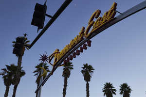
Photographs of Fremont East District sign, June 28, 2017
Date
2017-06-28
2017-08-30
Archival Collection
Description
The Fremont East District sign sits near the intersection of Fremont St and Eighth St. Information about the sign is available in the Southern Nevada Neon Survey Sheet.
Site name: Fremont Street (Las Vegas, Nev.)
Site address: Fremont St and 8th St
Sign owner: Downtown Las Vegas and Fremont East District
Sign details: The Fremont East District really formed together in 2002 for a coalition to maintain the vintage Las Vegas feel particularly by bringing out some vintage looking Neon Signs. This coalition became known as the Fremont East Entertainment District (FEED). Since this area is already close to the Fremont Street Experience with foot traffic the 2007 revitalization also was an effort to create pedestrian friendly sidewalks.
Sign condition: 5 - Very good condition
Sign form: Pole mounted signs
Sign-specific description: The two gateway signs are identical in design to welcome drivers and pedestrians into the Fremont Street District. These signs go across all of the lanes of Fremont Street, so there are two poles on the opposite sidewalks and then two curved steel beams connecting the sidewalk poles, and the main logo is on the curved pole portion. The two steel sidewalk beams each have a yellow curved googie style design. Right above the curved yellow design, on top of the sidewalk beams each have a red starburst orbit. In the middle curved beam there are red channeled Fremont Street East in a mid century modern semi-cursive font, with yellow neon tubes within the channeled letters. Underneath the Fremont Street East letters there is the word DISTRICT in the red channeled block letters.
Sign - type of display: Neon
Sign - media: Steel and Plastic
Sign animation: Yellow neon on gateway signs flash
Sign environment: The gateway to Fremont East District from both the East and West end. One sign is at the corner of Las Vegas Blvd. and Fremont an the other is at the intersection of 8th St.
Sign manufacturer: Fluoresco Lighting and Signs
Sign designer: John Lutz
Sign - date of installation: 2007
Sign - thematic influences: This sign really brings back the mid-century modern theme, and the old Vegas theme as well. The starbursts are similar to the one from the Sweetheart Wedding Chapel Sign.
Sign - artistic significance: This sign speaks to the 1950s/1960s mid-century modern design with the starburst orbits and the yellow curved design.
Survey - research locations: Fremont East website, Floresco
Survey - research notes: Floresco Website http://www.fluoresco.com/pages/about/history.php, as well as contact with Gary Grider of Floresco, Las Vegas Today and Tomorrow Website, http://www.vegastodayandtomorrow.com/fremonteast.htm
Surveyor: Emily Fellmer
Survey - date completed: 2017-08-30
Sign keywords: Flashing; Neon; Steel; Plastic; Pole sign
Mixed Content
Pagination
Refine my results
Content Type
Creator or Contributor
Subject
Archival Collection
Digital Project
Resource Type
Year
Material Type
Place
Language
Records Classification
