Search Results

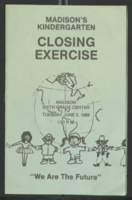
Interview with Bennie Reilley, Sr., May 10, 2004
Date
Archival Collection
Description
Access note: May not quote in any form without written permission from interviewee
Text

Michael Ciccolo oral history interview: transcript
Date
Archival Collection
Description
Oral history with Michael Ciccolo conducted by Claytee D. White on September 18, 2018 for the Remembering 1 October Oral History Project. In this interview, Ciccolo, a doctor at Sunrise Hospital in Las Vegas, Nevada, discusses the early morning after the mass shooting on October 1, 2017. He participated in surgery for two victims in the early morning after the shooting. As a doctor trained in Iowa, Arizona, and California, Ciccolo and his family love the city of Las Vegas. He trained at the University of Iowa, University of Arizona, and University of Southern California. His thoughts after the October 1 tragedy include the belief that as a society, we are not grateful enough for everyday things. He also discusses anger, and his conflicting thoughts on gun ownership.
Text

Congregation Ner Tamid roundtable oral history interview: transcript
Date
Archival Collection
Description
Oral history interview with the Congregation Ner Tamid roundtable conducted by Barbara Tabach on September 21, 2016 for the Southern Nevada Jewish Heritage Project. In this interview, Rabbi Sanford Akselrad and five members of the congregation discuss the founding of Congregation Ner Tamid, the first reform synagogue in Las Vegas, Nevada, in 1974. They go into detail on how the synagogue was formed, the building-hopping they did until they built their current structure, and the funding it took to get to that point. The interviewees reveal a few donors, such as Morris Dalitz and Frank Sinatra, who helped to build their synagogue and school. The interview ends with meaningful stories and memories the members have relating to Congregation Ner Tamid.
Text
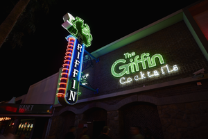
Photograph of The Griffin sign, Las Vegas (Nev.), June 28, 2017
Date
Archival Collection
Description
Site address: 511 Fremont St
Sign owner: Aaron Chepenik and Jonathan Hensleigh
Sign details: Opened in February of 2007 as a medieval British pub/ tavern style bar. This location brought on a wave of revitalization of the East Fremont District especially since many new bars/restaurants started to open in this area after this bar did.
Sign condition: 5- still looks relatively new
Sign form: Blade and overlay neon on building
Sign-specific description: Placed above the entrance their brick building the letters The Griffin Cocktails is painted with white block letters outlined with black paint is painted on the building itself. These letters have skeletal neon surrounding the letters. The Griffin letters are yellow tubes and do illuminate green at night, the word cocktails lights up white. To the left of the entrance but still on the building is a green painted griffin drinking a painted white martini ( also all outlined with black paint) The neon tubing outlining the griffin is a yellow tubing but glows green at night ( possibly argon inserted to make it glow green). The Blade is placed a little left of the entrance and hangs off of the building by two blue steel beams, but in between the beams is a beautiful swirl design. At the top of the Blade there is a green griffin sipping a martini (same design as the one painted on the building). At the base of the griffin is white THE letters painted with skeletal neon. Then below is the blue portion of the blade spelling out GRIFFIN in a Britannic looking font in white channeled letters which do illuminate white at night. This part of the blade is outlined in neon ,possibly argon, since it does illuminate blue at night. On the side of the blade ( if you're looking from the road) there are about 14 red curved neon tubes lining the sign.
Sign - type of display: Neon
Sign - media: Steel and Brick Wall
Sign - non-neon treatments: Using the brick wall as a portion of the sign is a design not seen often in Vegas.
Sign animation: Oscillation of red neon tubes on the side of the sign.
Sign environment: Located in the Fremont East District in between Las Vegas Blvd. and 6th St. This location has The Vault to the East of it and The Smashed Pig Gastropub to the west. It is across the street from the Park and Evil Pie. In the middle of the street right in front of the Griffin Bar is the Martini Glass sign.
Sign manufacturer: YESCO
Sign designer: Owners Aaron Chepenik and Jonathan Hensleigh-Aaron stated that the blade portion of the sign was inspired by the old Boulder Club Blade sign
Sign - date of installation: Slightly before they opened so late 2006/early 2007
Sign - thematic influences: Griffin shows that it has a medieval and kind of fantasy kind of feel since its interior does have that cool medieval tavern vibe to it, especially with their fireplaces. Using their brick wall as a part of the sign is a cool innovative way to use their space and stay true to their theme.
Sign - artistic significance: Medieval theme. The blade is a prominent theme in the 50s/60s, though their blade sign was inspired by the Boulder Club (opened 1931-1960) blade.
Survey - research locations: Acessors page, outreach to owner Aaron Chepenik
Survey - research notes: Possible use of argon within their yellow painted tubes, similar to the Yucca Motel signs leaves.
Survey - other remarks: The Blade does look very similar to the Boulder Club blade, so its awesome to see modern properties paying homage to the ones that are no longer around.
Surveyor: Emily Fellmer
Survey - date completed: 2017-09-15
Sign keywords: Oscillating; Steel; Neon; Blade; Fascia; Building-front design
Mixed Content
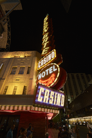
Photographs of Golden Gate Hotel and Casino signs, Las Vegas (Nev.), April 18, 2017
Date
Archival Collection
Description
Site address: 1 Fremont St
Sign owner: Derek and Greg Stevens
Sign details: This location originally held the Hotel Nevada that opened in 1906. This location had the first phone that was installed in Las Vegas in 1907. The building dates back to 1935, but in 1990 Mark and Craig Italo restored the exterior of the building to reflect the original art deco look to the building. This property was named Sal Sagev (Las Vegas spelled backwards) before it changed to the Golden Gate in 1955. This location was made famous with their bargain shrimp cocktail. This location has exhibits near their check-in desk showcasing older casino memorabilia, old slot machines, as well as an old phone.
Sign condition: 5- still shines brightly and paint is holding up very well
Sign form: Blade and semi-decorated shed
Sign-specific description: Their blade sign is on the corner of Main and Fremont on the top of the blade is a spherical yellow light with two neon 3-D diagonal oval shapes beneath it the with the top one blue and the bottom one a fuchsia pink. The main portion of the blade is made up by sideways rusty colored squares spelling out "GOLDEN GATE" in block letters (one letter in each box) each containing flashing incandescent light bulbs. Beneath this is a rusty colored rectangular box that spells out "CASINO" in the interior with white neon letters with the box outlined in sparkling incandescent light bulbs. Underneath the rectangle is a rusty colored circle with white block letters spelling out "HOTEL" in neon, and underneath the words is a red skeletal neon outline of the Golden Gate Bridge. On the corner of the building right underneath the blade is is a rectangle sign with red neon spelling out "CASINO". There are chasing incandescent light bulbs surrounding the first second story of the building with the words "GOLDEN GATE" in channeled white neon letters that are outlined with blue neon and have sparkling incandescent light bulbs at night, and are both on the west and north side of the building. Also there are the words "RESTAURANT" as well as "CASINO" both in flashing incandescent light bulbs on both sides of the building as well. There are also LED lights that illuminate the building's windows at night time.
Sign - type of display: Neon, Incandescent light bulbs and LED
Sign - media: Steel
Sign - non-neon treatments: Incandescent light bulbs on signs and LED lights illuminating the building
Sign animation: Chasing, flashing
Notes: incandescent light bulbs
Sign environment: This location is on the corner of Main and Fremont which is the entrance to the Fremont Street Experience. There is also a concert stage in front of this property. Across the street would have been the Las Vegas Club, the Glitter Gulch and Mermaids; but have been demolished in recent times.
Sign - date of installation: 1964
Sign - date of redesign/move: When the sign was installed in 1964 the bottom circle of the blade stated "HOTEL SAL SAGEV" but now there is the Golden Gate bridge, so it must have switched when the Sal Sagev name was not affiliated with that location anymore.
Sign - artistic significance: This blade looks similar to the old Sal Sagev sign that was up on this building previous to this sign. The blade also was a prominent theme for signs in the 50's and 60's especially down on Fremont.
Survey - research locations: Assessor's Page, Tour outline, Golden Gate website for history http://www.goldengatecasino.com/history/#
Survey - research notes: http://www.goldengatecasino.com/history/# has a good timeline of the history of the casino as well as some good Vegas history notes as well.
Surveyor: Emily Fellmer
Survey - date completed: 2017-09-22
Sign keywords: Neon; Incandescent; Chasing; Flashing; Decorated shed; Steel; Pole sign
Mixed Content
Mabel Hoggard: community interest materials (folder 2 of 3)
Date
Archival Collection
Description
Folder of materials from the Mabel Hoggard Papers (MS-00565) -- Personal papers file. This folder contains event programs, "Going For The Gold: The Story of Black Women in Sports" booklet by Ken Bently (a gift to J. David & Mabel W. Hoggard, not digitized in its entirety), "Pictorial Souvenir Book of the Pennsylvania State Federation of Women's Clubs, Inc." (not digitized in its entirety), and Alpha Kappa Alpha Sorority Theta Theta Omega Chapter 1988 "BLAC-tivities" calendar.
Mixed Content
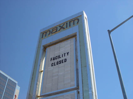
Photographs of Maxim signs, Las Vegas (Nev.), 2002
Date
Archival Collection
Description
Site address: 160 E Flamingo Rd
Sign owner: Premier Interval Resorts
Sign details: The Maxim is located just east of the Bourbon Street, in close proximity to Bally's Hotel Casino. The Maxim is no longer operating, and is fenced off from further inspection. The signage that is seen entails building signs, the original pylon, and the porte cochere
Sign condition: Structure 2 Surface 2
Sign form: Pylon; Fascia; Porte-cochère
Sign-specific description: Building: The tower itself contains the logo and giant text spelling the name of the establishment, on one side of the building. The tower is mirrored and reflective, thus matching the porte cochere and pylon, and reserves to collect its building signage to one end of the tower. The tower, which runs east/west, and faces north/south contains the signs on the east end structure. On the north and south faces of the building, giant red channel letters run vertically along the block surface. The letters look to be lined on the interior of the letters with neon. The logo can be seen on the east face. Pylon: The pylon sign is essentially a giant vertical monolith of a rectangle, divided into several different sub-shapes. The center of the monolith is occupied by cabinets which fill in most of the shape, with a small gap bordering the cabinet. The cabinets are treated the same as the square arch, and flush with the surface. The cabinets are very subtle and create an illusion of one solid object. The entire outer arch shape and interior cabinets are bordered with polished aluminum. The interiors surface of the arch are covered in polished gold aluminum panels. The lining of the incandescent bulbs on the sign is interesting. On the arch the incandescent bulbs are on the interior return width of the aluminum borders. With this configuration, the bulbs sit parallel to the surface instead of perpendicular. The main marquee text is aligned horizontally across the top in gold channel letters with red plastic faces. The letters blend with the gold surface nicely. The interior cabinets are internally lit with plastic faces. There are two cabinets, the larger of the two, occupying the upper part the interior space of the monolith. Incandescent bulbs line the exteriors of the cabinets, sitting back on a recessed edge. Porte Cochere: The porte cochere is unique, opting to rise high above the surface of the pavement. The prismatic design crafted in polished aluminum, interlocks into a pattern suitable to the space which it resides. The recesses in which the decoration resides are separated by a small width of structure. This pattern of giant recesses, matched with the prismatic design in each negative space create a hulking environment high above the head in proud stature. Along the peak edge of the pieces of the prism, rods protrude every foot or so, creating a row of arms holding incandescent spheres.
Sign - type of display: Neon; Incandescent
Sign - media: Steel; Plastic
Sign - non-neon treatments: Graphics; Paint
Sign animation: chasing, flashing
Sign environment: The Maxim is now closed, and stands in marked contrast to its neighbors a bit to the east--the famous "Four Corners" of Flamingo and the Strip, and next to the trendy Meridian at Hughes Center apartment complex.
Sign designer: Maxim letter design: Kenneth Young, Porte Cochere; Lighting: Jack Dubois Pylon sign: Marnell Corrao
Sign - date of installation: 1977
Sign - thematic influences: The influence of the Maxim hotel was 70's Vegas design refined to simple geometric forms and curved linear logo's. The pylon was completely sheathed in polished aluminum, as well as the underside of the porte cochere being polished gold aluminum. The use of the popular 70's material is used extensively throughout the design. Letters hung over the main entrance, as well as signage on three sides of the building. Other examples of the material can be seen elsewhere but not as extensively. The only property that comes close is the pylon for usage of the material is the Westward Ho.
Surveyor: Joshua Cannaday
Survey - date completed: 2002
Sign keywords: Chasing; Flashing; Pylon; Fascia; Porte-cochère; Neon; Incandescent; Steel; Plastic; Graphics; Paint
Mixed Content
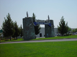
Photographs of McCarran Field signs, Las Vegas (Nev.), 2002
Date
Archival Collection
Description
Site address: 6005 S Las Vegas Blvd
Sign owner: McCarran International Airport
Sign details: On the south end of the Strip, the very last sign on the east side before you arrive at Sunset Blvd Facing West the two stone pylons are set approximately fifty feet off of the street at the end of a dual-lane stretch of pavement separated by an island of grass. The banner marquis between the two pylons stretches over this area of grass.
Sign condition: Structure 3 Surface 3 Lighting 4 Notes: The surface of the pylon is in good shape considering its age and its environmental condition. It is essentially left to fend for itself against the elements, being in the flat expanse of an airfield. The stone, plaques, and paint treatment are all badly worn, with the stone pylons, appearing the least worn.
Sign form: Pylon
Sign-specific description: The original McCarran Air Field entrance is constructed of two masonry pylons sit on an island of grass, and serve as an entrance to the private Hughes executive airport terminal. Each individual tower is adorned with a propeller attached to the front and the representation of a bird's wing crowning the tops Both facets are constructed of steel. When facing the structures the left has a plaque on the bottom section with the inscription "1948" while the one on the right reads "Las Vegas". Between the two pylons a stretch of text in white channel letters and white neon, large text in the old "Frontier style text reads McCarran Airport. The signage sits independently on top of a sturdy connecting steel cabinet, which supports the words "executive terminal" in smaller channel letters, with white neon. The cabinet is a painted blue horizontal plane tapering wider on either end in rounded profile patterns. The wings are outlined in pink neon, while the propellers are outlined in rose neon with a circle of white in the middle.
Sign - type of display: Neon
Sign - media: Masonry
Sign - non-neon treatments: Paint
Sign animation: none
Sign environment: The surrounding area is rather dark due to the wide expanse of the airfield which stretches out behind the sign. It truly is a last marker for the end of the Strip, and stands alone. Even though it is in close proximity to the major strip resorts of the Four Seasons as well as the Mandalay Bay and various small roadside hotels, it seems to stand in solitude.
Sign - date of installation: 1948
Sign - date of redesign/move: The blue banner of steel and white letters was added after its initial construction.
Sign - thematic influences: The masonry pylons are constructed in an adobe style masonry reminiscent of the desert landscape surroundings. Designed for the airport, the appendages stem obviously around the theme of flight. This may be denoted from the propeller and the wing. The juxtaposition of the two elements, one being the method of flight in nature and the other man made, serves as a reminder of mans fascination with flight. The added banner's text is in the pioneer fashion of the original Last Frontier.
Sign - artistic significance: Opened in 1948, the sign was intended for use as a marker for the endpoint of the Strip. " It was part of the city's expanding policy creating a jet-scale entrance for the city," Jorg Rudemer from Lost Las Vegas. Artistic significance also lies in the combination of materials using masonry, steel and, neon. The piece successfully combined these elements to provide an architecturally solid design by day, which was cohesive with its surrounding landscape. A metamorphosis takes place at night as the sign is transformed into a glowing specter of its daytime counterpart. The surrounding area is rather dark as the pylon rises up out of the darkness as a neon marker for the property. The illuminated wing and propeller stand out as the significant and successful partners in the world of flight.
Surveyor: Joshua Cannaday
Survey - date completed: 2002
Sign keywords: Pylon; Neon; Masonry; Paint
Mixed Content