Search Results
Photographs of Grand Canyon Experience signs, Las Vegas (Nev.), 2002
Date
2002
Archival Collection
Description
Daytime and nighttime views of the Grand Canyon Experience signs on the Strip. Information about the sign is available in the Southern Nevada Neon Survey Data Sheet.
Site address: 3791 S Las Vegas Blvd
Sign owner: M H & K Enterprises
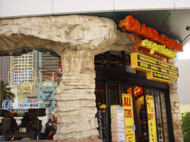
Sign details: The Grand Canyon Experience is directly North of the MGM next to the GameWorks complex. Above the clear glass entrances to the outdoor scenic tour's facility is a large building front designed marquee design, as well as a smaller version over the entrance facing northwest.
Sign condition: Structure 5 Surface 3 Lighting 5
Sign form: Fascia
Sign-specific description: The marquee reads Grand Canyon in yellow channel letters outlined in yellow neon, the insides are orange with orange neon in the middle. Experience is spelled in a cursive style orange channel letters with orange neon and incandescent bulbs on the interior. The two texts are supported on a steel framework of interconnecting steel pipes. The shape looks as if it is a bow pointed toward the ground. Two steel poles run vertically approximately 16 feet from the edge of the support system. They run toward the ground against the wall and stop to square i18" tall 10 inch deep, yellow, message box with a black surface. The neon whit von inside of the red channel letters reads "Shop Grand Avenue" in an all caps Arial style text. Two halogen lamps project off of the top of the sign and illuminate a three-dimensional sculpted caricature of a hiker. The entire structure is supported on the West wall of the building. The logo itself spans seventy-eight and a half feet at it's widest and is approximately twenty-three feet tall. Below the NW entrance to the establishment, a smaller version of the giant marquee sign sits above the door. Aluminum channel letters spell " Grand Canyon," with orange argon on the interiors. Below that sits a three-tiered back lit message panel. It forms a shape reminiscent of an upside down step pyramid. The top section actually contains yellow argon in nine-inch cursive text spelling experience. The three stepped cabinet is of a polished aluminum. The text sits on sheet metal raceways.
Sign - type of display: Neon; Incandescent; Backlit
Sign - media: Steel; Fiberglass; Plastic
Sign - non-neon treatments: Paint
Sign animation: Chasing, flashing, oscillating
Notes: The text, which resides on the southern wall and reads "Casino," is filled with incandescent bulbs that all illuminate at the same time, and oscillate. They then shut off at the same time, and then repeat. The raceways of incandescent bulbs chase each other while the neon, which surrounds the back lit, plastic, screens on this wall flash on then off. The bottom two raceways sandwiching the reflective panel chase from left to right, while the remainder of the raceways surrounding the signs, run right to left. The incandescent bulbs on the pylon chase each other gracefully up the length of the pylon. The animation is patterned so as to appear as if a section of several bulbs are pulsing its way up the towers, hugging the edge of the bulbous tops. The raceways continue around the east face of the building. The umbrellas in the plaza behind the pylon, also are animated with incandescent bulbs chasing each other downward along the raceways.
Sign environment: The Grand Canyon Experience is a rather large sign but is dwarfed by the immense MGM pylon just to the south of it. It is accented by faux rock serving as door jambs for the actual entrances.
Sign manufacturer: Mikohn Lighting and Sign
Sign - date of installation: 2000- 08
Sign - thematic influences: The actual theme of the sign is correspondent to that of the business, which the sign advertises. The text does not appear to be associated with any particular theme, but hold a style complimentary to each other. An element of theming is still evident with the faux rock facade, and the sculpted figure on top of the sign.
Sign - artistic significance: If not significant for simply combining different elements to create a completely self-contained sign, it fits into the movement in Las Vegas's history, which is geared more toward the family. The cartoon-like representation of a hiker, the fake rocks, the bright colors, and location in a strip mall, which centered on such establishments as Gameworks and M&M World, all point to the conclusion that families are welcome.
Surveyor: Joshua Cannaday
Survey - date completed: 2002
Sign keywords: Fascia; Neon; Incandescent; Backlit; Steel; Fiberglass; Plastic; Paint
Site address: 3791 S Las Vegas Blvd
Sign owner: M H & K Enterprises
Sign details: The Grand Canyon Experience is directly North of the MGM next to the GameWorks complex. Above the clear glass entrances to the outdoor scenic tour's facility is a large building front designed marquee design, as well as a smaller version over the entrance facing northwest.
Sign condition: Structure 5 Surface 3 Lighting 5
Sign form: Fascia
Sign-specific description: The marquee reads Grand Canyon in yellow channel letters outlined in yellow neon, the insides are orange with orange neon in the middle. Experience is spelled in a cursive style orange channel letters with orange neon and incandescent bulbs on the interior. The two texts are supported on a steel framework of interconnecting steel pipes. The shape looks as if it is a bow pointed toward the ground. Two steel poles run vertically approximately 16 feet from the edge of the support system. They run toward the ground against the wall and stop to square i18" tall 10 inch deep, yellow, message box with a black surface. The neon whit von inside of the red channel letters reads "Shop Grand Avenue" in an all caps Arial style text. Two halogen lamps project off of the top of the sign and illuminate a three-dimensional sculpted caricature of a hiker. The entire structure is supported on the West wall of the building. The logo itself spans seventy-eight and a half feet at it's widest and is approximately twenty-three feet tall. Below the NW entrance to the establishment, a smaller version of the giant marquee sign sits above the door. Aluminum channel letters spell " Grand Canyon," with orange argon on the interiors. Below that sits a three-tiered back lit message panel. It forms a shape reminiscent of an upside down step pyramid. The top section actually contains yellow argon in nine-inch cursive text spelling experience. The three stepped cabinet is of a polished aluminum. The text sits on sheet metal raceways.
Sign - type of display: Neon; Incandescent; Backlit
Sign - media: Steel; Fiberglass; Plastic
Sign - non-neon treatments: Paint
Sign animation: Chasing, flashing, oscillating
Notes: The text, which resides on the southern wall and reads "Casino," is filled with incandescent bulbs that all illuminate at the same time, and oscillate. They then shut off at the same time, and then repeat. The raceways of incandescent bulbs chase each other while the neon, which surrounds the back lit, plastic, screens on this wall flash on then off. The bottom two raceways sandwiching the reflective panel chase from left to right, while the remainder of the raceways surrounding the signs, run right to left. The incandescent bulbs on the pylon chase each other gracefully up the length of the pylon. The animation is patterned so as to appear as if a section of several bulbs are pulsing its way up the towers, hugging the edge of the bulbous tops. The raceways continue around the east face of the building. The umbrellas in the plaza behind the pylon, also are animated with incandescent bulbs chasing each other downward along the raceways.
Sign environment: The Grand Canyon Experience is a rather large sign but is dwarfed by the immense MGM pylon just to the south of it. It is accented by faux rock serving as door jambs for the actual entrances.
Sign manufacturer: Mikohn Lighting and Sign
Sign - date of installation: 2000- 08
Sign - thematic influences: The actual theme of the sign is correspondent to that of the business, which the sign advertises. The text does not appear to be associated with any particular theme, but hold a style complimentary to each other. An element of theming is still evident with the faux rock facade, and the sculpted figure on top of the sign.
Sign - artistic significance: If not significant for simply combining different elements to create a completely self-contained sign, it fits into the movement in Las Vegas's history, which is geared more toward the family. The cartoon-like representation of a hiker, the fake rocks, the bright colors, and location in a strip mall, which centered on such establishments as Gameworks and M&M World, all point to the conclusion that families are welcome.
Surveyor: Joshua Cannaday
Survey - date completed: 2002
Sign keywords: Fascia; Neon; Incandescent; Backlit; Steel; Fiberglass; Plastic; Paint
Mixed Content
Photographs of La Concha sign, Las Vegas (Nev.), 2002
Date
2002
Archival Collection
Description
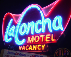
Daytime and nighttime views of the La Concha Motel sign on the Strip. Information about the sign is available in the Southern Nevada Neon Survey Data Sheet.
Site address: 2955 S Las Vegas Blvd
Sign owner: Edward Doumani
Sign details: The La Concha is located north of the Riviera hotel Casino, just past the giant glass wall advertising for Splash. The La Concha double sided ground sign, sits close to the street on the east side of the strip, facing north /south. Directly to the east the origin of the signs shape resides in the form of the front structure of the La Concha's lobby structure. The sweeping elliptical roofline creates a structure dripping with the flavor of outlandish 50's-60's expressionistic modern design. The roadside ground sign reflects this shape actually mimicking it in a stylized silhouette of itself. The two icons are separated by a small but busy parking lot that expands north of the La Concha to house other similar style structures. The wings of the hotel, which extend out behind the main lobby, are a rather stark and plainly rectangular form, compared to the front portion of the lot.
Sign condition: Structure 4 Surface 4 Lighting 4 Notes: Considering the age of the property and the sign, it is in great condition, everything is intact, but not perfect.
Sign form: Pylon
Sign-specific description: The sign resides in a pleasant spot of green grass, among the concrete and black top surfaces. A rectangular base, painted a light hue of blue and gold, supports a double-sided sculpted cabinet in a three-pointed crown, which is the stylized profile of the building in sits in front of. Below the main cabinet a triangular internally lit message center has been added, as well as two more, flat rectangular cabinets on the north and south sides. The cabinets are adorned with text that advertising for car rentals located in the same neighboring lot. Off of the west side of the cabinet a small circular cabinet is cantilevered off of the edge. It is an internally lit marker, noting that color television is available inside. The surface of the actual cabinet is painted red, and is somewhat faded. The section of the cabinet that would be dedicated to the low-lying portions of the La Concha's roof are addressed in white. The "La Concha" is spelled across the front of the sign in white text outlined in blue. The text is designed specific to the sign, for the capital L and C are shaped to match the contours of the crowns of the sign. The rest of the script also takes on some of the same stroke of the manner. Motel is spelled in the same coloring across the bottom right hand portion of the signs face, in block text. The very bottom portion of the cabinet is a black painted horizontal extension with edges that angle back into the body of the sign. The words "vacancy' are written across the surface of the sign to the right hand side. No is spelled on the left, but only in neon. When illuminated the main text is lined with a light electric blue, while the edges, and the top contours are lined with a pink and fuchsia glowing borders. The words "vacancy" and "motel" are lined in an orange, amber colored, warm tubing.
Sign - type of display: Neon; Incandescent; Backlit
Sign - media: Steel; Plastic
Sign - non-neon treatments: Graphics; Paint
Sign animation: none
Sign environment: The La Concha sits just to the south of the Riviera's giant glass wall. Headed south, the property comes into view, being a quiet transition from the extreme nature of the Riviera. The sign sits in a black top expanse that meanders back into the rest of La Concha's property. The base of the sign is surrounded with plants and curbing, firmly rooted into the urban mainstream of the neighboring street.
Sign manufacturer: YESCO
Sign - thematic influences: The theme of the La Concha can be drawn directly from 1950's and 60's modern design. Such curve can be seen signs of the decade for example the original Dunes pylon displays elements of such curve and swell. In Jorg Rugemer's Lost Las Vegas, there is a picture of a 60's era automobile sitting next to the building. It is used to show the influences of the structures design present in the design of something as common as the automobile. It is reminiscent of the protruding fins and large eye like taillights seen on such autos. The sign itself is an interpretation of the building in a silhouette form, so it's angle draw from the same pool as well. The coloration of the neon is also reminiscent of the era. The turquoise, vermilion and red are reminders of such properties as the original Flamingo, and the Algiers.
Surveyor: Joshua Cannaday
Survey - date completed: 2002
Sign keywords: Pylon; Neon; Incandescent; Backlit; Steel; Plastic; Graphics; Paint
Mixed Content
Photographs of Frontier signs, Las Vegas (Nev.), 2002
Date
2002
Archival Collection
Description
Daytime views of the Frontier Hotel and Casino signs on the Strip. Information about the sign is available in the Southern Nevada Neon Survey Data Sheet.
Site name: Frontier Hotel and Casino
Site address: 3120 S Las Vegas Blvd
Sign owner: Phil Ruffin
Sign details: The New Frontier Hotel and Casino sits south of the Stardust, on the east side of Las Vegas Blvd The Frontier main pylon still remains at the south end of the property, a short distance from the southeast, near the porte-cochere. A rear port e cochere also resides on the east side of the building . Like so many other properties the Frontier is composed of a low-rise building accompanied by, another higher rise structure, and a tower of rooms. A parking lot sits on the north end of the property, denoted by a small, double-sided pole sign. Two porte-cocheres adorn on the southeast and west sides of the property, as well as the famous pylon outside the eastern porte- cochere.
Sign condition: Structure 4 Surface 4 Lighting 4
Sign form: Pylon; Porte-cochère; Fascia
Sign-specific description: A parking lot sits on the north end of the property, denoted by a small, double-sided pole sign. It is a simple rectangular cabinet, with a small steel circular cabinet on the top east edge of the sign, and a triangle on the west edge of the height, pointing west. The two are connected by a long horizontal section, which runs along the top of the cabinet. The circle, arrow, and connecting pieces are lined with incandescent bulbs. The surface if the Frontier is reserved, not holding too many exterior references to a western theme, besides the actual script of the logo, and wood paneling of the overhangs, little else is there to support the theme. Just south of the parking lot and on the west side of the strip, the Frontier is separated from the sidewalk with a large section of green lawn, and a guard of tall palm trees against the east face of the building. Tall windows occupy most of the wall separated by columns of brick. The structure continues south and juts east to create an entrance, with a text logo above the door with brass edges and a wood panel facade. The three sided entrance is two tiered flat font design, with the lower half being taller, fit with a backlit message board. The top half is shorter in height, and plays home to the polished channel letters spelling "Frontier," and filled with incandescent bulbs. The surface of the top half of the facade is a rusted brown color, referencing panels of exposed wooden construction. The bottom edge of the entire face of the sign is a protruding brass geometric edge, as well as being the device that separates the two parts of the sign. The top edge of the top section is brass treatment also, but is crafted into different forms along its path. Directly in the center of the front face, there is an arch curving over a set of vents. The two sides are treated with an pointed triangular shape. The porte-cochere is located just south, if you follow the property, pointed toward the southeast extending off of the building. The northeast and southwest sides of the porte- cochere are lined on the top and the bottom with the same protruding, square molding, rising into a long, low rising arch, peaking in the center of the sign. The center portions of the sides are the same rusted brown tone seen on the entrance mentioned earlier. Suggestions of the paneling are evident at the edges. The "Old west" font, polished channel letters spell out "Frontier" on the rust facade. Each is filled with incandescent bulbs, and outlined in neon. Most impressive about the covered area is the space occupied by the ceiling. The underside of the port-cochere is separated by four large, deep, recessed rectangles with mirrored walls. The walls slope into another smaller recessed rectangle rising straight up only a sort distance before stopping. Standing directly underneath the section, it is seen as a smaller rectangle located within a larger one. Both rectangles are lined on all edges by polished gold raceways, and incandescent bulbs. The open space is occupied by multi armed, ornate brass chandelier. Each arm is adorned with faux gas lanterns. The arms are curved in a quite extreme fashion, making the piece appear more as an organic shape, or a creature such as an octopus. The centers are adorned with decorative silver spheres. Over the doors to the casino a large backlit message center panel, curves with the radius of the face of the building. The brown and polished metal edges of the sign combined with the incorporation of the architecture of the building, gives it a reserved, streamlined look. South of here the building grows in height and becomes a series of tall windows that create the wall. Following the property around to the building's west side, another porte-cochere can be seen. An eight-sided post serves as a valet station. The facade of the roof is treated as the entrance on the east side of the building. Protruding square brass edges form borders for polished channel letters filled with incandescent bulbs. Text is contained within the southwest, southeast, and western panels. Frontier is spelled in the properties font on both the southeast, and western sides. The southwest side reads "Parking" in the company's font, but is flanked by "self" and "valet," in smaller plain white channel letters filled with neon. The western and southeastern sides are crafted with the top edge of the pediments being an arch flanked by two triangle shaped rooflines. Elements also seen elsewhere over the other entrances. Looking up, facing this porte-cochere, the tower of rooms looms high overhead. Signage is located on all four sides of the tower. The northeast and southwest sides of the tower hold giant channel letters that spell "Frontier" with the interior being a reflective orange material. The facade is a giant replication of the two sides of the southeast and western sides of the multisided porte-cochere below. A giant polished metal framework, with a rounded arch flanked by two A frame roof lines, as well as the rust colored background hold the letters. The text is filled with incandescent bulbs. Along the northwest and southeast sides of the tower "Frontier" is spelled vertically down the face of the building in the distinctive channel letters. They too are filled with incandescent bulbs and finished orange on the inside. The famed main pylon sign for the frontier still stands in good repair, as reminder of Las Vegas past. It is located in the south side of the Frontier property facing north south. The two-sided sign is essentially pair of close set steel legs joined by an arch at the top to create one continuous shape. The steel is treated in a pastel pink coloring lined on both edges with a double row of incandescent bulbs. The inner portion of the arch contains three elements. The small cabinet at the top holds the image of the Frontier "F" logo. The edge of this cabinet is painted yellow, with a white internally lit face below that a long cabinet runs the length of the remaining space to the ground. The interior of the cabinet has been cut away to form a pattern of repeated circular holes down the length of the cabinet. This portion has been painted a teal color, with the edges lined with incandescent bulbs. In the space inside of the circles a continuous string of star shapes, reminiscent of the Stardust star emblems, are crafted in yellow painted steel and laden with small incandescent bulbs. The shape is interrupted twice with the main marquee logo for the establishment as well as well as a large internally lit message center. Both portions are not solid, double faced cabinets, but four single faced cabinets. The design is also seen in the Westward HO pylon. The bottom section message center can divided into essentially six parts: four individually denoted sections for vinyl lettering, and two steel panels with an animated neon silhouette of a cowboy riding a mechanical bull. The bottom half of the cabinet is one portion of the collection of section, with a thin, one letter width portion running the length of the cabinet, separating the sign into two halves. The top half is another section flanked by the two steel panels containing the bull rider. The middle portion contains crafted red vinyl logo the "Gilley's" establishment. A thin, one letter space cabinet, emerges out of the top of the sign, running a bit shorter than the length of the cabinet. The panel with the rider is actually three separate images, crafted with gold neon stacked on top of another in different positions to allow the three-stage animation process of the rider to be realized. Fashioned out of red neon text is written in the same text as the Frontier wall logo's above and below the rider. The word "Ride" sits above and the phrase "The Bull" is below the rider. He entire width edge of both the North and South sides are encrusted with yellow incandescent bulbs. While the bottom half of the pylon is dominated by the message center, a bit further up on the structure is the main marquee logo. The green steel cabinet is a rectangular with added elements of shape and design. The ends of the plane are slightly curved back into space, with the actual surface of the shape rising into a small pointed crest in the center. Across the surface of the cabinet the word "Frontier" is spelled in the "Western Font" in channel letters. The letters are outlined in neon and filled with incandescent bulbs. The surface of the cabinet is striped horizontally with tubes of red neon.
Sign - type of display: Neon; Incandescent; Backlit
Sign - media: Steel; Plastic
Sign - non-neon treatments: Graphics; Paint
Sign animation: Chasing, flashing, oscillating
Notes: The incandescent bulbs inside the text reading "Paris" on the balloon oscillate rapidly.
Sign environment: Sitting north of the Fashion Show Mall and, south of the Stardust, the Frontier seems to create its own environment upon an expansive property. The expansive sidewalks, healthy landscaping, and clean, reserved faced, make the Frontier more akin to the larger corporate establishments such as the Mirage, or Monte Carlo. It is quite the dominant presence on the west side of the street, for the east side is the vacant lot where the Desert Inn used to reside. The Frontier stands clean and strong amongst the chaos of the Fashion Show construction, and the empty lot across the street.
Sign manufacturer: Ad-art (Pylon), Sign Systems, Inc (facade and porte-cochere)
Sign designer: Bill Clarke (Pylon) Brian K. Leming (facade and porte-cochere)
Sign - date of installation: pylon: 1967 porte-cochere and facade 1981
Sign - date of redesign/move: The face of the Frontier was remodeled in an effort to keep up with the larger corporate casinos in 1998, but retained the main pylon, tower signage, porte-cochere signage and various entrance signs.
Sign - thematic influences: The obvious theme of the hotel is a Western, cowboy/pioneer themed establishment. The facade of the structure was at one time engulfed in the theme, but has slowly over time changed to compete and fit in with the ever-changing Las Vegas strip. Vestiges of the Western theme are present in the remaining elements of the porte-cochere, side entrances, the tower fascia and roofline, as well as all the text, including the main pylon. Other establishments that carry the much popular theme throughout Las Vegas history, include the Westward Ho, The Golden Nugget, The Bonanza, Hotel Apache, the Boulder Club, and the Pioneer Club.
Sign - artistic significance: In 1967, the Frontier sign was considered the tallest sign on the Strip. The 24 x 84 foot signature panel proved to be one of the largest at the time as well. Charles Barnard's scale model displayed at the Montreal Expo and his design of the seventeen-foot tall logo cabinet, were instrumental in Ad-Art landing the contract for the establishment. (Barnard) The cabinet and center scalloping used to incorporate animatronics, turning in concert.
Surveyor: Joshua Cannaday
Survey - date completed: 2002
Sign keywords: Chasing; Flashing; Oscillating; Pylon; Porte-cochère; Fascia; Neon; Incandescent; Backlit; Steel; Plastic; Graphics; Paint
Mixed Content
Photographs of Mandalay Bay signs, Las Vegas (Nev.), 2002
Date
2002
2017-08-15
Archival Collection
Description
Photos show Mandalay Bay signs during the day and at night. Two surveys were conducted to gather information about this sign. One was conducted in 2002 and one was conducted in 2017. PDFs are available for both surveys. See the 2017 survey PDF for additional information that is not included in the object description.
Site name: Mandalay Bay (Las Vegas, Nev.)
Site address: 3950 S Las Vegas Blvd
Sign owner: Mandalay Resort Group
Sign details: Mandalay Bay resides on the west side of the Strip, south of the Luxor. The expanse of property is surrounded with ornate foliage, jutting faux rocks, and assorted statuary accented with the flavor of an ancient island. The three-winged tower looms over the low-rise casino structure. The surface of the tower is covered with an impressive expanse of gold mirrored windows, and vertically striped with gold tubes of neon. The towers also home to the giant channel letters, which serve as the logo building text for the establishment. The ground level the property is home to two giant pylon signs at either end of the property as well. One resides on the east side of the property, while the other on the west.
Sign condition: Structure 5 Surface 5 Lighting 5
Sign form: Pylon; Fascia
Sign-specific description: The Mandalay Bay has little signage, but is cohesively joined together into a simple yet effective use of lighting, which fits in well with it's environment. The building itself is actually the biggest piece of signage, being vertically striped with tubing of gold neon. There is actually over three miles of neon tubing which runs up and down the surface of the tower, reflecting off of the gold, mirrored, surface of the tower. The tower itself during the day is unassuming, for the off white stucco, and mirrored surface, blend to create a harmonious surface. When dark, the building transforms into a mysterious figure clad in golden stripes. On each wing of the Y shaped tower, " Mandalay Bay" is spelled in channel letters across the top edge of the surface. These giant black pans hold incandescent bulbs, which oscillate rapidly. The two pylon signs sit flanking the building on extreme edges of the property. The two pylons are rather plain in design, but are efficient and large. They are highly integrated architecturally, being essentially two giant vertical rectangles. Two massive square legs support an upshot of space defined by two internally it color screens advertising for the "Shark Reef" and for the "House of Blues" These two are squares which sit side by sides, comprising the bottom section of the face. Above that, a large LED screen stretches up to the end of this section. The three signs are closed in on either side by a set square legs capped on the top and bottom with molding. Making up the top section of the pylon another horizontal plane rises up a bit before being topped with a series of crown moldings. Two lines of channel letters spell " Mandalay Bay" and are filled with incandescent bulbs.
Sign - type of display: Neon; Incandescent; Backlit
Sign - media: Steel; Plastic; Masonry
Sign - non-neon treatments: Graphics; Paint
Sign animation: Oscillating
Notes: The incandescent bulbs inside the channel letters which spell the text for the establishment oscillate in a pattern which makes them appear as if shimmering. This style is the most common animation next to the incandescent bulbs on the raceway.
Sign environment: The Mandalay Bay resides in exclusive company on the south end of the Strip. It stands as one of the four major establishments before Tropicana Ave. The other three include the Luxor, the Excalibur, and the Tropicana
Sign manufacturer: LED and plastic sign inside pylon were manufactured by Ad-Art
Sign - date of installation: 1999
Sign - thematic influences: The theme of the Mandalay Bay is one revolving around an island paradise, transformed into a sleek ultra modern super resort, creating a sort of independent city of steel glass, neon, lush foliage, and assorted statuary. It could best be said that it is a combination of the influences of the Tropicana, the Mirage, and Treasure Island, all mixed together as one. The pylons themselves find themselves more a kin to those displayed by the large corporate properties like the Bellagio, and the Mirage. The simple vertically oriented rectangle, plays host to LED screens and backlit color advertisements, and channel letters filled with incandescent bulbs. These elements can be seen in other large properties such as the Mirage.
Surveyor: Joshua Cannaday
Survey - date completed: 2002
Sign keywords: Oscillating; Pylon; Fascia; Neon; Incandescent; Backlit; Steel; Plastic; Masonry; Paint; Graphics
Mixed Content
Photographs of Fantasia signs, Las Vegas (Nev.), 2002
Date
2002
Archival Collection
Description
Daytime and nighttime views of the Fantasia gift shop on the Strip. Information about the sign is available in the Southern Nevada Neon Survey Data Sheet.
Site address: 2800 S Las Vegas Blvd
Sign details: Fantasia on the Strip is located north of the Circus Circus, among the smaller properties located the northern end of the Strip before Sahara Avenue. The building faces east, only separated from the street by a small parking lot, which runs along the front of the property. The two-story building is adorned with a building length message cabinet, and sculpted, patterned raceways. The sign extends north across a drive designating parking in the rear. A small pole sign also sits on the east edge of the property.
Sign condition: Structure 3 Surface 4 Lighting 4 The Fantasia establishments signage looks decently weathered up close, for the colors and paint treatments are in good condition. The structure of the sign has a couple of anomalies that are apparent. The pole sign on the street side of the property has no face on the triangular portion of the surface. The far right hand side of the building fascia makes an uncomfortable transition into the support structure from the ground.
Sign form: Pylon; Fascia
Sign-specific description: The design is a building front, message cabinet running the length of the facade of the building, facing east. The white, steel, paneled front cabinet contains Blue and red plastic text. The larger fonts run the entire length of the sign and read "Souvenirs, T-shirts, Gifts, Indian Jewelry, Moccasins, Liquor," in an "old west" style text seen on properties such as the Frontier. This arrangement's color is blue. The bottom line of text is smaller and is broken up into three separate phrases and distributed evenly across the surface. The left side reads, " Jewelry, Belts, Hats, Cactus" in red cursive. The center is blue western font, reading "Las Vegas Souvenirs." The right hand side is red cursive again reading "Sundries, Food, Beer Wine, Ice." The bottom and top edges are lined with yellow raceways with incandescent bulbs. The top edge is created by a repeating series of raceway arches, matching the finish of the other edges. The top edge of repeating arches continues north past the edge of the cabinet onto a smaller, much thinner cabinet. The thinner cabinet looks as is if it is a continuation of the main sign with pieces cut out of it. The arches continue to the end of the extension and down connecting to a steel I-beam linked to the ground. The smaller plane reads "park in rear" in red, plastic, all capital, letters. Raceway arrows protrude through the bottom of the sign, pointing through the entrance it creates for traffic. The arrows are arranged on the bottom edge as if they are extensions of the imaginary points created by the meeting of the downward strokes two sides of two arches. Across the very top of the main banner, a narrow, red, steel cabinet reads the word "Fantasia" in white script. The script is surfaced with neon. Near the street, on the northern portion of the property, a pole sign holds an internally lit cabinet. The frame of the cabinet is a blue raceway whose western edge is fashioned into an arrow shape. White plastic comprises the face of the sign, which faces north south, and does not reach into the arrow section. It is a skeleton of a frame, with nothing in the middle. Translucent vinyl lettering is present on the face of the sign and reads "Liquor, Moccasins, Indian Jewelry 1/2 off," in all capital letters.
Sign - type of display: Neon; Incandescent; Backlit
Sign - media: Steel; Plastic
Sign - non-neon treatments: Paint
Sign animation: Chasing
Notes: The only animation present is the animation of the incandescent bulbs on all the raceways surrounding the signs. The bulbs chase each other from left to right.
Sign environment: The fueling station resides on the northern edge of the strip before Sahara Avenue. Directly to the east, across the street is the Sahara Hotel Casino, but is flanked by smaller non-resort related properties. Along with the other two properties to the north and to the south, they seem as functional aspects for tourists and patrons of the larger properties of the Circus Circus and the Sahara. Almost dwarfed by the two nearby giants the properties can easily go unnoticed without the treatment of the illumination.
Sign manufacturer: YESCO
Sign - thematic influences: There is no real theme associated with the property other than being a typical Las Vegas strip shopping establishment. The unique array of raceways and chasing incandescent bulbs are reminiscent of the countless canvass of the same design technique seen all of the strip, yet retain a hint of originality with it's arched pattern. Another widely used element , present in the design, is the internally lit message center. These two simple elements are used in conjunction to create a unique display typical to the Las Vegas Strip. It fits into the context of the Las Vegas strip as one of the many gift shops, but stands out as one of the larger ones, with the most vibrant signage.
Surveyor: Joshua Cannaday
Survey - date completed: 2002
Sign keywords: Chasing; Pylon; Fascia; Neon; Incandescent; Backlit; Steel; Plastic; Paint
Mixed Content
Photographs of Alan Albert's signs, Las Vegas (Nev.), 2002
Date
2002
Archival Collection
Description
Daytime and nighttime views of the Alan Albert's restaurant signs on the Strip. Information about the sign is available in the Southern Nevada Neon Survey Data Sheet.
Site address: 3763 S Las Vegas Blvd
Sign details: Following the alleyway created between the Walgreen's and Fatburger establishments, you can find the entrance to the secluded Alan Albert's. The restaurant is located on the Fatburger (north) side of the drive, found headed east down the south side of the building. The building quickly stretches out to the south and then continues east again. Signage is located on this extension of wall. The signage includes a logo wall sign, a neon back-lit glass block wall, as well as three small steel boxes adorned with crafted neon. Signage is also located on the Walgreen's dominated pylon out front.
Sign condition: Structure 5 Surface 4 Lighting 5 Note:The structure of the sign is intact, and appears to be complete in all its parts. The surface of the sign is worn by the weather, but no worse than any other property.
Sign form: Fascia
Sign-specific description: The small face created by the south extension creates the space for the entrance to Alan Albert's. The sign hangs off this wall above a pair of large wooden doors, created with brown painted channel letters in a text specific to the establishment. They are painted white on the exterior. The channel letters are steel, outlined with white neon and filled with incandescent bulbs. White neon tubes underline each word. Almost the entire wall is created of translucent glass blocks. Behind the glass blocks there are tubes of red neon running vertically and horizontally along the open sections of the blocks create a glowing background grid of red light. The entire sign is supported with steel brackets, which are hung from the top of the roof hooking onto the wall of the building. The letters are hung at an angle pointing from the bottom toward the top right hand corner of the building. Below the main text on the right hand portion of the sign are three horizontal steel boxes hung consecutively, supporting text sculpted out of neon. The top box reads "Steaks," the second reads "Seafood," and the third reads "Prime-rib." On the Multi-use pylon the Alan Albert's signage only plays second fiddle to the dominant Walgreen's sign. It is four lines of text with the two lines of "Alan Albert's" filling the top spots. Below that "steaks, seafood, prime rib," sits above the text "so delicious intimate." The top two lines are spelled in brown channel letters, filled with incandescent bulbs, and bordered on the face with red neon. A narrow polished channel underlines each line of text and is lined with a single tube of white neon. The bottom two lines of text are smaller script channel letters lined with red neon. Below this collection of letters and bulbs, a backlit selection of signs also adds to the list. "Lobster House" is spelled in closed channel letters with red faces. A narrow internally lit green cabinet, with rounded ends, is treated with white script.
Sign - type of display: Neon; Incandescent; Backlit
Sign - media: Steel; Plastic; Glass
Sign - non-neon treatments: Graphics; Paint
Sign animation: Oscillating
Notes: The incandescent bulbs inside the interior of the main text, oscillate rapidly. The effect is the shimmering effect seen so often throughout neighboring properties. It can be seen in the main building texts of properties such as the Monte Carlo and the Mirage. The Alan Albert's text on the Walgreen's pylon near the street is animated as well. The incandescent bulbs animate with an oscillating pattern steady burn on, then flash off, then on, off then starts to oscillate once again.
Sign environment: Alan Albert's sits tucked away from the bustle of the main street, guarded on both sided by Walgreen's and the Fatburger establishments. Besides the adjacent archway advertising for the Ginseng BBQ establishment, the signage for the Alan Albert's is the main attraction in the immediate space.
Sign manufacturer: YESCO
Sign - artistic significance: The significance of the Alan Albert's establishment fits in with other facilities on the Strip such as The Rosewood Grill, and Battista's Hole in the Wall, and the Peppermill. Considering that most dining establishments are located on the interior of the properties, these stand as excellent quality, intimate restaurants seen by and available to the pedestrian public. Like the everyday establishments dressed to fit in the Las Vegas Strip such as the neighboring Walgreen's, Alan Albert's is a non-casino dressed up to fit in with the local surroundings. The incandescent bulbs also contain the most common animation seen on the strip. The surface of the wall is turned into a blurry illuminated canvas with glass block wall, backed by a grid of red neon. The surface is a one of a kind for the properties in this survey and the genre that it represents.
Surveyor: Joshua Cannaday
Survey - date completed: 2002
Sign keywords: Oscillating; Neon; Incandescent; Backlit; Paint; Graphics; Steel; Plastic; Glass; Fascia
Mixed Content
Photographs of Tourist Bureau signs, Las Vegas (Nev.), 2002.
Date
2002
Archival Collection
Description
Daytime views of the Tourist Bureau signs near the Las Vegas Strip. Information about the sign is available in the Southern Nevada Neon Survey Data Sheet.
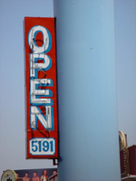
Site address: 5191 S Las Vegas Blvd
Sign owner: John Morris
Sign details: The Las Vegas Tourist Bureau is the first establishment on the strip after the McCarran Gates. It located in the south end of the property that is also occupied by the Klondike Motel Casino.
Sign condition: Structure 4 Surface 3 Lighting 3 Notes: Some of the lighting no longer works, and the surface seems to be deteriorating in spots. The structural integrity is good.
Sign form: pylon, fascia
Sign-specific description: The Las Vegas Tourist Bureau is the first establishment on the strip after the McCarran Gates. It located in the south end of the property that is also occupied by the Klondike Motel Casino. Upon the small low-rise structure, white, internally lit message centers wrap the flat roofline of the north and west sides of the building. The cabinet's steel housing is painted yellow to match the borders of the doors below. The cabinets form a giant entablature with giant black vinyl lettering. The north face reads "Show Tickets" in all capitals, and the west face reads "Grand Canyon" in smaller all caps lettering on the left hand side. Three words in the large all caps text reads "Tours," "Rooms," and weddings. Above the internally lit cabinets, the roof rises up several more feet, and is finished in red steel siding, with vertical panels made to look like wood. It is the same as the treatment seen on the Klondike. On the surface of this upper extension and above the cabinets, yellow raceways form a series of arches all along the fascia. They are lined with yellow incandescent bulbs. Standing right next to the entrances on the west face is the giant, double pole, pylon sign. The giant blue poles telescope up three levels, before a horizontal, rectangular, internally lit, yellow cabinet, lined with incandescent bulbs on the widths edge. The plastic face is white with red text. "Las Vegas" is written on the left-hand side at an angle in two lines, and "Tourist Bureau," written horizontally in two lines, in all capital text. A steel grated platform sits just above the cabinet on two extensions of the poles. The platform runs well beyond the edges of the backlit cabinet. On top of the grate a black LED message center runs the length of the platform. Next to the driveway into the small parking lot, a small internally lit sign stands street side. The small sign is two yellow steel cabinets, with white plastic faces, and incandescent bulbs running along the width's edge. They are treated to match the message cabinet on top of the main pylon sign. On top of a thin blue, steel post, a smaller cabinet supports another slightly larger one. The top cabinet reads "Entrance" in faded, red, all capital text. Just below the text on the face of the cabinet, a faded red arrow points east toward the parking lot. Neon tubing is crafted to create a reproduction of the shape, hovering over the surface. The bottom cabinet reads "Parking" in the same text, and condition. The three signs together form a cohesive, matching set of signage appropriate for the property. The sign is actually cohesive with the "Welcome to Fabulous Las Vegas" sign on the median just west of the actual structure.
Sign - type of display: neon, incandescent, backlit
Sign - media: steel, plastic
Sign animation: Chasing
Notes: The incandescent bulbs chase each other around the perimeter of the sign.
Sign environment: Just to the west on the median is the famous "Welcome to Las Vegas" sign, and the Klondike to the north. An expanse of field reaches south, past an attached structure on the south side of the building. That field is the airfield. The structure is highly visible from the north, but a bit less from the south due to heavy foliage placed directly south of the giant pylon. The Giant pylon is highly visible, but has high competition in it's midst. The Klondike when illuminated is very bright, and the Welcome to Las Vegas sign's popularity attracts a great amount of attention. The Las Vegas Tourist Bureau is sort of an afterthought.
Sign - thematic influences: The theme associated around these signs is not so evident. Yes they are the typical elements such as the internally lit cabinet and the border of incandescent bulbs. It is a roadside pole sign design, but it is a bit unique to it's area for it is extremely tall in its surroundings, and it is a double pole supporting internally lit cabinet. The thematic influence is also evident in relation to it's surroundings. It's coloring, and basic principle of design is based on the neighboring welcome to Las Vegas sign. The are both double poled, internally lit, and have incandescent bulbs which chase each other around the outside edge. The coloring of the Tourist Bureau sign parts corresponds with the same parts as the Welcome to Las Vegas sign as well.
Surveyor: Joshua Cannaday
Survey - date completed: 2002
Sign keywords: Pylon; Fascia; Neon; Incandescent; Backlit; Steel; Plastic; Chasing
Text