Search Results
Photographs of Mirage signs, Las Vegas (Nev.), 2002
Date
2002
2017-08-15
Archival Collection
Description
Photos show Mirage signs during the daytime. Two surveys were conducted to gather information about this sign. One was conducted in 2002 and one was conducted in 2017. PDFs are available for both surveys. See the 2017 survey PDF for additional information that is not included in the object description.
Site name: Mirage (Las Vegas, Nev.)
Site address: 3400 S Las Vegas Blvd
Sign owner: MGM Mirage
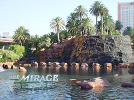
Sign details: The main attraction of the property is its spectacular exploding volcano placed among an astounding array of lagoons, waterfalls and palm trees. One of the themed hotel casinos, the architectural form takes precedence over an abundance of flashing lights and neon. Two pylon signs reside on the front of the property along Las Vegas Blvd, another on the west side of the property, two arched banner entrances are placed among them, lettering atop the towers, and various text placed among the vast stretch of landscaping are the only visible large elements of signage.
Sign condition: Structure 5 Surface 5 Lighting 5 The structure and lighting on the signs are in excellent repair, with no apparent major physical damage. The surfaces of the pylons and assorted log text, are a bit dirty, but no more than any other establishment, considering the punishment each must undergo due to the elements as well as the live volcano.
Sign form: Pylon; Fascia; Porte-cochère
Sign-specific description: Just north of Caesars Palace a giant pylon sign faces north/south, on the east side of the strip. Two giant square posts support a giant backlit advertisement panel, and an adorning entablature containing the channel letters spelling "Mirage." Between the two giant legs two cabinets are present to fill the space. Just below the main backlit panel an LED screen resides just above another back lit panel. The two giant legs have a series of polished metallic panels running vertically up the sides, creating a recessed channel. The sections are separated with slight overhangs. The bottom smaller panel cabinet is an advertisement for "Danny Gans" and the main panel advertises for the "Seigfried and Roy" magic show. A small banner rests between the main entablature, and the panel, reading "Magicians of the Century." The black channel letters in the main pediment spells "The Mirage," and are filled with incandescent bulbs. The lush foliage and walkways continue north where a covered awning faced with a carved wood and brass bullnose, allows pedestrians to take a moving walkway up to the resort. The landscaping continues north where it meets a driveway denoted by a low arched banner supported by a pair of square columns on either end. "The Mirage" is spelled in polished gold channel letters, with white interiors and filled with incandescent bulbs. The banner itself is sculpted into two sweeping solid shapes on the tops and bottoms, with a series of folded ribbon like scroll shapes. The center section is crafted as to allow light to pass through the negative spaces created by the rows of positive scroll shapes. The banners face east. On the faces of each of the flanking posts, two images of jumping dolphins are sculpted and finished in the same fashion. Past the gateway the thick beds of foliage and palm trees can be seen headed back along the drives. Continuing north a multi tiered lagoon rushes circulating water on and over waterfalls, while yet more green shrubbery and palm trees encrust islands and images of eroded rocks and geological formations. The beautiful imagery continues north, twisting and turning in and behind itself to create a fantastic spectacle for a passerby to be lured in and be fascinated. Approximately in the middle of the length of the expanse, the famous functioning volcano rests quietly amongst smaller rocks and waterfalls. Just past the volcano the lagoon opens up into a wide flat area of water where bronze dolphins are positioned to look as if they are jumping out of the water. Still the rich foliage dominates the landscape, until another arched gateway interrupts the expanse to allow traffic. The foliage, and lagoon landscaping, picks up again, cozily grasping the base of a smaller pylon of similar design as the first. The two reflective paneled legs rise up to connect with a horizontal piece of the same design. A large backlit cabinet advertising for Danny Gans occupies approximately three-quarters of the space between the legs. An entablature of the same design as the main pylon, yet smaller, crowns the top of the sign. The trademark font spells "The Mirage" in black channel letters and filled with incandescent bulbs. Just past the small double sided pylon, a small of recess of rocks plays home to the end marker of the Mirage. A bust of Siegfried and Roy with a tiger is ambiently lit, provided photo opportunities for tourists. An interesting function has been added to the bust. In the flower bed behind and on the sides of the object, faux boulders are places with glowing crystals protruding from the surface. The tower of rooms for the Mirage is the popular three winged "Y" configuration converging onto a center structure. On each face of each wing, giant black channel letters spell "The Mirage" in their trademark text. Each is filled with incandescent bulbs.
Sign - type of display: Neon; Incandescent; Backlit
Sign - media: Steel; Plastic
Sign animation: Oscillating
Notes: The incandescent bulbs located within text logos on the pylon sign, and upon the tower oscillate to appear as shimmering. The effect is one of the more common animations particularly among the larger, corporate casinos.
Sign environment: The placement of the Mirage right on the curve of the Strip makes the pylons visible from a good distance from either direction. The environment displayed by the mirage is that of paradise. When walking past, and up to the property, it hard not to stop and stare at the amazing foliage and spread of waterfalls, and rocks.
Sign manufacturer: Ad-Art
Sign designer: Pylons: Charles Barnard with touches from Wynn's design group Atlandia Design Group. Dolphin Archways: Barnard and Jack Dubois as well as hotel architect, Joel Bergman
Sign - date of installation: 1989
Sign - date of redesign/move: The main pylon has since been updated with a new Siegfried and Roy Back lit Mural, a new LED screen, and another back lit plastic screen featuring Danny Gans. An internally lit banner reads horizontally across the top of the giant Siegfried and Roy Mural which reads Magicians of the Century.
Sign - thematic influences: The theme is tropical island paradise. Complete with active volcano, the front spectacle of rushing waterfalls, chirping bird noises, and leaping bronze dolphins, serves as the backdrop for the simple, slim design of the property's pylon structure. The pylons were designed to reach harmony with the structure of the tower itself, rather than the island theme. The dolphins over the entrance arches however represent the tropical island theme, as well as speaking about the dolphin habitat inside.
Sign - artistic significance: The main pylon was the first of its kind to feature a full color illuminated photographic pictoral. Designed by Rosco, it was billed as the largest of its type in the world. The resort's themed spectacular was also the first of it's kind in regards to its extravagance and unique functionality. Approximate 125,000 people visited the property on its opening day. The resort fits well into the theme of design of the large, corporate property, after all it was one of the pioneers of such a movement in Las Vegas. The Mirage also set the standards for the now frequently seen element of the attraction spectacle, and the standard of quality on the Las Vegas Strip
Surveyor: Joshua Cannaday
Survey - date completed: 2002
Sign keywords: Oscillating; Pylon; Fascia; Porte-cochère; Neon; Incandescent; Backlit; Steel; Plastic
Site name: Mirage (Las Vegas, Nev.)
Site address: 3400 S Las Vegas Blvd
Sign owner: MGM Mirage
Sign details: The main attraction of the property is its spectacular exploding volcano placed among an astounding array of lagoons, waterfalls and palm trees. One of the themed hotel casinos, the architectural form takes precedence over an abundance of flashing lights and neon. Two pylon signs reside on the front of the property along Las Vegas Blvd, another on the west side of the property, two arched banner entrances are placed among them, lettering atop the towers, and various text placed among the vast stretch of landscaping are the only visible large elements of signage.
Sign condition: Structure 5 Surface 5 Lighting 5 The structure and lighting on the signs are in excellent repair, with no apparent major physical damage. The surfaces of the pylons and assorted log text, are a bit dirty, but no more than any other establishment, considering the punishment each must undergo due to the elements as well as the live volcano.
Sign form: Pylon; Fascia; Porte-cochère
Sign-specific description: Just north of Caesars Palace a giant pylon sign faces north/south, on the east side of the strip. Two giant square posts support a giant backlit advertisement panel, and an adorning entablature containing the channel letters spelling "Mirage." Between the two giant legs two cabinets are present to fill the space. Just below the main backlit panel an LED screen resides just above another back lit panel. The two giant legs have a series of polished metallic panels running vertically up the sides, creating a recessed channel. The sections are separated with slight overhangs. The bottom smaller panel cabinet is an advertisement for "Danny Gans" and the main panel advertises for the "Seigfried and Roy" magic show. A small banner rests between the main entablature, and the panel, reading "Magicians of the Century." The black channel letters in the main pediment spells "The Mirage," and are filled with incandescent bulbs. The lush foliage and walkways continue north where a covered awning faced with a carved wood and brass bullnose, allows pedestrians to take a moving walkway up to the resort. The landscaping continues north where it meets a driveway denoted by a low arched banner supported by a pair of square columns on either end. "The Mirage" is spelled in polished gold channel letters, with white interiors and filled with incandescent bulbs. The banner itself is sculpted into two sweeping solid shapes on the tops and bottoms, with a series of folded ribbon like scroll shapes. The center section is crafted as to allow light to pass through the negative spaces created by the rows of positive scroll shapes. The banners face east. On the faces of each of the flanking posts, two images of jumping dolphins are sculpted and finished in the same fashion. Past the gateway the thick beds of foliage and palm trees can be seen headed back along the drives. Continuing north a multi tiered lagoon rushes circulating water on and over waterfalls, while yet more green shrubbery and palm trees encrust islands and images of eroded rocks and geological formations. The beautiful imagery continues north, twisting and turning in and behind itself to create a fantastic spectacle for a passerby to be lured in and be fascinated. Approximately in the middle of the length of the expanse, the famous functioning volcano rests quietly amongst smaller rocks and waterfalls. Just past the volcano the lagoon opens up into a wide flat area of water where bronze dolphins are positioned to look as if they are jumping out of the water. Still the rich foliage dominates the landscape, until another arched gateway interrupts the expanse to allow traffic. The foliage, and lagoon landscaping, picks up again, cozily grasping the base of a smaller pylon of similar design as the first. The two reflective paneled legs rise up to connect with a horizontal piece of the same design. A large backlit cabinet advertising for Danny Gans occupies approximately three-quarters of the space between the legs. An entablature of the same design as the main pylon, yet smaller, crowns the top of the sign. The trademark font spells "The Mirage" in black channel letters and filled with incandescent bulbs. Just past the small double sided pylon, a small of recess of rocks plays home to the end marker of the Mirage. A bust of Siegfried and Roy with a tiger is ambiently lit, provided photo opportunities for tourists. An interesting function has been added to the bust. In the flower bed behind and on the sides of the object, faux boulders are places with glowing crystals protruding from the surface. The tower of rooms for the Mirage is the popular three winged "Y" configuration converging onto a center structure. On each face of each wing, giant black channel letters spell "The Mirage" in their trademark text. Each is filled with incandescent bulbs.
Sign - type of display: Neon; Incandescent; Backlit
Sign - media: Steel; Plastic
Sign animation: Oscillating
Notes: The incandescent bulbs located within text logos on the pylon sign, and upon the tower oscillate to appear as shimmering. The effect is one of the more common animations particularly among the larger, corporate casinos.
Sign environment: The placement of the Mirage right on the curve of the Strip makes the pylons visible from a good distance from either direction. The environment displayed by the mirage is that of paradise. When walking past, and up to the property, it hard not to stop and stare at the amazing foliage and spread of waterfalls, and rocks.
Sign manufacturer: Ad-Art
Sign designer: Pylons: Charles Barnard with touches from Wynn's design group Atlandia Design Group. Dolphin Archways: Barnard and Jack Dubois as well as hotel architect, Joel Bergman
Sign - date of installation: 1989
Sign - date of redesign/move: The main pylon has since been updated with a new Siegfried and Roy Back lit Mural, a new LED screen, and another back lit plastic screen featuring Danny Gans. An internally lit banner reads horizontally across the top of the giant Siegfried and Roy Mural which reads Magicians of the Century.
Sign - thematic influences: The theme is tropical island paradise. Complete with active volcano, the front spectacle of rushing waterfalls, chirping bird noises, and leaping bronze dolphins, serves as the backdrop for the simple, slim design of the property's pylon structure. The pylons were designed to reach harmony with the structure of the tower itself, rather than the island theme. The dolphins over the entrance arches however represent the tropical island theme, as well as speaking about the dolphin habitat inside.
Sign - artistic significance: The main pylon was the first of its kind to feature a full color illuminated photographic pictoral. Designed by Rosco, it was billed as the largest of its type in the world. The resort's themed spectacular was also the first of it's kind in regards to its extravagance and unique functionality. Approximate 125,000 people visited the property on its opening day. The resort fits well into the theme of design of the large, corporate property, after all it was one of the pioneers of such a movement in Las Vegas. The Mirage also set the standards for the now frequently seen element of the attraction spectacle, and the standard of quality on the Las Vegas Strip
Surveyor: Joshua Cannaday
Survey - date completed: 2002
Sign keywords: Oscillating; Pylon; Fascia; Porte-cochère; Neon; Incandescent; Backlit; Steel; Plastic
Mixed Content
Photographs of Madame Tussaud's signs, Las Vegas (Nev.), 2002
Date
2002
Archival Collection
Description
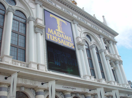
Daytime and nighttime views of Madame Tussaud's museum signs on the Strip. Information about the sign is available in the Southern Nevada Neon Survey Data Sheet.
Site name: Venetian (Las Vegas, Nev.)
Site address: 3377 S Las Vegas Blvd
Sign details: Madame Tussaud's Wax Museum is located inside the Venetian Hotel and Casino. Located at the southern end of the property, it is tucked away at the end of a long stretch of escalators. Even though it is not in complete plain view, the facility is directly in the line of pedestrian traffic. The escalators serve as one of the main causeways into the Venetian for the traveler headed north on the east side of the strip. The facility is also advertised by an architecturally integrated building sign, and an LED screen that are in plain view from the street. A the end of the bay of escalators, a platform folds out, containing the vibrant entrance to the Wax Museum. Flanking the large opening designated as the entrance, are six free standing sculpted cabinet, advertising for Madame Tussaud's, lining up three on either side of the door. Standing underneath the entry, are a cast of ever rotating wax figures of celebrities. Just beyond the wax sentry, six more sculpted cabinets are present on other side of the pedestrian leading up to a ticket counter. On the ceiling above the pedestrian is an array of sculpted elements that are adorned with incandescent bulbs and neon, all leading up to the afore mentioned counter.
Sign condition: Structure 5 Surface 5 Lighting 5
Sign form: Fascia
Sign - type of display: Neon; Incandescent
Sign - media: Steel; Plastic
Sign - non-neon treatments: Graphics; Paint
Sign animation: Chasing
Sign environment: Madame Tussaud's holds the unique position of being elevated above the street, within the Venetian. Located at the top of a bank of escalators, the museum is positioned so that it is the dominating force upon the pedestrian with its immediate area. With careful examination it is evident that the it resides in the Venetian, but has tight hold on it's claim of space. Even though the location is somewhat hidden, it is a present force, and alongside a series of moving walk paths, generating a high frequency of vibration.
Sign manufacturer: YESCO
Sign - date of installation: 2000
Sign - thematic influences: The theme of Madame Tussaud's revolves around the theme of what the establishment provides. The main attraction is of course the lifelike imagery of celebrities sculpted in wax. The establishment draws from the theme of celebrities and stardom in design. The advertisement cabinets, which line the entry to Madame Tussaud's, are shaped to reference this. One set is crafted in the shape of a stylized star, while the others appear as street side movie posters seen in theatres or propaganda. The feel of them, to sum up initially, is classic "Hollywood" movie opening extravaganza. The star shapes and jutting channels on the ceiling of the entrance are other references to stars as well as the feel of electricity. These too can be associated with "movie star" like elements such as the Hollywood walk of fame, with it's star shaped crests, references to celebrities as "stars," as well as the a fore mentioned flavor of a movie opening or extravaganza.
Surveyor: Joshua Cannaday
Survey - date completed: 2002
Sign keywords: Chasing; Fascia; Neon; Incandescent; Steel; Plastic; Graphics; Paint
Mixed Content
Photographs of Pit Stop signs, Las Vegas (Nev.), 2002
Date
2002
Archival Collection
Description
Daytime views of the Pit Stop signs on the Strip. Information about the sign is available in the Southern Nevada Neon Survey Data Sheet.
Site address: 3951 S Las Vegas Blvd
Sign details: In the southern end of the Strip, an interesting lone pole sign stands as a reminder that actual functioning business remaining inside the old, minimal, stucco structures. On the east side of the Strip, somewhat south of the area dominated by the Luxor, a pole sign facing north south stands in close proximity to the strip.
Sign condition: Structure 3 Surface 2 Lighting 2 The sign is still standing, and appears to have a sufficient structural integrity, but the paint on the surface is extremely worn, but the text is still readable and present. The lighting on the sign that was once evident no longer exists.
Sign form: Pylon
Sign-specific description: On the south end of the Strip the small shop resides in an older complex, of dusty buildings. On the east side of the strip, a minimal pylon sign denotes the businesses presence. At the top of a narrow, white, steel pole, a six sided, internally lit, double backed, cabinet advertises the establishment. On the yellow plastic face, "Pit Stop" is spelled in black text, along with white text spelling "Diecast Collectibles" on a black horizontal rectangle. Just below the crowning cabinet, an arrow shaped cabinet is pointed to the bottom right hand side toward the building. The cabinet is double sided with two legs creating the head of the arrow, and the upper end formed by a tail of these two legs. A double pinstripe of blue and red border the edges of the cabinet's face. The word "NASCAR," is spelled in all capital, red, text across the horizontal plane of the cabinet. Placed cantilevering off of the west side of the pole, a square message cabinet faces north /south. It is painted white on the exterior, with a wooden face graphically treated with red white and blue text, and a blue line border. The north side of the cabinet has no face. A small steel cabinet sits on top of the cantilevered one, yet has signage upon it.
Sign - type of display: Backlit
Sign - media: Steel; Plastic
Sign - non-neon treatments: Graphics; Paint
Sign animation: None
Sign environment: To the south is the Motel 8 while a vacant lot occupies the north. The pole sin sits in an island of grass, designated for the beat-up pylon. The small, dual level building, which houses the establishment, is non-descriptive, containing no signage. Of the southern strip it is one of the more minimal structures.
Sign - thematic influences: There appears no theme associated with the actual structure, even with the name itself. The actual structure of the sign is however reminiscent of the roadside pole signs so commonly associated with the roadside motel. To reference an actual sign still standing, it is reminiscent of the signage available for the Happi Inn.
Surveyor: Joshua Cannaday
Survey - date completed: 2002
Sign keywords: Pylon; Backlit; Steel; Plastic; Graphics; Paint
Mixed Content
Photographs of Holiday House Motel sign, Las Vegas (Nev.), March 1, 2017
Date
2017-03-01
2017-08-30
Archival Collection
Description
The Holiday House motel sign with a "For Sale" sign sits at 2211 South Las Vegas Boulevard. Formerly the Bagdad Inn, the property has been in operation since the early 50s. Information about the sign is available in the Southern Nevada Neon Survey Data Sheet.
Site address: 2211 S Las Vegas Blvd
Sign details: The Holiday House Motel was originally the Bagdad Inn that opened up in the 1950's. The actual motel was possibly named after Bagdad California, a small ghost town in the San Bernardino county. This town was a former route 66 pit stop and later passed by with the new I-15 and I- 40 in the late 1970's. The motel changed its name in 1983 to Holiday House Motel. The motel currently has a for sale sign.
Sign condition: The sign is in a 4.5. There seems to not have much sun or wind damage to the sign. The color is still fresh.
Sign form: This is a two- pole squared structured sign.
Sign-specific description: The sign is a bright red squared basis. All aspects of the sign's advertisement are connected together in one large square. There is no separation within the structure; it just looks like one giant red canvas with words and would even suggest the sign is very minimal. At the bottom, right portion of the sign you will see a small reader board (currently the reader board has been covered with a for sale sign). Vertically on the left side is the word motel in white lettering. The holiday house font is in yellow incandescent lighting, and the font looks italicized. The no vacancy is in neon underneath the holiday house typography. Two white poles are what holds up the sign.
Sign - type of display: Neon, Incandescent and fluorescent lighting.
Sign - media: Steel and Plastic
Sign - non-neon treatments: Reader board
Sign animation: Flasher for the incandescent light bulbs in the letters
Sign environment: This location is on the north end of the Strip across the street from the Stratosphere and near the Holiday Motel and Fun City Motel.
Sign - date of installation: 1983
Sign - date of redesign/move: In 1950's the sign was Bagdad Inn and in 1983 the establishment later changed into the Holiday House Motel.
Sign - thematic influences: This sign could have inspiration from the post modernism idea of open space and minimal design to "advertise" to consumers. This sign is very representative of 1970's designs.
Sign - artistic significance: Every portion of the sign was thoughtfully placed to hit the consumer in a fast and efficient way.
Survey - research locations: Vintage Vegas http://vintagelasvegas.com/search/Holiday+House+Motel and Roadside Architecture http://www.roadarch.com/signs/nvvegas.html .
Surveyor: Gisselle Tipp
Survey - date completed: 2017-08-30
Sign keywords: Neon; Incandescent; Steel; Plastic; Flashing; Reader board; Pole sign; Fluorescent; Roof Sign
Mixed Content
Photographs of Fremont East District sign, June 28, 2017
Date
2017-06-28
2017-08-30
Archival Collection
Description
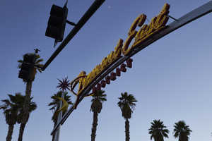
The Fremont East District sign sits near the intersection of Fremont St and Eighth St. Information about the sign is available in the Southern Nevada Neon Survey Sheet.
Site name: Fremont Street (Las Vegas, Nev.)
Site address: Fremont St and 8th St
Sign owner: Downtown Las Vegas and Fremont East District
Sign details: The Fremont East District really formed together in 2002 for a coalition to maintain the vintage Las Vegas feel particularly by bringing out some vintage looking Neon Signs. This coalition became known as the Fremont East Entertainment District (FEED). Since this area is already close to the Fremont Street Experience with foot traffic the 2007 revitalization also was an effort to create pedestrian friendly sidewalks.
Sign condition: 5 - Very good condition
Sign form: Pole mounted signs
Sign-specific description: The two gateway signs are identical in design to welcome drivers and pedestrians into the Fremont Street District. These signs go across all of the lanes of Fremont Street, so there are two poles on the opposite sidewalks and then two curved steel beams connecting the sidewalk poles, and the main logo is on the curved pole portion. The two steel sidewalk beams each have a yellow curved googie style design. Right above the curved yellow design, on top of the sidewalk beams each have a red starburst orbit. In the middle curved beam there are red channeled Fremont Street East in a mid century modern semi-cursive font, with yellow neon tubes within the channeled letters. Underneath the Fremont Street East letters there is the word DISTRICT in the red channeled block letters.
Sign - type of display: Neon
Sign - media: Steel and Plastic
Sign animation: Yellow neon on gateway signs flash
Sign environment: The gateway to Fremont East District from both the East and West end. One sign is at the corner of Las Vegas Blvd. and Fremont an the other is at the intersection of 8th St.
Sign manufacturer: Fluoresco Lighting and Signs
Sign designer: John Lutz
Sign - date of installation: 2007
Sign - thematic influences: This sign really brings back the mid-century modern theme, and the old Vegas theme as well. The starbursts are similar to the one from the Sweetheart Wedding Chapel Sign.
Sign - artistic significance: This sign speaks to the 1950s/1960s mid-century modern design with the starburst orbits and the yellow curved design.
Survey - research locations: Fremont East website, Floresco
Survey - research notes: Floresco Website http://www.fluoresco.com/pages/about/history.php, as well as contact with Gary Grider of Floresco, Las Vegas Today and Tomorrow Website, http://www.vegastodayandtomorrow.com/fremonteast.htm
Surveyor: Emily Fellmer
Survey - date completed: 2017-08-30
Sign keywords: Flashing; Neon; Steel; Plastic; Pole sign
Mixed Content

Photographs of Don't Tell Mama signs, Las Vegas (Nev.), June 28, 2017
Date
2017-06-28
2017-08-14
Archival Collection
Description
Photos show the signs for Don't Tell Mama at 517 Fremont Street Suite 110 in Downtown Las Vegas. Information about the sign is available in the Southern Nevada Neon Survey Sheet.
Site address: 517 Fremont St
Sign owner: Assessor's page stated T-Breo II LLC (possibly owner of the property, but no owner of the bar/business was found.
Sign details: Don't Tell Mama originally opened in 2008/9 as a New York style piano bar. The name is inspired by the 1966 song "Don't Tell Mama" in the Broadway show "Cabaret". They are known for their bartenders that double as entertainers as well as having open mic every night.
Sign condition: 3- The sign does show some aging and some of the neon piano keys currently do not work
Sign form: Hanging sign and entrance sign
Sign-specific description: The hanging sign is a rectangle sign is outlined in red neon with lower case letters "don't tell mama" is spelt out in a painted white font, but at night the letters are in red cursive skeletal neon. Below the font there is a piano key design. On the building right above the entrance the sign is an image of a closed grand piano neon sign. The body of the piano during the day has blue tubes and illuminates blue at night. Some of the keys are blue and others are red. Both signs are also plastic back lit so people can see the black and white piano keys with the neon on top of it.
Sign - type of display: Neon and backlit plastic
Sign - media: Steel and plastic
Sign - non-neon treatments: Plastic backlit sign
Sign animation: There may have been animation with the neon piano keys lighting up to look like the piano was being played but since many of these keys are not working it can not be confirmed.
Sign environment: Located in the East Fremont District in between Las Vegas blvd and 6th St. This bar has the Beauty Bar to the west of it and Le Thai restaurant to the east. Across the street is Therapy and the Emergency Arts center.
Sign manufacturer: Valley Signs and Lighting
Sign - date of installation: Sign has been up since at least 2014
Sign - thematic influences: The sign portrays the New York piano bar vibe they are going for, and since Neon is and was prominent New York it plays along with their theme as well.
Sign - artistic significance: Piano bars were prominent in the 1950's.
Survey - research locations: Don't Tell Mama website http://www.donttellmama.com/Dont_Tell_Mama/About.html, Asessor's page
Survey - research notes: There is a Don't Tell Mama in New York, but did not find an affiliation or a real connection.
Surveyor: Emily Fellmer
Survey - date completed: 2017-08-14
Sign keywords: Neon; Steel; Plastic; Backlit; Hanging; Building-front design; Fascia; Cantilever construction
Mixed Content

Photograph of Therapy restaurant sign, Las Vegas (Nev.), June 28, 2017
Date
2017-06-28
2017-08-06
Archival Collection
Description
The sign for Therapy sits at 518 Fremont Street in Downtown Las Vegas. Information about the sign is available in the Southern Nevada Neon Survey Data Sheet.
Site address: 518 Fremont St
Sign owner: Jared Weiss and Sig Rogich (Motion Corp)
Sign details: The building is from 1951, so within the restaurant there are exposed bricks and wood ceiling from the original building. Therapy restaurant opened in 2015 as a gastropub with Daniel Octiveas as the chef. Previous to turning into the Therapy restaurant this location held a Dollar Store.
Sign condition: 5, a newer sign still in very good condition
Sign form: Hanging sign and entrance sign
Sign-specific description: Pink lettering. The T is a solid print type font, then the rest of the letters are in cursive. There is a period at the end of the word Therapy. Each individual letter is in its own channeled block to contain the light for each letter. Also above their door there is a small black rectangular sign with the Therapy logo (same manufacturing style as the letters previously noted). There is a pink arrow starting from the farthest (from the entrance) top of the sign pointing towards the entrance. On this arrow there are sparking incandescent light bulbs.
Sign - type of display: Neon and Incandescent
Sign - media: Steel
Sign animation: Flasher for Incandescent light bulbs on the arrow to show the entrance of the property.
Sign environment: This property is in between 6th and Las Vegas Blvd. on the North side of Fremont St. This district in the past few years has shaped into its own creative and artsy area.
Sign manufacturer: Vision Signs
Sign designer: Gerrit Blok and Rob McGuire
Sign - date of installation: 2015 when the restaurant opened
Sign - thematic influences: The sign above the door has the arrow which was a popular trend in 1950s signs with the car consumer era, but also helps with the pedestrian traffic on Fremont St.
Sign - artistic significance: The simple yet beautiful cursive font shows that there is simplicity and elegance. Also the arrow above the entrance could be a hint of subliminal messaging, as well as a great direction indicator. The channeled letters shows how to capture illumination compared to skeletal Neon.
Survey - research locations: Therapy website http://www.therapylv.com/ , Las Vegas Weekly Article https://lasvegasweekly.com/dining/reviews/2015/aug/12/therapy-downtown-restaurant-review-fremont-east/ , Acessor's office, discussion with owner and contact with Vision signs
Survey - research notes: Eater Las Vegas (2015 article) shows cool pictures of the building being renovated. https://vegas.eater.com/2015/6/25/8845981/las-vegas-restaurants-therapy#5
Surveyor: Emily Fellmer
Survey - date completed: 2017-08-06
Sign keywords: Neon; Incandescent; Steel; Flashing; Hanging; Building-front design; Fascia; Cantilever construction
Mixed Content
The Wheel Las Vegas Rotary Club newsletter, April 10, 1975
Date
1975-04-10
Archival Collection
Description
Newsletter issued by the Las Vegas Rotary Club
Text
Photographs of White Sands Motel signs, Las Vegas (Nev.), 2002
Date
2002
Archival Collection
Description
Daytime views of the White Sands Motel signs on the Strip. Information about the sign is available in the Southern Nevada Neon Survey Data Sheet.
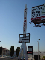
Site address: 3889 S Las Vegas Blvd
Sign details: Just south of the Tropicana Hotel Casino, the white Sands Motel begins the stretch of decaying properties that comprise the south end of the strip. In the parking lot outside a small low rise office, and rows of rooms the distinct pylon sign for the White Sands Motel faces north/south.
Sign form: Pylon
Sign-specific description: Two legs, in the shape of an "A" with a pole running up through the center, support a black, internally lit message center. The face of the cabinet is two sectioned with a larger portion sitting below a smaller section. The smaller top section has neither a face nor a backing. The interior parts lie exposed to the elements revealing the internal workings. Growing out of the center of the cabinet, tall thin internally lit rectangular cabinet runs into the sky approximately fifteen feet. The cabinet is designated into twelve sections by steel borders. Plastic red letters, reside inside this row of panels, horizontally spelling "White Sands" in all capital letters, with one space between the two words and one below the last word. At the very peak of the sign, a triangular shape, with a rounded top, appears to be back lit also. A smaller section sits on top of this as well. The tall cabinet, the peak, and the top antenna, are lined on the edges with raceways and incandescent bulbs. The resultant effect all of the pieces together is an image of a rocket or missile. Next to the drive on the streets edge, a small red, internally lit, message center faces north /south. The white flexible plastic face is treated with red text, and a logo for the establishment. Across the top of the cabinet "Entrance" is spelled and "Motel" across the bottom. The White sands logo is a red half circular shape with a white silhouette of palm trees, and "White Sands" across the top edge of the half circle.
Sign - type of display: Neon; Incandescent; Backlit
Sign - media: Steel; Plastic
Sign - non-neon treatments: Graphics; Paint
Sign animation: Chasing, flashing, oscillating
Notes: The text, which resides on the southern wall and reads "Casino," is filled with incandescent bulbs that all illuminate at the same time, and oscillate. They then shut off at the same time, and then repeat. The raceways of incandescent bulbs chase each other while the neon, which surrounds the back lit, plastic, screens on this wall flash on then off. The bottom two raceways sandwiching the reflective panel chase from left to right, while the remainder of the raceways surrounding the signs, run right to left. The incandescent bulbs on the pylon chase each other gracefully up the length of the pylon. The animation is patterned so as to appear as if a section of several bulbs are pulsing its way up the towers, hugging the edge of the bulbous tops. The raceways continue around the east face of the building. The umbrellas in the plaza behind the pylon, also are animated with incandescent bulbs chasing each other downward along the raceways.
Surveyor: Joshua Cannaday
Survey - date completed: 2002
Sign keywords: Chasing; Flashing; Oscillating; Pylon; Neon; Incandescent; Backlit; Steel; Plastic; Paint; Graphics
Mixed Content