Skip to main content
Main navigation
Finding Aids
Digital Projects
African American Experience in Las Vegas
Charles Saladino Landscape Architecture Collection
Culinary Union Photograph Collection
Dino at the Sands
Dreaming the Skyline
Entertainment
Historic Landscape of Nevada
Hoover Dam
Jamey Stillings
Menus: The Art of Dining
Nevada Test Site Oral History Project
Newspapers
Oral Histories Collection
Photograph Collections
Rebel Yell Newspaper
Showgirls
Southern Nevada: The Boomtown Years 1900-1925
Southern Nevada History in Maps
Southern Nevada Jewish Heritage Project
UNLV CSUN Records
Union Pacific Railroad Water Documents
Walking Box Ranch Collection
Welcome Home Howard
About
Request Images
Help
Provide Feedback
Special Collections Home
Search the Special Collections and Archives Portal
Search
Search
Breadcrumb
Special Collections and Archives Portal
Search Results
Display
List
Grid
Results Per Page
10
25
50
100
250
Displaying results 61631 - 61640 of 880285
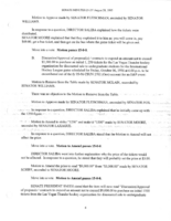
Meeting minutes for Consolidated Student Senate University of Nevada, Las Vegas, August 28, 1995, page 001
View
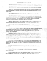
Meeting minutes for Consolidated Student Senate University of Nevada, Las Vegas, August 28, 1995, page 002
View
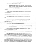
Meeting minutes for Consolidated Student Senate University of Nevada, Las Vegas, August 28, 1995, page 003
View
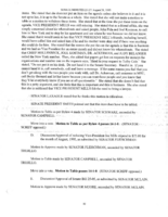
Meeting minutes for Consolidated Student Senate University of Nevada, Las Vegas, August 28, 1995, page 004
View
Meeting minutes for Consolidated Student Senate University of Nevada, Las Vegas, August 28, 1995, page 005
View
Meeting minutes for Consolidated Student Senate University of Nevada, Las Vegas, August 28, 1995, page 006
View
Meeting minutes for Consolidated Student Senate University of Nevada, Las Vegas, August 28, 1995, page 007
View
Meeting minutes for Consolidated Student Senate University of Nevada, Las Vegas, August 28, 1995, page 008
View
Meeting minutes for Consolidated Student Senate University of Nevada, Las Vegas, August 28, 1995, page 009
View
Meeting minutes for Consolidated Student Senate University of Nevada, Las Vegas, August 28, 1995, page 010
View
Pagination
First page
« First
Previous page
‹ Previous
…
Page
6160
Page
6161
Page
6162
Page
6163
Current page
6164
Page
6165
Page
6166
Page
6167
Page
6168
…
Next page
Next ›
Last page
Last »
Go
Refine my results
Content Type
Digital Object (435902)
Archival Component (297506)
Person (13168)
Subject (6840)
Archival Collection (5342)
Organization (3892)
Geographic Location (1845)
Webpage (107)
Blog Entry (66)
Family (34)
Creator or Contributor
Wright, Clinton, 1940- (8650)
Mayes, Aaron, 1968- (6325)
University of Nevada, Las Vegas. Libraries. Special Collections and Archives (5488)
University of Nevada, Las Vegas. Creative Services (5144)
deLespinasse, Hank, 1943-2017 (1839)
McBride, Dennis (1179)
Consolidated Students of the University of Nevada, Las Vegas (943)
Stillings, Jamey (879)
Las Vegas News Bureau (732)
Martin Stern Jr., A. I. A. Architect & Associates (630)
Rozaire, Charles E., 1927- (608)
Durham, Will (587)
Nevada Historical Society (547)
Starks, R. Marsh (529)
White, Claytee D. (528)
Sierra Nevada Museum of Art (520)
United States. Bureau of Reclamation (442)
Ralph Roske Oral History Project on Early Las Vegas (392)
Union Pacific Railroad Company (357)
Rissman and Rissman Associates (328)
Davis, Glenn A. (326)
Tabach, Barbara (323)
Severson, Berton Charles (312)
Rinker, C. A. Earle (Cleveland A. Earle), 1883-1965 (310)
Alpha Kappa Alpha Sorority. Theta Theta Omega Chapter (Las Vegas, Nev.) (306)
Miller, Chelsea S. (290)
Webb, Brian Walter (290)
Nevada Ballet Theatre (281)
African Americans in Las Vegas: a Collaborative Oral History Project (272)
Frashers Inc. (257)
Neon Museum (Las Vegas, Nev.) (237)
University of Nevada, Las Vegas. Libraries (237)
Paluzzi, Bob, 1920-2006 (236)
Stupak, Bob (236)
Cannon, Howard W. (220)
Hawkins, Josh (196)
Boyer Early Las Vegas Oral History Project (193)
Palevsky, Mary (181)
Stern, Martin, 1917-2001 (157)
Standard Oil Company of California (154)
Saladino, Charles (146)
Fitzgerald, Roosevelt, 1941-1996 (139)
Las Vegas Land and Water Company (138)
Martin Stern Jr. AIA Architect and Associates (134)
Bracken, Walter R., 1870-1950, Esq. (133)
Davis, W. A. (129)
KLAS-TV (Television station : Las Vegas, Nev.) (126)
Mitrani, Frank H. (124)
Mitchell, Jay Florian (123)
Allen Photographers, Inc. (120)
Grant, Art (120)
Las Vegas Rotary Club (119)
KVBC Channel 3 (Television station : Las Vegas, Nev.) (118)
Latinx Voices of Southern Nevada Oral History Project (116)
Ulloms (photo studio) (115)
Boulder Dam Service Bureau (113)
KTNV-TV (Television station : Las Vegas, Nev.) (112)
Press Association Inc. (112)
Becker, Suzanne (110)
The Production Company (108)
Menefee, Pete (104)
Doughty, Nanelia, 1907-1987 (103)
Geological Survey (U.S.) (103)
Smith, E. W. (Emory Willard), 1850-1941 (101)
University of Nevada, Las Vegas (101)
Jackson, Jerry (98)
Stardust Resort and Casino (Las Vegas, Nev.) (95)
Daily news (New York, N.Y. : 1920) (94)
Las Vegas sentinel-voice (94)
Syphus, Levi (94)
Evans, Stefani (93)
Socoloske, Zelner and Associates (93)
Cannaday, Joshua (92)
Schiff, Thomas R. (89)
Acme Newspicture (New York, N. Y.) (88)
Kula, Dennis (88)
J. L. Cusick and Associates (84)
Oakes Photo (82)
Aid for AIDS of Nevada (80)
Building Las Vegas Oral History Project (79)
Frasnay, Daniel (79)
Underwood, Gilbert Stanley (75)
University of Nevada, Las Vegas. The Lincy Institute (73)
Desert Sea News Bureau (72)
Reflections: the Las Vegas Asian American and Pacific Islander Oral History Project (72)
Campbell, Bill (70)
UNLV @ 50 Oral History Project (70)
Remembering 1 October Oral History Project (67)
Gilbert Stanley Underwood and Co. (65)
Pitchford, G. I. (62)
Efstonbuilt, Inc. of Chicago (61)
Boulder Canyon Project (U.S.) (58)
Los Angeles & Salt Lake Railroad Company (58)
Sidney, George, 1916-2002 (57)
Spinedi, Josephine (57)
Golden Rainbow (Non-profit organization) (56)
J.A. Lyons and Company (54)
Bunker, John Mathieson, 1870-1946 (53)
Las Vegas Review-Journal (52)
Ullom, G. L. (52)
United States. Air Force (52)
Simmons, Pamela (51)
Buck, Joe (50)
Mercado-Rosas, Cindi (50)
Folger, Al M. (48)
Alam, Miranda (47)
Joseph L. Cusick and Associates (47)
English, Don C., 1913-1986 (46)
Harold L. Epstein and Associates (46)
Russell, William S. (46)
Henry, Scott (45)
Binion, Jack, 1937- (44)
Mackie, Robert Gordon, 1940- (43)
Southern Nevada Jewish Heritage Project (43)
Clark, J. Ross (James Ross), 1850-1927 (42)
Rodriguez, Thomas (42)
West Charleston Neighborhoods: an Oral History Project of Ward 1 (42)
J.H. Taylor Construction Co. (41)
Las Vegas Women in Gaming and Entertainment Oral History Project (41)
United States. Department of Energy (41)
Cava, Greg, 1958- (40)
John A. Lowell & Co. (40)
Porter, Donna Michelle (40)
Syphus, Mary Etta, 1871-1895 (40)
United States. Bureau of Reclamation. Lower Colorado Region (40)
Winchell, Cecilia (40)
Harmon, Harley Emmett (39)
Leavitt, Joan (39)
Scammel, Derek S. (39)
Seattle FilmWorks, Inc. (39)
Belknap Photographic Services (38)
Schwartz, David G., 1973- (38)
Voices of the Historic John S. Park Neighborhood Oral History Project (38)
Beavers, Kelliann (37)
Hull, Daniel R. (37)
Martin, James (37)
Martinez, Magdalena (37)
Epstein, Harold L. (36)
Miller, Nolan, 1933-2012 (35)
Segerblom, Cliff (34)
Ira Tepper and Associates (33)
United States. Bureau of Indian Affairs (33)
Spiers & Pond Ltd. (caterers and hoteliers) (32)
Walker, Don Travis, 1939-2013 (32)
Bennett, E. E. (31)
Sands Hotel & Casino (Las Vegas, Nev) (31)
Soto, Nicole (31)
Congregation Ner Tamid (Henderson, Nev.) (30)
Hernández, Monserrath (30)
Las Vegas Valley Water District (Nev.) (30)
Abbott, Jerry (29)
Cohen, Norman A. (29)
Las Vegas News Agency (29)
Mills, Lyra (29)
Schafer, Bill (29)
Las Vegas Bugle (28)
McCreary, John (28)
Patrick, Elizabeth Nelson, 1924-2001 (28)
Barcus, J. Clyde (James Clyde), 1889-1966 (27)
Barstow Studio Las Vegas (27)
Desert Supply Company (27)
Harry Hayden Whiteley A. I. A. and Associates (27)
Lido, Serge (27)
U.S. Atomic Energy Commission (27)
Dunes Hotel and Casino (Las Vegas, Nev.) (26)
Finder, Esther Toporek (26)
International News Photos (New York, N.Y.) (26)
Jones, Kenneth Charles "Ken", 1913-2000 (26)
Wittwer, John, 1880-1977 (26)
Gioia-Acres, Lisa (25)
Las Vegas Women Oral History Project (25)
Lisanby, Charles (25)
Mitrani, Frank, 1931- (25)
Caesars Palace Las Vegas Hotel and Casino (24)
Stadelman, Richard (24)
W. L. Donley and Associates (24)
Bernard, Bruno, 1912-1987 (23)
Glaha, Ben D., 1899-1970 (23)
Iwamoto, John T. (23)
Lees, Dave (23)
Murphy, F. M. (23)
Robinson Engraving Company (23)
Seymour, Maurice (23)
W. Southwood and Company, Limited (23)
Glucksman, Leon (22)
Levner, Brett (22)
McDaniel, James B. (22)
Wilson Drug Company (22)
Winnemucca Construction (22)
All That Jazz Oral History Project (21)
Applegate, Shannon (21)
Autrey, Max Munn (21)
Bosio Pressphoto (21)
Foster, Harold P. (Harold Paul), 1939-2012 (21)
Katherine Hepworth (21)
Las Vegas (Nev.). Citizens Committee for Community Improvement (21)
Las Vegas Sun (21)
Roy F. France and Sons (21)
Temple Beth Sholom (Las Vegas, Nev.) (21)
Weller, J. Maher (21)
Chief Engineer's Office, Los Angeles, California (20)
Mather, Stephen Tyng, 1867-1930 (20)
McWilliams, J. T. (John Thomas), 1863-1941 (20)
Sahara Hotel and Casino (20)
Wide World Photos, Inc. (20)
Anderson, Fred D. (19)
Calderón, Maribel Estrada (19)
Emerson, David W. (19)
United States. Army Map Service (19)
Bracken, J. K. W. (18)
Las Vegas City Commission (18)
Lopez, Elsa (18)
McNamee, F. R. (Frank R.) (18)
San Pedro, Los Angeles & Salt Lake Railroad Company (18)
Slot Manager Oral History Project (18)
Stern Architectural Associates, LTD. (18)
Swain, Mark (18)
Bray, William M. (17)
J.H. Bufford & Co. (17)
Summit Engineering Corporation (17)
Aghayan, Ray (16)
Antler, Irving L. (16)
Cammerer, Arno B. (16)
Economic Opportunity Board of Clark County (Nev.) (16)
Hellman, Albert A. (16)
Knickerbocker, F. H. (16)
Martin, John A. (16)
McNeil Construction Co. (16)
Reinhardt, William (16)
Tokubo, Masayoshi (16)
Veljkovic, Zoran (16)
Automobile Club of Southern California (15)
Belknap, William, Jr. (15)
Bettis, H. I. (15)
Bruner, Elmo C., 1906-1973 (15)
Carl Byoir & Associates (15)
Concepcion, Vanessa (15)
Frasher's Fotos (15)
Heart to Heart Oral History Project (15)
Kniele, A. G. (15)
KVVU Channel 5 (Television station : Henderson, Nev.) (15)
McAllister, Wayne D., 1907-2000 (15)
O'Brien, Joseph D. (15)
Peralta, Kristel (15)
Table Games Management Oral History Project (15)
Thomas Companies, Inc. (15)
Vegas Studio (15)
Bañuelos-Benitez, Laurents (14)
Donley, W. L. (14)
McDermott, William (14)
Palmer, Milt (14)
Paramount Pictures Corporation (14)
Strong, Frank (14)
Vazquez, Rodrigo (14)
Viñas, José Luis (14)
Bañuelos-Benitez, Laurents, 1994- (13)
Cooke, Joseph W. (13)
Desert Inn Hotel and Casino (13)
Farwell, William H. (13)
Greene, James M. (13)
Julius Gabriele A. I. A. & Associates (13)
Las Vegas One (Television station : Las Vegas, Nev.) (13)
Lebovich, Max (13)
le Duc, Ernest W. (13)
Levitt, Harold W. (13)
Life Photo (13)
Martinez, Nathalie, 1998- (13)
Riviera Hotel & Casino (Las Vegas Strip, Nev.) (13)
Sempé, F. (manager) (13)
United States. Department of the Interior (13)
UNLV TV (13)
Abbey, Joshua, 1956- (12)
Alpha Kappa Alpha Sorority. Kappa Xi Chapter (University of Nevada, Las Vegas) (12)
Compagnie générale transatlantique (12)
Deitrich, Charlie (12)
Frontier Hotel and Casino (12)
Geographical Surveys West of the 100th Meridian (U.S.) (12)
Guava Soleil (Drag queen) (12)
Harbert, Raymond Chester (12)
Las Vegas Gay, Lesbian, Bisexual and Transgender Archives Oral History Project (12)
Laufer, Peter (12)
Lober, Allen (12)
Nobile, G. C. (manager) (12)
Nulty, John (12)
Sage and Sable Enterprises, Inc. (12)
Swan, Sheila (12)
Union Pacific Railroad Company. Office of Chief Engineer (12)
Union Pacific Railroad Photo (12)
United States. Bureau of Reclamation. Region 3 (12)
Westen, John E. (12)
Barrett, Christine Khan, 1955- (11)
Comstock, W. H. (11)
English, Donald E., 1926- (11)
Freemyer, Clifford (11)
Goodwin, Joanne L. (11)
Halsted, A. S. (11)
Hertzog, E. E. (11)
Knop, Siegfried (11)
Landmark Hotel and Casino (Las Vegas, Nev.) (11)
Las Vegas Paiute Tribe (11)
Malmberg, Glenn T. (Glenn Thomas), 1925- (11)
Mancuso, Maggie, 1941- (11)
McNamee, F. R. (Frank R.), 1865 or 1866-1933 (11)
Meador, Russell A. (11)
Montrose, Jerry (11)
Nevada Cooperative Extension (11)
Plume, Russell W. (11)
Rodriguez-Campo, Marcela (11)
Solomon, Ernest (11)
Western Studio (11)
Adat Ari El (Las Vegas, Nev.) (10)
Alpha Kappa Alpha Sorority (10)
Associated Booking Corp. (10)
Campbell Realty Company (10)
Capon, A. E. (10)
Clark County (Nev.). Department of Comprehensive Planning (10)
Cole, D. (10)
Cook, John (10)
Gogerty, H. L. (10)
Hayes, J. R. (James R.) (manager) (10)
McNamee, Leo A. (10)
Nagro, Michael (10)
Neal, Joe, 1935-2020 (10)
Nellis Air Force Base (Nev.) (10)
Nevada. State Engineer (10)
Osgood Engineers, Inc. (10)
Paiute Indian Agency (Nev.) (10)
Prater, B. H. (10)
Smithman, Dan (10)
Smithman, Josh (10)
United States. Army Air Forces (10)
Vegas PBS (10)
Walker, R. T. (10)
Wittick, Ben, 1845-1903 (10)
Zimmerman, Fiman and Dixon (Firm) (10)
Baker, C. D. (Charles Duncan), 1901-1972 (9)
Bettoni, H. (manager) (9)
Booth, W. I. (9)
Browne, Wilkinson and Braganza Architects (9)
Crockwell, James H., 1855-1940 (9)
David, Alexis, engraver (Paris, France) (9)
Ferrell, Mallory Hope (9)
Friedrichs, Robert Elmer, 1943- (9)
GAI Associates, Inc. (9)
Generic, Inc. (9)
Gilliam Brady Associates, Inc. (9)
Harney, Corbin, 1920-2007 (9)
Hellman & Lober, Inc. (9)
History of Nursing in Southern Nevada Oral History Project (9)
Johnson, A. J. (Alvin Jewett), 1827-1884 (9)
Johnson, N. C. (proprietor) (9)
KLVX (Television station: Las Vegas, Nev.) (9)
Las Vegas High School (9)
Mark, Bill (9)
Morelli, Dave, 1928- (9)
NAMES Project (9)
Parkins & Gotto (London, England) (9)
Powers, Emily (9)
Reaves Engineering, Inc. (9)
Rockfield, H. L. (proprietor) (9)
Rudma Picture Company (9)
Squires, Charles Pember (9)
Stan Davis Air Photo (9)
Tom Pappas, Inc. (9)
Treadway, W. D. (9)
Tropicana Hotel (Las Vegas, Nev.) (9)
United States. Army. Air Corps (9)
Baldwinson, R. (8)
Berthaud, photographer (Paris, France) (8)
Boulder City Library Oral History Project (8)
Burt Moritz Photography (8)
Campbell, Thomas A. (8)
Carr Childers, Leisl (8)
Flamingo Hilton (Las Vegas, Nev.) (8)
Grygo, John (8)
H. O. Rose & Co. (proprietors) (8)
Harrell, Judy (8)
Jo. B. Alexander & Co. (proprietors) (8)
Loughead and Company (8)
Manaigre, Aram (8)
Mangubat, Raul (8)
Mann, Tony (8)
Meston's Travels (8)
Mike Roberts Color Productions (8)
Moore, Joyce (8)
Palmer, Milt, 1925-1996 (8)
Parkinson, D. (Donald), 1891- (8)
Parkinson, John, 1861-1935 (8)
Patch, O. G. (8)
Robinson, A. W., engraver (Boston, Massachusetts) (8)
Rostine, Irene (8)
Studio Southwest Photography (8)
Summers & Monfort (proprietors) (8)
Timpe, Felicitas (8)
Tiu, Jerwin (8)
Ullom, George Lawrence "Larry" (8)
University of Nevada, Las Vegas. Audio/Visual Services (8)
Welch and Tune (8)
Wheeler, George M. (George Montague), 1842-1905 (8)
Whittemore, C. O., 1862-1920 (8)
Yamaguchi, Ayrton (8)
York, Herbert F. (Herbert Frank) (8)
Adamson, R. L. (7)
Ad Art Lith. (Cleveland, Ohio) (7)
Anderson, Swede (7)
Bancroft, W. H. (7)
Barringer, Robert E. (7)
Baud, R. (7)
Bernard, Frank, R. (7)
Bertrand, Milton R. (7)
Bonanza Printers (Las Vegas, Nevada) (7)
C. E. Morrell Co. (Elmira, New York) (7)
Corkhill, Charles C. (7)
Delim, Caitlin (7)
Diamond, Renee (7)
Dziedziak, Caryll Batt (7)
Eisenberg, Dorothy (7)
Frank and Virginia Ball Studio (7)
Front Boy Service Co. (7)
Goodall, Lois (7)
Hollywood Pictoral Service (7)
Huxley Architect and Associates (7)
Jacobson, Coppedge (7)
Johnson, W. H. (7)
Kranz, Chet (7)
L. F. Lowe & Son (7)
Last Frontier Village (Las Vegas, Nevada) (7)
Lith. F. Appel (Paris, France) (7)
Los Angeles Times (Firm) (7)
Lynch, Rosemary, 1917-2011 (7)
Mack, Michael S., 1937- (7)
Moffitt & McDaniel Architects, Ltd. (7)
Montgomery, J. M. (James M.) (7)
Myers, Harry, 1915-1982 (7)
Nevada. Department of Highways (7)
Nevada State Library (7)
Paul Schmierer and Associates Photography (7)
Photo/Rama (Las Vegas, Nev.) (7)
Puckett, Terry W. (7)
Rand McNally and Company (7)
Redwood Publishing Co. (7)
Reibold, Louis (proprietor) (7)
Romano, A. N. (proprietor) (7)
S.D. Childs & Co. (7)
Silver Moon Press (7)
Silvia, Pauline Helena, 1930- (7)
Smith, A. R. (proprietor) (7)
Sowder, Elmer Jesse (7)
Spearman, Rupert B. (7)
United States. War Department (7)
Zick, W. (7)
Bailey, Banks & Biddle Company (Philadelphia, Pa.) (6)
Ballinger, E. M. (6)
Baratz, Adele (6)
Belknap, Bill, 1920- (6)
Benham, Frank "F.H." (6)
Bernand, B. M. (6)
Biro, A. (6)
Booker & Bradford (6)
Campbell, John Frederick, 1943- (6)
Chapman, R. H. (Robert Hollister), 1868-1920 (6)
Chute, Elmer J. (6)
Court, Nicholas A. (manager) (6)
de Vincent, George (6)
Dougall Design (6)
Douglas, E. M. (Edward Morehouse), 1855-1932 (6)
E. W. Wormald & Co., Printers (London, England) (6)
Elder, Henry (6)
Epic Records (6)
Fisher, Ray, 1924- (6)
Flor, Jose (6)
George, Hampton Ellis, 1857-1907 (6)
Goodman, Oscar Baylin, 1939- (6)
Gross Photo (6)
Indian Springs Air Force Base (Nev.) (6)
Jameson, C. (6)
Jewish Nevada (6)
Knee, Ernest, 1907-1982 (6)
Koziol, Walter H. (6)
KVLX Channel 10 (Television station : Las Vegas, Nev.) (6)
L.S. Whaley and Sons, Inc. (6)
Las Vegas (Nev.). Metropolitan Police Department (6)
Las Vegas Age (6)
Las Vegas Convention/Visitors Authority (6)
Laurie, Jim P., 1955- (6)
Leviste, C. L. (6)
Lit. L. Salomone (Rome, Italy) (6)
Louis, Margaret (6)
Martinez, Nathalie (6)
McCreery, John H. (proprietor) (6)
Nevada. Public Service Commission (6)
Nevada Southern University (6)
Nevada State Museum (6)
Nickel, Robert (6)
Replogle, John (6)
Shaw, Arnold, 1909-1989 (6)
Smith, Alfred Merritt (6)
Smith, W. E. (6)
Starkweather, Wendy (6)
Stewart, B. D. (6)
Stewart, Helen Jane Wiser, 1854-1926 (6)
Tilton, E. G. (6)
United States. Congress. Senate (6)
Uruchurtu, Hector (6)
Vegas Studio and Camera Supply (6)
Wade, Troy Ernest, II, 1934- (6)
Wagner, William C. (6)
Welsh, John Elliott (6)
Wengert, Cyril S., 1889-1965 (6)
Wyman, Richard Vaughn, 1927- (6)
Absera, M. (5)
Akselrad, Sanford David (5)
Allen, Marion V. (5)
Armstrong, W. R. (5)
Barth, Delbert S. (5)
Basic Magnesium, Inc. (5)
Beckwith, E. G. (Edward Griffin), 1818-1881 (5)
Bergman, Joel (5)
Berkley, Shelley (5)
Bishop Brothers (Firm) (5)
Blackburn, J. E. (5)
Brimmies (Las Vegas, Nevada) (5)
Brunacci, Tom (5)
CADMUS (caterer) (5)
Clarke, Walter (5)
Clason, George S. (George Samuel), 1874-1957 (5)
Clason Map Co. (5)
Compagnie des Chargeurs Réunis (France) (5)
Davis, Jefferson, 1808-1889 (5)
De Bini, Gino, illustrator (Italy) (5)
Desert Souvenir Supply (5)
Edwards, Elbert B. (5)
Emerson, Shirley (5)
Farnsworth, David (5)
Farrow, E.A., Dr. (Edgar A.), 1873-1947 (5)
Fiol, Raymonde "Ray" (5)
Frémont, John Charles, 1813-1890 (5)
Green, Henry Delorval, 1896-1984 (5)
Greenspun, Hank, 1909-1989 (5)
Hancock, Doris, 1895-1987 (5)
Harper, C. H. (proprietor) (5)
Hart Photographic Studio (Ames, Iowa) (5)
Hoggard, J. David, 1914-2001 (5)
Host Menu Co. (unknown location) (5)
J. F. Antisdel & Son (proprietors) (5)
Jessup, E. M. (Edgar M.) (5)
Kohl, Jean (manager) (5)
Kuechel, Alexander, 1924- (5)
Larson, P. E. (Per Edward) (5)
Lebovic, Lydia (5)
Longwell, Chester R. (Chester Ray), 1887-1975 (5)
Los Angeles & Salt Lake Railroad Company. Los Angeles Division (5)
Maag, L. R. (5)
Maguire, Arthur (5)
Manis, John L. (5)
McMillan, Marie E., 1926-2019 (5)
Moore, Bill J. (5)
Nevada. Division of Water Resources (5)
Nevada Bureau of Mines and Geology (5)
Nevada State Journal (5)
O'Sullivan, Timothy H., 1840-1882 (5)
Oakes, L. J. (5)
Oasis Confectionery Photo (5)
Pelicann, J. A. (manager) (5)
Perrin, Olivier (5)
Preddy, Sarann Knight (5)
R. and P. Photo Company (5)
Roberts, Tony (5)
Rosencrantz, Arne, 1947- (5)
Sabbath, Roberta Sterman (5)
Schuster, Henry, 1926-2014 (5)
Seidman, Lorne (5)
Siebert, Selmar (5)
Smith, Alexander (proprietor) (5)
Sternberg, Adam (5)
Timespic Inc. (5)
Tonopah Miner Publishing Company (5)
Vanden, Lewis (proprietor) (5)
Verne, "Spike" (5)
Weissman, Art (5)
Welt, Gerald "Jerry" (5)
Werstein, Kathy (5)
White, C. W. (manager) (5)
White, Howard (5)
Wm. H. Brett Eng. Co. (Boston, Massachusetts) (5)
Woodward, L. (5)
Zepeda, M. (5)
Allen, Philip W. (Philip Wymer), 1918- (4)
Aquilina, Nick C., 1937- (4)
Artigue, Pierre M., 1872-1934 (4)
Baepler, Donald (4)
Baldwin & Gleason Co., Ltd. (New York, New York) (4)
Behar, Maurice Halfon, 1938- (4)
Benedict, Blaine, 1948- (4)
Bergh, Beth (4)
Black, Stuart C., 1919-2010 (4)
Borns, Leo (4)
Brandt, Monty (4)
Brewer, Jay (4)
Bridges, Marcell Eugene, 1929- (4)
Bridges, Zenna Mae, 1928- (4)
Britton & Rey (4)
Cahlan, John F. (4)
California State Automobile Association. Nevada Division (4)
Cardinell-Vincent Co (4)
Cella Barr Associates (4)
Chamber of Commerce (Las Vegas, Nev.) (4)
Clark County School District (Nev.) (4)
Cobb's Library Co., engravers, stationers, printers (Chicago, Illinois) (4)
Connelly, James Hargis (4)
Cox, Norma (4)
Curran, Robert Joseph (4)
Daitch, Babs, 1947- (4)
Dennison News Company (4)
Diven, Benjamin Clinton, 1919-2010 (4)
Douglass Studio (4)
Dunn, J. C. (proprietor) (4)
E. G. Farmer & Co., engravers (Providence, Rhode Island) (4)
E. Marx (Paris, France) (4)
El Cortez Hotel & Casino (Las Vegas, Nev.) (4)
Gallagher, Chas D. (4)
Gass, Octavius Decatur (4)
George, Sadie Kiel (4)
Giller, Edward Bonfoy, 1918- (4)
Goldfield Publishing Company (4)
Goldfield Review (4)
Goldman, Ed, 1951- (4)
Gordon, Mike (4)
Gordon, Sallie, 1907-1997 (4)
Gregory, Leila M. (4)
Harris & Ewing (4)
Hausch, Mary, 1949- (4)
Heyer, Mildred J. (4)
Hood, William (4)
Hotel Last Frontier (4)
Huckabee, Fred Ray, 1931- (4)
International Hotel (Las Vegas, Nev.) (4)
Johnson and Ward (4)
Kamegai, Meera (4)
Katz-Yarchever, Edythe (4)
Kaufman, Perry Bruce, 1942- (4)
Kayaert, Robert (4)
Ketchum, W. (proprietor) (4)
Kissel, F. (proprietor) (4)
Kodey, Geri (4)
Koerner, Bruce (4)
Ladd, Burton A. (Burton Andrew), 1905-1985 (4)
Laux, Charles (proprietor) (4)
Law Offices of O'Melveny & Myers (4)
Lester, Gene (4)
Limbocker, Arcade Stationer (Springfield, Ohio) (4)
Lit. Bruno e Salomone (Rome, Italy) (4)
Lyon, Farnham (proprietor) (4)
M.R.T. Foto (4)
Massa, Adriane (4)
Maynard, George Robert, Sr. (4)
McKay, E. J. (4)
McWilliam, Charles (4)
Miller, C. F. (4)
Moor, D. F. C. (4)
Morgan, Gilbert (4)
O'Neill, Layton James (4)
Omega Psi Phi Fraternity. Kappa Xi Chapter (Las Vegas, Nev.) (4)
Pantagraph printing Company (4)
Pappas, John (4)
Pierce, M. B. (proprietor) (4)
Polehn, Yonna (4)
Proctor, Cork, 1932- (4)
Progress Publishing Company (4)
Rice, William A. (4)
Rissman, Homer A., 1927-2001 (4)
Roske, Ralph J. (Ralph Joseph), 1921-1994 (4)
Royal Nevada Hotel (Las Vegas, Nevada) (4)
Schoff, Stuart L. (Stuart Leeson), 1906- (4)
Schwartz, Priscilla, 1938- (4)
Sennes, Frank (4)
Shaff Studio (4)
Shamberger, Hugh A. (4)
Shaw, H. T. (Herbert T.) (4)
Showboat Hotel and Casino (Las Vegas, Nevada) (4)
Silas Gurney & Co. (proprietors) (4)
Smith, Linda, 1940- (4)
Spence Air Photos (Firm) (4)
Thomas Bros. Maps (4)
Toston, Roosevelt (4)
U.S. Coast and Geodetic Survey (4)
Union Pacific System (4)
Union Plaza Hotel and Casino (4)
United States. Army. Corps of Engineers (4)
United States. Army. Corps of Topographical Engineers (4)
United States. Department of Agriculture (4)
United States. Soil Conservation Service (4)
UNLV University Libraries Oral History Collection (4)
Urban, Ruth Pearson, 1948- (4)
Wells, Ralph E. (4)
Welt, Doris (4)
Welt, Marcy (4)
Whitmoyer, Theodore F. (4)
Wilkinson, Marc, Printer (Las Vegas, Nevada) (4)
Williams, Aaron , 1921-2011 (4)
Williams, Ernest Benjamin (4)
Winer, Jack (4)
Woro Studio Photography (4)
Young Electric Sign Company (4)
A-wan, A. K. (3)
Agonia, Robert, 1938- (3)
Aizley, Paul, 1936- (3)
Aizley, Sari, 1934-2017 (3)
Alexander, L. C. (proprietor) (3)
Amundsen Studio (Salt Lake City, Utah) (3)
Aoust, Emile (maître d'hôtel) (3)
B & B Photo (3)
Barnes, Harley, 1916-1979 (3)
Bass, Burt (3)
Beaman, F. M. (proprietor) (3)
Bennett, Marion D., Sr., 1933-2013 (3)
Bien, Julius, 1826-1909 (3)
Blew, Phil (3)
Blut, Arlene (3)
Bosler, Greg (3)
Bouton, Ken (3)
Bracken, Walter R., 1870-1950 (3)
Bristol Hotel & Palmerston Co., Ltd. (proprietors) (3)
Brookman, Eileen (3)
Brown, Alice (3)
Brownlee, Robert Rex, 1924- (3)
Buck and Swift Las Vegas, Nevada (3)
Burke, Howard (3)
Burnett, Mark A. (manager) (3)
Byers, F. M. (Frank M.), 1916- (3)
Byler, E. A. (3)
C. H. Elliott Co., engravers and printers (North Philadelphia, Pennsylvania) (3)
Cafe Monico (3)
California State Automobile Association (3)
Calvin, E. E. (3)
Caples, Cheryl (3)
Case, H. C. (proprietor) (3)
Case, W. P. (clerk) (3)
Christiansen, Robert L. (3)
Clark County (Nev.). Department of Health (3)
Cohen, Philip M., 1931- (3)
Cory, Calvin M. (3)
Cotterill, J. R. (3)
Countess, Jerome "Jerry" (3)
Cullen, T. P. (3)
Cunningham, E. E. (3)
Davis, Elmer, illustrator (unknown location) (3)
Deal, L. Joe (Laurie Joe), 1924-2008 (3)
DeAltley, Murray (3)
Dean's Photos (3)
Dee Ennis Photography (3)
Devlyn, Jean, 1903-1968 (3)
Dondero, Thalia (3)
Dreka (3)
Druk. Ratinckx frères (3)
E. Stockley and Co. (London, England) (3)
E. W. Smith Photography (3)
Eakin, Thomas E. (Thomas Emery), 1914- (3)
Earls Court Exhibition Centre (London, England) (3)
Eden Fisher & Co. (London, England) (3)
Edward J. Allen Associates, Inc. (3)
Elson-Alexandre (3)
Escoffier, A. (Auguste), 1846-1935 (3)
Evans, K.J. (3)
Express Publishing Company (3)
F. M. Howell & Co. (Elmira, New York) (3)
Farmer, Livermore & Co. (Providence, Rhode Island) (3)
Filet Menu, printer (Los Angeles, California) (3)
Flamingo Hotel & Casino (Las Vegas, Nev.) (3)
Flower, H. A. (clerk) (3)
Ford, Dan (3)
Fred M. Hublitz Advertising Photography (3)
Freeman, Al (3)
G. H. Kendall, Engraver & Printer (New York, New York) (3)
Gang, Roberta (3)
Gay, Hazel (3)
Gay, James A., III, 1916-1999 (3)
Geller, Billie (3)
Geo. D. Barnard & Co. (3)
George, Patricia Ann (3)
Gerich, Carol (3)
Goldfield Belmont Extension Mining Company (3)
Goodman, Carolyn, 1939- (3)
Goulet, Robert, 1933-2007 (3)
Grater, Russell K. (3)
Habbart, Mary, 1897-1988 (3)
Hamblin, W. B. (manager) (3)
Hamburg-Amerikanische Packetfahrt-Actien-Gesellschaft (3)
Hamilton, Franklin T. (3)
Hamilton, H. M. (proprietor) (3)
Hardy, Nancy (3)
Harrill, James R. (3)
Harter, Carol C., 1941-2023 (3)
Hecht, Chic, 1928-2006 (3)
Hedden, George W. , 1907-1997 (3)
Heinsohn, J. A. (Julius A.) (proprietor) (3)
Hiller, Charles M. (3)
Hirsch, Charles J., 1912-2002 (3)
Hoenig, Joseph (3)
Hogan, Henry (proprietor) (3)
Hooper, Robert Scott (3)
Hudson, M. (proprietor) (3)
J.A. Carruth (3)
J.H. Colton & Co. (3)
Jameson, Charles Harry, 1899-1954 (3)
Jenne, Floyd L., 1915-2001 (3)
Johnson, N. E. (3)
Justus Perthes (Firm : Gotha, Germany) (3)
KABC Channel 7 (Television station : Los Angeles, Calif.) (3)
Karafantis, Layne (3)
Kinsley, John E. (3)
Kirby, A. E. (manager) (3)
Krigsmann, James J. (3)
L. D. Cain & Co. (proprietors) (3)
Landry, Bob (3)
Lang, George William Jr. (3)
Las Vegas Review-Journal First 100 Oral History Project (3)
Lawless, Ed (3)
Lick, Ken (3)
Lighthouse (Religious institutions) (3)
Lit. F.lli Doyen e C. (3)
Lith. P. Symons (unknown location) (3)
Lo, Hy Simon (3)
Lockette, Agnes Louise, 1927-2011 (3)
Lockwood, D. W. (Daniel Wright) (3)
Lord Menu Co. (Los Angeles, California) (3)
Luft, Stanley Jeremie, 1927- (3)
Lurie, Ronald Philip "Ron", 1941- (3)
Macmichael (London, England) (3)
Mallin, Sandy (3)
Maltzman, Max (3)
Marcus Ward & Co. (3)
Marney, Denis de (3)
Mason, Flora, 1940- (3)
Matsumoto, F. (3)
Maxey, George Burke, 1917- (3)
Maxwell, Ervin (manager) (3)
McCarthy, Stuart A. (3)
McDonald, Will. H. (proprietor) (3)
Mella, J. B. (proprietor) (3)
Michigan Central Railroad Company (3)
Miller, Harry E. (3)
Mirror Enterprises Syndicate (3)
Mitchell, S. Augustus (Samuel Augustus), 1792-1868 (3)
Mittleman, B. C. (3)
Molasky, Irwin (3)
Monaco, Cheryl (3)
Monroe, Jerome "Stump" (3)
Moran Photographers (3)
Morris, Bobby (3)
Morris, Daryl, 1961- (3)
Moses, Andres (3)
Nevada. Office of the State Treasurer (3)
Nevada. State Planning Board (3)
Nevada Studios (Las Vegas, Nev.) (3)
NOPS & Tarrant (London, England) (3)
Ogden, Jackie L. (3)
Olmstead and Rich (3)
Pacific Video (Firm) (3)
Parsons, P. B. (manager) (3)
Passenbronder, J. (proprietor) (3)
Peaslee, Ruth (3)
Pedrick, Willard H. (3)
Peluaga, Henry Eloy, 1927- (3)
Perkins, John Fenton (3)
Ph. Hake (New York) (3)
Phelps, T. I. (proprietor) (3)
Raben, Barbara, 1945- (3)
Raphael Tuck & Sons (3)
Reed, John E. (3)
Reno-Sparks Convention & Visitors Authority (3)
Renwick, Edward C. (3)
Richter & Co. (Naples, Italy) (3)
Ritz and Hastings (3)
Roadrunners Internationale (3)
Rock, J. (3)
Rocky Mountain Produce Group (3)
Rosencrantz, Lynn Leshgold, 1949- (3)
Rudiak, Gertrude, 1915- (3)
Sally, Ted, illustrator (unknown location) (3)
Sanchez, Virginia (3)
Sans Souci Hotel (Las Vegas, Nevada) (3)
Screeton, Ed (3)
Scrugham, James G. (James Graves), 1880-1945 (3)
Sessner, Paul (3)
Shaw, Gilbert "Gil", 1928- (3)
Shepherd, Christy (3)
Simmons, Eva G. (3)
Simmons, H. (3)
Six Companies (3)
Smith, Charles H. (proprietor) (3)
Soibelman Commercial Photography (3)
Sparer, Jonathan S., FAIA (3)
Sport and General Press agency (3)
Stephenson, D. J. (manager) (3)
Sternberg, Gary (3)
Stevens and sons, Limited, Waterlow and sons Limited (3)
Stevenson, John J. (John James), 1841-1924 (3)
Stieler, Adolf, 1775-1836 (3)
Stone, J. L. (proprietor) (3)
Strieb, Art (3)
Swanson, Marilyn (3)
The LGBTQ Center of Southern Nevada (3)
The Photo Shop (3)
Thomas, B. J. (3)
Thomas, Sonny (3)
Thome, Ronald (3)
Thome, Rosemary (3)
Titanic Resorts Inc. (3)
Tyson Engineering Co. (3)
Ullom, George Leslie, Sr. (3)
United States. Bureau of Land Management (3)
United States. Forest Service (3)
United States. General Land Office (3)
United States. General Services Administration (3)
United States. White House Photographic Office (3)
Universal Pictures Corporation (3)
University of Nevada, Las Vegas. Oral History Research Center (3)
Uruchurtu, Denise (3)
Valley Times-News (3)
Van Etta, J. (proprietor) (3)
Vickery, John A. (clerk) (3)
Vinci, Sarah (3)
Wardle, Austin (3)
Wardle, Luella (3)
Weaver, Henry (superintendent) (3)
Weir, M. R. (3)
Weissman, Len, -1997 (3)
Wergin, Wolf (3)
West, John T., 1849-1899 (3)
Whitney, Alma J., 1936-2004 (3)
Williams, Paul R., 1894-1980 (3)
Wilson, Woodrow, 1915-1999 (3)
Winograd, Isaac J. (Isaac Judah), 1931- (3)
Wm. B. Burford (Firm) (3)
Worts, Robert (3)
Wright, A. W. (Ammi Willard), 1822-1912 (3)
Yamazaki, James N. (3)
Young, Walker R. (3)
A. Gast and Company (2)
A. W. White & Son (proprietors) (2)
Abert, John James, 1788-1863 (2)
Adams, Charles L., 1929-2008 (2)
Agnew, Harold M. (Harold Melvin) (2)
Agonia, Barbara, 1934- (2)
Albert Parvin Company of Los Angeles (2)
Albright, George H., 1909-1996 (2)
Ali, Olivia (2)
Alpine Village Inn (Las Vegas, Nevada) (2)
Alterwitz, Daryl S., 1959- (2)
American Society for Quality Control (2)
Amie, Curtis Rufus, Sr., 1927- (2)
Andersen, Roger William, 1930- (2)
Anderson, Helen, 1949- (2)
Anderson, Ian (2)
Anderson, Shanna (2)
Anderson Toland, Helen , 1926- (2)
Andress, Donna, 1925- (2)
Antisdel, J. F. (James F.) (proprietor) (2)
Arum, Lovee (2)
Asher, Jack, 1916-1991 (2)
Bacot, Cheryle (2)
Badger, H. F. (proprietor) (2)
Bagley, J. M. (James M.), engraver (Denver, Colorado) (2)
Baker & Co. (proprietors) (2)
Ballard, Lynn Kelstrom (2)
Ballmer, N. E. (2)
Barkalow Bros. (proprietors) (2)
Barnes, L. A. (2)
Barnes, T. D. (Thornton Duard), 1937- (2)
Barr, J. M. (manager) (2)
Barrett, William (2)
Barrón, Isaac (2)
Bartolo, Karen Sarret (2)
Beam, William Byron, 1930- (2)
Beebe, George H. (manager) (2)
Behne, Joseph C., Jr., 1927- (2)
Bell, Rex, 1934-2011 (2)
Bellver, Catherine Gullo, Dr. (2)
Bennett, Jean (2)
Berlandi and Knarr, lithographers (2)
Bilbray, James H., 1938- (2)
Blair, Hobert D., 1900-1993 (2)
Blake, Lindell (2)
Blut, Jerome "Jerry" L., 1939- (2)
Bolt, Beranek, and Newman (2)
Bordner, Michael A., 1956-2005 (2)
Bostian, Peggy L., 1940- (2)
Bowser, Ida M. (2)
Boyer, Marius (unknown role) (2)
Bradford, S. K. (2)
Bradford and Bradford (2)
Brissell's Photo (2)
Brown, David (2)
Brown, John Joseph, 1924-2009 (2)
Brown, R. F. (2)
Brusso, Gordon (2)
Bucovich, Mario von (2)
Buer, David Alan, 1953- (2)
Buford, Eugene (2)
Bugbee, Robert W. (2)
Burge, Joseph Campbell "J.C." (2)
Burke, Carey (2)
Burt, G. C. (proprietor) (2)
Bushnell Photo Company (2)
C. B. Galloway & Co. (proprietors) (2)
Cal-Pictures (2)
Caldwell, Richard (2)
Callwood, Sabina, 1936- (2)
Camera Associates (2)
Campbell, Robert, 1920- (2)
Canty, Hattie, 1933-2012 (2)
Carpenter, Everett (2)
Carson, John (New York) (2)
Cecil, Helen Mott (2)
Cepeda, Irene (2)
Chapin & Robinson (proprietors) (2)
Charles Desilver (Firm) (2)
Chenin, Suzie, 1949- (2)
Cherry, Michael A. (2)
Childers, Michael (2)
Church, Bruce Walter, 1941- (2)
Ciarlo, Dorothy Day (2)
Circus Circus Hotel-Casino (Las Vegas, Nevada) (2)
City of Las Vegas (2)
Claborn, Jerry Don, 1939- (2)
Clarence Harford, Printer (Seattle, Washington Territory) (2)
Clark & Co. (proprietors) (2)
Clark, Fred T. (proprietor) (2)
Clark County (Nev.). Board of County Commissioners (2)
Clark County Review (2)
Clarke and Courts, stationers and printers (2)
Cliff Segerblom & Associates (2)
Cohen, Malcolm, Rabbi, 1973- (2)
Colbert, Margot (2)
Colbert, Paul (2)
Cole Fischer Rogow Inc. (2)
Coleman, Rachel Lee, 1936- (2)
Collins, Charles (2)
Coniglio, Louigi (proprietor) (2)
Connell, Dan (2)
Conway, Debbie (2)
Coogan, John Shannon (2)
Cooper Aerial Surveys (2)
Cotter Printer, (Omaha, Nebraska) (2)
Cotton, D. D., 1935-2009 (2)
Cox, Suzette (2)
Cragin, Ernie W. (2)
Crawford, Jerry L. (2)
Creative Studios Photography (Las Vegas, Nev.) (2)
Creech Air Force Base (2)
Creel, Cecil W. (2)
Crooks, Jeannette M. "Jean", 1924- (2)
Crooks, Lawrence, 1924-2007 (2)
Cross, G. J. (proprietor) (2)
Cubat, P. (Pierre) (chef) (2)
Cubat, P. (Pierre) (proprietor) (2)
Cunard Steam-Ship Company, Limited (England) (2)
Cunningham, G. A. (2)
Cunningham, Harold David (2)
Curtis, Joseph Story (2)
Curt Teich & Co. (2)
D'autremont-Helms & Associates (2)
D'Hondt, Ruth Eppenger (2)
Dahan, Michelle, 1983- (2)
Dana, Lafayette H. "Lafe", 1915- (2)
David Sutton Photography (2)
Davis, George R. (2)
Davis and Byler (2)
Deming, R. (manager/proprietor) (2)
DeMoss, Crosby (2)
Denis, Mo (Moises), 1961- (2)
Deutsche Konzert- und Gastspieldirektion (2)
Dewey, Autumn (2)
Díaz, Olivia, 1978- (2)
DiMarino, Phil (2)
Doherty, Frank A., Mrs. (2)
Dondero, Harvey (2)
Draper, Helen Marguerite, 1926-2009 (2)
Drell, Sidney D. (Sidney David), 1926-2016 (2)
Duncan, Katherine (2)
Duncan, Ruby, 1932- (2)
Dunn, B. W. (2)
DuRussel, Larry J. (2)
Dye, Ann G., 1939- (2)
E. E. Brown & Son (proprietors) (2)
E. G. Farmer & Co., printers (Providence, Rhode Island) (2)
Eaton, Bruce (2)
Eaton, Mary, 1908-2009 (2)
Ediger, Peter, 1926-2012 (2)
Edward Weber & Co. (2)
Elias J. Unger House (Pa.) (2)
El Rancho Hotel and Casino (Las Vegas, Nev.) (2)
Emerson, R. P. (proprietor) (2)
Entratter, Jack (2)
Fairchild Aerial Surveys, inc. (2)
Falcon Engineering Co. (2)
Falls City Lith. & Ptg. Co. (Louisville, Kentucky) (2)
Farrar, C. P. (proprietor) (2)
Fehl, Fred (2)
Figler, Dayvid, 1967- (2)
Figueras, Tom, 1927- (2)
Fille, L. (proprietor) (2)
Finch, Fred S. (2)
Fine, Mark L., 1946- (2)
Finfrock, Jane (2)
Fischer, Deborah (2)
Fisher, Robert D. "Bob" (2)
Flangas, William Gus, 1927- (2)
Flint, A. E. (2)
Florida Photo, Inc. (2)
Foger, Oscar (2)
Foldes, Tamas, 1938- (2)
Fong, Kenneth (2)
Forsythe, Norman (2)
Foster Bros. (proprietors) (2)
Fox & Mason (proprietors) (2)
Fox & Smith (proprietors) (2)
Fox, Horace (proprietor) (2)
Francis, Beth (2)
Fraser, Dale (2)
Frehner, Merle, 1905-1994 (2)
Freise, H. (proprietor) (2)
Fremont Hotel & Casino (Las Vegas, Nev.) (2)
French, Mark E. (2)
Freudenthal, Herman E. (2)
Friedman, Phyllis, 1941- (2)
Fritz, John S. (2)
Frost, Florence, 1929- (2)
Fuchs, Elizabeth "Lizzy", 1998- (2)
Fuller, C. P. (steward) (2)
G. Harmsworth and Company, Hart Street (2)
G.W. & C.B. Colton & Co. (2)
Gabrielle, Julius (2)
Gaby (2)
Gaines, Ida M., 1937- (2)
Galatz, Elaine (2)
Garcia, E. C. (2)
Garland, Cecil C., 1925- (2)
Garrett, Elton M. (2)
Garwin, Richard L. (2)
Gates, Lee (2)
Geological Survey (U.S.). Water Resources Division. Nevada District (2)
Gibbon, T. E. (2)
Gibson, Fred D., Jr. (2)
Gilbert, J. C. (proprietor) (2)
Giles, Edwin Scofield, 1870-1950 (2)
Giles, Kenneth R., 1941-2021 (2)
Gillette, Eddy (2)
Gilmer, T. L. (cashier) (2)
Godbey, Erma O., 1905-1993 (2)
Golden Nugget (Las Vegas, Nev.) (2)
Goldfield Deep Mines Company of Nevada (2)
Goldstein, Evelyn, 1936- (2)
Goodall, Leonard E. (2)
Goodman, Cara, 1973- (2)
Goodman, Felipe, Rabbi (2)
Goossens, Eymert-Jan (2)
Goot, Joel, 1946- (2)
Goot, Max (2)
Gordon, Gerald, 1948- (2)
Gordon, Lilias (2)
Gorter, Brie (2)
Goynes, Naomi (2)
Goynes, Theron (2)
Graven Studio (Crookston, Minn.) (2)
Green, George (2)
Greene, D. L. (2)
Griscom, George S. (proprietor) (2)
Griswold, R. W. (2)
Grove, Keith (2)
Guggenbühl & Marroni (proprietors) (2)
Gunnison, J. W. (John Williams), 1812-1853 (2)
Guthals, Paul R. (2)
Guzman, Peter, 1966- (2)
H.M. Gousha Company (2)
H.R. Tracy & Co. (2)
Hacienda Resort Hotel and Casino (Las Vegas, Nev.) (2)
Hafen, Tim, 1932- (2)
Hahn, Robert (2)
Hallmark, Gary (2)
Halsall, A. W. (Albert W.) (2)
Hamel, P. W. (2)
Hard & Parsons, agents (New York, New York) (2)
Harlig, Shea (2)
Harlow, Andy (A.V.) (2)
Harold's Club (Reno, Nev.) (2)
Harrington, M. R. (Mark Raymond), 1882-1971 (2)
Harrison, Hank (2)
Hart, Steven, 1946- (2)
Hart, Wendy Stark (2)
Hatt, Ellis L. (2)
Hawgood, H. (2)
Hazard, Ruth (2)
Hazzard, J. L. (2)
Hecht, Mel, Rabbi (2)
Heckethorn, Howard (1922-2007) (2)
Helin Engineering Co. (2)
Heliotype Printing Co. (2)
Henry Good & Son (London, England) (2)
Herpolsheimer, H. F. (2)
Hess, Harrie Fox, Dr., 1929- (2)
Hickey, Liliam Lujan, 1932- (2)
Hill, Leslie Ray, 1941- (2)
Hinrichs, E. Neal (2)
Hodges, James Arnold (2)
Hogan, James L., 1909-2003 (2)
Hoggard, Mabel, 1905-1989 (2)
Hoggard, Verlia Davis (2)
Holiday Casino (Las Vegas, Nev.) (2)
Holloway, Simeon (2)
Holmes, G. S. (proprietor) (2)
Holmes, Neil Henry, 1897-1989 (2)
Holy Trinity A.M.E. Church (Las Vegas, Nev.) (2)
Hopkins, John Chapman, 1933- (2)
Horsford, Sonya Douglass (2)
Hotel Cecil (London, England) (2)
Houssels, Nancy (2)
Howe, Willis (managing partner) (2)
Howell, Edwin E. (Edwin Eugene), 1845-1911 (2)
Hoyt, H. W. (proprietor) (2)
Huddleston, Anna (2)
Hughes, R. M. (head waiter) (2)
Hughes Electronics Corporation (2)
Hutchinson, John W. (John Wallace), 1821-1908 (2)
Hylton, Jerushia McDonald (2)
Iaconis, Stella, 1910-1998 (2)
Imprimerie Nouvelle (London, England) (2)
Imrie, John (Printer) (2)
Industrial Photography Services (2)
Ipsen, Ludvig Sandöe (2)
J. & C. Walker (Firm) (2)
J. Spink & Sons (caterer) (2)
J. Stercken (2)
Jackson, Donald, 1938- (2)
Jacobs, Essie, 1925-1999 (2)
James, Donald David (2)
James F. Antisdel & Co. (proprietors) (2)
Jeffers, William Martin (2)
Jenner, Ann, 1935- (2)
Jewish Community Center of Southern Nevada (2)
Jewish Family Service Agency (2)
JMA Architecture Studios (2)
John A. Lowell bank note Company (2)
John B. Drake & Co. (proprietors) (2)
John S. Cook & Company Bank (2)
Johnson, Elmer (Elmer S.) (2)
Johnson, Erma B. (2)
Johnson, Lubertha, 1906-1989 (2)
Jones, Essie Lee (2)
Jones, Vernon Henry (2)
Jones, Wiener & Jones, Attorneys at Law (2)
Jordan, Marie, 1940- (2)
Joseph, Katherine M. (2)
Joseph, Monsieur (proprietor/manager) (2)
Judge, Phil (manager) (2)
Junior Chamber of Commerce (Las Vegas, Nev.) (2)
Kahle, Alex (2)
Kaminski, Thomas J. (Doc) (2)
Kanellis, Dick (2)
Karp, Elliot B. (2)
Katz, Mimi, 1926-2015 (2)
Katzer, Terry (2)
Kaufmann, Oliver Wilhelm, 1918-2010 (2)
Kerestesi, Tom (2)
Kiel, Edwin, 1847-1900 (2)
Kilburn (unknown location) (2)
Killian, Barbara Germain (2)
King's Photo Service (2)
Kirkland, Barbara Bates (2)
Kitchen & Wilson (proprietors) (2)
Klein, Heather, 1981- (2)
Knapp, George (2)
Kohlman, P. (2)
Kohn, Martin, 1929- (2)
Kolvet, Renee Corona (2)
Krenzien, Lawrence Frerric (2)
Kress, G. B. (2)
Kriesler, Leonard (2)
Krushensky, R. D. (2)
Kwon, Myoung-ja Lee (2)
Kyle, Matthew S. (2)
L. Prang & Co. (2)
Langston, Esther Jones (2)
Lanier, C. A. (proprietor) (2)
Lankford (2)
Larson, H. H. (2)
Larson, L. A. (2)
Las Vegas Drug Co. (2)
Las Vegas Hacienda Hotel (2)
Las Vegas Hilton (Hotel) (2)
Las Vegas Land and Water Company. Office of Vice President (2)
Laub, Mary McDonald (2)
LaVecchia, Lee (2)
Lawrence, Duane L. (2)
Lawrence, Henry W. (Henry William), 1835-1924 (2)
Lawrence, Ron, 1944- (2)
Leavitt, Eleanora (2)
Lebovic, William "Willie", 1922- (2)
Lederer, Charles, 1856-1925 (2)
Lee, Henry Hudson, 1877-1973 (2)
Lermusiaux, Lawrence E. (2)
Lesser, Benjamin, 1928- (2)
Letizia, Marla, 1953- (2)
LeTourneau, R. G. (Robert Gilmour), 1888-1969 (2)
Levine, George, 1925- (2)
Levy, Al (2)
Levy, Andrew S. (2)
Lewis, Elsie Lavonne (2)
Lewis, Marzette, 1940- (2)
Libotte, Jeanne-Marie (2)
Liddell, C. A. (2)
Ligon, LaVerne C. (2)
Linden, Gaston, painter and illustrator (unknown location) (2)
Lipman, Peter W. (2)
Llaneza, Diether (2)
London News Agency (2)
Long, Kay (2)
Lopez, Luciano Acevedo (2)
Lord Menu Co. (Las Vegas) (2)
Los Angeles & Salt Lake Railroad Company. Office of Vice President (2)
Louis Vitale (2)
Lubken, Walter J., 1881-1960 (2)
Lurie, Art (1918 April 01-2014 July 18) (2)
Lynch, Perry J. (2)
M. W. & Co. (unknown location) (2)
Machicao, F. (2)
Mack, Joyce (2)
Mackenzie, Robert William, 1933- (2)
Maclure & Macdonald (Firm) (2)
Magruder, James Keith (2)
Marble, Harson Percy, 1870-1945 (2)
Marchese, Lamar (2)
Marchese, Patricia (2)
Marks, R. E. (2)
Marnell Corrao Associates (2)
Marsh, Henry (steward) (2)
Marshall, Arthur "Art", 1929- (2)
Marshall, Edwin (2)
Marshall, Jay L. (2)
Marvine, A. R. (Archibald Robertson), 1848-1876 (2)
Masini, Jerry (2)
Mason, Beverly (2)
Mason, William "Bill", 1962- (2)
Mayer, Frankie Louise "Lou", 1931- (2)
Mayer, William John (2)
Maynard, Theresa Dorothy (2)
McCarran, Pat, 1876-1954 (2)
McCurdy, Lovey, 1927- (2)
Mc Fadden Air Photos (2)
McIlhenny, S. E. (manager) (2)
McKee, C. W. (2)
McKiernan, Hortencia Dominguez (proprietor) (2)
McMillan-Arnold, Jarmilla (2)
McWilliam, Katie (2)
Medina, Sandie A. (2)
Meehan, Jack R. (2)
Megone, Norfolk (2)
Merlino, James Donald "Jim", 1928- (2)
Miller, Lewis Gibson, 1931- (2)
Mills, R. B. (Robert B.) (proprietor) (2)
Mintz, Yocheved, 1910- (2)
Moapa Soil Conservation District (2)
Montrose, Alex (2)
Montrose Photos (2)
Moor, Angela Christina (2)
Moore, William J., Jr. (manager) (2)
Mortati, Patricia (2)
Moulton & Cornue (proprietors) (2)
Mueller, Carl J. (manager) (2)
Mulroy, Patricia (2)
Munger Brothers (proprietors) (2)
Murtagh, W. H. (proprietor) (2)
Museum of Modern Art (New York, N.Y.) (2)
Music Corporation of America (2)
Nasser, Stephen (2)
National Black Leadership Initiative on Cancer (U.S.). Las Vegas Chapter (2)
Nelson, Robert, 1941- (2)
Nevada Engineering & Construction Service Inc. (2)
Nevada Rapid Transit Company (2)
Nevada Women's History Project (2)
Nicklin, T. G. (2)
Nignon, Edouard (2)
Nobile, R. (general manager) (2)
Noble, Donald C. (2)
Nock, George (2)
Novello & Company (2)
Nowicki, Christopher (2)
Nutley, Richard Van (2)
Nutt, H. C. (2)
O'Brien and Windle (2)
O'Connor, Joseph T. (Joseph Tappan) (2)
O'Leary, Sean (2)
O'Neill, Melva Jean, 1951- (2)
O'Neill, Paul H. (Paul Henry), 1935-2020 (2)
Occhiogrosso, Julia (2)
Ogawa, Ken (2)
Oggero, Robert (2)
Ogle, James, 1945- (2)
Olsen, Clifford W., 1936- (2)
Orcutt, W. F. (William F.) (proprietor) (2)
Orkild, Paul P. (2)
Oto Maxmilian Photography (2)
Owen, Donald R., 1931- (2)
Pacific Coast Borax Company (2)
Palmer, Vesta (2)
Parkhurst, Joyce Anne, 1935- (2)
Parks, James H. (2)
Pate, Johnny (2)
Patrick Investment Company (2)
Paul, J. H. (Joshua Hughes), 1863-1939 (2)
Peeples, W. A. (proprietor) (2)
Pellen, J. H. (John H.) (2)
Peoples Drug Store (2)
Petermann, A. (August), 1822-1878 (2)
Pflum, Burke Douglas (2)
Philcox, George (2)
Pilotelle, Georges, illustrator (London, England) (2)
Planning Commission (Las Vegas, Nev.) (2)
Plimpton print (2)
Polk, Leonard, Jr., 1948- (2)
Polson, Billie Mae (2)
Poole, F. G. (Forrest Graham), 1929- (2)
Porter & White Agency (2)
Powell, John Wesley, 1834-1902 (2)
Preuss, Charles, 1803-1854 (2)
Public Utilities Commission of Nevada (2)
Pugh, Charles R., Jr., 1920-2003 (2)
R. K. Cobb & Co. (2)
R. K. Pike & Co. (Louisville, Kentucky) (2)
R.L. Polk & Co. (2)
R. Stab. Lit. C. Virano e Ci. (Rome, Italy) (2)
Ramirez, Christopher (2)
Ray, Roger, 1922- (2)
Reeves, Roscoe (2)
Regan, Henry L., Jr. (2)
Register Print. (Ann Arbor, Michigan) (2)
Reigl, H. (2)
Reilley, Bennie, Sr. (2)
Reno Evening Gazette Company (2)
Review print (2)
Rhodes, Dell Ray (2)
Rice, Megan (1930-2021) (2)
Richardson, Jeffrey R. (2)
Richardson, Vicki (2)
Richert, Paul J., 1935-1999 (2)
Richfield Oil Company (2)
Ristvet, Byron Leo (2)
Riverside Studio (Reno, Nev.) (2)
RKO Radio Pictures (2)
Robbins, Adelaide (2)
Robinson, Lawrence V. (2)
Rodgers, Kerin Scianna (2)
Roles, Treva (2)
Rolph Smith & Co. (2)
Ronshaugen, Stephen Craig (2)
Roosevelt, Sid. H. (Sidney H.) (proprietor) (2)
Rosenberg, Bess, 1912-1999 (2)
Ross, Diana, 1944- (2)
Round, Roy (2)
Rowe, Patrick (2)
S. H. Stitt & Co. (proprietors) (2)
Sallee, Nafeesa (2)
Saltman, Sonja (2)
Salton, Charles (2)
Sanchez, Tony F., III, 1966- (2)
Sargent, Kenneth A. (2)
Savage, C. R. (Charles Roscoe), 1832-1909 (2)
Sax, Harry A., 1939- (2)
Scheid, Beatrice (2)
Schultz printing Company (2)
Schuster, Anita, 1930- (2)
Schwartz, Carol (2)
Schwartz, Milton I., 1921-2007 (2)
Schwartz, Stanley (2)
Schwer, R. Keith (2)
Scott, Lee S. (2)
Scruton, Brenda Adams, 1940- (2)
Semendoff, Carol A. (2)
Sensor Photography Studio (2)
Sewell, Duane C., 1918-2008 (2)
Seymour, Maurice, 1904- (2)
Shears, D. C. (proprietor) (2)
Sherer, George E. (2)
Shober & Carqueville Lithographing Co. (Chicago, Illinois) (2)
Shutler, Richard, 1921- (2)
Shutterbug, Inc. (Las Vegas, Nev.) (2)
Sierra Construction Company (2)
Simpson, John (proprietor) (2)
Smith & Bayley, Printers (London, England) (2)
Smith, Al (2)
Smith, Bob (2)
Smith, Gus. F. (proprietor) (2)
Smith, J. W. (proprietor) (2)
Smith, Ross W. (Ross Wilbert) (2)
Smits, Cornelius John (2)
Society for the Diffusion of Useful Knowledge (Great Britain) (2)
Southwick, C. H. (manager) (2)
Spence, Mary Lee (2)
Spiers & Pond Steam Printing Works (London, England) (2)
St. Clair Mineral Spring Co. (Saint Clair, Mich.) (2)
Stansbury, Howard, 1806-1863 (2)
Steele, John, 1821-1903 (2)
Steele, Judith Dee "Judi", 1943- (2)
Stein, Melody Hope (2)
Stein, Vic (2)
Steinberg, Faye, 1930- (2)
Stephen Berry, printer (2)
Stetler, Julia (2)
Stevens, Muriel (2)
Stewart, Mina (2)
Stoddard, A. E. (2)
Stuparich, G. Nicholas, Jr. (2)
Summa Printers (2)
Sunday Society (2)
Swart Brothers (proprietors) (2)
Swena, William Marvin, 1938- (2)
Symens-Bucher, Anne (2)
Syminton, Emily, illustrator (unknown location) (2)
Taft, Robert W., 1925- (2)
Taylor, W. T. (2)
Tecktiel, Bradley, Rabbi (2)
Terry, Carole C. (2)
The Kayco (Los Angeles, California) (2)
Thomas, Therese, 1917-2001 (2)
Thompson, Erik, 1957- (2)
Thomson, David B. (David Browning), 1927- (2)
Titus, A. Costandina, 1950- (2)
Todd, Faye (2)
Tokarski, Lily, 1941- (2)
Tonopah Times-Bonanza (2)
Toston, Gertrude (2)
Tredwell, Glenn, 1945- (2)
Troutman, Porter (2)
Ullom, Francis (2)
Ulmer, Philip Lyle (2)
Unger, Michael, 1947- (2)
United States. Army (2)
United States. Bureau of Indian Affairs. Phoenix Area Office (2)
United States. Bureau of Mines (2)
United States. Congress. Senate. Committee on Appropriations (2)
United States. Navy (2)
United States. Office of Indian Affairs (2)
United States. Office of Management and Budget (2)
United States. Public Health Service (2)
United States. Surveyor General of Nevada (2)
University of Nevada Cooperative Extension (2)
Upman, Frank (proprietor) (2)
Valdez, Navor Tito (2)
Van Betten, Pat (2)
VC menus (Eastland, Texas) (2)
Vegas World Hotel Casino (2)
Violet, Charles E. (2)
Violette, Wayne Albert (2)
Viot, Jewel Maynard (2)
Von Tobel, Ed, Sr. (2)
Wagner, Jean (2)
Wagner International Photos (2)
Waldie, L., illustrator (unknown location) (2)
Wales, C. E. (managing partner) (2)
Walker, John, 1786-1873 (2)
Walker, Prentiss (1910-1977) (2)
Walker, Sharon, 1949- (2)
Walter M. Brown Engineering Company (2)
Wanderer, John (2)
Warren, A. A. (manager/proprietor) (2)
Warschauer Bros. (proprietors) (2)
Washington, David L., 1950?- (2)
Washington, Isadore (2)
Wasserman, David (2)
Watkins, Wilfred (2)
Weart, Wendell D. (2)
Weekly, Lawrence (2)
Welsh, Anna, 1941- (2)
Welton Becket and Associates (2)
West, D. P. (David Putnam) (proprietor) (2)
West, W. F. (2)
Whaley, Eva Poole (2)
Wharton Drug Co. (2)
White Star Line (England) (2)
Whitley, June F. (2)
Whitley, Lewis H. (2)
Whittington, Wayne "Dick" (2)
Wichera, Raimund (Ritter von Brennerstein), painter (Austria) (2)
Wiener, Louis, Jr., 1915-1996 (2)
Wilhelm, Bruce Lee, 1933- (2)
Willard, Bill (2)
William Morris Agency (2)
Williams, Cora (2)
Williams, Estralita C., 1956- (2)
Williams, Eugene C. (2)
Williams, Inas Eleanor (2)
Williams, Jillean (2)
Williams, Monroe (2)
Williams, N. A. (2)
Williams, Rejoyce (2)
Williamson-Haffner Co. (2)
Wilson, Paul (2)
Woodbury, Bruce L., 1944- (2)
Worth, W. H. (William Henry), 1839-1931 (2)
Wouters, L. F. (Louis Francis), 1921- (2)
Wright, Bianca (2)
Wright, Eddie, Jr. (2)
Wright, Johnie B. (2)
Wright, Lonnie (2)
Wright, Samuel E. (2)
Yeager, E. (Edward) (2)
Yeager Securities (2)
Young, J. H. (James Hamilton) (2)
Young, Linda (2)
Zabarte, Ian Dominic (1964) (2)
Zaima, G. I. (2)
Zavattaro, Peter (1937) (2)
Zawada, Jerome Alexander (1937-2017) (2)
Zenoff, David (2)
Zick & Sharp Architects (2)
20 Pearls Foundation, Inc. (1)
94th Infantry Regiment (Royal Italian Army) (musicians) (1)
A. B. Ridgway & Co. (proprietors) (1)
A. Boutillier, Gr., printer (Paris, France) (1)
A. C. Gonzalez Photography (1)
A. F. Judd & Co. (Rockford, Illinois) (1)
A. Hoen & Co. (1)
A.L. Bancroft & Company (1)
A. Mertens et fils (1)
Aalberts, Robert J. (1951) (1)
Abbey, Rita Deanin (1)
Abbott, Greg (1)
Abbott, James Smith (1)
Abell, Jacqueline, 1924- (1)
Abell, S. (1)
Abrigo, Catherine (1)
Acherman, Ruben J. (1)
Ackerman, Broderick T. (1)
A Clock Shop (1)
Acres, John F., 1953- (1)
Adams, "Flash" (1)
Adams, Beula Jane, 1902- (1)
Adams, E. C. (1)
Adams, Kelly (1)
Adams, Wesley T. (Wesley Troy), 1930 (1)
Adamson, F. R. (1)
Adco Publishing Co. (1)
Adras, Georgia, 1916-1989 (1)
Aganon, Maila, 1975- (1)
Agence de presse Bernand Agence photographique (1)
Aguilar, Francisco V. (1)
Ahmady, Hamed, 1990- (1)
Aiken, Thelma C., 1899-1998 (1)
Aikens, Alex, 1988- (1)
Aitken, Kameron (1)
Aladdin Hotel and Casino (1)
Alano, Cristina, 1962- (1)
Alberger, W. R. (1)
Albert, Henry (1)
Albright, Zoe, 1959- (1)
Alcock, G. (proprietor) (1)
Aldarondo, Yatska (1)
Alderman, George F. (proprietor) (1)
Alderson, Robert, illustrator (unknown location) (1)
Alexander, David (1)
Alger, Earl, 1933- (1)
Alger, Gloria (1)
Alires, Lucy, 1941- (1)
Allaire, Judith Ann, 1944- (1)
Allan, Amber (1)
Allan, Edith M., 1889-1984 (1)
Allard, J. George (1)
Allen, Harvey (1)
Allen, Joseph (Printer) (1)
Allen, Lyman Cowan "Skip", 1935-2014 (1)
Allen, Robert N., III, 1947- (1)
Allen, Robert N., Jr., 1919- (1)
Allen, Russell H., 1914-2005 (1)
Allen-Palenske, Francis Oh, 1977- (1)
Alliati, Pancho (maître d’hôtel) (1)
Almond, W. D. (illustrator) (1)
Almy, Elmer E. (proprietor) (1)
Alpha Kappa Alpha Sorority. Psi Upsilon Omega Chapter (Henderson, Nev.) (1)
Alterwitz-Stralser, Deanne (1)
Alvarado, Cecia (1)
Alvarado, Sylvia, 1989- (1)
Alvarez, Felipe (1)
Amaya, Hernando, 1954- (1)
Ambrose, Robert (1)
Amusement Guide Publications of America (1)
Anderson, David (1)
Anderson, H. Edward "Eddie", 1946- (1)
Anderson, Jessica, 1985- (1)
Anderson, Julian (1)
Anderson, R. Ernest (Roy Ernest) (1)
Anderson, Rachel (1)
Anderson, Seneca Eugene (1)
Anderson, Thomas M. (1)
Andre, Dorothy Engel, 1898-1983 (1)
Andress, Gail (1)
Angeleno Photo Service (1)
Anthony, Gordon (1)
Anthony, Stavros Steve (1)
Antonio, Marie Antoinette, 1970- (1)
Apfel, George (1)
Applegreen, John (1)
Arabshian, Alexandra (1)
Arage, Michael, 1976- (1)
Arakawa, Minami (1)
Argus Printing Co. (1)
Arias-Petrel, Maggie (1966-) (1)
Arino, Gigi (1)
Arizona. Colorado River Commission (1)
Armstrong, Bill, 1921- (1)
Arnett, Leonard L. (1)
Arnold, George W. (1)
Arsene Studio (1)
Arthur, Allen A. (1)
Artichoke, John (1)
Artistic Stationery Company, Limited (London, England) (1)
Art Reproduction Co. (1)
Arum, Robert "Bob", 1931- (1)
Ashby, G. F. (1)
Asher & Adams (1)
Associated Press (1)
Atkins, Pamela (1)
Atomura, Kazuko (1)
Attwater, J. P. (1)
Auburn Greeting Card Company (1)
Avelar, Lupe, 1946- (1)
Avis-Rent-A-Car System (1)
Aylett, Charles (1)
Aylsworth, A. H. (manager) (1)
B. Pellosi & Co. (proprietors) (1)
Baca, Cindy (1)
Baca, Mauricia (1)
Baca, Mauricia, 1970- (1)
Bachrach, Fabian, 1917-2010 (1)
Baepler, Donald H. (1)
Bahret, George (steward) (1)
Baide, Oscar (1)
Bailey, A.P. (Photographer) (1)
Bailey, Gilbert Ellis, 1852-1924 (1)
Bailey, John R. (1)
Bailey, William, (History students) (1)
Bajoneta, Vonna (1)
Baker, Carol (1)
Baker, Charles Duncan (1)
Baker, George (1)
Baldini, Daniel (1)
Ball, Alfred J. (clerk) (1)
Ball, Sydney H. (Sydney Hobart) (1)
Baller, Mike, 1939- (1)
Ballinger Publishing Company (1)
Bally's Las Vegas (1)
Baltimore and Ohio Railroad Company (1)
Baluyut, Kyle Gregory (1)
Bananto, Ronald Joseph, 1935-2002 (1)
Banavong, Eric (1)
Banks, Gloria (1)
Banks, Myrtle, 1923- (1)
Bann and Mervin (proprietors) (1)
Bannister, Andrew, 1945- (1)
Baran, Hank (1)
Baratti, Patty L. (1)
Barbarite, Thomas, 1932- (1)
Barber, J. T. (1)
Barber, V. S. (1)
Barbutti, Pete (1)
Barcus, Edith (1)
Bardy, Mildred, 1907- (1)
Barker, Frederick F. (1)
Barlow, Pauline (1)
Barnes, A. E. (1)
Barnes, A. J. (1)
Barnes, Walter (manager) (1)
Barnes and Dunklee (proprietors) (1)
Barnett, Barbara, 1936- (1)
Barney, Lendon Kaye, 1925- (1)
Barouch, Sidney Elie, 1941- (1)
Barrera, Bob (1)
Barrett, Barbara (1)
Barrett, Ed. (proprietor) (1)
Barrick, Marjorie (1)
Bartlett, David, 1940- (1)
Barto, Samuel (1)
Barton, R. J. (1)
Basic Management, Inc. (1)
Baskow, Jacqueline (1)
Bass, Saul (1)
Bass, Wilma (1)
Bateman, C. A. (1)
Bates, C. M. (1)
Batlouni, Iskander A. (1)
Battey, Lawrence (1)
Baucum, Helen (1)
Baughman, Haught & Turner (1)
Baumert, Charles A., 1908-1990 (1)
Bautista, A. S. (1)
Bavington, Kim (1)
Baxter, Brenda (1)
Beach, Paul A., 1922- (1)
Beal, Katherine D. (1)
Beal, M. S. (1)
Beale, Edward Fitzgerald, 1822-1893 (1)
Beauchamp, R. H. (1)
Beauchamp, W. H. (steward) (1)
Becker, Barry (1)
Becker, David, 1963- (1)
Becker, George F. (George Ferdinand), 1847-1919 (1)
Becker, Patty (1)
Beckley Richardson, Virginia, 1917-2017 (1)
Beko, William (1)
Bell, Laura (1)
Bell, Lucille (1)
Bellingar, Jonathan R. (1)
Bellis, Bob (1)
Belmont, Miriam, 1923- (1)
Belote, E. C. (proprietor) (1)
Beltram, Justin (1)
Beltran, Yazmin (1985) (1)
Benavidez, Kelly D. (1)
Bender, H.L. (1)
Benham, Webster L. (1)
Benítez, Maria M., 1964- (1)
Bennet, Beverly (1)
Bennet, Bob (1)
Bennett, Charles A., 1914- (1)
Bennett, John (1)
Bennett-Haron, Karen P. (1)
Berggren, Gregg (1)
Bergin, Robert Francis, 1891-1985 (1)
Bergman Walls & Associates (1)
Bernier, Josef, designer (unknown location) (1)
Berry, Lydia Caroline Hansen, 1914-2008 (1)
Bertrand, Freddy, 1906-1984 (1)
Bettis, H. I. (Horace Ingersoll), 1863-1913 (1)
Bettoni, E. (manager) (1)
Beville, John M., 1906-1983 (1)
Beyer, G. A. (1)
Bianchi, Chris (1)
Bible, Alan, 1909-1988 (1)
Biddinger, John (1)
Bigelow, Jane A. (1)
Biggs, L. F. (1)
Biggs, Lawrence R. (1)
Bijou Drawing Room Orchestra (1)
Bingham, Jay (1)
Bingham, JoAnn (1)
Bingham, Marsha Lamb, 1942- (1)
Binion's Horseshoe Club (1)
Binion, Benny, 1904-1989 (1)
Bird, Kim (Pickering) (1)
Bird, Sharpless E. (proprietor) (1)
Birkett, D. S. (1)
Bissell Co. (1)
Black, Frank (1)
Black, Irene Sprague, 1919-2005 (1)
Black Community Organizations Network (1)
Blake, Elaina (1)
Blankinship, Jerome "Jerry", Reverend (1)
Bleeker, Tony (1)
Blevins, Betty (1)
Bliablias, Violet (1)
Block & Co. (1)
Block, Arthur (1)
Block, Brian, 1945- (1)
Block, D. J. (proprietor) (1)
Block, Edith (1)
Block, Harry J., 1934-1996 (1)
Blood, E. J. (proprietor) (1)
Bloomberg Television News (1)
Bloomer, Fred C. (steward) (1)
Blue, Ivory (1)
Bly, E. H. (Eber H.) (proprietor) (1)
BMR Enterprises (publishers) (1)
Boag, Tina (1)
Board of Fire Underwriters of the Pacific (1)
Bödecker, Aug. (proprietor) (1)
Boernge, H. E. (1)
Boich, Connie (1)
Boiman, Jackie, 1946- (1)
Boland, Cecillia (1)
Bollig, Frank M., 1906-1987 (1)
Bonaventure, Jim (1)
Boncey, Brother G. H. (proprietor) (1)
Boncey, R. J. (manager) (1)
Bond, Sherman (manager) (1)
Bonenfant, Beth Ann (1)
Bonham, H. F. (Harold F.) (1)
Bonnell, James (1)
Boone, Danel, 1932- (1)
Booth, H. (1)
Booth, Junius Brutus, 1821-1883 (1)
Boquecosa, Joey (1)
Borch GmbH (1)
Borden & Cain (New York, New York) (1)
Borden and Slater Press (New York, New York) (1)
Borders, Myram (1)
Borns, Susan (Easley), 1936- (1)
Borowsky, Miriam Zaidman, 1937- (1)
Borsack, Donald Edward, 1928- (1)
Bottega International Maps (1)
Boulder City News (1)
Bowerman, Paul H., 1929-2001 (1)
Bowler & Holmdale (proprietors) (1)
Bowler & Taylor (managers) (1)
Bowman, E. S. (1)
Bowyer, Ben (1)
Boyd, Grace Bradley (1)
Boyd, Michael (1)
Boyd, William, 1895-1972 (1)
Boyer, Alice (1)
Boyer, Harold L., 1916-2002 (1)
Boyer, Judith T. (1)
Boyle, Albert C. (Albert Clarence), 1879- (1)
Boyle, John M., 1924- (1)
Boyle, Meghan (1)
Brackett, W. H. (proprietor) (1)
Bradley, Theresa (1)
Bradley, Tracey (1)
Brady, Kevin (1)
Branch, Cecelia (1)
Brandise, Eugene, 1913-2003 (1)
Brands Studios (1)
Brascia, Charlotte Ann, 1934-2007 (1)
Braun, Mara, 1950- (1)
Braver, George (1)
Brazelle, Wayne, 1946- (1)
Bredsquard, Ed (1)
Breedlove, Mildred (1)
Brenkus, Chuck (1)
Brenner, Craig (1)
Brents, Barbara G. (1)
Brett, Al (1)
Brewer, Andrew (1)
Brickley, Theresa (1)
Briggs, A. E. (1)
Bright, Nancy (1)
Brinker, Charles Homer, 1915-2003 (1)
Brinkerhoff, Donald Carl, 1930- (1)
Brinkerhoff-Jacobs, Julie (1)
Brinkley, R. J. (proprietor) (1)
Brinton, Patricia (1)
Brislin, Jolie, 1979- (1)
Bristol, Shelley (1)
British American Bank Note Co. (Montreal, Canada) (1)
Britton, Beverly J., 1949- (1)
Broadbent, Robert Nevin, 1926- (1)
Brockett, Marilyn B., 1925-1993 (1)
Brodie, R., Lithographer to the Queen (Windsor, England) (1)
Broniecki, Elaine (1)
Brooks, Bob (proprietor) (1)
Brooks, Hershel, 1930- (1)
Brooks, John, 1937-2014 (1)
Brooks, Marion C., 1913- (1)
Brothers, Earl (1)
Broussard, David Steele (1)
Brower, Laurie (1)
Brown & Bigelow (1)
Brown & Crocker (proprietors) (1)
Brown, Bernard Lee, 1915-1999 (1)
Brown, Betty, 1941- (1)
Brown, C. H. (1)
Brown, Gregory S., 1968- (1)
Brown, H. A. (1)
Brown, Harry (1)
Brown, Hugh, Mrs. (1)
Brown, Jessica E., 1977- (1)
Brown, Lansing, Jr., 1900-1962 (1)
Brown, Lauren M., 1980- (1)
Brown, Lisa (1)
Brown, M. W. (proprietor) (1)
Brown, Mahlon (1)
Brown, Marcus B. (1)
Brown, Phil. F. (Philip F.) (proprietor) (1)
Brown, Robert (1)
Brown, Roy (1)
Browne, Alan K. (1)
Browning, Irving, 1895-1961 (1)
Brown Studio (1)
Broxterman, David C. (1)
Bruce, N. (1)
Brundy, Dixie F. (1)
Brundy, Neil A. (1)
Brune, Nancy Elizabeth Luffman (1)
Bryan, Oscar W. (1)
Bryan, Patricia, 1917- (1)
Bryan, Richard H. (1)
Bryan, Roger M., 1938- (1)
Brymer, William, 1916- (1)
Buchanan, Chet, 1966- (1)
Buchanan, Richard (1)
Buckley, Barbara (1)
Buckley, Kevin M. (1)
Buckley, Michael (1)
Budak, Danny (1)
Buettner, Mamie (1)
Bugbee & Kelly (Providence, Rhode Island) (1)
Bullfrog Gold Coin Mining Company (1)
Bullfrog Mining Syndicate (1)
Bullock, Jack T., 1916-1988 (1)
Bunch, Betty (Rosenthal) (1)
Bunch, Nellie, 1902-1997 (1)
Bunker, Ferren W., 1918-2014 (1)
Bunker, John M. (1)
Bunker, Lucile Whitehead, 1907-1988 (1)
Bunker, Richard W. (1)
Buol, Peter (1)
Burbank, E. A. (Elbridge Ayer), 1858-1949 (1)
Burch, H. C. (Henry C.) (manager) (1)
Burdick and Armitage (1)
Buress, Dan (1)
Burgos, O. F. (1)
Burgwardt, Lestor, 1926- (1)
Burkett Distributing Co., Inc. (1)
Burkey, Liz (1)
Burland Lithographic Co. (1)
Burnell & Martin (1)
Burns, George, 1896-1996 (1)
Burt, Leroy (1)
Burtis, H. (Howard) (proprietor) (1)
Burton, Joe (1)
Busch, Pearl (1)
Bush, Bob (1)
Bush, Candice (1)
Bush, Darrin, 1948- (1)
Bush, Loren S. (1)
Bustamante Adams, Irene, 1968- (1)
Butera, Edward "Ed" P., 1949- (1)
Butler, DeRuyter O. (American architect, contemporary) (1)
Butterfield, Stella (Goldberg), 1925- (1)
Button, Laura (1)
Büxenstein, E. F. (manager) (1)
Buxton, Eddie E., 1938-2008 (1)
C. E. Voigt & Co., Printer (London, England) (1)
C. H. Cohen (London, England) (1)
C. H. Kimball, Printer (Plymouth, New Hampshire) (1)
C. L. Schultze (New York, New York) (1)
C.P. Campbell Company (1)
C. W. Faulkner & Co., publisher (London, England) (1)
Cabatingan, Maylene C. (1)
Cabrera, Patricia (1)
Cagley, Lee, 1951- (1)
Caivin, Emilee (1)
Caldwell, Clyde C. (1)
Caldwell Bros. Limited (Edinburgh, Scotland) (1)
California State Automobile Association. Cartographic Department (1)
Calvert lith. Company (1)
Calvillo, Eric, 1980- (1)
Calvin, E. E. (Edgar E.), 1858-1938 (1)
Camacho, Vicente C. (1)
Cambeiro, Domingo J., 1940- (1)
Campagna, Bobby (1)
Campbell, Chelsie (1)
Campbell, J.W. (1)
Campbell, James D. (1)
Campbell, Mary Ellen, 1886-1979 (1)
Campbell, Patricia K. (1)
Campbell, Robert "Bob" E., 1945- (1)
Canarelli, Larry (1)
Cancela, Yvanna, 1987- (1)
Candel, Sandra, 1968- (1)
Candrian, H. A. (Herman Anton) (1)
Canemona Drilling Company (1)
Cannata, Robert (1)
Cannon, Dorothy (1)
Capel, Sigrid Oas (1)
Caples, Vernon S. (1)
Cardinal Publishing Company (1)
Cardle, James A. (1)
Cargill, Frank R. (president) (1)
Carlson, William D. (1)
Carmichael, Marie (1)
Carnell, Margaret (1)
Carone, Walter, 1920-1982 (1)
Carpenter, Eugene Johnson (1)
Carpenter, Marianne (1)
Carr, Connie (1)
Carr, Matthew A. (1)
Carr, W. J. (1)
Carrigan, Chet, 1912- (1)
Carrillo, Antioco, 1967- (1)
Carrington, Albert, 1813-1889 (1)
Cart & Davids (prorietors) (1)
Carter & Hussey, Printers (Des Moines, Iowa) (1)
Carter, Harvey L. (Harvey Lewis), 1904-1994 (1)
Carter, Leon, Jr., 1952- (1)
Casale, Drew (1)
Casas, Maria Raquél (1)
Case, F. O. (1)
Case, L. L. (proprietor) (1)
Casey, Linda Schneider (1)
Casey, Peggy (1)
Casey, Steve (1)
Casey, Walter D., Jr. "Walt" (1)
Casibang, Marc Franco, 1998- (1)
Cason, Jack (Jack Edward), 1927- (1)
Cason, Maxine (Maxine Cobb), 1929- (1)
Castrejon, Brittany Jean, 1989- (1)
Castro, Angela, 1980- (1)
Castro, Erika, 1989- (1)
Castroverde, Alex de, 1972- (1)
Caswell, Wallace B. (proprietor) (1)
CBS News (1)
Century Lighting, Inc. (1)
Ceppi, Don (1)
Chadwick, Verna, 1931- (1)
Chamberlain, George W. (steward) (1)
Chamberland, Dennis (1)
Chamber of Commerce (North Las Vegas, Nev.) (1)
Chambers, Alison (1)
Chambers, Frank M. (1)
Chambers, Kendall M. (1)
Chambers, Michael (1)
Champenois & Cie. (Paris, France) (1)
Chan, Bryan, 1974- (1)
Chan, Christian, 1954- (1)
Chandler, Allin (1)
Chang, Madison (1)
Chapter, Richard "Dick" T. (1)
Charles Goodall & Son (London, England) (1)
Charles Greening, Printer (Bradford, England) (1)
Charlton, Nicole, 1972- (1)
Charron, C. C. (Claude C.), manager (1)
Chavez, Judith (1)
Cheese, Eric M. (1)
Chen, Juliana, 1959- (1)
Chen, Po-Sun (1)
Cherry, Jack C., 1897- (1)
Chesapeake and Ohio Railroad Company (1)
Chesnutt, Charles (1)
Chester, W. E. (assistant manager) (1)
Chestovich, Paul J., 1978- (1)
Chin, Michael (1)
Chippewa Herald Steam Job Print. (Chippewa Falls, Wisconsin) (1)
Chittenden Co., Ltd. (unknown role) (1)
Choik, Walt (1)
Chrestensen, Andrea (1)
Chretien, Jeanne P., 1923- (1)
Christ, Billy (1)
Christensen, Barbara (1)
Christensen, Paul (1)
Christian, G. M. (proprietor) (1)
Christian, Ray, 1927- (1)
Christian, Rosemary (1)
Christian, Wendy (1)
Christiansen, Norman (1)
Christie, Gordon (1)
Christy Shepherd Studio (1)
Chronicle Publishing Company (1)
Chung, Kevin, 1970- (1)
Chung, Su Kim (1)
Chung, Yeon-Kyung (Mar), 1971- (1)
Ciccolo, Michael Leo (1)
Cicero, Cynthia (1)
Cichoski, George D. (1)
Ciliax, Betty (Kelly), 1919- (1)
Ciliax, Carl (1)
Ciliax, Gus, 1909- (1)
Cincinnati, Hamilton and Dayton Railway Company (1)
Civilian Conservation Corps (U.S.). (1)
Clancy, Alan (1)
Clark, Ann (1)
Clark, Betty Joyce, 1940- (1)
Clark, Georgie, 1910-1992 (1)
Clark, Helen M. (1)
Clark, Lorna Suzette (1)
Clark, Miriam A. (1)
Clark, Phyllis (Webb) (1)
Clark, Toni (1)
Clark, William Andrews, 1839-1925 (1)
Clark County (Nev.). Department of Comprehensive Planning. Advanced Planning Division (1)
Clark County (Nev.). Fair and Recreation Board (1)
Clark County (Nev.). Geographic Information Systems. Central Repository. (1)
Clark County (Nev.). Master Planning Program (1)
Clark County Comprehensive Planning Department (1)
Clark County Health District (1)
Clary, Ernest, 1906-1981 (1)
Clarys, A. (Alexandre), artist (Belgium) (1)
Cleary, Elizabeth (1)
Cleman (Conner), Rosemary C. (1)
Clemens, Earle R. (1)
Cliff's Photo Shop (1)
Clifton Family (1)
Cloud, Barbara Lee (1)
Cluff, Danny, 1988- (1)
Coates, Della E., 1919- (1)
Cobeaga, Mitchell A., 1917-2007 (1)
Coblentz, Thelma, 1911-2003 (1)
Codd, A. A. (1)
Cody, Brenda Sue (1)
Coffey, H. T. (1)
Coffin, Bob, 1942- (1)
Cohen, Burton (1)
Cohen, Gil (1)
Cohen, Lebovich, Pascoe and Associates (1)
Cohen, Leora (1)
Cohen, Steven (1)
Cohen and Company, printers (1)
Cole, E. E. (proprietor) (1)
Coleman, Samuel, 1928- (1)
Coleman, Sherrill, 1941- (1)
Coletti, Cindy (1)
College of Southern Nevada Foundation (1)
Collier & Cleaveland, Printers (Denver, Colorado) (1)
Collins, Ed (1)
Collins, Tracye Ann (1)
Collonge, Chelsea (1)
Colonial Portrait Studios (1)
Colorado River Commission (1)
Colton, J. H. (Joseph Hutchins), 1800-1893 (1)
Colville, Dave, 1938-2020 (1)
Comacchio, Nympha, 1963- (1)
Compagnie des messageries maritimes (1)
Compagnie Liebig (Antwerp, Belgium) (1)
Compan, Stephen (1)
Concannen, Joseph (1)
Cond Bros. (1)
Conedy, Clifford (1)
Conner, Maureen Beth (1)
Connor, Gerald L. (1)
Conti, C. Richard (Charles Richard), 1934- (1)
Conti, Charlotte (1)
Cook, Phillip L., 1939- (1)
Cooke, Mary B. (1)
Coolidge, Cassius M. (1)
Coombs, DeeAnn (1)
Coombs, Doug (1)
Coombs, Joel (1)
Coon, Dave (1)
Cooper, Eldon G., 1922- (1)
Cooper, Lance (1)
Cooper, Larry E. (1)
Cooper, Wilma (1913-1992) (1)
Cope, Anne (1)
Cope, Frank (1)
Copeland, Sam (1)
Corbett, Stavan, 1974- (1)
Corcoran, Brian (1)
Corderman, Margie Joanne (1)
Corey, Fletcher (1)
Corliss, Henry Madison (1)
Cornell, Jack W. (1)
Corpus, Casiano, Jr., 1964- (1)
Corrington, Joe W. (manager) (1)
Cortés, Wanda (1)
Cortez, Jocelyn, 1980- (1)
Cortez, Joe (1)
Cortez Masto, Catherine, 1964- (1)
Cosgrove, Sondra, 1966- (1)
Costa, Charles (1)
Costello, J. D. (steward) (1)
Coulter, Gabby (1)
Courier-Journal Lith. (Louisville, Kentucky) (1)
Courtney, James (1)
Coverdale, T. (manager) (1)
Covington, Layne (1)
Cowan, Susan (1)
Cowles, W. N. (manager) (1)
Cox, Debra Jane (1)
Cox, Lois (1)
Cox, Mitch (1)
Cox, Owen Earl (1)
Cox and Sharland, Limited (1)
Cracraft, Nadine, 1945- (1)
Craddock, John E. Dr. (1)
Craddock, Melody (1)
Craddock, Nancy (1)
Craddock, Patricia Carmichael (1)
Craft, Nancy, 1937- (1)
Cram, Brian, 1937- (1)
Cram, George Franklin, 1841-1928 (1)
Crampton, Frank A. (1)
Crampton, Jeff (1)
CreaTours Inc. (1)
Crickman, Oliver (1)
Crittenden, E. H. (manager) (1)
Crocker & Ryan (1)
Crocker, Clark (1)
Crocker, D. E. (proprietor) (1)
Croteau, Karen (1)
Crowe, Cecil (Dotson), 1911- (1)
Crowell, A. Russell (1)
Cruz, Jaime, 1966- (1)
Cruze, Charlene Cox, 1941-2014 (1)
Cullen, T. J. (manager) (1)
Culver, Mary Ann (1)
Cummings-Schmidt, Nancy (1)
Cunningham, Bill (1)
Cunningham, Eldon W. (1)
Cunningham, Martha Jane (1)
Curley, Elmer F. (1)
Current, Ron (1)
Curtis, Archie (1)
Curtis, Elmore B., 1896- (1)
Curtis, Hal G., 1926- (1)
Curtis, Isabella Jessie, 1922- (1)
Curtis, Judy L. (1)
Curt Teich and Company (1)
Cuti, Frank (1)
Cutright, Ray, 1902-1997 (1)
Daily Mirror (1)
Daily Review Power Print (unknown location) (1)
Dalitz, Morris (1)
Dalmas, Neil C (1)
Daly, Ralph, 1903- (1)
Dane, Walter (1)
Daniels, Ace, 1982- (1)
Daniels, Raul, 1979- (1)
Danzinger, Edwina (1)
Darling, Coates & Johnston, Printers (Topeka, Kansas) (1)
Darling, Robert F. (1)
Daseler, Helen (1)
Davidson and Hall, state printers (1)
Davis, B. (1)
Davis, C. W. (clerk) (1)
Davis, Chris W., 1959- (1)
Davis, Debbie, 1953- (1)
Davis, Henry Clay, 1900- (1)
Davis, J.D. (1)
Davis, Leita Kaldi (1)
Davis, Winthrop A., 1904-2005 (1)
Dawson, Marshall Mack (1)
Day, Sophia (1)
Dazzio, Russell (1)
Deacon, James E. (1)
Deacon, Mary Dale (1)
Deaner, Charles (1)
De Becker, Hal (1)
Decaro, Marian Beltran, 1914-2006 (1)
DeCordova & Co., Ltd., printers (Kingston, Jamaica) (1)
De Costa, I. B. (proprietor) (1)
Degarmo, Chuck, 1954- (1)
Degernes, Connie (1)
Deglas, Michael (1)
de Haven, René (1)
Deiro, Guido (Guido Roberto), 1938- (1)
DeJong, Mike (1)
DeLand, Ellen, 1931- (1)
Delaney, Joe (1)
Del E. Webb Corporation (1)
De Leon, Fermin (1)
Delibos, John (1)
Del Rosario, Alessandra (1)
Del Rosario, Jeanettee L., 1965- (1)
Democrat Print (1)
Dempsey, Jack, 1895-1983 (1)
Denner, Pat (1)
Denning, Teresa (Jones), 1912-2006 (1)
Dennison, Merna (1)
Dentner, W. H. (1)
Denton, Ralph, 1925-2012 (1)
Denton, Sara (1)
Denver Engraving Co. (1)
de Otley, Murray (1)
Detroit Photographic Co. (1)
Detroit Publishing Co. (1)
Deverell, Patricia, 1929- (1)
DeVries, David G. (1)
Dewitt Photo (1)
Diamond, Renee, 1937- (1)
Diamond Jims (1)
Diaz, Sam, 1983- (1)
Dickerson, Harvey (1)
Dickhudt, Timothy, 1986- (1)
Diederich, Harvey (1)
Dieleman, Jake, 1904- (1)
Dieleman, Ruth Myrtle, 1908-2004 (1)
DiFederico, Suzan (1)
DiGiacomo, Danny (1)
Dill, David Bruce, 1891- (1)
Dillingham, John N., 1904-1983 (1)
Dillingham, Mabel (1)
Dillon, Kathryn (1)
Diskin, Amber, 1984- (1)
Doble, Eleanor (1)
Dokter, Betty (Ham), 1922-1990 (1)
Dominguez, Andres, 1992- (1)
Domonkos, Julie (1)
Dondero, Harvey N., 1909-1986 (1)
Donoho, Ron (1)
Donovan, Diane (1)
Doolittle, Alice, 1897-1984 (1)
Doran, Meta, 1926- (1)
Dorr, Robert, Jr. "Bob" (1)
Dorval Co. (proprietors) (1)
Doty, Irene, 1914-1978 (1)
Dougan, Frederick (1)
Douglas, Michael L., 1948- (1)
Dowe, O.S. (1)
Down, James Henry, Jr., 1907-1981 (1)
Down, Lucille, 1911-2007 (1)
Doyle, John P. (1)
Drakulich, Michael (1)
Drappo, Steve (1)
Dreitzer, Howard (1)
Drothzen, A. J. (1)
Duarte, Jay (1)
DuBarton, Anne (1)
DuBarton, Hazel F. (1)
Dubin, Susan (1)
Ducharme, C.A. "Robin" (1)
Dudley, Roger H. (1)
Dunn, Joan (1)
Dunn, Les (1)
Dupalo, Martin Dean (1)
DuPré, Dalton (1)
Dvorak, Jacque, 1944- (1)
Dwyer, Kay (1)
Dye, Dowling G. (1)
Dziabczenko, Alick (1)
E. B. Smith and Company (1)
E. Sternheim (publisher) (1)
Eagle Post Card View Company (1)
Earl, H. Wayne (1)
Earl, Marion B. (1)
Earl, Sam S. (1)
Early, Charles Alvin (Todd) Jr. (1)
Early, Helen R., 1919- (1)
East, Ruth (1)
Eaton, Mary (1)
Eckert, Don L. (1)
Ed. Bonvallet (Caen, France) (1)
Edouart, Alexander, 1818-1892 (1)
Edsall, Edward H. (clerk) (1)
Edward Rice, Art Printer (London, England) (1)
Edwards, L. W. (1)
Edwards, Lesley W. (1)
E G & G, Inc. (1)
Ege, John R. (1)
Eglington, Robert (1)
Egloffstein, F. W., 1824-1885 (1)
Egnew, E. R. (Edwin R.) (proprietor) (1)
Ehlen, Tom (1)
Eisenberg, Bernice (1)
Eisenberg, Ivan, 1930- (1)
Eisner-Stewart and Associates (1)
Eitland, Richard (1)
Ekren, E. B. (Einar Bartlett), 1923- (1)
Electric Studio (Ely, Nevada) (1)
Elexpuru, Sylvia (1)
Eliqué, José, 1944- (1)
Elique, Jose Armando (1944-) (1)
Elite (Photographic firm) (1)
Elliott, A. A., Jr. (1)
Ellis, Arthur (illustrator) (1)
Ellis, Russell L. (1)
Ellsworth, Clark (1)
Ellsworth, Emma (1)
El Mirador Photo (1)
Ely Daily Times (Firm) (1)
Emerald Motion Pictures (Las Vegas, Nev.) (1)
Emerson, Charles, 1971- (1)
Emery, Horace, 1911- (1)
Emery, Murl (1)
Emmons, William H. (William Harvey), 1876-1948 (1)
Empire Construction Company (Los Angeles, Cal.) (1)
Engel, Jerry, 1930- (1)
Engelland, Deryk (1)
Engelland, Melissa (1)
Epstein, Ike Lawrence (1)
Epstein, Kenneth, 1941- (1)
Erb, John, 1932-1982 (1)
Erb, Joseph L. (1)
Erbe, Richard (1)
Eric George Enterprise (1)
Ericksen, Michael K. (1)
Erickson, Ronald (1)
Eriksson and Peters ASLA (1)
Escobedo, Eddie, 1961- (1)
Esteban, Carl, 1995- (1)
Etablissements Jean Malvaux, Brussels (1)
Eubank, Bruce (1)
Eusebio, Julian P. (1)
Evans, Booker T. (1)
Evans, Doris D. (1)
Evans, Earl A., Jr. (1)
Evans, Jacqueline (Dwyer) (1)
Evans, Louis, 1914-1989 (1)
Evans, Steve (1)
Evening Herald (1)
Everett, Dale Duane (1)
Everett, John (1)
Eyth & Herrman (proprietors) (1)
F. C. Festner and son, printers (1)
F. J. Melvin & Co. (proprietors) (1)
F. M. Bateman & Co. (proprietors) (1)
F.W. Dodge Co. (1)
Fabian, Charissa B., 1967- (1)
Fagel, Harry (1)
Fahey, J. C. (manager) (1)
Falkins, Bob (1)
Fanning, J. D. (proprietor) (1)
Fant, Betty (proprietor) (1)
Fant, Charles (proprietor) (1)
Farei, Mae (1)
Fargo Republican Co. (Fargo, North Dakota) (1)
Farias, Jahaira, 1988- (1)
Farmer, Roberta (1)
Favela, Justin, 1986- (1)
Fee, Linh, 1974- (1)
Feldman, Alan (1960 January 16-) (1)
Fenner, C. H. (1)
Fennessy, T. E. (1)
Ferguson, William J. (proprietor) (1)
Fernald, Charles Nur (1)
Fernandez, Concepcion (1)
Fernandez, Edith, 1972- (1)
Ferriss, B. F. (Benjamin F.) (proprietor) (1)
Fesler, Richard (1)
Fidelman, Barbara (1)
Fife, Alisa (1)
Finck, E. S. (manager) (1)
Fine, Fran Ventura (1)
Fink, Hyman (1)
Fink, Sandy (1)
Finklea, Sara (1)
Finn, Patrick (1)
First Friday Foundation (Las Vegas, Nev.) (1)
First State Bank (1)
Fish, George C. (1)
Fish, Richard (1)
Fisher, Carole A., 1958- (1)
Fisher, Irene (1)
Fisher, Louis, 1922-2011 (1)
Fisher, Robert M. (1)
Fitch, C. H. (Charles Hall), 1854-1930 (1)
Flangas, William Gus (1)
Fleming, Ed, 1915-1990 (1)
Fleming, Stella (1)
Fletcher, Dorothy (1)
Flint, Steve (1)
Flores, Rosemary Q., 1959- (1)
Foley, John (1)
Folies-Bergère (1)
Fong, Lilly, 1925-2002 (1)
Fong Family (proprietors) (1)
FonotiSatele, Junior, 1973- (1)
Foote, Bridgette (1)
Forbes, A. A. (1)
Forbusch, Frederick William, -1985 (1)
Forbuss, Robert, 1948-2012 (1)
Ford, Katie, 1929- (1)
Ford, Lyla Joy (1)
Fordham, David (1)
Foreman, G. S. A. (1)
Foreman, Irving Junior, 1930-2009 (1)
Foreman, John Russell (1)
Foremaster, Emma (Richard) (1)
Foremaster, Lamar (1)
Forshee, Dale (1)
Forsythe, Carol (1)
Forward Mining Development Company (1)
Foster, Ray (Photographer) (1)
Foster, Robert (1)
Foucher-Créteau, Roger 1911- (1)
Fountain, Louise (Lorenzi) (1)
Four Queens Hotel and Casino (Las Vegas, Nev.) (1)
Foutz, Pauleen (1)
Francis, Richard L. "Curley" (1)
Frank, Buddy (1)
Frank, Henry (1)
Frank, Joseph "Joe", 1937- (1)
Frank A. Hervey & Son (proprietors) (1)
Franks, Joe (1)
Frassmann, Dorothy, 1931- (1)
Fred Van Orman & Co. (proprietors) (1)
Freedly Rose Photo (Mackinac Island, Michigan) (1)
Freeman, Al, 1924-1972 (1)
Fretwell, Betsy (1)
Freulich, Roman (1)
Frey, Carol, 1947- (1)
Frey, James H. (1941 June 29-) (1)
Frey, Raymond (1)
Fried, Joan "Joni" (1)
Fried, Joni (1)
Fried, Sarah (1)
Fried, Yvonne (1)
Friedman, Joe (1)
Friedmutter, Brad (1)
Fritz, Pom, 1950- (1)
Frontier Photos (1)
Frost, Clark D. (manager) (1)
Fry, Joseph A., 1947- (1)
Fudenberg, John, 1969- (1)
Fuentes, Ashley Brooke (1)
Fuentes, Rodel, 1967- (1)
Fuentes, Tracy (1)
Fuetsch, Frederic Theodore (1)
Fugmann, William (chef) (1)
Fujii, Valerie (1)
Fulton, H. T. (unknown role) (1)
Funkhouser, Cindy (1)
Furbush, David A. (1)
Furitsu, Katsumi (1)
Fusco, Frank (1)
G & B Publishers (Chicago, Illinois) (1)
G. & B. Monico (proprietors) (1)
G. & V. Nowak (1)
G. F. House (caterer) (1)
G. Falkner and sons Limited (1)
G. Kraft (Buenos Aires, Argentina) (1)
G. Norman and son, printers (1)
G. Pulman and sons, Limited (1)
G. Simpson, Printer (Newmarket, England) (1)
G. W. Ferguson & Son (proprietors) (1)
G. W. Mullin & Co. (proprietors) (1)
Gaffey, Patrick, 1946- (1)
Gaines, Lovell (1)
Galati, Craig (1)
Gale, Jane (Greenspun) (1)
Gale, Pamela (1)
Gallagher & Gutter (1)
Gallagher's Studio (1)
Gallinetti, Leon (chef) (1)
Galvan, Maria Paloma, 1974- (1)
Gamble, W. H. (William H.) (1)
Gang, Leonard (1)
Gannett, Henry, 1846-1914 (1)
Gans, Jim (1)
Ganz, Willie (1)
Garcia, Andrea (1)
Garcia, Gabriel, 1976- (1)
Garcia, Patricia (1)
Garcia, Randy, 1954- (1)
Garcia Mendoza, Eva, 1950- (1)
Gardea, Andrea, 1981- (1)
Gardner, Bill (1)
Garrett, Perle (1)
Garrett, Theodore R., 1898-1980 (1)
Garrett-Bromfield & Co. (1)
Garrey, G. H. (George H.), 1886- (1)
Garrison, Elizabeth (1)
Garry, Janet, 1927- (1)
Garside, Frank F. (1)
Garside, Sherwin (Scoop) (1)
Garvin, Don (1)
Garvin, Laura (1)
Gary Guy Wilson Architects (1)
Gaston, Kathleen (Bryan) (1)
Gates Studio (1)
Gauger, Agnes (1)
Gausling, Mike (1)
Gavrin, David (1)
Gaydosh, Patricia (1)
Gaylor, Cindy (1)
Geary, Kim (1)
Gekakis, Gary (1)
Gekakis, William (1)
Gemma, Joseph, 1934- (1)
General Drafting Service (Las Vegas, Nev.) (1)
General Dynamics Corporation. Convair Division (1)
General Washington Mining Company (1)
Genovese, Ann (1)
Genovese, David (1)
Genovese, Joseph R. (1)
Genovese, Patrick (1)
Genovese, Robert (1)
Gentile, Arthur C., 1926- (1)
Gentile, Christine (1)
Gentle, Paul (1)
Gentleman's Quarterly (1)
Gentry, Edward (1)
Gentry, Laura (1897-1980) (1)
Geographical and Geological Survey of the Rocky Mountain Region (U.S.) (1)
Geological Society of America (1)
Geological Survey and Soil Conservation Service (1)
George, Dorothy O'Donnell, 1921- (1)
George, Joseph, Dr. (1)
George, Lloyd D., 1930-2020 (1)
George, Willard (1)
George Kenning & Son (London, England) (1)
Geran, Trish (1)
Gerdts, Joern (1)
Germain, Mary (1)
Germany, Norwood, Jr. (1)
Geuder, Pat, 1913- (1)
Ghenis, D. (1)
Giani, P. Giovanni (1)
Gibbons, Anthony B. (1)
Gibson, A. B. (1)
Gibson, M. S. (proprietor) (1)
Gibson, Maisie (1)
Gibson, Rachel (Rammelkamp), 1913- (1)
Gidel, Darren (1)
Gieck, John D., 1902- (1)
Gilbert, Bil (1)
Gilbert, G. K. (1)
Gilbert, George, 1931- (1)
Gilbert, Grove Karl, 1843-1918 (1)
Giles, Reva (1)
Gilissen-Herincx, Hub. (Hubert) (proprietor) (1)
Gilmore, Bobbie (1)
Gione, Gary (1)
Giovani, Stuardi (1)
Giovanni, Christian (1)
Giraldon Bovinet (1)
Giunchigliani, Chris (1)
Giunchigliani, Chris, 1954- (1)
Givens, Barbara (1)
Givens, Victor, 1958-2001 (1)
Glasco, David (1)
Globe Job Print (1)
Godwin, Rick (1)
Goldberg, Fred (1)
Goldberg, Ira J. (1)
Goldfield-Majestic Mines Company (Goldfield, Nev.) (1)
Goldfield Daily Tribune (1)
Goldfield News (1)
Goldstein, Bob (1)
Goldstein, Marguerite, 1925- (1)
Goldstein, Stanley, 1933- (1)
Golub, Rita, 1920- (1)
Gomez, Abraham, 1991- (1)
Gonzalez, Rowena Marie, 1946-2017 (1)
Goode, Richard Urquhart, 1858-1903 (1)
Goodin & Goodin (proprietors) (1)
Goodman, Felipé, Rabbi, 1967- (1)
Goodman, Margot, 1928- (1)
Goodsell, Terri (1)
Goodwin, J. N. (proprietor) (1)
Goodwin, Rosina, 1918- (1)
Goolsby, John (1)
Goolsby, Judy (1)
Goosby, Rodney (1)
Gordon, Gerald (Lawyer) (1)
Gordon, Hank, 1934- (1)
Gordon, Janet (1)
Gordon Hotels Ltd. (caterer) (1)
Gore, Bob (1)
Gortz, Steve (1)
Goto, Toshiyuki "George", 1922- (1)
Gould, Martha B. (1)
Grace, F. M. (1)
Graf, Isabel (1)
Gragson, Oran K. (Oran Kenneth), 1911-2002 (1)
Grand Canyon Boulder Dam Tours (1)
Grant, Deborah (1)
Grasso, Tony, 1926- (1)
Gratini, Dario (1)
Gratton, Peter (1)
Grau, R. A. (1)
Graves, John (1)
Gray, Carl R. (Carl Raymond), 1867-1939 (1)
Gray, H., illustrator (unknown location) (1)
Gray, Lee (1)
Gray, Leonardo B. (1)
Gray, Madeline (1)
Gray, Sandra, 1984- (1)
Grayson, Alexander, 1952- (1)
Grayson, John C., 1898- (1)
Greater Las Vegas Chamber of Commerce (1)
Greeley and Hansen (1)
Green, H. Stanley (manager) (1)
Green, Michael S. (1)
Greenberg, Gene, 1949- (1)
Greenberg, Melanie (1)
Greene, Shecky (1)
Greenspun, Brian (1)
Greenspun, Robin, 1952- (1)
Green Valley News (1)
Greenwood, W. Barton (William Barton), 1896-1962 (1)
Gregory, Colleen, 1928-2010 (1)
Gregory, Edward Lund, 1922-2016 (1)
Grenfell, Celia Rivero, 1926- (1)
Gresh, Bertha M., 1883-1975 (1)
Grey, William W. (proprietor) (1)
Grier, Dorothy Jean (1)
Grier, John J. (manager) (1)
Griffin, Hugh F. (proprietor) (1)
Griffin, James Thomas (1)
Grinnell, Theda Kay, 1935- (1)
Griswold, James (1)
Grogan, Pamela (1)
Grogan, Stephen (1)
Groves, A. (1)
Gruber, Christina (1)
Gubler, John G. (1)
Gubler, Norman E. (Norman Ensign), 1914-2004 (1)
Guedalla, Joseph (unknown role) (1)
Guiao, Jessica (1)
Guidi, Ruth (1)
Guild, William H. (1)
Gunning, Laura, 1923-1993 (1)
Gurwitz, Alan (1)
Gust, Ruth, 1905- (1)
Gutierrez, Glorialyn (1)
Gutiérrez, José Luis, 1941- (1)
Gutzman, Sharon, 1935- (1)
Guy, Charles E., 1919-2005 (1)
Guzman, Al, 1932-2010 (1)
Guzman, Anthony (1)
Guzman, Barbara (1)
Gwon, Billy (chef) (1)
H. C. Chandler and Company, printers (1)
H. M'Allaster & Co. (Chicago, Illinois) (1)
H. R. Johnson's Orchestra (1)
Habenicht, Hermann, 1844-1917 (1)
Habibian, Tashina (1)
Hadland, Lawrence, 1919- (1)
Hafen, Gregory T. (1)
Haft, Raymond (1)
Haggerty, Sarah (1)
Hale, Blair (1)
Hale, Monte, 1919-2009 (1)
Halko, Sally, 1921- (1)
Hall, Ashley (1)
Hall, Gregory (1)
Hall, Sidney (1)
Hall-Patton, Mark (1)
Halloran, Pat (1)
Halstead, S. H. (manager) (1)
Hamblin, Guy Franklin, 1896-1979 (1)
Hamblin, Judith L., 1941- (1)
Hambric, Arby L. (1)
Hamilton, Alice, 1907-1995 (1)
Hamilton, Rose (1)
Hammer, Judy (1)
Hammers, Tyler (1)
Hanaford, J. M. (proprietor) (1)
Hancock, Doris (1)
Hancock, Myrtle (Robertson), 1921- (1)
Handy, Savannah (1)
Hank, Charles L., III (1)
Hank, Lisa (1)
Hanlon, Kenneth M. (1)
Hannig-Kellar, Flora, 1902-1997 (1)
Hanson, James (1)
Hanson, William George, 1937- (1)
Harbach, Isabel (1)
Harde, Jack (1)
Hardman, George (1)
Hardy, W. L. (caterer) (1)
Harelik, Frances (1)
Harlig, Mendy (1)
Harmon, Harley A. (1)
Harney, Kathleen (1)
Harney, Timothy (1)
Harney-Moore, Kimberly (1)
Harris, Bunny, 1920- (1)
Harris, Otis (1)
Harris, Tisha (1)
Hart, Nat (1)
Hart, Vince, 1945- (1)
Hartley, Linda, 1941- (1)
Hartley, W. (Winifred) (1)
Hartook Photo (1)
Harvey & Wood (managing directors) (1)
Harvey, J. Fred (managing director) (1)
Harwell, Vivian E., 1920-2005 (1)
Haselton, Velma, 1914- (1)
Hatch, Ethel S., 1914- (1)
Hatter, Charles V. (1)
Haughaboo, James F. (1)
Haughaboo, Joseph L. (1)
Hausback, Brian P. (1)
Hausch, Mary (1)
Hausebeck Korgan, Kate (1)
Hawkins, Ralston O. (1)
Hawkins, Stan (1)
Hawley, Lawrence Earl (1)
Hawley, Stephen La Thair, 1936-2010 (1)
Hawley, William (1)
Hawline, Jim (unknown location) (1)
Hayden, Don E. (1)
Hayes, Karen, 1935- (1)
Hayes, Leander Fields, 1907-1983 (1)
Hayes, Robin L. (1)
Haymes, Dick (1)
Haywood, Carolyn (1)
Hazard, Ruth Josi, 1923- (1)
Heard, Lomie (Gray), 1906- (1)
Hechter, Marc (1)
Hedges, Hazel (1)
Heinrich, Annemarie (1)
Hejmanowski, Paul R. (1)
Helmick, Lyle, 1954- (1)
Helmick, Shirley Faye, 1930-2011 (1)
Helms, William E. "Bilbo", 1932- (1)
Henderson, Lloyd (1)
Henderson Chamber of Commerce (1)
Hendricks, Edward (1)
Hendrix, Holbert Howard, Dr., 1914-2007 (1)
Hendrix, LaVaun (1)
Henley, Larry, 1957- (1)
Henninger, Eric, 1962- (1)
Henshaw, Donna Gene, 1937- (1)
Hensley, Ernest W. (1)
Herald Print (Oskaloosa, Iowa) (1)
Herald steam print (1)
Herrmann, H. (proprietor) (1)
Herron, W. H. (William Harrison), 1865- (1)
Herst, Jack, 1943- (1)
Herzer, Amy Bush, 1979- (1)
Herz Postcards (1)
Hess, Alan, 1952- (1)
Hess, Harrie Fox, Dr., 1926- (1)
Hesse, Patricia, 1895- (1)
Hewerdine, Matthew B., illustrator (England) (1)
Hicks, Dee (1)
Hicks, Harriett Thornton (1)
Hicks, Pamela Calos, 1946- (1)
Hildebrandt, Sharon (1)
Hill, Charlotte (1)
Hill, Dan, 1914-1982 (1)
Hill, F. H. (clerk) (1)
Hill, Lawrence Chiu, 1972- (1)
Hilsinger, Elmer (1)
Hitchcock, Bill (1)
Hixon Studios (1)
Hodge, Jim Clyde, Jr., 1927-2013 (1)
Hodgeson, H. H. (1)
Hodson, Burton M. (1)
Hodson, Chester A. Jr. (1948-) (1)
Hoff, Eddie (1)
Hoffman, C. M. (1)
Hogan, Mary B. (1)
Holder, Thomas (1)
Holland, Patricia (1)
Holland, Velma, 1903- (1)
Hollingsworth, Howard Earl, 1927-2010 (1)
Hollywood, Elmer Fryer (1)
Holmes, Helen Hazel (Hanson), 1906-1991 (1)
Holt, A. E. (1)
Holt, Barry (1946-) (1)
Holt, Vaughan, 1912- (1)
Holtam, Erma (1)
Holtam, Herbert (1)
Hood, Bert (Albert), 1930- (1)
Hoover, D. L. (1)
Hopkins, James A. (1)
Horden, Elinor, 1930-2014 (1)
Horden, Nancy H. (Deverell), 1921-2007 (1)
Horne, Chari (1)
Horns Hotel (caterer) (1)
Hornsilver Herald (1)
Horr, W. A. (proprietor) (1)
Horseley, Marie (1)
Horst, Rudy, 1928- (1)
Hotel Blodgett (Marshfield, Wisconsin) (1)
Hotel Cadillac Orchestra (Detroit, Mich.) (1)
Hotel Nevada (Las Vegas, Nev.) (1)
Hotel Press (French Lick, Indiana) (1)
Hotel Roosevelt (Cedar Rapids, Iowa) (1)
Hotop, Fred, Jr. (proprietor) (1)
Houck, John L., 1944- (1)
Houghton & Gunn (London, England) (1)
Houghton, Fred B., 1894- (1)
Houser, F. N. (Frederick Northrop), 1924- (1)
Houser, Virginia (1912-) (1)
Housing Authority of the City of Las Vegas (1)
Howard, Jack E., 1920-2002 (1)
Howard, Jon J. (1)
Howard, L. E. (L. Everett) (manager) (1)
Howell, Billy (1)
Howell, P. (manager) (1)
Howell, Robert, 1939-2005 (1)
Howland, Graeson (1)
Howland, J. D. (John D.), artist (Denver, Colorado) (1)
Hrushowy, Jillian (1)
HSST Development Corporation (1)
Huang, Hanyong (1)
Huber, Ben (1)
Huber, Peggy, 1884- (1)
Huckins, H. E. (1)
Huffey, Paul (1)
Huffman, Alma Athella (Leavitt), 1909-1977 (1)
Hug, Conrad (1)
Hughes, Francis Evans, 1917-2009 (1)
Hughes, Heidi G. (1)
Hughes, photographer (London, England) (1)
Hughes Nevada Preview (1)
Hulsizer, W. H. (1)
Humble Oil and Refining Company (Incorporated in Del.) (1)
Hummel Brothers Employment Agency (1)
Humphrey, J. W., Jr. (proprietor) (1)
Humphreys, D. (1)
Humphries, A. A. (1)
Hunsberger, Charles W., 1929- (1)
Hunt, Catherine (Johnston), 1932- (1)
Hunt, Charles T. "Blackie" (1)
Hunt, Dennis (1)
Hunter, Carol (1)
Hunter, Harold R., 1901-1984 (1)
Hunter, J. S. (1)
Huston, Ashmead, Smith Co. Ltd. (Philadelphia, Pennsylvania) (1)
Hutchings, Jessica , 1985- (1)
Hwang, Sharon (1)
Hyatt, F. (1)
Hyman, Stanley (1)
I. A. Medlar Co. (Omaha, Nebraska) (1)
Igert, Lee (DeMarco), 1929-2003 (1)
Igert, Richard "Dick" C., 1929- (1)
Imp. Clamaron Graff. (Paris, France) (1)
Imp. F. Levée (Paris, France) (1)
Imp. J. De Winter (Antwerp, Belgium) (1)
Imp. Lemercier and Cie (1)
Imp. P. Mouillot (1)
Imp. Paquier et Ricard (Paris, France) (1)
Imp. Vallier (Grenoble, France) (1)
Impr. marseillaise (1)
Imprescia, Joanne J., 1927- (1)
Independent Print Industries Association (1)
Innis, Midge, 1928- (1)
Inter-Tribal Council of Nevada (1)
Intermountain Association of Petroleum Geologists (U.S.) (1)
Irish, Mark H. (proprietor) (1)
Irving, Joseph (1)
Irwin, Stan (1)
Isaacson, Bruce (1)
Islas, David (1)
Isola, Alfred A., 1917- (1)
Israelsen, Orson Winso, 1887-1968 (1)
Ita, Autumn (Keyes), 1936- (1)
Iverson, Charles R. (1)
J. & J. Cerardi (proprietors) (1)
J.B. Lyon Company, General Printers (1)
J. E. Kingsley & Co. (proprietors) (1)
J. E. Stanion, Stationer (Boston, Massachusetts) (1)
J. H. Whitley & Co. (1)
J. J. Pastoriza, Print. (Houston, Texas) (1)
J. M. Taylor, state printer (1)
J. Manz Engraving Company (1)
J. W. Perkins, Printer (Muncie, Indiana) (1)
Jablonski, Roger (1)
Jaccard's (Kansas City, Missouri) (1)
Jack, Charles P. (proprietor) (1)
Jackson, Ernest, Jr., 1932- (1)
Jackson, Frank, illustrator (unknown location) (1)
Jackson, Sally Lorraine, 1932-2013 (1)
Jackson, W. C. (William C.), 1810-1888 (1)
Jackson-Ferguson, Edna, 1897- (1)
Jacobs, Lucy Gliuck, 1928- (1)
Jacobs, William (proprietor) (1)
Jaeger, Bernice (Smith), 1934- (1)
Jamerson, Dana (1)
James, A. (Proprietor) (1)
James, Maxine, 1925- (1)
James Brooks McDaniel, Architect (1)
Jaramillo Landscape (1)
Jeffers, Nell (1)
Jefferson, James (1)
Jeffrey, John E., 1938- (1)
Jeffries, Herb (1)
Jenkins, Krista (1)
Jenkins, Thelma (1923-2014) (1)
Jensen, Andrew (1)
Jerbic, Brad (1)
Jessup, E. M. (Edgar M) (1)
Jessup, Leonard M. (1)
Jetter, Judy (1)
Jewell, K. (1)
Jimenez, Henry (1)
Jimerson, Herman, Jr. (1)
Jimerson-Carter, Ruth, 1954- (1)
Johann, Kenneth F., 1924-2015 (1)
John A. Martin and Associates, Inc. (1)
John A. Rice & Co. (proprietors) (1)
Johns, Ronald (1)
Johnson, Ann K., 1954- (1)
Johnson, Bernice M., 1919- (1)
Johnson, Bruce (1)
Johnson, Delores "Dodi" (1)
Johnson, Dorothy M. (Chairman) (1)
Johnson, Eleanor (1)
Johnson, Frank, 1929- (1)
Johnson, Hannah (1)
Johnson, Joan, 1911- (1)
Johnson, Marianne (1)
Johnson, R. J. (1)
Johnson, Stephen R. (1)
Jones & Ivins (unknown role) (1)
Jones, Bart (1951-) (1)
Jones, Bobbie, 1965- (1)
Jones, Clifford A. (1)
Jones, Cody Lin, 1998- (1)
Jones, Flora (1)
Jones, James, 1920- (1)
Jones, Jamet, 1961- (1)
Jones, Judy Lee (Johnson) (1)
Jones, Mazie (Martin) (1)
Jones, Robert E. (1)
Jones, Steve (1949-) (1)
Jones, Todd (1)
Jones, Tom, 1858- (1)
Jones, Willie C., 1923- (1)
Jos. Ratti (Indianapolis, Indiana) (1)
Jostens, Inc. (1)
Juden, Ryann, 1976- (1)
Jumbo Fraction Mining Company (1)
K. G. & Co. (Paris, France) (1)
Kadin, Madeline F. (1)
Kagafas, Yorgo (1)
Kahler, J. H. (John H.) (manager) (1)
Kahre, Robert (1)
Kainsinger, W. C. (1)
Kalaoram, Sara, 1998- (1)
Kalaoram, Stella, 1969- (1)
Kalish, Stephen (1)
Kaminski, Daniel, 1947- (1)
Kamp, Robert (1)
Kane, Roberta "Bobbie" (Gordon), 1932- (1)
Kanie, Ann Clark (1)
Kano, Julie, 1957- (1)
Kappenman, Anthony (1)
Karo, H. Arnold (Henry Arnold), 1903-1986 (1)
Kasmir, Kathleen (1)
Kasten, Emmy, 1971- (1)
Katz, George (1)
Kaufman, Jack (1)
Kaye, Don Scott (1)
Kaynor, W. A. (proprietor) (1)
KCBS-TV (Television station : Los Angeles, Calif.) (1)
KCLV Channel 2 (Television station : Las Vegas, Nev.) (1)
Kearney, William M. (1)
Keem, A. H. (steward) (1)
Keenan, Patrick P. (1)
Keene, Leavitt L. (1)
Keene Guy, T. (1)
Keener, Steve (1)
Keiser, Mary K. (1)
Keith, Ray, 1911- (1)
Kelch, Albert R. (1)
Kelch, Maxwell (1)
Kelepecz, Dolly (1)
Kelley, Carl F., 1922- (1)
Kelley, Carlton G. (1)
Kelley, Fiona, Dr. (1)
Kelley, J. B. (manager) (1)
Kellogg, Anne (1)
Kelly, Charlotte M., 1935- (1)
Kelly, Darlene, 1942- (1)
Kelly, Frank (proprietor) (1)
Kelly, Laura L. (Godbey), 1928- (1)
Kelsey, Dorothy Helen, 1916-2014 (1)
Kelsey, William F., 1908- (1)
Kemple, Clifford, 1909-1985 (1)
Kendall Bank Note Co. (New York, New York) (1)
Ken Gray Photographic, Inc. (1)
Kenmir, R. C. (1)
Kennedy & Arms (Philadelphia, Pennsylvania) (1)
Kennedy, Jan (1)
Kennedy, Jeff (1)
Kenny, Lance (1)
Kenyon Menus (California) (1)
Kern, M. H. (1)
Kern, Richard H., 1821-1853 (1)
Kerr, Kenny, 1952-2013 (1)
Kerschner, Joan G. (1)
Kesterson, Lorna, 1925-2012 (1)
Kesterson, Robert Earl, 1920-2001 (1)
Kethen, Vincent (1)
Ketterlinus Printing House (1)
Key, Hugh E., 1919-1994 (1)
Kilburg, Juanita (Bates), 1923- (1)
Kiley, Ruth J., 1944- (1)
Kim, Robert C. (1970) (1)
Kim, Sook-ja (1)
Kim, Su, 1988- (1)
Kine, Joseph (1)
King, Andre P., 1959- (1)
King, Kimberly, 1991- (1)
King, Thorne & Stace, Typs. (Brighton, England) (1)
King, William, 1978- (1)
Kirchner, Meckel & Co., Printers (Chicago, Illinois) (1)
Kirk, Lance (1)
Kirkwood, Louise, 1925- (1)
Kirsh, Barbara (1)
Kiser, Patrick Sean (1)
Kishner, Irwin, 1933-2017 (1)
Kishner, Joanna (1)
Kissel's Restaurant Ltd. (proprietors) (1)
Kitchen Bros. (proprietor) (1)
Kitchen Bros. Hotel Co. (proprietors) (1)
Klatt, Craig S. (1)
Klein, Jeffery B. (1)
Kleven, Cherina, 1958- (1)
Kline, Geoconda Arguello (1)
Klinkner, Donald E., 1935- (1)
KNBC Channel 4 (Television station : Los Angeles, Calif.) (1)
Knepp, Donn (1)
Knickerbocker, W. H. (1)
Knight and Leonard Company, printers (1)
Knighten, Madeline Taylor (1)
Knighton, Jack (1)
Knowles, Darville, Dr. (1)
Knowles, Margo, 1935- (1)
Knowles, Steven (1)
Knowlton, A. D. (1)
Knuckles, Luella (1)
Knudsen, R. L. (1)
KNUU (Radio station : Paradise, Nev.) (1977-2012) (1)
Koch, Gordon (1)
Kodey, Wayne C. (1)
Koehler, Gregory E. (1)
Kogan, Harry (1)
Kohls, Hans (1)
Kollar, James (1)
Korzennik, Susan (1)
Koury, Lee (1)
Kowalewski, Jane P. (1)
Kozlowski, L. (1)
KRAM (Radio Station : Las Vegas, Nev.) (1)
Krantz, Kim (1)
Kreuzer, Mary F., 1923- (1)
Krolak, Elizabeth "Betty" (1)
KTVN Channel 2 (Television station : Reno, Nev.) (1)
Kuecke, Frederick (pastry chef) (1)
Kuhls, Deborah A., 1951- (1)
Kulifay, Stephen (1)
Kulwin, Michael E. (1)
Kwan, Kyla (1)
L. Curtis & Son (proprietors) (1)
L. P. Parker & Co. (lessees) (1)
Lake, Mary E. (1)
Lake, Tom (1)
Laliberte, Judy (1)
Lamont, J. (proprietor) (1)
Lamont and Scott (proprietors) (1)
Lampus Studio (1)
Lamsal, Simon (1)
Lancaster, James Mervin, 1911-1995 (1)
Land, Kenneth Ray (1)
Landau, Ellis (1)
Landiscor Aerial Photo, Inc. (1)
Lanier, Virginia T. (1)
Lapham, Macy H. (Macy Harvey), 1874-1960 (1)
Lapie, M. (Pierre), 1779-1850 (1)
La Porta, Lou (1)
Lappin, Joe, 1914- (1)
Lappin, Patricia (Russell), 1924- (1)
Larkin, C. C. (1)
Larkins, Pamela (1)
Larsen, Marlene L. (1)
Larson Photo (1)
LaRue, E. C. (1)
Las Vegas & Tonopah Railroad. Office of Chief Engineer (1)
Las Vegas (Nev.) (1)
Las Vegas-Clark County Library District (1)
Las Vegas and Tonopah Railroad (1)
Las Vegas Chamber of Commerce (1)
Las Vegas Department of Design and Development (1)
Las Vegas Evening Review-Journal (1)
Las Vegas Motel Association (1)
Las Vegas Research & Statistical Bureau (1)
Las Vegas sentinel (1)
Las Vegas Townsite Company (1)
Laub, William, Jr. (1)
Laughlin, Don (1)
Laux, Chas. (proprietor) (1)
Lavell, William (1)
Lavigne, Randy, 1943- (1)
Lawson, Robert L. (1)
Layne, Bruce (1)
Lazarus, Andrew (1)
Leavitt, Edith, 1924- (1)
Leavitt, Gene, 1923- (1)
Leavitt, Jack K., 1924-2005 (1)
Leavitt, James Dean, 1961- (1)
Leavitt, Monte (1)
Leavitt, Myron E., 1930-2004 (1)
Leavitt, Relda W. (1)
Leavitt, Ruby C., 1907-2011 (1)
LeClair, Louise (1)
LeCoque, Fluff (1)
Lee, Chris, 1974- (1)
Lee, Clark "Danny", 1935- (1)
Lee, Dana Su, 1965- (1)
Lee, Dorothy Ann, 1941- (1)
Lee, Gregory T. H., 1964- (1)
Lee, J. M. (proprietor) (1)
Lee, Jimmy, 1970- (1)
Lee, Ping (1)
Leen, Thomas L. (1)
Lees, Rena, 1934- (1)
Legere, LeMoyne (1)
Lehman, Jack (1)
Lehman, Monica (1)
Lehuby, P. C. (1)
Leib, Frank H. (1)
Leigon, Richard A., 1949- (1)
Le Jeune, Sonny (1)
Leland & Wiggins (proprietors) (1)
Leland, Charles A. (manager) (1)
Leland, Warren F. (proprietor) (1)
Lemel, Monsieur (proprietor) (1)
Lemoine, Melissa (1970 March 22-) (1)
Lemon, William J. (1)
Lempe, Ellen (1)
Leo, Mary Kaime, 1949- (1)
Leonard, Cheryl (Martin) (1)
Leone, Frank (1)
Lermusiaux, Albert R. (1)
Lessertisseux, imprimeur (Paris, France) (1)
Lester Book and Stationery (Atlanta, Georgia) (1)
Leu, Debra (1)
Leubrie & Elkus (New York, New York) (1)
Leung, Cynthia (1)
Levanon, Talia (1)
Levenberg Consulting Group (1)
Leveque, Nancy W., Dr. (1)
LeVine, Jack (1)
Levy, Debbie, 1958- (1)
Lew and Leslie Grade LTD (1)
Libert, Tatum (1)
Ligon, LaVerne (1942 July 26-) (1)
Ligouri, Steven (1)
Lincoln County Publishing Company (1)
Lincoln Herald Print (Lincoln, Illinois) (1)
Lindinger, Fred (1)
Lintner, Linda (1)
Linton, Lee, -2006 (1)
Lisby, Lee Henry (1)
Liszt, P. (1)
Lit. E Tip. G. Obsner (Florence, Italy) (1)
Lit. Lacau-Hileras (Spain) (1)
Lit. Ronchi (Milan, Italy) (1)
Lith. Chène (Monaco) (1)
Lith. Crump Label Co. (Chicago, Illinois) (1)
Lith. De Verver-De Weuwe (Brussels, Belgium) (1)
Lith. Van Loo (Gand, Belgium) (1)
Liu, Qiong X., 1963- (1)
Llorente-Gonzales, Margie (Marietta), 1952- (1)
Lockette, Emory W., Sr., 1923-2005 (1)
Loesch, Harrison, 1916-1997 (1)
Logsdon, Caroline (1)
Lollar, Paul (chef) (1)
Lombardo, Charlie (1)
Lommori, Mike (1)
Long & Osborn (1)
Long, Shirley Dianne (1)
Long, Vincent (1)
Lonpergan, Jeannette (1)
Lopez, Grecia (1)
Lopez, Horacio, 1938- (1)
Lopez, John (1)
Lopez Castillo, Martin (1)
Lopez Omaña, Marvelys (1)
Lorenzi, D. G. (1)
Los Angeles & Salt Lake Railroad Company. Office of Chief Engineer (1)
Los Angeles & Salt Lake Railroad Company. Office of General Land and Tax Agent (1)
Los Angeles & Salt Lake Railroad Company. Office of Industrial Engineer (1)
Los Angeles Chamber of Commerce (1)
Los Angeles Chamber of Commerce. Mining Committee (1)
Los Angeles Examiner (1)
Lowe, Celesta, 1917-2004 (1)
Lucas, Mark (1)
Luchs, Kelli (1)
Luigi, Ferrara (1)
Lujan, Annie (1)
Luna, Nora, 1971- (1)
Lunt & Longshore, Printers (unknown location) (1)
Luppens, Dennis (1)
Lutey, Denise, 1966- (1)
Ly, Brendan, 1973- (1)
Lyle, D. A. (David Alexander), 1845-1937 (1)
Lynch, Ann (1)
Lynch, M. L. (Superintendent of Dining Cars, Chicago) (1)
Lytle, Paul M., 1909-2001 (1)
M'Clees, Jas. E. (James E.) (1)
M. M. Taylor (London, England) (1)
Mac, Ernie (Reno, Nev.) (1)
MacDonald, Richard (1)
MacFarlane, Jacqueline (1)
Machado, Robert (1)
Macias, Pablo, 1965- (1)
Mackie, James H. (proprietor) (1)
Mackway, Richard (1)
Mades, Lisa (1)
Madison-Kane, Maureen (1)
Maestas, Chris, 1965- (1)
Maestas, Lou (1)
Mahon, Charles (1)
Mahon, Dr. Kathleen Melanie (1)
Maison H. Levillain-Rom (caterer) (1)
Makino, Kaku, 1943- (1)
Malcolm, A., designer (New York, New York) (1)
Malcolm and Hayes (1)
Maldonado, Florian (1)
Malkowski, Charles J. (1)
Mallari, Chanele (1)
Mallari, Sonny V., 1962- (1)
Mallette, L. (manager) (1)
Mallin, Stanley, 1923- (1)
Malloy, Donna (1)
Malmin, John (1)
Malone, Lance (1)
Maltrotti, Jean T. (1)
Manchester & Carter (proprietors) (1)
Manchester, J. C. (proprietor) (1)
Mancini, Coleen (1)
Mancuso, Gus (1)
Mandel, Kathy (1)
Manger Printer (Omaha, Nebraska) (1)
Mangiaracina, Mark A. (1)
Mann, Howard C. (1)
Manuel, Arlene, 1984- (1)
Manuel, Mach V., 1977- (1)
Map Corporation of America (1)
MapEasy, Inc. (1)
March, Debra (1)
March, Debra, 1953- (1)
Marchese, Pauline (1)
Mariano, Catherine (1)
Marini Legnani & Co. (proprietors) (1)
Markham, W. J. (proprietor) (1)
Markow, Bob, -2009 (1)
Marlow, J. U. (proprietor) (1)
Marnell, Anthony A., II, 1949- (1)
Maroshek, Franz A. (1)
Marquez, Emilia (1)
Marsh, Jim (1)
Marshak, Ira C. (1)
Marshall, Agnes C., 1931- (1)
Marshall, Gladys Boggs, 1896-1978 (1)
Marshall, Jayn, 1929-2010 (1)
Marshall, R. B. (1)
Marshall, William D. (1)
Martin, Donna (1)
Martin, Germaine, 1892-1971 (1)
Martin, Myron, 1958- (1)
Martin, Pam (Fogliasso) (1)
Martin, Randy (1)
Martin, Tom (1)
Martin, Z. (proprietor) (1)
Martinez, Al, 1958- (1)
Martinez, Eloiza B., 1942- (1)
Martinez, Jose Leonardo, 1971- (1)
Martinez, Mike (1)
Martinez, Nery (1)
Martinez, Ramon J. (1)
Martin Menu Printing Co. (Los Angeles, California) (1)
Martocci, Michael (1)
Marucchi, H. (Henry) (manager) (1)
Mascellino, Joseph (1)
Mason, Brenda (1)
Mason, Larry P., 1945- (1)
Mason, Stuart J., 1935-2012 (1)
Mason, Walter (1)
Massagli, Joan (1)
Master, Nancy (1)
Mathews, Sam (manager) (1)
Matson, James, 1923- (1)
Matthews-Northrup Company (1)
Mattingly, Joseph C., 1912-1987 (1)
Mattingly, Tom (1)
Mattson, Donna (1)
Maurer-Schwartz, Sharon (1)
Maurizi, Nino (1)
Mawhinney, Cheryl (1)
Maxson, Robert C. (1)
May, Harold (1)
Mayes, Darryel (1)
Mühlmeister & Johler (1)
McCartney, H. M. (1)
McCauley, C. A. H. (Charles Adam Hoke), 1847- (1)
McClellan & Markwith (1)
McClenachan, Steve (1)
McClure, Florence (1)
McColl, Jean Sherman, 1931-2006 (1)
McCoy, Mary L., 1948-2014 (1)
McCracken, Richard G. (1)
McCracken, Robert D. (1)
McCullough, William D., 1905-1986 (1)
McCurdy, William O'Neill (1)
McDaniel, James Brooks, 1931-1977 (1)
McDaniels, Al (1)
McDonald, Evelyn (Miller), 1905-1989 (1)
McDonald, Julie (1)
McDougal, Rosamond, 1937- (1)
McEwen, Xan (1)
McGhie, Margaret (1)
McGill Photo Services Mobile (1)
McGinley, Ann C. (1)
McGirl, Christy, 1973- (1)
McKay, Harold C., 1903-1985 (1)
McKay, John, 1926- (1)
McKee, Jamie (1)
McKenna, Michael (1)
McKenzy, Steven (1)
McKinley, Emily, 1930-2009 (1)
McKinnie, W. M. (proprietor) (1)
McLane, Mark (1)
McLaren, Beth (1)
McLaughlin, Dani, 1984- (1)
McLaughlin, Ian (1)
McLaurin, Robbin (1)
McLeod, Valerie (1)
McLeod, William L., 1937-2001 (1)
McNamara, Elaine Cali (1)
McNamee & McNamee Attorneys at Law (1)
McNeal, Barbara (1)
McQuary, Gail Spaulding (Jaros), 1937- (1)
McSweeney, Linda Falba (1)
Meade, Mike (Michael), 1951- (1)
Meadows Mall (Las Vegas, Nev.) (1)
Mecina, Enrico (1)
Mehargue, J. W. (manager) (1)
Meidell, Hildred, 1900-1992 (1)
Meinecke, Philipp M. (1)
Meireis, Diane, 1945- (1)
Melcer, Robert (1)
Melchiome, Sam C., Jr. (1)
Meléndrez, José, 1965- (1)
Mellgren & Cowham, engravers and printers (St. Paul, Minnesota) (1)
Melton, Mary Carol (1)
Menard, Julie (1)
Mendelsohn, Isadore (1)
Mendoza, Eric, 1968- (1)
Mendoza, John F., 1928-2011 (1)
Meneses, Olivia, 1952- (1)
Merida, Otto, 1945- (1)
Meritt, Edgar Briant, 1874- (1)
Merl, Pat A. (1)
Meron, Raya (1)
Merrell, Barry (1)
Merriam, C. Hart (Clinton Hart), 1855-1942 (1)
Merrill, Ray D. (Ray Dean), 1933-2009 (1)
Merrill, Rick (1)
Merritt, C.A. (proprietor) (1)
Meswarb, Carmon, 1932- (1)
Metromedia, Inc. (1)
Metropolitan Water District of Southern California (Calif.) (1)
Meyer, Auguste (proprietor) (1)
Meyers, Anna Sipl, 1943- (1)
MGM Grand Hotel (1973-1986) (1)
MGM Grand Las Vegas (1)
Miachle, Robert (1)
Middlebrook, Deloris (1)
Middleton, R. C. (1)
Mile, Philip John (1)
Miller & Rich Printers (St. Paul, Minnesota) (1)
Miller, August (1)
Miller, Daisy Lee (1)
Miller, Elissa, 1935- (1)
Miller, Haynes, Smith, Inc. (1)
Miller, Linda Karen (1)
Miller, Louis (proprietor) (1)
Miller, Mac (1)
Miller, Micheal (1)
Miller, Thomas P. (proprietor) (1)
Miller-Newcomb, Terry (1)
Milliken, W. B. (1)
Millington, Barbara, 1937- (1)
Mills, Greta (1)
Mills, Hughie (1)
Mills, Morgan H., 1914-1982 (1)
Mills, Ruth Annette (1)
Millson, Cathie (1)
Minnelli, Liza (1)
Mirabal, Nora, 1964- (1)
Mirage Hotel and Casino (1)
Miranda, M. L. (Malvin Lane), 1939- (1)
Mirchandani, Ashok (1)
Missouri, Kansas and Texas Railway Company (1)
Mitchell, Harry (proprietor) (1)
Miyazawa, Sosuke (1)
Mlynarczyk, Flo (1)
Moapa Band of Paiute Indians (1)
Moffitt, Gerald Max, 1929-2013 (1)
Molasky, Beth, 1950- (1)
Molen, Joanne Pattiani (1)
Monaco, Mario C. (1)
Monetah Securities Company (1)
Money Magazine (1)
Monroe, Jack L., Jr., 1937- (1)
Monroe, June (1)
Monson, Loreta C. (Loreta Comish), 1904-1992 (1)
Montagu, Friar (unknown location) (1)
Montana, Robert (1)
Montandon, Mike (1)
Montano, Mike C., 1937- (1)
Montes, Frances, 1940- (1)
Monteverge, Al (1)
Montezuma Silver Mines Corporation (1)
Montgomery and Vrooman, printers (1)
Moon & Wills (Seattle, Wash.) (1)
Mooney, Courtney, 1970- (1)
Moore & Co., Printers (Toronto, Canada) (1)
Moore, Colonel (1)
Moore, Daniel A., 1939- (1)
Moore, Gertrude Anne (1)
Moore, Janie (1)
Moore, Jay (1)
Moore, John E. (John Ezra), 1931- (1)
Moore, Maria, 1959- (1)
Moore, Robert J. (1)
Moore-Langen Printing & Publishing Company (1)
Mora, Alber A. (1)
Morales-Jackson, Catherine (1)
Moran, Christopher (1)
Moran, Marilyn (1)
Moreo, Patrick J. (1)
Morey, Paula Catherine (1)
Morgan, Mary Ann (1)
Morgan, P. (proprietor) (1)
Morgan, Richard J. (1)
Morgan, Wallace (1)
Morgan, William (1)
Morning Monitor Print. (Springfield, Illinois) (1)
Morris, Sam (1)
Morrison, Lee (1)
Morrison, Lillian B., 1908-2008 (1)
Morse, C. M. (Carlos M.) (manager) (1)
Mortimer, George D. E., 1876-1920 (1)
Mosca, Erica, 1986- (1)
Moss, Roscoe (1)
Mossman, Zach (1)
Moulin, Gabriel, 1872-1945 (1)
Moulton, W. R. (proprietor) (1)
Mowrey, David (1)
Moyer, Donald C. (Donald Carlyle), 1919- (1)
Muckel, Dean Christner (1)
Mudra, Shirley (1)
Mueller, Jo (1)
Mujica, Leslie (1)
Mulholland, Anthony (1)
Mullaney, Rob (1)
Mullen & Bean (proprietors) (1)
Mun, Cynthia, 1967- (1)
Munson, Jean Marie Pilario, 1987- (1)
Murashige, Ward (1)
Murillo, Frank (1)
Murison & Malin (proprietors) (1)
Murnan, Denali (1)
Murphy, Allycia B. (1)
Murphy, Dan (1)
Murphy, J. M. (1)
Murphy, Paul J. (1)
Murray, Ted R. (1)
Murray Erick Associates (1)
Muscelli, Emilio (1)
Myrtle M. Colaw Production Co. (1)
Myton, H. P. (1)
N. T. Burroughs & Co. (unknown role) (1)
Nakanishi, Gene Noboru, 1960- (1)
Nartker, Thomas A. (1)
Nathan, Arte (1)
National Black Leadership Initiative on Cancer (U.S.) (1)
National Broadcasting Company (1)
National City Bank of New York (1)
National Pan-Hellenic Council. Unity Council (1)
Native American Forum on Nuclear Issues (1)
Native Community Action Council (1)
Naugle, Helen L. (1)
Nave, DeDee (1)
NBC Artists Service (1)
Neal, Dina (1)
Neal, John (1)
Neal, Mabel (1)
Neely, W. A. (1)
Neese, Larry (1)
Neher, Jeff (1)
Neighbors, Sonny (1)
Neill, Thomas (1)
Nell, Louis (1)
Nelson, Brad, 1944- (1)
Nelson, Laralee (1)
Nelson, Paulette R. (1)
Nesbit, Debbie (1)
Nettlow, Mikaela (1)
Neuaus, M. (steward) (1)
Neumann, Kathleen (1)
Nevada. Department of Conservation and Natural Resources (1)
Nevada. Department of Transportation (1)
Nevada. Health Division (1)
Nevada. Legislature (1)
Nevada. Office of the Attorney General (1)
Nevada. Secretary of State (1)
Nevada Architronics (1)
Nevada Desert Experience (Organization) (1)
Nevada Library Association (1)
Nevada Press Company (1)
Nevada State Bank (1)
Nevada State College (1)
Nevada State Motel Association (1)
Nevada Title Insurance Co. (1)
Neville, Gladys (1)
New Frontier Hotel and Casino (1)
Newman, Elena, 1973- (1)
Newman, Judy, 1938- (1)
Newman, Samuel, 1934- (1)
Newman, V. W. (unknown location) (1)
Newman, W. L. (1)
Newman Post Card Co. (1)
Newsom, Donna (1)
Newton, Elaine, 1943- (1)
New York Lithographing, Engraving and Printing Co. (1)
Nichols, J. Wes. (clerk) (1)
Nishikawa, Kei (1)
Nissanov, Judd, 1924- (1)
Nissanov, Magda, 1924- (1)
Nitz, Ashley E., 1962- (1)
Nitzschke, Mary Beth, 1961-2010 (1)
Nixon, J. T. (proprietor) (1)
Nolan, Henry J. (chief clerk) (1)
Norman, John (1)
Northeastern Nevada Museum (1)
Novafoto (Brescia, Italy) (1)
NY1 (Television station : New York, N.Y.) (1)
Nyman, Corey, 1977- (1)
O'Brien, James F., 1866-1922 (1)
O'Donnell, Buck (1)
O'Donnell, Holly, (History students) (1)
O'Neill, Dev (1)
O'Neill, Ralph W. (1)
Oakes & Millar (proprietors) (1)
Oakes, Russell (1)
Ober, David (1962-) (1)
Obert, Karl (1)
Ochoa, Arturo F., 1951- (1)
Oda, Christina (1)
Oehlbaum, Perry, 1932- (1)
Office of General Land and Tax Agent (1)
Ohio Oil Company (1)
Oliver, W. T., illustrator (unknown location) (1)
Olsen, Izola (1)
Olson, James Ralph, 1948- (1)
Olson, Tanya, 1965- (1)
Olympia (Exhibition Centre : London, England) (1)
Omega Psi Phi Fraternity (1)
Oon, Ernest, 1969- (1)
Organization of Black Airline Pilots (1)
Orgill, Diane, 1948- (1)
Original Gilbert Mines Company (1)
Orrock, Kevin T. (1)
Ortega, Emmanuel (1)
Ortiz, Sara, 1984- (1)
Ortwein, Dennis (1)
Oscar & Associates, Inc. (1)
Ostunio, Joseph, 1989- (1)
Otto, R., engraver (Berlin) (1)
Overland Hotel (Las Vegas, Nev.) (1)
Overton, Ed (1)
Owen, F. V. (1)
Owens (Gillard), Beatrice (1)
Owens, Lorraine (1)
P. Rumsey & Co. (proprietors) (1)
Pacheco, John, 1947- (1)
Pacific Audit & System Company (1)
Pacific Fruit Express Company (1)
Packer, Adrienne (1)
Packwood, Dave (1)
Page, John (1)
Paher, Stanley W. (1)
Paige, Bob (1)
Paine & Akers (proprietors) (1)
Palacios, Craig Sean (1)
Palin, C. Herb (1)
Pallned Photography (1)
Palm, Bob (1)
Paluzzi, Robert J., 1920-2006 (1)
Pampeyan, Earl Haig, 1925- (1)
Pantlind & Co. (proprietors) (1)
Park, T. (1)
Parke, John G. (1)
Parker, C. W. (clerk) (1)
Parker, John W. (1)
Parker, Robert (1)
Parker, Steven (1)
Partenope Orchestra (1)
Partridge, Philip (1)
Patt, David R. (1)
Pattenden & Co. (proprietors) (1)
Patterson, Edward G., 1866-1949 (1)
Patton, Alberti (1)
Paul, Charlie (1)
Payne and Stockdorf (1)
Paz, Jacob, 1938- (1)
Pearce, Robert A. (1)
Pearson, Paul B., 1905-1997 (1)
Peck, T. C. (1)
Peinado, David (1)
Pelkus, William (1)
Peltier, Anna, 1978- (1)
Peña, Sandra (Gomez), 1969- (1)
Pendleton, Wayne (1)
Penfield (unknown location) (1)
Perazzo, Peter F., 1954- (1)
Pere Marquette Railroad (1)
Perez, Daniel E., 1976- (1)
Perez, Frankie (1)
Perrigo, Tom (1)
Perrin, S. (proprietor) (1)
Perry, Don, 1928-1995 (1)
Peters, W. J. (William John), 1863-1942 (1)
Peterson, Houghton (1)
Peterson Studio (Algona, Iowa) (1)
Petley Studios (1)
Petrie, C. G. (1)
Pettersson, Roger (1)
Pfeffinger, Ramsey (1)
Phanalasy, Gai (1)
Phelps, Greg, 1973- (1)
Phillips, Ann (1)
Phillips, Dale (1)
Phipps, Christopher (1)
Photographic Associates (1)
Picknell, R. (1)
Pictorial Press (London, England) (1)
Pierzchala, Henry (1)
Pignatello, Joe (proprietor) (1)
Pilgram, Steven E. (1)
Pilot, Ruby Amie (1)
Pinjuv, Fred, 1935- (1)
Pinjuv, John, 1923-2015 (1)
Pinjuv, Mike (1)
Pioneer Hotel and Gambling Hall (Laughlin, Nev.) (1)
Pioneer Studio (1)
Pioneer Title Insurance & Trust Company (1)
Pioneer Title Insurance Company of Nevada (1)
Pitman, A. H. (1)
Pittman, Charlotte, 1981- (1)
Pittman, Mimosa Gates (1)
Pitzer, Dorothy (1)
Platt, Linda (1)
Pleggenkuhle, Jay, 1965- (1)
Ploke, Don (1)
Plowman, Laura (1)
Plunkett, Bob (1)
Pock, Leonard, Jr. (1)
Poff, George (1)
Poirier, Claude Photographe (1)
Poirier, Ruth, 1917- (1)
Polikoff, Todd (1)
Pollak,George (1)
Pong, So (chef) (1)
Poole Brothers (1)
Poon, Percy (1)
Pope, Daniel (1)
Portaro, Ron M., 1955- (1)
Porter, Carrie Townley (1)
Porter, Ina (1)
Porter, Irene (1)
Porter Bros. (1)
Poster, Jay (1)
Potosi Mining Group (1)
Pougher, J. (1)
Poulson, Charles A. (1)
Powers, Sean (1)
Pratt Cirac Wilson, Alice, 1908-1994 (1)
Preciado, Mirna (1)
Press of J. T. Bowles (1)
Press Photo News (1)
Price, Gene (1)
Price, Margaret (1)
Probst, Richard (1)
Provan, David B. (manager) (1)
Provance, Will (1)
Pryor, Dale (1)
Pulido, Meli Calvo, 1966- (1)
Purser, W. J., illustrator (unknown location) (1)
Pushard, Greg (1)
Quate, Graham S. (1)
Quigley, Tina, 1967- (1)
Quincy Master Sargent Company (1)
Qvale, Ragnar K. (1)
R. O. Hearson (London, England) (1)
R. Stab, G. Gavuzzo & C. (Rome, Italy) (1)
Rabanes, Jennifer (1)
Radeloff, Cheryl (1)
Radford, W. B. (1)
Radovich, Radmila (1)
Raele McCoy Co. (1)
Rahner, Gwen Weekes, 1922-1998 (1)
Railroad Pass Casino (Boulder City, Nevada) (1)
Railroad Pass Hotel and Casino (1)
Railway Men's Publishing Company (1)
Raizen, Carol (1)
Raizen, Leonard (1)
Ramirez, Krystal, 1985- (1)
Ramos, Gustavo, Jr., 1940- (1)
Rampton, Renée (Marchant) (1)
Randazzo and Morrison, Inc. (1)
Ransome, Frederick Leslie, 1868-1935 (1)
Rapkin, J. (1)
Rapport, Susan (1)
Rascon, Aracely, 1982- (1)
Rastatter, C. A. (1)
Rathbun, Frank D., 1908-1968 (1)
Ratinchx Frères (Antwerp, Belgium) (1)
Ratner, Marc, 1944- (1)
Rattinger, C. H. (manager) (1)
Rauch, W. E. (1)
Ravetti, Jan (1)
Rawson, Linda (1)
Rawson, Raymond (1)
Ray, Frank H. (proprietor) (1)
Rebollal, Margarita (1)
Recorder printing Company, Limited (1)
Reddie, Bill (1)
Redmond, Guadalupe Meza, 1964- (1)
Red Viennese Band (1)
Reed, Charles (proprietor) (1)
Reed, Helen Scott (1)
Reed, K. R. (1)
Reed, Karen (1)
Reeves, Cynthia (1)
Reid, Rory (1)
Rentchler, Geri Sandra Rudiak, 1943-2006 (1)
Respati, Arsya, 2001- (1)
Reyes-Spindola, Rafael (1)
Reynolds, Douglas D. (1)
Rhodes, Kim (1)
Rhodes, Susan (1)
Riback, Steve (1)
Ricci, John Ettore, 1907- (1)
Rice, Edna (1)
Richardson, Louis (1)
Richardson, Michael (1)
Richelieu catering co. (caterer) (1)
Richfield Company (1)
Ricks, Kathy (1)
Rineer, Kathryn Joy, 1978- (1)
Ring & Brymer (caterer) (1)
Ritzau, Walter John (1)
Rivelli Jiavis, Sonia, 1931- (1)
Rivera, Erma Linda, 1952- (1)
Rivera, Linda (1)
Rivera, Lyle (1)
Rivera, Mary Ann "Timbuck" (1)
Rivera-Rogers, Mariteresa, 1943- (1)
Rivers & McGrath (proprietors) (1)
Robarts, H. B. (general manager) (1)
Roberts & Son, Printers (Birmingham, Alabama) (1)
Roberts, E. A. L. (proprietor) (1)
Roberts, Jill, 1975- (1)
Roberts, Sergio (1)
Roberts, W. B. (proprietor) (1)
Robertson, R. B. (1)
Robinson, Donna, 1948- (1)
Robinson, Lyn (1)
Robinson, R. E. (proprietor) (1)
Robinson, Ronald (1)
Robinson, T. W. (1)
Robone, Anthony (1)
Robone, Nick, 1989- (1)
Rocha, Fernando, 1994- (1)
Rockwell, Leon H., Sr., 1888-1968 (1)
Rockwell Family (1)
Rodman, Charles (1)
Rodriguez, Marisa, 1979- (1)
Rodriguez, Niki (1)
Rodriguez, Thomas, 1940- (1)
Rodríguez-Martinez, Rocio (1)
Rodríguez-Robles, Javier A. (1)
Roeser, C. (Charles) (1)
Roesser, Henry F. (manager) (1)
Rogers & Wells, designers and printers (Chicago, Illinois) (1)
Rogers, C. L. (Cleaves L.), 1916- (1)
Rogers, Cheryl (1)
Rogers, Henry D. (Henry Darwin), 1808-1866 (1)
Rogers, James M. (1)
Rohn, David (1)
Rojas, Joseph, Dr. (1)
Rojas, Mirtha (1)
Rojas-Cantres, Gerry, 1980- (1)
Romero, Fernando, 1946- (1)
Romero, Raoul (1)
Rose, Ken (1)
Rosen, Millicent (Siegel) (1)
Rosenberry, Patsy (1)
Rosendorn, P. A. (1)
Rosenthal, Aaron (1)
Rosenthal, Gary, 1933- (1)
Ross, Don (1)
Ross, Ian (1)
Ross, Irmalee (1)
Ross, Patty Ann (1)
Ross Photo Service (Sparks, Nev.) (1)
Rostine, Della Mae (1)
Rothermel, Brad L. (1)
Rothstein, Arthur, 1915-1985 (1)
Rothstein, Gabriel (1)
Round, Stephen, 1970- (1)
Round-up Real Estate (1)
Rouse, W. R. (1)
Rozinsky, Elyse (1)
Rubel, B. Amadeus (1)
Rubens, Stan, 1932- (1)
Rueff & Schultze (New York) (1)
Rufino, Francisco Parra, 1976- (1)
Rufus Adams & Co. (1)
Rush, F. Eugene (1)
Russ, J. K., 1963- (1)
Ryan, Alfred J. (1)
Ryan and Hart Company (1)
Ryciak (1)
Ryhlick, Mark Kevin (1)
Saa, Juan (1)
Saccavino, Ron (1)
Sahara Boardwalk Corporation (1)
Sain, Charles MacKnight (1)
Salen, Simone Goldhirsch, 1939- (1)
Salgado, Checko, 1970- (1)
Salinas-Menjivar, Mayra (1)
Sanders, Melvin (1)
San Diego & Arizona Eastern Railway Company (1)
Sandigo, Katrina (1)
Sandoval, Brian, 1963- (1)
Sandoval, Mario, 1965- (1)
San Francisco Call Co. (1)
Sanoff, Gary (1)
San Pedro, Los Angeles & Salt Lake Railroad Company. Los Angeles Division (1)
San Pedro, Los Angeles & Salt Lake Railroad Company. Office of Chief Engineer (1)
Sant, Joe (1)
Saquib, Syed, 1981- (1)
Sarles, Barry (1)
Sartor, Henry (1)
Sasso, Richard (1)
Sato, Beatriz (1)
Sauceda, Apolonio, 1927- (1)
Saunders, Diana (1)
Savalli, Janet S. (1)
Savino, Santo (1)
Sawyer, Lynnette Arvelo (1)
Saxena, R. (1)
Sayers Restaurant Ltd. (caterer) (1)
Sayon, Generoso E. (1)
Scalley, Priscilla (1)
Scannell, J. R. (local manager) (1)
Scatena, Lexi (1)
Schank, Karen (1)
Schecter, Elliott (1)
Scheiner, Mark (1)
Scheller, George (proprietor) (1)
Schmitt, Sharon Von Tobel (1)
Schneider, Irwing (chef) (1)
Schneider, Joe (1)
Schoeman, Thomas J. (1)
Schofield, Jack (1)
Schreiber, Lee (1)
Schultz, Amy (1)
Schulz, Charles, painter (unknown location) (1)
Schuman, Carl (1)
Schütz, Ch. (Christian), illustrator (Paris and Vienna) (1)
Schwartz, Gil (1)
Schwartz, Norma (1)
Scodwell, Tony (1)
Scott, Arlone (1)
Scott, Dumont (1)
Scott, Jesse D. (1)
Scott, Susan (1)
Scott, W. (pastry cook) (1)
Scoyen, Eivind T. (1)
Scroggins, Peggy "Lee" (1)
Searchlight Publishing Company (1)
Searl, Hanford, 1947- (1)
Sedera, Sanje, 1970- (1)
Seed, Frank O. (1)
Seeman, William M. (1)
Seemann, Christopher (chef) (1)
Sefman, Julie (1)
Segerblom, Gene (1)
Segerblom, Richard, 1948 (1)
Seifert, Coleen (1)
Sells, Allen (proprietor) (1)
Semenoff, Sasha (1)
Sempé & Cie (proprietors) (1)
Senzaki, Paul (1)
Sessions, J. W. (1)
Shahani, Natasha (1)
Shake, Rattle and Roll: Nevada Test Site Wives and Children Oral History Project (1)
Shalmy, Pat (1)
Shane, Michael (1)
Shaw, Mary M. (1)
Sheehan, Bill (1)
Sheehan, Jack (Jack Edward), 1949- (1)
Sheehan, Mary Jo (1)
Sheldon, Connie Hill (1)
Shepard & Johnston (1)
Shepherd, Brian O., 1976- (1)
Shepherd, Henry (1)
Shepherd, John, Dr. (1)
Shepperson, Tara (1)
Sherman, H. B. (proprietor) (1)
Sherwin, Giles and Liddell (1)
Sheskin, Ira M., 1950- (1)
Shook, Alyssa (1)
Shum, Annie Yuk-Siu (1)
Shurley, Rebecca L. (1)
Sidney, Corinne Entratter (1)
Siegel, Scot (1)
Signorelli, Michael Joseph, 1945- (1)
Silva, Astrid (1)
Silver, Abbi (1)
Silver, Frank (1)
Silverbird Hotel and Casino (Las Vegas, Nev.) (1)
Silver Nugget (North Las Vegas, Nevada) (1)
Silver Slipper Casino (1)
Silver State Printers & Engravers (1)
Silver State Printers and Engravers (Las Vegas, Nevada) (1)
Silvestri, Phyllis (1)
Simetys, Andre (maître d’hôtel) (1)
Simon, Jack, 1940- (1)
Simon, Marcy (Stiel), 1941- (1)
Simone, Ronald (1)
Simpson, John (caterer) (1)
Simpson, Ruth DeEtte (1)
Sinclair, Wm. H. (William H.) (proprietor) (1)
Singer, Stephen M. (1)
Siskey, Lee (1)
Sisolak, Steve, 1953- (1)
Sisson, H. A. (manager) (1)
Sisters Network, Inc. (1)
Sitgreaves, Lorenzo, 1811-1888 (1)
Sitton, Pamela T. (1)
Skaggs, Robert L. (1)
Skeels, A. L. (manager) (1)
Skinner, C. S. (unknown role) (1)
Skousen, Joseph N. (1)
Slater, Hugh "Slip" (1)
Slauson Bros. (Elmira, New York) (1)
Slemmons, David B. (1)
Slot Operations Oral History Project (1)
Smith, B. P. (Billy Paul), 1942- (1)
Smith, Clayton V. (1)
Smith, Donna, 1938- (1)
Smith, Gordon W. (1)
Smith, Helen Marie (1)
Smith, J. (train representative) (1)
Smith, J. A. (1)
Smith, Judy (1)
Smith, M. G. (Marshall G.) (proprietor) (1)
Smith, Mynda, 1974- (1)
Smith, Perry L. (1)
Smith, Robert Bruce, 1937- (1)
Smith, Steven (1)
Smith Printing Co. (unknown location) (1)
Snavely, Ann (1)
Snavely, Charles (1)
Snelgrove, H. H. (1)
Snook, Brandon, 1970- (1)
Snow, Jacob L., 1964- (1)
Snyder, Bill (1)
Snyder, Donald D., 1947- (1)
Snyder, Joy (1)
Société anversoise de cartonnages et biseautages (société anonyme) (Antwerp, Belgium) (1)
Sogan, Paul, 1924- (1)
Soholt, Luise A. (1)
Solaegui, Daniel, 1921- (1)
Solaegui, Frank (1)
Somes, Benilda Long, 1969- (1)
Sommer, Franz (manager) (1)
Sommers, H. W. (proprietor) (1)
Sorkin, Marta (1)
Sorrells, Karol (1)
Southam & Brierley, Printers (London, Ontario) (1)
Southern Nevada Home-Siters (1)
Southwest Museum (Los Angeles, Calif.) (1)
Spaatz, Carl, 1891-1974 (1)
Spencer, Prince (1)
Spero, Diane (1)
Spiegel, Ellen Barre (1)
Spight, Lonnie D. (1)
Sprague, D. J. (1)
Spring, Emerson and Company, printers (1)
Spurlock, Janice (1)
Spurlock, Robert (1)
Spurr, Josiah Edward, 1870-1950 (1)
St. Jacques, F. X. (proprietor) (1)
St. Louis Bank Note Co. (St. Louis, Missouri) (1)
Stambro, Margaret (1)
Stanton, Robert Brewster, 1846-1922 (1)
Stanton House (1)
Starr, Joey (1)
Steel, Robert (1)
Steele, Eden (1)
Steele-Jones, Zakeisha (1)
Stefanelli, Deanna (1)
Stein, Amy (1)
Sterling Gazette Company (Sterling, Illinois) (1)
Stern, Bella Tyktin, 1939-1997 (1)
Stern, L. (1)
Stern, Phil (1)
Stevens, Chase (Photo editor) (1)
Stevens, Cornell, Dean (unknown location) (1)
Stewart, Jan (1)
Stewart, Keny (1)
Stewart, Tiza (1)
Stewart, Willie T. (1)
Stewart Stay, Evaline (1)
Stilwell, Jill Buckley (1)
Stilwell, Lindsay (1)
Stobin, Ruth, 1924- (1)
Stock, Alan, 1948- (1)
Stocker, Harold J., 1900-1983 (1)
Stokely Bros. (proprietors) (1)
Stout-Hall, Margaret Ostler (1)
Stowers, LeGary (1)
Strahan, Richard (1)
Straus, David, 1964- (1)
Straus, Heidi Sarno (1)
Strauss, Celia, 1930- (1)
Strauss, Janos, 1928- (1)
Stringer, James E. (1)
Stuart, Robert (1)
Stucki, H. Bruce (Harvey Bruce), 1937-2019 (1)
Studio Bernand (Paris, France) (1)
Studio Lipnitzki (Paris, France) (1)
Stülpnagel, F. von (1)
Sturgeon, Andy (1)
Stutzman, Sadie (1)
Summa Printers (unknown location) (1)
Summers, John, active 1834 (1)
Sun, Reika, 1983- (1)
Sussman, Laura A., 1956- (1)
Sutton, Lisa Song, 1985- (1)
Sutton, R. M. (1)
Swadley, W. C. (1)
Swank, Heidi, 1968- (1)
Swank, Scott, 1968- (1)
Swann, C. E. (1)
Sweet, Kevin (1)
Sweet, M. L. (Martin L.) (proprietor) (1)
Swett, George W. (1)
Sylvain, G. J. (1)
Szukala, Christine, 1975- (1)
Tafoya, Daniel J. (1)
Taing, Kim You, 1967- (1)
Tanaka, Wayne N., 1948-2024 (1)
Tang, Kochy, 1973- (1)
Tarkanian, Lois Esther (1)
Tate, George (1)
Tauer, Luis (bartender) (1)
Taufa, Lucy (1)
Tavenner, Jack (1)
Taylor, A. C. (manager) (1)
Taylor, Bob (proprietor) (1)
Taylor, D. R. (1)
Taylor, F. Andrew (1)
Taylor, J. P. (proprietor) (1)
Taylor, Laura (1)
Taylor, Michael D. (1)
Taylor, Rachel Stuczinksa, 1937- (1)
Taylor Construction Co. (1)
Teepe, Bill (1)
Tell, Michael (1)
Teo, Lily, 1945- (1)
Terbeek, Russell (1)
Terry, Leanne (1)
Terziani, Raffaele (1)
Textor, Ron (1)
Thackeray, L., illustrator (unknown location) (1)
The A. M. Davis Company (1)
The Canada Bank Note Company (1)
The Chicago and Alton Railroad (1)
The Cunnard Steamship Company, Limited (England) (1)
The Gate City Printing House (Keokuk, Iowa) (1)
The Great Pause: Las Vegas Chronicles of the COVID-19 Pandemic (1)
The Hotel / Motor Hotel Monthly (1)
The Kendall Bank Note Co. (New York, New York) (1)
Thelan, Ethelda (1)
The Matthews-Northrup works (1)
The Minneapolis Star (1)
The Mint Hotel and Casino (Las Vegas, Nevada) (1)
The Plaza Hotel (1)
The Public Education Foundation (1)
The Richmond and Backus Company, printers (1)
The Smith-Brooks Press (Denver, Colorado) (1)
Thielke, Marjorie (1)
Thiriot, Joseph, 1906-2009 (1)
Thomas, JoNell (1)
Thomas, Keith (1)
Thomas, Roger, 1951- (1)
Thominet, Maurice (chef) (1)
Thompson, A. H. (Almon Harris), 1839-1906 (1)
Thompson, A. R. (1)
Thompson, Jeff (1)
Thompson, Melvin (1)
Thordarson, William (1)
Thunderbird Hotel and Casino (Las Vegas, Nev.) (1)
Tiberti, Jelindo A. (1)
Tice, B. K. (manager) (1)
Tijerina Revilla, Anita, 1973- (1)
Tilling, R. (1)
Tilman, Lee R., 1913-2007 (1)
Time, Inc. (1)
Tinsley, Laronda D. (1)
Tobman, Jean (1)
Toldisky, Darin (1)
Tolford, Hugh C. (1)
Tomiyasu, Nanyu (1)
Tomiyasu, Nanyu, 1918-2002 (1)
Tonemah, Chris (1)
Tonopah & Tidewater Railroad Company (1)
Tonopah Miner (1)
Tonopah Studio (1)
Torme, Myrna, 1929- (1)
Toronto Engraving Co. (Toronto, Canada) (1)
Torres, Dave (1)
Torres-Cortez, Ricardo, 1985- (1)
Tours, typographie et lithographie Juliot (Paris, France) (1)
Townsend, Dick (manager) (1)
Townsley, Bethany (1)
Travel Graphics International (Firm) (1)
Treem, George O. (1)
Tribune Printing Company (Minneapolis, Minn.) (1)
Trudell, Harriet Hope (Hardbarger), 1935- (1)
Truesdell, Terri Lynn (1)
Tryon, John G. (1)
Tuchman, Kelley (1)
Tucker, Mort (1)
Turaeun, Maître (chef) (1)
Turgeon Brothers (proprietors) (1)
Turner, Lauren (1)
Turner, Stephen F. (1)
Turner, Thelma (1)
Tuskegee Airmen, Inc. James B. Knighten Chapter (1)
Typ. Ed. Régnault (Paris, France) (1)
Typographie Morris Père et Fils (1)
U. S. News Service Capital Bureau (1)
Uhalde, Gracian Michael (1)
Underhill, Bryon (1)
Unger, Robert (1)
Unger, Robert G. "Bob" (1)
Unger-Wadkins, Mindy, 1965- (1)
Union bank note Company (1)
Union Pacific Coal Company (1)
United Aerial Survey (1)
United Press Photo (1)
United States. Army. Army, 6th (1)
United States. Army Topographic Command (1)
United States. Bureau of Chemistry and Soils (1)
United States. Bureau of Land Management. Nevada State Office (1)
United States. Congress. House (1)
United States. Department of Housing and Urban Development (1)
United States. Farm Security Administration (1)
United States. Federal Highway Administration (1)
United States. Federal Insurance Administration (1)
United States. Marine Corps (1)
United States. Supreme Court (1)
United States. Surveyor General (1)
United States. U.S. Savings Bonds Division (1)
United States. War Department. Corps of Engineers (1)
University of Nevada, Las Vegas. Department of Biological Sciences (1)
University of Nevada, Reno (1)
University of Nevada. State Hygienic Laboratory (1)
University of Nevada System. Board of Regents (1)
Univisión (Television network) (1)
Upman & Fanning (proprietors) (1)
Upton, William Bayly (1)
Urtubey, Juliana, 1986- (1)
Valentine, Virginia, 1956- (1)
Valera, Luis F., 1974- (1)
Vallen, Jerome J. (1)
Van Buuren, Christiaan (1)
Vandenberg, Wilma (1)
Vandersnick, Ralph, 1927- (1)
van Ee, Jeff (1)
Vardiman, Bernard D. (1)
Varela, Irma I., 1960- (1)
Vargas, Ashley, 1986- (1)
Vashon, Leain (1)
Vassiliadis, Rosemary (1)
Vaughn, E. A. (cook) (1)
Vazquez, Patricia, 1966- (1)
Veatch Studio (Cedar Falls, Iowa) (1)
Vega, Valorie J., 1955- (1)
Velasquez, Virginia (1)
Velez, Paul, 1967- (1)
Venetian Part Singers (1)
Venezia, Greg (1)
Vergara-Mery, Alvaro R. (1)
Villarba, Miguel, 2002- (1)
Villasis, Rene P. (bar master) (1)
Vilt, Kim (1)
Vint, Thos. C. (Thomas C.) (1)
Viudes, Vicente, 1916- (1)
Vivien de Saint-Martin, M. (1)
Vivirito, Frank (1)
Vogel, Susan (1)
Volk, W. H. (proprietor) (1)
Voorvart, Linda (1)
W. Cal. Brown & Co. (1)
W. Drewett & Sons (1)
W. H. & L. Collingridge City Press (London, England) (1)
W. H. Claspill's Orchestra (1)
W. M. Colman, Print. (Iowa) (1)
Wahlquist, Pete (1)
Waite, Alice Ann (Thiriot) Ballard (1)
Walbroek, Elaine (1)
Walker, D. S. (manager) (1)
Walker, Eleanor (1)
Walker, Gwendolyn (1)
Walker, Jay (1)
Walker, Randall H. (1)
Wall, Breck (1)
Walsh & Fisher (proprietors) (1)
Walsh, Andrew, 1967- (1)
Walsh, Marty (1)
Walter, Andrea (1)
Walter Johnson & Co., Printers (London, England) (1)
Walters, Ed (1)
Walther, Sonja Niekerk (1)
Walton Advertising and Printing Company (Boston, Mass.) (1)
Wanderer, Emilie N., 1902-2005 (1)
War, Kathy (1)
Ward, Geri (1)
Warden, William (manager) (1)
Warfel, John, 1958- (1)
Warner, J. H. (New York, New York) (1)
Warren, Elizabeth, 1934-2021 (1)
Warren, Frank B. (1)
Wasserman, David R. (1)
Waters, F. A. (1)
Waters, Timothy (1)
Watkins, Clyde (1)
Watkins, John P., 1920-2011 (1)
Watson, Susan (1)
Watson, W. W. (proprietor) (1)
Watt & Beale (proprietors) (1)
Wattin, Lucela M., 1979- (1)
Watts, H. O. (1)
Webber, Kaity, 1990- (1)
Webster & Co. (London, England) (1)
Webster, D. H. (manager) (1)
Wehe, Roy A. (1)
Weidner, Barbara, 1928-2001 (1)
Weiner, Stanley (1)
Weinstein, Jack (1)
Weinstein, Pauline (Polly) (1)
Weiss, Shirley, 1929- (1)
Welch, Ferdinand (proprietor) (1)
Wells, Herbert C., 1927- (1)
Wells, Thomas (1)
Wells, William R. (1)
Wenger, Lindsay, 1986- (1)
Wengert, D. F. (1)
Wentworth, Jeanne (1)
Wesley, Saul (1)
Weslowski, James W. (1)
Western States Publishing Co. (1)
Whaley, L. S. (1)
Wheeler, H. C. (1)
Whitaker, Dean, 1925- (1)
White, Charlie, III (1)
White, Lonnie (1)
White, W. W. (1)
White Advertising Bureau Inc. (Seattle, Washington) (1)
White House News Photographers Association (1)
Whitehurst Gallery (Washington, D.C.) (1)
Whitten, D.D. (manager) (1)
Whyte, H. T. (1)
Wickliffe, Sydney (1)
Wickman, Audrey (Messer), 1903- (1)
Wickstrom, G. T. (1)
Wiener, Valerie (1948 October 30-) (1)
Wiggin, J. A. (manager) (1)
Wightman Mountain & Andrews, Ltd., Printers (London, England) (1)
Wike, Jimmy (1)
Wilcock, Joe M. (1)
Wilcox, Jewett (manager) (1)
Wilhelm, John (1)
Wilhelm, Kamal (1)
Wilhelm Jöntzen (Bremen, Germany) (1)
Wilkes, Roscoe (1)
Wilkins, Paul (1)
Wilkinson, Marc (1)
Wilkinson bros., Limited (1)
Wilks, Arnel D. (1)
William Carvell & Co. (Manchester, England) (1)
William P. Dane, stationer (New York, New York) (1)
Williams, Charles V. (1)
Williams, Cleophis (Hill) (1)
Williams, D. A. (1)
Williams, Frank, 1871-1947 (1)
Williams, George (1)
Williams, Jeanne (1)
Williams, Randall L. (1)
Williams, Timothy C., 1955- (1)
Williams, Tyrone (1)
Williams, W. P. (1)
Williams, W. R. (1)
William S. Boyd School of Law (1)
Willis, Mary (1)
Wilson, A. Y. (manager) (1)
Wilson, Bob, 1914-1992 (1)
Wilson, Charles T. (manager) (1)
Wilson, Dennis (1)
Wilson, Fred (1)
Wilson, Herbert M. (Herbert Michael), 1860-1920 (1)
Wilson, J. T. (proprietor) (1)
Wilson, Joseph S. (1)
Wilson, Jourdin (1)
Wilson, Thomas (proprietor) (1)
Winegar, Danny (1)
Wingfield, George, 1876-1959 (1)
Winn & Hammond (Firm) (1)
Wisbrod, Lester (1)
Wiser, David P. (1)
Witmer, Bertha (1)
Witt, Rosemary (1)
Wittenberg & Sorber (1)
Wojciechowski, Marian, 1914-2011 (1)
Wolf, Natalie (1)
Wolff, Denise (1)
Wolff, Kyle (1)
Wood, C. A. (Charles A.) (managing director) (1)
Wood, Gary (1)
Woodruff's Basic Photo (1)
Woodworth, I. J. (1)
Wormington, H. M. (Hannah Marie), 1914-1994 (1)
Wright, J. M. F. (John Martin Frederick) (1)
Wright, Keri (1)
Wright, R. N. (1)
Wright, Robin (1)
Wright, Suzanne (1)
Wright, Thomas C. (1)
Wright, Willie (1)
Wyman, Richard Vaughn (1)
Wynecook, George (1)
Yang, Mei, 1975- (1)
Yarish, Alice Foley, 1909-2005 (1)
Yasuda, Shoji (1)
Yepes, Marcela (1)
Yoder, Gertrude Anne (1)
Yoder, H. T. (1)
Yome Photo (1)
Young, Bill (1)
Young, Christie, 1956- (1)
Young, Kenneth P. (1)
Young, Sachiko, 1936- (1)
Youngs, Francis Ogden (1)
Youssouf, Mahamed (1)
Yoxen, Louise Anna (1)
Yu, Andrew (1)
Yu, Helen, 1975- (1)
Zamparelli, Mario Armond (1)
Zane, Len (1)
Zapata, Alexander (1)
Zaplatilak, Roberta (1)
Zehnder, Martha (1)
Zeller, Kathy (1)
Zender, Bill (1)
Zuckerman, Norma Morrow (1)
Zunino, Jack W., 1948-2024 (1)
Subject
People (7303)
Men (7247)
Hotels (5118)
Automobiles (5115)
Casinos (4388)
Buildings (4325)
Mountains (4317)
Women (4169)
Deserts (3889)
Las Vegas (Nev.) (3883)
Land use (3720)
Oral histories (document genres) (3457)
Streets (3166)
University of Nevada, Las Vegas (3040)
Trees (2222)
Dams (2028)
Signs and signboards (1983)
Roads (1824)
Dancers (1818)
Neon sculpture (1796)
Costume (1698)
Portrait photography (1508)
Canyons (1503)
Neon signs (1465)
Airplanes (1458)
Construction equipment (1413)
Dwellings (1408)
Showgirls (1400)
Children (1364)
Performances (1337)
Sidewalks (1308)
Demonstrations (1285)
College student government (1284)
Suits (Clothing) (1274)
Building (1254)
Ponds (1238)
Culinary Workers Union Local 226 (1171)
Water (1163)
Horses (1155)
Portraits (1141)
Entertainers (1134)
Labor unions (1113)
Hotels (public accommodations) (1058)
Costume design (1037)
Universities & colleges (1029)
Electric signs (1018)
Politicians (1011)
Neon Lighting (1003)
Las Vegas (Nev.) -- Social life and customs (1001)
Arts (986)
Casinos (Architecture) (983)
Dams--Design and construction (970)
Cities and towns (949)
Rivers (927)
Hughes, Howard, 1905-1976 (911)
Stores, Retail (911)
Sands Hotel & Casino (Las Vegas, Nev) (897)
Crowds (889)
African American women (860)
Parades (859)
Protest movements (853)
Bell, Rex, 1903-1962 (844)
Performing arts (843)
Ranches (830)
Commercial buildings (829)
Cannon, Howard W. (823)
Marquees (823)
Hats (803)
Mines and mineral resources (787)
Neighborhoods (786)
photographs (781)
Rocks (765)
Boats and boating (764)
Aerial views (699)
Restaurants (694)
Families (690)
Gambling (673)
Antinuclear movement (670)
Clothing and dress (655)
Architecture (651)
Construction workers (640)
Resorts (640)
Reservoirs (632)
Cooking, French (627)
Storefronts (601)
Real estate development (599)
Ballet dancers (598)
Bodies of water (595)
Schools (587)
Dance (584)
Girls (573)
Portraits, Group (571)
Political activists (570)
Ballet (561)
Cooking, American (551)
Medals (549)
Towers (542)
Advertising (541)
Swimming pools (541)
aerial photographs (537)
African American men (532)
Portrait photography--Posing (526)
Shrubs (525)
Students (525)
Dogs (519)
Flood dams and reservoirs--Design and construction (515)
Arnold, Jim (508)
Libraries (508)
Ballet dancing (507)
Gay community (506)
Strikes and lockouts (501)
Flags (500)
Theaters--Stage-setting and scenery (492)
Railroads (479)
Nevada--Las Vegas (473)
Snow (472)
Arden, Donn, 1917-1994 (470)
Solar energy (466)
Las Vegas Shooting, Las Vegas, Nev., 2017 (465)
Bridges (461)
African American children (460)
Sulich, Vassili (458)
Theater--Production and direction (458)
Publicity (454)
Dresses (452)
Parties (443)
Businesspeople (439)
Meetings (437)
Soils (424)
Las Vegas News Bureau (423)
Land subdivision (421)
Desert plants (415)
Records and correspondence (415)
Trucks (414)
Oral history (408)
Cities and towns -- Growth (401)
Electric lines (401)
Housing development (400)
Clubs (396)
Bars (Drinking establishments) (395)
Dance photography (395)
Jackson, Jerry (394)
Education (393)
Boys (391)
Business enterprises (391)
Tables (386)
Folies-Bergère (384)
Interior decoration (379)
Commencement ceremonies (376)
Landscapes (365)
Revues-Librettos (362)
Family (360)
Gay rights (360)
Tents (359)
Cooking, European (351)
Grasses (350)
Parade floats (350)
Wagons (350)
Nevada (349)
Housing (344)
Gay pride celebrations (341)
Parking lots (339)
Dinners and dining (334)
Nuclear weapons--Testing (332)
Atomic bomb -- Testing (330)
Dirt roads (329)
Awards (328)
Anniversaries (323)
Excavation (323)
Motion pictures (322)
Lakes (321)
Employees (319)
Landforms (315)
United States. Department of Energy (314)
Las Vegas Land and Water Company (312)
Theaters (311)
Flood dams and reservoirs--Recreational use (309)
Church buildings (306)
Land settlement (304)
Electric power production (303)
Salt (303)
Views (303)
Excavations (Archaeology) (301)
Microphone (297)
Lynch, Rosemary, 1917-2011 (295)
Homes (292)
Plants (291)
Cowboys (289)
Electric power systems (288)
Mine buildings (285)
Electric power-plants (283)
Memorials (282)
Alpha Kappa Alpha Sorority. Theta Theta Omega Chapter (Las Vegas, Nev.) (279)
Actors (278)
Casinos--Social aspects (275)
Nevada--Nevada Test Site (275)
Entratter, Jack (274)
Hotels--Social aspects (274)
Offices (272)
Machinery (271)
African Americans--Social life and customs (270)
Clouds (270)
Hughes HK-1 Hercules (Flying Boat) (269)
Water utilities (269)
Fund raising (266)
Art (264)
Donkeys (263)
Chairs (262)
Sculpture (262)
Miners (257)
Pedestrians (257)
Eyeglasses (256)
Musicians (256)
Mills and mill-work (254)
Parks (253)
Stages (Platforms) (253)
Infants (251)
Police (251)
Casinos -- Employees (250)
City and town life (249)
Bridges--Design and construction (248)
Film stills (245)
Hoover Dam (Ariz. and Nev.) (245)
Las Vegas (Nev.) -- History (245)
Posters (244)
Carriages and carts (243)
Mining machinery (242)
Postcards (241)
Trails (241)
Gamblers (240)
Teachers (239)
Buses (238)
Power plants (237)
Headdresses (235)
Multiple dwellings (235)
Ballerinas (233)
Celebrities (232)
Flood control (231)
Weddings (230)
Special events (229)
Union Pacific Railroad Company (227)
Fences (225)
Bow, Clara, 1905-1965 (224)
Construction industry (224)
Water-supply (222)
Clark, Wilbur (219)
Dedications (219)
Porches (217)
School children (214)
Apartments (213)
Lockheed L-14 Super Electra (213)
National security (213)
African Americans (210)
Bartenders (210)
Dams--Location (209)
Abandoned buildings (208)
Indians of North America (208)
Sky (208)
Books (207)
Canty, Hattie, 1933-2012 (207)
Indigenous peoples (207)
Events (206)
Stadiums--Design and construction (206)
Food (205)
Mining camps (205)
Stadiums (205)
Freeman, Al (204)
Ranch houses (202)
Air pilots (199)
Political campaigns (199)
Single-family dwellings (194)
College buildings (192)
Flowers (190)
Boulder City (Nev.) (187)
Race discrimination (186)
Railroad tracks (186)
Office buildings (185)
National Football League (184)
Soldiers (180)
Theater (180)
Railroad stations (179)
Uniforms (178)
Crosses (177)
Industrial buildings (177)
Tropicana Hotel (Las Vegas, Nev.) (177)
American Peace Test (Organization) (175)
Electric utilities (174)
School principals (172)
Tunnels (172)
Arch bridges--Design and construction (171)
Latinxs (171)
Sports (171)
Real property (169)
Hotel management (168)
Military uniforms (167)
Doorways (165)
Politics and government (165)
Wooden-frame buildings (165)
Water-supply--Sources (163)
Yards (162)
United States--Hoover Dam (161)
Desks (160)
Feathers (160)
Westside (Las Vegas, Nev.) (160)
Singers (159)
Basic Magnesium, Inc. (158)
Copa Girls (158)
Scenic overlooks (158)
Slot machines (158)
Desert soils (157)
airports (156)
Couples (156)
Spillways (156)
Jewish women (155)
Log cabins (155)
Banners (154)
Magnesium industry and trade (154)
Congresses and conventions (153)
Lawns (153)
Furniture (152)
Dinners and dining--Social aspects (151)
Las Vegas Strip (Nev.) (151)
Palms (151)
Shopping centers (151)
Synagogues (151)
Bell, Rex, Jr., 1934-2011 (149)
Neckties (149)
Pedestrian areas (149)
Stills (Motion pictures) (149)
Protest posters (148)
Socialites (148)
Wilson, Maurine (148)
Fountains (147)
Governors (147)
Hayes, Grace, 1895-1989 (147)
Banks and banking (145)
Headframes (Mining) (144)
Horsemanship (142)
Las Vegas Community Healing Garden (Las Vegas, Nev.) (142)
maps (documents) (142)
Revues (142)
Airplanes, Military (140)
Cityscapes (140)
Immigrants (140)
Older people (140)
Plaques, plaquettes (140)
Mass shootings (139)
Newspapers (139)
Religious gatherings (139)
Podiums (138)
Windows (138)
Audiences (136)
Nevada National Security Site (Nev.) (136)
Seaplanes (136)
Water use (136)
Football stadiums (135)
Stocker, Mayme V., 1875-1972 (135)
Air bases (134)
Sawyer, Grant, 1918-1996 (134)
Animals (133)
Roads--Design and construction (133)
Warehouses (133)
Casinos--Management (132)
Motion picture actors and actresses (131)
Athletes (130)
Card games (130)
Jewelry (130)
Stratosphere Hotel and Casino (1996-2020) (130)
Beaches (129)
College students (129)
Community life (129)
Legislators (129)
Race relations (129)
Valleys (129)
Fishes (128)
Community gardens (127)
Metal buildings (127)
Pittman, Vail M., 1883-1964 (127)
African Americans -- Las Vegas (Nev.) (126)
Archaeology (126)
Exhibit booths (125)
George, Sadie Kiel (125)
Moulin Rouge (Hotel-Casino : Las Vegas, Nev.) (125)
Wells (125)
Playing cards (124)
Spectators (124)
Swimming (124)
Waiters (124)
Water diversion (124)
Facades (123)
Gambling industry (123)
African American businesspeople (122)
Cake (122)
Desert Inn Hotel and Casino (122)
Ghost towns (122)
Water-pipes (122)
Airplanes--Wings (121)
Gaming -- Las Vegas (Nev.) (121)
Lost architecture (121)
Railroad cars (121)
Bathing suits (120)
Newsletters (120)
Stocker, Harold J., 1900-1983 (120)
Water levels (119)
Archives (118)
Bracken, Walter R., 1870-1950 (118)
Businessmen (118)
Courthouses (118)
COVID-19 Pandemic, 2020- (118)
Gay pride parades (118)
Night photography (118)
Postage stamps (118)
Lawyers (117)
Building materials (116)
Aid for AIDS of Nevada (115)
North America--Colorado River Watershed (115)
Fishing (114)
Hotels--Employees (114)
Labor disputes (114)
Helldorado Parade (Las Vegas, Nev.) (113)
Jackson, Jesse, 1941- (113)
Manners and customs (113)
Petroglyphs (113)
City council members (112)
Community development (112)
Convention facilities (112)
Interior architecture (112)
Bands (Music) (111)
Entertainment--Nevada--Las Vegas (111)
Finance (111)
Floods (111)
Railroad trains (111)
Speech (111)
Cattle (110)
Public schools -- Clark County -- Nevada (110)
Billboards (109)
Living rooms (109)
Building sites (108)
Entertainment (108)
Fires (108)
School facilities (108)
Arch dams--Design and construction (107)
Choreographers (107)
Fayle, Leonard R. (107)
motion picture theaters (107)
Rites and ceremonies (107)
Biography (106)
Dorothy, Dorothy (Varnum) (106)
Water-supply--Management (106)
Dining tables (105)
Gays (105)
Labor camps (105)
Musical instruments (105)
Stupak, Bob (105)
Actresses (104)
Equipment and supplies (104)
Jewish families (104)
Mules (104)
Nevada Desert Experience (Organization) (104)
Real estate business (104)
Textile fabrics (104)
Waterworks (104)
Mayors (103)
Birthday parties (102)
Camps (102)
Henderson (Nev.) (102)
Holidays (102)
Mothers (102)
Stores (102)
Street lighting (102)
Art and popular culture (101)
Basketball (101)
College buildings--Design and construction (101)
College graduates (101)
Kitchens (101)
Religious institutions (101)
Sitting position (101)
African American couples (100)
Dinner parties (100)
Jewish community centers (100)
Men's clothing (100)
Showrooms (100)
Civic leaders (99)
Cooking (99)
Jewish men (99)
Accidents--Prevention (98)
Comedians (98)
Hotelkeepers (98)
Night (98)
Writing (98)
Coffeehouses (97)
Implements, utensils, etc. (97)
Motion pictures--Production and direction (97)
Christmas (96)
Volunteers (96)
World War, 1939-1945 (96)
MGM Grand Hotel (1973-1986) (95)
Sinatra, Frank, 1915-1998 (94)
Tourists (94)
Travel (94)
Water resources development (94)
Cactus (93)
Clark, J. Ross (James Ross), 1850-1927 (93)
Fortification (93)
African American entertainers (92)
Bible, Alan, 1909-1988 (92)
Cooks (92)
Locomotives (92)
Reinforced concrete construction (92)
Beds (91)
Corporation reports (91)
Gasoline pumps (91)
Blue Diamond (Nev.) (90)
Elementary school teachers (90)
Gold mines and mining (90)
Jews--Social life and customs (90)
Nevada--Las Vegas Valley Water District (90)
Recreation (90)
Table setting and decoration (90)
Baker, C. D. (Charles Duncan), 1901-1972 (89)
Church facilities (89)
Clark County School District (Nev.) (89)
Cowboy hats (89)
Gragson, Oran K. (89)
Piers (89)
Architectural drawing (88)
Express highways (88)
Golf (88)
Motels (88)
Nellis Air Force Base (Nev.) (88)
School buildings (88)
Water rights (88)
African American families (87)
Casinos -- Marketing (87)
Footbridges (87)
Librarians (87)
Magnesium industry and trade (87)
Medical care (87)
Organizations (87)
Promotional materials (87)
Segregation -- Nevada (87)
Trenches (87)
Armed Forces--Officers (86)
Classrooms (86)
Community activists (86)
Nursing (86)
Public welfare (86)
Sheet music (86)
Wilhelm, John, 1945- (86)
Bartenders Union. Local 165 (Las Vegas, Nev.) (85)
Hoisting machinery (85)
Laboratories (85)
Nightclubs (85)
Nuclear fallout (85)
Dedication services (84)
Genealogy (84)
Jews -- Las Vegas (Nev.) -- History (84)
River boats (84)
Women singers (84)
Apartment houses (83)
Gardens (83)
Holocaust survivors (83)
Metal-work (83)
Mexican Americans (83)
Public officers (83)
African American youth (82)
Air pilots, Military (82)
Discrimination (82)
Employment (82)
Photography (82)
Postal service (82)
Surveying (82)
Dunes Hotel and Country Club (81)
Joshua tree (81)
Judaism--Customs and practices (81)
Lamps (81)
Las Vegas Rotary Club (81)
Ruined buildings (81)
Springs (81)
Wengert, Cyril S., 1889-1965 (81)
Artesian wells (80)
Birthdays (80)
Cashman, James, Sr., 1884-1962 (80)
Educators (80)
Electric generators (80)
Electric light fixtures (80)
Farms (80)
Public utilities (80)
Railroad companies (80)
African American choirs (79)
Aqueducts (79)
Arch bridges (79)
House furnishings (79)
Moving of buildings, bridges, etc. (79)
Presidents (79)
Anderson Toland, Helen , 1926- (78)
Antique and classic cars (78)
Artists (78)
Elementary schools (78)
Emigration and immigration (78)
Surveyors (78)
Theater rehearsals (78)
Theatrical producers and directors (78)
Universities and colleges--Design and construction (78)
Bennett, E. E. (Lawyer) (77)
Cemeteries (77)
Costume jewelry (77)
Erickson, Harold H. J. (77)
Firearms (77)
Nevada--Las Vegas Metropolitan Area (77)
Ocean (77)
Reinhardt, William, 1884-1969 (77)
Sarno, Jay (1921-1984) (77)
Camping (76)
Music (76)
Political participation (76)
Clark County (Nev.) -- Politics and government (75)
Factories (75)
Fire fighters (75)
Hayes, Peter Lind, 1915-1998 (75)
Southern Nevada (75)
Zucker-Bozarth, Blanche (75)
African American teachers (74)
Coats (74)
George, Hampton Ellis, 1857-1907 (74)
AFL-CIO (73)
African American students (73)
Casinos -- Nevada -- Las Vegas (73)
Doughty, Nanelia, 1907-1987 (73)
Mining districts (73)
Synagogue architecture (73)
Veterans (73)
Women--Portraits (73)
Airport terminals (72)
Debris (72)
Dining rooms (72)
Transportation (72)
Bookcases (71)
Childhood and youth of a person (71)
Christmas decorations (71)
Food service (71)
Geology (71)
Hospitality industry (71)
Kelly, Margaret, 1910-2004 (71)
Pipelines (71)
United States--Mojave Desert (71)
Cameras (70)
Fremont Street (Las Vegas, Nev.) (70)
Hotels--Nevada--Las Vegas (70)
Hughes XF-11 (70)
Judges (70)
Las Vegas (Nev.). Metropolitan Police Department (70)
public speaking (70)
Racism (70)
Religious buildings (70)
Scientists (70)
Stage props (70)
Stewart, Helen Jane Wiser, 1854-1926 (70)
Umbrellas (70)
Advertising--Motion pictures (69)
Casinos -- Management (69)
Davis, Sammy, Jr., 1925-1990 (69)
Drawing (69)
Historic preservation (69)
Hunting (69)
Huts (69)
Journalists (69)
Menus (69)
Scaffolding (69)
Sofas (69)
Squires, Charles Pember (69)
United States. Air Force (69)
Caves (68)
Desert Sea News Bureau (68)
Hispanic Americans (68)
Historic sites (68)
Lumber (68)
Piano (68)
Railroads--Design and construction (68)
Reporters and reporting (68)
Swimmers (68)
Tourism (68)
Advertising campaigns (67)
Alcoholic beverages (67)
Bedrooms (67)
Bennett, Marion D., Sr., 1933-2013 (67)
Caesars Palace Las Vegas Hotel and Casino (67)
Staircases (67)
Card dealers (66)
Hotels -- Employees (66)
Women--Societies and clubs (66)
Business (65)
Butterfield, Spencer L. (65)
Law enforcement (65)
National parks and reserves (65)
Wagon trains (65)
Water utilities--Rates (65)
Women--Political activity (65)
Clark, Toni (64)
Mormon Church (64)
Painting (64)
Ships (64)
Golden Rainbow (Non-profit organization) (63)
Hangars (63)
North Las Vegas (Nev.) (63)
Popular culture--Periodicals (63)
Waterfalls (63)
Adulthood (62)
Automobile driving (62)
Clark County (Nev.) (62)
Cloaks (62)
Football (62)
High school teachers (62)
Organized crime (62)
Panoramic views (62)
Shopping malls (62)
Signs and symbols (62)
Stagecoaches (62)
Airplanes--Cockpits (61)
Automobile dealers (61)
Bailey, William Henry, 1927-2014 (61)
Forests and forestry (61)
Married people (61)
Military life (61)
Stocker Family (61)
Water conservation (61)
African American musicians (60)
Aircraft accidents (60)
Autographs (60)
Businesswomen (60)
Civil rights (60)
Construction projects (60)
Frontier Hotel and Casino (60)
Irrigation (60)
Las Vegas Valley Water District (Nev.) (60)
Telephone lines (60)
Death (59)
Guests (59)
Jewish businesspeople (59)
Lobbies (Rooms) (59)
Mining--Nevada (59)
Museums (59)
Religions (59)
Robes (59)
Rockwell, Leon H., Sr., 1888-1968 (59)
Temple Beth Sholom (Las Vegas, Nev.) (59)
Water consumption (59)
Airplanes--Turbine-propeller engines (58)
Education, Higher (58)
Farm life (58)
Fireplaces (58)
Gay liberation movement (58)
Ground breaking ceremonies (58)
Hair ornaments (58)
Jews in public life (58)
Maxson, Robert C. (58)
Metallurgical furnace industry (58)
Nevada -- History (58)
Paperwork (Office practice) (58)
Picnics (58)
Railroads--Buildings and structures (58)
Women's clothing (58)
Boxing (57)
Draperies (57)
Greek letter societies (57)
Jews--Charities (57)
Landscape photography (57)
Military service (57)
Television broadcasting (57)
Tonopah (Nev.) (57)
United States. Air Force. Thunderbirds (57)
Armed Forces (56)
Casinos--Marketing (56)
Construction (56)
Dance costume (56)
Floor coverings (56)
Letter writing (56)
Municipal government (56)
School buses (56)
School integration -- Nevada (56)
Wilson, Fred (56)
Chapels (55)
Courtyards (55)
Evening gowns (55)
Nuclear weapons -- Nevada -- Testing (55)
San Pedro, Los Angeles & Salt Lake Railroad Company (55)
Student activities (55)
Tableware (55)
Wengert, Lottie, 1891-1968 (55)
Accidents (54)
Beauty contestants (54)
Chandeliers (54)
Drilling and boring machinery (54)
Harbors (54)
Ladders (54)
Latin Americans (54)
Los Angeles & Salt Lake Railroad Company (54)
Martin, Dean, 1917-1995 (54)
Monuments (54)
Municipal water supply (54)
Mushroom clouds (54)
African American dancers (53)
Bulldozers (53)
Concrete (53)
Fast food restaurants (53)
Franciscans (53)
Games (53)
Gay clubs (53)
Graphic arts (53)
Historical markers (53)
Parking garages (53)
Water--Measurement (53)
Baepler, Donald H. (52)
Baskets (52)
Castles (52)
Cats (52)
Fayle, Anna (52)
Fire departments (52)
Giles, Edwin Scofield, 1870-1950 (52)
Golf courses (52)
Haynes, Joe, 1916-2004 (52)
Jewish women--Societies and clubs (52)
Las Vegas High School (52)
Law (52)
Lists (52)
Sand (52)
Skis and skiing (52)
Statues (52)
Synagogues--Organization and administration (52)
Television programs (52)
University and college buildings (52)
Women entertainers (52)
African American women -- Nevada -- Clark County (51)
African American women entertainers (51)
Architects (51)
Committees (51)
Cranes, derricks, etc. (51)
Engineers (51)
Fur garments (51)
Gloves (51)
Latter Day Saints (51)
Philanthropists (51)
Railroad rails (51)
Real estate agents (51)
Rockwell, Earl (51)
Young Electric Sign Company (51)
African American women--Societies and clubs (50)
Airplanes--Equipment and supplies (50)
Christmas trees (50)
Contests (50)
Electric apparatus and appliances (50)
Executives (50)
Gabrielle, Julius (50)
Government spending policy--U.S. states (50)
Music halls (50)
Prayer (50)
Railroad terminals (50)
Reid, Harry, 1939-2021 (50)
Symphonies (50)
Water-supply--U.S. states (50)
Architectural models (49)
Baseball (49)
Coaches (Athletics) (49)
Mansions (49)
National Association for the Advancement of Colored People (49)
National Association for the Advancement of Colored People. Las Vegas Branch (49)
Pictures (49)
Real estate development -- Nevada -- Las Vegas (49)
Segregation (49)
Skelton, Red, 1913-1997 (49)
Space (Architecture) (49)
Spouses (49)
Tanks (49)
Telephone (49)
Wheels (49)
Amusement parks (48)
Amusements (48)
Athletics (48)
Boy Scouts (48)
Charity organization (48)
Ham, Alta Mereness, 1896-1974 (48)
Indian reservations (48)
International relations (48)
Land titles (48)
Pumping stations (48)
Roulette (48)
Smoke (48)
Squires, Delphine (48)
Wright, Marshall (48)
African American girls (47)
Arrest (47)
Buildings--Deterioration (47)
Grant, Archie C. (47)
Indians of North America--Clothing (47)
Jewish refugees (47)
Journalism (47)
Riviera Hotel & Casino (Las Vegas Strip, Nev.) (47)
Service stations (47)
Water well drilling (47)
Albert Parvin Company of Los Angeles (46)
Automobiles--Service stations--U.S. states (46)
Buildings, Temporary (46)
Cotton (46)
Cragin, Ernie W. (46)
Diving boards (46)
Evans, Claude, 1935-2007 (46)
Hotel Last Frontier (46)
Public relations (46)
Sailboats (46)
Stardust Resort and Casino (Las Vegas, Nev.) (46)
Stone buildings (46)
Weather (46)
Depressions -- 1929 (45)
Engineering (45)
Hacienda Resort Hotel and Casino (Las Vegas, Nev.) (45)
Helicopters (45)
Henderson, A. S. (45)
Paiute Indians (45)
Pittman, Ida Louise "Liz", 1893-1984 (45)
Prospecting (45)
Traffic signs and signals (45)
Agriculture (44)
Amusement rides (44)
Atomic bomb (44)
Bricks (44)
College administrators (44)
Community organization (44)
Explosions (44)
Fire stations (44)
High schools (44)
Hotel housekeeping (44)
Labor leaders (44)
Public buildings (44)
Vanda, Charles (44)
Clubhouses (43)
Contracts (43)
Cotton growing (43)
Elections (43)
Elevators (43)
Gragson, Oran K. (Oran Kenneth), 1911-2002 (43)
Housing -- Nevada -- Las Vegas (43)
illustrations (layout features) (43)
Jews -- Societies, etc. (43)
Laxalt, Paul (43)
Military bases (43)
Models (Persons) (43)
Photographers (43)
Power-plants (43)
Press conferences (43)
Religious facilities (43)
Ribbons (43)
Rifles (43)
Utility poles (43)
Walk-a-thons (43)
Whalen, Grover A. (Grover Aloysius), 1886-1962 (43)
Architectural drawings (visual works) (42)
Cannon, Dorothy Pace (42)
Clergy (42)
Entratter, Jack, 1914-1971 (42)
Labor union locals--Nevada (42)
Lawyers -- Nevada -- Clark County -- Biography (42)
Pets (42)
Roofs (42)
Sahara Hotel and Casino (42)
Storytelling (42)
World War (1939-1945) (42)
Art--Exhibitions (41)
Arts & crafts (41)
Bracken, Walter R., 1870-1950, Esq. (41)
Cornwall, C. Norman, 1902-1967 (41)
Fire (41)
Hairstyles (41)
Human services (41)
Jazz musicians (41)
Las Vegas Review-Journal (41)
McCarran International Airport (Nev.) (41)
Menu design (41)
Political parties (41)
Skirts (41)
Structural frames (41)
Adobe houses (40)
African American churches (40)
Bags (40)
Baseball teams (40)
Boulders (40)
Decoration and ornament (40)
Economic policy (40)
Exhibition buildings (40)
Greenpeace International (40)
Las Vegas Mormon Fort (Nev.) (40)
Libraries--Special collections (40)
Money (40)
Railroads--Employees (40)
Rodeos (40)
Route 91 Harvest (Music festival) (40)
Wilson, Woodrow, 1915-1999 (40)
Basketball players (39)
Boxers (Sports) (39)
Budget (39)
Cancer (39)
Carlson, William D. (39)
Catholics (39)
Correspondence (39)
Driveways (39)
Education and state--Nevada (39)
Financial statements (39)
Goldfield (Nev.) (39)
Golfers (39)
Mines and mineral resources--Equipment and supplies (39)
Preddy, Sarann Knight (39)
Press (39)
Radiation (39)
Showgirls -- Las Vegas (Nev.) (39)
Tuxedoes (39)
Vegas World Hotel Casino (39)
Wallpaper (39)
West, Charles I., 1908-1984 (39)
Bighorn sheep (38)
Buffets (Cooking) (38)
City planning--Growth (38)
Dunes Hotel and Casino (Las Vegas, Nev.) (38)
Entrepreneurship (38)
Esau, Valda Boyne (38)
Filipinos (38)
Food habits (38)
Girders (38)
Hammond, Lena Falvey (38)
Jews--Education (38)
Kiel Ranch (38)
Mining (38)
Railroad yards (38)
Restaurant management--Prices (38)
Rockwell, Bessie (38)
Synagogue bulletins (38)
Tourism -- Nevada -- Las Vegas (38)
Visitors' centers (38)
Water-pipes--Design and construction (38)
Water-supply--Planning (38)
Accounting (37)
Aladdin Hotel and Casino (37)
Beckley, William, 1877-1965 (37)
City halls (37)
College teachers (37)
Community activists -- Las Vegas (Nev.) (37)
Cooking, British (37)
Festivals (37)
Football teams (37)
Gymnasiums (37)
Hoover Dam (Ariz. and Nev.)--Design and construction (37)
Kim, Eddye (37)
Mechanics (Persons) (37)
Mine railroad cars (37)
Outdoor furniture (37)
Poker (37)
Public health (37)
Recreation rooms (37)
Shopping plazas (37)
Shovels (37)
Stone walls (37)
Surveying--Equipment and supplies (37)
Thomas, Danny (37)
Tractors (37)
Water-meters (37)
Water towers (37)
Wine lists (37)
Administrative agencies (36)
Bellagio Hotel and Casino (36)
Building, Adobe (36)
Caesars Palace (36)
Education (Higher) (36)
Ford, Jean, 1929-1998 (36)
Kellar, Charles (36)
Nye County (Nev.) (36)
Prostitution (36)
Special events--Planning (36)
Stocker, Geraldine (36)
Voting (36)
Antisemitism (35)
Aplin, Charles W. (35)
Beauty operators (35)
Bottles (35)
Cows (35)
Discrimination in employment (35)
Dormitories (35)
Dorothy, Dale (35)
Fitzgerald, Virgie (35)
Gatewood, Marilyn Wengert, 1924-2014 (35)
Gay, James A., III, 1916-1999 (35)
General stores (35)
Hancock, Doris (35)
Lake Mead National Recreation Area (Ariz. and Nev.) (35)
Lido (Cabaret : Paris, France) (35)
Marching bands (35)
Mead, Lake (Ariz. and Nev.) (35)
Water utilities--Costs (35)
Women -- Societies and clubs -- Las Vegas (Nev.) (35)
Andre, Joseph Otto, 1890-1982 (34)
Baseball players (34)
Beads (34)
Beards (34)
Buildings--Repair and reconstruction (34)
California (34)
College presidents (34)
Conference rooms (34)
Congregation Ner Tamid (Henderson, Nev.) (34)
Dolls (34)
Economic development (34)
Economic Opportunity Board of Clark County (Nev.) (34)
Education, Higher -- Administration (34)
Fourth of July celebrations (34)
Fraternal organizations (34)
Hay (34)
Hosiery (34)
Lodwick, Albert I., 1904-1961 (34)
Mexicans (34)
Mining districts -- Nevada (34)
Music-Halls (Variety-theaters, cabarets, etc.) (34)
Public speaking (34)
Sewage (34)
Thunderbird Hotel and Casino (Las Vegas, Nev.) (34)
Universities and colleges--Faculty (34)
Wengert, Ward W., 1926-1993 (34)
African American models (33)
Attorney and client (33)
Benches (33)
Boyer, Florence M., 1890-1973 (33)
Câmara, Hélder, 1909-1999 (33)
Cities and towns--Politics and government (33)
Civil rights movements (33)
Cliffs (33)
Field crops (33)
Fire engines (33)
Giles, Edith Warren (Corliss), -1946 (33)
Glassware (33)
Islands (33)
Marinas (33)
Moore, William J., Jr. (33)
Reno (Nev.) (33)
Rockwell, Leon H., Jr. (33)
Shockley, May Bradford, 1879-1977 (33)
Stoves (33)
Waitresses (33)
Water-pipes--Maintenance and repair (33)
Aerial tramways (32)
African American Greek letter societies (32)
African Americans--Employment (32)
Blue Diamond Mine (Clark County, Nev.) (32)
Bryan, Richard H. (32)
Building sites--Planning (32)
Cahlan, John F. (32)
Civil rights workers (32)
Coalition of Labor Union Women (U.S.) (32)
Cotton textile industry (32)
Football players (32)
Garages (32)
Library employees -- Nevada (32)
Military service, Voluntary (32)
Mine railroads (32)
Mural painting and decoration (32)
Nevada Southern University (32)
O'Callaghan, Mike (32)
Pageants (32)
Park, John William (32)
Penstocks (32)
Physicians (32)
Politics & government (32)
Radioactive substances (32)
Radio broadcasting (32)
Railroad repair shops (32)
Recreation areas (32)
Rooms (32)
Shoshoni Indians (32)
Stocker, Clarence Clifton, 1894-1951 (32)
Strikes and lockouts--Railroads (32)
Watersheds (32)
West, John P., 1939-2005 (32)
Atomic bombs (31)
Cotton-picking machinery (31)
Edwards, Elbert B. (31)
Fighting (31)
Flood damage (31)
Horse sports (31)
Icehouses (31)
Judaism (31)
Kennedy, John F. (John Fitzgerald), 1917-1963 (31)
Key, Alice, 1911-2010 (31)
Law schools (31)
Memorial rites and ceremonies (31)
Middle school teachers (31)
Mustaches (31)
Ranch life (31)
Reading (31)
Rinker, C. A. Earle (Cleveland A. Earle), 1883-1965 (31)
Sheds (31)
Strong, Frank, 1879- (31)
Wedding costume (31)
African American politicians (30)
African Americans--Civil rights (30)
Asian Americans (30)
Bayley, Judith Florence "Judy" (30)
Building, Wooden (30)
Colorado River (Colo.-Mexico) (30)
Drum (30)
Elections--Political aspects (30)
Flamingo Hotel & Casino (Las Vegas, Nev.) (30)
Gifts (30)
Gun control (30)
Harmon, Harley, 1882-1947 (30)
Hughes H-1 Racer (30)
Immigrants -- Cultural assimilation (30)
Lewis, Jerry, 1926-2017 (30)
Mirrors (30)
Motion picture cameras (30)
Northrop Gamma Racer (30)
Post office stations and branches (30)
Rabbis (30)
Six Companies (30)
Taylor, William (William L.) (30)
Water resources development--Nevada (30)
White, Juanita Greer (30)
Athletic fields (29)
Bakeries (29)
Butterfield, Georgia Hanna (29)
Craps (Game) (29)
Deer (29)
Diners (Restaurants) (29)
Garside, Sherwin (Scoop) (29)
Jewish children in the Holocaust (29)
Medical instruments and apparatus (29)
Memorabilia (29)
Ranchers (29)
Religion (29)
Schuyler, Donald Richard, Sr. (29)
Sheriffs (29)
Shipping (29)
Southwest, New (29)
Taxation (29)
Trailers (29)
Treaties (29)
Wright, Clinton, 1940- (29)
African American clergy (28)
Authors (28)
Boxing matches (28)
Charities (28)
Corrals (28)
Countertops (28)
Coverlets (28)
Crime (28)
Goldfield Mining District (Nev.) (28)
Golf--Tournaments (28)
Irrigation water (28)
Las Vegas Paiute Tribe (28)
Lincoln County (Nev.) (28)
Luncheons--Social aspects (28)
McCarran, Pat, 1876-1954 (28)
McMillan, James B., 1917-1999 (28)
Mendoza, John F., 1928-2011 (28)
Motion picture producers and directors (28)
Mount Charleston (Nev.) (28)
Nevada--Clark County (28)
Nevada--Nye County (28)
Ores (28)
Rockwell Riley, Marjorie (28)
Sewing (28)
Tools (28)
University of Nevada, Las Vegas. Libraries (28)
Wengert, Robert E. (28)
Wiley, George A. (28)
African Americans--Religion (27)
Barrels (27)
Bicycles (27)
Birthday cakes (27)
Boots (27)
Brookman, Eileen (27)
Carver, Dick (Richard), 1944-2003 (27)
Civilian Conservation Corps (U.S.). (27)
Deans (Education) (27)
Drugstores (27)
Experiments (27)
Ferries (27)
Financial records (27)
Folger, Al M. (27)
Fraternal Order of Eagles (27)
Garland, Ruby A., 1916- (27)
Gold ores (27)
Harrah, William F. (27)
Hospitals (27)
Hotels--Decoration (27)
Irrigation canals and flumes (27)
Katleman, Beldon (27)
Knudson, K. O. (27)
Lodging-houses (27)
McGlothen, Grace (27)
Military buildings (27)
Nuns (27)
Nurses (27)
Patios (27)
Photograph albums (27)
Restaurants--Nevada--Las Vegas (27)
Scott, Walter E., 1872-1954 (27)
Straus, Heidi Sarno (27)
Super Bowl (27)
Turkeys (27)
University of Nevada, Las Vegas -- Basketball (27)
Voluntarism (27)
Women teachers (27)
Wrestling (27)
Wynn, Steve (27)
Automobile trailers (26)
Charts, diagrams, etc. (26)
Cleland, C. R. "Bud" (26)
Dam construction -- Nevada -- Boulder City -- 1930-1940 (26)
Display of merchandise (26)
Duncan, Ruby, 1932- (26)
Greater Las Vegas Chamber of Commerce (26)
Hoggard, Mabel, 1905-1989 (26)
Mobile homes (26)
Municipal water supply--Planning (26)
Nevada--Goldfield Mining District (26)
Park, Virginia Joan (26)
Photography of women (26)
Poker players (26)
Roberts, Dave (26)
Scrapbooks (26)
Service stations--U.S. states (26)
Smoking (26)
Sports spectators (26)
Stables (26)
Synagogues--Membership (26)
United Food and Commercial Workers International Union (26)
Windmills (26)
Activity programs in education (25)
Alpha Kappa Alpha Sorority (25)
Arizona (25)
Berkley, Shelley (25)
Binion, Benny, 1904-1989 (25)
Debutantes (25)
Drilling (25)
Dungan, Flora (25)
Fashion shows (25)
Filipino Americans (25)
Gravel (25)
Hairdressing (25)
Harris, Otis (25)
Horse-drawn vehicles (25)
Industries (25)
Jews (25)
Las Vegas (Nev.) -- Religious life and customs (25)
Lesbians (25)
Liberace, 1919-1987 (25)
Medical personnel (25)
Musical groups (25)
Political activism -- Nevada (25)
Public opinion (25)
Reid, Robert L. (25)
Sand dunes (25)
Sight & Sound Center (Las Vegas, Nev.) (25)
United States. Navy (25)
Water utilities--Law and legislation (25)
Armstrong, Charles (24)
Aviation (24)
Bettis, H. I. (24)
Brothels (24)
Business enterprises -- Nevada -- Las Vegas (24)
Businesspeople--Nevada--Las Vegas (24)
Cartography (24)
Clotheslines (24)
Coins (24)
Dondero, Harvey N., 1909-1986 (24)
Electric lines--Poles and towers (24)
Humphrey, Hubert H. (Hubert Horatio), 1911-1978 (24)
Jewish religious education (24)
Katz, Lloyd (24)
Lake-Eglington, Olive (24)
Monorail railroads (24)
Motion picture studios (24)
Nevada--Las Vegas Valley (24)
Outbuildings (24)
Roses (24)
Shop stewards (24)
Sports teams (24)
Standing position (24)
Sunglasses (24)
Sunrises & sunsets (24)
Tarkanian, Jerry (24)
Toys (24)
Tricycles (24)
Vests (24)
Water--Prices (24)
West, Dottie (Dorothy) (24)
African American basketball players (23)
African Americans--Politics and government (23)
African American singers (23)
Arnold, Audrey (23)
Brides (23)
Bunkhouses (23)
Business meetings (23)
Child welfare--Societies, etc. (23)
Chinese (23)
City planning (23)
Clocks and watches (23)
Cole, Nat King, 1919-1965 (23)
College sports (23)
Community centers (23)
Elliott, Marjorie (23)
Fairs (23)
George, Willard (23)
Goodsprings (Nev.) (23)
Handshaking (23)
Health (23)
Hotels--Design and construction (23)
Judges--Nevada (23)
Kellar, Nina (23)
LeCoque, Fluff (23)
Libraries (buildings) (23)
McCormick, Kathleen (23)
Minorities (23)
Minsky, Harold, 1915-1977 (23)
Mountain resorts (23)
Nevada. Public Service Commission (23)
Panoramas (23)
Pickets (23)
Ponies (23)
Prima, Louis, 1910-1978 (23)
Recreation buildings (23)
Rockwell Family (23)
Runways (Aeronautics) (23)
Scotty's Castle (Calif.) (23)
Stewart, Flora Eliza Jane "Tiza", 1879-1955 (23)
Stock certificates (23)
Stocker, Oscar Wellington, 1872-1941 (23)
Storms (23)
Syphus, Levi (23)
Von Tobel, Ed, Sr. (23)
Water-supply--Law and legislation (23)
Women executives (23)
Airport aprons (22)
Archaeological site location (22)
Architecture --Nevada--Las Vegas (22)
Bailey, Anna (Anna E.) (1921-2005) (22)
Banks (22)
Barns (22)
Blackjack (Game) (22)
Bluebell Girls (Dance company) (22)
Boards of directors (22)
Bontempi Simpkin, Fedora, 1912-1998 (22)
Businesswomen -- United States -- Nevada (22)
Cheerleading (22)
Civil disobedience (22)
Death Valley (Calif. and Nev.) (22)
El Rancho Hotel and Casino (Las Vegas, Nev.) (22)
Ephemera (22)
Equal rights amendments (22)
Flamingo Hilton (Las Vegas, Nev.) (22)
Funeral rites and ceremonies (22)
Gambling chips (22)
Golden Nugget (Las Vegas, Nev.) (22)
Groundwater (22)
Guitar (22)
Halloween (22)
Halsted, A. S. (22)
Jails (22)
Kitchen utensils (22)
List, Robert (22)
Marriage (22)
McCants, Barbara (22)
MGM Resorts International (22)
Mining engineering (22)
Neal, Joe, 1935-2020 (22)
Nonprofit organizations (22)
Pants (22)
Priests (22)
Rehearsals (22)
School superintendents (22)
Special education -- United States (22)
Stairs (22)
Storage facilities (22)
Tablecloths (22)
Teenagers (22)
Theater audiences (22)
Women labor union members (22)
Young, Stephen M. (Stephen Marvin), 1889-1984 (22)
AIDS (Disease)--Patients--Services for (21)
Airports (21)
American Society for Quality Control (21)
Arches (21)
Baker Denton, Hazel, 1887-1962 (21)
Balconies (21)
Baptist church buildings (21)
Bars (Furniture) (21)
Bennett, William Gordon, 1923-2002 (21)
Ceilings (21)
Checks (21)
Choruses (21)
Cities and towns--Growth (21)
Civil engineering (21)
Cocker spaniels (21)
College attendance (21)
Cornwall, Beda (21)
Corridors (21)
Cowboy boots (21)
Day care centers--Employees (21)
Extinct cities (21)
Gates (21)
Goodman, Oscar Baylin, 1939- (21)
Grandstands (21)
Ham, Artemus W., Sr., 1892-1970 (21)
High schools (buildings) (21)
Horse teams (21)
Johnson, Lyndon B. (Lyndon Baines), 1908-1973 (21)
Kiel Ranch (North Las Vegas, Nev.) (21)
Laundry (21)
Maag, L. R., 1889-1978 (21)
Nevada Ballet Theatre (21)
Newspaper publishing (21)
Orchestra (21)
Pacifism (21)
Pioche (Nev.) (21)
Police, Private (21)
Political posters (21)
Practice of law (21)
Radioactivity (21)
Religious communities (21)
Roosevelt, Franklin D. (Franklin Delano), 1882-1945 (21)
Scholarships (21)
Searchlight (Nev.) (21)
Spanish language (21)
Stern, Bella Tyktin, 1939-1997 (21)
Universities and colleges (21)
University of Nevada, Reno (21)
Wedding cakes (21)
Western Airlines (21)
Wheelbarrows (21)
Women's rights (21)
Women -- Las Vegas (Nev.) (21)
Acting (20)
African American athletes (20)
Assaying (20)
Baseball fields (20)
Beckley, William Bruce, 1915-1986 (20)
Birds (20)
black-and-white photographs (20)
Cadogan, Jane Alice (20)
Caricatures and cartoons (20)
Casinos -- Nevada -- Las Vegas -- Design and construction (20)
Collage (20)
Comstock, W. H. (20)
Convention centers (20)
Cowgirls (20)
Crawford, Margaret (20)
Environmentalism (20)
Fire prevention (20)
Fitzgerald, H. P. (Huedillard Paris), 1917-1994 (20)
Fletcher, Ron, 1921-2011 (20)
Flight (20)
Flower arrangement (20)
Gay, Phyllis (20)
Grocery trade (20)
Hall, Chris (20)
Hoggard, J. David, 1914-2001 (20)
Human beings (20)
Interviews (20)
Knickerbocker, F. H., 1875-1955 (20)
Las Vegas Sun (20)
Las Vegas Valley (Nev.) (20)
Lightning (20)
Lundy Bennett, Gwendolyn (20)
Male teachers (20)
Military ceremonies, honors, and salutes (20)
Mitchell, Stanley (20)
Music-halls (20)
Novelty balloons (20)
Oil well drilling rigs (20)
Pahrump (Nev.) (20)
Park, John S. (20)
Pine (20)
Restaurants--Employees (20)
Saint Thomas (Nev.) (20)
Sarno, Joyce (20)
Scott, Jesse D. (20)
Sepulchral monuments (20)
Service Employees International Union (20)
Skaters (20)
Skyscrapers (20)
Šparemblek, Milko, 1928- (20)
Stewart Family (20)
Tailings embankments (20)
Walking Box Ranch (Searchlight, Nev.) (20)
Water-supply, Rural (20)
William S. Boyd School of Law (20)
Workshops (20)
African American boys (19)
AIDS (Disease) (19)
Beverages (19)
Camera operators (19)
Catholic Church (19)
Certificates (19)
Chickens (19)
Cocktail servers (19)
Columns (19)
Compulsive gambling (19)
Construction -- Nevada -- Las Vegas (19)
Cox, Wally, 1924-1973 (19)
Department stores (19)
Disasters (19)
Economic & social conditions (19)
El Rancho Vegas (Casino) (19)
Environmental policy (19)
Estates (Law) (19)
Fayle, Jean (19)
Floors (19)
Food relief (19)
Good Friday (19)
Goynes, Theron (19)
Gragson, Bonnie (19)
Hello America (Las Vegas, Nevada) (19)
Johnson, W. H. (Executive) (19)
Kepper, Anna Dean, 1938-1983 (19)
Kiel, Edwin, 1847-1900 (19)
Labor unions--Officials and employees (19)
Latin Chamber of Commerce (Nev.) (19)
Lewis, Joe E. (19)
Liquor stores (19)
Lurie, Ronald Philip "Ron", 1941-2020 (19)
Mental health (19)
Moser, Wanda Ball, 1896-1979 (19)
Moyer, Donald C. (Donald Carlyle), 1919- (19)
Nuclear power (19)
Office workers (19)
Pack animals (Transportation) (19)
Post-traumatic stress disorder (19)
Public buildings (governmental buildings) (19)
Racetracks (Horse racing) (19)
Radio talk show hosts (19)
Rainbows (19)
Reunions (19)
Santa Claus (19)
Sarb, John (19)
Schuyler, William Norton (19)
Security checkpoints (19)
Segregation in education (19)
Sennes, Frank (19)
Sewage disposal, Rural--Environmental aspects (19)
Ski resorts (19)
Student unions (19)
Suspension bridges (19)
Television commercials (19)
Unbuilt projects (19)
University Medical Center of Southern Nevada (19)
Utah (19)
Water skiing (19)
Wedding attendants (19)
Women lawyers (19)
Arms control (18)
Basements (18)
Beatty (Nev.) (18)
Beaumont, Tessa (18)
Binion's Horseshoe Club (18)
Bouquets (18)
Bow, Robert Walter, 1875-1959 (18)
Boxes (18)
Bunkerville (Nev.) (18)
Business presentations (18)
Cigarettes (18)
Clark, Donald, 1933-2017 (18)
Clerks (18)
Clifton, George A. (18)
Clowns (18)
Clubs -- Nevada (18)
Cooking, Italian (18)
Easter (18)
Employment agencies (18)
Erickson, Ronald (18)
Farmers (18)
Funeral homes (18)
Girl Scouts (18)
Goodall, Leonard E. (18)
Governors' spouses (18)
Grapes (18)
Healy, Mary, 1918-2015 (18)
Horse racing (18)
Jazz (18)
Jewish children (18)
John S. Park Neighborhood (Las Vegas, Nev.) (18)
Las Vegas High School (Las Vegas, Nev.) (18)
Lease and rental services (18)
Little League baseball (18)
McNamee, Leo A., 1888-1958 (18)
Mead, Elwood, 1858-1936 (18)
Meadows (18)
Mesquite Club, Inc. (18)
Milling-machines (18)
Mining claims (18)
Nevada--Boulder City (18)
Nevada. Legislative Assembly (18)
Radio programs (18)
Railroads--Nevada--History (18)
Research (18)
Roberts, Deborah (Daughter of James Roberts) (18)
Rope (18)
Rugs (18)
Sailors (18)
School boards (18)
Schuyler, Emma "Peggy" Marie (18)
Sports facilities (18)
Stands (Furniture) (18)
Stewart, William James "Will", 1874-1931 (18)
Timber (18)
Tobacco pipes (18)
Turbines (18)
Urban Planning -- Las Vegas -- Nevada (18)
Urban renewal (18)
Vigils (Liturgy) (18)
Water--Waste (18)
Web archives (18)
Welfare rights movement--Nevada (18)
Western Air Express Corporation (18)
Wheelchairs (18)
Women in community development (18)
Women professional employees (18)
Yeager Berg, Lillian, 1895-1974 (18)
Zion Methodist Church (Las Vegas, Nev.) (18)
African American police (17)
African Americans -- Employment (17)
African Americans--Migrations (17)
African Americans--Recreation (17)
Altars (17)
Ancient Arabic Order of the Nobles of the Mystic Shrine for North America (17)
Antiques and classic cars (17)
Art--Galleries and museums (17)
Artesian wells--Equipment and supplies (17)
Astronauts (17)
Baked products (17)
Balloons (17)
Bars (17)
Beckley, Leva A., 1886-1979 (17)
Blankets (17)
Bolden, Lois (17)
Catholic church buildings (17)
Children of immigrants (17)
Clark, Ed (17)
Diving (17)
Docks (17)
Douglas, Kirk, 1916-2020 (17)
Economics--Nevada (17)
English language -- Study and teaching -- Foreign speakers (17)
Holocaust survivors--Societies, etc. (17)
Ice (17)
Industrial water supply (17)
Jacobsen, Harold (17)
Japanese Americans (17)
Lake, Spud (17)
Logos (Symbols) (17)
Masks (17)
Medicine (17)
Medicine--Practice (17)
Morelli, Antonio, 1904-1974 (17)
Moten, Bernice (17)
National Committee to Prevent Child Abuse (U.S.) (17)
Nevada--Las Vegas Region (17)
Operation Independence (Las Vegas, Nev.) (17)
Overton (Nev.) (17)
Park, William S. (17)
Periodicals (17)
Pittman, Key, 1872-1940 (17)
Playgrounds (17)
Pottery (17)
Prisons (17)
Protest movements -- United States (17)
Radio stations (17)
Residential structures (17)
Rockets (Aeronautics) (17)
Salvadorans (17)
School field trips (17)
School integration (17)
Sewage disposal, Rural (17)
Sheep (17)
Shockley, W.H., 1855-1925 (17)
Stocker, Lester Wellington, 1892-1934 (17)
Stuckey, Evelyn (17)
Tonopah & Tidewater Railroad Company (17)
United States--Economic policy--1961-1971 (17)
Venetian Resort Hotel Casino (17)
Vietnam War, 1961-1975 (17)
Water--Distribution (17)
Water rights--Management (17)
Wedding anniversaries (17)
Women educators (17)
Young, Walker R. (17)
Academic librarians (16)
Administration (16)
African American teenagers (16)
AFSCME (16)
Aircraft (16)
Allen Photographers, Inc. (16)
Art--Reproduction (16)
Asian American women (16)
Auctions (16)
Automobile mechanics (16)
Backyards (16)
Bankers (16)
Beckley, Jake (16)
Bishop, Joey (16)
Cahlan, Florence Lee Jones (16)
Carver, Gary, 1946-2018 (16)
Carver, Gerald Miller, -1956 (16)
Choirs (Music) (16)
Cook, Charlotte (16)
Copyright (16)
Cradleboards (16)
Crowe, Frank T., 1882-1946 (16)
Dams--Planning (16)
Day care centers (16)
Drainage (16)
Drilling and boring (16)
Driving of horse-drawn vehicles (16)
El Cortez Hotel & Casino (Las Vegas, Nev.) (16)
Electricians (16)
Elephants (16)
Evans, Dorothy Casner (16)
Excavations (Archaeology)--Conservation and restoration (16)
Fashion (16)
Freedman, Jake (16)
Fuel tanks (16)
Giuffre, Gus (16)
Goats (16)
Griffith, Robert (16)
Hand-railing (16)
Harter, Carol C., 1941-2023 (16)
Helldorado Days (16)
Hickey, Thomas J., 1930-2016 (16)
Hughes Flying-boat (Seaplane) (16)
Industrial districts (16)
Jewish youth--Societies and clubs (16)
Jews--Attitudes toward Israel (16)
Junior League of Las Vegas (Las Vegas, Nev.) (16)
Kirkland, Barbara Bates (16)
Land tenure (16)
Leases (16)
Life Photo (16)
Louis Vitale (16)
Mack, Marion, 1902-1989 (16)
Metals (16)
MGM Grand Las Vegas (16)
Mortenson, Helen (16)
Mud (16)
NAMES Project AIDS Memorial Quilt (16)
Nevada. Legislature. Senate (16)
Outhouses (16)
Preliminary examinations (Criminal procedure) (16)
Racing (16)
Radio (16)
Railroad construction workers (16)
Ranches -- Nevada (16)
Recording and registration (16)
Retirement (16)
Rhyolite (Nev.) (16)
Senior centers (16)
Stereotypes (Social psychology) (16)
Stripes (16)
Telephone switchboards (16)
Typewriters (16)
Universal Pictures Corporation (16)
University of Nevada System. Board of Regents (16)
Water utilities--Accounting (16)
White, Pat (Wife of Isaac White) (16)
Winter (16)
Women artists (16)
Wrecking (16)
Abandoned mines (15)
Abington, Edith (15)
Academic costume (15)
Advertising -- Hotels (15)
African Americans--Education (15)
African American soldiers (15)
American Red Cross (15)
Baby strollers (15)
Barcus, Edith Corliss (Giles), 1894- (15)
Baring, Walter S. (Walter Stephan), 1911-1975 (15)
Bays (15)
Berg, Dan Sanford, 1915-1956 (15)
Berg Zaval, Irene, 1914- (15)
Biplanes (15)
Bishops (15)
Blasting (15)
Bodyguards (15)
Boy Scouts of America (15)
Brewington, Ann E., 1889-1993 (15)
Budget process (15)
Burlesque (Theater) (15)
Campuses (15)
Carter, Jimmy, 1924- (15)
Charisse, Cyd (15)
Circus performers (15)
Clippings (Books, newspapers, etc.) (15)
Coaching (Athletics) (15)
College sports -- Coaching (15)
Community organization--Nevada (15)
Cultural relations (15)
Dance halls (15)
digital photographs (15)
Discoveries in geography (15)
Engines (15)
Fike, Ed (15)
Flood control channels (15)
Fraday, René (15)
Freemasonry--Lodges (15)
Freight and freightage (15)
Gold (15)
Guérin, Pierre-Louis, 1906-1982 (15)
Guinn, Kenny (15)
Hand (15)
Henderson (Nev.) (15)
Hiking (15)
Holography--Materials (15)
Langston, Esther Jones (15)
Las Vegas Ranch (Nev.) (15)
Legislative bodies (15)
Leisure (15)
Livestock (15)
Lombard, Carole, 1908-1942 (15)
Merriam, Frank Finley, 1865-1955 (15)
Moapa Band of Paiute Indians (15)
Moody, Dolores (15)
Morris, Bill (15)
Motorcycles (15)
New Frontier Hotel and Casino (15)
Newton, Wayne (15)
Nonprofit organizations--Nevada (15)
Occupational training (15)
Occupations (15)
Philippines (15)
Pistols (15)
Pollution (15)
Public speaking (15)
Publishers and publishing (15)
Pueblo Indians (15)
Race horses (15)
Radio talk shows (15)
Red Rock Canyon National Conservation Area (Nev.) (15)
Revues -- Nevada -- Las Vegas (15)
Scores (15)
Scrapbook (15)
Spring Mountain Ranch State Park (Nev.) (15)
Sullivan, John (15)
Tcherina, Ludmila (15)
Turbans (15)
United States--Lake Mead (15)
United Steelworkers of America. District 39 (15)
Walbroek, Elaine (15)
Water rights--U.S. states (15)
Wengert, Shirley (15)
White, Lorraine (15)
Work camps (15)
Zucker, Reuben, Dr. (15)
African American educators (14)
Airships (14)
Andre, Dorothy Engel, 1898-1983 (14)
Animal experimentation (14)
Antoszewska, Sister Klaryta, 1932-2014 (14)
Arts and Humanities -- Las Vegas (14)
Baby carriages (14)
Bancroft, W. H. (14)
Baring, Walter (14)
Barrick, Marjorie (14)
Bernard, Bruno, 1912-1987 (14)
Bingo (14)
Bombs (14)
Bonds (14)
Brookman, Eileen B., 1921-2004 (14)
Business enterprises--Finance (14)
Cafeterias (14)
California, Southern (14)
Caricature (14)
Civic improvement (14)
College campuses (14)
College sorority members (14)
color slides (14)
Corsets (14)
Cosmetics (14)
Daines, Ray (14)
Dead animals (14)
Democratic Party of Nevada (14)
Discrimination in housing (14)
Diseases (14)
Dixon, Brock (14)
Doors (14)
Drama (14)
Ducks (14)
Duhme, Jean Carver, 1915- (14)
Eaton, Judy (Judith S.), 1941- (14)
Ely (Nev.) (14)
Fayle, George (14)
Fisher, Eddie (14)
Fortune Telling (14)
Frehner, Merle, 1905-1994 (14)
Fruit (14)
Gambling--Law and legislation (14)
Garage sales (14)
Garrett, Elton M. (14)
Greenspun, Hank, 1909-1989 (14)
Helmets (14)
History--Study and teaching (14)
Horne, Lena (14)
Hubbard, F. B. (Fleming Ballew) (14)
Hubbard, Ida (14)
Hydroplanes (14)
Inauguration (14)
Keno (14)
Landau, Fred (14)
Landowners (14)
Law offices (14)
Leadership in minority women (14)
Lion (14)
Machine shops (14)
Military air shows (14)
Models (Representations) (14)
Moving, Household (14)
Municipal water supply--Management (14)
Public relations and politics (14)
Radioactive wastes (14)
Railroads--Joint use of facilities (14)
Ranching (14)
Real estate investment (14)
Reed, Orville Knighten "O. K.", Sr., 1873-1941 (14)
Reflection (Optics) (14)
Refuse and refuse disposal (14)
Renderings (drawings) (14)
Shooting (14)
Shopping (14)
Siegfried and Roy (14)
Silver mines and mining (14)
Simmons, Eva G. (14)
Sleds (14)
Social justice (14)
Souvenirs (Keepsakes) (14)
Squires, Herbert (14)
Steam-engines (14)
Sugar Hill (Nightclub : Las Vegas, Nev.) (14)
Thanksgiving Day (14)
Thurlow, Thomas (14)
Toleno, Mary Griffith (14)
Transportation -- Las Vegas -- Nevada (14)
Truman, Harry S., 1884-1972 (14)
United States. Bureau of Indian Affairs (14)
Wall, Breck (14)
Water consumption--Rates (14)
Water districts (14)
World AIDS day (14)
Wright, Carlton (Teachers' assistant) (14)
Aerospace industries (13)
African American women teachers (13)
Airlines (13)
Ali, Muhammad, 1942-2016 (13)
Antennas (Electronics) (13)
Archie, Robert (13)
Architectural rendering (13)
Arizona Club (Las Vegas, Nev.) (13)
Atlantic City (N.J.) (13)
Auditoriums (13)
Award presentations (13)
Axes (13)
Baby Florence Mining Company (13)
Barracks (13)
Bonds--Law and legislation (13)
Boyd, Sam A. (13)
Bridegrooms (13)
Brothers, Earl (13)
Bulls (13)
Calves (13)
Carroll, Rose (13)
Circus (13)
Circus Circus Enterprises (13)
Community College of Southern Nevada (13)
Concentration camps (13)
Constellation (Transport planes) (13)
Cubans (13)
Dalitz, Morris (13)
Dill, Clarence C. (Clarence Cleveland), 1884-1978 (13)
Discussion (13)
Douglas DC-3 (Transport plane) (13)
Exhibitions (13)
Farm equipment (13)
Fathers (13)
Flight testing (13)
Fong, Lilly, 1925-2002 (13)
Fraternal lodges (13)
Friendship (13)
Gambling--Nevada (13)
Gambling--Nevada--Las Vegas (13)
Hafen, Tim, 1932- (13)
Harney, Corbin, 1920-2007 (13)
Helldorado Parade (13)
High school students (13)
Hind, Betty (13)
Hoggard, Verlia Davis (13)
Interstate Highway System (13)
Invitations (13)
Labor Day (13)
Landmark Hotel and Casino (Las Vegas, Nev.) (13)
Las Vegas Convention Center (Nev.) (13)
Las Vegas Hilton (Hotel) (13)
Lombardi, Louis (13)
Luggage (13)
Lund, Ed (13)
Machine-tools (13)
Mascots (13)
McBride, Dennis (13)
McGroarty, John S. (13)
McNamee, F. R. (Frank R.), 1865 or 1866-1933 (13)
Miller, Bob, 1945- (13)
Mineral industries (13)
Nixon, Richard M. (Richard Milhous), 1913-1994 (13)
Ore industry (13)
Overland Hotel (Las Vegas, Nev.) (13)
Petitti, Jack R. (13)
Photography of men (13)
Poverty--Government policy (13)
Press coverage (13)
Proclamations (13)
Pughsley, James (13)
Pumping machinery (13)
Radio programs--Nevada--Las Vegas (13)
Real property--Valuation (13)
Reid, Sondra (13)
Rex Bell (George Francis Beldam)(George Francis Beldam) (13)
Rock gardens (13)
Ronzone, Richard "Dick" (13)
Russell, Charles H. (Charles Hinton), 1903-1989 (13)
Saddlery (13)
Sales (13)
Sarno, September (13)
Seating (Furniture) (13)
Signs and symbols--Religious aspects (13)
Szathmary, Louis (13)
Taxicabs (13)
Technical reports (13)
Television production companies (13)
Thrower, Benny (13)
Tires (13)
Treasure Island Hotel and Casino (Las Vegas, Nev.) (13)
Tree stumps (13)
Underground nuclear explosions -- Nevada (13)
United States. Army (13)
UNITE HERE (Organization) (13)
Universities and colleges--Employees (13)
University of Nevada, Las Vegas. Runnin' Rebels (Basketball team) (13)
Von Tobel, Jake (13)
Water-power (13)
Welfare rights movement (13)
Whittemore, C. O., 1862-1920 (13)
Women -- Societies and clubs (13)
World War, 1939-1945 -- Women -- United States (13)
Yucca Mountain (Nev.) (13)
African Americans -- History (12)
AIDS (Disease)--Prevention (12)
Air conditioning -- Equipment and supplies (12)
Alpha Kappa Alpha Sorority. Kappa Xi Chapter (University of Nevada, Las Vegas) (12)
Architects -- Nevada -- Las Vegas -- Design and construction (12)
Audiotapes (12)
Automobiles--Maintenance and repair (12)
Awnings (12)
Balls (Parties) (12)
Barbershops (12)
Benefactors (12)
Benson, Irving, 1914- (12)
Berg, William Henry (12)
Booker, Kermit, Jr. (12)
Bracken, J. K. W. (12)
Bradshaw, Albert N., Jr. (Nicholas), 1914-1990 (12)
Briare, Bill (12)
Caliente (Nev.) (12)
Chinese Americans (12)
Circus animals (12)
Civil service (12)
Colorado (12)
Comedians--Las Vegas (12)
Community colleges (12)
Composers (12)
Computers (12)
Cooking, Chinese (12)
Criminal investigation (12)
Dobro, Marko (12)
Dry cleaning (12)
Durante, Jimmy, 1893-1980 (12)
Edwards, Francis (Project director) (12)
Elementary school principals (12)
Elks (Fraternal order) (12)
Entertainment events (12)
Ephemeral streams (12)
Escalators (12)
Ferron, William Ewart (12)
Film festivals (12)
First State Bank (12)
Ford Motor Company (12)
Gamma Phi Delta Sorority. Alpha Rho Chapter (Las Vegas, Nev.) (12)
Gays -- Social life and customs -- Nevada -- 20th century (12)
Gold miners (12)
Goldwater, Barry M. (Barry Morris), 1909-1998 (12)
Graffiti (12)
Haymes, Dick (12)
High school graduates (12)
Hind, Harold, 1898-1962 (12)
Holocaust, Jewish (1939-1945) (12)
Hooper, Mayme W. (Mayme Williams), 1909- (12)
Horseshoes (12)
Hospices (Terminal care) (12)
Houssels, Nancy (12)
Howard R. Hughes College of Engineering (University of Nevada, Las Vegas) (12)
International Alliance of Theatrical Stage Employees and Moving Picture Machine Operators of the United States and Canada (12)
Jackson, Blanch (12)
James, Audrey, 1914- (12)
Jubilee! (Las Vegas, Nev.) (12)
Khrushchev, Nikita Sergeevich, 1894-1971 (12)
Kirk Kerkorian School of Medicine at UNLV (12)
Koreans (12)
Landscape drawing (12)
Landscape photography -- West (U.S.) (12)
League of Women Voters of Southern Nevada (12)
Lewis, Marzette, 1940- (12)
Lighting (12)
Management (12)
Mendenhall, Paula Clements (12)
Mental health services (12)
Metamorphic rocks (12)
Military camps (12)
Mountain passes (12)
Mulford, Anne Davis (12)
Music (Arrangement) (12)
Nelson (Nev.) (12)
Nevada--Red Rock Canyon National Conservation Area (12)
Nevada. State Gaming Control Board (12)
Nevada System of Higher Education (12)
Newspapers--Local editions (12)
Page, John Chatfield (12)
Pickett, Mae (12)
Play (12)
Political candidates--Nevada (12)
Porte cocheres (12)
Prostitutes (12)
Puerto Ricans (12)
Radiation -- Physiological effect (12)
Rancho High School Class of 1962. Las Vegas, Nevada (12)
Real property--Boundaries (12)
Reservoirs--Design and construction (12)
Restaurants -- Menus (12)
Restaurateurs (12)
Roads--Access control (12)
Rozaire, Charles E., 1927- (12)
Rural Southern Nevada (12)
Sarno, Freddie (12)
Sects (12)
Security systems (12)
Service organizations--Nevada--Las Vegas (12)
Service Station (12)
Social advocacy (12)
Southwick, Stan (12)
Sprinklers (12)
Stockbrokers (12)
Stunt driving (12)
Syphus, Levi Walter, 1866-1949 (12)
Taylor, Erle A. (12)
Television journalists (12)
Tree felling (12)
Trestles (12)
Truck driving (12)
Video tapes (12)
Water--Storage (12)
Water rights--Law and legislation (12)
Watkins, Shirley Ann (12)
Williams, Aaron , 1921-2011 (12)
Williams, Jovanna C. (12)
Women journalists (12)
Youth (12)
Accounting -- United States (11)
Activists (11)
African American infants (11)
Air conditioning (11)
Airplanes--Models (11)
Alfalfa (11)
Arkansas Agricultural, Mechanical, and Normal College. Alumni Association (11)
Armstrong, Louis, 1901-1971 (11)
Asian Americans -- Ethnic identity (11)
Ballrooms (11)
Barges (11)
Basketball teams (11)
Bathrooms (11)
Berg Lofthouse, Shirley Ann, 1932- (11)
Bilbray, James H., 1938- (11)
Bills, Legislative (11)
Boardwalks (11)
Bowling alleys (11)
Buddhism (11)
Businessmen -- United States -- Biography (11)
Carnival (11)
Carson City (Nev.) (11)
Cattle brands (11)
Central-local government relations--Decision making (11)
Christmas presents (11)
Clark County (Nev.). County Commission (11)
Clinton, Bill, 1946- (11)
Connor, Harry (11)
Conway, Debbie (11)
Coyote Springs (11)
Deacon, Mary Dale (11)
Dentists (11)
Denton, Ralph, 1925-2012 (11)
Doubrava, Joan (11)
Drinking vessels (11)
Employees--Salaries, etc. (11)
Engineering teachers (11)
Esteves, Pauline (11)
Families--Social life and customs (11)
Farm produce (11)
Fayle, Arthur (11)
Fireworks (11)
Flamingo Hotel and Casino (11)
Gay businessmen (11)
Gays--Nevada--Las Vegas (11)
Geology -- Nevada (11)
Gore, Al, 1948- (11)
Harrington, M. R. (Mark Raymond), 1882-1971 (11)
Hicks, Ruth (Wife of William Hicks) (11)
houses (11)
Hurry, Dalta (11)
Identity (Philosophical concept) (11)
Information storage and retrieval systems (11)
International Union of Operating Engineers. Local 501, AFL-CIO (11)
Jones, Betty Jo (11)
Kellogg, Lois (11)
La Guardia, Fiorello H. (Fiorello Henry), 1882-1947 (11)
Lampposts (11)
Letters (11)
Magicians (11)
Mannequins (Figures) (11)
Mason, Pamela (11)
Maxson, Robert C. (Robert Clinton), 1936- (11)
May, Paul (11)
McWilliams, J. T. (John Thomas), 1863-1941 (11)
Memorials -- United States (11)
Mesquite Club (Las Vegas, Nev.) (11)
Military personnel (11)
Mineral industry (11)
Mohawk Ledge Mining Company (11)
Moon (11)
Motorboats (11)
Murder (11)
Nevada. National Guard (11)
Nevada Library Association (11)
Nuclear reactors (11)
Nursing schools (11)
Oliver Ranch (Blue Diamond, Nev.) (11)
Operas (11)
Operation Life Community Development Corporation (Las Vegas, Nev.) (11)
Orchards (11)
Ordinances, Municipal (11)
Outdoor recreation (11)
Page, Virginia (11)
Palaces (11)
Panaca (Nev.) (11)
Pawnbroking (11)
Personal papers (11)
Physicists (11)
Picnic grounds (11)
Police stations (11)
Prefabricated houses (11)
Printed ephemera (11)
Public welfare -- Nevada (11)
Queues (11)
Railroad passenger cars (11)
Rain and rainfall (11)
Rayford, Lee (Teacher) (11)
Real estate developers (11)
Religious articles (11)
Republican Party (Nev.) (11)
Right of way (11)
Rizzo, Rich (11)
Roberts, James (Father of Deborah Roberts) (11)
Rojas, Manuel (11)
Ronzone's Department Store (Las Vegas, Nev.) (11)
Roventini, Johnny (11)
Scrolls (11)
Sediments (Geology) (11)
Shoshone Action (11)
Sports betting (11)
Steamboats (11)
Stoddart, Richard (11)
Stone houses (11)
Sun (11)
Swings (11)
Telephone operators (11)
Television (11)
Television scripts (11)
Theater programs (11)
Thomas & Mack Center (11)
Transportation buildings (11)
United States. Marine Corps (11)
University of Nevada, Las Vegas -- Faculty (11)
War (11)
Water-pipes--Valves (11)
Water-supply--Analysis (11)
Water pumps (11)
Water quality (11)
West Las Vegas (Las Vegas, Nev.) (11)
Willis, Vern (11)
Wilson, George "Tweed" Anderson (11)
Women college administrators (11)
Women musicians (11)
Young Presidents' Organization (U.S.) (11)
Abington, Edythe (10)
Academic library directors (10)
Ad Art (10)
African American barbershops (10)
African American jazz musicians (10)
African American journalists (10)
Anthropology (10)
Architecture--Preservation (10)
Art -- Nevada -- Las Vegas (10)
Art galleries, Commercial (10)
Ashe, Arthur (10)
Associations, institutions, etc. (10)
Berle, Milton (10)
Britian, Helen (10)
Building designers (10)
Cahlan, Albert Edmunds (10)
Calvin, E. E. (10)
Campfires (10)
Casinos -- Laws and legislation (10)
Chamber of Commerce (Las Vegas, Nev.) (10)
Chesley, Bert (10)
Child care services--Nevada--Clark County (10)
Childhood and youth (10)
City and town life--Henderson (Nev.) (10)
Clinton, Hillary Rodham (10)
Community leadership (10)
Contact printing (10)
Convenience stores (10)
Craig, Walter (10)
Crimes against peace (10)
Dempsey, Jack, 1895-1983 (10)
Denton, Lewis (10)
Deverall, George (10)
Elardi, Tom (10)
Electric lighting (10)
Electric power distribution (10)
Elks (Fraternal order). Lodge No. 1508 (Las Vegas, Nev.) (10)
Emery, Murl (10)
Envelopes (Stationery) (10)
Environmentalism--Nevada--Las Vegas (10)
Environmental protection (10)
Fan mail (10)
Fayle, Jean Nevada (10)
Fayle, Leonard Ray, Jr. (10)
Femmes Douze (Organization) (10)
Film posters (10)
Finance, Personal (10)
Four Queens Hotel and Casino (Las Vegas, Nev.) (10)
Frazier, Maude (10)
Gambling -- United States (10)
Grandmothers (10)
Guy, Addelair D. (10)
Harmon, Harley A. (10)
Harris, David (Entertainers) (10)
Hawkins, Martha, 1914- (10)
Hesse, J. F. (10)
Homeless persons (10)
Hospitality (10)
House construction (10)
Initiations (into trades, societies, etc.) (10)
Jewish politicians (10)
Katz-Yarchever, Edythe (10)
Kennecott Copper Corporation. Western Mining Division (10)
King, Martin Luther, Jr., 1929-1968 (10)
Las Vegas (Nev.). City Council (10)
Las Vegas Fire & Rescue (10)
Latino Youth Leadership Conference (10)
Lewis, John, 1940-2020 (10)
Library buildings (10)
Lido de Paris (Las Vegas, Nev.) (10)
Local telephone service (10)
Lone Wolf (Blackfoot Indian) (10)
Male dancers (10)
Marchand, Colette (10)
McGinty, Thomas J. "Tommy" (10)
Merlino, James Donald "Jim" (10)
Mesquite Valley (Nev.) (10)
Minerals (10)
Missionaries (10)
Moapa Valley (Nev.) (10)
Model minority stereotype (10)
Mojave Desert (10)
Motion picture theaters (10)
Multilingual education (10)
Nevada. Legislature (10)
New Mexico (10)
Pamphlets (10)
Park, Mary Bell (10)
Partridge, John Myron (10)
Pharmacy (10)
Placer mining (10)
Planned communities--Nevada--Las Vegas (10)
Polson, Billie Mae (10)
Popular music (10)
Population--Statistics (10)
Post offices (10)
Powers, Harold J. (10)
Public Library -- Nevada -- Clark County -- Las Vegas (10)
Pughsley, Joanne (10)
Quartzite (10)
Railroad accidents (10)
Red-light districts (10)
Repair shops (10)
Representative government and representation (10)
Restaurant management -- Las Vegas (Nev.) (10)
Reynolds, Debbie (10)
Richard, Alain J., 1925- (10)
Rivero, Alicia (10)
Sales personnel (10)
Same-sex marriage--Law and legislation--Nevada (10)
Sarno, Jay, Jr. (10)
Schuyler, Freda Humphrey (10)
Secretaries (10)
Shaw, Frank L. (10)
Show costume -- Nevada -- Las Vegas (10)
Siegel, Bugsy, 1906-1947 (10)
Slavery (10)
Smith, Peggy (Candidate for School Board Trustee for Clark County) (10)
Social workers (10)
Southern Nevada Memorial Hospital (Las Vegas, Nev.) (10)
Southern Paiute Indians (10)
Southwestern States (10)
Speeches, addresses, etc (10)
Spiritual retreats (10)
Stay, Evaline La Vega "Eva" Stewart, 1882-1947 (10)
Strikes (10)
Summerlin (Nev.) -- History (10)
Sunday schools (10)
Teaching (10)
Tennis (10)
Testing (10)
Toms, Thelma (10)
Tourism -- Marketing (10)
Traffic accidents (10)
transparencies (10)
United Brotherhood of Carpenters and Joiners of America. Local 1780 (Las Vegas, Nev.) (10)
University of Nevada, Las Vegas. Department of Athletics (10)
Urban transportation (10)
Valley View Golf Club (Las Vegas, Nev.) (10)
Vegas Lodge No. 32 (10)
Von Tobel, George (10)
Walter, R. F. (10)
Water--Pollution (10)
Water-pipes--Law and legislation (10)
Water districts--Law and legislation (10)
Watts, H. O. (10)
Web sites (10)
Williams, Doretha (10)
Women college teachers (10)
Adams, Eva Bertrand, 1908-1991 (9)
African American boxers (9)
African Americans--Charitable contributions (9)
African Americans--Scholarships, fellowships, etc. (9)
Anderson, Megan (9)
Arms race (9)
Arrington, Natalie (9)
Artists' materials (9)
Asian American business enterprises (9)
Balzar, Fredrick Bennett, 1880-1934 (9)
Beldam, George, Jr., 1938- (9)
Bertell, Rosalie, 1929- (9)
Binion, Jack, 1937- (9)
Blackmon, Ella (9)
Boyd Gaming Corporation (9)
Braggs, Loretta (9)
Cartooning (9)
Choreography (9)
City managers (9)
Clark, William Andrews, 1839-1925 (9)
Cobain, Jon Eric (9)
Concrete construction (9)
Conductors (Music) (9)
Cortez, Manuel J., 1939-2006 (9)
Creative writing (9)
Cronkite, Walter (9)
Dailey, Dan, 1914-1978 (9)
Dams--Design and construction--Costs (9)
Dance parties (9)
Dickinson, James R. (9)
Dietrich, Noah (9)
Dinner theater (9)
Douglas, Anne Buydens, 1919- (9)
Dragadze, IvaÌn (9)
Dumas, Daphne (9)
Earthquakes (9)
Elections--Nevada--20th century (9)
Excalibur Hotel and Casino (9)
Fallini, Joseph Battista, 1904-1979 (9)
Families of military personnel (9)
Fayle, Janie (9)
Female impersonators (9)
Fenwick, Myrta (9)
Floods--Cleaning (9)
Foley, Roger D. (9)
Forge shops (9)
Gambling -- Equipment and supplies (9)
Gatewood, Robert Payne, 1923-2006 (9)
Gay business enterprises -- Nevada -- Las Vegas (9)
Gay pride celebrations--Nevada (9)
Gay rights--Nevada--Las Vegas--21st century (9)
Glass sculpture (9)
Goulston, Reverend (9)
Grant, Jean Marie Kalez, 1926-2014 (9)
Harmon, Veronica (9)
Hayes, Becky (9)
Health service areas (9)
Higher education and state--United States (9)
Historians (9)
Holocaust survivors' writings (9)
Hopkins, Robert, 1886-1966 (9)
Hopper, Rea (9)
Hose (9)
Hughes Aircraft Company (9)
Huston, Walter, 1884-1950 (9)
Insurance agents (9)
Jackson, David Howell (9)
Jewish cooking (9)
Jewish women--Political activity (9)
Jo Mackey Elementary School (9)
Judicial proceedings (9)
Kelch, Maxwell (9)
Kelsay, Fulton Little, 1885-1945 (9)
Korean War, 1950-1953 (9)
Las Vegas Convention/Visitors Authority (9)
Las Vegas Metropolitan Police Department (9)
Laundries (9)
Lee, Tricia (9)
Les Folies Bergere (Las Vegas, Nev.) (9)
Leypoldt, W.E. Butch (9)
Lost City Museum (9)
Manila (Philippines) (9)
Mansfield, Jayne, 1933-1967 (9)
Manuscripts (9)
Marciano, Rocky, 1923-1969 (9)
Mason, Brenda (9)
Mason, Leonard (General manager) (9)
Mayors--Nevada--Las Vegas (9)
McClendon, Francine (9)
Memorial works (9)
MiÅ¡koviÄ, Milorad, 1928-2013 (9)
Milling machinery (9)
Mirage Hotel and Casino (9)
Molasky Group of Companies (Las Vegas, Nev.) (9)
Moore, Deborah (9)
National Broadcasting Company (9)
Nevada--Nevada National Security Site (9)
Nevada State Library (9)
Nevada Tuberculosis and Health Association (9)
Nuclear facilities--Waste disposal (9)
Palmer & Krisel (9)
Paneling (9)
Park, Nancy "Nannie" (Smith), 1855-1931 (9)
Parker, Sandra (9)
Pharmacists (9)
Physical education and training (9)
Pipelines--Design and construction (9)
Planned communities (9)
Playas (9)
Poetry--Nevada (9)
Prisoners of war (9)
Private security services (9)
Professional sports (9)
Public libraries (9)
Radioactive fallout (9)
Raft, Tommy "Moe", 1914-1975 (9)
Rainbow/PUSH Coalition (9)
Ray, Sarah (Vice president of Vegas Central Federal Credit Union) (9)
Real property--Ownership (9)
Reclamation of land (9)
Recreational vehicles (9)
Roberts, Frank, Sr., 1888-1968 (9)
Rocking chairs (9)
Rockwell, Charlotte Amanda "Lottie" (9)
Rockwell, Floyd (9)
Ronzone, Richard James, 1917-1989 (9)
Roosevelt, Eleanor, 1884-1962 (9)
Sagan, Carl, 1934-1996 (9)
Saiger, Morton, 1903-1997 (9)
Sale of business enterprises (9)
Sawyer, Bette, 1923-2002 (9)
Scarves (9)
Scientific equipment (9)
Sears, Lawrence (Husband of Dolores Moody) (9)
Seastrand, James K. (James Kent), 1929-1997 (9)
Sedimentary rocks (9)
September 11 Terrorist Attacks, 2001 (9)
Shepp, Helen M. (9)
Shoshone-Paiute Tribes of the Duck Valley Reservation, Nevada (9)
Simmons, Laceryne (9)
Singing (9)
Skeleton (9)
Snowmen (9)
Southern Nevada Water Authority (9)
Stewards (9)
Streets--Design and construction (9)
Supermarkets (9)
Tahoe, Lake (Calif. and Nev.) (9)
Taverns (Inns) (9)
Teapots (9)
Theaters (buildings) (9)
The Mint (Las Vegas, Nev.) (9)
Tipis (9)
Tour Eiffel (Paris, France) (9)
Town Tavern (Las Vegas, Nev.) (9)
Trade shows (9)
Transgender people (9)
Trans World Airlines (9)
Treichel, Judith (9)
United Nations Association of the United States of America (9)
United States. Bureau of Land Management (9)
Vickers, Martha, 1925-1971 (9)
Walker, Peggy (Ebony Fashion Fair attendee) (9)
Walker, R. T. (9)
Washington, Marcia, 1953- (9)
Washoe Tribe of Nevada & California (9)
Water-supply, Rural--Equipment and supplies (9)
Water utilities--Management (9)
Weirs (9)
Wengert, Ree, 1927-2006 (9)
White, Lee A., 1946- (9)
Women clergy (9)
Women in nonprofit organizations (9)
Wooden fences (9)
Adelson, Sheldon, 1933-2021 (8)
African American fire fighters (8)
African American fraternal organizations (8)
African American graduate students (8)
Air mail service (8)
Albright, George H., 1909-1996 (8)
American Gold Star Mothers, Inc. (8)
Anderson, Fred (Frederick Mather), 1906- (8)
Aria (Hotel-Casino) (8)
Ash Wednesday (8)
Atkinson-Gates, Yvonne (8)
Automobile racing (8)
Bacall, Lauren, 1924- (8)
Barbers (8)
Beckley Richardson, Virginia, 1917-2017 (8)
Bells (8)
Belts (Clothing) (8)
Big band music (8)
Big bands (8)
Bikinis (8)
Boardinghouses (8)
Bock, Joe (8)
Bombings (8)
born digital (8)
Briare, William H. “Bill” (8)
Building -- Planning (8)
Bunker, John Mathieson, 1870-1946 (8)
Bus terminals (8)
Butera, Sam (8)
Candles (8)
Carr, Jeanette (8)
Cash registers (8)
Casino de Paris (Las Vegas, Nev.)--History (8)
Catering and hospitality (8)
Cattle pens (8)
Caves (8)
Charlton, Ffolliott (8)
Chavez, Cesar, 1927-1993 (8)
Chemical industry (8)
Circus Circus Hotel-Casino (Las Vegas, Nevada) (8)
Citizenship (8)
City of Las Vegas (8)
Cohen, Carl (8)
Cohen, Carl, 1913-1986 (8)
Colombians (8)
Comic books, strips, etc. (8)
Concerts (8)
Condolence notes (8)
Conservation -- Nevada (8)
contact sheets (8)
Cooke, Dale (8)
Coombs, Norman, 1914-1996 (8)
Copa Room (8)
Cosby, Bill, 1937- (8)
County government -- Clark County -- Nevada (8)
Courts (8)
Cuban Americans (8)
Democratic Party (8)
Diversity in the workpace (8)
East Las Vegas (Nev.) (8)
Echols, Eugene (8)
Electronic industries (8)
Elwell, William H. (8)
Employee rights (8)
Environmental impact statements (8)
Esmeralda County (Nev.) (8)
Faiss, Robert D. "Bob", 1934-2014 (8)
Farnsworth, David (8)
Fire chiefs (8)
Flood damage prevention--Planning (8)
Floods--Environmental aspects (8)
Fraday, RenΘ (8)
Freemasonry (8)
Gangs (8)
Gazebos (8)
Germain, Ray (8)
Goldfield News (8)
Gomes, Barbara (8)
Government paperwork--U.S. states (8)
Governors -- Nevada (8)
Grant, Karen Jean, 1953-2013 (8)
Gregory, Matt, 1921-2000 (8)
GuΘrin, Pierre-Louis (8)
Hardware stores (8)
Hayes, Myrtle (8)
Hello, Hollywood, Hello! (8)
Homophobia -- Nevada (8)
Hooper, Albert (Son of Tim Hooper) (8)
Hope, Bob, 1903-2003 (8)
Hotel lobbies (8)
Hughes XH-17 (8)
Hunting trophies (8)
Ingots (8)
International Alliance of Theatrical Stage Employees and Moving Picture Machine Operators of the United States and Canada. Local 720 (Las Vegas, Nev.) (8)
Jeffers, William Martin (8)
Jefferson, Raymond (8)
Jewish Federation of Las Vegas (Nev.) (8)
Jewish Nevada (8)
Jewish newspapers (8)
Jews--Social conditions (8)
Johnson, Lubertha, 1906-1989 (8)
Kit Carson Elementary School (8)
Kosher food (8)
Lace craft (8)
Lake, Robert E. (8)
Landscape design (8)
Land tenure--Law and legislation (8)
Land titles -- Nevada -- Clark County (8)
Las Vegas (Nev.) -- 1950-1960 (8)
Las Vegas Depot (Las Vegas, Nev.) (8)
Lauper, Cyndi, 1953- (8)
Lawford, Peter, 1923-1984 (8)
Lewis, Avanelle (8)
Lewis, Edmond Lee (8)
Library finance (8)
Library legislation (8)
Library resources (8)
Lobbyists--Nevada (8)
Lorenzi Park (Las Vegas, Nev.) (8)
Los Angeles (Calif.) (8)
Lumber trade (8)
Lyles, Albert (8)
Lynch, Clay (8)
Mafia (8)
Magnet Schools (8)
Maheu, Robert, 1917-2008 (8)
Mailboxes (8)
Mandalay Bay Resort and Casino (8)
Mangubat, Raul (8)
Manors (8)
McClendon, Roosevelt (8)
McClure, Florence (8)
McDaniel, Shirley (8)
Memorandums (8)
Merchants (8)
Military education (8)
Mineral rights (8)
Mining corporations (8)
Moapa River School (8)
Moore, Henry (8)
Mosbach, Roy (8)
Motherhood (8)
Municipal water supply--Accounting (8)
Murphy, Patsy M. (8)
Music -- Instruction and study (8)
Nevada Gaming Commission (8)
New York-New York Hotel and Casino (8)
New York Times (8)
Nutt, H. C. (8)
Pacifists (8)
Pails (8)
Penmanship (8)
Peterson, Irene (8)
Petitions (8)
Pews and pew rights (8)
Photojournalists (8)
Postal service -- Employees (8)
Pre-primary schools (buildings) (8)
Public safety buildings (8)
Public utilities--Law and legislation (8)
Pueblos (8)
Radioactive waste repositories (8)
Refugees (8)
Rhythmettes (Las Vegas, Nev.) (8)
Salt flats (8)
Sandals (8)
Sandstone (8)
Schlegel, Rob, 1954- (8)
Scott, Lillie, 1923-2013 (8)
Sexual minorities (8)
Shoes (8)
Simpson, Ruth DeEtte (8)
Sleep (8)
Snakes (8)
Spirituality (8)
Squires, James (8)
Storage batteries (8)
Student Organization of Latinos (8)
SuleÄmenov, Olzhas (8)
Sun--Rising and setting (8)
Surgeons (8)
Swine (8)
Taylor, Dorothy (Wife of Samuel Taylor) (8)
Taylor, Elizabeth, 1932-2011 (8)
Taylor, Ryland G. "Zack" (8)
Telegraph stations (8)
Tennis courts (8)
Theater -- Nevada -- Las Vegas (8)
The LGBTQ Center of Southern Nevada (8)
Titus, A. Costandina, 1950- (8)
Toddlers (8)
Trade literature (8)
Trumka, Richard L., 1949- (8)
United States. Post Office Department (8)
Universities and colleges--Examinations (8)
University of Nevada, Las Vegas. College of Education (8)
University of Nevada, Las Vegas. Department of Anthropology and Ethnic Studies (8)
University of Nevada, Las Vegas. Libraries. Special Collections and Archives (8)
University of Nevada, Las Vegas. Marjorie Barrick Museum of Art (8)
Veterans -- Services for -- United States (8)
Violin (8)
Virginia City (Nev.) (8)
Von Tobel, Ed, Jr. (8)
Waite, Frank (8)
Watchmen (8)
Water-supply--Finance (8)
Water-supply--Quality (8)
Wegand, Leo (8)
Wellheads (8)
Wilbur, Ray L. (Ray Lyman), 1875-1949 (8)
Wild flowers (8)
Wile, A. E. Bert (8)
Wiley, Roland H. (8)
Women in medicine (8)
World War, 1914-1918 (8)
Wounds and injuries (8)
Yucca (8)
Zorn, Roman (8)
Zunino, Jack W., 1948-2024 (8)
Aerialists (7)
African American church musicians (7)
African American college administrators (7)
African American golfers (7)
African American lawyers (7)
African American mothers (7)
African American nurses (7)
African American women employees (7)
American Legion. Auxiliary (7)
Andre, Ruth (7)
Animal shelters (7)
Applications for positions (7)
Armstrong, W. R. (7)
Artillery (7)
Australian shepherd dog (7)
Authors, American (7)
Backus, Jim (7)
Banks, Richards, Jr. (7)
Barlow, Ricki Y., 1972- (7)
Baron, Charles (7)
Bartending (7)
Bennett, Marion D., Jr. (7)
Bennett-Haron, Karen P. (7)
Berg, Karl W. (7)
Bishop, Florence (7)
Black Mountain Institute (7)
Bonnie Springs Ranch (Nev.) (7)
Bowie, Mary (7)
Bowling (7)
Brewington, Frances R., 1890-1973 (7)
Brewster, Willie (7)
Broadbent, Robert Nevin, 1926- (7)
Bryant, Beatrice (7)
Cahlan, Ruth Estella Schuyler (7)
Caldicott, Helen (7)
Caliente Express (7)
California--History (7)
Camels (7)
Carpenters (7)
Carville, Edward Peter, 1885-1956 (7)
Casinos--Security measures (7)
Chimneys (7)
Chinese American businesspeople (7)
Clark County (Nev.)--History (7)
Clark County Courthouse (7)
Clerico, Christian (7)
Clothing and dress--Religious aspects (7)
Cohen, Burton (7)
Community parks (7)
Cookbooks (7)
Cope, Lloyd (7)
Coroners (7)
Croplands (7)
Crozier, Helen (7)
Curriculum planning (7)
Dairy products industry (7)
Dance companies (7)
Decoration and ornament, Architectural (7)
Devils Hole (Nev.) (7)
Documentary films (7)
Donn Arden Dancers (7)
Doolittle Community Center (Las Vegas, Nev.) (7)
Draft (7)
Dressing tables (7)
Dry cleaning industry (7)
Earl, Ira J. (Ira Joseph) (7)
Economic assistance, Domestic (7)
Edwards, Esias Francis "Frank", 1860-1934 (7)
Edwards, George, 1860-1937 (7)
Edwards, Mary Reid, 1912- (7)
Emigration and immigration law (7)
Engineering models (7)
Erosion--Control (7)
Erosion--Costs (7)
Fairbanks, Ralph Jacobus, 1857-1943 (7)
Fans (7)
Fayle, Edward George (7)
Fenwick, John H. W. (7)
Ferron, Ruth (7)
Flamingo Hilton Hotel and Casino (7)
Folds (Geology) (7)
Fonda, Jane, 1937- (7)
Ford, Gerald R., 1913-2006 (7)
Foster home care (7)
Gabor, Zsa Zsa, 1917-2016 (7)
Gardening (7)
Garland, Judy (7)
Gay clubs -- Nevada (7)
Gays -- Religious life (7)
Geological surveys (7)
Gilcrease, Ted (7)
Gorme, Eydie (7)
Government business enterprises--Law and legislation (7)
Gowland, Peter (7)
Graduate students (7)
Grandmothers for Peace International (7)
Grocery shopping (7)
Guatemalans (7)
Hammond, Bill (7)
Hawkins, Shirley (7)
Hazard, Harry E. "Hap" (7)
Head, I. "Pat" (7)
Health care (7)
Heating (7)
Heller, Jackie (7)
Hemsley, Winston DeWitt (7)
Herndon, Marva Jo (7)
Hides and skins (7)
High school student activities (7)
Historic buildings (7)
Historic buildings -- Conservation and restoration (7)
Historic Fifth Street School (Las Vegas, Nev.) (7)
Historic sites--Nevada--Las Vegas (7)
Hoggard, David, Jr. (7)
Homelessness -- United States (7)
Homemakers (7)
Horsemen and horsewomen (7)
Housing, Rural (7)
Hunter, Celeta (7)
Huntridge Theater (Las Vegas, Nev.) (7)
Infantry (7)
Inland water transportation (7)
Irrigation farming (7)
Japanese (7)
Jones, Clifford A. (7)
Justice (7)
Juvenile delinquency--Nevada--Clark County (7)
Kennedy, Edward M. (Edward Moore), 1932-2009 (7)
Kerrey, Robert, 1943- (7)
Kiel, Franklin, 1842- (7)
Kramer, Martha (Student at Las Vegas High School) (7)
Kranz, Marianne (7)
Labor unions--Political activity (7)
Lake, Mary E. (7)
Lamb, Floyd R. (7)
Lang, Charles (7)
Law enforcement--Government policy (7)
Leather jackets (7)
Lectures and lecturing (7)
Legal cases --Nevada--Las Vegas (7)
Leming, Brian K., 1940-2015 (7)
Lindquist, Ward (7)
Lobbying (7)
London, David (7)
Lounge chairs (7)
Luce, Harvey (7)
Maintenance (7)
Mandalay Resort Group (7)
Manor, Jessie Pearl Howard Johnson, 1892-1969 (7)
Marching drills (7)
Martin, Roy (7)
Martin, Tony, 1913-2012 (7)
Master plans (orthographic projections) (7)
Matt Kelly Elementary School (7)
McCurdy, William O'Neill (7)
McNeal, Robert, Jr. (7)
Medical education (7)
Mentoring (7)
Methodist Church (7)
Mexico (7)
Migration, Internal (7)
Mlakar, Veronika (7)
Mlynarczyk, Flo (7)
Moore, Gale Joseph (7)
Motion pictures--Setting and scenery (7)
Mountaineering (7)
Mowbray, John Code (7)
Nakai, Raymond (7)
Neighborhood Youth Corps (U.S.) (7)
Nevada Athletic Commission (7)
Nevada Women’s Archives (7)
New York (N.Y.) (7)
Nonprofit organizations--Management (7)
Nuclear power plants (7)
O'Connor, Donald, 1925-2003 (7)
Organization (7)
Outdoor cooking (7)
Oxen (7)
Pacific Engineering and Production Company (7)
Papionis, Leo (7)
Parks -- Nevada (7)
Passenger trains (7)
Pasternak, Joe, 1901-1991 (7)
Pavilions (7)
Peace symbol (7)
Piano--Instruction and study (7)
Pioche (7)
Platforms (Architecture) (7)
Podcasting (7)
Poetry (7)
Poets, American (7)
Poker--Competitions (7)
Police brutality -- United States (7)
Pornography (7)
Postmasters (7)
President’s Child Safety Partnership (U.S.) (7)
Press releases (7)
Pyramids (7)
Radioactive fallout -- Nevada (7)
Railroads--Freight (7)
Railroad sidings (7)
Reagan, Ronald (7)
Real property--Registration and transfer (7)
Receipts (Acknowledgments) (7)
Reed, Florence, 1906-1947 (7)
Reed, Warren (7)
Reid Blake, Addie (7)
Renderings (7)
Reports (7)
Roberts, Frances Josephine, 1911-1989 (7)
Robinson, Edward G., 1893-1973 (7)
Rock groups (7)
Rogers, Pete (7)
Ronnow, Leland (7)
Ruud, Jacque, 1929- (7)
Salvage (7)
Santini, Jim, 1937-2015 (7)
Schriever, Bernard A. (7)
Science--Experiments (7)
Science--Study and teaching (7)
Scrugham, James G. (James Graves), 1880-1945 (7)
Sellers, Bernice (7)
Sex work (7)
Silver (7)
Smith, Arthur M. (7)
Smith, Mary (7)
Social media (7)
Societies (7)
Sphinxes (Mythology) (7)
Staffs (Sticks, canes, etc.) (7)
Station Casinos, Inc. (7)
Stay, Clarence Arthur, Jr., 1918-1967 (7)
Stools (7)
Students -- Nevada -- Las Vegas (7)
Students--Uniforms (7)
Sullivan, Ed, 1901-1974 (7)
Summa Corporation (7)
Summer schools (7)
Syphus, Mary Etta, 1871-1895 (7)
The Howard Hughes Corporation (7)
Thomas, Anthony (Community member of the Regal Estates neighborhood) (7)
Tobler, Wendell, 1923-2012 (7)
Tomiyasu, Yonema "Bill" (7)
Tompkins, Andrew, 1932-2004 (7)
Ullom, Rose, 1893-1977 (7)
United States, West (7)
United States. Bureau of Reclamation. Lower Colorado Region (7)
United States Military (7)
University of Nevada, Las Vegas. William F. Harrah College of Hotel Administration (7)
Urbina, Janelle (7)
Van Fleet, Allie (7)
Volcanoes (7)
Voter registration (7)
Wald, Harry, 1924-1996 (7)
Walker, Prentiss (1910-1977) (7)
Walsh, John, 1945 December 26- (7)
War bonnets (7)
Washington, David L., 1950?- (7)
Washington, Pernella (1878-1978) (7)
Water-wheels (7)
Watercolor painting (7)
Water quality management (7)
Weiler, John R. "Jack", 1899-1974 (7)
Wells--Design and construction (7)
Wengert, Jimmie (7)
Whitman, Dyanna (7)
Wills (7)
Wilson, James Beck (7)
Winchell, Walter, 1897-1972 (7)
Winfrey, Ulysses L. (7)
Women--Biography (7)
Women--Employment (7)
Women air pilots (7)
Women authors (7)
Women politicians (7)
Yarn (7)
Youth league baseball (7)
Ziegfeld Girls (7)
4-H Youth Development Program (U.S.) (6)
African American artists (6)
African American business enterprises (6)
Agricultural machinery (6)
Aircraft industry (6)
Airplanes--Electronic equipment--Testing (6)
Alleys (6)
American Dream (6)
American Revolution Bicentennial, 1976 (6)
Anonymous persons (6)
Anti-defamation League (6)
Antiquities (6)
Ardery, Carlton B., Jr., 1923-1965 (6)
Arenas (sports buildings) (6)
Art, Modern (6)
Austin, Nancy Byrne, 1934-1995 (6)
Bailey, Lajuana (6)
Ball, Emily Rebecca, 1872-1954 (6)
Ball, Lucille, 1911-1989 (6)
Bantovich, David (6)
Barbary Coast Hotel and Casino (Las Vegas, Nev) (6)
Barcus, J. Clyde (James Clyde), 1889-1966 (6)
Bar mitzvah (6)
Basie, Count, 1904-1984 (6)
Bathtubs (6)
Beauty shops (6)
Binion, Teddy Jane, 1916-1994 (6)
Black lives matter movement (6)
Blood donors (6)
Board games (6)
Boeing 100 (6)
Bonanza Hotel (Las Vegas, Nev.) (6)
Bones (6)
Boulder Canyon Project (U.S.) (6)
Boulder Club (Las Vegas, Nev.) (6)
Bow and arrow (6)
Bracken, Anna, 1883-1950 (6)
Brothers (6)
Brown, Dora Lee, 1880-? (6)
Brown, Gloria (Recreation leaders) (6)
Buhrer, Suzanne (6)
Bunker, Berkeley Lloyd (6)
Burial (6)
Candelabra (6)
Car washes (6)
Chaps (Clothing) (6)
Cherry, Jack Conrad, 1932-2015 (6)
Children's choirs (6)
Children--Social conditions (6)
Christensen, Paul (6)
Cinco de Mayo (Mexican holiday) (6)
Clark's Las Vegas Townsite (6)
Clark, Harold (6)
Coasts (6)
Cold (Disease) (6)
College students--Societies and clubs (6)
Collins, Will, 1953- (6)
Communism (6)
Concert programs (6)
Condominiums (built works) (6)
Confectionery (6)
Cooking, Japanese (6)
Cooking, Mexican (6)
Cooperation (6)
Copper mines and mining (6)
COVID-19 (Disease) (6)
Cowboys--Clothing (6)
Criminal justice, Administration of (6)
Darin, Bobby (6)
Debutante balls (6)
Delaney, Joe (6)
Dentistry--Practice (6)
Desert ecology (6)
Digging (6)
Dill, David Bruce, 1891- (6)
Diplomas (6)
Display boards (6)
Domes (6)
Dondero, Thalia (6)
Downs, Jimmie (6)
Dredges (6)
Drinking cups (6)
Drinking water (6)
Droughts (6)
Dwellings--Flood damage (6)
Earth houses (6)
Edward J. Allen Associates, Inc. (6)
Elardi, Margaret (6)
Elko County (Nev.) (6)
El Morocco Club (Las Vegas, Nev.) (6)
El Mundo (Las Vegas, Nev.) (6)
Entertaining (6)
Face (6)
Fairbanks, Celestia Adelaide “Ma” Johnson (6)
Fallini, Helen L., 1919-1989 (6)
Fenton, Virginia "Teddy", 1916-2005 (6)
Fletcher, Curley, 1892-1953 (6)
Folco, Louis (6)
Fremont Hotel & Casino (Las Vegas, Nev.) (6)
Gambling -- Nevada -- History (6)
Gambling and crime -- Nevada (6)
Gambling systems (6)
Generals (6)
Geysers (6)
Glasco, Diane (6)
Goldfield Consolidated Mines Company (6)
Golf carts (6)
Goodwin, Joanne L. (6)
Grable, Betty, 1916-1973 (6)
Graglia, John, 1907- (6)
Grand Canyon (Ariz.) (6)
Granddaughters (6)
Grenfell, Celia Rivero, 1926- (6)
Guesthouses (6)
Gypsum mines and mining (6)
Handcars (6)
Hansen, Oskar J. W. F., 1892-1971 (6)
Harris, Buck (6)
Head Start Program (U.S.) (6)
Health care reform -- Nevada (6)
Heart (Shape) (6)
Holloway, Jerry (Teacher) (6)
Hospice care (6)
Hot air balloons (6)
Hot air balloons--Launching (6)
Hotel cleaning personnel (6)
Hotel Employees & Restaurant Employees International Union (6)
Hotel housekeeping--Management (6)
Hotel Las Vegas (Las Vegas, Nev.) (6)
Household employees (6)
Hughes, Leon (6)
Ice industry (6)
Imperial Palace Hotel and Casino (Las Vegas, Nev.) (6)
Independence Day (Israel) (6)
Indians--Kings and rulers (6)
Indians of North America--Relocation (6)
Influenza (6)
Inspections (6)
International Brotherhood of Electrical Workers. Local 357 (Las Vegas, Nev.) (6)
Irrigation pumps (6)
Italian Americans--Nevada--Las Vegas (6)
Jackson, Carl E. (6)
Jackson, Clyde (6)
Jails (buildings) (6)
Japanese Americans -- Evacuation and relocation, 1942-1945 (6)
Jones, Clyde (6)
Kaye, Norman, 1922-2012 (6)
Keel, Howard, 1919-2004 (6)
Kerr, Kenny, 1952-2013 (6)
Kiel, Conrad (6)
Kirkland, Donald (6)
Kites (6)
Kleven, Cherina, 1958- (6)
Knudtsen, Molly Flagg (6)
Lake, Ada (6)
Landlord and tenant (6)
Landscape architectural projects (6)
Landscaping industry (6)
Last Frontier Village (6)
Las Vegas and Tonopah Railroad (6)
Las Vegas Housing Authority (Nev.) (6)
Las Vegas Monorail (6)
Laughlin (Nev.) (6)
Leavitt, Myron (6)
Limousines (6)
Lisle, Chloe, 1916-2001 (6)
Lobbyists (6)
Longwell, Chester R. (Chester Ray), 1887-1975 (6)
lots (land) (6)
Lowe, Deke (David Walker), Jr., 1913-1992 (6)
Madison Elementary School (Las Vegas, Nev.) (6)
Magazine covers (6)
Maione, Gia (6)
Mann, Jack (6)
Mariotti, Richard (6)
Marquez, Roberta (6)
Marshall, Gladys Boggs, 1896-1978 (6)
Mass media (6)
McMillan, Marie E., 1926-2019 (6)
McNeil Neighborhood (Las Vegas, Nev.) (6)
Medical screening (6)
Memorials in art (6)
Midwifery (6)
Military reconnaissance (6)
Mine safety (6)
Mine shafts (6)
Mining--Nye County (Nev.) (6)
Minority women--Employment (6)
Minutes (Records) (6)
Mitterrand, François, 1916-1996 (6)
Mobile home parks (6)
Modern dance (6)
Mondale, Walter F., 1928- (6)
Monks (6)
Moody, Almeta (6)
Moten, Freddie (6)
Mother's Day (6)
Motsinger, Sue (6)
Municipal courts (6)
Municipal officials and employees (6)
Museums (buildings) (6)
Music-halls (Variety-theaters, cabarets, etc.) (6)
Musicals (6)
Music teachers (6)
Nathan Adelson Hospice (6)
Navajo Indians (6)
Neonis, Dolores Brownhofer (6)
Nevada--Henderson (6)
Nevada Association of Latin Americans (6)
Nevada Dance Theatre (6)
Nevada Power Company (6)
Ninety-Nines (Organization) (6)
Norman, Jerry (6)
North America -- Colorado River (6)
Novelli, Gianni (6)
Nuclear nonproliferation (6)
Oddie, Tasker L. (Tasker Lowndes), 1870-1950 (6)
Official residences (6)
Oilcans (6)
Opel, Dana (6)
Pan American World Airways, Inc. (6)
Paris Las Vegas (6)
Parker, Jacqueline (Wife of Jodie Bradley) (6)
Patriotism (6)
Pellissier, Robert (6)
Philosophy (6)
Phonograph (6)
Pike, William (6)
Poker -- Tournaments -- Nevada (6)
Police vehicles (6)
Potts, Jeanne, 1927- (6)
Presentation drawings (proposals) (6)
Presley, Elvis, 1935-1977 (6)
Press agents (6)
Prohibition -- United States (6)
Public housing (6)
Public lands--Nevada (6)
Quarries and quarrying (6)
Racially mixed families (6)
Radioactive waste disposal (6)
Railroad passes (6)
Railroad ties (6)
Retail trade--Employees (6)
Revert, Robert A. (6)
Revues--France--Paris (6)
Ripps, Marie (6)
Rivero, Celia (6)
Rooney, Mickey (6)
Rosse, William "Bill" (6)
Roundhouses (Railroads) (6)
Ruud, Bob (Robert H.), 1928-1983 (6)
Sand and gravel plants (6)
San Francisco (Calif.) (6)
Santini, James (6)
Schaller, Harriet (6)
Schiller, Abe, 1904-1973 (6)
Schuyler, Donald Richard, Jr. (6)
Shaving (6)
Sign Systems, Inc. (6)
Silver Slipper Gambling Hall and Saloon (6)
Sinatra, Nancy (6)
Sluice gates (6)
Smiling (6)
Smith, Jimmy (James R.), 1930- (6)
Smith Center for the Performing Arts (Las Vegas, Nev.) (6)
Soccer (6)
Soil conservation projects (6)
Sparks, Carolyn (6)
Stamp seals (6)
Stations of the Cross (6)
Stevens, Derek (6)
Stewart, El Mina "Mina" Hanson, 1887-1967 (6)
Stock exchanges (6)
Stocks (6)
Stonewall Park (Nev.) (6)
Storage cabinets (6)
Student movements (6)
Suiter, Harry (6)
Tap dancing (6)
Technology (6)
Television programs -- Nevada -- Las Vegas -- History (6)
Television talk show hosts (6)
Telford, Bruce (6)
Telford, George (6)
Tennis players (6)
Thais (6)
Thaxton, R. C. (6)
Thomas, E. Parry (6)
Toilets (6)
Toles, Sandra Blake, 1942- (6)
Tombs (6)
Tomiyasu, Nanyu (6)
Tonopah Mining District (Nev.) (6)
Trauma centers (6)
Tucker, Sophie, 1884-1966 (6)
Tule Springs (Nev.) (6)
U.S. Atomic Energy Commission (6)
Ullom, George Leslie, Sr. (6)
Ullom, Norma F. (6)
Ulloms (photo studio) (6)
Undertakers and undertaking (6)
United States. Congress. Senate (6)
University of Nevada, Las Vegas. Department of Theatre Arts (6)
Valley of Fire State Park (Nev.) (6)
Vandalism (6)
Veterans' organizations (6)
Violinists (6)
Vocational education (6)
Volcanic fields (6)
Waite, Nellie (6)
Walker, Edna Rose (6)
War stories (6)
Weights and measures (6)
Welding (6)
Wesley, Mary Ray, 1937- (6)
West United States (6)
Whipple, Reed (6)
Whitney, Stowell Edward, 1884-1961 (6)
Wieking, Henry (6)
Wildlife conservation (6)
Williams, Claude (6)
Wills, Chill, 1902-1978 (6)
Wine (6)
Women's hats (6)
Women newspaper editors (6)
Young, John (John Watts), 1930- (6)
Abandonment of automobiles (5)
Acquisition of property (5)
Actions and defenses (5)
Adits (5)
Administrative assistants (5)
Aesthetics, Renaissance (5)
Affirmative action programs--Nevada--Clark County (5)
AIDS (Disease)--Study and teaching (5)
Alamo (Nev.) (5)
Alliati, Pancho (5)
American Institute of Architects. Las Vegas Chapter (5)
American Mining Congress (5)
Anderson, Jim (5)
Anderson Rogers, Grace Margaret, 1882-1961 (5)
Apache Indians (5)
Aprons (5)
Armstrong, Ellis L., 1914-2001 (5)
Arnaz, Desi, 1917-1986 (5)
Art centers (5)
Artemus Ham Hall (University of Nevada, Las Vegas) (5)
Athletes--Training of (5)
Attractions (5)
Automobile races (5)
Ball, Bob (5)
Bank of Nevada in Las Vegas (5)
Banks, Myrtle, 1923-1993 (5)
Basalt (5)
Basic High School (Henderson, Nev.) (5)
Basket making (5)
Bat mitzvah (5)
Bayley, Judy, 1915-1971 (5)
Beauty contests (5)
Beckley, Alta (5)
Bednar, Lavina, 1915-1988 (5)
Bell, Rex, 1934-2011 (5)
Benedict, Alvin "Al", 1923-2014 (5)
Black History Week (5)
Blind (5)
Blue Diamond Corporation (Clark County, Nev.) (5)
Bobsledding (5)
Bolden, Larry, 1937-2000 (5)
Booth, Willard, 1939- (5)
Boring (5)
Boundaries (5)
Bowen, Chalmer (5)
Brigham Young University (5)
Brown, Hannah, 1939- (5)
Buffington, Daisy (5)
Bulloch, Boyd (5)
Bunker, Helen (5)
Bush, Q. B., 1931-2019 (5)
Business--Finance (5)
Butler, Jim, 1855-1923 (5)
Cabooses (Railroads) (5)
Cannon, Helen (5)
Canoes and canoeing (5)
Capitals (Cities) (5)
Cardinali, Karen (5)
Carnival games (5)
Case, F. O. (5)
Case, Harold (5)
Casino exteriors (5)
Casino interiors (5)
Casinos--New Jersey--Atlantic City (5)
Castaways Hotel & Casino (Las Vegas, Nev.) (5)
Central-local government relations--Planning (5)
Central America (5)
Central business districts--Nevada--Las Vegas--Maps (5)
Chaney, James (5)
Children's parties (5)
Childs, Dean (5)
Church of God in Christ (5)
Cigars (5)
Citizen participation (5)
City of Hope Cancer Research Center (5)
Civil war (5)
Cleaning (5)
Clerks (Retail trade) (5)
Climbing (5)
Coffins (5)
College environment (5)
Collins, Dacoda Clayton (5)
color photographs (5)
Community Action Program (U.S.) (5)
Contractors (5)
Cooking, American--Southern style (5)
Cooking -- Study and teaching (5)
Country clubs (5)
Courtrooms (5)
Cox, Clyde Carson, 1911-1969 (5)
Crates (5)
Crawford, Cranford L., Jr. (5)
Crook, Fred (5)
Crosby-Brown, Corinne (5)
Crowns (5)
Crumley, Newton H., 1911-1962 (5)
Dance Masters of America (5)
Design drawings (5)
Designers (5)
Dietrich, Doc (5)
Disaster relief (5)
Disc jockeys (5)
Diversion weirs (5)
Divorce (5)
Doram, Tony M. (5)
Down, James H., Sr. (5)
Down, James Henry, Jr., 1907-1981 (5)
Drugs (5)
Drug traffic (5)
Dynamite (5)
Eating & drinking (5)
Edwards, Sheldon Mahlon, 1933- (5)
El Portal Theater (5)
Energy industries (5)
Energy policy (5)
English teachers (5)
Entratter, Michele (5)
Enus, James (5)
Equal Rights Nevada (5)
Erosion (5)
Erosion--Prevention (5)
Evans, William (Recreation leaders) (5)
Explosives (5)
Fanning, Bill, 1926-2007 (5)
Fiction -- Authorship (5)
Filing cabinets (5)
Financial literacy (5)
Fire extinguishers (5)
Fire insurance (5)
Fire risk assessment (5)
Fisk, Della White (5)
Fitzgerald, Roosevelt, 1941-1996 (5)
Food and industry trade (5)
Food trucks (5)
Frazier, Maude, 1881-1963 (5)
Freedman, Jake, 1891-1958 (5)
Freemasons (5)
Frehner, Albert (5)
Frontier and pioneer life (5)
Fuelwood (5)
Fund raising--Societies, etc. (5)
Galleries (Architecture) (5)
Gambling on Indian reservations (5)
Gambling on river boats (5)
Game and game-birds (5)
Gay, Sam, 1860-1932 (5)
Gay men (5)
Gaynor, Mitzi, 1931- (5)
Gays and the performing arts (5)
Gentry, Harry, Jr. (5)
German shepherd dog (5)
Gibson, Hoot (5)
Gibson, James, 1925-1988 (5)
Gilcrease, Bill (5)
Glass painting and staining (5)
Goldfield Belmont Extension Mining Company (5)
Golf--Equipment and supplies (5)
Graglia, Anne (5)
Graglia, Joseph (5)
Grant, Cary, 1904-1986 (5)
Grants-in-aid (5)
graphic design (5)
Graphic design (Typography) (5)
Great Dane (5)
Greenspun College of Urban Affairs (University of Nevada, Las Vegas) (5)
Griffin, Merv, 1925-2007 (5)
Groundwater flow--Measurement (5)
Guest rooms (5)
Hadassah, the Women's Zionist Organization of America (5)
Haggland, Paul (5)
Ham, Artemus W., Jr., 1920-1991 (5)
Hanson, Norman E. (Norman Ernest), 1893- (5)
Harbert, Jim (5)
Hard Rock Hotel and Casino (5)
Harrah's Entertainment, Inc. (5)
Hawaii (5)
Hayes, Bessie G., 1892-1980 (5)
Hayes, Lou Ann (5)
Hayes, Michael (5)
Hays, Will H. (Will Harrison), 1879-1954 (5)
Healing (5)
Herding (5)
Highland Elementary School (Las Vegas, Nev.) (5)
Holiday decorations (5)
Holocaust Survivors Group of Southern Nevada (Las Vegas, Nev.) (5)
Homesickness (5)
Hospitality industry--Customer services (5)
Hubbard, J. E. (5)
Hubbard, Mary Ellen (5)
Hughes Tool Company (5)
Hydrants (5)
Hydroelectric power plants (5)
Ice carving (5)
Ikonen, Oscar (5)
International Union, United Automobile Workers of America (CIO) (5)
Invoices (5)
J. L. Cusick and Associates (5)
Jacquelin, Claudie (5)
Janssen, David (5)
Japan (5)
Jewish Community Center of Southern Nevada (5)
Jewish Family Service Agency of Clark County, Nevada (5)
Jews--Commerce (5)
Johnson, Godfrey (Student at Las Vegas High School) (5)
Jones, Cliff (5)
Jones, Glen (5)
Jordan, Juana Leia (5)
Jugglers (5)
Karel, Charles (5)
Ketchum, Black Jack, 1863-1901 (5)
Kilns (5)
Kingman (5)
Kings and rulers (5)
KNPR (Radio station : Las Vegas, Nevada) (5)
Kunkel, Victor (5)
Lafon, Madeleine 1923-1965 (5)
Lake, Tom (5)
Land capability for agriculture (5)
landscape architecture (work genre) (5)
Lanterns (5)
Las Vegas (Nev.)--Economic conditions (5)
Lawrence, Steve, 1935- (5)
Lawson, Sam J. (5)
League of United Latin American Citizens (5)
Leigh, Janet (1927-2004) (5)
Lifting and carrying (5)
Lime industry (5)
Linero, Jeanne (5)
Little Church of the West (5)
Local elections--Nevada--Las Vegas (5)
Locks and keys (5)
Long, Walter V. (5)
Looms (5)
Lounsberry, Hewitt (5)
Lowe, Celesta Adelaide Lisle, 1917-2004 (5)
Manuscript preparation (5)
Martin Luther King, Jr., Day (5)
McCullough, Ethel Leslie (5)
McNamee, Frances McChrystal (5)
McNeil Construction Co. (5)
Meier, John H. (John Herbert), 1933- (5)
Memorialization (5)
Merv Griffin show (Television program) (5)
Midbar Kodesh Temple (Henderson, Nev.) (5)
Mikohn Lighting & Sign (5)
Military intelligence (5)
Military maneuvers (5)
Mingard, Richard (5)
Minority business enterprises (5)
Missions (5)
Monitoring wells (5)
Motion pictures -- Nevada -- History (5)
Mountain sheep (5)
Murphy, Merlin S. (5)
Music -- Nevada -- Las Vegas (5)
Music--Performance (5)
Musical notation (5)
MX (weapons system) (5)
National Conservation Areas (5)
National Welfare Rights Organization (U.S.) (5)
Nevada -- Las Vegas -- History -- Pioneer (5)
Nevada--Las Vegas Strip (5)
Nevada--Nellis Air Force Base (5)
Nevada--North Las Vegas (5)
Nevada State Board of Education (5)
Nevada State College (5)
Notti, Bob (5)
Nuclear weapons (5)
Nudity (5)
Oldenburg, Claes (5)
Old Spanish Trail (5)
Pacific railroads (5)
Pacific railroads--Explorations and surveys (5)
Pahrump Valley (Nev. and Calif.) (5)
Panoramic photography (5)
Parachutes (5)
Parsons, Theodore M. (5)
Patten, Edwin Giles (5)
Perkins, Claude (5)
Peruvians (5)
Photography -- Negatives (5)
Photojournalism (5)
Pico, Louis C., Sr., 1886-1973 (5)
Pipelines--Right of way (5)
Pit houses (5)
Poets (5)
Police ethics (5)
Political organizations (5)
ponds (water) (5)
Posters--Publishing (5)
Power industry (5)
Presidents' spouses (5)
Programs (5)
Psychologists (5)
Public policy (5)
Public services (Libraries) (5)
Public utilities--Right of way (5)
Radioactive waste repositories laws and legislation (5)
Radio and television towers (5)
Rampton, Calvin L., 1913-2007 (5)
Reading (Elementary)--Activity programs (5)
Red Rock Canyon Recreation Lands (5)
Reed, Lucille, 1910-1935 (5)
Refrigeration and refrigerating machinery (5)
Reporters (5)
Research grants (5)
Revert, Albert (5)
Rhinelander, Leonard Kip (5)
Rio All-Suite Las Vegas Hotel & Casino (5)
Riots (5)
Rivero, Carmen (5)
Rivero, Francisco "Frank" (5)
Rivero, Gloria (5)
Rockefeller, Nelson A. (Nelson Aldrich), 1908-1979 (5)
Roske, Ralph J. (Ralph Joseph), 1921-1994 (5)
Rothermel, Brad L. (5)
Russell, Jane, 1921-2011 (5)
Salons (5)
Salt Lake City (5)
Sands, Tommy, 1937- (5)
Saws (5)
Schaller, Leigh (5)
School librarians (5)
School libraries (5)
Schroeder, Ed (5)
Scotch 80s (Neighborhood: Las Vegas, Nev.) (5)
Scuba divers (5)
Seminars--Finance (5)
Seoul (Korea) (5)
Sewer-pipe (5)
Sewerage (5)
Sewerage--Design and construction (5)
Sewing machines (5)
Showboat Hotel and Casino (Las Vegas, Nevada) (5)
Sidney, Corinne Entratter (5)
Smith, Rosie (Vice President of Vegas Central Federal Credit Union) (5)
Smitherman, John (5)
Snowballs (5)
Sorkin, Marta (5)
Southern Nevada Home Builders Association (5)
Southwest Gas Corporation (5)
Souvenir programs (5)
Special days (5)
Special events--Marketing (5)
Sperling Kronberg Mack Holocaust Resource Center (Las Vegas, Nev.) (5)
Sprinkler irrigation (5)
Steinem, Gloria (5)
Stevenson, Adlai E. (Adlai Ewing), 1900-1965 (5)
Stripteasers (5)
Structural drawing (5)
Student organizations (5)
Stuffed animals (Toys) (5)
Surveys (5)
Tail coats (5)
Taiwan (5)
Taiwanese (5)
Tambourine (5)
Tate, Roland (5)
Taylor, Richard B. (Richard Blackburn), 1929-2011 (5)
Telegraph (5)
Theatrical managers (5)
Tiger (5)
Tilton, E. G. (5)
Tobler, Golda, 1927-2013 (5)
Topographic maps (5)
Tree limbs (5)
Trellises (5)
Troutman, Porter (5)
Truck Stop (5)
Turner, Joan S. (5)
Underhill, E. Otto (5)
United States. Bureau of Reclamation (5)
United States. Immigration and Naturalization Service (5)
Universities and colleges--Alumni and alumnae--Societies, etc. (5)
University of Nevada, Las Vegas--Beam Hall (BEH) (5)
University of Nevada, Las Vegas. College of Fine Arts (5)
University of Nevada, Las Vegas. College of Sciences (5)
University of Nevada Las Vegas. Performing Arts (5)
University of Nevada System. Desert Research Institute (5)
Unrue, John (5)
Vegas Golden Knights (Hockey team) (5)
Veins (Geology) (5)
Vidal, F. L. (5)
Vietnamese (5)
Vogliotti, Ruth, 1915-2010 (5)
Volcanic ash, tuff, etc. (5)
Von Tobel Family (5)
Vucanovich, Barbara F., 1921-2013 (5)
Ware, Verna (5)
Washbowls (5)
Washington, Hetro (1880-1975) (5)
Water -- Law and legislation -- West (U.S.) (5)
Water--Recreational use (5)
Water-supply--Fires and fire prevention (5)
Water-supply--Maps (5)
Water-supply engineering--Maintenance and repair (5)
Waterfronts (5)
Water holes (5)
Water table (5)
Water transfer (5)
Water treatment plants (5)
Webb, Del E., 1899-1974 (5)
Westlake, Otto "Kelly" (5)
Wiesner, Tom, 1939-2002 (5)
Williams, Red (5)
Wilson, Bob, 1914-1992 (5)
Wilson, Jim (5)
Windsor Park (North Las Vegas, Nev.) (5)
Women art teachers (5)
Women dressmakers (5)
Women government executives (5)
Wood, William Ransom, 1907-2001 (5)
Wynn, Juanita (Mrs. Laceryne Simmons faculty party attendee) (5)
Zoning (5)
Aaring, Curtis (4)
Academic writing (4)
Account books (4)
Acrobats (4)
Adams, Charles L., 1929-2008 (4)
Adams, Jimmy (4)
Adult education of women (4)
Aerospace engineering (4)
African American parents (4)
AIDS (Disease)--Patients--Care (4)
Airlines -- United States (4)
Airmen (4)
Airports -- Employees (4)
Air shows (4)
Aldrin, Buzz (4)
All-suite hotels (4)
Allen, Harry (4)
Allen, Marty, 1922- (4)
Allied Arts Council of Southern Nevada (4)
Allotment of land (4)
Alter, Harry Floyd (4)
American Association of University Women. Las Vegas Branch (4)
American Israel Public Affairs Committee (Las Vegas, NV) (4)
Anthony, Peter (4)
Anti-Defamation League. Nevada Region Office (4)
Apples (4)
Arcade (Las Vegas, Nev.) (4)
Arcades (Architecture) (4)
Archery (4)
Archivists (4)
Arden, Nevada (4)
Arkansas--Fordyce (4)
Armed Forces--Non-commissioned officers (4)
Artesian basins (4)
Asia--Languages (4)
Assayers (4)
Automobile showrooms (4)
Bachelorette parties (4)
Barker, William S. "Bill", 1924-2008 (4)
Barton, Eileen (4)
Baryshnikov, Mikhail, 1948- (4)
Basements--Remodeling (4)
Basketball for girls (4)
Beal, Robert (4)
Bears (4)
Becker III, Ernest A. "Ernie", 1919-1999 (4)
Benington, Ray (4)
Bergen, Edgar, 1903-1978 (4)
Biology (4)
Bishop Gorman High School (Las Vegas, Nev.) (4)
Black Panther Party (4)
Blacksmithing (4)
Blacksmiths (4)
Blouses (4)
Bluebells (Musical group) (4)
Boy bands (4)
Boycotts (4)
Boyd, William, 1895-1972 (4)
Boyer, Naomi (4)
Boyle, Emmet Derby, 1879-1926 (4)
Breechcloths (4)
Breese Family (4)
Broadcast advertising (4)
Broadcasting (4)
Broadcast journalism (4)
Brown, B. Mahlon (4)
Brown, Joe W., 1897-1959 (4)
Browne, Lucile, 1907-1976 (4)
Brownhofer, Francis X. (4)
Bulletin boards (4)
Bunker, Archie Wendell, 1911-1998 (4)
Bunkerville (4)
Buol, Frank "Pop" (4)
Bush, Elouise (4)
Cadogan, John Lucas, -1929 (4)
Cahlan, Albert W. (4)
Calendars (4)
Caliente Progress (4)
Cannon, Dorothy (4)
Capitols--Buildings (4)
Cardiology (4)
Career development (4)
Carratelli, Susan E., 1956- (4)
Carroll, Thomas M. (4)
Catholic schools (4)
CBS Television Network (4)
Celebrity chefs (4)
Chandler, Jeff, 1918-1961 (4)
Channels (Hydraulic engineering) (4)
Chavez-Thompson, Linda, 1944- (4)
Cheeseman, Pearl Matilda, 1919-2004 (4)
Chinatown Plaza (Las Vegas, Nev.) (4)
Christensen, John M. (4)
Cirac, Louis Victor, Jr., 1901-1962 (4)
Cisterns (4)
City promotion (4)
Claiborne, Harry Eugene (4)
Clark, Wilbur, 1908-1965 (4)
Clark County Review (4)
Coach drivers (4)
Cocktail lounges (4)
Cole Fischer Rogow Inc. (4)
Coleman, Walter (Vice president of the Unitarian Fellowship of Las Vegas) (4)
Collective memory (4)
Colombian Americans (4)
Columbia Records, Inc. (4)
Communication (4)
Community Counseling Center (Las Vegas, Nev.) (4)
Compass (4)
Concessions (Amusements, etc.) (4)
Cooking (Seafood) (4)
Cooking, German (4)
Coolidge, Calvin, 1872-1933 (4)
Cooper, Bertha (4)
Corporations--Real estate investments (4)
County council members (4)
County government (4)
Cousins (4)
Cox, Beauford (4)
Coyote (4)
Crippen, Robert L. (4)
Culture (4)
Dairy cattle (4)
Damone, Vic (4)
Dance teams--Nevada--Las Vegas (4)
Daughters (4)
Davis, George W., -1973 (4)
Davis, Grant (4)
Denton, Floyd (4)
Denzel, Mary Ann (4)
Desert pupfish (4)
Deutsch, William (4)
Diamond, Bill (4)
Diamond, Renee (4)
Donahue, Thomas R. (Thomas Reilly), 1928- (4)
Dondero, Harvey (4)
Doolittle, Theresa, 1878-1970 (4)
Dorr, Robert, Jr. "Bob" (4)
Drainage districts (4)
Drive-in restaurants (4)
Drug abuse--Prevention (4)
DuBoef, Larry (4)
Dubois, Jack (4)
Duckett, Robert "Bob" (4)
Dump trucks (4)
Easter, Charles (Graduate of Arkansas Agricultural, Mechanical, and Normal College) (4)
Easter eggs (4)
Education--Finance (4)
Edwards, Eli Lee, 1870-1951 (4)
Edwards, Hosea S., 1875-1947 (4)
Edwards, William H., 1864-1960 (4)
EG & G, Inc. (4)
Eglington, Earle (4)
Ellsworth, Elmo (4)
El Rancho Hotel and Casino (4)
El Salvador (4)
El Salvador -- History -- Civil War, 1979-1992 (4)
El Tiempo (Las Vegas, Nev.) (4)
Eminent domain (4)
Endowments (4)
Engelstad, Ralph (4)
Engineering graphics (4)
Esau, Esper (4)
Ethnic costume (4)
Evans, Dave (4)
Evaporative cooling (4)
Eviction (4)
Executions (Law) (4)
Exercise (4)
Exhibition building spaces (4)
Farm management (4)
Fashion design (4)
Feminism (4)
Fictitious characters (4)
Financial planning industry (4)
First Methodist Church (Las Vegas, Nev.) (4)
First responders (4)
Flood control--Cost effectiveness (4)
Food--Tables (4)
Fourth of July (4)
Foxx, Redd, 1922-1991 (4)
Francis, Floyd (4)
Fremont Street Experience (4)
French, Doris (4)
Frey, Vincent (4)
Frontier and pioneer life--Nevada (4)
Funeral service (4)
Gardner, Gladys (4)
Gay business enterprises (4)
Generic, Inc. (4)
Gentry, Bobbie (4)
Gilbert, Bob (4)
Gilbert Magnet School for Communications & Creative Arts (4)
Gilcrease, Elda (4)
Gillhouse, Eva, 1892-1977 (4)
Goffstein, Ben (4)
Golden Block Building (4)
Goldring, Lucille (4)
Good, Betty (4)
Goodwin, Spencer (4)
Goss-Mayer, Hildegard (4)
Gottesman, Al (4)
Goynes, Naomi (4)
Graglia, Frances, 1877-1941 (4)
Grand Prix racing (4)
Gresh, Bertha M., 1883-1975 (4)
Grief (4)
Grumman Aircraft Engineering Corporation (4)
Guam (4)
Gunderson, E. M. "Al" (4)
Guy, Addeliar Dell, III (4)
Hall, Rodger (4)
Hallelujah Hollywood (4)
Ham, Louella Frances (4)
Hammargren, Lonnie (4)
Hansen, Tom (4)
Hargitay, Mickey, 1926-2006 (4)
Harmon, Harley L. (4)
Harrah's Las Vegas Hotel & Casino (4)
Harris, Phil (4)
Harrison, Harry (4)
Harrison, Mary (4)
Hartke, Earl (4)
Hartwell, Carrie A., 1926-1978 (4)
Hayworth, Rita, 1918-1987 (4)
Headgear (4)
Henderson, Donald (4)
Henderson, Madge (4)
Henderson, Margaret (4)
Henry, Hank, 1906-1981 (4)
Hildreth, James R. (4)
Hispanic American women (4)
Hispanic American youth (4)
Hockey (4)
Holiday, Jarvis (4)
Home economics (4)
Home schooling (4)
Honda motorcycle (4)
Hong Kong (China) (4)
Hoover Dam (dam) (4)
Hotel Nevada (Las Vegas, Nev.) (4)
Houston, Dorothy (Graduate of Arkansas Agricultural, Mechanical, and Normal College) (4)
Hualapai Indians (4)
Hubbard, Jack (4)
Hubbard Family (4)
Hudkins, Ace (4)
Hulsizer, W. H. (4)
Human trafficking (4)
Hurley, Strutt (4)
Indian reservations--Environmental aspects (4)
Indians -- Gambling (4)
Indians of North America--Employment (4)
Industrial feeding (4)
International Hotel (4)
Israel -- Foreign relations (4)
Jackson State University (4)
Jails -- Clark County -- Nevada (4)
Jantzen, Inc. (4)
Jarrett, Rex A., 1913-1998 (4)
Jazz musicians -- United States -- Biography (4)
Jewish converts (4)
John S. Park residence (4)
Jones, Buck, 1889-1942 (4)
Jones, Joe (Community member of the Regal Estates neighborhood) (4)
June Taylor Dancers (4)
Juvenile corrections--Nevada--Clark County (4)
Kahn, Charles R. (4)
Kaiser, Henry J., 1882-1967 (4)
Kappa Alpha Psi Fraternity. Las Vegas Alumni Chapter (4)
Karamanos, Chris (4)
Korean Americans (4)
Krause, Herb (4)
Lake, Alice (4)
Lake, Emily (4)
Lake, Ernest (4)
Landscape architects (4)
Land use--Management (4)
Land use--Planning (4)
Lang, James (4)
Language and languages (4)
Las Vegas Air Force Base (Nev.) (4)
Las Vegas Army Air Field (Nev.) (4)
Las Vegas Grammar School (4)
Las Vegas Springs (4)
Law firms (4)
lawns (landscaped grass) (4)
Leadership (4)
Lee, Clara (4)
Lee, Henry Hudson, 1877-1973 (4)
Lee, Peggy, 1920-2002 (4)
Legislative hearings (4)
Leis (4)
LeMay, Curtis E. (4)
Lewis, Bruice (4)
Lewis, Elsie Lavonne (4)
Lewis, Grover, 1936-2024 (4)
Lillis, Henry M. (4)
Lincoln Davis Brokerage Office (4)
Lind, Joseph Conrad, Sr., -1917 (4)
Litigation (4)
Locke, Charlene, 1900-1974 (4)
Locke, Madison, 1895-1976 (4)
Longfellow, Henry Wadsworth, 1807-1882 (4)
Lotteries (4)
Lottery ticket vendors (4)
Louis, Joe, 1914-1981 (4)
Loveland, Archie (4)
Lynn, Miss (Dee Dee) (4)
Malone, George W. (George Wilson), 1890-1961 (4)
Mansfield, Mike, 1903-2001 (4)
March, Hal, 1920-1970 (4)
Markets (4)
Marshall, George E. (4)
Mass (4)
Mathematics teachers (4)
McCarran, Martha Harriet (4)
McCarthy, John (4)
McDonald, Michael (4)
McDonald, Tommy (4)
McGuire, Phyllis (4)
McLaurin, Joe (4)
McNamee, F. R. (Frank R.) (4)
McNamee, Leo A. (4)
McNeil, Bruce (4)
McPhee, James S. "Jim", 1942-1995 (4)
Meacham, Paul (4)
Meditation (4)
Mellot, Archie (4)
Meteorology (4)
Methodists (4)
Miller, Robert (4)
Milton, Billie Grace (4)
Mining--Esmeralda County (Nev.) (4)
Mixed martial arts (4)
Mohave County (Ariz.) (4)
Mohave Indians (4)
Moldings (4)
Moore, Ruby K. (Ruby Kepplinger), 1903- (4)
Morgan, Maude (4)
Mormon cities and towns (4)
Mosbach, Gilda (4)
Motion picture industry (4)
Motney, Carol (4)
Municipal buildings--Planning (4)
Municipal services (4)
Muslims (4)
Nally, Don (4)
National Collegiate Athletic Association (4)
National Press Photographers Association (U.S.) (4)
Neighborhoods--Social aspects (4)
Nevada--Lincoln County (4)
Nevada. Department of Education (4)
Nevada. Department of Highways (4)
Nevada Federation of Women's Clubs (4)
Nevada Women's History Project (4)
New Orleans (La.) (4)
News agencies (4)
Nicaraguans (4)
Nihon Kōkū (4)
Noad, Vera (4)
Nomads (4)
North America--Colorado River Region (4)
Northern Club (Las Vegas, Nev.) (4)
Northern Paiute Indians (4)
Norton, Dallas W. (4)
Novak, Kim (4)
Novick, Jack (4)
Occupational training for women (4)
Office parties (4)
Omega Psi Phi Fraternity. Kappa Xi Chapter (Las Vegas, Nev.) (4)
Organ (Musical instrument) (4)
Ostriches (4)
Owens, Danny (Community member of the Regal Estates neighborhood) (4)
Owens, Dennis (Community member of the Regal Estates neighborhood) (4)
Pacific Audit & System Company (4)
Palace Station Hotel & Casino (4)
Pappageorge, Ted (4)
Pappas, John (4)
Parents (4)
Paris (France) (4)
Parodi, Pierre (4)
Parsons, Louella O. (Louella Oettinger), 1881-1972 (4)
Patch, O. G. (4)
Patten, Patricia Ann (4)
Patterson, Brian (4)
Peace movements--Nevada (4)
Peccole, William "Bill", 1913-1999 (4)
Pentecostal Temple Church of God in Christ (4)
Perkins, Coleen (4)
Physical diagnosis (4)
Physical fitness (4)
Physical geology (4)
Physiology (4)
Pianists (4)
Piazza, Marguerite (4)
Polhamus, Isaac, 1828-1922 (4)
Polk, Fred, Jr. (4)
Ponix, James (4)
Popcorn (4)
Poverty--Nevada--Clark County (4)
Powerhouse Church of God in Christ (4)
Prohibition (4)
Prospecting--Equipment and supplies (4)
Prowse, Juliet, 1936-1996 (4)
Public law (4)
Public radio (4)
Public relations personnel (4)
Race identity (4)
Racetracks (Automobile racing) (4)
Radiation--Safety measures (4)
Radiation exposure (4)
Raft, George (4)
Rafts (4)
Ragsdale, Dorothy Irene Weiler, 1922-2006 (4)
Railroad Eating House (4)
Ramps (Walkways) (4)
Rancho High School (Las Vegas, Nev.) (4)
Rayford, LaNeal (4)
Real estate appraisers (4)
Reed, Ed, 1877-1953 (4)
Reed, Orville Knighten "O. K.", Jr., 1921-1934 (4)
Reidhead, Claudia (4)
Renshaw, William (4)
Restrooms (4)
Retirement homes (4)
Reynolds Electrical & Engineering Co. (4)
Rhodes, Ben E. (4)
Ritz Brothers (4)
Rivero, Francisco G. "Frank", 1892-1948 (4)
Roberts, Ellen (4)
Rock climbing (4)
Rocky Mountain Produce Group (4)
Rogers, Dale Evans (4)
Romances (4)
Ronnow, C. C. (4)
Rothkopf, Muriel (4)
Rowe, Louis E. (4)
Rubble (4)
Running races (4)
Russaw, Mary (4)
Safety goggles (4)
Saint George (4)
Saint Thomas (historical) (4)
Salutations (4)
Salvadorans -- United States (4)
San Diego Army and Navy Academy (4)
San Francisco Bay Area (Calif.) (4)
School districts--Maps (4)
Schroeder, Art (4)
Scott, Frank (4)
Scott, Jewel (4)
Sculptors (4)
Seaplanes--Design and construction (4)
Segerblom, Gene (4)
Seven brides for seven brothers (Motion picture) (4)
Sex change (4)
Sex workers (4)
Sharecropping (4)
Shetland pony (4)
Shields (4)
Show jumping (4)
Simmons, George, 1937- (4)
Simmons, Katherine (4)
Singapore (4)
Skeet shooting (4)
Skelton, Red (4)
Skiers (4)
Small business (4)
Smelting (4)
Snackateria (4)
Social service (4)
Sodomy -- Law and legislation (4)
Soil erosion (4)
Sombert, Claire, 1935-2008 (4)
Sombreros (4)
Sons (4)
Soss, Maury (4)
Sports car events (4)
Squatter settlements (4)
Stage lighting (4)
Statutes (4)
Stevens, Greg (4)
Stevens, Socijean (4)
Stitak, Carl F. (4)
Stocks--Prices (4)
Stockyards (4)
Student aid (4)
Sweeney, M. M. (4)
Tagalog language (4)
Tap dancers (4)
Tate, Leslie (Community member of the Regal Estates neighborhood) (4)
Teamsters Local 995 (Las Vegas, Nev.) (4)
Tecopa, Paiute Chief, 1815-1905 (4)
Telegraph lines (4)
Telephone directories (4)
Tennis rackets (4)
The Mob Museum (4)
Thurmond, Strom, 1902-2003 (4)
Tiles (4)
Titanic Resorts Inc. (4)
Toles, Jess (4)
Tomiyasu, Bill (4)
Tomiyasu, Kiyo (4)
Tonopah and Goldfield Railroad (4)
Tonopah Miner (4)
Tonopah Mining District (4)
Tonopah Railroad Company (4)
Topographical surveying (4)
Torme, Myrna (1929-) (4)
Toxton, Candy, 1925-2005 (4)
Tracy, Spencer, 1900-1967 (4)
Trail riding (4)
Turner, Lana, 1921-1995 (4)
Twain, Mark, 1835-1910 (4)
Typewriting (4)
U-2 (Reconnaissance aircraft) (4)
Ullom, Francis (4)
Ullom, George, Jr. (4)
Ullom, George Lawrence "Larry" (4)
Ullom, Lloyd, 1891-1941 (4)
Ultimate Fighting Championship (Organization) (4)
Union Plaza Hotel and Casino (4)
United Press Photo (4)
United States (4)
United States--Lake Mead Region (4)
United States Capitol (Washington, D.C.) (4)
University of Nevada, Las Vegas. Alumni Association (4)
University of Nevada, Las Vegas. School of Nursing (4)
University of Nevada, Las Vegas Foundation (4)
Utah State University (4)
Valuation (4)
Vases (4)
Ventriloquists' dummies (4)
Victims of crimes (4)
Villages (4)
Vincenti, Marlene (4)
Vineyards (4)
Von Tobel, Elizabeth (4)
Wah, Gue Gim (4)
Waite, Wendell (4)
Walker, G. G. (4)
Walsh, Gail Schuyler (4)
Walt Disney Company (4)
War memorials (4)
Warren, Elizabeth, 1934-2021 (4)
Water--Distribution--Equipment and supplies (4)
Water-supply--Statistics (4)
Waterman, Sanford (4)
Water quality--Testing (4)
Waterslides (4)
Watson, Joseph (4)
Weber, Max (4)
Weems, Aldine (4)
Wells--Maintenance and repair (4)
Wengert, Ella (4)
West (U.S.)--History (4)
Whitney, Cleo, 1921-1993 (4)
Whitney, Isabel Anna, 1894-1980 (4)
Whitney, Lloyd Frehner, 1923-2005 (4)
Wickiups (4)
Wild burros (4)
Williams, Jack, 1909- (4)
Williams, Nota (4)
Willis, Betty, 1923-2015 (4)
Wingfield, George, 1876-1959 (4)
Woman’s Club of Goldfield (Goldfield, Nev.) (4)
Women's Democratic Club of Clark County (4)
Women--Suffrage (4)
Women college presidents (4)
Women postal service employees (4)
Women scientists (4)
Women social reformers--Nevada (4)
Woodruff, Robert (4)
Wynn, Elaine (4)
Wynn Las Vegas (4)
Yarborough, Riki (4)
Youth--Religious life (4)
Zabarte, Ian Dominic (1964) (4)
Zimmerman, Paul (4)
Zoos (4)
16mm (photographic film size) (3)
Abernathy, Ralph, 1926-1990 (3)
Accident victims (3)
Accreditation (Education) (3)
Adams, Don, 1923-2005 (3)
Adelson, Lori (3)
Advertising, Public service (3)
Advertising -- Lotteries (3)
Aerial ladders (3)
AFL-CIO. Union Label and Service Trades Department (3)
African American engineers (3)
African American History Month (3)
African American judges (3)
African American newspapers (3)
African Americans--Housing (3)
African Americans--Social conditions (3)
Agricultural laborers (3)
Agriculture -- Research -- United States (3)
AIDS (Disease)--Patients (3)
Airplane factories (3)
Air travel (3)
Albright, Ellen (3)
Altitudes (3)
Ambulances (3)
American Guild of Variety Artists (3)
American Legion (3)
Animal welfare (3)
Anka, Paul (3)
Apcar, Frederic, 1914-2008 (3)
Aquifers (3)
Arbors (3)
Arcadia News Stand (Las Vegas, Nev.) (3)
Architectural lighting (3)
Argentines (3)
Arizona--Mohave County (3)
Arizona Charlie's Hotel and Casino (3)
Armored vehicles, Military (3)
Arrowheads (3)
Art and photography (3)
Ashton, Barry (3)
Athletic clubs (3)
Athletic directors (3)
Atlandia Design Group (3)
Attorneys general (3)
Autobiography (3)
Automobiles--Collision damage (3)
Automobile supplies industry (3)
B'nai B'rith Hillel Foundation (University of Nevada, Las Vegas) (3)
Bailey, Pearl (3)
Baker Baird, Anna (3)
Balloons (Aircraft) (3)
Bandstands (3)
Bankers--Nevada (3)
Bankhead, Tallulah, 1902-1968 (3)
Bank notes (3)
Basketball--Tournaments (3)
Basketball courts (3)
Batalis, George (3)
Bateman, Clarice (3)
Baths (3)
Bats (3)
Beauty, Personal (3)
Bechtel, William Augustine, 1928- (3)
Beckley family (3)
Beckwourth, James Pierson, 1798-1866 (3)
Behavior therapists (3)
Beko, William (3)
Beldam, Daisy Bacon, 1877-1948 (3)
Bell towers (3)
Belt, R. V. (Robert V.) (3)
Bennett, N. B. (3)
Benny, Jack, 1894-1974 (3)
Berg, Roger D., 1946-2011 (3)
Bersi, Robert (3)
Bilbray, James A. (3)
Bill, Harthon (Spud) L. (3)
Billheads (3)
Billiards (3)
Birdcages (3)
Birth announcements (3)
Bishop, Mary (3)
Blackboards (3)
Blood, Gordon F. (Gordon Fisk), 1919- (3)
blueprints (reprographic copies) (3)
Bodell, Glen E. "Bud" (3)
Bodo, Father Murray (3)
Bogart, Humphrey, 1899-1957 (3)
Bonanza Airlines (3)
Bones--Anatomy (3)
Boni, Domenica L., 1884-1975 (3)
Booker, Kermit, Sr. (3)
Bowler hats (3)
Boyer, Alice (3)
Bracken, J. K. W., 1865-1940 (3)
Brass instruments (3)
Brenn, Erich (3)
Brinley, Harold (3)
Brockman, Norma (3)
Bronner, Robert J. (3)
Brookman, George (3)
Brooms and brushes (3)
Brown, Pearl (3)
Brown, Seymour (3)
Bruner, Lucille Spire, 1909-1998 (3)
Bruno, George, 1891-1960 (3)
Brush, F. J. (3)
Buddhists (3)
Buick automobile (3)
Building laws (3)
Buildings--Irrigation systems (3)
Buismato, Christina, 1936- (3)
Burger, Warren E., 1907-1995 (3)
Burky, J. D. (3)
Burns, George, 1896-1996 (3)
Bus drivers (3)
Butler, Belle (3)
Cahlan, Marion (3)
Cain, Harry P. (Harry Pulliam), 1906-1979 (3)
Campbell, Amie (3)
Campbell, Donald Malcolm, 1921-1967 (3)
Cancer--Prevention (3)
Cannabis (3)
Canteens (Beverage containers) (3)
Card catalogs (3)
Cardinal, Joe (3)
Caros, Joy (3)
Carter, Leon, Jr., 1952- (3)
Carter, Lillian (Member of Doolittle Community Center. Senior Citizens Club) (3)
Carter, Rosalynn (3)
Cashell, Robert Alan, 1938-2020 (3)
Casino de Paris (Las Vegas, Nev.) (3)
Casino de Paris (Music hall : Paris, France) (3)
Cavalcanti, Maria Jose Duperron, 1909-1999 (3)
Celebrity impersonators (3)
Census (3)
Central Telephone Company. Southern Nevada Division (3)
Chaplin, Geraldine, 1944- (3)
Chase, Newell, 1904-1955 (3)
Chevalier, Maurice, 1888-1972 (3)
Chicago (Ill.) (3)
Children's furniture (3)
Children's playhouses (3)
Chileans (3)
China (3)
Chinese American women (3)
Chinese New Year (3)
Churchill, Winston, 1874-1965 (3)
Cirac, Louis Victor, Sr., 1877-1934 (3)
CityCenter (Las Vegas, Nev.) (3)
City planning -- Nevada -- Henderson -- Maps (3)
Clark County (Nev.) -- Finance (3)
Clark County (Nev.). Fire Department (3)
Clark County School Board of Trustees (3)
Clinics (3)
Clooney, Rosemary (3)
Coffee shops (3)
Cold War -- United States (3)
Coleman, Alvin, 1931-2007 (3)
Coleman, V. C. L., Rev. (1912-1980) (3)
Collectors and collecting (3)
College of Southern Nevada (3)
College presidents--Inauguration (3)
College student government -- Elections (3)
College students--Psychology (3)
Collins, Kathleen, 1903-1994 (3)
Colorado River Commission (3)
Colorism (3)
Commemorative coins (3)
Companies (3)
Composition (Language arts) (3)
Computer scientists (3)
Consultants (3)
Continuing education (3)
Cooling towers (3)
Corn (3)
Cotton gins and ginning (3)
Coward, Noel, 1899-1973 (3)
Crampton, Louis (3)
Criminals (3)
Crowell, Irving, 1900-1991 (3)
Crowell, Josiah Irving, 1857-1938 (3)
Culp, Robert, 1930-2010 (3)
Cultural artifacts (3)
Cultural pluralism (3)
Culture shock (3)
Cunningham, Joe (3)
Curtis, Tony, 1925-2010 (3)
Dairy farming (3)
Dance teachers (3)
Daniels, Dan (3)
Davidson, Earl (3)
Davies, Caryl (3)
Day, Doris, 1924-2019 (3)
Day care centers--Administration (3)
Deacon, James E. (3)
Debates and debating (3)
Debrink, Shorty (3)
Dellinger, David T., 1915-2004 (3)
Deltas (3)
Demolished buildings (3)
Desert tortoise (3)
Desmond, William, 1878-1949 (3)
Diamond Head Sign Co. (3)
DiCotignano, Jay (3)
Di Paspleane, Carol (3)
Dobbel, Charles A. (3)
Documents (3)
Dokter, Betty Ham, 1922-1990 (3)
Dominy, Floyd E. (3)
Doolittle, Alice, 1897-1984 (3)
Doolittle Swift Steppers (Dance team) (3)
Dorothy, Bert (3)
Dorothy, Myrtle (3)
Douglass Studio (3)
Draglines (3)
Drake, Tommy (3)
drawings (visual works) (3)
Dressmaking (3)
Drugs of abuse (3)
Dust (3)
Eagles (3)
Earl, Joseph Ira, Bishop (3)
Earl, Marion B. (3)
Earp, Wyatt, 1848-1929 (3)
Eastwood, Clint, 1930- (3)
Educational evaluation (3)
Edwards, Arthur Bird, 1936-2012 (3)
Edwards, Jeane (3)
Edwards, John Lee, 1862-1937 (3)
Edwards, Keith Reid, 1942- (3)
Eisenhower, Dwight D. (Dwight David), 1890-1969 (3)
Electronic apparatus and appliances (3)
Electronics (3)
Electronics engineers (3)
Ely, Sims (3)
Emblems (3)
Emergency management (3)
English, Marla (3)
English language -- Study and teaching (3)
entrances (3)
Entratter, Caryl (3)
Epic Records (3)
Erotic drawing (3)
Ethnic groups--Health and hygiene (3)
Eureka (Nev.) (3)
Evacuation and relocation of Japanese Americans (United States : 1942-1945) (3)
Evaluation (3)
Event planners (3)
Ex-gang members (3)
Explosives--Safety measures (3)
Facsimile transmission (3)
Faculty (3)
Fatigue (3)
Faucets (3)
Feature films (3)
Fentres, James (3)
Finance, public -- Nevada (3)
Findley, Diane (3)
Finney, J. R. (3)
Fire, Valley of (Nev.) (3)
First National Bank of Nevada (3)
Fishing--Nevada (3)
Flamingo Las Vegas (3)
Flight attendants (3)
Flight simulators (3)
Flood damage prevention--Citizen participation (3)
Flood dams and reservoirs (3)
Floor plans (3)
Florists (3)
Floyd, Charlotte (3)
Flumes (3)
Foley, Helen (3)
Foley, John P. (3)
Folk festivals (3)
Food -- Safety measures (3)
Ford, Stanley, 1902-1981 (3)
Formula One (3)
Forson, Beverly (3)
Forson, Robert O. (3)
Forums (Discussion and debate) (3)
Foster, Josephine "Jo" Gail Johnson (3)
Foulois, Benjamin D. (3)
France (3)
Francisco, Armando A., 1916-1993 (3)
Frazier, Joe, 1944-2011 (3)
Free material (3)
Frehner, Albert, 1863-1957 (3)
Frehner, Harvey (3)
Gabbs Valley (Nev.) (3)
Gamblers -- United States -- Biography (3)
Gamblers Anonymous (3)
Gambling--International (3)
Gang members (3)
Gas industry -- Environmental aspects (3)
Gavin, Herbert J. (3)
Gay, Hazel (3)
Gay rodeos -- Nevada -- Reno (3)
Gedance, Maurice (3)
Genealogy--Societies, etc. (3)
Geology -- Nevada -- Clark County (3)
Get Outdoors Nevada (3)
Gibbon, T. E. (3)
Gibson, James I. (3)
Gilbert, C. V. T. (Chet) (3)
Girl Scouts -- Nevada -- Las Vegas (3)
Good, Bill (3)
Gossick, Lee V. (3)
Goulet, Robert, 1933-2007 (3)
Grant, Zora Faye (3)
Gravel, Mike, 1930- (3)
Gray, Carl R. (Carl Raymond), 1867-1939 (3)
Gray, Dan (3)
Gray, R. Guild (3)
Grayco, Helen (3)
Gregory, Arthur Wilson (3)
Griffith, Bob (3)
Griffith, E. W. (3)
Grocers (3)
Group identity (3)
Guangzhou (China) (3)
Gubler, V. Gray (3)
Gymnasts (3)
Halloween costumes (3)
Halloween decorations (3)
Hammes, Jack, 1910-1976 (3)
Hannah, Dick (3)
Hardy, Oliver, 1892-1957 (3)
Harley-Davidson motorcycle (3)
Harmon, Charles E. (3)
Harmon, Harley Emmett (3)
Harold's Club (Reno, Nev.) (3)
Hate crimes (3)
Havana (Cuba) (3)
Hawkins, Frank, Jr., 1959- (3)
Hawn, Goldie (3)
Haycock, Colleen (3)
Hayes, Gert (3)
Health education (3)
Health facilities (3)
Health insurance (3)
Hecht, Chic, 1928-2006 (3)
Hecht, Mel, Rabbi (3)
Henderson, Ruth Marion Cahlan (3)
Herr, Helen, 1907-1999 (3)
Hicks, William (Husband of Ruth Hicks) (3)
Highland School (historical) (3)
Hinrichsen, A. D. (3)
Hoffa, James R. (James Riddle), 1913- (3)
Holiday Casino (Las Vegas, Nev.) (3)
Holiday Casino Holiday Inn (Las Vegas, Nevada) (3)
Home, John D. (3)
Homosexuality--Law and legislation--United States (3)
Honolulu (Hawaii) (3)
Horden, Elinor, 1930-2014 (3)
Horgan, Rusty (3)
Horse racing -- Betting (3)
Hotel Fayle (3)
Howe, Frank (3)
Hubbard, Boyd, Jr., 1912-1982 (3)
Hudson, Guy Edward "Whataman" (3)
Hug, Proctor, Jr. (3)
Hughes Electronics Corporation (3)
Hull, T. E. (3)
Hunter, Jeffrey, 1925-1969 (3)
Hunter, Tab, 1931- (3)
Hunting dogs (3)
Hydrology (3)
Iannaci, David (3)
Ickes, Harold L. (Harold LeClair), 1874-1952 (3)
Igneous rocks (3)
Incense burners and containers (3)
Indian Peaks Band of Paiutes (3)
Indians, Treatment of -- United States (3)
Indians of North America--Dwellings (3)
Indians of North America--Land tenure (3)
Indian Springs (Nev.) (3)
Industrial power trucks (3)
Industrial safety (3)
International AIDS Candlelight Memorial and Mobilization (3)
International Brotherhood of Teamsters, Chauffeurs, Stablemen, and Helpers of America (3)
Inventory control (3)
Irrigation districts (3)
I spy (Television program) (3)
Jacobson, Nate (3)
Jameson, Charles Harry, 1899-1954 (3)
James R. Dickinson Library (3)
Janis, Dorothy, 1910-2010 (3)
Janise, Nick (3)
Jazz singers (3)
Jean (Nev.) (3)
Jerman, Jack (3)
Jessup, Leonard M., 1961- (3)
Jewelry -- Design (3)
Jews--Dietary laws (3)
Job hunting (3)
Jockeys (3)
Johnson, Clarence (3)
Johnson, Corinne (3)
Johnson, Josephine (3)
Junior Chamber of Commerce (Las Vegas, Nev.) (3)
Juvenile courts--Nevada--Clark County (3)
Juvenile delinquents (3)
Kane, Walter (3)
Kaufman, Herb, 1930-2010 (3)
Kaye, Mary (3)
Keller, Oscar (3)
Kelly, James B. (3)
Khrushcheva, Nina (3)
Kiel, William, 1849-1900 (3)
Kincaid, Mary (3)
Kindelberger, James Howard, 1895-1962 (3)
King, Sonny (3)
Kissinger, Henry, 1923- (3)
Kitt, Eartha (3)
Kitt, Evelyn (3)
Kleinman, Morris (3)
Koontz, John (3)
Korea (3)
Korean War, 1950-1953 -- Women -- United States (3)
Kozloff, Fern (3)
Krebs, Frank X. (3)
Kusick, Matt (3)
Kwon, Myoung-ja Lee (3)
Labor--Accidents (3)
Lake, Clifford (3)
Lake-Eglington, Olive, 1895-1992 (3)
Lambs (3)
Lambs--Feeding and feeds (3)
Lamouret, Robert (3)
Landmarks--Nevada--Las Vegas (3)
Landscape architecture (3)
Land trusts (3)
Land use, Rural--Environmental aspects (3)
Larsen Sign (3)
Larson, A. B. (3)
Las Vegas-Clark County Library District (3)
Las Vegas Art Museum (3)
Las Vegas Assistance League (Nev.) (3)
Las Vegas Bugle (3)
Las Vegas Club Hotel & Casino (3)
Las Vegas News (Thai newspaper) (3)
Las Vegas Raiders (Football team) (3)
Las Vegas Stars (baseball team) (3)
Las Vegas voice (3)
Laughlin, Don (3)
Laundresses (3)
Law--Study and teaching (3)
Law libraries (3)
Lease, Rex, 1903-1966 (3)
Leaves (3)
Leavitt, Myron E., 1930-2004 (3)
Leavitt, Relda, 1917-1997 (3)
Lee, Dora (3)
Legal aid (3)
Legislative bodies--U.S. states (3)
Leigh, Janet (3)
Lent (3)
Levy, Al (3)
Lewis, Jerry, 1926- (3)
Libraries--Societies, etc. (3)
Lidova, IreÌne (3)
Lifeguards (3)
Life preservers (3)
Light bulbs (3)
Limekilns (3)
Linkletter, Art, 1912-2010 (3)
Lisanby, Charles (3)
Loading docks (3)
Lotteries -- United States (3)
Lovelock (Nev.) (3)
Lucas, Jason (3)
Ludden, Allen (3)
MacMaster, H. D. (3)
MacMurray, Fred, 1908-1991 (3)
Magen David (3)
Malagon Sisters (3)
Malinsky, Dave (David), 1960-2018 (3)
Manhattan Gulch (Nev.) (3)
Manis, John L. (3)
Manix, J. C. (3)
Manpower of Southern Nevada (3)
Marble (3)
Marshall, Edward, 1893-1964 (3)
Martin, Anne, 1875-1951 (3)
Martin, Gail (3)
Martinez, Delia (Government executive) (3)
Mary Kaye Trio (3)
Mason, Morry (3)
Mason, Stuart J., 1935-2012 (3)
Mathematics (3)
Matt Kelly Elementary School (Las Vegas, Nev.) (3)
Mature, Victor (3)
May, Catherine, 1909- (3)
May, Frank (Francis L. May), 1908- (3)
May, Jack (John R.), 1912- (3)
McBeath, Joe (3)
McCowan, Samuel M. (3)
McDaniels, Beau (3)
McDermott, Paul (3)
McDermott, William (3)
McDonald, Herb (3)
McDowell, H. S. (3)
McGinty, Helen (3)
McGriff, Della (3)
McMillan-Arnold, Jarmilla (3)
McNamara, Robert S., 1916-2009 (3)
McQuilkin, Joe (3)
McWilliams' Original Las Vegas Townsite (3)
Medical policy--Nevada (3)
Melancholy (3)
Melfi, Sue Ann (3)
Melons (3)
Men's clothing industry (3)
Mental health laws--Nevada (3)
Merchants Hotel (3)
Merit pay (3)
Mesas (3)
Mesquite (Nev.) (3)
Metro-Goldwin-Mayer (3)
Metropolitan Community Church (Las Vegas, Nev.) (3)
Middle school students (3)
Mikkelsen, Elmer (3)
Military dependents--Housing (3)
Military trophies (3)
Miller, Henry (3)
Miller, Nolan, 1933-2012 (3)
Miller, Ruth (3)
Miller, Wes (3)
Mills, Lottie, 1891-1956 (3)
Mining machinery--Rollover protective structures (3)
Miranda, Carmen, 1909-1955 (3)
Moapa (3)
Moapa Valley High School (3)
Monkeys (3)
Monroe, Marilyn, 1926-1962 (3)
Monte Carlo Resort and Casino (Las Vegas, Nev.) (3)
Montevecchi, Liliane (3)
Moore, Julian (3)
Moore, Margaret (3)
Moran, John, 1922-1998 (3)
Moreno, Peter (3)
Morledge, Mal (3)
Morrison, J. B. "Georgia" (3)
Mosbach, Charlotte (3)
Mosquitoes--Control (3)
Motion picture premieres (3)
Motion pictures -- California -- Los Angeles -- Marketing (3)
Motion pictures--Ratings (3)
Motorcycle clubs (3)
Music industry -- Nevada -- Twentieth century (3)
Myers, John T. (3)
National Organization for Women (3)
Natural resources management (3)
Neagle, Roy (3)
negatives (photographs) (3)
Neighborhood government (3)
Nelson, Lori (3)
Neon Museum (3)
Nests (3)
Nevada--Moapa Valley (3)
Nevada. Legislature. Assembly (3)
Nevada Catholic Welfare Bureau (3)
Nevada Equal Rights Commission (3)
Nevada Historical Society (3)
Nevada Hotel and Motel Association (NHMA) (3)
Newton, L. Margaret (3)
New Year (3)
Nigro, Edward H. (3)
Ninnie, V. A. (3)
novels (3)
Nuclear submarines (3)
Nuclear weapons -- Testing -- Accidents (3)
Nuclear weapons testing victims (3)
Nusser, Grace (3)
O'Brian, Hugh (3)
O'Neil, Aileen (3)
Oaths (3)
Occhi, Ann (3)
Off-reservation boarding schools (3)
Off-reservation casinos (3)
Off-road racing (3)
Older people -- Nevada (3)
Ophthalmology (3)
Oral history -- Methodology (3)
Organ donors (3)
Osborne, Thomas J., 1860-1918 (3)
Outdoor recreation for children (3)
Pacific Coast Borax Company (3)
Pacific Islanders (3)
Pagava, Ethéry (3)
Paher, Stanley W. (3)
Pahrump Paiute Tribe (3)
Painters (3)
Paintings (visual works) (3)
Palace Hotel (Las Vegas, Nev.) (3)
pamphlets (3)
Pan, Hermes, 1905-1990 (3)
Panaca (3)
Paramount Pictures Corporation (3)
Parents' and teachers' associations -- Nevada (3)
parking (area) (3)
Parks, David R., 1943- (3)
Parmelee, C. Harless (3)
Partridge, Evelyn (3)
Partridge, Ted (3)
Pastures (3)
Pearson, Bill (3)
Peck, Gregory, 1916-2003 (3)
Pediatrics (3)
Penn & Teller (3)
People with disabilities (3)
Percussion instruments (3)
Perrine, Valerie (3)
Perry, Harve (3)
Petralli, Joe (3)
Phi Delta Kappa (3)
Phreatophytes (3)
Physics (3)
Pickles, Herb (3)
Pigeons (3)
Pioneer (Nev.) (3)
Pioneers -- West (U.S.) -- Biographies (3)
Planning Commission (Las Vegas, Nev.) (3)
Platters (Musical group) (3)
Playgrounds--Equipment and supplies (3)
Plotkin, Lee (3)
Plumbing--Design and construction (3)
Plumbing fixtures (3)
Poets laureate--Nevada (3)
Police -- Response time (3)
Police chiefs (3)
Police spouses (3)
Political science (3)
Pons, Lily, 1898-1976 (3)
Pop art (3)
Popov, Serge? (3)
Pornographic film industry (3)
Porter, Jim (3)
Postal service--Nevada (3)
Potosi (Nev.) (3)
Presidents--Election (3)
Presidents--Inauguration (3)
Price, Nancy (3)
Primm (Nev.) (3)
Printers (3)
Printing (3)
prints (visual works) (3)
Prison administration (3)
Proctor, Cork, 1932-2024 (3)
property lines (3)
Psychiatry--Nevada (3)
Public lands (3)
Public television--Nevada (3)
Public utility holding companies (3)
Pulleys (3)
Pumping stations--Design and construction (3)
Puppets (3)
Purchasing (3)
Quadrille (Dance) (3)
Quarantine (3)
Rabbits (3)
Race relations--Political aspects (3)
Radar (3)
Radar--Antennas (3)
Rademacher, Janet (3)
Raggio, William John, 1926- (3)
Ragsdale, Beverly (3)
Railroads, Miniature (3)
Railroads--California--History (3)
Railroads--Maintenance and repair (3)
Railroads--Utah--History (3)
Railroad tunnels (3)
Rainbow Club & Casino (3)
Rambo, George (3)
Rat Pack (3)
Ratz, Rose Ann (3)
Raven, Arnold J. (3)
Ravenholt, Otto Hakon, 1927-2012 (3)
Rawlings, Barney (3)
Reading comprehension (3)
Reality television programs (3)
Recorder's Office. Clark County. Nevada (3)
Record stores (3)
Recycling (Waste, etc.) (3)
Red Onion Club (Las Vegas, Nev.) (3)
Regional Transportation Commission of Southern Nevada (3)
Relaxation (3)
Religious leaders (3)
Religious services industry (3)
Repairing (3)
Resignation from office (3)
Resnick, Ash, -1989 (3)
Restaurants -- Employees (3)
Rheem Manufacturing Company (3)
Rhoades, Wally (3)
Riddle, Major Arteburn (3)
Riparian areas (3)
Rivero, Robert (3)
Roberts, Dave, Jr. (3)
Robots (3)
Rockets (Aeronautics)--Models (3)
rocks (landforms) (3)
Rodriguez, Thomas (3)
Roen, Evelyn (3)
Rogers, Benjamin Franklin, 1878-1931 (3)
Rogers, Roy, 1911-1998 (3)
Role models (3)
Roller skating (3)
Rome, Gloria (3)
Rose, Jack (3)
Rosenthal, Frank, 1928-2008 (3)
Ross, Chic (3)
Round Mountain (Nye County, Nev. : Mountain) (3)
Rowland, Roy (3)
Rutting of roads (3)
Ryan, James G. (3)
Sacramento (Calif.) (3)
Safes (3)
Safe sex in AIDS prevention (3)
Saint Patrick's Day (3)
Salt mines and mining--Nevada (3)
Saltz, Colette, 1926-2015 (3)
Sam's Town Hotel & Gambling Hall (Las Vegas, Nev.) (3)
Samoan Americans (3)
San Diego (Calif.) (3)
Sanitary districts (3)
Saxophone (3)
Scales (Weighing instruments) (3)
Schafler, Cecilia (3)
Scherer, L. B. "Tutor", 1879-1957 (3)
Schick, Barbara (3)
Scholarly periodicals (3)
School board members (3)
School enrollment (3)
School libraries--Nevada (3)
School recess breaks (3)
Scott, Vernon (3)
Scouting (Youth activity) (3)
Securities (3)
Segerblom, Cliff (3)
Sewage irrigation (3)
Sewerage--Planning (3)
Sex discrimination against women (3)
Sex discrimination against women -- Law and legislation -- United States (3)
Shale (3)
Shattuck, Elinor Glenn (3)
Shaw, Arnold, 1909-1989 (3)
Shearing, Miriam, 1935- (3)
Shelton, Bob (3)
Shepard, Alan B. (Alan Bartlett), 1923-1998 (3)
Shivwits Band of Paiute Indians (3)
Shockley, William (3)
Short stories (3)
Showgirls--Nevada--Reno (3)
Shreve, Earl Owen, 1881- (3)
Sick (3)
Siegfried, Thorwald (3)
Silver Slipper Casino (3)
Silverware (3)
Simmons, Cecil (3)
Simon, Matthew J. (3)
Sinatra, Ray (3)
Sisters (3)
Skorik, Irène 1928-2006 (3)
Skylights (3)
Sleighs (3)
Smith, Arlene Mathews (3)
Smith, Joan (3)
Smith, Sunny (3)
Sociology (3)
Solar activity (3)
Solitude (3)
Soroptimist International of Greater Las Vegas (3)
Sound recordings (3)
Sports officiating (3)
Squires family (3)
Star, Hedy Jo, 1920- (3)
Station Casinos Inc. (Las Vegas, Nev.) (3)
Stefen, L. L. (3)
Stern, Martin, 1917-2001 (3)
Stevens, Muriel (3)
Stewart, Frank Royer, 1850-1918 (3)
Stokes, Cynthia (3)
Story, Tod (3)
Strand, William L. (3)
Strategic planning (3)
Student publications (3)
Sullivan, William Joseph, 1932-2011 (3)
Summer (3)
Summerlin (Nev.) (3)
Swing (music) (3)
Swords (3)
Symphony orchestras (3)
Takemaru, Naoko (3)
Taylor, Connie (Resident of West Las Vegas, Nev.) (3)
Taylor Construction Company (3)
Teachers' assistants (3)
Teenagers--Social conditions (3)
Television--Production and direction (3)
Television news anchors (3)
Terrorism (3)
Terrorism -- Prevention (3)
Theater -- Production and direction -- Las Vegas (Nev.) -- History (3)
The Gem (3)
The Lucky Girls (3)
The Nevada Independent (3)
The Shade Tree (Las Vegas, Nev.) (3)
Thomas, Chas. W. (3)
Thomas, E. Parry, 1921-2016 (3)
Thompson, Charles (3)
Tiberti, Jelindo A. (3)
Ticket offices (3)
Time capsules (3)
Toasts (3)
Tobey, Sam (3)
Toles, Myrtle (3)
Tour buses (3)
Tourist camps, hostels, etc. (3)
Traction-engines (3)
Transgender rights (3)
Translators (3)
Transport planes (3)
Trapnell, Fredrick Edward (3)
Trapnell, Louise (3)
Trappers (3)
Trask, Clara (3)
Travel agents (3)
Trees, Fossil (3)
Trelease, Bill (3)
Trombonists (3)
Tryboski, Laura (3)
Turner, Roscoe, 1895-1970 (3)
Twentieth Century-Fox Film Corporation (3)
Tyler, Tom, 1903-1954 (3)
Typescripts (3)
Typesetting (3)
Ullom, G. L. (3)
Ullom, James Madison "Jim" (3)
Uncle Sam (Symbolic character) (3)
Underwood, Edward (3)
United Airlines, Inc. (3)
United Association of Journeymen and Apprentices of the Plumbing and Pipe Fitting Industry. Local 525 (Las Vegas, Nev.) (3)
United States -- Emigration and immigration -- History -- 19th century (3)
United States. Energy Research and Development Administration (3)
United States. Federal Aviation Administration (3)
United States. Indian Reorganization Act (3)
United States. Supreme Court (3)
Universities and colleges--Alumni and alumnae (3)
University of Nevada, Las Vegas -- Department of Dance (3)
University of Nevada, Las Vegas. College of Business and Economics (3)
University of Nevada, Las Vegas. College of Liberal Arts (3)
University of Nevada, Las Vegas. Department of Music (3)
University of Nevada, Las Vegas. Graduate College (3)
University of Nevada, Las Vegas. Library (3)
University of Nevada, Las Vegas. School of Architecture (3)
University of Nevada, Las Vegas. School of Dental Medicine (3)
University of Nevada, Las Vegas. School of Integrated Health Sciences (3)
Univisión (Television network) (3)
Unrue, Darlene H. (3)
Urban gardens (3)
Vacations (3)
Vallen, Jerry (3)
VanLuvanee, Nora (3)
Vehicles--Models (3)
Venezuelans (3)
Ventriloquism (3)
Veterinarians (3)
Vietnam (3)
Vietnam War, 1961-1975 -- Women -- United States (3)
Violence -- United States (3)
Volcanic soils (3)
Walker, Calantha (3)
walls (3)
War games (3)
Warren, Larsen (3)
Water-saturated sites (Archaeology) (3)
water features (landscaping) (3)
Watering troughs (3)
Water resources development--Law and legislation (3)
Waters, F. A. (3)
Waters, Frank, 1902-1995 (3)
Water supply (3)
WE CAN (Working To Eliminate Child Abuse and Neglect) (3)
Wells--Law and legislation (3)
West (U.S.) (3)
West, Roberta Jeanette, 1950–2021 (3)
Western High School (Las Vegas, Nev.) (3)
Westover, Oscar (3)
White, Claytee D. (3)
White, Thomas S. (3)
White Pine County (Nev.) (3)
Whitney, Donald, 1926-2019 (3)
Wigs (3)
Willard, Bill (3)
William F. Harrah College of Hospitality (University of Nevada, Las Vegas) (3)
Williams, Big Boy, 1900-1962 (3)
Williams, Herschel (Member of Las Vegas alumni chapter of Kappa Alpha Psi Fraternity) (3)
Williams, N. A. (3)
Williams, Tom (3)
Wilson, Buster (3)
Winds (3)
Winnemucca (Nev.) (3)
Winters, Dale (3)
Women accountants (3)
Women composers (3)
Women golfers (3)
Women in finance (3)
Women United of Nevada (3)
Woodbury, Bruce L., 1944- (3)
Woodward, Dick (3)
World Series of Poker (3)
World Trade Organization (3)
Wright, Emma Jean (3)
Wright, Lonnie (3)
Wright, William "Bill", 1917-1998 (3)
Young, Loretta, 1913-2000 (3)
Yount, Emma (3)
Youth league football (3)
Abortion--Law and legislation (2)
Academic achievement--Awards (2)
Acting--Study and teaching (2)
Acupuncture (2)
Adams, Cedric (2)
Adams, Joey, 1911-1999 (2)
Administrative law (2)
African American architects (2)
African American guitarists (2)
African American neighborhoods (2)
African American poets (2)
African Americans--Medical care (2)
African American school superintendents (2)
African Americans in Las Vegas: a Collaborative Oral History Project (2)
African Americans in the performing arts (2)
African American women in art (2)
African American women musicians (2)
African American women physicians (2)
Agnew, Spiro T., 1918-1996 (2)
Aircraft industry -- United States -- History (2)
Alderman, Minnie (2)
Alemán, Miguel, 1905-1983 (2)
Aloha shirts (2)
Alston, Joe (2)
Aluminum (2)
Alward, Fred S. (2)
Amargosa River Valley (Nev. and Calif.) (2)
Ambassadors (2)
American Broadcasting System (2)
American Environmental Movement -- U.S. (2)
American Federation of Musicians of the United States and Canada (2)
American Gold Star Mothers, Inc. Desert Chapter (Las Vegas, Nev.) (2)
American Immigration Lawyers Association (2)
American Red Cross. Southern Nevada Chapter (2)
American Revolution (United States : 1775-1783) (2)
American Revolution Bicentennial Commission (2)
AmeriCorps*VISTA (2)
Anderson, Leo (Service supervisor) (2)
Anderson, Shirley (2)
Anglican church buildings (2)
Animal rights (2)
Anticlines (2)
Antlers (2)
Aphorisms and apothegms (2)
Applause (2)
Aquatic sports (2)
Aquirre, Leonore (2)
Argentine Americans (2)
Arigoni Chisum, Hazel Viryl, 1924-2014 (2)
Armed Forces--Protection (2)
Arnett, Leonard L. (2)
Art festivals (2)
Articles (2)
Artificial satellites (2)
Art in education (2)
Ashworth, Keith (2)
Asian Community Development Council. Las Vegas, Nev. (2)
Associated Press (2)
Athletes' spouses (2)
Atomic bomb -- Safety measures (2)
Atriums (2)
Automobile license plates (2)
Automobile racing drivers (2)
Automobiles, Convertible (2)
Automobile travel (2)
B'nai B'rith Youth Organization (2)
Baepler, Donald (2)
Baer, Max, 1909-1959 (2)
Bagley, John A. (2)
Baker, Dorothy (2)
Baling (2)
Ball, Charles Packard, 1869-1928 (2)
Ball, Lola May (2)
Bally's Las Vegas (2)
Baneberry Nuclear Test, Nev., 1970 (2)
Banjo (2)
Banovich Lydon, Catherine, 1916-1993 (2)
Barker, Joan (2)
Baron, Bea (2)
Barrie, Mona, 1909-1964 (2)
Basil, Charles (2)
Bathhouses (2)
Baton twirling (2)
Battley, Joe (2)
Baugh, Sam, 1914-2008 (2)
Beal, Alversa (2)
Beale, Harry (2)
Beatty, Norrison (2)
Becker, Ernest J., Sr. (2)
Belknap, William, Jr. (2)
Bell, Thomas (2)
Benson, Phil (2)
Bergman, Joel (2)
Betten, Herman Van (2)
Bettles, Gordon (2)
Bigelow, Jean (2)
Bigelow, Thayer (2)
Big Smoky Valley (Nev.) (2)
Bikini Atoll (2)
Bill-posting--Law and legislation (2)
Bill drafting (2)
Billiards--Equipment and supplies (2)
Bills of sale (2)
Bingham, Dean (2)
Binion, Becky (2)
Binion, Ted (2)
Black, Frank (2)
black-and-white transparencies (2)
Blackface (2)
Blackface entertainers (2)
Blackhurst, Jan Jones (2)
Blackmon, Andrew (2)
Black willow (2)
Blakemore, Richard E., 1922-2007 (2)
Blanchard, Howard W. (2)
Bland, Willie (2)
Blasdel, H. G. (Henry Goode), 1825-1900 (2)
Blow, Peggy, 1952- (2)
Boards of trade (2)
Bond, Julian, 1940-2015 (2)
Bonds--Public opinion (2)
Bonelli, Daniel (2)
Boni, Pete, Sr., 1879-1932 (2)
Bonner, Kittie (Wells) (2)
Bookkeepers (2)
Bookkeeping (2)
Books and reading (2)
Boone, Debby (2)
Boone, Pat (2)
Boord, Robert O. "Bob" (2)
Booth, Delia (Member of Doolittle Community Center. Senior Citizens Club) (2)
Botany (2)
Botts, Lynn (2)
Boulder (2)
Boulder City Steering Committee (Boulder City, Nev.) (2)
Boulder Dam Service Bureau (2)
Bowlers (2)
Bowles, Steve (2)
Boxing--Equipment and supplies (2)
Boyd, Grace Bradley (2)
Boyd, Sam A., 1910-1993 (2)
Boyle, Betty (2)
Bracken, Anna (2)
Bradshaw, Judy (2)
Bramlet, Al, 1917-1977 (2)
Branding irons (2)
Brando, Marlon (2)
Brazilians -- United States (2)
Breese, F. L. (2)
Bremner, Don (2)
Brewer Cooper, Carolyn (2)
Breweries (2)
Brewington, George F., 1863-1959 (2)
Brewington, Rose, 1866-1955 (2)
Brezhnev, Leonid Ilʹich, 1906-1982 (2)
Brick trade (2)
Bridles (2)
Broadbent, N. E. (2)
Broadcasters (2)
Brothers and sisters (2)
Brown, Bob (Chairman of Nevada Athletic Club) (2)
Brown, C. H. (2)
Brown, Edmund G. (Edmund Gerald), 1905-1996 (2)
Brown, Marvin (2)
Brown, Maxine, 1939- (2)
Brown, Savannah (Music student) (2)
Brownhofer, Isabelle (2)
Brownie Girl Scouts (2)
Bryant, Lloyd "Home Boy", 1932-2004 (2)
Brynner, Yul (2)
Bubbles, John W., 1902-1986 (2)
Buckets (Excavating machinery) (2)
Buckley, William F., Jr., 1925-2008 (2)
Budge, Don, 1915-2000 (2)
Buffaloes (2)
Buick Motor Company (2)
Built environment (2)
Buismato, Frank D., 1931-2000 (2)
Bullfrog Goldfield Railroad (2)
Bullfrog Mining District (2)
Bullfrog Mining District (Nev.) (2)
Bullionville (historical) (2)
Bullying (2)
Buol, Peter (2)
Burrett, J. C. (2)
Bush, George, 1924- (2)
Butchers (2)
Byler, E. A. (2)
Byrne, William B. (2)
Cabanas (2)
Cade, Jerry, Dr. (2)
Cahlan, Forest (2)
Cake decorating (2)
Calbert, Cecile (2)
calendars (documents) (2)
Calhoun, Lorenzo (2)
Caliente Railroad Depot (2)
California--Inyo County (2)
California--Sacramento Valley (2)
California--San Bernardino County (2)
California--San Joaquin Valley --http://id.worldcat.org/fast/1270333 (2)
Call, Anson (2)
Cambodians (2)
Campaign speeches (2)
Candelaria (Nev.) (2)
Canned foods (2)
Canopies, Architectural (2)
Cantinflas, 1911-1993 (2)
Captain Tornell (2)
Captivity (2)
Caravans (2)
Carbonated beverages (2)
Carmody, Donald (2)
Carney, Charlene (2)
Carrol, Mary (Resident of West Las Vegas, Nev.) (2)
Carroll, L. O. (2)
Carson, Kit, 1809-1868 (2)
Carter, Tony (Baseball player) (2)
Case, Clifford P. (Clifford Philip), 1904-1982 (2)
Cashman, James, Jr., 1926-2005 (2)
Casinos -- Security measures -- United States (2)
Cassidy, Butch, 1866- (2)
Castanzo, Frank (2)
Castro, Fidel, 1926-2016 (2)
Catt, Virginia (2)
Cattle guards (2)
Caviglia, Caesar John, 1928-2013 (2)
Cement (2)
Centers for the performing arts (2)
Cerf, Bennett, 1898-1971 (2)
Cernan, Eugene (2)
Chabad of Southern Nevada (2)
Chadek, Arthur "Art" (2)
Chadwick, Florence, 1918-1995 (2)
Chandler, Wes (2)
Chaney, Lon, 1883-1930 (2)
Chaney, Lon, Jr., 1906-1973 (2)
Chaney, Lonnie (2)
Chang, Jerry (2)
Charrat, Janine (2)
Chashoudian, Evonne (2)
Checker, Chubby, 1941- (2)
Cheerleaders (2)
Chemistry (2)
Chess (2)
Child abuse (2)
Children of Holocaust survivors (2)
Chimpanzees (2)
Christianity (2)
Church, Frank, 1924-1984 (2)
Church attendance (2)
Church dedication sermons (2)
Church of Jesus Christ of Latter-day Saints (2)
Church pennants (2)
Cirque du Soleil (2)
Cities and towns--Maps (2)
Civil defense (2)
Civil rights--Asians (2)
Clark, Louise Murphy, 1933-2006 (2)
Clark, Merle (2)
Clark, Toni, 1915-2006 (2)
Clark County (Nev.). Department of Parks and Recreation (1963-2001) (2)
Clark County Association for Retarded Children (2)
Clark County Comprehensive Planning Department (2)
Clarke, W. E. (2)
Clement, Frank G. (2)
Clover (2)
clubhouses (2)
Club Savoy Restaurant (2)
Clydesdale horse (2)
Coal mines and mining--Equipment and supplies (2)
Cobb, Ron (2)
Coca-Cola Bottling Company United (U.S.) (2)
Coca-Cola Company (2)
Coffee industry (2)
Coffey, R. J. (2)
Cole, Maria, 1922-2012 (2)
Coleman, LaVerne (2)
Collectibles (2)
Collectibles as an investment (2)
College facilities--Maintenance and repair (2)
Collins, Gene, 1943- (2)
Collins, Ray (2)
Colonna, Jerry, 1904-1986 (2)
Colorado River Commission of Nevada (2)
color transparencies (2)
Colvin, James H., 1913-2003 (2)
Comedy (2)
Commercial law (2)
Community arts projects (2)
Community service (Punishment)--U.S. states (2)
Como, Perry, 1912-2001 (2)
Como, William (2)
Company towns (2)
Complexes (Stratigraphy) (2)
Composition (2)
Concrete plants (2)
Condensation trails (2)
Confederated Tribes of the Goshute Reservation, Nevada and Utah (2)
Conrad, Pete, 1930-1999 (2)
Consent decrees (2)
Consolidated Students of the University of Nevada, Las Vegas (2)
Coombs, M. G. (2)
Coombs, Norman (Father of Allen Coombs) (2)
Cooper, Charles (Member of the Arkansas Agricultural, Mechanical, and Normal College. Alumni Association) (2)
Cooper, Clara (Resident of West Las Vegas, Nev.) (2)
Cooper, Jimmy (husband of Carolyn Brewer Cooper) (2)
Corliss, Henry Madison (2)
Corn Creek Ranch (Nev.) (2)
Cornero, Tony (Anthony Stralla), 1899-1995 (2)
Corporation law--Cases (2)
Corporations--Headquarters (2)
Corradetti, Al (2)
Corsages (2)
Cosmopolitan Hotel and Casino (2)
Cost (2)
Costa Ricans (2)
Coterie Club (Las Vegas, Nev.) (2)
Cotten, Joseph, 1905-1994 (2)
Cotton, D. D., 1935-2009 (2)
Cottrell, Kevin (2)
County government -- Law and legislation (2)
Courthouses -- Nevada (2)
Courts--United States--Cases (2)
Crandall, David L. (2)
Crear, John Richard, Dr., 1925-2003 (2)
Credit unions (2)
creeks (bodies of water) (2)
Cribs (Children's furniture) (2)
Crime prevention (2)
Critchfield, Eddie (Edward), 1898-1975 (2)
Crockett, George E., 1912-1990 (2)
Crockett, Johnny (Resident of West Las Vegas, Nev.) (2)
Crockett, Peg, 1924-2022 (2)
Crops (2)
Crosby, Bing, 1903-1977 (2)
Crowe, Gerald (2)
Crowe, Jerry (2)
Crowell, A. Russell (2)
Cuba (2)
Cullen, T. P. (2)
Cunningham, Glenn, 1909-1988 (2)
Cunningham, Walter, 1932- (2)
Curtis, Barbara (Resident of West Las Vegas, Nev.) (2)
Curtis, Bill (2)
Curtis, Gloria (2)
Custody of children (2)
Cutlery (2)
Daileda, Dominic (2)
Dandini, Alessandro (2)
Daniels, Darlene (Student at Doolittle Community Center Preschool in 1970) (2)
Danner, Richard (2)
Darrough, Clarence (2)
Data sets (2)
Davidson, Penny (2)
Davis, Clarence (2)
Davis, Pauline (Resident of West Las Vegas, Nev.) (2)
Dawn on the Great Divide (2)
Death Valley Junction (Calif.) (2)
Decker, Clarabelle H. (2)
decks (uncovered spaces) (2)
Dee Dee Lynns School of Performing Arts (Las Vegas, Nev.) (2)
Deer hunting (2)
Defense Plant Corporation (2)
Delameter, Vernon (2)
Delicatessens (2)
Delta Dart (Jet fighter plane) (2)
Democratic National Committee (U.S.) (2)
Deng, Xiaoping, 1904-1997 (2)
Dental hygienists (2)
Denton, R. B. (2)
Denver, John (2)
DePaolo, Pete, 1898-1980 (2)
Desert National Wildlife Range (Nev.) (2)
DeVinney, Frank C. (2)
Dexheimer, Wilbur A., 1901-1974 (2)
Diaries (2)
Diaz, Margerito, 1888-1983 (2)
Dickerson, Denver S. (2)
Dietrich, Marlene, 1901-1992 (2)
Diller, Phyllis (2)
Diphtheria (2)
Diplomatic and consular service (2)
Discount (2)
Dishwashing (2)
Dispute resolution (Law) (2)
Distance education (2)
District courts (2)
Ditches (2)
Dodge trucks (2)
Doherty, Florence (2)
Domestic partner benefits -- Law and legislation -- United States (2)
Dominoes (2)
Douglass, Louis R. (2)
Down, James Henry, Sr., 1877-1946 (2)
Drill and minor tactics (2)
Drinking of alcoholic beverages (2)
Duke, Forrest Reagan, 1918-1988 (2)
Duke, Robert (Program assistant) (2)
Dune buggy racing (2)
Durgin, Sandy (2)
Durocher, Leo, 1906-1991 (2)
Dwarfs (Persons) (2)
Dwyer, Robert, 1908-1976 (2)
Eaker, Ira, 1896-1987 (2)
Earl, Rulon (2)
Eason, Andrew M., 1913-1986 (2)
East Indians (2)
Eaton, Bruce (2)
Edgar, Robert, 1943-2013 (2)
Editorial cartoons (2)
Education, Preschool (2)
Educational law and legislation (2)
Educational technology -- Nevada (2)
Edwards, Josephine (Sister of Lee Rayford) (2)
Edwards, Karl Lee, 1942- (2)
Edwards, Lesley W. (2)
Edwards, Maribah, 1869-1943 (2)
Eglington, Lorena (2)
Einstein, Albert, 1879-1955 (2)
Eisele, Donn, 1930-1987 (2)
Eldorado Canyon (2)
Electrical engineering (2)
Electric power failures (2)
Ellington, A.B. (2)
El Rancho Vegas (2)
Emergency medical services (2)
Emerick, Ben (2)
Emigration and immigration--Social aspects (2)
Employment interviewing (2)
Endacott, Paul (2)
Engineering drawings (2)
Engineering firms -- United States -- History (2)
Entertainers' spouses (2)
Entertainment--New Jersey--Atlantic City (2)
Entratter, Dorothy (2)
Environmental monitoring (2)
Erb, Theodore H. (2)
Esparza, Eddie (2)
Evans, Jimmy (Student at Doolittle Community Center Preschool in 1970) (2)
Evans, Ronald E., 1933-1990 (2)
Evergreens (2)
Ex-football players (2)
Exercise--Equipment and supplies (2)
Exhibition catalogs (2)
Expenditures, Public (2)
Explorers (2)
Facility management (2)
Falana, Lola (2)
Fallini, Raymond August, 1902-1958 (2)
Fallini Lorigan, Mildred F., 1900-1987 (2)
Fame, Georgie (2)
Family medicine (2)
Farmhouses (2)
Farm tenancy (2)
Farndale, James D. "Jim", 1885-1967 (2)
Farnsworth, Frances (2)
Farnsworth, Larry (2)
Farrow, Mia, 1945- (2)
Federal Signal (2)
Feeds (2)
Feller, Bob, 1918-2010 (2)
fences (site elements) (2)
Fencing (2)
Feral dogs (2)
Fiberwork (2)
Fifth Street Grammar School (Las Vegas, Nev.) (2)
Financial institutions--Buildings (2)
Finlayson, James, 1887-1953 (2)
Finley, Clara (2)
Firearms and crime--United States (2)
Fire escapes (2)
First Friday Foundation (Las Vegas, Nev.) (2)
First person narrative (2)
Fishers (2)
Fitzgeralds Hotel and Casino (Las Vegas, Nev.) (2)
Flangas, William Gus, 1927- (2)
Fleming, Margaret (Music student) (2)
Flemming, Mabel (2)
Flint, A. E. (2)
Flood damage prevention--Costs (2)
Flowerpots (2)
Flowers, W. J. (2)
Fluorescent lighting (2)
Flyge, Lew (2)
Flynn, Errol, 1909-1959 (2)
Foals (2)
Foley, Betty J., 1927- (2)
Foley, Joseph M., 1914-2002 (2)
Foley, Roger Drummond, 1917-1996 (2)
Folsom, Edward R. (2)
Fong, Wing (2)
Food banks (2)
Football injuries (2)
Foran, Dick, 1910-1979 (2)
Ford, Dennis (Newspaper employee) (2)
Ford automobile (2)
Forest fires (2)
Forest reserves -- Toiyabe National Forest (Nev. and Calif.) -- Management (2)
Forklift trucks (2)
Fortney, Darlene (2)
Fortson, Gertrude (2)
Foxes (2)
Foy, Charlie, 1898-1984 (2)
Frank's Cafe (2)
Franklin, Albert (2)
Franklin, George, Jr. (2)
Fraternal Order of Eagles (Las Vegas, Nev.) (2)
Frémont, John Charles, 1813-1890 (2)
Freeman, Carol (2)
Frehner, Beulah, 1911-1985 (2)
Frehner, Lee (2)
Fremont Hotel & Casino (2)
French, Edna E., 1892-1989 (2)
French, Fred (Supervisor committee chairman) (2)
French, William (2)
Friel, John J., 1926- (2)
Frontier Girl Scouts (2)
Fuller, Willie (2)
Furnaces (2)
Furthman, Jules (2)
Gaines, Rosie (Member of Doolittle Community Center. Senior Citizens Club) (2)
Galantin, I. J., 1910- (2)
Galbraith, John Kenneth, 1908-2006 (2)
Gambling--Korea (2)
Gameboards (2)
Gang prevention (2)
Gardner, Ava, 1922-1990 (2)
Garlin, Nadine (2)
Garner, John Nance, 1868-1967 (2)
Garrard, Lenny (2)
Garroway, Dave, 1913-1982 (2)
Garside, Frank F. (2)
Garwood, Paul S. (2)
Gastronomy (2)
Gates, Barbara (2)
Gauchos (2)
Gautier, Pat (2)
Gay bars (2)
Gay pornography (2)
Geer, Adin Webb, 1833-1930 (2)
Geer, Clarissa Dyer, 1836-1929 (2)
Gender identity (2)
General Federation of Women’s Clubs (2)
Gentleman's Quarterly (2)
Gentrification (2)
Gentry, Edward S. "Ted", 1877-1963 (2)
Geoffrion, Bernie, 1931-2006 (2)
Geological mapping (2)
George, Sadie Kiel, 1868-1943 (2)
Germany (2)
Gerson, Herbert "Shorty" (2)
Get Booked (2)
Geuder, Patricia A. (2)
Gifford, Alice Lake (2)
Giles, Richard (2)
Gillan, Junior (2)
Glamour photography (2)
Glasco, Theresa Anita (2)
glass plate negatives (2)
Glenn, John, 1921-2016 (2)
Global Financial Crisis, 2008-2009 (2)
Globalization (2)
Glover, Charles (2)
Godfrey, Arthur, 1903-1983 (2)
Goldberg, Marshall (2)
Gold Coast Hotel & Casino (Las Vegas, Nev.) (2)
Golden Gate Hotel & Casino (Las Vegas, Nev.) (2)
Golden Whistle Laundry Cleaners (2)
Goldfield Daily Tribune (2)
Goldfield Hotel (Goldfield, Nev.) (2)
Goldman, Paul S. (2)
Golf teachers (2)
Gonzales, Jo (2)
Goodman, Carolyn, 1939- (2)
Goot, Evelyn (2)
Goot, Max (2)
Gorges (2)
Gospel music (2)
Grading (Earthwork) (2)
grading plans (2)
Grain--Storage (2)
Grandchildren (2)
Grand jury--Nevada--Clark County (2)
Grant, Helen (2)
Great Basin (2)
Greek letter societies--Management (2)
Green, Fay (Student at Doolittle Community Center Preschool in 1970) (2)
Green, Greg (Newspaper employee) (2)
Greene, Art (2)
Greene, Shecky (2)
Greenhouses (2)
Greenspun, Barbara (2)
Gresh, Cyrus E. L., 1875-1955 (2)
Greyhound Lines, Inc. (2)
Griffith, Ruth (2)
Grissom, Virgil I. (2)
Grounds (open spaces) (2)
Groundwater flow--Measurement--Standards (2)
Guided missiles (2)
Gumbleton, Thomas J. (2)
Gusewelle, Frank (2)
Hadassah, the Women's Zionist Organization of America. Southern Nevada Chapter (2)
Hafen, Gary B., 1934-2020 (2)
Hafen, Maxwell Kent (2)
Hall, Bill (2)
Hall, Bob (2)
Ham, Cyril (2)
Ham, Herbert (2)
Ham, Richard (2)
Hampton, William Robert "Bob", 1920-1994 (2)
Hanley, Edward T., 1932-2000 (2)
Hanson, Nola Ullom, 1919- (2)
Harden, Eliza (2)
Hardman, Tena, 1891-1982 (2)
Harley, Harmon L., 1948-2006 (2)
Harlow, Jean, 1911-1937 (2)
Harmon, C. N. (2)
Harmon, Cleo L. (2)
Harnesses (2)
Harris, James (Musician) (2)
Harris, Lois (Education committee member) (2)
Harris, Melgee (2)
Harris, Tisha (2)
Hartwell, Carol (2)
Harvard University (2)
Harvesting (2)
Hatton, Raymond, 1887-1971 (2)
Haver, June, 1926-2005 (2)
Hawgood, H. (2)
Hayakawa, S. I. (Samuel Ichiyé), 1906-1992 (2)
Hayes, Karen, 1935- (2)
Hayes, Keith C. (2)
Hebrew language (2)
Hedges (2)
Hefner, Hugh M. (Hugh Marston), 1926-2017 (2)
Heirs (2)
Henderson, Charles Belknap, 1873-1954 (2)
Henderson, Jeannie (2)
Herpetology (2)
Hill, Ida (2)
Hills, Gussie (2)
Hirsch, Edith Mack (2)
Historic hotels (2)
Historic sites--Maps (2)
History (2)
Hitler, Adolf, 1889-1945 (2)
Hitte, Mabel Louise Schaefle (2)
Hodges, Douglas (Resident of West Las Vegas, Nev.) (2)
Hodges, Virginia (2)
Hogans (2)
Holidays--Law and legislation (2)
Holman, Lindsey Haskell (2)
Holmes, Graham (2)
Holmes, Helen, 1892-1950 (2)
Holsters (2)
Homeless families (2)
Homeopathy (2)
Home ownership (2)
Hoover, Herbert, 1874-1964 (2)
Hopper, Hedda, 1885-1966 (2)
Horse racing -- Law and legislation (2)
Horton, Frank, Jr. (2)
Hoshelle, Marjorie (2)
Hospitals--Emergency services (2)
Hotel Esmeralda (2)
Hotels--New Jersey--Atlantic City (2)
Hotels--Registers (2)
House buying (2)
Household appliances (2)
Housekeepers (2)
House painters (2)
Housing--Inspection (2)
Houston, David, 1935-1993 (2)
Houston, Eva (2)
Howe, Allen T. (2)
Hubbard, A. E. (2)
Hubbard, Earl (2)
Hubbard, Ola B. (2)
Hude, Marcella (2)
Hughes, Kenneth (Son of John R. Hughes) (2)
Hughes, Willie (2)
Hughes D-2 (2)
Hull, Jerry (2)
Human anatomy (2)
Human ecology -- Study and teaching (2)
Humanities (2)
Human physiology (2)
Humphrey, Harriet (2)
Humphrey, James L., 1875-1944 (2)
Hunsaker, Martha (2)
Hunsaker, Walter (2)
Hurricane Katrina, 2005 (2)
Hurt, Shirley (2)
Hutchings, Jessica , 1985- (2)
Hydrogeology (2)
Illustrators (2)
Immigrants--Civil rights (2)
Imprisonment (2)
Independent Order of Odd Fellows (2)
India (2)
Indian cooking (2)
Indians, Treatment of (2)
Indians of North America -- Cultural assimilation (2)
Indians of North America -- Government relations (2)
Industrial arts (2)
Infant baptism (2)
Information technology (2)
Infrastructure (Economics) (2)
Insignia (2)
Institute of Scrap Iron and Steel (2)
Intelligence officers (2)
Internment camp inmates (2)
Interracial marriage (2)
Ireland, Bill (2)
irrigation systems (2)
Islam (2)
Italian Americans (2)
J.A. Tiberti Construction (2)
Jackson, Blanch, 1884-1973 (2)
Jackson, Claudia (2)
Jackson, Donna (Music student) (2)
Jackson, Lily B. (2)
Jackson, Mahalia, 1911-1972 (2)
Jackson, Winifred (2)
James, Harry, 1916-1983 (2)
Janish, Carl (2)
Janish, Jeanne R. (2)
Janitors (2)
Jarvis, Susan (2)
Jägerstätter, Franziska, 1913- (2)
Jefferson, Glen (Student at Doolittle Community Center Preschool in 1970) (2)
Jefferson, Lula Mae (2)
Jensen, Julius, 1898-1982 (2)
Jewish orphanages (2)
Job descriptions (2)
John Paul II, Pope, 1920-2005 (2)
Johnson, Bill (2)
Johnson, Hiram (2)
Johnson, Linda (Faculty member at Kit Carson Elementary School) (2)
Johnson, Lonnie (Newspaper employee) (2)
Johnson, Louis (Resident of West Las Vegas, Nev.) (2)
Johnson, Norma (Member of the Coterie Club) (2)
Johnson, Robb (2)
Johnson, Van, 1916-2008 (2)
Jo Mackey Elementary School (North Las Vegas, Nev.) (2)
Jones, Fletcher, Jr. "Ted" (2)
Jones, J. P. (2)
Jones, Jack, 1938- (2)
Jones, Jonah, 1909-2000 (2)
Jones, Louise (Ebony Fashion Fair attendee) (2)
Jones, Marcia (Music student) (2)
Jones, Spike, 1911-1965 (2)
Joy, Russell (2)
Judges--U.S. states--Judges (2)
Judo (2)
Juggling (2)
Julie, Leonard (Newspaper employee) (2)
Junior high school graduates (2)
Kaibab Band of Paiute Indians of the Kaibab Indian Reservation, Arizona (2)
Kalez, Helen, 1906-1999 (2)
Kaltenborn, Robert J. (2)
Kampling, Henry (2)
Kane, Wally (2)
Kanosh Band of Paiute Indians (2)
Katz-Yarchever, Edythe, 1920-2015 (2)
Kawich Mountains (Nev.) (2)
Keene, Leavitt L. (2)
Kelch, Laura Belle (2)
Keller, Duane (2)
Kemperman, Ben (2)
Kenny Guinn Center for Policy Priorities (2)
Kerwin, Joe, 1932- (2)
Key, Almos, 1929-2024 (2)
Kiernan, Clara Pauline (2)
Kiles, Wesley (2)
Kimball, Otto (2)
Kinchen, Walter (2)
King, Clement (2)
King, Kimberly, 1991- (2)
King, Rodney, 1965-2012 (2)
King, William, 1978- (2)
Kinkead, John H. (John Henry), 1826-1904 (2)
Kirkland, Lane (2)
Kirkpatrick, Jeanne (2)
Kirkpatrick, Paul F. (2)
Kit Carson Elementary School (Las Vegas, Nev.) (2)
Kizziar, John T. (2)
Klai Juba Wald Architecture + Interiors (2)
Klarke, Sherry (2)
Knapp, George (2)
Kniaseff, Boris (2)
Knight, James A., Jr. (2)
Knight, Roma (2)
Knives (2)
Knowland, William F. (William Fife), 1908-1974 (2)
Koosharem Band of Paiutes (2)
Kozloff, Jake (2)
Kramer, John (2)
Kranz, Chet (2)
Krupa, Gene, 1909-1973 (2)
LaBar, Elizabeth (2)
Labor housing (2)
Labrada, Islagar (2)
Lackey, Archer Evans (2)
Lagoons (2)
Laine, Frankie, 1913-2007 (2)
La Jeunesse, J. Marie (Jenny Marie), 1900-1969 (2)
Lake, Claude (2)
Lake, Nellie (2)
Lamb, Ralph (2)
Lameness in horses (2)
Landscape architects -- California -- Newport Beach -- Interviews (2)
Land settlement--Maps (2)
Land subdivision--Law and legislation (2)
Land subdivision--Planning (2)
Land use, Rural (2)
Lane, Earl (2)
Lane, Ike (2)
La Rosa, Julius (2)
Larsen, Mathew Eric, 1919-1987 (2)
Las Vegas Bank & Trust Company (2)
Las Vegas Centennial Commission (2)
Las Vegas Dragon Hotel LLC (2)
Las Vegas Drug Store (2)
Las Vegas Hotel (Las Vegas, Nev.) (2)
Las Vegas Jewish Film Festival (2)
Las Vegas Police Department (2)
Las Vegas Review (2)
Las Vegas Rose Garden Senior Citizens Club (2)
Latham, F. A. (2)
Lawler, H. J. (2)
Lawrence, Steve (2)
Lawson, Allye (2)
Lawson, Elloree (2)
Lawson, Linda (2)
Lawson, Patricia (Music student) (2)
Law teachers (2)
Leaf, Earl (2)
Learning for Life (Organization) (2)
Leavitt, Dick (2)
Lecturers (2)
Lee, Frank (2)
Lee, Sammy, 1920-2016 (2)
Legislation (2)
Legislative materials (2)
Leixon, Mattie (2)
Leland, Elma (2)
Lemmon, Jack (2)
Lesbian activists (2)
Lesbian artists (2)
Lester, Buddy, 1917-2002 (2)
Lettler, Ted (2)
Lettuce (2)
Leukemia, Radiation-induced -- Nevada (2)
Levy, Harry C., -1992 (2)
Lewis, Lee (2)
Lewyn, Louis, 1891-1969 (2)
Liberace Foundation (2)
Licenses (2)
Liddle, Verle Allen, 1917-2004 (2)
Lifescapes International, Inc. (2)
Lighthouse (Religious institutions) (2)
Lindsay, Ted, 1925-2019 (2)
Linguistics (2)
LINKS, Inc. Las Vegas Chapter (2)
Lisle, Chloe C. (2)
Lisle, John Quincy (2)
Lisle, Ralph F., 1914- (2)
Lisle, Ralph Fairbanks, 1914-2004 (2)
Liston, Sonny, 1932-1970 (2)
Literacy (2)
Literature--Societies, etc.--Nevada--Las Vegas (2)
LMNT (Musical group) (2)
Loans (2)
Lobby cards (2)
Lockhart, George (2)
Logan, Jane (2)
Logandale (Nev.) (2)
Loggers (2)
Long-distance running (2)
Longstreet, Andrew Jackson, approximately 1834- (2)
Lord, Frank (2)
Loren, Sophia, 1934- (2)
Lorre, Peter (2)
Los Angeles Times (Firm) (2)
Lottery tickets (2)
Louisiana (2)
Lowden, Suzanne "Sue" Pluskoski, 1952- (2)
Lowe, Celesta, 1917-2004 (2)
Lowe family (2)
Luce, Henry E. (2)
Lynch, Agnes (2)
Lynch, Denny, 1903-1995 (2)
Mabry, Doris (2)
Machine guns (2)
Mack, Jerome D. "Jerry", 1920-1998 (2)
Mack, Joyce (2)
MacLaine, Shirley, 1934- (2)
Magnesium industry and trade--Environmental aspects (2)
Mahoney, Dan (2)
Mallin, Stanley, 1923- (2)
Mandolin (2)
Mangrum, Lloyd, 1914- (2)
Mann, Conrad H., 1871-1943 (2)
Mann, Howard C. (2)
Mann, Kalman Jacob, 1912- (2)
Manor, Sam Houston, Jr. (2)
Mantels (2)
Manzi, Angelo J. (2)
Marathon running (2)
Marbles (Game) (2)
Marches (2)
March of Dimes Birth Defects Foundation (2)
Marentic, Anthony (2)
Mariachi (2)
Marijuana -- Therapeutic use (2)
Marines (2)
Marlowe, Marion (2)
Marshal, Gary (2)
Marshall, Thurgood, 1908-1993 (2)
Marston, Otis R. (2)
Martin, Elizabeth Ann, 1881-1972 (2)
Massage (2)
Mass media -- Study and teaching (2)
Mathis, Robert (2)
Matthews, Kenneth (Retail supervisor) (2)
Matthews, W. B. (2)
Maxim Hotel (Las Vegas, Nev.) (2)
McCann Anderson, Catherine, 1872-1949 (2)
McCants, Ralph (2)
McCauslin, Jack (2)
McDonald, Linda (Music student) (2)
McDonald, Sharon (Music student) (2)
McDonald, Zatta (2)
McGee, Billy (Baseball player) (2)
McGonagill, Lois (2)
McGonagill Family (2)
McKinney, Donald (Baseball player) (2)
McMahon, Brien, 1903-1952 (2)
McNamee, Frank (2)
McQuade, Charles (2)
Meade, Julia (2)
Meadows Playhouse (2)
Measured drawing (2)
Medical aspects of war (2)
Medicare--Law and legislation (2)
Meireis, Diane, 1945- (2)
Menorah (2)
Merlino, James Donald "Jim", 1928- (2)
Metates (2)
Mexico, North (2)
Meyer, Yvonne 1935?- (2)
MGM Mirage (2)
Mice (2)
Middlecoff, Cary (2)
Middle schools (2)
Milestone, Lewis, 1895-1980 (2)
Military decorations (2)
Military helicopters (2)
Military organizations (2)
Miller, Debra (Daughter of Mary Miller) (2)
Miller, Jack (2)
Miller, Mary (Faculty member at Kit Carson Elementary School) (2)
Miller, Mitch (2)
Miller, Steve, 1944- (2)
Millers (Nev.) (2)
Mills, Harry, 1913-1982 (2)
Milwaukee (Wis.) (2)
Mina (Nev.) (2)
Mindyas, Joe (2)
Mineo, Sal, 1939-1976 (2)
Miners--Labor unions--Officials and employees (2)
Miniature objects (2)
Mining law (2)
Miniskirts (2)
Minsky, Harold (2)
Minstrel shows (2)
Missouri (2)
Miss Universe Organization (2)
Miss Universe Pageant (2)
Mitchell, Andrew Jackson, 1918-2010 (2)
Mizpah Hotel (Tonopah, Nev.) (2)
Moapa River Reservation (Nev.) (2)
Modeling agencies (2)
Moffat, Bessie L. (Stevenson), 1881-1986 (2)
Moffat, James R. 1885-1967 (2)
Moilien, Wallace (2)
Monin, Janine 193.- (2)
Monorail conveyors (2)
Monroe, Louise (2)
Montana Station (2)
Moody, Herman, 1924-2023 (2)
Moore, Alma (2)
Moore, Joyce (2)
Moose (2)
Morgan, T. J. (Thomas J.) (2)
Moser, C.P. (2)
Moser, Eleanor (2)
Moss, Johnny (2)
Mossman, Ted, 1914- (2)
Mothers of soldiers--Nevada (2)
Motion picture locations -- Nevada -- Las Vegas (2)
Motion picture music (2)
Motion pictures (visual works) (2)
Motor scooters (2)
Motorsports (2)
Mott, Harold (2)
Muchow, Violet G., 1907-1989 (2)
Multipurpose buildings (2)
Murphy, Austin J. (2)
Murphy, Big Ed, 1914-1965 (2)
Murphy, Florence (2)
Murphy, Gordon (2)
Murphy, Virgil (2)
Murray, Jan, 1916-2006 (2)
Museum exhibits (2)
Music--Instruction and study (2)
Music festivals (2)
Myrtle Tate Elementary School (2)
Myton, H. P. (2)
Names, Ethnological (2)
NAMES Project (2)
National Association of Radiation Survivors (U.S.) (2)
National Automobile Dealers Association (2)
National Basketball Association (2)
National Society for Crippled Children and Adults (2)
National songs (2)
Naval reserves (2)
Navarre, Rafael (2)
Navarro-Velez, Patricia (2)
Navies (2)
Navy Mothers' Club. Local Chapter No. 392 (Las Vegas, Nev.) (2)
Nay, Earl (2)
Nealy, Ray (2)
Neighborhoods--Evaluation (2)
Nelson, Billie (2)
Nelson, Raymond (Faculty member at Kit Carson Elementary School) (2)
Nevada--Centennial celebrations, etc. (2)
Nevada--Esmeralda County (2)
Nevada--Goldfield (2)
Nevada -- Las Vegas -- 20th century -- Gay clubs (2)
Nevada--Las Vegas Mormon Fort (2)
Nevada--Tonopah (2)
Nevada. Department of Transportation (2)
Nevada. District Court (Clark County : 8th Judicial District) (2)
Nevada. State Welfare Department (2)
Nevada. Supreme Court (2)
Nevada Biltmore Hotel (2)
Nevada Development Authority (2)
Nevada Motion Picture Division (2)
Nevada Nurses Association (2)
Nevada Resort Association (2)
Nevada State Park System (2)
Newell, Fred (Newspaper employee) (2)
New Jersey (2)
Newman, Edwin (2)
Newspaper vendors (2)
Newton, Lillie Clifton (2)
Nixon Block Building (2)
Nogaret, Nicole (2)
Norman, Donohew Jack (2)
North Las Vegas Boys' Club (2)
Nuclear excavation (2)
NV Energy (2)
Nyberg, Marla (2)
Nye, James W. (James Warren), 1814-1876 (2)
O'Brien, J. D., Mrs. (2)
O'Brien, Joseph D. (2)
O'Conner, Pat (2)
Oakie, Jack, 1903-1978 (2)
Oberlander, Obie (2)
Occhiogrosso, Julia (2)
Oddie, Daisy Rendall, 1884-1955 (2)
Oldenburg, Claes, 1929-2022 (2)
Older people -- Care (2)
Olsen, Art (2)
Optimist International (2)
Oranges (2)
Ormond, Willie (Baseball player) (2)
Osaka (Japan) (2)
Osher Lifelong Learning Institute (2)
Osteopathic physicians (2)
Ostrander, Ed (2)
Ott, Chester (2)
Overman, Harry (2)
Overton, Milton (2)
Owens, Allen (Baseball player) (2)
Page, Patti (2)
Palmer, Donald (2)
Palmer, Edwin A. (2)
Palmer, Graham (2)
Palmer, Lorenzo (Baseball player) (2)
Palmer, Nelle (2)
Panamanians (2)
Parachuting (2)
Parcel maps (2)
Pari-mutuel betting (2)
Parkinson's disease (2)
Parkinson, Alfred (2)
Park rangers (2)
Parks, Gene (2)
Parks, Rosa, 1913-2005 (2)
Parole officers (2)
Parson, Claude H., 1928-1998 (2)
Passes (Transportation) (2)
Pastry (2)
Patents (2)
patios (recreation areas) (2)
Patrick, Elizabeth Nelson, 1924-2001 (2)
Patten, Arthur, Jr. (2)
Patton, George S. (George Smith), 1885-1945 (2)
Pauline, Madame (2)
Paydays (2)
Payne, Pearl Lavavey (2)
Payrolls (2)
Pecetto, Domenic (2)
Pediatric clinics (2)
Peerless Cafe (2)
Pembroke, Bess (2)
Penstocks--Design and construction (2)
Pepper, Jack (2)
Perlman, Itzhak, 1945- (2)
Perrett, John "Potato Creek Johnny" (2)
Peterson, Joe (2)
Peterson, Zella (2)
Pettit, F. E., Jr. (2)
Pharmacy management (2)
Philipp, Betty (2)
photograph albums (2)
photographic film (photographic materials) (2)
Phragmites (2)
Physical measurements (2)
Pickleball (Game) (2)
Pierce, Duane (2)
Pike, Miles N. (2)
Pike Apartments (2)
Pinckney, Ida (2)
Pioneer Hotel (2)
Pipelines--Law and legislation (2)
Pirates (2)
Pisetta, Louis (2)
Planets (2)
Plant conservation (2)
Plat books (2)
Plumbing (2)
Poe, Raymond (2)
Police--Job stress--United States (2)
Police dogs (2)
Politicians' spouses (2)
Polk, Vet (2)
Pony express (2)
Pool (Game) (2)
Poor -- Services for (2)
Popes (2)
Popular culture (2)
Population--Environmental aspects (2)
Populist Party (U.S. : 1892-1908) (2)
Pornographic films (2)
Porter, Jon C. (2)
Porticoes (2)
Postal service--Management (2)
Post office buildings (2)
Potter, Dan (2)
Potter, Lois Wright, 1903-1996 (2)
Potts, Donald B., 1923-2013 (2)
Poverty (2)
Powell, Jane, 1929- (2)
Powell, John Wesley, 1834-1902 (2)
Pratt, Roger (2)
Prayer breakfasts (2)
Presidents' Day (2)
Preston, Joseph, Major General, 1912-1984 (2)
Priest, Ivy Baker, 1905-1975 (2)
Primm, Wiley (2)
Printing presses (2)
Private libraries (2)
Private railroad cars (2)
Professional Golfers' Association of America (2)
Progressive Leadership Alliance of Nevada (2)
Project files (2)
Property tax (2)
Protective clothing (2)
Provo (2)
Psychology (2)
Public buildings--Restrooms (2)
Public utilities--U.S. states--Price policy (2)
Puddles (2)
Pulvermann, Harold (2)
Purcell, Roy (2)
Quaid, Jean (2)
Qualls, Joan (2)
Quarries and quarrying--Equipment and supplies (2)
Queen, Velton (2)
Race riots (2)
Racetracks (2)
Radkovich, William (2)
Rahner, Gwen Weekes, 1922-1998 (2)
Rahner, Gwen Weeks (2)
Railroads--Economics of construction (2)
Railroads--Maps (2)
Railroads--Right of way (2)
Rainwater, Irene (2)
Ram, Buck (2)
Rape Crisis Center (Las Vegas, Nev.) (2)
Rationing (2)
Rattlesnakes (2)
Rayburn, Sam, 1882-1961 (2)
Reading comprehension--Study and teaching (Elementary) (2)
Records, Robert (2)
Recreation--Equipment and supplies (2)
Recreation--Management (2)
Recruiting and enlistment (2)
Redd, William Si (William Silas), 1911-2003 (2)
Redelsperger, Ken (2)
Reed, Frank Michael, 1935-2015 (2)
Reed, Helen Scott (2)
Reed, Lee (2)
Refrigerator cars (2)
Rehabilitation (2)
Reich, George (2)
Reiches, Nancy Ann, 1949- (2)
Reindeer (2)
Religious education (2)
Religious literature (2)
Remote sensing (2)
Renaud, Line (2)
Renewable energy sources (2)
Replogle, John (2)
Republican Party (U.S. : 1854- ) (2)
research (documents) (2)
Restaurants -- California -- Los Angeles (2)
Retail trade--Ownership (2)
Retired Teachers of Nevada (2)
Revert, Bobby (Robert), 1944-2016 (2)
Revert, Henrietta Bucking (2)
Revues--Nevada--Reno (2)
Richman, Ronnie (2)
Riley, William (2)
Risk management (2)
Rivero, Margarita, 1898-1974 (2)
Rivers, Joan (2)
RKO Radio Pictures (2)
Roads--Nevada (2)
Robby the Robot (2)
Robertson, Dale, 1923-2013 (2)
Robinson, Lois (Resident of West Las Vegas, Nev.) (2)
Robinson, Sean (Musician) (2)
Robinson, Sugar Ray, 1920-1989 (2)
Rock slopes (2)
Rockwell, William H. (2)
Rodeo performers (2)
Roen, Allard (2)
Rogers, Emma G. (2)
Rogers, Kenny (2)
Rohr, Richard (2)
Rolls-Royce automobile (2)
Roommates (2)
Rose, Robert E. (2)
Rosenberg, Bess, 1912-1999 (2)
Ross, Bill (2)
Ross, Frank, -1995 (2)
Rossi, Steve (2)
Rowe, Maude (Member of Doolittle Community Center. Senior Citizens Club) (2)
Runoff (2)
Runoff irrigation (2)
Russell, Nipsey, 1924-2005 (2)
Russell, Rosalind (2)
Ryder, Red (2)
Saccone, Mike (2)
Sadat, Anwar, 1918-1981 (2)
Sagebrush (2)
Saints (2)
Salon (2)
Sal Sagev Hotel (2)
Samuels, Julia (Member of Doolittle Community Center. Senior Citizens Club) (2)
San Bernardino (Calif.) (2)
San Jose (Calif.) (2)
Satellites (2)
Saunders, Diana (2)
Sawyer, Gail (2)
scale drawings (2)
Scars (2)
Schaefle, William Jacob (2)
schematic drawings (2)
Schirra, Wally (2)
Schollander, Don (2)
School children--Food (2)
School custodians (2)
Schools--Furniture, equipment, etc. (2)
Schoonmaker, Fred, 1942-1987 (2)
Schreibman, Renee (2)
Scott, Hugh, 1900-1994 (2)
scrapbooks (2)
Scrap materials (2)
Scrap metals (2)
Screenwriters (2)
Scuba diving (2)
Seasons (2)
Seeliger, Albert (2)
Service learning (2)
Severson, Berton Charles (2)
Sewage disposal (2)
Sex (2)
Sex discrimination in education--Nevada (2)
Sex industry--Nevada (2)
Shallenberger, Jake, 1838-1914 (2)
Shanghai (China) (2)
Sharpe, William (Assistant cashier) (2)
Shaver, Jim (2)
Shea, C. A. (2)
Sheet-metal work (2)
Shellenberger, Percy (2)
Shelley, D. E. (2)
Shell Oil Company (2)
Shelters for the homeless (2)
Shenker, Morris A., 1907- (2)
Sheppard, Vivian (2)
Shields, Calvin Anthony, 1924-2010 (2)
Shockley, Walter (2)
Shore, Dinah, 1917-1994 (2)
Short films (2)
Showboats (2)
Showers (Parties) (2)
Shrines (2)
Shurtliff, Victor (2)
Sidney, George, 1916-2002 (2)
Sifnios, Duška (2)
Silverbird Hotel and Casino (Las Vegas, Nev.) (2)
Simmons, Margaret (Special education teachers) (2)
Singaporeans (2)
Sinhalese (Sri Lankan people) (2)
Skating (2)
Skerla, Léna (2)
Skull Valley Band of Goshute Indians of Utah (2)
Skydiving (2)
Slaughtering and slaughter-houses (2)
Slavin, Hale B. (2)
Sloate, Maynard (2)
Sly & the Family Stone (Musical group) (2)
Smart, Robert W. (2)
Smelters (2)
Smiley, Floretta (2)
Smith, Addison T. (2)
Smith, J. D. (2)
Smith, Mary V. (Member of Doolittle Community Center. Senior Citizens Club) (2)
Smith, Paul (Newspaper editor) (2)
Smithson, Monta (2)
Snoddy, John (Resident of West Las Vegas, Nev.) (2)
Snow--Environmental aspects (2)
Snowflakes (2)
Snyder, Donald D., 1947- (2)
Social classes (2)
sod (soil)á (2)
Sodaville Mill (2)
Softball teams (2)
Souvenirs (Keepsakes)--Nevada--Las Vegas (2)
Spain (2)
Special education (2)
Special Olympics (2)
Speeches, addresses, etc., American -- History and criticism (2)
Speech therapists (2)
Speer, Nila Ullom, 1919-2007 (2)
Spilotro, Anthony (2)
Spinning-wheel (2)
Spiritual Clouds (Musical group) (2)
Spoken word poetry (2)
Sports administration (2)
Sports for women (2)
Springs Preserve (2)
Squires, Russell (2)
Squirrels (2)
St. Cyr, Lili, 1917-1999 (2)
St. Denis, Ruth, 1880-1968 (2)
Stafford, Thomas P. (2)
Stagehands (2)
Stained glass windows (2)
Standifer, L. R. (2)
Starr, Kay (2)
State Bank and Trust Company (Carson City, Nev.) (2)
Statistics (2)
Stay, Clarence Arthur, 1889-1967 (2)
Stay, Evaline, 1882-1947 (2)
Steelman, Paul Curtis, 1955- (2)
Stefanelli, Deanna (2)
Steninger, John Melvin "Mel", 1931-2013 (2)
Stern, Louis (2)
Stewart, Archibald Richard, 1834-1884 (2)
Stewart, Kathy (2)
Stewart, William M. (William Morris), 1827-1909 (2)
Stocker, Howard R. (2)
Stocker, Ruby Nordmark (2)
Stock photography (2)
Stokes, Idelia (2)
Stone, Dellie (2)
Stone doorways (2)
Stonewall Riots, New York, N.Y., 1969 (2)
Storage racks (2)
Straus, Joyce, 1935-2013 (2)
Street-railroads (2)
Stress (Psychology) (2)
Strikebreakers (2)
Strokes, Cynthia (2)
Stromalla, Elizabeth (2)
Stuckey, Evelyn, 1921-1980 (2)
Student housing (2)
Stunt performers (2)
Substance abuse--Treatment (2)
Superstition (2)
Supervisors, Industrial (2)
Sustainable buildings (2)
Swain, Mark (2)
Swans (2)
Swanson, Bernard (2)
Swartwood, Maude (2)
Sweaters (2)
Sweeney, Morgan J. (2)
Swing, Philip David, 1884-1963 (2)
Tabat, Lou (2)
Taft, Robert A. (Robert Alphonso), 1889-1953 (2)
Taipei (Taiwan) (2)
Talent shows (2)
Tarkanian, Lois Esther (2)
Tax assessment (2)
Taylor, Horace (2)
Taylor, Walter (Baseball player) (2)
Teamsters, Chauffeurs, Warehousemen, and Helpers of America Local 631 (Las Vegas, Nev.) (2)
Teamsters Local 881 (Las Vegas, Nev.) (2)
Tear gas (2)
Tecopa, 1815?-1904? (2)
Telethons (2)
Television broadcasting of news (2)
Television game shows (2)
Temples (2)
Temple Sinai (Las Vegas, Nev.) (2)
Tenant farmers (2)
Tennis--Tournaments (2)
Terrell, Clyde Rufus, 1886-1950 (2)
Terrell, Solan Chester, 1916-2000 (2)
Testolin, Berto (2)
Textile crafts (2)
Thailand (2)
Tharp, William (2)
Thayer, John (Judo instructor) (2)
Theatrical agents -- Nevada (2)
The Believer Festival (2)
The Calgary herald (1939) (2)
The Four Step Brothers (2)
The General Electric Company (2)
Thomas, W. R. (2)
Thompson, Gordon (2)
Thompson, Helen R. (2)
Tisdale, Pauline (2)
Tlatelolco Massacre, Mexico City, Mexico, 1968 (2)
Tobin, Phil (2)
Tobman, Herb, 1924-2006 (2)
Todd, Red (2)
Toiyabe Range (Nev.) (2)
Toles, Herbert Leroy (2)
Toles, Jean (2)
Tom, Eugene (2)
Tomiyasu, Mimi (2)
Tomiyasu, Toyono (2)
Tomlin, Dorothy, 1922-2014 (2)
Top hats (2)
Torches (2)
Tourism--Maps (2)
TraiÌline, HeÌleÌne 1928- (2)
Traynor, Leonard F., 1908-1971 (2)
Treadwell, Joe, Rev. (2)
Treicher, Judy (2)
Trespass (2)
Trials (Sodomy) (2)
Trumpet players (2)
Trump Taj Mahal Hotel and Casino (2)
Trusts and trustees (2)
Tubb, Robert M., 1906-1980 (2)
Tule Springs Fossil Beds National Monument (Nev.) (2)
Turner, Ben (2)
Turner, James Edward (Husband of Theresa Anita Glasco) (2)
Turner, Ray (2)
Tutor Perini Corporation (2)
Tutors and tutoring (2)
Twins (2)
Tyson, L. E. (2)
Ullom, Mable R., 1871-1947 (2)
Underhill, Tommy (2)
Underpasses (2)
United States--Death Valley Region (2)
United States -- History -- Civil War, 1861-1865 (2)
United States--Pahrump Valley (2)
United States. Bureau of Mines (2)
United States. Cadet Nurse Corps (2)
United States. National Aeronautics and Space Administration (2)
United States. Navy. Judge Advocate General's Corps (2)
United States. Office of Postsecondary Education. Student Support Services (2)
United States. Small Business Administration (2)
United States. Transportation Security Administration (2)
United States Army Reserve in Operation Desert Storm (2)
United States Postal Service (2)
United States Senate (2)
United Way of America (2)
University of Nevada, Las Vegas. Architecture Studies Library (2)
University of Nevada, Las Vegas. Arnold Shaw Popular Music Research Center (2)
University of Nevada, Las Vegas. Department of Anthropology (2)
University of Nevada, Las Vegas. Department of History (2)
University of Nevada, Las Vegas. Department of Mathematical Sciences (2)
University of Nevada, Las Vegas. Division of Finance and Business (2)
University of Nevada, Las Vegas. Honors College (2)
University of Nevada, Las Vegas. Office of Student Services (2)
University of Nevada, Las Vegas. Office of the President (2)
University of Nevada, Las Vegas. Oral History Research Center (2)
University of Nevada, Las Vegas. School of Allied Health Sciences (2)
University of Nevada, Las Vegas. The Lincy Institute (2)
University of Nevada. Southern Regional Division (2)
Upholstery (2)
Upward Bound Program (U.S.) (2)
Urban Chamber of Commerce (Las Vegas, Nev.) (Las Vegas, Nev.) (2)
Urey, Harold Clayton, 1893-1981 (2)
Uruguayans (2)
Utah--History (2)
Vaccination (2)
Vallée, Rudy, 1901-1986 (2)
Vandalism--Prevention (2)
Van Doren, Mamie (2)
Vaughan, Frankie, 1928-1999 (2)
Vaughn, Shon (2)
Vegetables (2)
Vernon, Mike (Student at Doolittle Community Center Preschool in 1970) (2)
Veterans Day (2)
Veterinary hospitals (2)
Victims (2)
Victims of family violence (2)
Vietnam War (1961-1975) (2)
Villa, Percy (2)
Viñas, José Luis (2)
Vines, Henry Ellsworth, Jr. (2)
Vi±as, JosΘ Luis (2)
Von Bibra, Adele (2)
Von Bibra, Carl J. (2)
Von Bibra, Edith (2)
Von Tobel, Mary (2)
Wages (2)
Wagner, Jack (2)
Waiting rooms (2)
Waldman, Herb (2)
Walker, Eleanor (2)
Walker, Myrtle (2)
Walker, Rosa (2)
walkways (2)
Walsh, Jack (2)
Walton, Barbara (Music student) (2)
Walton, Delois (2)
Waltz (2)
War casualties (2)
Ward, Gene (2)
Ward, Rodger. (2)
Wardard, Lois (2)
Wardle, Austin (2)
Warmerdam, Cornelius (2)
Warren, Earl, 1891-1974 (2)
Washington (D.C.) (2)
Washington, Amber (2)
Washington, April (2)
Washington, Charles (Resident of West Las Vegas, Nev.) (2)
Washington, Florence (2)
Washington, George, 1732-1799 (2)
Washington, Ray (2)
Washington, Ronald (Newspaper employee) (2)
Washington, Shedrick (2)
Waste disposal (2)
Water-supply--Government policy (2)
Water chemistry (2)
Water consumption--Forecasting (2)
Water leakage (2)
Water rights--Valuation (2)
Water towers--Design and construction (2)
Water withdrawals (2)
Wattis, E. O. (Wattis, Edmund Orson, Jr.) (2)
Watts, Frank, 1911-2004 (2)
Watts, Raymond (Baseball player) (2)
Web site development (2)
Wehrner, Walter (2)
Weinberger, William S., 1913-1996 (2)
Weintraub, Julie (2)
Weitz, Paul J. (2)
Welk, Lawrence, 1903-1992 (2)
Wells, Dave (2)
Wengert, Cyril S. (Cyril Sebastian), 1889-1965 (2)
Wengert, Frank (2)
Wengert, Pat (2)
West (Musical group) (2)
West, A. B. (2)
West, Dottie, 1932-1991 (2)
Wharves (2)
Wheeler, J. B., 1863-1940 (2)
Wheeler, Rachel Talmage, 1860-1951 (2)
White, Betty, 1922- (2)
White, Earle W. (2)
White, Loray (2)
White House (Washington, D.C.) (2)
Wicker furniture (2)
Widow, Diane (2)
Wiener, Louis, Jr., 1915-1996 (2)
Williams, Claudine B. (2)
Williams, Esther (2)
Williams, Joy Ann (2)
Williams, Major (2)
Williams, Wendell P. (2)
Williams, Wendell Phillips, 1950- (2)
Williams, Zarita (2)
Wilson, Earl, 1907-1987 (2)
Wilson, Marie, 1916-1972 (2)
Wilson, Nancy, 1937-2018 (2)
Wilson, Tom (Resident of West Las Vegas, Nev.) (2)
Wine cellars (2)
Wine tasting (2)
Winger, Jeri J. (2)
Wishing wells (2)
Wolheim, Louis (1880-1931) (2)
Wolters, Thomas E. (2)
Women's shelters (2)
Women--Health and hygiene (2)
Women -- Suffrage (2)
Women radio talk show hosts (2)
Women’s Democratic Club of Clark County (2)
Woner, Mildred E., 1909-1990 (2)
Wood (2)
Wooden bridges (2)
Woods, Albert Andrew, II, 1901-1988 (2)
Woods, Lyman Lafayette, 1833-1918 (2)
Woods, William Lytle, 1904-1988 (2)
Woodwork (2)
Woofter, Roy (2)
Working class (2)
Working dogs (2)
Workmanship (2)
Wright, Eddie, Jr. (2)
Wright, Johnie B. (2)
Wright, John Peter, Sr., 1870-1903 (2)
Wright, John S., 1910-1989 (2)
Wright, Mary Eliza, 1863-1939 (2)
Wright, Thomas (2)
Wright, Tony (Marlon) (2)
Wynette, Tammy (2)
Yachts (2)
Yarmulkes (2)
Yoga (2)
Yount, Samuel (2)
Yowell, Ray (2)
Zodiac (2)
Zuru, Koma (2)
ABC Television Network (1)
Abdul-Jabbar, Kareem, 1947- (1)
Abortion (1)
Abortion--Government policy--Citizen participation (1)
Abzug, Bella S., 1920-1998 (1)
Accordion (1)
Activism (1)
Acuña, Rodolfo (1)
Adams, Charley (Charles) (1)
Adams, J. W. (Jewett William), 1835-1920 (1)
Adams, Joan (1)
Adams, Kaweeda (1)
Adams, Wayne B., Jr., Colonel (1)
Adat Ari El (Las Vegas, Nev.) (1)
Adcock, O. K. (1)
Adco Publishing Co. (1)
Adelson, Merv (1)
Administrative and political divisions (1)
Admiral Dot, -1918 (1)
Adorée, Renée, 1898-1933 (1)
Advance directives (Medical care) (1)
Advertising, Newspaper (1)
Advertising fliers (1)
Aerial surveys (1)
Aerojet-General Corporation (1)
Aeronautical charts (1)
Aeronautical engineers (1)
Aeronautics, Military--Equipment and supplies (1)
Aerospace Medical Association (1)
Afghans (1)
African American actresses (1)
African American comedians (1)
African American fathers (1)
African American physicians (1)
African Americans--Charities (1)
African Americans--Music (1)
African Americans--Societies, etc. (1)
African American sailors (1)
African American women authors (1)
African American women journalists (1)
Afrikaans language (1)
Agaves (1)
Agnetti, Louis (1)
Agricultural experiment stations (1)
Agricultural extension work (1)
Agricultural extension work -- Nevada (1)
Agricultural machinery--Equipment and supplies (1)
Ahlstrom, Dan (1)
Aiken, George D. (George David), 1892-1984 (1)
Ainsworth, Robert Andrew, 1910-1981 (1)
Air bases--Security measures (1)
Air Force Association (1)
Airlines -- Employees (1)
Airplanes, Military--Storage (1)
Airplanes--Motors (1)
Airplanes--Radar equipment (1)
Air quality management (1)
Air traffic controllers (1)
Airways (1)
Aizley, Paul, 1936- (1)
Aizley, Sari, 1934-2017 (1)
Akiyama, Kazuyoski (1)
Alamo Airways (1)
Albrecht, Fred, 1944-2016 (1)
Alexander, J. B. (Jesse Bennett), 1895-1976 (1)
Alexander, J. R. (1)
Alkali lakes (1)
Alkali lands (1)
Allen, Gerry (1)
Allen, Gracie, 1902-1964 (1)
Allen, Larry (1)
Allen, Lorraine "Frenchy" (1)
Allen, Margaret (1)
Allen, Nicholas Eugene, 1907-1993 (1)
Allen, Thomas H, Dr. (1)
Allen Mercantile Company (1)
Alliance for Retired Americans (1)
Allied Mining and Milling Company (1)
Allred, Addy, 1906-1980 (1)
Allred, Tom, 1883-1964 (1)
All Shades United (Las Vegas, Nev.) (1)
Allstate Insurance Group (1)
All terrain vehicle racing (1)
Allyson, June, 1917-2006 (1)
Alpha Kappa Alpha Sorority. Psi Upsilon Omega Chapter (Henderson, Nev.) (1)
Alpin, Charles (1)
Alternative mass media (1)
Alternative medicine (1)
Alternative medicine specialists (1)
Alumni and alumnae (1)
Alvarez, Eileen (1)
Amateur astronomy (1)
Amazon.com (Firm) (1)
Ambassador Casino (1)
American Academy of Ophthalmology and Otolaryngology (1)
American Advertising Federation (1)
American Alliance of Museums (1)
American Association of University Women. Nevada State Division (1)
American Cancer Society (1)
American Civil Liberties Union (1)
American Civil War (1861-1865) (1)
American Contract Bridge League (1)
American Dental Association (1)
American Gaming Association (1)
American Legion Baseball (1)
Ames, Nancy, 1937- (1)
Amie, Ronald T., 1953-2002 (1)
Amiel, Josette 1930- (1)
Amos, John, 1939- (1)
Amphitheaters (1)
Anderl, Susan (1)
Anderson, Clark (1)
Anderson, Fred D. (1)
Anderson, George (1)
Anderson, Harry (1)
Anderson, Howard B. (1)
Anderson, Idell (1)
Anderson, Jack (1)
Anderson, John (1)
Anderson, Kit, 1873-1951 (1)
Anderson, Rita (1)
Anderson, Ted (1)
Anderson, Victor E. (Victor Emmanuel), 1902-1962 (1)
Andre Agassi Foundation (1)
Andreotti, Romano, 1929-1984 (1)
Andrino, Tony (1)
Anger (1)
Animals--Transportation (1)
Ann-Margret, 1941- (1)
Annabella, 1909-1996 (1)
Anstett, Joseph (Joseph Leonard), 1933-2008 (1)
Antarctica (1)
Anti-Smoking -- Law and legislation -- Nevada (1)
Antique and classic aircraft (1)
Antis Family (1)
Antonius, Marcus, 83 B.C.?-30 B.C. (1)
Antoszewska, Klaryta, Sister, 1932-2014 (1)
Apcar, Frederic (1)
Aplin, Charles W., 1887-1971 (1)
Apollo Theatre (Organization : New York, N.Y.) (1)
Appliance stores (1)
Apportionment (Election law)--Nevada (1)
Aquatic animals (1)
Aquino, Corazon Cojuangco (1)
Arapis, Peter (1)
Arboretums (1)
Arch dams (1)
Archer, Harold (1)
Architects Collaborative, Inc. (1)
Architecture, Domestic (1)
Architecture, Victorian (1)
Archival materials -- Digitization (1)
Arden-Fletcher Dancers (1)
Area 51 (Nev.) (1)
Arenas (1)
Arentz, Samuel Shaw, 1879-1934 (1)
Aristocracy (Social class) (1)
Arizona--Black Mountains (Mohave County) (1)
Arizona--Grand Canyon (1)
Arkansas Children's Hospital (1)
Armed Forces--Barracks and quarters (1)
Arnold, Mabel (1)
Arnold, Weld (1)
Arp, Clarence (1)
Arp, Virginia, 1915-2000 (1)
Arrow Canyon Wilderness (1)
Arroyos (1)
Artifacts (object genre) (1)
Artificial satellites in telecommunication (1)
Artists' studios (1)
Art therapy (1)
Ashbaugh, Jim (1)
Ashbaugh, Louise (1)
Ashtrays (1)
Ashurst, Henry Fountain, 1874-1962 (1)
Asian American legislators (1)
Asian Pacific American Labor Alliance (1)
Askew, Dale (1)
Asociación Nacional de Locutores de México (1)
Assassination (1)
assembly drawings (1)
Assistant school principals (1)
Asthma in children (1)
Astor, Mary, 1906-1987 (1)
Astronomy--Study and teaching (1)
Atchison, Topeka, and Santa Fe Railway Company (1)
Atheism (1)
Atkinson, Barbara F. (1)
Atlanta journal-constitution (1)
Atlases (1)
Auditing (1)
Augustine, Kathy Marie (1)
Ault, Traci (1)
Austin, Gene (1)
Austin, Keith, 1944-2023 (1)
Automobiles--Bumpers (1)
Automobiles -- Collectors and collecting (1)
Avalon, Frankie, 1940- (1)
Avants, Beecher (1)
AVN (1)
Axtell, Keith, 1942- (1)
Azbarea, Zane (1)
B'nai B'rith. Nate Mack Lodge 2825 (Las Vegas, Nev.) (1)
B'nai B'rith International (1)
Babcock, Howard W. (1)
Baccarat (1)
Bacharach, Burt (1)
Backyard gardens (1)
Bacon, James, 1914-2010 (1)
Badik, Eleanor (1)
Badlands (1)
Bagg, Frances W. (1)
Bailey, Elizabeth (1)
Bailiffs (1)
Baird, Julian (1)
Baird, Xenia (1)
Bakaleinikoff, C. (Constantin), 1898-1966 (1)
Baker, Bobby, 1928- (1)
Baker, James E. (1)
Bakery, Confectionery, and Tobacco Workers International Union (1)
Baking (1)
Balboni, Al (1)
Baldwin, Gloria (1)
Baldwin, John (1)
Ball, Lois (1)
Ball games (1)
Ballinger, Oran (1)
Ballistic missiles (1)
Ball mills (1)
Balloonists (1)
Ballroom dancing (1)
Bancroft, W. H., (William Hazard), 1840-1915 (1)
Band directors (1)
Bandy, Lesley (1)
Banfield Family (1)
Bank of America (1)
Bank of Pioche (1)
Banks and banking--Real estate business (1)
Banky, Vilma, 1898-1991 (1)
Baptists (1)
Barbecuing (1)
Barcon, Len (1)
Barker, Lex, 1919-1973 (1)
Barker, Marion (1)
Barlow, John (1)
Barnett, Eileen (1)
Barnett, Eileen (Singer) (1)
Barnette, Don (1934-2020) (1)
Barney, James M. (1)
Barnum, Cal (1)
Barnum, Lillian Gentry (1)
Barnum, P. T. (Phineas Taylor), 1810-1891 (1)
Barnum, Rosslyn (1)
Barnum, Wesley (1)
Barr, Juanita, 1920- (1)
Barron, Ballard (1)
Barron, Ronald (1)
Barry, Betty (1)
Barry, C. C. (1)
Barry, Gene (1)
Barry Ashton Girls (1)
Barth, Lucille, 1925-2015 (1)
Bartlett, Fred (1)
Baseball bats (1)
Baseball pennants (Flags) (1)
Basic training (Military education) (1)
Baskin, Robert "Bob" (1)
Basque Americans (1)
Bass, Henry (1)
Bataan Death March, Philippines, 1942 (1)
Battin, James Franklin, 1925-1996 (1)
Battleships (1)
Baum, Beverly (1)
Baxter, Robert H. (1)
Beach, Rex, 1877-1949 (1)
Beadwork (1)
Beard, Shirley (1)
Bearden, Anna Lake (1)
Beatie, Hampton S. (1)
Beatty, Clara (1)
Beavers (1)
Becker, Barry (1)
Becker, Bruce J. (1)
Beeler, Walter (1)
Begging (1)
Beggs, Jim (1)
Begin, Menachem, 1913-1992 (1)
Begovich, Nicholas (1)
Beirut (Lebanon) (1)
BeÌjart, Maurice (1)
Belafonte, Harry, 1927- (1)
Beldam, Hodson M., 1907-1965 (1)
Belding, Ruth Doolittle, 1916-2003 (1)
Belgium--Brussels--Grand-Place (1)
Belizeans (1)
Bell, Terrel H. (Terrel Howard), 1921-1996 (1)
Bellagio Gallery of Fine Art (Las Vegas, Nev.) (1)
Bellhops (1)
benches (furniture) (1)
Benchley, Robert, 1889-1945 (1)
Bendix, William, 1906-1964 (1)
Benham, Frank "F.H." (1)
Bennett, Jo (1)
Bennett, Leon W. (1)
Bennett, Vernon (1)
Bennioger, Fred (1)
Benson, Ezra Taft (1)
Benton, Earl (1)
Berets (1)
Berger, Cindy (1)
Bergman Walls & Associates (1)
Berkey, Charles Peter, 1867-1955 (1)
Berklee College of Music (1)
Berlin (Germany) (1)
Berman, Davie, 1903-1957 (1)
berms (landscaped-site elements) (1)
Beta Sigma Phi (1)
Betterments (1)
Bettles, Billie, 1902-1993 (1)
Bible, Lucille (1)
Bible stories, English--Old Testament (1)
Bicycle sharing programs (1)
Biden, Joseph R. (1)
Big Ben (Tower clock) (1)
Big Brothers of America (1)
Biggs, Douglas (1)
Billiard parlors (1)
Binoculars (1)
Birdhouses (1)
Birnie, G. W. (1)
Birth control--Government policy (1)
Bisexual youth (1)
Bishop, Bill (1)
BjegojeviÄ, Jovanka (1)
Black, Frances (1)
Black, K. Dean (1)
Black, Thomas (1)
Black Butte Goldfield Mining Company (1)
Blackman, A. W. (1)
Blackman, Kathryn (1)
Blackman, William (1)
Black Mountain Golf Course (1)
Blackouts in war (1)
Blair, Bobbi (1)
Blankenship, Margaret (1)
Blankinship, Jerome "Jerry", Reverend (1)
Blanton, Charles (1)
Blazers (1)
Blesse, F. C. (Frederick C.), 1921- (1)
Bliss, Sid (1)
Block, Martin, 1903-1967 (1)
Blocker, Dan, 1928-1972 (1)
Blonde, R. A. (1)
Blonsley, Gil (1)
Blood, Leonard T. (1)
Bloomer costume (1)
Blue, Chet (1)
Blue, Eloise (1)
Blue Man Group (1)
Blueprints (1)
Boarding schools (1)
Body dysmorphic disorder (1)
Boehm, N. E. (1)
Boggerly, Darlene (1)
Bogie's Niteclub (1)
Boilers (1)
Bolivians (1)
Bommarito, Joan (1)
Bommarito, Pete (1)
Bonanza Gifts (1)
Bonanza High School (Las Vegas, Nev.) (1)
Bond, Walter (1)
Bondley, Velma (1)
Bonds--Accounting (1)
Bonds--Prices (1)
Boni, James, 1916- (1)
Boni, Leo W., 1925-1947 (1)
Boni, Virgilio, 1909-2010 (1)
Bonner, Lisa (1)
Bonovitch, Nick (1)
Book clubs (Discussion groups) (1)
Boorsten, Dr. (1)
Booth, Dorothy (1)
Borders, Ornamental (Decorative arts) (1)
Bordoli, Henry A., 1882-1943 (1)
Bortman, Eva C., 1917-1999 (1)
Bosch, Betty Jane (1)
Boston Bloomer Girls (1)
Boswell, Bill (1)
Botafogo, Ana (1)
Botts, Isbell (1)
Botts, Len (1)
Boulder City (Nev.). City Council (1)
Boulder City News (1)
Boundary stones (1)
Bower, B. M., 1871-1940 (1)
Bowers, Ken (1)
Bowles, John (1)
Bowman, Perry, 1917-1998 (1)
Boxing rings (1)
Boyd, Betty Jo, 1921- (1)
Boyd, William S., 1931- (1)
Boyer, Harold Lester, 1916-2002 (1)
Boyle, Vida Margaret McClure, 1880-1972 (1)
Bracken, Edith (1)
Bradbury, Sam H. (1)
Bradley, Carter W., 1919-2008 (1)
Bramlet, Al (1)
Branch, Marshall (1)
Branding (Marketing) (1)
Brandon, Robert (1)
Brands, X, 1927-2000 (1)
Brandsness, David R., 1936-1999 (1)
Brandt, Robert Jay (1)
Brandwynne, Betty (1)
Brandwynne, Nat (1)
Brazilians (1)
Breese, Charles E. (1)
Breese, George (1)
Breese, Ronald (1)
Breese, S. B. (1)
Bremner, Roger (1)
Brennan, James (1)
Brent, Evelyn, 1899-1975 (1)
Breuner, Andy (1)
Brewer, Artemessia (1)
Brewer, Gay (1)
Brewer, Marilyn (1)
Brewing industry (1)
Brian, Mary, 1906-2002 (1)
Brick walls (1)
Bridge, Lew (1)
bridges (built works) (1)
Briggs, Mitzi Stauffer, 1929-2013 (1)
Brimmer, Don (1)
Brinegar, Paul, 1917-1995 (1)
Brissell, John Clifford (1)
Brixham (England) (1)
Broan, D. (1)
Broccoli, Albert R., 1909-1996 (1)
Brochures (1)
Brockman, Henrietta (1)
Brohn, Terry (1)
Bronson, Betty, 1906-1971 (1)
Brookings Institution (1)
Brookman, Deborah (1)
Broughton, Cliff (1)
Brown, Alice (1)
Brown, Betty Lea (1)
Brown, Bill (1)
Brown, Calvin (Mrs. Laceryne Simmons faculty party attendee) (1)
Brown, Charles (1)
Brown, Charles, 1883-1963 (1)
Brown, Donna May (1)
Brown, Estella Frances Fairbanks (1)
Brown, George, L. (1)
Brown, Hugh Henry, 1872- (1)
Brown, Kay (1)
Brown, Les (1)
Brown, Mahlon (1)
Brown, Margaret (1)
Brown, Norman (1)
Brown, Olivia (Usher board member) (1)
Brown, Ruth (1)
Brown, S. P. (1)
Brown, Sonny (1)
Brown, Tom (1)
Bruggen, Cossje (1)
Bruner, Elmo C., 1906-1973 (1)
Bryan, Bonnie, 1939- (1)
Bryan, Oscar W. (1)
Bryan, William Jennings, 1860-1925 (1)
Brylawski, E. Fulton (1925-2017) (1)
Bubbles (1)
Buchanan, John (1)
Buck, Gilbert Denton, -1986 (1)
Buck, Joe (1)
Buckingham, Tom, -1934 (1)
Buckley, Joseph J., 1930-2003 (1)
Buddhism--Rituals (1)
Building materials -- Environmental aspects (1)
buildings (structures) (1)
Buildings, Prefabricated (1)
Buildings, Reinforced concrete (1)
Bullets (1)
Bullfrog Gold Coin Mining Company (1)
Bullfrog Mining Syndicate (1)
Bullionville (Nev.) (1)
Bumper stickers (1)
Bunch, Cheryl (1)
Bunker, Edward, 1822-1901 (1)
Bunker, Hector (1)
Bunker, Lauren (1)
Bunker, Rose (1)
Bunker, Verna (1)
Bunker, Vernon E. (1)
BUNNYFiSH studio (1)
Burger, Barney (1)
Burgess, Seth (1)
Burial records (1)
Burke, Jackie (1)
Burlesque (Theater) -- Paris (France) -- 20th century (1)
Burnett, Carol (1)
Burnett, Chris (1)
Burns, Mark (1)
Burns, Paul E., 1881-1967 (1)
Burris, Carol (1)
Burroughs, Edgar Rice, 1875-1950 (1)
Burton, Jessica (1)
Bus garages (1)
Bush, Dalora (1)
Bush, Valora (1)
Bushido (1)
business records (1)
Butler, Jack (1)
Butler Building (1)
Butte (Mont.) (1)
Buttons, Red, 1919-2006 (1)
Buzick, Hal (1)
Bye, Clarence (1)
Byers-Pevitts, Beverly (1)
Byrd, Robert C. (1)
Cabazon ʔivitem (1)
Cabinet photographs (1)
Cable News Network (1)
Cadge, Earl (1)
Cadillac automobile (1)
Caesar, Sid, 1922-2014 (1)
Caesars Entertainment Corporation (1)
Caesars Palace Grand Prix (1)
Cagayan de Oro City (Philippines) (1)
Cahill, Robbins E. (1)
Cahlan, A. E. (Albert Edmunds), 1899-1968 (1)
Cahn, Sammy (1)
Caliente Youth Center (Caliente, Nev.) (1)
California Pictures Corporation (1)
Call, Anson, 1810-1890 (1)
Callahan, Irma Marie (1)
Calloway, Al (1)
Cambodia (1)
Cambodia -- History -- Civil War, 1970-1975 (1)
Campaign buttons (1)
Campbell, Elizabeth W. Crozer, 1893-1971 (1)
Campbell, Eugene (1)
Campbell,George (1)
Campbell, Glen, 1936- (1)
Campbell, John D. (1)
Campbell, Thomas A. (1)
Campbell Realty Company (1)
Camp Fire Girls (1)
Camping--Equipment and supplies (1)
Campus police (1)
Canada (1)
Candelaria Depot (1)
Candlesticks (1)
Candy (1)
Cantonese dialects (1)
Canvas (1)
Canzoneri, Tony, 1908-1959 (1)
Capital levy (1)
Capital punishment (1)
Capitols (1)
Carbary, Ed (1)
Carbone, Joseph (1)
Card counting (1)
Cardiovascular system -- Diseases (1)
Cardsharping (1)
Carideo, Norma (1)
Carl Byoir & Associates (1)
Carlson, Marian, 1923-2012 (1)
Carlson, Richard,Dr. (1)
Carnera, Primo, 1906-1967 (1)
Carpenter, Kenneth (1)
Carpenter Family (1)
Carpentier, Georges (1)
Carr, Vikki, 1941- (1)
Carrell, Janice Ann (1)
Carrillo, Leo (1)
Carroll, Diahann, 1935- (1)
Carroll, John, 1906-1979 (1)
Carson, Charles W. (Charles William), 1921- (1)
Carson, Didi (1)
Carson, Johnny, 1925-2005 (1)
Carson and Colorado Railroad (1)
Carter, Genevieve W. (1)
Carter, Jack (1)
Carville, Edward P., 1885-1956 (1)
Carville, Irma Marie, 1890-1973 (1)
Carwashes (1)
Casablanca, Joe (1)
cascades (water features) (1)
Case, Glenn (1)
Casey, Walter D., Jr. "Walt" (1)
Cashman, Harris, 1935-2011 (1)
Cashman, James, III, 1949-1995 (1)
Cashman, Leah, 1894-1961 (1)
Casino (Motion picture) (1)
Casino du Liban (1)
Casinos--Public relations (1)
Cassar, Frank (1)
Cassese, Tom (1)
Cassini, Oleg, 1913-2006 (1)
Castle, Roy, 1932-1994 (1)
Casts (1)
Caterers and catering (1)
Cattle--Housing (1)
Cattle--Marking (1)
Cattle trails (1)
Cavanaugh, Charles (1)
Cawrey, Harry (1)
Cebu (Philippines : Province) (1)
Cebu City (Philippines) (1)
Cecil, Bruce (1)
Cedar Band of Paiutes (1)
Cedar City (1)
Celery (1)
Cemetaries (1)
Census districts (1)
Center Stage, Inc. (1)
Central business districts (1)
Central Canada Exhibition Association (1)
Central Credit, Inc. (1)
Central labor councils (1)
Ceramics (1)
Chace, Emory (1)
Chain drive (1)
Chalices (1)
Chamber of Commerce (North Las Vegas, Nev.) (1)
Chambers, Audrey (1)
Chambers, Dennis (1)
Chambers, Verna (1)
Chamorro (Micronesian people) (1)
Chancels (1)
Chandler, Kenneth (1)
Chandler, Lucille (1)
Chaney, Joyce (1)
Channing, Carol (1)
Charcoal (1)
Château de Fontainebleau (Fontainebleau, France) (1)
Château de Versailles (Versailles, France) (1)
Chauffeurs (1)
Chautauquas (1)
Chavenan, Charley (1)
Check fraud (1)
Cheel, Chester W. (1)
Chelation therapy (1)
Chemists (1)
Cheng, Long, 1954- (1)
Chenin, Irene, 1926-2004 (1)
Chenin-Frankl, Lori (1)
Chernov, Vladimir, 1953- (1)
Cherokee women (1)
Cherry, Dan (1)
Chesson, Peggy (1)
Chester, Morris (1)
Chevillat, Richard (1)
Chevrolet automobile (1)
Chevron Corporation (1)
Chicken Ranch (Nevada) (1)
Chief Hotel Court (Las Vegas, Nev.) (1)
Childers, Sonny (1)
Children's Asthma Research Institute and Hospital (Denver, Colo.) (1)
Children's Heart Center (1)
Children's literature (1)
children (people by age group) (1)
Childress, Evelyn (1)
Chile (1)
China--Great Wall of China (1)
Chinese restaurants (1)
Chiquita the Doll Queen (1)
Christening gowns (1)
Christensen, C. P. (1)
Christman, Mark L. (1)
Christmas cards (1)
Church dedication (1)
Church of Jesus Christ of Latter-day Saints. Young Men's Mutual Improvement Association. General Board (1)
Church vestments (1)
Cincinnati (Ohio) (1)
Cinematographers (1)
CineVegas (1)
Cirac, Leland P. (Leland Paul), 1906-1946 (1)
Cirac, William Theodore, 1904-1954 (1)
Circus Saints & Sinners Club of America, Inc. (1)
Cities and towns--Guidebooks (1)
Citizen Potawatomi Nation, Oklahoma (1)
Citizens Against Nuclear Waste in Nevada (1)
City & town life (1)
City of Henderson. Planning Commission (Nev.) (1)
Civil Disobedience--Las Vegas, Nevada (1)
Civil engineers (1)
Civilian review boards (Police administration) (1)
Claire, Ina, 1892-1985 (1)
Clapper, Thomas (1)
Claremont (Calif.) (1)
Claridge Hotel (Atlantic City, N.J.) (1)
Clarinet (1)
Clark, Al (1)
Clark, Ed W., 1871-1946 (1)
Clark, Fred (1)
Clark, George (1)
Clark, Jeanne (1)
Clark, Lulu (1)
Clark, Mildred P. (1)
Clark, Rita (1)
Clark, Tom (1)
Clark, Walter C. (1)
Clark, William C., Jr., Colonel (1)
Clark County (Nev.). Board of County Commissioners (1)
Clark County (Nev.). Department of Public Works (1)
Clark County (Nev.). Fair and Recreation Board (1)
Clark County (Nev.). Health Systems Agency (1)
Clark County Central Labor Council (Nev.) (1)
Clark County Commission (1)
Clark County Community College (1)
Clark County Credit Union. Nevada (1)
Clark County Gem Collectors (1)
Clark County Health District (1)
Clark County Library (1)
Clark County Welfare Rights Organization (1)
Clark County Wetlands Park (Nev.) (1)
Clarke, Bill (1)
Classic Film Museum, Inc. (1)
Class reunions (1)
Clay (1)
Clayton, Jan (1)
Cleland, Alma (1)
Cleopatra, Queen of Egypt, -30 B.C. (1)
Clerico, Joseph (1)
Clifton Family (1)
Clifton House (1)
Climatic changes (1)
Clocks and watches--Repairing (1)
Clowning (1)
Coal (1)
Coal mines and mining (1)
Cochran, Jacqueline (1)
Cochran, Liz (1)
Cocktails (1)
Coe, Bert (1)
Coggshall, John (1)
Cohen, Frances "Fran" (1)
Colbert, Claudette (1)
Colcord, Roswell Keyes, 1839-1939 (1)
Cole, George, Jr. (1)
Coleman, Myrtle Kai (1)
College-student veterans (1)
College athletes (1)
College fraternity members (1)
College sports--Recruiting (1)
College students--Recruiting (1)
Collings, Charles (1)
Collins, Charles (1)
Collins, Joan, 1933- (1)
Collins, Lillian (1)
Colombia (1)
Colorado River Basin Project (U.S.) (1)
Colton, Rodney (1)
Columbia Club (1)
Columbia Pictures (1)
Columns, Concrete (1)
Commercial art (1)
Commercial artists (1)
Commercial streets (1)
Communism--China (1)
Communism--Soviet Union (1)
Communism in literature (1)
Community Concerts, Inc. (1)
Comparative literature (1)
Compton (Calif.) (1)
Compton, Johana, 1836-1900 (1)
Compton, Lemuel, 1834-1903 (1)
Computer printers (1)
Computer security (1)
Comstock Lode Mining District (Nev.) (1)
Comunidad Panameña (1)
Concentration camps--Officials and employees (1)
Concrete blocks (1)
Concrete mixers (1)
Condor Canyon Mil (1)
Confederate States of America (1)
Conforte, Joseph (1)
Conger, Al (1)
Conger, Dave (1)
Conger, Doc (1)
Coniglio, Laura (1)
Conley, Marge (1)
Conn, Floyd (1)
Connecticut (1)
Connecticut Athletic Club (1)
Conners, Eileen (1)
Conroy, Daniel P. (1)
Conscientious objectors (1)
Conservation of natural resources (1)
Conservatism -- United States (1)
Constables (1)
Constellations (1)
Conte, Richard, 1910-1975 (1)
Conti, C. Richard (Charles Richard), 1934- (1)
Contract bridge (1)
Control rooms (1)
Conversion--Judaism (1)
Conway, Tim (1)
Cook, Arthur B. (1)
Cook, Rex (1)
Cooke, Jane (1)
Cooking (Curry) (1)
Cooking, Polynesian (1)
Cooking, Samoan (1)
Cooking, Thai (1)
Cooling (1)
Cooper, Jack (1)
Cooper, Lois (1)
Cooper Aerial Survey Company (1)
Copenhaver, Rozie (1)
Copland, Aaron, 1900-1990 (1)
Copley Press, inc. (1)
Corbin, Harold (1)
Corday, Elliott (1)
Cork (1)
Cormack, Bartlett, 1898-1942 (1)
Cornish, Dick (1)
Corporate power (1)
Corporate profits (1)
Corporate sponsorship (1)
Corporations--Investor relations (1)
Corpus Christi (Tex.) (1)
Correctional institutions (1)
Correctional personnel (1)
Cortez Masto, Catherine, 1964- (1)
Corwin, Sherrill (1)
Cory, Calvin M. (1)
Costa, Joseph, 1904- (1)
Cotter, Frank (1)
Cottonwood (1)
Cottrell, Fred, 1903-1979 (1)
Counter tops (1)
Country life (1)
County government--Administration (1)
Courage (1)
Courtland Family (1)
Cove Hotel (Las Vegas, Nev.) (1)
Cow Palace (San Francisco, Calif.) (1)
Cox, Gary (1)
Cox, James (1)
Cox, Leland (1)
Coyote (Organization) (1)
Coziahr, Jim (1)
Cragin & Pike Insurance (1)
Craig, George North, 1909-1992 (1)
Craig, Pat (1)
Crampton, Frank A. (1)
Crandall, Charlotte Putnam (1)
Crandall, I. R. "Cy" (1)
Crane, John R., 1926-1960 (1)
Craner, Frances Ruth (1)
Craner, Maranda (1)
Crawford, Jerry L. (1)
Crawford, Joan, 1908-1977 (1)
Creosote bush (1)
Crime prevention--Security measures (1)
Crippe, Rose (1)
Cristo Rey St. Viator College Preparatory High School (1)
Crockett, Caty, 1949- (1)
Crops--Effect of drainage on (1)
Crosby, J. H. (1)
Crosby, Lindsay (1)
Crotty, A. (1)
Crotty, James (1)
Crowe, Cecil (Dotson), 1911- (1)
Crowell, Mary Dean, 1887-1980 (1)
Crowley, Joe (1)
Crowley, Joseph N., 1933- (1)
Crowley, Pat, 1933- (1)
Crown Queen Mining Company (1)
Crutches (1)
Cruz, Luis Santa (1)
Cruze, James, 1884-1942 (1)
Cubertson, Ross (1)
Cub Scouts (1)
Cullen, Rich (1)
Cunningham, Charles, Jr. (1)
Cupcakes (1)
Curley, Elmer F. (1)
Current events (1)
Curtis, Connie (Resident of West Las Vegas, Nev.) (1)
Curtis, Edward P. (1)
Curtis, King, 1934-1971 (1)
Cutner, Sid, 1903-1971 (1)
D. Mackenzie & Company (1)
Dahan, David, 1957- (1)
Dalton, Marvin Albert (1)
Daly City (Calif.) (1)
Dandridge, Dorothy, 1922-1965 (1)
Danger (1)
Danger (Law) (1)
Dangerfield, Rodney, 1921-2004 (1)
Daniel, Faye Duncan (1945 December 21-) (1)
Daniels, Josephus, 1862-1948 (1)
Daniels, Lawrence (Resident of West Las Vegas, Nev.) (1)
Daniels, Mildred (Usher board member) (1)
Darren, James (1)
Darwin (N.T.) (1)
Dashiel, Douglas (1)
Dat-so-la-lee, approximately 1829-1925 (1)
Data centers (1)
Daugherty, Arthur Red (1)
Daughters of Utah Pioneers (1)
Davidson, E. Roy (1)
Davidson, P. W., Dr. (1)
Davis, Bill (1)
Davis, John F. (1)
Davison, E. F. (1)
Dawes, Cassi (1)
Day, Clara, 1923-2015 (1)
Day, Laraine, 1920-2007 (1)
Daybooks (1)
Deakin, James (1)
Dean, Jimmy (1)
Dean, Loomis (1)
Dean Crowell, Annie L., 1859-1940 (1)
Dearing, David (1)
Death Valley Days (1)
Death Valley National Park (Calif. and Nev.) (1)
Death Valley Railroad (1)
Decision making (1)
Deck, James (1)
Decker, Clarabelle, 1900-1984 (1)
Decker, George Henry, 1902-1980 (1)
Decoys (Hunting) (1)
Decriminalization (1)
Delamar (Nev.) (1)
Delamar Lode (1)
Delamar Mill (1)
Del E. Webb Corporation (1)
De Leon, Jack, 1901-1956 (1)
Delores Neonis Realty (1)
Del Papa, Frankie Sue, 1949- (1)
DeLuca, John (1)
Demetrius, Andy (1)
Deming, Wilford E. (1)
Democracy (1)
Denning, Robert (1)
Denning, Teresa (1)
Denny, Martin (1)
Dental assistants (1)
Denver post (1)
Depreciation (1)
De Rose Industries (1)
Desert Community Church (1)
Desert Fishes Council (U.S.) (1)
Desert Newcomers Club (1)
Desert Shores (Las Vegas, Nev.) (1)
design drawings (1)
De Toth, André, 1912-2002 (1)
Developing countries (1)
DeVinney, Della McGriff, 1895-1973 (1)
DeVinney, Francis, 1887-1944 (1)
Diamond, Neil (1)
Diana, Princess of Wales, 1961-1997, http://id.loc.gov/authorities/names/n81073496 (1)
Díaz, Luis (1)
Dickerson, Euphrasia Louisa "Una", 1881-1959 (1)
Dickerson, Harvey (1)
Diederich, Harvey (1)
Dieterich, Ludwig M., Dr., 1867-1935 (1)
Dietrich, Noah, 1889-1982 (1)
Dikes (Engineering) (1)
Dilley, Al (1)
Dillingham, Patty (1)
DiMaggio, Joe, 1914-1999 (1)
Dimick, Jewel Sharp, 1905-1977 (1)
Dimmick, Royal (1)
Dinosaurs (1)
Diplomats (1)
Directories (1)
DIRECTV (Firm) (1)
Disability Awareness Day (1)
Disappointment (1)
Diskin, Pat (1)
Dissertations (1)
Distilleries (1)
District Attorney's Opinion Project. Clark County. Nevada (1)
Diveney, Frank (1)
Dixon, Brock, 1918-2015 (1)
Dixon, Doc (1)
Dixon, Mead, 1919- (1)
Doctoral students (1)
Dodd, Christopher J. (Christopher John), 1944- (1)
Dodd, Thomas J. (Thomas Joseph), 1907-1971 (1)
Dodson, Jim, 1916-2009 (1)
Dog racing (1)
Doherty, Alice (1)
Doherty, John (1)
Dole, Billy (1)
Dolenz, George, 1908-1963 (1)
Domergue, Faith, 1924-1999 (1)
Dominican Americans (1)
Dominicans (Dominican Republic) (1)
Dondero, Thalia, 1920-2016 (1)
Doner, Rose, 1905-1926 (1)
Don Laughlin's Riverside Resort Hotel & Casino (1)
Donlin, Paula, 1896-1967 (1)
Doolan, B. J. (1)
Doolittle, Dwight Russell (1)
Doolittle, Ferris, 1901-1969 (1)
Dorchester Hotel (London, England) (1)
Doris, French (1)
Dormitories (buildings) (1)
Dorothy, Dale Burton, 1910-1982 (1)
Doubrava, Max, Dr. (1)
Doubrava, Sterling Max (1)
Douglas County School District (Nev.) (1)
Douguet, Jacqueline (1)
Dove, Billie (1)
Dove, Rita (1)
Downs, Lamont (1)
Downtown Project (1)
Doyle, Helen (1)
Doyle, Jack (1)
Drag (1)
Dragons (1)
Drag performance (1)
Drag queens (1)
Drag racing (1)
Drag shows (1)
Drake, Leo (1)
Drakulich, Michael, 1924-2004 (1)
Dramatists (1)
Dressing rooms (Performing arts) (1)
Drew, Joseph (1)
Drift (1)
Drive-in theaters (1)
Drums (Containers) (1)
Duckwater Reservation (Nev.) (1)
Duesenberg automobile (1)
Dugan, Mrs. (1)
Dugout houses (1)
Dumas Brothel (1)
Dunbar, Leo, Sr. (1)
Dunbar, Rebecca (1)
Duncan, Frank (1)
Dungan, Flora Turchinsky, 1917-1973 (1)
Dunlap, Joe (1)
Duplexes (1)
Durango (Durango, Mexico) (1)
Durham (N.C.) (1)
Durham, Tony (1)
Durkins, Bud (1)
Dusein, Gilles (1)
Dutton, Jean, 1923-2001 (1)
Dvorak, Ann, 1911-1979 (1)
Dwellings--Maintenance and repair (1)
Dwellings--Safety measures (1)
Dworak, James J., 1925-2002 (1)
Dye, Jerry (1)
Dyer, Elmer (1)
Earl, Milton (1)
Earl, Sylvester Henry (1)
Earl, Zilpha Diadama Fuller, 1856-1952 (1)
Earls Coiffeurs (Hair salon chain) (1)
Easels (1)
Eastveld, Kathy (1)
Eaton, Frank, 1860- (1)
Eaton, Gary (1)
Eaton, Mary, 1908-2009 (1)
Eban, Abba Solomon, 1915-2002 (1)
Eccles, Richard (1)
Echols, Wanda (1)
Eckstine, Billy (1)
Ecuadorian Americans (1)
Ed. Von Tobel Lumber Company (1)
Edenton (N.C.) (1)
Edgerly, Raymond Henry, 1919- (1)
Edmondson, James Howard, 1925-1971 (1)
Edmundson, Pete (1)
Education, Bilingual (1)
Education, Secondary--Activity programs (1)
Educational surveys (1)
Educational television programs (1)
Edwards, Clay (1)
Edwards, Guy D. (Guy Dewitt), 1888-1970 (1)
Edwards, Les (1)
Edwards, Margaret (Parent-teacher association official) (1)
Edwards, Nephi (1)
Eells, Howard P., 1892-1978 (1)
Egbert, Sherwood Harry (1)
Eggs (1)
Eglington, Earle F. (1)
Eglington, Frank (1)
Eglington, Fred (1)
Eglington, Frederick (1)
Eisenberg Elementary School (1)
Eldorado Mining District (1)
Eldorado Mountains (1)
Eldorado School District (Nev.) (1)
Electrocutions (1)
Electronic data processing (1)
Electronic dissertations (1)
Electronic mail (1)
Electronic technicians (1)
elementary schools (buildings) (1)
Elk (1)
Elkoro Mining Co. (1)
Elliott, Marian (1)
Ellis, Florence (1)
Ellsworth, Bob (1)
Ellsworth, Charlotte R. (Charlotte Rowberry), 1912-1998 (1)
Ellsworth, Elmo Hughes, 1911-1971 (1)
Elmore, Florence (1)
Emancipation Proclamation (United States. President (1861-1865 : Lincoln)) (1)
Embossing (Printing) (1)
Emergency vehicles (1)
Emerson College (1)
Emery, Horace, 1911- (1)
Emery, Pop (1)
Emigration and immigration--Psychological aspects (1)
Emmett, Jessie, 1923-2005 (1)
Emmy Awards (1)
Emotions (1)
Empey, James B., Mons (1)
Empire Crafts (1)
Employee affinity groups (1)
Employees -- Dismissal of (1)
Engle, Clair, 1911-1964 (1)
Engler, Howie (1)
English, Don C., 1913-1986 (1)
English language--Idioms (1)
Enus, Claudette (1)
Epidemics (1)
Epting, Jim (1)
Equality (1)
Erickson, Hal, 1950- (1)
Erickson, Stanley R. (1)
Erotica (1)
Errors (1)
Ervin, Sam J., Jr. (Sam James), 1896-1985 (1)
Erwin, William Horace Bruce (1)
Escobedo, Eddie (1)
Escobedo, Eddie, 1961- (1)
Espionage (1)
Esquire, inc. (1)
Estes, Howell M. (Howell Marion), 1914- (1)
Eulogies (1)
EV&A Architects (1)
Evans, Daryl (1)
Evans, Maude Gates (1)
Everett, William (1)
Evinrude, Ralph, 1907-1986 (1)
Excelsior Stone Quarry (1)
Exchange Hotel (Beatty, Nev.) (1)
Extended Education Center for Lifelong Learning (1)
Exterior walls (1)
Ê»Abd al-IlÄh, Prince, 1913-1958 (1)
Faber, Rudy (1)
Fabian, 1943- (1)
Fables (1)
Facsimiles (1)
Factories--Restrooms (1)
Factory and trade waste (1)
faculty papers (1)
Fahey, Robert (1)
Fahrenkopf, Frank (1)
Fain, Juanita, Dr. (1)
Fair, James Graham, 1831-1894 (1)
Fairbanks, Zella Vonola, 1900-1995 (1)
Faird, Leila (1)
Faird, Margaret (1)
Faird, Nellie (1)
Fairness (1)
Faiss, Wilbur (1)
Falcon Engineering Co. (1)
Fallacies (Logic) (1)
Fallini, Joe B., Jr. (1)
Fallini Arigoni, Ethel Grace, 1906-1984 (1)
family papers (1)
Family reunions (1)
Fanon, Laurence (1)
Farewell, Yvonne (1)
Farish, Fred G. (1)
Farley, James A. (James Aloysius), 1888-1976 (1)
Farnsworth, Russell (1)
Farr, Hugh, 1903-1980 (1)
Farr, Karl, 1909- (1)
Farrar, Earl (1)
Farrington, Amy, 1915-1990 (1)
Fashion designers (1)
Fasting (1)
Fasules, P. B. (1)
Faults (Geology) (1)
Faxon, Ross (1)
Faye, William (1)
Fayle, Edmund (1)
Fayle, George Arthur, Jr. (1)
Fayle, Leonard, 1904-1983 (1)
Fayle, Stephen Joseph (1)
feasibility studies (1)
Federal-Indian trust relationship (1)
Federally recognized Indian tribes (1)
Federation of Rocky Mountain States (1)
Felix, Tony (1)
Feminist Majority Foundation (1)
Fennel, Curley (1)
Fenton, Eileen (1)
Ferarri, John (1)
Fermi, Enrico, 1901-1954 (1)
Fernandez, Alicia (1)
Fescher, Chuck (1)
Field, Virginia, 1917-1992 (1)
Field note book (1)
Fields, Jackie (1)
Fields, Leona (1)
Fig (1)
Fighting (Psychology) (1)
Fike, Brian (1)
Film reels (1)
Fincher, Hal (1)
Findlay, David I., 1864-1929 (1)
Fine, Fran Ventura (1)
Finley, Larry (1)
Finnochio's Club (1)
Firpo, Luis, 1885-1950 (1)
First impression (Psychology) (1)
First National Bank of Rhyolite (1)
First Western Savings and Loan Association (Las Vegas, Nev.) (1)
Fiscal policy (1)
Fisher, Gay (1)
Fisher, Hermann (1)
Fisher, Lee (1)
Fishes--Feeding and feeds (1)
Fishing boats (1)
Fisk, Jim (1)
Fitz, E. H. (1)
Fitzgerald, Dennis J., 1866-1932 (1)
Fitzgerald, Ella (1)
Fitzgerald, Josephine (1)
Fitzgeralds Hotel and Casino (Tunica, MS) (1)
Flake, Mattie (1)
Flammable liquids (1)
Flanagan, Tanya (1)
Flat roofs (1)
Fleck, Freddie (Friedrich A.) (1)
Fleer, Bob (1)
Fleischman, Ernest (1)
Fleitz, Richard (1)
Fleming, Charles E., 1889-1969 (1)
Fleming, Eric, 1925-1966 (1)
Fleming, Judy (1)
Fleming, Stella (1)
Flintkote Company. Blue Diamond Division (1)
Flock (1)
Flong (1)
Flood, James Clair, 1826-1888 (1)
Flood, Roy (1)
Flood insurance (1)
Floodplains (1)
Flood routing (1)
Florence McClure Women's Correctional Center (1)
Florence Mine (1)
Flores, Rosemary Q., 1959- (1)
Florida Governor's Mansion (Tallahassee, Fla.) (1)
flower (motif) (1)
Flowers in art (1)
Floyd, George, 1973-2020 (1)
Flywheels (1)
Fodor, Eugene, 1950-2011 (1)
Foley, Joe (1)
Foley, John (1)
Foley, Roger (1)
Foley, Tom (1)
Folies Bergere (1)
Folk dancing (1)
Fong, Sui Mon (1)
Fong, Wing G., 1925-2005 (1)
Food prices (1)
Footbinding (1)
Foote Mineral Company (1)
Forbidden planet (Motion picture) (1)
Ford, Betty, 1918-2011 (1)
Ford, Button (Harry Stanley), 1937-2011 (1)
Ford, Glenn, 1916-2006 (1)
Ford, Hattie E. (Hattie Eva), 1904-1972 (1)
Ford, Phil (1)
Foreign study (1)
Forest County Bodéwadmi (1)
Forest reserves (1)
Formations (Geology) (1)
Forni, Nancy M. (1)
Fort Irwin (Calif.) (1)
Fort Mojave Indian School (1)
Fortune-tellers (1)
Forward Mining Development Company (1)
Foss, Joe, 1915-2003 (1)
Foster, George Byron (1)
Foster, Mack, -1962 (1)
Foster, Phil, 1914-1985 (1)
Foster, Will, -1952 (1)
Fountain, Ernest (1)
Fountain, Mary (1)
Fountain, William (1)
Fox, George A. (1)
Fox, William, 1879-1952 (1)
Francis, Arlene (1)
Franciscan Friars of California (1)
Frank, Christian J., 1890-1967 (1)
Franklin, George, Sr. (1)
Franklin, George Edward, 1916- (1)
Franklin, Harold B. (Harold Brooks), 1889-1941 (1)
Franks, Joanie (1)
Franks, Joe (1)
Franscent, Bobby (1)
Fraternal Order of Eagles. Tonopah Aerie No. 271 (Tonopah, Nev.) (1)
Frederiksen, Sigurd, 1881-1965 (1)
Freed's Bakery (1)
Freeman, Al, 1924-1972 (1)
Freeman, Leon (1)
Freeman, Orville L. (1)
Frehner, Edith (1)
Frehner, Ethel (1)
Frehner, Harry (1)
Frehner, Ida (1)
Frehner, Isabel (1)
Frehner, Matilda, 1869-1951 (1)
Frehner, Roxie (1)
Frehner, Vivian, 1914-1999 (1)
Frehner, Wallace (1)
Frehner family (1)
Fremont Street (1)
Fremstad, Kurt (1)
French, Helen (1)
Freni, Mirella, 1935- (1)
Friedman, Bill (1)
Friends of Red Rock Canyon (1)
Frogs (1)
Fronske, Ed (1)
Frudenthal, Herman (1)
Fry, Leslie (1)
FUBU (1)
Fuller, Ellen Celeste Woodward, 1831-1915 (1)
Fuller, Robert, 1934- (1)
Fullerton, Charles G. (Charles Gordon) (1)
Fulton, Bill (1)
Fulton, John M. (1)
Fur traders (1)
Futch, Eddie, 1911-2001 (1)
Gaa-waabaabiganikaag Anishinaabeg (1)
Gaa-zagaskwaajimekaag Anishinaabeg (1)
Gable, Rex (1)
Gagnon, Russell (1)
Gaines, Lovell (1)
Gallagher, Florence (1)
Galloway, W.W. (1)
Gambarana, Eddie (1)
Gambarana, Peggie Jean (Kaltenborn) (1)
Gambler's Book Club (1)
Gambling--Australia (1)
Gambling--Canada (1)
Gambling--Great Britain (1)
Gambling -- South Africa (1)
Gambling literature (1)
Game pieces (1)
Gamett, Mark (1)
Gammet, LaVon (1)
Gammett, Jim (1)
Gans, Joe (1)
Garcia, Aquiles, 1927- (1)
Gardiner, Reginald, 1903-1980 (1)
Gardner, Bill (1)
Gardner, Reid (1)
Garner, James (1)
Garner, Val (1)
Garrett's General Store (1)
Garrett, Madelaine E., 1919-2001 (1)
Garwood, Paul (1)
Gas-retorts (1)
Gas masks (1)
Gas pipelines (1)
Gass, Octavius D. (1)
Gates, E. R. (1)
Gates, Henry Louis, Jr. (1)
Gaughan, Jackie, 1920-2014 (1)
Gavin, Doris (1)
Gay/Lesbian Community Services Center (1)
Gay critics (1)
Gaye, Marvin (1)
Gay erotic drawing (1)
Gay men--Fiction (1)
Gay veterans (1)
Gay youth (1)
Gazettes (1)
Geddes, J. O. (1)
Geese (1)
Gellman Family (1)
Gemology (1)
Gems and Minerals (Magazine) (1)
General Motors Corporation (1)
General Society of Mayflower Descendants (1)
General Washington Mining Company (1)
Genocide (1)
Gentile, Arthur C., 1926- (1)
Gentry, DeWitt (1)
Gentry, Ernest T., 1888-1964 (1)
Gentry, Harry, Sr. (1)
Geologists -- United States (1)
George, Ferris (1)
George, Harold L. (1)
Georgens, Jo Ann (1)
Geraghty, Cecil E. (1)
Geran, Jonas (1)
Germain, Mary (1)
Germans (1)
Gettinger, Milton (1)
Getz, Paul (1)
Ghana--Social life and customs (1)
Ghanem, Elias F., 1939- (1)
Giampeetro, James (1)
Giannoti, Virginia (1)
Gibbons, Hazel (1)
Gibney, Frank, 1924-2006 (1)
Gibney, Joe (1)
Gibson, Louise (1)
Gibson, Robert Orson, 1880-1967 (1)
Gilbert, Ford L. (1)
Gilbert, John, 1897-1936 (1)
Gilcrease, John T. (John Theodore), 1916-2003 (1)
Gilcrease, William O. (William Orr), 1919-2017 (1)
Gilcrease Orchard (1)
Giles, Anne Cotnam (1)
Giles, Edward (Usher board member) (1)
Giles, Edwin Scofield, 1871-1950 (1)
Giles, Kate (Lenfield) (1)
Giles, William (1)
Giles Engineering (1)
Gill, Benjamin (1)
Gillhouse, Fred (1)
Gilliard, Jim (1)
Gilmore, Warner (1)
Giulini, Carlo Maria (1)
Gladys Knight and the Pips (1)
Glaser, Orm (1)
Glass, Betty J. (1)
Glassman, Ned (1)
Glee clubs (1)
Glick, Allen (1)
Glinski, Bob (1)
Globes (1)
Glover, Charles, Mrs. (1)
Glusman, Freddie, 1937- (1)
GM Hughes Electronic Corporation (1)
Goal (Psychology) (1)
Gobel, George, 1919-1991 (1)
Godbey, Erma (1)
Godbey, Tom (1)
Goddard, Dick (1)
Godina, Eugene (1)
Godwin, Lamond (1)
Goffstein, Dottie (1)
Gogerty, H. L. (1)
Gold, Aaron S., Rabbi, 1920-2001 (1)
Gold, Harry L., 1893-1971 (1)
Gold Butte National Monument (1)
Golden Anchor Mining Company (1)
Golden Gloves Tournament (1)
Goldfield (1)
Goldfield-Majestic Mines Company (1)
Goldfield American Mining Company (1)
Goldfield Bottle House (1)
Goldfield Circle Mining Company (1)
Goldfield Combination Fraction Mining Company (1)
Goldfield Courthouse (1)
Goldfield Deep Mines Company of Nevada (1)
Goldfield High School (1)
Goldfield Joshua Mining Company (1)
Goldfield Mascot Mining Company (1)
Goldfield Trading and Transfer (1)
Gold Hill (Nev.) (1)
Gold ingots (1)
Gold mines and mining--Equipment and supplies (1)
Goldring, Ira (1)
Goldsmith, Harold G., 1946-2017 (1)
Goldwater, Patsy (1)
Gomez, Willie (1)
Gompers, Samuel, 1850-1924 (1)
Gonzales, Pancho, 1928-1995 (1)
Gonzalez, Polly (1)
Goodall, Lois (1)
Goodheart, Harry (1)
Goodwin, Howard (1)
Gorbachev, Mikhail Sergeevich, 1931- (1)
Gordon, Bobby (1)
Gordon, Dorothy (Senior choir queen) (1)
Gordon, Stimmel and Co. Townsite Office (1)
Gormon, John (1)
Gourkova, Ella (1)
Gouzy, Thomas (1)
Governesses (1)
Government librarians (1)
Government securities (1)
Government spending policy -- United States (1)
Governor's Conference on Women (1)
Governors -- Election (1)
Grace, F. M. (1)
Grace, Princess of Monaco, 1929-1982 (1)
Graders (Earthmoving machinery) (1)
Gragson, Ken (1)
Grain (1)
Granaries (1)
Grand Canyon National Park (Ariz.) (1)
Grandfathers (1)
Granger, Farley (1)
Grannan, Riley, -1908 (1)
Grant, Julia Dent, 1826-1902 (1)
Grant, Ulysses S. (Ulysses Simpson), 1822-1885 (1)
Grant, Ulysses S., 1852-1929 (1)
Grants-in-aid--Nevada (1)
Graphic Communications (1)
grass (plant material) (1)
Grasso, Eleanor Roth (1)
Gratitude (1)
Graves, Ralph, 1900-1977 (1)
Graves, Susan (1)
Gray, Lawrence, 1898-1970 (1)
Gray, William Butcher, 1863-1946 (1)
Grayson, Kathryn, 1922-2010 (1)
Great Allentown Fair (1)
Great Basin National Park Foundation (1)
Great Britain. Royal Air Force (1)
Great Salt Lake (Utah) (1)
Greco, Buddy (1)
Greek letter societies--Membership (1)
Greeks--United States (1)
Green, Frederick (1)
Green, Michael S. (1)
Greenberg, Aaron (1)
Greenberg, Hank (1)
Green cards (1)
Greene, Bill (1)
Green Ink Limited (1)
Greenspun, Brian (1)
Greenspun, Millie (1)
Greenspun Media Group (1)
Green Valley News (1)
Green Valley Ranch Resort Spa & Casino (1)
Greeting cards (1)
Gregory, Arthur Walker, 1909-1980 (1)
Gregory, Jack I. (1)
Grief -- Social aspects (1)
Grier, Herbert E. (1)
Griffen, Walter H. (1)
Griffin, Herman (1)
Griffin, Robert P. (Robert Paul), 1923-2015 (1)
Griffis, Patsy Carmen Harris, 1944-2004 (1)
Griffith, Joan (1)
Griffith, R. E. (1)
Griffith, Robert B., 1899-1979 (1)
Griffith, Scott (1)
Grilles (1)
Griswold, Marianne, 1892-1965 (1)
Grossman, Larry (1)
Grotto, Earl (1)
Groundwater--Analysis (1)
Groundwater flow (1)
Groundwater recharge (1)
Grubb, Margie (1)
Guadalajara (Mexico) (1)
Guangdong Sheng (China) (1)
guardrails (1)
Guemero, Ron (1)
Guerrero, Ron (1)
Guided missile industries (1)
Guided missile silos (1)
Guild, William H. (1)
Guisti, Marshall (1)
Guitarists (1)
Gustafson, J. (1)
Gutierrez, Adolph, Mrs. (1)
Gutierrez, Jake (1)
Hackett, Montyce (1)
Hadassah Medical Organization (1)
Hadland, Richard (1)
Hafen, Estelle E. Bowler, 1904-1979 (1)
Hafen, Gregory T. (1)
Hafen, LeRoy R. (LeRoy Reuben), 1893-1985 (1)
Hage, Wayne, 1936-2006 (1)
Hagler, Marvin, 1954- (1)
Haile Selassie I, Emperor of Ethiopia, 1892-1975 (1)
Hairston, Happy, 1942-2001 (1)
Hakka (Chinese people) (1)
Halderman, Bob (1)
Hale, Mae F., 1900-1994 (1)
Hale, Monte, 1919-2009 (1)
Haley, Alex (1)
Haley, Goerge (1)
Hall, Ashley, 1943- (1)
Hall, Caruth, -2015 (1)
Hall, Curtis Joseph (Basketball coach) (1)
Hall, Ed (1)
Hall, James, 1900-1940 (1)
Hall, Talton, 1846-1892 (1)
Halseth, Florence (1)
Halseth, Jonnie (1)
Halsted, A. S. (Lawyer) (1)
Ham, Doris (1)
Ham, Jane F., 1919- (1)
Ham, Margaret (1)
Ham, Virgil (1)
Hamar, Carol Ann (1)
Hamblin, William (1)
Hamilton, Heidi (1)
Hamilton, Tom (1)
Hamilton, Wilbert, 1897-1964 (1)
Hammargren, Lonnie Lee, 1937- (1)
Hammers (1)
Hampton, Bow (1)
Hancock, George Allan, 1875-1965 (1)
Hand, Herman, 1875-1961 (1)
Handicraft (1)
Hand pumps (1)
Handsaker, Gene (1)
Haney, Danny (1)
Hanley, Clarabelle (1)
Hanley, Thomas, 1916-1979 (1)
Hannah, Don, 1929-2008 (1)
Hansberry, Marno J. (1)
Hansen, Anne (1)
Hansen, Ray (1)
Hanshue, Harris M. (1)
Hanson, George T. (1)
Hanson, Tom (1)
Harbor City (Los Angeles, Calif.) (1)
Hardman, George (1)
Hardman, George Franklin, 1918-1944 (1)
Hardman, Lucille, 1896-1976 (1)
Hardy, Roy A. (1)
Hardy, William Harrison, Captain, 1823-1906 (1)
Harley-Davidson Incorporated (1)
Harman, Fred, 1902-1982 (1)
Harmon, Harley (1)
Harmon, Harley E., 1918-2001 (1)
Harmon, Tommy (1)
Harmon, W. Burke (1)
Harness racing (1)
Harr, Charlie (1)
Harrah's Hotel Reno (1)
Harrah, William, 1911-1978 (1)
Harrah Hotel College (1)
Harrell, Beverly (1)
Harris, B. G. (1)
Harris, Barbara (1)
Harris, Bucky, 1896-1977 (1)
Harris, George (1)
Harris, Gordon B. (1)
Harris, I. C. (1)
Harris, Overton (1)
Harris, Stanley (1)
Harris, Wilbert (1)
Harrison, Benjamin, 1833-1901 (1)
Harrison, Benjamin, approximately 1726-1791 (1)
Harrison, William Henry, 1773-1841 (1)
Harry Reid Center for Environmental Studies (1)
Harshberger, Herb (1)
Hart, Nat (Nathan), 1916-1995 (1)
Harvesting machinery (1)
Harveys Lake Tahoe Hotel and Casino (Stateline, Nev.) (1)
Hatfield, Bobby, 1940-2003 (1)
Hauck, Nick (1)
Hawaiian guitar (1)
Hawkins, Frank (1)
Hawkins, W. E. (1)
Hawks, Frank, 1897-1938 (1)
Hawks, Howard, 1896-1977 (1)
Hayes, James A. (1)
Haynes, Marcus (1)
Hazardous waste site remediation (1)
Hôtel Bellevue (1)
Head--Wounds and injuries (1)
Healers (1)
Health behavior (1)
Healy, Lela (1)
Hearns, Thomas (1)
Heath & Company (1)
Heathman, James (1)
Heaton, Caroline Agnes Schaefle (1)
Heaton, Jack (1)
Heaton, Jack (John) (1)
Hebert, Leonard (1)
Heddens, Addie (1)
Hedges, Dale (1)
Heers, Charles (1)
Heflin, Sharon (1)
Heifers (1)
Heinrickson, A. D. (1)
Helene Curtis Industries (1)
Helgeson, Bob P. (1)
Helgren, C. E. (1)
Heller, Louis Albert, 1916-2001 (1)
Hemingway, Ernest, 1899-1961 (1)
Henderson, Alfred (1)
Henderson, Annie (1)
Henderson, Flora (1)
Henderson, George (1)
Henderson, Jeff (1)
Henderson, Lubin (1)
Henderson, Nancy (1)
Henderson, Randall (1)
Henderson, Susan (Suzie) Elaine (1)
Henderson Home News (1)
Hendrickson, Phyllis (1)
Henie, Sonja, 1912-1969 (1)
Henke, Sue (1)
Henley, Nadine, 1906-1990 (1)
Henreid, Paul (1)
Heraldry (1)
Herders (1)
Herman, Sam (1)
Hermann, David (1)
Hernandez, Steve (1)
Herrod, Dean (1)
Herron, Walter, Dr., 1925-2015 (1)
Herter, Christian Archibald, 1895-1966 (1)
Hertz, Murray (1)
Heustis, Doris (1)
Heymann, Werner Richard, 1896-1961 (1)
Hickey, Liliam Lujan, 1932- (1)
Hickey, Thomas J. (1)
Hickok, Wild Bill, 1837-1876 (1)
Hicks, Diane (1)
Hicks, George W. (1)
Hicks, Lillian (1)
Higbee, Verne (1)
Higgins, John M. "Jack" (1)
High Sierra Hotel and Casino (Stateline, Nev.) (1)
Hill, Gladwin (1)
Hill, Roland (1)
Hilton, Barron (1)
Hilton Hotels Corporation (1)
Hilty, Fred (1)
Hinckley, Dan (1)
Hinckley, Daniel (1)
Hinduism (1)
Hindu temples (1)
Hines, Mimi (1)
Hinrickson, Clifford (1)
Hinton Coleman, Ida Mae (1916-2005) (1)
Hirsch, Charles (1)
Hirshberg, Sidney S. (1)
Hirt, Al, 1922-1999 (1)
Hisgen, Thomas Louis, 1858-1925 (1)
Hispanic Educators Association of Nevada (1)
Historical reenactments (1)
Historic Commercial Center District (1)
Historic sites--Conservation and restoration (1)
Historic Westside School (Las Vegas, Nev.) (1)
History teachers (1)
Ho, Don (1)
Ho-Chunk Nation of Wisconsin (1)
Hobbyhorses (1)
Hock, Raymond J. (1)
Hockett, Bill N. (1)
Hodges, Luther Hartwell, 1898-1974 (1)
Hofheinz, Roy, 1912-1982 (1)
Hofues, Frank S. (1)
Hoggard, James Clinton (1)
Hogue, Jerry Fillmore, 1923-1994 (1)
Hoisting machinery--Electric equipment (1)
Holcourt, Jake (1)
Holcourt, Laff (1)
Holdberg, Weston (1)
Holder, Debra (1)
Holder, Ken (1)
Holes (1)
Holiday Inns, Inc. (1)
Holiday magazine (1)
Holland Hotel (Pioneer, Nev.) (1)
Hollingsworth Armstrong, Leola, 1921-2004 (1)
Home and private club games (1)
Homosexuality--History (1)
Honeycutt, Lillian V., 1899-1980 (1)
Honor guards (1)
Honsa, Vlasta (1)
Hood, William (1)
Hooper Productions (Las Vegas, Nev.) (1)
Hoover, Herbert Charles, 1903-1969 (1)
Hoover, J. Edgar (John Edgar), 1895-1972 (1)
Hoover, Lou Henry, 1874-1944 (1)
Hoover, Paul (1)
Hopcroft, Newton, 1886-1962 (1)
Horden, J. W. (John Wesley) (1)
Horion, Florida M. (1)
Horizon (1)
Horner, Charles F. (1)
Horse racing -- Puerto Rico (1)
Horses--Grooming (1)
Horsford, Steven, 1973- (1)
Horton, Edward Everett (1)
Horton, Linda (1)
Hospitals--Water-supply (1)
Hotel Gasoline (1)
Hotel Jean (1)
Houck, Walter (1)
Houle, Bernice (1)
Houle, Germain (1)
Houn, Hannah (1)
Houseman, John, 1902-1988 (1)
Housing--Prices (1)
Housing authorities (1)
Houssels, J. Kell, Jr., 1922-2017 (1)
Howard, Ernestine (1)
Howard, Linda (1)
Howard Hughes Medical Institute (1)
Hsieh, Tony (1)
HSST Development Corporation (1)
Hubbard, Nell (1)
Hudson, Reynolds (1)
Huerta, Dolores, 1930- (1)
Huff, Kenneth (1)
Huffaker, Stephen (1)
Hughes, Howard Robard, 1869-1924 (1)
Hughes-Franklin Midwest Theatres Corporation, Incorporated (1931-1938) (1)
Hughes Productions (1)
Hula (Dance) (1)
Hull, Thomas C., 1893-1964 (1)
Humanists (1)
Humanitarianism (1)
Human rights (1)
Humphrey, Neil D. (1)
Hunter, J. S. (1)
Huntsman, David (1)
Hurdic, Andrew (1)
Hurdic, Charlotte (1)
Hurdic, Grace (1)
Hurdic, Peter (1)
Hurst, Sadie Dotson, 1857-1952 (1)
Hydraulic engineering (1)
Hydraulic power networks (1)
Hydraulic structures--Design and construction (1)
Hyland, L. A., 1897- (1)
Hypocrisy (1)
Ice on rivers, lakes, etc. (1)
Ichthyology (1)
Ickes, Harold L., 1912-1972, Mrs. (1)
Idaho State University (1)
Ideal Lodging House (1)
Iloko language (1)
Imperial Royal Sovereign Court of the Desert Empire, Inc. (1)
Inch'ŏn (Korea) (1)
Income tax (1)
Independence Day (Mexico) (1)
Indiana. State Highway Commission (1961-1981) (1)
Indian country (United States law) (1)
Indians of North America--Politics and government (1)
Indians of North America--Social conditions (1)
Indian Springs Valley (Nevada) (1)
Indigenous art (1)
Indigenous women (1)
Indonesia (1)
Indonesians (1)
Industrial arbitration (1)
Industrial chimneys (1)
Inflammation (1)
Informers (1)
Infrastructure (Economics)--Finance (1)
Inouye, Daniel K., 1924-2012 (1)
Instructional films (1)
Intellectuals (1)
Intelligence service -- United States (1)
Intensive care units (1)
Intention (Logic) (1)
Interface Group (1)
International Alliance of Atomic Veterans (1)
International Association of Bridge, Structural, Ornamental and Reinforcing Iron Workers. Local 84 (Houston, Tex.) (1)
International Association of Machinists and Aerospace Workers (1)
International Association of Rebekah Assemblies, IOOF (1)
International Association of Rotary Clubs (1)
International Chamber of Commerce. Commission on Asian & Pacific Affairs (1)
International Hotel (Las Vegas, Nev.) (1)
International Longshore and Warehouse Union (1)
International News Photos (New York, N.Y.) (1)
International Sex Worker Foundation for Art, Culture, and Education (1)
International Stewards and Caterers Association (IS&CA) (1)
Interpersonal relations (1)
Interstate 15 (1)
Interstate 95 (1)
Intimacy (Psychology) (1)
Inverness Lodging House (1)
Investigative reporting (1)
Investment Insurance International (1)
Investments (1)
Ionizing radiation -- Health aspects (1)
Iraq (1)
Irrigation--Costs (1)
Irrigation--Power supply (1)
Irrigation canals and flumes--Maintenance and repair (1)
Irrigation projects (1)
Irvin, Stan (1)
Irwin, James B. (James Benson) (1)
Irwin, Stan (1)
Ishmael, Margaret, 1896-1980 (1)
Iturbi, José, 1895-1980 (1)
Ives, J. C. (1)
Ivey, Frank (1)
Jablonski, Missy (1)
Jack, Captain, Modoc Chief, -1873 (1)
Jackman, Fred, 1913-1982 (1)
Jackrabbits (1)
Jackson, Andrew, II (1)
Jackson, Clyde, 1872-1956 (1)
Jackson, David Howell, 1833-1925 (1)
Jackson, Henry M. (Henry Martin), 1912-1983 (1)
Jackson, Wendell (1)
James, A. (Proprietor) (1)
James, Dennis (1)
Jameson, Lollie Bell, 1904-1998 (1)
Janette, Jim (1)
Janssens, Joe (1)
Japanese language (1)
Japanese restaurants (1)
Jarbidge (Nev.) (1)
Jarrett, T., Reverend (1)
Jarrico, Paul (1)
Jarrit, Glen (1)
Jean Devlyn Dancers (1)
Jeanmarie, Zizi (1)
Jeep automobile (1)
Jeffers, Nell (1)
Jefferson Recreation Center (Las Vegas, Nev.) (1)
Jensen, Corille, 1912-1984 (1)
Jensen, Frank C. "Doc" (1)
Jensen, Hanne (1)
Jensen, Mary (1)
Jessel, George, 1898-1981 (1)
Jess Knight Merchandise (1)
Jewel, Olivia (1)
Jewelry trade (1)
Jewish funeral rites and ceremonies (1)
Jewish Genealogy Society of Southern Nevada (1)
Jewish ghettos -- China -- Shanghai (1)
Jewish refugees -- China -- Shanghai (1)
Jewish Repertory Theatre of Nevada (1)
Jewish War Veterans of the United States, Inc. (1)
Jews, Ethiopian--Social conditions (1)
Jews--Persecutions (1)
Jews--Societies and clubs (1)
Jiggens, Jim (1)
Jimmy, the Greek (1)
Jinx (chimpanzee) (1)
JMA Architecture Studios (1)
John, Elton (1)
John C. Fremont Middle School (1)
John Deere tractors (1)
John S. Cook & Company Bank (1)
John S. Park Elementary School (1)
Johnson, Carol (1)
Johnson, Dorothy (1)
Johnson, Dorothy (Resident of West Las Vegas, Nev.) (1)
Johnson, George (1)
Johnson, Gloria Tapscott (1)
Johnson, James Monroe (1)
Johnson, Lady Bird, 1912-2007 (1)
Johnson, Nephi (1)
Johnson, Richard (Manager) (1)
Johnson, Sharon (1)
Johnston, Olin D. (Olin Dewitt), 1896-1965 (1)
Joking (1)
Jonasen, Bernice E., 1910-1990 (1)
Jones, A. E. (1)
Jones, Cora (1)
Jones, Don Cameron (1)
Jones, Fletcher, Sr. (1)
Jones, Jan (1)
Jones, John E. (John Edward), 1840-1896 (1)
Jones, Kenneth Charles "Ken", 1913-2000 (1)
Jones, Marg (1)
Jones, Nathaniel Vary, 1822-1863 (1)
Jones, Nell (1)
Jones, Sam (1)
Jones, Sonni (1)
Jones, Tom, 1940- (1)
journals (accounts) (1)
Joyce, James "Jim", 1937-1993 (1)
Joyner, Frederick (1)
Judkins, Deon (1)
Jump ropes (1)
junior high schools (buildings) (1)
Jurisdiction (1)
Juvenile delinquency (1)
Jydstrup, Helen M., 1912-1999 (1)
K-Mart Corporation (1)
Kahn Family (1)
Kalb Construction Company (1)
Kalez, Jim (1)
Kaltenborn, Robert (1)
Kamegai, Meera (1)
Kane, Roberta Gordon, 1932- (1)
Kanellis, Dick (1)
Kane Springs Ranch (1)
Kangaroos (1)
Kaper, Bronislaw, 1902-1983 (1)
Kapfer, Miram (1)
Kappa Alpha Psi Fraternity (1)
Kappa Alpha Psi Kats (1)
Karting (1)
Katharine, Hepburn, 1907-2003 (1)
Kathmandu (Nepal) (1)
Katsaros, Phyllis (1)
Kautz, Lorraine (1)
Kawich Range (1)
Kaye, Danny (1)
Keele, Vincent (1)
Keeler, Charles (1)
Keeler, Dorothy (1)
Keeley, Wayne (1)
Keen, Betty (1)
Keen, Jane (1)
Keese, Catherine (1)
Kelley, Leroy, Jr. (1)
Kelly, Arthur F. (1)
Kelly, Eugene (Gene) (1)
Kelly, Fred W. (1)
Kelly, Gene, 1912-1996 (1)
Kelly, Jim (1)
Kempton, Bert (1)
Kendall, Tom (1)
Kenin, Herman (1)
Kennedy, Fred, 1909-1958 (1)
Kennels (1)
Keough, Charles D. (1)
Kerkorian, Kirk, 1917-2015 (1)
Kesterson, Lorna, 1925-2012 (1)
Kibbutzim (1)
Kickball (1)
Kidder, Harold (1)
Kienholz, Edward, 1927-1994 (1)
Kilgallen, Dorothy (1)
Kilimanjaro, Mount (Tanzania) (1)
Kimonos (1)
Kim Sisters (Musical group) (1)
Kincaid, Mary J. (1)
Kinesiology (1)
King, Alan, 1927-2004 (1)
King, B. B. (1)
King, Dick (1)
King, Martha Pike, 1902-1994 (1)
King 8 Hotel and Casino (1)
Kinnear, J. C., Jr. (1)
Kinney, David Oliver (1)
Kirby, George, 1923-1995 (1)
Kirman, Richard, 1877-1959 (1)
Kirschner, Fred (1)
Kishner, Irwin (1)
Kissing (1)
Kissinger, Dale (1)
Kivas (1)
Kiwanis Club of Las Vegas (1)
Kleiger, Phyllis (1)
Kleinman, Gizella (1)
Klenepter, Helen (1)
KLVX (Television station: Las Vegas, Nev.) (1)
KME Architects (1)
Knickerbocker, F. H. (1)
Knickerbocker, Floyd "Bud" (1)
Knight, H. T., Dr. (1)
Knight, Tui Ava (1)
Knighten, Lula (1)
Knights and knighthood (1)
Knitting (1)
KNPR (Radio Station : Las Vegas, Nev.) (1)
Koch, Ed, 1924-2013 (1)
Kogan, Jack (1)
Kogutek, Michael J., 1926-2012 (1)
Kohr, Celeste (1)
Kollmar, Dick (1)
Korean restaurants (1)
Korean War (1950-1953) (1)
Koseberg, Edward (1)
Kosier, Wesley (1)
Kowski, Frank (1)
Kraemer, Edie (1)
Kraft, Wendy, 1960- (1)
Kramer, Ann (1)
Kramer, Dave (1)
Kramer, Stanley (1)
Kringer, Janet (1)
Kristallnacht, 1938 (1)
Krizek, Eugene L. (Gene) (1)
Krolak, Florence DeVinney, 1931-2009 (1)
Kronberg, Lillian, 1918-2010 (1)
KSNV Channel 3 (Television station : Las Vegas, Nev.) (1)
Kuller, Sid, 1910-1993 (1)
Kung fu (1)
Kurtz, Samuel B. (1)
Kyoto (Japan) (1)
La Costa (Carlsbad, Calif.) (1)
Lacrosse (1)
Ladd, Carolyn (Resident of West Las Vegas, Nev.) (1)
Ladd, Jim (1)
Ladies Professional Golf Association (1)
Lafferty, Tim (1)
Lahaina (Hawaii) (1)
Lake, Robert (1)
Lake, Veronica (1)
Lake Las Vegas (1)
Lam, Nora (1)
Lamb, Darwin (1)
Lamb, Lawrence E, Dr. (1)
Lamborn, Olivia (1)
Lamkin, Bob (1)
Lancaster, Mac (1)
Landis, James M. (James McCauley), 1899-1964 (1)
Landis, Kenesaw Mountain, 1866-1944 (1)
Landon, Michael, 1936-1991 (1)
Landscape contracting (1)
Landscape painting, American (1)
Lane, Donald (1)
Lane, Lucy B. (1)
Lane, Michael (1)
Langford, Frances (1)
Langston, Willie (1)
Lansky, Meyer, 1902-1983 (1)
Laos (1)
La Porta, Lou (1)
LaPorta,Lou (1)
Larsen, Lisa Ann (1)
LASIK (Eye surgery) (1)
Las Vegas (1)
Las Vegas (Nev.) -- 1970-1980 (1)
Las Vegas (Nev.)--Centennial celebrations, etc. (1)
Las Vegas (Nev.). Cultural & Community Affairs Division (1)
Las Vegas (Nev.) Porcelain Artists (1)
Las Vegas 51s (baseball team) (1)
Las Vegas Ambassadors (1)
Las Vegas Art League (1)
Las Vegas Beautification Committee (Nev.) (1)
Las Vegas Carnaval International (1)
Las Vegas Chamber of Commerce (1)
Las Vegas Charities Foundation (1)
Las Vegas City Band (1)
Las Vegas Convention Center (1)
Las Vegas Day School (1)
Las Vegas Downs Racetrack (1)
Las Vegas Founders Club (1)
Las Vegas Gay Softball League (1)
Las Vegas Gem Collectors (1)
Las Vegas Jaycees (1)
Las Vegas Jazz Society (1)
Las Vegas Lesbian and Gay Pride Association (1)
Las Vegas News Agency (1)
Las Vegas Park (1)
Las Vegas Philharmonic Orchestra (1)
Las Vegas Press Club (1)
Las Vegas Sands Corporation (1)
Las Vegas sentinel-voice (1)
Las Vegas Sportsmen Club (1)
Las Vegas Township (Nev.) (1)
Las Vegas Valley Tours (1)
Las Vegas Variety Club (1)
Las Vegas Victims' Fund (1)
Las Vegas Victory (Ship) (1)
Las Vegas Women in Gaming and Entertainment Oral History Project (1)
Latham, Jim (1)
Lathrop & Davis General Merchandise (1)
Lathrop & Davis Tonopah Store (1)
Latinx Voices of Southern Nevada Oral History Project (1)
Latson, Eldon (1)
Lau, Cheryl, 1944- (1)
Laub, William, Jr. (1)
Lauvanee, Nora Van (1)
Laventhol & Horwath Gaming Conference and International Gaming Congress (1)
LaVoy, Donald (1)
Lawrence, Ron, 1944- (1)
Lawson, Lee (1)
Lawson, Roy (1)
Lawson Family (1)
Lawyers--Fees (1)
Layoff systems (1)
Layton, Thomas N. (1)
Lazy 88 Ranch (1)
Lead mines and mining (1)
leaf (plant material) (1)
Lean-tos (1)
Leather goods (1)
Leather industry and trade (1)
Leavitt, Eldon, 1893-1985 (1)
LeBoutillier, Oliver Colin, 1894-1983 (1)
Le Claire, Jack (1)
Ledbetter, Adams (1)
Lee, Arthur V. (1)
Lee, Danny (1)
Lee, Fred (1)
Lee, George Evan, 1896-1924 (1)
Lee, Gus (1)
Lee, John Jay (1955) (1)
Lee, Kenneth D. (1)
Lee Canyon (Clark County, Nev.) (1)
Lees, Dave (1)
Legal cases--Nevada--Reno (1)
Lehnert, Carl A. (1)
Le Mont-Saint-Michel (France) (1)
Lenihan, Lenny (1)
Leon, Steve (1)
Leonard, Helen (1)
Leonard, Richard (1)
Leonard, Sheldon, 1907-1997 (1)
Leonard, Sugar Ray, 1956- (1)
Lequattes, H. B. (1)
Lesbian erotic films (1)
Lesbian youth (1)
Less, Jack (1)
Lesson planning (1)
Letter carriers (1)
Lettler, Otto (1)
Leverett, Sidney D., Jr. (Sidney Duncan), 1925- (1)
Levin, Carl, 1934- (1)
Levy, Maria (1)
Lewin, Lucy (1)
Lewis, Fred (1)
Lewis, William Chesley, Jr., 1912-1982 (1)
Lexington (Ky.) (1)
LGBT community centers (1)
LGBTQ+ artists (1)
LGBTQ+ bars (1)
Liability for nuclear damages -- Nevada (1)
Liberty (1)
Liberty Bell (1)
Library architecture (1)
Liddle, Samuel (1)
Lieutenant Colonel Furino (1)
Lieutenant governors (1)
Life is Beautiful Music & Art Festival (1)
Life sciences (1)
Lifestyles--Economic aspects (1)
Light, Edward C. (1)
Lighter, Louise (1)
Lightfoot, Nana (1)
Lincoln, Brian J. (1)
Lincoln County High School (1)
Lincoln Davis and Company (1)
Lineweaver, G. W. (1)
Linotype (1)
Lintels (1)
Lion dance (1)
Lionel, Sawyer & Collins (1)
Lionel Hampton Orchestra (1)
Lions International (1)
Lisby, Lee Henry (1)
Lisle, Celesta A., 1888-1981 (1)
Lisle, John (1)
Lithium mines and mining (1)
Little, Rich, 1938- (1)
Little Church of the West (Las Vegas, Nev.) (1)
Live sound recordings (1)
Lizards (1)
Llewellyn, Beth (1)
Lloyd, Harold, 1893-1971 (1)
Lobato, Nelida (1)
Lobbying--Law and legislation (1)
Local transit (1)
Lockers (1)
Lockheed Corporation (1)
Lockheed XFP-80 Shooting Star (1)
Lockwood, Mat (1)
Logan (1)
Logan, George (1)
Lojacono, Corrado 1924-2012 (1)
Lollobrigida, Gina, 1928- (1)
Lombard, Alain (1)
London (England) (1)
Lone Star Consolidated Mining Company (1)
Long, Oren E. (Oren Ethelbirt), 1889-1965 (1)
Long, Walter V. (Walter Varah), 1899-1986 (1)
Long-distance relationships (1)
Long Beach (Calif.) (1)
Longet, Claudine (1)
Lord's Supper (1)
Los Angeles Dodgers (Baseball team) (1)
Los Angeles Rams (Football team : 1946-1994) (1)
Lotería (Game) (1)
Lousma, Jack, 1936- (1)
Love-letters (1)
Lovelace, Alan M. (1)
Loveman, G. (Gary) (1)
Lowe, C. H. (1)
Lowe, Janet Celesta, 1940-2019 (1)
Lowry, Norman (1)
Lubbers, Sonja (1)
Luckman, Edna, 1923-2002 (1)
Ludmir, Pepe (1)
Luftschein, Lila (1)
Lundgren, Edna (1)
Lurie, Art (1918 April 01-2014 July 18) (1)
Lurie, Ellie (1)
Lutz, Henry (1)
Lutzeier, Peter (1)
Lynch, Agnes, 1910-1992 (1)
Lynch, Eddie (1)
Lynch, Gail (1)
Lynn, Loretta (1)
Lyon, Ben, 1901-1979 (1)
Lyon, Merle (1)
Lyricists (1)
Lytle, John (1)
M-16 rifle (1)
Mabel Hoggard Sixth Grade Center School (Las Vegas, Nev.) (1)
Macau (China) (1)
MacCormack, D. M. (1)
MacDonald Ranch Real Estate (1)
MacFarland, Alice (1)
Machovec, Frank (1)
Mack, Jerome D., 1920-1998 (1)
Mack, Nate (1)
Mackay, D. S. (1)
MacKenzie, David (1)
MacKenzie, Jimmie (1)
Mackie, Robert Gordon, 1940- (1)
MacMaster, Walt (1)
MacMaster and MacMaster Mine Leasing Company (1)
Magee, Molly (1)
Magic (1)
Magnus, Linda (1)
Maguire, Arthur (1)
Maher, Alice C. (1)
Maher, Tim (1)
Maichle, Robert W., 1946-2018 (1)
Mail-order business (1)
Mailing lists (1)
Maître d's (1)
Majors, Lee (1)
Make room for daddy (Television program) (1)
Maksimova, Ekaterina (1)
Male striptease (1)
Mallin, Jennifer (1)
Mallin, Virginia (1)
Malone, Jo Ann (1)
Maltz, Rudolph (1)
Management--United States (1)
Manchester (England) (1)
Mancuso, Gus (1)
Mandan, Hidatsa, and Arikara Nation (1)
Mandarin dialects (1)
Manente, Harry (1)
Manganese ores (1)
Manhattan (Kan.) (1)
Manhattan (New York, N.Y.) (1)
Manhattan Gold Mining and Milling Company (1)
Manhattan Mercantile Company (1)
Mann, Robert W. (1)
Manning, Ernest C. (Ernest Charles), 1908-1996 (1)
Manning, Mary (1)
Manor, Sam Houston (1)
Mansfield, W. Duncan (1)
Mantle, Mickey, 1931-1995 (1)
Marber, Sam (1)
March, Joseph Moncure (1)
Marcos, Ferdinand E. (Ferdinand Edralin), 1917-1989 (1)
Marcos, Imelda Romualdez, 1929- (1)
Marina Hotel and Casino (Las Vegas, Nev.) (1)
Marine Corps spouses (1)
Marion, Cathy (1)
Marketing research companies (1)
Marquardt, Paul, 1889-1960 (1)
Marriage, Edward C. D. (1)
Marsh, Jim (1)
Marshall, Bradley (1)
Marshall, David (1)
Marshall, Dwight W. (1)
Marshall, Eddie (1)
Marshall, Ernie (1)
Marshall, Ronald (1)
Marshall, Vickie (1)
Marston, Garth, 1926- (1)
Martin, Dick, 1922-2008 (1)
Martin, Nellie (1)
Martin, Royce Wood (1)
Martin, Skip (1)
Martin, Steve, 1945- (1)
Martin, Tony (1)
Martin-Harris Construction (1)
Martinelli, Ernest (1)
Martinez, Reynaldo (1)
Marts, Dolores (1)
Martyn, Earl (1)
Marzan, Rebecca (1)
Mashantucket Pequot Tribe of Connecticut (1)
Mason Proffit (Musical group) (1)
Masonry (1)
Massacres (1)
Masseurs (1)
Massey, H. R. (1)
Masters of ceremonies (1)
Mathematics--Study and teaching (1)
Mathis, Johnny (1)
Matsuo, Kazuko, 1929- (1)
Matthews, Jackie (1)
Matthews, Malvin (1)
Maupin, Ernest, Sr. (1)
Maurizi, Nino (1)
Maxson, Charles E. (Charles Elvin), 1947- (1)
Maxson, Sylvia (1)
May, Leona (1)
May, Lucille (1)
Maynard, John (1)
Mayne Goldfield Mining Company (1)
Mayweather, Floyd, 1977- (1)
Mazār-i Sharīf (Afghanistan) (1)
McArdel, Andrea (1)
McBride, Jack, 1920-2005 (1)
McCall, Jack, 1851-1877 (1)
McCall, Quannah (1)
McCann, John William, 1865-1931 (1)
McCann, Joseph Edward, 1875-1945 (1)
McCarthy, Charles E. (1)
McCarthy, Charlie (1)
McCarthy, Eugene J., 1916-2005 (1)
McCarthy, Joseph, 1908-1957 (1)
McCarthy, Neil (1)
McCarty, Patsy "Pat" (1)
McCleary, William (1)
McClune, Donald (1)
McCormack, Mac (1)
McCormick, Don (1)
McDonald, Etta (Student at Las Vegas High School) (1)
McDonald, Gene (1)
McDonald, John (1)
McEntee, Gerald W. (1)
McEvoy, Louella (1)
McGill (Nev.) (1)
McGonagill, Ruth (1)
McGowan, J. P. (John P.), 1880-1952 (1)
McGriff, Clyde (1)
McGriff, E. G. (Edwin Guy), 1860-1938 (1)
McGriff, Olive Higgins, 1872-1962 (1)
McHenry, Dean E., 1939- (1)
McHugh, Jimmy, 1894-1969 (1)
McIntyre, J. Francis A. (James Francis Aloysius), 1886-1979 (1)
McKeen, Marion (1)
McKinley, Keith (1)
McKinley, Martha (1)
McKinney James, Rose (1)
McKinnon, N. E. (1)
McKnight, Bernice (1)
McLane, John (1)
McLean, Larry (1)
McMullen, Howard (1)
McNamee, Effie (1)
McRoy, Bobby (1)
McWilliams Townsite of Las Vegas (1)
Mead, Daniel W. (Daniel Webster), 1862-1948 (1)
Mead, Margaret, 1901-1978 (1)
Mead, Warren J. (Warren Judson), 1883-1960 (1)
Meadows, Lorena S. (1)
Meadows Mall (Las Vegas, Nev.) (1)
Meadow Valley Wash (Nev.) (1)
Measuring instruments industry (1)
mechanical systems (1)
Medical offices (1)
Medical rehabilitation (1)
Medley, Bill (1940) (1)
Meehan, Louise (1)
Meehan, V. T., Jr. (1)
Meet me in Las Vegas (Motion picture) (1)
Mehta, Zubin (1)
Meighan, Thomas, 1879-1936 (1)
Meir, Golda, 1898-1978 (1)
Melancon, Mark (1)
Melcher, Martin (1)
Menemencioğlu, Turgut, 1914-2010 (1)
Menjou, Adolphe, 1890-1963 (1)
Menorah Lodge of Los Angeles (1)
Mental illness (1)
Mercury automobile (1)
Merlin Construction (1)
Merriam, C. Hart (Clinton Hart), 1855-1942 (1)
Merrill, Dick, 1894-1982 (1)
Merrill, Robert, 1917-2004 (1)
Merry-go-round (1)
Merton, Robert King, 1910-2003 (1)
Mescher, Pete (1)
Meyers, Lavinia Tom (1)
Meyner, Robert B. (1)
Miami (Fla.) (1)
Michaels, Frankie (1)
Migrant labor (1)
Migrant laborers' families (1)
Mike O'Callaghan-Pat Tillman Memorial Bridge (Ariz. and Nev.) (1)
Mikinaakwajiw-ininiwag Anishinaabeg (1)
Mikulich, Sebastian (1)
Mikveh (1)
Mildren, Forest (1)
Military campaigns (1)
Military geography (1)
Military readiness (1)
Military training (1)
Milius, M. (1)
Millar, Melvin (1)
Millard, Oscar (1)
Miller, Byron L. (1)
Miller, Carl S. (1)
Miller, David E. (1)
Miller, Donald (1)
Miller, Frank (1)
Miller, Glenn (1)
Miller, Harold (Mrs. Laceryne Simmons faculty party attendee) (1)
Miller, Harry E. (1)
Miller, Helen (1)
Miller, John Elvis, 1888-1981 (1)
Miller, Joyce D. (Joyce Dannen), 1928-2012 (1)
Miller, Lon (1)
Miller, Marion, 1920- (1)
Miller, Maya (1)
Miller, Maya, 1915-2006 (1)
Miller, Mike (1)
Miller, Roger, 1936-1992 (1)
Miller, Steve (1)
Miller, Thomas (1)
Miller, Toni (Representative of Western Airlines) (1)
Miller, Wake (1)
Millett's Store (1)
Milligan, Thomas (1)
Millionaires -- United States (1)
Mills, Herb (1)
Mills, Vernon (1)
Mina Club (1)
Mine accidents (1)
Mine management (1)
Miner's Cash Store (1)
Miner's Drug Store (1)
Mineralogy (1)
Miners--Accidents (1)
Miners Union Hall (1)
Miniatures (1)
Mining machinery--Electric equipment (1)
Minneapolis (Minn.) (1)
Minnelli, Liza (1)
Minnesota Chippewa Tribe, Minnesota (1)
Minority women executives (1)
Minor league baseball (1)
Minsky's Girls of 1960 (1)
Mirages (1)
Mirror Enterprises Syndicate (1)
Misi-zaaga'iganiing Anishinaabeg (1)
Miskwaagamiiwi-zaaga'igan (1)
Missions, Spanish (1)
Missions to Mormons (1)
Mississippi Band of Choctaw Indians, Mississippi (1)
Mitchell, Johnny (1)
Mitchell, Joni (1)
Mitchell, Thomas, 1892-1962 (1)
Mitchum, Robert (1)
Mitchum, Robert (1917-1997) (1)
Mlynarczyk, Ed (1)
Moapa Post Office (1)
Mobil Oil Company (1)
Mock trials (1)
Modern movement (Architecture) (1)
Mohave, Lake (Ariz. and Nev.) (1)
Mohegan Tribe of Indians of Connecticut (1)
Mojave Indians (1)
Monaco, Clementine (1)
Monastero, Joan (1)
Moncrief, Kenneth (1)
Monica, Corbett (1)
Monin, Janine 193.-.... (1)
Monk, Hank, 1826-1883 (1)
Monogram Pictures Corporation (1)
Monograms (1)
Montana, Montie (1)
Montana-Tonopah Mine (1)
Monte-Carlo (Monaco) (1)
Montessori method of education (1)
Montez, Lola, 1818-1861 (1)
Montezuma Silver Mines Corporation (1)
Montgomery (Ala.) (1)
Montgomery, "Monty" (1)
Montrose, Jerry (1)
Moody, Don (1)
Moody, Henry (1)
Moody, J. F. (1)
Mooney, Courtney, 1970- (1)
Moonlite BunnyRanch (1)
Moore, Bill, 1926-2012 (1)
Moore, Bill J. (1)
Moore, Fran (1)
Moore, Jack (1)
Moore, Kerry (1)
Moore, Leonard (1)
Moore, Matt, 1888-1960 (1)
Moore, Robert J. (1)
Moore, Terry, 1929- (1)
Moore, Thomas (1)
Moorehead, Agnes, 1906-1974 (1)
Mopan Indians (1)
Moran, "Diamond Jim", 1897-1958 (1)
Morelli, Helen, 1905-1996 (1)
Morgan, James (1)
Morgan, Kathy (1)
Morgan, Mark (1)
Morgan, T. J. (Thomas Jefferson), 1839-1902 (1)
Morlan, Jerry Duane, 1938-2000 (1)
Morley, Karen (1919-2003) (1)
Morris, Greg (1)
Morrisette, Raymond J. (1)
Morrison, Giles, 1903- (1)
Morrison, William Herbert, 1881-1945 (1)
Mortati, Patricia (1)
Mortenson, Harry, 1930-2014 (1)
Mortgages (1)
Mosbach, Earl (1)
Mosbach Family (1)
Moser, Alfred Arthur (1)
Mosque officers (1)
Mosso, Anna (1)
Mosso, Rose (1)
Motion picture film--Equipment and supplies (1)
Motion picture plays (1)
Motion pictures -- Setting and scenery (1)
Motivation (Psychology) (1)
Moving images (1)
Mowing machines (1)
M Resort Spa Casino (1)
Mubārak, Muḥammad Ḥusnī, 1928-2020 (1)
Muddy River (Nev.) (1)
Multicolor Films Inc. (1)
Multicultural education--Study and teaching (Higher) (1)
Multiculturalism (1)
Multiple sclerosis (1)
Mumps (1)
Muncey, Bill (1)
Mundy, W. R. (1)
Munford, Gordon, 1929-1999 (1)
Muni, Paul, 1895-1967 (1)
Municipal bonds (1)
Municipal incorporation (1)
Muralists (1)
Mural painting and decoration, American (1)
murals (general, decorations on wall) (1)
Murphy, George, 1902-1992 (1)
Murphy, Iva B. (1)
Murphy, Jeanne (1)
Murphy, L. J (Lewis J.) (1)
Murphy, Mary (1)
Murphy, Murray (1)
Murray, Gregory (1)
Muscular Dystrophy Association (1)
Musée du crime génocide Tuol-sleng (1)
Museum directors (1)
Museum studies (1)
Musial, Stan, 1920-2013 (1)
Musical instrument cases (1)
Music Hall (1)
Musicians Wives Club of Las Vegas (1)
Muslim religious leaders (1)
Mustang (1)
Mustang Ranch (Brothel) (1)
Muste, A. J. (Abraham John), 1885-1967 (1)
Myer, Peter Livingston (1)
Myers, Doc (1)
Nabors, Jim, 1930-2017 (1)
Nagro, Michael (1)
Nalley, Rebecca (1)
Nannies (1)
Napier, Dan (1)
NASCAR (Association) (1)
Nash, Percy (1)
Nathanson, Milton N. (1)
National Aeronautical Association (U.S.) (1)
National Association for the Advancement of Colored People. Freedom Fund Program (1)
National Association of Black Journalists (1)
National association of gaming attorneys (1)
National Association of Letter Carriers (U.S.) (1)
National Audubon Society (1)
National Black Leadership Initiative on Cancer (U.S.). Las Vegas Chapter (1)
National Council of Teachers of English (1)
National Finals Rodeo (Las Vegas, Nev.) (1)
National Hotel (1)
National Landscape Conservation System (U.S.) (1)
National Legion of Decency (1)
National Soldiers Home (1)
National Women's Conference (1)
Nationwide Insurance Enterprise (1)
Natural gas pipelines -- Design and construction (1)
Natural monuments (1)
Nautical charts (1)
Navajo Nation, Arizona, New Mexico & Utah (1)
Navies--Officers (1)
Nay, Charlotte Louise (Stimler), 1877-1967 (1)
Nay, John Eugene, 1877-1946 (1)
Naylor, Jack (1)
Nazer, Glen (1)
Neal, Roy (1)
Nealey, Roy (1)
Neary, Jessie (1)
Neary, Tommy (1)
Neckwear (1)
Neeley, Wes (1)
Negotiation (1)
Neighborhood Council (Las Vegas, Nev.) (1)
Neighbors (1)
Neilan, Marshall A., 1891-1958 (1)
Neilson, Fred (1)
Nellis, Bob (1)
Nellis, William H., 1916-1944 (1)
Nelson, Hal (1)
Nelson, Oscar, 1882-1954 (1)
Nelson, Tammi (1)
Nelson, William R. (1)
Nelson, Willie, 1933- (1)
Nepali people (1)
Neuberg, Al (1)
Nevada -- Clark County -- History -- Twentieth century (1)
Nevada--Elko (1)
Nevada--Eureka Mining District (1)
Nevada--Goodsprings Mining District (1)
Nevada--History (1)
Nevada--Las Vegas Ranch (1)
Nevada--Mesquite (1)
Nevada--Moapa (1)
Nevada--Muddy Mountains Wilderness (1)
Nevada--Muddy River (1)
Nevada--Nelson (1)
Nevada--Overton (1)
Nevada--Pahrump (1)
Nevada--Pioche (1)
Nevada--Round Mountain Region (1)
Nevada--Searchlight (1)
Nevada--Spring Mountains (1)
Nevada--Yucca Mountain (1)
Nevada-Goldfield Reduction Company (1)
Nevada-Utah Mines and Smelters Corporation (1)
Nevada. Department of Prisons (1)
Nevada. Office of State Controller (1)
Nevada American Revolution Bicentennial Commission (1)
Nevada Arts Council (1)
Nevada Bar Association (1)
Nevada Campaign for Choice Committee (1)
Nevada Cattlemen's Association, 1935- (1)
Nevada Chapter of Citizens United for Rehabilitation of Errants (1)
Nevada Club (Bar) (1)
Nevada Club Hotel and Casino (Laughlin, Nev.) (1)
Nevada Constables Association (1)
Nevada Department of Cultural Affairs (1)
Nevada Federation of Business and Professional Women's Clubs (1)
Nevada Gay Action League (1)
Nevada Humanities (1)
Nevada Industrial Commission (1)
Nevada Interscholastic Activities Association (1)
Nevada Music Teachers Association (1)
Nevada Peace Officers (1)
Nevada Rapid Transit Company (1)
Nevada Restaurant Association (1)
Nevada Sesquicentennial (1)
Nevada State Farm Bureau (1)
Nevada State Library and Archives (1)
Nevada State Museum (1)
Nevada State Police (1)
Nevada Test and Training Range (1)
Nevada Test Site (1)
Nevada Theater Corporation (1)
Nevada Youth Legislature (1)
Nevills, Norman D., 1908-1949 (1)
Newark (N.J.) (1)
New Consolidated Mill (1)
Newell, Louise (1)
Newman 'n Hamilton (1)
Newman, Paul, 1925-2008 (1)
Newman, Robert V. (Robert Vivian), 1903-1982 (1)
Newspaper carriers (1)
Newspaper editors (1)
Newspapers--Headlines (1)
New York Jets (Football team) (1)
Nicaraguan Americans (1)
Nichols, Robert W. (1)
Nissen, Greta, 1906-1988 (1)
Niven, David, 1910-1983 (1)
Nixon, George Stuart, 1860-1912 (1)
Nobility (1)
Noblitt, Leonard (1)
Nong Khai (Thailand) (1)
Nonviolence (1)
Noordhoek, Paul (1)
Nordmark, Matilda (1)
Nordmark, Oscar (1)
Norman, Lee, 1912-1994 (1)
Norman, Neosha, 1912-2001 (1)
Normand, Mabel, 1894-1930 (1)
Norodom Sihanouk, Prince, 1922-2012 (1)
Norris, George W. (George William), 1861-1944 (1)
Norstad, Lauris, 1907-1988 (1)
North America (1)
North America--Colorado River (1)
North American Aviation (1)
North Carolina (1)
North Las Vegas Library (1)
Nostrand, Barbara Van (1)
Novelists (1)
Novello, Jay, 1905-1982 (1)
Novello, Patricia (1)
Nuclear explosions (1)
Nuclear industry -- Employees (1)
Nuclear power plants--Safety measures (1)
Nunamaker, Bill (1)
Nunez, Herb (1)
Nungesser, Kendal (1)
Nurse administrators (1)
Nursing homes (1)
Nusser, Grace A., 1898-1952 (1)
Nutrition (1)
Nuts (1)
Nye & Ormsby County Bank (1)
Nye County Mercantile (1)
O'Brien, Cashious (1)
O'Brien, J. D. (1)
O'Brien, Pat, 1899-1983 (1)
O'Brien, William Shoney, 1825 or 1826-1878 (1)
O'Connell, Robert E. (1)
O'Connor, Hallie (1)
O'Shaughnessy, M. J. (1)
Oahu (Hawaii) (1)
Oakes, Harry, Sir, 1874-1943 (1)
Obama, Barack (1961) (1)
Obstacle racing (1)
Occidental College (1)
Ogden (1)
Ogden (Utah) (1)
Okinawa-shi (Japan) (1)
Old-time music (1)
Old Las Vegas Mormon Fort (1)
Old Nevada (1)
Olds, Lee (1)
Olinghouse, Ralph (1)
Olive, Witt (1)
Olson, Tina (1)
Olympics (1)
Ombudspersons (1)
Oneida Nation (1)
Oneida Nation of New York (1)
Opera House Casino (1)
Operating rooms (1)
Operation Weed and Seed (U.S.) (1)
Oppenheimer, Nicholas (Nicholas F.), 1945- (1)
Optical disks (1)
Optometrists (1)
Orchestral music (1)
ordinances (1)
Ordnance (1)
Ore-dressing (1)
Oregon Short Line Railroad Company (1)
Ormandy, Eugene, 1899-1985 (1)
Orr, William T., 1917-2002 (1)
Orthodox Judaism (1)
Ortiz, Florence (1)
Osborn,Pearl (1)
Osborne, Bud, 1881-1964 (1)
Osborne, Lillian (1)
Osmond, Donny (1)
Osmond, Jimmy (1)
Osmond, Marie, 1959- (1)
Osteopathic medicine (1)
Ostrich farming (1)
Otoma, Michi (1)
Outdoorsmen (1)
Oval Office (White House, Washington, D.C.) (1)
Ovard, Helen (1)
Oviatt, Dan (1)
Owens, Bob, 1910-2007 (1)
Owls (1)
Owyhee (Nev.) (1)
Paar, Jack (1)
Pabst Brewing Company (1889-1920) (1)
Pacheco, John, 1947- (1)
Pacific Fruit Express Company (1)
Pacific Ocean (1)
Packaging (1)
Packtrains (1)
Paiute Indian Agency (Nev.) (1)
Palace (1)
Palance, Jack, 1919-2006 (1)
Palestinian Arabs (1)
Palm Desert (Calif.) (1)
Palmer, Milt (1)
Palm Sunday (1)
Panaca Grammar School (1)
Panaca Public School (1)
Pan American Association of Opthalmology (1)
PanAmSat Corporation (1)
Pandas (1)
panels (surface components) (1)
Panos, Pete (1)
Paper -- Preservation (1)
Papier-mâché (1)
Paragon Gaming (1)
Parenting (1)
Park, John S., 1852-1939 (1)
Parker, Cecilia, 1914-1993 (1)
Parker, Jim (1)
Parker, Willard, 1912-1996 (1)
Parkhurst, Ray B. (1)
Parks, Muriel (1)
Parks for dogs (1)
Parmelee, Thelma G., 1905-1975 (1)
Parodies (1)
Parrish, Roger (1)
Parson, Stella, 1929-2016 (1)
Partitions (Building) (1)
Party of Democratic Kampuchea (1)
Pasadena (Calif.) (1)
Pascal, Ernest, 1896-1966 (1)
Passive resistance (1)
Pastor, Tony, 1907-1969 (1)
Pastures--Weed control (1)
Patrick, Allen Russell, 1910-1995 (1)
Patriotism--Nevada (1)
Patterakis, Vicki (1)
Patterson, Andre (1)
Patterson, Paul Linton, 1900-1956 (1)
Pauff, Peter (1)
Paul, John (1)
Paulsen, Pat (1)
Pavements, Asphalt (1)
Pavlova, Galina (1)
Pavornik, Lee (1)
Payne, Lloyd S. (1)
Peafowl (1)
Peanut industry (1)
Pearce, Charlotte (1)
Pearl Harbor (1)
Pearson, Maggie (Chairman of Pi Tau Sigma. Education Committee) (1)
Pearson, Walter Clyde "Puggy" (1)
Pearson Urban, Ruth, 1948- (1)
Pedestals (1)
Pediatricians (1)
Pediatric nursing (1)
Pelicans (1)
Pembroke, Jack (1)
Pengelly, William, 1812-1894 (1)
Pennington, Fred A. (1)
Pennington, Lulu (1)
Penwell, Clifford R. (1)
Peoples Theatre (1)
Pepe, Tony (1)
Pepperdine University (1)
Peranakan (Asian people) (1)
Percy, Charles H., 1919-2011 (1)
Performing arts sponsorship (1)
Perine, Dave (1)
Perkins, Orville (1)
Perlberg, Everett (1)
Perong, Wade A. (1)
Perri, Anita (1)
Perri, Charles, 1911-1982 (1)
Perry, Gene (1)
Perry, Harry, 1888-1985 (1)
Persons, Doug (1)
Peruvian Americans (1)
Peruvian Association of Las Vegas (1)
Peters, Edith (1)
Peters, Joyce, 1929- (1)
Peters, Mattie (1)
Peterson, Charles (Charles F.) (1)
Peterson, Susie (1)
Peterson, Val (1)
Pet grooming salons (1)
Petit, Robert Lee, Jr. (1)
Petitti, Bonnie (1)
Petrova, Nadia (1)
Petterino, Arturo, -2010 (1)
Petty, Pat (1)
PGA Tour (Association) (1)
Pheasants (1)
Phillips, Ernest (1)
Phillips, Paul (1)
Phinney, Charles Edward, 1879-1951 (1)
Phoenix (Ariz.) (1)
Photography of the nude (1)
Photomontage (1)
Picketing (1)
Pickett, Tommy (1)
picnic areas (1)
Pico, Antonia Eva (1)
Pico, Louis, Jr. (1)
Picture frames and framing (1)
Pida, Valerie Ann, 1967-1992 (1)
Pidgin English (1)
Piero's Italian Cuisine (Las Vegas, Nev.) (1)
Pinatas (1)
Pinball machines (1)
Pine, Fred (1)
Pine cones (1)
Pinto, Fred (1)
Pioche Assay Office (Pioche, Nev.) (1)
Pioche Power and Light Company (1)
Pioneer Hotel and Gambling Hall (Laughlin, Nev.) (1)
Pioneer Loan Office (1)
Pipa Aha Macav (1)
Pipelines--Finance (1)
Pipe smoking (1)
Pittman, Vail, 1883-1964 (1)
Pitts, Pat (1)
Pittsburgh (Pa.) (1)
Pittsburg Tonopah Mining Company (1)
Pizzerias (1)
Planned Parenthood of Southern Nevada (1)
Plantations (1)
Plants--Effect of drought on (1)
Plates (Tableware) (1)
Plath, Neil (1)
Playbills (1)
Playground equipment (1)
Plows (1)
Plumb, Mabel Grant (1)
Plumbing--Accounting (1)
Plunkett, Annebelle (1)
Plunkett, Bob 19..-2004 (1)
Pocras, Sharon (1)
Podiatry (1)
Poker--Tournaments (1)
Polhamus, Isaac (1)
Police, State (1)
Police corruption (1)
Police misconduct (1)
Police patrol -- Specialized units (1)
Poliomyelitis--Patients (1)
Political action committees (1)
Political science teachers (1)
Poll tax (1)
Polo (1)
Pontoons (1)
Poolman, Robert (1)
Poor (1)
Population (1)
Porcelain Artists -- Nevada (1)
Porter, Arnold (1)
Porter, Dorothy, 1906-1996 (1)
Posey, LaSalle (1)
Post, Wiley Hardeman (1)
Post-office boxes (1)
Post Consumer Brands (1)
Potosi Mining Group (1)
Pottenger, Charles H. (Charles Hoffman), 1911- (1)
Pouinard, Rosalie (1)
Pouinard, Rosalie, Hinkley, Daniel (1)
Poulson, Norris, 1895-1982 (1)
Powell, Dick, 1904-1963 (1)
Powell, Eleanor, 1912-1982 (1)
Powell, Glen (1)
Powell, Lake (Utah and Ariz.) (1)
Powell, Ray (1)
Powell, William Horatio (1)
Power, Tyrone, 1914-1958 (1)
Powers, Pat (1)
Power tools (1)
Prairies (1)
Prather, Gaylord K. (1)
Pratt Cirac Wilson, Alice, 1908-1994 (1)
Prejudices (1)
Prentice, Dale (1)
Presidents--Seals (1)
Prevost, Marie, 1898-1937 (1)
Price, Brenda (1)
Price, Robert E., Jr. "Bob" (1)
Price-Kim, EIleen (1)
Prices (1)
Pricing (1)
Primadonna Resort & Casino (Primm, Nev.) (1)
Printing--England--History (1)
Prints (1)
Prison violence (1)
Privacy, Right of (1)
Prival, Lucien, 1901-1994 (1)
Private schools (1)
Pro-choice movement--Nevada (1)
Probasco, George A. (1)
Proffitt, Steven (1)
Projectors (1)
Project Rover (1)
Prokovsky, André (1)
Promotions (1)
Proms (1)
Propaganda (1)
Prouty, Winston L. (Winston Lewis), 1906-1971 (1)
Proving grounds (1)
Psaltis, David (1)
Psaltis, Ed (1)
Psychiatry (1)
Psychics (1)
Public administration (1)
Public land sales (1)
Public land sales--Nevada (1)
Public relations firms (1)
Public schools (1)
Public service employment -- United States -- 1930-1940 (1)
PublicServiceNV (1)
Public service radio programs (1)
Public utilities--Finance--Law and legislation (1)
Public utilities--Maintenance and repair (1)
Public works--Nevada (1)
Pub signs (1)
Pueblo (Colo.) (1)
Puerto Rico. Administración de la Industria del Deporte Hípico (1)
Pulliam, Don (1)
Pulpits (1)
Punishment (1)
Punk culture (1)
Purdue, Albert (Bert) H. (1)
Purdy, Bert (1)
Putman, Tiny (1)
Pymm, We (1)
Pyramid Lake Indian Reservation (Nev.) (1)
Pzazz (Las Vegas, Nev.) (1)
Quaid, Jack (1)
Quails (1)
Queer community (1)
Questa, E. J. , 1898-1962 (1)
Quillinan, Edmund (1)
Quilting (1)
Racially mixed people (1)
Racially mixed people -- Race identity (1)
Racino (1)
Radar--Testing (1)
Radiators (1)
Radio operators (1)
Radio programs--New Jersey--Atlantic City (1)
Raffles (1)
Rafter gages (1)
Ragsdale, Kimberly (1)
Railroads--Freight--Rates (1)
Railroads--Models (1)
Railroad snowplows (1)
Railroad trains--Dispatching (1)
Rainbow trout (1)
Raka, Ni Gusti (1)
Raleigh (N.C.) (1)
Ramasco, Gus (1)
Ramo, Simon (1)
Ramona Girls (1)
Ramos, Bo (1)
Ramos, Fidel V., 1928- (1)
Ramos, Gustavo, Jr., 1940- (1)
Ramsden, Frances, 1920-2000 (1)
Ranches--Cost of operation (1)
Randson, Sally (1)
Ranger stations (1)
Rasmussen, Mary (1)
Rassmussen, Mary (1)
Rathbun, Frank D., 1908-1968 (1)
Raton (N.M.) (1)
Raton Rouge (La.) (1)
Rauscher, Joseph T., 1942-2019 (1)
Ravenholt, Barbara N., 1936-2015 (1)
Rawhide Mining District (1)
Ray, Johnnie, 1927-1990 (1)
Ray Mining District (1)
RCA Corporation (1)
Reader's Digest Association (1)
Ream, Donald (1)
Reber, Albert (1)
Reber, Harry (1)
Reber, Harvey (1)
Reber, Isabel (1)
Reber, Matilda (1)
Reber, Sam (1)
Reber, Wally (1)
Reber family (1)
Rebollal, Margarita (1)
Records (1)
Records Management Policies and Programs. Clark County. Nevada (1)
Redlands (Calif.) (1)
Red Lion Consolidated Mine Co. (1)
Red Rock Consolidated Mining Company (1)
Reed, Helen, 1908-1982 (1)
Reed, Maude Rose, 1882-1965 (1)
Reed, Walter (1)
Reese, Glen A. (1)
Reeve, R. A. (1)
Reeves, James (1)
Regattas (1)
reinforcing bars (1)
Reining, Henry, Dr. (1)
Reitan, Judie (1)
Reiter, Mary Jane (1)
Relay racing (1)
Remembering 1 October Oral History Project (1)
Remote control (1)
Reno (Nev.)--History (1)
Reno/Tahoe International Airport (Nev.) (1)
Rent (1)
Rentzel, Lance, 1943- (1)
Representation (Philosophy) (1)
Reproductive health--Nevada (1)
Research institutes (1)
Reservoir sedimentation (1)
Restaurant management -- Atlantic City (N.J.) -- Twentieth century (1)
Restaurants--Costs (1)
Rest periods (1)
Retirement communities--Activity programs (1)
Rettig, Tom (1)
Reyes, Mya (1)
Reynolds, Maxine (1)
Reynolds, Raymond (1)
Rhea, Tilghman P. (Tilghman Palmer) (1)
Rhetoric (1)
Rhoads, Gertrude E., 1896-1955 (1)
Rhodes, Dell Ray (1)
Rhyno, Richard W (1)
Rhyolite (1)
Rhyolite Depot (1)
Rhyolite Herald (1)
Rhythm and blues music (1)
Rice (1)
Rice, Erma (1)
Rice, Megan (1930-2021) (1)
Rice, William A. (1)
Rich, Charlie (1)
Rich, Frances, 1910-2007 (1)
Richard, Mary (1)
Richards Manufacturing Company (Memphis, Tenn.) (1)
Richardson, Elliot L., 1920-1999 (1)
Richardson family (1)
Richthofen, Manfred, Freiherr von, 1892-1918 (1)
Rickard, Tex, 1871-1929 (1)
Rickenbacker, Eddie, 1890-1973 (1)
Rickles, Don (1)
Rickles, Don A. (1)
Rickshaws (1)
Riddle, Toby, 1845?-1920 (1)
Ridesharing (1)
Riegal, Danessa (1)
Riesenfeld, Hugo, 1879-1939 (1)
Rifle-ranges (1)
Righteous Brothers (1)
Right of property (1)
Rinker, Vieune (Prigg), 1886-1967 (1)
Rioville (Nev.) (1)
Risk managers (1)
Ritland, Osmond J. (Osmond Jay), 1909- (1)
Rivera, Lyle (1)
Riverboat Casino (1)
River channels (1)
River Mountains (Nev.) (1)
Rivero, Alfonso (1)
Rivero, Margarita, -1974 (1)
Rivero, Ramona (1)
Rivero, Raymond "Ramon" (1)
Riverside Hotel (Reno, Nev.) (1)
RKO Teleradio Pictures (1)
Robbery (1)
Robbins, Alfred Reynolds, 1896-1966 (1)
Robbins, Scott, 1906-1968 (1)
Roberson, Martha (1)
Robert Mondavi Winery (1)
Roberts, Earl (1)
Roberts, Frank, Jr., 1927-2017 (1)
Roberts, Harley (1)
Roberts, Hope (1)
Robeson, Ada C., 1901-1969 (1)
Robinson, Ace (1)
Robinson, Bill, 1878-1949 (1)
Robinson, Pat W. (1)
Robinson, Robert "Robbie" (1)
Robinson Merchandise Store (1)
Robinson Mining District (Nev.) (1)
Robison, Del (1)
Rochester Goldfield Mining Company (1)
Rochester Hills Mining Company (1)
Rock-drills (1)
Rocks, Carbonate (1)
Rockwell, Bessie, 1887-1962 (1)
Rockwell, Lou (1)
Rockwell Automation (Firm) (1)
Rockwell Family (Las Vegas, Nevada) (1)
Rodgers, Kerin Scianna (1)
Roels, Tim (1)
Roen, Allard, 1921-2008 (1)
Rogers, Ginger, 1911-1995 (1)
Rogers, James E., 1938- (1)
Rogers, Katie (1)
Rogers, Will, 1911-1993 (1)
Rogers Family (1)
Rolltop desks (1)
Romanoff, Michael (1)
Romans, Lorenzo (1)
Romero, Cesar, 1907-1994 (1)
Romero, Frank (1)
Romero, John (1)
Romero, Raoul (1)
Romney, M. G. (1)
Roncancio, Carlo (1)
Ronnow, C. L. (1)
Ronnow, F. Lorin, (Francis Lorin), 1909-1987 (1)
Ronnow Family (1)
Ronzone, Ann Barbara, 1913-2007 (1)
Ronzone, Bertha (Bishop), 1885-1969 (1)
Ronzone, Bertha Bishop, 1885-1969 (1)
Rose, Robert H. (1)
Rosenbluth, Wallye, 1911-2010 (1)
Rosenfeld, Ben, 1904-1996 (1)
Ross, John Tom (1)
Ross, Lou (1)
Ross, W. F. (1)
Rossi, Elaine (1)
Rothkopf, Bernie (1)
Rotundas (1)
Round Mountain Banking Corporation (1)
Rovinsky, Mike (1)
Rowan, Carl T. (Carl Thomas), 1925-2000 (1)
Rowan, Dan (1)
Rudiak, Richard, 1952- (1)
Rufurt, Sheldon (1)
Rummel Motel (1)
Rural girls (1)
Rural population (1)
Rural public utilities (1)
Rusco, Elmer R. (1)
Russel, Bob (1)
Russell, John L. (1)
Russell, Maxine (1)
Russell Birdwell & Associates (1)
Russian roulette (1)
Ruymann, Bill (1)
Ryan, Robert, 1909-1973 (1)
Rydell, Bobby (1)
S.I.R. Productions (1)
Saatar, Barbara (1)
Sabatini, Ed (1)
Sabbath schools (1)
Sadler, Reinhold, 1848-1906 (1)
Sagebrush Ranch (1)
Saginaw Anishinaabeg (1)
Sahl, Mort (1)
Saint Joseph (historical) (1)
Saint Paul (Minn.) (1)
Sales meetings (1)
Saltonstall, Leverett, 1892-1979 (1)
Saltz, Sidney (1)
Sam's Town Gold River Hotel and Gambling Hall (1)
Sam's Town Hotel & Gambling Hall (Tunica, Miss.) (1)
Sam Boyd Stadium (1)
Same-sex marriage (1)
Samoans (1)
Sample, Alex K. Jr. (1)
Sanchez, Belle (1)
Sanchez, Mary (1)
San Diego Chargers (Football team) (1)
Sando, Lloyd (1)
Sandoval, Brian, 1963- (1)
Sandoval, Sandy (1)
Sands Hotel & Casino (1)
Sandusky, Marcelina, 1916-2005 (1)
Sandy Valley (Nev.) (1)
San Francisco (1)
San Luis Potosí (Mexico : State) (1)
San Salvador (El Salvador) (1)
Sant, Arthur (1)
Santa Ana (Calif.) (1)
Santa Clara University (Calif.). School of Law (1)
Santee Sioux Nation, Nebraska (1)
Sarapes (1)
Sarno, Herman (1)
Sarno Family (1)
Sasha's Nightclub and Restaurant (Las Vegas, Nev.) (1)
Saunders, Russell M., 1919-2001 (1)
Saville, Anthony (1)
Savings bonds (1)
Savini, Robert M., 1886-1956 (1)
Savoldelli, Steve (1)
Savoy, Ramon (1)
Sawyer, Tom (1)
Scann, Joan (1)
Scarcell, Pat (1)
Scarface Charley (1)
Schaeffer, Glenn (1)
Schaefle, Levi (1)
Schafer, Bill (1)
Scharf, Walter, 1910-2003 (1)
Scheduling (1)
Scheller, Daniel (1)
Schirling, Mary (1)
Schmoutey, Ben (1)
Schoenfeld, Michael (1)
School attendance (1)
Schoolcraft, Janet (1)
School districts -- Nevada -- Clark County -- Appropriations and expenditures (1)
School mascots (1)
School nursing (1)
School sports for girls (1)
Schott, Bill (1)
Schram, Marty (1)
Schulkitt, Wayne (1)
Schultz, Harold, 1925-1995 (1)
Schuyler, Allen Angevine (1)
Schuyler, Charles Mortimer (1)
Schuyler, Donald, Sr., 1905-1992 (1)
Schuyler, Freda, 1903-1972 (1)
Schuyler, Jeffrey William (1)
Schuyler, Marion (1)
Schwertfeger, William (1)
Scientific apparatus and instruments industry (1)
Scientific expeditions (1)
Scoble, William (1)
Scott, A. L. (1)
Scott, Arlone (1)
Scott, Arnold (1)
Scott, David Randolph, 1932- (1)
Scott, Dred, 1809-1858 (1)
Scott, Dumont (1)
Scott, Lizabeth, 1922-2015 (1)
Scrugham, Julia, 1879-1954 (1)
Scuba diving--Equipment and supplies (1)
Searchlight Mining District (1)
Sears, Walter "Tubby" (1)
Seas (1)
Seattle (Wash.) (1)
Seatz, Gilberta (1)
Seaver, Maurice (1)
Seder--Customs and practices (1)
Sedor, Judy (1)
See, Dorothy (1)
Segerblom, Richard, 1948 (1)
Seiberlich, C. J. (1)
Seideman, Bob (1)
Selbst, Sussy (1)
Seldom Seen Slim, 1889-1968 (1)
Self-Service Laundry (1)
Selling (1)
Selling--Furniture (1)
Selling--Tickets (1)
Seminars (1)
Sennes, Frank, Sr., 1903-1993 (1)
Set design drawings (1)
Settling basins (1)
Settling basins--Environmental aspects (1)
Sewage disposal plants (1)
Sewage disposal plants--Design and construction (1)
Seward, William R. (Bill) (1)
Sewerage--Equipment and supplies (1)
Sex instruction (1)
Sexual abstinence (1)
Sexual abuse victims--Services for (1)
Seymour, Maurice (1)
Shack, William (1)
Shafer, Raymond P. (1)
Shalmy, Pat (1)
Shannon, Mary (1)
Shapiro, Ted (1)
Sharp, Joseph Lewis, 1865-1925 (1)
Sharp, Lawrence H., 1896-1959 (1)
Sharp, Mary Catherin Richard, 1875-1963 (1)
Shaw, Lauren (1)
Shawls (1)
Shearing, George (1)
Sheeler, Larry (1)
Sheen, Martin (1)
Sheepherding (1)
Sheep Range (1)
Sheffer, Ray K. (1)
Sheldon, Nancy (1)
Sheppard, Paul (1)
Sheri's Ranch (1)
Sherman, Allan, 1924-1973 (1)
Sherman, George (Member of the Kappa Kats) (1)
Sherman Indian High School (Riverside, Calif.) (1)
Shields, W.F. (1)
Shilberg, Stanley (1)
Shipley, Claude (1)
Shipwrecks (1)
Shivwits Day School (1)
Shlegel, Rob (1)
Shockley, George (1)
Shopping carts (1)
Shorfless, Fred (1)
Short, Ted (1)
Showboat, Inc. (1)
Shrewsbury, Royella (1)
Shuken, Leo, 1906-1976 (1)
Shuttle services (1)
Sidney, Corinne, 1937- (1)
Sidney, Robert, 1909-2008 (1)
Siefert, Tona (1)
Siegfried, Lou-Vee Bradforfd (1)
Siegfried, Victor (1)
Siegfried, Victoria (1)
Siegfus, S. B. D. (1)
Sierra Construction Corporation (1)
Sierra Vista (Ariz.) (1)
Sigesmund Pierce, Sherry, 1938- (1)
Silent film music (1)
Silverman, Dave (1)
Silver ores (1)
Silver Peak Mining District (Nev.) (1)
Silverton Casino Hotel (1)
Simmons, Althea T. L., 1924-1990 (1)
Simmons, Cecil (Cecil Bernard), 1909-2005 (1)
Simmons, Jean, 1929-2010 (1)
Simon, Howard (1)
Simon, Lenore (1)
Simon, P. A. "Pop" (1)
Simonoff, Louis (1)
Simpson, Lloyd (1)
Simpson, Milward L. (Milward Lee), 1897-1993 (1)
Simpson, O. J., 1947- (1)
Sinatra, Nancy, 1917-2018 (1)
Singer, Ray (1)
Sin Sity Sisters of Perpetual Indulgence (1)
Sisseton-Wahpeton Oyate of the Lake Traverse Reservation, South Dakota (1)
Sisters of Perpetual Indulgence (1)
Si Zentner Orchestra (1)
Skedaddle, Albert (1)
Skidmore, John L. (1)
Ski runs (1)
Skurski, Florence L., 1921-2006 (1)
Slade, Virgil (1)
SlamBall (1)
Slavin, Ruth, 1909-1993 (1)
Slavin, Sarah (1)
Sledge, Claudine, 1926-2009 (1)
Sledge, Leonard (1)
Sleepwear (1)
Sloan, Parson (1)
Small business investment companies (1)
Smalley, Mabel (1)
Small limit games (1)
Smallworks Gallery (1)
Smith, Carl W. (1)
Smith, D. L. (1)
Smith, Ethel (1)
Smith, Francis R. (1)
Smith, Fred C. "Cal", 1926-2013 (1)
Smith, Frederick (1)
Smith, Helen Marie (1)
Smith, John (1)
Smith, Mary Ann (1)
Smith, Ralph Carlisle, 1910-1989 (1)
Smith, Ross W. (Ross Wilbert) (1)
Smith, Stanton T., Jr., Colonel, 1916-1999 (1)
Smith, W. E. (1)
Smith, Willard (1)
Smith, William (Member of Kappa Alpha Psi Fraternity) (1)
Smithsonian Associates (1)
Smotony, Bonnie M. (1)
Snider, Bye (1)
Snowden, Lynn (1)
Snowden, Myrtle (1)
Snowshoes and snowshoeing (1)
Snyder, Donald D. (1)
Sobriety (1)
Social distancing (Public health) (1)
Social policy (1)
Social problems (1)
Sociologists (1)
Sod houses (1)
Soil structure--Analysis (1)
Soil structure--Measurement (1)
Soil surveys (1)
Soldiers -- Books and reading (1)
Soldiers -- Books and reading -- United States (1)
Soraya, Princess, 1932-2001 (1)
Sordi, Alberto, 1919-2003 (1)
Sorello, Frank (1)
Soroptimist International of the Americas (1)
Sorvinski, Eddie (1)
Soss, Olga (1)
Sotheby's International Realty (1)
Sound recording industry (1)
South Africa (1)
South Carolina (1)
Southern Nevada Association of PRIDE, Inc. (1)
Southern Nevada Association of Women Attorneys (1)
Southern Nevada Bike Coalition (1)
Southern Nevada Gem and Mineral Society (1)
Southern Nevada Jewish Heritage Project (1)
Southern Nevada Regional Housing Authority (1)
Southern Nevada Water Project (1)
Southern Nevada Weavers and Spinners (1)
Southern Nevada Women's Correctional Facility (1)
Southern Nevada Women's Political Caucus (1)
Southwest Mining Company Store (1)
Sovereignty (1)
Spano, Donald (1)
Sparks (Nev.) (1)
Sparks, John, 1843-1908 (1)
Spearman, Rupert B. (1)
Speculation (1)
Speer, Don (1)
Speigel, Sammy (1)
Spencer, Nanniette (1)
Spencer, Thomas Collier (1)
Spirit Lake Tribe, North Dakota (1)
Spittoons (1)
Spivak, Lawrence E. (Lawrence Edmund), 1900-1994 (1)
Spoons (1)
Sports illustrated (1)
Sprague, Charles S. (1)
Spriggins, Deuce (1)
Springer, Charles (1)
Spring Mountains (Nev) (1)
Sproule, William (1)
Squires, Delphine Anderson, 1868-1961 (1)
Sri Lanka (1)
Sri Lanka -- History -- Civil War, 1983-2009 (1)
St. Amand, Julia (1)
St. Germain, Fernand J. (1)
St. Thomas, Nevada (1)
St. Thomas Gap (1)
Stagecoach stations (1)
Staley Family (1)
Stalin, Joseph, 1878-1953 (1)
Stallings, Charles P., 1893-1960 (1)
Stamos, George, Jr. (1)
Stamp collecting (1)
Stamp duties (1)
Standing Rock Sioux Tribe of North & South Dakota (1)
Stanford, Mary Bernice Baxter (1)
Stanger, Rebecca (1)
Stanley, Thomas B. (Thomas Bahnson), 1890-1970 (1)
Starec, Tony (1)
Starkweather, Wendy (1)
Starr, Bart (1)
Starrett, Charles (1903-1986) (1)
State governments--Officials and employees (1)
State Historical Records Advisory Board (SHRAB). Nevada (1)
Statehood (American politics) (1)
State songs (1)
Stationery (1)
Statue of Liberty (New York, N.Y.) (1)
Steam-boilers (1)
Steam shovels (1)
Stebbins Darrough, Laura, 1862-1952 (1)
Stefano, N. M. (1)
Steffen, Paul, 1922-2010 (1)
Steiger, Rod, 1925-2002 (1)
Stennis, John C. (John Cornelius), 1901-1995 (1)
Stenographers (1)
Stenseth, Martin (1)
steps (stair units) (1)
Stereographs (1)
Sterling, Ford, 1882-1939 (1)
Stern, Isaac, 1920-2001 (1)
Stevens, Joseph E. (1)
Stevens, Maury (1)
Stevens, Wilber A. (1)
Stevenson, Bunny (1)
Stevenson, Jon (1)
Stevenson, Vesta (1)
Stewart, Carrie (1)
Stewart, Don (1)
Stewart, Grant (1)
Stewart, James, 1908-1997 (1)
Stewart, Lena Carl (1)
Stewart, Paris (1)
Stewart, Tom (1)
Stirling, Penny (1)
Stitak, Frank (1)
Stocking, Bob (1)
Stone (1)
Stone carving (1)
Stoping (Mining) (1)
Storage tanks (1)
Stout, Barbara (1)
Straus, Heidi, 1966- (1)
Strauss, John (1)
Streets--Maps (1)
Strickland, Prenticesteen (1)
Strikes and lockouts -- Miners (1)
Strong, Frank (1)
Structural engineering (1)
Studebaker Corporation (1)
Student affairs services (1)
Student passports (1)
Student registration (1)
Students--Societies, etc. (1)
Stunt flying (1)
Stupak, Sandra (1)
Sturges, Preston (1898-1959) (1)
Subcontractors (1)
Subpoena (1)
Substance abuse (1)
Suburbs--United States (1)
Sue's Fantasy Club (1)
Suffrage (1)
Sugar plantations (1)
Sullivan, Bill (1)
Sullivan, Carley L., 1927-2020 (1)
Sullivan, H. R. (Henry Riggs), 1915-1992 (1)
Sullivan, Sylvia (1)
Summerhayes, Martha, 1844-1926 (1)
Summit meetings (1)
Sun City Dance Company (1)
Sun City Summerlin (Las Vegas, Nev.) (1)
Sunday Society (1)
Sunrise Mountain (1)
Sunset Regional Park (Clark County, Nev.) (1)
Sunset Rooms (Goldfield, Nev.) (1)
Sun West Custom Homes (1)
Surveillance detection (1)
Sussman, Laura A., 1956- (1)
Sutherland, Eva (1)
Sutherland, Marian (1)
Sutton, Jan (1)
Swackhammer, William (1)
Swain, Clarence (1)
Swain, Colette (1)
Swain, Joanne (1)
Swann, Bill (1)
Swanson, Ken (1)
Swartwood, Lottie Naomi (1)
Swartz, Patty (1)
Swastikas (1)
Sweeney, Walter C. (Walter Campbell), 1909-1965 (1)
Swift, Dale L. (1)
Sylvester, Jackie (1)
T-ball (1)
T-shirts (1)
T.F. Niland (1)
Table (1)
Table tennis (1)
Table tennis--Organization and administration (1)
Tadpoles (1)
Taft, Martha Wheaton Bowers, 1891-1958 (1)
Tailors (1)
Takacs, Richard (1)
Tally-Ho Club (1)
Tam, Richard (1)
Tamil (Indic people) (1)
Tanaka, Wayne N., 1948-2024 (1)
Tandler, Adolf (1)
Tank trucks (1)
Tanner, N. E., 1898-1982 (1)
Tarvin, Russell W., 1920-1998 (1)
Tattooing (1)
Taxicab drivers (1)
Taxicab industry (1)
Taylor, Bill (1)
Taylor, Charlene Flora, 1939-2018 (1)
Taylor, D. R. (1)
Taylor, George (1)
Taylor, J. Francis, 1912-1999 (1)
Taylor, James (1)
Taylor, Lilly (1)
Taylor, Myrtle (1)
Taylor, Ralph G., 1918-1997 (1)
Taylor, Sam (1)
Taylor, Samuel (Husband of Dorothy Taylor) (1)
Taylor, Wade H. (1)
Teachers--Training of (1)
Teachers of the blind (1)
Tealet (1)
Technical illustration (1)
Tecopa Railroad Company (1)
Teddy's Terrors (1)
Teenage pregnancy (1)
Teenbeat Club (1)
Telecommunication (1)
Telecommunication in education (1)
Telephone booths (1)
Telephone companies -- Employees (1)
Telephone conferencing (1)
Television--Stage-setting and scenery (1)
Television cooking shows (1)
Television music (1)
Television specials (1)
Television talk shows (1)
Temple Beth Am (Las Vegas, Nev.) (1)
Temple Beth Shalom (Las Vegas, Nev.) (1)
Templin, E. W. (1)
Temporary employment (1)
Terriers (1)
Terry, Charlotte, 1877-1964 (1)
Terry, Roxa, 1874-1965 (1)
Tet Offensive, 1968 (1)
Tevlin, C. J., 1899-1966 (1)
Texas (1)
Thatched roofs (1)
The 66 Club (1)
The Arts Factory (1)
Theater--New York (State)--New York (1)
Theater curtains (1)
Theatrical makeup (1)
The Bridge World (1)
The Caddo Company, Incorporated (1)
The Culinary Health Fund (1)
The Great Pause: Las Vegas Chronicles of the COVID-19 Pandemic (1)
The King Charles Troupe (1)
The LINQ (1)
The Mardi Gras Hotel & Casino (1)
The Mexican Social Club (1)
The Northern (1)
The Orleans Hotel & Casino (1)
The Scarlet & Gray Free Press (2016-) (1)
The Westerner (1)
The White House (1)
Thomas, Bernice (1)
Thomas, Cecelia (1)
Thomas, Clarence, 1948- (1)
Thomas, Danny (Vocalist) (1)
Thomas, Johnny (1)
Thomas, Peggy (1)
Thomas, Wayne (1)
Thomas Block (1)
Thompson's Opera House (1)
Thompson, William Norman (1)
Thorne, Ray (1)
Thornley, Hank, 1917-2018 (1)
Thorpe, Jim, 1887-1953 (1)
Thorton, Charles "Tex" Bates (1)
Three Stooges (Comedy team) (1)
Thrift shops (1)
Thrust faults (Geology) (1)
Thunder Bird, Chief, 1866-1946 (1)
Thurber, Richard H. (1)
Thurman White Academy of the Performing Arts (1)
Tiaras (1)
Tiberti, Jelindo A (1)
Tiberti, Marrietta (1)
Tiberti, Renaldo M., 1951- (1)
Tiberti, Tito (1)
Tickets (1)
Tilley, Becky (1)
Tim, David (1)
Time (1)
Tingley, Doug (1)
Tisdale, Betty Marie (1)
Tisdale, Fred (1)
Titanic Las Vegas (1)
Titanium (1)
Tobacco (1)
Todd, Walter E. (Walter Edwin), 1906-1978 (1)
Toiyabe National Forest (Nev. and Calif.) (1)
Toles, Josephine Marie (1)
Tolford, Hugh C. (1)
Toll roads (1)
Tom, Dalton (1)
Tom, Luella (1)
Tom, Preston (1)
Tomiyasu, Bill, 1882-1969 (1)
Tomiyasu, Maymi (1)
Tom Kelly's Bottle House (1)
Tomlinson, Jo (1)
Tongans (1)
Tonopah Belmont Development Company (Tonopah, Nev.) (1)
Tonopah Extension Mining Company (1)
Tonopah Mining Company (1)
Tonopah Reduction Company (1)
Tony's bror, 1869-1957 (1)
Toomey, Patrick J., Jr. (1)
Toomy, Patrick J. (1)
Torjman, David (1)
Torjman, Iris Schwartz (1947 June 22-) (1)
Tornel y Mendívil, José María, 1789-1853 (1)
Torti, Bruno (1)
Toston, Roosevelt (1)
Totem poles (1)
Toumanova, Tamara, 1919-1996 (1)
Tour Eiffell (Paris, France) (1)
Tour guides (Persons) (1)
Tourism -- United States -- Periodicals (1)
Tourist maps (1)
Touro University Nevada (1)
Towell, David (1)
Tower, Hick (1)
Townscapes (built environment) (1)
Townsend, Brigham (1)
Townsend, Brigham M., 1907-1987 (1)
Townsend, Marge (1)
Tracht, Lawrence (1)
Track and field (1)
Trade schools (1)
Trading posts (1)
Traffic circles (1)
Trai?line, He?le?ne 1928- (1)
Trail, Armitage (1)
Trailer camps (1)
Training manuals (1)
Transnational education (1)
Transplantation of organs, tissues, etc. (1)
Travel writing (1)
Travis, Sue (1)
Trays (1)
Trelease, Carl (1)
Trenier, Claude (1)
Trenier, Cliff, 1919-1983 (1)
Treniers (Musical group) (1)
Trent, Bruce (1)
Trials (1)
Trials (impeachment) -- United States (1)
Trials (Murder) (1)
Triangulation (1)
Tribal government (1)
Tribes (1)
Trick roping (1)
Troi?anovski?, A. (Aleksandr), 1882-1955 (1)
Trolley cars (1)
Trout (1)
Truck drivers (1)
Truckee Meadows Community College (1)
Trucks--Motors (Diesel) (1)
Trudell, Harriet, 1932-2019 (1)
Trump Hotels & Casino Resorts (1)
Trusses (1)
Tucker, Forrest, 1919-1986 (1)
Tucker, Samuel A. (1)
Tueller, Patty (1)
Tufts, Sonny, 1911-1970 (1)
Tug of war (Game) (1)
Tulalip Tribes of Washington (1)
Turner, Bert (1)
Turner, Dave (1)
Turntables (Railroads) (1)
Turtles (1)
Tuskegee Airmen (1)
Tuskegee University (1)
Tuttle, Andrew C., 1933- (1)
Tuttle, Jennie (1)
Twelvetrees, Helen, 1908-1958 (1)
Twin Springs (Nev.) (1)
Twitty, Conway (1)
Typhoid fever (1)
Tyree, Chester K. (1)
Tyson, Mike, 1966- (1)
U.S. Department of Energy Solar Decathlon (1)
Udon Thani (Thailand) (1)
Uehling, Ed (1)
Ulanova, Galina Sergeevna, 1910-1998 (1)
Ullom, Norman F., 1918-1936 (1)
Umarov, Kairat (1)
Undercover operations (1)
Underhill, Bryon, 1919-2009 (1)
Underhill, Clarence (1)
Underhill, E. Otto, 1894- (1)
Underwater exploration (1)
Ungashick, Andrea (1)
Unicorns (1)
Unicycles (1)
Unidentified flying objects (1)
Union Drug Store (1)
Union Oil Company (1)
United Artists Corporation (1)
United Blood Services (1)
United Commercial Travelers of America (1)
United Jewish Appeal (1)
United Service Organizations (U.S.) (1)
United States--Black Canyon (1)
United States--Humboldt-Toiyabe National Forest (1)
United States--Politics and government (1)
United States--San Juan Mountains (1)
United States--Toiyabe National Forest (1)
United States--Virgin River (1)
United States. Army. Armored Division, 9th (1)
United States. Army. Parachute Team (1)
United States. Army. Signal Corps (1)
United States. Army Air Forces. Bombardment Group, 477th (1)
United States. Bureau of Land Management. Battle Mountain Field Office (1)
United States. Bureau of Reclamation. Region 3 (1)
United States. Central Intelligence Agency (1)
United States. Comprehensive Employment and Training Act (1)
United States. Congress. Senate. Special Committee Investigating the National Defense Program (1)
United States. Department of Agriculture (1)
United States. Department of Housing and Urban Development (1)
United States. Department of Labor (1)
United States. Department of State (1)
United States. Department of the Interior (1)
United States. Department of the Treasury (1)
United States. Environmental Protection Agency (1)
United States. Federal Civil Defense Administration (1)
United States. Great Basin National Park Act of 1986 (1)
United States. Land and Water Conservation Fund Act of 1965 (1)
United States. National Guard Bureau (1)
United States. National Park Service (1)
United States. Office of Coordinator of Information (1)
United States. Ordinance of 1787 (1)
United States. Radiation Exposure Compensation Act (1)
United States Fencing Association (1)
United States Housing Authority (1)
United States Mint (1)
United States Naval Academy (1)
Universities and colleges--Admission (1)
Universities and colleges--Planning (1)
Universities and colleges--United States--Admission (1)
University Methodist Church (Las Vegas, Nev.) (1)
University of Arizona (1)
University of Nevada, Las Vegas. Alumni Engagement (1)
University of Nevada, Las Vegas. Alumni Relations (1)
University of Nevada, Las Vegas. College of Human Performance Development (1)
University of Nevada, Las Vegas. Department of Dance (1)
University of Nevada, Las Vegas. Division of Educational Outreach (1)
University of Nevada, Las Vegas. Judy Bayley Theatre (1)
University of Nevada, Las Vegas. Office of Civic Engagement & Diversity (1)
University of Nevada, Las Vegas. Performing Arts Center (1)
University of Nevada, Las Vegas. Student Engagement and Diversity (1)
University of Nevada, Las Vegas. University College (1)
University of Nevada, Las Vegas. University Library Society (1)
University of Nevada, Las Vegas Immigration Clinic (1)
University of Nevada, Reno. Women's Studies Program (1)
University of Nevada. Agricultural Extension Division (1)
Utah--Great Salt Lake Valley (1)
Utah--Washington County (1)
Ute Indian Reservation (Colo.) (1)
Ute Indians (1)
Vacation homes (1)
Valadez, Esty (1)
Valdez, Miguel (1)
Valets (1)
Valley High School (Las Vegas, Nev.) (1)
Valley times (North Las Vegas, Nev.) (1)
Van, Garwood, 1910-1999 (1)
Van, Joan Marian, 1933-2015 (1)
VanBurch, Kirby (1)
Vanda, Shirley (1)
Van Doren, Monique (1)
Van Elten, C. L. (1)
Van Levy, Nora (1)
Vargas, Alberto, 1896-1982 (1)
Variety Clubs International (1)
Variety Club Tent 39 (Las Vegas, Nev.) (1)
Vassiliev, Vladimir (1)
Vaudeville (1)
Vaughan, Sarah, 1924-1990 (1)
Vaughn, Robert, 1932-2016 (1)
Vaughn, Rory (1)
Vavaʻu (Tonga) (1)
Vee, Virginia (1)
Vega, CoCo (1)
Vegetation and climate (1)
Vending stands (1)
Venet, Nick (1)
Venezuelan Americans (1)
Vereen, Ben (1)
Vernon, James (1)
Veterans -- Diseases -- Law and legislation (1)
Veterans--Medical care (1)
Veterans--Societies and clubs (1)
Veterans Affairs Hospital (1)
Vial, Corrine (1)
Vibrations (Musical group) (1)
Victims of crimes--Services for (1)
Victims of family violence--Services for (1)
Victorson, Heather (1)
Viend & Kahn Brokers (1)
Vietnamese Americans (1)
Vintners (1)
Virginia City (Nev.). Fire Department (1)
Visual communication (1)
Vitale, Father Louis (1)
Viva Las Vegas (Motion picture) (1)
Vocal groups (1)
Vocation (in religious orders, congregations, etc.) (1)
Vocational qualifications (1)
Voice actors and actresses (1)
Volcker, Paul A. (1)
Volkswagen Beetle automobile (1)
Volleyball (1)
Von Bibra, Conrad (1)
Von Bibra, Edith Hulberta (1)
Von Karr, Darrette (1)
Von Tagen, Mado (1)
Voorvart, Linda (1)
Vores, Cockey (1)
Vos, Josephine (1)
Voting registers (1)
Wadsworth, J. (1)
Waggonner, Joe D. (Joe David), 1918-2007 (1)
Wagner, Bob (1)
Wagner, Roger (1)
Wagoneer automobile--Maintenance and repair (1)
Wah, Gue Gim, 1900-1988 (1)
Wah, Tom Fook (1)
Waite, Pinky (1)
Waitman, Donna (1)
Walgreens (Firm) (1)
Walker, Harry (1)
Walker, Lee (1)
Walker African-American Museum & Research Center (1)
Walker Lake Combination Mines Company (1)
Wallace, Louise (Usher board member) (1)
Wallach, Eli, 1915-2014 (1)
Wall clocks (1)
Walley, Aubrey (1)
Wallon, Marge (1)
Walsh, James Christopher (1)
Walsh, Michael Robert (1)
Walsh, Paul Kelly (1)
Walsh, Steven Peter (1)
Walter, J. R. (1)
Walter, John P., 1939- (1)
Walters, Luana, 1912-1963 (1)
Walters, Nate (1)
Walters, Theo. A. (Theo. Arthur), 1900- (1)
Walther, Glendon (1)
Waltman, Donald G. (1)
Wanderer, John (1)
War--Medical aspects (1)
War and literature (1)
Warawa, Charleen (1)
Warburton, Stan (1)
Ward, Arthur (1)
Ward, Cyrus D., 1858-1936 (1)
Ward, Ethel (1)
Ward, Harry Eugene, 1889-1983 (1)
Ward, Rosie (1)
Ward, Ted (1)
Wardle, Luella (1)
Warm Springs (Nye County, Nev.) (1)
Warner, Jack (1)
Warner Bros. Entertainment (1)
War posters (1)
Warren, Claude N., 1932-2021 (1)
Warren, Mark, 1938-1999 (1)
Wartman, Peter (1)
War work (1)
War work -- Red Cross (1)
War wounds (1)
Wasden, Evan (1)
Wasden, Howard (1)
Washing machines (1)
Washington, Angel (1)
Washington, Bertral (1)
Washington, Booker T., 1856-1915 (1)
Waste spills--Environmental aspects (1)
Water--Analysis (1)
Water--Cooling (1)
Water--Purification (1)
Water-wheels--Economic aspects (1)
Water consumption--Measurement (1)
water resources (1)
Waters, F. A., 1877-1940 (1)
Waters, J. F. (1)
Waters, Maxine (1)
Watershed hydrology (1)
Water tunnels--Design and construction (1)
Watkins, Clyde (1)
Watkins, Wilfred (1)
Watson, Laura (1)
Watts, Don (1)
Wayne, John, 1907-1979 (1)
Weapons (1)
Weapons system (1)
Weather control (1)
Weather Observation Station (1)
Webb, Jack, 1920-1982 (1)
Webb, James E. (James Edwin), 1906-1992 (1)
Webb, Michael (1)
Webb, P.S. (1)
Wednesday Pan Club (1)
Weeds (1)
Weeds--Control (1)
Weeks, Alan, 1948-2015 (1)
Weems, Robert C. (1)
Weepah (Nev.)--History (1)
Wegner, Hart (1)
Weidner, Barbara, 1928-2001 (1)
Weiler, Lillian Mae Castleman, 1904-1998 (1)
Weiman,Sam (1)
Weinberger, Jean, 1916-1993 (1)
Weins, Ted (1)
Welland General Merchandise (1)
Welles, Orson, 1915-1985 (1)
Wells, Betty (1)
Wells, Buckley (1)
Wells--Abandonment (1)
Welsh, Jim (1)
Wendelbow, Al (1)
Wengert, Fuzzy (1)
Wengert, Lottie Elizabeth, 1891-1968 (1)
Wentz, Robert E. (1)
Werner, Dorothy (Chairman of Democratic Party of Nevada) (1)
Werner, Ted (1)
West, Arleigh (1)
West, Helen (1)
West, Mae (1)
Westfall, Herman (1)
West Indies (1)
Westlake, Jewel (1)
Westlake, Katherine (1)
Westlake, Minnie (1)
Westward Ho Hotel and Casino (Las Vegas, Nev.) (1)
wetlands (1)
Whalen, Dennis (1)
Wheeler, C. D. (1)
Wheeler, Earle G. (Earle Gilmore), 1908-1975 (1)
Wheeler, Gerridee (1)
Whitcomb, Mart (1)
White, Clifton (1)
White, George M. (George Malcolm), 1920-2011 (1)
White, John Valery (1)
White, Robert M. (Robert Michael), 1924-2010 (1)
White Cross Drugs (1)
White Cross Drug Store (Las Vegas, Nev.) (1)
White House Clothing (1)
White House Conference for a Drug Free America (1)
White House Conference on Aging (1)
Whiteley, Harry Hayden (1)
White Mountain Reservoir (1)
White Spot Cafe & Arcade (1)
Whitley, June F. (1)
Whitmore, Bryant, 1887-1926 (1)
Wicks, Ren, 1911-1997 (1)
Wide World Photos, Inc. (1)
Widowers (1)
Widows (1)
Wiener, Valerie (1948 October 30-) (1)
Wiesenthal, Simon (1)
Wilbur, Curtis Dwight, 1867-1954 (1)
Wilburn, Larry (1)
Wilde, Cornel (1)
Wildlife monitoring (1)
Wiley, Richard (1)
Wilkerson, Tichi (1)
Willard, James Bassett, 1859-1947 (1)
William, Prince, grandson of George V, King of Great Britain, 1941-1972 (1)
William Morris Agency (1)
Williams, Arthur L., Jr. (1)
Williams, Bert (1)
Williams, Carl (1)
Williams, Claudine (1)
Williams, Cora (1)
Williams, Edith J. Crawford, 1888-1967 (1)
Williams, Estralita C., 1956- (1)
Williams, Frank (1)
Williams, G. Mennen, 1911-1988 (1)
Williams, Jeanne (1)
Williams, Joe, 1918-1999 (1)
Williams, Lorin L. (1)
Williams, Marvin R. (1)
Williams, Monroe (1)
Williams, Tyrone (1)
Willie, Anne Louise (1)
Willis, Catherine D., 1907-1994 (1)
Wills, Maury, 1932- (1)
Willson, Meredith, 1902-1984 (1)
Wilner, Leo, 1917-1998 (1)
Wilson, Boone (1)
Wilson, Evelyn Gertrude, 1916-1998 (1)
Wilson, Flip (1)
Wilson, George, Mrs. (1)
Wilson, George Tweed, 1876-1959 (1)
Wilson, Horace, 1876-1967 (1)
Wilson, James Bernard, Jr., 1874-1943 (1)
Wilson, James Bernard, Sr., 1828-1906 (1)
Wilson, Thomas C. (1)
Wilson, Woodrow, 1856-1924 (1)
Wilson Family (1)
Winchester, Jessi, 1943- (1)
Wineries (1)
Winkler, Henry, 1945- (1)
Winnemucca (1)
Winnemucca, Sarah, 1844?-1891 (1)
Winslow, Carleton M., 1919- (1)
Winter, Dorothy (1)
Winter festivals (1)
Wirner, Lewi (1)
Wise, Reggie (1)
Wiseman, Dick (1)
Witnesses (1)
Wittwer Robinson, Pearl (1)
Wolfman Jack, 1939-1995 (1)
Women's clothing industry (1)
Women's Democratic Club of Whitney (Nev.) (1)
Women's History Month (1)
Women's Professional Basketball League (1)
Women--Legal status, laws, etc. (1)
Women architects (1)
Women attorneys general (1)
Women clerks (Retail trade) (1)
Women college teachers in literature (1)
Women illustrators (1)
Women in mass media (1)
Women in the hospitality industry (1)
Women libertarians (1)
Women potters (1)
Women sailors (1)
Women soldiers (1)
Women tailors (1)
Women taxicab drivers (1)
Wonyetye, Cyndi (1)
Wood, Emma (1)
Woodard, Jay Warren (1)
Woodbury, C. W. (1)
Woodbury, Clare (1)
Woodbury, Clare W. (Clare Watson), 1895-1983 (1)
Woodbury, Howard (1)
Woodruff's Basic Photo (1)
Woods, Albert Andrew, 1871-1943 (1)
Woods, Joseph Lafayette, 1881-1904 (1)
Woodward, Joanne, 1930- (1)
Woodward, L. (1)
Wooley, Gwendolyn (1)
Wootton, Dick, 1816-1893 (1)
Worden, Al, 1932-2020 (1)
Work ethic (1)
World Organization of China Painters (1)
World War (1914-1918) (1)
World War, 1914-1918 -- Aerial operations (1)
World War, 1939-1945 -- Literature and the war (1)
World War, 1939-1945--Campaigns--Poland (1)
World War, 1939-1945--Posters (1)
Worts, George F. (Worts, George Frank) (1)
Wovoka, approximately 1856-1932 (1)
Wreaths (1)
Wreckers (Vehicles) (1)
Wrestling matches (1)
Wright, Alan S. (1)
Wright, Jeff (1)
Wright, Jessie L. (1)
Wright, Robert, Jr. (1)
Wright, Sheri (1)
Wright, Thomas C. (1)
Wyatt, Addie L., 1924-2012 (1)
Wyman, Daniel (1)
Wyman, Jane, 1917-2007 (1)
Wymore, Patrice, 1926-2014 (1)
Wynn, Ed, 1886-1966 (1)
Wynn, Elaine, 1942- (1)
Wyoming (1)
X, Malcolm, 1925-1965 (1)
Xeriscaping (1)
XFL (Football league) (1)
Yaeger, Don (1)
Yale University (1)
Yavorsky, Orest (1)
Yellow Pine Mining District (1)
Yerington (Nev.) (1)
YMCA of the USA (1)
Young, Brigham, 1801-1877 (1)
Young, David D. (1)
Young, Dot (1)
Young, Frank W. (1)
Young, Roy (1)
Young, Thomas, 1895-1971 (1)
Young, Thomas, Jr., 1928- (1)
Young, Victor, 1900-1956 (1)
Young, Walker (1)
Youth--Societies and clubs (1)
Youth organizations (1)
Yucca schidigera (1)
Zambia (1)
Zamparelli, Mario Armond, 1921-2012 (1)
Zaret, Harry (1)
Zebras (1)
Zender, Gladys (1)
Zenoff, Moritz "Morry", 1910-1996 (1)
Zentner, Si, 1917-2000 (1)
Zick & Sharp Architects (1)
Zike, Leroy (1)
Zimbabwe (1)
Zimmerman, Richard (1)
Zinc mines and mining (1)
Zines (1)
Zoning--Planning (1)
Zoppe, Tony (1)
Zumar, Harry (1)
ʻĪd al-Fiṭr (1)
Archival Collection
University of Nevada, Las Vegas Creative Services Records (2010s) (112524)
University of Nevada, Las Vegas Creative Services Records (1990s) (12177)
Guide to the Canadian Film Centre Worldwide Short Film Festival Submissions (12034)
University of Nevada, Las Vegas Creative Services Records (2000s) (11925)
University of Nevada, Las Vegas Creative Services Records (1980s) (11294)
University of Nevada, Las Vegas Creative Services Records (1970s) (11096)
UNLV University Libraries Photographs of the Development of the Las Vegas Valley, Nevada (9963)
Clinton Wright Photographs (9112)
Howard Cannon Papers (9054)
Frank Mitrani Photographs (8596)
UNLV University Libraries Menu Collection (7688)
Charles S. Sprague and Benjamin Gill Papers on Nevada Mining (7254)
L. F. Manis Photograph Collection (6632)
Stardust Resort and Casino Records (6136)
New York-New York Hotel and Casino 9-11 Heroes Tribute Collection (5671)
Union Pacific Railroad Collection (5450)
Alpha Kappa Alpha Sorority, Incorporated, Theta Theta Omega Chapter Records (4666)
Dennis McBride Photograph Collection (4445)
University of Nevada, Las Vegas Photograph Collection (4279)
Charles J. Hirsch Papers (4226)
Russ Morgan Music Manuscripts (4185)
Dennis McBride Collection on LGBTQ Las Vegas, Nevada (4057)
Eugene Martin Christiansen Papers (3805)
Northern Nevada Neon Photograph Collection (3650)
Howard Hughes Film Production Records (3505)
Elmo C. Bruner Architectural and Real Estate Appraisal Records (3395)
University of Nevada, Las Vegas Theses, Dissertations, and Honors Papers (2952)
Walking Box Ranch Photograph Collection (2913)
J. A. Tiberti Construction Records (2848)
Bohn-Bettoni Menu Collection (2740)
Martin Stern Architectural Records (2550)
UNLV University Libraries Collection of Maps (2545)
Howard Hughes Public Relations Photograph Collection (2517)
North Las Vegas Library Photograph Collection on North Las Vegas, Nevada (2374)
Yucca Mountain Site Characterization Office Collection (2349)
Nye County, Nevada Photograph Collection (2305)
University of Nevada, Las Vegas Office of Vice President for Academic Affairs Records (2235)
Hank deLespinasse Photographs (2179)
Vassili Sulich Photographs (2101)
Elbert Edwards Photograph Collection (2081)
UNLV Libraries Collection of Articles on Gaming and Las Vegas, Nevada Topics (1988)
Culinary Workers Union Local 226 Las Vegas, Nevada Photographs (1933)
Sister Klaryta Antoszewska Photograph Collection (1873)
UNLV Libraries Collection of Biographical Files (1871)
Sands Hotel Public Relations Records (1868)
Roosevelt Fitzgerald Professional Papers (1823)
Thomas Hickey Political Papers (1798)
Gary W. Royer Collection on Gaming (1783)
Sands Hotel Photograph Collection (1764)
Fred and Maurine Wilson Photograph Collection (1719)
University of Nevada, Las Vegas Commencement Programs and Graduation Lists (1654)
John Vergiels Political Papers (1635)
Las Vegas Library Regional History Files Collection (1615)
UNLV Libraries Single Item Accession Photograph Collection (1607)
Howard Cannon Photograph Collection (1571)
Patrick Egger Southern Nevada Real Estate Records (1564)
Environmental Radiation Protection Standards for Yucca Mountain, Nevada (1537)
Senator Chic Hecht Political Papers (1537)
University of Nevada, Las Vegas William S. Boyd School of Law Records (1497)
Jamey Stillings Photographs (1457)
Katherine A. Spilde Papers on Native American Gaming (1439)
Homer Rissman Architectural Records (1430)
Consolidated Students of the University of Nevada, Las Vegas Records (1357)
Jerry Jackson Papers (1351)
Charles Rozaire Collection on Tule Springs, Nevada (1338)
Paul Lavern Cummings Papers (1315)
Beverly Rogers Collection of Armed Services Editions (1310)
Ferron and Bracken Photograph Collection (1263)
UNLV Libraries Collection of Regional History Files (1262)
Mavis Eggle "Books as They Were Bought" Collection (1219)
Frontier Girl Scouts Records (1210)
Leon Rockwell Photograph Collection (1186)
Las Vegas Real Estate Brochures Collection (1149)
Donn Arden Photographs (1147)
University of Nevada, Las Vegas Faculty Publications (1134)
Michael Circuit Menu Collection (1130)
Dennis McBride Personal Papers (1121)
Sister Rosemary Lynch Photograph Collection (1100)
Neon in Nevada Photograph Collection (1054)
Bill Hughes Photographs (1053)
Norma Jean Almodovar Papers (1046)
Elton and Madelaine Garrett Photograph and Architectural Drawing Collection (1038)
KNPR: "Monday Night Jazz" Program Documentation and Recordings (1037)
International Food Service Executives Association Records (1009)
Young Electric Sign Company (YESCO) Corporate Records (992)
MGM Mirage Records on Mandalay Resort Group (960)
Clark County Planning Commission Research Library Collection (953)
Bob Paluzzi Panoramic Photographs (883)
Howard Hughes Professional and Aeronautical Photographs (883)
David Donovan Collection on Hydrology and Geology (872)
Nevada Desert Experience Records (864)
Alice P. Broudy Papers on Broudy v. United States (849)
Donn Arden Papers (837)
Dorothy Dorothy Photograph Collection (822)
Wayne C. Kodey Photographs (818)
Harrah’s Entertainment Corporate Archives (804)
Union Pacific Railroad Photographs (796)
Harold Stocker Photographs (792)
UNLV Libraries Collection on the Las Vegas Paiute Tribe (742)
UNLV Libraries Collection of Gaming Research Files (738)
Si Zentner Collection of Music Scores (716)
Arnold Shaw Papers (709)
Nan Doughty Photograph Collection (703)
Harold Minsky Photograph Collection (697)
Charles P. Squires Photograph Collection (696)
Toni and Wilbur Clark Photographs (689)
Arnold Shaw Interviews and Performance Recordings (675)
Elizabeth von Till and Claude N. Warren Professional Papers (674)
Bill Campbell Costume Designs (664)
Corbin Harney Nevada Test Site Protest Photograph Albums (639)
Henderson Public Library Photograph Collection on Henderson, Nevada (630)
Gary Guy Wilson Architectural Drawings (626)
UNLV University Libraries Photographs of the Jewish Community of Southern Nevada (624)
University of Nevada, Las Vegas Office of the Vice President for Business Affairs Records (613)
Jamey Stillings Photograph Collection (601)
United States National Park Service Photograph Collection (600)
Historic Building Survey Collection (596)
Fayle Family Photographs (572)
Bob Stupak Professional Papers (566)
Frontier Hotel and Casino Collection (566)
Nevada Test Site Oral History Project Records (561)
Richard "Dick" Stabile Sheet Music (546)
Jewish Nevada Records (540)
Basic Magnesium, Inc. (BMI) Records and Photographs (539)
Chester Longwell Photograph Collection (535)
Six Companies, Inc. Hoover Dam Photograph Collection (533)
UNLV University Libraries Photographs of the Response to the 1 October Shooting in Las Vegas, Nevada (528)
Ruby Duncan Collection on Operation Life (527)
Greg Cava Photograph Collection (524)
Glenn Davis Photograph Collection (523)
William N. Thompson Photographic Slide Collection (520)
Don Hannah Big Band Music Manuscripts (519)
Jean Ford Papers (519)
Thomas L. Morgan Real Estate Development Records (506)
James B. McDaniel Architectural Records (504)
Harvey's Hotel and Casino Postcard Collection (501)
C. A. Earle Rinker Photograph Collection of Goldfield, Nevada (499)
Chester R. Longwell Professional Papers (499)
Thalia Dondero Political Papers (494)
Robin Holabird Film Press Kit Collection (491)
Helen J. Stewart Photographs (489)
MacDonald Ranch Development Records (489)
Mesquite Club Records (487)
Sierra Club Toiyabe Chapter Records (480)
UNLV University Libraries Collection on Nevada Mining (478)
Robin Leach <em>Lifestyles of the Rich and Famous</em> Audiovisual Collection (467)
Sadie and Hampton George Papers (459)
Bob Hampton Photographs of Construction Projects in Southern Nevada (456)
Bureau of Reclamation Photographs of the Hoover Dam and Boulder City, Nevada (454)
Historic Building Survey Photograph Collection (452)
Bruce Turner Collection on Transportation and Water in Southern Nevada (451)
Matt Gregory Photograph Collection (449)
Robert Beckmann Photographs (440)
Johnnie Ray Music Scores (438)
Shelley Berkley Papers (437)
Blanche Zucker-Bozarth Papers (430)
JMA Architecture Studio Records (426)
Greenpeace Pacific Southwest Records (424)
Scott Rayer Collection of Television Programs about Las Vegas, Nevada (422)
Edythe and Lloyd Katz Photographs (415)
Ted McIlvenna Pornography Collection (401)
Dunes Hotel and Casino Records (391)
Lake-Eglington Family Photograph Collection (391)
Ray Cutright Collection of Winthrop A. Davis Photographs (387)
Julius Jensen Professional Papers (386)
Yucca Mountain Environmental Safety Reports Collection (381)
Peter Collins Papers on International Gaming (380)
Nat Hart Professional Papers (378)
UNLV University Libraries Collection of Architecture Drawings (378)
Robert Woodruff Papers (376)
Hughes Electronics Corporation Records (372)
Alton Dean Jensen Architectural Records (368)
Nevada Mining Photograph Collection (368)
MGM Mirage Corporation Records (361)
Nevada Nurses Association Records (358)
Oakes Las Vegas Studio Photographs (354)
Company Mobility Histories Papers (345)
Franklin M. Murphy Photograph Collection (343)
Southern Nevada Daughters of the American Revolution Records (343)
Maggie Mancuso Collection of Film Locations (342)
Joanne de Longchamps Papers (341)
Morgan Sweeney Photograph Collection (339)
Doris Hancock Photograph Collection (337)
Oran K. Gragson Papers (330)
Sin Sity Sisters of Perpetual Indulgence Records (330)
Jeff Van Ee Papers (327)
Junior League of Las Vegas Records (326)
JMA Architecture Studio Project Sheets (324)
Young Audiences New York, Nevada Humanities Collection (324)
Sherwin "Scoop" Garside Photographs (320)
Jim Rogers Papers (318)
Citizen Alert Records (317)
Thomas P. O'Farrell Papers (316)
Betty Ham Dokter Photograph Collection (315)
John Wittwer Collection on Agriculture in Nevada (314)
Bob Friedlander Jazz Music Manuscripts (313)
Southwest Oral History Association Records (313)
Bill Willard Photograph Collection (312)
Larry Fotine Music collection (312)
Las Vegas, Nevada LGBTQ Collection (311)
Bill Willard Papers (305)
Pueblo Grande de Nevada Photograph Collection (300)
Dunes Hotel Photograph Collection (297)
Margaret Kelly Collection on the Bluebell Girls (294)
Kenny Kerr Papers (291)
James Cashman Sr. Photograph Collection (290)
C. A. Earle Rinker Papers (288)
Fayle Family Papers (287)
Virginia Logan Photograph Collection (283)
Colorado River Commission of Nevada Reference Library Collection (275)
Gilbert Buck Papers (274)
William Mors Audiovisual Collection (274)
Bob Stoldal Collection of Nevada Menus (270)
Ethan Jennings Jr. Architectural Records (269)
Jay Sarno Photograph Collection (265)
Denny Lynch Photograph Collection (262)
Edith Giles Barcus Family Photograph Collection (262)
Bob Coffin Political Papers (260)
Junior League of Las Vegas' Records on the Morelli House Preservation Project (256)
Wengert Family Photographs (256)
Johnny Pate Music Scores and Music Manuscripts (254)
Blanch Jackson Photograph Collection (253)
Grace Hayes Photograph Collection (250)
Harvey's Lake Tahoe Hotel and Casino Collection (249)
League of Women Voters of Las Vegas Valley, Nevada Records (248)
University of Nevada, Las Vegas Office of the Vice President for Development and University Relations Records (245)
Web Archive on the October 1, 2017 Shooting in Las Vegas, Nevada (245)
Arthur G. Grant Photograph Collection (240)
Robert E. Robinson Legislative Papers (240)
Southern Nevada Neon Survey Records (240)
John Levy Lighting Productions, Inc. Records (238)
Cherina Kleven Papers (236)
UNLV Libraries Collection of 1983 Hoover Dam Overflow Photographs (236)
UNLV Public Lands Institute Records (236)
William R. Eadington Professional Papers (236)
William Thompson Collection on International Gaming (236)
Las Vegas Chamber of Commerce Records (234)
Soroptimist International of Greater Las Vegas and Paradise Valley Records (233)
Blue Diamond Mine Corporate Records (232)
Frank Reynolds Professional Papers (226)
The Production Company Audiovisual Collection (226)
UNLV TV Audiovisual Collection (226)
KLVX Steamboats on the Colorado Photograph Collection (222)
Binion's Horseshoe Casino Records on Poker (221)
Clark County Economic Opportunity Board Records (220)
William S. Park Photograph Collection (219)
Ray Tutaj Jr. and Harv Kahn Photographs (218)
Tonopah-Goldfield Mining Photograph Collection (216)
Vassili Sulich Papers (212)
San Pedro, Los Angeles & Salt Lake Railroad Company Records (209)
Virginia "Teddy" Fenton Photograph Collection on the Hoover Dam and Boulder City, Nevada (209)
Florence Lee Jones and John Cahlan Papers (208)
Richard and Sheilagh Brooks Papers (208)
Howard Hughes Public Relations Reference Files (205)
Albert S. Henderson Photograph Collection (200)
Planned Parenthood of Southern Nevada Records (200)
Ward Lindquist Photograph Collection on Lake Mead (200)
Hotel Last Frontier Photograph Collection (198)
University of Nevada, Las Vegas Office of the President Records (198)
19th and 20th Century Children's Literature (195)
Ardis Kearns Papers (195)
Farnsworth Collection on Housing in Clark County, Nevada (195)
Valerie Wiener Papers (195)
Anita Freeman Photograph Collection on Southern Nevada (194)
Maurine and Fred Wilson Papers (192)
<em>Las Vegas Bugle</em> Photograph Collection on Lesbian, Gay, Bisexual, and Transgender History (190)
Kenneth H. Childers Architectural Drawings (189)
Women of Diversity Productions, Inc. Records (189)
Erle A. Taylor Photograph Collection (188)
Ralph Denton Legal Papers (188)
Arnie and Sheila Wexler Professional Papers (187)
Juanita Greer White Papers (186)
Eileen Brookman Papers (185)
Dorothy Dorothy Papers (183)
Beckley Family Photograph Collection (182)
Las Vegas Housing Development and Apartment Complex Brochures Collection (181)
University of Nevada, Las Vegas Creative Services Thematic Slides and Prints (180)
C. D. Baker Photograph Collection (179)
Hazel Baker Denton Photograph Collection (179)
Lincoln County Museum Photograph Collection (179)
Thomas Schiff Panoramic Photographs (179)
Jacob E. Von Tobel Photograph Collection (177)
Boulder City 31ers Photograph Collection (174)
Mike O'Callaghan Professional Papers (174)
Robert B. Griffith Photograph Collection (174)
Marta and Pedro Ortiz Family Papers (172)
Nevada Women's History Project Records (172)
Jeanne Russell Janish Papers (170)
Charles Thomas-Perry Photograph Collection (169)
Florence McClure Papers (167)
Jon E. Cobain Papers (167)
Renee Diamond Papers (167)
Connie Atkinson Collection of Sheet Music and Music Scores (166)
Gene Hertzog Professional Papers (166)
Christie Young Papers (165)
John C. Olsen Photograph Collection (165)
Marzette Lewis Papers (164)
Max DiJulio Music Scores (164)
North Las Vegas Library District Collection on Nevada (164)
Desert Fishes Council Records (163)
Florence Lee Jones Cahlan Photographs (162)
Robert Woodruff Photograph Collection (162)
Binion’s Horseshoe Club Photograph Collection (161)
Stardust Resort and Casino Photograph Collection (160)
"Las Vegas: Snapshots of History" Photograph Collection (158)
Muriel Stevens Papers (158)
Nevada Division of State Parks Photograph Collection (158)
Pearl Francis Neeley Photograph Collection (157)
Beda and C. Norman Cornwall Photograph Collection (156)
Lincy Institute "Perspectives from the COVID-19 Pandemic" Oral History Project (156)
Lori Lipman Brown Papers (156)
May Bradford Photograph Collection (155)
Syphus-Bunker Papers (153)
George Knox Roth Collection (151)
Mollie Gregory Collection of Oral Histories (151)
Zelvin Lowman Papers (151)
Frank D. Rathbun Photograph Collection (150)
John Hamilton Collection of Keno Pay Charts (150)
Ken Tiffany Music Scores (149)
Thomas Clark Professional Papers (148)
Claudine Williams Papers (147)
Danny Cassella Collection of Sheet Music (147)
Charlotte Hill Papers (146)
Janet MacEachern Papers (146)
Evelyn Stuckey Photograph Collection (144)
Harrah’s Entertainment, Inc. Photograph Collection (143)
Marie and James B. McMillan Papers (143)
Steve Bourie Collection of Casino Brochures (143)
Stocker Family Papers (142)
Blanche Zucker-Bozarth Photograph Collection (141)
University of Nevada, Las Vegas Gaming Web Archive (141)
Mark L. Fine Papers (140)
Nancy Wier Papers on Rock Art in Southern Nevada (140)
Union Plaza Photograph Collection (140)
Minsky's Burlesque Records (139)
William Hillman Shockley Photograph Collection (139)
Nevada Federation of Women's Clubs Records (138)
Nevada Motion Picture Division Collection of Scripts (138)
Southern Nevada Community Concerts Association Records (138)
Wilson Family Papers (138)
Kiel Family Photographs (137)
<em render="italic">The Story of Classic Las Vegas</em> Oral History Interviews (134)
Ida Brewington Pittman Photographs (134)
Hank Castro Music Business Records and Audio Recordings (132)
Las Vegas Land & Water Company Records from the Las Vegas Valley Water District (132)
Shar Rednour and Jackie Strano Papers on S.I.R. Productions (132)
National Organization for Women, Las Vegas Chapter Records (130)
Oran K. Gragson Photographs (129)
Tony Wuehle Collection (129)
University of Nevada, Las Vegas Web Archive (129)
UNLV Libraries Collection of Compton Dancer Consulting Promotional Reports (129)
Elbert Edwards Papers (128)
Joe Andre Photograph Collection (124)
Leon Rockwell Papers (124)
Thunderbird Hotel Records (124)
UNLV Libraries Collection of Nevada Newspapers (124)
Las Vegas Sun Photographs (123)
Mary Griffith Toleno Photograph Collection (123)
Bob Stoldal Collection of Nevada Sheet Music (122)
Central Nevada Historical Society Photograph Collection (122)
Von Tobel Family Papers (122)
Schuyler Family Photograph Collection (120)
Flora Dungan Papers (119)
Nellis Air Force Base Photograph Collection (118)
University of Nevada, Las Vegas Lied Library Architectural Records (117)
Ffolliott "Fluff" LeCoque Papers (114)
Imperial Royal Sovereign Court of the Desert Empire Records (114)
Collection on the Las Vegas, Nevada Jewish Community (113)
Bergman Walls & Associates Architectural Drawings (112)
Las Vegas, Nevada Elected Officials Photographs (112)
Brian Jones Collection of Henderson, Nevada Aerial Photographs (111)
Burrell C. Lawton Photograph Collection on the Hoover Dam (111)
Daniel Hinkley Papers (111)
John W. Steiger Photograph Collection (111)
Hal Belfer Papers (110)
Las Vegas Bugle Collection on Lesbian, Gay, Bisexual, and Transgender History (110)
Southern Nevada Historical Society Photograph Collection on Basic Magnesium, Inc. (110)
Temple Beth Sholom Records (110)
UNLV University Libraries Collection on Las Vegas Show Costume Design (109)
Amy Ayoub Papers (108)
O. J. Fisk Photographs (108)
History of Emergency Medical Services in Nevada Oral History Interviews (107)
Junior League of Las Vegas Photograph Collection (107)
Merle and Beulah Frehner Photograph Collection (107)
Milton Norman Photograph Collection (107)
UNLV Libraries Collection of Gaming Industry Promotional Materials and Reports (105)
Ernie W. and Lucille Marleau Cragin Photograph Collection (104)
Victor Kunkel Photograph Collection (104)
American Institute of Architects (AIA) Nevada Design & Service Awards Records (103)
Byrd Wall Sawyer Collection (103)
David Coons Photograph Collection (103)
Alan Byron Olson Photographs (102)
Clarence L. Cleveland Photographs (102)
Leprechaun Mining and Chemical, Inc. Records (102)
Maureen Mackey Papers (101)
UNLV Libraries Collection of Gambling Related Sheet Music (101)
Don T. Walker Photograph Collection (100)
Stuart and Flora Mason Photographs (100)
Timothy Peters Postcard Collection (100)
Franklin M. Murphy Geological Papers (99)
Robert E. "Spud" Lake Photographs (99)
Spencer and Georgia Hanna Butterfield Photograph Collection (99)
American Society of Landscape Architects Nevada Chapter Photographs (98)
Southern Nevada Jewish Heritage Project Community Collection (98)
Richard Ronzone Photographs (97)
Marie and James B. McMillan Photograph Collection (96)
Crockett Family Photographs (95)
October 1 Vigil Photographs (94)
Lloyd Gill Photograph Collection (93)
Penelope Ruchman Collection of Las Vegas, Nevada Casino Professionals Oral Histories (92)
Archaeo-Nevada Society Records (91)
Lamar and Patricia Marchese Papers (91)
Michael McKensie Pratt Professional Papers (89)
Nevada Historical Society Photograph Collection (89)
U.S. Department of Energy Photograph Collection on the Nevada Test Site (89)
American Red Cross Southern Nevada Chapter Records (88)
Anna Dean Kepper Papers (88)
Baneberry Nuclear Test Trial Records (88)
Evelyn Stuckey Papers (88)
Generations of the Shoah - Nevada Records (88)
Robert Ranney Collection on the Children's Service Guild of Southern Nevada (88)
Marko Dobro Photograph Collection (87)
W. I. Booth and A. Allen Photograph Album of Goldfield, Nevada (87)
C. D. Baker Engineering Field Notebooks (86)
Sue Fawn Chung Collection on Asians in Nevada (86)
UNLV Libraries Collection of Hotel and Casino Promotional and Publicity Materials (86)
Valda and Esper Esau Photographs (86)
Delores Brownhofer Neonis Papers (85)
Lee Plotkin Papers (85)
Ron Lawrence Collection of 1980 Reno Gay Rodeo Photographs (85)
Adele von Bibra Personal Papers (84)
Blue Diamond Mine Photograph Collection (84)
Gertrude and Roosevelt Toston Photograph Collection (84)
John B. DuBois Papers (84)
Las Vegas Art Museum Records (84)
Riviera Hotel & Casino Publicity Collection and Architectural Records (84)
Scott Henry Photographs of the Las Vegas, Nevada Latinx Community (84)
Dennis McBride Collection on Las Vegas, Nevada LGBTQ Organizations (83)
Helen J. Stewart Papers (83)
Las Vegas Television Viewer Reports and Programming Guides (83)
UNLV University Libraries Collection of Posters (83)
Domingo Cambeiro Corporation Architectural Records (82)
Reverend Donald M. Clark Papers (82)
Lohan School of Shaolin Records (81)
Phil Carlino Papers (81)
UNLV Libraries Collection of Merrill Lynch & Bear Stearns Reports (81)
Archie C. Grant Photograph Collection (80)
Bogie's Niteclub Revue Collection (80)
Junior Mesquite Club Records (80)
Kiel Ranch Preservation Committee Records (80)
Harmon Family Photograph Collection (79)
Hazel Baker Denton Papers (79)
Horden-Graglia Family Photographs (79)
James H. Down Jr. Photograph Collection (79)
Kathy Augustine Papers (79)
Mildred Mann Papers (79)
UNLV University Libraries Collection on Techatticup Mine (79)
William J. Moore Jr. Mining and Real Estate Papers (79)
James Hulse Photograph Collection on Pioche, Nevada (78)
Edythe and Lloyd Katz Papers (77)
Marshall L. Wright Photograph Collection (77)
Richard B. Taylor Papers (77)
William J. Moore Jr. Photograph Collection (77)
Goldfield Consolidated Mines Company Records (75)
K. O. Knudson Photograph Collection (75)
Reynolds Electrical and Engineering Company Photograph Collection (75)
Ruby Duncan Photograph Collection on Operation Life (75)
Tomiyasu Family Photograph Collection (75)
John F. Campbell Papers (74)
Las Vegas City Commission Records (74)
Nevada Women’s Conference Photograph Collection (74)
Georgia Lewis Photograph Collection (73)
Ralph Roske Photographs (73)
Art Rader Photograph Collection on Nevada Railroads (72)
James Bilbray Papers (72)
Joshua Abbey Papers (72)
Bob Weinstein Papers on Compulsive Gambling (71)
Hollywood Gambling Movie Poster Collection (71)
Showboat Atlantic City Photograph Collection (71)
Tony Costa Sheet Music and Music Scores (70)
Jack Anderson Professional Papers on Operation Life (69)
UNLV Libraries Collection of Digital Communication about COVID-19 in Las Vegas (69)
Alice Key Photograph Collection (68)
Eileen Brookman Photographs (68)
Harry Hayden Whiteley Architectural Records (68)
Charley Henchis Papers (67)
Equal Rights Nevada Collection (67)
Myram Borders Papers (67)
Tropicana Hotel and Casino Records (67)
International Association of Gaming Attorneys Collection (66)
Kathy Eastland Papers (66)
Martha C. Knack and Omer C. Stewart Research Papers on the Pyramid Lake Paiute Tribe (66)
Murphy-Farmer Family Photograph Collection (66)
Nita Londo Rieger Photograph Collection (66)
Fanny's Dress Shop Photographs (65)
Frank E. Partridge Photographs (64)
Gerald Schaffer Professional Papers (64)
Jess Mack Papers (64)
Nevada Watercolor Society Records (64)
Lena Hammond Photograph Collection (63)
Margo Mansergh Papers (63)
Nevada Political Buttons Collection (63)
Reverend Donald M. Clark Photograph Collection (63)
UNLV Athletics Programs and Memorabilia Collection (63)
Allied Arts Council of Southern Nevada Records (62)
Charles Aplin Photograph Collection (62)
Harry Hayden Whiteley Photograph Collection (62)
International Food Service Executives Association Photograph Collection (62)
Rene de Haven Papers (62)
Sherwin "Scoop" Garside Papers (62)
Charles Vanda Photograph Collection (61)
Perry Kaufman Papers (61)
Richard "Dick" Ham Photograph Collection (61)
Alice Lake-Rockwell and Earl Rockwell Photographs (60)
Billie Mae Polson Photograph Collection (60)
Carmella Rickman Papers (60)
Charles P. and Delphine Squires Papers (60)
Lilly Fong Papers (60)
University of Nevada, Las Vegas Department of Theatre Records (60)
UNLV University Libraries Collection of Aerial Photographs (60)
A. J. Shaver Papers (59)
American Association of University Women, Las Vegas Branch Records (59)
Ann Valder Photograph Collection on Judy Bayley (59)
Elizabeth Nelson Patrick Photograph Collection (59)
Raymond Brooks Papers on Mining (59)
UNLV University Libraries Collection on Goldfield, Nevada (59)
Barbara G. Brents Professional Papers (58)
Celia Rivero Grenfell Family Photographs (58)
Frank F. Watts Photograph Collection (58)
Jane Ham Legislative Papers (58)
Jeanne Russell Janish Photograph Collection (58)
Nevada Campaign for Choice Records (58)
Stand OUT for Equality Records (58)
Central Credit, Inc. Records (57)
Elizabeth Harrington Photograph Collection (57)
Fred Houghton Papers (57)
Mabel Hoggard Papers (57)
Thomas Rodriguez Professional Papers (57)
Amie Williams video footage for "Stripped and Teased: Tales from Las Vegas Women" (56)
Center Stage, Inc. Records (56)
E. W. Smith Glass Plate Negatives (56)
Irma McGonagill Photograph Collection (56)
Karen and Eric Warren Collection of Las Vegas and Paris Cabaret and Show Programs (56)
Rodney Sumpter Papers on Doe v. Bryan (56)
Thomas J. Hickey Photograph Collection (56)
Dorothy Casner Evans Photograph Collection (55)
Fallman Family Papers (55)
Historic American Buildings Survey of Kiel Ranch Photograph Collection (55)
History of Nursing in Southern Nevada Oral History Project Records (55)
Sunnie Gillette Photograph Collection (55)
Agnes Lynch Photograph Collection on Pahrump, Nevada (54)
Bella Tyktin Stern Photographs (54)
Bob Parker Photograph Collection (54)
Fred and Eva Gillhouse Photograph Collection (54)
William V. Wright Collection of Nevada Postcards (54)
Cliff Trenier Papers (53)
Dorothy Eisenberg Papers (53)
Helen M. Shepp Photograph Collection (53)
Jack Kent Tillar Papers (53)
Maria Pogee Papers (53)
Mike Smith Editorial Cartoons (53)
Nevada Association of Psychiatric Physicians Records (53)
Stephen G. Brown Literary Papers (53)
Thomas J. Osborne Photograph Collection (53)
Caesars Palace Photograph Collection (52)
Game On! The Oral History of Las Vegas Sports Interviews (52)
Las Vegas Convention and Visitors Authority Records (52)
Peggy Hyde Phillips Papers (52)
Revert Family Photograph Collection (52)
University of Nevada, Las Vegas School of Nursing Records (52)
Grace Hayes Papers (51)
Jany Ortiz-Robinson Papers (51)
Johnny Eshow Haig Papers (51)
Mountain West's Yucca Mountain Socioeconomic Project Records (51)
Cork Proctor Papers (50)
Ned V. Bearden Sr. Photograph Collection (50)
UNLV Libraries Collection of 18th Century Sheet Music (50)
Veterans' Voices: We're Listening Oral History Project (50)
CER Corporation Photograph Collection of Henderson, Nevada Aerials (49)
Flamingo Hilton Hotel Records (49)
James B. Wilson Jr. Photographs (49)
Jean Ford Photograph Collection (49)
Pittman Family Photographs (49)
Urban Chamber of Commerce of Las Vegas, Nevada Records (49)
Frank Benham Photograph Collection on Goldfield, Nevada (48)
Joe Williams Music Scores (48)
Nan Doughty Family Collection (48)
Boyd Gaming Corporation Records (47)
Darrell Bradford Photograph Collection (47)
Dick Maurice Papers and Audiovisual Recordings (47)
Marlena Shaw Music Scores (47)
Robert Beckmann Professional Papers (47)
Southern Nevada Historical Society Records (47)
UNLV December 6, 2023 Memorial Collection (47)
Alice Pearson Papers (46)
Anna and Jo Pitney Personal Papers (46)
Carole Terry's "Germans in Las Vegas" Oral History Project (46)
Garwood and Joan Van Family Papers (46)
JW Zunino Landscape Architecture Records (46)
Minnie Perchetti Photograph Collection (46)
Ruthe Scott Photographs of Las Vegas, Nevada Hotels and Casinos (46)
UNLV Libraries Collection of Gaming Artifacts and Ephemera (46)
American Institute of Graphic Arts (AIGA) Las Vegas Records (45)
Kenneth Giles Professional Papers (45)
Las Vegas Porcelain Artists Records (45)
Mike Miller Papers (45)
UNLV Remembers: an Oral History of the 6 December 2023 Shooting interviews (45)
Cliff Olsen Professional Papers (44)
Cork Proctor Photograph Collection (44)
Karl Carsony Papers (44)
Steven Segal Postcard Collection (44)
University of Nevada, Las Vegas Jean Nidetch Care Center Records (44)
Alice Key Papers (43)
Clifford Jones Family Papers (43)
Eileen Margaret Green Photograph Collection (43)
Las Vegas Jazz Society Records (43)
North Las Vegas Bicentennial Committee Photographs and Drawings of Kiel Ranch (43)
Boardwalk Hotel and Casino Records (42)
David Fluke Papers on Las Vegas Entertainers (42)
Fedora Bontempi Simpkin Photograph Collection (42)
Hyman Gold Papers (42)
J. T. McWilliams Photograph Collection (42)
John Janney Photograph Collection on Pioche, Nevada (42)
Wayne Cronister Photograph Collection (42)
Alan Cummings Research Files (41)
Barbara and John Kizziar Photograph Collection (41)
Dennis McBride LGBTQ Poster and Sign Collection (41)
Hal Rothman Faculty Papers (41)
Inter-Tribal Council of Nevada Photograph Collection (41)
Las Vegas Professional Men's Club Records (41)
Nevada EPSCoR Women in Science and Engineering Records (41)
Robert Scott Hooper Photographs [UNPROCESSED] (41)
Bill Schafer Papers (40)
Las Vegas, Nevada Women's Softball Collection (40)
Mary Kinnear Photograph Collection (40)
Maurice Halfon Behar Papers (40)
Robert "Bob" Price Political Papers (40)
Robert Worts Photographs (40)
Alan Copeland Music Scores (39)
Cave Nightclub Records (39)
Jackie Brett Collection on Las Vegas, Nevada Entertainment (39)
Larry A. Strate Faculty Papers (39)
Virginia Lelake Photograph Collection (39)
Cynthia Cunningham Papers (38)
Edwin Silberstang Papers (38)
Elmer R. Rusco Collection on Ethnicity and Race in Nevada (38)
Las Vegas Review-Journal Photograph Collection (38)
Nelda Cole Photograph Collection (38)
Nevada Hotel and Motel Association Collection (38)
Antonio Morelli Papers (37)
Congregation Ner Tamid Records (37)
Human Radiation Experiments Records (37)
Kerin Scianna Rodgers Papers (37)
Mida Mae Dick Collection on Las Vegas Entertainment (37)
Nevada Empowered Women's Project Records (37)
Stephen P. Grogan Papers (37)
Edward G. Halligan Photograph Collection on the Nevada Test Site (36)
Johnny LaVoie Papers on the Culinary Workers Union Local 226 (36)
Marian Honeycutt Photograph Collection (36)
Nevada Division of State Parks Records (36)
Robbins Family Photograph Collection (36)
Ken Hanlon Jazz Music Manuscripts (35)
Las Vegas Casino and Hotel Advertisement Clippings Collection (35)
Murl Emery Photograph Collection (35)
Red Rock Canyon National Conservation Area Records (35)
Ronzone Family Papers (35)
Tonopah Mining Company Records (35)
Wilbur and Toni Clark Papers (35)
Cindy Coletti Papers (34)
Elsie and Richard Goldsworthy Collection of Las Vegas Ephemera (34)
Eric A. Jamieson Photographs (34)
Harmon Family Papers (34)
Margot Mink Colbert Papers (34)
Advanced Technologies Academy "Civic Voices" Oral History Project (33)
Beda Cornwall Collection on the Citizen's Library Association of Las Vegas (33)
Clark County Department of Air Quality and Environmental Management Records (33)
Documenting the African American Experience in Las Vegas, Nevada Web Archive (33)
Erle A. Taylor Collection on Aviation (33)
Irwin and Susan Molasky Papers (33)
Las Vegas, Nevada Strip Hotel Labor Relations Collection (33)
Ralph Roske Papers (33)
Renee Lee Papers (33)
Sperling Kronberg Mack Holocaust Resource Center Records (33)
University of Nevada, Las Vegas Solar Decathlon Records (33)
Alice Brown Photograph Collection (32)
Antonio Morelli Photograph Collection (32)
Barbara Raben Collection on the Las Vegas Jewish Community (32)
C. C. Mobley Photograph Collection (32)
Carol Corbett Papers (32)
Charles Vanda Collection (32)
Donna Andress Papers (32)
Doolittle Family Photographs (32)
Doris Hancock Papers (32)
Dorothy Ray Photograph Collection on Southern Nevada (32)
Educational Equity Resource Center Records (32)
Flora Dungan Photographs (32)
George Lee Papers (32)
Houssels Photograph Collection (32)
Jack K. Leavitt Collection on Las Vegas Land and Real Estate (32)
Josephine Johnson Foster Photograph Collection (32)
Las Vegas City Engineering and Planning Department Reports (32)
Las Vegas News Bureau Photograph Collection (32)
Las Vegas Variety Club Records (32)
Matt Gregory Entertainment Papers (32)
Maury Stevens Papers (32)
Neil Galatz Scrapbooks (32)
Sonny Schwartz Recordings and Papers (32)
UNLV University Libraries Collection of Nevada Calendars (32)
Blue Diamond History Committee Collection (31)
Building Las Vegas Web Archive (31)
Gay and Lesbian Community Center of Southern Nevada Records (31)
George Laurence Ullom Photograph Collection (31)
Julian Taber Collection on Gambling Addiction (31)
Roger D. Foley Papers on United States v. Cappaert (31)
Sandstone Ranch Collection (31)
T. David Horton Photographs of Pioche, Nevada (31)
Annette Lyon Collection of Las Vegas, Nevada Casino Ashtrays (30)
Breck Wall Photograph Collection (30)
Del Webb Corporation Photograph Collection (30)
Southern Nevada Jewish Heritage Project Web Archive (30)
UNLV Libraries Collection of Station Casinos Promotional Materials and Reports (30)
Wengert Family Papers (30)
Carratelli Family Collection on Gay Rights in Nevada (29)
Charter Hospital of Las Vegas, Nevada Records on Problem Gambling (29)
Desert Sculptors Association Records (29)
George Laurence Ullom Photographs (29)
James Cashman Sr. Papers (29)
Nevada Banking History Collection (29)
UNLV University Libraries Collection on Las Vegas, Nevada Show Programs (29)
Vern Lanegrasse Papers (29)
Alan Bible Collection of Speeches (28)
Bill Moore Professional Papers (28)
Collection on Repeal of Nevada's Anti-Sodomy Law (28)
Dan Lovil Audiovisual Collection (28)
Dow Metals, Incorporated Photograph Collection on Basic Magnesium, Incorporated (28)
Evan and Kathy Thompson Photograph Collection (28)
J. T. McWilliams Family Papers (28)
Jay Sarno Papers (28)
North Las Vegas Library District Records (28)
Sheilagh Brooks Collection on Nevada Historical Sites and Museums (28)
Ann Valder Papers (27)
Carol C. Harter Professional Papers (27)
Earl Rockwell Papers (27)
Hughes Aircraft Retirees Association Records (27)
Las Vegas Contemporary Arts Center Records (27)
Mary Kozlowski Pichot Papers (27)
Ortiz Family Collection on the Las Vegas 51s Baseball Team (27)
Progressive Leadership Alliance of Nevada Records (27)
Strutt Hurley Collection on the Southern Nevada Association of Pride, Inc. (SNAPI) and Las Vegas Gay Pride (27)
UNLV University Libraries Collection on International Lotteries (27)
Al Mueller Collection of Las Vegas Film Posters and Lobby Cards (26)
Association of Women in Science, Las Vegas Chapter Records (26)
Ella Earl Carruth Photograph Collection (26)
Florence McClure Photograph Collection (26)
Grace Clement Papers on the Daughters of the American Revolution (DAR) (26)
John R. Klai II, FAIA Papers (26)
Lisle Family Photograph Collection (26)
Lois Wright Potter and Logan Wright Photograph Collection (26)
Maurine and Fred Wilson and Dr. William S. Park Photograph Albums (26)
Nathan Adelson Hospice Records (26)
Patricia van Betten Healthcare and Nursing Papers (26)
Spencer and Georgia Butterfield Papers (26)
Wanda Ball Moser Photographs (26)
William Barak Collection (26)
Archie and Zora Grant Papers (25)
Arlene Mathews Smith Photograph Collection (25)
Brian Gross Professional Papers (25)
Diana Crites Papers (25)
Ed W. Clark Photograph Collection (25)
Ernest Mitchell Pratt Photographs (25)
Gladys Frazier Photographs (25)
Howard Schwartz Collection on Gaming (25)
Ikonen Family Photograph Collection (25)
John Myron Partridge Papers (25)
Las Vegas Monorail Records (25)
Leslie H. Smith Papers (25)
Louise Meehan Collection of Memorabilia (25)
Maria LaCavera Papers (25)
Perri Family Photograph Collection (25)
Tamara Pickett Papers (25)
University of Nevada Las Vegas Dean of Libraries Records (25)
UNLV Libraries Collection of MGM Mirage Corporation Promotional Materials and Reports (25)
UNLV University Libraries Collection of Exhibit Material (25)
UNLV University Libraries Collection of Graphic Art (25)
William Geagley Collection on Nuclear Safety (25)
Marjorie Barrick Museum of Natural History Records (24)
Southern Nevada Chapter of the American War Mothers Organization Records (24)
Dr. Charles L. Adams Graduate Studies and Department of English Records (23)
Harriet Trudell Papers (23)
Jewish Family Service Agency Records (23)
Nevada Council on Compulsive Gambling Records (23)
Rancho High School Class of 1962 Collection (23)
Sarah Vinci Photograph Collection (23)
Soroptimist International of Henderson/Green Valley Chapter Records (23)
St. Joseph's Catholic School (Las Vegas, Nevada) Records (23)
Alex Shoofey Papers (22)
Billie Milton Grace Photograph Collection (22)
Debbie Conway oral history interview (22)
Donna Silva Lighting Design Plans (22)
George Petri Collection (22)
John Myron Partridge Photographs (22)
Kane Springs Ranch Records (22)
Linda Miller Papers (22)
Mary and Arthur Ackerman Aerial Photograph Collection (22)
Regional Transportation Commission of Southern Nevada Records (22)
Sheilagh Brooks Collection on Nevada Division of Historic Preservation and Archaeology Records (22)
Shelley Bristol Papers (22)
University of Nevada, Las Vegas Division of Educational Outreach Records (22)
UNLV Libraries Collection of Project Faultless Photographs (22)
Army Mapping Service Aerial Photographs of Southern and Western Nevada (21)
Clarabelle Decker Papers (21)
David Bedford Photograph Collection (21)
Friends of Southern Nevada Libraries Records (21)
Geneva Stark Merwin Photograph Collection (21)
H. E. and Ruth Hazard Political Papers (21)
Halina Kretkowski Papers (21)
John S. Wright Faculty Papers (21)
Larven Mason Photograph Collection (21)
Richard Wiley Papers (21)
State of Nevada-Water Resources Reconnaissance Records (21)
Theodore M. Parsons Photograph Collection (21)
UNLV Libraries Collection of Hilton Hotels Corporation Promotional Materials and Financial Reports (21)
Walking Box Ranch Collection (21)
Babe Pier Papers (20)
Campbell Family Photograph Collection (20)
Clark County Mother of the Year Records (20)
Dennis Lee Askew Papers (20)
Edith Giles Barcus Family Papers (20)
Henry Kronberg Papers (20)
Liberace Fan Memorabilia Collection (20)
Nadine Tobin Collection of Helldorado Photographs (20)
Nellis Air Force Base Installation Restoration Program Records (20)
Relda Leavitt Photograph Collection (20)
Robert Lang Professional Papers (20)
Tonopah and Tidewater Railroad Records (20)
UNLV Libraries Collection of Tropicana Resorts Publicity and Press Materials (20)
Aaron Williams Papers (19)
Betty Henderson Professional Papers (19)
Chip Chat Newsletters and Catalogues (19)
City of Las Vegas, Nevada Records (19)
Dennis McBride Erotica Collection (19)
Dorothy Keeler Papers (19)
Gay Kauffman Nevada Test Site Papers (19)
Greg McCurdy oral history interview (19)
Ida Brewington Pittman Papers (19)
Kirk Kerkorian School of Medicine at UNLV Records (19)
Lamont Patterson Papers (19)
Las Vegas Founders Club Records (19)
Lewis Homes Records (19)
Michael S. Mack Papers (19)
Mike Malone Papers (19)
Paul May Papers (19)
Reflections: The Las Vegas Asian American & Pacific Islander Web Archive (19)
S. R. Shapiro Collection (19)
Siegfried and Roy Memorabilia Collection (19)
Stanley Mitchell Photograph Collection (19)
University of Nevada, Las Vegas Faculty Senate Records (19)
UNLV History 117: Nevada History Photograph Collection (19)
Albert C. Phillips Photograph Collection (18)
Bella Tyktin Stern Papers (18)
Brian "Paco" Álvarez Professional Papers (18)
Castaways Hotel and Casino Photograph Collection (18)
Elmo and Charlotte Ellsworth Papers (18)
Frank Gagliardi Music Manuscript Collection (18)
Gary Sternberg Papers (18)
George Stewart Personal Papers (18)
George Wingfield Records on the Tonopah Divide Mining Company and Other Holdings (18)
Gladys Boggs Marshall Photographs (18)
H. E. "Hap" Hazard Photograph Collection (18)
Hank Henry Papers (18)
Henry and Anita Schuster Papers (18)
José Luis Viñas Papers (18)
Joyce Mack Papers (18)
Kim Sisters Photographs (18)
Mallory H. Ferrell Photograph Collection (18)
McCall Family Papers (18)
Nancy Ellen Webb Williams Papers (18)
Pueblo Grande de Nevada Manuscript Collection (18)
Q. B. Bush Papers (18)
UNLV Libraries Collection of Bally Manufacturing and Entertainment Promotional Materials and Reports (18)
Aquavision Records (17)
CineVegas International Film Festival Records (17)
D. Kenneth Richardson Papers on the Hughes Aircraft Company (17)
David G. Malcolm Papers (17)
Edward C. Light Schematic Drawings of the Hughes H-4 Hercules "Spruce Goose" Seaplane (17)
Flora and Stuart Mason Photographs and Event Programs (17)
Florence DeVinney Krolak Photograph Collection (17)
Harold Hind Photograph Collection (17)
Holocaust Survivors Group of Southern Nevada Records (17)
James McQuade Erotic Comics (17)
Jarbidge, Nevada Community Archives Collection (17)
Juanita Greer White Photographs (17)
Lake-Eglington Family Papers (17)
Marge Jacques Papers (17)
McGriff and DeVinney Family Papers (17)
Rich Rizzo Professional Papers (17)
Rick L. May Papers (17)
Ron Lawrence Photograph Collection (17)
Southern Nevada Educators Photograph Collection (17)
Southern Nevada Governance Web Archive (17)
Southern Nevada Women's Political Caucus Records (17)
Underground House of Las Vegas Collection (17)
University of Nevada, Las Vegas Alumni Association Records (17)
University of Nevada, Las Vegas Department of Athletics Records (17)
University of Nevada, Las Vegas Office of News and Publications Records (17)
UNLV Special Collections Photograph Collection of Book Illustrations (17)
Wayne Newton Fan Club Records (17)
Anna Dean Kepper Postcard Collection (16)
Art Wolf Professional Papers (16)
Credit Professionals of Las Vegas Records (16)
Edward Joseph Deck Photograph Collection (16)
Frank D. Rathbun Archaeology Papers (16)
George Kelly Ryan Photograph Collection (16)
Henry C. Wieking Photograph Collection (16)
Hugh H. Brown Papers (16)
Kathryn Howell Papers on Civic Engagement in Nevada (16)
Ken Easley Photographs for Del Webb Corporation in Nevada (16)
Las Vegas Rotary Club Records (16)
Latino Youth Leadership Conference Records (16)
Leonard Blood Papers (16)
Nevada Consolidated Copper Company Records (16)
Nevada CURE Records (16)
Stephen Nasser Papers (16)
Terry Wilsey Papers on the Las Vegas, Nevada LGBT Community (16)
U-Wah-Un Study Club Records (16)
Ullom-Brockman Family Papers (16)
UNLV Libraries Collection of Coast Casinos, Inc. Promotional and Publicity Materials (16)
UNLV Libraries Collection on the Union Pacific Railroad in Las Vegas, Nevada (16)
Valda and Esper Esau Collection on Lido de Paris (16)
Clark County 208 Water Quality Management Plan Records (15)
Flamingo Hilton Photograph Collection (15)
Frank Scott Papers (15)
Helen Anderson and Karen Walker oral history interview (15)
John R. Bruckman Photographs of Nellis Air Force Base (15)
Marzette Lewis oral history interview (15)
Nevada State Senator Bob Coffin Records of the Kathy Augustine Impeachment Trial (15)
Sidney R. Whitmore Collection (15)
Southern Nevada Home Builders Association Records (15)
The Mint Hotel Photograph Collection (15)
Tutor Perini Corporation Records (15)
University of Nevada, Las Vegas Events Audiovisual Collection (15)
University of Nevada, Las Vegas Office of Admissions Records (15)
UNLV University Libraries Collection on Hoover Dam (15)
Verna Mortensen Photograph Collection (15)
AH'-WAH-NEE Exhibition Records (14)
Aladdin Hotel and Casino Photograph Collection (14)
Bertha Gresh Photograph Collection (14)
Charles Lipschitz International Stamp Collection (14)
Clarence Ray Photograph Collection (14)
Frank Williams Papers on Early Nevada (14)
Gay Fiction Book Collection (14)
Gwendolyn Woolley Photographs (14)
James E. Deacon Pupfish Research Files (14)
L. F. Manis Papers on Boulder Dam (14)
Liliam Lujan Hickey Papers (14)
Mirage Hotel and Casino Photograph Collection (14)
Nevada Resort Association Records (14)
Patchin Pictures Videotapes (14)
Robert M. Stevenson Postcard Collection (14)
Ron Lurie Papers (14)
Sidney R. Whitmore Photograph Album (14)
Smith & Chandler Photograph Collection (14)
Southern Nevada Coalition of Concerned Women, Inc. Records (14)
Thunderbird Plane Photograph Collection (14)
Tom and Erma Godbey Photograph Collection (14)
Tom Hansen Collection on the Jubilee! Stage Show (14)
University of Nevada, Las Vegas Graduate College Records (14)
University of Nevada, Las Vegas Poster Collection (14)
University of Nevada, Las Vegas Student Engagement and Diversity Records (14)
Ainsworth Collection of Las Vegas, Nevada Memorabilia (13)
Audrey James oral history interview (13)
Cynthia Ortiz Collection on Election Campaigns in Nevada (13)
Dave Melton Graphic Design Papers (13)
Elizabeth Harrington Collection of Essays (13)
Eva Gillhouse Papers (13)
First Good Shepherd Lutheran Church Photograph Collection (13)
Harry Floyd Alter Photograph Collection (13)
Kenneth Yerike Papers (13)
Key Pittman Correspondence (13)
Las Vegas, Nevada Personal Rapid Transit System Project Records (13)
Las Vegas-Clark County Library District Photograph Collection (13)
Las Vegas Fiber Arts Guild oral history project interviews (13)
Las Vegas Victims' Fund Records (13)
Marcia Washington oral history interview (13)
Patrick W. Carlton Papers on the Oral History of the Public School Principalship Project (13)
University of Nevada, Las Vegas College of Education Records (13)
University of Nevada, Las Vegas Division of Student Affairs Records (13)
UNLV Libraries Collection of Circus Circus Hotel and Casino Promotional Materials and Reports (13)
UNLV Libraries Collection of Sahara Resorts Press Releases and Reports (13)
UNLV Libraries Collection of Spanish Broadsides (13)
Active Republican Women's Club Records (12)
Adele Baratz Papers (12)
Andrew Russell Papers on Japanese Americans in Nevada (12)
Anthony J. Franchini Papers (12)
Bill Laub Jr. Papers (12)
Burt and Wilma Bass Photographs and Programs (12)
Celesta Lowe Photograph Collection (12)
Charles Duncan (C. D.) Baker Papers (12)
Delores Brownhofer Neonis Photograph Collection (12)
Dennis and Roberta Sabbath Papers (12)
Elizabeth Casper Photograph Collection (12)
Ellen Burke Rawls Papers (12)
El Rancho Vegas Collection (12)
Felicia Campbell Papers (12)
Gilbert Schwartz Papers (12)
Greg Clemens Photograph Collection (12)
Hank Greenspun Papers (12)
Harry Reid Center for Environmental Studies Records (12)
Howard R. Hughes College of Engineering Records (12)
James Reece Photographs of El Rancho Vegas (12)
Jim P. Laurie Photographs of the MGM Grand and Las Vegas Hilton Fires (12)
KLVX Steamboats on the Colorado Records (12)
Las Vegas Gambling Surveillance Collection (12)
Las Vegas Literary Club Records (12)
Las Vegas Valley Land Ownership Collection (12)
Marshall L. Wright Collection on the Riviera Hotel (12)
Requests from Residents and Business Owners to City Officials of Las Vegas, Nevada (12)
Rico Izaguirre Collection of Harrah's Entertainment Records (12)
Russ Freeman Television Music Manuscripts (12)
Ruthe Deskin Papers (12)
Southern Nevada Association of Women Attorneys Records (12)
Theron and Naomi Goynes oral history interview (12)
Tom Hawley Papers (12)
University of Nevada, Las Vegas Foundation Records (12)
UNLV Libraries Collection of Boyd Gaming Promotional Materials and Reports (12)
UNLV Libraries Collection of GTECH Corporation Press Materials and Financial Reports (12)
UNLV Libraries Collection of Showboat, Inc. Promotional Materials and Financial Reports (12)
UNLV Libraries Collection of UNLV Campus Architectural Drawings and Photographs (12)
UNLV Libraries Collection on Casino Game Management (12)
William M. Moore Papers (12)
William M. Stewart Correspondence (12)
<em>Out of the Neon Closet: Queer Community in the Silver State</em> records (11)
African American Experience Community Scanning Day Photograph Collection (11)
Albert S. Henderson Papers (11)
Barbara Tabach Papers (11)
Barrick Lecture Series Records (11)
Chris Giunchigliani Political Papers (11)
Cosmopolitan Hotel and Casino Las Vegas, Nevada Records (11)
Eddie Hawk Jim Family Papers (11)
First Methodist Church of Las Vegas Photograph Collection (11)
Jeju Hyatt Regency Casino Records (11)
Joan Kane Collection of Casino Training Manuals (11)
Joseph "Wingy" Manone Papers (11)
Josie Dondich Papers (11)
Karen Allison Collection on Contract Bridge (11)
Larry Billman Papers (11)
Latinx Voices of Southern Nevada Community Collection (11)
MGM Grand Hotel Fire Litigation Collection (11)
Mindy Toutounji Photograph Collection (11)
Nevada Research Labs Photographs (11)
Pat Jones Photograph Collection (11)
Rena Nora Papers on Gambling Addiction (11)
Theresa Malone Papers (11)
Tobias Mattstedt Menu Collection (11)
Toiyabe National Forest Land and Resource Management Plan (11)
University of Nevada, Las Vegas Department of Anthropology and Ethnic Studies Records (11)
University of Nevada, Las Vegas Office of Decision Support Records (11)
University of Nevada, Las Vegas School of Architecture Records (11)
University of Nevada, Las Vegas University Libraries Records (11)
UNLV Libraries Collection of Ameristar Casinos, Inc. Promotional Materials and Reports (11)
UNLV Libraries Collection of Argosy Gaming Company Promotional Materials and Reports (11)
UNLV Libraries Collection of Hollywood Casino Corporation Promotional Materials and Reports (11)
UNLV Libraries Collection of Nevada Mining Maps (11)
UNLV Libraries Collection of Sands Hotel and Casino Promotional Materials and Reports (11)
UNLV University Libraries Collection of Lake Mead Government Documents (11)
William F. Harrah College of Hospitality Records on UNLVino (11)
Women's Research Institute of Nevada Records (11)
"Jazz on the Strip" Scrapbooks (10)
Albert E. Wile Papers (10)
Barbara Cloud Personal Papers (10)
Bob McCaffery Collection on the Save the Hughes Flying Boat Campaign (10)
Carolyn V. Hamilton Papers (10)
Danny Cassella Papers (10)
Dottie Dee Dancers Collection (10)
Eberhardt and Aurora Mining Company Records (10)
Edward Halligan Papers (10)
Frank F. Watts Collection of Casino Memorabilia (10)
Hughes Aircraft Company Weapons System Publications (10)
James Berry Photograph Collection (10)
Jerry Rodnitzky Collection of Las Vegas Promotional Material (10)
John Irsfeld Professional Papers [UNPROCESSED] (10)
Las Vegas High School Architectural Drawings (10)
Max R. McComb Photograph Collection (10)
Navy Mothers' Club, Las Vegas, Nevada Records (10)
Nevada Poetry Society Records (10)
Nevada Wildlife Bulletin Collection (10)
Pacific Engineering and Production Company of Nevada (PEPCON) Disaster Collection of News Articles (10)
Pacific Engineering and Production Company of Nevada (PEPCON) Records (10)
Patricia Craig Papers (10)
R. F. "Chick" Perkins Papers (10)
Ray W. Baldwin Photograph Collection (10)
Samoset Chapter of the Colonial Dames XVII Century Records (10)
Senator Joe Neal oral history interviews (10)
The Vista Group Records (10)
Thomas McLaughlin Papers (10)
University of Nevada, Las Vegas Collection of Transcripts and Journal Articles about Gambling (10)
University of Nevada, Las Vegas Housing and Residential Life Records (10)
University of Nevada, Las Vegas Phi Kappa Phi Records (10)
UNLV Libraries Collection of Caesars World, Inc. Promotional Materials and Reports (10)
UNLV Libraries Collection of Grand Casinos, Inc. Promotional Materials and Reports (10)
UNLV Libraries Collection of International Game Technology (IGT) Promotional Materials and Reports (10)
UNLV Libraries Collection of Trump Entertainment Resorts, Inc. Promotional Materials and Reports (10)
Art Sloan Collection of Las Vegas Memorabilia (9)
Celesta Lowe Papers (9)
Clara M. Crisler Papers (9)
Clark County Child Care Association (CCCA) Records (9)
Daly v. Daly Collection (9)
David E. James Papers on the Southern Nevada Environment (9)
David R. Parks Papers (9)
Dell Ray Rhodes oral history interview (9)
Don Ashbaugh Papers on Nevada Ghost Towns (9)
Dr. William S. Park Papers (9)
Eddie Wright Jr. and Johnie B. Wright oral history interview (9)
Elizabeth and Charles Pratt Personal Papers (9)
Florence and Jerry Vallen Faculty Papers (9)
Frederickson Family Papers (9)
General Land Office Survey Books (9)
Hannah Brown Papers (9)
Insignia Films Research for the American Experience: <em>Las Vegas - An Unconventional History</em> (9)
James D. O'Brien Photographs (9)
Jerde Partnership Records (9)
Jerry Morlan Professional Papers (9)
Ladies Auxiliary to the Veterans of Foreign Wars Collection (9)
Levy Family Papers (9)
Lois Sagel Papers on Nevada Wilderness Preservation (9)
Lorelle Nelson Collection on Atomic Testing (9)
Matthew O'Brien Papers (9)
Michael Loewy Papers (9)
National League of American Pen Women Las Vegas (Nevada) Branch Records (9)
Nevada-Utah Mines and Smelters Corporation Records (9)
Nevada Nurses Association Photograph Collection (9)
Richard Gibbs Papers (9)
River Mountains Trail Partnership Records (9)
Ronnow Family Photographs (9)
UNLV Libraries Collection of Golden Nugget Las Vegas Hotel and Casino Promotional Materials and Reports (9)
UNLV Libraries Collection of Harrah’s Entertainment Promotional Materials and Reports (9)
UNLV Libraries Collection of Primadonna Resorts, Inc. Promotional Materials and Reports (9)
UNLV Libraries Collection of Regional Civic Plans (9)
UNLV Libraries Collection of Riviera Hotel and Casino Promotional and Press Materials (9)
Vivian Woods Papers (9)
Voices from the Past: the Las Vegas Springs Preserve Oral History Project Interviews (9)
Walter Cartier Papers (9)
Walter E. Lundberg Collection on Dining and Entertainment (9)
William F. Harrah College of Hospitality Records (9)
<em render="italic">Memorial for Queer Rhyolite</em> Papers (8)
Clark County, Nevada United States Bicentennial Collection (8)
Daughters of Union Veterans of the Civil War, Las Vegas, Nevada Records (8)
David A. Davis Collection of Aerial Photographs (8)
David Bruce Dill Papers (8)
Fraternal Order of Eagles, Las Vegas Chapter Records (8)
Governor's Conference on Nevada's Library and Information Needs Collection (8)
Helen M. Shepp Papers (8)
Ilene Bittle Collection on Basic High School (8)
Janice Allen Papers (8)
Joan D. Norris Photograph Collection (8)
John Pappas Photograph Collection (8)
Jordan C. Ross Collection on the Food Service Industry (8)
Ken "Nevada" Maines Papers (8)
Las Vegas-Clark County Consolidation Records (8)
Las Vegas-Clark County Urban Action Committee Task Force Records (8)
Las Vegas Black Historical Society Records (8)
Lavinia Tom Myers Photographs (8)
Leslie Sitton Photograph Collection (8)
Mildred J. Heyer Photograph Collection (8)
Miriam "Mimi" Katz Papers (8)
Nick Pratto Photograph Collection (8)
Paris, France Show Programs Collection (8)
Paul May Photograph Collection (8)
Peter C. Bernhard Papers (8)
Republican Women of Las Vegas, Nevada Records (8)
Sean Clark Collection of Las Vegas Entertainment Ephemera (8)
Southern Nevada Telephone Company Collection (8)
Station Casinos Menu Collection (8)
University of Nevada, Las Vegas Faculty Club Records (8)
University of Nevada, Las Vegas Speeches (8)
UNLV Libraries Collection of Harveys Casino Resorts Press Releases and Reports (8)
UNLV Libraries Collection of Lady Luck Gaming Corporation Promotional Materials and Reports (8)
UNLV Libraries Collection of Mandalay Bay Resort and Casino Promotional Materials and Reports (8)
UNLV Libraries Collection of Rio Hotel & Casino Promotional Materials, Reports, and Manuals (8)
UNLV Student Organizations Web Archive (8)
William A. Rice Photograph Collection (8)
William E. Ferron Family Papers (8)
Alan Paine Papers (7)
David Schmoeller Papers (7)
Donald Welch Photograph Collection (7)
Edward Clark Papers (7)
Franklin Mint Reports (7)
Hank Kovell Papers (7)
Joyce Moore Papers (7)
Kenneth Reim Photographs of Las Vegas, Nevada (7)
L. Paul Mercer Papers (7)
Las Vegas Professional Sports Teams Collection (7)
Lawrence Revere Papers (7)
Loretta Bowman Collection of Clark County Clerk Records (7)
Marc Weiswasser Papers (7)
Maryellen Vallier Sadovich Papers (7)
Maurine and Fred Wilson and William S. Park Audiovisual Collection (7)
Milt Palmer Photographs (7)
Nevada Biltmore Hotel Collection (7)
Nevada Library Directories, Statistics, and Handbook (7)
Norman Kaye Papers (7)
Norman Kaye Photograph Collection (7)
Phyllis Martin Papers (7)
Preservation Association of Clark County Photograph Collection (7)
Searchlight, Nevada City Council Meeting Minutes and Articles of Incorporation (7)
Shade Tree Shelter Records (7)
Slavin Family Papers (7)
Southern Nevada Gem and Mineral Society Records (7)
Stardust Hotel and Desert Inn Hotel Photographic Negatives (7)
Stella Champo Iaconis Photograph Collection (7)
Union of Black Episcopalians Las Vegas Chapter Records (7)
University of Nevada, Las Vegas Greenspun College of Urban Affairs Records (7)
University of Nevada, Las Vegas Office of Continuing Education Records (7)
University of Nevada, Las Vegas Office of Media Relations Records (7)
UNLV Libraries Collection of Anchor Gaming Promotional and Publicity Materials (7)
UNLV Libraries Collection of Aztar Corporation Financial Reports and Press Materials (7)
UNLV Libraries Collection of Elsinore Corporation Reports and Publicity Materials (7)
UNLV Libraries Collection of Grace Nusser Photographs (7)
UNLV Libraries Collection of Hollywood Park Inc. Financial Reports and Press Materials (7)
Walter V. Long Photographs (7)
Alicia Lawrence Photograph Collection (6)
Alma Hinricksen Photograph Collection on Judy Bayley (6)
Arlene Mathews Smith Papers (6)
Arthur Walker Gregory Photograph Collection (6)
Betty Lewis Postcard Collection (6)
David Farnsworth Photograph Collection (6)
David L. Washington oral history interview (6)
Elmo and Charlotte Ellsworth Photograph Collection (6)
Florine McCuistion Papers (6)
Frances Intravia Photograph Collection (6)
Get Booked Financial Records (6)
Hal Erickson Correspondence (6)
International Center for Responsible Gaming Records (6)
Joan Snyder Meadows Playhouse Collection (6)
John D. Dombrink Gaming Research Files (6)
Las Vegas High School Class of 1929 Photograph Collection (6)
Las Vegas Philharmonic Orchestra Publications (6)
Las Vegas Rock & Roll Hall of Fame Collection (6)
Lewis E. Tullis Photograph Collection (6)
Lonnie Wright oral history interview (6)
Louise Meehan Photograph Collection on the Boulder Club (6)
Marc Wilkinson Papers (6)
Marguerite and Jack Wagner Photograph Collection (6)
Paul J. Richert Photograph Collection (6)
Raymond Germain Photograph Collection (6)
Richard B. Taylor Photograph Collection (6)
Robert W. MacKenzie Papers (6)
Ronald and Rosemary Thome Collection of Goldfield, Nevada Postcards (6)
Ron Lewis Papers (6)
Ruby Amie-Pilot Papers (6)
Ruth Eppenger D'hondt oral history interview (6)
Sheree Downs Las Vegas, Nevada Photographs (6)
Steve Lawrence and Eydie Gormé Papers (6)
Suzy Broeg Photograph Collection (6)
University of Nevada, Las Vegas Division of Facilities Management and Planning Records (6)
University of Nevada, Las Vegas Office of the Registrar Records (6)
University of Nevada, Las Vegas Office of University Marketing and Communications Records (6)
UNLV Libraries Collection of California Hotel and Casino Publicity and Promotional Materials (6)
UNLV Libraries Collection of Jackpot Enterprises, Inc. Promotional Materials and Reports (6)
UNLV Libraries Collection of Scientific Games Holding Corporation Financial Reports and Press Materials (6)
UNLV University Libraries Collection on Southern Nevada Mining (6)
Vegas PBS Interviews for the African Americans in Las Vegas: a Collaborative Oral History Project (6)
Wende Lestelle Photograph Collection (6)
Wynn Las Vegas Scrapbook (6)
Ann Brewington Papers (5)
Anti-Defamation League Nevada Region Office Records (5)
Aplin Family Scrapbooks (5)
Artemus W. Ham Family Papers (5)
Arthur and Joe Lyon Papers (5)
Beth Daniels-Henderson Collection (5)
Bonnie and Al Levinson Papers on Bonnie Springs Ranch (5)
Brandeis National Committee-Las Vegas Chapter Records (5)
Catherine Boyer Postcard Collection (5)
Clyde F. Merrick Photographic Slides (5)
Dennis McBride Collection of Gay Erotica (5)
Elma G. Leland Papers (5)
Erica Mosca Papers (5)
Ernest Clary Papers on Basic Magnesium, Inc. Engineering Plans (5)
Esther Ruth Peaslee Postcard Collection (5)
Eunice Claxton Papers (5)
Fraley Family Collection of Las Vegas, Nevada Films and Photographs (5)
Gladys Boggs Marshall Papers (5)
Howard Booth Papers (5)
J. Ross Clark Photograph Collection (5)
Jack Schofield Papers (5)
Jean Hertzman Menu Collection (5)
Jeff Gale Photographs (5)
Joe Andre Papers (5)
Josephine A. Johnson Diaries (5)
Junior League of Las Vegas Oral History Project (5)
Kendall Stagg Collection (5)
Las Vegas Astronomical Society Records (5)
Las Vegas Chapter 7-11 of the American Ex-Prisoners of War Oral Histories (5)
Las Vegas Fiber Arts Guild Records (5)
Maggi Coleman Papers (5)
Maryann Picchi Collection on Las Vegas Showgirls and Entertainment (5)
Mary Jane Griffith Reiter Papers (5)
Michael Athanasoglou Collection on Taxi Driver Rights (5)
Monty Brandt Photograph Collection (5)
Nancy Abercrombie Collection of Audio Recordings (5)
Nancy Houssels Collection on the Nevada Dance Theatre (5)
Nevada Democrat Collection of Newsletters (5)
Rabbi Bernard Cohen Papers (5)
Rochelle Hornsby Papers (5)
Rosemary Clarke Papers (5)
Ruthadele Stearns Doyle Lathrop Personal Papers (5)
Ruth St. Denis Collection (5)
Shirley Edmond Papers (5)
Shoah Survivors Project oral history interviews (5)
Stardust Hotel/Casino Convention Information Cards (5)
State of Nevada Educational Directories, Bulletins, and Certification Requirements (5)
Stephen Powell Papers (5)
Ted Lenhart LGBTQ Community Collection (5)
Trump Taj Mahal Hotel and Casino Publicity Files (5)
University of Nevada, Las Vegas Alumni Association Sports Memorabilia Collection (5)
University of Nevada, Las Vegas Department of Sports Education Leadership Records (5)
University of Nevada, Las Vegas University Subject Files (5)
UNLV Libraries Collection of Excalibur Hotel and Casino Promotional and Press Materials (5)
UNLV Libraries Collection of International Lottery & Totalizator Systems, Inc. Financial Reports and Press Materials (5)
UNLV Libraries Collection of Luxor Hotel and Casino Promotional Materials and Reports (5)
UNLV Libraries Collection of Treasure Island Hotel and Casino Promotional and Publicity Materials (5)
UNLV Libraries Collection on Casino Game Protection (5)
UNLV University Libraries Collection on Nevada Gaming Fiftieth Anniversary (5)
Willis B. Smith Collection on Western Airlines (5)
Woodrow Wilson Photograph Collection (5)
Aaron Williams Photograph Collection (4)
Anna Bailey oral history interview (4)
Arthur Gamlin & Co. Records (4)
Austin R. Wardle Photograph Collection (4)
Barbara Tabach Collection on the New Frontier Hotel and Casino, Las Vegas (4)
Beryl Harrell Papers (4)
Bill Beam Papers (4)
Bill Friedman Professional Papers (4)
Cliff Segerblom Artwork (4)
D. D. Cotton oral history interview (4)
Dow Metals, Incorporated Records on the Basic Magnesium Project (BMI) (4)
Dummkopf Band Collection (4)
Eddie Anderson Papers (4)
Edmund P. Warren Papers (4)
Elizabeth Gemmell Frizzell Photograph Collection (4)
Ernie W. and Lucille "Seely" Cragin Photograph Collection (4)
Evan Renglehoff Collection of Punchboards (4)
Fort Mojave Indian School Records (4)
Frank C. "Doc" Jensen Photograph Collection (4)
George Kelly Ryan Papers (4)
Gilcrease Farm Photograph Collection (4)
Golden Agila Lions Club Records (4)
Goldriver Limited Partnership and Goldriver Finance Corporation Records (4)
Hank Harrison Photograph Collection on Helldorado Days (4)
Jackie Ogden Photograph Collection on Goodsprings, Nevada (4)
Jack Livingston and Jacquelynn Smith Papers (4)
Jerry Tarkanian Memorabilia (4)
Jim Ratigan Collection on Mike Miller (4)
John G. (Jack) Fogliani Photograph Collection (4)
Joni Naves-Neal Photograph Collection (4)
Joseph LaMar Foremaster Photograph Collection (4)
Joseph T. LaVoie Papers (4)
Katherine Hoenig Arai Photograph Collection (4)
Las Vegas, Nevada Anti-Gay Counter-Protest Collection (4)
Las Vegas African American Community Conversations round table interviews (4)
Las Vegas Ambassadors Collection (4)
Las Vegas Asian American and Pacific Islander (AAPI) Community Program Collection (4)
Las Vegas High School Reunion Biography Collection (4)
Las Vegas LGBTQ Community Center of Southern Nevada Audiovisual Collection (4)
Lee and Thomas Beam Music Center Architectural Records (4)
Leon Carter, Sr. Photographs (4)
Marion Brooks Photograph Collection (4)
Mary Lytle Papers (4)
Maude Frazier Professional Papers (4)
Merle Frehner Map of St. Thomas, Nevada (4)
Mike and Sallie Gordon oral history interview (4)
Mojave, Kern River, and El Dorado Natural Gas Pipeline Project Reports (4)
Nancy Austin Papers (4)
Nevada Test Site Roadrunners Special Projects Collection on Reconnaissance Aircraft (4)
Nevada Women's Archives Records (4)
Nita Longo Rieger Collection on the Desert Chapter of Gold Star Mothers (4)
Norman C. Jensen Collection (4)
North Las Vegas Chamber of Commerce Records (4)
Peggie Kaltenborn Gambarana Photograph Collection (4)
Red Rock Audubon Society Records (4)
Reno Gay Rodeo Collection (4)
Richard Taylor Collection on Moulin Rouge Hotel History (4)
Robert B. Griffith Collection (4)
Southern Nevada Memorial Hospital Records (4)
Stanley W. Paher Photograph Collection (4)
Station Casinos Publicity Collection (4)
Stella and Claude Parson oral history interview (4)
Stella Champo Iaconis Collection of Helldorado Photographs (4)
Stonewall Park Collection (4)
Stuart A. McCarthy Photograph Collection (4)
Taylor Construction Company Collection (4)
The Whitney Family Collection of Bunkerville, Nevada Photographs (4)
University of Nevada, Las Vegas Anniversaries Event Records (4)
University of Nevada, Las Vegas Faculty Records (4)
University of Nevada, Las Vegas Office of Fraternity and Sorority Life Records (4)
University of Nevada, Las Vegas Physical Plant Planning and Development Committee Records (4)
University of Nevada, Las Vegas ROTC Records (4)
University of Nevada, Las Vegas Vice President of Administration Records (4)
University of Nevada, Las Vegas Women's Council Records (4)
UNLV Libraries Collection of Barbary Coast Hotel and Casino Promotional Materials (4)
UNLV Libraries Collection of Binion’s Horseshoe Hotel and Casino Promotional and Press Materials (4)
UNLV Libraries Collection of Desert Inn Hotel and Casino Promotional and Publicity Materials (4)
UNLV Libraries Collection of Imperial Palace Hotel and Casino Promotional and Publicity Materials (4)
UNLV Libraries Collection of Sam’s Town Promotional and Publicity Materials (4)
UNLV Libraries Collection of Sun International Hotels Limited Promotional Materials and Reports (4)
UNLV Libraries Collection of the Claridge Hotel Promotional and Press Materials (4)
UNLV Libraries Collection on the UNLV Runnin' Rebels (4)
Vesta Palmer Photograph Collection (4)
William White Postcard Collection (4)
Wilner Family Collection (4)
Zsa Zsa Gabor Collection (4)
<em render="italic">Real to Reel</em> Documentary Series Records (3)
Aaron Williams oral history interview (3)
Adele Baratz oral history interview (3)
Alma Whitney oral history interviews (3)
Apolonio Sauceda Scrapbooks (3)
Arne Rosencrantz oral history interview (3)
Arthur C. Lurie oral history interview (3)
Arthur H. Wolf Photographs of the Women's March and March for Science (3)
Arturo Amaya Papers (3)
Beckley Family Papers (3)
Benedict Family Papers (3)
Blackstone Edge Studios Collection (3)
Bobby Morris oral history interview (3)
C. Vern Olmstead Professional Papers (3)
Carolyn Merriam Collection on the Sands Hotel (3)
Chip Mosher Literary Papers (3)
Clark County, Nevada Jail Consent Decree Implementation Plan (3)
Desert Inn Country Club Newsletter Collection (3)
Dorothy Casner Evans Personal Papers (3)
Dorothy Eisenberg oral history interview (3)
Eleanora E. and Gerald Neil Leavitt Photograph Collection (3)
Erma Cunningham Collection on the Eldorado School District, Nelson, Nevada (3)
Estralita C. Williams oral history interview (3)
Eva G. Simmons oral history interview (3)
Fred A. and Clara G. Monson Papers (3)
Frederic Apcar Collection on the Casino de Paris Show (3)
Fun One Bowling League Records (3)
Gellman Family Photograph Collection on the Flamingo Hotel (3)
Geological Society of America, Cordilleran Section Records (3)
George Rhodine Papers (3)
George W. Malone Papers (3)
H. E. Hazard Real Estate Maps and Photographs (3)
Hank Greenspun oral history interview (3)
Harlan Brown Papers (3)
Hazel Gay oral history interview (3)
International Training in Communication, Vegas Valley Club Chapter Records (3)
Jean Decock Papers (3)
Jim and Effie Spicer Papers (3)
John F. Cahlan oral history interview (3)
John Lester Luckman Gambler's Book Club Collection (3)
John Ponticello Papers (3)
Jonathan S. Sparer, FAIA oral history interview (3)
Julia Lynn Morris and James Stanford Papers (3)
Kathy Quinn Papers on the Paiute Indians (3)
Kim Sisters Scrapbooks and Clippings (3)
Klai Juba Wald Architectural Records (3)
Las Vegas-Clark County Library District Records (3)
Las Vegas Art League Photograph Collection (3)
Las Vegas High School Class of 1929 Collection (3)
Lynn Leshgold Rosencrantz oral history interview (3)
Mary Edna Brown Clement Papers (3)
Midbar Kodesh Temple Records (3)
Monroe Williams oral history interview (3)
MX (Missile eXperimental) Reviews and Reports (3)
Navy Mothers' Club Photograph Collection (3)
Nellie Bunch Collection of Lake Mead Postcards (3)
Nevada Official Bicentennial Book Collection (3)
Nevada State Protection of Marriage Initiative Collection (3)
Nino Maurizi Photograph Collection (3)
Opus Dance Ensemble of Las Vegas Collection (3)
Patricia Becker Scrapbooks (3)
Professional Black Women's Alliance Records (3)
Reverend Marion D. Bennett, Sr. oral history interview (3)
Robert L. Forbuss Papers (3)
Ronald Sharp Collection on MAD Building for Project Rover (3)
Ron Lurie oral history interview (3)
Ron Saccavino Papers (3)
Roosevelt Toston oral history interview (3)
Roy Baugher Photograph Collection (3)
Sarann Knight Preddy oral history interviews (3)
Saundra Krenzer Papers (3)
Sergio Salgado Photographs (3)
Southern Nevada Antique Bottle Club Records (3)
Stanley Mallin Papers (3)
State of Nevada Department of Highways Construction Plans (3)
Stella Champo Iaconis Papers (3)
Summa Corporation Summerlin Development Presentation Materials (3)
Thalia Dondero oral history interview (3)
The Gem Bar and Rioville Ferry Ledgers (3)
Thomas T. Beam Engineering Complex Photograph Collection (3)
U. S. Senator George S. Nixon Correspondence with William B. Ogden (3)
University of Nevada, Las Vegas Arboretum Project Records (3)
University of Nevada, Las Vegas Department of Health and Physical Education Records (3)
University of Nevada, Las Vegas Phi Lambda Alpha Records (3)
UNLV Black Lives Matter Web Archive (3)
UNLV Libraries Collection of Fitzgeralds Hotel and Casino Promotional and Publicity Materials (3)
UNLV Libraries Collection of Frontier Hotel and Casino Promotional and Publicity Materials (3)
UNLV Libraries Collection of Gold Strike Resorts Inc. Promotional and Press Materials (3)
UNLV Libraries Collection of Kiwanis Club of Las Vegas Audiovisual Material (3)
UNLV Libraries Collection of Las Vegas Sands Corporation Reports and Press Materials (3)
UNLV Libraries Collection of Players International, Inc. Financial and Research Reports (3)
UNLV Libraries Collection of Political Ephemera (3)
Valerie Chapman Eliot Papers (3)
Verna Mortensen Papers (3)
William Flangas Scrapbooks (3)
Woodrow Wilson oral history interview (3)
World Series of Poker 2006 Collection (3)
"The Art of Las Vegas Hard Core" Collection of Punk Rock Flyers and Photographs (2)
2016 Presidential Debate Memorabilia (2)
<em>Gems and Minerals Magazine</em> Cover Image for October 1967 (2)
<em render="italic">Las Vegas' Gay Yellow Pages</em> Telephone Directories (2)
Adele Baratz and Florence Frost oral history interview (2)
Alice Elizabeth Farrar Quay Family Papers (2)
Alice Key oral history interview (2)
Alice Kinnear Photograph (2)
Al Levy oral history interview (2)
Andy Katz oral history interview (2)
An Interview with Katherine M. Joseph (2)
Arlene Blut oral history interview (2)
Arthur Marshall oral history interview (2)
Barbara Bates Kirkland oral history interview (2)
Barbara Raben oral history interview (2)
Bernie and Barbara Kaufman oral history interview (2)
Bess Rosenberg oral history interview (2)
Beverly Mason oral history interview (2)
Blaine Benedict oral history interview (2)
Bob Fisher oral history interview (2)
Boulder City, Nevada Financial Reports and Budgets (2)
C. E. Johnson Photographs (2)
Carolyn G. and Oscar B. Goodman oral history interview (2)
Charles Adams oral history interview (2)
Charles Salton oral history interview (2)
Chris Ramirez and Greg Ramirez oral history interview (2)
Christian Giovanni Papers (2)
Clark County, Nevada School District Annual Reports (2)
Clark County Attorney General Files on the Howard Hughes Estate (2)
Clark County Central Labor Council Records (2)
Claudine Williams Photograph Collection (2)
Clinton Wright oral history interview (2)
Congregation Ner Tamid roundtable oral history interview (2)
Cora Williams oral history interview (2)
Courtney Hunt oral history interview (2)
Daniel Connell oral history interview (2)
Daryl Alterwitz oral history interview (2)
David Rea Collection of Howard Hughes Publicity Photographs (2)
Doris Welt, Gerald Welt, and Marcy Welt oral history interview (2)
Dorothy Damrow Lee and Clark "Danny" Lee Papers (2)
Doug Unger oral history interview (2)
Dr. Agnes Lockette oral history interview (2)
Dr. Angela Clarke oral history interview (2)
Dr. Ed Goldman oral history interview (2)
Dr. Howard Zellhoefer Collection of Artwork (2)
Dr. Porter Troutman oral history interview (2)
Elaine Galatz oral history interview (2)
Elbert Edwards oral history interview (2)
Elliot B. Karp oral history interview (2)
El Rancho Vegas Newspaper Clippings (2)
Emily Higby Powell Photograph Album (2)
Essays on the Nevada MX Missile Project (2)
Essie Lee Jones oral history interview (2)
Essie Shelton Jacobs oral history interviews (2)
Eugene Buford oral history interview (2)
Eugene Williams oral history interview (2)
Eva Poole Whaley oral history interview (2)
Faye Duncan Daniel oral history interview (2)
Faye Todd oral history interview (2)
Floyd Jenne oral history interview (2)
Freda Klein Papers (2)
Freddie Glusman oral history interview (2)
Fred Gibson oral history interview (2)
Gary Sternberg oral history interview (2)
Gay Business Directories Collection (2)
Gay Life Newsletters (2)
Gene Collins oral history interview (2)
George Levine oral history interview (2)
George Mortimer Photograph Album of Searchlight, Nevada (2)
George Simmons oral history interview (2)
Gertrude Toston oral history interview (2)
Gilbert Shaw oral history interview (2)
Gil Shaw Photograph Collection (2)
Glenn Tredwell oral history interviews (2)
Greg Goussak oral history interview (2)
Hard Rock Cafe Neon Guitar Sign Sketch and <em>HRH</em> Magazine Mock-Up (2)
Harry Sax oral history interview (2)
Harvey N. Dondero oral history interview (2)
Hattie Canty oral history interview (2)
Hazel Geran oral history interview (2)
Helen Anderson Toland oral history interview (2)
Henry and Anita Schuster oral history interview (2)
Henry Kronberg oral history interview (2)
Henry L. Regan Jr. oral history interview (2)
Herb Tobman oral history interview (2)
Herman van Betten Papers (2)
Hermina Washington oral history interview (2)
Hixon Boranian Music Scores (2)
Hobert D. Blair oral history interview (2)
Hotel Nevada Guest Register (2)
Howard Heckethorn oral history interview (2)
Humanist Association of Las Vegas and Southern Nevada (HALVASON) Newsletters (2)
Ian and Shanna Anderson oral history interview (2)
Ida Bowser oral history interview (2)
Irma McGonagill Papers (2)
Irwin Molasky oral history interview (2)
Isadore Washington oral history interview (2)
J. David Hoggard oral history interview (2)
Jackie Brantley oral history interview (2)
Jack Jeffrey Legislative Papers (2)
James A. "Jimmy" Gay III oral history interview (2)
James A. "Jimmy" Gay oral history interview (2)
James C. Shaw Collection on Hotel Dining (2)
James H. Down Sr. Scrapbooks (2)
James Hogan oral history interview (2)
James Jones Jr. oral history interview (2)
James Perkins Correspondence (2)
Janellen Radoff oral history interview (2)
Jean Bennett oral history interview (2)
Jean Olen Papers (2)
Jean S. Childs oral history interview (2)
Jerome Countess oral history interview (2)
Jerry Eppenger oral history interview (2)
Jerry Fox oral history interview (2)
Jerushia McDonald Hylton and Suziliene McDonald oral history interview (2)
Joan Gordon Family Films (2)
Jocelyn Oats oral history interview (2)
Johnny Pate and Jillean Williams oral history interview (2)
John R. Moser Real Estate Appraisal Records (2)
John Wanderer oral history interview (2)
Joyce Mack oral history interview (2)
Judge Lee Gates oral history interview (2)
Judith D. Steele oral history interview (2)
Julia Payne oral history interviews (2)
June and Lewis Whitley oral history interview (2)
Karen Sarret Bartolo oral history interview (2)
Katherine Duncan and Sarann Knight Preddy (2)
Kenneth W. Fong oral history interview (2)
Kitty Rodman Collection on Sierra Construction Corporation (2)
Las Vegas, Nevada Women's March Memorabilia (2)
Las Vegas Archive Memorabilia and Promotional Materials (2)
Las Vegas Art League Scrapbooks (2)
Las Vegas High School Tales of Las Vegas Collection (2)
LaVerne Ligon, B. J. Thomas, and Leonard Polk oral history interview (2)
Lawrence Weekly oral history interview (2)
Lee H. Lisby oral history interview (2)
Lift Up Windsor Park Project Collection (2)
Lindell Blake oral history interview (2)
Lisle Family Collection on Education in Beatty, Nevada (2)
Lorenzo Romans Papers (2)
Lori Chenin Frankl oral history interview (2)
Lottery Enterprises Incorporated Records (2)
Louis Wiener, Jr. oral history interview (2)
Lovee duBoef Arum oral history interview (2)
Lovey McCurdy oral history interview (2)
Lucille "Seely" Cragin Papers (2)
Lucille Bryant oral history interview (2)
Lu Jones Waite Papers (2)
Margot Mink Colbert oral history interview (2)
Maria Burston Wheeler Papers (2)
Marie Jordan oral history interview (2)
Marilyn Glovinsky and Melissa Lemoine oral history interview (2)
Mark Fine oral history interview (2)
Mark Kernes Pornographic Stereograph Slides (2)
Marla Letizia oral history interview (2)
Mary E. Habbart oral history interview (2)
Mary Louise Williams oral history interview (2)
Marzette Lewis Photograph Collection (2)
Maurice Halfon Behar oral history interview (2)
Mauricia Baca oral history interview (2)
Max Goot oral history interview (2)
Melody Stein oral history interview (2)
Members of Midbar Kodesh Temple roundtable oral history interview (2)
Members of Temple Beth Sholom oral history roundtable (2)
Michael Cherry oral history interview (2)
Michael S. Mack oral history interview (2)
Michael Saltman oral history interview (2)
Mike Unger oral history interview (2)
Mike Weatherford Entertainment Research Papers (2)
Milton I. Schwartz oral history interview (2)
Miriam (Mimi) Katz oral history interview (2)
Miss Nevada U. S. A. Pageant Programs (2)
Monte Carlo Club Las Vegas, Nevada Records (2)
Morrison Family Photograph Collection (2)
Mozella Sheds Scott oral history interview (2)
Mustafa Richards oral history interview (2)
Myra Berkovits oral history interview (2)
Nafeesa Sallee oral history interview (2)
Nanyu Tomiyasu oral history interview (2)
Nathaniel Whaley oral history interview (2)
Neil H. Holmes oral history interview (2)
Nevada and Las Vegas, Nevada Maps and Tourism Ephemera [UNPROCESSED] (2)
Nevada Burial Records of Stewart Ranch (2)
Nevada Chili Boosters and Nevada Association for the Handicapped Chili Cookoff Records (2)
Nevada History Elementary School Teaching Kits (2)
Nevada Power Company Rate Hike Records (2)
Nevada State Board of Education Teacher and Student Exams (2)
Nevada State Highway Commission Reports (2)
Nevada State Prison, Parole, and Probation Reports (2)
Nevada State Retired Teachers Association on the Book, Inside Nevada Schools: A Challenge for the Future (2)
Norma Cooper Photograph Collection (2)
Norman Forsythe oral history interview (2)
Order of the Eastern Star Grand Chapter of Nevada Records (2)
Pacifica Hotel Collection (2)
Patricia Mulroy oral history interview (2)
Patrick Meiklejohn Collection of Nevada Hotel and Casino Ephemera (2)
Paul and Sari Aizley oral history interview (2)
Paul Pradia oral history interview (2)
Phyllis Friedman oral history interview (2)
Priscilla Schwartz oral history interview (2)
Rabbi Bradley Tecktiel oral history interview (2)
Rabbi Malcolm Cohen oral history interview (2)
Rabbi Mel Hecht oral history interview (2)
Rabbi Shea Harlig oral history interview (2)
Rachel Coleman oral history interview (2)
Raymonde Fiol oral history interview (2)
Raymond Hock papers (2)
Rejoyce Williams oral history interview (2)
Renee L. Diamond oral history interview (2)
Reverend Prentiss Walker oral history interview (2)
Ricki Barlow City Council Papers (2)
Ricki Barlow oral history interview (2)
Rita Ritner Jung Papers (2)
Ruby Amie-Pilot oral history interview (2)
Ruby Duncan oral history interview (2)
Rudolf Stuebing Photographs (2)
Ruth E. Hazard oral history interview (2)
Ruth Urban oral history interview (2)
Samuel E. Wright oral history interview (2)
Samuel Smith oral history interview (2)
Sanford Akselrad oral history interview (2)
Sharon Walker oral history interview (2)
Shelley Berkley oral history interview (2)
Shirley Edmond oral history interview (2)
Simeon Holloway oral history interview (2)
Sonja Saltman oral history interview (2)
Sonny Thomas oral history interview (2)
Soroptimist International Sierra Nevada Region Records (2)
Stanley Schwartz oral history interview (2)
Steven and Wendy Hart oral history interview (2)
Susan Molasky oral history interview (2)
Suzette Cox oral history interview (2)
Suzie Chenin oral history interview (2)
Terry Ritter Collection (2)
Thomas & Mack Center Records (2)
Tom Hribar Collection of Nevada Southern University Memorabilia (2)
Tom Kerestesi oral history interview (2)
Treva Roles oral history interview (2)
University of Nevada, Las Vegas 60th Anniversary Memorabilia (2)
University of Nevada, Las Vegas Academic Achievement Awards Records (2)
University of Nevada, Las Vegas Academic Council Records (2)
University of Nevada, Las Vegas College of Liberal Arts Records (2)
University of Nevada, Las Vegas Department of Foreign Languages Records (2)
University of Nevada, Las Vegas Department of Music Records (2)
University of Nevada, Las Vegas Lee Business School Records (2)
University of Nevada, Las Vegas Mathematical Sciences Department Records (2)
University of Nevada, Las Vegas Office of Community Engagement Records (2)
University of Nevada, Las Vegas Office of the Vice President for Research Records (2)
University of Nevada, Las Vegas Public Safety and Campus Police Records (2)
University of Nevada, Las Vegas School of Social Work Records (2)
UNLV Libraries Collection of American Advertising Federation ADDY Award Submissions (2)
UNLV Libraries Collection of Landmark Hotel and Casino Promotional and Press Materials (2)
UNLV Libraries Collection of Peppermill Casinos Incorporated Promotional and Press Materials (2)
UNLV Libraries Collection of Prints, Lithographs, and Illustrations (2)
UNLV Libraries Collection on the UNLV Mascot and Other University Symbols (2)
Vicki Cassman Faculty Papers and UNLV Memorabilia (2)
Vicki Richardson oral history interview (2)
Viola Johnson oral history interview (2)
Waldemar Jackson oral history interview (2)
Willard H. George Furrier, Ltd. Scrapbooks (2)
William Sullivan oral history interview (2)
Women's Research Institute of Nevada (WRIN) Oral History Records (2)
Yocheved Mintz oral history interview (2)
"Help Nevada Get In The Scrap!" Poster (1)
"Talking Stories: A Panel of the City of Las Vegas AAPI Committee" panel discussion (1)
1955 Gaming License for Mina, Nevada (1)
<em>Rebel Intelligencer</em> Records (1)
<em render="italic">Boulder Dam: The Pictorial Record of Man's Conquest of the Colorado River</em> Film (1)
<em render="italic">LGBTQ Las Vegas</em> Records (1)
<em render="italic">The Yell</em> Negatives (1)
A.E. Cahlan Newspaper Columns (1)
Aaron Rosenthal oral history interview (1)
Abraham Gomez oral history interview (1)
Adelaide Robbins oral history interview (1)
Agnes and Emory Lockette oral history interview (1)
Agnes Gauger oral history interview (1)
Agnes Marshall oral history interview (1)
Aikaterine Vervilos Collection on Public Policy and Gaming Markets (1)
Alan Bible Photograph Collection (1)
Alan Clancy oral history interview (1)
Alan Feldman oral history interview (1)
Alan Feldman Papers (1)
Alan Stock oral history interview (1)
Alber A. Mora oral history interview (1)
Albert (Bert) Hood oral history interview (1)
Alexander Grayson oral history interview (1)
Alexander Zapata oral history interview (1)
Alex de Castroverde oral history interview (1)
Alfred Guzman oral history interview (1)
Alfred Isola oral history interview (1)
Alice Brown oral history interview (1)
Alice Cowles Brown oral history interview (1)
Alice M. Doolittle oral history interview (1)
Alice Waite oral history interview (1)
Alice Ward Boyer oral history interview (1)
Alison and Michael Chambers oral history interview (1)
Allan N. Wilson Papers (1)
Al Lermusiaux oral history interview (1)
Allin Chandler oral history interview (1)
Alma Athella Huffman oral history interview (1)
Al McDaniels oral history interview (1)
Amanda "Alex" Aikens oral history interview (1)
Amber Allan oral history interview (1)
Amber Diskin oral history interview (1)
Amilcar "Ace" Daniels oral history interviews (1)
Amy Bush Herzer oral history interview (1)
Andrea Gardea oral history interview (1)
Andre King oral history interview (1)
Andres Dominguez oral history interview (1)
Andrew and Debbie Levy oral history interview (1)
Andrew Brewer oral history interview (1)
Andrew Walsh oral history interview (1)
Angela Castro oral history interview (1)
An Interview with Barbara Buckley, Kevin Buckley, Michael Buckley, Jill Buckley and Lindsay Stilwell (1)
An Interview with Judith Lee Johnson Jones (1)
An Interview with Paul Huffey and Michael Mack (1)
An Interview with Todd Jones (1)
An Interview with Yorgo Kagafas (1)
Anita Tijerina Revilla oral history interview (1)
Anna Peltier oral history interview (1)
Anna Sipl Meyers oral history interview (1)
Ann Clark Kanie oral history interview (1)
Anne Kellogg oral history interview (1)
Ann K. Johnson oral history interview (1)
Ann Lynch oral history interview (1)
Ann McGinley oral history interview (1)
Anson Call Papers (1)
Anthony A. Marnell II oral history interview (1)
Anthony Kappenman oral history interview (1)
Anthony M. Valentino Erotica Collection (1)
Antioco Carrillo oral history interviews (1)
Apolonio 'Loney' Sauceda oral history interview (1)
Aracely Rascon oral history interview (1)
Arby L. Hambric oral history interview (1)
Archie Curtis oral history interview (1)
Arlone Scott oral history interview (1)
Arsya Respati oral history interview (1)
Arte Nathan oral history interview (1)
Artists and Architects of CityCenter Exhibit Panels (1)
Arturo Ochoa oral history interview (1)
Ashley Hall oral history interview (1)
Ashley Nitz oral history interview (1)
Ashley “Ms. Aye Vee” Vargas oral history interview (1)
Ashok Mirchandani oral history interview (1)
Astrid Silva oral history interview (1)
Aubrey (Bud) Weil oral history interview (1)
Audrey (June) Taylor Henry oral history interview (1)
Audrey Wickman oral history interview (1)
Autumn Keyes Ita oral history interview (1)
Barbara Agonia oral history interviews (1)
Barbara Ann Barnett oral history interview (1)
Barbara Cloud oral history interview (1)
Barbara G. Brents oral history interview (1)
Barbara Givens oral history interview (1)
Barbara Millington oral history interview (1)
Barry Holt oral history interview (1)
Barry W. Becker oral history interview (1)
Basil N. Harris Scrapbook (1)
Baton Rouge, Louisiana Family Diary (1)
Benilda Long Somes oral history interview (1)
Bernard Lee Brown oral history interview (1)
Bernice Jaeger oral history interviews (1)
Bernice Johnson oral history interview (1)
Bertha Gresh oral history interview (1)
Beth Molasky oral history interview (1)
Betty and Gus Ciliax oral history interview (1)
Betty Blevins oral history interview (1)
Betty Bunch oral history interview (1)
Betty Dokter oral history interview (1)
Betty Joyce Clark oral history interview (1)
Betty Krolak oral history interviews (1)
Beula Jane Adams oral history interview (1)
Beverly J. Britton oral history interview (1)
Bill Armstrong oral history interview (1)
Bill Belknap oral history interview (1)
Bill Sheehan oral history interview (1)
Billy Christ oral history interview (1)
Billy Paul Smith oral history interview (1)
Bill Zender oral history interview (1)
Bob Arum oral history interview (1)
Bob Bellis oral history interview (1)
Bobbie and Cody Lin Jones oral history interview (1)
Bob Campagna oral history interview (1)
Bob Coffin oral history interview (1)
Boulder Dam Postage Stamp (1)
Brad Burch Collection of Las Vegas Gaming and Hotel Advertising Ephemera (1)
Brad Friedmutter oral history interview (1)
Brad Jerbic and Tom Perrigo oral history interview (1)
Bradley Rothermel oral history interview (1)
Brad Nelson oral history interview (1)
Brandon Snook oral history interview (1)
Breck Wall oral history interview (1)
Brenda Mason oral history interview (1)
Brendan Ly oral history interview (1)
Brian Block oral history interview (1)
Brian Cram oral history interview (1)
Brian Greenspun oral history interviews (1)
Brian Shepherd oral history interview (1)
Brittany Castrejon oral history interview (1)
Bruce Eaton oral history interview (1)
Bruce Isaacson oral history interview (1)
Bruce L. Woodbury oral history interview (1)
Bruce Layne oral history interview (1)
Bruce Woodbury oral history interview (1)
Bryan Chan oral history interview (1)
Buddy Frank oral history interview (1)
Burton Cohen oral history interview (1)
Byrd Wall Sawyer Photograph Collection (1)
Byron Underhill oral history interview (1)
Carey Burke oral history interview (1)
Carl Ciliax oral history interview (1)
Carl Esteban oral history interview (1)
Carl F. Kelley oral history interview (1)
Carmon Meswarb oral history interview (1)
Carol Baker oral history interview (1)
Carole Fisher oral history interview (1)
Carol Forsythe oral history interview (1)
Carol Frey oral history interview (1)
Carol Harter oral history interview (1)
Carolyn Goodman oral history interview (1)
Carrie Townley Porter oral history interview (1)
Carson Exchange Hotel Register (1)
Carter Family oral history interviews (1)
Casiano Corpus Jr. oral history interview (1)
Catherine Abrigo oral history interview (1)
Catherine Bellver oral history interviews (1)
Catherine Compton Scrapbook Pages (1)
Catherine Cortez Masto oral history interview (1)
Catherine Hunt oral history interview (1)
Catherine Morales-Jackson oral history interview (1)
Cathie Millson oral history interview (1)
Cecia Alvarado oral history interview (1)
Cecile Dotson Crowe oral history interview (1)
Celia Rivero Grenfell oral history interview (1)
Charissa B. Fabian oral history interview (1)
Charla Glimp Photograph Collection (1)
Charlene Cox Cruze oral history interview (1)
Charlene Herst oral history interview (1)
Charles A. Baumert oral history interview (1)
Charles A. Bennett oral history interview (1)
Charles A. Hendel Notebook (1)
Charles Alvin (Todd) Early Jr. oral history interview (1)
Charles Brinker oral history interview (1)
Charles Deaner oral history interview (1)
Charles Guy oral history interviews (1)
Charles J. Hirsch Photographic Slide Collection (1)
Charles Kielhofer Letter (1)
Charles Lanman Papers (1)
Charles Lee Hank III oral history interview (1)
Charles Nur Fernald oral history interview (1)
Charles Scott Emerson oral history interview (1)
Charles T. "Blackie" Hunt oral history interview (1)
Charles W. Hunsberger oral history interview (1)
Charlie Lombardo oral history interview (1)
Charlotte Brascia oral history interview (1)
Charlotte Conti oral history interview (1)
Charlotte Hill oral history interview (1)
Charlotte M. Kelly oral history interview (1)
Charlotte Pittman oral history interview (1)
Chelsie Campbell oral history interview (1)
Cherina Kleven oral history interview (1)
Cheryl Leonard Collection of Helldorado Parade Photographs (1)
Cheryl Leonard oral history interview (1)
Cheryl Radeloff oral history interview (1)
Chester A. Hodson Jr. oral history interview (1)
Chester W. Cheel Manuscripts (1)
Chet Buchanan oral history interview (1)
Chet Carrigan oral history interview (1)
Chic Hecht oral history interview (1)
Chip Johnson Collection of Hoover Dam Photographs (1)
Chris Bianchi oral history interview (1)
Chris Davis, Debbie Davis, and Mynda Smith oral history interview (1)
Chris Giunchigliani oral history interview (1)
Chris Guinchigliani oral history interview (1)
Chris Lee oral history interview (1)
Christiaan Van Buuren oral history interview (1)
Christian Chan oral history interview (1)
Christian Giovanni oral history interview (1)
Christie Young Collection of Las Vegas Show Programs (1)
Christie Young oral history interview (1)
Christina Gentile oral history interview (1)
Christina Gruber oral history interview (1)
Christine Szukala oral history interview (1)
Christopher Maestas oral history interview (1)
Christopher Phipps oral history interview (1)
Christy McGirl oral history interview (1)
Chuck Degarmo oral history interview (1)
Cindy Baca oral history interview (1)
Cindy Funkhouser oral history interview (1)
Circus Circus Enterprises Scrapbook (1)
Civic Historical Research Project, Lincoln County Nevada Cemetery Census Records (1)
Claes Oldenburg Photograph (1)
Clark (Danny) Lee oral history interview (1)
Clark County, Nevada Financial Reports (1)
Clark County Community College Photograph Collection (1)
Clark County Museum Guild Records (1)
Clark Crocker oral history interview (1)
Cleophis Williams oral history interview (1)
Clifford Conedy oral history interview (1)
Clifford Kemple oral history interview (1)
Coates Playing Cards Collection (1)
Colleen Gregory oral history interview (1)
Commemoration of Kristallnacht with Esther Toporek Finder, Raymonde Fiol, Alexander Kuechel, Philipp Meinecke, and Felipe Goodman oral history roundtable (1)
Connie Hill Sheldon oral history interview (1)
Corey Nyman oral history interview (1)
Corrine Sidney oral history interview (1)
Count Guido Roberto Deiro oral history interview (1)
Courtney Mooney oral history interview (1)
Craig Galati oral history interview (1)
Craig Palacios oral history interview (1)
Cristina Alano oral history interview (1)
Cultural Focus Tours Research Notes (1)
Cynthia "Cindy" Coletti oral history interview (1)
Cynthia Mun oral history interview (1)
D. C. Frazer Photograph Collection (1)
D. L. Washburn Photograph Collection on Sasha's Nightclub and Restaurant (1)
D. Taylor oral history interview (1)
Daisy Lee Miller oral history interview (1)
Dale Everett oral history interview (1)
Dale Scheideman Architectural Records (1)
Dana Su Lee oral history interview (1)
Danel Boone oral history interview (1)
Dan Hill oral history interview (1)
Daniel A. Moore oral history interview (1)
Daniel Kaminski oral history interview (1)
Daniel Tafoya oral history interview (1)
Dani McLaughlin oral history interview (1)
Danny Cluff oral history interview (1)
Darlene Kelly oral history interview (1)
Darrin Bush oral history interview (1)
Darwin Gidel oral history interview (1)
Daryl Morris oral history interview (1)
David and Heidi Straus oral history interview (1)
David and Iris Torjman oral history interview (1)
David Bartlett oral history interview (1)
David Becker oral history interview (1)
David Broxterman oral history interview (1)
David Bruce Dill oral history interview (1)
David Dahan oral history interview (1)
David L. Weide Research Papers (1)
David Ober oral history interview (1)
David Rohn oral history interview (1)
David Torres oral history interview (1)
Dayton, Nevada Gold Discovery Sesquicentennial Commemorative Plate (1)
Dayvid Figler oral history interview (1)
Dean Ishman oral history interview (1)
Deanna Stefanelli oral history interview (1)
Deanne Alterwitz-Strasler oral history interview (1)
Debra March oral history interview (1)
Dedee (DaVeen) Nave oral history interview (1)
Dee Hicks oral history interview (1)
Della Coates oral history interview (1)
Della Mae Rostine oral history interview (1)
Denise Lutey oral history interview (1)
Dennis Ortwein oral history interview (1)
DeRuyter Butler oral history interview (1)
Deryk and Melissa Engelland oral history interview (1)
Desert Inn "Black Book" Photograph Collection (1)
Diana Saunders oral history interview (1)
Diane Meireis oral history interview (1)
Diane Orgill oral history interview (1)
Dick and Lee Igert oral history interview (1)
Dixie and Neil Brundy oral history interview (1)
Dolly Kelepecz oral history interview (1)
Domingo Cambeiro oral history interview (1)
Donald Baepler oral history interview (1)
Donald C. Moyer oral history interview (1)
Donald Carl Brinkerhoff oral history interview (1)
Donald E. Klinkner oral history interview (1)
Donald Edward Borsack oral history interview (1)
Donald L. "Pat" Shalmy oral history interview (1)
Donald L. Eckert oral history interview (1)
Don Laughlin oral history interview (1)
Donna and Tom Martin oral history interview (1)
Donna Henshaw oral history interview (1)
Donna Newsom oral history interview (1)
Donna Robinson oral history interview (1)
Don Perry oral history interview (1)
Don Ross oral history interview (1)
Dora Lee Brown Papers (1)
Doris D. Evans oral history interview (1)
Dorothy Eisenberg oral history interviews (1)
Dorothy Engel Andre oral history interview (1)
Dorothy Frassmann oral history interview (1)
Dorothy George oral history interview (1)
Dorothy Kelsey oral history interview (1)
Dorothy Lee oral history interview (1)
Dorothy Pitzer oral history interview (1)
Dorothy Ross Fletcher oral history interview (1)
Dottie Dee Dancers Photograph Collection (1)
Douglas Reynolds oral history interview (1)
Downtown Las Vegas Design Drawings (1)
Downtown Project Marketing Materials (1)
Dr. Alvaro Vergara-Mery oral history interview (1)
Dr. Blair Hale oral history interview (1)
Dr. Darville Knowles oral history interview (1)
Dr. Dave Emerson oral history interview (1)
Dr. David R. Wasserman oral history interview (1)
Dr. Deborah Kuhls oral history interview (1)
Dr. Frank P. Silver oral history interview (1)
Dr. Harold Boyer oral history interview (1)
Dr. James Frey oral history interview (1)
Dr. Javier A. Rodríguez oral history interview (1)
Dr. John E. Craddock oral history interview (1)
Dr. John Shepherd oral history interview (1)
Dr. Joseph George oral history interview (1)
Dr. Leonard and Carol Raizin oral history interview (1)
Dr. Leonard Kreisler oral history interview (1)
Dr. Linda K. Miller oral history interview (1)
Dr. Lonnie D. Spight oral history interview (1)
Dr. Lorne Seidman oral history interview (1)
Dr. Percy Poon oral history interview (1)
Dr. Richard V. Wyman oral history interview (1)
Dr. Robert Aalberts oral history interview (1)
Dr. Robert B. Smith oral history interview (1)
Dr. Ruben Acherman oral history interview (1)
Dr. Steven Parker oral history interview (1)
Dr. Syed Saquib oral history interview (1)
Dr. Thomas Holder oral history interview (1)
Dr. Thomas Nartker oral history interview (1)
Dr. Tony Miranda oral history interview (1)
Earl A. Evans Jr. oral history interview (1)
Earl and Gloria Alger oral history interview (1)
Ed Collins oral history interview (1)
Eddie Ernest Buxton oral history interview (1)
Edgerton, Germeshausen, and Grier, Inc. (EG&G) Annual Reports (1)
Edith and Arthur Block oral history interview (1)
Edith Fernandez oral history interview (1)
Edith Giles Barcus oral history interview (1)
Edith Leavitt oral history interview (1)
Ed May oral history interview (1)
Edmund Fleming oral history interview (1)
Edmundo “Eddie” Escobedo oral history interview (1)
Edna Jackson-Ferguson oral history interview (1)
Ed Walters oral history interview (1)
Edward Butera oral history interview (1)
Edward Gregory oral history interview (1)
Edwina Danzinger oral history interview (1)
Edythe Katz-Yarchever oral history interview (1)
Eileen Lancaster Family Photographs (1)
Elaina Blake oral history interview (1)
Elaine Cali McNamara oral history interview (1)
Elaine McNamara Papers (1)
Elaine Newton oral history interview (1)
El Cortez Hotel and Casino Scrapbook (1)
Eldon G. Cooper oral history interview (1)
Eleanor Walker oral history interview (1)
Eleazar “Al” Martinez oral history interview (1)
Elena Newman oral history interview (1)
Elinor Horden oral history interview (1)
Elissa Miller oral history interview (1)
Elizabeth Francis oral history interview (1)
Elizabeth Garrison oral history interview (1)
Elizabeth N. "Betsy" Fretwell oral history interview (1)
Ellen Barre Spiegel oral history interview (1)
Ellen DeLand oral history interview (1)
Ellen Lempe oral history interview (1)
Elliott Schecter oral history interview (1)
Ellis Landau oral history interview (1)
Elmer Curley oral history interview (1)
Elmer Hilsinger oral history interview (1)
Elmore B. Curtis oral history interview (1)
Eloiza B. Martinez oral history interview (1)
Elton M. Garrett oral history interview (1)
Emilia Marquez oral history interview (1)
Emilie Wanderer oral history interviews (1)
Emilio Muscelli oral history interview (1)
Emily McKinley oral history interview (1)
Emma Ellsworth oral history interview (1)
Emmanuel Ortega oral history interview (1)
Emma Richard Foremaster oral history interview (1)
Emmy Kasten oral history interview (1)
Erica Mosca oral history interview (1)
Eric Calvillo oral history interview (1)
Eric Mendoza oral history interview (1)
Erika Castro oral history interview (1)
Erma Linda Rivera oral history interview (1)
Ernest Henry Clary oral history interview (1)
Ernest Jackson oral history interview (1)
Ernest Oon oral history interview (1)
Ernie Hensley oral history interview (1)
Esther Toporek Finder oral history interview (1)
Ethel S. Hatch oral history interview (1)
Eugene Brandise oral history interview (1)
Eunice Claxton oral history interview (1)
Eva Garcia Mendoza oral history interview (1)
Evelyn Miller McDonald oral history interview (1)
Evelyn Semling Music Manuscripts (1)
F. Andrew Taylor oral history interview (1)
Felix Lenox Photograph Collection (1)
Fercos Family Publicity Collection (1)
Fermin De Leon oral history interview (1)
Fernando Rocha oral history interview (1)
Fernando Romero oral history interview (1)
Ferren W. Bunker oral history interview (1)
Fiona Kelley oral history interview (1)
First Good Shepherd Lutheran Church Records (1)
Flo Mlynarczyk oral history interview (1)
Flora Hannig-Kellar oral history interview (1)
Flora Jones oral history interview (1)
Flora Mason oral history interview (1)
Florence McClure oral history interviews (1)
Floyd Jenne oral history interviews (1)
Fluff LeCoque oral history interview (1)
Folies Bergère Photographic Slides (1)
Frances Montes oral history interviews (1)
Francisco Arcaute Photographs (1)
Francisco Rufino-Parra oral history interview (1)
Francis E. Hughes oral history interview (1)
Francis Oh Allen-Palenske oral history interview (1)
Fran Fine oral history interview (1)
Frank's Cafe Discount Ticket (1)
Frank Cope oral history interview (1)
Frank Cuti oral history interview (1)
Frankie Perez oral history interview (1)
Frank Johnson oral history interview (1)
Frank Leone oral history interview (1)
Frank M. Bollig oral history interview (1)
Fred B. Houghton oral history interview (1)
Fred Goldberg oral history interview (1)
Freed Bakery Family, Joni Fried, Max Jacobson-Fried, and Sarah Fried oral history interview (1)
Frieda 'Faye' Steinberg oral history interviews (1)
Gabriel Garcia oral history interview (1)
Gail and Donna Andress oral history interview (1)
Gail S. McQuary oral history interviews (1)
Gary Marsh Scrapbook on Nevada History (1)
Gary Sanoff oral history interview (1)
Gay and Lesbian Community Center of Southern Nevada Photograph Collection (1)
Gene Greenberg oral history interview (1)
Gene Leavitt oral history interview (1)
Gene Noboru Nakanishi oral history interview (1)
Gene Segerblom oral history interview (1)
Geoconda Arguello Kline oral history interview (1)
George Albright oral history interview (1)
George Burns oral history interview (1)
George Cichoski oral history interview (1)
George E. Franklin Sr. Papers (1)
George E. Perkins Manuscript about Paiute History (1)
George Gilbert oral history interview (1)
George Goto oral history interview (1)
George Ladd Papers (1)
George Pollak oral history interview (1)
George W. Arnold Letter (1)
Georgia Adras oral history interview (1)
Georgie Clark oral history interview (1)
Gerald Gordon oral history interview (1)
Gerald L. Connor oral history interview (1)
Gerry Rojas-Cantres oral history interview (1)
Gertrude Greenblatt oral history interview (1)
Gertrude Rudiak oral history interview (1)
Gilbert Yarchever oral history interviews (1)
Gil Cohen oral history interview (1)
Gold Hill Nevada Masonic Lodge Records (1)
Gordon Christie oral history interview (1)
Gordon Munford Papers and Music Scores (1)
Gordon Smith oral history interview (1)
Governor's Conference on Women Records (1)
Grace Winkleman Byrne Papers (1)
Gregory and Jessica Brown oral history interview (1)
Gregory Koehler oral history interview (1)
Gregory T. H. Lee oral history interview (1)
Greg Phelps oral history interview (1)
Growing Up Jewish roundtable oral history interviews (1)
Guadalupe Meza Redmond oral history interview (1)
Gue Gim Wah Papers (1)
Gus Mancuso oral history interview (1)
Gustavo Ramos Jr. oral history interview (1)
Guy Hamblin oral history interview (1)
Gwendolyn Walker oral history interview (1)
H. Edward (Eddie) Anderson oral history interview (1)
Hal de Becker oral history interview (1)
Hal G. Curtis oral history interview (1)
Hamed Ahmady oral history interview (1)
Ham Family Photograph Collection (1)
Hanford Searl oral history interview (1)
Hank Gordon oral history interview (1)
Hannah Brown oral history interview (1)
Harold McKay oral history interview (1)
Harold R. Hunter oral history interview (1)
Harrie Fox Hess oral history interview (1)
Harriet Thorton Hicks oral history interview (1)
Harriet Trudell oral history interviews (1)
Harry Block oral history interview (1)
Harry Brown oral history interview (1)
Harry Fagel oral history interview (1)
Harry Kogan oral history interview (1)
Harvey Allen oral history interview (1)
Harvey Diederich oral history interview (1)
Hazel F. DuBarton oral history interview (1)
Hazel Hedges oral history interview (1)
Heidi and Scott Swank oral history interview (1)
Helen Cecil oral history interview (1)
Helen Daseler oral history interview (1)
Helen Early oral history interview (1)
Helen Holmes oral history interview (1)
Helen M. Baucum oral history interview (1)
Helen M. Clark oral history interview (1)
Helen Mott Cecil oral history interview (1)
Helen Naugle oral history interview (1)
Helen Smith oral history interview (1)
Helen Yu oral history interview (1)
Henry Clay Davis oral history interview (1)
Henry Hudson Lee Papers (1)
Henry Jimenez oral history interview (1)
Henry Shepherd oral history interview (1)
Henry Wieking Papers (1)
Herbert and Erma Holtam oral history interview (1)
Herbert C. Wells oral history interview (1)
Herb Jeffries oral history interview (1)
Hernando Amaya oral history interview (1)
Hershel Brooks oral history interview (1)
Hildred Meidell oral history interview (1)
Holbert Hendrix oral history interview (1)
Horacio Lopez oral history interview (1)
Horse Racing Collection (1)
Horse Racing Commemorative Postage Stamp (1)
Houghton Peterson oral history interview (1)
Howard Cannon oral history interview (1)
Howard Dreitzer oral history interview (1)
Howard E. Hollingsworth oral history interview (1)
Hughie E. and Greta Mills oral history interview (1)
Hugh Key oral history interview (1)
Huntridge Family Entertainment Center and Huntridge Theater Records (1)
Ike Lawrence Epstein oral history interview (1)
Ina Porter oral history interview (1)
Interview with Edith Allan (1)
Interview with Robert Allen (1)
Irene Bustamante Adams oral history interview (1)
Irene Doty oral history interview (1)
Irene Fisher and Bobbie Gang oral history interview (1)
Irene Porter oral history interviews (1)
Irene Sprague Black oral history interview (1)
Irma Varela oral history interviews (1)
Irving Hirshon Photographs (1)
Irving J. Foreman oral history interview (1)
Irving Kirshbaum oral history interview (1)
Irwin Kishner oral history interview (1)
Isaac Barrón oral history interview (1)
Isabella Jessie Curtis oral history interview (1)
Ivory H. Blue II oral history interview (1)
J. D. Smith Papers (1)
J. K. Russ oral history interview (1)
J. K. W. Bracken Correspondence (1)
J. R. Lane Illuminating, Lubricating, and Fuel Oil Company Receipt Book (1)
J. Ross Clark Scrapbook (1)
Jack Bullock oral history interview (1)
Jack E. Howard oral history interview (1)
Jack Herst oral history interview (1)
Jackie Boiman oral history interview (1)
Jackie Boor Logan Family Papers (1)
Jack K. Leavitt oral history interview (1)
Jack L. Monroe Jr. oral history interview (1)
Jack LeVine oral history interview (1)
Jack Schofield oral history interview (1)
Jack W. Cornell oral history interview (1)
Jack W. Zunino oral history interview (1)
Jacob D. "Jay" Bingham oral history interview (1)
Jacob Paz oral history interview (1)
Jacob Snow oral history interview (1)
Jacque Dvorak oral history interview (1)
Jacqueline Abell oral history interview (1)
Jacqueline Baskow oral history interview (1)
Jacqueline Evans oral history interview (1)
Jacqueline MacFarlane oral history interview (1)
Jahaira Farias oral history interview (1)
Jaime Cruz oral history interview (1)
James "Dee" Donithan Collection of Nevada Test Site Photographs (1)
James Cardle oral history interview (1)
James Deacon oral history interview (1)
James Dean Leavitt oral history interviews (1)
James H. Bilbray oral history interview (1)
James M. Bonaventure oral history interview (1)
James M. Lancaster oral history interview (1)
James Matson oral history interview (1)
James Ralph "Jim" Olson oral history interview (1)
James Rogers oral history interview (1)
Jane A. Bigelow oral history interview (1)
Jane Greenspun Gale oral history interview (1)
Janet Garry oral history interview (1)
Janet Kennedy oral history interview (1)
Janet Savalli oral history interview (1)
Janice and Robert Spurlock oral history interview (1)
Janzon Stewart oral history interview (1)
Jarmilla McMillan-Arnold oral history interview (1)
Jay Duarte oral history interview (1)
Jay Pleggenkuhle and Daniel Perez oral history interview (1)
Jay Poster oral history interview (1)
Jeanettee L. Del Rosario oral history interview (1)
Jean Munson oral history interview (1)
Jeanne Maxwell Williams oral history interview (1)
Jeanne P. Chretien oral history interview (1)
Jean Tobman, Janie Moore, and Marilyn Moran oral history interview (1)
Jelindo A. Tiberti II oral history interview (1)
Jerry (Jay) Vallen oral history interview (1)
Jerry Engel oral history interview (1)
Jesse Scott oral history interview (1)
Jessica Anderson oral history interview (1)
Jessica Guiao oral history interview (1)
Jessica Hutchings oral history interview (1)
Jewish Repertory Theater of Nevada Records (1)
Jillian Hrushowy oral history interviews (1)
Jill Roberts oral history interview (1)
Jim Bilbray oral history interview (1)
Jim Gans oral history interview (1)
Jim Hodge oral history interview (1)
Jim Marsh oral history interview (1)
Jimmy Lee oral history interview (1)
Jimmy Wike oral history interview (1)
Joan and Leslie Dunn oral history interview (1)
Joan Johnson oral history interview (1)
Joan Massagli oral history interview (1)
Joanna S. Kishner oral history interview (1)
Joanne Imprescia oral history interview (1)
Joanne Pattiani Molen oral history interview (1)
Joan Swift Papers (1)
Jocelyn Cortez oral history interview (1)
Joe Burton oral history interview (1)
Joe Cortez oral history interview (1)
Joe Friedman oral history interview (1)
Joe Lappin oral history interview (1)
Joel Bergman oral history interview (1)
Joel Coombs oral history interview (1)
Joel Mur Papers on Red Rock Canyon (1)
Joeseph L. Haughaboo oral history interview (1)
John Acres oral history interview (1)
John and Mabel Dillingham oral history interview (1)
John Archer Galley Notes for "The Archer Method of Winning at Blackjack" (1)
John Boyle oral history interview (1)
John Brooks oral history interview (1)
John C. Kepper Faculty Papers (1)
John D. Gieck oral history interview (1)
John Delibos oral history interview (1)
John E. Erb oral history interview (1)
John E. Jeffrey oral history interview (1)
John Foley oral history interview (1)
John Francis Cahlan oral history interview (1)
John Fudenberg oral history interview (1)
John G. Tryon oral history interview (1)
John Graves oral history interview (1)
John Grayson oral history interview (1)
John Gubler oral history interview (1)
John J. Page oral history interview (1)
John L. Houck oral history interview (1)
John M. Beville oral history interview (1)
John McKay oral history interview (1)
John Nichols Photograph Collection (1)
Johnny Griffin oral history interview (1)
John P. Watkins oral history interview (1)
John Pacheco oral history interview (1)
John R. Wilbanks Antarctica Research Papers (1)
John Warfel oral history interview (1)
John Wilhelm oral history interview (1)
Jolie Brislin oral history interview (1)
Jo Mueller oral history interview (1)
JoNell Thomas oral history interview (1)
Joni and Yvonne Fried oral history interview (1)
José Armando Elique oral history interview (1)
José Eliqué oral history interview (1)
Jose Leonardo Martinez oral history interview (1)
José Luis Gutiérrez oral history interview (1)
José Luis Meléndrez oral history interview (1)
Joseph A. Fry oral history interview (1)
Joseph C. Ives Personal Correspondence (1)
Joseph C. Mattingly oral history interview (1)
Joseph Delaney oral history interview (1)
Joseph Gemma oral history interview (1)
Joseph Kine oral history interview (1)
Joseph Ostunio oral history interview (1)
Joseph Rojas oral history interview (1)
Joseph Thiriot oral history interview (1)
Joseph Wilcock oral history interview (1)
Joshua Abbey oral history interview (1)
Joyce Marshall-Moore oral history interview (1)
Joyce Moore oral history interview (1)
Joy Rineer oral history interview (1)
Joy Snyder oral history interview (1)
Juanita Kilburg oral history interview (1)
Juan Saa oral history interview (1)
Judge Abbi Silver oral history interview (1)
Judge Jack Lehman oral history interview (1)
Judge Lee Koury oral history interview (1)
Judge Lloyd George oral history interviews (1)
Judge Tom O'Donnell Scrapbooks (1)
Judith Ann Allaire oral history interview (1)
Judith Boyer oral history interview (1)
Judith L. Hamblin oral history interview (1)
Judy and John L. Goolsby oral history interview (1)
Judy Jetter oral history interview (1)
Judy Smith oral history interview (1)
Juliana Chen oral history interview (1)
Juliana Urtubey oral history interview (1)
Julian Eusebio oral history interview (1)
Julie Brinkerhoff-Jacobs oral history interview (1)
Julie McDonald oral history interview (1)
Julie Menard oral history interview (1)
June Monroe and Kazuko Atomura oral history interviews (1)
Junior Fonotisatele oral history interview (1)
Justin Beltram oral history interview (1)
Justin Favela oral history interview (1)
Kaity Webber oral history interview (1)
Kaku Makino and Julie Kano oral history interview (1)
Karen Hayes oral history interview (1)
Kate Hausbeck Korgan oral history interview (1)
Kathia Quiros Pereira oral history interview (1)
Kathleen Bryan Gaston oral history interview (1)
Kathleen Harney oral history interview (1)
Kathleen Kahn Mahon oral history interview (1)
Kathrine McKee oral history interview (1)
Kathy List Scrapbook (1)
Kathy War oral history interview (1)
Katrina Sandigo oral history interview (1)
Kay Dwyer oral history interview (1)
Kay Royer Red Cross Scrapbook (1)
Keith Boman Papers on the Smith Center for the Performing Arts (1)
Kelly Benavidez oral history interview (1)
Ken Hanlon oral history interview (1)
Kenneth Johann oral history interview (1)
Kenny Epstein oral history interview (1)
Kenny Kerr oral history interview (1)
Kent (Tim) Hafen oral history interview (1)
Keny Stewart oral history interview (1)
Kerin Rodgers oral history interview (1)
Kerin Scianna Rodgers oral history interview (1)
Kevin Brady oral history interview (1)
Kevin Chung oral history interview (1)
Kevin Orrock oral history interview (1)
Kevin Sweet oral history interview (1)
Kim Bavington oral history interview (1)
Kimberly and William King oral history interview (1)
Kimberly Harney-Moore oral history interview (1)
Kim Bird and Pam Fogliasso oral history interview (1)
Kim Krantz oral history interview (1)
Kim Vilt oral history interview (1)
Kim You Taing oral history interview (1)
KLVX TV "Project Innovate" Research Papers (1)
Kochy Tang oral history interview (1)
Krystal Ramirez oral history interview (1)
LaMar Foremaster oral history interview (1)
Laralee Nelson oral history interview (1)
Larry Canarelli oral history interview (1)
Larry Henley oral history interview (1)
Larry Mason oral history interview (1)
Las Vegas, Nevada News Coverage of September 11, 2001 (1)
Las Vegas and Tonopah Railroad Blueprints (1)
Las Vegas Board of City Commissioners Records Regarding Water Supply (1)
Las Vegas Exchange Club Records (1)
Las Vegas Jewish Film Festival Records (1)
Las Vegas PRIDE Parade Records (1)
Las Vegas Senior Tripsters Records (1)
Las Vegas Thoroughbred Racing Association Stock Certificates (1)
Las Vegas Township Inspector of Elections Tally Books (1)
Las Vegas Women in Construction Collection (1)
Laura and Don Garvin oral history interview (1)
Laura Gentry oral history interview (1)
Laura Gunning oral history interview (1)
Laura Kelly oral history interview (1)
Laura Sussman and Wendy Kraft oral history interview (1)
Laura Sussman oral history interview (1)
Laura Taylor oral history interview (1)
Lauren M. Brown oral history interview (1)
Laurents Bañuelos-Benitez oral history interview (1)
LaVaun Hendrix oral history interview (1)
Lawrence Chiu Hill oral history interview (1)
Lawrence Hadland oral history interview (1)
Lawrence Hawley oral history interview (1)
Leain Vashon oral history interview (1)
Leandrew Winston oral history interview (1)
Leeander Fields Hayes oral history interview (1)
Lee Cagley oral history interview (1)
Lee Gray oral history interview (1)
Lee Scroggins oral history interview (1)
Lee Tilman oral history interviews (1)
Leila Walker Gregory Papers (1)
LeMoyne Legere oral history interview (1)
Lendon Kaye Barney oral history interview (1)
Len Zane oral history interview (1)
Leonard E. "Pat" Goodall oral history interview (1)
Leonard I. and Roberta (Bobbie) Gang oral history interview (1)
Leslie Mujica oral history interview (1)
Lestor Burgwardt oral history interview (1)
Liberty Engine Company No. 1 Records (1)
Lido de Paris Costume Designs (1)
Liliam Lujan Hickey oral history interview (1)
Liliam Lujan Hickey oral history interviews (1)
Lillian Morrison oral history interviews (1)
Lilly Fong oral history interview (1)
Lily Teo oral history interview (1)
Lincoln County Archaeological Initiative Collection (1)
Linda and Steve Casey oral history interview (1)
Linda Falba McSweeney oral history interview (1)
Linda Hartley oral history interview (1)
Linda Lintner oral history interview (1)
Linda Rivera oral history interview (1)
Lindsay Wenger oral history interview (1)
Linh Fee oral history interview (1)
Lisa Brown oral history interview (1)
Lisa Hank oral history interview (1)
Lisa Song Sutton oral history interview (1)
Liz Elliot Lieberman Papers (1)
Lois Cox oral history interview (1)
Lois Esther Tarkanian oral history interview (1)
Lois M. Goodall oral history interview (1)
Lomie Heard oral history interview (1)
Loreta Monson oral history interview (1)
Lorna Kesterson oral history interview (1)
Louise Anna Yoxen oral history interviews (1)
Louise Kirkwood oral history interview (1)
Louise LeClair oral history interview (1)
Louise Lorenzi Fountain oral history interview (1)
Louis F. Evans oral history interview (1)
Louis Fisher oral history interview (1)
Louis La Porta oral history interview (1)
Louis Richardson oral history interview (1)
Lovell Gaines oral history interview (1)
Lubertha Johnson oral history interview (1)
Luceanne "Lucy" Taufa oral history interview (1)
Lucela M. Wattin oral history interview (1)
Lucile Bunker oral history interview (1)
Lucille Down oral history interview (1)
Lucy Alires oral history interview (1)
Luella Knuckles oral history interview (1)
Luis F. Valera III oral history interview (1)
Lupe Avelar oral history interview (1)
Lydia Berry oral history interview (1)
Lyla Joy Ford oral history interview (1)
Lyle and Maryann (Timbuck) Rivera oral history interview (1)
Lynnette Sawyer oral history interview (1)
Lyn Robinson oral history interview (1)
M. Dean Dupalo oral history interview (1)
Mabel and David Hoggard oral history interview (1)
Mach and Arlene Manuel oral history interview (1)
Madeline Kadin oral history interview (1)
Madeline Taylor Knighten oral history interview (1)
Mae Farei oral history interview (1)
Magdalena Martinez oral history interview (1)
Maggie Arias-Petrel oral history interview (1)
Mahamed Youssouf oral history interviews (1)
Mahlon Brown oral history interview (1)
Maichle Family Films (1)
Maila Aganon oral history interview (1)
Major Galen F. Bartmus Collection of Nellis Air Force Base Photographs (1)
Mamie Buettner oral history interview (1)
Mara Braun oral history interview (1)
Marc Franco Casibang oral history interview (1)
Marc Ratner oral history interview (1)
Marcy and Jack Simon oral history interview (1)
Margaret (Peggy) Casey oral history interview (1)
Margaret and Frank Price oral history interview (1)
Margaret McGhie oral history interview (1)
Margaret Ostler Stout-Hall oral history interview (1)
Margarita Rebollal oral history interview (1)
Margie JoAnne Corderman oral history interview (1)
Margie Llorente Gonzales oral history interview (1)
Margo Knowles oral history interview (1)
Marguerite Goldstein oral history interview (1)
Maria Benítez oral history interview (1)
Maria Moore oral history interview (1)
Marian Beltran Decaro oral history interview (1)
Marianne Carpenter oral history interview (1)
Marian Wojciechowski oral history interview (1)
Maria Paloma Galvan oral history interview (1)
Maria Raquél Casas oral history interview (1)
Marie Antoinette Antonio oral history interview (1)
Marie Horseley oral history interview (1)
Marie McMillan oral history interview (1)
Marilyn B. Brockett oral history interview (1)
Mario C. Monaco oral history interview (1)
Marion Brooks oral history interview (1)
Mario Sandoval oral history interview (1)
Marisa Rodriguez oral history interview (1)
Mariteresa Rivera-Rogers oral history interview (1)
Marjorie Barrick oral history interview (1)
Mark Hall-Patton oral history interview (1)
Marsha Lamb Bingham oral history interview (1)
Marshall Mack Dawson oral history interview (1)
Marta Sorkin oral history interview (1)
Martha Gould and Joan Kerschner oral history interview (1)
Martin, Linda, and Robert Wilner oral history interview (1)
Martin Lopez Castillo oral history interview (1)
Marty Walsh oral history interview (1)
Marvelys Lopez Omaña oral history interview (1)
Mary and Bruce Eaton oral history interview (1)
Mary Cooke oral history interview (1)
Mary Dale Deacon oral history interview (1)
Mary Ellen Osborn Lake and Thomas Lake oral history interview (1)
Mary F. Kreuzer oral history interview (1)
Mary Habbart oral history interview (1)
Mary Hausch oral history interview (1)
Mary Jo Sheehan oral history interview (1)
Mary L. McCoy oral history interview (1)
Mary Laub oral history interview (1)
Mary Leo oral history interview (1)
Mary M. Laub and Bill Laub, Jr. oral history interview (1)
Mary M. Shaw oral history interview (1)
Mary Melton oral history interview (1)
Maxine and Jack Cason oral history interview (1)
Maxine James oral history interview (1)
Maxwell Kent (Tim) Hafen oral history interview (1)
Mayra Salinas-Menjivar oral history interview (1)
Mazie Martin Jones oral history interview (1)
McNamee Family Papers (1)
Mei Yang oral history interview (1)
Melanie Greenberg oral history interview (1)
Meli Calvo Pulido oral history interview (1)
Merna Dennison oral history interview (1)
MGM Grand Hotel Fire Photographs (1)
Michael and Susan Baller oral history interview (1)
Michael Arage oral history interview (1)
Michael Chin oral history interviews (1)
Michael Ciccolo oral history interview (1)
Michael DeJong oral history interview (1)
Michael Drakulich oral history interview (1)
Michael Green oral history interviews (1)
Michael J. Shane oral history interview (1)
Michael J. Signorelli oral history interview (1)
Michael Mack oral history interview (1)
Michael Montandon oral history interview (1)
Michael Tell oral history interview (1)
Micheal Miller oral history interview (1)
Midge Innis oral history interview (1)
Miguel Villarba oral history interview (1)
Mike, Fred, and John Pinjuv oral history interview (1)
Mike Gausling oral history interview (1)
Mike Meade oral history interview (1)
Mike Montano oral history interview (1)
Mildred Bardy oral history interview (1)
Mildred Breedlove oral history interview (1)
Millicent Rosen oral history interview (1)
Mims-Sutro Company Records (1)
Mindy Unger-Wadkins oral history interview (1)
Miriam Belmont oral history interview (1)
Mirna Preciado oral history interview (1)
Mirtha Rojas oral history interview (1)
Miss Black Teenager Pageant of Las Vegas Program (1)
Mitchell A. Cobeaga oral history interview (1)
Moises 'Mo' Denis oral history interview (1)
Morgan Mills oral history interview (1)
Murl Emery oral history interview (1)
Musicians Wives Club Scrapbooks (1)
Myoung-ja Lee Kwon oral history interview (1)
Myram Borders oral history interview (1)
Myrna Williams oral history interviews (1)
Myron E. Leavitt oral history interview (1)
Myron Martin and Don Snyder oral history interviews (1)
Myrtle Banks oral history interview (1)
Myrtle Hancock oral history interview (1)
Nadine Cracraft oral history interview (1)
Nancy Brune oral history interview (1)
Nancy Craddock oral history interview (1)
Nancy Craft oral history interview (1)
Nancy Cummings-Schmidt oral history interview (1)
Nancy Cummings-Schmidt Papers (1)
Nancy Horden oral history interview (1)
Nancy Houssels oral history interview (1)
Nancy Houssels oral history interviews (1)
Nancy Leveque oral history interview (1)
Nancy Master oral history interview (1)
Natalie Wolf oral history interview (1)
Nathalie Martinez oral history interview (1)
Ned V. Bearden Sr. Collection (1)
Nellie Bunch oral history interview (1)
Nell Jeffers oral history interview (1)
Nevada Consolidated Copper Company Photograph Albums (1)
Nevada Highway Department Photograph Collection (1)
Nevada Secretary of State Records (1)
Nevada Silver Centennial Postage Stamp Collection (1)
Nevada Southern Campus Fund Collection (1)
Nevada Southern University Football Scrapbook (1)
Nevada Southern University Land Foundation Collection (1)
Nevada State Treasurer Annual Reports (1)
Nevada Superintendent of State Printing Reports (1)
Nick Robone oral history interview (1)
Nicole Charlton oral history interview (1)
Nora Luna oral history interview (1)
Nora Mirabal oral history interview (1)
Norma and Gil Schwartz oral history interview (1)
Norma Friedman oral history interview (1)
Norma Morrow Zuckerman oral history interview (1)
Norman Christiansen oral history interview (1)
Norm Terry Matchbook Covers Scrapbook (1)
Nympha Comacchio oral history interview (1)
Olind Jenni Scrapbook on Las Vegas Casinos (1)
Oliver Crickman oral history interview (1)
Olivia Díaz oral history interviews (1)
Olivia Meneses oral history interview (1)
Oscar Goodman oral history interview (1)
Otis and Tisha Harris oral history interview (1)
Otto Merida oral history interview (1)
Owen Earl Cox oral history interview (1)
Pablo Macias oral history interview (1)
Pahrump Valley High School Photograph Collection (1)
Pamela and Stephen Grogan oral history interview (1)
Pamela Calos Hicks oral history interview (1)
Pamela Sitton oral history interview (1)
Patent for South Goldfield, Nevada Townsite (1)
Pat Geuder oral history interview (1)
Pat McKechnie Collection on <em render="italic">Casino de Paris</em> (1)
Pat Moreo oral history interview (1)
Patricia "Pat" Marchese and Lamar Marchese oral history interview (1)
Patricia A. Merl oral history interview (1)
Patricia and Herman van Betten oral history interviews (1)
Patricia and Lamar Marchese oral history interview (1)
Patricia Ann Ross oral history interview (1)
Patricia Becker oral history interview (1)
Patricia Brinton, Margaret Carnell, and Sharon Schmitt oral history interview (1)
Patricia Bryan oral history interview (1)
Patricia Carmichael Craddock oral history interview (1)
Patricia Deverell oral history interview (1)
Patricia Hesse oral history interview (1)
Patricia Lappin oral history interview (1)
Patricia Vazquez oral history interviews (1)
Patrick Gaffey oral history interview (1)
Patrick Keenan oral history interview (1)
Patsy Huff Rosenberry oral history interview (1)
Paul A. Beach oral history interview (1)
Paul Chestovich oral history interview (1)
Paul E. Meacham Faculty Papers (1)
Pauleen Foutz oral history interview (1)
Paulette Nelson oral history interview (1)
Paul H. Bowerman oral history interview (1)
Paul Hejmanowski oral history interview (1)
Pauline Barlow and Katie Ford oral history interview (1)
Paul J. Christensen oral history interview (1)
Paul M. Lytle oral history interview (1)
Paul Senzaki, Alan Hess, and Charlie White III roundtable interview (1)
Paul Sogan oral history interview (1)
Paul Velez oral history interview (1)
Pearl Busch oral history interview (1)
Peggy Huber oral history interview (1)
Perle Garrett oral history interview (1)
Pete Barbutti oral history interview (1)
Peter F. Perazzo oral history interview (1)
Peter James Guzman oral history interview (1)
Peter Michel UNLV University Libraries Committee Records (1)
Peter V. Gratton oral history interview (1)
Phillip L. Cook oral history interview (1)
Phyllis Silvestri oral history interview (1)
Phyllis Webb Clark oral history interview (1)
Poll Tax Receipt for Esmeralda County, Nevada (1)
Polly and Jack Weinstein oral history interview (1)
Pom Fritz oral history interview (1)
Porter Family Papers (1)
Prencess Nelson Scrapbooks (1)
Prince Spencer oral history interview (1)
Prince Stanislaus J. Bielski Papers (1)
Priscilla Scalley oral history interview (1)
Puerto Rico Administración del Deporte Hípico Press Releases (1)
Q.B. Bush oral history interview (1)
Qiong X. Liu oral history interview (1)
R. Ian Ross and Irmalee Anne Gray Ross oral history interview (1)
Rabbi Felipe Goodman oral history interview (1)
Rabbi Felipé Goodman oral history interview (1)
Rabbi Mendy Harlig oral history interview (1)
Rabbi Sanford Akselrad oral history interview (1)
Rabbi Yocheved Mintz Photographs (1)
Rachel Gibson oral history interviews (1)
Ralph Daly oral history interview (1)
Ralph Denton oral history interview (1)
Ralph Vandersnick oral history interview (1)
Ramon Martinez oral history interview (1)
Randall "Randy" Walker oral history interview (1)
Randy Garcia oral history interview (1)
Randy Lavigne oral history interview (1)
Raul Daniels oral history interview (1)
Raya Meron oral history interview (1)
Ray Christian oral history interview (1)
Ray Keith oral history interview (1)
Ray M. Cutright oral history interview (1)
Ray Merrill oral history interview (1)
Raymond D. Rawson oral history interview (1)
Raymond Germain Professional Papers (1)
Reika Sun oral history interview (1)
Relda Leavitt oral history interview (1)
Rena Lees oral history interview (1)
Rene de Haven oral history interview (1)
Renee Diamond oral history interviews (1)
Renée Marchant Rampton oral history interviews (1)
Republican Women of Southern Nevada Political Action Committee Records (1)
Reva Giles oral history interview (1)
Reverend Jerome Blankinship oral history interview (1)
Rex A. Bell Jr. oral history interview (1)
Rex Bell Jr. oral history interview (1)
Ricardo Torres-Cortez oral history interview (1)
Richard A. Leigon oral history interview (1)
Richard and Gertrude Rudiak with Dani Ramage oral history interview (1)
Richard C. MacDonald oral history interview (1)
Richard Caldwell oral history interview (1)
Richard E. Buchanan oral history interview (1)
Richard Erbe oral history interview (1)
Richard F. Caldwell Sr. oral history interview (1)
Richard G. McCracken oral history interview (1)
Richard L. (Curley) Francis oral history interview (1)
Richard Morgan oral history interview (1)
Richard Steele and Zakeisha Steele-Jones oral history interview (1)
Richard T. Chapter oral history interview (1)
Richard W. Bunker oral history interviews (1)
Rita Deanin Abbey Exhibition Catalogs (1)
Rita Golub oral history interview (1)
Robert "Bob" Agonia oral history interview (1)
Roberta Kane oral history interview (1)
Robert Allen III oral history interview (1)
Robert Ambrose oral history interview (1)
Robert B. Griffith Escrow Papers for the Las Vegas Army Airfield in Southern Nevada (1)
Robert Brown oral history interview (1)
Robert Bugbee oral history interview (1)
Robert C. Maxson oral history interview (1)
Robert E. Campbell and Patricia K. Campbell oral history interview (1)
Robert Forbuss oral history interview (1)
Robert Foster oral history interview (1)
Robert Francis Bergin oral history interview (1)
Robert Gore oral history interview (1)
Robert Howell oral history interview (1)
Robert Kesterson oral history interview (1)
Robert Kim oral history interview (1)
Robert M. Fisher oral history interview (1)
Robert N. Broadbent oral history interview (1)
Robert Paluzzi oral history interview (1)
Robert Skaggs oral history interview (1)
Robert W. Bugbee oral history interview (1)
Robin Greenspun oral history interview (1)
Rochelle Hornsby oral history interview (1)
Rocio Rodríguez-Martinez oral history interview (1)
Rodel Fuentes oral history interview (1)
Rodrigo Vazquez oral history interview (1)
Roger Bryan oral history interview (1)
Roger H. Dudley oral history interview (1)
Roger Pettersson oral history interview (1)
Roger Thomas oral history interview (1)
Ronald Bananto oral history interview (1)
Ronald Simone oral history interview (1)
Ron Current oral history interview (1)
Ron Donoho oral history interview (1)
Ron Lawrence oral history interview (1)
Ron M. Portaro oral history interview (1)
Ron Saccavino oral history interview (1)
Ron Textor oral history interview (1)
Roosevelt Fitzgerald Interview for "Nevada, One of Fifty" Program (1)
Rory Reid oral history interview (1)
Rosamond McDougal oral history interview (1)
Roscoe Wilkes oral history interview (1)
Rose Hamilton, Carolyn Haywood, Bobbie Gilmore, Marilyn Armstrong, Delores Johnson, and Dodi Fernandez oral history interview (1)
Rosemary A. Vassiliadis oral history interview (1)
Rosemary Cleman (Conner) oral history interview (1)
Rosemary Q. Flores oral history interviews (1)
Rosemary Witt oral history interview (1)
Rosina Goodwin oral history interview (1)
Rowena Gonzalez oral history interview (1)
Roy Brown oral history interview (1)
Ruby C. Leavitt oral history interview (1)
Russell Dazzio oral history interview (1)
Russell Grater oral history interview (1)
Russell H. Allen oral history interview (1)
Russell K. Grater oral history interview (1)
Russell K. Grater oral history interviews (1)
Russell Terbeek oral history interview (1)
Ruth and Jake Dieleman oral history interview (1)
Ruth Annette Mills oral history interview (1)
Ruth Gust oral history interview (1)
Ruth Hazard oral history interview (1)
Ruth J. Kiley oral history interview (1)
Ruth Poirier oral history interview (1)
Ruth Sweet oral history interview (1)
S. Charles Snavely and Ann M. Snavely oral history interview (1)
Sachiko Young oral history interview (1)
Sally Halko oral history interview (1)
Sally Jackson oral history interview (1)
Sam Diaz oral history interview (1)
Sam S. Earl oral history interview (1)
Sam Siegel Professional Papers (1)
Samuel Gompers Hotel Architectural Drawings (1)
Samuel Liddle General Store Records (1)
Sandra Candel oral history interview (1)
Sandra Gray oral history interview (1)
Sandra Peña oral history interview (1)
Sanje Sedera oral history interview (1)
Santo Savino oral history interview (1)
Sarah Haggerty and Lance Kirk oral history interview (1)
Sara Kalaoram oral history interview (1)
Sarann Knight oral history interview (1)
Sara Ortiz oral history interview (1)
Sara P. Denton oral history interview (1)
Sari and Paul Aizley oral history interview (1)
Saul Wesley oral history interview (1)
Scenic Southwest Travel Guide (1)
Schoolmaster's Club of Las Vegas, Nevada Records (1)
Scrapbook of Newspaper Clippings on Franklin Delano Roosevelt (1)
Senator Richard Bryan oral history interview (1)
Sergio "Checko" Salgado oral history interview (1)
Sharon and Henry Hwang oral history interview (1)
Sharon Gutzman oral history interview (1)
Sharon Maurer-Schwartz oral history interview (1)
Shawn Willis oral history interview (1)
Shecky Greene oral history interview (1)
Sherrill and Samuel Coleman oral history interviews (1)
Sherwin Garside oral history interview (1)
Shirley Helmick oral history interview (1)
Shirley Mudra oral history interview (1)
Silver Slipper Scrapbook (1)
Simon Lamsal oral history interview (1)
Skip Allen oral history interview (1)
Sonia Rivelli Jiavis oral history interview (1)
Sonja Niekerk Walther and Wilma Vandenberg oral history interview (1)
Sonny V. Mallari oral history interview (1)
Sook-ja Kim oral history interviews (1)
Sperling Kronberg Mack Holocaust Resource Center oral history interview (1)
Staley Family Photograph Collection on Beatty, Nevada (1)
Stan Fulton Building Construction Records (1)
Stan Irwin oral history interview (1)
Stanley and Sandra Mallin oral history interview (1)
Stanley Goldstein oral history interview (1)
Stanley Hyman oral history interview (1)
Stanley Weiner oral history interview (1)
State of Arizona vs. State of California Proceedings Concerning the Colorado River Usage Dispute (1)
Stavan Corbett oral history interview (1)
Stavros Anthony oral history interview (1)
Stefani Evans oral history interview (1)
Stella Butterfield oral history interviews (1)
Stella Champo Iaconis oral history interviews (1)
Stella Fleming oral history interview (1)
Stella Iaconis oral history interview (1)
Stella Kalaoram oral history interview (1)
Stephen Nasser oral history interview (1)
Stephen Powell Bibliography of Gaming Books Held by UNLV (1)
Stephen Round oral history interview (1)
Stephen S. Jones and Bart Jones oral history interview (1)
Steve Evans oral history interview (1)
Steve Keener oral history interview (1)
Steven Eisen oral history interview (1)
Steven Hart Papers (1)
Steven Ligouri oral history interview (1)
Steve Riback oral history interview (1)
Steve Round Memorial Book of the 1 October Shooting in Las Vegas (1)
Stuart Mason oral history interview (1)
Sue and Leo Borns oral history interview (1)
Su Kim oral history interview (1)
Susan Cowan oral history interview (1)
Susan Fine oral history interview (1)
Susan Watson oral history interview (1)
Sydney Wickliffe oral history interview (1)
Sylvia Alvarado oral history interview (1)
T. D. Bonner Manuscript Draft (1)
Talia Levanon oral history interview (1)
Tanya Olson oral history interview (1)
Temple Sinai roundtable oral history interview (1)
Teresa Jones Denning oral history interview (1)
Terrie Anne James Photograph Collection (1)
Terry Miller-Newcomb oral history interview (1)
The Collection of Newspaper Clippings on Thomas Hanley (1)
Theda Grinnell oral history interview (1)
The Genovese Family oral history interviews (1)
Thelma Aiken oral history interview (1)
Thelma Coblentz oral history interview (1)
Thelma Jenkins oral history interview (1)
Thelma Turner oral history interview (1)
Theodore Garrett oral history interview (1)
Theresa Brickley and Elizabeth Burkey oral history interview (1)
Therese Courture Thomas oral history interview (1)
Therese Thomas oral history interview (1)
The Wolf of Pace e Bene Newsletters (1)
Thomas Barbarite oral history interview (1)
Thomas J. Schoeman oral history interview (1)
Thomas Rodriguez oral history interview (1)
Tim Harney oral history interview (1)
Timothy Dickhudt oral history interview (1)
Tina Boag, Cynthia Cicero, Joanne Ravetti, and Betty Brown oral history interview (1)
Todd S. Polikoff oral history interview (1)
Tom Ehlen oral history interview (1)
Tom Mead Photograph (1)
Tom Wright oral history interview (1)
Toni Clark oral history interview (1)
Tonopah, Nevada Mining Town Photograph Album (1)
Tonopah, Nevada Promotional Film (1)
Tony F. Sanchez III oral history interview (1)
Tony Grasso and Doug Charles oral history interview (1)
Tony Scodwell oral history interview (1)
Trish Geran oral history interview (1)
Tyrone Williams oral history interview (1)
Ulvis Alberts Postcard Collection (1)
UniteHere Bartenders Union Local 165 oral history interview (1)
University of Nevada, Las Vegas #VegasStrong Banner (1)
University of Nevada, Las Vegas Associate Dean of UNLV University Libraries Records (1)
University of Nevada, Las Vegas Classified Staff Council Records (1)
University of Nevada, Las Vegas College of Dental Science Records (1)
University of Nevada, Las Vegas College of Sciences Records (1)
University of Nevada, Las Vegas Department of Chemistry and Biochemistry Records (1)
University of Nevada, Las Vegas Department of English Records (1)
University of Nevada, Las Vegas Division of Diversity Initiatives Records (1)
University of Nevada, Las Vegas Faculty, Staff, and Student Directories (1)
University of Nevada, Las Vegas Financial Aid & Scholarships Office Records (1)
University of Nevada, Las Vegas Lists of Authorized Positions (1)
University of Nevada, Las Vegas Office of Academic Assessment Records (1)
University of Nevada, Las Vegas Office of Information Services Records (1)
University of Nevada, Las Vegas Performing Arts Center Records (1)
University of Nevada, Las Vegas Professional Staff Council Records (1)
University of Nevada, Las Vegas Staff Council Meeting Minutes (1)
University of Nevada, Las Vegas Women's Studies Department Records (1)
UNLV Center for Social Justice Records (1)
UNLV Libraries Collection of Chinese and Soviet Union Communist Party Publications (1)
UNLV Libraries Collection of Dunes Hotel and Casino Promotional and Publicity Materials (1)
UNLV Libraries Collection of El Cortez Hotel and Casino Promotional and Publicity Materials (1)
UNLV Libraries Collection of French and Spanish Lotteries and Playing Cards (1)
UNLV Libraries Collection of Napoleonic Era Prints (1)
UNLV Libraries Collection of Thunderbird Hotel and Casino Promotional and Publicity Materials (1)
UNLV Libraries Collection of Travel Postcards (1)
UNLV Libraries Collection of Utah Territorial Assessment Records (1)
UNLV Libraries Collection on Claes Oldenburg's <em>Flashlight</em> Sculpture (1)
UNLV Libraries Collection on Tribal Gaming (1)
UNLV Songleader Uniform (1)
UNLV UndocuNetwork Student Group Records (1)
UNLV University Libraries Collection of Blackjack Software Manuals (1)
UNLV University Libraries Collection of Clark County, Nevada Secured Assessment Publications (1)
V. Hagemann Letter (1)
Valerie Pida Trust Records (1)
Valerie Wiener oral history interview (1)
Valorie J. Vega oral history interview (1)
Vaughan O. Holt oral history interview (1)
Velma Haselton oral history interview (1)
Velma Holland oral history interview (1)
Verna Chadwick oral history interview (1)
Vernon S. Caples oral history interview (1)
Victor Givens oral history interview (1)
Victor Kunkel Collection of Artifacts (1)
Vince Hart oral history interview (1)
Vincent Kethen oral history interview (1)
Virginia Beckley Richardson oral history interview (1)
Virginia Houser oral history interview (1)
Virginia T. Lanier oral history interview (1)
W. Dean Whitaker oral history interview (1)
Walter Casey oral history interview (1)
Walter Dane oral history interview (1)
Walter Gibson Typescripts of Books on Gambling (1)
Walter Weiss oral history interview (1)
Washington University, School of Fine Arts Collection of Student Calendars (1)
Wayne Brazelle oral history interview (1)
Wayne Earl oral history interview (1)
Wayne Rowe oral history interview (1)
Wayne Tanaka oral history interview (1)
Wendy M. Starkweather oral history interview (1)
Wesley Troy Adams oral history interview (1)
White Cross Drug Store Scrapbook (1)
William Carlson oral history interview (1)
William F. Harrah College of Hotel Administration Photograph Collection (1)
William Fulton Papers (1)
William G. Flangas oral history interview (1)
William G. Morris Papers (1)
William H. (Bob) Bailey oral history interview (1)
William Hanson oral history interview (1)
William Helms oral history interview (1)
William Kelsey oral history interview (1)
William McCullough oral history interview (1)
William McLeod oral history interview (1)
William Morgan oral history interview (1)
William Neely Letter (1)
William O'Neill McCurdy Sr. oral history interview (1)
William R. Wells oral history interview (1)
William Snyder oral history interview (1)
William W. Boyd oral history interview (1)
Willie, James, and Jamet Jones oral history interview (1)
Will Provance oral history interview (1)
Wilma and Burt Bass oral history interview (1)
Wilma Cooper oral history interview (1)
Wolfman Jack's "Disco Party" Script (1)
Yazmin Beltran oral history interview (1)
Yeon-Kyung (Mar) Chung oral history interview (1)
Young Audiences New York, Nevada Humanities Photograph Collection (1)
Yount Family Papers (1)
Yvanna Cancela oral history interview (1)
Zach Mossman oral history interview (1)
Zoe Albright oral history interview (1)
Digital Project
Culinary Workers Union Local 226 Photographs (38723)
African American Experience in Las Vegas (9976)
Southern Nevada The Boomtown Years 1900-1925 (5452)
Menus: The Art of Dining (5127)
Neon Survey (4033)
Dreaming the Skyline: Resort Architecture and the New Urban Space (2164)
Welcome Home, Howard (1702)
Entertainment (1682)
Showgirls (1498)
Walking Box Ranch Collection (1478)
Southern Nevada Jewish Heritage Project (1349)
UNLV CSUN Minutes (1282)
The Historic Landscape of Nevada: Development, Water and Natural Environment (1071)
Jamey Stillings Collection (883)
Historic Landscape of Nevada (792)
Southern Nevada and Las Vegas, History in Maps (615)
Nevada Test Site Oral History Project (376)
Dino at the Sands (263)
Charles Saladino Landscape Architecture Collection (22)
Resource Type
Image (188112)
Still Image (40931)
Text (37667)
Moving Image (563)
Sound (360)
Physical Object (6)
Year
We are sorry, but this facet only works with JavaScript enabled. Please check your browser's settings.
Material Type
photographs (195920)
digital photographs (109774)
photographic prints (63235)
black-and-white photographs (16049)
color photographs (8232)
slides (photographs) (5191)
negatives (photographs) (3295)
photographic transparencies (2445)
oral histories (literary works) (2088)
postcards (1982)
architectural drawings (visual works) (1777)
transcripts (1721)
menus (1647)
correspondence (1646)
line drawings (drawings) (1262)
measured drawings (1218)
mechanical drawings (tool-aided drawings) (1191)
minutes (administrative records) (1165)
scale drawings (1162)
periodicals (1042)
transparencies (800)
drawings (visual works) (739)
Kodachrome (TM) (642)
aerial photographs (571)
moving images (563)
floor plans (form attributes) (482)
sound recordings (357)
documents (object genre) (352)
sketches (344)
maps (documents) (247)
exterior elevations (242)
scrapbooks (238)
family papers (225)
typescripts (224)
clippings (information artifacts) (220)
books (217)
programs (documents) (204)
reports (203)
design drawings (200)
panoramic photographs (199)
cross sections (orthographic projections) (198)
detail drawings (drawings) (196)
administrative records (190)
newsletters (188)
presentation drawings (proposals) (177)
renderings (drawings) (177)
site plans (154)
freehand drawings (drawings) (150)
fliers (printed matter) (131)
exterior perspectives (120)
color slides (118)
magazines (periodicals) (110)
sections (orthographic projections) (109)
landscapes (representations) (107)
interior elevations (106)
articles (105)
elevations (building divisions) (92)
county government records (90)
manuscripts (documents) (85)
contracts (83)
newspaper clippings (80)
telegrams (80)
topographic maps (74)
blueprints (reprographic copies) (73)
financial records (71)
Newspapers (70)
photographic postcards (70)
audiovisual materials (68)
cards (information artifacts) (68)
ink washes (64)
reflected ceiling plans (63)
business records (59)
conceptual drawings (59)
master plans (orthographic projections) (58)
photograph albums (53)
agendas (administrative records) (52)
ephemera (general object genre) (52)
typical floor plans (52)
promotional materials (50)
key plans (49)
laws (legal concept) (49)
legal document (49)
diagrams (48)
pamphlets (48)
road maps (47)
newspapers (46)
preliminary drawings (drawings) (45)
bird's-eye perspectives (44)
charts (graphic documents) (44)
plats (maps) (43)
quadrangle maps (43)
biography (general genre) (42)
government records (42)
partial plans (42)
orthographic projections (images) (39)
notes (documents) (38)
geological maps (36)
historical maps (36)
memorandums (35)
press releases (35)
printed ephemera (35)
schedules (architectural records) (34)
public utility maps (32)
forms (documents) (30)
serials (publications) (30)
cadastral maps (28)
mine maps (28)
certificates (27)
set design (27)
brochures (25)
contact sheets (24)
portrait photography (24)
annual reports (23)
plans (orthographic projections) (23)
yearbooks (23)
hydrologic maps (22)
title indexes (21)
daybooks (20)
foundation plans (20)
structural drawings (20)
agreements (19)
proposals (19)
booklets (18)
front views (18)
leaflets (printed works) (18)
business cards (17)
interior perspectives (17)
longitudinal sections (17)
portraits (17)
posters (17)
thematic maps (17)
calendars (documents) (16)
reproductions (derivative objects) (16)
transportation maps (16)
utility plans (16)
essays (14)
lists (document genres) (14)
zoning maps (14)
city maps (13)
envelopes (13)
paperwork (records) (13)
specifications (13)
instructions (document genre) (12)
invitations (12)
personal correspondence (12)
perspective views (images) (12)
registrations (licenses) (12)
resolutions (administrative records) (12)
space planning (12)
framing plans (11)
partial elevations (11)
tintypes (photographs) (11)
military maps (10)
schedules (time plans) (10)
sectional elevations (10)
bylaws (administrative records) (9)
deeds (9)
land use maps (9)
meeting announcements (9)
studio portraits (9)
application forms (8)
mechanical drawings (building systems drawings) (8)
photomosaic maps (8)
publicizing (8)
relief maps (8)
remarks (8)
advertisements (7)
easement (7)
greeting cards (7)
legislation (declaration of laws) (7)
licenses (7)
press kits (7)
sketch maps (7)
speeches (documents) (7)
watermain maps (7)
glass plate negatives (6)
personal papers (6)
price lists (6)
résumés (personnel records) (6)
song sheets (6)
surveys (documents) (6)
tickets (6)
grading plans (5)
keys (texts) (5)
legal documents (5)
petitions (5)
shaded-relief maps (5)
tourist maps (5)
watershed maps (5)
HVAC plans (4)
landscaping plans (4)
pictorial maps (4)
plans (maps) (4)
plan views (4)
roll film negative (4)
scores (documents for music) (4)
articles of incorporation (3)
awards (3)
bills of sale (3)
bulletins (3)
form letters (3)
record covers (3)
registers (lists) (3)
right of way (3)
sales catalogs (3)
sheet music (3)
television scripts (3)
thumbnail sketches (3)
account books (2)
bird's-eye views (2)
constitutions (2)
data (information) (2)
diaries (2)
directories (2)
instant cameras (2)
manuals (instructional materials) (2)
mineral resource maps (2)
ordinances (2)
outlines (documents) (2)
packaging (2)
plumbing plans (2)
poems (2)
proclamations (2)
property-related concepts (2)
publications (documents) (2)
reproduction (copying) (2)
rosters (2)
school records (2)
school yearbooks (2)
seismicity maps (2)
short stories (2)
soil maps (2)
summaries (2)
workbooks (2)
abstracts (summaries) (1)
aeronautical charts (1)
affidavits (1)
albums (books) (1)
announcements (1)
bonds (negotiable instruments) (1)
chapters (layout features) (1)
charters (1)
communiques (1)
compilation manuscripts (1)
comprehensive plans (reports) (1)
condition reports (1)
corporation records (1)
decrees (1)
diazotypes (copies) (1)
diplomas (1)
donor lists (1)
examinations (documents) (1)
exhibit scripts (1)
film stills (1)
flood-prone-area maps (1)
genealogies (histories) (1)
general information (1)
grant proposals (1)
great-circle charts (1)
grid plan (1)
group portraits (1)
illustrations (layout features) (1)
insurance policies (1)
insurance records (1)
journalism (1)
ledgers (account books) (1)
local histories (1)
membership directories (1)
minute books (1)
nautical charts (1)
newspaper ads (1)
other documents (1)
pages (components) (1)
photocopies (1)
playbills (1)
plumbing drawings (1)
prayers (compositions) (1)
profiles (figures) (1)
progress reports (1)
public speaking (1)
purchase orders (1)
removed sections (1)
reprographic copies (1)
scripts (documents) (1)
signs (declatory or advertising artifacts) (1)
synopses (1)
testimonies (1)
topographic surveys (1)
visual resources (1)
Web archives (1)
wine lists (1)
working drawings (1)
Place
Las Vegas (18364)
Hoover Dam (1895)
University of Nevada-Las Vegas (1486)
Henderson (1351)
Clark County (1282)
Nevada (1074)
Las Vegas Strip (1058)
Boulder City (986)
Lake Mead (860)
North Las Vegas (791)
Reno (740)
Goldfield (643)
Nevada Test Site Area 400 (576)
Nevada Test Site (532)
Tonopah (493)
Searchlight (479)
Paradise (419)
Sands Hotel & Casino (386)
London (378)
Pahrump (329)
Sunset Park (308)
San Bernardino County (307)
Round Mountain (296)
Fremont Street (285)
Crescent Dunes Solar Energy Project (283)
Doolittle Community Center (276)
Paris (243)
West Las Vegas (Las Vegas, Nev.) (206)
Pioche (202)
Allegiant Stadium (196)
Death Valley (194)
Carson City (192)
Beatty (181)
Dunes Hotel and Casino (156)
Las Vegas Valley (153)
Rhyolite (151)
Stateline (150)
Clark's Las Vegas Townsite (historical) (143)
Las Vegas Community Healing Garden (131)
Washington, D.C. (131)
Caliente (130)
Nellis Air Force Base (127)
Nye County (125)
Welcome to Fabulous Las Vegas Sign (120)
Los Angeles (115)
Mount Charleston (114)
Rocky Flats Plant (114)
Washoe County (114)
Desert Inn (110)
California (101)
Goodsprings (86)
Pintwater Range (86)
Big Smoky Valley (84)
San Francisco (81)
Colorado River (80)
Assisi (78)
Ely (77)
Black Canyon (74)
Kit Carson Elementary School (74)
Arizona (66)
Eldorado Canyon (64)
Elko County (64)
Amargosa Valley (63)
Las Vegas Indian Colony (62)
Philadelphia (62)
United States (61)
Caesars Palace (59)
Las Vegas Convention Center (59)
Panaca (59)
Rome (59)
Lincoln County (58)
Charleston Peak (57)
Virginia City (56)
Chicago (55)
Elko (55)
Utah (55)
Candelaria Mining District (54)
Jo Mackey Elementary School (54)
Italian Republic (53)
Louisville (51)
Pentecostal Temple Church of God in Christ (51)
Winnemucca (50)
Zion National Park (50)
Sparks (49)
Berkley Square (47)
Yuma (47)
Mohave County (46)
Pickhandle Gulch (46)
Kyle Ranch (historical) (45)
Goldfield Consolidated Mines (44)
Copenhagen (43)
Spring Mountains (43)
Binion's Gambling Hall and Hotel (42)
Blue Diamond Mine (42)
Lost City (historical) (42)
Highland School (historical) (41)
Matt Kelly Elementary School (41)
Mojave Desert (41)
Bryce Canyon National Park (40)
Moulin Rouge Hotel Casino (40)
Death Valley Junction (39)
Desert Range (39)
Overton (39)
Europe (38)
Hollywood (38)
Seattle (37)
City of Chicago (36)
Pasadena (36)
Cove Hotel (historical) (35)
Manhattan (35)
Beverly Hills (34)
Lake Tahoe (34)
Lee Canyon (34)
Monte-Carlo (34)
New York City (34)
Saint Thomas (historical) (34)
Columbia Mountain (33)
New Mexico (32)
Salt Lake City (32)
Laughlin (31)
The New Frontier (31)
Valley of Fire (31)
Fallon (30)
Atlantic City (29)
Harrahs Showboat (29)
Sahara Las Vegas Hotel and Casino (29)
Belmont (27)
Blue Diamond (27)
Colorado (27)
Duckwater (27)
Hemenway Wash (27)
Stardust Resort and Casino (27)
Wendell Williams Elementary School (27)
Westside School (historical) (27)
Riviera Hotel And Casino (26)
Alaska (25)
Camp Desert Rock (25)
City of Springfield (25)
Denver (25)
Grand Canyon (25)
Las Vegas DownTown (25)
Republic of France (25)
Wells (25)
Edmonds (24)
Flamingo Las Vegas (24)
Techatticup Mine (24)
Esmeralda County (23)
Indian Springs (23)
Moapa River Indian Reservation (23)
Pacific Palisades (23)
Pershing County (23)
Ash Meadows (22)
Cincinnati (22)
Grand Canyon National Park (22)
Guam (22)
Hawthorne (22)
McCarran International Airport (22)
Nelson (22)
St. Louis (22)
Jefferson County (21)
Red Rock Canyon National Conservation Area (21)
Boston (20)
Golden West Shopping Center (20)
Jean (20)
Kawich Range (20)
MGM Grand Hotel and Casino (20)
Moapa Valley (20)
Indianapolis (19)
Pahrump Valley (19)
Pioneer (historical) (19)
Republic of the Philippines (19)
West Wendover (19)
Gabbs (18)
Grand Bahama Island (18)
Rancho High School (18)
San Juan (18)
Delamar (17)
Jackpot (17)
Johannesburg (17)
Logan (17)
San Diego (17)
Sarann's Dress Shop (historical) (17)
Sheep Range (17)
Arden (transport point) (16)
Buenos Aires (16)
Bunkerville (16)
Crystal Bay (16)
Frenchman Flat (16)
Las Vegas-Henderson-Paradise, NV Metro Area (16)
Las Vegas Wash (16)
Meadow Valley Wash (16)
Mesquite (16)
Mexico (16)
Saint George (16)
Spanish Springs (16)
Candelaria (historical) (15)
City of Milwaukee (15)
City of Saint Paul (15)
Hidden Hills Ranch (15)
Honolulu (15)
Itō (15)
Kittitas County (15)
Lava Beds National Monument (15)
Lovelock (15)
Rio de Janeiro (15)
Treasure Hill (15)
Victory Missionary Baptist Church (15)
Zagreb (15)
Aladdin Hotel and Casino (14)
Berlin (14)
Bonnie Claire (14)
Chloride (14)
Colorado Springs (14)
Eldorado Canyon (historical) (14)
Palm Springs (14)
Provo (14)
Railroad Valley (14)
State of Queensland (14)
Boulder Canyon (13)
Carrara (historical) (13)
Coyote Springs (13)
Doolittle Park (13)
Federal Republic of Germany (13)
Jackson Street (13)
Kansas City (13)
Kyle Canyon (13)
Ogden (13)
Township of Hot Springs (13)
Detroit (12)
El Rio Club (historical) (12)
Moapa (12)
Original Las Vegas Townsite (historical) (12)
Paradise Valley (12)
Randsburg (12)
Sight & Sound Center (historical) (12)
Valley of Fire State Park (12)
Verdi (12)
Wahmonie (historical) (12)
Alamo (11)
Arden (11)
Arden Mining District (11)
Barstow (11)
Carver Park (11)
Cathedral Canyon (11)
City of Grand Rapids (11)
Columbia River (11)
Florence Mine (11)
Greene County (11)
Hiko Range (11)
Kermit R Booker Sr Elementary School (11)
Kingston (11)
Las Vegas High School (11)
Miami Beach (11)
Ophir (historical) (11)
Site of the 2017 Route 91 Harvest Festival (11)
Tecopa (11)
Tropicana Hotel and Casino (11)
Bethel Baptist Church (10)
Bishop (10)
City of Jacksonville (10)
Eden Creek (10)
Edwards Air Force Base (10)
Eureka (10)
Fernley (10)
Golden Nugget (10)
Hamburg (10)
Iowa (10)
Lida (10)
Massachusetts (10)
McGill (10)
Miami (10)
Millers (10)
Mohawk Mine (10)
Naples (10)
New York (10)
Rawhide (10)
Toiyabe Range (10)
Twin Springs Ranch (10)
Warendorf (10)
Antwerpen (9)
El Rancho Hotel and Casino (9)
England (9)
Greater Faith Baptist Church (9)
Griffith Canyon (9)
Houston (9)
Las Vegas Mormon Fort (historical) (9)
Logandale (9)
Long Beach (9)
Mazatlán (9)
Park County (9)
Pittsburgh (9)
Potosi Mine (9)
Sentinel Island (9)
Spotted Range (9)
Washington (9)
Yerington (9)
Austin (8)
Berkshire (8)
Bullfrog (historical) (8)
Callville Bay (8)
Cathedral Gorge (8)
Cedar Breaks National Monument (8)
City of Buffalo (8)
City of Petoskey (8)
Clarion Hotel And Casino Near Las Vegas Strip (8)
Corn Creek Field Station (8)
District of Columbia (8)
Fort Callville (historical) (8)
Hawaii (8)
Klamath Falls Airport (8)
Lake Mohave (8)
Larry's Music Bar (historical) (8)
Las Vegas Hilton (8)
Mirage (8)
Mormon Mountains (8)
Mount Oddie (8)
Nipton (8)
Silver Slipper Gambling Hall and Saloon (8)
Sunrise Mountain (8)
Three Kids Mine (8)
Tubb Ranch (8)
Warm Springs (8)
White Pine County (8)
Winslow (8)
Alessandria (7)
Aurora (historical) (7)
Black Butte (7)
Chloride Cliff (7)
City of Alma (7)
City of Columbus (7)
City of Toledo (7)
Clover Valley (7)
Cosenza (7)
Deer Creek (7)
Diamondfield Mines (7)
Fantasy Park (7)
Keystone Mine (7)
Kingman (7)
Lake Mead Marina (7)
Leadfield (7)
Lorenzi Park (7)
Luning (7)
Mizpah Mine (7)
New Jersey (7)
North Hollywood (7)
Omaha (7)
Pennsylvania (7)
Pioneer Mine (7)
Powerhouse Church of God in Christ (7)
Red Top Mine (7)
Shoshone (7)
South Lake Tahoe (7)
Sugar Hill Nightclub (historical) (7)
Willow Beach (7)
Yerington (Nev.) (7)
Andrews AFB (6)
Battle Mountain (6)
Bodie (6)
Brighton (6)
Bullfrog Hills (6)
Florence (6)
Gardnerville (6)
Goldfield Mining District (6)
Hiko (6)
Hot Springs (6)
Kaibab National Forest (6)
Minden (6)
Missouri (6)
Montréal (6)
New Orleans (6)
North Twin River (6)
Northumberland Mine (6)
Oregon (6)
Pioche Hills (6)
Portland (6)
Pyramid Lake (6)
Red Rock Canyon (6)
Republic of Singapore (6)
Sacramento (6)
San Domino Island (6)
Serbia and Montenegro (6)
Techatticup Wash (6)
Thomas Mack Center (6)
Toronto (6)
Township of Burlington (6)
Township of Decatur (6)
Truckee River (6)
Tucson (6)
Vietnam Veterans Memorial (6)
West (6)
Yellowjacket Mine (6)
Anaheim (5)
Bakersfield (5)
Brea (5)
Bright Angel Point (5)
Brooks Air Force Base (5)
Brussels (5)
Calgary (5)
Cashman Field (5)
Cathedral Rock (5)
City of Ann Arbor (5)
City of Dayton (5)
City of Kalamazoo (5)
City of Madison (5)
City of Portland (5)
City of Saginaw (5)
City of Saint Joseph (5)
Cleveland (5)
Death Valley National Park (5)
Delamar Mountains (5)
Delano (5)
Ehrenberg (5)
Galveston (5)
Gold Hill (5)
Hacienda Resort Hotel and Casino (5)
Hamilton (5)
Hiroshima (5)
Jackass Flats (5)
Jordan (5)
Kingdom of Spain (5)
Las Vegas Depot (historical) (5)
Las Vegas Ranch (historical) (5)
Liberty (5)
Ludlow (5)
Marine Corps Recruit Depot San Diego (5)
Mercedes - Benz Superdome (5)
Mount Diablo Mine (5)
Muddy Mountains (5)
Palo Alto (5)
Panamint (5)
Phoenix (5)
Primm (5)
Republic of Korea (5)
Riverside (5)
Rose Bowl (5)
Sawmill Canyon (5)
Silver Peak (5)
Springdale (5)
Stone Cabin Valley (5)
Texas (5)
Tonopah Mining District (5)
Township of Des Moines (5)
Township of Peoria City (5)
Vegas Creek (5)
Venice (5)
Wadsworth (5)
Weepah (5)
Yellowstone National Park (5)
Yucca Mountain (5)
Albuquerque (4)
Ames (4)
Atlanta (4)
Baker (4)
Bethpage (4)
Bikini Atoll (4)
Black Mountains (4)
Boston Pioche Mine (4)
Brougher Mountain (4)
Bullfrog Mining District (4)
Carlsbad (4)
Carvers (4)
Cedar (4)
Chico (4)
City of Bismarck (4)
City of Bradford (4)
City of Davenport (4)
City of Jackson (4)
City of Mankato (4)
City of Minneapolis (4)
City of Montgomery (4)
City of Oconomowoc (4)
Claremont (4)
Clay Camp (4)
Comiso (4)
Creech Air Force Base (4)
Delamar Mine (4)
Douglas County (4)
Dubrovnik (4)
El Cortez Hotel and Casino (4)
Eldorado Valley (4)
Enewetak Atoll (4)
Estado de Sinaloa (4)
Eureka County (4)
Fish Lake Valley (4)
Frenchman Mine (4)
Gabbs Valley (4)
Golden Whistle Laundry Cleaners (historical) (4)
Goshute Reservation (4)
Hafen Ranch (4)
Havana (4)
Hungary (4)
Indiana (4)
Japan (4)
Jerry's Nugget Casino (4)
Kaibab (4)
Kanab (4)
Keane Wonder Mine (4)
Kentucky (4)
Lime Hill (4)
Little Church of the West, Wedding Chapel (4)
Love's Cocktail Lounge (historical) (4)
Manhattan Beach (4)
Maxwell Air Force Base (4)
Mercury (4)
MGM Grand Reno (4)
Monitor Valley (4)
New Rochelle (4)
Nice (4)
Nogales (4)
Oakland (4)
Olympic Peninsula (4)
Patuxent River Fire and Emergency Services Patuxent Naval Air Test Center (4)
Pilgrim Rest Missionary Baptist Church (4)
Port Huron (4)
Ralston Valley (4)
Resting Springs (4)
Revert Mine (4)
Rio All-Suite Hotel & Casino (4)
Riverbank (4)
Sammamish (4)
San Bernardino (4)
Sanremo (4)
Spring Mountain Ranch State Park (4)
Sun Valley (4)
Supai (4)
Tennessee (4)
The White House (4)
Tonopah Extension (4)
Town of Hartford (4)
Trona (4)
Tule Springs (4)
United States Capitol (4)
Vegas Village Shoe Stores. Store No. 1 (historical) (4)
Vegas Village Shoe Stores. Store No. 2 (historical) (4)
Vienna (4)
Walker Lake (4)
Wheeler Wash (4)
Wildwood (4)
Windsor Castle (4)
Arcadia News Stand (historical) (3)
Aspen (3)
Ballarat (3)
Baltimore (3)
Basel (3)
Bellevue (3)
Big Spring (3)
Bozeman (3)
Bristol (3)
Bullionville (historical) (3)
Canada (3)
Cane Springs (3)
Carthage (3)
Cheshire (3)
Churchill County (3)
City of Cedar Rapids (3)
City of Clinton (3)
City of Eau Claire (3)
City of Fallon (3)
City of Fargo (3)
City of Greenville (3)
City of Lansing (3)
City of Providence (3)
City of Sandusky (3)
City of Spirit Lake (3)
Cognac (3)
Colón (3)
Condor Canyon (3)
Continental Beauty Salon (historical) (3)
Crucero (3)
Daylight Pass (3)
Deadwood (3)
Divide Consolidated Mine (3)
Eagle Valley (3)
East Cat Canyon (3)
East Las Vegas (3)
El Reno (3)
Emerald Green Golf Course (3)
Fresno (3)
Funeral Mountains (3)
Gallup (3)
Glendale (3)
Gold Ace Mine (3)
Gold Point (historical) (3)
Grantsville (3)
Hampton (3)
Hilliard (3)
Idyllwild (3)
Illinois (3)
Independence (3)
Inyo County (3)
Jerusalem (3)
Joe Robbie Stadium (3)
Johnnie (3)
Kaibab Indian Reservation (3)
Kent (3)
Keyesport (3)
Las Vegas Bay (3)
Lehman Caves National Monument (historical) (3)
Lone Pine (3)
Macon County (3)
Manse Ranch (3)
Manse Ranch Springs (3)
McDermitt (3)
Meadow Valley (3)
Milan (3)
Mono Lake (3)
Montague (3)
Mount Butler (3)
Mount Hood (3)
Natchez (3)
Nebraska (3)
Northampton (3)
Oatman (3)
Otero County (3)
Palermo (3)
Palm Desert (3)
Panamá (3)
Panamá Oeste (3)
Placerville (3)
Quartzite Mine (3)
Rochester (3)
Rockford (3)
Royston (historical) (3)
Saint-Malo (3)
Saint Clair County (3)
Sankt Radegund (3)
Santa Barbara (3)
Santa Catalina Island (3)
Santa Fe (3)
SDCCU Stadium (3)
Skull Valley Reservation (3)
State of the Vatican City (3)
Sunnyside Mine (3)
Tonopah Belmont Mine (3)
Toulon (3)
Township of Aurora (3)
Township of Bloomington (3)
Township of Galesburg (3)
Tybo (3)
University of Nevada (3)
Upper Black Canyon Dam Site (historical) (3)
Velvet Mine (3)
Vernal Mine (3)
Virgin Mountains (3)
Waupun (3)
Werdenhoff Pasture (3)
Wildrose Canyon (3)
Wilkinson (3)
Willow Creek (3)
Yellow Pine Mine (3)
Yosemite National Park (3)
Aachen (2)
Alexandria (2)
Algona (2)
Alturas (2)
Amargosa River (2)
Antelope (historical) (2)
Arcadia (2)
Arrow Canyon Range (2)
Astrodome (2)
Baden-Baden (2)
Bare Mountain (2)
Bellehelen (historical) (2)
Bergs Ranch (2)
Berkeley (2)
Blair (2)
Boulder (2)
Bowie (2)
Bradford (2)
Brigham Young University (2)
Brockville (2)
Buckhorn Canyon (2)
Burford (2)
Burke Mine (2)
Cactus Range (2)
Calico (2)
Cannes (2)
Cape Canaveral (2)
Cedarburg (2)
Cedar City (2)
Central Park (2)
Cerbat (2)
Château de Versailles (2)
City and Borough of Birmingham (2)
City of Adrian (2)
City of Big Rapids (2)
City of Dubuque (2)
City of Fort Wayne (2)
City of Jamestown (2)
City of La Porte (2)
City of Long Branch (2)
City of Marshalltown (2)
City of Mobile (2)
City of Muncie (2)
City of Oklahoma City (2)
City of Ottumwa (2)
City of Sterling (2)
City of Titusville (2)
City of Topeka (2)
Club Savoy Restaurant (historical) (2)
Coachella Valley (2)
Connecticut (2)
Corfu (2)
Crookston (2)
Cúcuta (2)
Dallas (2)
Darmstadt, Wissenschaftsstadt (2)
Davis Dam (2)
Desert National Wildlife Range (2)
Devils Den (2)
Devils Hole (2)
Diamond Valley (2)
Dianas Punch Bowl (2)
Dodger Stadium (2)
Duckwater Reservation (2)
Edwards (2)
Eldorado Mountains (2)
El Paso (2)
Ely Springs Range (2)
Epps (2)
Fairbury (2)
Formignana (2)
Fort Lauderdale (2)
Fremont Hotel & Casino (2)
Frontier Hotel and Casino (2)
Georgia Dome (2)
Gerlach (2)
Gilbert (historical) (2)
Glasgow (2)
Gold Butte (2)
Gold Center (2)
Gold Mountain (2)
Gold Reed Mine (2)
Granite Falls (2)
Groom Lake (2)
Guadalajara (2)
Harrah's Lake Tahoe Resort & Casino (2)
Hong Kong (2)
Hong Kong Special Administrative Region (2)
Houlgate (2)
Houlihan Stadium (2)
Humboldt County (2)
Incline Village (2)
Indian Spring (2)
Indian Spring Ranch (2)
Indio (2)
Jackrabbit (historical) (2)
Jefferson Canyon (2)
Jefferson Mine (2)
Kanosh Indian Reservation (historical) (2)
Kemper Campbell Ranch (2)
Kingdom of Thailand (2)
Kingston Canyon (2)
Knob Hill (2)
Knoxville (2)
Koosharem Indian Reservation (historical) (2)
La Jolla (2)
La Madre Mountain Wilderness (2)
La Paz County (2)
Las Vegas Country Club (2)
Las Vegas Creek (2)
Little Fish Lake Valley (2)
Little Warm Spring (2)
Locke Mine (2)
Lone Mountain (2)
Los Angeles County (2)
Maine (2)
Malpais Mesa (2)
Memphis (2)
Menlo Park (2)
Mexico City (2)
Mississippi (2)
Moenkopi (2)
Montana Tonopah (2)
Montana Tonopah Mill (historical) (2)
Montezuma (2)
Montezuma Mine (2)
Monument Valley (2)
Moonstone Cove (2)
Mound House (2)
Mount Vernon (2)
Muddy River (2)
Munich (2)
Needles (2)
Nervi (2)
Newcastle upon Tyne (2)
Newport Beach (2)
Northern Belle Mine (2)
North Star Mine (2)
Ontario (2)
Oreana (2)
Oxford (2)
Pahranagat Valley (2)
Palace Station Hotel and Casino (2)
Palisade (2)
People’s Republic of China (2)
Peoria County (2)
Petrified Forest (2)
Pikes Peak (2)
Pine Canyon (2)
Pine Creek (2)
Pleasant Grove Baptist Church (2)
Potosi Mountain (2)
Prince Mine (2)
River Mountains (2)
Rock Island County (2)
Ryan (2)
San Antonio (2)
San Damiano (2)
San José de Gracia (2)
Santa Cruz County (2)
Santa Monica (2)
Schurz (2)
Shermantown (2)
Sierra Nevada (2)
Skykomish River (2)
Sloan (2)
Socialist Republic of Vietnam (2)
Sodaville (2)
Southampton (2)
State of Israel (2)
Stewart Indian School (historical) (2)
Stockholm (2)
Strawberry Valley (2)
Taxco de Alarcón (2)
Terre Haute (2)
The Club at Sunrise (2)
The Orleans Hotel & Casino (2)
Toiyabe National Forest (2)
Tokyo (2)
Town of Wellesley (2)
Township of Peru (2)
Twin Lakes (2)
University Medical Center of Southern Nevada (2)
Upper Fish Lake (2)
Valley View and Foothill Mine (2)
Vegas Heights (2)
Vegas View Church of God In Christ (2)
Ventura (2)
Vernon (historical) (2)
Wallingford (2)
Wall Street Mine (2)
Washington County (2)
Washington Mormon Temple (2)
Watsonville (2)
Westport (2)
White Rock Spring (2)
Wilmington (2)
Windsor (2)
Yellowstone County (2)
Yermo (2)
Yucca Flat (2)
Zephyr Cove (2)
Adams Mine (1)
Aguereberry Point (1)
Alcatraz (1)
Alcatraz Island Lighthouse (1)
Alhambra (1)
All England Lawn Tennis and Croquet Club (1)
Allentown (1)
Amador County (1)
Amargosa Desert (1)
Amboy Crater (1)
Amsterdam (1)
Anaconda (1)
Annapolis, United States Naval Academy (1)
Apex (1)
Arista Mine (1)
Arlington (1)
Arlington National Cemetery (1)
Arlington Park Racecourse (1)
Arrow Canyon (1)
Ashland (1)
Athens (1)
Ballys Hotel and Casino (1)
Bamoa (1)
Bannack (1)
Barcelona (1)
Barnwell (1)
Baton Rouge (1)
Bavaria (1)
Beirut (1)
Bellagio (1)
Belleville (historical) (1)
Belmont Courthouse State Historic Site (1)
Ben Lomond (1)
Big Sur (1)
Black Kaweah (1)
Black Rock (1)
Blythe (1)
Boise (1)
Bonanza Mountain (1)
Bonanza Village (1)
Boston Harbor (1)
Bottle Creek (1)
Boulder Junction (1)
Boulogne-sur-Mer (1)
Braintree (1)
Bridgeport (1)
Budapest (1)
Bullhead City (1)
Burlingame (1)
Cabourg (1)
Cambridgeshire (1)
Carlin (1)
Carlisle (1)
Castellammare di Stabia (1)
Cave Valley (historical) (1)
Cedar Falls (1)
Cedarville (1)
Centralia (1)
Charleston County (1)
Charter Oak (1)
Chatham (1)
Chemung River (1)
Cherry (1)
Cherry Creek Mining District (1)
Cheyenne (1)
China Ranch (1)
Choix (1)
Churchill Downs (1)
Cinnabar Mine (1)
Circle (1)
Circus Circus (1)
City of Atchison (1)
City of Battle Creek (1)
City of Birmingham (1)
City of Cairo (1)
City of Charlotte (1)
City of Chattanooga (1)
City of Cherokee (1)
City of Chippewa Falls (1)
City of Council Bluffs (1)
City of Dover (1)
City of Elyria (1)
City of Eureka Springs (1)
City of Goshen (1)
City of Greensboro (1)
City of Grinnell (1)
City of Gunnison (1)
City of Huron (1)
City of Ishpeming (1)
City of Keokuk (1)
City of La Crosse (1)
City of Lafayette (1)
City of Lake Geneva (1)
City of Laramie (1)
City of Leadville (1)
City of Manistique (1)
City of Mansfield (1)
City of Marquette (1)
City of Marshfield (1)
City of McAlester (1)
City of Mount Clemens (1)
City of Nevada (1)
City of Paducah (1)
City of Red Wing (1)
City of Ripon (1)
City of Rochester (1)
City of Salida (1)
City of Sanborn (1)
City of Sioux City (1)
City of Smithville (1)
City of Virginia (1)
Clinton (1)
Coalville (1)
Cohasset (1)
Columbia (historical) (1)
Columbus (1)
Corn Creek (historical) (1)
Cornwall (1)
Coronado City Beach (1)
Cottonwood (1)
Cottonwood (historical) (1)
Cottonwood Island (historical) (1)
Cottonwood Spring (1)
Covington (1)
Cowes (1)
Crater Lake (1)
Cusco (1)
Daisy Mine (1)
Dana Point Harbor (1)
Darwin Falls (1)
Daytona Beach (1)
Deer Lodge (historical) (1)
Delamar Mining District (1)
Del Mar (1)
Democratic Socialist Republic of Sri Lanka (1)
Des Moines County (1)
Devils Canyon (1)
Dieppe (1)
Dixie Valley (1)
Du Quoin (1)
Dyer (1)
East Ely (1)
East Humboldt Range (1)
Eastline (1)
Echo Canyon (1)
Edgewater Hotel & Casino (1)
Edinburgh (1)
El Centro (1)
Eldorado Hotel and Casino (1)
Ellendale (historical) (1)
El Monte (1)
El Segundo (1)
Engadin (1)
Erda (1)
Erie (1)
Eureka Consolidated Mine (1)
EverBank Field (1)
Fajardo (1)
Falcon Hill (1)
Fallen Leaf Lake (1)
Fay (historical) (1)
Fillmore (1)
Fontana (1)
Forêt de Fontainebleau (1)
Fort Churchill Historic State Monument (1)
Fort McDermitt Indian Reservation (1)
Fort Worth (1)
Four Queens Hotel and Casino (1)
Freedom Park (1)
Friendship Palace Hotel Harbin (1)
Frontenac (1)
Furnace Creek Ranch (1)
Garfield County (1)
Gass Peak (1)
Geneva (1)
Genoa (1)
George R Moscone Convention Center (1)
Geyser Ranch (1)
Gibraltar (1)
Gilbert Mine (1)
Gilcrease Ranch (1)
Glen (1)
Glen Canyon Dam (1)
Globe Theatre (historical) (1)
Gold Bar Mine (1)
Gold Coast Hotel and Casino (1)
Golden Anchor (1)
Gold Hill Mine (1)
Gold Point (1)
Gold Reef (historical) (1)
Governors Mansion (1)
Grapevine Mountains (1)
Graville (1)
Great Basin National Park (1)
Great Wall (1)
Greenwater (historical) (1)
Green Water Spring (1)
Greenwood (1)
Griffith Park (1)
Gunlock (1)
Hannibal (1)
Harar (1)
Harrah's Hotel Reno (1)
Havasu Falls (1)
Havilah Gulch (1)
Hazen (1)
Hermosillo (1)
Highland Square (1)
Hubert H Humphrey Metrodome (1)
Hudson (1)
Humboldt Range (1)
Ibis Grand Palace (1)
Imperial Palace Hotel and Casino (1)
Imperial Valley (1)
Index (1)
Indianapolis Motor Speedway (1)
Inner Harbor (1)
International Palms Resort And Conference Center (1)
Ione (1)
Islamic Republic of Afghanistan (1)
Itsuku Shima (1)
Ivanpah Springs (1)
Jasper County (1)
Jornada del Muerto (1)
Juab (1)
Jumbotown (historical) (1)
K?hala (1)
Ka‘ula (1)
Kensington (1)
Kiernan (historical) (1)
Kilauea Lighthouse (1)
Kimberly (1)
King County (1)
Kingdom of Belgium (1)
Kingdom of Cambodia (1)
Kingdom of Tonga (1)
Kingman Wash (1)
Kingston Range (1)
Klamath County (1)
Klamath Falls (1)
Klondike (historical) (1)
Kolkata (1)
Lahontan Valley (1)
Laird Park (1)
Lake Arrowhead (1)
Lake Elsinore (1)
Lake Havasu (1)
Lake Isabella (1)
Lake Minnetonka (1)
Lamoille Canyon (1)
Las Croabas (1)
Las Vegas (Nev.) (1)
Lausanne (1)
Lee Vining (1)
Lee Vining Ranger Station (1)
Lexington (1)
Lido Isle (1)
Linz (1)
Lions Memorial Park (1)
Little Butte Mine (1)
Lofgreen (1)
London Bridge (1)
Lorain (1)
Los Alamos (1)
Lourdes (1)
Lucerne-Stadt District (1)
Lucky Boy (historical) (1)
Lüdinghausen (1)
Lutz (1)
Lynwood (1)
Manhattan Gulch (1)
Maple Grove (1)
Margate (1)
Markleeville (1)
Marseille (1)
Mason Valley (1)
Maui (1)
Mayflower Mine (1)
Meadow Canyon (1)
Meadow Valley Shaft Three (1)
Medusa (1)
Menton (1)
Metallic-Equator Joint Shaft (1)
Metz (1)
Midbar Kodesh Temple Early Childhood Center (1)
Middlesex (1)
Midway Mine (1)
Mill City (1)
Mill Valley (1)
Mina (1)
Mineral County (1)
Mission Hills (1)
Mission San Juan Capistrano (1)
Modena (1)
Montana (1)
Monte Piano (1)
Monterey (1)
Monterey Bay (1)
Montgomery-Shoshone Mine (1)
Moro Rock (1)
Moscow (1)
Mount Diablo (1)
Mount Index (1)
Mount Irish (1)
Mount Saint Helens (1)
Mule Mountains (1)
Multnomah Falls (1)
Mumbai (1)
Nampa (1)
Nara-shi (1)
Nashville (1)
Nassau (1)
Naval Station Mayport (1)
Neds Cache Spring (1)
Nepal (1)
Newark Valley (1)
Newberry Springs (1)
Newmarket (1)
New York Tonopah (1)
Niagara Falls (1)
Niles (1)
Nome (1)
Nopah Range (1)
Norfolk (1)
North America (1)
North Berwick (1)
North Fork Trinity River (1)
North Muddy Mountains (1)
Oak Creek Canyon (1)
Oasis Ranch (1)
Odenthal (1)
Ohio (1)
Ohio Tonopah (1)
Okinawa (1)
Old Spanish Trail (1)
Orange (1)
Orlando (1)
Osceola (1)
Ottawa (1)
Owyhee (1)
Pahrump Valley High School (1)
Pahute Mesa (1)
Painted Desert (1)
Palace of Fontainebleau (1)
Palisade Canyon (1)
Panguitch (1)
Paramount Theatre Building (1)
Paris 04 Hôtel-de-Ville (1)
Parowan (1)
Patrick Air Force Base (1)
Pearl Harbor (1)
Petrified Forest National Park (1)
Piedmont (1)
Pigeon Forge (1)
Pillar Spring (1)
Pioneer Hotel And Gambling Hall (1)
Pismo Beach (1)
Piute Indian Reservation-Cedar City (historical) (1)
Point Lobos (1)
Princeton (1)
Principality of Monaco (1)
Puerto Rico (1)
Quantico (1)
Quartette Mine (1)
Rainbow Bridge (1)
Rainbow Gardens (1)
Raleigh (1)
Red Mountain (1)
Redondo Beach (1)
Regent Mining District (1)
Republic of Chile (1)
Republic of Croatia (1)
Republic of Cuba (1)
Republic of Indonesia (1)
Republic of Panama (1)
Resting Spring Range (1)
Reveille Valley (1)
Richardson Springs (1)
Richfield (1)
Rio Grande Valley State Park (1)
Robert Mondavi Winery (1)
Rock Springs (1)
Rose Valley (1)
Ruby Mountains (1)
Ruby Valley (1)
Runnymede District (1)
Russian Federation (1)
Ruth (1)
Ruth Mine (1)
Rye Patch (1)
Saint Joseph (historical) (1)
Salzkotten (1)
Sam's Town Hotel & Gambling Hall (1)
Sam Boyd Stadium (1)
San Diego Bay (1)
San Diego County (1)
Sand Spring Valley (1)
Sandstone Canyon (1)
Sandstorm Kendall Mine (1)
San Jacinto (1)
San Jacinto Mountains (1)
San Joaquin County (1)
San Jose (1)
San Juan Capistrano (1)
San Mateo (1)
San Nicolò (1)
San Pedro (1)
Santa Claus (1)
Santa Rosa (1)
Santa Rosalía (1)
Sarcobatus Flat (1)
Sausalito (1)
Sayre (1)
School Hill (1)
Scottys Castle (1)
Second Baptist Church (1)
Sedan Crater (1)
Seoul (1)
Shasta (1)
Shoshone Canyon (1)
Side Canyon (1)
Sierra Army Depot (1)
Silver City (1)
Silver Falls Creek (1)
Simi Valley (1)
South (1)
South Kensington (1)
Spirit Lake (1)
Spokane (1)
St. Moritz (1)
Stamford (1)
Star City Casino (1)
Starr (1)
Stewart (historical) (1)
Stewart Ranch (1)
Stockmen's Casino (1)
Stone House (1)
Storey County (1)
Strait of Juan de Fuca (1)
Strunk (1)
Sun Devil Stadium (1)
Sweetwater County (1)
Tāj Mahal (1)
Tallahassee (1)
Tallulah (1)
Taylor (historical) (1)
Tempiute (1)
The Bronx (1)
The Great Pyramid at Giza (1)
The Lone Cypress (1)
The Narrows (1)
Thompson Falls (1)
Thousand Oaks (1)
Three Mile Island (1)
Tippipah Spring (1)
Tokyo Prefecture (1)
Tombstone (1)
Tonopah Dividend Mine (1)
Topanga Canyon (1)
Town of French Lick (1)
Town of Liberty (1)
Town of Manchester-by-the-Sea (1)
Town of Norwalk (1)
Town of Plymouth (1)
Township of Anderson (1)
Township of Quincy (1)
Township of Ravenna (1)
Township of Vincennes (1)
Town Tavern (historical) (1)
Trinity Church (1)
Tropicana Country Club (1)
Troy (1)
Tule Spring (1)
Tunica County (1)
Tuolumne City (1)
Turin (1)
Turner Falls Historic District (1)
Tuscarora Mountains (1)
Twin Springs (1)
U.S. Route 93 (1)
Union Mining District (1)
United States Naval Academy (1)
US Marine Corps War Memorial (1)
Utah State University (1)
Verdi Divide Mine (1)
Victorville (1)
Virgin River Basin (1)
Waik?k? Beach (1)
Waldorf-Astoria Hotel (1)
Ward Charcoal Ovens State Historic Park (1)
Washoe Valley (1)
Watts (1)
Waukesha County (1)
Wayland (1)
Weepah Hills (1)
Weiser Valley (1)
West Point (1)
White Lake (1)
Williamson (1)
Williamsport (1)
Winnemucca Lake (1)
Winnipeg (1)
Wolf Creek (1)
Wonder Mine (1)
Wrightsville Beach (1)
Yalta (1)
Yucaipa (1)
Language
English (109194)
eng (3822)
French (656)
German (24)
Spanish (24)
Italian (9)
Danish (2)
Hebrew (1)
Japanese (1)
Records Classification
Oral Histories (3509)
Manuscript collections (1175)
Photograph collections (462)
University Archives (144)