Search the Special Collections and Archives Portal
Search Results
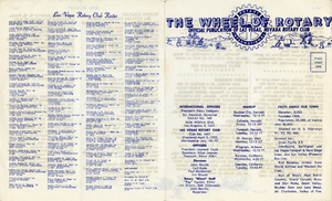
The Wheel of Rotary Las Vegas Rotary Club newsletter, January 26, 1950
Date
Archival Collection
Description
Text
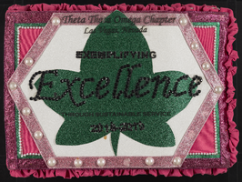
Alpha Kappa Alpha Sorority, Theta Theta Omega Chapter scrapbook: "Exemplifying excellence through sustainable service"
Date
Archival Collection
Description
From the Alpha Kappa Alpha Sorority, Incorporated, Theta Theta Omega Chapter Records (MS-01014).
Mixed Content
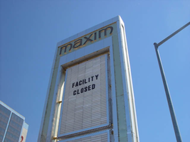
Photographs of Maxim signs, Las Vegas (Nev.), 2002
Date
Archival Collection
Description
Site address: 160 E Flamingo Rd
Sign owner: Premier Interval Resorts
Sign details: The Maxim is located just east of the Bourbon Street, in close proximity to Bally's Hotel Casino. The Maxim is no longer operating, and is fenced off from further inspection. The signage that is seen entails building signs, the original pylon, and the porte cochere
Sign condition: Structure 2 Surface 2
Sign form: Pylon; Fascia; Porte-cochère
Sign-specific description: Building: The tower itself contains the logo and giant text spelling the name of the establishment, on one side of the building. The tower is mirrored and reflective, thus matching the porte cochere and pylon, and reserves to collect its building signage to one end of the tower. The tower, which runs east/west, and faces north/south contains the signs on the east end structure. On the north and south faces of the building, giant red channel letters run vertically along the block surface. The letters look to be lined on the interior of the letters with neon. The logo can be seen on the east face. Pylon: The pylon sign is essentially a giant vertical monolith of a rectangle, divided into several different sub-shapes. The center of the monolith is occupied by cabinets which fill in most of the shape, with a small gap bordering the cabinet. The cabinets are treated the same as the square arch, and flush with the surface. The cabinets are very subtle and create an illusion of one solid object. The entire outer arch shape and interior cabinets are bordered with polished aluminum. The interiors surface of the arch are covered in polished gold aluminum panels. The lining of the incandescent bulbs on the sign is interesting. On the arch the incandescent bulbs are on the interior return width of the aluminum borders. With this configuration, the bulbs sit parallel to the surface instead of perpendicular. The main marquee text is aligned horizontally across the top in gold channel letters with red plastic faces. The letters blend with the gold surface nicely. The interior cabinets are internally lit with plastic faces. There are two cabinets, the larger of the two, occupying the upper part the interior space of the monolith. Incandescent bulbs line the exteriors of the cabinets, sitting back on a recessed edge. Porte Cochere: The porte cochere is unique, opting to rise high above the surface of the pavement. The prismatic design crafted in polished aluminum, interlocks into a pattern suitable to the space which it resides. The recesses in which the decoration resides are separated by a small width of structure. This pattern of giant recesses, matched with the prismatic design in each negative space create a hulking environment high above the head in proud stature. Along the peak edge of the pieces of the prism, rods protrude every foot or so, creating a row of arms holding incandescent spheres.
Sign - type of display: Neon; Incandescent
Sign - media: Steel; Plastic
Sign - non-neon treatments: Graphics; Paint
Sign animation: chasing, flashing
Sign environment: The Maxim is now closed, and stands in marked contrast to its neighbors a bit to the east--the famous "Four Corners" of Flamingo and the Strip, and next to the trendy Meridian at Hughes Center apartment complex.
Sign designer: Maxim letter design: Kenneth Young, Porte Cochere; Lighting: Jack Dubois Pylon sign: Marnell Corrao
Sign - date of installation: 1977
Sign - thematic influences: The influence of the Maxim hotel was 70's Vegas design refined to simple geometric forms and curved linear logo's. The pylon was completely sheathed in polished aluminum, as well as the underside of the porte cochere being polished gold aluminum. The use of the popular 70's material is used extensively throughout the design. Letters hung over the main entrance, as well as signage on three sides of the building. Other examples of the material can be seen elsewhere but not as extensively. The only property that comes close is the pylon for usage of the material is the Westward Ho.
Surveyor: Joshua Cannaday
Survey - date completed: 2002
Sign keywords: Chasing; Flashing; Pylon; Fascia; Porte-cochère; Neon; Incandescent; Steel; Plastic; Graphics; Paint
Mixed Content
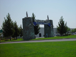
Photographs of McCarran Field signs, Las Vegas (Nev.), 2002
Date
Archival Collection
Description
Site address: 6005 S Las Vegas Blvd
Sign owner: McCarran International Airport
Sign details: On the south end of the Strip, the very last sign on the east side before you arrive at Sunset Blvd Facing West the two stone pylons are set approximately fifty feet off of the street at the end of a dual-lane stretch of pavement separated by an island of grass. The banner marquis between the two pylons stretches over this area of grass.
Sign condition: Structure 3 Surface 3 Lighting 4 Notes: The surface of the pylon is in good shape considering its age and its environmental condition. It is essentially left to fend for itself against the elements, being in the flat expanse of an airfield. The stone, plaques, and paint treatment are all badly worn, with the stone pylons, appearing the least worn.
Sign form: Pylon
Sign-specific description: The original McCarran Air Field entrance is constructed of two masonry pylons sit on an island of grass, and serve as an entrance to the private Hughes executive airport terminal. Each individual tower is adorned with a propeller attached to the front and the representation of a bird's wing crowning the tops Both facets are constructed of steel. When facing the structures the left has a plaque on the bottom section with the inscription "1948" while the one on the right reads "Las Vegas". Between the two pylons a stretch of text in white channel letters and white neon, large text in the old "Frontier style text reads McCarran Airport. The signage sits independently on top of a sturdy connecting steel cabinet, which supports the words "executive terminal" in smaller channel letters, with white neon. The cabinet is a painted blue horizontal plane tapering wider on either end in rounded profile patterns. The wings are outlined in pink neon, while the propellers are outlined in rose neon with a circle of white in the middle.
Sign - type of display: Neon
Sign - media: Masonry
Sign - non-neon treatments: Paint
Sign animation: none
Sign environment: The surrounding area is rather dark due to the wide expanse of the airfield which stretches out behind the sign. It truly is a last marker for the end of the Strip, and stands alone. Even though it is in close proximity to the major strip resorts of the Four Seasons as well as the Mandalay Bay and various small roadside hotels, it seems to stand in solitude.
Sign - date of installation: 1948
Sign - date of redesign/move: The blue banner of steel and white letters was added after its initial construction.
Sign - thematic influences: The masonry pylons are constructed in an adobe style masonry reminiscent of the desert landscape surroundings. Designed for the airport, the appendages stem obviously around the theme of flight. This may be denoted from the propeller and the wing. The juxtaposition of the two elements, one being the method of flight in nature and the other man made, serves as a reminder of mans fascination with flight. The added banner's text is in the pioneer fashion of the original Last Frontier.
Sign - artistic significance: Opened in 1948, the sign was intended for use as a marker for the endpoint of the Strip. " It was part of the city's expanding policy creating a jet-scale entrance for the city," Jorg Rudemer from Lost Las Vegas. Artistic significance also lies in the combination of materials using masonry, steel and, neon. The piece successfully combined these elements to provide an architecturally solid design by day, which was cohesive with its surrounding landscape. A metamorphosis takes place at night as the sign is transformed into a glowing specter of its daytime counterpart. The surrounding area is rather dark as the pylon rises up out of the darkness as a neon marker for the property. The illuminated wing and propeller stand out as the significant and successful partners in the world of flight.
Surveyor: Joshua Cannaday
Survey - date completed: 2002
Sign keywords: Pylon; Neon; Masonry; Paint
Mixed Content
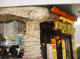
Photographs of Grand Canyon Experience signs, Las Vegas (Nev.), 2002
Date
Archival Collection
Description
Site address: 3791 S Las Vegas Blvd
Sign owner: M H & K Enterprises
Sign details: The Grand Canyon Experience is directly North of the MGM next to the GameWorks complex. Above the clear glass entrances to the outdoor scenic tour's facility is a large building front designed marquee design, as well as a smaller version over the entrance facing northwest.
Sign condition: Structure 5 Surface 3 Lighting 5
Sign form: Fascia
Sign-specific description: The marquee reads Grand Canyon in yellow channel letters outlined in yellow neon, the insides are orange with orange neon in the middle. Experience is spelled in a cursive style orange channel letters with orange neon and incandescent bulbs on the interior. The two texts are supported on a steel framework of interconnecting steel pipes. The shape looks as if it is a bow pointed toward the ground. Two steel poles run vertically approximately 16 feet from the edge of the support system. They run toward the ground against the wall and stop to square i18" tall 10 inch deep, yellow, message box with a black surface. The neon whit von inside of the red channel letters reads "Shop Grand Avenue" in an all caps Arial style text. Two halogen lamps project off of the top of the sign and illuminate a three-dimensional sculpted caricature of a hiker. The entire structure is supported on the West wall of the building. The logo itself spans seventy-eight and a half feet at it's widest and is approximately twenty-three feet tall. Below the NW entrance to the establishment, a smaller version of the giant marquee sign sits above the door. Aluminum channel letters spell " Grand Canyon," with orange argon on the interiors. Below that sits a three-tiered back lit message panel. It forms a shape reminiscent of an upside down step pyramid. The top section actually contains yellow argon in nine-inch cursive text spelling experience. The three stepped cabinet is of a polished aluminum. The text sits on sheet metal raceways.
Sign - type of display: Neon; Incandescent; Backlit
Sign - media: Steel; Fiberglass; Plastic
Sign - non-neon treatments: Paint
Sign animation: Chasing, flashing, oscillating
Notes: The text, which resides on the southern wall and reads "Casino," is filled with incandescent bulbs that all illuminate at the same time, and oscillate. They then shut off at the same time, and then repeat. The raceways of incandescent bulbs chase each other while the neon, which surrounds the back lit, plastic, screens on this wall flash on then off. The bottom two raceways sandwiching the reflective panel chase from left to right, while the remainder of the raceways surrounding the signs, run right to left. The incandescent bulbs on the pylon chase each other gracefully up the length of the pylon. The animation is patterned so as to appear as if a section of several bulbs are pulsing its way up the towers, hugging the edge of the bulbous tops. The raceways continue around the east face of the building. The umbrellas in the plaza behind the pylon, also are animated with incandescent bulbs chasing each other downward along the raceways.
Sign environment: The Grand Canyon Experience is a rather large sign but is dwarfed by the immense MGM pylon just to the south of it. It is accented by faux rock serving as door jambs for the actual entrances.
Sign manufacturer: Mikohn Lighting and Sign
Sign - date of installation: 2000- 08
Sign - thematic influences: The actual theme of the sign is correspondent to that of the business, which the sign advertises. The text does not appear to be associated with any particular theme, but hold a style complimentary to each other. An element of theming is still evident with the faux rock facade, and the sculpted figure on top of the sign.
Sign - artistic significance: If not significant for simply combining different elements to create a completely self-contained sign, it fits into the movement in Las Vegas's history, which is geared more toward the family. The cartoon-like representation of a hiker, the fake rocks, the bright colors, and location in a strip mall, which centered on such establishments as Gameworks and M&M World, all point to the conclusion that families are welcome.
Surveyor: Joshua Cannaday
Survey - date completed: 2002
Sign keywords: Fascia; Neon; Incandescent; Backlit; Steel; Fiberglass; Plastic; Paint
Mixed Content

neo000058-004
Date
Description
Notes: The text fascia sign just to the north of the giant glass display illuminates with a background of neon tubing which chases from right to left. The pattern of colors running across are a sequence banks of red, pink purple and blue vertical neon tubing, chase each other creating a pulsating movement of the individual banks of these colors. While they are animating, the channel letters, which spell "Riviera," are dark and proceed to light up one letter at a time. Once all lit they remain lit, until the background stops with all the bars illuminated. Once all the bars are lit, the interiors of the letters turn off one at a time starting on the far right. The giant mirrored section of the building, advertising for the Splash stage show. The sequence can be best described from its dramatic powering up. The entire sign comes alive with a rapid upward chasing pattern covering the surface of the tower. Once alive, small white bulbs grow out of the end of the space on the top and bottom of the end of the "Splash" text. Once all the previous elements are illuminated, the letters in the Splash logo shut off, illuminate one letter at a time in red neon, then the white neon figure of the seal balancing a ball on the end of it's nose, lights up. The neon bordered circular raceway, then animates with the bulbs in the center chasing each other in a clock-wise sequence. Once lit the vast array of white bulbs grown out of the end of the text begin to gently oscillate, as well as the sparse assortment of floating and attached incandescent bulbs on the wall of the tower. Once the bulbs animate for a few seconds, the entire wall chases downward, becoming black as night, except for the Slash logo text. Underneath the entire front side of the western face of the Riviera, the incandescent bulbs which cover the entire surface oscillate in a wildly, while the ringed entablature on the wall animates quietly in comparison. The multi-colored rings of neon tubing chase each other from left to right, chasing the distance then repeating. The sequence then changes direction and chase from left to right. Creating the tops and bottoms of the entablature are raceways lined with incandescent bulbs that chase each other from left to right. On the surface of the west wall incandescent bulbs chase each other along the raceways which run horizontally around the internally lit cabinets. The small vertical raceways which run inside the clear plastic boxes chase each other from top to bottom, but all the raceways are offset to each other by a few seconds. At the North end of the property the signage for the Riviera's, "Nickeltown" gambling attraction, dominates the corner. He animation on the large exploding sculptural fountain lights up the entire corner. The three rocketing pieces of steel are wrapped in repeating bands of their corresponding colors of blue, purple and yellow. All three simultaneously chase from bottom to top, until completely lit. Then they begin to animate in a chasing pattern from bottom to top. After a few moments of chasing, they chase from beginnig to top once more, leaving al the tubes dark in its path. Along the circular entablature, which runs the circumference of the top mass of the fountain, incandescent bulbs chase each other from right to left, but only on the side which faces the casino. The wall, which faces north, contains the multicolored banks of vertical neon bars that animate in a specific pattern. They chase each other from right to left, then only the purple neon tubing illuminates, they chase again, then only the blue neon tubing illuminates. They chase once again, and then only the gold bars illuminate. The bars chase yet one more time, then all of the tubing illuminates, thus ending the sequence. The main entrance to nickel town is adorned with neon text and images, but only the stars higher up on the wall itself animate. The incandescent bulbs elevated above the surface of the mirrored wall, animate in a soft oscillating pattern, adding the twinkling effect. The larger five pointed stars are animated on the interior by a center of oscillating incandescent bulbs, while concentric neon shapes echo outward in the yellow, purple and blue colors seen on the adjacent wall facing north. The smaller snow-flake esque star shapes are alive with oscillating incandescent bulbs. Looking upward along the north face of the closest tower, the giant vertical, Riviera channel letters animate one character at a time, oscillate then shuts off.
Epilogue: Nevada Southern University Yearbook, 1967
Date
Description
Yearbook main highlights: schools and departments; detailed lists with names and headshots of faculty, administration and students; variety of photos from activities, festivals, campus life, and buildings; campus organizations such as sororities, fraternities and councils; beauty contest winners; college sports and featured athletes; and printed advertisements of local businesses; Institution name: Nevada Southern University, Las Vegas, NV
Mixed Content

Transcript of interview with Barbara Agonia by Suzanne Becker, September 17, 2007, September 25, 2010, & October 2, 2007
Date
Archival Collection
Description
When Barbara Agonia arrived in Las Vegas in 1969 to pursue a Master's Degree in English, the University of Nevada Las Vegas was barely ten years old and the population of Las Vegas was just approaching 160,000 residents. At the time, she was 35 years-old and it was a decision and move that would forever change her life and higher education in Clark County. Barbara Agonia was born in St. Louis, Missouri, in 1934 to Robert Lewis Klinefelter and Suzanne Carter Klinefelter. At the time of Barbara's birth, her father worked for Brown Shoe Company in St. Louis. The family moved to Bunker Hill, Illinois when Barbara was still an infant. This was Mr. Klinefelter's hometown where a portion of the extended family still resided. In the late 1930s, Mr. Klinefelter got a job in a brass mill near Alton, Illinois, and he commuted there daily. When the United States entered World War II, Mr. Klinefelter tried to enlist in the army, but was rejected because he had two small children and because he worked in an essential industry. He decided to work in a non-essential industry and took a job at Montgomery Ward in Oak Park, Illinois. Barbara was in the third grade that year. Still unable to enlist, Mr. Klinefelter moved the family to Wabash, Indiana, and began working for General Tire in 1943. They moved to Logansport, Indiana in 1947. Agonia recounts that education has always been a significant part of her life, with the importance of a good education stressed in her life from early childhood forward. After graduating from high school in Logansport, Indiana, she attended Hanover College in southern Indiana, enrolling in 1952. Her educational experience at Hanover included a year studying abroad at the University of Exeter in Devonshire, England—an experience which Agonia credits as further cementing her commitment to education and her love of literature and language. She graduated from Hanover in 1957 with a double major in English and speech/ theater. Agonia spent her first years out of college teaching high school English, speech, and theater in west central Illinois and the next eight in northern Illinois. A little over ten years into her career, at the age of 35, she decided to pursue a Master's degree in English. Her sister, Martha, who at the time lived in Las Vegas, suggested checking into programs offered at the city's newly formed university. In 1969, Barbara moved to Las Vegas and enrolled in the English Department at UNLV. As Agonia was completing her degree in 1971, the community college system in Nevada was emerging and seeking faculty for the up and coming institution. Curious to know more about the new system, Agonia scheduled a meeting with the person in charge of hiring. Two hours later, she walked out with a contract in her hand, one of eight new faculty members at Clark County Community College, now known as College of Southern Nevada. In her early years with the college, Agonia did a great deal of public speaking on behalf on the newly formed system, promoting the new institution and reaching out to potential students. At the same time, she taught full course loads in composition and literature, and eventually became chair of the English department. Her new position and public speaking work on behalf of the college not only provided her contact with the local Las Vegas community, it ultimately became the catalyst in spurring her passion for community involvement, particularly working on behalf of women within the community. • • Vll As the 1980s approached, Agonia became actively involved in rape crisis education, at the urging of Florence McClure. Then, in 1980, Agonia was again in on the ground floor of community programming, when she and Beverly Funk, at the urging of Judith Eaton, the president of Clark County Community College, established a Women's Center on campus. The Center was initially set up to help women in a variety of life circumstances, including women who were wanting to return to school or who were new to the process of school altogether. The center eventually became the Re-Entry Center offering skill development, tutoring programs, and other forms of assistance for anyone interested in returning to school. In addition to her involvement in and commitment to public education, Agonia has also been involved in the Soroptimist International organization for business and professional women who work to improve the lives of women and girls in local and international communities. In the Las Vegas area, Soroptimist International of Greater Las Vegas worked to establish the Rape Crisis Center and the Center for Domestic Violence, which later became SafeNest. Agonia has been working with the organization since 1982. Through Soroptimist International, she also became involved in Friends of the Nevada Wilderness, an organization devoted to designation and long-term protection of Nevada's wilderness areas. As the representative for Soroptimist International, she traveled to Washington to lobby and testify in front of the senate for the establishment of Great Basin National Park. Agonia's work in the Las Vegas community over the past forty years has been significant. She counts Florence McClure, Geneva Douglas, and Jean Ford amongst her greatest influences. As she notes in her oral history, "I learned how to be radical from those women." She happily embraces the label of radical. This attitude surfaces throughout Agonia's experiences and recollections, and underscores her work and dedication to the interplay of local education and women's issues within Nevada.
Text
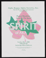
Alpha Kappa Alpha Sorority, Theta Theta Omega Chapter 74th Far Western Regional conference program and reports
Date
Archival Collection
Description
From the Alpha Kappa Alpha Sorority, Incorporated, Theta Theta Omega Chapter Records (MS-01014) -- Chapter records file.
Text

