Search Results

Transcript of interview with Joy Snyder by Lisa Gioia-Acres, December 17, 2009
Date
Archival Collection
Description
Joy Snyder, born and raised in Pennsylvania, is the daughter of Jean Dasinto and stepdaughter of Ray Hunt. Though she was raised thinking she was an only child, she shares that as an adult, she was contacted by an aunt who gave her information about an Austrian half-sister. The half-sister had tracked the family through WWII records on her biological father! Joy was raised in a very large extended Italian family (her maternal grandmother was first-generation Italian) and became the first in her family to attend college. She had decided early on that she wanted to be a nurse and chose to attend Temple University Hospital in Philadelphia. She recounts memories of her earliest work there, which began the first week of school. After graduation from nursing school, Joy married her childhood sweetheart, William (Bill) Snyder. They made the move to Las Vegas in 1978 and Joy found work right away at Desert Springs Hospital. She worked there about six months and then took maternity leave after the birth of their second son. When she returned to work, it was at Sunrise Hospital (early 1979) in the newborn nursery. Joy comments on many aspects of her career, including the informal approach to health care, the effects of desert climate on mothers and newborns, and the changes she has seen at Sunrise Hospital. She also comments on adoption practices in Las Vegas, drug-addicted babies, and cultural attitudes that appear during the birthing process. Today Joy is retired and her husband Bill is close to retiring. They feel a strong connection to Las Vegas (Bill has a school named after him), but maintain a second home in New York for their trips back East to visit friends and family. They also keep up with various community activities, including book clubs and running clubs for the children at William Snyder Elementary School.
Text
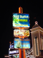
Photographs of Boardwalk Holiday Inn signs, Las Vegas (Nev.), 2002
Date
Archival Collection
Description
Site address: 3750 S Las Vegas Blvd
Sign owner: MGM Mirage
Sign details: The Boardwalk Holiday Inn is one of the most distinctive front faces which incorporate an extreme amount of signage condensed into a replica version of an eastern sea board. Since it is designed to be reminiscent of a boardwalk, the pedestrian element is a wooden planked walkway lined with shops and establishments. The area is separated from the traffic by landscaping and concrete elements. All the shop fronts designs, some false and others functioning, are all linked into the casino. The structure is encrusted with raceways and incandescent bulbs, as well as a ridiculous amount of internally lit signage that advertising everything from hotel promotions, to prices of drinks. Headed from the south, headed north, the parking garage can be seen, set back from the street slightly west, adorned with signage on it's face. The casino begins at full throttle aesthetically, with raceways lining almost every edge, contrasting tones of paint, murals, advertisements, neon and incandescence all come together. Above the first main entrance of the property, is a vibrantly lit, gold clad entrance canopy. Above that a non-functioning skeletal mass of a roller coaster comprises the majority of the southern end of the property. Neon letters are located on the vertical plane created by the rise of the tracks. The carnival style treatments of raceways and propaganda run north until the path is interrupted by the vertical pylon sign which is integrated into the architecture of the Boardwalks facade. The tracks continue above the property, all along the length interrupted by the main pylon and addressed with replica's of Ferris wheels with actual mannequins, dressed and riding inside of them. Just pas the main pylon the facade is transformed into a giant three dimensional clowns head smiling joyfully. The facade continues a short distance past the clown's head, and rounds off just as it began.
Sign condition: Structure 4 Surface 4 Lighting 4
Sign form: Pylon; Fascia
Sign-specific description: Upon the eastern face of the parking garage signage is created upon the top edge of the outside wall. The top edge of the wall is fashioned into a sculpted entablature of signage, complete with rising crests and swooping scrolls, which match the fashion of decoration for the facade as well. On each side of the surface possess a pair of internally lit signage. One is square, and the next is rectangular, brandished with black text. The center portion of the sign is closed in with a pair of half columns which rise out of the surface of the entablature to flank the main text. These half columns are laced with an outline of an orange and yellow neon tubing. The Text is spelled in two different lines of channel letters lined with red neon on the interiors. The First line reads "Boardwalk Casino" the second line reads "Free Parking." The two lines span the length of the space provided and are separated by a sculpted dividing line. The tower just to the north of the parking garage is suited with channel letters that spell "Boardwalk' and are filled with red neon. Roller coaster: The sign which resides over the first entrance is similar that of the paring garage, for it is placed in a raceway bordered fascia. The large channel letters are placed in the center and spell " Casino." The first and last letter are the smallest in size, and gradually climb up toward the middle. They are filled with incandescent bulbs and outlined with a border of red neon. Pylon: The rest of the facade is necessary for the theme to really work, but the tallest and brightest piece is the main pylon sign. The pylon sign is essentially a triangular shape which rises straight up into the air. If a unilateral triangle, then one point is facing east with the two sides meeting at this eastern most point, being designated for the main signage. Three visible posts support the sign, glowing with the reflectivity of the gold polished underside which is striped with rows of incandescent bulbs, running perpendicular to the entrance. Three bands of pink neon wrap the two visible sides, just above the pedestrians head. Just above that there is a narrow LED message center which scrolls text, which also wraps the two sides. The majority of the sign occupies the space between this small border and the main marquee. This rectangular portion each one of the pylons sides can be broken down into four horizontal sections. The bottom two comprise the bottom 1/3 of the sign, and are internally lit advertisements ninety-nine cent offers and the Surf buffet. The middle section, being the tallest, contains a large LED message center, flanked on both sides by multi colored neon tubes crafted into the shapes of stars. The stars vary in size and spread up the small wings of the reader board with surprising fluidity. Compared to the rest of this section, the top remainder is rather plain. A plain surface is accented with a pair of words spelled in channel letters. The word hotel is spelled on the left and filled red neon. They are separated by a small, circular, channel filled with green neon. The word on the right is spelled in the same lettering except it is filled with green neon. The space above that is occupied by the main logo for the establishment. A black field supports large white channel letters that are filled with white neon. Then black field is closed in on all sides by scrollwork shapes created out of incandescence and neon. The white and yellow luminescence, takes the form of a double arched section resembling an "E" or a sideways "M" or "W." The top sweeps upward creating an arched top. A top the main array of signage there are three smoke stacks arranged in a triangular formation, with one at the very front of the edge of the sign and two flanking them in the distance. When looking at the sign directly at the face, it appears as if there are a pair for either side. Spanning the distance between the two smoke stacks is an LED reader board lined on both the top and bottom edge with blue neon. An arch of raceways lined with incandescent bulbs loops over the reader board. A large pylon is designated for the Surf Buffet as well. On the northern end of the property a tall pylon sign faces north/south, and stands lined with red neon. The vertical post supports three internally lit cabinets. The post itself, if viewed directly from the top, would be in an "X" or cross formation. Vertical bars of red neon run up the length of the pole, creating a striping effect. The three cabinets are arranged sitting one on top the other, with a small space in between each. The group all differ in size to an extent, with the two lower cabinets being similar sized, horizontal rectangles, and the top cabinet being the largest. They all have raceways lining the exterior faces with chasing incandescent bulbs. The faces are brightly illuminated colored plastic, with the main cabinet being an advertisement for the Surf Buffet. The others advertise for similar amenities.
Sign - type of display: Neon; Incandescent; Backlit
Sign - media: Steel; Plastic; Fiberglass
Sign - non-neon treatments: Graphics; Paint
Sign animation: Chasing, flashing, oscillating
Sign environment: The environment created by the Boardwalk is an effective use of the theme on the pedestrian to create the environment. The Boardwalk is located next to a CVS Pharmacy to the south, which was erected during the course of the survey. When the pedestrian walks upon the Boardwalk, it is busy and noisy, and very attraction getting. When passing into the front side of the property, a pedestrian is assaulted with sounds and noises that are difficult not to pay attention to. This feeling created by the conglomerate of signage and utter blazing advertisement, is almost like a roller coaster. Person comes out the other side noticeably aware of the silence and darkness contrasted to the presence of the property.
Sign - thematic influences: The theme surrounding the Holiday Inn Boardwalk is that of a seaside boardwalk. Most preferably it is modeled to be representative of the eastern seaboard Coney Island. The facade therefore is most logically themed after the environment experienced on such property, amusement rides, and boisterous circus type lighting loom overhead, while wooden planks exist under the foot of the pedestrian. The walk is lined with coin-operated gadgets and games, while store fronts are found spaced between glowing advertisements. A faux Ferris wheel and roller coaster create an overhead arena of stylized representation that can best be suited as one of the more unique on the strip. It is not often that you see mock people lined up inside of a non- functioning Ferris wheel. Oddly enough, this phenomenon can be linked to couple of still existing Las Vegas Strip properties. When Caesars Palace completed its initial main pylon sign, actual life sized replicas of Centurions and Romans were placed at the base of the statue. They were painted to appear as life like as well. This is one example. The next is the living embodiment of this representation of figures, and their role as evolved on the strip as well. Madame Tussaud's wax museum can be said to be the incarnation of the use and fascination with such a medium. While the exteriors of such properties have shifted toward classic statuary, the life like figure has assumed the role of art form, as an elevated attraction in today's strip community. The noisy facade finds a place for three dimensional sculptural elements, such as the clowns face, which further adds to the "Coney Island" "Atlantic City" theming. Event though, the theme, and very nature of the construction of the Boardwalks facade are dictated by its name, it set early precedence for this interactive miniature city facade as present in many of the major player among the strip. e.g. The Paris, NY NY, Bellagio, Aladdin, etc.
Surveyor: Joshua Cannaday
Survey - date completed: 2002
Sign keywords: Chasing; Flashing; Oscillating; Pylon; Fascia; Neon; Incandescent; Backlit; Steel; Plastic; Fiberglass; Graphics; Paint
Mixed Content
UNLV University Libraries Collection of Boulder City, Hoover Dam, and Lake Mead National Recreation Area Maps and Brochures
Identifier
Abstract
The UNLV University Libraries Collection of Boulder City, Hoover Dam, and Lake Mead National Recreation Area Maps and Brochures (1927-1998) primarily contains regional maps, brochures for local points of interest, and subdivision plat maps of Boulder City, Lake Mead, and Hoover (Boulder) Dam.
Archival Collection

Jean Munson oral history interview: transcript
Date
Archival Collection
Description
Oral history interview with Jean Munson conducted by Vanessa Concepcion, Cecilia Winchell, and Stefani Evans on November 30, 2021 for Reflections: The Las Vegas Asian American and Pacific Islander Oral History Project. Jean discusses her childhood growing up in Guam, the nursing career path of her parents, and her decision to pursue an "unconventional path" as a comic book artist. She talks about her education at the University of Nevada, Las Vegas, her passion for the Asian American Pacific Islander (AAPI) community within Las Vegas, and her roles in community activism and leadership. Jean also shares her current pursuits as a podcaster of Bruha Baddies, co-owner and printer of Plot Twist Publishing, and co-founder of the Comic and Zines Festival.
Text
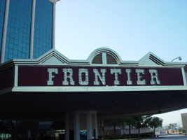
Photographs of Frontier signs, Las Vegas (Nev.), 2002
Date
Archival Collection
Description
Site name: Frontier Hotel and Casino
Site address: 3120 S Las Vegas Blvd
Sign owner: Phil Ruffin
Sign details: The New Frontier Hotel and Casino sits south of the Stardust, on the east side of Las Vegas Blvd The Frontier main pylon still remains at the south end of the property, a short distance from the southeast, near the porte-cochere. A rear port e cochere also resides on the east side of the building . Like so many other properties the Frontier is composed of a low-rise building accompanied by, another higher rise structure, and a tower of rooms. A parking lot sits on the north end of the property, denoted by a small, double-sided pole sign. Two porte-cocheres adorn on the southeast and west sides of the property, as well as the famous pylon outside the eastern porte- cochere.
Sign condition: Structure 4 Surface 4 Lighting 4
Sign form: Pylon; Porte-cochère; Fascia
Sign-specific description: A parking lot sits on the north end of the property, denoted by a small, double-sided pole sign. It is a simple rectangular cabinet, with a small steel circular cabinet on the top east edge of the sign, and a triangle on the west edge of the height, pointing west. The two are connected by a long horizontal section, which runs along the top of the cabinet. The circle, arrow, and connecting pieces are lined with incandescent bulbs. The surface if the Frontier is reserved, not holding too many exterior references to a western theme, besides the actual script of the logo, and wood paneling of the overhangs, little else is there to support the theme. Just south of the parking lot and on the west side of the strip, the Frontier is separated from the sidewalk with a large section of green lawn, and a guard of tall palm trees against the east face of the building. Tall windows occupy most of the wall separated by columns of brick. The structure continues south and juts east to create an entrance, with a text logo above the door with brass edges and a wood panel facade. The three sided entrance is two tiered flat font design, with the lower half being taller, fit with a backlit message board. The top half is shorter in height, and plays home to the polished channel letters spelling "Frontier," and filled with incandescent bulbs. The surface of the top half of the facade is a rusted brown color, referencing panels of exposed wooden construction. The bottom edge of the entire face of the sign is a protruding brass geometric edge, as well as being the device that separates the two parts of the sign. The top edge of the top section is brass treatment also, but is crafted into different forms along its path. Directly in the center of the front face, there is an arch curving over a set of vents. The two sides are treated with an pointed triangular shape. The porte-cochere is located just south, if you follow the property, pointed toward the southeast extending off of the building. The northeast and southwest sides of the porte- cochere are lined on the top and the bottom with the same protruding, square molding, rising into a long, low rising arch, peaking in the center of the sign. The center portions of the sides are the same rusted brown tone seen on the entrance mentioned earlier. Suggestions of the paneling are evident at the edges. The "Old west" font, polished channel letters spell out "Frontier" on the rust facade. Each is filled with incandescent bulbs, and outlined in neon. Most impressive about the covered area is the space occupied by the ceiling. The underside of the port-cochere is separated by four large, deep, recessed rectangles with mirrored walls. The walls slope into another smaller recessed rectangle rising straight up only a sort distance before stopping. Standing directly underneath the section, it is seen as a smaller rectangle located within a larger one. Both rectangles are lined on all edges by polished gold raceways, and incandescent bulbs. The open space is occupied by multi armed, ornate brass chandelier. Each arm is adorned with faux gas lanterns. The arms are curved in a quite extreme fashion, making the piece appear more as an organic shape, or a creature such as an octopus. The centers are adorned with decorative silver spheres. Over the doors to the casino a large backlit message center panel, curves with the radius of the face of the building. The brown and polished metal edges of the sign combined with the incorporation of the architecture of the building, gives it a reserved, streamlined look. South of here the building grows in height and becomes a series of tall windows that create the wall. Following the property around to the building's west side, another porte-cochere can be seen. An eight-sided post serves as a valet station. The facade of the roof is treated as the entrance on the east side of the building. Protruding square brass edges form borders for polished channel letters filled with incandescent bulbs. Text is contained within the southwest, southeast, and western panels. Frontier is spelled in the properties font on both the southeast, and western sides. The southwest side reads "Parking" in the company's font, but is flanked by "self" and "valet," in smaller plain white channel letters filled with neon. The western and southeastern sides are crafted with the top edge of the pediments being an arch flanked by two triangle shaped rooflines. Elements also seen elsewhere over the other entrances. Looking up, facing this porte-cochere, the tower of rooms looms high overhead. Signage is located on all four sides of the tower. The northeast and southwest sides of the tower hold giant channel letters that spell "Frontier" with the interior being a reflective orange material. The facade is a giant replication of the two sides of the southeast and western sides of the multisided porte-cochere below. A giant polished metal framework, with a rounded arch flanked by two A frame roof lines, as well as the rust colored background hold the letters. The text is filled with incandescent bulbs. Along the northwest and southeast sides of the tower "Frontier" is spelled vertically down the face of the building in the distinctive channel letters. They too are filled with incandescent bulbs and finished orange on the inside. The famed main pylon sign for the frontier still stands in good repair, as reminder of Las Vegas past. It is located in the south side of the Frontier property facing north south. The two-sided sign is essentially pair of close set steel legs joined by an arch at the top to create one continuous shape. The steel is treated in a pastel pink coloring lined on both edges with a double row of incandescent bulbs. The inner portion of the arch contains three elements. The small cabinet at the top holds the image of the Frontier "F" logo. The edge of this cabinet is painted yellow, with a white internally lit face below that a long cabinet runs the length of the remaining space to the ground. The interior of the cabinet has been cut away to form a pattern of repeated circular holes down the length of the cabinet. This portion has been painted a teal color, with the edges lined with incandescent bulbs. In the space inside of the circles a continuous string of star shapes, reminiscent of the Stardust star emblems, are crafted in yellow painted steel and laden with small incandescent bulbs. The shape is interrupted twice with the main marquee logo for the establishment as well as well as a large internally lit message center. Both portions are not solid, double faced cabinets, but four single faced cabinets. The design is also seen in the Westward HO pylon. The bottom section message center can divided into essentially six parts: four individually denoted sections for vinyl lettering, and two steel panels with an animated neon silhouette of a cowboy riding a mechanical bull. The bottom half of the cabinet is one portion of the collection of section, with a thin, one letter width portion running the length of the cabinet, separating the sign into two halves. The top half is another section flanked by the two steel panels containing the bull rider. The middle portion contains crafted red vinyl logo the "Gilley's" establishment. A thin, one letter space cabinet, emerges out of the top of the sign, running a bit shorter than the length of the cabinet. The panel with the rider is actually three separate images, crafted with gold neon stacked on top of another in different positions to allow the three-stage animation process of the rider to be realized. Fashioned out of red neon text is written in the same text as the Frontier wall logo's above and below the rider. The word "Ride" sits above and the phrase "The Bull" is below the rider. He entire width edge of both the North and South sides are encrusted with yellow incandescent bulbs. While the bottom half of the pylon is dominated by the message center, a bit further up on the structure is the main marquee logo. The green steel cabinet is a rectangular with added elements of shape and design. The ends of the plane are slightly curved back into space, with the actual surface of the shape rising into a small pointed crest in the center. Across the surface of the cabinet the word "Frontier" is spelled in the "Western Font" in channel letters. The letters are outlined in neon and filled with incandescent bulbs. The surface of the cabinet is striped horizontally with tubes of red neon.
Sign - type of display: Neon; Incandescent; Backlit
Sign - media: Steel; Plastic
Sign - non-neon treatments: Graphics; Paint
Sign animation: Chasing, flashing, oscillating
Notes: The incandescent bulbs inside the text reading "Paris" on the balloon oscillate rapidly.
Sign environment: Sitting north of the Fashion Show Mall and, south of the Stardust, the Frontier seems to create its own environment upon an expansive property. The expansive sidewalks, healthy landscaping, and clean, reserved faced, make the Frontier more akin to the larger corporate establishments such as the Mirage, or Monte Carlo. It is quite the dominant presence on the west side of the street, for the east side is the vacant lot where the Desert Inn used to reside. The Frontier stands clean and strong amongst the chaos of the Fashion Show construction, and the empty lot across the street.
Sign manufacturer: Ad-art (Pylon), Sign Systems, Inc (facade and porte-cochere)
Sign designer: Bill Clarke (Pylon) Brian K. Leming (facade and porte-cochere)
Sign - date of installation: pylon: 1967 porte-cochere and facade 1981
Sign - date of redesign/move: The face of the Frontier was remodeled in an effort to keep up with the larger corporate casinos in 1998, but retained the main pylon, tower signage, porte-cochere signage and various entrance signs.
Sign - thematic influences: The obvious theme of the hotel is a Western, cowboy/pioneer themed establishment. The facade of the structure was at one time engulfed in the theme, but has slowly over time changed to compete and fit in with the ever-changing Las Vegas strip. Vestiges of the Western theme are present in the remaining elements of the porte-cochere, side entrances, the tower fascia and roofline, as well as all the text, including the main pylon. Other establishments that carry the much popular theme throughout Las Vegas history, include the Westward Ho, The Golden Nugget, The Bonanza, Hotel Apache, the Boulder Club, and the Pioneer Club.
Sign - artistic significance: In 1967, the Frontier sign was considered the tallest sign on the Strip. The 24 x 84 foot signature panel proved to be one of the largest at the time as well. Charles Barnard's scale model displayed at the Montreal Expo and his design of the seventeen-foot tall logo cabinet, were instrumental in Ad-Art landing the contract for the establishment. (Barnard) The cabinet and center scalloping used to incorporate animatronics, turning in concert.
Surveyor: Joshua Cannaday
Survey - date completed: 2002
Sign keywords: Chasing; Flashing; Oscillating; Pylon; Porte-cochère; Fascia; Neon; Incandescent; Backlit; Steel; Plastic; Graphics; Paint
Mixed Content
Epilogue: UNLV Yearbook, 1986
Date
Description
Yearbook main highlights: schools and departments; detailed lists with names and headshots of faculty, administration and students; variety of photos from activities, festivals, campus life, and buildings; campus organizations such as sororities, fraternities and councils; beauty contest winners; college sports and featured athletes; and printed advertisements of local businesses; Institution name: University of Nevada, Las Vegas
Mixed Content
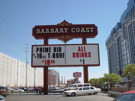
Photographs of Barbary Coast signs, Las Vegas (Nev.), 2002
Date
Archival Collection
Description
Site address: 3595 Las Vegas Blvd
Sign owner: Coast Casinos
Sign details: Just West of the Maxim, on a strip of property adjacent to the Flamingo, the Barbary Coast appeared in 1977 dressed in Burgundy and gold with full wrap mansard canopies and simulated Tiffany glass fascias. YESCO's Brian Lemming drew from 19th century woodblock alphabet styles to create the new distinctive logo style. It has since earned the nickname Barbary Coast Block. Lemming's bull nose design paired two opposing drum elements, which tapered near midpoint and were ringed with traceries of traveling lamps alternating with decorative panels outlined in red neon. Other signage includes a pylon sign on Flamingo Rd., textual wall an logo signs, as well as LED display screens. The screens are located near walkways, which extend north/south across Flamingo road, and east/west across Las Vegas Blvd
Sign condition: Structure 5 Surface 5 Lighting 5
Sign form: Pylon; Fascia
Sign-specific description: Upon the south elevation of the building, eight foot tall channel letters spell the "Barbary Coast" logo. South of the main logo, two square poles support the Barbary Coast pylon, which is on the north side of Flamingo, facing east/west. The two legs play Atlas to a double backed, internally lit, message cabinet, with vinyl lettering. The two legs protrude through the top of the sign for a short distance before the main logo cabinet begins. It is about half the size in height of the internally lit message center and containing more elements of design. "Barbary Coast" is spelled in white channel letters and filled with incandescent bulbs, in the Barbary Coast text. The edges of the letters are actually narrow channels that house tubes of gold neon. The neon and the channels actually create the designed curves of the fonts. The centers of the top and bottom edges of the cabinet, are crafted into protrusions in the rectangular shape. They are placed cleverly shallow into the surface to almost seem as if they are resting on the width of the cabinet instead of being part of it. Being completely treated in a gold paint on its width edge, which are parallel to the straight portion of the cabinet edge width, helps with the illusion of the sections being separate entities. Orange and burgundy scroll works are graphically placed into the faces of these protrusions in the panel to finish them off. Headed west at the beginning of the actual property, the first vestiges of signage hangs above the parking garage. A triangular back lit cabinet is finished in polished gold aluminum with a raceway acting as an element, on the edge pointing north, then transforms into a raceway arrow pointed toward the entrance of the garage. The famed overhang creates an arch over the garage entrance, which is recessed all the way back to the main wall of the structure. Mirrors create the surface of the wall at the back of the tunnel vault, of the recessed arch. Upon the mirrored surface a channel logo for the "Drai's" nightclub, hangs quite high above the pedestrian's head. The logo is bordered with green neon and filled with incandescent bulbs. The entire sign is a shallow channel letter design allowing enough room for the depth of the bulb. Another arch and tunnel, with a mirrored wall, is located just west of the first arch. It plays host to a brass colored chandelier with spherical lamps. At ground level underneath the middle section of the famed structure where the main logo text resides, we have an entrance to the casino with a cabinet denoting that over the door. The cabinet is a mirrored face with a gold aluminum polished raceways with incandescent bulbs. The text spelling "Hotel Casino Entrance" is in gold polished channel letters and filled incandescent bulbs. Underneath the canopy, the faux Tiffany glass is separated on its edges by gold polished raceways with incandescent bulbs. Past the main entrance another tunnel arch is formed just past the "B" in Barbary main logo and plays host to a different entrance. It too has a brass chandelier and a mirrored cabinet of the same design as the afore mentioned entrance. The only difference is the text. It spells " Casino Entrance." The rest of the treatments for this sign are identical to the first entrance. On the northeast corner underneath the bull nose, a giant brass chandelier hangs in the center, supported with a multisided, mirrored column. The corner of the building is also an entrance. The west side of the building boasts two wall signs. The south side of the building plays host to the main logo text for the Barbary Coast facility, upon the fascias architecture. The middle of the sign is a long low rise arch. Giant channel letters spell Barbary Coast, above the row of faux stained glass squares, and stand independently away from the wall. They are filled with incandescent bulbs and bordered with neon. The interiors are painted red and the exteriors are treated in gold. Rows of red, vertical, neon tubes line the face of the facade behind the standing channel letters. Continuing around the corner upon the west face of the building the facade continues for a short stretch north after the corner rotunda. The wall of the building itself is where another Barbary Coast text logo resides It's large, and occupies a good portion of the area of the wall. The letters are designed in the same fashion as the letters on the pylon, painted white on the interior and treated gold on the exterior. Above and below the text, two cabinets crafted into scrollwork, similar to those seen on the pylon yet are not attached to the text. The cabinets are slightly recessed providing room for a border of gold neon. Below that and above an LED screen another logo for Drai's, as seen on the south elevation, hangs on the wall. A pair of LED screens flank the NW corner, on the west and south faces of the building. The LED screen on the south wall is at the end of an elevated walkway, that crosses Flamingo. The West wall LED is appropriation to the elevated walkway crossing Las Vegas Blvd, on the west side of the building as well. Another Drai's logo sign shares the west wall also. Along the fascia awning that wraps around the building graphics adorn the rounded panels, which simulate the Tiffany glass. Vertical raceways separate these panels. Neon borders each one of these panels as well as polished raceways along the top and bottom. Incandescent bulbs line all the raceways, as well as the outer edges of the underside. On the North wall of the building, just around the corner from the signage on the west face of the building, another Barbary coast logo wall sign is located on the top portion of the building. It is accompanied by an internally lit, plastic, message board, with vinyl lettering. The two pieces together sit in a slightly recessed niche, so that the board and the text are flush with the rest of the building. The letters are painted yellow on the inside, possess incandescent yellow incandescent bulbs on the interior. The letters are also treated with the same gold finish seen throughout the establishment.
Sign - type of display: Neon; Incandescent; LCD; LED
Sign - media: Plastic
Sign - non-neon treatments: Graphics; Paint
Sign animation: Flashing, chasing, oscillating
Notes: All incandescent bulbs on the polished, gold raceways, chase each other down their entire lengths. The bulbs inside the polished channel letters oscillate as well. The incandescent bulbs in the Drai's sign also oscillate. The pylon sign: The background of vertical red neon bars chase each other from the outer ends, until the entire background is illuminated, then the incandescent bulbs inside the letters chase down and fill the letters, which then oscillate. The text then steady burns, chases downward, then leaves the letters dark in it's path. Once the letters are dark then the neon background curtains open chasing from the center to either end. Once the neon goes dark, then the empty text chases downward again, oscillating, then chasing from top to bottom leaving the letters dark in it's path. The text on the west side of the building lights up one letter at a time, then oscillates, and then steady burns. The letters then oscillate again, shut of for a split second. Then each individual word lights up one at a time. "Barbary" then "Coast," "Barbary" then "Coast" again. On the last sequence of the individual words lighting up they stay lit, and turn off one letter at a time. The main marquee: Each letter of the main marquee illuminate one letter at a time, then oscillate. While they are oscillating then, the vertical red neon bars chase from either end of the sign illuminating each bar in it's path. Right before it reaches the center, the letters shut off briefly then lights up "Barbary" then "Coast," then they both oscillate. They shut off briefly lighting up one word at a time again, oscillating once more. This pattern runs one more time while the red background chases from the center to the ends leaving the rest dark in it's path. The letters remain dark until the red bars regenerate, by chasing outward from two different spots, meeting in the center and extending to the ends. By the time the background is regenerated then the text begins to light up again, rapidly from left to right as if saying "Barbary Coast." It does this a total of three times. All the while the background is opening and closing from the two spots a total of three times. Once the background regenerates one more time, then the letters flash off then on, then alternates with the background. Letters, then background, letters, then background, then off. The two are not lit at the same time during this exchange, but take turns lighting up.
Sign environment: The Barbary Coast sits in the unique intersection of Flamingo Rd. and Las Vegas Blvd, once the main four corners of the Strip. The majority of the surface of the building is located on Flamingo road, just off the strip, headed east. Walking underneath the covered awing on the south side of the building, the constantly pulsating incandescent bulbs and various sounds of the casino bombard a pedestrian, enveloping one until you meet the end of the establishment at either end. The large drummed corner, makes the rest of the adjacent facade hard to miss. Directly south, across Flamingo the Bally's multimedia pylon behemoth resides, and the vibrant Flamingo, sits snugly next to the Barbary Coast's north side. The two establishments of Flamingo and Bally's are considered akin, due to such close proximity. Once you exit the Barbary Coast, utilizing the portals on the west side, headed north, you are almost automatically standing in a small courtyard, in the grasp of the attractive, bright, pink and orange plumage of the Flamingo Hilton. The pedestrian traffic flows from one establishment to the next with ease.
Sign manufacturer: YESCO
Sign designer: Brian K. Leming (bull nose and wrap around fascia)
Sign - date of installation: 1977
Sign - date of redesign/move: LED screens were added to the west and south faces of the building
Sign - thematic influences: A good phrase to describe the thematic influence would be that of a turn of the century ambiance. With it's logo style derived from 19th century woodblock prints, canopies covered in faux Tiffany glass, ornate brass tracings, and distinctive mansards, the decor is reminiscent of a bustling turn of the century gala or festival.
Sign - artistic significance: The full wrap fascia design by Leming, is reminiscent of older Fremont street properties such as the Golden Nugget, and Binion's Horse Shoe. The pedestrian passes underneath the pulsating signage, next to the entrances to the facility. It is a significant design maximizing the space with its design.
Surveyor: Joshua Cannaday
Survey - date completed: 2002
Sign keywords: Chasing; Oscillating; Flashing; Pylon; Fascia; Neon; Incandescent; LED; LCD; Plastic; Paint; Graphics
Mixed Content
Red Rock Canyon National Conservation Area Records
Identifier
Abstract
The Red Rock Canyon National Conservation records (1965-2007) contain information about the Red Rock Canyon National Conservation Area (previously the Red Rock Canyon Recreation Lands). It largely consists of newspaper clippings on a variety of events related to Red Rock Canyon from 1965 to 1998 with the bulk from the 1980s and 1990s. The records also include Bureau of Land Management documents pertaining to interpretive efforts, visitation statistics, and law enforcement reports. Also included are the newsletters (1990-1998) and volunteer training manual of the Friends of Red Rock Canyon, a non-profit volunteer organization.
Archival Collection
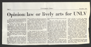
University of Nevada, Las Vegas law school establishment: correspondence, newspaper clippings, and reports
Date
Archival Collection
Description
Folder from the Jean Ford Papers (MS-00025) -- Political materials file.
Text

Horacio Lopez oral history interview: transcript
Date
Archival Collection
Description
Oral history interview with Horacio Lopez conducted by Laurents Bañuelos-Benitez on September 05, 2018 for the Latinx Voices of Southern Nevada Oral History Project. In this interview, Lopez discusses his early life in Cordova, New Mexico and arriving to Las Vegas, Nevada in 1963. He recalls the establishment of the Nevada Association of Latin Americans (NALA), the increase of Latin Americans in the southwest region of the United States, and his role as the Vice President of the Latin Chamber of Commerce. Lastly, Lopez discusses his thoughts on the future of Latino culture.
Text