Search Results
Meeting minutes for Consolidated Student Senate University of Nevada, Las Vegas, December 05, 1994
Date
Archival Collection
Description
Text
Meeting minutes for Consolidated Student Senate University of Nevada, Las Vegas, March 31, 1997
Date
Archival Collection
Description
Text
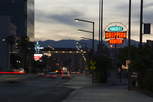
Photographs of Somerset Shopping Center sign, Las Vegas (Nev.), April 4, 2017
Date
Archival Collection
Description
Site address: 252 Convention Center Dr
Sign owner: Somerset Shopping Center CO LP
Sign details: This shopping center was built in 1966 next to the Somerset House Motel. The motel was demolished in 2011; however, the shopping center is still around. Some businesses that reside in the shopping center include: a hair and nail salon, a dry cleaners, an Ethiopian restaurant, and a place for banquets to name a few.
Sign condition: 5, the sign is in beautiful condition.
Sign form: Pole
Sign-specific description: This pole sign sits close to the street so motorists and pedestrians can view it easily. A light blue pole holds up the main portion of this sign, as well as back lit plastic signs on each side of the pole that display what businesses are in the shopping center. The sign itself consists of a yellow ring that encircles three other signs. This yellow circle is covered in incandescent light bulbs that chase when the sign is lit up at night. Also, extending from this yellow circle are light blue poles in various lengths that are surrounded in neon tubes and oscillate around the yellow circle when the sign is lit up at night. In the center of the circle are three signs. The first sign is an elongated oval that has the word "SOMERSET" painted on it in bold white letters with a black outline on a light blue background. Neon tubes outline these letters. The sign under that is a large rectangle shape with each of the sides curving inward. There are also incandescent light bulbs lining the outer edge of this sign that chase when the sign is lit up. This sign has the word "SHOPPING" painted on it in bold white text against a red background. Neon tubes outline each letter of this word. The sign under this is another elongated oval that is a similar size to the "SOMERSET" sign. This sign reads "CENTER" in bold white text against a red background and neon tubes outline this word as well.
Sign - type of display: Neon, Incandescent light bulbs and back lit
Sign - media: Steel and plastic
Sign - non-neon treatments: Plastic portion of sign
Sign animation: Oscillating, chasing
Sign environment: The shopping center that this sign is located in is about a block away from the Strip and is near a few monumental properties. It resides close to the Las Vegas Country Club, the Las Vegas Convention Center, and the Guardian Angel Cathedral that Paul Revere Williams designed. It is down the road from casinos like the Wynn, Encore, Circus Circus, and the Westgate. The Peppermill, an iconic Las Vegas restaurant, is down the street as well. It was down the street from the Stardust when that property was up and running.
Sign manufacturer: YESCO
Sign - date of installation: Most likely 1966, 1960's era
Sign - thematic influences: The design of this sign is very eye-catching from the road, as are many roadside signs throughout this era of the city. Bold text and light animation make this a standout sign to attract motorists and pedestrians to the shopping center.
Sign - artistic significance: This sign appears to have some Googie design influence throughout it. It has a space age feel to it because of the yellow circle that surrounds the "SOMERSET SHOPPING CENTER" signs and the blue poles that extend from it also add to this style.
Survey - research locations: Assessor's Page http://www.clarkcountynv.gov/assessor/Pages/searchbybusinessname.aspx , Vintage Las Vegas website http://vintagelasvegas.com/search/somerset , Roadside architecture website http://www.roadarch.com/signs/nvvegas.html
Surveyor: Lauren Vaccaro
Survey - date completed: 2017-09-01
Sign keywords: Neon; Incandescent; Backlit; Steel; Plastic; Oscillating; Chasing; Pole sign
Mixed Content
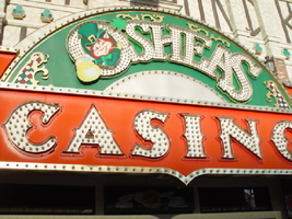
Photographs of O'Shea's signs, Las Vegas (Nev.), 2002
Date
Archival Collection
Description
Site address: 3555 S Las Vegas Blvd
Sign owner: Park Place Entertainment
Sign details: O'Shea's Casino is located just north across a small driveway from the Flamingo. The small but busy facade is a small, yet busy stop along the Las Vegas Strip. The exterior signage consists of two corner signs, a blade sign, hanging off of the west face of the building, a main entrance sign, backlit screens as well as various images laden with neon. All of these create a flashing display of luminescence all just above the pedestrian's head.
Sign condition: Structure 5 Surface 5 Lighting 5
Sign form: Fascia
Sign-specific description: O'Shea's Casino is located just north across a small driveway from the Flamingo. O'Shea's theme and signage is influenced by Irish culture and imagery, integrated into the forms of signage along the Las Vegas Strip. The building design itself is influenced by traditional European housing imagery, generalized with other elements of architecture also. One example of this is the coloring, exposed wooden beams and narrow rooflines over treated windows, which suggest styles seen in classic European architectural imagery. Examples of other elements such as sculpted windowsills and exterior molding are more akin to neoclassical than the Irish pub or cottage. A small blade sign hangs in the center of the structure facing north /south. Attached off of the building by two poles, the double sided cabinet is designed with a circular portion at the top that transforms along it's bottom edge into length portion of the "blade" that continues down to a rounded bottom. The Circular portion serves as the "O" in O'Shea's. The exterior of the signs width is finished in a polished gold aluminum surface. The top portion continues into a full circular space in the front where the backlit image of the O'Shea's leprechaun mascot resides in it's center. The image has a circular green neon border at the edge of the cabinet and is set into a field of incandescent bulbs, which occupy the remaining space in the face of the "O". Incandescent bulbs also run around the edge of a face on a gold raceway. Channel letters run vertically down the face of the blade spelling the remaining "Sea's" of the title. Each letter is filled with incandescent bulbs, and bordered on it's exterior in green neon. The remainder of the space, which comprises the surface of the sign, is a green material. The entire edge of the rest of the sign is also bordered with incandescent bulbs. Below the blade sign, the main entrance for the establishment is denoted by the large, arched, marquee logo, and wall sign for the casino. The arch shape is bordered by gold polished raceways, with the interior space where the O'Shea's logo is written in a bowed, horizontal arrangement with the "O" and "S" being the biggest letters in this group. The same back-lit leprechaun figure which is present in the blade sign, in seen in the "O" of the logo. The letters are of channel design and filled with incandescent bulbs. Gold scrollwork adorns the green background above and on the sides of the logo. An entablature, running the length below the arch, reads "casino" in channel letters filled with incandescent bulbs and bordered with green neon. The orange background in contained on the bottom edge with a gold polished raceway, which sharply curves into a downward point at the very center. All the raceway edges of the sign are lined with incandescent bulbs. Flanking the wall on either side of the main entrance are two backlit message centers with vinyl lettering. They also are bordered with incandescent bulbs, strewn upon polished raceways. To the south toward the Flamingo Casino, a corner marquee sign faces toward the southwest. The message center on the right of the main entrance essentially continues its shape wrapping in radius fashion all the way around the corner. As the entablature wraps the corner, the color changes to a section of black, containing the channel letters hung at a slight angle, spelling the words " Hall of Fame," in cursive text. Small stars in channel design adorn the black background. On the left of the text, O'Shea's is painted in red paint, in a cursive script at a similar angle as the premier text. Neon is shaped over the surface of the letters to allow it to be spelled in light. The word "Casino" is spelled on the right hand side, and treated in the same fashion. A top the black portion of pediment, the sign continues with it's corner finishing, rounded marquee, containing the text, "Magic & Movie," in a three lined arrangement. Putting the two signs together the appropriate title for the advertisement of the attraction is read "Magic and Movie Hall of Fame." The channel letters on the top portion are filled with neon and treated white on the interiors. The edge of the cabinet is treated with white bull nose borders, sandwiching a field of pink holding two tubes of contoured neon. At the peak of the sign a small element reminiscent of a fan, created using a multi layered box, uses different levels receding into space, with the center blade at the front of the sign. The sections are lined with gold raceways and incandescent bulbs, with the center blade being horizontally striped with tubes of neon. Two small gold finished gargoyle statues flank either side of the theatre-esque entrance. Underneath the overhang created by the corner sign, polished aluminum element creates a sloping drum shape above the door. This drum is divided into sections by gold polished raceways. The flat portion, which returns to the ceiling of the overhang is adorned with painted images of clovers, encircled in rings of green neon. This section is reminiscent of the top section of the corner drum of the Barbary Coast. The black pediment along the south portion of the building., abruptly changes to the orange color seen on the main entrance. Along the south wall section of the pediment green pan channels in the shape of clovers hang, lined on the interior with neon. A small sign denoting parking is also present. Another corner entrance is located on the north end of the property, facing northwest. It too has the rounded corner entrance and logo sign. Slightly different than the main entrance, the same "Casino text and structure is seen on the orange pediment above the door, as well as the channel logo with the mascot located in the letter "O." A three-sectioned panel with swooping wings and an arched center creates the field for the main logo. A more busy section of two dimensional scrollwork sits below the neon filled text. The wings of the top section a recessed panels with checkerboard design behind that. Each side of the entire top section is book ended with two small square posts. Three small miniature spires line the very top, and the same inverted drum shape sits underneath the door. Street posts reside on the sidewalk outside.
Sign - type of display: Neon; Incandescent; Backlit
Sign - media: Steel; Plastic
Sign animation: Chasing, flashing, oscillating
Notes: All of the bulbs, which reside in the fascia signs which designate entrances, oscillate rapidly. The entrance sign a bit closer to the north end of the property also contain the pan channel star shapes, with incandescent bulbs in the center. The bulbs which, reside on the widths edge of the small pole sign at the south end of the property, oscillate giving a twinkling effect. The main pylon's animation is rather simple considering the amount of lighting. Bulbs which create the dazzling background chase each other upward to the very point, then once they reach the top, each letter light up from left to right, one at a time, then off one letter at a time. The letters all turn on simultaneously while, while the background chases up, leaving the lights off in its trail. The text then shuts off as well. The small incandescent bulbs lacing the background of the main body of the sign oscillate subtly, twinkling themselves. Each letter of the text contains a single row of incandescent bulbs, just inside the border of the red neon. This row is always on in a chasing animation from left to right even when the letters are dark. The animation for the three sided, pole sign, at the north end of the property is adorned with sparkling animation as well. The purple bulbs, which create the border of the main base, chase each other from bottom to top, and the star shape in the center is filled with oscillating incandescent bulbs. The bulbs, which also encrust the bottom surface of the cabinet, oscillate as well. The incandescent bulbs, which adorn the background of the text portion of the sign, also sparkle with a soft random oscillating pattern. The stars which sit on top of the cabinet, animate in a random, non descriptive fashion. The inner star shaped pans oscillate with incandescent bulbs, and the neon borders flash on then off, in a clumsy random order. The three-sided sign also rotates, one of the few animatronic signs on the Strip.
Sign environment: Being essentially part of the Flamingo, O'Shea's is only separated by a small drive, producing the easy traffic flow from the north entrance of the former. The north of O'Shea's on the immediate vertical explosion of the front tower/porte cochere of the Imperial Palace. It is easy to say that O'Shea's is sandwiched in between two giants, assuming its place as the charming gap between the Flamingo and the Imperial Palace which is quite a bit more pedestrian friendly. Traveling north on the east side of the strip, O'Shea's is not hard to miss at all
Sign - date of installation: Original date of installation 1989. The southwest, and northwest corner signage were added at a later date
Sign - thematic influences: O'Shea's centers around the theme of the Irish pub, utilizing various imagery to get support the design. The color green is used extensively in the main signs color scheme while the ever-popular image of the folkloric leprechaun illuminated it a cartoon form upon the pylon. The green pan channels, which are shaped like shamrocks, are place along the exterior wall, an obvious reference to the St. Patrick's Day Holiday as well a reference to good luck. ( example: the four-leaf clover, luck of the Irish.) Luck is something synonymously associated with an industry such as gaming. Gold is also used extensively with the exterior referencing the infamous pot of gold associated with the lore of leprechauns. The actual structure itself is constructed with elements which suggest a European rustic cottage.
Surveyor: Joshua Cannaday
Survey - date completed: 2002
Sign keywords: Chasing; Oscillating; Fascia; Neon; Incandescent; Backlit; Steel; Plastic
Mixed Content
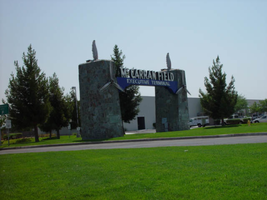
Photographs of McCarran Field signs, Las Vegas (Nev.), 2002
Date
Archival Collection
Description
Site address: 6005 S Las Vegas Blvd
Sign owner: McCarran International Airport
Sign details: On the south end of the Strip, the very last sign on the east side before you arrive at Sunset Blvd Facing West the two stone pylons are set approximately fifty feet off of the street at the end of a dual-lane stretch of pavement separated by an island of grass. The banner marquis between the two pylons stretches over this area of grass.
Sign condition: Structure 3 Surface 3 Lighting 4 Notes: The surface of the pylon is in good shape considering its age and its environmental condition. It is essentially left to fend for itself against the elements, being in the flat expanse of an airfield. The stone, plaques, and paint treatment are all badly worn, with the stone pylons, appearing the least worn.
Sign form: Pylon
Sign-specific description: The original McCarran Air Field entrance is constructed of two masonry pylons sit on an island of grass, and serve as an entrance to the private Hughes executive airport terminal. Each individual tower is adorned with a propeller attached to the front and the representation of a bird's wing crowning the tops Both facets are constructed of steel. When facing the structures the left has a plaque on the bottom section with the inscription "1948" while the one on the right reads "Las Vegas". Between the two pylons a stretch of text in white channel letters and white neon, large text in the old "Frontier style text reads McCarran Airport. The signage sits independently on top of a sturdy connecting steel cabinet, which supports the words "executive terminal" in smaller channel letters, with white neon. The cabinet is a painted blue horizontal plane tapering wider on either end in rounded profile patterns. The wings are outlined in pink neon, while the propellers are outlined in rose neon with a circle of white in the middle.
Sign - type of display: Neon
Sign - media: Masonry
Sign - non-neon treatments: Paint
Sign animation: none
Sign environment: The surrounding area is rather dark due to the wide expanse of the airfield which stretches out behind the sign. It truly is a last marker for the end of the Strip, and stands alone. Even though it is in close proximity to the major strip resorts of the Four Seasons as well as the Mandalay Bay and various small roadside hotels, it seems to stand in solitude.
Sign - date of installation: 1948
Sign - date of redesign/move: The blue banner of steel and white letters was added after its initial construction.
Sign - thematic influences: The masonry pylons are constructed in an adobe style masonry reminiscent of the desert landscape surroundings. Designed for the airport, the appendages stem obviously around the theme of flight. This may be denoted from the propeller and the wing. The juxtaposition of the two elements, one being the method of flight in nature and the other man made, serves as a reminder of mans fascination with flight. The added banner's text is in the pioneer fashion of the original Last Frontier.
Sign - artistic significance: Opened in 1948, the sign was intended for use as a marker for the endpoint of the Strip. " It was part of the city's expanding policy creating a jet-scale entrance for the city," Jorg Rudemer from Lost Las Vegas. Artistic significance also lies in the combination of materials using masonry, steel and, neon. The piece successfully combined these elements to provide an architecturally solid design by day, which was cohesive with its surrounding landscape. A metamorphosis takes place at night as the sign is transformed into a glowing specter of its daytime counterpart. The surrounding area is rather dark as the pylon rises up out of the darkness as a neon marker for the property. The illuminated wing and propeller stand out as the significant and successful partners in the world of flight.
Surveyor: Joshua Cannaday
Survey - date completed: 2002
Sign keywords: Pylon; Neon; Masonry; Paint
Mixed Content
Photographs of Trader Bills sign, Las Vegas (Nev.), April 18, 2017
Date
Archival Collection
Description
The Trader Bills gift shop-turned-motorcycle shop sits at 328 Fremont Street inside the Fremont Street Experience. Information about the sign is available in the Southern Nevada Neon Survey Sheet.
Site address: 328 Fremont St
Sign owner: Marshall Family, LP
Sign details: The current building was constructed in 1943 (Assessor). Trader Bill's was a Western style leather and gift shop (RoadsideArch.com). The business has been located downtown at least since the 1930's or 1940's (UNLV digital photo collection) but possibly longer (Shemeligian, 1997). The store moved to its present location by the 1950's (RoadsideArch.com). It later became the Jewelry Outpost and Las Vegas Harley-Davidson (Shemeligian).
Sign condition: Condition 3-4. Cabinet and lights are in good condition. The paint on the street side of the sign is extremely faded.
Sign form: Blade
Sign-specific description: The metal cabinet is shaped like an upside down "L" which points toward the building. The cabinet is painted red. On the side of the sign facing Las Vegas Boulevard the paint has faded almost completely to reveal the earlier blue paint. An arrow-shaped metal cabinet runs along the Fremont Street side of the sign. The sides of the arrow are painted yellow. Three rows of yellow incandescent light bulbs cover the shaft of the arrow and nine rows cover the feathers and head. "Trader" is spelled out in yellow san serif channel letters which run horizontally across the top of the sign. The interiors of the letters are outlined in white neon tubing. "BILLS" (no apostrophe) runs vertically down the sign in the same channel lettering. Rungs run along the spine of the sign and what appears to be a ladder is located under "Trader" at the top of the sign. A plaque on the back of the arrowhead near the last "S" in "BILLS" has a YESCO logo and states "THIS SIGN IS THE PROPERTY OF THE YOUNG ELECTRIC SIGN COMPANY-{illegible] 876-8080
Sign - type of display: Neon and incandescent
Sign - media: Steel
Sign - non-neon treatments: Incandescent
Sign environment: This location is in the Fremont Street Experience on the corner of Fremont street and Fourth Street. It is across the street from Neonopolis and surrounded by other gift shops.
Sign manufacturer: It has the YESCO logo and states that it is the property of YESCO though it is not confirmed if they manufactured it.
Sign - date of installation: Circa 1960's
Sign - date of redesign/move: The sign is probably from the 1960's (Roadside Architecture). A photograph circa 1960 shows the sign painted dark blue with yellow letters (Classic Las Vegas, n.d.). A photograph from 1991 shows the color scheme unchanged (Classic Las Vegas). The sign was painted its current red color by 2006 (RoadsideArch.com).
Sign - thematic influences: The building is Western style brick and weeping mortar.
Survey - research locations: Clark County Assessor Classic Las Vegas. (n.d.). A brief history of Fremont Street, North side of the street, Third to Fourth. Retrieved from http://classiclasvegas.squarespace.com/downtown-history/2007/5/3/a-brief-history-of-fremont-street-cont.html RoadsideArcitecture. Las vegas Signs, Trader Bill's. Retrieved from http://www.roadarch.com/signs/nvvegas3.html Shemeligian, B. (1997 June 19). Landmark downtown shop changes focus. Las Vegas Sun. Retrieved from https://lasvegassun.com/news/1997/jun/09/landmark-downtown-shop-changes-focus/ UNLV Digital Collections. (n.d.). Film transparency showing Trader Bill's souvenir shop in Las Vegas, circa 1930s-1940s. Retrieved from http://n2t.net/ark:/62930/d1nk2c
Surveyor: Mitchell Cohen
Survey - date completed: 2017-08-14
Sign keywords: Blade; Neon; Incandescent; Steel
Mixed Content
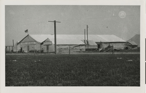
Photograph of the Hotel Las Vegas (Las Vegas), 1905
Date
Archival Collection
Description
The Hotel Las Vegas was the first hotel in Las Vegas, a tent set up for people who came to participate in the land auction. Managed by Pop Squires." Transcribed from back of photo: "Hotel Las Vegas 1905. Hotel Las Vegas, built by Las Vegas Trading Co. in 1905 was located on North Main Street between Stewart and the creek across from Woodards Down Town Camp on grounds later occupied by Elwells Ware House. All canvas and lumber used in building was cut to size and holes bored in Los Angeles, ready to be bolted together on arrival in Las Vegas. Hotel had 20 rooms. Floor space was 40 x 130 ft. Kitchen and Dining Room are seen next door to Hotel on the right. This Hotel was managed by Chas. P. Squires. Photo by Eddie Gillette, 1905." Transcribed from Special Collections sheet: "Selling of L.V. First L.V. Hotel pic cap. First Las Vegas Hotel -- The Hotel Las Vegas was made ready for the first buyers of real estate at the 1905 auction when the Las Vegas Trading Co., managed by Charles (Pop) Squires, opened the registry. All canvas and lumber used in building was cut to size and holes bored in Los Angeles, a prefab forerunner. Hotel Las Vegas boasted 20 rooms and was regarded as the top 'night spot' of its day."
Site Name: Hotel Las Vegas
Address: 1 Fremont Street
Image
Las Vegas High School Reunion Biography Collection
Identifier
Abstract
The Las Vegas High School Reunion Biography Collection (1983) consists of class rosters, biographies of graduates, and photocopies of original programs from the four graduating classes of 1933 to 1936. The information specific to each year is compiled into its own handmade scrapbook. The materials were created for the 50th reunion of the class of 1933, and the event also included the classes of 1934, 1935, and 1936.
Archival Collection
Willard H. George Furrier, Ltd. Scrapbooks
Identifier
Abstract
The Willard H. George Furrier, Ltd. Scrapbooks are comprised primarily of three leatherbound scrapbooks containing black-and-white and sepia toned photographs taken from the 1920s through 1955. The scrapbooks feature actresses from Hollywood, California wearing furs designed and created by furrier Willard H. George. Actresses of note include Lucille Ball, Rita Hayworth, and Greta Garbo.
Archival Collection
The Vista Group Records
Identifier
Abstract
The Vista Group records are comprised of The Vista Group's legal, financial, and correspondence records from 1986 through 2001. The records include information about real estate developments The Vista Group was involved with in Las Vegas, Nevada. The majority of the records are financial and legal documents related to The Vista Group's ventures.
Archival Collection