Search Results


Photographs of Little Church of the West signs, Las Vegas (Nev.), 2002
Date
2002
2017-08-02
Archival Collection
Description
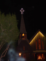
Photos show Little Church of the West signs during the day and at night. Two surveys were conducted to gather information about this sign. One was conducted in 2002 and one was conducted in 2017. PDFs are available for both surveys. See the 2017 survey PDF for additional information that is not included in the object description.
Site name: Little Church of the West
Site address: 4617 S Las Vegas Blvd
Sign owner: Greg Smith
Sign details: The Little Church of the West now resides on the south end of the Strip, along the east side among the smaller roadside hotels. Surrounded with pleasant landscaping the property is a charming and welcome sight among the more barren area of the strip.
Sign condition: Structure 4 Surface 4 Lighting 5
Sign form: Pylon; Fascia
Sign-specific description: There are two specific signs which are significant to the property. The first being the double backed internally lit pylon roadside sign which sits on the east side of Las Vegas Blvd and faces east/west. The 10 feet at its widest, and thirty seven feet tall. The structure consists of a center pole upon which an internally lit plastic sculpted message board sits. Painted in an old west script upon the plastic are the words "Little Church Of The West Wedding Chapel," with painted scrollwork on the top and the bottom of the plane. The entire message board is bordered in neon. Sitting on top of the message cabinet is a small, sculpted apse and bell. The original sign from its original construction still exists atop the actual structure of the Little Church of the West. It is an image of a cross outlined in white neon.
Sign - type of display: Neon; Backlit
Sign - media: Steel; Plastic
Sign - non-neon treatments: Graphics; Paint
Sign animation: none
Sign environment: The property sits among the dying roadside motel environment of the South end of Las Vegas Blvd It stands as on of the properties that is still in good repair. The pleasant landscaping and grass provide a pleasant establishment among the southern strip. It seems to capture the environment it has always tried to attain, of the picturesque country church.
Sign manufacturer: Larsen Sign
Sign - date of installation: It was originally part of William J. Moore's Last Frontier Village, which was assembled in the late 1950's. The current pylon sign was manufactured in 1996.
Sign - date of redesign/move: Originally, it resided in the Las Frontier until it was demolished in 1954. The Little Church of the West stood approximately in the spot where Sax Fifth Avenue is located. When the New Frontier was constructed, it was moved to the east side of the Strip approximately where the Silver Slipper was located. It stood in this location until 1978 when it was moved to the south edge of the Hacienda's property. The property was moved to its current location in 1996.
Sign - thematic influences: The thematic influence of the Little Church of the West draws from its original property which was the Old Western theme of the Frontier Hotel Casino. The Last Frontier Village was assembled from actual Western towns and reassembled on the Last Frontier's Property. With its wooden facade, brown color tones, script and pylon structure, the Little Church of the West rings true with its origins, while still incorporating the subtle elements of Las Vegas such as neon.
Sign - artistic significance: The Little Church of the West is reminiscent of old west theme which extends back to the very beginnings of Las Vegas and which dominated the themes for a period of time. " Before it became filled with themed western architecture, Las Vegas was an actual western town with a Spanish Style train station and false front facades fronting plank sidewalks"-Alan Hess, After Hours Architecture. Such properties, which dominated the early years of Las Vegas, were the Pioneer Club, the El Rancho Vegas, the El Cortez, the Last Frontier, Binion's Horseshoe, and the Silver Slipper.
Surveyor: Joshua Cannaday
Survey - date completed: 2002
Sign keywords: Pylon; Fascia; Neon; Backlit; Steel; Plastic; Graphics; Paint
Mixed Content
Photographs of Gateway Motel sign, Las Vegas (Nev.), March 12, 2017
Date
2017-03-12
2017-08-30
Archival Collection
Description
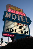
The Gateway Motel sign sits in early evening light at the northeast corner at 928 South Las Vegas Boulevard. Information about the sign is available in the Southern Nevada Neon Survey Data Sheet
Site address: 928 S Las Vegas Blvd
Sign owner: Vinod Soni and Gateway Motel Inc
Sign details: The Gateway Motel dates back to early 1930's and could be considered one of the earliest motels to pop up in Las Vegas. Before the name changed to Gateway Motel it was named as the Gateway Auto Court circa 1930-1946 it was known as the Gateway Auto Court. The first sign was built circa 1930's and their new remodeled sign which is still in use today was built circa 1950's. The 1950's sign was originally painted darker colors and had a larger graphic of a gate. The original 1930's sign has the streamline modern influence that was prominent in 1930's and 40's. The sign itself is a pole sign with a square structure at the top. The font Auto-Court is in pure neon with that fire-red hue; the font is placed in the middle to stand out the most. The word Gateway is on top of Auto-Court in black with black streamline lines surrounding the word. Underneath is a small wooden board hanging probably stating no vacancy. The background color of the square structure is in pure white and the pole is chrome.
Sign condition: The condition of the sign is a 3.5. Some of the neon is not working when it's turned on at night. The paint has some sun/UV damage since it looks faded. The reader board has a stained effect from sun damage.
Sign form: Pylon with three separate signs converged into one.
Sign-specific description: The sign is made out of glass, steel, plastic, and concrete. The color palette is light blue, white and a cream white. The sign is designed in separate sections. The white cream based portion is situated at the top with a gate and bridge illustrative design in glass tubes and neon. The gate itself lights up yellow with red on the side. The font Gateway is larger than the gate and is in the color white when lit up. Underneath the Gateway word is a subliminal directional arrow pointing towards the motel buildings This section is in the color sky blue with the word motel in massive white letters. Underneath the directional arrow is the reader board surrounded by the steel light blue border. The reader board states Free Wi-Fi and HBO. Underneath in the left corner is a small light blue board that states "no vacancy" in neon. These three separate signs are all connected like blocks with a concrete pillar structure holding up the sign. During the evening, the light blue paint is not shown and is just pure black with the neon illuminating the sign.
Sign - type of display: Neon and plastic back lit sign
Sign - media: Steel, plastic and concrete
Sign - non-neon treatments: Plastic back lit portion
Sign environment: This location is on the corner of Las Vegas Blvd and Charleston. This is right next to the original Dona Maria Tamales restaurant.
Sign - date of installation: Circa 1950's
Sign - date of redesign/move: From a 1930's streamline modern sign to a 1950's Mid-Century modern architectural roadside motel sign.
Sign - thematic influences: The sign is influenced by Mid-Century Modern roadside architecture, with the directional arrow as a staple in many motel roadside designs of the 1950's and 60's to accommodate the car consumer era.
Sign - artistic significance: One main trends of the 1950's designs with neon signs is using illustrative motifs with the inclusion of directional arrows to lend to the highway travelers an idea of where the property is located. To make sure these travelers don't miss the establishment in an empty road.
Survey - research locations: Assessor's Page, Roadside Architecture Website http://www.roadarch.com/signs/nvvegas.html , Neon Museum book Spectacular, Vintage Las Vegas http://vintagelasvegas.com/search/Gateway+Motel
Surveyor: Gisselle Tipp
Survey - date completed: 2017-08-30
Sign keywords: Neon; Plastic; Backlit; Steel; Concrete; Roadside; Reader board; Back to back
Mixed Content
Photographs of Travelers Motel sign, Las Vegas (Nev.), 2017
Date
2017-04-18
2017-06-28
2017-08-18
Archival Collection
Description
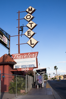
The Travelers Motel sign sits at 1100 Fremont Street in Downtown Las Vegas. Information about the sign is available in the Southern Nevada Neon Survey Data Sheet.
Site address: 1100 Fremont St
Sign details: This location was constructed in 1926. Though the year of when the Traveler's Motel opened in unknown though its sign states, "Your Best Bet In Las Vegas Since 1936'. Though Vintage Las Vegas' blog states that the Traveler's Motel acquired some of their land from the Lucky Motel. Currently the Traveler's Motel is closed and gated up.
Sign condition: 3, the sign is fairly in condition. However, the sign does not light up at night. The sign that used to read "Traveler's Motel" that was affixed to the iron gate-like structure appears to have the majority of its sign taken down or destroyed in recent times.
Sign form: Blade Pole sign and Porte Cochere
Sign-specific description: This sign is attached to the building that belongs to and extends outward to Fremont Street. The lower portion of this sign has the same details on each side of the sign. The top portion of this sign is a trapezoid with "Traveler's" painted on it in a cursive text except for the "t." This is done in white on a rust colored background. Neon is also affixed to "Traveler's." Underneath this is a plastic back lit sign detail the various accommodations of the property, such as: phone, cable T.V., microwave, refrigerators, "totally remodeled rooms," "daily * weekly rental," and "Your Best Bet In Las Vegas Since 1936." Under this is another, smaller trapezoid that has the street address painted on it in bold white numbers with a rust background. Extending from the top portion of this sign is a rust colored pole that has five other poles with various lengths extending out from that towards Fremont Street. Attached to these poles are letters that spell out "MOTEL," the top supports the "M" and each pole following hold each of the others letters to spell out the word. Each of these are diamond shaped plastic, possibly back lit signs. The plastic is off-white and each of the letters is black. The marquee sign attached to the iron gate-like structure that connects one side of the building to the next. This sign is a long, rectangular back lit sign that has a white background and bold red text reading "Traveler's Motel. " This sign also was attached to an longer, yellow rectangle with rounded sided on the left and right side of the sign.
Sign - type of display: Neon, possibly back lit (sign doesn't light up any more)
Sign - media: Steel and Plastic
Sign - non-neon treatments: Plastic back lit portion
Sign animation: The sign is no longer in use; therefore, it is difficult to determine this. There is also no record of the sign having any animation.
Sign environment: This property resides in the area east of the Fremont East District with many new businesses surrounding it, such as: PublicUs, the Bunkhouse Saloon, Chow, The Writer's Block, and 11th Street Records. However, there are quite a few other closed Motel properties that reside near the Traveler's Motel as well.
Sign - thematic influences: The sign is extremely reminiscent of many of the signs from the 50's and 60's that belong to the other motels in the downtown area. The sign has many geometric elements to it that make it appear that it could be from this time period.
Sign - artistic significance: This sign does not have a specific theme to it. However, the plastic figure climbing on the sign stresses that this motel would be for those who do enjoy traveling and adventures. This sign does follow a very basic trend regarding motel signs on Fremont Street. It is attractive and very noticeable to those moving along Fremont Street. The overall design of the sign is very geometric, which is a common aesthetic among signs made in the 50's and 60's.
Survey - research locations: Assessor's Page and Vintage Las Vegas website http://vintagelasvegas.com/search/Traveler+Motel
Survey - research notes: It was difficult to find any history or old photographs of this property.
Surveyor: Lauren Vaccaro
Survey - date completed: 2017-08-18
Sign keywords: Neon; Steel; Plastic; Backlit; Pole sign
Mixed Content
Photographs of Boardwalk Holiday Inn signs, Las Vegas (Nev.), 2002
Date
2002
Archival Collection
Description
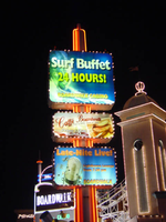
Daytime and nighttime views of the Boardwalk Holiday Inn signs on the Strip. Information about the sign is available in the Southern Nevada Neon Survey Data Sheet.
Site address: 3750 S Las Vegas Blvd
Sign owner: MGM Mirage
Sign details: The Boardwalk Holiday Inn is one of the most distinctive front faces which incorporate an extreme amount of signage condensed into a replica version of an eastern sea board. Since it is designed to be reminiscent of a boardwalk, the pedestrian element is a wooden planked walkway lined with shops and establishments. The area is separated from the traffic by landscaping and concrete elements. All the shop fronts designs, some false and others functioning, are all linked into the casino. The structure is encrusted with raceways and incandescent bulbs, as well as a ridiculous amount of internally lit signage that advertising everything from hotel promotions, to prices of drinks. Headed from the south, headed north, the parking garage can be seen, set back from the street slightly west, adorned with signage on it's face. The casino begins at full throttle aesthetically, with raceways lining almost every edge, contrasting tones of paint, murals, advertisements, neon and incandescence all come together. Above the first main entrance of the property, is a vibrantly lit, gold clad entrance canopy. Above that a non-functioning skeletal mass of a roller coaster comprises the majority of the southern end of the property. Neon letters are located on the vertical plane created by the rise of the tracks. The carnival style treatments of raceways and propaganda run north until the path is interrupted by the vertical pylon sign which is integrated into the architecture of the Boardwalks facade. The tracks continue above the property, all along the length interrupted by the main pylon and addressed with replica's of Ferris wheels with actual mannequins, dressed and riding inside of them. Just pas the main pylon the facade is transformed into a giant three dimensional clowns head smiling joyfully. The facade continues a short distance past the clown's head, and rounds off just as it began.
Sign condition: Structure 4 Surface 4 Lighting 4
Sign form: Pylon; Fascia
Sign-specific description: Upon the eastern face of the parking garage signage is created upon the top edge of the outside wall. The top edge of the wall is fashioned into a sculpted entablature of signage, complete with rising crests and swooping scrolls, which match the fashion of decoration for the facade as well. On each side of the surface possess a pair of internally lit signage. One is square, and the next is rectangular, brandished with black text. The center portion of the sign is closed in with a pair of half columns which rise out of the surface of the entablature to flank the main text. These half columns are laced with an outline of an orange and yellow neon tubing. The Text is spelled in two different lines of channel letters lined with red neon on the interiors. The First line reads "Boardwalk Casino" the second line reads "Free Parking." The two lines span the length of the space provided and are separated by a sculpted dividing line. The tower just to the north of the parking garage is suited with channel letters that spell "Boardwalk' and are filled with red neon. Roller coaster: The sign which resides over the first entrance is similar that of the paring garage, for it is placed in a raceway bordered fascia. The large channel letters are placed in the center and spell " Casino." The first and last letter are the smallest in size, and gradually climb up toward the middle. They are filled with incandescent bulbs and outlined with a border of red neon. Pylon: The rest of the facade is necessary for the theme to really work, but the tallest and brightest piece is the main pylon sign. The pylon sign is essentially a triangular shape which rises straight up into the air. If a unilateral triangle, then one point is facing east with the two sides meeting at this eastern most point, being designated for the main signage. Three visible posts support the sign, glowing with the reflectivity of the gold polished underside which is striped with rows of incandescent bulbs, running perpendicular to the entrance. Three bands of pink neon wrap the two visible sides, just above the pedestrians head. Just above that there is a narrow LED message center which scrolls text, which also wraps the two sides. The majority of the sign occupies the space between this small border and the main marquee. This rectangular portion each one of the pylons sides can be broken down into four horizontal sections. The bottom two comprise the bottom 1/3 of the sign, and are internally lit advertisements ninety-nine cent offers and the Surf buffet. The middle section, being the tallest, contains a large LED message center, flanked on both sides by multi colored neon tubes crafted into the shapes of stars. The stars vary in size and spread up the small wings of the reader board with surprising fluidity. Compared to the rest of this section, the top remainder is rather plain. A plain surface is accented with a pair of words spelled in channel letters. The word hotel is spelled on the left and filled red neon. They are separated by a small, circular, channel filled with green neon. The word on the right is spelled in the same lettering except it is filled with green neon. The space above that is occupied by the main logo for the establishment. A black field supports large white channel letters that are filled with white neon. Then black field is closed in on all sides by scrollwork shapes created out of incandescence and neon. The white and yellow luminescence, takes the form of a double arched section resembling an "E" or a sideways "M" or "W." The top sweeps upward creating an arched top. A top the main array of signage there are three smoke stacks arranged in a triangular formation, with one at the very front of the edge of the sign and two flanking them in the distance. When looking at the sign directly at the face, it appears as if there are a pair for either side. Spanning the distance between the two smoke stacks is an LED reader board lined on both the top and bottom edge with blue neon. An arch of raceways lined with incandescent bulbs loops over the reader board. A large pylon is designated for the Surf Buffet as well. On the northern end of the property a tall pylon sign faces north/south, and stands lined with red neon. The vertical post supports three internally lit cabinets. The post itself, if viewed directly from the top, would be in an "X" or cross formation. Vertical bars of red neon run up the length of the pole, creating a striping effect. The three cabinets are arranged sitting one on top the other, with a small space in between each. The group all differ in size to an extent, with the two lower cabinets being similar sized, horizontal rectangles, and the top cabinet being the largest. They all have raceways lining the exterior faces with chasing incandescent bulbs. The faces are brightly illuminated colored plastic, with the main cabinet being an advertisement for the Surf Buffet. The others advertise for similar amenities.
Sign - type of display: Neon; Incandescent; Backlit
Sign - media: Steel; Plastic; Fiberglass
Sign - non-neon treatments: Graphics; Paint
Sign animation: Chasing, flashing, oscillating
Sign environment: The environment created by the Boardwalk is an effective use of the theme on the pedestrian to create the environment. The Boardwalk is located next to a CVS Pharmacy to the south, which was erected during the course of the survey. When the pedestrian walks upon the Boardwalk, it is busy and noisy, and very attraction getting. When passing into the front side of the property, a pedestrian is assaulted with sounds and noises that are difficult not to pay attention to. This feeling created by the conglomerate of signage and utter blazing advertisement, is almost like a roller coaster. Person comes out the other side noticeably aware of the silence and darkness contrasted to the presence of the property.
Sign - thematic influences: The theme surrounding the Holiday Inn Boardwalk is that of a seaside boardwalk. Most preferably it is modeled to be representative of the eastern seaboard Coney Island. The facade therefore is most logically themed after the environment experienced on such property, amusement rides, and boisterous circus type lighting loom overhead, while wooden planks exist under the foot of the pedestrian. The walk is lined with coin-operated gadgets and games, while store fronts are found spaced between glowing advertisements. A faux Ferris wheel and roller coaster create an overhead arena of stylized representation that can best be suited as one of the more unique on the strip. It is not often that you see mock people lined up inside of a non- functioning Ferris wheel. Oddly enough, this phenomenon can be linked to couple of still existing Las Vegas Strip properties. When Caesars Palace completed its initial main pylon sign, actual life sized replicas of Centurions and Romans were placed at the base of the statue. They were painted to appear as life like as well. This is one example. The next is the living embodiment of this representation of figures, and their role as evolved on the strip as well. Madame Tussaud's wax museum can be said to be the incarnation of the use and fascination with such a medium. While the exteriors of such properties have shifted toward classic statuary, the life like figure has assumed the role of art form, as an elevated attraction in today's strip community. The noisy facade finds a place for three dimensional sculptural elements, such as the clowns face, which further adds to the "Coney Island" "Atlantic City" theming. Event though, the theme, and very nature of the construction of the Boardwalks facade are dictated by its name, it set early precedence for this interactive miniature city facade as present in many of the major player among the strip. e.g. The Paris, NY NY, Bellagio, Aladdin, etc.
Surveyor: Joshua Cannaday
Survey - date completed: 2002
Sign keywords: Chasing; Flashing; Oscillating; Pylon; Fascia; Neon; Incandescent; Backlit; Steel; Plastic; Fiberglass; Graphics; Paint
Mixed Content