Search the Special Collections and Archives Portal
Search Results

35 Years of Rotary in Las Vegas, 1923-1958
Date
Archival Collection
Description
Text

Transcript of interview with Madeline Kadin by Kathy Mandel, March 8, 1975
Date
Archival Collection
Description
On March 8, 1975, Kathy Mandel interviewed housewife Madeline Kadin (born in New York) in her home in Las Vegas, Nevada. Also present for the interview is Madeline’s husband, who is referred to as “Mr. Kadin.” The three discuss differences between early Las Vegas and the present. The Kadins also explain the history of Helldorado and how it has changed over the years.
Text

Transcript of interview with Robert & Patricia Campbell by Stefani Evans, November 28, 2017 & March 1, 2018
Date
Archival Collection
Description
In 1976, when Bob Campbell accepted the city manager position in Henderson, Nevada, he and his family had just endured nearly a month of sub-zero temperatures in their native Missouri. Southern Nevada's mild winter coupled with the promise of developing the 8,600 acres that would become Green Valley convinced Bob and his wife, Pat, to make the move. Bob came to Henderson with a degree in public administration and city manager experience in two Missouri towns, but Green Valley offered something akin to "an artist having a blank canvas on which to plan and create." In this interview, Bob talks about the ways his career in public administration blossomed in Southern Nevada. After about five years with the City of Henderson, Campbell joined Mark Fine and American Nevada Corporation to develop Green Valley; five years after that, he moved to Southwest Gas Corporation to work with Bill Laub and later, Kenny Guinn. From about 1989 to 1997, he helped develop Lake Las Vegas. In 1994, Bob and Pat together formed The Campbell Company, a private consulting firm whose clients included Transcontinental Properties' Lake Las Vegas project as well as Henry Chen's Ascaya. v Much of the interview focuses on the Lake Las Vegas project: its original visionary, false starts, and its tumultuous development as an arm of the Bass brothers of Fort Worth, Texas; their developer, Ronald Boeddeker of Transcontinental Properties in Santa Barbara, California, and Boeddeker's appointee, Alton Jones. Along the way Campbell shares the strategies employed by the Wednesday morning group of Henderson boosters who met at Saint Peter's Catholic Church and who succeeded in gaining the necessary local, state, and federal approvals to move the project forward. He reveals the intimidation, physical threats, and sexual harassment suffered by those who questioned the way Jones did business. Overall, though, he explains why he continues to respect the Bass brothers and is still proud of Lake Las Vegas, "proud that we got it on, and proud that it's turned out to be what it is."
Text

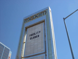
Photographs of Maxim signs, Las Vegas (Nev.), 2002
Date
Archival Collection
Description
Site address: 160 E Flamingo Rd
Sign owner: Premier Interval Resorts
Sign details: The Maxim is located just east of the Bourbon Street, in close proximity to Bally's Hotel Casino. The Maxim is no longer operating, and is fenced off from further inspection. The signage that is seen entails building signs, the original pylon, and the porte cochere
Sign condition: Structure 2 Surface 2
Sign form: Pylon; Fascia; Porte-cochère
Sign-specific description: Building: The tower itself contains the logo and giant text spelling the name of the establishment, on one side of the building. The tower is mirrored and reflective, thus matching the porte cochere and pylon, and reserves to collect its building signage to one end of the tower. The tower, which runs east/west, and faces north/south contains the signs on the east end structure. On the north and south faces of the building, giant red channel letters run vertically along the block surface. The letters look to be lined on the interior of the letters with neon. The logo can be seen on the east face. Pylon: The pylon sign is essentially a giant vertical monolith of a rectangle, divided into several different sub-shapes. The center of the monolith is occupied by cabinets which fill in most of the shape, with a small gap bordering the cabinet. The cabinets are treated the same as the square arch, and flush with the surface. The cabinets are very subtle and create an illusion of one solid object. The entire outer arch shape and interior cabinets are bordered with polished aluminum. The interiors surface of the arch are covered in polished gold aluminum panels. The lining of the incandescent bulbs on the sign is interesting. On the arch the incandescent bulbs are on the interior return width of the aluminum borders. With this configuration, the bulbs sit parallel to the surface instead of perpendicular. The main marquee text is aligned horizontally across the top in gold channel letters with red plastic faces. The letters blend with the gold surface nicely. The interior cabinets are internally lit with plastic faces. There are two cabinets, the larger of the two, occupying the upper part the interior space of the monolith. Incandescent bulbs line the exteriors of the cabinets, sitting back on a recessed edge. Porte Cochere: The porte cochere is unique, opting to rise high above the surface of the pavement. The prismatic design crafted in polished aluminum, interlocks into a pattern suitable to the space which it resides. The recesses in which the decoration resides are separated by a small width of structure. This pattern of giant recesses, matched with the prismatic design in each negative space create a hulking environment high above the head in proud stature. Along the peak edge of the pieces of the prism, rods protrude every foot or so, creating a row of arms holding incandescent spheres.
Sign - type of display: Neon; Incandescent
Sign - media: Steel; Plastic
Sign - non-neon treatments: Graphics; Paint
Sign animation: chasing, flashing
Sign environment: The Maxim is now closed, and stands in marked contrast to its neighbors a bit to the east--the famous "Four Corners" of Flamingo and the Strip, and next to the trendy Meridian at Hughes Center apartment complex.
Sign designer: Maxim letter design: Kenneth Young, Porte Cochere; Lighting: Jack Dubois Pylon sign: Marnell Corrao
Sign - date of installation: 1977
Sign - thematic influences: The influence of the Maxim hotel was 70's Vegas design refined to simple geometric forms and curved linear logo's. The pylon was completely sheathed in polished aluminum, as well as the underside of the porte cochere being polished gold aluminum. The use of the popular 70's material is used extensively throughout the design. Letters hung over the main entrance, as well as signage on three sides of the building. Other examples of the material can be seen elsewhere but not as extensively. The only property that comes close is the pylon for usage of the material is the Westward Ho.
Surveyor: Joshua Cannaday
Survey - date completed: 2002
Sign keywords: Chasing; Flashing; Pylon; Fascia; Porte-cochère; Neon; Incandescent; Steel; Plastic; Graphics; Paint
Mixed Content

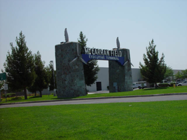
Photographs of McCarran Field signs, Las Vegas (Nev.), 2002
Date
Archival Collection
Description
Site address: 6005 S Las Vegas Blvd
Sign owner: McCarran International Airport
Sign details: On the south end of the Strip, the very last sign on the east side before you arrive at Sunset Blvd Facing West the two stone pylons are set approximately fifty feet off of the street at the end of a dual-lane stretch of pavement separated by an island of grass. The banner marquis between the two pylons stretches over this area of grass.
Sign condition: Structure 3 Surface 3 Lighting 4 Notes: The surface of the pylon is in good shape considering its age and its environmental condition. It is essentially left to fend for itself against the elements, being in the flat expanse of an airfield. The stone, plaques, and paint treatment are all badly worn, with the stone pylons, appearing the least worn.
Sign form: Pylon
Sign-specific description: The original McCarran Air Field entrance is constructed of two masonry pylons sit on an island of grass, and serve as an entrance to the private Hughes executive airport terminal. Each individual tower is adorned with a propeller attached to the front and the representation of a bird's wing crowning the tops Both facets are constructed of steel. When facing the structures the left has a plaque on the bottom section with the inscription "1948" while the one on the right reads "Las Vegas". Between the two pylons a stretch of text in white channel letters and white neon, large text in the old "Frontier style text reads McCarran Airport. The signage sits independently on top of a sturdy connecting steel cabinet, which supports the words "executive terminal" in smaller channel letters, with white neon. The cabinet is a painted blue horizontal plane tapering wider on either end in rounded profile patterns. The wings are outlined in pink neon, while the propellers are outlined in rose neon with a circle of white in the middle.
Sign - type of display: Neon
Sign - media: Masonry
Sign - non-neon treatments: Paint
Sign animation: none
Sign environment: The surrounding area is rather dark due to the wide expanse of the airfield which stretches out behind the sign. It truly is a last marker for the end of the Strip, and stands alone. Even though it is in close proximity to the major strip resorts of the Four Seasons as well as the Mandalay Bay and various small roadside hotels, it seems to stand in solitude.
Sign - date of installation: 1948
Sign - date of redesign/move: The blue banner of steel and white letters was added after its initial construction.
Sign - thematic influences: The masonry pylons are constructed in an adobe style masonry reminiscent of the desert landscape surroundings. Designed for the airport, the appendages stem obviously around the theme of flight. This may be denoted from the propeller and the wing. The juxtaposition of the two elements, one being the method of flight in nature and the other man made, serves as a reminder of mans fascination with flight. The added banner's text is in the pioneer fashion of the original Last Frontier.
Sign - artistic significance: Opened in 1948, the sign was intended for use as a marker for the endpoint of the Strip. " It was part of the city's expanding policy creating a jet-scale entrance for the city," Jorg Rudemer from Lost Las Vegas. Artistic significance also lies in the combination of materials using masonry, steel and, neon. The piece successfully combined these elements to provide an architecturally solid design by day, which was cohesive with its surrounding landscape. A metamorphosis takes place at night as the sign is transformed into a glowing specter of its daytime counterpart. The surrounding area is rather dark as the pylon rises up out of the darkness as a neon marker for the property. The illuminated wing and propeller stand out as the significant and successful partners in the world of flight.
Surveyor: Joshua Cannaday
Survey - date completed: 2002
Sign keywords: Pylon; Neon; Masonry; Paint
Mixed Content

University of Nevada, Las Vegas law school planning: correspondence, meeting minutes, and clippings
Date
Archival Collection
Description
Folder contains materials related to establishing a law school at UNLV, including: lists of members on the Law School Advisory Board and Citizens Committee for Law School; draft booklet by the UNLV Pre-Law Advisory Committee; The National Pre-Law Newsletter, December 1974; Law School Admission Bulletin, 1974-1975; LSAT/LSDAS blank registration form; Law School Advisory Board meeting minutes, 1973-1974; Consolidated Students of UNLV resolution supporting the establishment of a law school, 1974; correspondence; published articles; and informational documents. From the University of Nevada, Las Vegas William S. Boyd School of Law Records (UA-00048).
Text
Tamara Pickett Papers
Identifier
Abstract
The Tamara Pickett Papers (1977-1998) are comprised of materials related to the experiences of transgendered individuals in America. The collection includes transgender publications, scientific articles about sex reassignment surgery, and informational material provided to Pickett from various doctors as she planned her own sexual reassignment surgery.
Archival Collection
Jack Anderson Professional Papers on Operation Life
Identifier
Abstract
Materials in this collection (1969-1989) document various endeavors of the Operation Life organization. They include original correspondence, meeting minutes, news clippings, medical programs, grant applications, legal and financial documents, brochures and pamphlets, and other materials that provide context on the kinds of services provided by Operation Life. These files were kept by Jack Anderson in the course of his work as attorney for Operation Life.
Archival Collection


