Search Results
Photographs of Rosewood Grille signs, Las Vegas (Nev.), 2002
Date
Archival Collection
Description
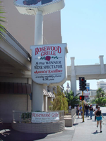
Site address: 3335 S Las Vegas Blvd
Sign owner: Alan and Kevin LeWinter
Sign details: The Rosewood Grill is between the Venetian Hotel-Casino and the Tam O'Shanter Motel on the east side of Las Vegas Blvd The facade of the building is a plain, if not unassuming white stucco structure, with a driveway running along the north side of the building. Directly in front of the buildings western wall, along the strip, a tall pylon faces north /south
Sign condition: Structure 3 Surface 3 Lighting 3
Sign form: Pylon
Sign-specific description: The pylon sign, which faces north/south, is the only signage notifying the pedestrian traffic of the establishment within. It is a tall vertical advertisement, mostly comprised of a vertical, rectangular shaped, internally lit cabinet, with rounded edges. The face of the sign is a plastic, graphically treated photo image of a man in a tuxedo holding up a giant lobster.
Sign - type of display: Incandescent; Backlit
Sign - media: Steel; Plastic
Sign - non-neon treatments: Graphics
Sign animation: Chasing, flashing
Notes: The raceway, which runs the circumference of the faces of the sign, contains small strobes placed at random places, and flashing at random patterns.
Sign environment: The sign for the establishment is the only marker that anything is operational in the dimly lit building. Not that the building looks non operational, but the majority of the building is very unassuming, mostly being denoted by the large drive and entrance. It is located just south of the Tam O'Shanter motel, among the awkward transition of the strip, that is Spring Mountain Rd. The Vagabond Inn and the Treasure Island square off the end of the block before the desolate expanse of what used to be the Desert Inn, and the transforming Fashion Show Mall, sprawl out across the north side of the road. The Rosewood Grill is part of the side of the street that trails off in size, but not character as the giant Venetian slows its progress.
Sign - date of redesign/move: Was the Anoje Continental Restaurant, next to the Kit Carson Motel, but was changed to the Rosewood Grill.
Sign - thematic influences: Not much of a theme, outside of advertising for a big lobster dinner.
Surveyor: Joshua Cannaday
Survey - date completed: 2002
Sign keywords: Chasing; Flashing; Pylon; Incandescent; Backlit; Steel; Plastic; Graphics
Mixed Content
Photographs of Somerset Shopping Center sign, Las Vegas (Nev.), 2002
Date
Archival Collection
Description
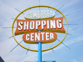
Site address: 252 Convention Center Dr
Sign form: Pylon
Sign-specific description: The sign is designed out of a blue pole, telescoping upward, spearing three double backed cabinets stacked on top of each other in close proximity. Two small wings flagpole of the north and south edges of the pole, which houses graphics advertisement for the businesses in the shopping center. The top sign is an oval cabinet, painted a light blue color on the surface and yellow on the width. The text, "Somerset" is painted white all capital letters, and outlined in black. The text that occupies the cabinet takes up most of the available space and is overlaid with neon tubing. The middle cabinet is the largest of the three. It is a rectangular shape with concave sides. The sides look as if a low sweeping cut has been taken out of the body, starting from edge to edge. The result is a symmetrically morphed geometric shape. "Shopping" is spelled in all capital channel letters, painted white on the interiors, and lined on the interiors with neon tubing. The surface is painted a rusted orange with the width painted yellow. The width of the cabinet is lined with a single row of incandescent bulbs on opposite edges. The bottom and third cabinet is identical to the oval shape of the top cabinet. The difference is that the surface of the cabinet is painted the same rusted orange color as the middle cabinet, and yellow on the width. The three cabinets are encircled with a giant circular, yellow, raceway, reaching up in the sky arching up over the top and completely encompassing the cabinets facing east/west. Blue rods radiate outward, repeating around the edge of the raceway at various lengths. They penetrate the surface of the raceway, protruding on both sides. They start at the top one vertical rod pointing directly vertical into the sky from the center pole. They then alternate, short then long, attached to various strategic points on the three central cabinet, creating a symmetrical pattern. The rods are lined on two edges with neon tubing, which animate in a chasing pattern.
Sign - type of display: Neon; Incandescent; Backlit
Sign - media: Steel; Plastic
Sign - non-neon treatments: Graphics; Paint
Sign animation: Chasing, flashing, oscillating
Surveyor: Joshua Cannaday
Survey - date completed: 2002
Sign keywords: Chasing; Flashing; Oscillating; Pylon; Neon; Incandescent; Backlit; Steel; Plastic; Graphics; Paint
Mixed Content
Photographs of Tourist Center signs, Las Vegas (Nev.), 2002
Date
Archival Collection
Description
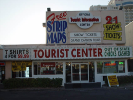
Sign details: Continuing north, a tourist and information center as well as a mini mart are incorporated into the front of a low rise Travelodge. A small parking lot creates the space between the structure and the street. The light earth tone stucco facade has a small high rise wall behind it, which is treated with signage and graphically treated with paint.
Sign form: Fascia
Sign-specific description: To the north of the Polo Towers plaza, a small lot located next to the Travelodge houses the Tourist Information Center and Gift Shop. A long, back-lit message center runs the length of the west face of the building along the front edge of the low-rise building. It is divided into three sections: The first belonging to the T-shirt mini mart on the north end of the lot, another small section advertising for the same business, then the rest of the sign stretching north belongs to the Tourist Center. The first section is not back-lit yet retains the steel raceway which encloses the entire sign. This section has a stucco background with green channel letters reading "Souvenirs Mini-Mart," with green neon on the interior. The second section is separated by a vertical raceway lined with bulbs. This section advertises for prices of shirts in the shop. The third section, which belongs to the Tourist Center, is dominated by red text which reads "Tourist Center." A higher elevation building sits right behind the front building. Assorted graphics adorn the surface of the building advertising for free maps and discounts. A rounded back-lit cabinet with two sections sticking out from either side hangs on the west face of this higher elevation structure. "Tourist Information" is spelled in red text, and the word "center" below that in black text. Green neon runs along the width edge of the cabinet, as well as the edges of the actual elevation of the building which it is hung, and the painted text below.
Sign - type of display: Neon; Incandescent; Backlit
Sign - media: Steel; Plastic
Sign - non-neon treatments: Paint
Sign animation: Chasing
Sign manufacturer: YESCO
Sign - date of installation: 35274
Surveyor: Joshua Cannaday
Survey - date completed: 2002
Sign keywords: Chasing; Fascia; Neon; Incandescent; Backlit; Steel; Plastic; Paint
Mixed Content
neo000076-003
Date
Description
Notes: The logo cabinets which adorn the entrances on the elevated walkways: The letters start with both rows of text in the off position. The top row flashes on, while the bottom row is dark then the bottom row illuminates, as the top row goes dark. Once the top row flashes off it flashes back on so that both rows of text are briefly illuminated simultaneously before they both go dark and the sequence stars over again. While this is going on the incandescent bulbs which line all of the raceways are chasing each other from left to right on the horizontal planes, while the arched sections chase each other downward. The triangular peaks which radiate around the top of the logo sign, flash on and off in a sequence which chase each other downward. First the top center peak flashes on, then the next sequential triangular channel on both sides illuminate simultaneously, flash off, then the next two in the series illuminate. The resultant effect is a chasing pattern starting from the top. The sister animation is located on almost the exact same design on the porte cochere. I would think the previous smaller sign would be based on the larger porte cochere. The other variance besides obvious size difference is the that the channel letters are filled with incandescent bulbs instead of neon. The animation is a bit simpler as well. The incandescent bulbs oscillate continuously while the triangular pan channels which create the radiating crown, animate. The neon in the channels chase each other as described in the smaller walk way version, while the text continues until the entire text flashes off, then on, off, then begin to animate once again. All of the bulbs, which line the raceways of the exterior edge of the porte cochere, as well as the encrustation of bulbs on the brass bull nose portion, animate in rapid succession. All the raceway bulbs chase each other while the bulbs on the brass portion continually oscillate. Animation continues on the east face of the building with the entrances first. The principle for these two signs is oscillation and chasing. All bulbs on the underside of the entrance, as well as in the logo, oscillate rapidly. All bulbs on the raceways chase each other. Further on the surface of the building as well, the Pepsi cola wall sign is found displaying a very unique form of animation, seen here on the strip. The signage for the Pepsi ad is located on the eastern wall. (Detailed in specific description) The Incandescent bulbs which fill the inside of the text that spells Pepsi, chase each other from left to right, leaving all the bulbs in its path illuminated, as if writing out the word Pepsi. The neon bars located within the tilted bottle of Pepsi are illuminated, and chase each other downward, leaving the bars it its path dark. As this sequence in taking place, the waving tubes of neon illuminate, flashed subtly making the neon appear as soda pouring out of the bottle. As the tubing flows then the vertical neon bars in the cup illuminate one at a time making the cup appear as if it is filling up. The text above each of the painted fires head, flashes back and forth as if talking to each other as well. ESPN ZONE animation: The letters in the vertical blade portion of the ESPN Zone illuminate one at a time, starting from the top. Once the entire phrase is lit, in flashes off then on then off, before restating. The orange and red neon tubing which resides inside the pan channels that represent flames flash on and off in a relaxed manner as if to animate the flickering of the flames. The small incandescent bulbs on the black portions above the main matrix reader board flash on and off subtly.
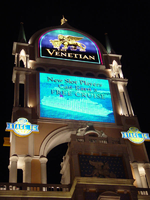
Photographs of Venetian sign, Las Vegas (Nev.), 2002
Date
Archival Collection
Description
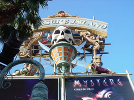
Site name: Venetian (Las Vegas, Nev.)
Site address: 3355 S Las Vegas Blvd
Sign owner: Las Vegas Sands, Inc., Sheldon Adelson
Sign details: The Venetian utilizes very little signage at all ad relies heavily on the architecture and themed environment which it creates for its advertisements.
Sign condition: Structure 5 Surface 5 Lighting 5
Sign form: Pylon
Sign-specific description: The signage for the Venetian Hotel and Casino is limited to an architecturally integrated sign on the north end of the property, The structure is essentially a giant arch which supports two levels which hold the signage. The arch which rises out of the roof of a building has six columns on its western most exposed edge, at the base. Each section of the pylon, is flanked by sets of four columns. The top sections legs prove to be shorter, being that they are supports for crown of smaller arches. Each flanking arcade is capped with a pointing spire. The top cabinet is an internally lot log for the Venetian.
Sign - type of display: Backlit; Ambient
Sign - media: Steel; Plastic; Masonry
Sign environment: The Venetian is quite successful in creating an environment since the entire facade creates wrapping arms of architecture, ambiently lit. The ornate quatrefoils, details columns and capitals form walls of joined elements and design rotations, that turn endlessly upon one another. The giant towers perching statuary high above the pedestrians head leave those who wander near the Venetian constantly looking up. Whether in the day or night hours, the Venetians plaza creates a environment which is pedestrian friendly.
Sign designer: The Stubbins Association
Sign - date of installation: 1998
Sign - thematic influences: The theme surrounding the Venetian is suggested strongly in the name of the property as well. The architecture is modeled after that seen in the city of Venice, Italy, and stays true to the form regardless of the configuration of the collection. It falls into the category of property which is themed after a city, particularly that of European origin. Such other examples include the Paris and the Bellagio.
Surveyor: Joshua Cannaday
Survey - date completed: 2002
Sign keywords: Pylon; Backlit; Steel; Plastic; Masonry
Mixed Content
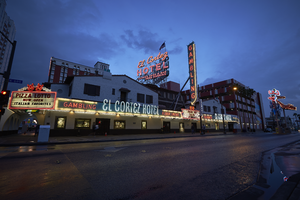
Photographs of El Cortez Hotel and Casino at dusk, Las Vegas (Nev.), April 10, 2016
Date
Archival Collection
Description
Site name: El Cortez Hotel & Casino (Las Vegas, Nev.)
Site address: 600 Fremont St
Sign owner: IKE Gaming Inc
Sign details: 2,77 acre lot, with an original construction year of 1941.
Sign condition: 5 - fully functional, looks well taken care of, no damage to the sign, even looks original.
Sign form: Back to back Architectural sign
Sign-specific description: Double sided architectural sign perched on top of the building of the El Cortez reads El Cortez HOTEL COFFEE SHOP & BAR FREE PARKING with a metal frame work to hold it high for tourists to see down Fremont Street on either side of the road or sidewalk. in the Day it looks white and baby blue with the frame work painted white. At night El Cortez glows red whit what looks like white skeleton neon outlining the wording, HOTEL is outlined with pink skeleton neon, and COFFEE SHOP & BAR FREE PARKING is made of the same pink neon as the HOTEL portion.
Sign - type of display: Neon
Sign - media: Steel
Sign environment: The property is surrounded by other casinos, restaurants, and bars.
Sign - date of installation: circa 1941
Sign - date of redesign/move: Possible change in signage around 1946
Sign - thematic influences: Spanish revival (mission) style, the facade was faced with bricks with weeping mortar and the roof was red tile while a large metal sign announced the casino clubs name.
Sign - artistic significance: Spanish Revival / Western cowboy themes were popular in Vegas especially in the 30s and 40s due to the image pushed to look like the wild west or as a pioneer town.
Survey - research locations: Las Vegas Then and Now, Spectacular, assessor's website
Surveyor: Danny Jacobs
Survey - date completed: 2017-09-04
Sign keywords: Neon; Steel; Architectural; Back to back; Incandescent; Reader board; Marquee; Roof Sign
Mixed Content
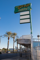
Photographs of Strip Centre sign, Las Vegas (Nev.), March 24, 2017
Date
Archival Collection
Description
Sign owner: Has been for sale since 2013
Sign details: This location has is a little shopping mall, and is called the strip centre since they are near the north end of the strip. Though this location has been up for sale since 2013.
Sign condition: 3- has had some bad weathering over the years and the paint is quite faded now.
Sign form: Blade
Sign-specific description: This sign stand on top of the building above the entrance. It is a green base that reaches the top of the sign. On the top part there is a big green steel rectangle with yellow painted words "The Strip Centre" but the word "Strip" is contained in channeled neon while the other two words are skeletal neon. Beneath this is 3 green sign boxes that would contain back lit plastic signs, but there are no signs in them currently. To the south side of the main sign there are remains of a sign that look like it used incandescent light bulbs.
Sign - type of display: Neon and plastic back lit signs.
Sign - media: Steel and plastic
Sign - non-neon treatments: Plastic back lit portion
Sign environment: This location is on the north end of the strip. It is north of the Stratosphere by a few blocks but also has some motels and wedding chapels close to it.
Sign - date of installation: Has been up since at least 2009
Sign - thematic influences: The plastic back lit portion is helpful for malls like this since they can change out which stores are within the mall relatively easily without getting a whole new sign.
Survey - research locations: Google map roadside view, attempted assessor's page but could not find it
Survey - research notes: This location was hard to find information on since it is for sale. Also I could not find information on it the assessor's page for some reason.
Surveyor: Emily Fellmer
Survey - date completed: 2017-10-01
Sign keywords: Neon; Plastic; Backlit; Steel; Pole sign; Back to back
Mixed Content
Photographs of A Little White Chapel, Las Vegas (Nev.), February 1, 2017
Date
Archival Collection
Description
Site address: 1301 S Las Vegas Blvd
Sign owner: Charlotte Richards
Sign details: Charlotte Richards came to Las Vegas at the age of 17, for her husband had abandoned her with 3 kids. Took a job at The Little church of the West. She married the man that helped her and that gave her the job there. After her second husband died she moved on and bought A Little White Wedding Chapel in 1967. A little White Wedding Chapel had been opened since 1951.
Sign condition: 4 - Still in relatively good condition.
Sign form: Pylon
Sign-specific description: This pylon sign is mainly white with splashes of red schemes particularly with the red hearts that are outlined in neon. The Two red hearts are represented underneath the name of the property in channeled rusty gold letters. The hearts have a gold ribbon rendering surrounding them also outlined in skeletal neon. The square design at the top of the sign resembling a chapel roof. Underneath the main portion of the sign is a plastic backlit sign that also has a heart on it.
Sign - type of display: Neon and plastic backlit sign
Sign - media: Steel and plastic.
Sign - non-neon treatments: Plastic backlit portion
Sign environment: Close to downtown, Next to Viva Las Vegas Wedding Chapel and two hostels.
Sign manufacturer: YESCO , confirmed by owner Charlotte Richards
Sign - date of installation: 1960
Sign - thematic influences: The hearts are a theme seen in many other chapel signs across the valley.
Survey - research locations: A Little white Wedding Chapel's website. Las Vegas Review Journal articles. Las Vegas Sun articles. Youtube Podcast, Downtown Podcast, Channel: Vegas Talk, A Little White Wedding Chapel and representatives.
Survey - research notes: YESCO maintains sign which was confirmed by Charlotte Richards the owner.
Surveyor: Wyatt Currie-Diamond
Survey - date completed: 2017-08-11
Sign keywords: Neon; Plastic; Backlit; Steel; Roadside; Pole sign; Back to back
Mixed Content
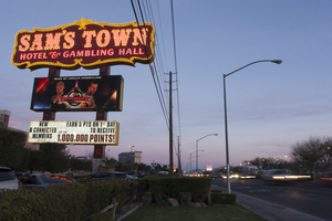
Photographs of Sam's Town sign, Las Vegas (Nev.), March 7, 2017
Date
Archival Collection
Description
The Sam's Town Hotel and Gambling Hall sits at 5111 Boulder Highway. Information about the sign is available in the Southern Nevada Neon Survey Data Sheet
Site name: Sam's Town (Las Vegas, Nev.)
Site address: 5111 Boulder Hwy
Sign owner: Boyd Gaming
Sign details: Sam Boyd came to Las Vegas in the late 40's early 50's and went to work in the Downtown casinos. He moved quickly through the ranks and was overseeing many operations. His son studied law and coupled with him, Sam Boyd created Boyd Gaming in 1975. Sam's Town opened April 1, 1979 which was named after the company's patriarch. This was one of the first Resorts to cater to locals.
Sign condition: 5- Very good condition
Sign form: Super Pylon and many smaller Port Cocheres.
Sign-specific description: The background of the sign is Red with a yellow/gold trim, "Sam's Town" is in channeled white lettering. The font as well as the gold trim on the sign show the Old West and Frontier style. This sign contains a LED video board as well as a reader board.
Sign - type of display: Neon, LED video board, reader board and Incandescent light bulbs.
Sign - media: Steel and plastic
Sign - non-neon treatments: Reader board and LED screen
Sign animation: Flasher for incandescent light bulbs
Sign environment: This location is on Boulder Hwy just minute's drive from Arizona Charlie's. There are RV parks and various chain restaurants close to this casino.
Sign - thematic influences: It keeps it tradition with western cowboy theming that has been popular in Las Vegas.
Sign - artistic significance: With this Western theme it has remnants of the gold rush and 49er's type aesthetic.
Survey - research locations: Sam's Town https://www.samstownlv.com/ , Correspondence with Boyd gaming. Boyd Gaming website https://www.boydgaming.com/about-boyd-gaming .
Surveyor: Wyatt Currie-Diamond
Survey - date completed: 2017-08-18
Sign keywords: Pylon; Porte-cochère; Neon; Incandescent; Flashing; Reader board; Steel; Plastic; Video screen
Mixed Content
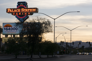
Photographs of Palace Station sign, Las Vegas (Nev.), April 5, 2017
Date
Archival Collection
Description
Site address: 2411 W Sahara Ave
Sign owner: Palace Station
Sign details: Founded by Frank Fertitta III, was originally Bingo Palace in 1976 but was changed to Palace Station
Sign condition: 4 - some broken lights on the sign but for the most part seems in great condition. Owners unsure if keeping the sign or replacing it with a new one during 2017 remodel of property
Sign form: back to back pylon
Sign-specific description: Double sided pylon road side sign, word "PALACE STATION HOTEL CASINO" In red encasement stuck to the front of a minimalistic image of a train, the word "BINGO" underneath the train front. Skeleton Neon is used to accentuate the features of the train and the lettering on the sign.
Sign - type of display: Neon and incandescent
Sign - media: Steel, Plastic
Sign animation: Chasers around "PALACE STATION HOTEL CASINO" and "BINGO" boxes and the neon in the boxes turn off then fill in from both sides until full again
Sign environment: Property is near the I-15, by local businesses and some residential
Sign - date of installation: c. 1983
Sign - thematic influences: Seeking to avoid the western theme popular among casinos at the time, Fertitta chose trains. Worried that the name Bingo Palace didn't highlight the full-range of gaming and amenities on offer at the expanded casino, Fertitta held an open contest to rename the casino later that year. More than 26,000 entries were received over three weeks. Las Vegas resident Claire Jarvis won as Palace Station touched on the new train theme while keeping part of the original name. - Las Vegas Review Journal
Sign - artistic significance: Owner Frank Ferttitta Jr held a contest for the casinos new theme and the "train station" theme was the favorite out of the entries.
Survey - research locations: UNLV Special Collections, Las Vegas Sun, YESCO, Review Journal
Surveyor: Danny Jacobs
Survey - date completed: 2017-09-10
Sign keywords: Pylon; Neon; Incandescent; Steel; Chasing; Back to back; Roadside; Video screen; Reader board
Mixed Content