Search Results
Photographs of ESPN Zone signs, Las Vegas (Nev.), 2002
Date
2002
Archival Collection
Description
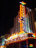
Daytime and nighttime views of the ESPN Zone signs on the Strip. Information about the sign is available in the Southern Nevada Neon Survey Data Sheet.
Site name: New York-New York Hotel and Casino (Las Vegas, Nev.)
Site address: 3790 S Las Vegas Blvd
Sign details: Located in New York-New York Casino and Hotel
Sign condition: Structure 5 Surface 5 Lighting 5
Sign form: Pylon; Fascia; Porte-cochère
Sign-specific description: The northern end of the property is dominated by the signage for the ESPN Zone sports lounge, located inside the NY NY. The exterior signage is basically a theatre marquee entrance with a long overhang supporting an electronic message banner that reads from left to right. The majority of the theatre front is polished aluminum with thin tubes of red neon above and below the electronic reader board. Above the top edge of the actual front of the sign is a design of pan channels, crafted and shaped to form a complex background for the logo text spelling "ESPN." A wavy green crafted channel creates what looks like a horizon. The space between the marquee and the green channel is a black field laden with incandescent bulbs. Above the green channel an array of pan channels crafted into interlocking, swaying, pointed shapes. They are painted yellow and orange so the result is a bed of flames. These too are lined in the interior of the contour in red and orange neon. In the center of the entire face of the overhand in a black steel cabinet with the logo for the establishment spelling "ESPN Zone." The First portion of the two-word phrase is spelled in shallow channel letters lined with horizontal bars of white neon. The text is outlined in red neon as well. The second half spells "Zone," and is written in the same font with the "Z" being the largest letter in the sign, designed with the bottom horizontal leg underlining the rest of the letters in the word. The word is outlined with white neon as well. The latter portion is filled with horizontal bars of red neon. Situated along the middle of the sign, and against the vertical plane of the building, a blade sign repeats the design and colors of the bottom portion of the sign. The vertical cabinet is double sided spelling the "ESPN Zone" logo vertically with the same neon treatments for the respective words. The three toned background of black, green, red and orange on the bottom of the sign is interpreted on the blade. Running vertically, the black portion laden with bulbs runs against the wall, with the wavy channel next to that, disappearing temporarily behind the letters. The flames hang off of the outer edge of the sign. All of the neon treatments are seen here as well. Crowning the top of the blade sign two circular cabinets are arranged touching each other at one end, the faces pointing out to angled directions. Here the ESPN logo is arranged inside a circle. The bottom half below the letters is filled with horizontal bars of green neon, while the flames are present on the top half. The same cabinets can be seen mounted on the ends of the bottom overhang.
Sign - type of display: Neon; Incandescent; Backlit
Sign - media: Steel; Plastic
Sign - non-neon treatments: Graphics
Sign animation: Notes: The letters in the vertical blade portion of the ESPN Zone illuminate one at a time, starting from the top. Once the entire phrase is lit, in flashes off then on then off, before restating. The orange and red neon tubing which resides inside the pan channels that represent flames flash on and off in a relaxed manner as if to animate the flickering of the flames. The small incandescent bulbs on the black portions above the main matrix reader board flash on and off subtly.
Surveyor: Joshua Cannaday
Survey - date completed: 2002
Sign keywords: Chasing; Flashing; Oscillating; Pylon; Fascia; Porte-cochère; Neon; Incandescent; Backlit; Steel; Plastic; Graphics
Mixed Content

4 Mile Bar Neon Survey document, September 8, 2017
Date
2017-09-08
Archival Collection
Description
Information about the 4 Mile Bar sign that sits at 3650 Boulder Hwy.
Site name: 4 Mile Bar (Las Vegas, Nev.)
Site address: 3650 Boulder Hwy
Sign owner: Bob and Bill Joslin
Sign details: This is one of the most historic bars in Las Vegas. The original site of the bar was actually where one of the oldest communities in town began called Formyle. The community was there long before The Boulder Highway or US Highway 95. The area where the bar currently resides was called Four Mile Spring because it was "four miles from the center of town" and for the natural spring that was there. This part of town, for much of its history, was outside of Las Vegas city limits and outside of the laws for the rest of the city as well. This site was originally a brothel when it opened in the 1950s. In 1954, the property was raided by the FBI and then ended up turning into a bar. It is "one of the Valley's last true-blue roadhouses" and it is named because it sits four miles away from the Downtown area. They are also known for their very popular karaoke nights.
Sign condition: 4, the roadside sign is in good condition, but the sign that is attached to the building has some light bulbs that have been burned out on it.
Sign form: Roadside sign is a pole sign with a message center and there is an architectural sign attached to the facade of the building.
Sign-specific description: The road side portion of the signage for the 4 Mile Bar is fairly simple. The top of the sign features a plastic, backlit square that has a large red "4" and "MILE" in bold white text in the middle of the number. Underneath this is "BAR" in a bold red text against a white background. About a foot or two underneath this sign is a large plastic, backlit reader board. The main support for the sign is a white rectangular structure with two red stripes running down the center of it with a few inches of space between the lines. The architectural sign that is on the facade of the building is uncomplicated as well. The shape of it fits the top portion of the building and looks like a stretched out rectangle. All of the edges are lined by incandescent light bulbs. In the middle of the sign in open channel letters are the words "4 MILE BAR" that are filled with white glowing neon tubes.
Sign - type of display: Incandescent, neon and backlit plastic portion
Sign - media: Steel and plastic
Sign - non-neon treatments: Plastic
Sign environment: This bar sits at the cusp where Fremont Street transitions to Boulder Highway. Many of the immediate properties that sit near this bar are motels and mobile home communities. This is also just down the road from Boulder Station Hotel and Casino as well as the Winchester Cultural Center.
Sign - thematic influences: The roadside sign is very straightforward since it just displays the name of the bar, but there could have been a stylistic choice to use the actual number "4" instead of the word "four."
Sign - artistic significance: The most notable feature about this sign is the number "4" instead of the word "four" that is used, possibly for stylistic reasons.
Survey - research locations: Accessor's Page http://www.clarkcountynv.gov/assessor/Pages/searchbybusinessname.aspx, Review Journal articles https://storify.com/ReviewJournal/7-of-the-most-historic-bars-in-las-vegas and https://www.reviewjournal.com/uncategorized/over-a-century-four-mile-has-gone-from-trailside-oasis-to-brothel-to-bar/ , Vegas Seven article http://vegasseven.com/2013/06/12/las-vegas-bar-hall-fame/
Surveyor: Lauren Vaccaro
Survey - date completed: 2017-09-08
Sign keywords: Architectural; Incandescent; Neon; Backlit; Plastic; Steel; Pole sign; Roadside
Text
Capri Motel Neon Survey document, September 14, 2017
Date
2017-09-14
Archival Collection
Description
Information about the Capri Motel sign that sits at 325 Fremont St.
Site address: 325 Fremont St
Sign owner: Nemo Motel LLC
Sign details: This motel was originally constructed in 1958. Their sign states "New Rooms, Daily and Weekly", so it is unclear if they renovated or if they have new rooms daily since this has been on their sign since 2007.
Sign condition: 2- Has a lot of weathering and the paint is very faded and some neon tubing is broken
Sign form: Pylon
Sign-specific description: This pylon has a red steel base. On the top there is a rusty-red rectangle with "MOTEL" spelt out horizontally in a painted white block letter font (looks as though it had skeletal neon with most of it broken on each side). Below this is a rusty-red rectangular blade sign box that has a white plastic sign in it that states "CAPRI" vertically in Red block font letters. The base behind this sign box does look like it has holes in it every few inches as a part of its design. Below this is another rusty-red sign box that has a white plastic sign that says, "New Rooms, Daily and Weekly, Free Phone- Wifi Internet-Cable T.V.- Movies" In a mid-century modern paint effect font. This sign box looks as though there once was incandescents surrounding it but are now mostly missing.
Sign - type of display: Neon and incandescent remains
Sign - media: Steel and plastic
Sign - non-neon treatments: Plastic backlit portion of sign
Sign environment: Down on the East side of Fremont, this location has two car sales lots on either side of it and has other Motels nearby.
Sign - date of installation: Has been up since at least 2007
Sign - thematic influences: The font they use on the bottom portion listing what this location offers has that thick paintbrush effect that you would see on older signs. With this it shows that many signs were hand painted (though we do not know if this one was or not).
Survey - research locations: Asessor's Page and Google map roadside view
Survey - other remarks: Next to the Flamingo there was a motel called the Flamingo Capri Motel which is a very similar name http://vintagelasvegas.com/post/116515472029/flamingo-capri- motel-las- vegas-c1960- this.
Surveyor: Emily Fellmer
Survey - date completed: 2017-09-14
Sign keywords: Neon; Steel; Plastic; Backlit; Pole sign
Text

Crystal Palace Neon Survey document, September 6, 2017
Date
2017-09-06
Archival Collection
Description
Information about the Crystal Palace that sits at 4680 Boulder Hwy.
Site address: 4680 Boulder Hwy
Sign owner: Tim Poole
Sign details: The building was constructed in 1977 for this Skating Center. This skating center opened during the prime skating rink roller age of the 70's/80's. The Crystal Palace does have a second location in North Las Vegas on Rancho built in 1981 which is ran by Larry & Judy Sandord though still under Tim Poole's company. Crystal Palace holds birthday parties, themed nights and open skate for all ages.
Sign condition: 4- has had some weathering over the ages.
Sign form: Pylon and building signs
Sign-specific description: On Boulder Hwy they have a roadside sign that has a yellow steel base with a yellow curved sign box that is lined with yellow incandescent light bulbs. Inside this box is a back lit plastic sign that states "Crystal Palace" in a retro 1970's/80's double lined font. Within the two words there is a red circle that showcases a navy blue pair of roller skates and then states "USA" in white letters within the red circle with two white stars on either side of it. On both sides of the building there are thin red steel words "Crystal Palace Skating Center" that is down lit by LED lights.
Sign - type of display: Incandescent, LED and backlit plastic sign
Sign - media: Steel and plastic
Sign - non-neon treatments: Signs on building up lit by LED lights and the roadside sign is backlit plastic
Sign animation: Flasher for incandescent light bulbs
Sign environment: On Boulder Hwy towards the East side of Las Vegas. There is an RV lot across the street as well as other shopping centers.
Sign - date of installation: Has been up sine at least 2007
Sign - thematic influences: The roller skate image on the sign shows symbolism for what kind of company it is, as well as the font makes you think of the classic 70's/80's roller rink style.
Sign - artistic significance: The double lined font is very 1970/80s roller rink/ video game style (similar to SEGAs logo).
Survey - research locations: Assessor's page, Crystal Palace website http://www.skatevegas.com/ , google maps satellite and road view
Surveyor: Emily Fellmer
Survey - date completed: 2017-09-06
Sign keywords: Incandescent; Backlit; Plastic; Steel; Flashing; Building-front design; Pole sign
Text

LaPalm Motel Neon Survey document, September 10, 2017
Date
2017-09-10
Archival Collection
Description
Information about the LaPalm Motel sign that sits at 2512 Fremont St.
Site address: 2512 Fremont St
Sign owner: La Palm Motel Inc
Sign details: Property originally constructed in 1963 on 0.33 acres.
Sign condition: 3 - the sign is in decent condition and appears worn from weather. It is unclear if the sign still lights up at night.
Sign form: Roadside pole sign
Sign-specific description: This pole roadside sign has a simple design. A large black pole supports the other elements for this sign. The top portion of the sign features a plastic, backlit sign reading "La Palm" in a black, serif text. Underneath the "lm" of the "La Palm" sign is a series of open channel letters spelling out "MOTEL" against a faded teal background. This portion of the sign is also a thin, rectangular shape allowing for an open space between the "MOTEL" of the sign and the pole that supports it. Underneath the "L" of the "MOTEL" is the bottom portion of the sign that is attached to the pole. This portion of the sign features a plastic, backlit sign reading "DAILY WEEKLY CABLE TV POOL KITCHENETTES LAUNDROMAT" in bold red letters against a white background. Under this is the word "VACANCY" painted in bold white text. Neon tubes spell out "NO" and outline "VACANCY." Along the outer edge of this sign facing Fremont, the sign is painted a pale yellow with incandescent light bulbs lining this section.
Sign - type of display: Neon, indandescent, backlit
Sign - media: Steel and plastic
Sign - non-neon treatments: Paint
Sign environment: This property sits at the corner of East Charleston and Fremont in an area filled with many other smaller motels. There is a Pepe's Taco and Lowe's Home Improvement that close to this motel.
Sign - date of installation: Possibly c. 1963
Sign - thematic influences: There is no exact theme replicated in this sign. It does look similar to other motel signs throughout the city since it sits directly along the roadside allowing motorist and pedestrians to see it easily.
Sign - artistic significance: This sign is a standard example of motel signage because it features the basic elements of a roadside motel sign. It has the name of the property, the word "motel", and other amenities that they may offer.
Survey - research locations: Assessor's website
Survey - research notes: http://www.roadsidepeek.com/roadusa/southwest/nevada/vegas/lvmotel/lvdownmotel/index4.htm
Survey - other remarks: There is not a date of any specific redesign of this sign; however, based on an earlier image of this sign the font in the "La Palm" portion of the sign did change somewhere along the way during the time this property has been around.
Surveyor: Lauren Vaccaro
Survey - date completed: 2017-09-10
Sign keywords: Neon; Incandescent; Backlit; Steel; Plastic; Paint; Pole sign; Roadside
Text

Mon Bel Ami Neon Survey document, August 19, 2017
Date
2017-08-19
Archival Collection
Description
Information about the Mon Bel Ami sign that sits at 607 S Las Vegas Blvd.
Site address: 607 S Las Vegas Blvd
Sign owner: Mon Bel Ami- Maudie Dog Trust
Sign details: Mon Bel Ami Wedding Chapel originally was the Silver Bell Wedding Chapel owned by nineteen year old Jim Duszynski. He moved from Toledo, Ohio and purchased the small wedding chapel for five dollars in 1958. Silver Bell wedding Chapel eventually moved across the street adding a steeple to an old masonic lodge hosting dozens of weddings. In 2002 the building caught on fire where the property was later purchased by new ownership. In 2003 the new ownership re-named Silver Bell Wedding Chapel to Mon Bel Ami Wedding chapel. The new chapel replaced the Silver Bell panel and painted over the SB. Currently the sign has been removed and donated to the Neon Museum and replaced with new signage.
Sign condition: The condition of the sign is a 5. From what I can tell the sign has been kept maintained. No paint has chipped, and the LED is still working perfectly.
Sign form: The sign is a pole sign and not attached to the building.
Sign-specific description: The sign is a pole based free standing sign. The heavy curved triangle is in the color burnt sienna made of steel. The pole itself is a faux marble with swirls circulating the pole etched into the pole. The sign is tastefully ornate, yet simple in design. The pole transitions into a Chapean Tuscan architectural feature. The typography is slightly thick and light up white at night. The actual light features surround the typography and takes the shape of the curved triangle. The light is LED based.
Sign - type of display: LED
Sign - media: Steel and concrete
Sign environment: It is next door to Graceland Wedding Chapel and near Nevada Legal Services, US Labor Department Wage and Hour Divisions, Dougie J's Cafe, Thunderbird Lounge, and Rogue Toys.
Sign manufacturer: YESCO
Sign - date of installation: Mid 2000's
Sign - date of redesign/move: After 2003 the ownership from Silver Bells changed and renamed the chapel to Mon Bel Ami. The Silver Bells Wedding sign was donated to the Neon Museum.
Sign - thematic influences: The design resembles faux Tuscan elements, simple yet semi- ornamental.
Sign - artistic significance: The sign resembles the early 2000's trend with faux semi ornate but sleek contemporary design within architecture. The sign is quite reminiscent of Wynn Hotel, Palazzo, and Encore.
Survey - research locations: Mon Bel Ami wedding chapel website https://www.monbelami.com/historic-wedding-chapel-sign-neon-museum-vegas/ , Asessor's Page
Surveyor: Gisselle Tipp
Survey - date completed: 2017-08-19
Sign keywords: Steel; Concrete; Pole sign; Neon
Text

Neonopolis Neon Survey document, September 8, 2017
Date
2017-09-08
Archival Collection
Description
Information about the Neonopolis sign that sits at 450 Fremont St.
Site address: 450 Fremont St
Sign owner: Rohit Joshi leases the building from Wirrulla USA Inc.
Sign details: This building was originally constructed in 2001 as a retail store center. This location currently holds a Denny's, a vintage toy store, the Telemundo station office and an international food market. This location also held a movie theater until 2009.
Sign condition: 4.5- Sign still in relatively new looking condition
Sign form: Entrance sign
Sign-specific description: Above the main entrance way into the mall there are the letter "NEONOPOLIS" in plastic back lit signs. Each letter has a lime green border with white strip and then purple for the main color of the block letters. The letter "O" in "polis" is actually an orbit shape that is orange and purple to double as the "O". Portions of the building have neon tubes, some illuminating blue and others are purple, green, red and yellow. There are also different colored shapes of neon spread throughout the building such as yellow triangle as well as orbits showcasing red and yellow neon tubing. Many of the companies in this location have their own signs as well.
Sign - type of display: Plastic back lit sign and neon
Sign - media: Plastic and steel
Sign - non-neon treatments: Plastic back lit portion
Sign environment: This property is on Fremont in between 4th St. and Las Vegas Blvd. Right in front on the building is the Slotzilla machine where people get onto the zipline.
Sign - date of installation: 2002
Sign - date of redesign/move: When the movie theater portion of this location closed in 2009 part of the signage was taken down and in recent years with different companies settling in there have added their own signs.
Sign - thematic influences: The name and the theme of this location being neonopolis showcases the downtown neon vibe particularly since there is a wide variety of neon display surrounding this property.
Sign - artistic significance: Showcasing the different designs with neon shows how true of an art it still is, particularly with the triangle designs and the orbits
Survey - research locations: Asessors page, https://neonjoshiassociate.wixsite.com/mysite-1 Neonopolis website, https://www.reviewjournal.com/entertainment/food/neonopolis-theaters-to-go-dark-thursday-night/ Review Journal article discussing the closure of their movie theater, https://lasvegassun.com/news/2002/may/03/long-awaited-neonopolis-opens-in-downtown-vegas/ Las Vegas Sun article talking about their opening in 2002
Survey - research notes: There used to be an 18 theater movie theater located there which shut down in 2009 and was renovated into clubs, the most recent one to open is called the Nerd.
Surveyor: Emily Fellmer
Survey - date completed: 2017-09-08
Sign keywords: Plastic; Backlit; Neon; Steel; Fascia
Text
Photograph of Fremont Country Club sign, Las Vegas (Nev.), June 28, 2017
Date
2017-06-28
2017-08-26
Archival Collection
Description
The sign for the Fremont Country Club sits at 601 Fremont Street in Downtown Las Vegas. Information about the sign is available in the Southern Nevada Neon Survey Data Sheet.
Site address: 601 Fremont St
Sign owner: City of Las Vegas: Economic and Urban Development owns the building
Sign details: The original construction year of this building was 1957. This bar opened September 2012 as an acclaimed kitschy-chic bar and concert venue. Inside they have Tex-Mex decorations with a merry-go- round horse, an 8 foot steel horseshoe, a covered wagon entryway and antler chandeliers.
Sign condition: 5 - newer sign
Sign form: Blade and Reader Board
Sign-specific description: Surrounding their building there is a reader board that is lined with incandescent light bulbs that sparkle at night time, for this reader board is connected to the adjoining Triple B Bars reader board a well. Above their entrance there is a black blade, on the top part of the blade Fremont is written in an elegant white calligraphy font spelt out horizontally which does illuminate white at night time. Vertically down the blade spells out Country Club in block font letters which illuminates red at night. Along this portion of the blade it is lined with little red LED lights that look like incandescent bulbs that sparkle. On the portion of the blade that faces the road, underneath the word Fremont there is a swirly design that decorates the corner of where the horizontal letters meet the vertical letters, but the design does pop up again a little lower on the sign as well. Though at the bottom of the sign underneath the Country Club letters they have their main F.C.C. logo on a plastic backing that seems to be dimly backlit at night time. Their F.C.C logo consists of a silver shield that looks to be dotted on the perimeter with painted diamonds, the middle portion is checkered red and black in 4 sections then has a crest on it of a longhorn with two golf clubs under its head to act as an iteration of crossbones. Under the longhorn there are calligraphy letters F.C.C. in white.
Sign - type of display: Neon, LED, Incandescents and reader board
Sign - media: Steel and Plastic
Sign - non-neon treatments: Reader Board, plastic backlit sign and light bulbs
Sign animation: Flasher for LED
Sign environment: Located in the East Fremont District, this property is right across the street from the El Cortez and is adjoined to the Triple B Bar. To the East of the property is The Market.
Sign - date of installation: c. 2012
Sign - thematic influences: Since are named as a country club, the crest portion of their sign does have golf clubs as well as is a crest could be on a clothing item that a golfer would wear.
Sign - artistic significance: The blade portion is remnant of the 1950s/60s blade. As well as their logo that is a crest shows an older medieval
Survey - research locations: Assessor's website, Fremont Country Club website
Survey - research notes: Reader board for this property is shared with the Triple Bs reader board and both locations opened in 2012 and signs both installed that year as well.
Survey - other remarks: The adjoining property, Triple B states that they named their bar Backstage Bar and Billiards because it was literally backstage to the Fremont Country Club bar and stage.
Surveyor: Emily Fellmer
Survey - date completed: 2017-08-26
Sign keywords: Blade; Neon; Incandescent; Steel; Plastic; Backlit; Flashing
Mixed Content
Photographs of Milan Bakery, Las Vegas (Nev.), April 18, 2017
Date
2017-04-18
2017-08-17
Archival Collection
Description
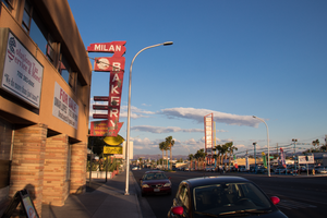
The Milan Bakery sign sits at 1625 Fremont Street in Downtown Las Vegas. Information about the sign is available in the Southern Nevada Neon Survey Sheet.
Site address: 1625 Fremont St
Sign owner: Selak, LLC
Sign details: The building was constructed in 1952 (Assessor). Milan Selakovik acquired the property from the Salvation Army in 1966 (Assessor).
Sign condition: The sign is condition 2, fair to poor. The paint is flaking. Approximately a third of cabinet bottom has rusted out. No neon remains on the sign.
Sign form: Blade sign
Sign-specific description: The background of the entire sign is painted red. The top and bottom of the sign are attached to the building by two metal cabinets. The lower cabinet is irregularly shaped. On the west side of the lower cabinet, the telephone and fax numbers are painted in peeling yellow. The paint has almost completely flaked off around the area where a cursive "Fax" formerly appeared. Attached to the street side of the sign is a vertical metal cabinet which runs almost the entire height of the sign. The word "BAKERY" is painted in white sans serif letters which run vertically over most of the cabinet. Extending horizontally from the cabinet toward the building are three small metal cabinets. A horizontal white line is painted on each of the three cabinets. A larger cabinet attached next to the "B" in "BAKERY" extends horizontally toward the building. The cabinet has a medallion shaped black and white cartoon of a baker holding a tray of baked goods. An irregularly shaped cabinet topping the sign contains the name, "MILAN" painted in white sans serif letters. The east side of the sign is painted similarly to the west, except that: 1) a cursive white or silver "Fax" is located at the bottom of the sign to the left of the fax number and, 2) extreme flaking has completely removed what was painted on the medallion at the top of the sign.
Sign - type of display: Formerly neon
Sign - media: Steel
Sign environment: Down on the East side of Fremont Street
Sign - date of installation: Based on the acquisition date of the property by Milan Selakovik in 1966, the current design of the sign possibly dates from the 1960's.
Sign - date of redesign/move: The unusual shape of the sign indicates that it has been modified over time. The form suggests that the sign was originally a directional arrow which pointed down from the roof toward the entrance to the business, with additional cabinets added later. A 2004 photograph shows the current sign design and color scheme (RoadsidePeek.com). A drawing of a baker's head was located in the medallion where the cartoon baker now resides. The three small cabinets which jut out horizontally from the sign formerly stated, "BREAD", "CAKES" and "PASTRY". The lower portion of the sign advertised "FRESH SANDWICHES".
Sign - thematic influences: Their sign showcases similar themes to cartoons, bakers and bakeries.
Sign - artistic significance: The sign portrays similar designs to other signs manufactured in the 1960's.
Survey - research locations: Clark County Assessor Parcel No. 139-35-315-002. Retrieved from http://www.clarkcountynv.gov/assessor/Pages/PropertyRecords.aspx?H=redrock&P=assrrealprop/pcl.aspx RoadsidePeek.com. Milan Bakery. Retrieved from http://roadsidepeek.com/roadusa/southwest/nevada/vegas/lvsign/lvothersign/index2.htm
Surveyor: Mitchell Cohen
Survey - date completed: 2017-08-17
Sign keywords: Blade; Neon; Steel
Mixed Content
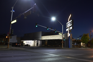
Photographs of PublicUs sign, Las Vegas (Nev.), April 18, 2017
Date
2017-04-18
2017-08-18
Archival Collection
Description
The PublicUs coffee shop sign sits at 1126 Fremont in Downtown Las Vegas. Information about the sign is available in the Southern Nevada Neon Survey Data Sheet.
Site address: 1126 Fremont St
Sign owner: Kimo Akiona, Cole McBride and Travis Landice
Sign details: PublicUs opened in 2015. This property has previously held other restaurants the most recent being a Philly Cheese Steak restaurant. PublicUs represents "for the people" in Latin. Hemant Kishore is the baker and chef. This location is a canteen-style restaurant and coffee house where they make all organic foods in house.
Sign condition: 4- the steel part of the sign looks relatively new and has bright paint, but the plastic portion for the sign does some aging to it.
Sign form: Pylon
Sign-specific description: On the corner of Fremont E and Maryland pkwy at the corner of their building there is a blue been sticking out of the ground that is curved at the top. Near this curved section is a rectangle steel sign box that has a back lit plastic sign in it, and underneath is a similar rectangular box. The bigger rectangular box has a white background, but has the a light tan box with PublicUs logo in white letters in the light tan brown box. The smaller box on the bottom has the white backdrop and the tan colored rectangle has Fremont Village written in a white font. Both rectangle signs have an arrow pointing through them with the tip of the arrow above their main logo sign and the "feathers" of the arrow underneath Fremont Village sign.
Sign - type of display: Backlit plastic sign and incandescent light bulbs
Sign - media: Steel and plastic
Sign - non-neon treatments: Plastic back lit portion of sign
Sign animation: Flasher for incandescent light bulbs
Sign environment: This is located on the corner of Maryland Pkwy and Fremont Street East. Surrounding this property is a lot of old motels that have been shut down, and painted over though many of their neon signs are still up and some working. On the same block as them is a vintage barber shop and a vintage tattoo parlor.
Sign manufacturer: Main portion of the sign was around before they opened so information on the base of the sign was not found
Sign - date of installation: The sign box has records of being around longer than the PublicUs has, records (Google Maps satellite view) show the sign similar to this has been up since at least 2013
Sign - date of redesign/move: Late 2015 is when their main logo was installed
Sign - thematic influences: This sign shows how signs can be re-purposed or can evolve with different colors and slightly different designs over the years even though the theme of the property has changed.
Sign - artistic significance: The arrow in the sign could signify a bulls eye in the sense that you are looking in the right spot or have found the perfect spot.
Survey - research locations: Google Maps satellite view, Sprudge coffee blog http://sprudge.com/publicus-97938.html , Eating Las Vegas http://www.eatinglv.com/2015/03/publicus-is-open-and-baking-for-the-people/
Survey - research notes: This restaurant has faux trees and nice wooden tables inside to make it feel as though you are outdoors but still in a homey place.
Surveyor: Emily Fellmer
Survey - date completed: 2017-08-18
Sign keywords: Plastic; Backlit; Incandescent; Steel; Flashing; Pole sign
Mixed Content