Search Results
Advertising
Level of Description
File
Archival Collection
Young Electric Sign Company (YESCO) Corporate Records
To request this item in person:
Collection Number: MS-00403
Collection Name: Young Electric Sign Company (YESCO) Corporate Records
Box/Folder: N/A
Collection Name: Young Electric Sign Company (YESCO) Corporate Records
Box/Folder: N/A
Archival Component
Financial records
Level of Description
File
Archival Collection
Young Electric Sign Company (YESCO) Corporate Records
To request this item in person:
Collection Number: MS-00403
Collection Name: Young Electric Sign Company (YESCO) Corporate Records
Box/Folder: N/A
Collection Name: Young Electric Sign Company (YESCO) Corporate Records
Box/Folder: N/A
Archival Component
General business records
Level of Description
File
Archival Collection
Young Electric Sign Company (YESCO) Corporate Records
To request this item in person:
Collection Number: MS-00403
Collection Name: Young Electric Sign Company (YESCO) Corporate Records
Box/Folder: N/A
Collection Name: Young Electric Sign Company (YESCO) Corporate Records
Box/Folder: N/A
Archival Component
Meeting minutes and bylaws
Level of Description
File
Archival Collection
Young Electric Sign Company (YESCO) Corporate Records
To request this item in person:
Collection Number: MS-00403
Collection Name: Young Electric Sign Company (YESCO) Corporate Records
Box/Folder: N/A
Collection Name: Young Electric Sign Company (YESCO) Corporate Records
Box/Folder: N/A
Archival Component
YESCO anniversary scrapbooks
Level of Description
File
Archival Collection
Young Electric Sign Company (YESCO) Corporate Records
To request this item in person:
Collection Number: MS-00403
Collection Name: Young Electric Sign Company (YESCO) Corporate Records
Box/Folder: N/A
Collection Name: Young Electric Sign Company (YESCO) Corporate Records
Box/Folder: N/A
Archival Component
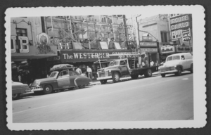
Photograph of the Westerner Gambling Hall and Saloon, Las Vegas, Nevada, circa 1931-1943
Date
1931 to 1943
Archival Collection
Description
Workers on scaffolding on the exterior of the Westerner Gambling Hall and Saloon (owned by the Stockers). Next door are Kolstad's Toggery men's store and the Monte Carlo Club. A truck for the Young Electric Sign Company is parked in front of the Westerner. Site Name: Westerner Gambling Hall and Saloon (Las Vegas, Nev.)
Image
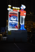
Photographs of Pabst Blue Ribbon sign, Las Vegas (Nev.), June 28, 2017
Date
2017-06-28
2017-07-22
Archival Collection
Description
The Pabst Blue Ribbon sign sits near the intersection of Fremont Street and North Las Vegas Boulevard in Downtown Las Vegas. Information about the sign is available in the Southern Nevada Neon Survey Sheet.
Site address: Fremont St and Las Vegas Blvd
Sign owner: PBR Donated, but a part of Fremont Street East
Sign details: PBR held a revealing party when installed in 2015, right next to The Park on Fremont. YESCO manufactured the 30 feet tall sign is nicknamed Cool Blue. Previous to this sign in this location the Maharaja Hookah Cafe had their signage in the same location previous to 2013.
Sign condition: 5, just installed in 2015 so neon and paint are still in great condition
Sign form: Free Standing Sign
Sign-specific description: 30 feet tall, the sign is nicknamed Cool Blue. A 30 foot waiter holding his arm out with 3 beers on his arm and one in his hand. The beers are animated with them lighting up in order starting with the one closest to his body. His arm is resting on a PBR can. The waiters shirt and cheeks illuminate red neon while the rest of his body illuminates blue argon. The PBR beer can illuminates red and blue as well.
Sign - type of display: Neon
Sign - media: Steel
Sign animation: The Beer cans on the waiters arm light up in order, starting with the one closest to his body.
Sign environment: This is located in the parking lot on the corner of Las Vegas Blvd. North and Fremont St. East next to the Park on Fremont. This marks the beginning of the Fremont Street East District were other freestanding Neon signs are as well.
Sign manufacturer: YESCO
Sign - date of installation: 2015
Sign - thematic influences: The retro theme makes it look like a throwback to 1950s/60s advertisement. Also since it is for a beer company it shows that Neon does not always have to be for the Casinos here in Vegas. This is one of the first freestanding signs you see in the Fremont Street East District, thus showing that the Neon community downtown still is thriving and still defines our culture here.
Survey - research locations: YESCO website http://www.yesco.com/news/yesco-installs-pabst-blue-ribbon-neon-sign/ , Vital Vegas website https://vitalvegas.com/downtowns-fremont-east-gets-a-new-neon-sign-courtesy-of-pbr/ , google map roadside view
Survey - research notes: Since this is a freestanding sign it is difficult to find any specific information on a single owner or why this sign was placed there specifically.
Surveyor: Emily Fellmer
Survey - date completed: 2017-07-22
Sign keywords: Neon; Steel; Back to back; Monument sign
Mixed Content
The Palette, 1936
Level of Description
File
Archival Collection
Young Electric Sign Company (YESCO) Corporate Records
To request this item in person:
Collection Number: MS-00403
Collection Name: Young Electric Sign Company (YESCO) Corporate Records
Box/Folder: Box 06
Collection Name: Young Electric Sign Company (YESCO) Corporate Records
Box/Folder: Box 06
Archival Component
Profit and Progress, 1940
Level of Description
File
Archival Collection
Young Electric Sign Company (YESCO) Corporate Records
To request this item in person:
Collection Number: MS-00403
Collection Name: Young Electric Sign Company (YESCO) Corporate Records
Box/Folder: Box 06
Collection Name: Young Electric Sign Company (YESCO) Corporate Records
Box/Folder: Box 06
Archival Component
Commercial price book, undated
Level of Description
File
Archival Collection
Young Electric Sign Company (YESCO) Corporate Records
To request this item in person:
Collection Number: MS-00403
Collection Name: Young Electric Sign Company (YESCO) Corporate Records
Box/Folder: Box 01
Collection Name: Young Electric Sign Company (YESCO) Corporate Records
Box/Folder: Box 01
Archival Component