Search Results
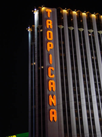
Photographs of Tropicana signs, Las Vegas (Nev.), 2002
Date
Archival Collection
Description
Photos show Tropicana signs at night. Two surveys were conducted to gather information about this sign. One was conducted in 2002 and one was conducted in 2017. PDFs are available for both surveys. See the 2017 survey PDF for additional information that is not included in the object description.
Site name: Tropicana Hotel and Casino (Las Vegas, Nev.)
Site address: 3801 S Las Vegas Blvd
Sign owner: Aztar
Sign details: The southeast corner of Las Vegas Blvd and Tropicana Boulevard belongs to the Tropicana Hotel Casino. The Tropicana is composed of two high-rise towers, the low-rise wings of rooms, and the casino itself. One tower faces southwest/northeast, while the other tower, further east on the property faces southeast/northwest. The expanse of the corner, near the street is an open concrete pedestrian plaza, with rising planters, a large functioning waterfall, also surrounded by foliage, and various vendors. The porte-cochere connects the plaza to the hotel, with the connecting bridge to the Excalibur, residing on top.
Sign condition: Structure 5 Surface 5 Lighting 5
Sign form: Pylon; Fascia
Sign-specific description: On the north and south faces of the porte-cochere roof line, on a pediment between the sloping blue roof and a row of brass fixtures, large channel letters in the faceted Tropicana font, horizontally spell "Tropicana." The exteriors are painted black wit a blue reflective finishing the interiors. They are filled with blue neon. The ceiling of the porte-cochere holds two distinct features to its credit. The north half is adorned with a glass domed hole through the roof. The interior thickness and recessed lip are covered in a polished metallic surface. Seashells adorn the edge where the lip meets the ceiling as well as on the face of the ledge as well. Teal, red and gold organic lines are floating across the surface in paint. The south half of the porte-cochere is covered with six recessed rectangular areas. Within the giant coffering a field of polished metal squares form a tiled field bordered with incandescent bulbs. In each of the corner intersections a sculpted glass cover, hold a single incandescent bulbs. Each field holds forty or so of these bulbs and their coverings. Two identical pylons flank the courtyard. One of them is on the south side of Tropicana avenue facing east /west, while the other faces north/south on the east side of the street. The pylon is essentially a giant double-sided rectangle with a top section that angles back into space on either side to meet at a peak. The result is a small roof like peak at the top of the sign supporting text on its face. The text however is standing up horizontally at a 90-degree angle. Besides the text logo at the top, the sign possesses an internally lit message cabinet on the bottom of the face, a small LED message center, and another backlit cabinet with a color advertisement for Follies Berger. The message center at the bottom is white plastic with vinyl lettering. The small message center is flanked by three steel poles, the height of the sign and finished to look like bamboo. The horizontal line created by the top edge of the sign is also lined with this false bamboo. The channel lettering at the top are polished metallic, shallow channel letters, which extend in depth all the way back to the face of the roof like form. The faces are filled with incandescent bulbs and bordered in neon. The sides of the sign are treated with a vertical bull nose like shape which runs vertically up the width of the sign. It is pointed wit ha triangular shape on both ends. The shape begins flush with the triangular peak of the signs profile and ends with its point approximately halfway down the height of the bottom message center. The bull nose is faceted with three faces. At the triangular tips, the three faces appear to make the space retain a jewel like shape. The middle face is laden with incandescent bulbs. The rest of the width of the sign is also finished in polished gold metal. The remaining open space on the faces of the cabinet, as well as exposed pieces of the cabinet, are painted a teal color. A border on incandescent bulbs runs around the entire face of the signage. The only signage present on the towers , is the on the first tower, closest to the corner. Running vertically down the west side of the southwest face of the tower, giant metallic channel letters spell "Tropicana" and are lined on the interiors with a double row of neon. Along the western end of the tower, three, double rows of incandescent bulbs run the entire height of the building. These animate, chasing each other down, simulating a waterfall.
Sign - type of display: Neon; Incandescent; Backlit; LED
Sign - media: Steel; Plastic
Sign - non-neon treatments: Graphics; Paint
Sign animation: Chasing, oscillating
Notes: Pylons: The incandescent bulbs inside the channel letters for the logo oscillate, as well as on the vertical width of the pylon. The raceways around the backlit screen chase each other, but it is a double row of incandescent bulbs that chase in opposite directions to each other. Building: The giant raceways of incandescent bulbs on the northwest corner of the Tropicana's front tower, chase each other from top to bottom, representing a waterfall.
Sign environment: The Tropicana belongs to one of the four major properties which comprise the intersection of Tropicana Ave. and Las Vegas Blvd The corner is occupied by a plaza and pedestrian element that is also seen in the other neighbors in the intersection as well. The towers loom over the plaza, as is accented by kiosks for patron promotions, and other services such as refreshments. The property is a good example of a property which has adapted over the years to fit and compete with the rapid evolution of Las Vegas.
Sign manufacturer: Original fascia design ( letters on building are what remain after remodel) by Heath and Company. Pylons: by YESCO
Sign designer: Original prismatic design was submitted by AD-Art's Jack DuBois ,but produced by Raul Rodriguez for heath and Company.
Sign - date of installation: 1978
Sign - date of redesign/move: The original facade was remodeled, which altered the exterior of the porte- cochere, but the letters remain.
Sign - thematic influences: The theme surrounding the Tropicana is that of the island paradise. References to the theming, that are evident on the exterior, are the shape and style of the text utilized in the various signage as well as those shapes being carried over into the designs other architectural elements. The blue incandescent bulbs that chase each other down the face of the building obviously reference a waterfall. Juxtaposed to the aesthetic, actual water elements have been incorporated into the front facade also. The angular design of the text is reminiscent of prism like faceted fonts is reminiscent many aspects dealing with Las Vegas, but fit more into the theme of the property than Vegas. The prismatic design is also incorporated into the design of the actual pylon also. The edges of the vertical length of the pylon are faceted and the triangular end seen on the fonts can be found elsewhere on the pylon. Not only is this shape evident with the pylon but on the fascia of the neighboring facade. The peaked rooflines of the village like facade also mirror this shape, being accented by the incandescent bulbs that line the edges. The text are reminiscent of something tropical, the shape somehow represents something rustic and wooden, even a tiki-like flavor.
Surveyor: Joshua Cannaday
Survey - date completed: 2002
Sign keywords: Chasing; Oscillating; Pylon; Fascia; Neon; Incandescent; Backlit; Steel; Plastic; Graphics; Paint; LED
Mixed Content
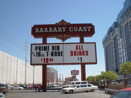
Photographs of Barbary Coast signs, Las Vegas (Nev.), 2002
Date
Archival Collection
Description
Daytime and nighttime views of the Barbary Coast signs on The Strip. Information about the sign is available in the Southern Nevada Neon Survey Data Sheet.
Site address: 3595 Las Vegas Blvd
Sign owner: Coast Casinos
Sign details: Just West of the Maxim, on a strip of property adjacent to the Flamingo, the Barbary Coast appeared in 1977 dressed in Burgundy and gold with full wrap mansard canopies and simulated Tiffany glass fascias. YESCO's Brian Lemming drew from 19th century woodblock alphabet styles to create the new distinctive logo style. It has since earned the nickname Barbary Coast Block. Lemming's bull nose design paired two opposing drum elements, which tapered near midpoint and were ringed with traceries of traveling lamps alternating with decorative panels outlined in red neon. Other signage includes a pylon sign on Flamingo Rd., textual wall an logo signs, as well as LED display screens. The screens are located near walkways, which extend north/south across Flamingo road, and east/west across Las Vegas Blvd
Sign condition: Structure 5 Surface 5 Lighting 5
Sign form: Pylon; Fascia
Sign-specific description: Upon the south elevation of the building, eight foot tall channel letters spell the "Barbary Coast" logo. South of the main logo, two square poles support the Barbary Coast pylon, which is on the north side of Flamingo, facing east/west. The two legs play Atlas to a double backed, internally lit, message cabinet, with vinyl lettering. The two legs protrude through the top of the sign for a short distance before the main logo cabinet begins. It is about half the size in height of the internally lit message center and containing more elements of design. "Barbary Coast" is spelled in white channel letters and filled with incandescent bulbs, in the Barbary Coast text. The edges of the letters are actually narrow channels that house tubes of gold neon. The neon and the channels actually create the designed curves of the fonts. The centers of the top and bottom edges of the cabinet, are crafted into protrusions in the rectangular shape. They are placed cleverly shallow into the surface to almost seem as if they are resting on the width of the cabinet instead of being part of it. Being completely treated in a gold paint on its width edge, which are parallel to the straight portion of the cabinet edge width, helps with the illusion of the sections being separate entities. Orange and burgundy scroll works are graphically placed into the faces of these protrusions in the panel to finish them off. Headed west at the beginning of the actual property, the first vestiges of signage hangs above the parking garage. A triangular back lit cabinet is finished in polished gold aluminum with a raceway acting as an element, on the edge pointing north, then transforms into a raceway arrow pointed toward the entrance of the garage. The famed overhang creates an arch over the garage entrance, which is recessed all the way back to the main wall of the structure. Mirrors create the surface of the wall at the back of the tunnel vault, of the recessed arch. Upon the mirrored surface a channel logo for the "Drai's" nightclub, hangs quite high above the pedestrian's head. The logo is bordered with green neon and filled with incandescent bulbs. The entire sign is a shallow channel letter design allowing enough room for the depth of the bulb. Another arch and tunnel, with a mirrored wall, is located just west of the first arch. It plays host to a brass colored chandelier with spherical lamps. At ground level underneath the middle section of the famed structure where the main logo text resides, we have an entrance to the casino with a cabinet denoting that over the door. The cabinet is a mirrored face with a gold aluminum polished raceways with incandescent bulbs. The text spelling "Hotel Casino Entrance" is in gold polished channel letters and filled incandescent bulbs. Underneath the canopy, the faux Tiffany glass is separated on its edges by gold polished raceways with incandescent bulbs. Past the main entrance another tunnel arch is formed just past the "B" in Barbary main logo and plays host to a different entrance. It too has a brass chandelier and a mirrored cabinet of the same design as the afore mentioned entrance. The only difference is the text. It spells " Casino Entrance." The rest of the treatments for this sign are identical to the first entrance. On the northeast corner underneath the bull nose, a giant brass chandelier hangs in the center, supported with a multisided, mirrored column. The corner of the building is also an entrance. The west side of the building boasts two wall signs. The south side of the building plays host to the main logo text for the Barbary Coast facility, upon the fascias architecture. The middle of the sign is a long low rise arch. Giant channel letters spell Barbary Coast, above the row of faux stained glass squares, and stand independently away from the wall. They are filled with incandescent bulbs and bordered with neon. The interiors are painted red and the exteriors are treated in gold. Rows of red, vertical, neon tubes line the face of the facade behind the standing channel letters. Continuing around the corner upon the west face of the building the facade continues for a short stretch north after the corner rotunda. The wall of the building itself is where another Barbary Coast text logo resides It's large, and occupies a good portion of the area of the wall. The letters are designed in the same fashion as the letters on the pylon, painted white on the interior and treated gold on the exterior. Above and below the text, two cabinets crafted into scrollwork, similar to those seen on the pylon yet are not attached to the text. The cabinets are slightly recessed providing room for a border of gold neon. Below that and above an LED screen another logo for Drai's, as seen on the south elevation, hangs on the wall. A pair of LED screens flank the NW corner, on the west and south faces of the building. The LED screen on the south wall is at the end of an elevated walkway, that crosses Flamingo. The West wall LED is appropriation to the elevated walkway crossing Las Vegas Blvd, on the west side of the building as well. Another Drai's logo sign shares the west wall also. Along the fascia awning that wraps around the building graphics adorn the rounded panels, which simulate the Tiffany glass. Vertical raceways separate these panels. Neon borders each one of these panels as well as polished raceways along the top and bottom. Incandescent bulbs line all the raceways, as well as the outer edges of the underside. On the North wall of the building, just around the corner from the signage on the west face of the building, another Barbary coast logo wall sign is located on the top portion of the building. It is accompanied by an internally lit, plastic, message board, with vinyl lettering. The two pieces together sit in a slightly recessed niche, so that the board and the text are flush with the rest of the building. The letters are painted yellow on the inside, possess incandescent yellow incandescent bulbs on the interior. The letters are also treated with the same gold finish seen throughout the establishment.
Sign - type of display: Neon; Incandescent; LCD; LED
Sign - media: Plastic
Sign - non-neon treatments: Graphics; Paint
Sign animation: Flashing, chasing, oscillating
Notes: All incandescent bulbs on the polished, gold raceways, chase each other down their entire lengths. The bulbs inside the polished channel letters oscillate as well. The incandescent bulbs in the Drai's sign also oscillate. The pylon sign: The background of vertical red neon bars chase each other from the outer ends, until the entire background is illuminated, then the incandescent bulbs inside the letters chase down and fill the letters, which then oscillate. The text then steady burns, chases downward, then leaves the letters dark in it's path. Once the letters are dark then the neon background curtains open chasing from the center to either end. Once the neon goes dark, then the empty text chases downward again, oscillating, then chasing from top to bottom leaving the letters dark in it's path. The text on the west side of the building lights up one letter at a time, then oscillates, and then steady burns. The letters then oscillate again, shut of for a split second. Then each individual word lights up one at a time. "Barbary" then "Coast," "Barbary" then "Coast" again. On the last sequence of the individual words lighting up they stay lit, and turn off one letter at a time. The main marquee: Each letter of the main marquee illuminate one letter at a time, then oscillate. While they are oscillating then, the vertical red neon bars chase from either end of the sign illuminating each bar in it's path. Right before it reaches the center, the letters shut off briefly then lights up "Barbary" then "Coast," then they both oscillate. They shut off briefly lighting up one word at a time again, oscillating once more. This pattern runs one more time while the red background chases from the center to the ends leaving the rest dark in it's path. The letters remain dark until the red bars regenerate, by chasing outward from two different spots, meeting in the center and extending to the ends. By the time the background is regenerated then the text begins to light up again, rapidly from left to right as if saying "Barbary Coast." It does this a total of three times. All the while the background is opening and closing from the two spots a total of three times. Once the background regenerates one more time, then the letters flash off then on, then alternates with the background. Letters, then background, letters, then background, then off. The two are not lit at the same time during this exchange, but take turns lighting up.
Sign environment: The Barbary Coast sits in the unique intersection of Flamingo Rd. and Las Vegas Blvd, once the main four corners of the Strip. The majority of the surface of the building is located on Flamingo road, just off the strip, headed east. Walking underneath the covered awing on the south side of the building, the constantly pulsating incandescent bulbs and various sounds of the casino bombard a pedestrian, enveloping one until you meet the end of the establishment at either end. The large drummed corner, makes the rest of the adjacent facade hard to miss. Directly south, across Flamingo the Bally's multimedia pylon behemoth resides, and the vibrant Flamingo, sits snugly next to the Barbary Coast's north side. The two establishments of Flamingo and Bally's are considered akin, due to such close proximity. Once you exit the Barbary Coast, utilizing the portals on the west side, headed north, you are almost automatically standing in a small courtyard, in the grasp of the attractive, bright, pink and orange plumage of the Flamingo Hilton. The pedestrian traffic flows from one establishment to the next with ease.
Sign manufacturer: YESCO
Sign designer: Brian K. Leming (bull nose and wrap around fascia)
Sign - date of installation: 1977
Sign - date of redesign/move: LED screens were added to the west and south faces of the building
Sign - thematic influences: A good phrase to describe the thematic influence would be that of a turn of the century ambiance. With it's logo style derived from 19th century woodblock prints, canopies covered in faux Tiffany glass, ornate brass tracings, and distinctive mansards, the decor is reminiscent of a bustling turn of the century gala or festival.
Sign - artistic significance: The full wrap fascia design by Leming, is reminiscent of older Fremont street properties such as the Golden Nugget, and Binion's Horse Shoe. The pedestrian passes underneath the pulsating signage, next to the entrances to the facility. It is a significant design maximizing the space with its design.
Surveyor: Joshua Cannaday
Survey - date completed: 2002
Sign keywords: Chasing; Oscillating; Flashing; Pylon; Fascia; Neon; Incandescent; LED; LCD; Plastic; Paint; Graphics
Mixed Content
Hard Rock Cafe Neon Guitar Sign Sketch
Identifier
Abstract
Collection is comprised of a framed sketch of the neon guitar sign that was fabricated by YESCO for the Hard Rock Cafe in Las Vegas, Nevada circa 1990. It was hand-colored by the designer Shirley Ono, framed, and presented as a gift to Warwick Stone, Creative Director of the Hard Rock Cafe chain from 1982-1996, who commissioned the design.
Archival Collection
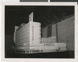
Photograph of a model of the Fremont Hotel and Casino (Las Vegas), circa early 1950s
Date
Description
Large model of the Fremont Hotel and Casino.
Site Name: Fremont Hotel and Casino
Address: 200 East Fremont Street
Image
Stardust Resort and Casino Photograph Collection
Identifier
Abstract
The Stardust Resort and Casino Photograph Collection, approximately 1970 to 1979, consists of black-and-white and color photographic prints of the Stardust Hotel and Casino in Las Vegas, Nevada. The photographs depict the interior and exterior of the hotel before and after its renovation in 1975.
Archival Collection
Stardust Resort and Casino Records
Identifier
Abstract
The Stardust Resort and Casino Records (1950-2006) contain materials of the Stardust Resort and Casino, which operated in Las Vegas, Nevada from 1958 to 2006. The collection contains materials on events hosted by the Stardust, the resort and casino's corporate history, interior and exterior building design, and performers. The collection also includes photographs, negatives, and slides that document the history of the resort and casino. Newspaper and magazine clippings, advertisement and marketing materials related to the Stardust's venues, shows, entertainers, and events are also present in the collection. The collection also contains a significant amount of audiovisual material, including VHS tapes, audio cassettes, optical discs, film reels, and cassette tapes containing footage and audio recordings of Stardust show promotions, news broadcasting clips, interviews, and commercials featuring the Stardust.
Archival Collection