Search the Special Collections and Archives Portal
Search Results
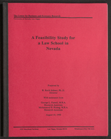
A Feasibility Study for a Law School in Nevada (bound)
Date
Archival Collection
Description
A bound version of "A Feasibility Study for a Law School in Nevada" prepared by R. Keith Schwer, Ph. D., Director, with assistance from George L. Fussell, M.B.A., Research Associate, and Mohammed H. Risheg, M.B.A., Research Associate, The Center for Business and Economic Research, University of Nevada, Las Vegas. From the University of Nevada, Las Vegas William S. Boyd School of Law Records (UA-00048).
Text
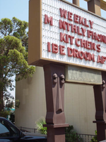
Photographs of Desert Oasis sign, Las Vegas (Nev.), 2002
Date
Archival Collection
Description
Site address: 4445 Diamond Head Dr
Sign owner: Volunteers of America/HUD
Sign details: The Desert Oasis Apartments is on the south end of the strip, south of the Pit Stop. The low rise tan stone structure of the apartments sits just east of the strip separated by a small parking lot.
Sign condition: Structure 4 Surface 3 Lighting 3
Sign form: Pylon
Sign-specific description: The Desert Oasis Apartments is on the south end of the strip, south of the Pit Stop. The low rise tan stone structure of the apartments sits just east of the strip separated by a small parking lot. Just outside the main entrance, extremely close to the building, facing north south, two brown, sculpted, steel legs, support an internally lit message center. The two legs look to be representative giant Tiki heads. In the space between the legs, and on the bottom edge of the message cabinet, a clear plastic box hold neon sculpted into the words "Vacancy" underneath the word "No." The cabinet is painted a rusted color and the face is fluted plastic with vinyl lettering. Two square posts rise out of the top of the cabinet, a short distance, before they support a larger double backed internally lit cabinet. A center pole resides between the two legs, rising into the center of the cabinet as well. The cabinet is crafted out of a polished gold metal. The face of the sign is a graphically treated surface. Desert Oasis is written in red cursive script across the top of the sign. A small graphically painted green palm tree, sits just to the right of the text. The middle of the board is occupied by large all capital text reading "Motel," in black text. Two black horizontal scrolls flank the text. A band of red runs horizontally across the bottom of the sign, with white painted text reading "Apartments."
Sign - type of display: Backlit
Sign - media: Steel; Plastic
Sign - non-neon treatments: Graphics
Sign animation: none
Sign environment: The Desert Oasis is located between the Laughing Jackalope to the south and the Motel 8 establishment to the north. It stands very inconspicuous among the environment of the southern end of the strip, easily passed by the motorist or wandering pedestrian.
Sign - thematic influences: Even though the establishment fits into the genre of a roadside motel, the sign itself doesn't quite fit in to the motif. The building itself is reminiscent of standard architecture of the era and location, the sign itself has elements of a Polynesian flavor. The legs of the sign appear to be Tiki like figures, but the details are quite vague.
Surveyor: Joshua Cannaday
Survey - date completed: 2002
Sign keywords: Pylon; Backlit; Steel; Plastic; Graphics
Mixed Content
Meeting minutes for Consolidated Student Senate, University of Nevada, Las Vegas, January 29, 2007
Date
Archival Collection
Description
Text
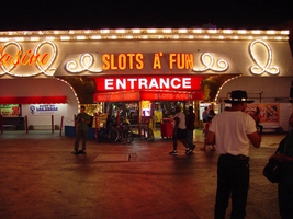
Photographs of Slots a Fun signs, Las Vegas (Nev.), 2002
Date
Archival Collection
Description
Site address: 2880 S Las Vegas Blvd
Sign owner: Mandalay Resort Group
Sign details: Slots a' Fun is located on the south side of the Circus Circus parking lot, but it is on residence now. The small building stretches west with the mouth of the building being an open mouth facing the east. The external signage is located on the elongated north face of the building, and the gaping east entrance. The north side is comprised of gold painted, crafted raceways with various text signage. The entrance is adorned with various internally lit cabinets as well as a marquee adorned pediment, located within the front face of the entrances overhang. The entrance is considerably small, sandwiched between flamboyant properties such as the Westward Ho and the Circus Circus.
Sign condition: Structure 4 Surface 4 Lighting 4 The structural integrity is good as well the lighting. The surface is starting to show some signs of wear, but not very much at all.
Sign form: Fascia
Sign-specific description: The main entrance faces east and contains an interesting array of signage. The front is highlighted by two giant pillars. The are uniquely designed as inverted, tapered cones supporting the barrel vaulted cantilevered overhang. Near the top portion of the column a backlit message box cuts through the pole dividing it into two apparent sections. Bordered on all edges with gold polished raceways with incandescent bulbs, the box is animated in a chasing pattern. A top the poles on the north and south sides a polished aluminum, circular cabinet, has red, backlit plastic containing the words "Slots A' Fun" in white text. These cabinets are outlined in red neon. The edges of the apparent recess are lined with incandescent bulbs Each vault contains a long bank of large incandescent sphere's, arranged in single file. Along the front of the cantilevered overhang we have an entablature running the length of building. Gold raceways run horizontally along the top and the bottom with rows of triple incandescent bulbs. In the center of the pediment, white channel letters painted red on the inside, with incandescent bulbs filling the interior space of all of the characters. Each letter is also outlined in neon. The rest of the interior space of the facade is sculpted raised circular pattern with incandescent bulbs placed in the centers where the repeated panels connect. Under that, a polished gold aluminum banner with various assorted neon letters and advertisements is displayed. Since the "Slots A' Fun" used to be part of the Circus Circus it is closely integrated into the environment and even with the signage. Upon the northeast corner of the building a sign for the Circus Circus is perched on the top of the roofline facing north/south. Facade is sculpted raised circular pattern with incandescent bulbs placed in the centers where the repeated panels connect. Moving around to the north face of the building, an array of signage is present headed west along the wall. Along the stucco facade we have overhangs of different dimensions. On these three overhangs we have gold channels in the shape of a continuous curly cue or rope shape. These raceway channels are lined on the inside with incandescent bulbs. The first one, furthest east, is a good length, and smaller in height than the others. The pattern loops eight times along the front. One single loop of the rope shape is located on the return width of the overhang as well. No text is incorporated with this overhang. The second curling raceway is over a wider, shallower depth. The overhang, is much larger in size and supports cursive pan channel letters painted red and outlined with red neon. The letters spell "Casino" in a continuous script text. The third overhang is the largest of the trio, and serves as the main entrance for this face of the building. It is in direct proximity to the actual Circus Circus building and the blazing signage, and porte cochere. This overhang is lower to the ground than the other two but projects further out. Channel letters spell "Slots A' Fun" in the front face of the overhang located in the center. The channel letters are painted red and lined on the interiors with red neon as well. This text is block instead of script. Flanking either side of the text there is the curling channels. The face of the building rises upward from the ground and meets the bottom edge of the overhang, with a continuous radius vault. The surface of the wall is surfaced with a gold reflective material. Just below the text of the overhang is a red steel cabinet, that is internally lit. The red painted steel box has a red plastic with a red plastic face with white lettering. The block text reads "Entrance." The sides are sculpted with a radius space reduced out of the sides of the cabinet. The edges of the face are lined with incandescent bulbs. Below the cabinet a red, vinyl, awning extends out over the doors, and a pedestrian path. A small portion of the main structure still extends west with one more loop on the face of the building.
Sign - type of display: Neon; Incandescent; Backlit
Sign - media: Steel; Masonry
Sign - non-neon treatments: Graphics; Paint
Sign animation: Chasing, oscillating
Notes: All of the raceways chase each other. This includes all of the different aspects which are lined with incandescent bulbs.
Sign environment: The Slots A Fun has the unique position of being in between the Westward Ho and the Circus Circus. It was at one time part of the Circus Circus, so it essentially blends in with its environment. The south side of the building literally resides touching the Westward Ho.
Sign manufacturer: YESCO
Sign - thematic influences: The theme of Slots a Fun can be regarded as the heavy influence from its initial design based on the Circus Circus. In that respect it would be linked to a circus theme. The almost surrealistic swelling of the tile laden columns on the east face of the building as well as the curly cue raceways suggest a busy excitement usually associated with the extravaganza of the circus. To that end, the interaction with the Las Vegas environment would suggest the theme of a party. Such influence of the same element of theming can be seen in the umbrella shapes and chasing action of the neighboring Westward Ho. Several elements of the facade suggest different trends as well. The eastern overhang's vaulted dome is surfaced with the highly reflective polished gold aluminum. The entrance on the northern face incorporated with the surfacing with a golden reflective surface. The trend of using the reflective surface to further perpetuate the luminescence is used highly in the flanking properties. The use of the raceways is a unique function, not repeated on any other property.
Sign - artistic significance: Some unusual elements that have not been repeated can be found in this lesser-known example of sign art.
Surveyor: Joshua Cannaday
Survey - date completed: 2002
Sign keywords: Chasing; Oscillating; Fascia; Neon; Incandescent; Backlit; Steel; Masonry; Graphics; Paint
Mixed Content
Alpha Kappa Alpha Sorority, Theta Theta Omega Chapter health committee reports
Date
Archival Collection
Description
From the Alpha Kappa Alpha Sorority, Incorporated, Theta Theta Omega Chapter Records (MS-01014) -- Chapter records file.
Text
Bland, Ora L., 1933-
Ora Bland migrated to Las Vegas in 1953 from Vicksburg, Mississippi. Her husband was a radiologist and worked in Area 51 of the Nevada Test Site. He never shared information about his work and would sometimes stay at the Test Site for a week or more without coming into the city. Bland remembers the Westside business community when the Brown Derby, the Mexican store, Johnson Malt Shoppe, and Bravo Market existed. An extremely independent person, she handled most of the childcare and worked at the downtown post office (now MOB Museum) for 20 years.
Person
Audio recording clip of interview with Judge Lee Gates by Claytee D. White, December 5, 1996
Date
Archival Collection
Description
Part of an interview with Judge Lee Gates by Claytee D. White on December 5, 1996. Gates explores his mother's motivations for moving to Las Vegas in the 1950s.
Sound


