Search Results

Photographs of Flamingo signs, Las Vegas (Nev.), 2002
Date
2002
2017-08-11
Archival Collection
Description
Photos show Flamingo signs at night. Two surveys were conducted to gather information about this sign. One was conducted in 2002 and one was conducted in 2017. PDFs are available for both surveys. See the 2017 survey PDF for additional information that is not included in the object description.
Site name: Flamingo Hotel and Casino (Las Vegas, Nev.)
Site address: 3555 S Las Vegas Blvd
Sign owner: Park Place Entertainment
Sign details: The majority of the Flamingo hotel and casino's neon signage encompasses the stretch of property that faces the strip. Even though the original porte-cochere and pylon sign are no longer in use, or in the original position, they are still evident and very much present. The original pylon has been moved around the corner onto Flamingo, actually closer to the Barbary coast than the Flamingo. The famous sculpted bull-nose design is repeated several times throughout the property and the design is repeated in visual reference on the towers of the hotel.. The Flamingo was one of the first hotels to push its entrance out to the street.
Sign condition: Structure 5 Surface 5 Lighting 5
Sign form: Pylon; Fascia; Porte-cochère
Sign-specific description: The Flamingo's vast array of signage of various types and styles make the hotel one of the more unique facades. Headed north just past the corner entrance to the Barbary Coast, only a two-lane drive separates the two properties. Across the drive, the original top of the old porte-cochere creates the first of the several three-dimensional, sculpted, corner sign you see. The well known swollen base and flexing body of this trademark crowning figure spread out in a bouquet of pink and orange steel feathers. Neon runs horizontally in a repeated pattern up the lengths of the feathers, with the outlying edge portions painted white and filled with incandescent bulbs, turning into single row raceways at the waving ends of the very tips. This corner serves as a pedestrian entrance now, and one of the main causeways between the Barbary Coast and Flamingo. The fattened plumage is set up high a top the corner of the building pointing to the southwest. The broad corner is dominated by the expansive sculpture. Standing atop of the plumage a channel letter logo sign faces outward spelling "Flamingo" in the Flamingo cursive text. The text is appropriated in a radius pattern, supported by a steel support structure making the logo seem as if it is floating above the sculpture. The sign is filled with incandescent bulbs. Two tubes of blue neon wrap the bull nose molding just below the three-dimensional structure, creating a space for the facade of the faceted pediment. Wrapping the face of the corner is a large entablature of patterned squares forming a grid like terrain with incandescent bulbs in the center of each square. Each square is faceted into pyramid shapes with bulbs at the center of each. Just above the pedestrian's head and below the faceted entablature, a raceway sandwiched by two tubes of pink neon creates a bottom line of the composition. The configuration continues to the right of the entrance into a smaller representation of the same effect. To the right of the old porte-cochere entrance, a small wall sign for "mega-jackpot world" is displayed with pink and Purple channel letters filled with neon on the section of wall which faces to the west. The sign is also incorporated into the famed pink and orange flame style, with the plumage emulated in channel pans on either side of the text. They are complete with horizontal neon bars and sections lined with incandescent bulbs as well. The section of wall that the sign sits upon is in the style of the faceted entablature spoken of previously. The two tubes of blue neon are above the pediment and sign and the bottom is also rounded out with the pink neon. Continuing east down the south face of the building, a continuous glass entablature is first seen, at the same height as the blue neon capped molding. The entablature is a glass wall lined with glass faced, two, dimensional figures of flamingos and shrubbery. Details such as wings, and other features are denoted by pink colored glass. Standing several inches off of the wall, the flamingos are lit from behind with red and pink neon creating halos, which reflect off of the glass behind them. The top edge of the pediment is lined with teal neon, while the bottom is blue. The top edge of the building, above the pediment and along other edges of the face, is a rolling design of hills lined pink neon. This element continues down the south wall of the building until it reaches the current porte- cochere. This structure is a circular drive covered with a circular roof. The east and west edges of the structure play host to large channel letter logo for the Flamingo. The pink steel structure spells "Flamingo" in their continuous cursive fashion, and filled with incandescent bulbs. The ceiling of the porte-cochere is an ornate pattern of raceways lined with incandescent bulbs. The pattern is reminiscent of a flower and it's radiating petals. The mirrored pediment continues past the porte-cochere on the wall of the building. Down the west face of the building, being the front of the facility along the strip, past the original porte-cochere, the glass pediment continues until it stops at a small wing of the building denoting another entrance. The entrance slightly radiuses out from the flat plane of the building, and is crowned by another three dimensional swollen bouquet of steel plumage spreading generously over the entrance, stretching it's waving fingers a good degree out on either side. It is constructed with the same color scheme and array of placement for incandescent lighting and neon. While not quite as bulbous as the southwest corner entrance, it breadth is the quality that beckons to the entrance. On the entablature below, the Flamingo logo is spelled in channel letters, and filled with pink neon. Teal neon lines the top of this pediment as well as blue along the bottom. The glass pediment continues on the wall north of the entrance until the face of the building goes from a stucco finish into a section of the elevation created by a wall of glass window panels. This section of the front is anchored in the center by as giant Doric column crowned by a third set of three dimensional sculpted array of pink and orange plumage. Like the two previously mentioned elements of this nature, the swollen base and stretching feathers take on a waving effect. This element is smaller in width than the previous two, but it's feathers or fingers curl forward in the center providing a support for a triangular cabinet section, with the two visible faces pointed northwest and southwest. The feathers continue in a smaller portion on top of the cabinet, appearing as if they rise thorough the cabinet.. The appearance of this set of plumage takes on different appearances for two reasons. The first being it's position upon the top of a column making appear as a torch. The plumage takes on the effect of being flames instead of feathers. The second being the severity of the curve of the center leaf or flame. From the side, coupled with the outer wings, it takes on the persona of a perched bird. The glass pediment continues past this section, stopping with another rooftop set of plumage on the entrance to the building, facing northwest. Above a backlit plastic advertisement cabinet, the fiery fingers of the sculpted, swollen signage, stand as a solid marker to the end of the property, or entrance to the pedestrian headed south. The glass pediment picks up again along the north face of the building headed east. On the East side of the Flamingo property, two fully three-dimensional sculpted steel structures serve as a gateway to the east side of the porte-cochere. Flanking either side of the drive, two identical bud-like structures stand with the same influence as the swollen elements of the front property. A short, faceted column, supports a three tiered, three layered rosebud shape crafted out of leaves more akin to palm fronds. Sagging leaves, pointed toward the ground, create the section between bud shape and the supporting column. They are folded down, representing the action of the leaves being opened. Neon runs in short horizontal bars along the outer surface leaves and all flat planes excluding the topsides of the relaxed leaves. These two markers also take on the persona an organic structure as a sapling palm tree, or rosebud, as well as the image of a burning torch. Building signage: Upon the western tower Flamingo is spelled in channel letters designed with the Flamingo text, and filled with pink neon. Upon the eastern face of the south tower, the half plumage of neon, flaming upward, reside underneath the Flamingo text logo. The same sign is repeated on the north edge of the west tower. Pylon: The original pylon sign now located on the north side of Las Vegas Blvd, in close proximity to the hotel, but actually between the Bourbon Street and the Barbary Coast. The vertical pylon is a double-sided pylon that faces east west. It has slightly modified over the years. The internally lit message center has been scaled down to fit its new environment. The pylon rises up in a square pole design, with neon running vertically up the center, approximately fifteen feet above the pedestrian's head, before being interrupted by the message cabinet. The cabinet has a white plastic face with removable letters. Gold polished raceways line the face of each of the sign, and incandescent bulbs line the raceways. The sides of the cabinet slope inward, round at the corners at the top, reaching toward the center that rises at a peak. The neon continues upward past the highest peak of the cabinet, and continues up to fan outward, created a giant frond of vermilion and red. The giant fan shape at the top supports channel letters, that spell "Flamingo' in white channel letters that are outlined in blue neon and filled with incandescent bulbs. The top fan shape is actually comprised of seven different levels, appearing to be stacked on top of one another. The center, oblong shaped panel, is the highest, with three sections on each side, fanned out, stepping back into space. The furthest wings on the edge are scrambled with bent and undulating tubes of pink neon. The center two are red, and the center holds the pink members. The waving tubes, which lose form and pattern as they spread toward the edges, resemble veins of a leaf, or the elements, which make up the feather. The sides of the pylon, including the internally lit cabinet, are treated with a pink paint.
Sign - type of display: Neon; Incandescent
Sign - media: Steel; Glass
Sign - non-neon treatments: Paint
Sign animation: Chasing, flashing, oscillating
Notes: The incandescent bulbs inside the text reading "Paris" on the balloon oscillate rapidly.
Sign environment: The Flamingo is in between the Barbary Coast and O'Shea's on the east side of the street. The establishment itself dominates the stretch of property, separating the pedestrian from the sidewalk with various shrubbery and palm, a phenomenon seen often on the strip. Exiting the Barbay Coast, headed north, the passerby is seamlessly brought into the Flamingo, bombarded by the vibrant pink and orange plumage, and continuous atmosphere. O'Shea's lies on the north end of the Flamingo, adding a bookend type effect along with the Barbary Coast. Even though the Barbary Coast is a vibrant and active property, most of it's action lies on the south side of the building, thus the Flamingo signage is the most dominating within its length along the Strip.
Sign manufacturer: Original Pylon: Ad-Art, Facade: Heath & Co
Sign designer: Original : Raul Rodriguez. Original Pylon: Bill Clarke
Sign - date of installation: Original Pylon: 1968 Original Porte Cochere 1976
Sign - date of redesign/move: When Park Place Entertainment separated the Flamingo name from Hilton, all of the text signs which read Hilton were removed. The original pylon sign was moved from the west side, or street side of the property, and moved East down Flamingo Rd., Between the Barbary Coast and the Bourbon Street during remodeling done in the Eighties. The pylon has been modified several times over the years, but has evolved into a slimmer, less flamboyant version, including a simplified internally lit message center.
Sign - thematic influences: The theme surrounding the resort is the theme of the pink flamingo bird, and its tropical environment. The blazing pink tone ( Vermillion ) of the neon is seen extensively throughout the property, as well as the repeated image of the pink bird. The white plaster facade and sculpted edges of the exterior's roof line are reminiscent of sun drenched villas, while staying well within the realm the surrounding environment. Elements such as the mirrored entablatures lined with illuminated pink Flamingos
Surveyor: Joshua Cannaday
Survey - date completed: 2002
Sign keywords: Chasing; Flashing; Oscillating; Pylon; Fascia; Porte-cochère; Neon; Incandescent; Steel; Glass; Paint
Mixed Content
Photographs of Gameworks signs, Las Vegas (Nev.), 2002
Date
2002
Archival Collection
Description
Daytime and nighttime views of the Gameworks' signs on the Strip. Information about the sign is available in the Southern Nevada Neon Survey Data Sheet.
Site address: 3785 S Las Vegas Blvd
Sign details: Game Works is located on the underground level of The Showcase Plaza, which is also home to such establishments as M&M World and the Show case theatres. Two small gateway pylons for the Game Works center, stand on other side of staircases that lead to the underground facility. Just east of there a large wall front design hands approximately nine feet above the ground on the structure of the mall.
Sign condition: Structure 5 Surface 4 Lighting 5
Sign form: Pylon; Fascia
Sign-specific description: The large wall marquee that reads GAMEWORKS in all capitals, utilizes deep, yellow, steel, channel letters painted black on the exteriors. The slightly arched sign is on the West wall of the building, facing West from the East side of the strip. The interior of the text contains double rows of yellow neon. The cabinet, which the words sit upon, is a black steel cabinet shadowing the individual letters in one cabinet. The backing cabinet itself is illuminated from its interior, with middle section of the width of the cabinet is made of a steel grating. This function allows the blue neon on the inside to cast a blue glowing halo seen from the exterior. Sitting on top of the right hand side of the marquee are two steel boxes manufactured into the shape of a male and female figure dashing to the end of the sign. These figures are made of black steel box like formations while retaining a cartoon-ish silhouette. Their posture suggests motion or running. These figures are constructed in the same fashion as the black cabinet, which the text is supported upon. They too are glowing with the blue interior neon halo. In front of the large wall sign are the two, single sided, gateway pylons. They serve as markers for the stairs that lead the underground facility. They sit on either end of the large channel cut into the sidewalk. One faces South on the South entrance, and one faces North at the North end. The signage is actually a smaller replica of the large building front logo. The same interior lit cabinet supports the same design of yellow channel letters, with the backing "shadow" cabinet. A difference between the larger and smaller cabinets is that the cabinets are surfaced with the grated material. The only difference in the channel letters besides their obvious discrepancy in size, is that single rows of neon comprise the interior of the channel letters. On either side of the sign, two, "space age" themed posts provide support. They are topped with a sculpted cylindrical fashion capital. The bases for which they are attached to the concrete with, are blue in color. The actual shaft of the pole is made of several smaller pipes, with a plastic cylindrical tube in the center. Inside this tube is a string of attached incandescent bulbs running vertically. Below the text, suspended with two rods, is an oval shaped, aluminum cabinet. In the face of the cabinet there are the words "cafe" and "lounge" painted in blue. Over the painted text is blue neon. From both sides of the sign, the blue neon scrawl is visible Separating the two words is a black circle with a red neon rectangular shape in the center. The ends of the cabinet are made small circular cabinets approximately seven inches in diameter.
Sign - type of display: Neon; Incandescent; Backlit
Sign - media: Steel; Plastic; Fiberglass
Sign - non-neon treatments: Paint
Sign animation: none
Sign environment: The Game Works facility is located directly across the street from the pedestrian "Brooklyn Bridge" element of the New York New York and sit is the shadow of the MGM super pylon. The vibrant yellow of the sign do stand out as distinct among the tremendous and attractive signage of the Showcase plaza. The large channel cut into the sidewalk, along with its large surrounding counterparts, makes the entrance reminiscent of that of a subway. The plaza itself is self-contained and while standing along the front a person is enveloped in the plaza without being distracted by the rest of the strip itself. The large signage looms over a pedestrian while walking by, or shouts at you while sitting along the shrub filled flowerbeds.
Sign - thematic influences: The actual theme of the sign is correspondent to that of the business, which the sign advertises. The property is an interactive gaming facility and lounge. The use of the glow of a monitor or computer screen. The polished aluminum poles supporting the gateways are reminiscent of the futuristic, or "space-age" theming associated with the classic representations of science fiction in movies and television throughout the twentieth century. Such examples of this classic representations may be seen in television programs from the past like "Lost in Space," or even literary descriptions in Orson Well's "War of The Worlds" of Ray Bradbury's "Martian Chronicles" The combination of materials along with the innovative use of lighting also suggests electricity and digital elements which associate with the function of the facility.
Sign - artistic significance: If not significant for simply combining different elements to create a completely self-contained sign, it fits into the movement in Las Vegas's history , which is geared more toward the family. Not only the space that it occupies, but also the function itself in intended to attract young people if not children into it domain. It is an obvious standout for the vote to make Las Vegas move toward a more family oriented town. Aesthetically the signage is modern innovation on a classic design.
Surveyor: Joshua Cannaday
Survey - date completed: 2002
Sign keywords: Pylon; Fascia; Neon; Incandescent; Backlit; Steel; Plastic; Fiberglass; Paint
Mixed Content
Photographs of Monte Carlo signs, Las Vegas (Nev.), 2002
Date
2002
2017-08-31
Archival Collection
Description
Photos show Monte Carlo signs during the day. Two surveys were conducted to gather information about this sign. One was conducted in 2002 and one was conducted in 2017. PDFs are available for both surveys. See the 2017 survey PDF for additional information that is not included in the object description.
Site name: Monte Carlo Resort and Casino (Las Vegas, Nev.)
Site address: 3770 S Las Vegas Blvd
Sign owner: Mandalay Resort Group (50%), MGM Mirage (50%)-Mandalay manages the property
Sign details: The Monte Carlo is located on the west side of the strip just past the New York New York. The signage on the front of the Monte Carlo is limited, with the dominant honors going to the architectural aspects instead. The front facade is made to represent the classical architecture actually found in Monte Carlo. Giant patina fountains are flanked by sweeping staircases, where giant recessed arches and niches hold an abundant array of diversely positioned statuary.
Sign condition: Structure 5 Surface 5 Lighting 5
Sign form: Pylon; Fascia
Sign-specific description: Through the main arch behind the fountain, located on the south east corner, an entrance is guarded from above by black channel letters spelling "Monte Carlo" and filled with incandescent bulbs. This entrance faces southeast. The architecture continues with relief entablature upon fluted columns supporting Corinthian caps, and more statuary. Light posts adorn the sweeping walk in front of the property. Throughout the architecture you can see pools and fountains contained between arches and recessed into other area. Another entrance in the same fashion as the southeast entrance sits facing northeast. Another set of channel letters is set above these doors as well. Just north of the last entrance is the pylon for the Monte Carlo. The pylon fits into the category commonly seen at resorts such as The Mirage, or Luxor. Essentially a giant rectangle in its general silhouette, a multi leveled collection of signs are designated into geometrical planes by the use of classical architectural elements. The sign is at the north end of the Monte Carlo property and faces north/south, and is double sided. The bottom half of the structure is occupied by a tall arch, creating a pedestrian element, allowing passage through the sign. The two legs that flank the arch are created utilizing a pair of double columns supporting a series of crowned ledges supporting yet another architectural element of a pilaster. The resultant effect is two rather massive collections of elements creating the outer legs of columns, combined with pilasters, for the recessed borders of the impressive arch. Above the arch the cabinet rises up divided into two planes, one on top of the other, each holding a message cabinet with a pair of the square post as seen on the structure just below. It creates another pilaster from the front with rows of stacked columns on the structures width. The two arrangements are identical in structure and facade. The difference lies in the different types of display each on holds. The top is a back lit color advertisement currently for magician Lance Burton, while the bottom is an LED matrix screen . The top is an entablature crowned with sweeping overhangs, and containing the text Monte Carlo in black channel letters and filled with incandescent bulbs. The signage on the towers of the hotel are the repeated Monte Carlo logos in giant black channel letters, and filled with incandescent bulbs. On each face of each one of the wings Monte Carlo is spelled in it's trademark text, in black channel letters and filled with incandescent bulbs.
Sign - type of display: Incandescent; Backlit
Sign - media: Steel; Plastic
Sign animation: Oscilllating
Notes: The incandescent bulbs inside the channel letters oscillate, at the entrances on the building as well.
Sign environment: The environment the Monte Carlo creates with its various forms of advertisement abruptly changes in aesthetic contrast to its southern companion and precursor to the northbound traveler. One minute the pedestrian is listening to the nasal audio streaming from the ESPN Zone loudspeakers, to the delicately ornate facade of the Monte Carlo's fountains and highly detailed statuary. Once you cross the drive it is not hard to be attracted the by classical architecture which serves its purpose of bringing in the patron with the limited space utilized for pedestrian passage across the front. I say limited, even though it is one of the more ornate and expansive ones, that is in comparison to its related properties of the Mirage and the Bellagio. The use of architecture makes the utmost use of this great strength of aesthetic by making it interactive for the pedestrian by allowing them to pass up close to the elements while entering the building or traversing the facade. The two giant wings on either end of the property act as arms to pull in people using swooping steps and large fountains. The signage is integrated into this environment, blending in nicely, in similar fashion as the previously mentioned examples. The oscillating incandescent bulbs can be found inside the channel letters, which is the most common animation seen in this type of signage in the other properties as well.
Sign - date of installation: 1995
Sign - thematic influences: The Monte Carlo theme is that of an understated European elegance.
Surveyor: Joshua Cannaday
Survey - date completed: 2002
Sign keywords: Oscillating; Pylon; Fascia; Incandescent; Backlit; Steel; Plastic
Mixed Content
Photographs of Walgreens signs, Las Vegas (Nev.), 2002
Date
2002
Archival Collection
Description
Daytime views of the Walgreens signs on the Strip. Information about the sign is available in the Southern Nevada Neon Survey Data Sheet.
Site address: 3765 S Las Vegas Blvd
Sign condition: Structure 5 Surface 3 Lighting 5
Sign form: Fascia
Sign-specific description: The Walgreens lot is shared with the Fat Burger establishment, and a strip mall of assorted shops. The lot is located on the east side of the strip, just north of the Showcase Mall. On the west elevation of the building the Walgreen's cursive, logo script spells out the word "Walgreen's". The same sign design is repeated on the north face of the building also. The two signs are crafted out of channel letter, with blue and red neon in the interior of the channel. In small black channel letters, a bit further below the logos, there are three separate sets of much smaller channel letters. These spell the phrases "Pharmacy," "24HRS," and "1 Hour Photo." These are also lined on the interior with red and blue neon. Above the entrance to the building, a wall sign crafted of neon in the shape of the "mortar and pestle" is perched above the customers head as they enter the building from the NW. The entire structure of the image of the Walgreen's mortar and pestle, as well as the outline of the exterior stars, is constructed of one giant pan channel. The body of the pestle is made of a series of blue neon tubing which starts in the center of the pan in a square shape and creates a concentric pattern, filling the pan. Small white neon stars float to the top of the sign and into the body of the sign. Below that image, on the same elevated plane, the Walgreen's script logo is written in channel letters with white neon. Below that script is written independently in neon reading "The Pharmacy that America Trusts." Facing north /south, the street-side, pylon sign for the Walgreen's establishment is a multi-use pylon. The sign boasts advertisements for several other businesses, however the Walgreen's advertisement is the most visible and dominant on the face. The architecture of the sign is mostly a giant, stucco covered vertical rectangle with a simple crown cornice molding on the top edge of the structure. The other establishments mentioned on the sign are as read from the top of the sign to the bottom: Alan Albert's Lobster House, Club Utopia, Fatburger, and a small back-lit plastic sign for ice cream and t-shirts. At the bottom of the sign, channel letters spell the phrase parking in rear, with an arrow of the same concept pointing east toward the rear of the property. The pylon is two sided, with almost the entire top of the sign belonging to Walgreen's, and sculpted almost completely out of neon. Red, horizontal neon tubes form a field of light for the neon mortar and pestle, as seen above the entrance. The red field is also home to the cursive, Walgreen's logo script, and the phrase "Open 24 hours." The mortar and pestle are a pan channel including the stars floating out of the top incorporated into its design. Crafted in blue, with white neon for the stars, the mortar handle portion sticking out of the top of the pestle animates to appear as if it is stirring, while the stars turn on and off, representing the concoction being stirred in the body of the image. The Walgreen's script is made of channel letters filled with white neon. The bottom line of the sign that reads "Open 24 Hours," is in all caps, and channel letters with white neon on the interior. They animate in sequence one word at a time from left to right. Along the vertical edge width of the sign, the words "The Plaza" are spelled in red neon.
Sign - type of display: Neon
Sign - media: Steel
Sign - non-neon treatments: Paint
Sign animation: Chasing, flashing, oscillating
Notes: The text, which resides on the southern wall and reads "Casino," is filled with incandescent bulbs that all illuminate at the same time, and oscillate. They then shut off at the same time, and then repeat. The raceways of incandescent bulbs chase each other while the neon, which surrounds the back lit, plastic, screens on this wall flash on then off. The bottom two raceways sandwiching the reflective panel chase from left to right, while the remainder of the raceways surrounding the signs, run right to left. The incandescent bulbs on the pylon chase each other gracefully up the length of the pylon. The animation is patterned so as to appear as if a section of several bulbs are pulsing its way up the towers, hugging the edge of the bulbous tops. The raceways continue around the east face of the building. The umbrellas in the plaza behind the pylon, also are animated with incandescent bulbs chasing each other downward along the raceways.
Sign manufacturer: Mikhon lighting and sign
Sign - date of installation: 1997
Sign - thematic influences: The thematic influence of the Walgreens pylon is based on the logo for the establishment, incorporated into the architectural design of a modern commercial signage. The objects represented in the logo's are based on historical peripheral tools used in the pharmaceutical trade. The mortar and pestle were instruments used by chemists and doctors to grind and pulverize chemical to me mixed together. Since Walgreen's is a pharmacy and purveyor of commonly used goods, the mortar and pestle are appropriate symbols of the property's function.
Sign - artistic significance: Walgreen's fits into a niche of locations on the Las Vegas Strip that are establishments that can be found anywhere in the United States.
Surveyor: Joshua Cannaday
Survey - date completed: 2002
Sign keywords: Flashing; Fascia; Neon; Steel; Paint
Mixed Content
Epilogue: Nevada Southern University Yearbook, 1964
Date
1964
Description
Yearbook main highlights: schools and departments; detailed lists with names and headshots of faculty, administration and students; variety of photos from activities, festivals, campus life, and buildings; campus organizations such as sororities, fraternities and councils; beauty contest winners; college sports and featured athletes; and printed advertisements of local businesses; Institution name: Nevada Southern University, Las Vegas, NV
Mixed Content
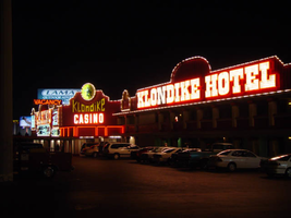
Photographs of Klondike signs, Las Vegas (Nev.), 2002
Date
2002
Archival Collection
Description
Daytime and nighttime views of the Klondike Hotel and Casino signs on the Strip. Information about the sign is available in the Southern Nevada Neon Survey Data Sheet.
Site address: 5191 S Las Vegas Blvd
Sign details: The Klondike Motel Casino is located on the east side of the strip, just north of the Las Vegas Tourist Bureau, actually sharing the same lot. The two are only separated by a small driveway. The mining town theme is exemplified throughout the exterior of the property with a western style text, seen on other similar themed properties such as the Frontier. Murals depicting scenes of prospecting miners and saloons adorn the surface as well as red steel sides which appears as wood, because of its horizontal panels. The property stretches north/south with a small parking lot separating the street from the establishment. Behind the front building a series of structures house the rooms. The buildings signage is situated along the face of the building, on the elevated surface of the walls themselves.
Sign condition: Structure 4 Surface 4 Lighting 3
Sign form: Fascia
Sign-specific description: The top edge of the wall entire face of the building arches, and steps up in various places, and is lined with gold raceways lined with incandescent bulbs. On the north side of the main building upon a vast paneled steel surface the word "Casino" is spelled in giant gold channel letters painted white on the interior. They are bordered in red neon and filled with incandescent bulbs. The text for the establishment is the western type face seen in properties such as the Frontier, or the Westward Ho. To the right of the text, an internally lit, white faced, plastic message board message board, is housed in a gold painted steel cabinet. Moving around the corner to the west face of the property, we see "Casino" spelled in the same manner of Cannel letters, flanked on either side by gold painted housings for cabinets, both crowning with an arched top. Incandescent bulbs forma border around the housing. Set inside each one of the square recessed areas is an internally lit, white, plastic faced message center, with vinyl lettering. Both cabinets are painted red. Below the main text an internally lit, white plastic faced, message center, with rounded ended runs the length of the space underneath the letters. The main entrance is underneath an awning, facing southwest. In the center of the top edge of the vertical wall above the awning, a circular internally lit cabinet is bordered with a gold raceway lined with incandescent bulbs. The surface of the sign is yellow plastic with the cartoon image of a dancing miner, complete with pick-axe. Below that Klondike is spelled with metallic channel letters with yellow plastic faces. The text descends in size toward the center of the text, then swells back to the original size on the sides. Below this, "Casino" is spelled in all capital, channel letters, filled with incandescent bulbs and bordered in neon. They are treated gold on the exterior and white in the interior. The awning cover the entrance, and is treated with neon as well. The face of the square awning is designed with three square recessed panels, with open bottoms. Three tubes of neon line each one of the three closed edges. Each tube takes a turn illuminating, red yellow, and blue. Cantilevered off of the left-hand side of the entrance roof line, a horizontal black cabinet reads "Vacancy" painted in white, and overlaid with red neon. The all caps text faces north/south. Continuing south along the face of the building, a two leveled stretch of structure, continues the last portion of the main building. On the red steel fascia continuing, above the overhang of the second level, "Klondike Hotel" is spelled in large channel letters, treated the same as those seen on the north face of the structure. They are painted gold on the exterior and white on the interiors, filled with incandescent bulbs and bordered with neon. To the left of the text, one on the golden housings for the cabinet, seen on the northern end of the west face, is present but empty. The edge of the overhang, beneath the text is also lined with a raceway and incandescent bulbs
Sign - type of display: Neon; Incandescent; Backlit
Sign - media: Steel; Plastic
Sign - non-neon treatments: Paint
Sign animation: Chasing, oscillating
Notes: The text which spells casino flashes on and steady burns, then oscillates, steady burns again, then shuts off. Moving around the corner to the western face, all the raceways bordering all the elements chase each other, while the incandescent bulbs located within the text which spells, "Casino" oscillate rapidly. The awning adorned with neon also animates, changing color flashing from red, then blue, then gold. The text which reads "Casino" above the awning is filled with incandescent bulbs which oscillate as well. The incandescent bulbs in the main text on the southern half of the western face of the building light up one letter at a time then once they are all illuminated, then they all begin to oscillate. Once they oscillate for a few seconds, then they all light up once again. The sequence is ended once all the letters go dark.
Sign environment: Located just north of the tourist bureau, the Klondike has the honor of being the first casino a traveler encounters as they enter the Strip. Besides the company of the tourist bureau and the Welcome to Las Vegas sign, it stands rather solitary. It's collection of pulsating bulbs and neon make the Klondike the most dominant force in its presence.
Sign - date of installation: 1978
Sign - date of redesign/move: Before the Klondike was opened twenty five years ago, it was known as the Konakai Motel.
Sign - thematic influences: mining, goldrush--small roadside motels
Surveyor: Joshua Cannaday
Survey - date completed: 2002
Sign keywords: Chasing; Oscillating; Fascia; Neon; Incandescent; Backlit; Steel; Plastic; Paint
Mixed Content