Search Results
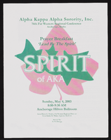
Alpha Kappa Alpha Sorority, Theta Theta Omega Chapter 74th Far Western Regional conference program and reports
Date
Archival Collection
Description
From the Alpha Kappa Alpha Sorority, Incorporated, Theta Theta Omega Chapter Records (MS-01014) -- Chapter records file.
Text
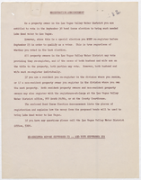
Announcement of registration to vote on the September 30 bond issue, 1953
Date
Archival Collection
Description
Notice to property owners of the upcoming bond issue election and the necessity of their pre-registration to participate, and the bond issue announcement. Appointed division deputy registrars are named in the document. Includes date stamp from E. E. Bennett. Chief Registrar Harry E. Miller is Secretary of the District, Calvin C. Magleby is Assistant Secretary.
Text
"Martin Luther King, Jr. and the American Dream": article draft by Roosevelt Fitzgerald
Date
Archival Collection
Description
From the Roosevelt Fitzgerald Professional Papers (MS-01082) -- Drafts for the Las Vegas Sentinel Voice file. On George Washington and Martin Luther King, Jr. comparisons.
Text
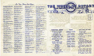
The Wheel of Rotary Las Vegas Rotary Club newsletter, September 22, 1949
Date
Archival Collection
Description
Text
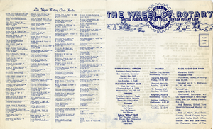
The Wheel of Rotary Las Vegas Rotary Club newsletter, December 22, 1949
Date
Archival Collection
Description
Text
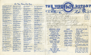
The Wheel of Rotary Las Vegas Rotary Club newsletter, January 12, 1950
Date
Archival Collection
Description
Text
Davis, Chester K., 1929-
From: https://uwf.edu/library/library-collections/chester-davis-music-collection/
I, Chester Davis, was born in Long Beach, California, June 22, 1929.
There was always music in the home. Two maiden aunts who visited regularly, encouraged their nephew to sing songs. He had a good ear and sang in tune. The wind-up "Victrola" was regularly heard playing Stephen Foster and Victor Herbert.
Person
Audio clip from interview with Nathaniel Whaley by John Grygo, March 6, 2013
Date
Archival Collection
Description
In this clip, Nathaniel Whaley talks about the differences between the opportunities for weekend entertainment for black and white young people in Las Vegas in the 1940s and 1950s.
Sound