Search Results

Transcript of interview with Murl Emery by James M. Greene, October 18, 1974
Date
Archival Collection
Description
On October 18, 1974, James M. Greene interviewed Murl Emery (born June 7th, 1903 in Bolton, California) at his home in Nelson, Nevada. Also present during the interview is Mrs. Emery and Mr. Dutch Eckhart, a guest who has just arrived to visit with Mr. Emery. The interview covers Mr. Emery’s personal experience in and around Southern Nevada, particularly in the areas from Searchlight, Nevada to Nelson, to Boulder Canyon, but mostly on the Colorado River. Mr. Eckhart also helps to interject some insight into the popularity of the Model T Ford in those days and early days of newly paved roads. Additionally, they discuss water shortage, wells, the building of the railroad, and mining in Nevada. Mr. Emery also discusses the books that were written about his adventurous life, his discoveries and his explorations.
Text
Transcript of interview with Dr. Fiona Kelley by Lisa Gioia-Acres, March 21, 2009
Date
Archival Collection
Description
Dr. Fiona Kelley was born and raised in Connecticut. Her parents were both teachers (though her mother quit teaching to raise their two daughters), and Fiona recalls the European vacations the family took every summer, exploring castles and enjoying picnic lunches. Fiona was educated at Greenwich Academy in Connecticut and Bard College (dance major with art history minor) in New York. She mentions dancing in Acapulco and California and then auditioning and being hired as a cover dancer for Hallelujah Hollywood! at the MGM in Las Vegas. Meanwhile, she had also become licensed in massage and states that as she was making the transition from dancing to production of dance, she and her husband were invited to China. While in China, Dr. Kelley recalls visiting a hospital which specialized in the treatment of AIDS through acupuncture. This led to a decision to learn Oriental medicine, which she pursued once she returned to the United States. She shares many details of her studies
Text

Transcript of interview with Emilio Muscelli by Claytee D. White, November 25, 2008
Date
Archival Collection
Description
Emilio Muscelli was in his mid-80s when he sat for this oral history interview. With a thick Italian accent he recalled his career as a Las Vegas maitre d' that spanned decades of Strip history. Emilio arrived in America in 1948, landed a job at the Copacabana in New York City. His boss was Jack Entratter, who brought Emilio to Las Vegas when he opened the Sands in 1952. Over the decades he has witnessed the ups and downs of Las Vegas economy and has befriended many celebrities along the way. He reminisces during this interview about his friendship with singer Bobby Darin, actor Cary Grant and meeting a laundry list of others. He fondly speaks of those he worked for and their contribution to the growth of Las Vegas.
Text

Transcript of interview with Dr. Leonard Kreisler by Barbara Tabach, May 23, 2016
Date
Archival Collection
Description
Dr. Leonard Kreisler, MD, was born August 3, 1930 in Brooklyn to post World War I European Jewish immigrants. Raised in the smaller community of White Plains, New York, he worked happily by his father?s side. The elder Kreisler was a cabinet maker and carpenter, who Len describes as fiercely independent. Young Len keenly helped his Yiddish language father write his contracts and guided him to increasing his prices. At an early age, Len knew that he would become a medical doctor?little did he know what an amazing life was in his future. It was while attending the University of Vermont, College of Medicine that Len met his wife Joan. They married in June 1957. Joan became a teacher and later a real estate agent while in Las Vegas. This interview includes stories about his medical education and his thirteen year private medical practice in Peekskill, New York. This was followed by a career in occupational medicine and over seventeen years as the Medical Director at the Nevada Test Site for Reynolds Electric and Engineering Corporation (1973 ? 1990). During that time he was also elected Chief of Staff at University Medical Center (UMC) for two years and helped create the Children?s Miracle Network Telethon and the UMC Foundation. When he recalls moving to Las Vegas, his memories include jogging by Temple Beth Sholom and joining a minyan. He became a congregation vice president. When his career at the Test Site was halted, his medical adventure led him to be a maritime physician for a cruise liner. He also ran twice for Clark County Commissioner against Thalia Dondero. Dr. Kreisler is the author of several books: Death by Any Means (2005); Roll the Dice, Pick a Doc and Hope for the Best (2009); The Codes of Babylon (2010); Shortfall (2011); The Obligated Volunteer (2014) and In Bed Alone, A Caregiver?s Odyssey (2016).
Text
Transcript of interview with Courtney Mooney by Suzanne Becker, July 30, 2007
Date
Archival Collection
Description
Courtney Mooney is the Urban Design Coordinator for the City of Las Vegas. Her job description includes a knowledge of historic preservation, which is her passion. In this interview she shares her professional and personal thoughts about John S. Park Neighborhood. She moved to John S. Park in 2002. As a professional she explains that "how I look at preserving neighborhoods or buildings, is more of a community preservation, not saving the individual building for the individual building's sake..." Courtney offers a big picture of the neighborhood's past, present and future. John S. Park, like so many other Las Vegas neighborhoods, was built during World War II and has been affected by history of segregation and the wave of changing demographics, and the work that went into the plan and requirements to be designated a historic neighborhood. Courtney provides a summary of the story about the land, its ownership and what lead to the foundation of the neighborhood: from John S. Park to George Franklin and John Law, to Mary Dutton and explains how the proposed development of the land differed from other communities being built to FHA standards and specifics that declared Las Vegas a Defense City in the 1940s. She lists the factors that made the neighborhood a logical and important target for the historic designation, a small neighborhood tucked away, that is "a snapshot of the types of people that were coming here," filled with community leaders, entrepreneurs, blue-collar and casino workers. She also mentions about the missed opportunity of the Las Vegas High School neighborhood for preservation while supporting the John S. Park designation.
Text
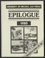
Epilogue: UNLV Yearbook, 1980
Date
Description
Yearbook main highlights: schools and departments; detailed lists with names and headshots of faculty, administration and students; variety of photos from activities, festivals, campus life, and buildings; campus organizations such as sororities, fraternities and councils; beauty contest winners; college sports and featured athletes; and printed advertisements of local businesses; Institution name: University of Nevada, Las Vegas
Mixed Content
Mabel Hoggard: personal correspondence
Date
Archival Collection
Description
Folder of materials from the Mabel Hoggard Papers (MS-00565) -- Personal papers file. This folders contains correspondence from friends, family members, and various organizations. It also includes an agenda for "National Sorority of Phi Delta Kappa" from Sunday October 28, 1973.
Text
University of Nevada, Las Vegas (UNLV) Fall 2020 commencement program
Date
Archival Collection
Description
Commencement program from University of Nevada, Las Vegas Commencement Programs and Graduation Lists (UA-00115).
Text
Photographs of New York New York signs, Las Vegas (Nev.), 2002
Date
Archival Collection
Description
Site name: New York-New York Hotel and Casino (Las Vegas, Nev.)
Site address: 3790 S Las Vegas Blvd
Sign owner: MGM Mirage
Sign details: Occupying the northwest corner of Las Vegas Blvd and Tropicana Ave. is the New York New York Hotel and Casino. The property is a miniature representation of New York City in a collection of colorful architecture and sculpture. Colored reflective panels create the facades of high rises and skyscrapers. An almost cartoon like element is brought to the structures, flowing seamlessly sometimes throughout a surreal landscape of classical architectural elements and mock high rises. Distinguishable landmarks, such as the Empire State Building, the Statue of Liberty, and the Brooklyn Bridge, can be recognized with ease. A lagoon of water represents a harbor shooting water out of fountains disguised as boats.
Sign condition: Structure 5 Surface 5 Lighting 5
Sign form: Pylon; Fascia; Porte-cochère
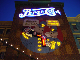
Sign-specific description: The porte cochere is located on the south side of the property facing Tropicana Ave. The design cantilevers off of the main structure to the north, and then is supported by two columns on its far end. The three exposed sides hold the radiating crown of the New York New York logo sign. The two on the east and west sides are smaller than the one on the south side, but are essentially the same design. A half circle cabinet holds the text New York New York stacked in two lines. The channel letters are polished metal on the outside with incandescent bulbs on the interior. Their faces are bordered with red neon. The text is positioned on the front of the half circle cabinet. Breaking the surface of the radius edge, elongated triangular pan channels create a repeating pattern. The result is a crown of points running all across the top of the cabinet. It is reminiscent of the crown on the statue of liberty, or the rays of the rising sun. The face of the cabinet is painted blue, with metallic raceways, filling the negative spaces with more triangular shapes. The triangular pans are painted yellow on the interior with a blue finish on the exterior. The exterior width of the cabinet is also finished in a golden reflective surface. Three tubes of neon fashioned into succeedingly smaller triangles are inside each surface. The color scheme of the neon is yellow being the outer, orange being the second, and the center being red. The sign on the south side is designed the same, except being quite a bit larger, and the crowns of the cabinet angle forward instead of straight up in the air. All the edges are bordered with incandescent bulbs. The bottom edge below the signage, actually underlining the signage significantly, is a gold polished double bull nose that wraps the entire length of each side. The surface is strewn with small incandescent bulbs. An entablature runs above the bull nose, filling the spaces between the sign. The pediment is bordered on the top and the bottom with gold polished raceways and incandescent bulbs. Two mirrored posts support the southern end. The ceiling of the porte cochere is treated much the same as the logo signage on the three sides of the roof. Long pan channels are placed on the ceilings and shaped to look like waving banners, confetti, and beams, radiate out of a centerpiece positioned over the entrance to the casino. Red pans are painted orange on the interiors and green channels are painted blue on the interior. Tubes of neon are bent to the contours of the shapes of each one of these channels. The entire composition is a brilliant abstract pattern of light and colored steel shooting out toward Tropicana Ave. Headed east toward the northwest corner a bridge connects the Excalibur property to the New York New York. At the end of a bridge an entrance into the NY NY is below a LED message center and an arched logo cabinet, with the text and the radiating triangular channels. It is actually the same neon and color scheme, just fit to sit over the LCD display. The sign faces south. The sign has the distinct backdrop of a domed rotunda lined with columns. Rounding the corner another elevated bridge stretches east over the strip to the MGM property. The same configuration of the arched signage, along with the illuminated text, and LCD display screen is on the east side of the building. The corner facade of the harbor is flanked by these two collections of signs and walkways. Around the corner, the property extends north up Las Vegas Blvd continuing the facade of fake apartment buildings, with storefront windows at ground level. Here the replica of the Brooklyn Bridge serves as the main concourse of pedestrian activity. There are two sections of sign that are of particular interest to the eastern face of the building. The first is an advertisement for Panasonic. Panasonic is spelled in silver channel letters with blue fronts. The blocky font is internally lit. The entire text sits along the top edge of a matching message center. Further north on the face of the building, a section of building, finished in brick, combine graphics and three-dimensional elements for a sign for Pepsi. Toward the top of the face a logo/wall sign is crafted out of channel letters and filled with incandescent bulbs and bordered with blue neon. The entire text reads "Pepsi: Cola" The capital "P" and "C" are crafted out of one cursive style channel. The remaining letters are spelled in separate channel letters. The channel letters are stylized in a fashion reminiscent of the turn if the century. The colon placed between the "I" in Pepsi and the "C" in cola is also made out of channel boxes. Below the logo, a mural is painted on the majority of the remaining open space on the surface. Two police officers, in the style of early cartoons from the first few decades of the twentieth century, are the focus of the mural and are reminiscent of the famed "keystone" cops. The two figures are shown from about waist up in a circle, which is broken at the top by the white painted thought bubbles, bordered in black. The thought bubble on the left reads "bigger bottle" and the opposite reads, "better flavor". The two police officers correspond the appropriate thought bubble, with the one on the left being the larger figure, and the one on the right being smaller and apparently older. They are treated with blue paint, with their stripes, buttons and badges, treated in yellow paint. The skin tones are treated with proper hues, with facial features distinguished by black contour lines. The three-dimensional aspects come into play when describing their action. The officer on the left is pouring a bottle of the cola into the glass, which the other officer is holding. The one hand each officer is showing is a three-dimensional, fiberglass, white, cartoon, gloves. The one on the left is integrated into the tilted bottle. The bottle is coming off of the wall in a sculpted two-dimensional cabinet. The bottle is treated with the red white and blue Pepsi label, and reminiscent of the logo channel text. The tilted bottle points down toward a glass that the other officer holds. The glass is also a sculpted cabinet treated with paint on the surface, as well as the bottle, to appear as glass, utilizing highlights. Neon for the mural is cleverly designed to accent the mural and compliment the design. The text in the thought bubbles is overlaid with yellow neon, which animates back and forth to suggest an interaction of talking to each other. One half will illuminate, then the other as the first darkens. The yellow painted buttons, stripes, and badges of the characters uniforms are all outlined with yellow neon. The action of the neon in the bottle and glass can be seen through the semitransparent materials. Horizontal tubes of red neon fill the bottle, as well as the glass. In the space between the bottle and the glass waving tubes of neon pass through the apparent opening at the top of the cabinet, and can be seen behind the translucent face. When in action, the bottle appears as if it is pouring the liquid into the cup. (see animation notes) Among the ground level shops along the east side, marquis signage denotes passage. One on the southern end of the elevation just before the Brooklyn Bridge begins, and another, a bit further north, before the ESPN Zone signage. Two message panels come off the wall at an angle flattening off with a smaller panel boasting logo channel letters. Each one of the wings are spanned across the top of the face with channel letters spelling "entrance," painted in an off white on the interior. They are filled with incandescent bulbs and bordered with red neon. The remaining space on the bottom of the face is an LED message center. A narrow horizontal plane rises off of the top edge and is lined with three tubes of neon. The cabinet is made of a polished gold metal. The entire outline of the wing is lined with a raceway lined with incandescent bulbs. Smaller eastern face of the overhang is a square cabinet with an arched top. To either side of the cabinet is crafted into a set of two narrow horizontal planes. The one closest to the cabinet is taller that the one right next to it, with rounded corners echoing the curve of the main cabinet. The resultant effect is a sculpted cabinet with a top edge descending on either side in a water falling radius. These bookend elements are bordered with yellow, and three vertical tubes of neon running the length of the interior. They main cabinet is occupied by the internally lit double set initials "NY," stacked one set on top of the other. They too are filled with incandescent bulbs and bordered with red neon. The face of the middle cabinet is bordered with incandescent bulbs and finished in a slick blue hue. The underside of the overhang is covered in the polished gold surface and laden with incandescent bulbs. The northern end of the property is dominated by the signage for the ESPN Zone sports lounge, located inside the NY NY. The exterior signage is basically a theatre marquee entrance with a long overhang supporting an electronic message banner that reads from left to right. The majority of the theatre front is polished aluminum wit h thin tubes of red neon above and below the electronic reader board. Above the top edge of the actual front of the sign is a design of pan channels, crafted and shaped to form a complex background for the logo text spelling "ESPN." A wavy green crafted channel creates what looks like a horizon. The space between the marquee and the green channel is a black field laden with incandescent bulbs. Above the green channel an array of pan channels crafted into interlocking, swaying, pointed shapes. They are painted yellow and orange so the result is a bed of flames. These too are lined in the interior of the contour in red and orange neon. In the center of the entire face of the overhand in a black steel cabinet with the logo for the establishment spelling "ESPN Zone." The First portion of the two-word phrase is spelled in shallow channel letters lined with horizontal bars of white neon. The text is outlined in red neon as well. The second half spells "Zone," and is written in the same font with the "Z" being the largest letter in the sign, designed with the bottom horizontal leg underlining the rest of the letters in the word. The word is oulined with white neon as well. The latter portion is filled with horizontal bars of red neon. Situated along the middle of the sign, and against the vertical plane of the building, a blade sign repeats the design and colors of the bottom portion of the sign. The vertical cabinet is double sided spelling the "ESPN Zone" logo vertically with the same neon treatments for the respective words. The three toned background of black, green, red and orange on the bottom of the sign is interpreted on the blade. Running vertically, the black portion laden with bulbs runs against the wall, with the wavy channel next to that, disappearing temporarily behind the letters. The flames hang off of the outer edge of the sign. All of the neon treatments are seen here as well. Crowning the top of the blade sign two circular cabinets are arranged touching each other at one end, the faces pointing out to angled directions. Here the ESPN logo is arranged inside a circle. The bottom half below the letters is filled with horizontal bars of green neon, while the flames are present on the top half. The same cabinets can be seen mounted on the ends of the bottom overhang.
Sign - type of display: Neon; Incandescent; Backlit
Sign - media: Steel; Plastic; Fiberglass
Sign - non-neon treatments: Graphics; Paint
Sign animation: Chasing, flashing, oscillating
Notes: The incandescent bulbs inside the text reading "Paris" on the balloon oscillate rapidly.
Sign environment: Centering around the theme of the city of New York, it utilizes the corner to create a wrapping montage of sales kiosks, paralleled by a miniature replica of the Brooklyn bridge transforming into a corner bay flanked by the overhead walkways, and bringing the viewer in to the brightly lit arms of the porte cochere. The environment of the overhead wall signs and entrance signs blend in and compliment the theme aspect of being in a city. Of course they stand out a bit more with the over the top Vegas garishness, but they also add to the pedestrian interactive feature that creates the environment in which it sets out to accomplish. The corner fountain provides a unique experience with the views of the neighboring casinos but creates a bit more of a surreal nature with the small scale Statue of Liberty and backing of stylized skyscrapers and metropolitan architecture. To follow further around the corner headed south; the blazing neon adorned porte-cochere is backed by yet more architecture and the sweeping tracks of the resorts roller coaster.
Sign designer: Marnell Corrao Architect: Neal Gaskin
Sign - date of installation: 1997
Sign - thematic influences: The New York City theme is the consuming factor in the aspects of the outmost design interior and exterior, as well as influencing the design of the signage itself. From the corner design being used to create a miniature water spectacular representing a harbor, to the faux apartment and store-fronts, and replica Brooklyn Bridge, to the peaks of the logo cabinet work. It joins the array of properties on the strip which are heavily themed, and designed to attract a family oriented crowd. It is also themed after a city.
Sign - artistic significance: This resort has regularly been recognized as one of the architectural wonders of the Strip, and the signage contributes to its fame.
Surveyor: Joshua Cannaday
Survey - date completed: 2002
Sign keywords: Chasing; Flashing; Oscillating; Pylon; Fascia; Porte-cochère; Neon; Incandescent; Backlit; Steel; Plastic; Fiberglass; Paint; Graphics
Mixed Content

Dr. Javier A. Rodríguez oral history interview: transcript
Date
Archival Collection
Description
Oral history interview with Dr. Javier A. Rodríguez conducted by Elsa Lopez and Barbara Tabach on December 19, 2019 for the Latinx Voices of Southern Nevada Oral History Project. Dr. Javier Rodríguez, Biology Professor at the University of Nevada Las Vegas, talks of his personal and educational history that led him to UNLV. He discusses his migration from Puerto Rico to California where he received his PhD from the University of California Berkley and became a biological museum curator for various animal specimens. He later moved to Las Vegas to teach at UNLV where he has now been for nearly two decades; Dr. Rodríguez shares how UNLV has changed since he first started working here, including the university's increased interest in faculty research to become a Top Tier institution. Subjects discussed include: Puerto Rico; University of California Berkley; University funding; Tier 1 research institutions.
Text