Search the Special Collections and Archives Portal
Search Results
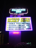
Photographs of Diamond Inn signs, Las Vegas (Nev.), 2002
Date
Archival Collection
Description
Site address: 4605 S Las Vegas Blvd
Sign details: North of the Glass Pool Inn is the Diamond Inn. The motel is on the east side of the strip, and is one of the larger properties on the southern tip of Las Vegas Blvd The facility fits into the typical model of the roadside motel on this portion of the strip. An official building sits on the north side of the property and precedes a span of pavement centered with a pool, and backed by the flanking wings of rooms. A pylon side is on the north end of the property, across a span of pavement from a grass island with a rather large statue of an elephant made of fiberglass. In the near distance behind the island, the pool house for the said pool, is adorned with distinct neon as well.
Sign condition: Structure 3 Surface 3 Lighting 3
Sign form: Pylon; Fascia
Sign-specific description: The facility fits into the typical model of the roadside motel on this portion of the strip. An official building sits on the north side of the property and precedes a span of pavement centered with a pool, and backed by the flanking wings of rooms. A pylon side is on the north end of the property, across a span of pavement from a grass island with a rather large statue of an elephant made of fiberglass. In the near distance behind the island, the pool house for the said pool, is adorned with distinct neon as well. The pylon sign is a tall vertical rectangle with a large square internally lit cabinet in the center, a message cabinet on top of the rectangle as well as a small LED screen between the two. The large, double backed, internally lit cabinet, is bordered on the faces with purple neon, which closes in the yellow and black graphic text which advertises amenities for the motel. The cabinet on top is a six sided, horizontal, diamond-esque shape, which is double backed as well. The border of the surface of the sign is created using incandescent bulbs. Diamond Inn is spelled on the surface with two lined channel letter text. The letters are filled with incandescent bulbs and bordered in blue neon. The pool's treatment also utilizes the corresponding colors of purple and pink as well. Along the roofs edge a glowing entablature is created using a top border of purple neon as well as a bottom border of pink neon. Inside the border seven pink and star shapes are crafted out of neon tubing. They run horizontally across the length of the pediment, alternating pink, then purple.
Sign - type of display: Neon; Incandescent; Backlit
Sign - media: Steel; Plastic; Fiberglass
Sign - non-neon treatments: Graphics
Sign animation: Chasing, flashing, oscillating
Notes: the letters inside of the letters of the tower actually oscillate.
Sign environment: The Glass Pool Inn resides just to the north of the Diamond Inn. Boasting a newer, yet improperly functioning pylon sign, the larger Diamond Inn property is one of the more standout establishments in the area. Its expansive lot and pink sculpture of an elephant make the Diamond Inn conspicuous.
Sign manufacturer: Diamond Head Sign Co.
Sign - thematic influences: No specific theme seems to be related to the Diamond Inn other than the typical roadside motel, typical for the south end of the Strip.
Surveyor: Joshua Cannaday
Survey - date completed: 2002
Sign keywords: Chasing; Oscillating; Pylon; Fascia; Neon; Incandescent; Backlit; Steel; Plastic; Fiberglass; Graphics
Mixed Content
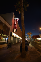
Photograph of Fremont Country Club sign, Las Vegas (Nev.), June 28, 2017
Date
Archival Collection
Description
Site address: 601 Fremont St
Sign owner: City of Las Vegas: Economic and Urban Development owns the building
Sign details: The original construction year of this building was 1957. This bar opened September 2012 as an acclaimed kitschy-chic bar and concert venue. Inside they have Tex-Mex decorations with a merry-go- round horse, an 8 foot steel horseshoe, a covered wagon entryway and antler chandeliers.
Sign condition: 5 - newer sign
Sign form: Blade and Reader Board
Sign-specific description: Surrounding their building there is a reader board that is lined with incandescent light bulbs that sparkle at night time, for this reader board is connected to the adjoining Triple B Bars reader board a well. Above their entrance there is a black blade, on the top part of the blade Fremont is written in an elegant white calligraphy font spelt out horizontally which does illuminate white at night time. Vertically down the blade spells out Country Club in block font letters which illuminates red at night. Along this portion of the blade it is lined with little red LED lights that look like incandescent bulbs that sparkle. On the portion of the blade that faces the road, underneath the word Fremont there is a swirly design that decorates the corner of where the horizontal letters meet the vertical letters, but the design does pop up again a little lower on the sign as well. Though at the bottom of the sign underneath the Country Club letters they have their main F.C.C. logo on a plastic backing that seems to be dimly backlit at night time. Their F.C.C logo consists of a silver shield that looks to be dotted on the perimeter with painted diamonds, the middle portion is checkered red and black in 4 sections then has a crest on it of a longhorn with two golf clubs under its head to act as an iteration of crossbones. Under the longhorn there are calligraphy letters F.C.C. in white.
Sign - type of display: Neon, LED, Incandescents and reader board
Sign - media: Steel and Plastic
Sign - non-neon treatments: Reader Board, plastic backlit sign and light bulbs
Sign animation: Flasher for LED
Sign environment: Located in the East Fremont District, this property is right across the street from the El Cortez and is adjoined to the Triple B Bar. To the East of the property is The Market.
Sign - date of installation: c. 2012
Sign - thematic influences: Since are named as a country club, the crest portion of their sign does have golf clubs as well as is a crest could be on a clothing item that a golfer would wear.
Sign - artistic significance: The blade portion is remnant of the 1950s/60s blade. As well as their logo that is a crest shows an older medieval
Survey - research locations: Assessor's website, Fremont Country Club website
Survey - research notes: Reader board for this property is shared with the Triple Bs reader board and both locations opened in 2012 and signs both installed that year as well.
Survey - other remarks: The adjoining property, Triple B states that they named their bar Backstage Bar and Billiards because it was literally backstage to the Fremont Country Club bar and stage.
Surveyor: Emily Fellmer
Survey - date completed: 2017-08-26
Sign keywords: Blade; Neon; Incandescent; Steel; Plastic; Backlit; Flashing
Mixed Content

Transcript of interview with William F. Kelsey by James M. Green, January 20, 1975
Date
Archival Collection
Description
On January 20, 1975, collector businessman, James M. Greene interviewed businessman, William F. Kelsey (born November 6th, 1908 in Pasadena, California) in his home in Nelson, Nevada. Mrs. Kelsey is also present during the interview. This interview covers the life and times of Mr. Kelsey.
Text

Transcript of interview with Marguerite Goldstein by Carol A. Semendoff, February 25, 1979
Date
Archival Collection
Description
On February 25 1979, collector, Carol A. Semendoff interviewed cashier, Marguerite Goldstein, (born on May 1925 in Oberlin, Kansas) in the library at the University of Nevada, Las Vegas. This interview covers early Las Vegas, from 1950 to 1979. Also included during this interview is discussion on local dignitaries, the growth of Las Vegas, gambling as the major industry in Las Vegas, Strip hotels, and housing developments.
Text
Meeting minutes for Consolidated Student Senate, University of Nevada, Las Vegas, January 29, 2001
Date
Archival Collection
Description
Text
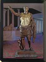
Hotel room brochure from Caesars Palace, circa 1969
Date
Archival Collection
Description
Bound booklet with concierge information for Caesars Palace. The guide provides entertainment and dining information about the resort and casino, including room service menus and a telephone directory.
Text
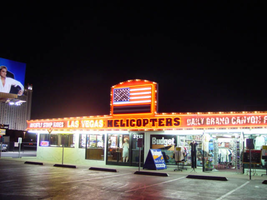
Photographs of Las Vegas Helicopter Tours signs, Las Vegas (Nev.), 2002
Date
Archival Collection
Description
Site address: 3712 S Las Vegas Blvd
Sign details: The establishment rests in a lot on the western side of the strip adjacent to the airfield, which is utilized for takeoff and landing of the aircraft. The Las Vegas Helicopter facility is also adjacent to and shares a building with a souvenir shop.
Sign condition: Structure 5 Surface 5 Lighting 5
Sign form: Fascia
Sign-specific description: The Las Vegas Helicopter tours facility possesses a quite elaborate wall sign which wraps the fascia of the building. The face of the building looks east. The eastern face is an entablature bordered in with polished gold aluminum raceway lined with incandescent bulbs. In the center of the eastern face of the narrow border transforms into a rectangular face, which juts upward. A giant pan channel representing the American flag occupies the space in the section. The horizontal red and white stripes are painted channels, and the blue field in the upper left- hand corner is a channel itself. The horizontal channels are lined with tubes of neon in a corresponding color. The blue field is bordered in blue neon, with incandescent bulbs in the center of graphically painted stars. The entire flag is bordered in red neon. The entablature below which runs along the entire face of the building plays home to several phrases of different text and designs. The center portion is taken up by a phrase "Las Vegas Helicopters," in black channel letters painted red on the interior. The exterior edge is lined with a border of red neon. The text is also filled with incandescent bulbs. To the left of the main title, smaller black, channel letters filled incandescent bulbs read, "Nightly Strip Rides" in all caps. The raceway deviated from the straight form underneath the secondary text, next to the primary title. On the bottom edge beneath the phrase, the raceway turns into an arrow pointing downward. The incandescent bulbs are still present along this deviation.
Sign - type of display: Neon; Incandescent; Backlit
Sign - media: Steel; Glass
Sign - non-neon treatments: Graphics; Paint
Sign animation: Chasing, flashing, oscillating
Notes: The incandescent bulbs inside the text reading "Paris" on the balloon oscillate rapidly.
Sign manufacturer: Sign Systems, Inc
Sign - date of installation: 1996
Sign - thematic influences: There is no real present theme evident in the appearance other than the Emblem of the American flag crafted in neon on the front of the building. The incandescent bulb lined raceways and bulb filled channel letters, placed within a pediment hanging above the pedestrians head, posses a theme in a sense. It is a common occurrence to see such a combination of lighting among the strip to designate an establishment so its theme cold be considered to be that of Las Vegas. It's artistic significance can only be linked to such a trait. It is one of the most unique properties considering its function. Yes there are many facilities which offer tours but, this is the only one which provides helicopter tours that the pedestrian may watch take off. It is also one of the only establishments where the American flag is represented on the exterior in neon. It is also one of the only establishments where the incandescent bulb lined raceway is shaped into arrows. An interesting use of the most common adornment of exterior surveyed signage.
Surveyor: Joshua Cannaday
Survey - date completed: 2002
Sign keywords: Chasing; Flashing; Oscillating; Fascia; Neon; Incandescent; Backlit; Steel; Glass; Graphics; Paint
Mixed Content
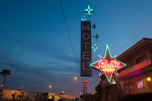
Photographs of Starlite Motel at dusk, Las Vegas (Nev.), March 17, 2017
Date
Archival Collection
Description
Site address: 1873 N Las Vegas Blvd
Sign owner: LAS VEGAS DRAGON HOTEL LLC
Sign details: This motel resides in North Las Vegas and is one of the few around that still offers traditional roadside lodging.
Sign condition: 5 - Sign was recently updated with was appears to be newer neon and a different color scheme, going with a bright blue and brown. New white vinyl letters have been added.
Sign form: Pole
Sign-specific description: Previous to the spring 2017 upgrade: This pole sign extends out toward the street for motorists and pedestrians to see. This pole is a bright red color. A four pointed red star sits at the top of the red pole for everyone to see. This is outlined with neon tubes that glow blue at night. In the spaces between the points of the star the neon tube is bent to create smaller points. In the middle of the star painted in bold white script is the word "Starlite." This is also outlined with neon tubes to glow at night. Under this is the word "VACANCY" painted in bold white text, but the neon tubes that outline it light up red. Attached to the point of the star that extends toward the road is a long, rectangular sign that reads "MOTEL" in bold white text with a black outline on a light blue background. Extending from the "MOTEL" sign towards the red star are 3 smaller four pointed stars that have incandescent light bulbs in their center and are outlined by neon tubes that glow blue at night. On top of the "MOTEL" sign is another one of these four pointed stars that sits on the outer edge of the sign. Next to this is a larger, light blue four pointed star with an incandescent light bulb in the center and a smaller four pointed star made from a neon tube surrounding the light bulb. The neon tube that outlines the larger portion of the star is bent to create smaller points in the portions of the star without points.
Sign - type of display: Neon and incandescent
Sign - media: Steel
Sign - non-neon treatments: Paint
Sign animation: Unknown since update
Sign environment: The surrounding properties are Jerry's Nugget and the Silver Nugget casinos. It is also just down the street from the Cultural Corridor which includes the Neon Museum and the Las Vegas Natural History Museum. The Las Vegas Library is also down the street.
Sign - date of installation: c. 1950s
Sign - date of redesign/move: Spring 2017
Sign - thematic influences: This property is one of many star-themed motels throughout the city. The 1950's was a popular time for space age/ star themed business due to the Space Age and explorations during this time period. Also, since the name of the property is the "Starlite Motel", the amount of stars included in this sign emphasizes this theme.
Sign - artistic significance: This sign has a heavy influence of the Space Age due to the stars throughout the sign that are telling of the theme for the property. The specific stars for this sign have a Googie-like influence as well because they are very stylized in a futuristic manner.
Survey - research locations: Assessor's website, roadarch.com
Survey - other remarks: http://www.roadsidepeek.com/roadusa/southwest/nevada/vegas/lvmotel/lvnorthmotel/index.htm#sta rlitemotel
Surveyor: Lauren Vaccaro
Survey - date completed: 2017-09-05
Sign keywords: Neon; Incandescent; Steel; Paint; Pole sign
Mixed Content
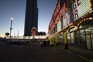
Photographs of Bonanza Gift Shop, Las Vegas (Nev.), March 6, 2017
Date
Archival Collection
Description
Site address: 2440 S Las Vegas Blvd
Sign owner: Haim Gabay
Sign details: The Bonanza Gift Shop opened in 1981 marketing as the world's largest gift shop. Though in 1963 a portion of the property opened as an Honest John's Casino. In 1971 the Big Wheel opened next to Honest John's Casino. After 1974 Big Wheel changed to Centerfold Casino 1975-1977. In 1977 the Centerfold Casino changed to Jolly Trolley Restaurant, Saloon and Dining Depot. From 1977-1981 Jolly Trolley remained at the location; it seems at one point Jolly Trolley took over the entire shopping center and casinos. Between 1977 and 1981, a 24 Hour Adult Book Store was taken over by Jolly Trolley that allowed Bonanza Gift Shop to purchase the whole property. The sign's design and theme has stayed the same from 1963 to current. The gift shop was sold for $50 million in 2016 to Haim Gabay.
Sign condition: 3- the paint is peeling off, and the signs have holes in them. The incandescent light bulbs and marquee are not working to full capacity; some portions do not light up at all.
Sign form: This is considered an architectural sign with the reader boards-marquee built into the building. The sign at the end of the corner is considered a cantilever construction.
Sign-specific description: The sign is mainly rusty red and a gold-yellow that surrounds the building with multiple "Bonanza Gift Shop" logos in a old west type font. Also there is a reader board surrounding the building as well.
Sign - type of display: The Display used is a reader board, neon, incandescent, and fluorescent lighting.
Sign - media: Plastic, Steel and Fiberglass
Sign - non-neon treatments: Plastic for reader board
Sign animation: Chasing
Notes: Incandescent light bulbs that surround the building and logos
Sign environment: The property is on the west corner of Las Vegas Blvd and Sahara. The stores surrounding the establishment are Naughty Town, Walgreens, Essence Cannabis, Strip Gun Club and Diversity Tattoos.
Sign - date of installation: Estimated 1963 or earlier
Sign - date of redesign/move: 1963 Honest John's cantilever construction. 1971 Big Wheel opened up and added the projection sign. In 1974 the Big wheel changed to Centerfold Casino and in 1977 name changed to Jolly Trolley. In 1981 the Jolly Trolley projection and cantilever construction sign changed to Bonanza Gift Shop.
Sign - thematic influences: The sign dates back to 1963 and resembles the golden nugget decorated shed concept along with the cantilever construction sign similar to golden nugget's 1946 sign, except circular rather than organic. The actual sign uses color psychology to attract consumers to the gift shop. The theme is definitely western themed.
Survey - research locations: https://www.reviewjournal.com/business/bonanza-gift-shop-in-las-vegas-sold-for-50m-records-show/ about new owner purchase. Vintage Las Vegas http://vintagelasvegas.com/search/Bonanza+Gift+Shop helped with dates of property change. Author Paul W. Papa's book "Discovering Vintage Las Vegas: A Guide to the City's Timeless Shops"
Surveyor: Gisselle Tipp
Survey - date completed: 2017-08-12
Sign keywords: Architectural; Plastic; Steel; Incandescent; Chasing; Reader board; Neon; Marquee; Fluorescent; Roof Sign
Mixed Content
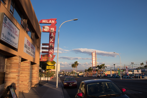
Photographs of Milan Bakery, Las Vegas (Nev.), April 18, 2017
Date
Archival Collection
Description
Site address: 1625 Fremont St
Sign owner: Selak, LLC
Sign details: The building was constructed in 1952 (Assessor). Milan Selakovik acquired the property from the Salvation Army in 1966 (Assessor).
Sign condition: The sign is condition 2, fair to poor. The paint is flaking. Approximately a third of cabinet bottom has rusted out. No neon remains on the sign.
Sign form: Blade sign
Sign-specific description: The background of the entire sign is painted red. The top and bottom of the sign are attached to the building by two metal cabinets. The lower cabinet is irregularly shaped. On the west side of the lower cabinet, the telephone and fax numbers are painted in peeling yellow. The paint has almost completely flaked off around the area where a cursive "Fax" formerly appeared. Attached to the street side of the sign is a vertical metal cabinet which runs almost the entire height of the sign. The word "BAKERY" is painted in white sans serif letters which run vertically over most of the cabinet. Extending horizontally from the cabinet toward the building are three small metal cabinets. A horizontal white line is painted on each of the three cabinets. A larger cabinet attached next to the "B" in "BAKERY" extends horizontally toward the building. The cabinet has a medallion shaped black and white cartoon of a baker holding a tray of baked goods. An irregularly shaped cabinet topping the sign contains the name, "MILAN" painted in white sans serif letters. The east side of the sign is painted similarly to the west, except that: 1) a cursive white or silver "Fax" is located at the bottom of the sign to the left of the fax number and, 2) extreme flaking has completely removed what was painted on the medallion at the top of the sign.
Sign - type of display: Formerly neon
Sign - media: Steel
Sign environment: Down on the East side of Fremont Street
Sign - date of installation: Based on the acquisition date of the property by Milan Selakovik in 1966, the current design of the sign possibly dates from the 1960's.
Sign - date of redesign/move: The unusual shape of the sign indicates that it has been modified over time. The form suggests that the sign was originally a directional arrow which pointed down from the roof toward the entrance to the business, with additional cabinets added later. A 2004 photograph shows the current sign design and color scheme (RoadsidePeek.com). A drawing of a baker's head was located in the medallion where the cartoon baker now resides. The three small cabinets which jut out horizontally from the sign formerly stated, "BREAD", "CAKES" and "PASTRY". The lower portion of the sign advertised "FRESH SANDWICHES".
Sign - thematic influences: Their sign showcases similar themes to cartoons, bakers and bakeries.
Sign - artistic significance: The sign portrays similar designs to other signs manufactured in the 1960's.
Survey - research locations: Clark County Assessor Parcel No. 139-35-315-002. Retrieved from http://www.clarkcountynv.gov/assessor/Pages/PropertyRecords.aspx?H=redrock&P=assrrealprop/pcl.aspx RoadsidePeek.com. Milan Bakery. Retrieved from http://roadsidepeek.com/roadusa/southwest/nevada/vegas/lvsign/lvothersign/index2.htm
Surveyor: Mitchell Cohen
Survey - date completed: 2017-08-17
Sign keywords: Blade; Neon; Steel
Mixed Content
